At eLife, we're always looking to improve how we disseminate scientific information and engage with the community. Our successful launch of the eLife journal ( elife.elifesciences.org) just over a year ago included a number of innovations in online scholarly publishing, for example including all figures, including 'supplementary figures' on a main article page, including the decision letter within the article, (as well as, fundamentally, the review process itself). But when you're launching a large, complex product to a deadline, not everything makes the first cut. We've been very aware that in the rush to launch, the eLife site didn't work that well on smaller screens, and this is something that our engaged community have been enthusiastically pointing out to us ever since. (Justifiably so: it sucked on narrow screens.) But no more! We've been working hard over the last five months to remedy that, and are proud to say that the eLife site you visit today provides a vastly improved experience for users of smaller screens.
What's changed?
Article pages
eLife *is* its content, so we've put most of our effort into improving the reading experience of our articles. This includes:
- enabling the article to scale to fit on a small screen with readable font size and intelligible images
- presenting interactive page elements large enough, and spaced far enough apart to make them usable on a small screen touch interface
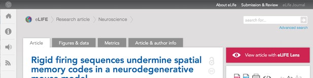
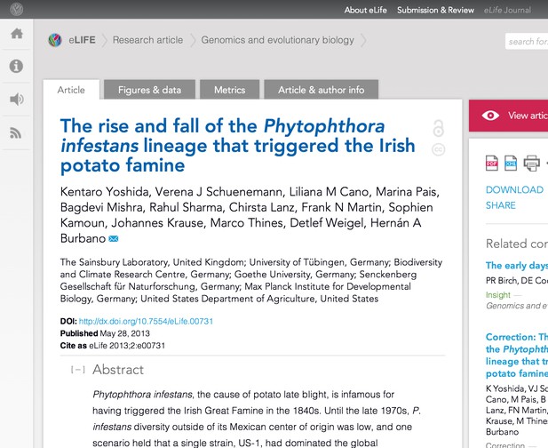
On wider screens things have been left pretty much as they are, with the notable exception of the search box now being readily available on the top right, rather than being hidden behind a fly-out menu:
No more horizontal scrolling
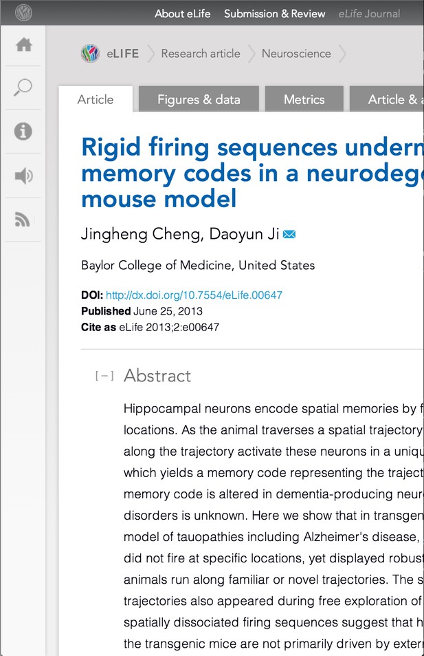
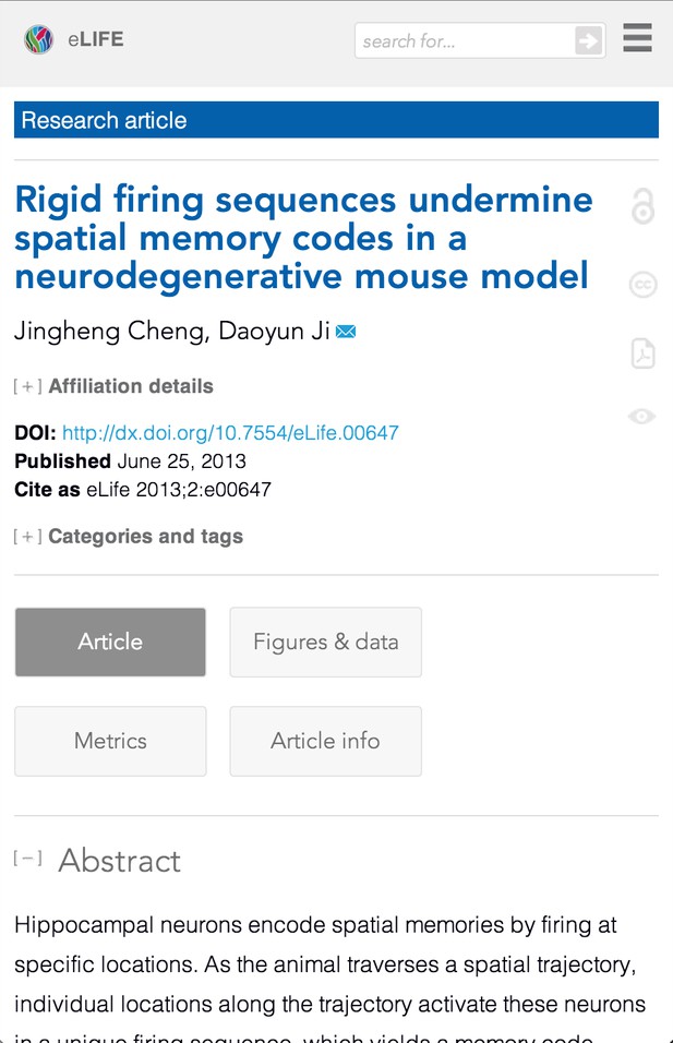
Previously, if your screen was narrower than the site's fixed width you had to scroll horizontally to read along a line of text (left), which was a real pain. We've done away with that old fixed width for narrower screens, and now the article scales to fit, whilst keeping the font a readable size (right). (Yeah, okay, not so readable in these screen shots, but check out the site for real.)
Placement
In order to make this approach work, on narrow screens the site has been constrained to one column, and as much clutter as possible removed from the interface in order to focus the user on the reading experience. This raised the obvious question of what to do with all of the stuff from the wide view's right-hand column, and various global page elements. (Any web folks reading this having mobile-first alarm bells going off at this point, see the note on constraints.) We carried out a prioritisation exercise, including a degree of user testing, and the results of that are what you see on the site today. We don't claim to have got it all right, but we think it's a credible starting point. So, what have we changed for smaller screens?
Global elements
These apply to almost all pages, not just the articles. The page footer contains most of the items that were in the flyout menu in a much more platform-agnostic presentation. The page header is shorter, as we want the user to get to the content as quickly as possible. It contains:
- a small eLife logo on the left that links to the home page
- a search form
- a nav icon that contains the global nav to the home page and the browse page. (It also may include contextual navigation that changes depending on which page you're on.)
Article-specific elements
When on an article page, the global menu is also where you find the article 'Jump to' links to navigate the current article.
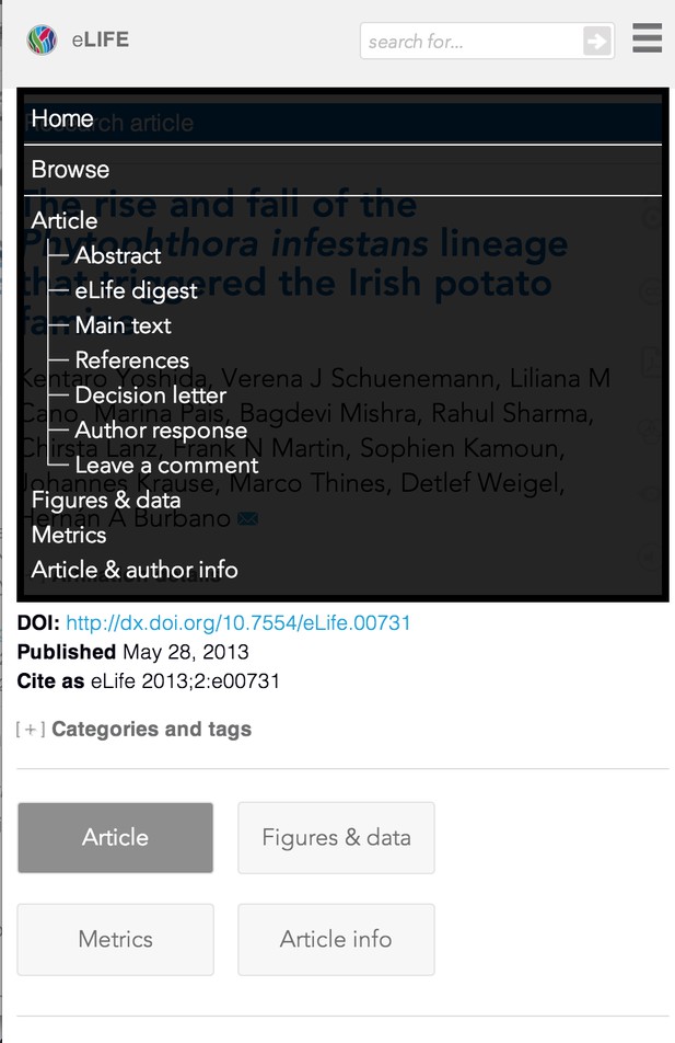

We've omitted the sub-sections of 'Main text' navigation in the narrow view (left) that are present in the wider view (right), to prevent the menu being taller than the screen on some devices, but this usability tradeoff seems worth it.
We've also added 'To top' links at the end of article sections to help more quickly find your way round when trying to quickly navigate a long article. The tabs for Figures and Data, Metrics and Article and author info that span very wide have been given a more button-like appearance and now stack, depending on the screen width, just above the abstract. The article type is now displayed in a linked coloured bar at the top of the article. The colour of the bar indicates the content type (blue for Research Articles, green for Insights, etc). Following the link takes you to a search results page for all articles of that type.
There is now an expandable Categories and tags section containing these erstwhile right-hand column dwellers:
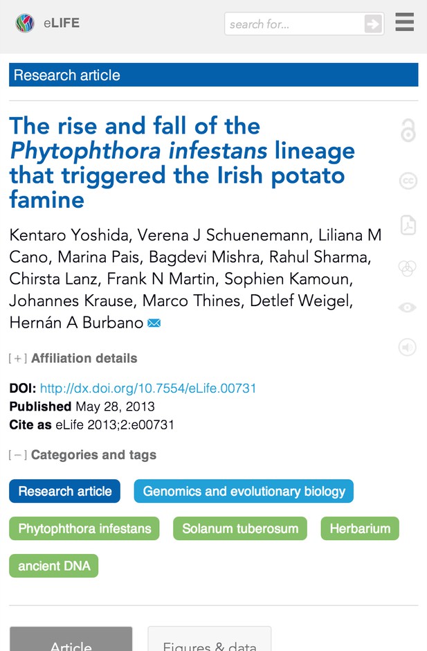
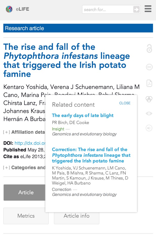
The pre-existing wide view's open access and Creative Commons links in the right-hand margin of the main article column (left pane below) have been joined in the narrow view by links to Lens and PDF versions of the article, and also by links to related content and multimedia where appropriate (right pane below). The related items and multimedia icons reveal popups with more info when pressed. The other icons link through directly.
Although reading a PDF on a small screen is typically a terrible experience, we've left the link in as users may wish to save it to Dropbox or similar. Despite the space constraints we have tried to be creative and retain as much as possible.
Images
Figure images now span the full width of the article. Where there are supplementary figures, the thumbnails for these have been moved above the image to enable full width display for this type of figure.
A more touch-friendly interface
Along with making the content fit a narrow screen, we also had to make sure that the site was usable with a touch interface, and many (but not all) narrow screens are touch-driven. We've made linked elements larger to be more easily pressable with a finger, and have increased the separation between previously close together links to reduce the risk of pressing the wrong link by mistake. We've also provided an alternative way of getting at information that had previously only been available when hovering the mouse over a page element (some touch devices try to handle hovers, but you can't rely on consistent results, so it's best to have touch-friendly alternatives to any hovers the site may have).
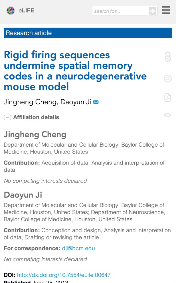
When viewing on a narrow screen, author affiliation details have been moved from a popup box activated when hovering over an author's name, into an expandable section just below the authors' names (shown below expanded).
Additionally, pressing a reference citation in the text takes you to that reference in the reference section. (Currently going back in the browser doesn't return you to your place in the text, but takes you to the previous page. This is a pre-existing irritation that we're working on fixing.)
Searching and browsing
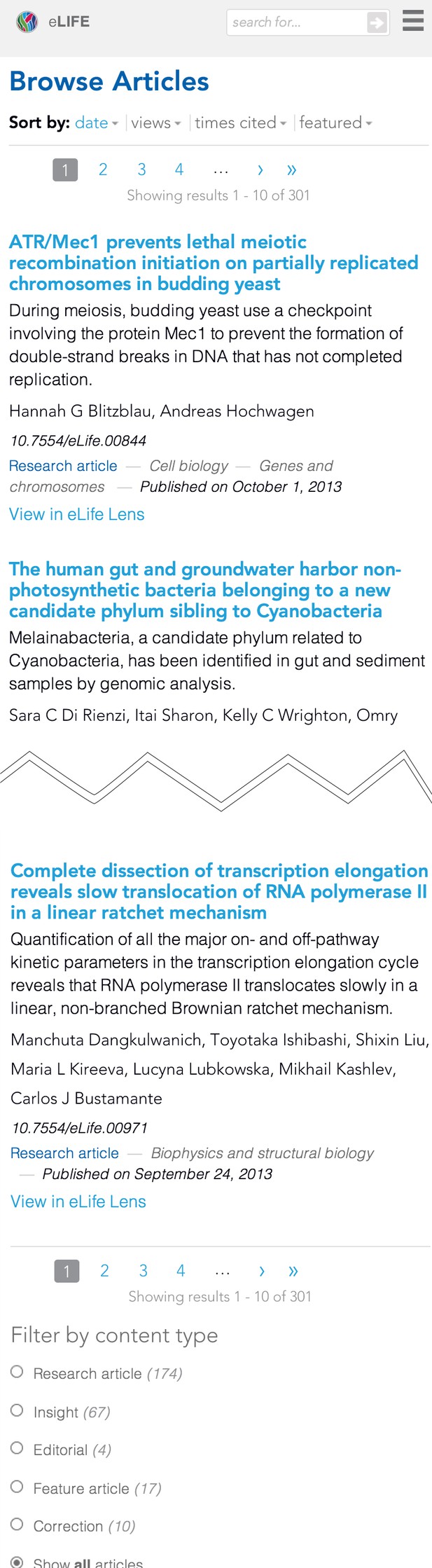
As should already be apparent from the various screen shots shown above, the search box is at the top of the page, towards the right hand side (on both narrow and wider screens). The search results page (and the browse-articles page, that is almost identical) has been given some narrow-screen love too.
The search results listing spans the full width of the screen, with the filters dropping beneath the main listing on the narrow view. The various links within each list item have been given more room to breathe, and as a bonus, there is now a link to Lens for each article in the listing.
The pagination controls have been made larger, and each link of these has been given more white space around it to make it easier to hit the right link with your finger. The sorting options have similarly been made larger.
Home page
The current home page you see on a narrow screen works, but is actually only an interim solution. We have a separate home page project simmering away nicely at the moment, so didn't spend too much time on the home page for this release. For example the Editors' choice box couldn't be made to work reliably in the short time we gave ourselves for the homepage, so we've turned it off on the narrow view for now. The articles highlighted by this box are still available, however, and there will be a new, improved home page along soon!
Constraints
Dealing with such a young site is a double-edged sword: because it's so new there is no appetite for significant refactoring in order to introduce the best in responsive design techniques (e.g. mobile/content first), and to set things up to be as future friendly as possible. On the other hand, being so new, the level of technical debt is manageable, so although we haven't been able to perhaps go as far as we'd like to, we can make changes at the level we have in a relatively timely fashion. eLife is a Drupal site published on the Highwire platform, and the content and image repositories are separate from, but called upon by, the site. Image processing workflow was outside the scope of this project, and so we've not been able to put in place a solution for responsive images yet. It's definitely something we want to look at for the future, though.
There's more to do
We’ve put a lot of effort into improving the quality of the reading experience of our main content, but we're not done. It’s a website: we’ll never be done! For example there are a few pages that still don’t look too good on narrow screens, and we’d also like to improve the figure handling generally (see this previous post). There's also room for some breakpoint tweaking in the media queries (there's always a temptation there). Next time we do this we’d like to go for a full content/’mobile’ first approach to make our content more accessible to users across even more of the technology spectrum. There're performance optimisations to be made too. We'll be constantly working to add new features, and optimise existing experiences. If you have a suggestion for how you think we could improve the site, please let us know in the comments. If you do, when you describe your suggestion, it would be super-helpful for us if you could describe:
- who you think would be the main beneficiary of the change, and what that person is trying to do that the change would assist with (e.g. 'a user trying to find a list of articles published last month')
- how that person would benefit from the change
- what your proposed change is
The better we understand why you've suggested something, the better we can prioritise it. We're really pleased at the improvements we've made to help elife.elifesciences.org stand up much better on smaller screens. The further improvements we will be introducing over the following weeks and months should improve the experience of users even further. We hope you like the direction we're taking with the eLife journal on the web. Exciting times ahead! by David Moulton (on Twitter at @davidcmoulton)