Quantifying the impact of quarantine duration on COVID-19 transmission
- Institute of Integrative Biology, ETH Zürich, Switzerland
- Institute of Social and Preventive Medicine, University of Bern, Switzerland
Figures
Figure 1 with 1 supplement
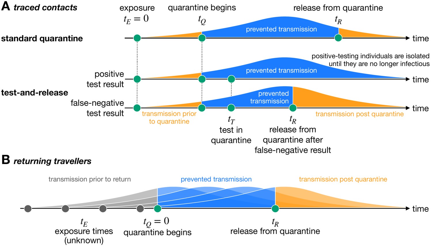
Quantifying the impact of quarantine using a mathematical model.
Here the y-axis represents the probability of transmission. These infectivity curves are a schematic representation of the generation time distribution shown in Figure 1—figure supplement 1. (A) Traced contacts are exposed to an infector at a known time and then enter quarantine at time . Some transmission can occur prior to quarantine. Under the standard quarantine protocol, the contact is quarantined until time , and no transmission is assumed to occur during this time. The area under the infectivity curve between and (blue) is the fraction of transmission that is prevented by quarantine. Transmission can occur after the individual leaves quarantine. Under the test-and-release protocol, quarantined individuals are tested at time and released at time if they receive a negative test result. Otherwise the individual is isolated until they are no longer infectious. The probability that an infected individual returns a false-negative test result, and therefore is prematurely released, depends on the timing of the test relative to infection () (Kucirka et al., 2020). (B) For returning travellers, the time of exposure is unknown and we assume that infection could have occurred on any day of the trip. The travellers enter quarantine immediately upon return at time , and then leave quarantine at time under the standard quarantine protocol. Test-and-release quarantine proceeds as in panel A.
Figure 1—figure supplement 1
Infection timing distributions.
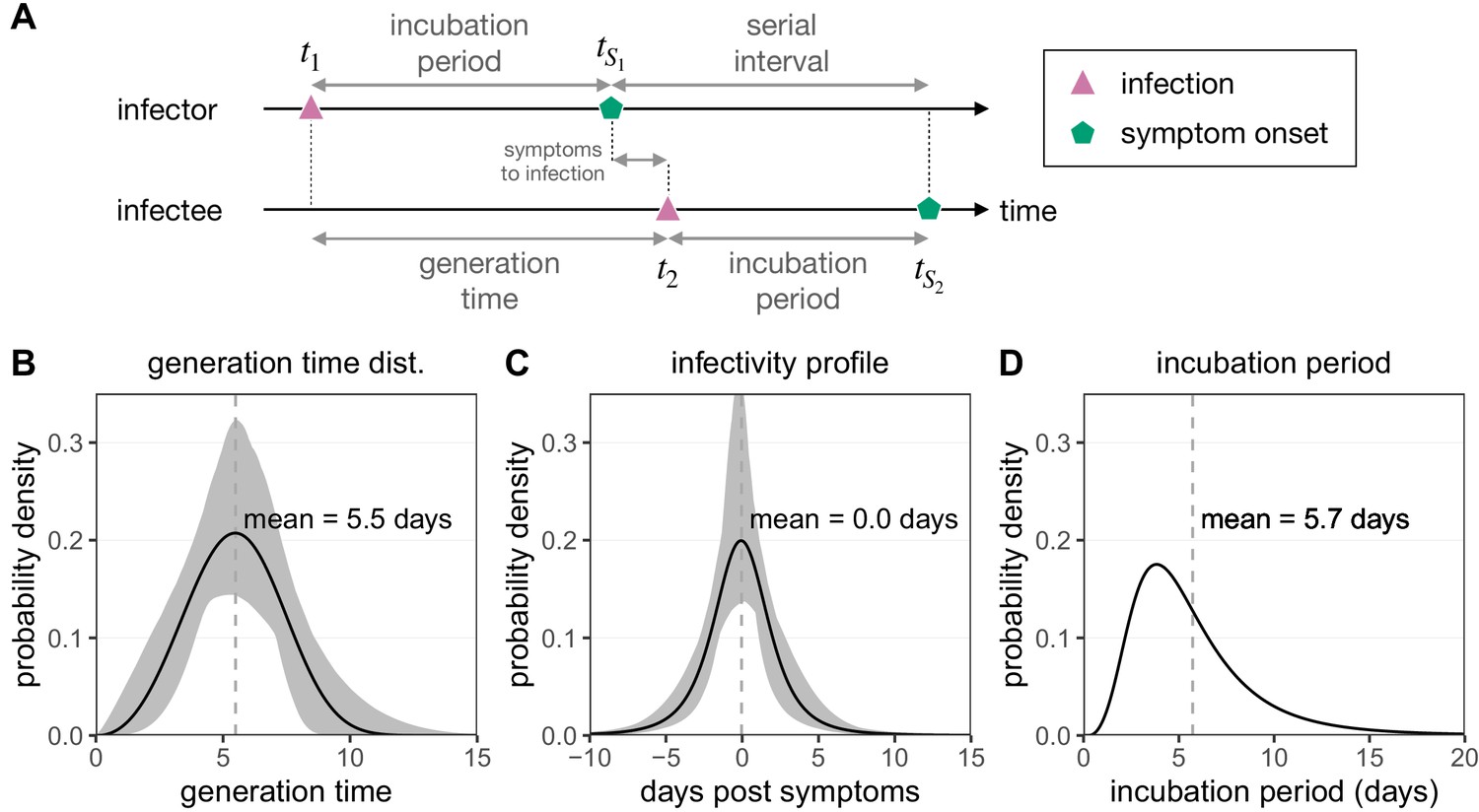
(A) The timeline of infection for an infector–infectee transmission pair. The generation time is defined as the time interval between subsequent infections (), while the serial interval is defined as the time between symptoms onsets in this transmission pair (). The incubation period describes the time between infection and symptom onset in a single individual (e.g. ). (B) The generation time distribution follows a Weibull distribution and is inferred from the serial interval distribution (Ferretti et al., 2020b). (C) The infectivity profile (describing the time between symptom onset in the infector and infection of the infectee) follows a shifted Student’s t-distribution and is also inferred from the serial interval distribution (Ferretti et al., 2020b). (D) The distribution of incubation times follows a meta-distribution constructed from the average of seven reported log-normal distributions (Bi et al., 2020; Jiang et al., 2020; Lauer et al., 2020; Li et al., 2020; Linton et al., 2020; Ma et al., 2020; Zhang et al., 2020), as described in Ferretti et al., 2020b.
-
Figure 1—figure supplement 1—source data 1
Infection timing distributions.
- https://cdn.elifesciences.org/articles/63704/elife-63704-fig1-figsupp1-data1-v2.zip
Figure 2 with 2 supplements
Quantifying the impact of quarantine for traced contacts.
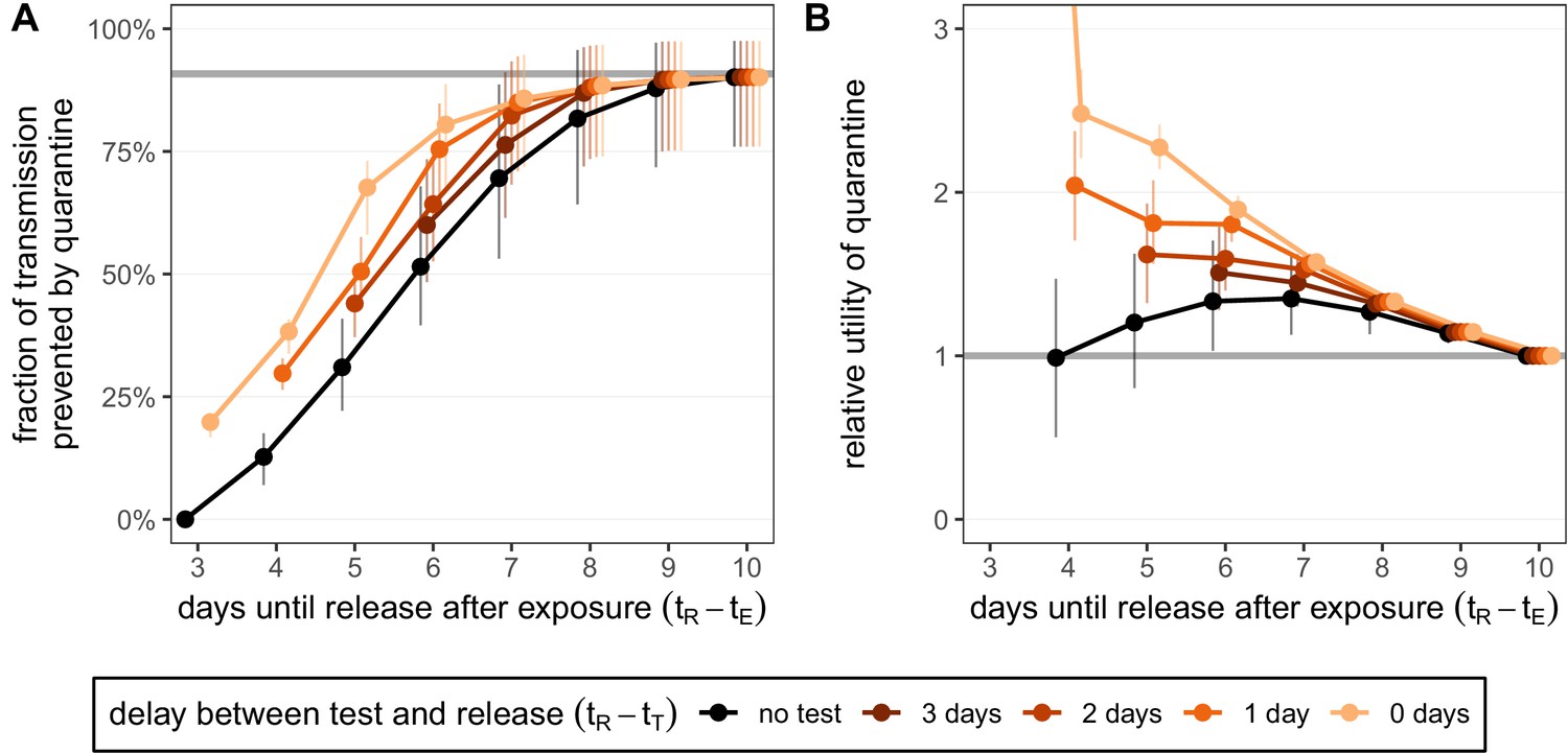
(A) The fraction of transmission that is prevented by quarantining an infected contact. Quarantine begins at time after exposure at time , that is, there is a 3-day delay between exposure and the start of quarantine. Under the standard quarantine protocol (black), individuals are released without being tested [Equation (1)]. The test-and-release protocol (colours) requires a negative test result before early release, otherwise individuals remain isolated until they are no longer infectious (day 10) [Equation (2)]. Colour intensity represents the delay between test and release (from 0 to 3 days). The grey line represents the maximum attainable prevention by increasing the time of release while keeping fixed. (B) The relative utility of the quarantine scenarios in A compared to the standard protocol 10-day quarantine [Equation (6)]. Utility is defined as the fraction of transmission prevented per day spent in quarantine. The grey line represents equal utilities (relative utility of 1). We assume that the fraction of individuals in quarantine that are infected is 10%, and that there are no false-positive test results. Error bars reflect the uncertainty in the generation time distribution.
-
Figure 2—source data 1
Fraction of transmission prevented by quarantine (contacts; test-and-release).
- https://cdn.elifesciences.org/articles/63704/elife-63704-fig2-data1-v2.zip
-
Figure 2—source data 2
Relative utility of quarantine (contacts; test-and-release).
- https://cdn.elifesciences.org/articles/63704/elife-63704-fig2-data2-v2.zip
Figure 2—figure supplement 1
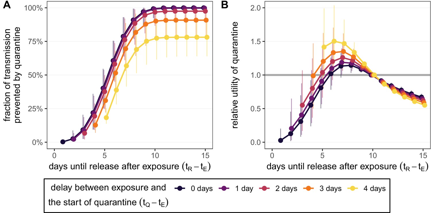
Quantifying the effect of duration and delay for the standard quarantine protocol (no test) for traced contacts.
(A) The fraction of transmission that is prevented by quarantining an infected contact [Equation (1)]. We fix the time of exposure to , and quarantine begins after a delay of 0–4 days (colour). (B) The relative utility of different quarantine durations compared to release on day 10 [Equation (5)]. Error bars reflect the uncertainty in the generation time distribution.
-
Figure 2—figure supplement 1—source data 1
Fraction of transmission prevented by quarantine (contacts; no test).
- https://cdn.elifesciences.org/articles/63704/elife-63704-fig2-figsupp1-data1-v2.zip
-
Figure 2—figure supplement 1—source data 2
Relative utility of quarantine (contacts; no test).
- https://cdn.elifesciences.org/articles/63704/elife-63704-fig2-figsupp1-data2-v2.zip
Figure 2—figure supplement 2
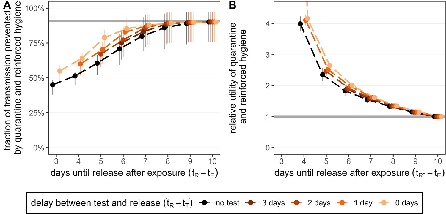
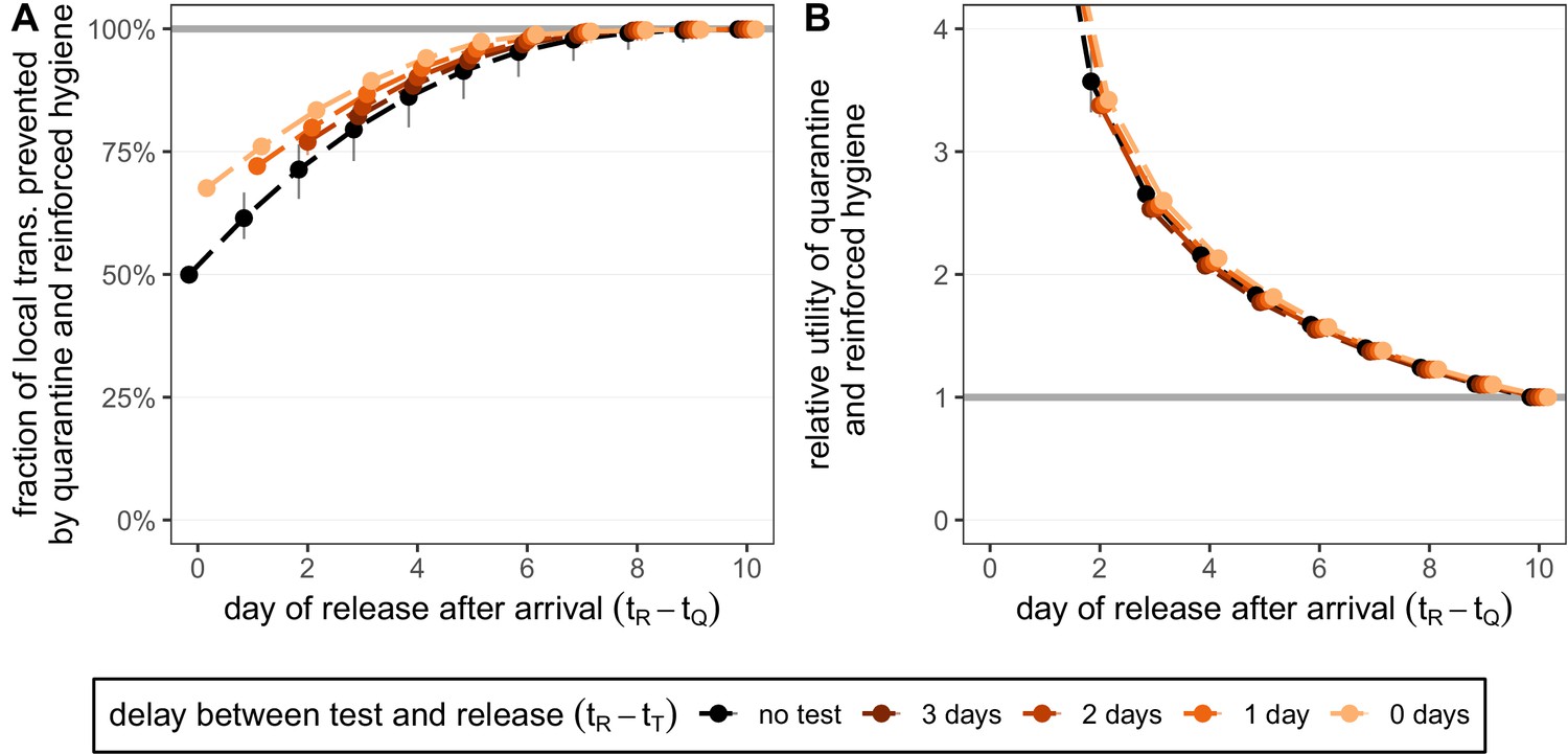
Quantifying the impact of quarantine and reinforced hygiene measures for traced contacts.
(A) The fraction of transmission that is prevented by quarantining an infected contact and enforcing strict hygiene measures after release (see 'Appendix 1: Reinforced prevention measures after early release' for details). The scenarios are the same as in Figure 2 (i.e. exposure at time and quarantine entry at time ), but we reduce post-quarantine transmission by until day 10, after which further transmission is unlikely. The grey line represents the maximum attainable prevention by increasing release time, but keeping fixed. (B) The relative utility of the quarantine and hygiene scenarios in panel A compared to the standard protocol 10-day quarantine [Equation 6]. The grey line represents equal utilities (relative utility of 1). We assume that the fraction of individuals in quarantine that are infected is , and that there are no false-positive test results. Error bars reflect the uncertainty in the generation time distribution.
-
Figure 2—figure supplement 2—source data 1
Fraction of transmission prevented by quarantine (contacts; reinforced hygiene).
- https://cdn.elifesciences.org/articles/63704/elife-63704-fig2-figsupp2-data1-v2.zip
-
Figure 2—figure supplement 2—source data 2
Relative utility of quarantine (contacts; reinforced hygiene).
- https://cdn.elifesciences.org/articles/63704/elife-63704-fig2-figsupp2-data2-v2.zip
Figure 3 with 1 supplement
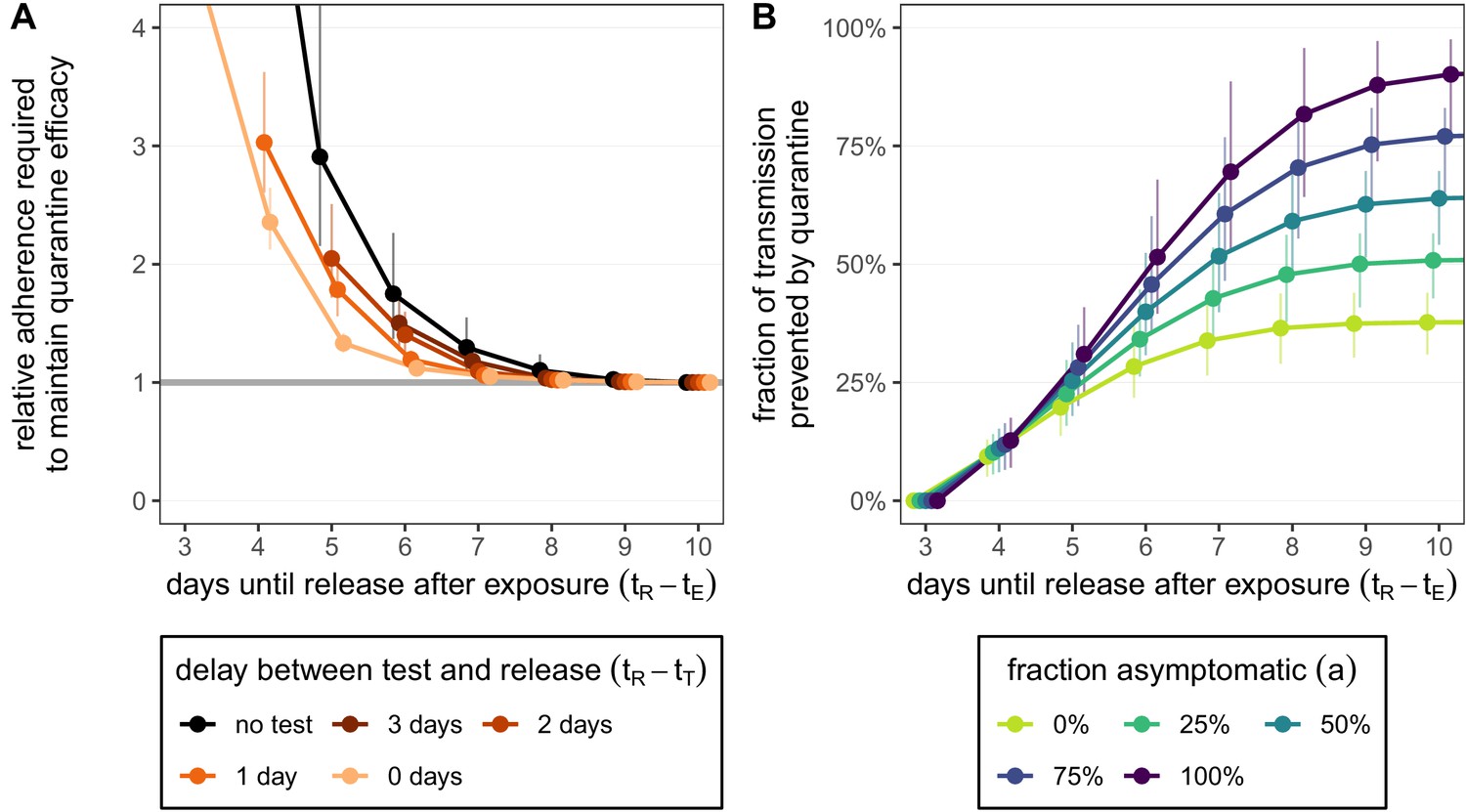
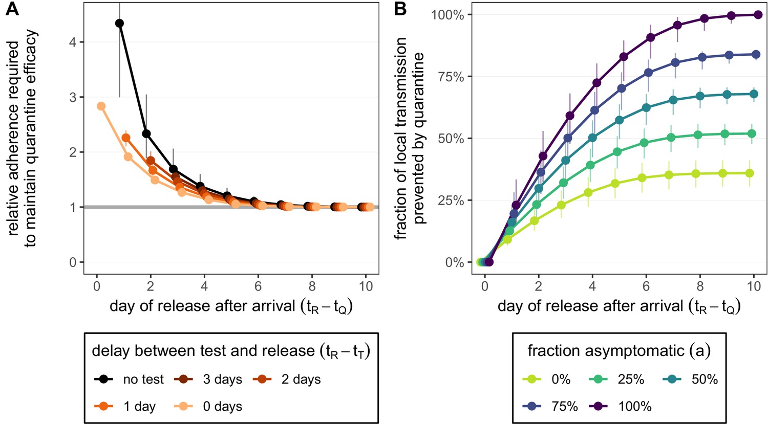
How adherence and symptoms affect quarantine efficacy for traced contacts.
(A) The fold-change in adherence to a new quarantine strategy that is required to maintain efficacy of the baseline 10-day standard strategy. Quarantine strategies are the same as in Figure 2 (standard = black, test-and-release = colours). The grey line represents equal adherence (relative adherence of 1). (B) The impact of symptomatic cases on the fraction of total onward transmission per infected traced contact that is prevented by standard (no test) quarantine [Equation (A9)]. We assume that symptomatic individuals will immediately self-isolate at symptom onset. The time of symptom onset is determined by the incubation period distribution (see Figure 1—figure supplement 1D). The curve for 100% asymptomatic cases corresponds to the black curve in Figure 2A. As in Figure 2, we fix the time of exposure at and the time of entering quarantine at days. Error bars reflect the uncertainty in the generation time distribution.
-
Figure 3—source data 1
Relative adherence (contacts; test-and-release).
- https://cdn.elifesciences.org/articles/63704/elife-63704-fig3-data1-v2.zip
-
Figure 3—source data 2
Role of asymptomatic cases (contacts; zero delay).
- https://cdn.elifesciences.org/articles/63704/elife-63704-fig3-data2-v2.zip
Figure 3—figure supplement 1
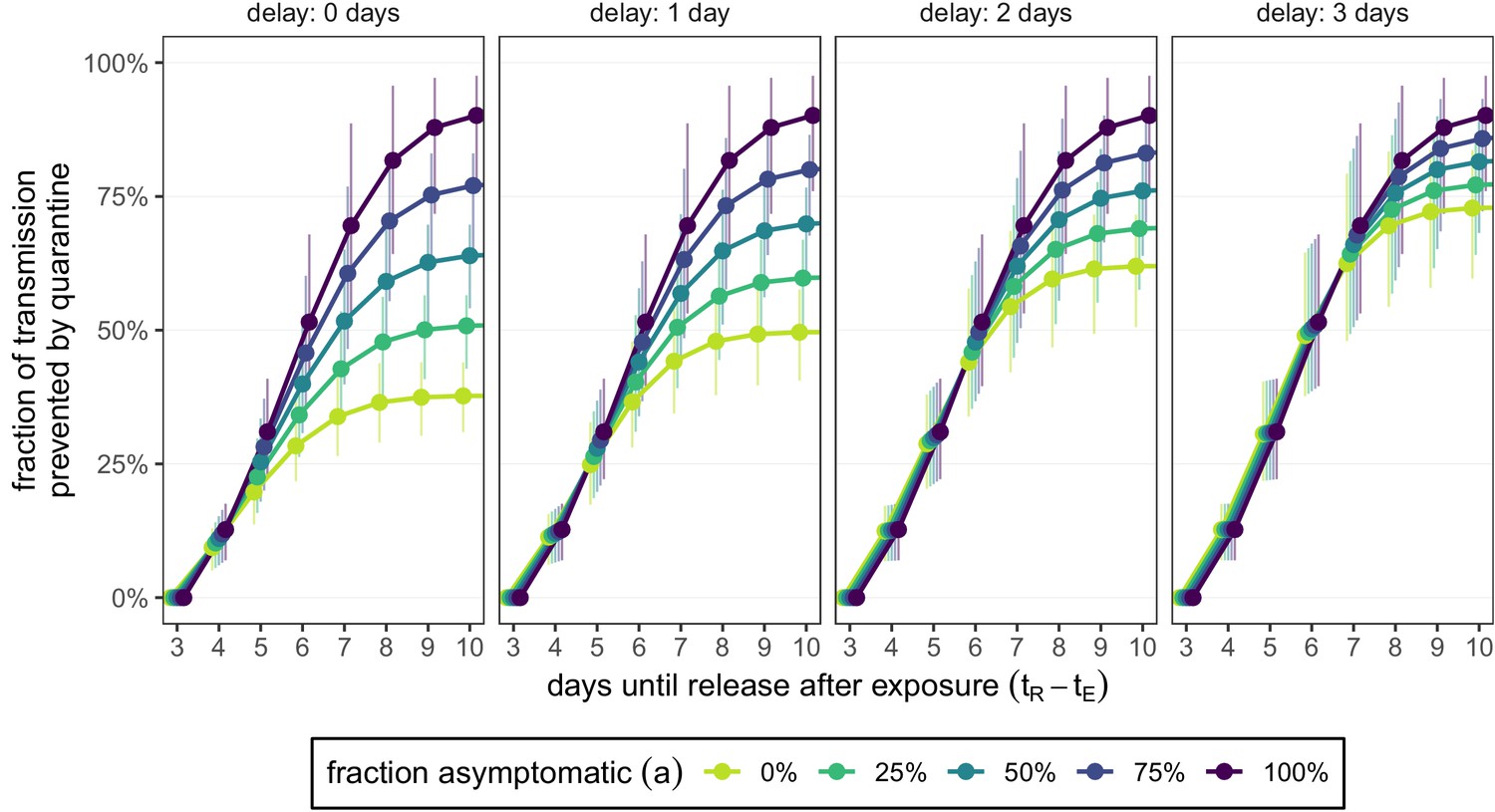
How the delay between symptom onset and self-isolation affects quarantine efficacy for traced contacts.
The y-axis is the fraction of total onward transmission per infected traced contact that is prevented by standard (no test) quarantine [Equation (A9)]. Each panel corresponds to a different delay between symptom onset and self-isolation in symptomatic individuals. The left-most panel (zero delay) corresponds to Figure 3B. The time of symptom onset is determined by the incubation period distribution (see Figure 1—figure supplement 1D). As in Figures 2 and 3, we fix the time of exposure at and the time of entering quarantine at days. Error bars reflect the uncertainty in the generation time distribution.
-
Figure 3—figure supplement 1—source data 1
Role of asymptomatic cases (contacts; changing delay).
- https://cdn.elifesciences.org/articles/63704/elife-63704-fig3-figsupp1-data1-v2.zip
Figure 4 with 3 supplements
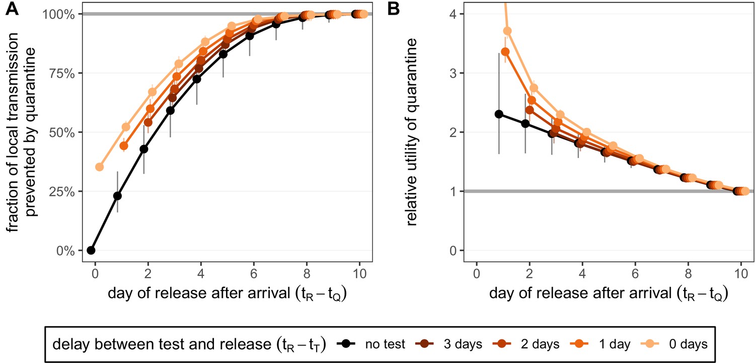
Quantifying the impact of quarantine for returning travellers.
(A) The fraction of local transmission that is prevented by quarantining an infected traveller returning from a 7-day trip. Quarantine begins upon return at time , and we assume that exposure could have occurred at any time during the trip, that is, . Under the standard quarantine protocol (black), individuals are released without being tested [Equation (9)]. The test-and-release protocol (colours) requires a negative test result before early release, otherwise individuals remain isolated until they are no longer infectious (day 10). Colour intensity represents the delay between test and release (from 0 to 3 days). While extended quarantine can prevent 100% of local transmission (grey line), this represents 73.3% [CI: 65.7%,80.3%] of the total transmission potential (see Figure 4—figure supplement 1A). The remaining transmission occurred before arrival. (B) The relative utility of the quarantine scenarios in A compared to the standard protocol 10-day quarantine [Equation 6]. Utility is defined as the local fraction of transmission that is prevented per day spent in quarantine. The grey line represents equal utilities (relative utility of 1). We assume that the fraction of individuals in quarantine that are infected is 10%, and that there are no false-positive test results. Error bars reflect the uncertainty in the generation time distribution.
-
Figure 4—source data 1
Fraction of transmission prevented by quarantine (travellers; local; test-and-release).
- https://cdn.elifesciences.org/articles/63704/elife-63704-fig4-data1-v2.zip
-
Figure 4—source data 2
Relative utility of quarantine (travellers; local; test-and-release).
- https://cdn.elifesciences.org/articles/63704/elife-63704-fig4-data2-v2.zip
Figure 4—figure supplement 1
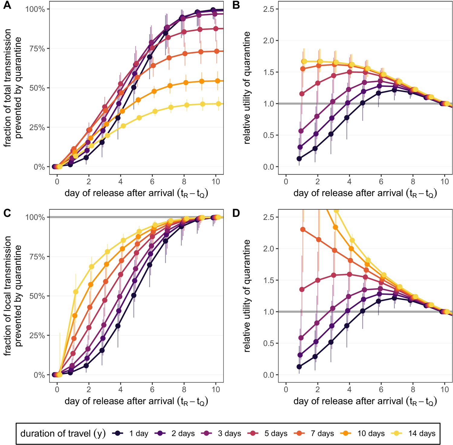
Quantifying the effect of travel duration and quarantine duration for the standard quarantine protocol (no test) for returning travellers.
(A) The fraction of total transmission that is prevented by quarantining an infected traveller [Equation (7)]. (B) The relative utility of the different quarantine durations in A compared to release on day 10, based on the total fraction of transmission prevented. (C) The fraction of local transmission that is prevented by quarantining an infected traveller [Equation (9)]. (D) The relative utility of the different quarantine durations in C compared to release on day 10, based on the local fraction of transmission prevented. Colours represent the duration of travel y, and we assume that infection can occur with equal probability on each day which satisfies . Quarantine begins at time , which is the time of arrival. Error bars reflect the uncertainty in the generation time distribution.
-
Figure 4—figure supplement 1—source data 1
Fraction of transmission prevented by quarantine (travellers; total; no test).
- https://cdn.elifesciences.org/articles/63704/elife-63704-fig4-figsupp1-data1-v2.zip
-
Figure 4—figure supplement 1—source data 2
Relative utility of quarantine (travellers; total; no test).
- https://cdn.elifesciences.org/articles/63704/elife-63704-fig4-figsupp1-data2-v2.zip
-
Figure 4—figure supplement 1—source data 3
Fraction of transmission prevented by quarantine (travellers; local; no test).
- https://cdn.elifesciences.org/articles/63704/elife-63704-fig4-figsupp1-data3-v2.zip
-
Figure 4—figure supplement 1—source data 4
Relative utility of quarantine (travellers; local; no test).
- https://cdn.elifesciences.org/articles/63704/elife-63704-fig4-figsupp1-data4-v2.zip
Figure 4—figure supplement 2
Quantifying the impact of quarantine and reinforced hygiene measures for returning travellers.
(A) The fraction of local transmission that is prevented by quarantining an infected traveller and enforcing strict hygiene measures after release (see 'Appendix 1: Reinforced prevention measures after early release' for details). The scenarios are the same as in Figure 4 (i.e. exposure occurs with equal probability between day –7 and return at day 0, , and quarantine starts at time ), but we reduce post-quarantine transmission by until day 10, after which further transmission is unlikely. (B) The relative utility of the quarantine and hygiene scenarios in A compared to the standard protocol 10-day quarantine [Equation 6]. We assume that the fraction of individuals in quarantine that are infected is 10%, and that there are no false-positive test results. Error bars reflect the uncertainty in the generation time distribution.
-
Figure 4—figure supplement 2—source data 1
Fraction of transmission prevented by quarantine (travellers; local; reinforced hygiene).
- https://cdn.elifesciences.org/articles/63704/elife-63704-fig4-figsupp2-data1-v2.zip
-
Figure 4—figure supplement 2—source data 2
Relative utility of quarantine (travellers; local; reinforced hygiene).
- https://cdn.elifesciences.org/articles/63704/elife-63704-fig4-figsupp2-data2-v2.zip
Figure 4—figure supplement 3
How adherence and symptoms affect quarantine efficacy for returning travellers.
(A) The fold-change in adherence to a new quarantine strategy that is required to maintain efficacy (local fraction of transmission prevented) of the baseline 10-day standard strategy. Quarantine strategies are the same as in Figure 4 (standard = black, test-and-release = colours). The grey line represents equal adherence (relative adherence of 1). (B) The impact of symptomatic cases on the fraction of local transmission per infected traveller that is prevented by standard (no test) quarantine [Equation (A9)]. We assume that symptomatic individuals will immediately self-isolate at symptom onset. The time of symptom onset is determined by the incubation period distribution (see Figure 1—figure supplement 1D). The curve for corresponds to the black curve in Figure 4A. For both panels, as in Figure 4, we fix the trip duration to 7 days and assume exposure can occur at any time . Quarantine begins at time . Error bars reflect the uncertainty in the generation time distribution.
-
Figure 4—figure supplement 3—source data 1
Relative adherence (travellers; local; test-and-release).
- https://cdn.elifesciences.org/articles/63704/elife-63704-fig4-figsupp3-data1-v2.zip
-
Figure 4—figure supplement 3—source data 2
Role of asymptomatic cases (travellers; local).
- https://cdn.elifesciences.org/articles/63704/elife-63704-fig4-figsupp3-data2-v2.zip
Appendix 1—figure 1

Log-likelihood values [] for random parameter samples of the generation time distribution.
These samples define the 95% confidence interval for the generation time distribution parameters. Red dot is the maximum likelihood parameter combination as shown in Appendix 1—table 1.
-
Appendix 1—figure 1—source data 1
Generation time distribution parameters versus likelihood.
- https://cdn.elifesciences.org/articles/63704/elife-63704-app1-fig1-data1-v2.zip
Tables
Table 1
Summary of terms used in the mathematical model.
| Value | Definition | Notes |
|---|---|---|
| Generation time distribution | Weibull distribution: shape = 3.277, scale = 6.127 | |
| Time of exposure | for traced contacts | |
| Time at which quarantine begins | for returning travellers | |
| Time of release from quarantine | - | |
| Time of test | - | |
| End of infectiousness | days | |
| Incubation period distribution | Meta-log-normal distribution ('Appendix 1: Distribution parameters') | |
| Time of symptom onset | incubation period | |
| Realised average duration of standard quarantine | ||
| Realised average duration of test-and-release quarantine | See Equation (3) | |
| , | Quarantine efficacy; the fraction of transmission prevented by quarantining an infected individual | See Equations (1) and (2) |
| y | Duration of travel journey (days) | - |
| s | Fraction of individuals in quarantine that are infected | - |
| Probability of returning a false-negative test result if tested t days after exposure | From Kucirka et al., 2020 | |
| r | Reduction of transmission under reinforced prevention measures post-quarantine | - |
| Probability to adhere to quarantine of duration D | - | |
| a | Fraction of persistently asymptomatic cases | - |
| Delay between symptom onset and isolation (days) | See 'Appendix 1: Persistently asymptomatic infections and the role of self-isolation' |
Appendix 1—table 1
Parameters of the distributions used in this work.
The meta-log-normal distribution is the average of seven reported log-normal distributions (Ferretti et al., 2020b). The shifted Student’s t distribution for the infectivity profile is defined in R by dt((x-shift)/scale, df)/scale (Ferretti et al., 2020b).
| Distribution | Shape | Parameters | Properties |
|---|---|---|---|
| Incubation period | Meta-log-normal | meanlog = 1.570, sdlog = 0.650 (Bi) | mean = 5.723, sd = 3.450, median = 4.936 |
| meanlog = 1.621, sdlog = 0.418 (Lauer) | |||
| meanlog = 1.434, sdlog = 0.661 (Li) | |||
| meanlog = 1.611, sdlog = 0.472 (Linton) | |||
| meanlog = 1.857, sdlog = 0.547 (Ma) | |||
| meanlog = 1.540, sdlog = 0.470 (Zhang) | |||
| meanlog = 1.530, sdlog = 0.464 (Jiang) | |||
| Generation time | Weibull | shape = 3.277, scale = 6.127 | mean = 5.494, sd = 1.845, median = 5.479 |
| Infectivity profile | Shifted Student's t | shift = -0.078, scale = 1.857, df = 3.345 | mean = -0.042, sd = 2.876, median = -0.078 |
Additional files
-
Transparent reporting form
- https://cdn.elifesciences.org/articles/63704/elife-63704-transrepform-v2.docx
-
Appendix 1—figure 1—source data 1
Generation time distribution parameters versus likelihood.
- https://cdn.elifesciences.org/articles/63704/elife-63704-app1-fig1-data1-v2.zip
Download links
A two-part list of links to download the article, or parts of the article, in various formats.
Downloads (link to download the article as PDF)
Open citations (links to open the citations from this article in various online reference manager services)
Cite this article (links to download the citations from this article in formats compatible with various reference manager tools)
Quantifying the impact of quarantine duration on COVID-19 transmission
eLife 10:e63704.
https://doi.org/10.7554/eLife.63704


