Meta-Research: Lessons from a catalogue of 6674 brain recordings
Figures
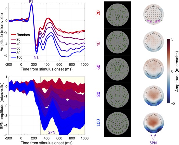
The sustained posterior negativity (SPN).
The grand-average ERPs are shown in the upper left panel and difference waves (reflection-random) are shown in the lower left panel. A large SPN is a difference wave that falls a long way below zero. Topographic difference maps are shown on the right, aligned with the representative stimuli (black background). The difference maps depict a head from above, and the SPN appears as blue at the back. Purple labels indicate electrodes used for ERP waves [PO7, O1, O2 and PO8]. Note that SPN amplitude increases (that is, becomes more negative) with the proportion of symmetry in the image. In this experiment, the SPN increased from ~0 to –3.5 microvolts as symmetry increased from 20% to 100%. Adapted from Figures 1, 3 and 4 in Makin et al., 2020c.
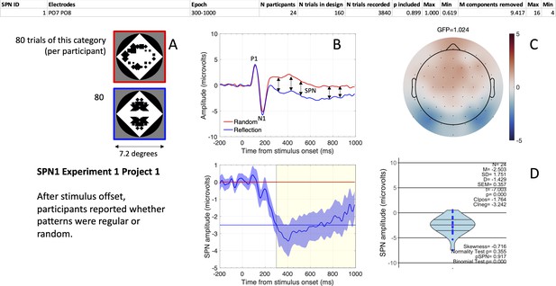
The first SPN from the SPN Gallery.
(A) Examples of stimuli. (B). Grand-average ERP waves from electrodes PO7 and PO8 (upper panel), and the SPN as a reflection-random difference wave (with 95% CI; lower panel). The typical 300–1000ms SPN window is highlighted in yellow. Mean amplitude during this window was –2.503 microvolts (horizontal blue line). (C) SPN as a topographic difference map. (D) Violin plot showing SPN amplitude for each participant plus descriptive and inferential statistics. The file “One SPN Gallery.pdf” (https://osf.io/eqhd5/) contains a figure like this for all 249 SPNs. The analysis details shown at the top of the figure are also explained in this file.
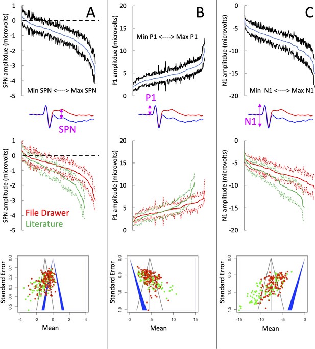
SPN amplitudes in published and unpublished work.
(A) The top panel shows the cumulative distribution of all 249 grand-average SPNs. The smallest SPN is at the left-most end of the x-axis, and the largest SPN is at the right-most end. The blue line is comprised 249 data points, and the black lines show 95% confidence intervals. If the upper confidence interval does not rise above zero, we have a significant SPN (P<.05, two-tailed). The middle panel shows that the 134 unpublished SPNs in the file drawer (red) are smaller (i.e., less negative) than the 115 published SPNs in the literature (green). The bottom panel shows a funnel plot of 249 grand-average SPNs arranged by mean (x-axis) and standard error (y-axis). Red dots are unpublished SPNs, green dots are published SPNs. Dots to the left of the blue central triangle represent significant SPNs (inner edge, P<.05, outer edge, P<.01); if dots are inside the blue triangle, the effect is non-significant. (B) Equivalent set of plots for the peak amplitude P1 on regular trials. (C) Equivalent set of plots for the trough amplitude N1 on regular trials.
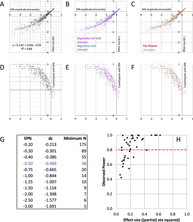
SPN effect size and power.
(A–C) The nonlinear relationship between SPN amplitude and effect size. The equation for the second order polynomial trendline is shown in panel A (y = 0.13x2+0.95 x - 0.03). This explains 86% of variance in effect size (R2=0.86). Using the equation, we can estimate effect size for an SPN of a given amplitude. Dashed lines highlight –0.5 microvolt SPNs, with average effect size dz of –0.469. For an 80% chance of finding this effect, an experiment requires 38 participants. The relationships were similar whether regularity was task relevant or not (B), and in published and unpublished work (C). (D–F) How many participants show the SPN? The larger (more negative) the SPN, the more individual participants show the effect (regular < random). Dashed lines highlight –0.5 microvolt SPNs, which are quite often present in 2/3 but not 3/4 of the participants. The relationships were similar whether regularity was task relevant or not (E), and in published and unpublished work (F). (G) Table of required N for 80% chance of obtaining an SPN of a given amplitude. (H) Observed power and effect size of 40 SPN modulations. 15/40 do not reach the 0.8 threshold (red line).
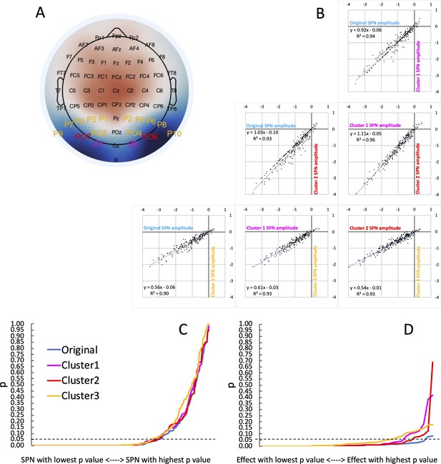
Vibration of the SPN effect.
(A) Typical SPN topographic difference map with labels colour coded to show three alternative electrode clusters, which could have been used dogmatically in all analyses, whatever the observed topography. (B) Scatterplots show SPNs from the original cluster and the three alternatives, which are highly correlated. (C) One-sample t-tests were used to establish whether each SPN is significant. The cumulative distribution of p values is shown here. The smallest p value (from the most significant SPN) is at the left-most end of the x axis, and the largest p value (from the least significant SPN) is at the right-most end. The p values from the original cluster and the three alternatives were very similar. There was a similar number of significant SPNs (169–177). (D) ANOVAs are used to assess SPN modulations. The p values from 40 representative ANOVA effects do not overlap completely. There were more significant SPN modulations when the original electrode cluster was used than any alternative (38 vs 35–29).
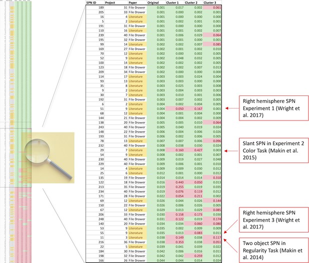
Which SPNs are significant using alternative clusters?
The left column shows a table of all 249 SPNs, colour coded (green, significant; red, non-significant), and sorted by p value obtained using the original cluster. The important part of the table is the centre, where significance thresholds are crossed by some clusters but not others. The central part is expanded, so text is now readable. The important cases are published SPNs that are not significant when either Cluster 1 or 2 is used instead. These 4 cases are all labelled (red boxes).
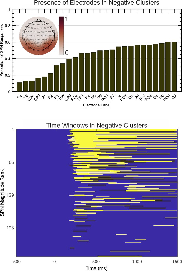
Spatio-temporal clustering results.
The upper image illustrates the proportion of times each electrode appeared in the most significant negative cluster. Electrodes appearing in less than 10% of cases are excluded. The topoplot inset shows proportions on a colour scale for all electrodes. The lower image illustrates the time course over which the same negative clusters were active, ranked by SPN magnitude.
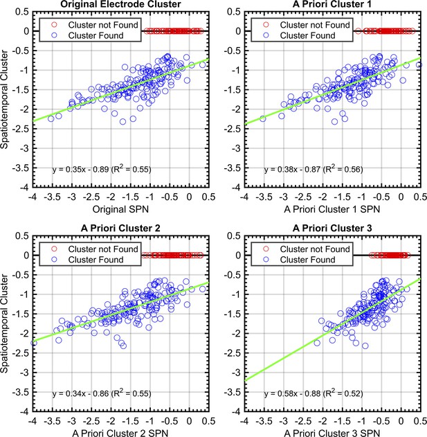
Correlations between SPNs from a priori and data-driven selections.
Red data points indicate no significant negative cluster was found for that SPN. For these points, the mean SPN cluster is plotted as zero and does not influence the green least-squares regression line.
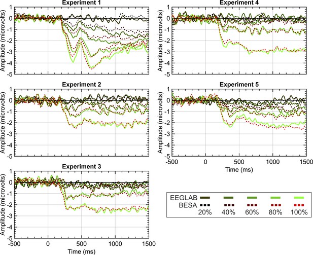
EEGLAB and BESA pipeline comparison.
Panels show SPN waves for each of the 5 experiments in project 13. EEGLAB waves are the solid lines; the BESA waves are the dashed lines. 20%–100% refers to the proportion of symmetry in the stimulus (see Figure 1 for example stimuli).


