By Ian Mulvany, Head of technology -
Starting to make the most of the web.
Today we launch our journal web site. You can check it out at elife.elifesciences.org. In building this site our goal is to create a great experience for reading research online, one that makes the most of what the web has to offer. The launch of the site today represents a first step in that direction and I'd like to give you a brief tour of some of the features that we have built.
Our main goal when designing the site is to create a clean, uncluttered experience for reading the articles. Some of the things we have done to help with this are:
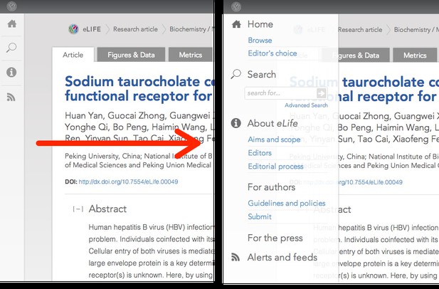
- Moving site navigation out of the way
We have taken the main site navigation and hidden it out of sight of the reader. In this way more space is given over to the research article, there are fewer distractions, and links to key resources are available when needed.

(In our user testing most researchers used the site breadcrumb trail to find their way around, so it could almost be argued that we don't even need the site navigation that we have. For the moment we are keeping it in, and we will be keeping an eye on whether it helps our readers navigate.)
- Use of tabs to move meta-data out of the way
Another design decision we took in order to ensure a clean experience for the reader was how to deal with author information.
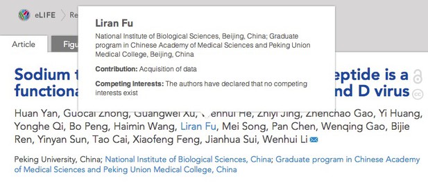
There is a lot of detailed information about each author's contribution to a paper. Readers want to know the author's affiliation, their contribution, their grant information, whether there are conflicts of interest, whether they are the corresponding author and so on. We have taken care to mark up all of this information in a machine-readable way in the XML, so it would be remiss of us not to make use of such structured data in our online view. It is critically important information, but how do you balance making it available while at the same time presenting a clean reading experience?
We are making information for each author available in a pop-up box which will appear when you roll over their name. Rolling over their name will also highlight their affiliation or affiliations.

At this point in the story I'm sure people will be asking about ORCID. We don't have ORCID ID's integrated into our article pages -- yet. The vendor that we are working with for our submissions system is pioneering integration with ORCID, and every author of aneLifepaper already has a unique identifier, so when ORCIDs are available through our submissions system we will be able to integrate them almost trivially.
The paper itself has a lot of critical meta-data that does not sit directly within the flow of reading the article. We have placed this data into each article's "Author information" tab.
- Offering article-level metrics
The metrics tab gives a daily updating view on the usage of the article. This is very much a version 1.0 of what we have planned for article-level metrics, so stay tuned on that front.
- Tabbed overview of figures and data
The other tab that I would like to mention is the "Figures and Data" tab. While we have worked hard to present the full story of the paper with all figures and videos available in-line, we thought it could also be useful to give the reader a quick overview of all of the non-article components of a paper. The figure and data tab presents all figures, tables, movies, source code or supporting data that are associated with the paper. Each item gets its own DOI, and each article fragment has a unique landing page. The thinking here is that this will give us space to bring interactivity to the data, where appropriate, as we evolve the journal.

- Presenting figures in line
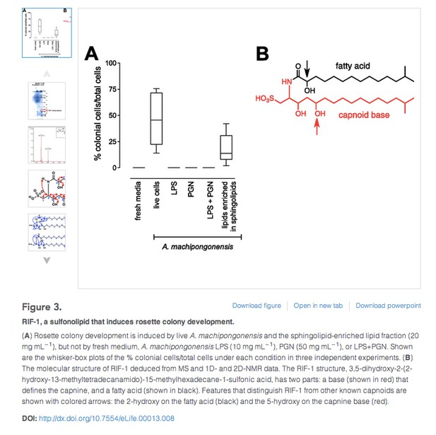
I'd also like to draw your attention to what we are doing with figures in the main body of the article. We don't have many of the restrictions that apply to a print journal, such as page restrictions, restrictions on the number of figures, or needing to charge for colour figures (the last time I was constrained by a monochrome internet was in 1992 using the Lynx web browser). Where authors provide supplemental figures that enhance the story presented by the main figure, we place those figures in a mini-carousel next to the main figure. When you bring up the full view of the main figure, you can scroll through all of the supplemental figures as well. You can also link through to the landing page of any figure via its DOI.
(At this point I'd like to ask the scientific community for a favour. I understand that there can be multi-panel figures, and in some cases they make sense, but most of the multi-panel figures that I have seen seem to be attempting to get around the artificial restriction imposed by journals that only allow a limited number of "figures". We don't have that restriction, so please do think about placing just a single figure in a single figure, where it best makes sense to do so).

Movies also play in line and you can see this in the Baldwin paper, among others.
- Posting editorial decision letters and author responses
Openness and transparency are key values foreLife. At the discretion of the authors, we are making the initial decision letters and author responses available along with the articles. This is less to do with the publishing platform, but we have integrated these pieces of information into the article navigation.
- Re-orderable references
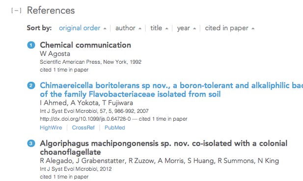
A web page does not need to be a static thing. We have made our reference lists sortable. You can sort by year published, by author first name, or you can quickly return to the original order. As we have the full content on the page, we can also count how many times a particular reference is cited in the article. This makes it straightforward to allow the reader to sort the reference list by how many times that reference has appeared in the article. This should quickly enable the reader to determine which references the author feels are the most important. We are not the first journal to make references re-orderable, but I think we are the first that allows sorting by the number of appearances in the article. The next step will be to allow sorting by how many citations that given reference has.

- Are you well RESTed?
The last feature that I'd like to mention here is the API. Every article comes with a link that leads to an API endpoint that returns the key meta-data for the paper via JSON. The API is pretty powerful, as you can see from the documentation. This is part of our goal of lowering the barriers to working with the article data in a reusable way. We are very open to enhancing the API, and if you have any specific pieces of information that you would like to see exposed through the API do let us know. We have some plans in mind already.

In summary
The features that I've highlighted today represent a small selection of the ideas that we discussed over the summer. Our goal with the site for early 2013 is to check on how well what we have built works for you, to continue to roll out iterative improvements, and to weigh the ideas that didn't make it into v1.0 of the site. This should be considered very much a first release of the site. You can definitely expecteLifeto evolve over the coming months and we will be making a roadmap for development available -- soon.
I'd like to end on a personal note. I've been involved in the ongoing development of a number of products for researchers over the last few years, but this was the first time that I had the opportunity to work on something practically from the ground up, right from the decision on which vendors we would work with, through to design and implementation. We know that we have a couple of rough edges that we need to round off in time, but it has been really exciting working on this, and seeing it come together so quickly. I'd like to thank all of those involved in getting us to where we are now - they have all done a tremendous job, and have brought an enormous amount of passion to the project, and it's been a real privilege working on this.


