Phase-amplitude coupling supports phase coding in human ECoG
- University of Bonn, Germany
- Radboud University, Netherlands
- German Center for Neurodegenerative Diseases, Germany
- Ruhr University Bochum, Germany
Figures
Figure 1 with 1 supplement
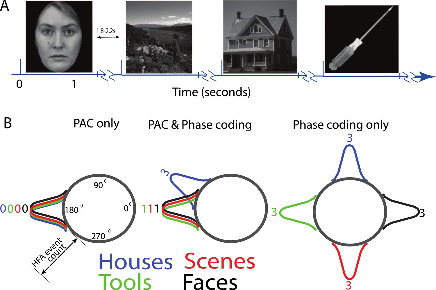
(A) Task structure and timing.
Exemplar images are shown from each category. Each image was presented in pseudo-random order for one second with a jittered inter-stimulus interval. (B) Theoretical model of phase amplitude coupling (PAC) and phase coding, showing how each phenomenon could occur in isolation (left, right) or together (middle). Numbers above distributions indicate difference scores (DSs), the total number of categories one category differs from. High-frequency activity (HFA) may occur at specific phases but not differ between categories, leading to PAC without phase coding (left). Alternatively, HFA may be phase clustered across categories but still occur at different phases for some categories, leading to both PAC and phase coding (middle). In a third scenario (right), category-specific phase clustering could occur without any phase-clustering of HFA across categories, leading to phase coding without PAC.
Figure 1—figure supplement 1
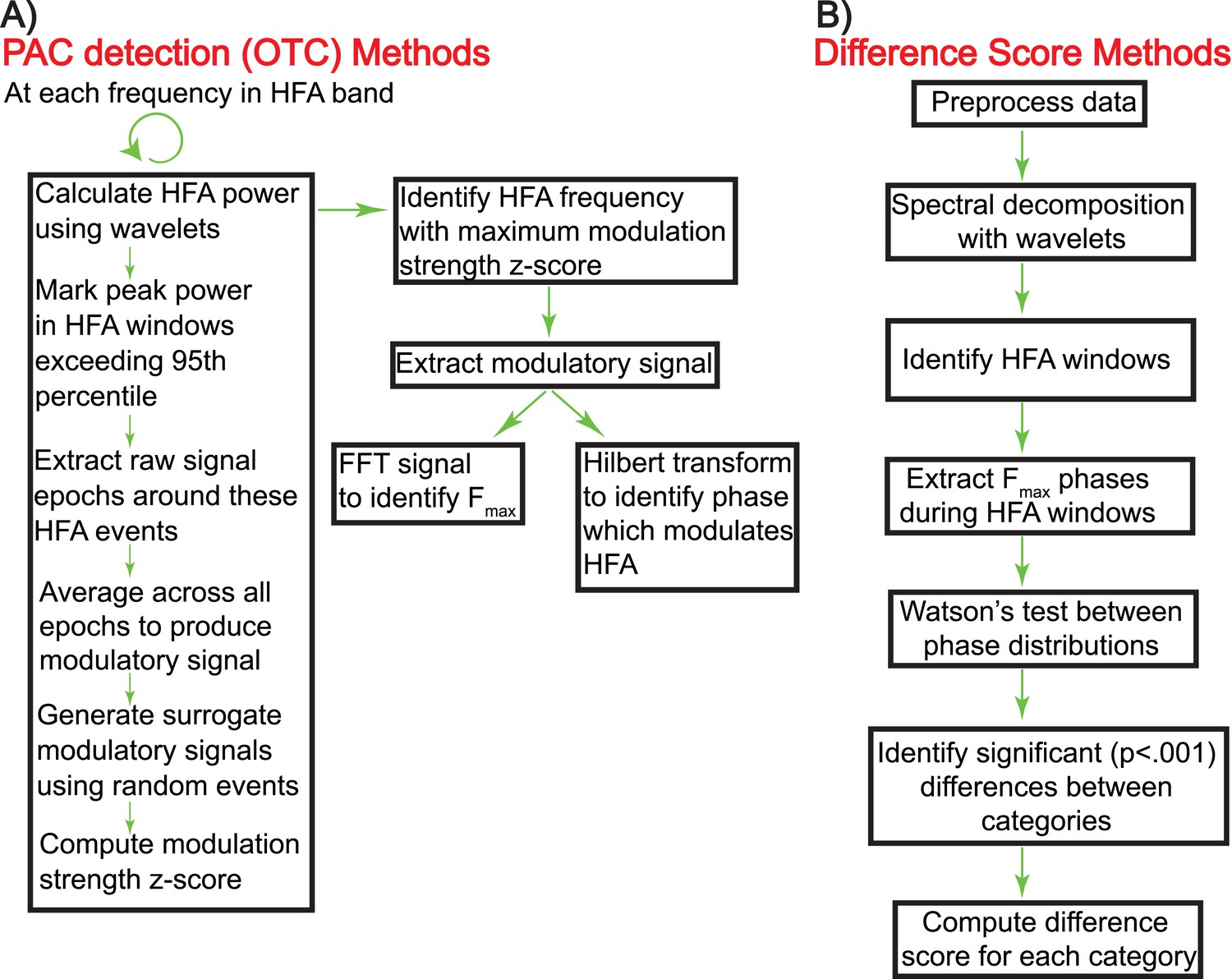
Schematic showing the calculation of oscillatory triggered coupling (OTC) and DS (panels A and B, respectively).
https://doi.org/10.7554/eLife.07886.004
Figure 2 with 3 supplements

Phase amplitude coupling analysis.
(A–E) Example of PAC using the OTC method described by Dvorak and Fenton (2014). Data are from one electrode located in the left basal temporal lobe of patient #3. (A) Oscillatory-triggered comodulogram shows phase coupling above 50 Hz, evident as red and blue vertical striped regions. Time zero corresponds to the HFA event. (B) Z-scored modulation strength as a function of frequency relative to 100 surrogate shuffles at pseudo-HFA events (i.e., random time points). (C) Modulation of gamma amplitude (green) by the phase of a 2.5 Hz oscillation (blue) on an example trial. Time zero indicates image onset. Red shaded area and arrowhead indicate an HFA window and HFA event, respectively. Extracting the peak modulatory signal from B (84 Hz) reveals the phase (D, HFA events occur at the trough at time 0), strength (D, peak-to-trough height) and frequency (E; green) of the modulation. The red trace in (E) shows the average normalized power of the entire recording. (F) Group level analysis of HFA event timing. HFA events occurred throughout the stimulus presentation period but increased ∼150 ms after stimulus onset. Magenta trace shows percentage of gamma events as a function of time, averaged across electrodes and categories. The timing of HFA events did not systematically differ by category (Figure 2—figure supplement 2). (G) Group level FFT data, defined at the peak of the modulation strength curve for each PAC+ electrode. Most PAC occurred around 1 Hz. Black bars are relative counts of electrodes with a peak at each frequency. (H) Distribution of modulated frequencies across electrodes. Electrodes were primarily modulated in the low and high gamma bands. (I) Preferred phases for modulation, clustered around the trough of the signal (180°).
Figure 2—figure supplement 1
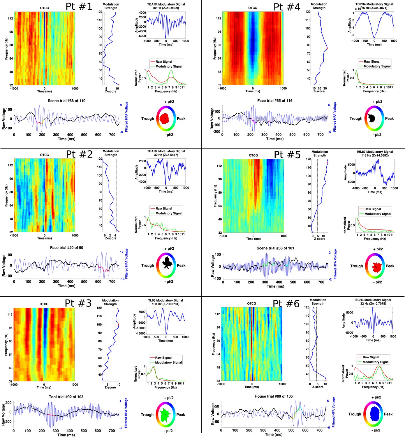
Additional examples of PAC from each patient, demonstrating frequency and phase-diversity of PAC.
Each panel separated by black grid lines comes from a different patient. In each panel, the oscillatory triggered comodulogram shows the phase coupling profile across frequencies and the modulation strength is shown relative to 100 surrogates at each frequency. The peak modulation frequency is indicated by a red dot and the modulatory signal and its frequency content are plotted on the right of the panel, along with the power for the entire recording. Below, the raw trace and filtered trace (at the peak modulated frequency) are plotted for an example trial. The phase at which HFA windows occur are overlaid on the raw trace using the circular color scheme on the right. Circular histograms show phase angles during all HFA windows for the category depicted in the raw trace.
Figure 2—figure supplement 2
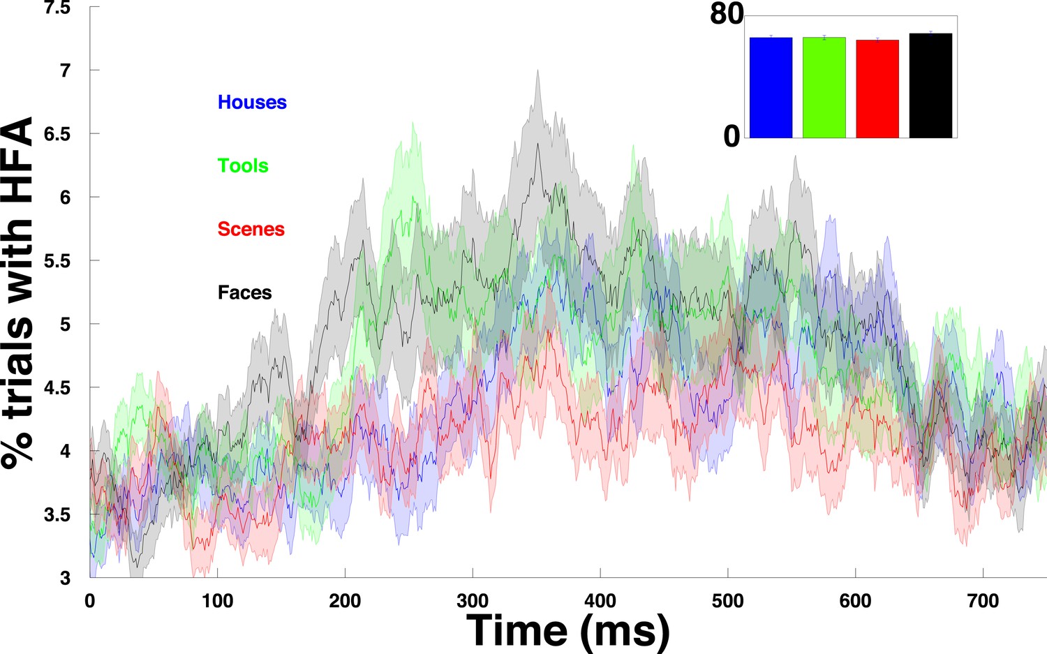
HFA time course for each category.
Percentage of trials with an HFA event, averaged over all PAC+ electrodes and plotted separately for each category.
Figure 2—figure supplement 3
Comparison of PAC results using the OTC and modulation index (MI).
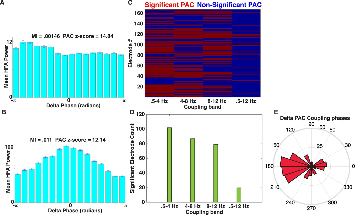
(A) Mean HFA (50–200 Hz) power as a function of delta phase for the example electrode shown in Figure 2A–E. MI values (Tort et al., 2009) and PAC z-scores (relative to 500 surrogates) are shown. Surrogates were generated by randomly ‘cutting’ the phase series once and swapping the order of the second and first halves of the phase series (Aru et al., 2015) prior to calculating MI. HFA was largest near the trough of delta oscillations. (B) Another example of delta band PAC coupling, taken from the frontal lobe of patient #5. (C) Mapping of significant electrodes (PAC z-score >1.65) using the MI (left) with different low-frequency coupling bands. (D) Count of significant electrodes using the MI are plotted using different low-frequency coupling bands (green). (E) Rose plot showing the phase at which peak HFA activity occurs relative to the delta band oscillation for each significant electrode using MI. Most electrodes showed HFA coupled to the oscillatory trough (compare to Figure 2I).
Figure 3 with 3 supplements
HFA occurs at category-specific low-frequency phases.
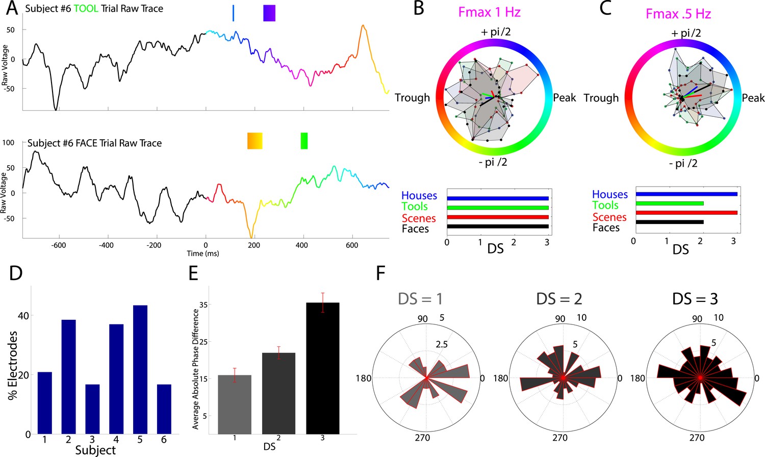
(A) Two example trials from patient #6 demonstrating that HFA windows occur at different phases for different categories. The signal is color-coded by the phase of 1 Hz oscillation only during the stimulus period. Times prior to stimulus period are shown in order to visualize the 1 Hz modulatory signal. HFA windows are indicated by the boxes, color-coded by the 1 Hz phase at which they occur. (B) Summary circular histograms and resultant vectors for this electrode. Categorical phase-clustering to different phases was prominent at Fmax, allowing for the decoding of categorical information based on the phase at which HFA events occur. DSs are plotted for each category in the lower panel. (C) Another example, from a different patient (#4), showing phase-clustered HFA windows for different categories (upper) along with DSs (lower). (D) Proportion of electrodes in each patient showing category specific phase-clustered HFA. (E) Average absolute phase difference across categories and electrodes for increasingly distinct phase representations (PRs). (F) Circular distribution of phases for each level of DS, pooled over electrodes and categories. Phase coded representations were equally likely to occur at each phase.
Figure 3—figure supplement 1
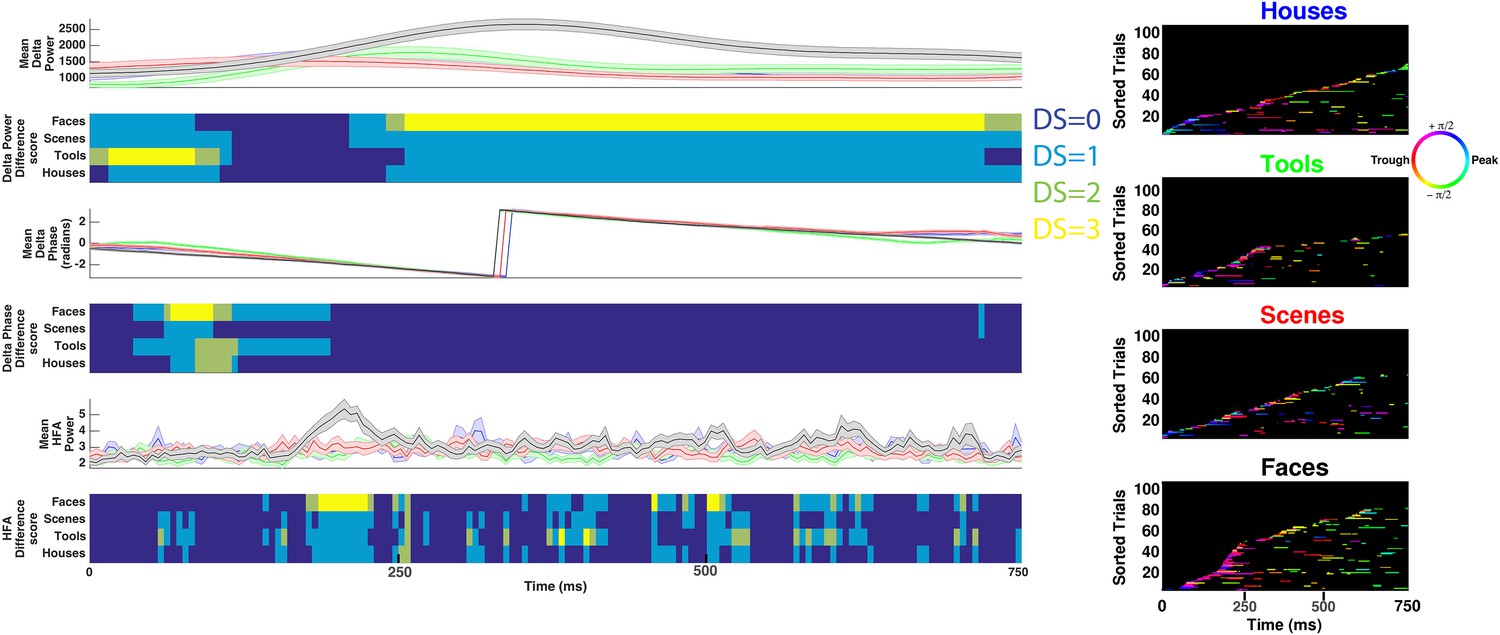
Decoding categorical information using delta power, phase, or HFA power on example electrode shown in Figure 3A–B.
(Left) Time-resolved and trial-averaged values for delta power (upper), phase (middle), or HFA (50–200 Hz) power (lower). Shaded areas show standard error of the mean. Time-resolved difference scores for each neural measure are plotted below each panel and are conceptually similar to DS values reported in Figure 3 and Figure 1—figure supplement 1, with the following exceptions. Power values were compared between conditions using a two-sample t-test and significant differences between conditions were assessed for all neural measures using trial-label permutation testing (n = 1000 shuffles, p < 0.05). (Right) HFA windows, color coded by 1 Hz phase, for each category. Note that although some categorical information can be recovered when considering delta power, phase, or HFA power, these effects do not correspond to HFA time windows and more categorical information exists in the phase at which HFA windows occur (i.e., PAC, Figure 3B lower).
Figure 3—figure supplement 2
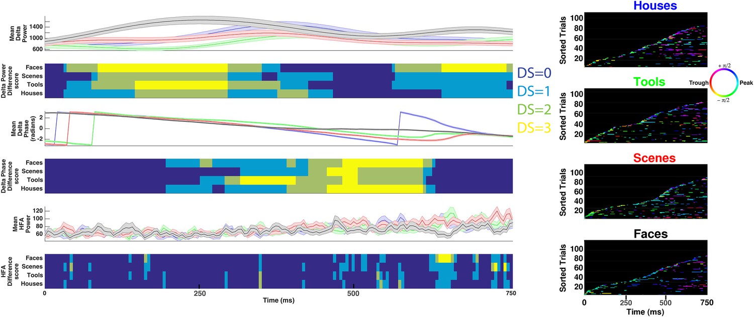
Decoding categorical information using delta power, phase, or HFA power on example electrode shown in Figure 3C.
See caption for Figure 3—figure supplement 1 for description of figure layout.
Figure 3—figure supplement 3
Category-specific phase locking analysis.
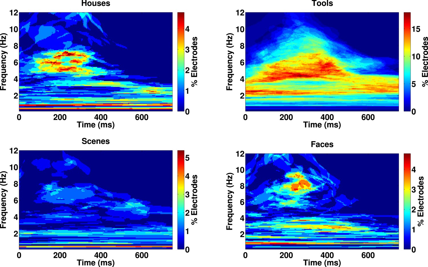
Proportion of 167 electrodes showing significant phase-clustering (Rayleigh test, p < 0.000001) exclusively for houses, tools, scenes, or faces as a function of time and frequency.
Figure 4 with 2 supplements
HFA clusters to specific phases and frequencies for different categories.
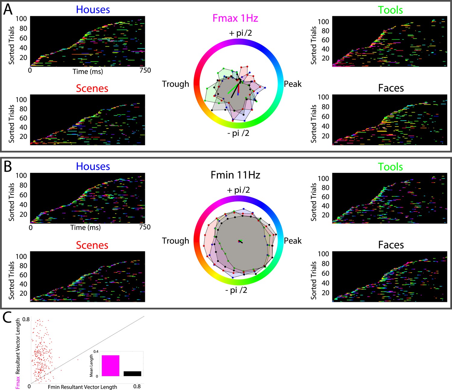
(A) Example electrode showing phase clustering at the maximum modulatory signal (Fmax; frequency with maximum power in the FFT, see Figure 2E) but not at the minimum modulatory signal (panel B; Fmin; frequency with minimum power in the FFT). HFA events are marked in color as the phase of the oscillation at the respective frequencies. (C) At the group level, phase clustering was more prominent at the maximum frequency (Fmax; maroon) compared to the minimum frequency (Fmin; black) across categories and PAC+ electrodes.
Figure 4—figure supplement 1
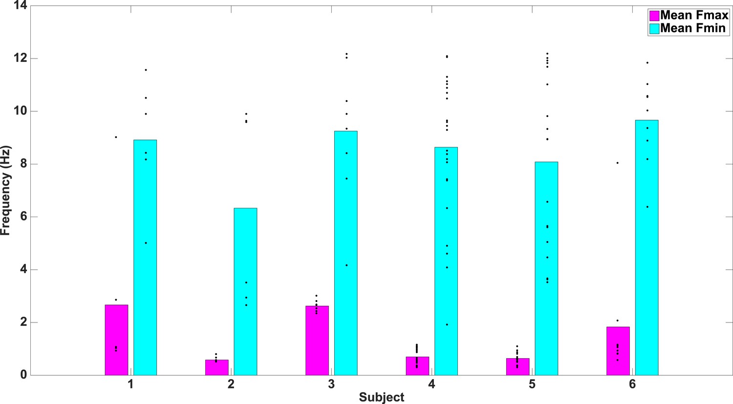
Fmax and Fmin values by subject.
Average Fmax and Fmin values for PAC+ electrodes in individual subjects. Black dots show values for individual electrodes and have been slightly jittered vertically in order to show all points; true values range from 0.5–12 Hz in 0.5 Hz increments.
Figure 4—figure supplement 2
Phase-locking analysis across all frequencies from 0.1–12 Hz.
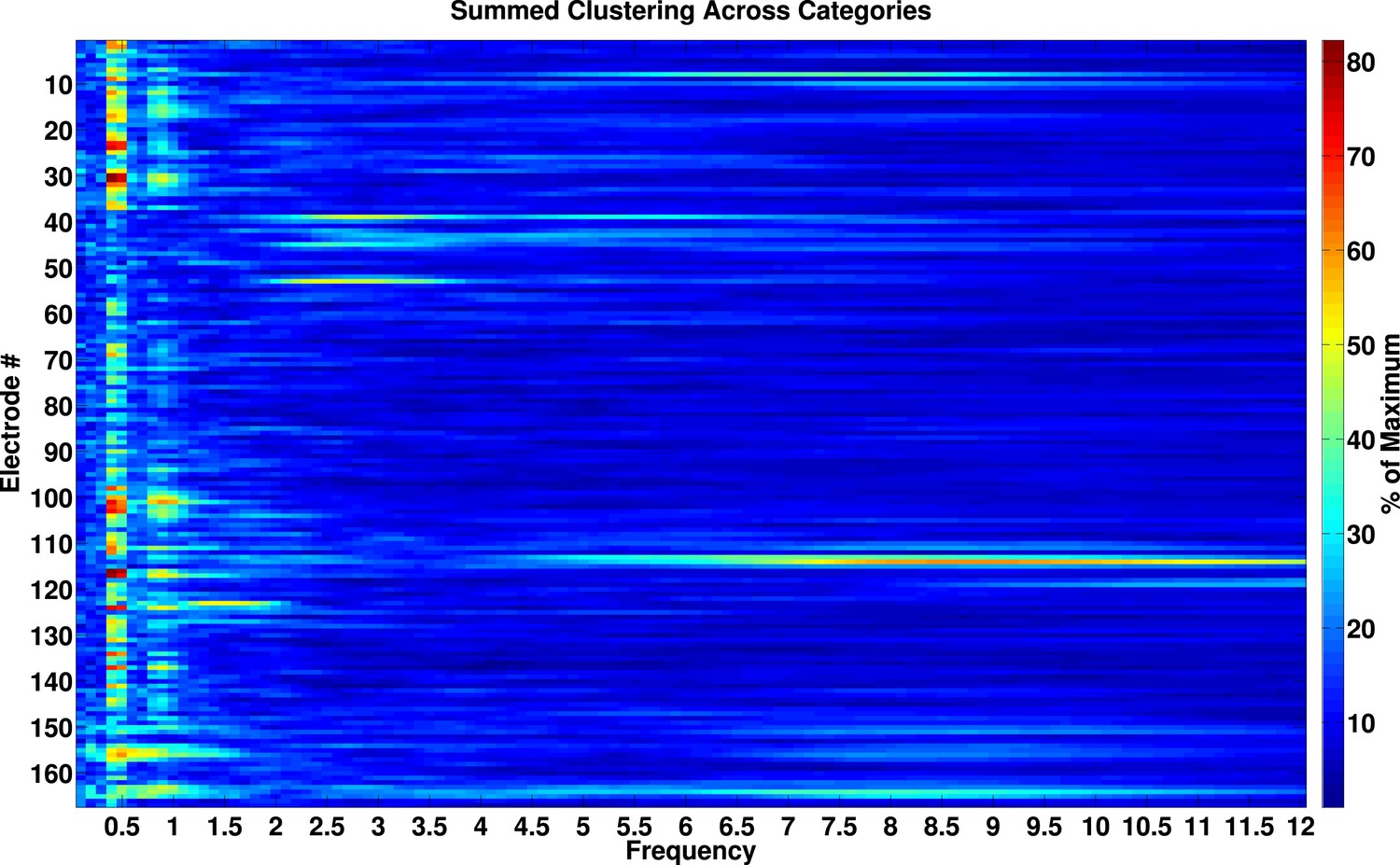
Phase-locked activity as a function of frequency and electrode. Values are expressed as percentage of maximal phase clustering. We calculated the resultant vector length for each category, summed these values across categories, and divided by the maximum value of 4. If our analysis was biased towards observing effects at slow frequencies, we would expect a smooth gradient of large phase clustering values at low frequencies, trailing off to smaller values at higher frequencies. Instead, there are clear peaks in phase clustering around 0.5 and 1 Hz and not at adjacent frequencies, particularly at frequencies lower than 0.5 Hz.
Author response image 1

Author response image 2
Videos
Video 1
Significant electrodes rendered onto a glass brain.
Each point represents an electrode, and each color represents different effects. Black electrodes (n = 95) did not show significant phase-amplitude coupling (PAC). Green electrodes (n = 9) only showed significant PAC. Yellow electrodes (n = 14) showed significant PAC and phase-clustering of HFA for all 4 categories. Red electrodes (n = 49) showed significant PAC, phase-clustering for all 4 categories, and phase-coding of high-frequency activity (i.e., difference score of 3 for at least one category).
Video 2
Electrode locations for each patient, rendered onto a glass brain of the average MNI template.
Each point represents an electrode, and each color represents a different patient. Electrodes were primarily located in the temporal lobe.
Download links
A two-part list of links to download the article, or parts of the article, in various formats.
Downloads (link to download the article as PDF)
Open citations (links to open the citations from this article in various online reference manager services)
Cite this article (links to download the citations from this article in formats compatible with various reference manager tools)
Phase-amplitude coupling supports phase coding in human ECoG
eLife 4:e07886.
https://doi.org/10.7554/eLife.07886


