Protein biogenesis machinery is a driver of replicative aging in yeast
- European Research Institute for the Biology of Ageing, University Medical Center Groningen, University of Groningen, The Netherlands
- Molecular Systems Biology, Groningen Biomolecular Sciences and Biotechnology Institute, University of Groningen, The Netherlands
- Probability and Statistics, Johann Bernoulli Institute of Mathematics and Computer Science, University of Groningen, The Netherlands
- Analytical Biochemistry, Groningen Research Institute of Pharmacy, University of Groningen, The Netherlands
- Biozentrum, University of Basel, Switzerland
Figures
Figure 1 with 5 supplements
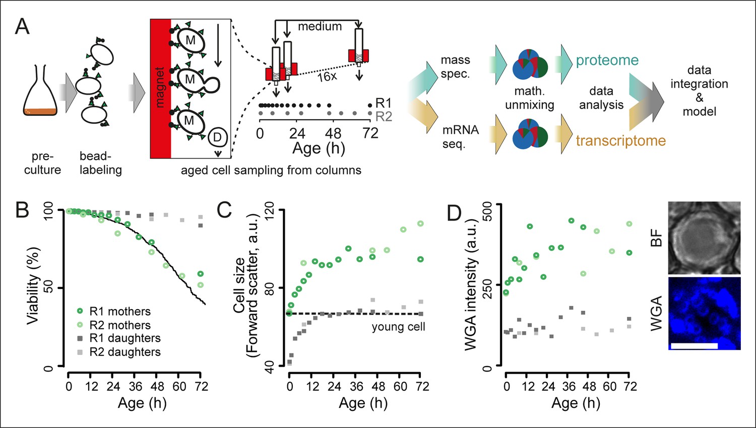
Experimental design for analysis of molecular changes during the replicative lifespan of yeast and its validation.
(A) Schematic overview of the column-based cultivation and data analysis pipeline with 16 parallel columns, where (zoom in) mother cells (M) containing streptavidin-bound (green triangles) iron beads (black circles) were captured on the magnetized column and aged under constant environmental conditions, while the daughter cells (D) were flushed away. Samples are collected in two replicate campaigns (R1, R2) at indicated time points in the lifespan. (B) Flow cytometry-based assessment of viability of mother (Avidin-fluorescein isothiocyanate positive [AvF]) and daughter (AvF negative) cells in R1 and R2, calculated for each time point comparing viable (propidium iodide [PI] negative) versus inviable (PI positive) cells in harvested samples Mix 1–3 (see figure 2A for explanation of Mix 1–3). The solid black line represents cell viability in time measured for the same strain in the same media using a microfluidic device (Lee et al., 2012; data from Huberts et al., 2014, was obtained from the authors). (C) Cell size is qualitatively assessed with median forward scatter of live mothers (AvF positive, PI negative) vs live daughters (AvF and PI negative). Dashed line represents the median forward scatter of young cells that have reached the fully-grown cell size to start their first division. (D) Aging was qualitatively assessed throughout the experiment by observing an increase in median WGA intensity over time in a population of primarily mothers (Mix 2) compared to a sample composed primarily of daughters flushed out of the column (Mix 3). Inset: bright field (BF) and fluorescence microscopy image of cell stained with AlexaFluor 633 conjugated wheat germ agglutinin (WGA), which selectively binds chitin in bud scars. Scale bar 5 μm.
-
Figure 1—source data 1
Table S1: Materials used for construction of novel column-based cultivation method.
- https://doi.org/10.7554/eLife.08527.004
Figure 1—figure supplement 1
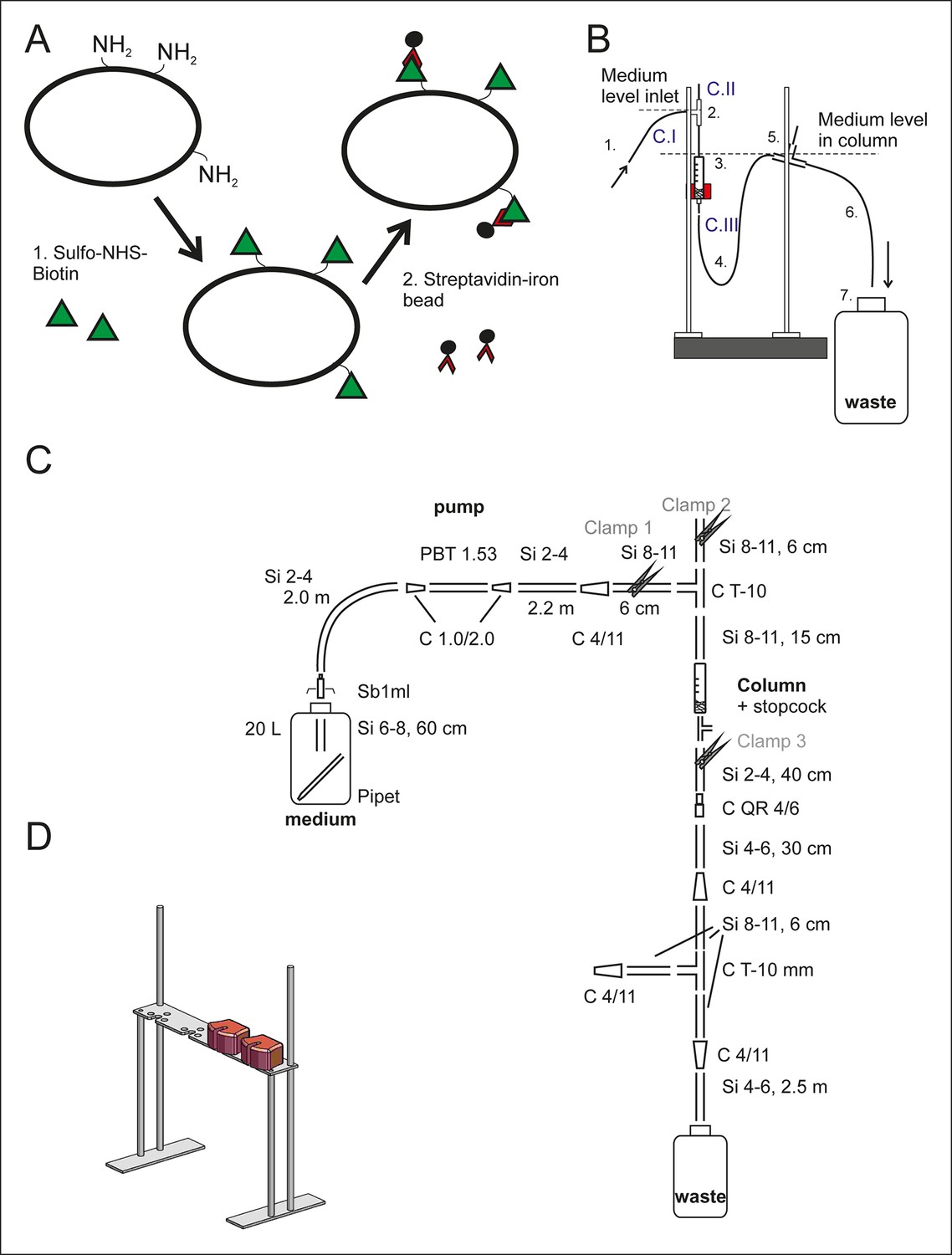
Setup of the aging columns.
(A) Prior to being loaded on the aging column, the yeast cells are labeled with membrane impermeable Sulfo-NHS-LC-Biotin (step 1, green triangles). The LC-linker in Sulfo-NHS-LC-Biotin has a spacer arm length of 22.4 Å. The NHS-ester forms a covalent amide bond with primary amine groups in the lysines and at the N-termini of the yeast cell wall proteins. Streptavidin-coated magnetic beads (black circles, step 2) bind with high affinity to the biotin-labeled cells. (B) The side view of one column setup. Medium is pumped with a flow rate of 170 ml/h via air permeable silicone tubing (1) and a T-connector (2) into the magnetized column holding the magnetic-bead-coupled yeast cells (3). The medium leaves the magnetized column via the U-shaped tubing below the column (4), a T-connector (5) and the outlet tubing (6) into a waste jar (7). The medium level in the column is regulated with the air valve on top of the T-connector (2) in combination with the backpressure caused by medium in the U-shaped tubing after the column (4). To disrupt the steady laminar effluent flow, air was allowed to enter the system via T-connector (5). During incubation at the columns, the flow was started and clamp 1 (C. I) and clamp 3 (C. III) were open, while the air valve was closed (C. II). (C) The items used to build the setup are presented in a simplified two-dimensional view and listed in Figure 1–source data 1 Table S1. (D) Three-dimensional view of the magnet’s stand with two magnets present.
Figure 1—figure supplement 2
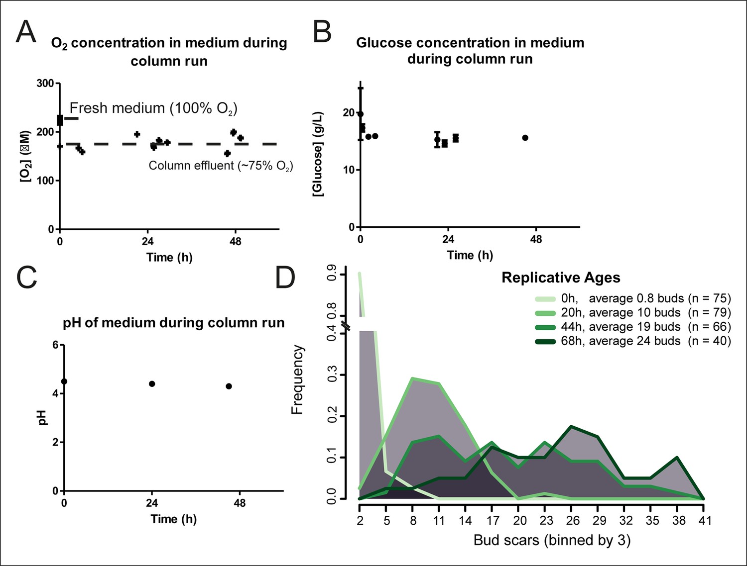
Cellular aging under constant conditions.
The aging columns maintain constant oxygen (A) and glucose (B) concentrations and pH (C) during cultivation. Oxygen concentration was determined using the Optical Oxygen Meter Fibox 3 in both fresh medium and the column effluent (A). Glucose concentration was determined by enzyme-based assay Enzytec fluid D-Glucose (B). The pH of the medium was measured by a conventional pH-meter in fresh medium (t = 0h) and in the column effluent after 24 and 48 hr in duplicate (C). (D) Distribution of replicative ages of (n) cells in samples harvested at different time points as determined by counting bud scars in AlexaFluor 633 WGA-labeled cells. The bud scars were counted double blind from confocal z-stack images.
Figure 1—figure supplement 3
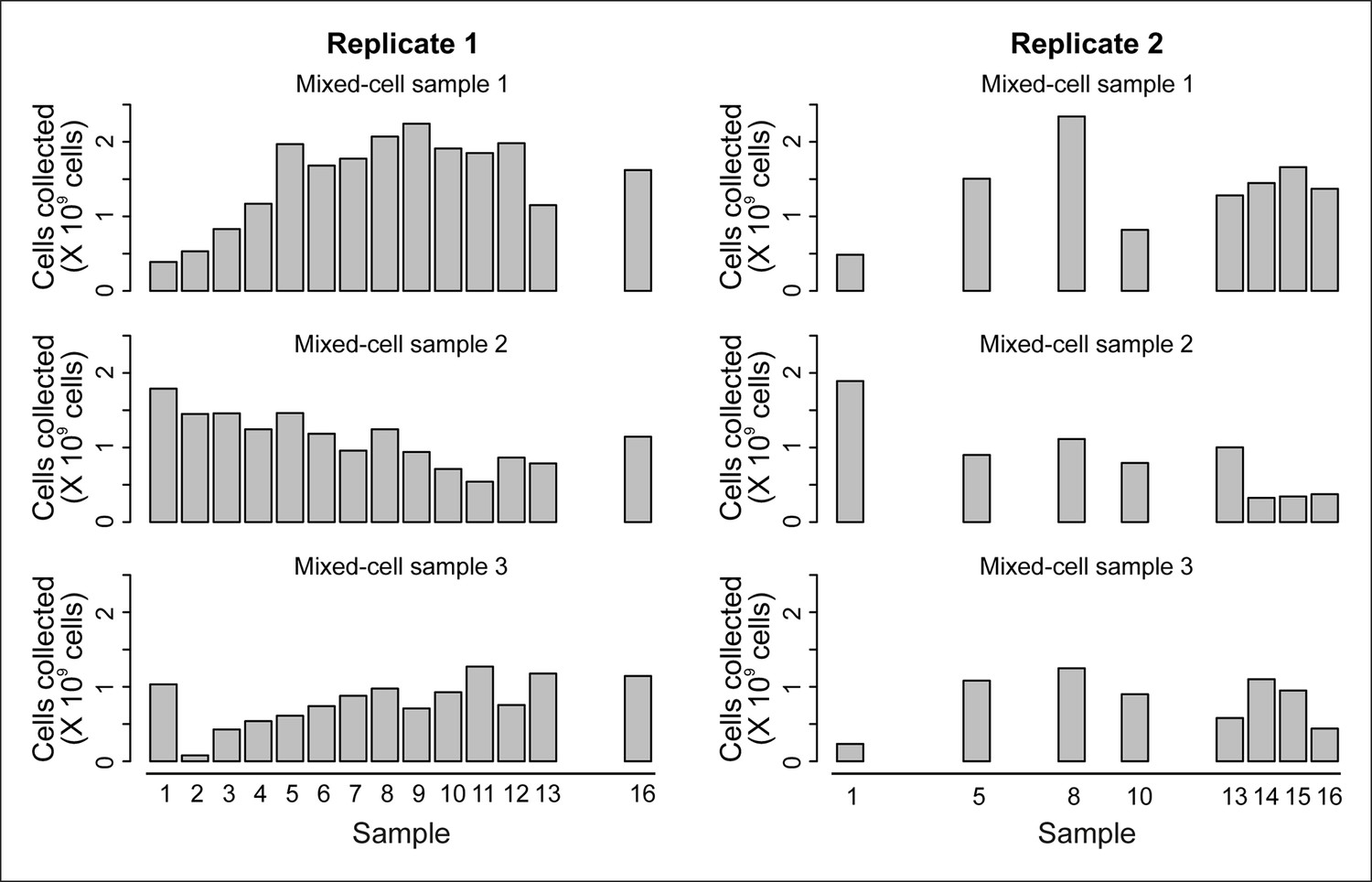
Cell counts per time point.
The cell counts present in each mixed-cell sample harvested from each time point of the experiment. These values (along with fractional compositions present in Figure 2—figure supplement 3B) were used to calculate the weighted lifespan curve presented in Figure 1B.
Figure 1—figure supplement 4
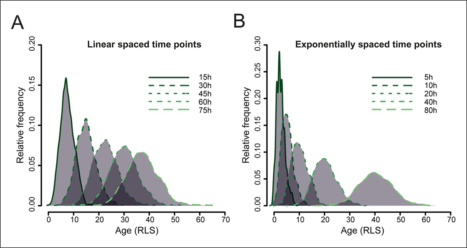
Simulated yeast aging population dynamics.
Due to biological cell-to-cell variation in cell division rates, the age distribution of a starting cohort of cells increases at later time points. This results in an increasing overlap of ages in the mother cell populations harvested at later time points, as modeled for a starting cohort of 1000 cells (see methods: Harvesting time points). The age is indicated as the replication life span (RLS). (A) shows the distribution of mother cell ages in samples harvested at indicated equally spaced time points, (B) shows the distribution when samples are harvested at exponentially spaced time points, minimizing the overlap of information between neighboring samples.
Figure 1—figure supplement 5
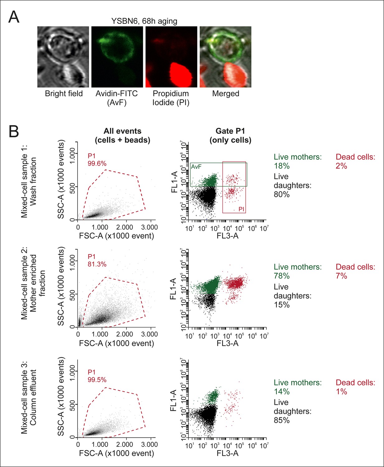
Characterization of mixed-cell samples.
(A) Cells were stained with fluorescein isothiocyanate conjugated avidin (AvF), which only labels cells coming from the initial biotin-labeled cohort (see Figure 1—figure supplement 1A), and with PI, which is permeable only to dead cells and fluoresces upon intercalation with DNA. (B) Analyzing the stained samples on a flow cytometer clearly distinguishes the populations of dead or alive mother cells and dead or alive daughter cells, based on fluorescence emission. Quantification of these populations gives the fractional compositions of each mixed-cell sample (Mix 1–3 in Figure 2—figure supplement 3) collected per time point. SSC-A is the side scatter area, FCS-A is theforward scatter area, FL1-A is the fluorescein emission peak area, FL3-A is the PI fluorescence emission peak area.
Figure 2 with 6 supplements
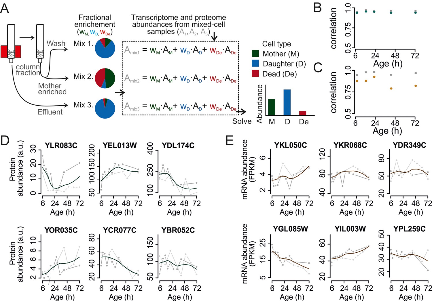
Mathematical un-mixing of proteomes and transcriptomes in mixed-cell populations.
For each time point in the aging experiment, three samples (mixed-cell samples 1,2,3; originating from different harvesting steps) composed of different fractions of Mother (M, green), Daughter (D, blue) and Dead cells (De, red) were harvested and analyzed. On the basis of the compositions of the mixed-cell samples (wM, D, De) and the determined proteome or transcriptome data of the mixed-cell samples (Amix1,2,3), with the mathematical un-mixing, we obtained un-mixed data (AM, D, De) over the time course of 72 hr from two replicates. See Figure 1—figure supplement 5 for details about determining the composition of the mixed-cell samples and Figure 2—figure supplement 3 for the un-mixing method. Data from proteome (B) and transcriptome (C) replicates highly correlated (Spearman correlation >0.85) for M (circles) and D cells (squares), indicating high reproducibility of the experimental and data processing pipelines. (D, E) Levels of random chosen proteins (D) and transcripts (E) from both replicate measurements (gray) and the fit (solid line) are indicated for un-mixed mother data. Raw abundance is a measure of mass spectrometry (MS) peak intensities (proteome) or fragments per kb of transcript per million mapped (FPKM) reads (transcriptome).
-
Figure 2—source data 1
Table S2: The shotgun proteome data processing.
- https://doi.org/10.7554/eLife.08527.011
-
Figure 2—source data 2
Table S3: The transcriptome data processing.
- https://doi.org/10.7554/eLife.08527.012
-
Figure 2—source data 3
Table S4: The final shotgun proteome data.
- https://doi.org/10.7554/eLife.08527.013
-
Figure 2—source data 4
Table S5: The final transcriptome data.
- https://doi.org/10.7554/eLife.08527.014
Figure 2—figure supplement 1
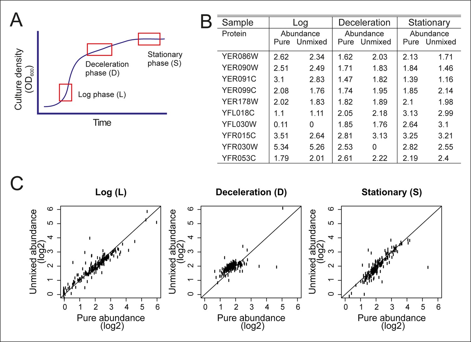
Validation of the mathematical un-mixing procedure.
(A) Schematic representation of samples used for validation of the mathematical un-mixing procedure, taken from fermenter-grown yeast. Log-phase represents mid-exponential growth of the culture (L), deceleration phase represents a decreased growth rate around the diauxic shift (D), and stationary phase is a nutrient deprived culture (S). Each phase of cultivation has a unique transcriptional and proteomic signature. (B) The abundance of 207 proteins was measured with targeted selected reaction monitoring (SRM) proteomics in the samples L, D and S, and in three mixed-cell samples composed of different ratios of L, D, and S. The protein abundance in the pure samples and the abundance derived after mathematical un-mixing of the data obtained from the mixed cell-sample is shown for 10 representative proteins of the 207 proteins. (C) As in B, for all 207 proteins.
Figure 2—figure supplement 2
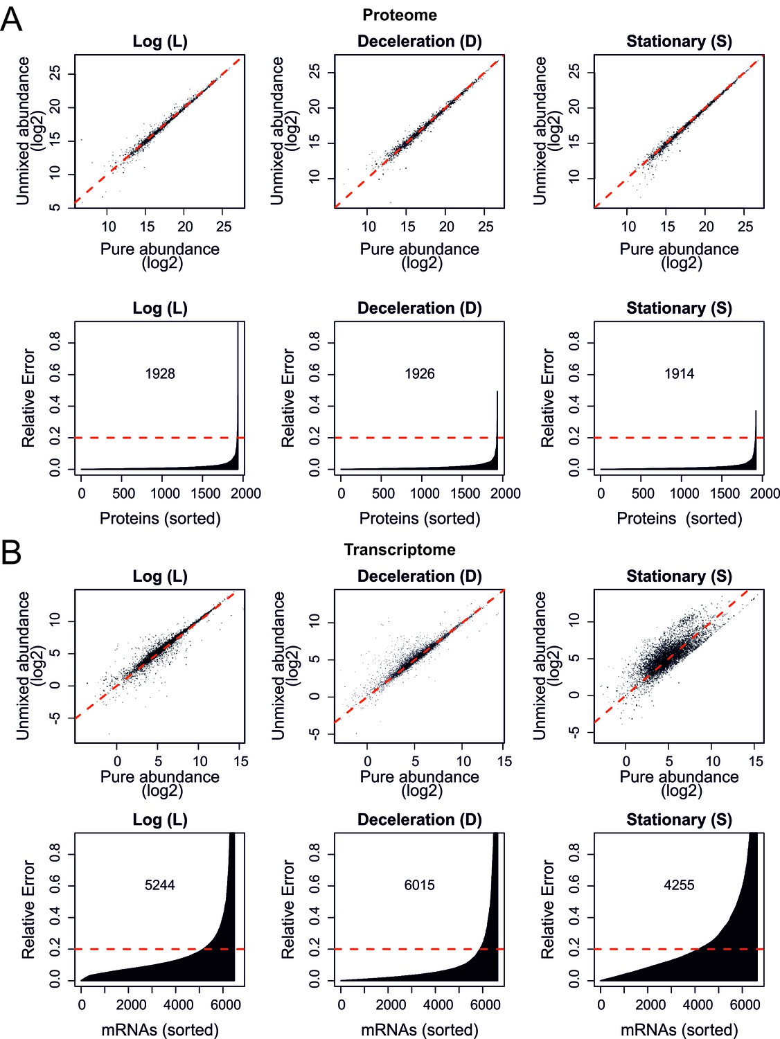
Validation of the mathematical un-mixing procedure, shotgun proteome and RNA sequencing.
(A) As in Figure 2—figure supplement 1C but now for proteome data obtained by shotgun proteomics. The Pearson correlations are as high as 0.989, 0.992, and 0.993, for log, deceleration, and stationary phase samples, respectively, in the log2 scale (top panels). Bottom panels show the relative errors for all proteins quantified; the abundance of the indicated number of proteins is recovered with less than 20% relative error. (B) As in (A) but here for the messenger RNA sequencing (mRNAseq) transcriptome data showing Pearson correlations of 0.945, 0.956, and 0.801 for log, deceleration, and stationary phase samples, respectively, in the log2 scale (top panels). The indicated numbers of transcripts were recovered with less than 20% relative error (bottom panels). All abundances are plotted on a log2 scale.
Figure 2—figure supplement 3
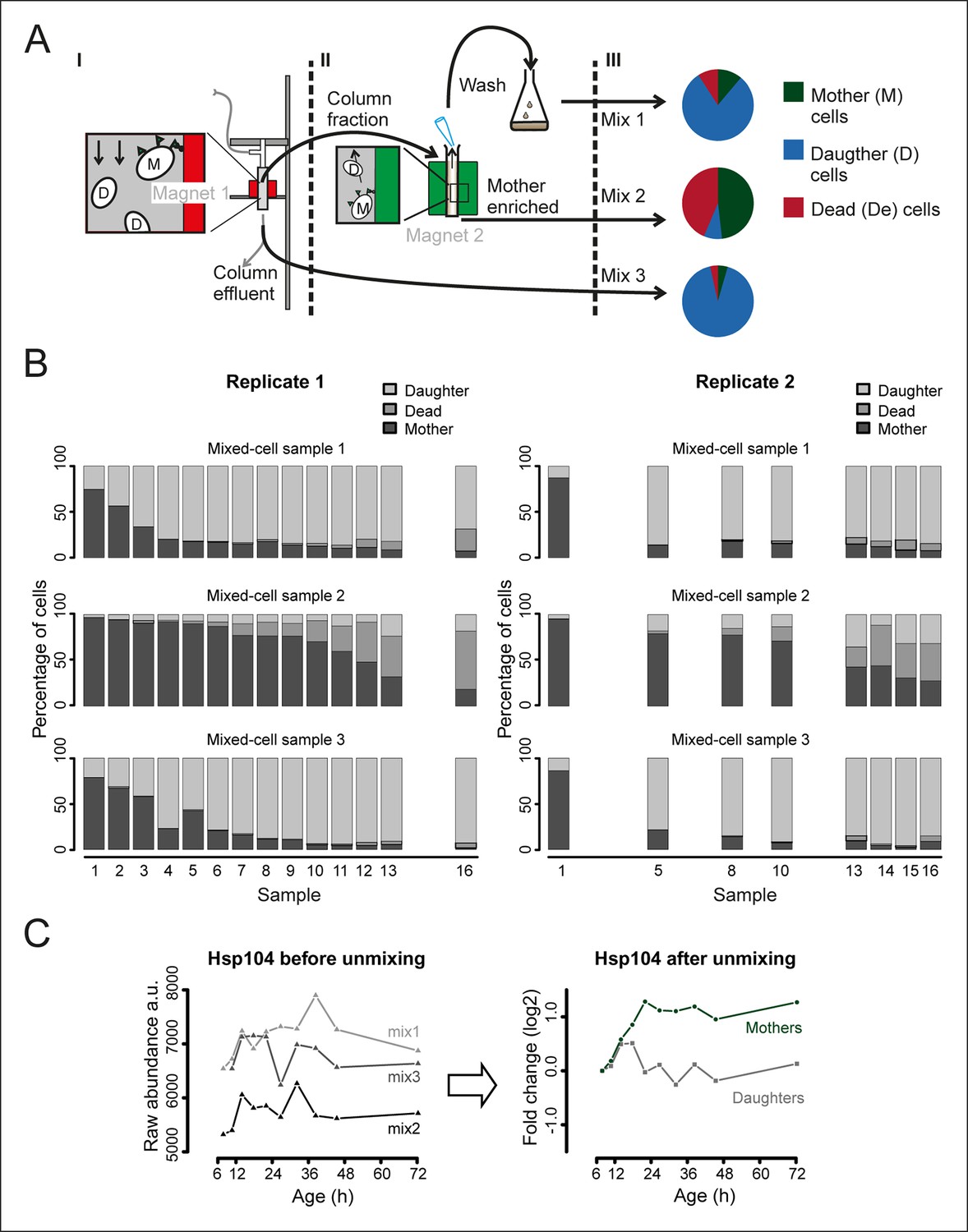
Generation and composition of the mixed-cell samples.
(A) I. A cohort of cells with cell-wall attached beads is maintained in the magnetized column (magnet 1) and harvested at set time points (column fraction) when also a fraction with mainly daughter cells is collected (column effluent, mix 3). II. The harvested column fraction was applied for further enrichment on ‘The Big Easy’ EasySep Magnet (magnet 2). The bead-labeled aged cells stay in the glass tube, while the non-bead-labeled young cells are removed by pipetting. This wash is repeated three times, resulting in a sample enriched for mothers (mother enriched; mix 2), and a wash fraction (wash, mix 1). The fractional population sizes of these three mixes, schematically represented in III, were determined (See Figure 1—figure supplement 5) before storage at −80°C. (B) The measured compositions of mother, daughters, and dead cells present in each mixed-cell sample harvested from each time point of the experiment. These fractional compositions were used in the mathematical un-mixing procedure. (C) Example of the mathematical un-mixing procedure: Hsp104 protein abundances (mass spectrometry [MS] peak intensity) for each time point in each of the mixed-cell samples (left panel) and the resulting un-mixed abundances visualized as fold changes on a log2 scale (right panel).
Figure 2—figure supplement 4
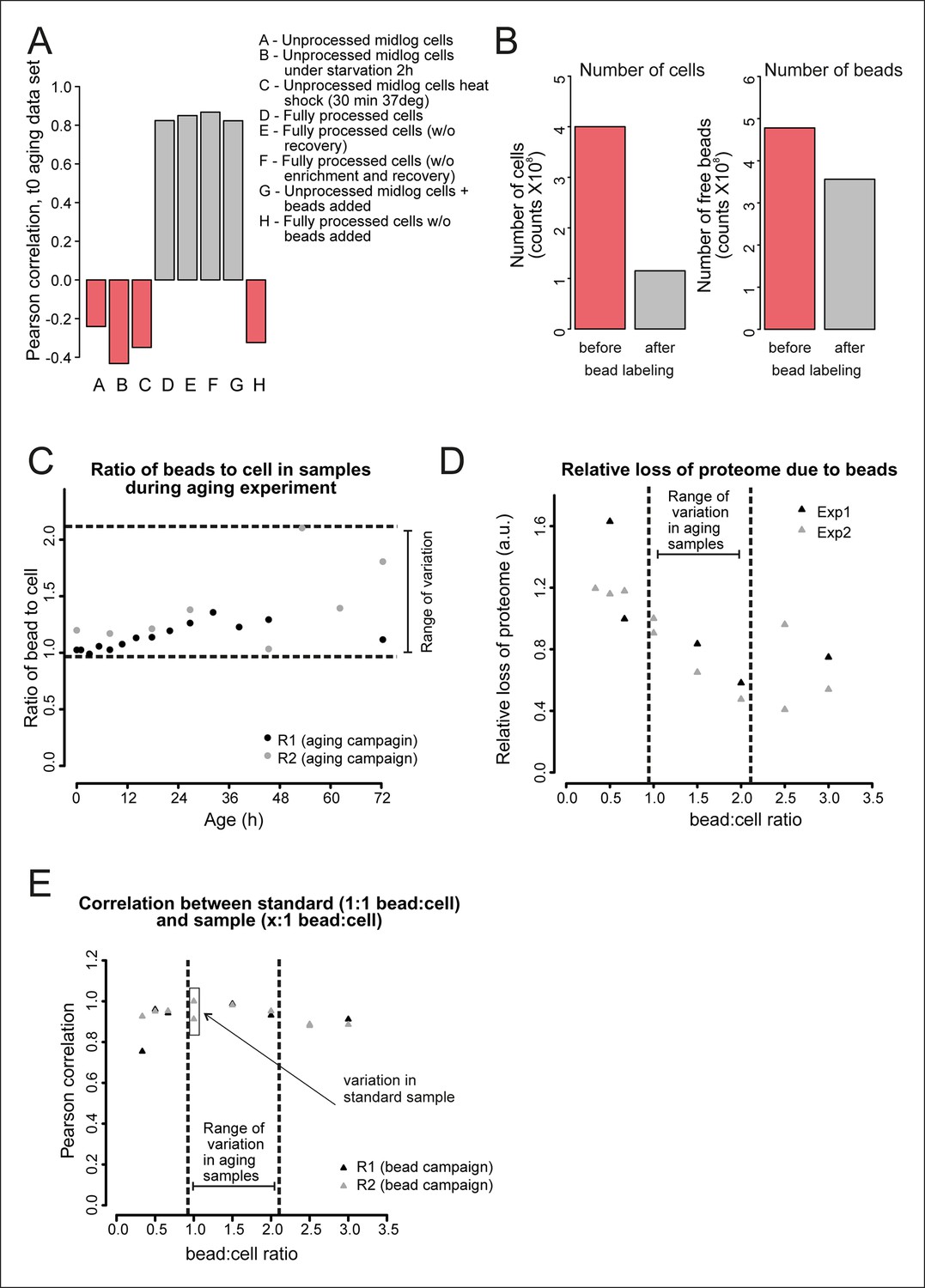
Validation of the bead effect correction.
The effect of the beads on the proteome was highly reproducible, regardless of the number of beads per sample, and was unrelated to other biological stimuli applied on the cells. (A) Samples generated at different steps during biotinylation, bead labeling, and harvesting were assessed for their similarity to a sample that has undergone all processing steps (sample D), as would the starting (bead labeled) sample of the experiment. Using targeted (SRM) proteomics focusing on 74 proteins known to be either strongly affected or not affected when comparing a processed to an unprocessed sample, we found that the presence of beads alone within a sample (sample G) was enough to match the starting bead-labeled sample (sample D). The process of bead labeling itself (sample ‘H’, where bead labeling conditions were mimicked) yielded proteomes that bore little resemblance to our bead-containing samples. (B) Cells and bead counts from flow cytometry. A cohort of 4.0×10⁸ cells (pink bar, left) was labeled with beads, by adding a known number of beads (4.8 × 10⁸ beads, pink bar , right ). The number of beads attached to a biotinylated cell population (1.2 × 10⁸) is the difference between free beads before (4.8 × 10⁸ beads, pink bar, right) and after bead labeling (3.6 × 10⁸ cells, gray bar, right). The number of cells with at least one bead was counted after bead labeling and cell enrichment on a magnet (after bead labeling, 1.2 × 10⁸, gray bar, left). The yield was on average 1.1 beads/cell. (C) The number of free beads and beads attached to the cells was determined for each sample with flow cytometry. The ratio of bead to cells increased maximally two fold in both replicates, most likely due to the detachment of cells from beads while being cultivated in the aging columns. (D) To study the effect of a small increase in bead concentration per sample we mixed unprocessed cells with different numbers of beads and performed targeted (selected reaction monitoring [SRM]) proteomics, using the same 74 proteins for assessment. The median of the measured peak intensities decreased with an increase of beads per sample, indicating a loss of proteins. (E) Nonetheless, we found that varying the amount of beads in the sample in the range relevant to the aging experiment, did not alter the degree to which the sample was changed by the presence of the beads. The Pearson correlation of these samples to the standard (1.06 beads/cell) was higher than the correlation between two replicates of the standard. We conclude that the bead effect is highly reproducible, and can be redressed with a correction factor specific to each protein (See Supplementary file 1).
Figure 2—figure supplement 5
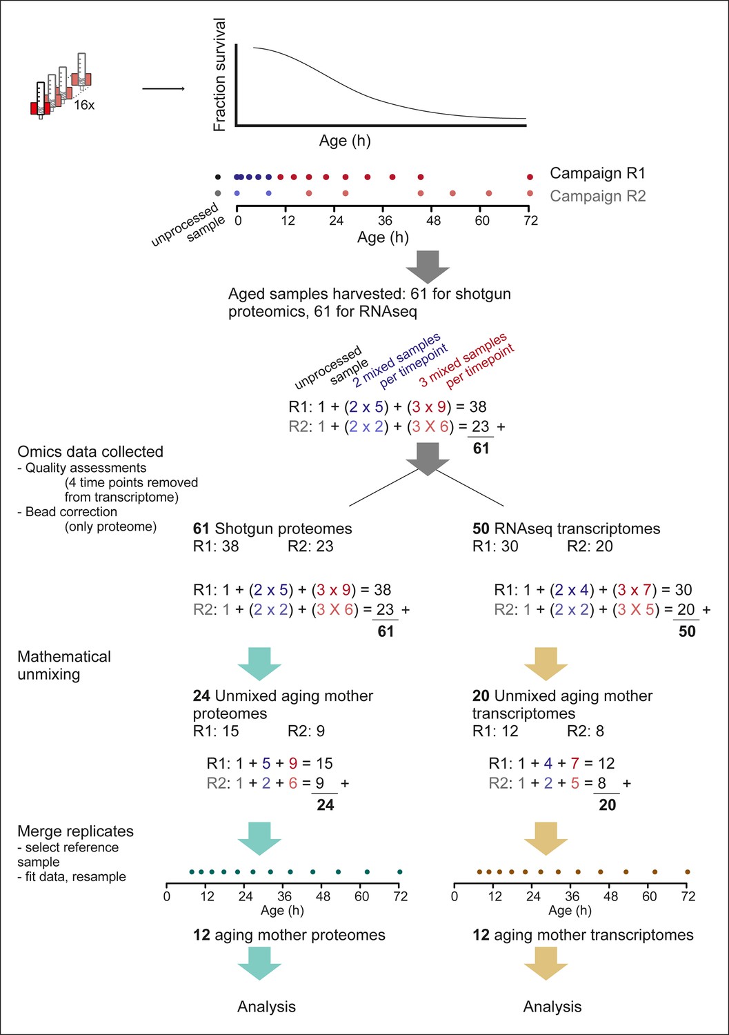
Overview of the experimental pipeline.
Detailed view of the experimental pipeline to depict number of samples collected and data processing steps. Up to 16 columns could be run simultaneously (cartoon of red magnet with column) and harvested throughout the aging procedure (cartoon of lifespan curve, fraction surviving at each age). Time points were exponentially spaced, and covered by two partially overlapping replicate campaigns (R1 and R2, dots showing time points), of 14 and 8 time points, respectively. For each time point, either two or three samples were required for mathematical un-mixing of the population, that is, early time points (blue dots), contained mainly live mother and daughter cells, without mortality in the population, and therefore required only two samples for the mathematical un-mixing of two unknowns. While later time points (red dots), contained increasing levels of dead cells, and required three samples for the mathematical un-mixing of three unknowns. Replicate 1 consisted of an unprocessed sample, five time points requiring two samples for un-mixing, and 9 time points requiring three samples for un-mixing, totaling 38 samples. Replicate 2 had in the same way 23 samples, and together the two replicates consisted of 61 samples, which were processed with shotgun proteomics and RNA sequencing (RNAseq) transcriptomics. After ‘omics’ data was collected, a bead correction was applied to proteome data coming from samples containing beads (see methods), and quality assessment of sequencing data removed four sets of samples from the transcriptome (see methods). The subsequent 61 proteome samples and 50 transcriptome samples were used for mathematical un-mixing, which resulted in mother-specific data for the proteome (R1, 15 time points, and R2, 9 time points) and transcriptome (R1, 12 time points, R2, 8 time points). Corresponding daughter-specific data also resulted from the un-mixing procedure (not depicted in schematic). Finally, a reference time point was selected (7.8 hr, see Materials and methods) and the replicate datasets were merged to produce a single time series, for each of the proteome and transcriptome, spanning 12 time points throughout the replicative lifespan of the cells.
Figure 2—figure supplement 6
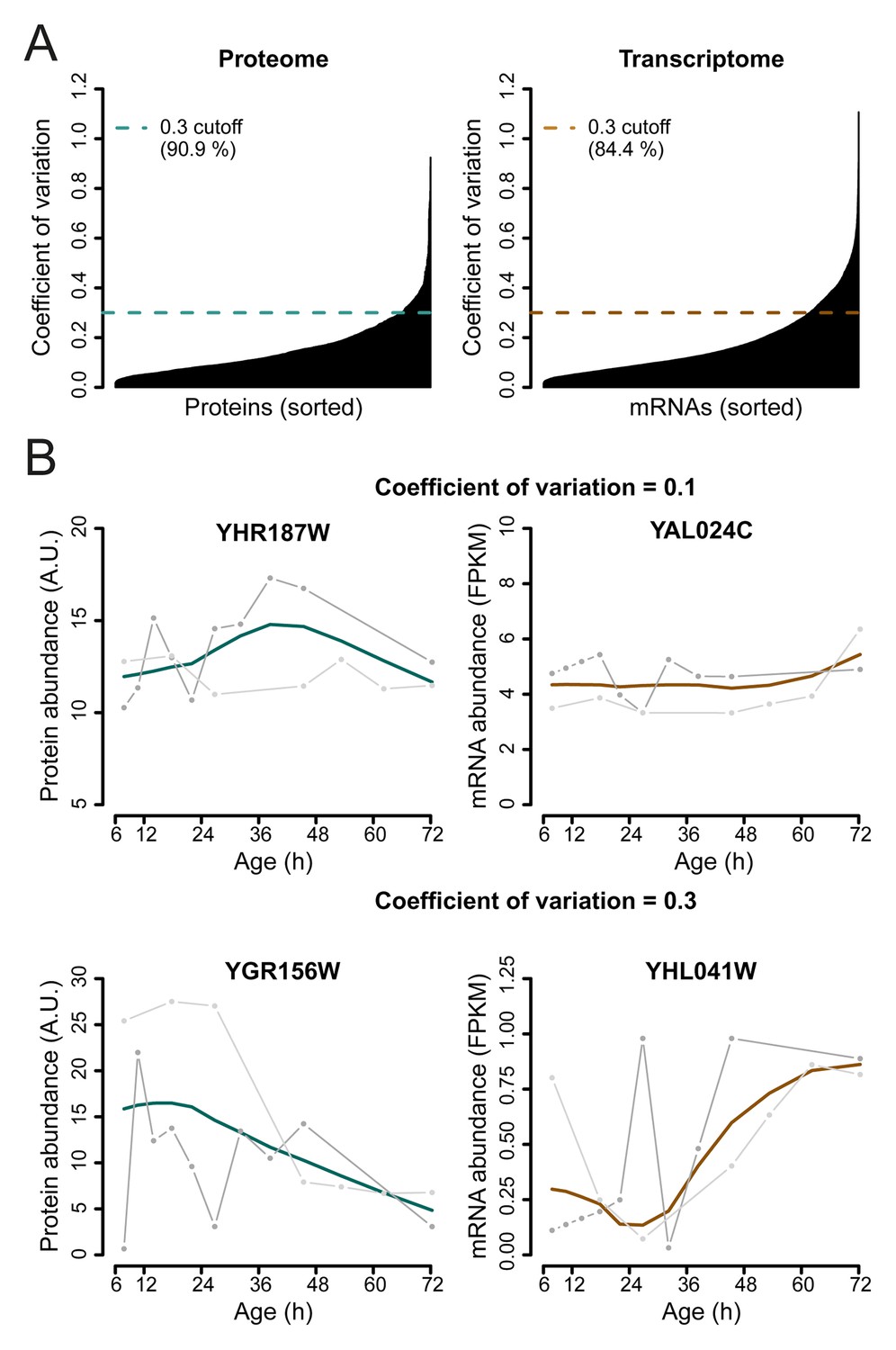
Selection of genes with highest similarity between replicates.
(A) The coefficient of variation was calculated between the replicate datasets for each gene-product profile and a cutoff of 0.3 was used to select the most reproducible expression profiles between replicates, consisting of ∼90.9% of the proteome, and ∼84.4% of the transcriptome datasets. (B) Example of a gene profile having a coefficient of variation of 0.1 (top panels) and coefficient of variation of 0.3, which just failed the cutoff for being included in the dataset (bottom panels). Data shown for both proteome (left panels), and transcriptome (right panels), with each replicate measurement (gray) and the fit (colored line).
Figure 3 with 4 supplements
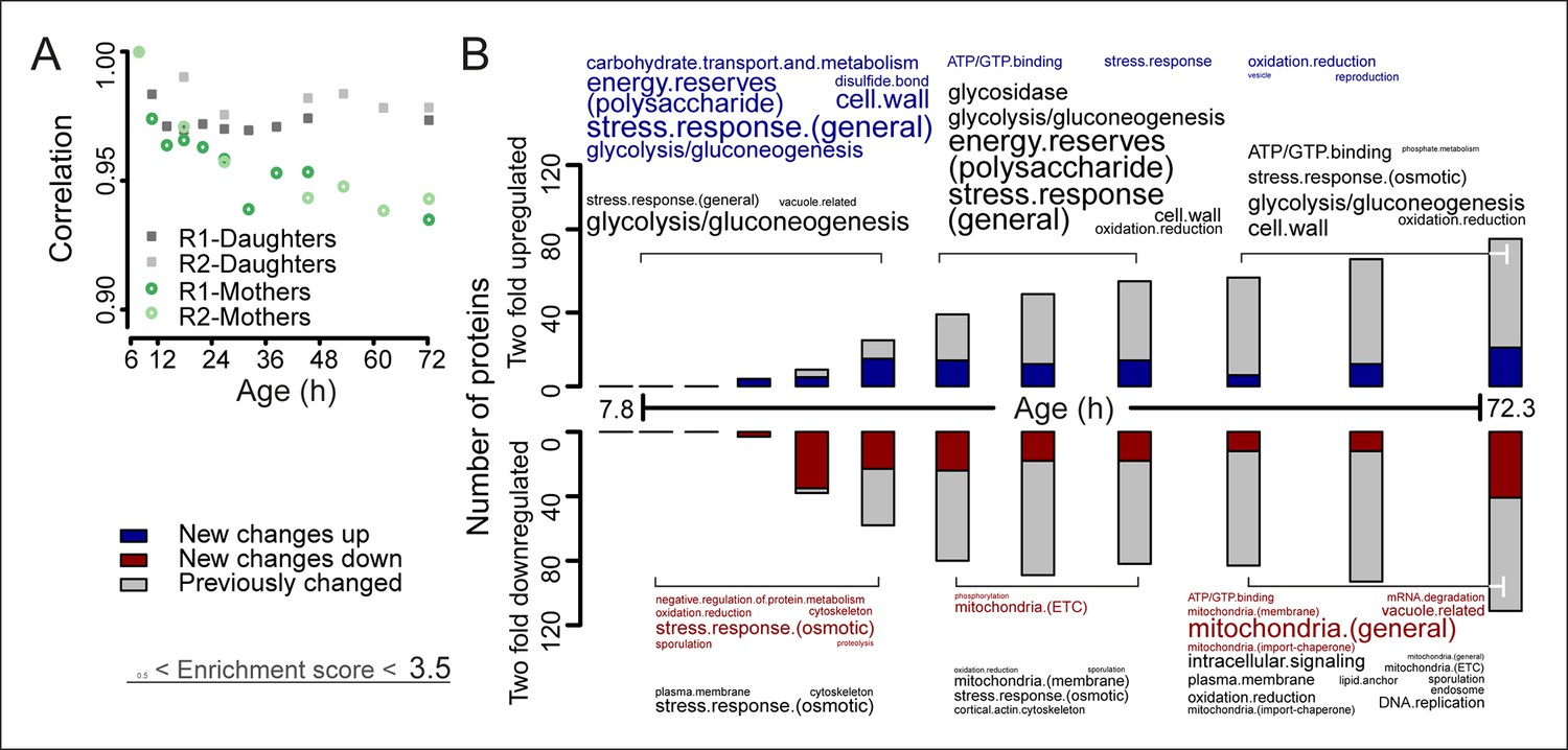
The aging proteome.
(A) The Spearman correlation at progressive time points compared with the young reference sample for the mother and daughter proteome shows a divergence away from a youthful state for the mother. (B) The numbers of proteins changing by at least twofold from the reference (young) sample per time point. Blue and red bars and text represent changes that had not occurred previously, either up- or down-regulated, respectively. Gray bars and text are changes that already occurred at a previous time point. Gene functional enrichments per grouped time points were derived from Gene Ontologies (GO) and are scaled with significance of enrichment obtained by database for annotation, visualization and integrated discovery (DAVID) bioinformatics resource version 6.7 (scaling of text: DAVID enrichment score see Materials and methods and Table S6 (Figure 3—source data 1).
-
Figure 3—source data 1
Table S6: Full lists of GO-term enrichment scores for all enrichment analyses.
- https://doi.org/10.7554/eLife.08527.022
Figure 3—figure supplement 1
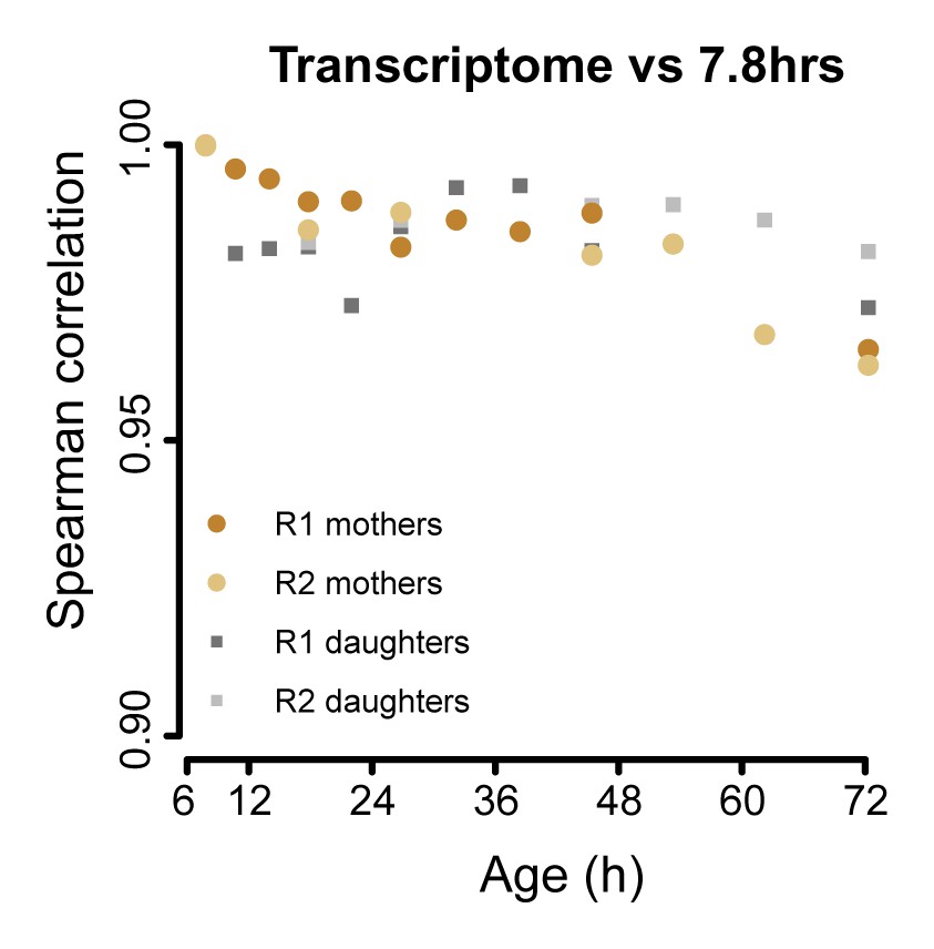
The aging transcriptome diverges minimally from a young profile.
Similar to Figure 3A, but for transcriptome. The Spearman correlation of the transcriptomes of mother and daughter cells at different time point compared to that of a reference (young) time point sample.
Figure 3—figure supplement 2
Changes in mother-age dependent daughter profiles.
Heat maps (with row clustering based on Euclidean distance) showing changes for daughter profiles of each mother-age dependent time point for both proteome (A) and transcriptome (B). Gene functional enrichments were determined using database for annotation, visualization and integrated discovery (DAVID) version 6.7 and summarized into representative terms (see Materials and methods section for details). The enrichment score provided by DAVID for the summarized terms were used as a size-scaling factor for the text, with larger words being more significantly enriched (scaling of text: DAVID enrichment score). Enriched terms are shown next to each respective heat map, for genes changing by at least twofold when comparing the daughter coming from the oldest mother age, to the daughter coming from the youngest mother age. This resulted in 33 genes twofold up-regulated and 40 genes twofold down-regulated in the proteome of 1494 proteins, and 31 genes up-regulated and 190 genes down-regulated in the transcriptome of 4904 transcripts. Fold changes are plotted on a log2 scale.
Figure 3—figure supplement 3
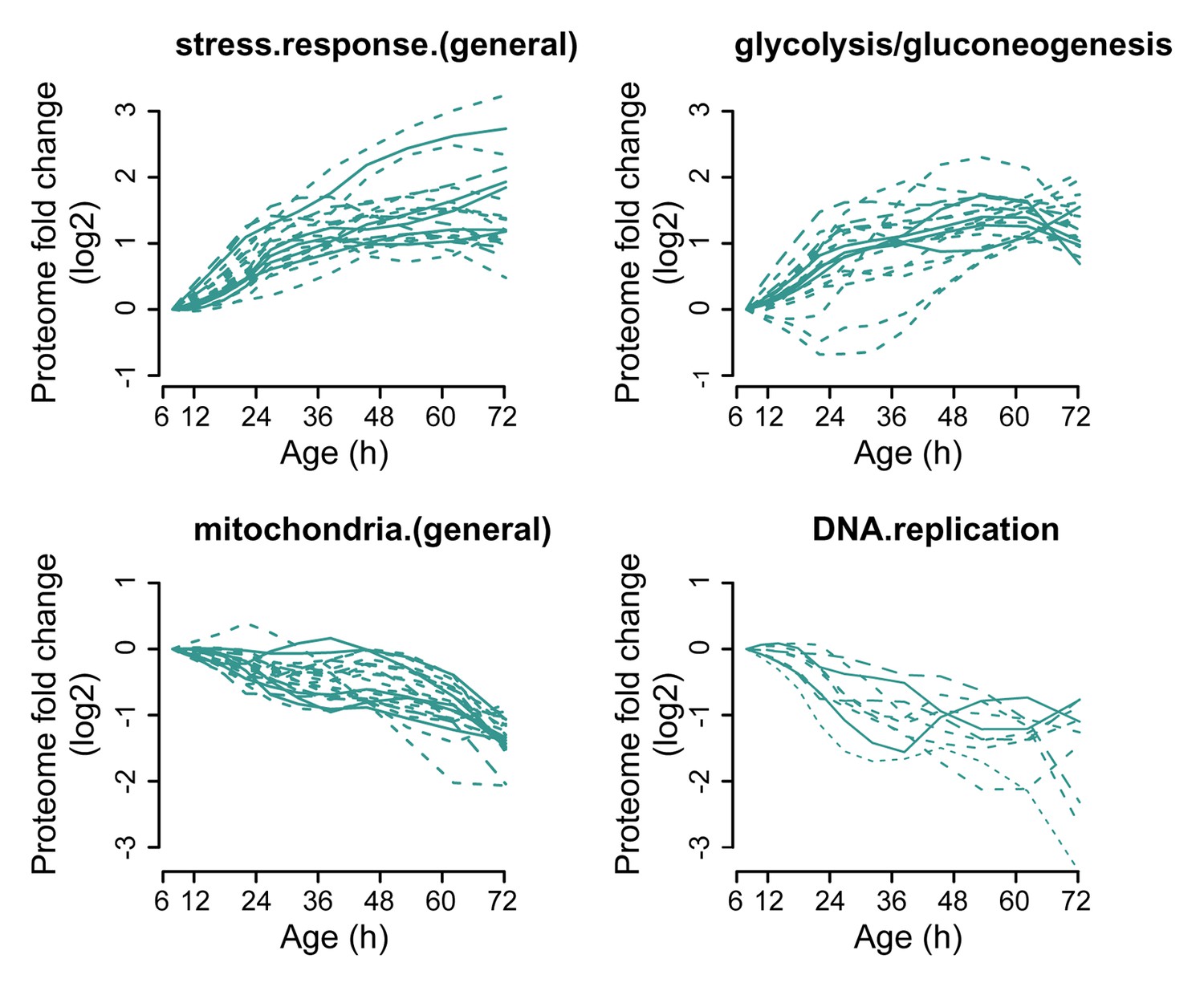
Profiles that contribute to the enrichments of proteins changing more than twofold.
Proteins contributing to the enrichment score for ‘stress response (general)’, or ‘glycolysis/gluconeogenesis’ that were increasing more than twofold with age, or proteins contributing to the enrichment score for ‘mitochondria (general)’ and ‘DNA replication’ that were decreasing more than twofold with age were selected for visualization (from Figure 3B). The fold changes are plotted on a log2 scale.
Figure 3—figure supplement 4
Single protein profiles matching literature.
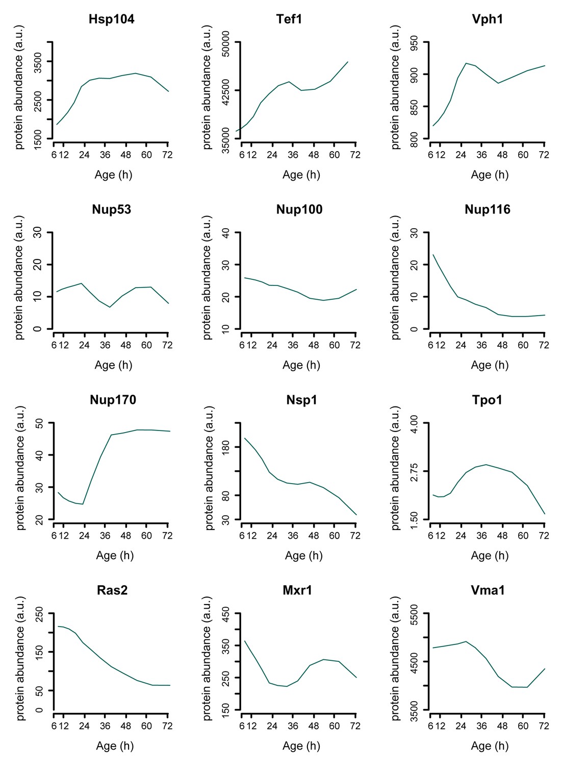
Assessing the protein dynamics on the single cell level that were reported in the literature to occur in aging yeast shows agreement with our global-scale proteome dataset. Specifically, we see protein levels of the stress-related chaperone Hsp104 and the translation elongation factor Tef1 to increase with aging as was shown using a microfluidic platform tracking single cells [Zhang et al., 2012]. Using another microfluidic platform and green fluorescent protein (GFP)-tagged Vph1 protein as a marker for the vacuole, it was found that the vacuole increased in size more rapidly than the cell itself, suggesting a net increase of Vph1 protein levels to occur in the aging cell [Lee et al., 2012]. Our data shows Vph1 levels to increase with aging, in line with these observations. Furthermore, our proteome also captures the subtle changes described to occur with the Tpo1 protein and aging, where a computational model based on production and inheritance of the protein throughout aging predicted Tpo1 levels to initially increase and then gradually decrease with age [Eldakak et al., 2010]. A recent study looking at protein abundances in young and old whole-cell extracts found that levels of the nucleoporins Nup116 and Nsp1 decrease with age, while Nup100 and Nup53 did not change significantly [Lord et al., 2015], and for one other nucleoporin, Nup170, was shown that the levels increase with aging [Denoth-Lippuner et al., 2014], which we all also detect in our proteome data (Figure 7D). Three proteins whose overexpression results in extended lifespan in yeast, Ras2 [Sun et al., 1994], Mxr1 [Koc et al., 2004], and Vma1 [Hughes and Gottschling, 2012] were observed to decrease with age. Literature references are according to main text reference numbering.
Figure 4 with 3 supplements
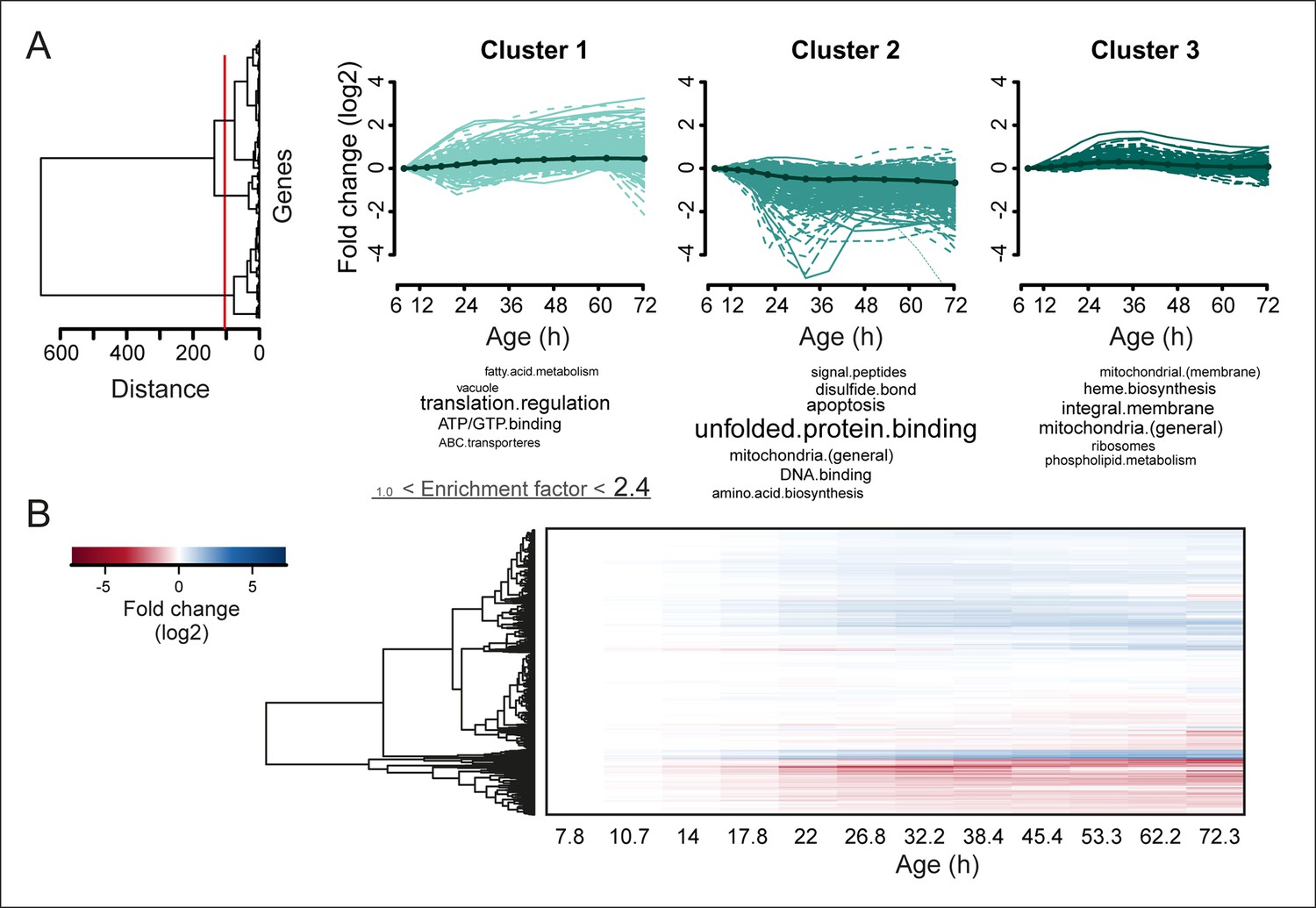
Protein profiles in aging yeast.
(A) Expression profiles for the proteome were clustered using the Ward clustering algorithm and plotted in a dendrogram. Visualization of the most prominent (red line in dendrogram) protein fold change profiles (log2 scale) occurring with age, showing up-regulated (cluster 1), down-regulated (cluster 2) and mainly flat (cluster 3) profiles. Gene functional enrichments per grouped time points were summarized into representative terms as in Figure 3B. (B) Unidirectional changes occurring with aging are illustrated with a heat map of the fold changes (log2 scale) of proteins in the aging mother compared to the young reference sample.
Figure 4—figure supplement 1
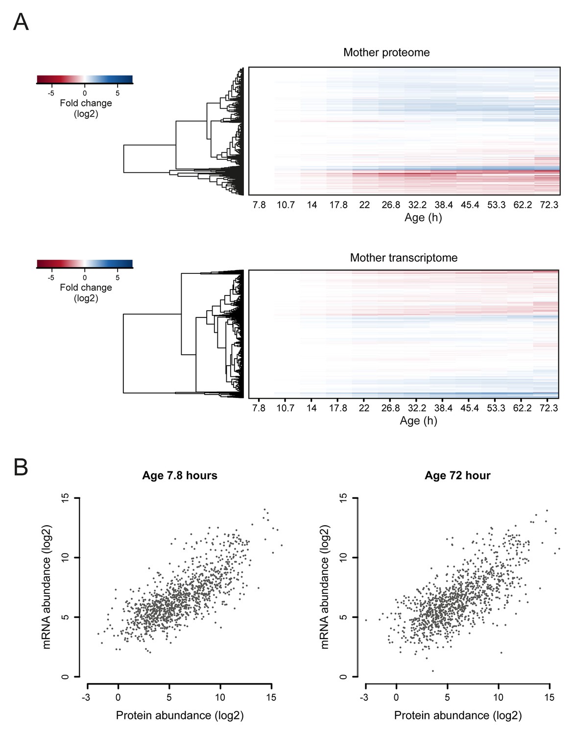
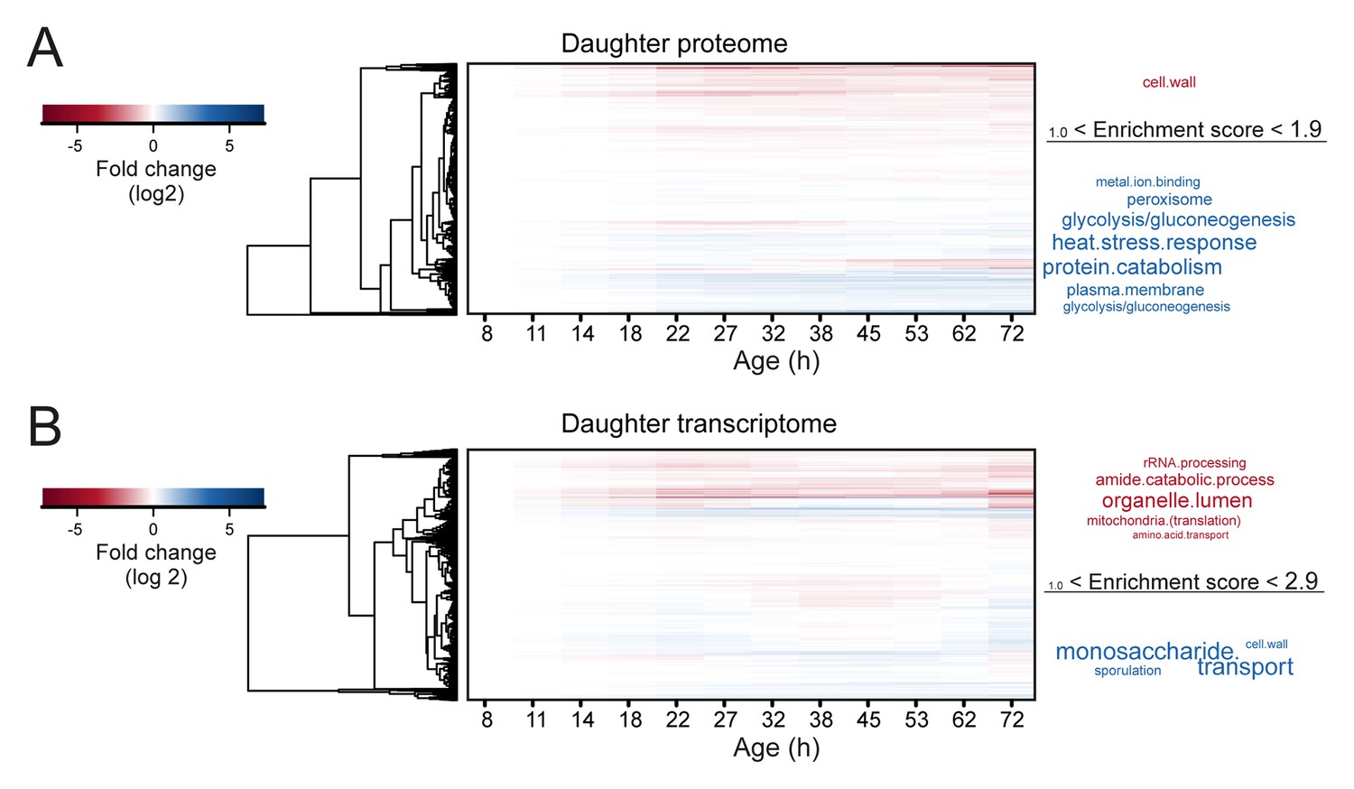
Comparison of aging proteomes and transcriptomes.
(A) Heat maps (with row dendrograms based on Euclidean distance) of proteome (top panel) and transcriptome (bottom panel) time series data, plotted as fold changes on a log2 scale. (B) The raw abundances (log2 scale) for the proteome and transcriptome are plotted against one another for young (left panel, age 7.8 hr) and old (right panel age 72 hr) cells.
Figure 4—figure supplement 2
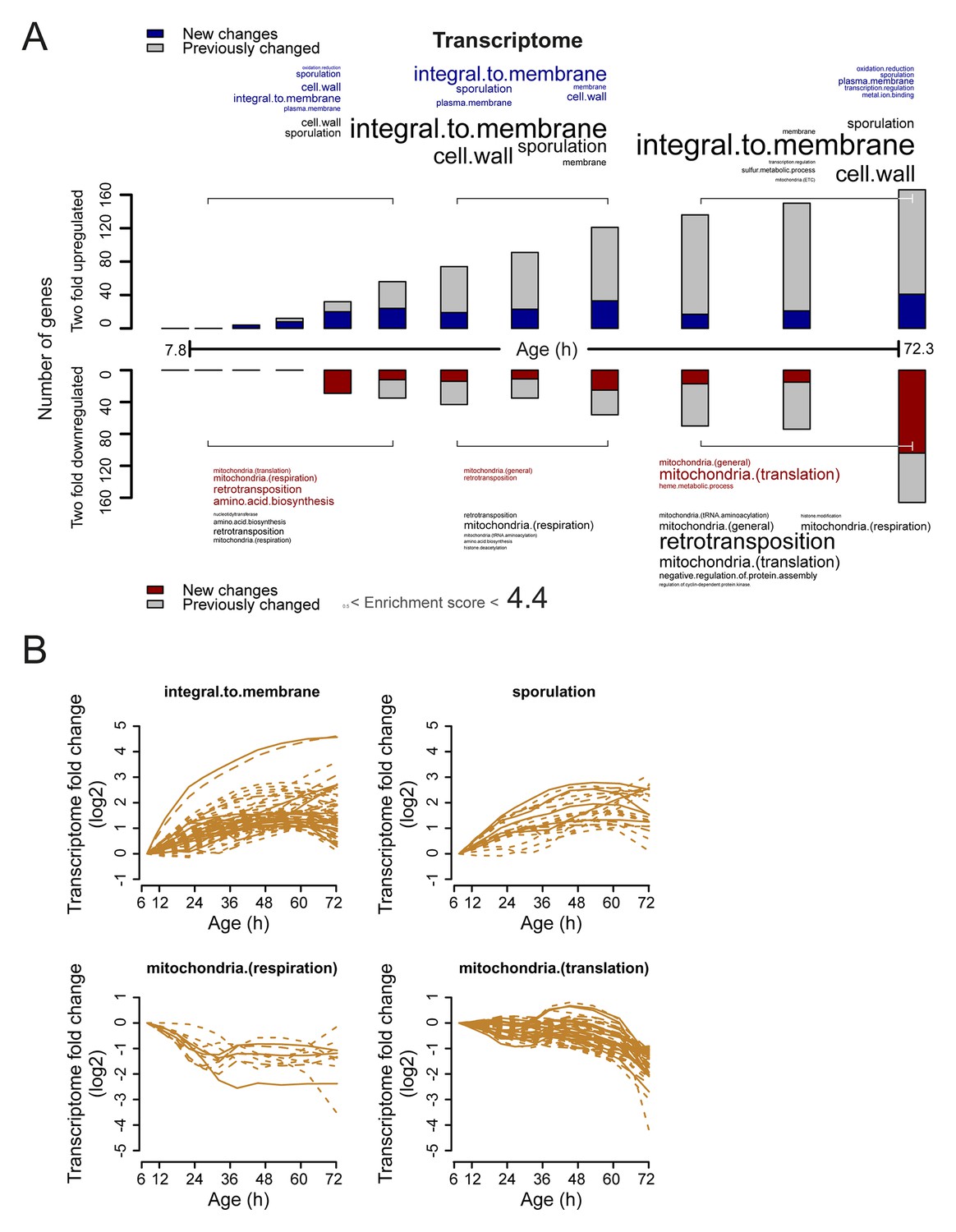
Analysis of twofold changes per time point in the aging transcriptome.
(A) The numbers of transcripts changing by at least twofold from the reference (young) sample per time point. Red and blue bars or text represent changes that had not occurred previously, either up- or down-regulated, respectively. Gray bars or text are changes that already occurred at a previous time point. Gene functional enrichments per grouped time points were derived from Gene Ontologies (GO) and are scaled with significance of enrichment obtained by database for annotation, visualization and integrated discovery (DAVID) version 6.7 (scaling of text: DAVID enrichment score). (B) Profiles that contribute to the enrichments of transcript changing more than twofold. Transcripts contributing to the enrichment score for ‘integral to membrane’, or ‘sporulation’ that increased more than twofold with age, or transcripts contributing to the enrichment score for ‘mitochondria(respiration)’ and ‘mitochondria(translation)’ that decreased more than twofold with age were selected for visualization (from A). The fold changes are plotted on a log2 scale.
Figure 4—figure supplement 3
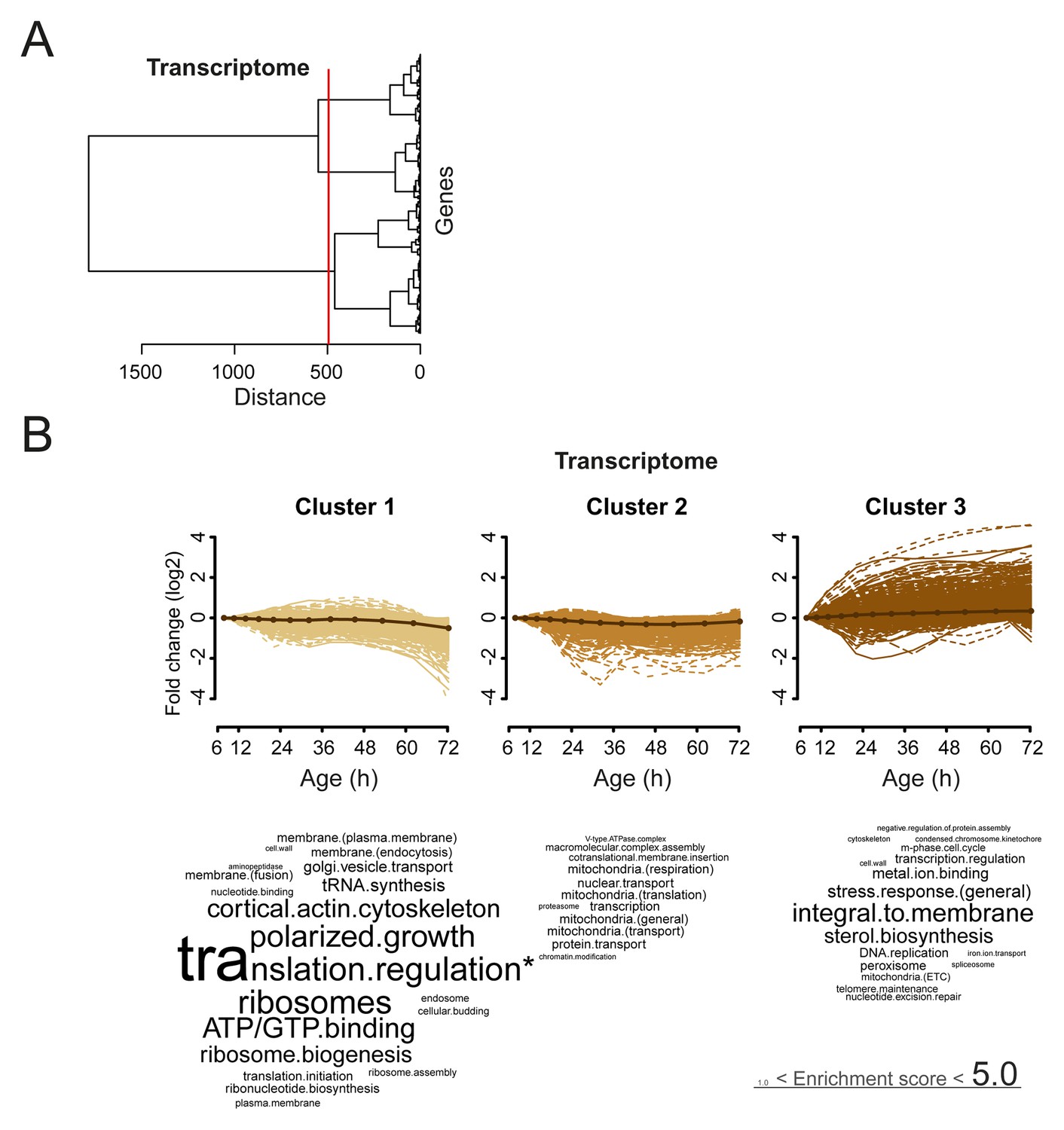
Analysis of aging changes clustered by expression profile.
(A) Expression profiles for the transcriptome were clustered using the Ward clustering algorithm and plotted in a dendrogram. Three expression profile groups were selected for characterization (red vertical line). (B) The three most prominent profile expression clusters for the transcriptome , showing mainly down-regulated (cluster 1 and 2) and up-regulated (cluster 3) profiles. Gene functional enrichments per grouped time points were summarized into representative terms as in Figure 3B. In one case (asterix, ‘translation regulation’), the enrichment value was scaled down (from 10.2) to the score of the next most enriched term (5.0), for better legibility of the other terms (with first three letters kept on the original scale). Transcript fold changes are plotted on a log2 scale.
Figure 5 with 3 supplements
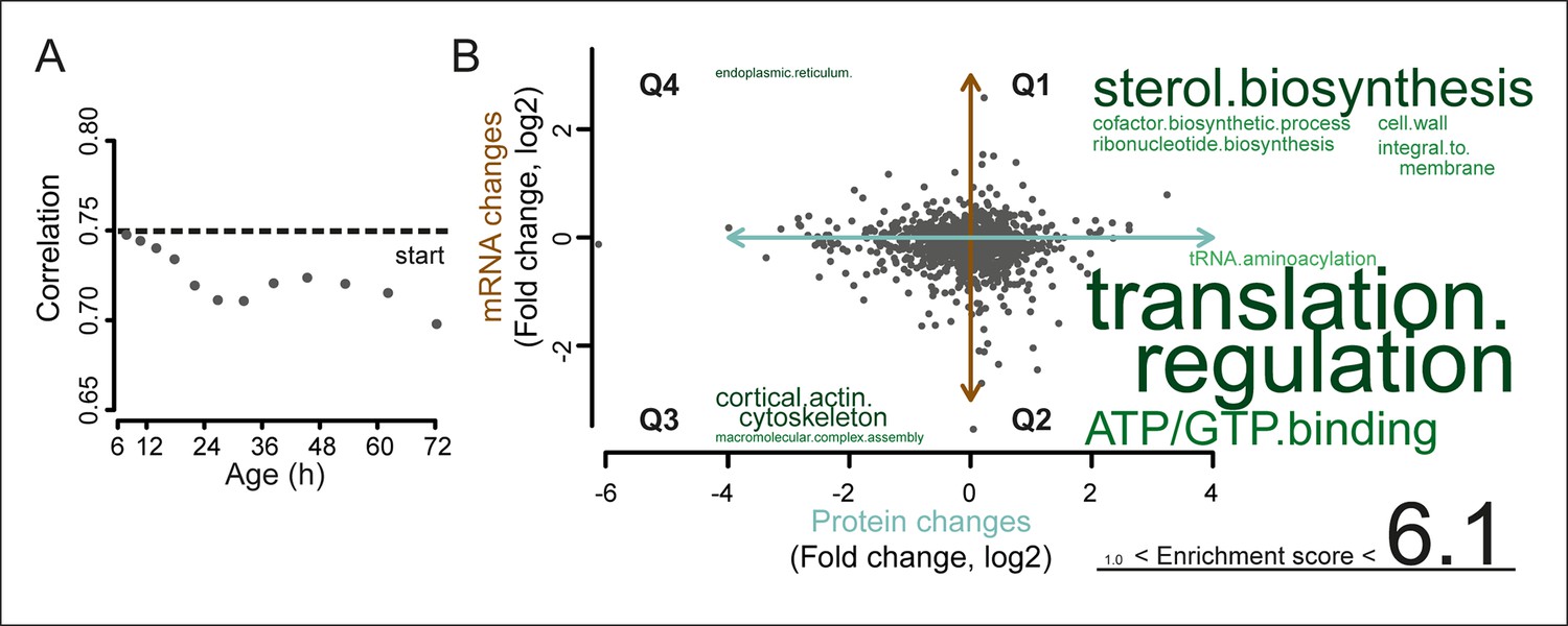
A post-transcriptional overrepresentation in protein biogenesis with aging.
(A) A progressive uncoupling of the proteome from the transcriptome in time is apparent from the decreasing Spearman correlation between the two. (B) Co-expression map showing fold changes (log2) of 72 hr aged samples compared to the young reference, plotting the proteome versus the transcriptome. Quadrants 1 and 3 (Q1 and Q3) represent changes where the protein changes match their transcript changes (coupled), while quadrants 2 (Q2) and Q4 (Q4) reflect opposite changes (uncoupled). Summarizing terms per quadrant are derived from Gene Ontologies (GO) as in Figure 3B (scaling of text: DAVID enrichment score).
Figure 5—figure supplement 1
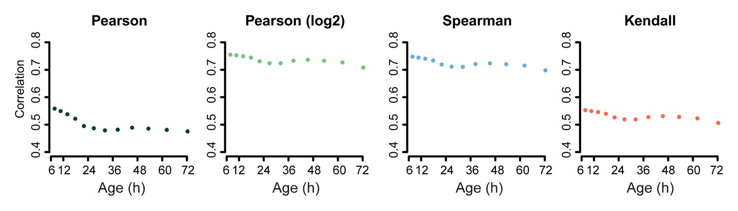
Correlation of proteome versus transcriptome using alternative statistical methods for comparison.
Comparison of the proteome versus the transcriptome using the dataset of genes in common between the two. Using Pearson correlation on the raw data, Pearson correlation on log2 transformed data, or Spearman or Kendall correlations on the raw data, show similar results: a decreasing correlation of the proteome and transcriptome with age.
Figure 5—figure supplement 2
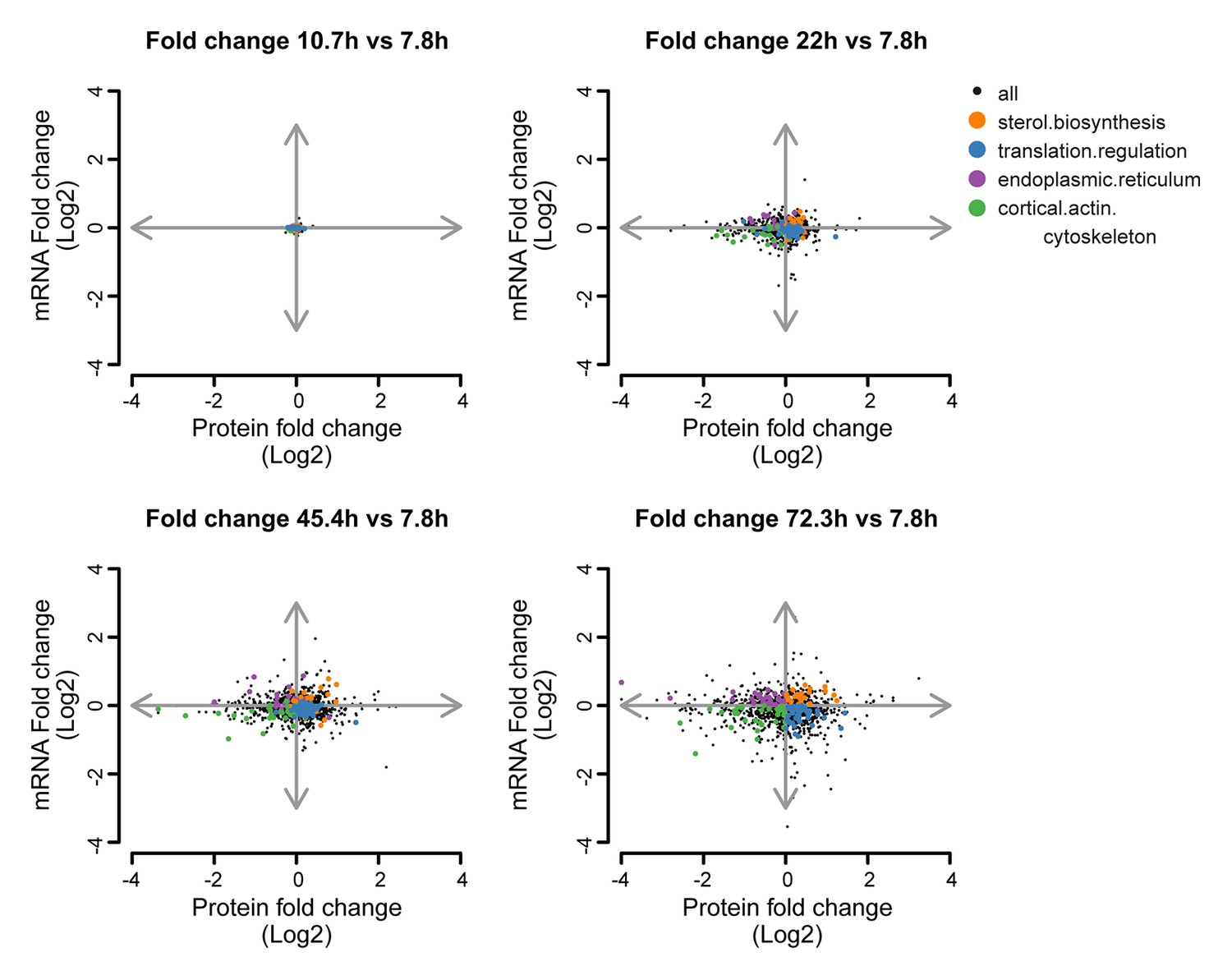
Co-expression map showing fold changes of 10.7, 22, 45.4 and 72.3 hr compared to the young reference, highlighting gene products contributing to gene enrichments.
Co-expression map as in Figure 5B, showing fold changes of proteins and transcripts at 10.7, 22, 45.4, and 72.3 hr aged time points compared to the young (7.8 hr) reference sample. Genes contributing to enrichment scores of the most enriched processes per quadrant at 72.3 hr of aging (sterol biosynthesis from Q1, translation regulation from Q2, cortical actin cytoskeleton from Q3, and endoplasmic reticulum from Q4) are shown highlighted for each time point to illustrate their changes. The fold changes are plotted on a log2 scale.
Figure 5—figure supplement 3
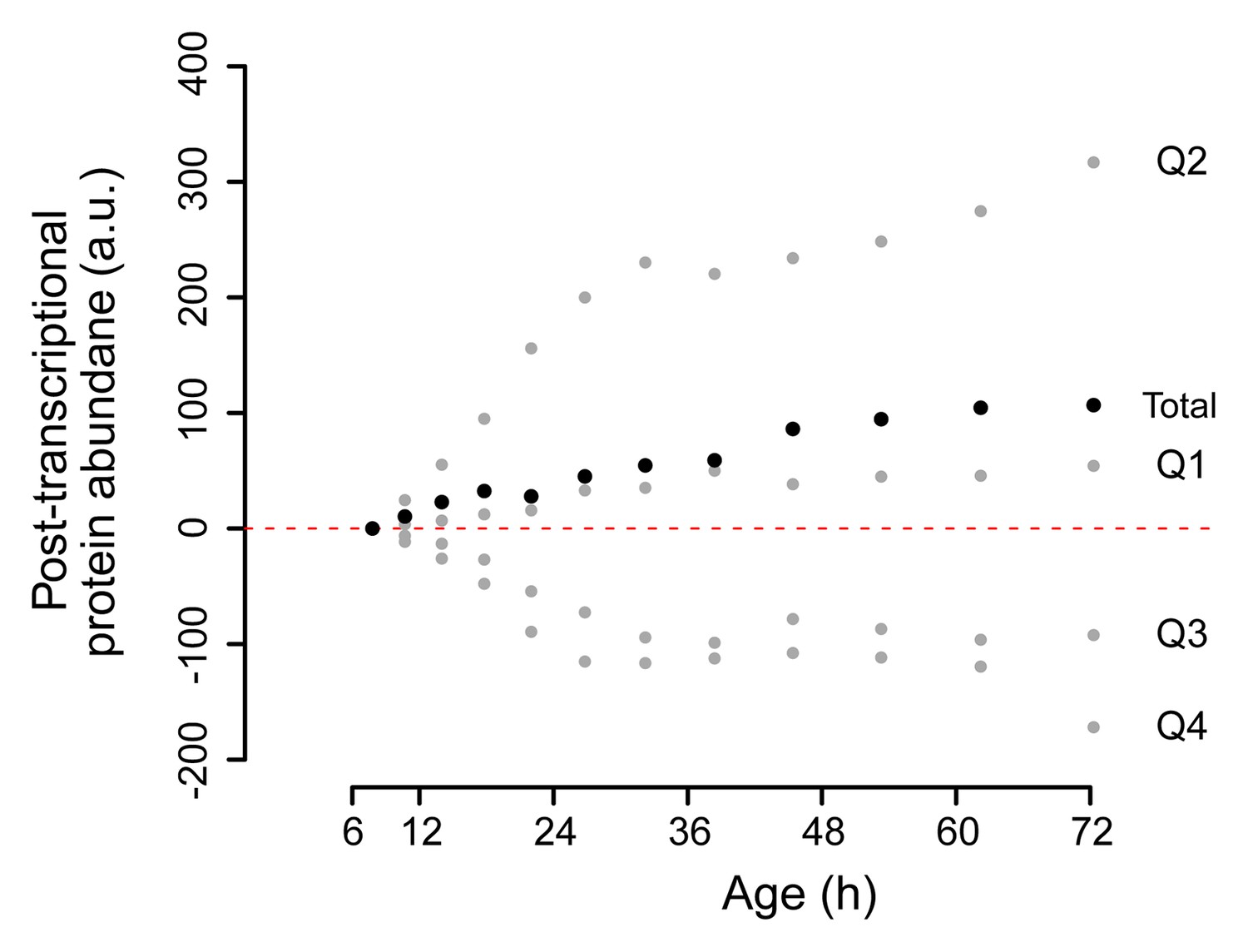
Change in posttranscriptional protein overabundance with aging.
The fold change in abundance of a protein compared to a reference (young) sample, minus the fold change of its transcript, gives a quantity for its relative overabundance. Plotted in time are the summed values for the gene products per quadrant of the co-expression map in Figure 5B (gray points), and for all genes of the entire plot summed (black points). This shows a net increase over time of total relative protein overabundance, and a distinct behavior per quadrant.
Figure 6 with 2 supplements
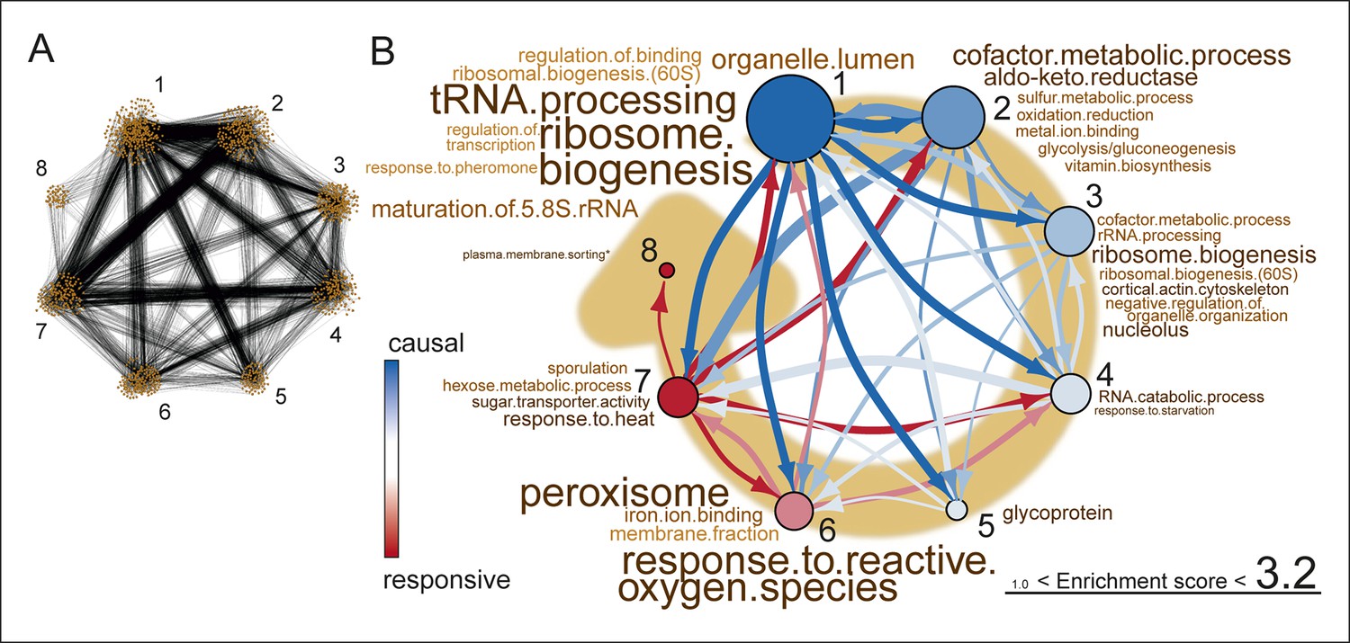
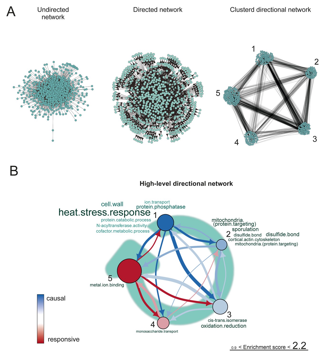
Network inference identifies protein biogenesis-related genes as causal force during aging.
(A) The directed and clustered transcriptome network consists of 3631 edges, connecting 1241 nodes in 8 clusters (see Figure 6—figure supplement 1 and supplemental note 4, in Supplementary file 1, for further details). Only actual relations are depicted, the causal direction between two nodes is indicated with an arrow, where the arrowhead points to the responsive node. (B) Clusters ranked from more causal to more responsive in the causality network (from blue to red for clusters 1 through 8). The degree of causality is determined by the ratio of the outgoing over incoming connections per cluster (from A). The blue to red arrows indicate the sum of outgoing arrows between two clusters, where arrow thickness is logarithmically scaled to the number of arrows (from A), that is, the summed predictive power of one cluster over the other. Terms per cluster are derived from Gene Ontologies (GO) as in Figure 3B (scaling of text: database for annotation, visualization and integrated discovery [DAVID] enrichment score).
-
Figure 6—source data 1
Table S7: The direction matrices and the sensitivity analyses for the proteomic and transcriptomic high-level directional networks.
- https://doi.org/10.7554/eLife.08527.036
Figure 6—figure supplement 1
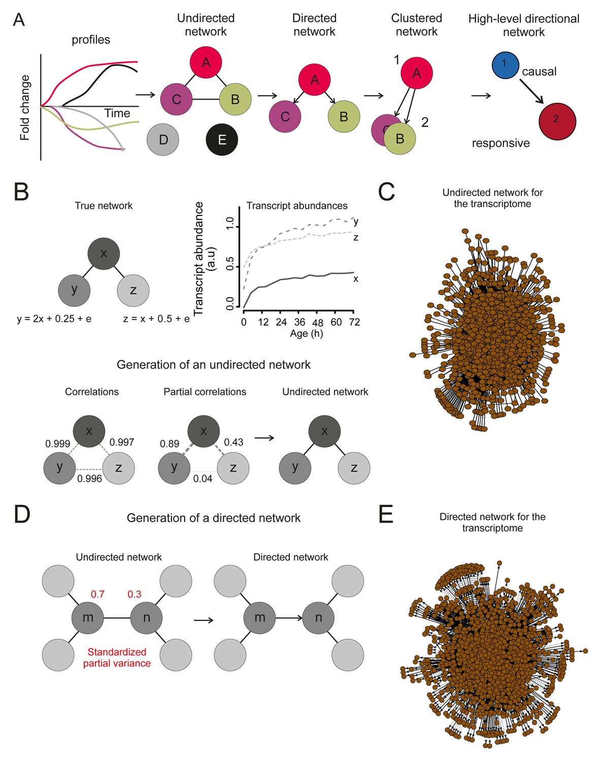
The transcriptome network.
(A) Cartoon illustrating the pipeline of the network analysis procedure, to go stepwise from gene expression time series (i.e. a gene profile) towards a high-level causal network. First, only nodes that have related gene profiles (based on partial correlations), as distinguished from all indirectly related gene profiles (based on simple correlations), are connected in the network (see B below). Second, the directionality of the arrows between two nodes was found by accounting for the relative reduction in the variability between the nodes. This revealed a causal relationship (see D below). Third, highly interconnected nodes were clustered. Finally, based on the clusters and the average directionality among the clusters, a high-level directional network was generated. For further details regarding these steps, see below and supplemental note 4. (B) A simulated example to highlight the first step in (A), showing that the edge between nodes in the network depends on the partial correlation between the gene profiles. Two transcript profiles (‘y’ and ‘z’) were based on a computationally generated transcript profile (‘x’), forming a small artificial network with edges between the nodes x and y in addition to x and z. While the simple correlations between all profiles are high (>0.995), the partial correlations are only high for x with y and x with z (grey dashed lines). Therefore, actual relations were only found from x to z and x to y (black edge). We can thus retrieve the true network, by making use of the partial correlations. (C) The undirected network for the transcriptome data. The edges between the nodes indicate only actual relations (based on partial correlations) between transcript profiles. All edges connected without partial correlations or nodes linked to the dataset without a partial correlation are omitted in this network. (D) An example to highlight the second step in (A) that the directionality between two transcript profiles was found by multiple testing of the standardized partial variances of the nodes. The standardized partial variances are the variances once the effect of the related profiles has been removed by regression analysis. For each of the connected node pairs (e.g. ‘m’ and ‘n’), the direction goes from the profile with the highest standardized partial variance to the lowest. Basically, for a profile with a lower standardized partial variance, much of its variability is explained by the profiles connected to it, while for a profile with a high standardized partial variance, less of its variability is explained by the profiles associated to it. The latter profile has thus a higher ability to predict the first one than vice versa, and makes a profile with high standardized variance causal over a profile with a low standardized variance. The directionality is indicated as an arrow between the nodes. (E) The directed network for the transcriptome data. The arrowhead is pointing to the responsive node. For the clustered directed network see Figure 6A and for the high level directional network see Figure 6B.
Figure 6—figure supplement 2
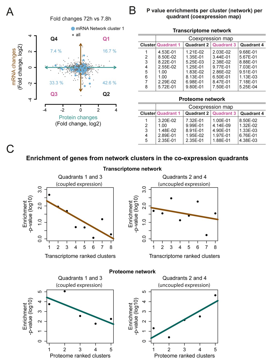
Network cluster gene enrichments in the co-expression map.
(A) The genes represented in cluster 1 of the transcriptome networks (blue dots) were mapped on the co-expression map (gray dots; Figure 5B). The percentage of the genes enriched in each of the four quadrants (Q1–4) is indicated, fold changes are plotted on a log2 scale (B) p-values for the enrichment of the genes in each cluster of the network in the four quadrants; transcriptome (top) and proteome (bottom). (C) The p-value for the enrichment of genes in each cluster in Q1 and Q3 together representing a ‘coupled’ change in protein and transcript levels (left panel), and in quadrant Q2 and Q4 (uncoupled change) (right panel). A shift towards an uncoupled phenotype in the ‘later’ network clusters is apparent. The p-values are plotted on a log10 scale.
Figure 7 with 4 supplements
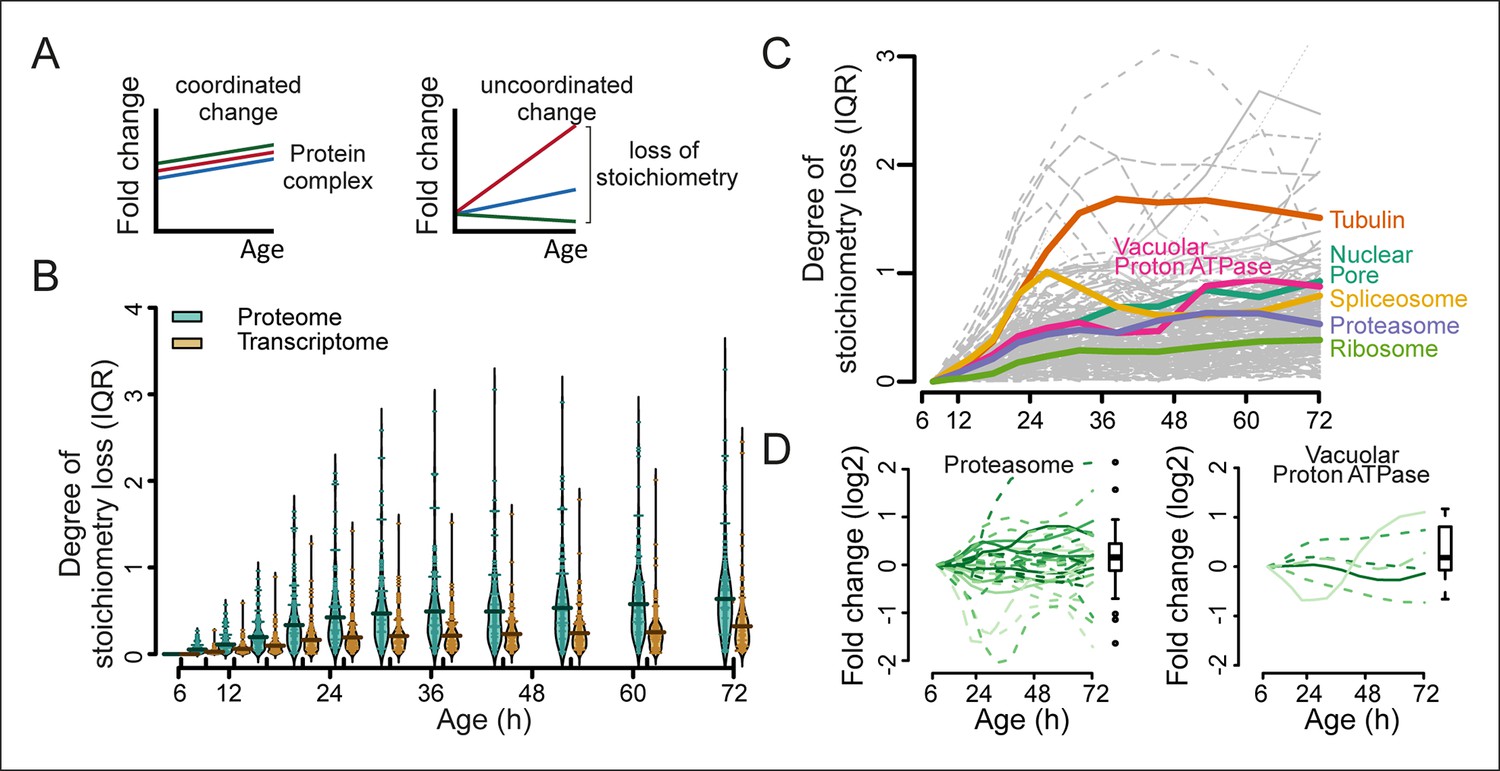
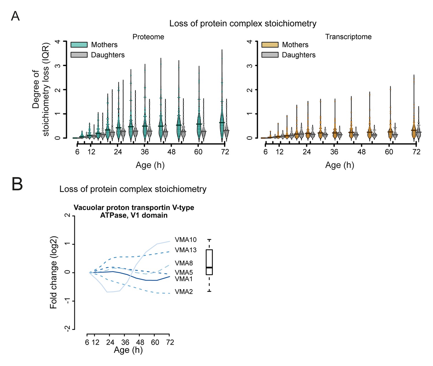
Loss of stoichiometry in protein complexes is a consequence during aging.
(A) Illustrative representation of loss of stoichiometry within a protein complex during aging. Changing levels of proteins may be coordinated (left) or uncoordinated and result in a loss of complex stoichiometry (right). (B) Stoichiometry loss (for a single complex defined as the InterQuartile Range (IQR) of the distribution of fold changes of the components) is plotted for all complexes in proteome and transcriptome datasets as bean plots during aging. Thick horizontal line represents the mean of the distribution of all complexes, thin colored lines the individual complexes’ stoichiometry loss, and the outline the distribution of all complexes. The genes in common between the proteome and transcriptome datasets are used. (C) Illustration of the loss of stoichiometry of protein complexes during aging for the proteome (gray lines), with specific examples highlighted (colored lines). (D) Illustration of the loss of protein stoichiometry in proteasome (left panel) and the vacuolar proton transporting V-type adenosine triphosphatase (ATPase), V1 domain (right panel). The protein abundance changes (log2 scale) of the complex’ components are plotted in time. The degree of stoichiometry loss is indicated with a box plot.
Figure 7—figure supplement 1
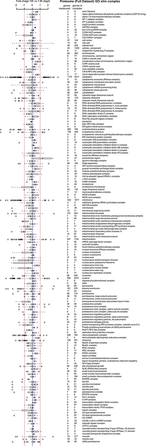
Proteome data of distribution of changes within complexes in the cell.
A curated list of protein complexes derived from the ‘cellular component’ gene ontology was downloaded from yeastgenome.org, and the horizontal box plots show the distribution of fold changes (log2 scale) occurring in the complex when comparing proteome data of the old (72 hr) sample to the young reference sample. Box-and-whisker plots are presented as follows: the thick black line within the box is the median of the data, the box extends to the upper and lower quartile of the dataset (i.e. to include 25% of the data above and below the median, respectively), whiskers (dashed lines) represent up to 1.5 times the upper or lower quartiles and circles represent outliers.
Figure 7—figure supplement 2
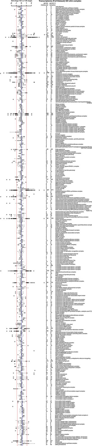
Transcriptome data of distribution of changes within complexes in the cell.
Same as Figure 7—figure supplement 1 but for the transcriptome data.
Figure 7—figure supplement 3
Loss of stoichiometry occurring in the protein complexes.
(A) Comparison between mother cells and mother-age dependent daughter cells, loss of stoichiometry within complexes. Bean plots showing the distribution of the loss of stoichiometry for all complexes in the cell (same as in Figure 7B), at each time point throughout aging. Mother and daughter cells plotted side by side, for the proteomes (left panel) and transcriptomes (right panel), showing that the mother cells’ proteome undergoes a greater degree of loss of stoichiometry within complexes than do mother-age dependent daughter cells. Stoichiometry loss for a single complex is calculated as the interquartile of the distribution of fold changes within the complex at any given time (i.e. the ‘box’ in Figure 7—figure supplement 1 and 2). Bean plots are drawn as follows: thick horizontal line represents the mean of the distribution of all complexes, thin colored lines the individual complexes’ stoichiometry loss, and the outline the distribution of all complexes. (B) Illustration of the loss of protein stoichiometry in the vacuolar proton transportin V-type adenosine triphosphatase (ATPase), V1 domain. The protein abundance changes (log2 scale) of the complex’ components are plotted in time. The degree of stoichiometry loss is indicated with a box plot.
Figure 7—figure supplement 4
The proteome network.
(A) Undirected, directed, and clustered directed networks for the proteome dataset. The clustered directed network consists of 669 edges, connecting 493 nodes in 5 clusters. (B) These interactions are summarized in a causal network: clusters are ranked from more causal to more responsive (from blue to red for clusters 1 through 5, placed on a turquoise arrow that depicts ranking) in the causality network. The degree of causality is determined by the ratio of the causal outgoing over incoming connections per cluster (from A). The blue to red arrows indicate the sum of outgoing arrows between two clusters (from A), that is, the summed predictive power of one cluster over the other. Terms per cluster are derived from Gene Ontologies (GO) as in Figure 3B (scaling of text: DAVID enrichment score).
Additional files
-
Supplementary file 1
Supplementary text and supplementary references (1–13).
- https://doi.org/10.7554/eLife.08527.044
Download links
A two-part list of links to download the article, or parts of the article, in various formats.
Downloads (link to download the article as PDF)
Open citations (links to open the citations from this article in various online reference manager services)
Cite this article (links to download the citations from this article in formats compatible with various reference manager tools)
Protein biogenesis machinery is a driver of replicative aging in yeast
eLife 4:e08527.
https://doi.org/10.7554/eLife.08527


