eLife is optimising the discoverability of Lens reader, offering an improved reading experience.
Did you know about Lens - a cutting edge, highly optimised HTML5 manuscript reading experience developed as a collaboration between eLife and Substance?
Lens offers an improved user experience: a streamlined, distraction free manuscript reader with a strong focus on contextual, side-by-side display of figures, references and text, broadly aimed at improving on the natural “flipping” behaviour of switching between text and figures on a multi-page printed manuscript.
Lens does an excellent job of catering for both full reading as well as skimming modalities of use, is fully open source, and provided free for journals to use. At the time of writing, Lens is being trialled by six other open access journals and has been shortlisted for the ALPSP Awards.
Yet, until recently only an average of 0.57 percent of users ever clicked on our Lens button and benefitted from this experience.
A quick review of our site design from a usability perspective soon revealed a possible culprit: the Lens button was designed in such a way as to be easily mistaken for a banner, and therefore liable to fall victim to a phenomenon called banner blindness, whereby the majority of users either consciously or unconsciously ignored it based purely on its shape and location. Additionally, the button was labelled “View in Lens” which, while technically accurate, did nothing to describe the advantage of clicking it to an unfamiliar user.

With these assumptions in mind, we devised a plan to address these issues. We started by designing and prototyping three completely different button strategies:
Button Option A: a traditional button placed just below the manuscript title.
Button Option B: a button which would be fixed to the bottom left of the browser window, and would animate on page load to advertise its function.
Button Option C, a floating button that would stick to the left edge of the main content column, and briefly advertise its function on page load before gracefully fading back whenever the page is scrolled.
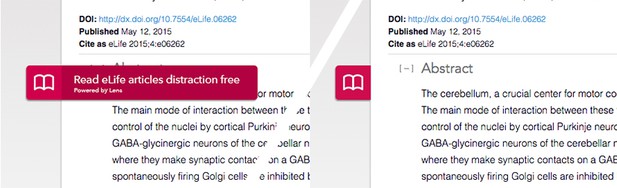
Each button also tried to provide a sense of why the user would want to use its linked function. The formerly cryptic “View in Lens” button label was replaced by more descriptive text promoting Lens as either an “eLife’s optimised reading experience”, or a way to “read eLife articles distraction-free.” The buttons where tagged with the appropriate Google Analytics to calculate the number of times the button was clicked as a percentage of the number of times it was displayed, and finally a cookie set up to ensure that each visitor to the site would only ever see one button variant, chosen at random. Our A/B (and ok, C) test could then begin in earnest.
The Results:
Test period: 9 July - 5 August
(Compared against. 11 June - 8 July for old lens link)
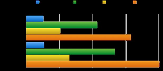
Cumulative results as percentages of clicks/displays, per button:
Old Lens Button: 0.51 (non-unique) - 0.53 (unique)
Option A: 2.13 (non-unique) - 2.66 (unique)
Option B: 1.01 (non-unique) - 1.30 (unique)
Option C: 3.15 (non-unique) - 4.00 (unique)
Conclusion:
Our best performing option, which has now been made a permanent fixture of the article page, increased clicks by almost eight times, showing that even the design of a humble button can have a big impact on the discoverability, and continued use, of an important site feature.
If you’re interested in Lens and how it’s going to develop in the future, take a look at the Lens Search experiment for advanced manuscript search, and Lens Writer (coming soon), an authoring environment based on Lens.


