Blogpost by Giuliano Maciocci, Head of Product
Why do we need an eLife 2.0?
When I joined eLife just short of two years ago, I moved from a long stint in the corporate high-tech space into the scientific publishing realm, and got a serious taste of professional culture shock. Having spent much of my career as a user experience practitioner, I was taken aback at the state of online science journals when compared directly against the well-established standards of usability, accessibility and design that have become commonplace in the online services, retail, technology and social media spheres.
Responsive design, the ability for content to adjust its presentation seamlessly from one device to another, is still a rarity in the journal space. So are applied UX design principles, affordances for multiple reading and browsing behaviours, offline reading and performance optimisations, and a number of other practices most of the rest of the web takes for granted.
The eLife website did many of these things right, but it was still far from ideal. Born of a need to get up and running quickly in the fledgling days of the organisation, and tasked as an effective delivery vehicle for an innovative peer-review process, the site followed the standard online journal practice of displaying as much information about the article as possible, without a great level of care about whether, and how, this information should be prioritised.

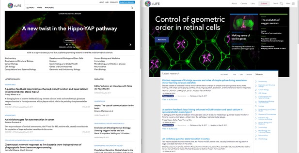
The new eLife homepage, left, next to the old.
The result, again typical of many online science journals today, was a somewhat cluttered article view brimming with seldom used links and metadata, a sub-optimal visual hierarchy, and an overall presentation that most users found less preferable than the stalwart format for research consumption, the venerable PDF.
The observation that the PDF, a proprietary legacy of the printed page era, still represents the dominant form through which the latest research is accessed, suggested that we as a journal had a real opportunity to look closely into what we could do to help our users transition towards more dynamic, rich, and interactive research artefacts that can more fully and faithfully convey the nuances of scientific discovery.
Thus began the effort that became eLife 2.0, a user-centred, bottom-up overhaul of our online journal aimed at delivering three key goals: deliver the best article reading experience, highlight content that enriches the research, and make it all easy to find. All while setting down a modern foundation for future innovation in the research publishing space.
Goal 1: deliver the best article reading experience
In an era of dynamic web content, open data, and increasingly powerful browsers, the PDF still rules supreme as the primary form through which new research is read. This is a shame, because it means fewer researchers are taking advantage of opportunities to more fully convey the full, reproducible narrative of their research through tools like interactive figures, executable code, and live data visualisations.
Our user research indicated a number of rather predictable reasons for PDF’s continued dominance as a research consumption format, including portability, offline reading use cases, and good old fashioned familiarity. But one of the most prevalent reasons given by our users for preferentially using PDF really surprised us: “because it looks nicer”.
Aesthetics are easy to underestimate in the realm of reason and scientific rigour, but even the most analytical mind is still human after all and, whether consciously or not, appreciates reading experiences that minimise visual noise, reduce distractions, and therefore limit sources of cognitive load beyond what’s needed to interpret the content being read. In the case of research articles, “looking nice” is in fact a proxy for some important aspects key to an article’s readability:
- A clean layout, with a clear visual hierarchy
- No intrusive sidebars, calls to action, thumbnails or adverts
- A legible, high-contrast font
- Good-sized figures that can be consumed alongside the article text
These aspects formed the basis of eLife 2.0’s article page design, and went on to influence every major design decision throughout the rest of the site.

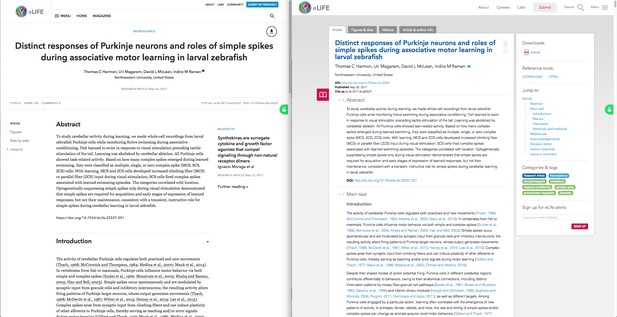
The new Article page (left) drastically simplifies scanning for relevant information against the previous design.
Inspired in part by research into reading behaviours, as well as text-focused platforms from Medium to the Amazon Kindle, the new article page in eLife 2.0 provides a clean, distraction-free layout with a flexible navigation structure that supports how reading and skimming behaviours vary across desktop and mobile. In addition, eLife 2.0 article pages more seamlessly embed our signature Lens view (for simultaneous text and figure browsing), which is now accessible by selecting the Side by Side option alongside the traditional Article and Figures views.
The new article pages are also optimised for reading across a wide range of devices and screen sizes, and should load significantly faster than our previous site thanks to a streamlined page asset budget and our new IIIF-enabled figures. Standing for International Image Interoperability Framework, IIIF allows us to more efficiently serve the large images behind our figures by efficiently delivering only the bare minimum image data needed to render an image at any given screen size.
IIIF also forms the basis of further enhancements to the site. Shortly after launch, we will be deploying an enhanced asset viewer that will take full advantage of IIIF’s feature set. This new viewer, which we’ll also release as a standalone open source tool, will allow figures viewed in full screen, and all their supplements, to be zoomed with very fine granularity thanks to OpenSeaDragon. This will let users interact with very large, highly detailed images with no performance penalty on almost any device. In the future, IIIF will also allow us to explore the ability to let users annotate our figures, as well as a number of other interesting use cases.
And what about offline reading? We’ve now laid the groundwork for the implementation of Serviceworker, a technology that will soon let eLife 2.0 articles cache locally on your machine, so that once you’ve browsed to an article you can go offline, reload it from your browser history or a bookmark at a later date, and it will still be there waiting for you. Or, you could download the article into ScienceFair and take advantage of its powerful manuscript management functions while enjoying your papers though our eLife Lens view.
Goal 2: highlight content that enriches the research
eLife’s in-house teams generate a large amount of content, such as Insights, Feature Articles and Editorials, that add both context and perspective to the science we publish. These articles also appeal to a broader, less specialised audience, and promote a shared understanding of scientific discoveries across disciplines.
In eLife’s previous iteration, this content could be quite difficult to find (Did you know we had a regular Podcast? Some of our users didn’t!), so we wanted to make sure that all this content had a proper home, a portal where readers could more easily access this material.

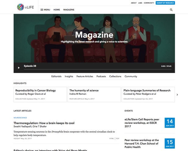
Our brand new Magazine section highlights the content that builds on the research.
The Magazine section of the site was created as just such a portal, showcasing everything from our latest Insights, Feature Articles and Editorials to subject-specific Collections, our Podcast and a range of content for and about early-career researchers.
It is our hope that the Magazine will establish itself as an alternative entry portal to eLife’s content that appeals to specialists who are keen to read about development in other fields, and to non-specialists keen to learn about the latest research in all areas of science.
Goal 3: make it all easy to find
Search was never a strong use case for the eLife website, given the majority of our visitors originate from search engines such as PubMed and Google Scholar, and enter our site directly at the individual article level.
But search is not the only way to find relevant content, which is why we have completely overhauled both the site’s navigation as well as its content recommendations infrastructure. What this means, is that specialists can jump directly into their subject of interest from the home page without having to so much as scroll, or directly from an article by clicking the appropriate tag.
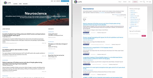
In eLife 2.0, research categories are now treated like mini home pages in their own right, presenting relevant, up-to-date Research and Magazine content in a single organised view — allowing users so inclined to bookmark their research category of choice and streamline their browsing experience.

The new research category pages (left) provide custom landing pages for research specialists.
Finally, when you’re done reading an article in eLife 2.0 you will be discreetly introduced to a set of abstracts for closely related articles, to help you discover more relevant science, or to more easily follow the full narrative of a discovery without leaving the article page.
And yes, we have also overhauled our search capability, so you should always get the most relevant results whether you’re searching for an author name or a model organism (or anything in between).
Performance, patterns, and giving it all away
eLife 2.0 is the result of roughly eighteen months of user-centred design, development and testing, with many key site features having seen dozens of iterations as a result of direct user testing and performance optimisations. And while we’ve made every effort to ensure the site serves as a good example of UX and accessibility best practices, we know others can do even better.
To that end, we will soon be releasing all the design patterns, style guides and key visual and code assets developed for eLife 2.0 under a CC-BY license, in the hope that they will lower the barrier to entry for other journals to use what we learned in the making of eLife 2.0 to improve their own user experience.
By using these assets, other publishers will also be able to take advantage of the substantial performance gains delivered by our minimalist design patterns, while making their own sites substantially more maintainable by adopting our novel approach to the use of PatternLab for the modular implementation of the site’s front-end (a post on the subject will follow soon).
We have worked hard to make sure that eLife 2.0 brings across-the-board improvements to our users, and now that the site is out we have many new features in the pipeline, to be announced in the coming months. We will be measuring the success of the project not only by its impact on the usual visitor metrics, but also on whether and how the assets and resources we release are used, and whether they are judged as helpful to the community.
But we’re not done listening and learning, so if you have any feedback on the new site, we’d love to hear from you. If you like what we’ve done with the site, please tell your friends and colleagues. If you don’t, please tell us!
We look forward to your feedback.
This blogpost is cross-posted on Medium.
For the latest in innovation, eLife Labs and new open-source tools, sign up for our technology and innovation newsletter. You can also follow @eLifeInnovation on Twitter.


