Point of View: Are theoretical results ‘Results’?
- University of Cambridge, United Kingdom
Figures
Figure 1

Experimental setup to study diffusion of the green alga Chlamydomonas.
(a) A light sheet is used to gather the algae, which are swimming in a petri dish, into a narrow strip of cells along the -axis. (b) After the light is turned off, the cells swim randomly and spread out. The concentration profile, , is then measured along a thin strip parallel to the -axis; is time.
Figure 2
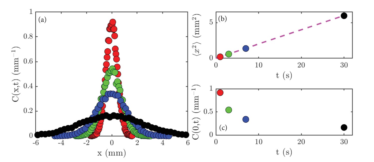
Experimental results on diffusion in a population of the green alga Chlamydomonas.
(a) Concentration profiles, , normalized to unity, at the following times: 1 second (red), 3 seconds (green), 7 seconds (blue) and 30 seconds (black). (b) The variance, , of the data shown in (a) as a function of time; the dashed magenta line is a linear fit to the data. (c) The peak height, , of the data shown in (a) as a function of time.
Figure 3

A random walk in one dimension.
(a) A cell at site moves with probability to the left or right. (b) Diagram illustrating the counting that underlies the evolution equation (Equation 1).
Figure 4
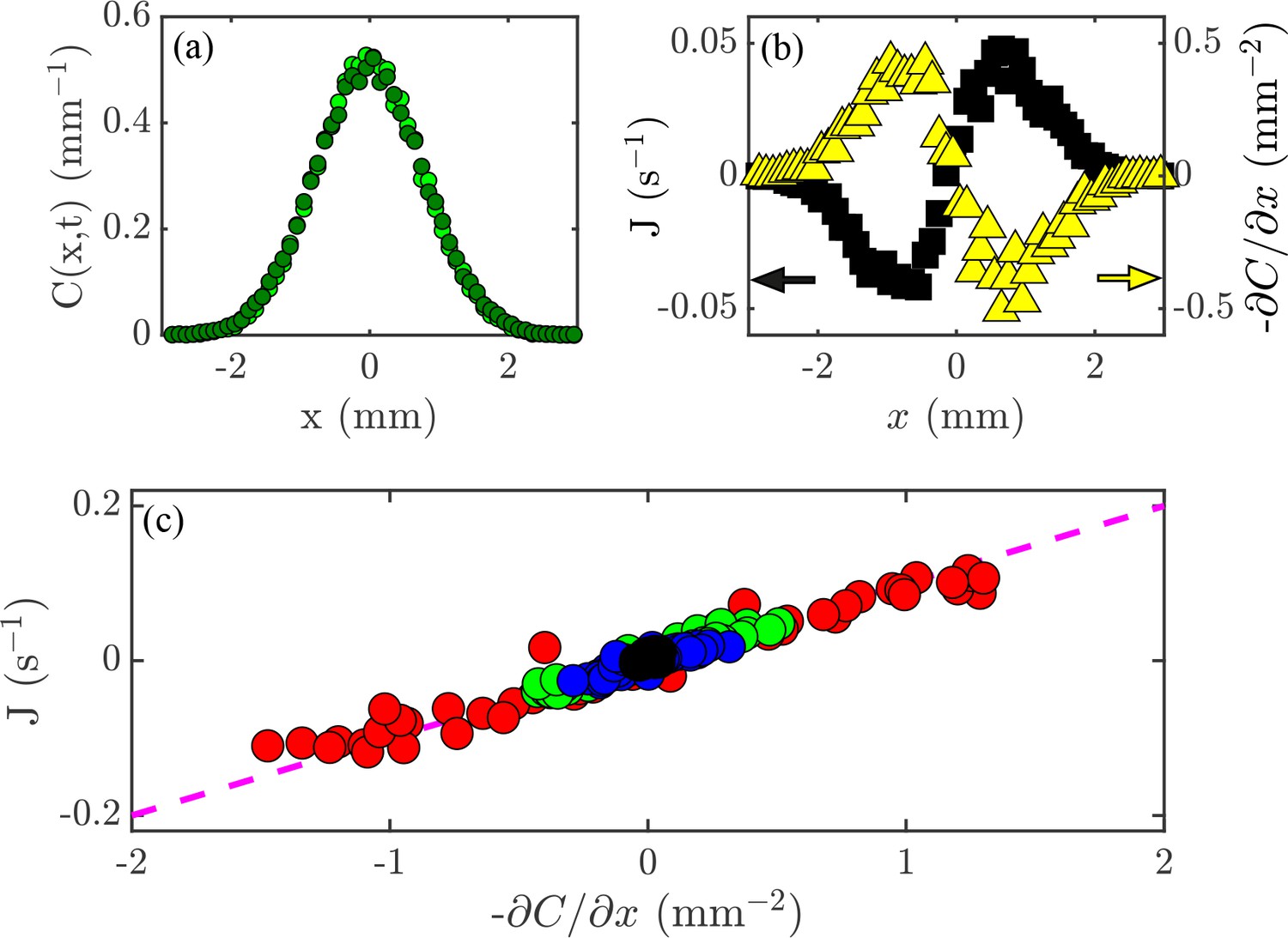
Flux and the diffusion equation.
(a) Concentration profiles, , at times s  and s
and s  . (b) The flux of cells past a given point, (black; left axis), and the concentration gradient, (yellow; right axis), versus position, . (c) Flux, , versus concentration gradient, , for all the values of and shown in Figure 2a. The dashed magenta line has a slope mm2/s.
Figure 5
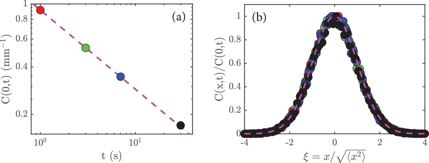
Rescaling the data.
(a) The peak amplitude, , from Figure 2c plotted as a function time, , on a log-log scale; the dashed magenta line has a slope of , which shows that . (b) When the data in Figure 2a are rescaled (see main text) and replotted, they collapse to a universal curve; the dashed magenta curve is the function .
Download links
A two-part list of links to download the article, or parts of the article, in various formats.
Downloads (link to download the article as PDF)
Open citations (links to open the citations from this article in various online reference manager services)
Cite this article (links to download the citations from this article in formats compatible with various reference manager tools)
Point of View: Are theoretical results ‘Results’?
eLife 7:e40018.
https://doi.org/10.7554/eLife.40018


