Blogpost by Nick Duffield, User Experience Designer
Introduction
Back in 2015, one of the first tasks I was given in my new UX design role at eLife was to redesign their entire journal website.
The site was built on a popular journal hosting platform chosen primarily to help get eLife up and running as quickly as possible – impressively achieved within an eight month timeframe. However, with the organisation wanting to experiment with new and innovative ways to publish, it soon became apparent that the level of control needed was not possible.
Some of the drawbacks eLife faced were:
- There were limits on how far the site could be adjusted, meaning that the ideas that eLife had to improve the experience and create new features could not easily be achieved.
- The site was not optimised for mobile device screen sizes.
- Because the platform was managed by another organisation, updates were out of eLife’s control and could take longer than desired to implement.
Tasked with a redesign, we not only had the opportunity to develop the site to match eLife’s needs, but to extend the project to better serve the needs of our users.
In this post I will share our approach to the redesign of the eLife website, known as “eLife 2.0”.
Initial review
To kickoff, we reviewed analytics gathered over the past couple of years and gave the site an expert evaluation to identify potential improvements.
We found that Research Articles were by far the most visited pages and that most readers read one article at a time before leaving. In addition to this, we could see that our site had some catching up to do with regard to what users might expect from a modern web experience, when compared to most mainstream sites outside of the academic journal space.
Some key aspects that we believed could be improved were:
- Reading experience – The site had a lot of furniture like tab panels, drop shadows and dividers, combined with varied colour use and lots of typographic styles. Comparing the site to others, like Medium or e-readers that have a very streamlined, content-focused look to enhance the reading experience, we knew that we could take some cues from these sources.
- Mobile friendly – The web development team had managed to make the site somewhat responsive, but being designed for large screens, pages appeared overloaded on devices like mobile phones. The mobile experience was therefore a prime target for improvement.
- Content discovery – Articles written by the Features team to accompany Research Articles add a lot of value to readers who are interested in subject areas outside of their own field of expertise. On the existing site, this content was hard to discover as it was tucked away in menus or buried in sidebars.
- Site navigation – The global navigation menu appeared overloaded, containing all of the research categories that eLife published in, and lists of content types. We could see that this was based on the way the organisation thought of the site from an internal point of view as opposed to the way a user might intuitively expect to navigate.
Given that Research Articles were our most important landing pages, we started our redesign here.
1. Reading experience
To begin the article-centred redesign, our Head of Product handed me a visual for how he imagined a bare-bones Research Article might look while maintaining all of the key functionality of an existing article page.
Using the Research Article pdf format for reference, all of the site furniture had been removed from around the content. Elements like panels, shadows and lines that can cause visual clutter were now replaced with the careful use of white space and alignment giving the article content priority on the page.
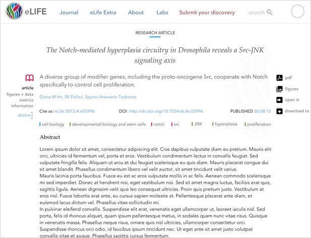
Our early idea for a minimalist Research Article.
We shared this first pass of a minimalist Research Article concept with staff internally to get some first impressions. Overall the response was positive, building internal support for a new approach to an article that was easier to read, although some expressed concerns that such a minimalist approach, if not carefully executed, could be perceived as undesigned or unfinished.
2. Mobile friendly
Now that we had a starting point for our redesign, we wanted to see how our new article scaled across different mobile devices.
We found the following issues on smaller screens:
- Research Article titles and author lists can be very long, which can push reading content a long way down the page (some of our articles have in excess of sixty authors).
- Information about the article like research category, content type and published date needed different placement to work across varying screen sizes.
- Functional controls like view switching and page navigation needed repositioning and scaling down to make better use of the limited screen real estate.
To tackle the first issue we reduced the title's font size down to something more suitable for small screens, and by taking a commonly used space-saving technique from scientific publishing we shortened the author list by suffixing the first author's name with ‘et al.’. We moved the remaining authors to the article information section of the page, thus reducing the height of the title section considerably while maintaining one-click access to the full list from the header’s author line.
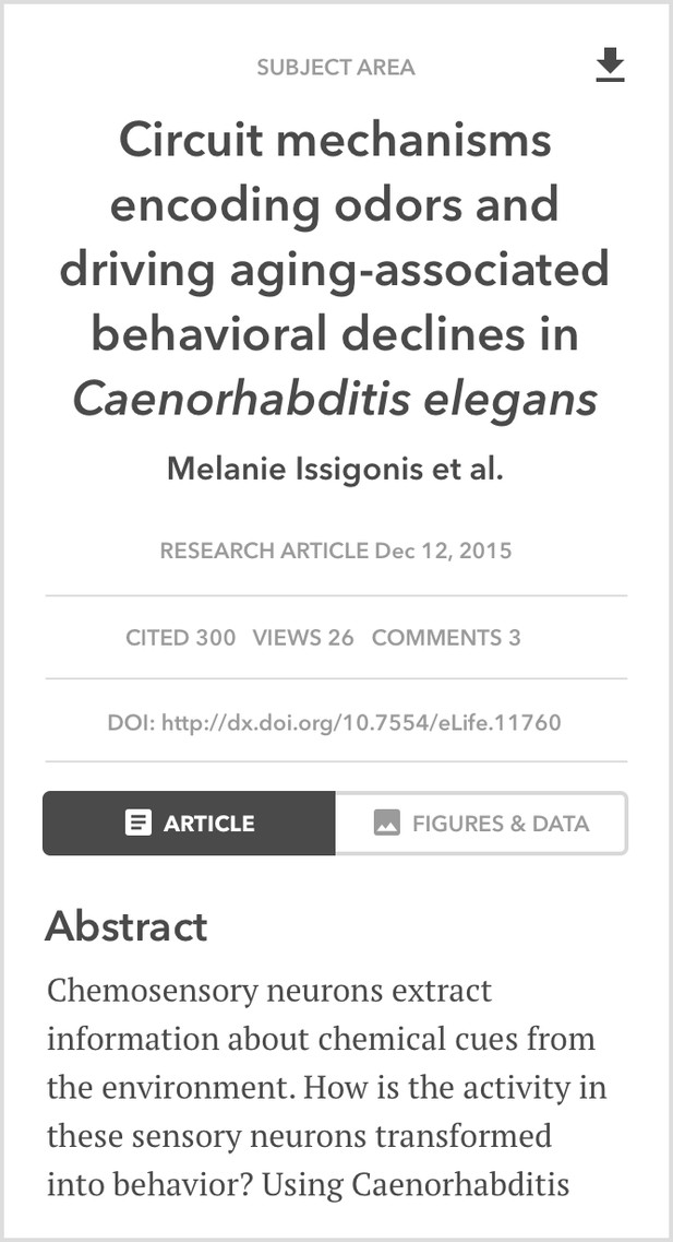
A wireframe for the Research Article adjusted for small screens.
Research Articles can relate to more than one research category, which can create lengthy lists for some articles. To make better use of the screen real estate we swapped the position of the research category list with the content label allowing us to fit more characters per line before we truncated the list for smaller screens. We could then combine the publish date and content type information into a single compact label which saved room and was easier to scan.
Next we turned our attention to reintroducing the page navigation controls. Offering the ability to jump through sections of a Research Article caters to the non-linear reading behaviour of our users. In order to cover this use case on small screens, where a sidebar navigation menu is impractical, we took an accordion style approach to our page sections, allowing each to be accessed with minimal scrolling. This helped to shorten the page length and bring the articles sections together as a more accessible list of links.
With the top section of the page taken care of, giving users the ability to switch views from article to figures only was the last thing left to do. On the mobile, this was particularly important as the figures only view is often used as a shortcut to rapidly evaluate an article’s content while considering a full read. This feature had been lost by removing our sidebar page navigation controls on smaller screens. A simple fix to this problem came by moving the view links up onto a single line and restyling them to appear like a toggle switch, using media queries and cascading style sheets.
2.1 Scaling the design from the article up
One step up from the article pages are channels – listing-style pages that showcase the latest content published with eLife in each research category. Channels can be very useful to specialists as they offer an easy way to find the latest content matched to their area(s) of expertise.
Channels were originally based on canned search page templates rather than having their own presence on the site, and we wanted to bring them into line visually with the new article design. But before focusing on adjusting styles and layout we wanted to review the information used to make up list items and carry out some restructuring.
We removed some details like Digital Object Identifiers (DOIs) and links to alternative viewing sources (all of which were still available in the articles themselves). This allowed for more focus on the contents lists and made the decision on what to read for users far simpler. This left us with the information below, which we prioritised in the following order:
- Title
- Author
- One sentence summary
- Research category(ies)
- Content type with published or updated date
- Article format if applicable
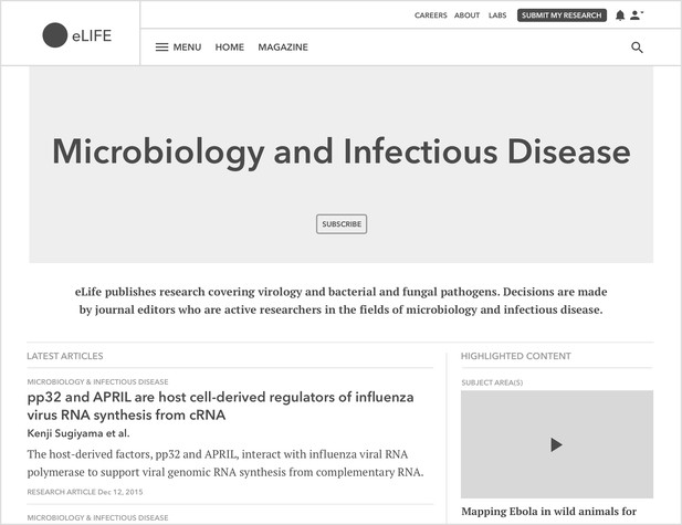
A wireframe for a research category channel page.
With our listings taking shape, we redesigned our channel to feel more like a home page for specialists by adding a banner section to call out the research category that the listings relate to. Next, making use of the real estate beside the main listing, we created an area for the Features team to promote content that they were excited about and felt would be of interest to readers.
Finally, every research category has a group of editors and reviewers. As a point of interest for authors interested in submitting work to eLife, we listed out a handful of Senior Editors and then added a ‘see more’ link to the base of the section so that readers could access the full list.
3. Content discovery
Our final step upwards took us to the top of the site hierarchy – the journal homepage.
Using the redesigned channel page as a template gave us most of the layout options that we needed. The main column worked well for the latest research listing, and the header section with some work could serve as a space to highlight a small number of selected Research Articles, similar to the current website. The only thing we wanted to add was a secondary level listing beside the latest research column to raise the profile of Features content.
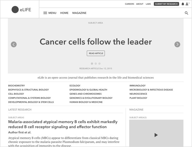
The journal homepage based on the channels design.
Additionally, we made sure to list all of our channels above the fold, to allow specialists visiting our home page to quickly dive into their preferred research category without distractions.
Until now the primary way to discover Features content was through its relationship with other articles, or by digging into the site menu. To pull this content together and make it easier to discover, we duplicated the homepage to create a new website section.
We used the header to feature a title and descriptive statement that would be placed over a graphic for visual impact, to help visitors to understand the new section and set expectations. This lead us to our next task of arranging the remaining areas of the page into sections that could promote the various types of content this page had to offer.
We arranged the page starting with the most important:
- Header section – To set expectations and help readers to understand the page before diving in.
- Features content main listing – A catch-all for the latest Features content mirroring other listings on the site.
- Highlighted content – Noteworthy content selected by the Features team surfaced to the attention of Magazine visitors.
- eLife events – Webinars and events hosted by eLife for site visitors to attend. Previously, events were promoted through social media but were hard to discover on the website.
- eLife digests on Medium – Content for less specialised readers based on more technical Research Articles on eLife. We wanted to use this section to highlight this offering.
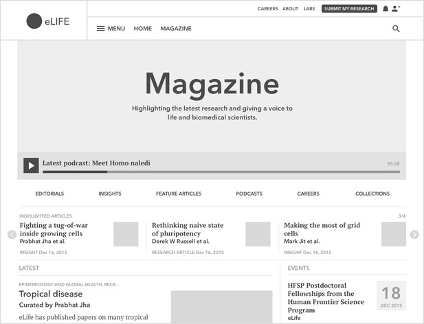
Our new Magazine section mirroring the journal homepage.
In addition to the above page sections, we were especially keen to highlight podcasts commissioned by the Features team on a monthly basis. Podcasts are based on Research Articles and it seemed a shame for readers to miss out on a very accessible content type that could serve as an entry point into understanding other areas of research. To help, we gave podcasts a highly discoverable placement on all screen sizes by placing the latest episode directly beneath the banner section, using an embedded media player for instant access.
4. Navigation
Once we’d completed the design of a selection of key pages including a new section to highlight Features content, we moved on to the overall site navigation.
Based on our initial site review we felt that we could reduce the amount of information displayed in the menu. The question that we had to ask was 'what should we keep?'. To us, the menu appeared very overcrowded and served as a listing for all of the content published with eLife. We wanted to streamline our navigation to more closely reflect our user's needs, and to better understand this we took a look at Google Analytics.
Typically users would:
- Find an article through a search service like Pubmed or Google Scholar and follow the link directly to a Research Article.
- Or, select a research category from the journal home page and browse a list of latest Research Articles regardless of type.
Because our users were not actively seeking out content types we removed them from the main site menu. This left us with a long list of research categories that we shortened to a single link which we directed to a new research categories page. Then we populated the rest of the menu with links to essential content, including the about and contact sections, with the idea that we could make refinements during the user testing phase of the project.

Redesigned site navigation.
During the redesign, we had created the Magazine as a new website section for Features content, but for now there was no way for users to access it. To address this we added two links to the website header. One for research-focused content that linked to the journal homepage, and the other for the new Features content page.
To reintroduce some of the content links that had been removed from the site menu, we added a list of Features content types to the new Features pages beneath the header graphic. From our analytic review, we could see that this was a familiar pattern for users to navigate to areas of interest from the landing pages and also mirrored the research categories channel listing on the homepage.
Now that we had a handful of key pages designed and linked, we were at a stage that we wanted to try our ideas out with real users.
Next
In part two of this article, I will cover our approach to user testing and the refinements that we made based on user feedback.
This blogpost is cross-posted on Medium.
For the latest in innovation, eLife Labs and new open-source tools, sign up for our technology and innovation newsletter. You can also follow @eLifeInnovation on Twitter.