Blogpost by Nick Duffield, User Experience Designer
In the first part of this article, Redesigning an online scientific journal from the article up I: Early designs, I walked through our process for designing the new eLife website by evaluating the previous site, creating mock-ups and gathering internal feedback. In this article, I am going to talk about how we validated our decisions through user testing.
So why user test?
Couldn’t we just roll out our best bet for a design and iterate on any feedback we receive? Sure! Why not? Well, the issue with this approach is that it can be very expensive in development time if that bet doesn’t work out, and we may later find ourselves unpicking a lot of the hard work that we had put in.
Enter user testing. By making prototypes to simulate the experiences that we have designed, we can share our ideas with our users and make all necessary changes before having to build some of the infrastructure needed to support these ideas in a production environment. This has less impact on our development resources and ensures a closer match to our users’ needs straight out of the gate.
Planning the user study
We had a made lot of decisions for the redesign of the new eLife website internally, and we now needed to see how well they fared when put in front of real users.
High-level goals
- We wanted to know how users would feel about such dramatic visual change to the eLife website compared to the experience they were used to.
- We wanted to make sure users would still be able to find their way around a restructured website.
- We wanted to know if this redesign would improve the article reading experience for our visitors.
- We wanted to see if we had created a great mobile experience for our users.
Turning goals into questions
In order to achieve our goals, we needed to formulate some key questions. Typically we would take a goal and develop a set of questions that could be answered through direct observation of our users’ interaction with our design prototypes.
An example of turning a goal into a question might be:
- Goal: We wanted to know how users would feel about such dramatic visual change to the eLife website compared to the experience they were used to.
- Question: How do users respond when they are presented with the prototype of the redesigned eLife website?
Developing tasks to answer questions
Rather than directly asking our users questions, we developed a script of tasks allowing them to express their thoughts and feelings in a more natural way, by using the think aloud protocol. This also helped us to uncover unexpected needs and test the usability of our designs in a non-leading way.
An example of turning one of the above questions into a task would be:
- Question: How do users respond when they are presented with the prototype of the redesigned eLife website?
- Task: "Can you describe the webpage on the screen in front of you?"
High-fidelity prototypes
A part of what we wanted to learn was how users would respond to our minimalist redesign, and to do this we needed a high-fidelity prototype to accurately represent the intended experience.

Screen shot high-fidelity HTML prototype.
Using a HTML prototype for this seemed like a good option for a number of reasons:
- Interactive: we were keen to see if users could navigate the design successfully, and so the prototype needed a sufficient level of interactivity.
- Responsive: we wanted to test our mobile experience along with our desktop experience — using a framework like bootstrap easily gave us the ability to create both experiences with minimal effort.
- Representative: as stated above we wanted to learn how users felt about a such a dramatic change to the experience that they were used to, so the prototype needed to feel realistic for an accurate comparison.
- Cheap: a HTML prototype covering the key use cases to be tested is relatively quick and cheap to put together as well as quick to iterate upon.
Running the study
To cover the range of visitors that come to the eLife website we recruited study participants from a variety of research areas and career stages, from early career researchers to institute directors, while ensuring a balanced spread across gender, age and nationality. We wanted to be able to observe our participants using our prototype and interject with questions at any sticking points, so we ran our study onsite using laptops and mobile phones.
Starting our study sessions
We kicked off each study session with a series of icebreaker questions to find out general information about each participant like their research interests, career stage and familiarity with the eLife website. This helped us learn a little about the person taking the study and also made our participants feel more comfortable before getting started.
Running through tasks
The tasks we asked our users to complete focused on four key areas that related to our study goals. These were navigation, presentation, usability and discovery. Typically tasks would range from asking users to describe what they see when arriving at pages to asking the user to find an article of interest to read.
Simple tasks like this helped us to understand if participants noticed ‘call to action’ buttons on the page and to make sure the navigation worked in an intuitive way.
Managing feedback
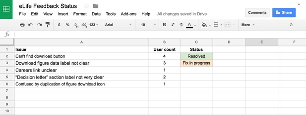
As our study progressed we took extensive notes and added issues uncovered by our participants to a spreadsheet. For any recurring issues (found by three or more participants), we would adjust the prototype accordingly and re-test our solution with a new set of users until the issue had been resolved.

Spreadsheet used for managing user test feedback.
The types of issues that came up most frequently during this process were misunderstood labels based on internal naming conventions, and some important navigation milestones being difficult to discover. An example of this was that our article download button was originally designed as a small icon, which our users frequently missed when asked to perform some activities that they would normally do when reading an article.
In general, the feedback we received during our study was positive with participants finding the design user-friendly with an improved reading experience. User tester comments included “no clutter… which I really like” and “makes a lot of intuitive sense”.
We wrapped up our study sessions once we felt that all of the issues uncovered by our users had been resolved, and no new issues were being raised. It was now time to embark on tidying up our design assets ready for our development team to start work.
Next
In part three of this article, I will walk through the process we went through to make our design deliverables ready for our development team.
This blogpost is cross-posted on Medium. Learn more about the motivations and goals for redesigning the eLife website.
For the latest in innovation, eLife Labs and new open-source tools, sign up for our technology and innovation newsletter. You can also follow @eLifeInnovation on Twitter.


