CA1 cell activity sequences emerge after reorganization of network correlation structure during associative learning
- National Centre for Biological Sciences, Tata Institute of Fundamental Research, India
Figures
Figure 1
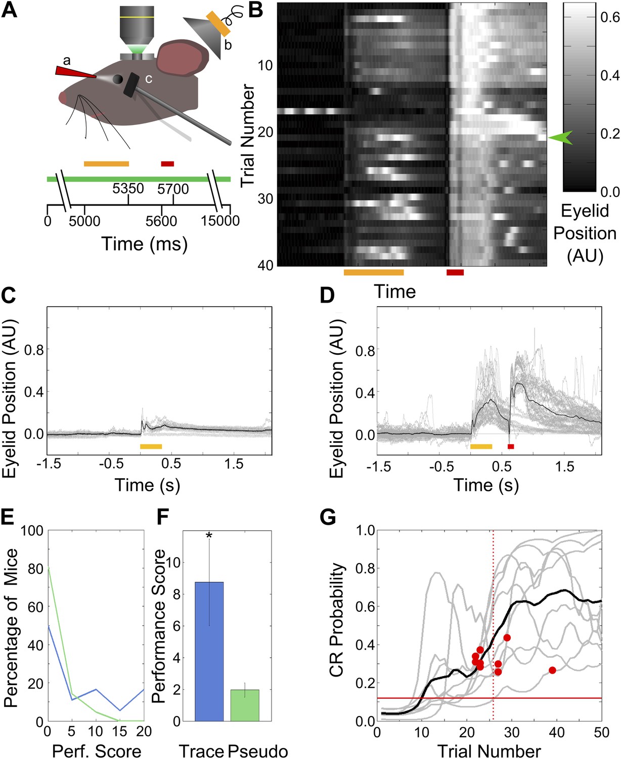
Behavior: trace eye-blink conditioning of mice.
(A) Cartoon schematic of experimental system. Two-photon calcium imaging was carried out in area CA1 of the dorsal hippocampus in a head-fixed mouse which underwent trace eyeblink conditioning. A speaker (yellow, b) was used for tone stimulus delivery, while a nozzle (red, a) directed the aversive air-puff. A magnetometer (black, c) was used to monitor eyelid position in order to detect blinks. Scale bars at the bottom of the figure indicate times of stimulus delivery (yellow and red bars for tone [350 ms long] and puff [100 ms long] respectively, along with the gap in-between [250 ms]) as well as data acquisition (green bar, 15 s long) during a single trial. (B) Sample eyelid position signal traces from a mouse undergoing trace eyeblink conditioning. The color scale indicates eyelid position in arbitrary units, with high values indicating eyelid closure (blink). This mouse started reproducibly showing significant blinks before the air-puff (e.g., green arrow) mid-way through the session. (C and D) Eyelid position traces in response to pre-training tone presentation (C), and both tone and puff stimuli during trace eye-blink conditioning (D). Gray traces are from individual trials and black traces are averages across trials. Yellow and red bars at the bottom indicate times of delivery of tone and air-puff respectively. (E) Distributions of performance scores for trace (blue) and pseudo (green) conditioned mice. (F) Average performance score, which is the ratio of tone evoked significant blink (CR) rates to spontaneous blink rates, is plotted for all trace conditioned mice (blue) and pseudo-conditioned mice (green). Error bars indicate SEM. * indicates p<0.05. (G) Learning curves (gray lines) for the nine mice that learned the association to criterion. The learning trial identified for each mouse is marked with a red circle. The black curve shows average performance across mice. The vertical, dotted line indicates the mean learning trial across mice (trial 26). Each learning curve was obtained by first obtaining a binary list of significant response trials for each mouse, and then using a previously described expectation maximization algorithm to calculate the CR probability on each trial, for individual mice. The horizontal, red line indicates the probability of CRs by chance.
Figure 2 with 1 supplement
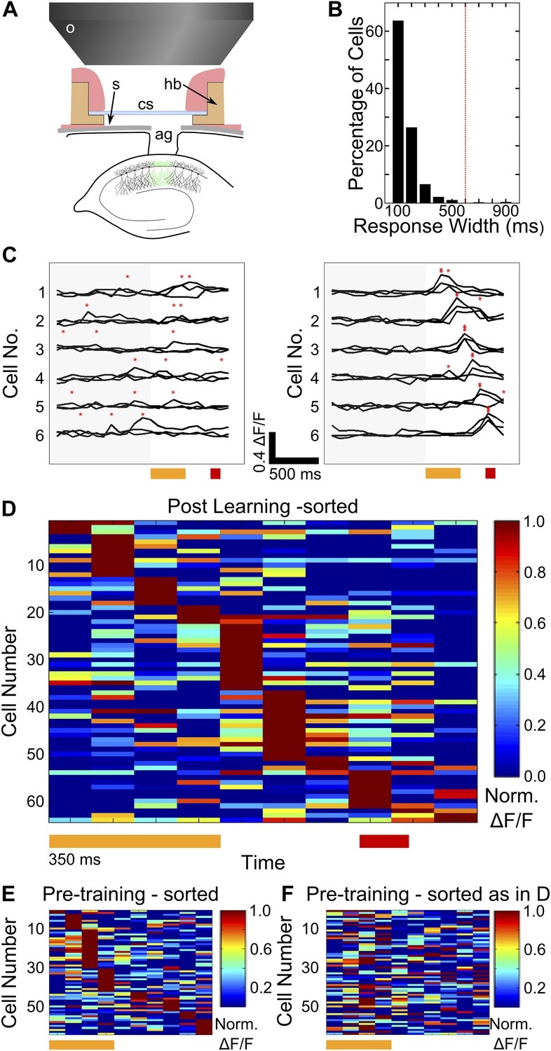
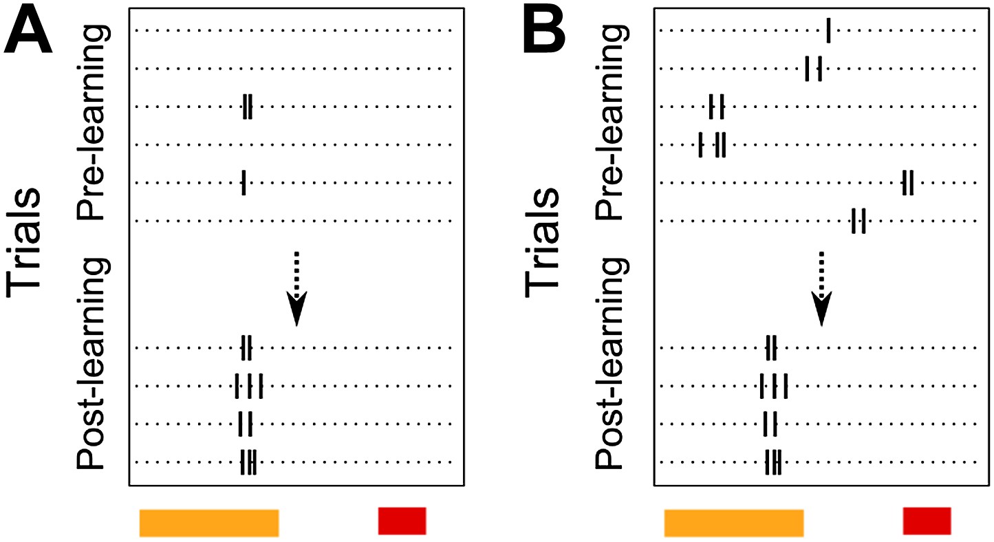
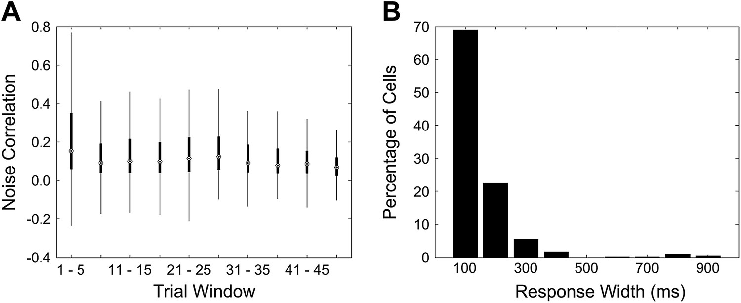
Two-photon imaging of calcium-responses in area CA1 neurons from awake mice.
(A) Schematic of the imaging preparation. o–objective lens, s–skull, cs–cover slip, hb–head bar, ag–agarose. (B) Histogram of neuron response widths in ms, calculated as the time for which a given neuron’s trial-averaged, ΔF/F trace remains above 50% of the peak value. The red, dotted line indicates a response width of 600 ms, which is the time of interest between tone-onset and puff-onset. (C) Area CA1 cell responses show sequentially timed activity peaks after learning. Calcium response (ΔF/F) traces for six exemplar neurons from a single mouse, for sets of three trials before (panel on the left), and after (panel on the right) task learning. Neurons have been sorted as per the timing of the peak in the averaged trace. The yellow and red bars at the bottom represent the times of delivery of tone and puff respectively. The gray shading to the left covers the period of spontaneous activity prior to the onset of the tone. The red asterisks indicate the peak in each individual trace. Scale bars indicate 0.4 ΔF/F and 500 ms along the time axis. (D) Area CA1 cell activity peaks tile the entire CS-on to US-off interval. Area CA1 calcium response traces from an example dataset, sorted by the peak times of the responses. Each response trace has been averaged over all trials following the learning trial (Figure 1G), and has been normalized to the peak ΔF/F response value for each neuron. The yellow and red bars below indicate times of delivery of tone and air-puff respectively. 50% of the neurons from the field of view, with the most reliably timed responses have been shown. This is to make this plot comparable to the ones from subsequent analyses, where neurons have been similarly chosen. (E and F) Cell activity peak timings change during learning. In E, pseudo-colored ΔF/F traces for the period of interest during and after tone delivery, are plotted using data acquired during the pre-training session, where tones without air-puff were delivered. Cells have been sorted as per the timings of peaks in pre-training session data. The yellow bar at the bottom indicates time of delivery of tone (350 ms). In F, the same averaged activity traces as in E have been re-ordered according to each cell’s activity peak timing after learning has occurred, as shown in (D) Plotted in Figure 2—figure supplement 1, are panels depicting the surgical preparation, the numbers of mice from each treatment group, images of dye-loaded tissue taken at multiple depths and basic data quality control analyses.
Figure 2—figure supplement 1
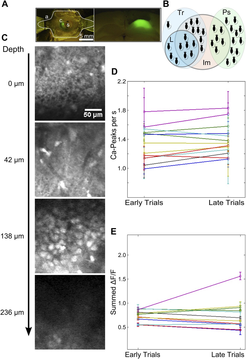
Imaging preparation and calcium response data.
(A) Left: Top-view of a head-fixed, awake mouse. a: white outline of custom-designed head bar affixed to the dorsal surface of the skull using skull-screws and dental acrylic. s: exposed skull. c: craniotomy of diameter ∼ 1 mm. Green fluorescence is due to OGB-1 dye loaded into the dorsal hippocampus. Right: OGB-1 dye-loading in the dorsal hippocampus in a coronal brain section. (B) A Venn-diagram indicating the numbers of mice (black shapes) trained on the trace conditioning task (light blue, dotted border, labeled Tr), that learned the task (blue, solid border, labeled L), that were pseudo-conditioned (green, dotted border, labeled Ps) and from whom calcium imaging data was obtained (red, solid border, labeled Im). (C) A selection of imaged optical slices from a bolus loaded volume in hippocampal area CA1. Scale to the left indicates the depth of each slice in microns, relative to an image of the hippocampal surface. The scale bar is 50 µm in size. Interneurons superficial to the cell-body layer are visible in the second slice from the top. The third slice depicts densely packed cell bodies (CA1 pyramidal cells) in the stratum pyramidale, imaged to acquire calcium response data. (D and E) Mean number of detected calcium peak events (D) and summed area under the ΔF/F curve (E) have been plotted for the first and last quarter of trials, as measures of recording stability. Datasets showing significant changes as per both metrics were discarded. For this, frames from a 4 s time window, starting 5 s after stimulus delivery (assumed to be background activity) was used.
Figure 3 with 2 supplements
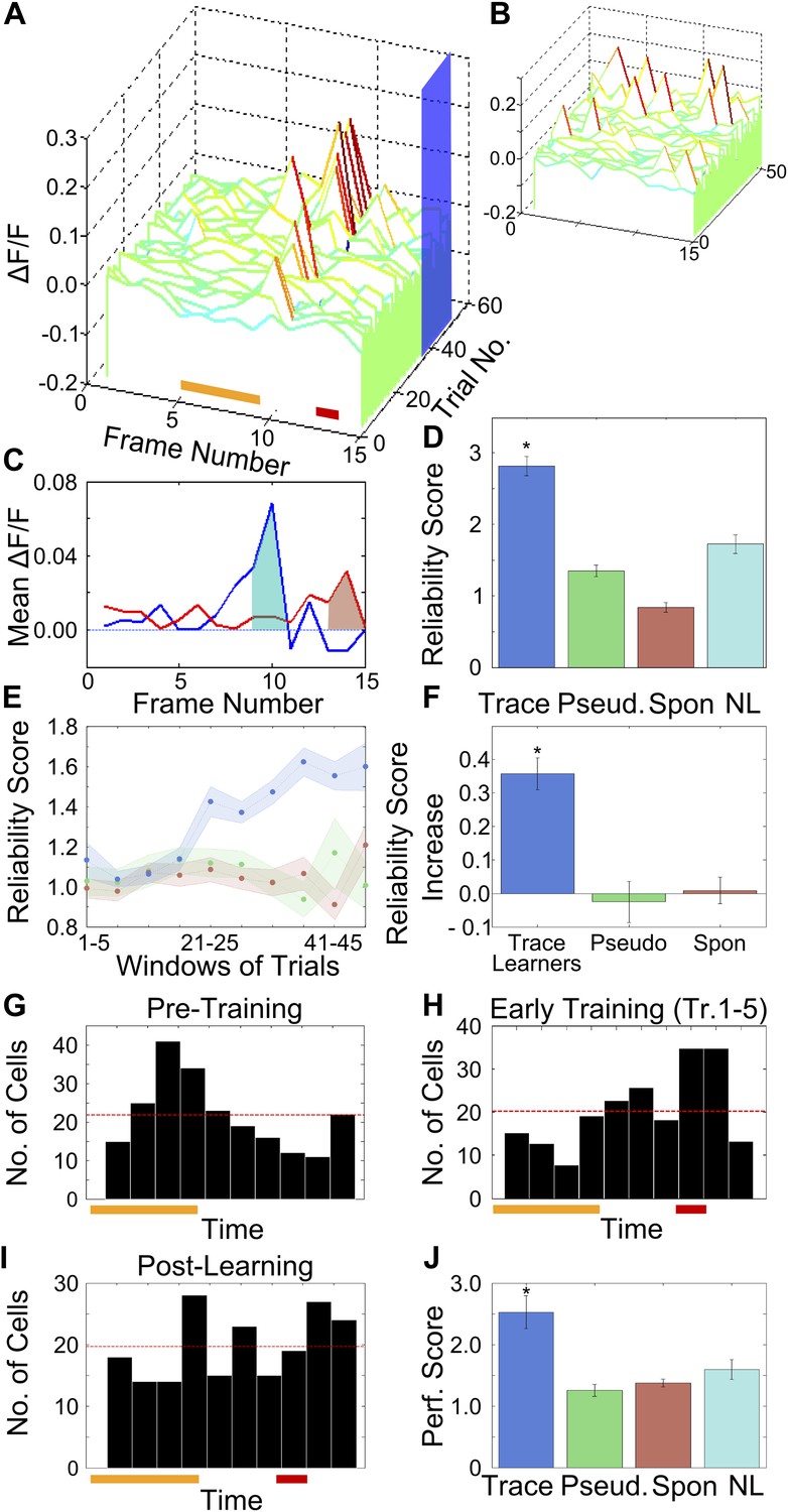
After training, area CA1 cells show reliably timed, sequential calcium responses.
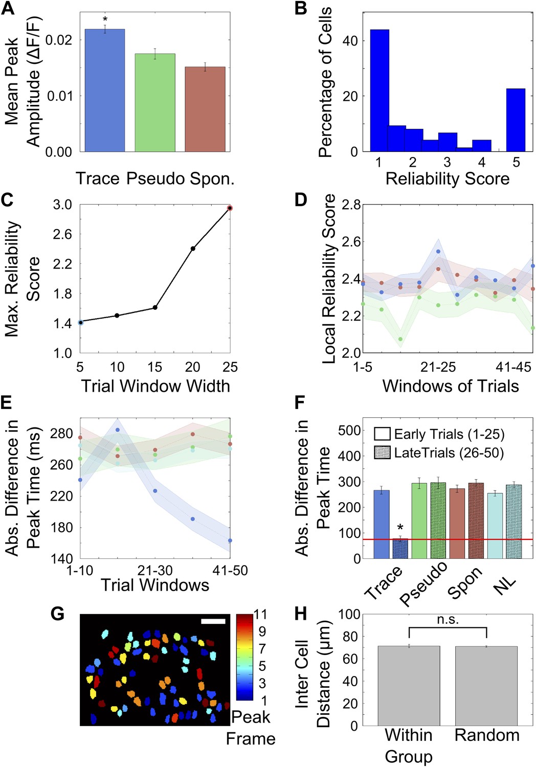
(A) Calcium response traces for an example neuron, aligned to the time of stimulus delivery (tone and puff indicated by yellow and red bars at bottom respectively). Warmer colors in the traces indicate higher ΔF/F values. The blue rectangle on the ‘trial number’ axis indicates the trial averaging window comprising all trials after the learning trial. (B) The same data as in A, except with each trial’s ΔF/F trace given a random time offset. (C) Averaged calcium response curves obtained from aligned, as well as random time-offset traces. The averaged curve from time-aligned traces (blue curve) has a prominent peak, which is absent in the random time offsets case (red curve). This indicates that the neuron fires reliably at a fixed time relative to stimulus delivery. The area under the shaded region (peak ± 1 frame) was used to calculate the reliability score. (D) Area CA1 cells from trace learners show significantly higher activity-timing reliability scores. Average reliability scores for all neurons in the entire dataset for learners of the trace-conditioning task (blue), pseudo-conditioned mice (green) spontaneous activity data (red) and data from non-learners (cyan; * indicates p<0.01). (E) Change in reliability score with learning for neurons from trace conditioned (blue), pseudo-conditioned (green) and spontaneous activity data (red) respectively. Reliability of firing at the final peak response time (PT) gradually increased over the training session. Reliability scores were computed in five-trial bins. The shaded regions represent SEM. (F) Change in reliability scores between early and late blocks of training trials. The increase over the training session for trace-learners was significantly higher than for spontaneous activity data or for pseudo-conditioned mice (* indicates p<0.01). This increase was calculated by subtracting reliability scores of the first half of the session from those of the second half. (G and H) Distributions of single-cell peak response times (PT) at different stages of learning: pre-training (G) and early in training (H). The distribution shifts from one showing distinct peaks at the time of tone delivery in the pre-training stage (G), to one showing a peak at the time of the air-puff during early training (H). Only the PTs of cells with high reliability scores were included in these plots. The red and yellow bars at the bottom indicate times of delivery of tone and air puff respectively. (I) Distribution of single cell peak response times (PT) after the learning trial in trace conditioned mice. For trials after the learning trial, PT is uniformly distributed across all times in the trace interval between tone and puff. Only the PTs of cells with significant reliability scores were included in this plot. (J) Average, time-decoder performance score, pooled across all trace conditioned mice (blue), pseudo-conditioned mice (green), spontaneous background activity (red) and non-learners (cyan). Dotted line indicates chance level scores, error bars indicate SEM (* indicates p<0.01). Figure 3—figure supplement 1, presents further characterization of the reliability score increase. A schematic explaining the time-decoder algorithm is depicted in Figure 3—figure supplement 2.
Figure 3—figure supplement 1
Activity peak times change during learning.
(A) Peak heights in trial-averaged ΔF/F traces are greater for cells from trace conditioned mice than controls. ΔF/F traces from tone onset to air-puff onset were averaged across all trials after learning and peak heights in these traces were determined and plotted for trace (blue bar), pseudo-conditioned (green bar) and spontaneous activity data (red bar) respectively (* indicates p<0.01). (B) Distribution of reliability scores for cells pooled from all mice that learned the trace conditioning task. (C) Reliability score depends on the number of trials averaged or the bin-width. In Figure 3D,F of the main text, reliability scores were calculated by averaging different numbers of trials (trial bin widths of 24 [on average] and 5 respectively). In this figure, we plotted the cell-averaged reliability score calculated using trial a range of trial bin-widths. The point highlighted with a blue circle indicates the bin-width used for Figure 3D and the red-highlighting indicates the bin-width used for Figure 3E. In Figure 3D,E of the main text, reliability scores were calculated by averaging different numbers of trials (trial bin widths of 24 [on average] and 5 respectively). The size of the highest peak in the averaged trace from randomly time-shuffled trials depends on the number of time-shuffled trials averaged. Hence, the reliability score depends on the trial-bin width used to calculate it. As seen in this panel, the highest cell-averaged reliability scores for trial bin-widths of 5 and 25 closely match the reliability scores seen in Figure 3D,F respectively. (D) Reliability scores for neuronal responsiveness at locally determined peak times do not change with learning. This plot shows the mean (solid line) and standard error (shaded areas) of the reliability score for neuron activity at a peak-timing determined locally, within each five-trial window. The blue, green and red curves are for neurons from trace learners, pseudo-conditioned mice and spontaneous activity respectively. (E) Activity peak timings progressively change towards the final peak timings. We computed the local activity peak timing within 10-trial windows over the entire session. Plotted here is the mean, absolute difference between these local peak timings and the final activity peak timings for cells from trace learners (blue), pseudo-conditioned mice (green), spontaneous activity (red) and non-learners (cyan). The solid curves depict mean values and the shaded areas, SEM. Final activity peak timings were computed using trials after the learning trial. (F) Activity peak timings early in the session are different from final, learning-related peak timings. Activity peak timings were calculated for the early half of the session by averaging activity traces for trials 1 to 25. The final peak timing for each cell was determined by averaging every alternate trial from trials 26 to 50. These two sets of peak-timings were then compared with the final, post-learning peak timings determined by averaging a non-overlapping set of trials from the 26–50 trial window. The absolute differences in peak timing have been plotted for trace learners (blue), pseudo-conditioned mice (green), spontaneous activity (red) and non-learners (cyan). For trace learners, the mean timing-difference is significantly higher for peak timings determined early in the session (solid colored bars) than for those determined in the latter half (bars with black hatch pattern). Peak timing difference does not decrease for all controls. The red line indicates the average frame time across datasets (* indicates p<0.01). (G) Cell-groups sharing peak activity timing are randomly distributed in the field of view. Neuron masks from an example field of view in a trace learner mouse, color-coded as per the timing (frame number) of peak calcium fluorescence within the tone to puff period. Scale bar represents 50 microns. (H) Average, pair-wise distances between neurons sharing the same peak timing (left) and random neuron pairs (right) are plotted, with error-bars marking SEM.
Figure 3—figure supplement 2
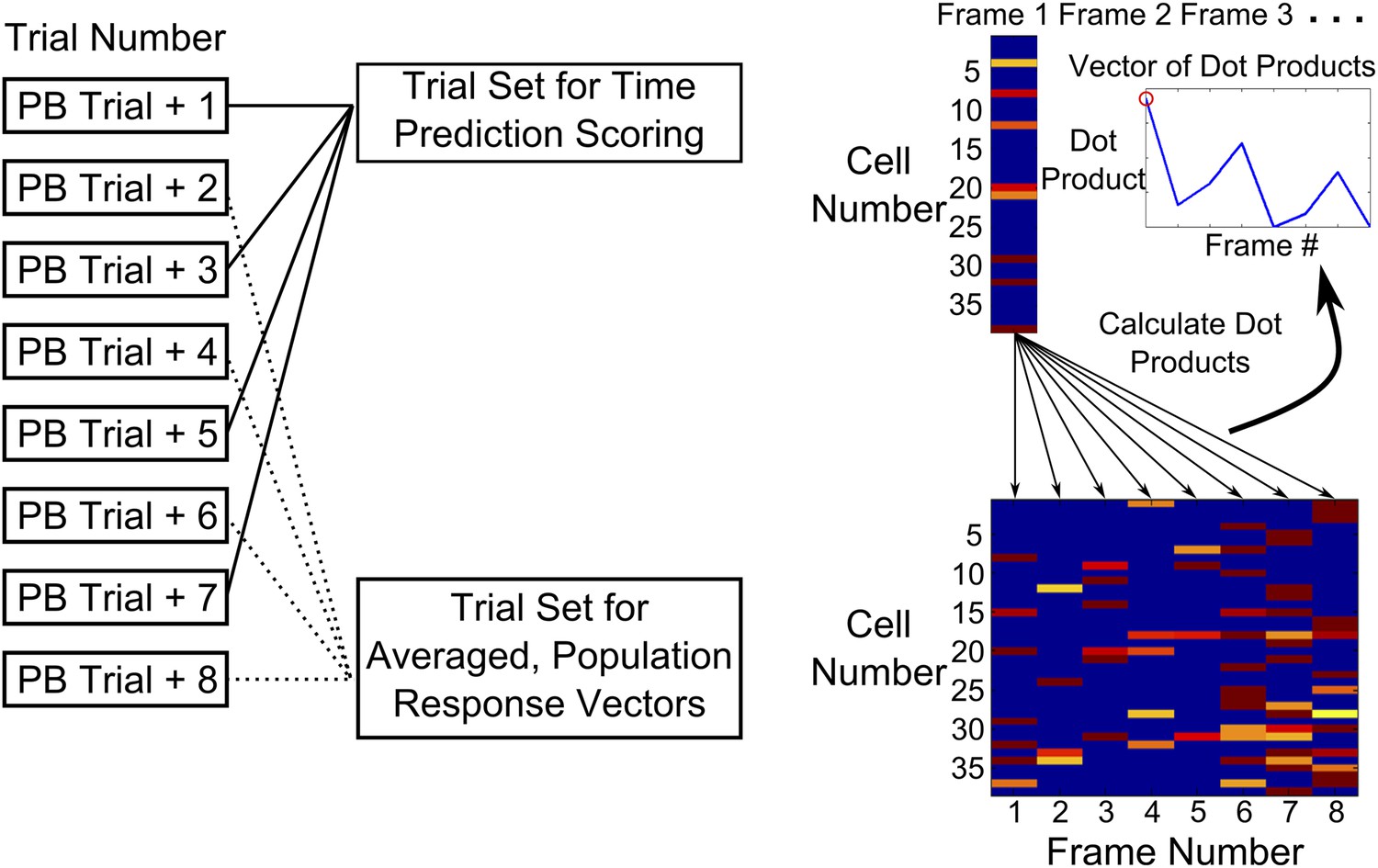
Time-decoder algorithm.
Schematic explaining the use of a template matching time decoder. Trials after peak behavioral trial were alternately split into two groups—one training set averaged to obtain a template of expected population response vectors for each time-point and another test group of trials used to calculate performance. To compute the performance score, we first measured the similarity (dot-product) of every test trial frame, with all expected population response vectors. Performance scores (PS) were then determined by computing the ratio of the dot product for the correct frame to a weighted mean of the dot products for the incorrect ones (‘Experimental Procedures’).
Figure 4 with 1 supplement
Area CA1 cell noise-correlations increase transiently during training.
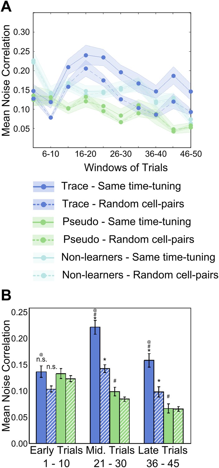
(A) Average neuron-pair noise correlations plotted as a function of training trials for task learner mice (blue curves), pseudo-conditioned mice (green curves) and non-learners (cyan curves). Solid lines represent average noise correlations between neurons that share similar time tuning (same PT), whereas dashed lines indicate average noise correlations between random neuron pairs. Pair-wise noise correlations have been determined from spontaneous activity traces over five trial windows. Shaded regions indicate SEM. (B) Summary statistics comparing average noise correlations across early (trials 1–10), middle (trials 21–30) and late (trials 36–45) stages of training, between task learner mice (blue bars) and pseudo-conditioned mice (green bars). Solid bars represent average noise correlations between neurons that share similar time tuning (same PT) whereas hatched bars represent average noise correlations between random neuron pairs. Error bars represent SEM. (* indicates within condition [same time-tuning v/s random cell-pairs], # indicates across conditions [trace learners v/s pseudo-conditioned] and @ indicates comparisons across stages of learning [early v/s middle v/s late], p<0.01; n.s. indicates not significant). Figure 4—figure supplement 1A depicts the point in the session at which behavioral CR rates, CA1 cell timing reliability and spontaneous activity correlations reach their peaks, on an individual mouse basis. It also presents further characterization of the changes in NC during learning.
Figure 4—figure supplement 1
Peaks of CR rate curve, CA1 activity timing reliability and NC; characterization of NC changes during learning.
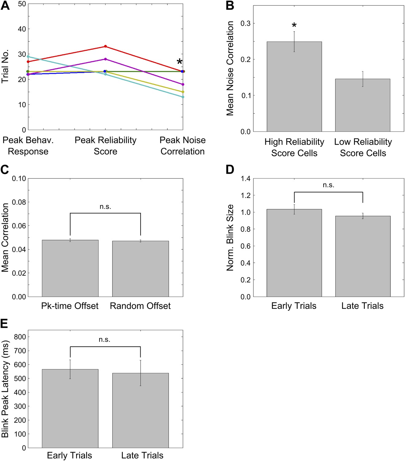
(A) Plots for individual mice, showing the trial number (or middle of trial-bin) of the training session when the learning trials, peaks in mean reliability scores of time-locked activity and mean spontaneous activity correlations occurred. For mean reliability scores and noise-correlations, the centers of the peak trial-bins have been plotted. Circles of a given color indicate values for a given mouse that learned the association. * indicates p<0.05. (B) Noise correlations are higher for neurons with high activity timing reliability scores. Neurons were classified into two groups based on their activity timing reliability scores. The spontaneous activity correlations were calculated for pairs of cells sharing the same activity peak timing. Plotted here are the mean spontaneous activity correlations for high and low reliability score groups. * indicates p=0.004. (C) Stimulus period activity sequences are not detectable in spontaneous activity. Spontaneous period activity traces for each neuron were given time offsets equal to the neurons peak timing in the stimulus period sequence. Thereafter, correlation coefficients were calculated for all neuron pairs. If similar sequences were re-capitulated during spontaneous activity, these correlations would be high. As a control, traces were given offsets randomly chosen from the existing peak timings and the same calculations carried out. The correlations of peak time offset activity traces were not significantly different from those for randomly offset traces (n.s.–p=0.71). (D) Mouse blink sizes remain stable over the training session. Blink size was estimated by calculating the area under the eyelid position curve during the tone-onset to puff-onset period for significant blink trials. The mean blink sizes before and after trial 25 of the training session were calculated across mice and compared and found not to be significantly different (n.s.–p=0.62). (E) Mouse blink peak latencies remain stable through the session. The latencies of the peak of the eyelid position trace from the time of tone onset were measured for significant blink trials. The mean blink latencies before and after trial 25 of the training session were calculated across mice and compared and found not to be significantly different (n.s.–p=0.80).
Figure 5 with 1 supplement

Correlated neurons are spatially clustered.
(A) Neurons within clusters show within-group, correlated activity. Spontaneous, ΔF/F calcium activity traces for neurons from an example dataset. Neurons are sorted as per clusters identified by meta k-means clustering. Cluster boundaries are indicated by red, dotted-lines. The color scale represents ΔF/F amplitude. A short, 6 s stretch of the traces outlined by the yellow box have been re-plotted on the right for clearer visibility. The white asterisk indicates a bout of correlated activity in a cluster. (B) Pair-wise noise correlation matrix for neurons sorted as per cluster identity, for the dataset in (A). Color scale represents the pairwise correlation coefficient during spontaneous activity (noise correlation). Boxes indicate within-cluster spontaneous activity correlations. (C) Masks of neuron ROIs for the dataset shown in A and B, color coded as per cluster identity. (D) Comparison of distributions of within cluster (gray) and across cluster (black) correlation-coefficients. The distributions are significantly different (p<10−4). (E) The same field of view, with neuron ROIs color-coded by timing of their activity peak in post-training trials (top) and by correlation cluster number (bottom). The number of cells in the top panel is smaller as only 50% of the cells with the highest reliability scores were found to be time-tuned. (F) Correlated cell-clusters are spatially organized. Inter-cell distances or the distances between the centroids of pairs of neurons, when both belong to the same noise-correlation cluster (Intra-Cluster) or when they belong to different clusters (Inter-Cluster). Error bars indicate SEM. (* indicates p<10−4). Figure 5—figure supplement 1 shows that the spontaneous activity correlations between pairs of cells fall off with increasing distance between the cells being considered.
Figure 5—figure supplement 1
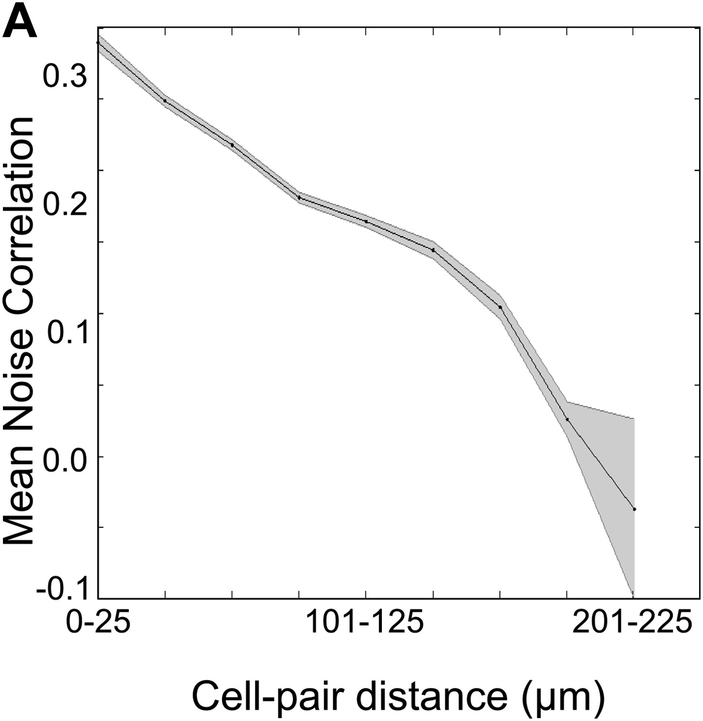
Spontaneous activity correlations fall with increasing inter-cell distance.
Mean of the spontaneous activity correlations for all cell-pairs plotted against the binned distances between these cell-pairs. The shaded area represents SEM. Correlation coefficient = −0.178, p<10−4.
Figure 6
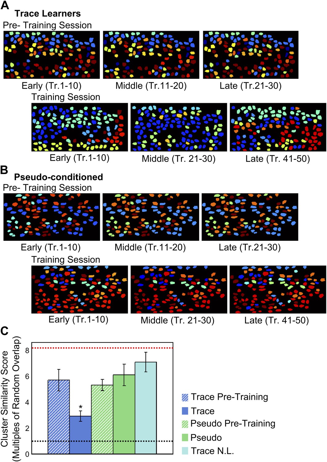
Correlated neuron-groups are spatially re-distributed during trace conditioning.
(A and B) Sample trace-conditioned (A) and pseudo-conditioned (B) mouse neuron-clusters, identified in early (left), middle (center) and late (right) trials, for pre-training (top) as well as training (bottom) sessions. Neurons have been color-coded as per the noise-correlation cluster they belong to, and cluster numbers have been sorted for maximum cluster member overlap across trial-groups. (C) Spatial organization of correlated cell-clusters changes during learning. Summarized statistical testing of stability of clusters over the training session. A cluster similarity score (SS) was computed to measure the similarity between clusters from different parts of the session. Mean similarity scores for clusters of neurons from trace conditioned mice are shown in blue, pseudo-conditioned mice in green, and non-learners in cyan. Pre-training session scores are displayed as hatched bars and training session scores, solid bars. Error-bars denote SEM. The black, dotted line denotes chance level overlap score, and the red, dotted line indicates mean overlap score with perfectly overlapping clusters (* indicates p<0.01).
Figure 7
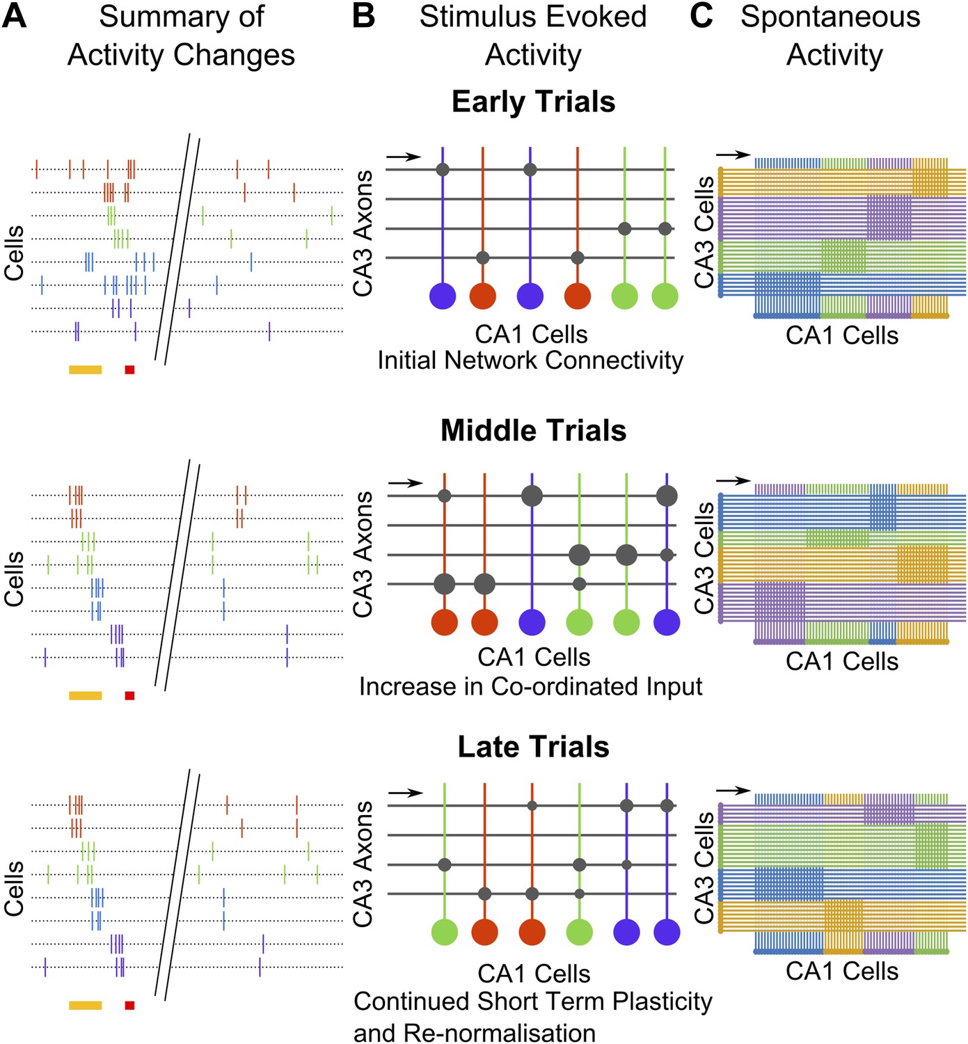
Summary and model schematics.
(A) Schematic summarizing findings: early in the session (top), neuron activity peaks are tuned to stimuli. Spontaneous activity is largely un-correlated. By the middle of the session (center), time-tuned activity during the stimulus period begins to emerge, after spontaneous activity correlations have risen. At the end of the session (bottom), stimulus–period activity is time-tuned, but spontaneous correlations have fallen back towards baseline levels. (B) Cartoon model of possible network changes occurring at the synaptic level: early in training (top), CA3 to CA1 synapses (gray circles) are at baseline strengths. As training progresses, specific synapses are strengthened (larger gray circles), towards the middle of the session (middle). At this point, neurons that share time tuning also begin to display increased noise-correlations as they receive more common input. Late in the training session (bottom), after repeated re-organization of the network, synapses undergo homeostatic normalization (gray circles reduced in size), thus causing total common input and spontaneous activity correlations to drop. (C) Schematic diagram depicting network changes at the level of groups of cells. CA1 cell clusters (horizontal row at bottom of each panel; clusters are color-coded) have high correlations in spontaneous activity, receiving shared input (direction indicated with black arrows) from groups of CA3 cells that are also correlated in their spontaneous activity. These correlation-groups of cells are spatially clustered. As learning progresses, the clusters of correlated CA3 cells change, resulting in changes in the groups of correlated CA1 cells. These new groups are also spatially organized, but differ significantly from pre-training groups.
Author response image 1
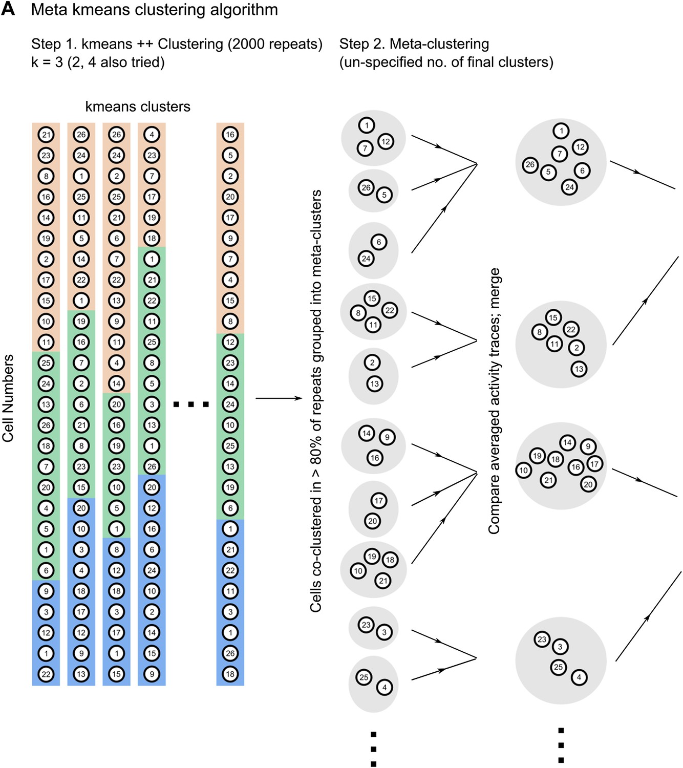
Schematic describing how the meta k-means clustering algorithm works.
Author response image 2
Schematic diagram depicting two possible patterns of learning related changes in timing of activity peaks. A Activity peak timing is fixed from the beginning of the session, only reliability of trial to trial activity increases with learning. B Activity peak timing changes with training, with reliable activity at a fixed timing being seen only towards the end of the session.
Author response image 3
A Mean noise correlations for non-learners are high in the first trial bin. This is not due to the presence of a few outliers. This panel is a box and whisker plot for the noise correlation data corresponding to the non-learners curve (cyan curve) in Figure 4 A. The boxes depict upper and lower quartiles around the median (black circle) noise correlation values for each window of trials. The whiskers represent the most extreme data values to lie within 1.5 quartiles from the upper and lower quartiles. B Response widths during the post-stimulus period are shorter than 1 s for cells from non-learners. Cell dF/F traces for the first 5 trials were averaged and then response widths were calculated for these trial-averaged traces for a 4 s period after the end of the puff stimulus. This was done in the same manner as for Figure 2 B.
Videos
Video 1
Mouse Behavior.
Video of mouse eyeblink behavior acquired at 100 frames per second (fps) and played back at 10 fps (i.e. 0.1x speed). A yellow spot in the bottom-right corner indicates when tone is being delivered, and a red spot indicates when the air-puff is being delivered. Frames from three trials, at different points in the session are shown, depicting behavior early in the session, prior to learning, and late in the session after learning. The last portion of the video shows eyeblink behavior in a probe-trial, where the tone was presented but no air-puff was delivered.
Video 2
Calcium responses.
Video showing a time-series of images of a single field of view of area CA1 cells. Brighter colors in the gray-scale indicate higher fluorescence intensities. Flashes visible are calcium responses.
Video 3
z-stack of dye-loaded hippocampal tissue.
Video showing optical sections through a typical, dye-loaded imaging preparation of the dorsal hippocampus. Optical sections were acquired beginning at the dorsal hippocampal surface and moving ventrally in steps of 2 µm/frame. The scale bar represents 50 µm. The densely-packed cell-bodies of the curved, stratum pyramidale cell-body layer appear near the 7 s time-point in the video. The frames of this video show some motion—they were not motion corrected as each frame was taken at a different depth and thus, differed from the others.
Download links
A two-part list of links to download the article, or parts of the article, in various formats.
Downloads (link to download the article as PDF)
Open citations (links to open the citations from this article in various online reference manager services)
Cite this article (links to download the citations from this article in formats compatible with various reference manager tools)
CA1 cell activity sequences emerge after reorganization of network correlation structure during associative learning
eLife 3:e01982.
https://doi.org/10.7554/eLife.01982


