Linking traits based on their shared molecular mechanisms
- Tel Aviv University, Israel
Figures
Figure 1 with 2 supplements
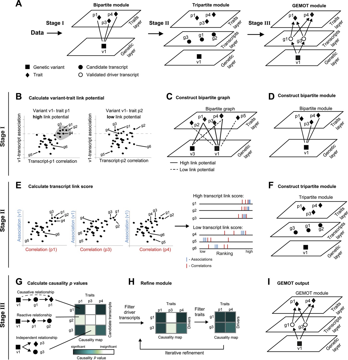
Schematic illustration of the GEMOT algorithm.
(A) An overview of GEMOT for the scenario depicted in Figure 1—figure supplement 1A. GEMOT incorporates 3 stages (I, II and III) that are schematically described in B–D, E–F and G–I, respectively. Stage I: (B) High and low link-potential scores for pairs of variants and traits. A typical calculation for variant–trait pairs (left: v1–p1, right: v1–p2). Shown are variant–transcript associations (y-axis) and transcript–trait correlations (x-axis) for each transcript (black dots). GEMOT uses a threshold (horizontal dashed line) to compare the distribution of transcript–trait correlation in high and low transcript–variant associations scores. Link potential is high (left) when the distributions of correlation differ between the high and low association range more than expected by chance; link potential is low (right) where no difference is observed. Notably, a high link potential reflects the potential that some transcripts may translate between a variant and a trait, although such transcripts are not yet specified. (C) Bipartite graph construction. GEMOT constructs a graph whose two parts are variants (squares) and traits (diamonds); edge weights are the link-potential scores (solid lines, high; dashed lines, low). (D) Bipartite module identification. GEMOT identifies ‘heavy’ biclusters in the bipartite graph (in this example, 1 module). Stage II: (E) Transcript link score. The input is provided by all calculated correlation and association scores (such as the three plots on the left). On the right: given a transcript, GEMOT aggregates and ranks all its scores in a horizontal track (red, correlations; blue, associations) and uses the distribution of ranks to score the transcript for significance. (F) Tripartite module construction. GEMOT adds high-scoring transcripts from E, referred to as ‘candidate transcripts’ (circles), to the module. Stage III: (G) Causality p value scores. GEMOT uses a statistical score to assess causative relationships (blue, significant; white, non-significant) for each transcript (row) and trait (column) in a module. Non-causative relationships attain non-significant scores (cartoon examples on the left). (H) Module refinement. Starting with the causality p value scores for the tripartite module (from G), GEMOT eliminates non-causative transcripts (left) and non-affected traits (right) in an iterative manner. (I) The resulting GEMOT module (arrows, causative relationships).
Figure 1—figure supplement 1
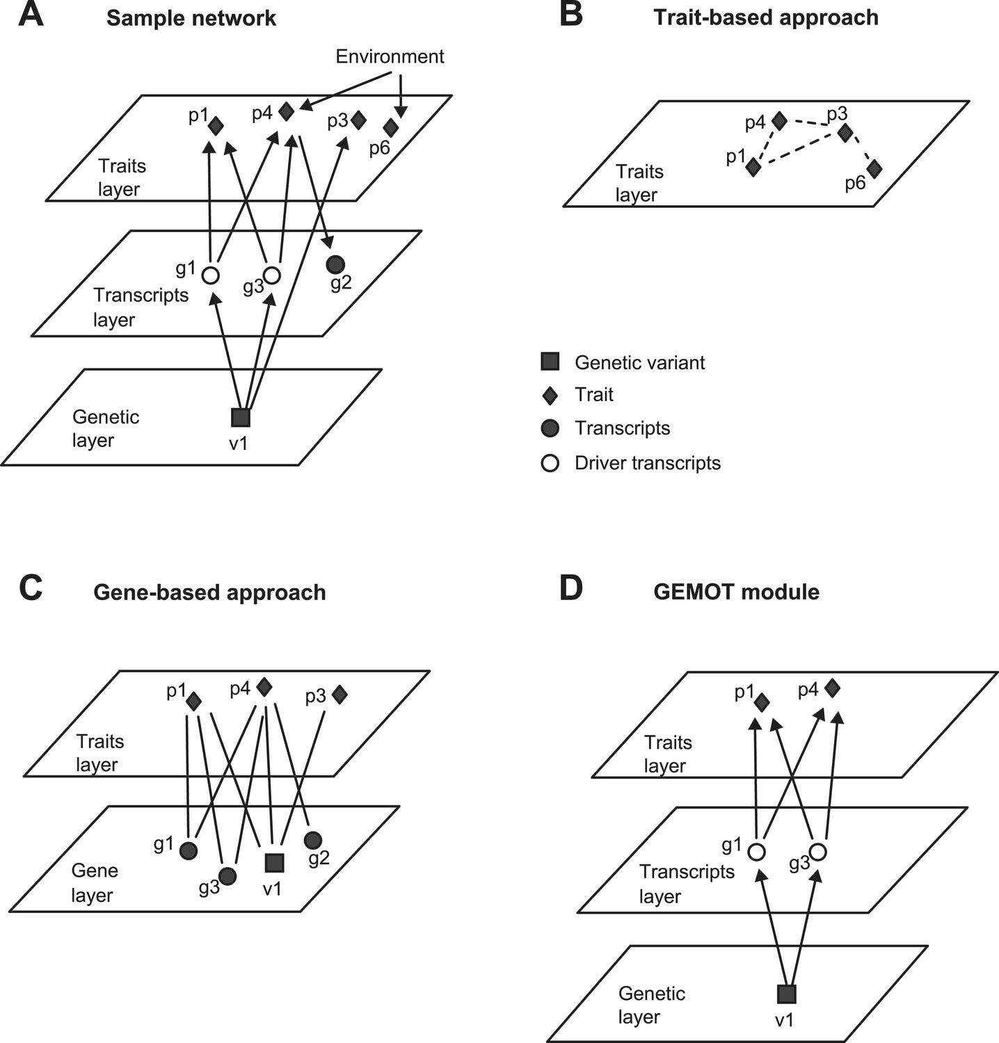
An example of GEMOT methodology compared to alternative methods.
(A) A sample group of related traits and their related mechanisms. The illustration exemplifies a scenario of two causative gene transcripts (g1 and g3) translating between a certain genetic variant (v1) and 2 traits (p1, p4). An additional transcript g2 is reactive to trait p4 and an additional trait p3 is affected by v1 independently of any driver transcript. Traits p4 and p6 are influenced by the same environmental factor. (B) Trait-based grouping methods, applied on the data from A. All four traits are grouped according to either shared environmental factors or shared molecular factors, but the underlying mechanisms are not specified. (C) Gene-based methods, applied on the data from A. The model consists of a group of traits (p1, p3, p4) that share enriched relationships to a group of transcripts (v1, g1–g3). Although environment-based relationships are purposely omitted here, the model still includes various types of relationships among transcripts and traits. (D) Our 3-layer GEMOT methodology, applied on the sample shown in A. The GEMOT module consists of causative transcripts called ‘driver transcripts’ (g1 and g3, middle) translating between a certain genomic interval (variant v1) and a group of traits affected by the drivers (p1, p4). The model avoids components that are related only through reactive or independent relationships (p3, g2) or by environmental factors (p6). Diamonds, traits; squares, genetic variants; circles, transcripts; empty circles, driver transcripts.
Figure 1—figure supplement 2
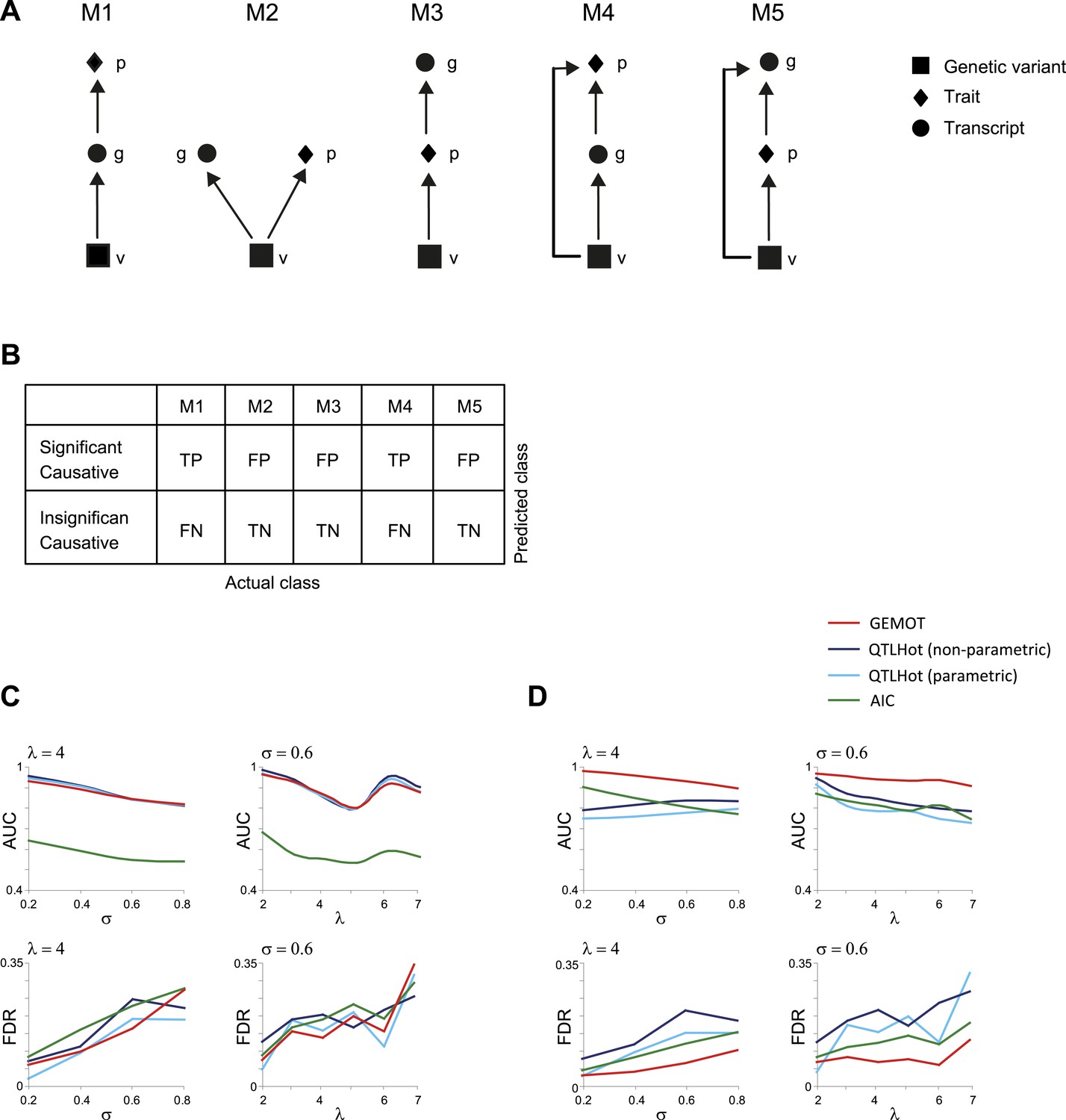
Evaluation of methods for identifying (broad sense) causative relationships.
(A) Causal models M1–M5. (B) Shown is an error matrix, where each cell i, j, represents whether prediction in row i is TP, TN, FP or FN, when the data were generated using the model in column j. (C and D) AUC (top) and FDR (bottom) scores (y-axis) when using synthetic models of types M1–M3 (C) or when using synthetic models M1–M5 (D). Scores are presented across varying levels of σ (x-axis, using fixed λ = 4; left panels) or across varying values of λ (x-axis, using fixed σ = 0.6; right panels). Presented are four methods (color coded): an AIC-based method (Lee et al., 2009), parametric and non-parametric QTLHot (Neto et al., 2013), and its modification in GEMOT (‘Materials and methods’). The results indicate that GEMOT performs similarly or better than the existing methods in identifying broad-sense causality.
Figure 2 with 5 supplements
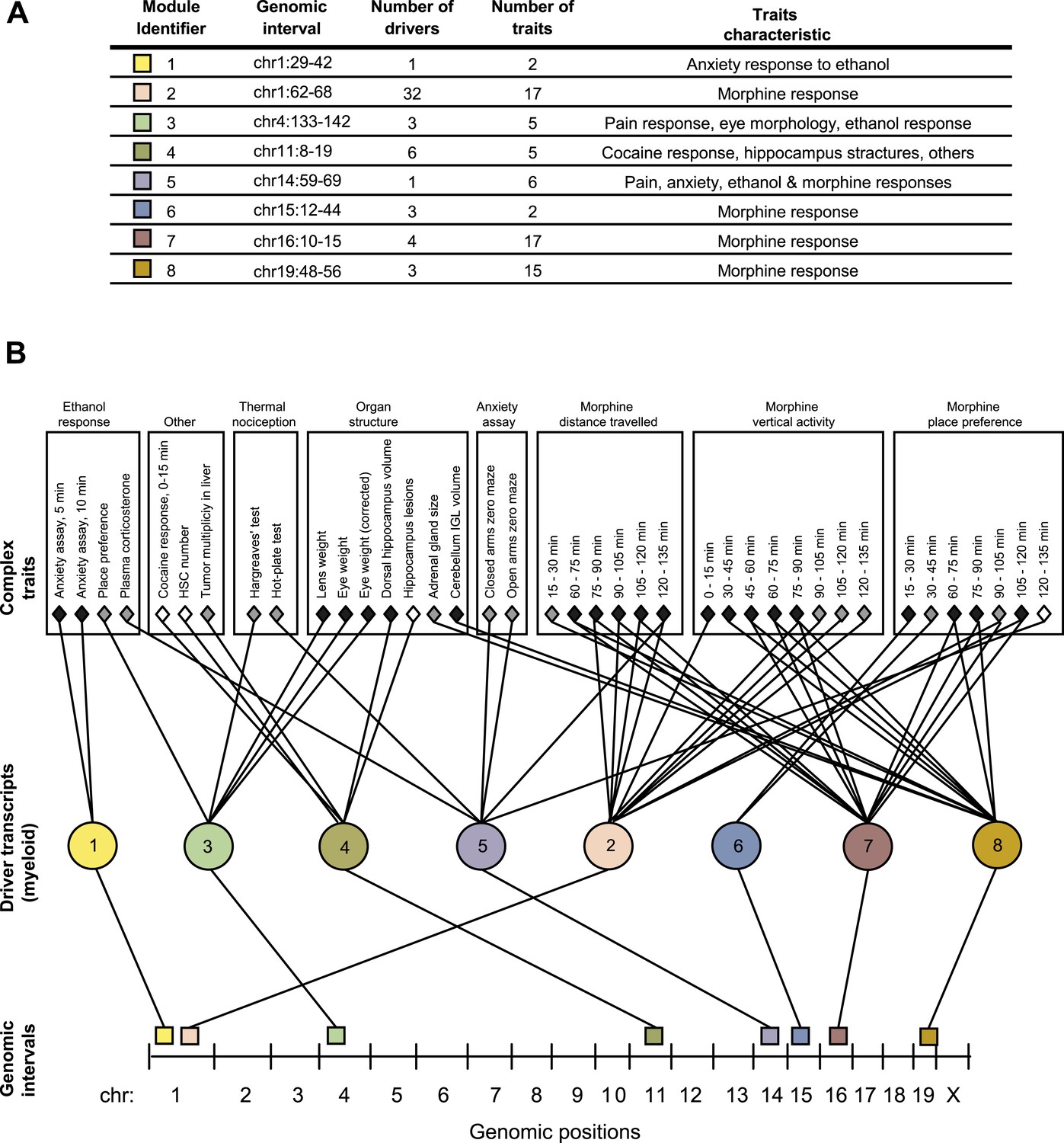
GEMOT modules in BXD mouse strains.
(A) Shown is a module identifier (column 1), its genomic interval (column 2), the numbers of driver transcripts and traits in the module (columns 3 and 4, respectively), and the main characteristic of its traits (column 5, see description in Supplementary file 1A). (B) Global visualization of the GEMOT modules. The graph presents the genomic intervals (squares, bottom), the transcripts (circles, middle) and traits (diamonds, top) of all eight resulting GEMOT modules. The transcripts, which are unique to each module, are connected to their module's variants and traits. Sets of traits known to be related to the same process are enclosed in a box and labeled (top). The module's genetic and transcripts layers are color coded as in A; the traits are color coded based on their gender: female (white), male (gray) or both (black). Notably, some modules have overlapping collections of traits, or their traits relate to the same process.
Figure 2—figure supplement 1
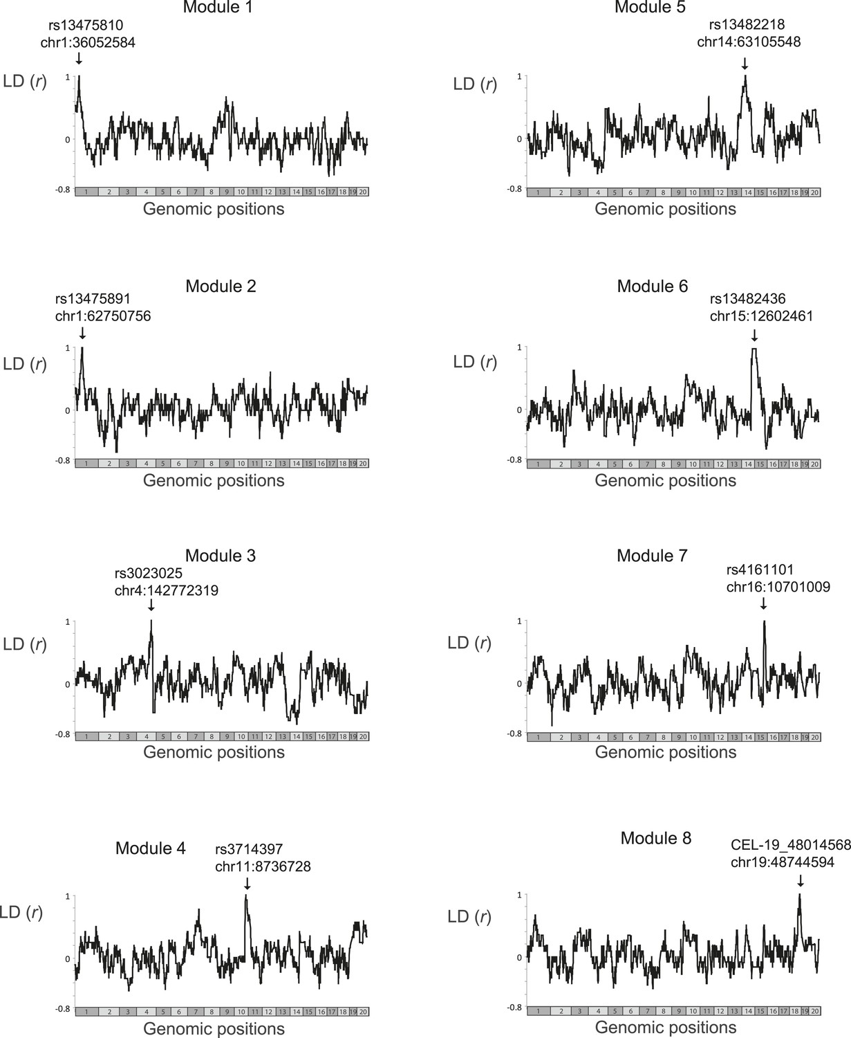
Linkage disequilibrium.
Scatter plots of linkage disequilibrium (correlation coefficient, y-axis) between all variants in the genome (x-axis) and the single representative genetic variant of a single module (marked by arrows). The analysis was applied only on those BXD mouse strains that were profiled in the myeloid gene-expression dataset (Gerrits et al., 2009) and were therefore used by the GEMOT algorithm in this study. Notably, for each module, none of the genomic positions outside its genomic interval was in absolute linkage disequilibrium that is larger than 0.75. Within the module's genomic interval, linkage disequilibrium reached 1, as expected.
Figure 2—figure supplement 2
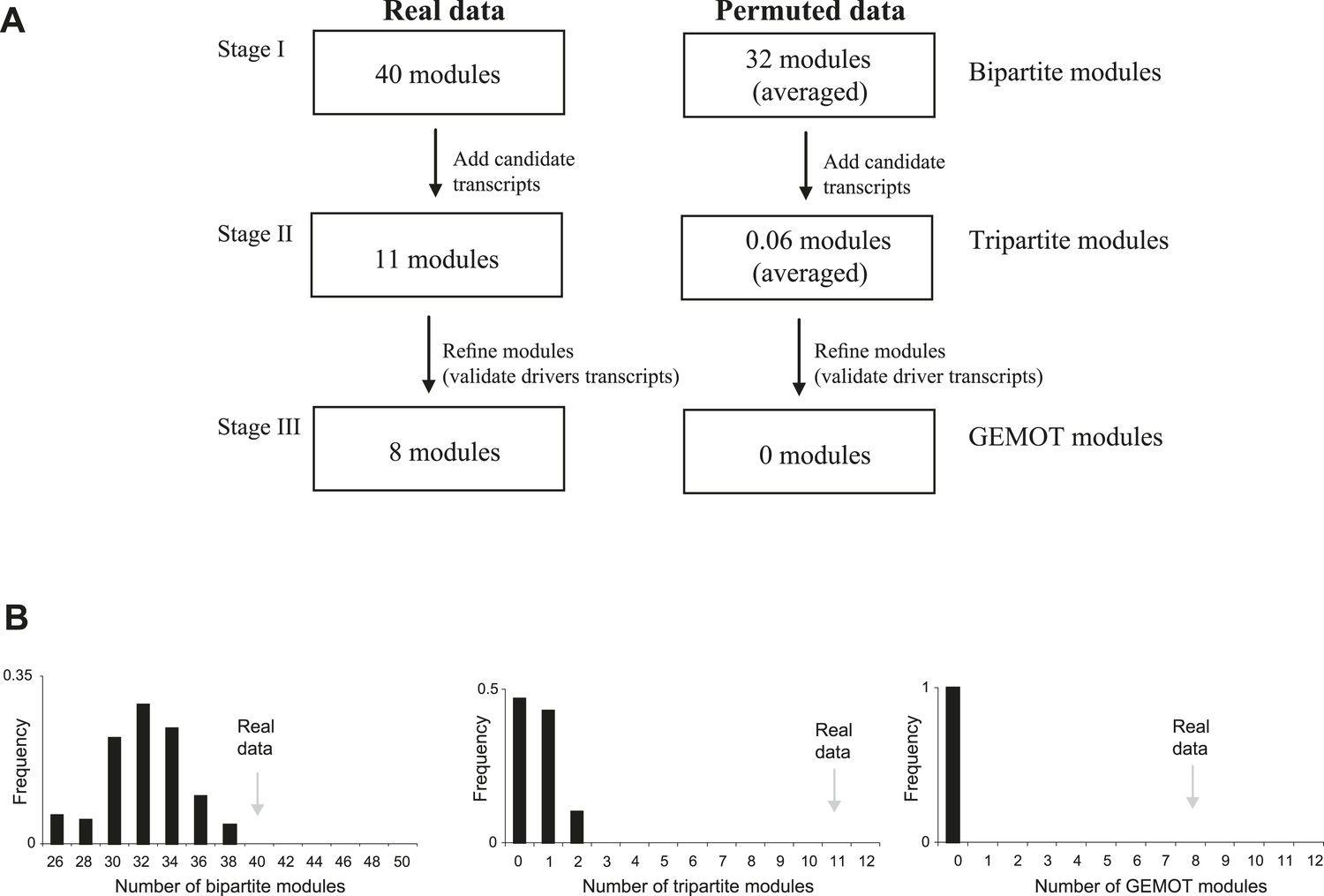
Application of GEMOT on real and on permuted data.
(A) Overview of the GEMOT algorithm applied on real data (in myeloid tissue) compared to permuted data (see ‘Materials and methods’). (B) A larger number of modules for real data than for permuted data. The histogram shows numbers of modules in the permuted dataset (x-axis, 100 repeats). Numbers of modules in the real data are indicated by gray arrows. The three plots record the numbers of modules that were constructed during stages I to III of the GEMOT algorithm (left to right, respectively).
Figure 2—figure supplement 3
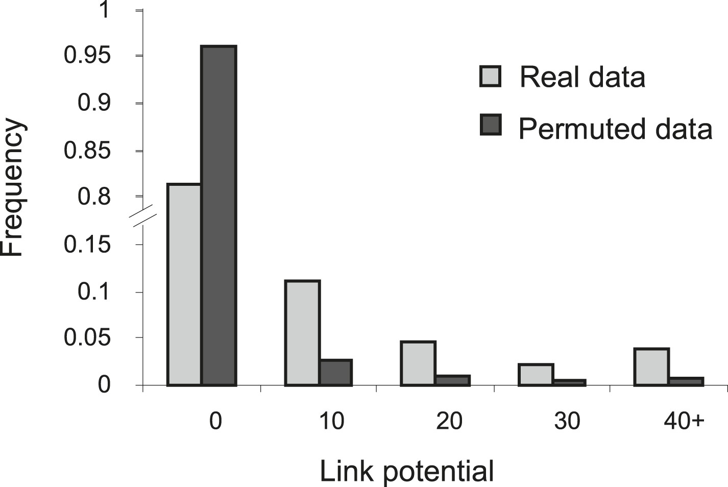
Higher link potential scores for real data than for permuted data.
Shown is a histogram representing the frequency (y-axis) of different link-potential ranges (x-axis) generated on the basis of real data (myeloid tissue, gray) compared to permuted data (black; see ‘Materials and methods’).
Figure 2—figure supplement 4
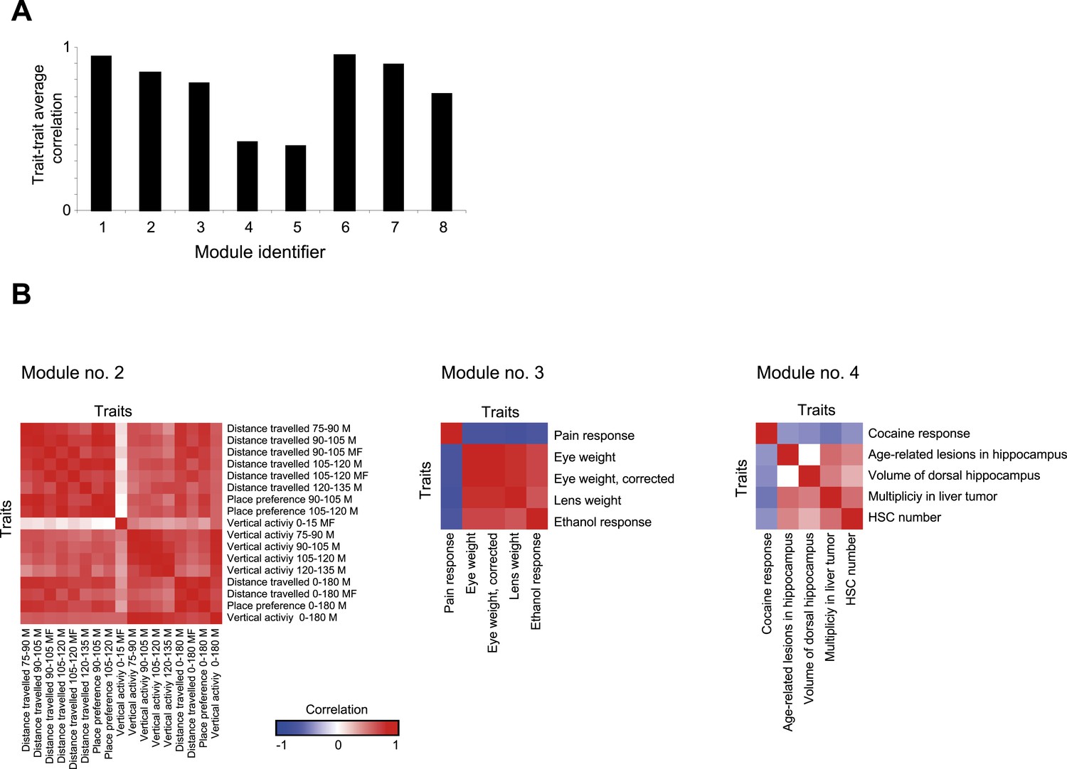
Trait- trait correlations in GEMOT modules.
(A) Shown is the average trait–trait absolute correlation coefficient (y-axis) in each of the GEMOT modules (x-axis). (B). Matrices of trait–trait Pearson correlation coefficient (blue/red scale indicates negative/positive correlations) for three exemplified modules: modules nos. 2 (left), 3 (middle) and 4 (right).
Figure 2—figure supplement 5
Characterization of GEMOT modules in BXD mouse strains.
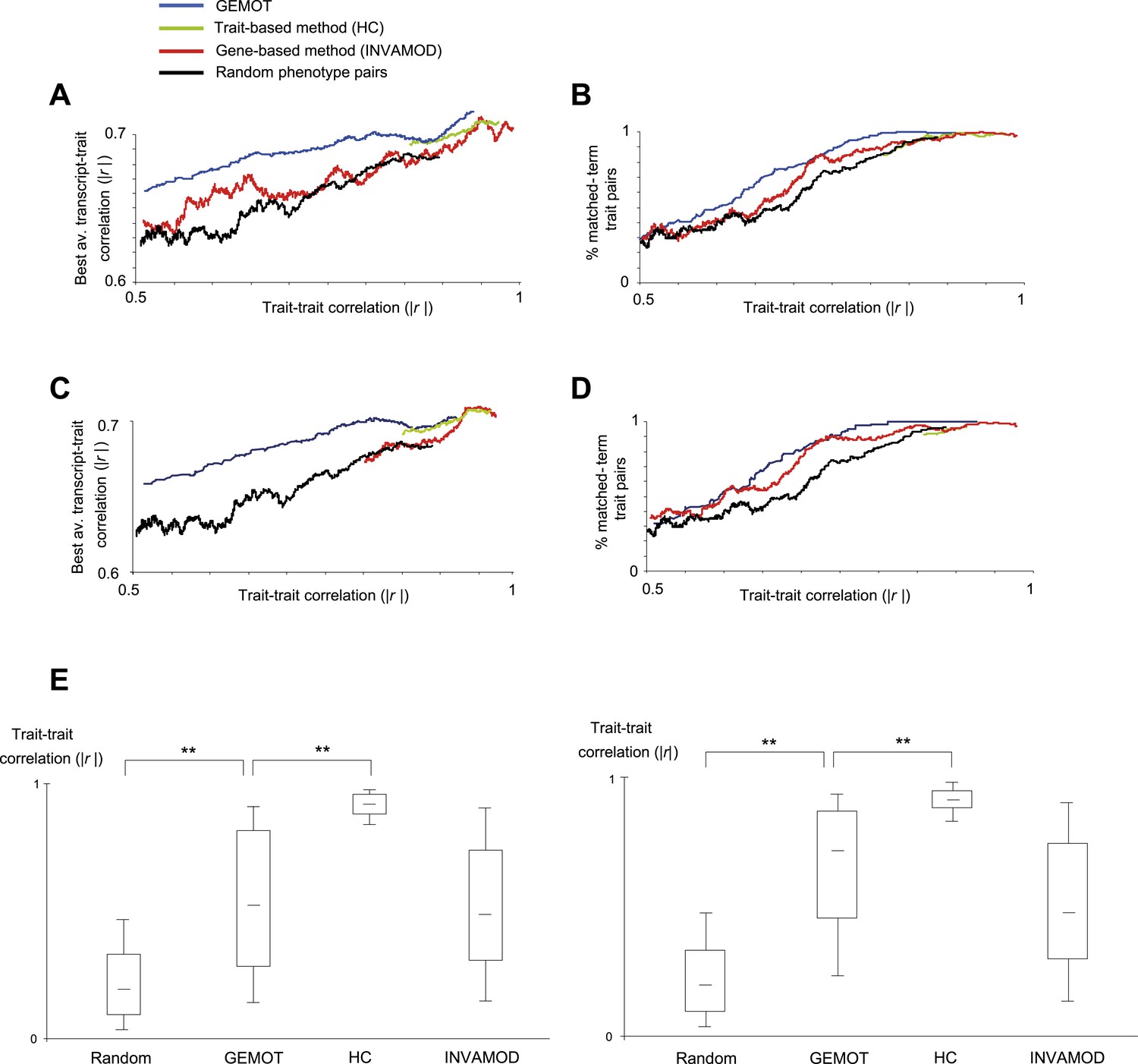
(A and B) Evaluation of pairs of traits predicted to be in the same group based on the GEMOT methodology (blue), the trait-based hierarchical clustering approach (‘HC’, green), the gene-based INVAMOD method (red), and random trait pairs (black). Results are presented for GEMOT's 40 bipartite modules compared to the top 40 predictions from each of the existing methods. (A) Absolute correlation coefficients between the two traits in a pair (x-axis) vs their best average absolute-correlation with a gene transcript (y-axis). (B) Percentages of matched biological annotations (terms) within the description of 2 traits in a pair (y-axis) vs their trait–trait absolute correlation (x-axis). The higher the percentage of matched annotation terms, the higher the agreement between trait-pairing predictions and prior knowledge. The plots were generated using the moving average of a window of 200 trait pairs. In both cases, GEMOT outperformed the other methods along a wide range of trait–trait correlation values. (C and D) Evaluation of pairs of traits predicted to be in the same group, presented as in plots A and B but using the 8 GEMOT modules and eight top-scoring groups from each of the existing methods. As with the 40 bipartite modules (in plots A and B), GEMOT outperformed the other methods along a wide range of trait–trait correlation values. (E) Correlations between trait pairs. Shown are the absolute correlation coefficients between trait pairs from modules of different grouping methods (left to right: random, GEMOT, HC, and INVAMOD; x-axis). Results are presented for GEMOT's 40 bipartite modules (left) and 8 GEMOT modules (right); in each plot we use the same number of top-scoring groups from each of the compared methods. In each box the central mark is the median; edges are the 25th and 75th percentiles; whiskers extend to the 10th and 90th percentiles. The plot highlights the wide range of trait–trait correlations generated by GEMOT and the gene-based methods.
Figure 3 with 5 supplements

Characteristics of module no. 2.
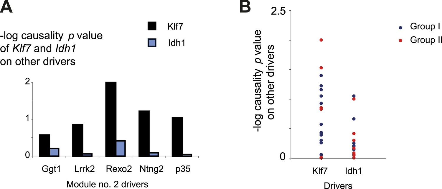
(A) Genetic associations. Shown are the association scores (y-axis) across the genomic positions of chromosome 1 (x-axis) for four module traits (top) and for seven selected drivers (bottom) in myeloid cells. The position of the Klf7 gene is marked below the x-axis. (B–E) Characterization of driver groups I and II. (B) A matrix of traits (rows) vs drivers (columns), where the blue/red scale indicates negative/positive Pearson correlation coefficients among them. (C) The transcript causality p value scores (y-axis) are shown for each module transcript (log scale), assuming a representative variant in the module's genomic interval (rs13475891 in chr1:62 Mbp). (D) The histogram represents the Pearson correlation coefficient (y-axis) of Klf7 with the remaining drivers (x-axis). (E) Genetic effect size of variant rs13475891 on the driver transcripts. The histogram represents the average expression levels of DBA2-carrying individuals minus the B6-carrying individuals (y-axis) for each module driver (x-axis). (F) Distribution of the causality −log p value scores of Idh1 (blue) and of Klf7 (black) on each of the remaining drivers in the module. Causality p values were calculated by positioning Idh1 or Klf7 between the module variant and a driver from this module. (G) Validation of the effect size of Klf7 perturbation of knockdown (left) or overexpression (right) on other drivers in bone-marrow hematopoietic stem cells (y-axis). The ‘effect size’ of perturbation (either knockdown or overexpression) on a certain transcript g is defined as the difference between the (log-scaled) expression of g in normal cells to that in the perturbed cells. In each panel, the first and second columns refer to groups I and II, respectively. **a significant t-test p value for determining whether the mean effect size is different from zero (FDR < 0.06). (H) Scatter plot, where for each driver in group I (a black square) the y-axis shows the transcript causality score (for morphine-response traits in this module; p values), and the x-axis shows the significance of Klf7 knockdown effect on its transcription level (t-test p value). The plot indicates that in group I, drivers with highly significant causality on behavioral responses to morphine were also significantly influenced by Klf7 knockdown. (I) Overall model illustration of module no. 2.
Figure 3—figure supplement 1
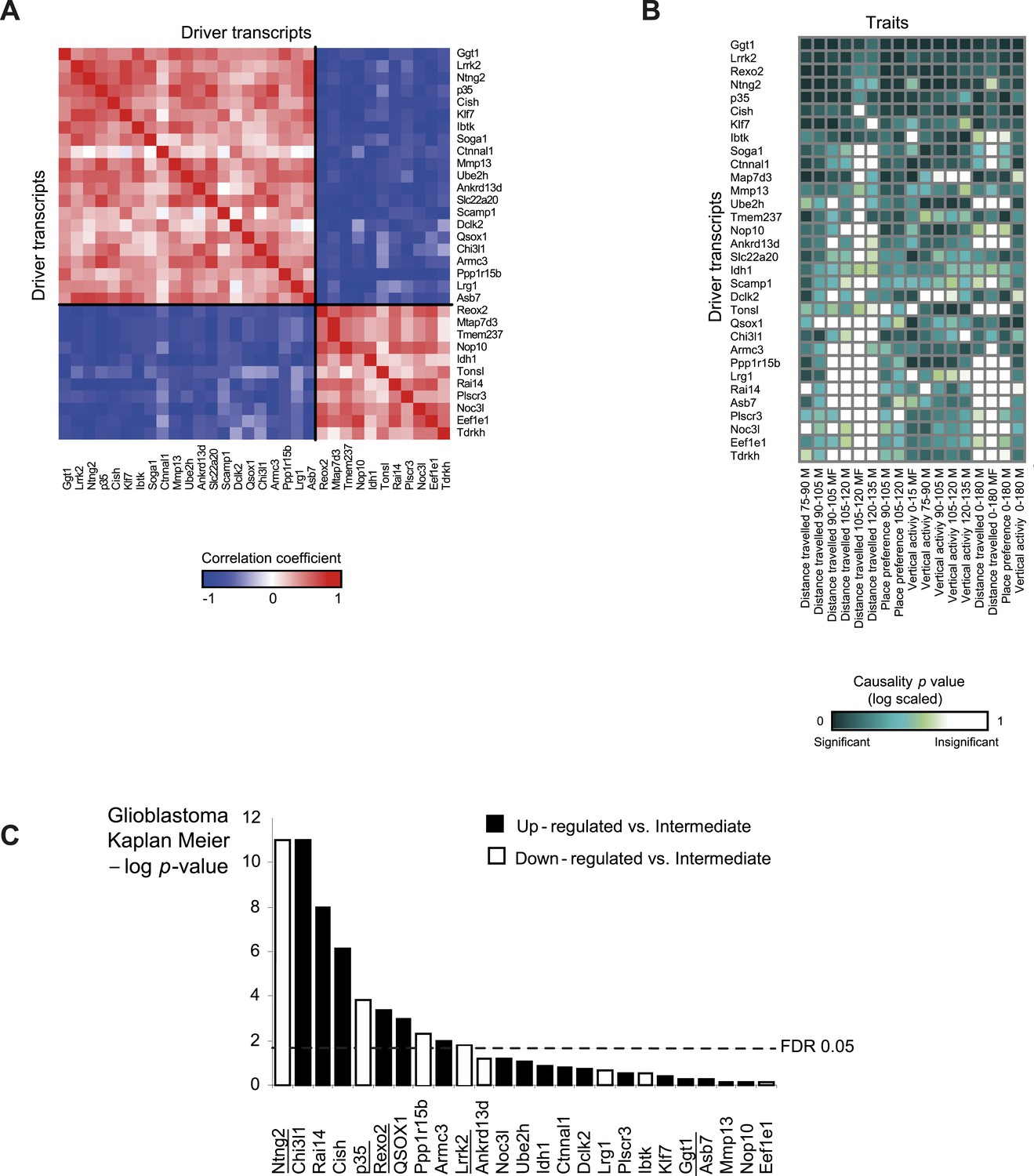
Characterization of module no. 2 drivers.
(A) Driver–driver correlations in module no. 2. A matrix of drivers (columns) vs drivers (rows), where the blue/red scale indicates negative/positive Pearson correlation coefficients. (B) Causality p value score profiles. A matrix of traits (columns) vs driver transcripts (rows), where the blue/white scale indicates the significance of causative relationships among the trait, the driver, and a representative variant in the module's genomic interval (rs13475891 in chr1:62 Mbp). (C) Relationship between module no. 2 drivers and human glioblastoma survival. The figure depicts the significance of differences in Kaplan–Meier survival plots (y-axis; −log p value) between groups of patients with glioblastoma, where groups are based on their levels of expression of a driver in module no. 2 (x-axis). Black/white indicates grouping based on up-regulation/down-regulation vs intermediate regulation of a driver.
Figure 3—figure supplement 2
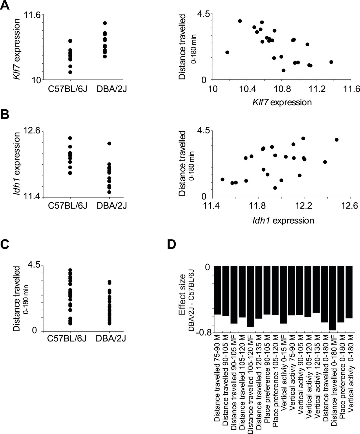
Relationships among components in module no. 2.
(A) Left: Klf7 expression levels (y-axis) of all individuals carrying the C57BL/6J allele (left column) and DBA/2J allele (right column) for the representative variant rs13475891 of module no. 2. Right: Scatter plot, where for each individual the y-axis shows the measured level of a morphine-related trait (distance travelled in 0–180 min in males and females) and the x-axis shows the Klf7 expression. (B) Plots are shown as in A, but for the Idh1 transcript. (C) Level of a morphine-related trait (distance travelled in 0–180 min in males and females; y-axis) of all individuals carrying the C57BL/6J allele (left column) and the DBA/2J allele (right column). The plot shows higher levels of the morphine-related trait in C57BL/6J-carrying individuals. (D) Effect size of variant rs13475891 on the traits in module no. 2. The histogram represents average expression levels of DBA/2J-carrying individuals minus the B6-carrying individuals (y-axis) for each module trait (x-axis). The plot indicates a higher level of the morphine-related trait in C57BL/6J-carrying individuals, as exemplified in C.
Figure 3—figure supplement 3
Causality of cis-associated transcripts.
(A) Causality p value scores of Klf7 and Idh1 on several drivers in module no. 2. The histogram represents the causality p-value scores (y-axis) of Idh1 (blue) and Klf7 (black) on the module's transcripts (x-axis). The plot indicates a stronger influence of Klf7 than of Idh1. Causality p-value scores were calculated as −log p values in a causality test (see ‘Materials and methods’), where the expression levels of Klf7 (or Idh1) were positioned between the genetic variant of module no. 2 and the gene expression of another driver transcript in this module. (B) Causality p-value scores (y-axis) of Klf7 (left column) and Idh1 (right column) on drivers in groups I (blue) and II (red), indicating a stronger influence of Klf7 than of Idh1 in both driver groups.
Figure 3—figure supplement 4
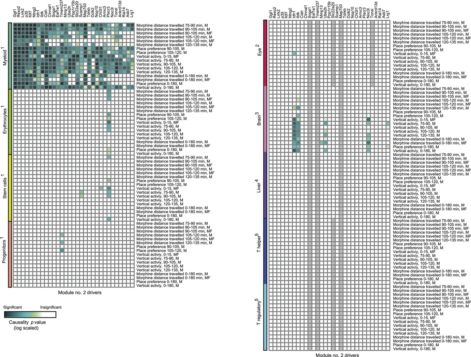
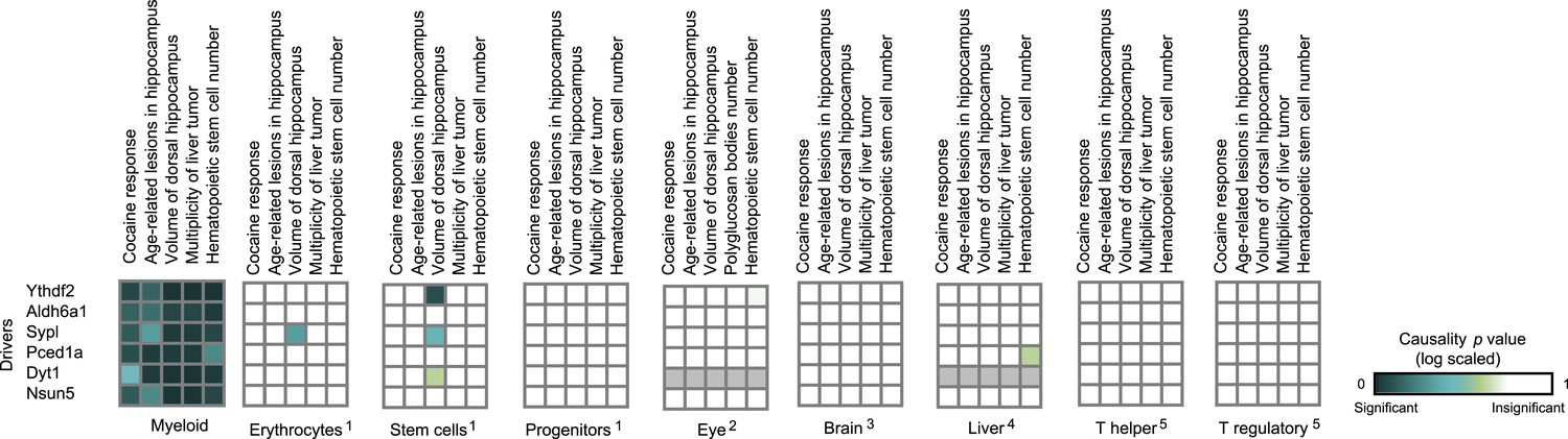
Causative relationships of module no. 2 across multiple tissues.
Significance of causative relationships (blue, high; white, low) among traits (rows) vs the expression of driver transcripts (columns) in nine different tissues or cell types (color coded). In all cases a representative variant in the genomic interval of the module was used for analysis of causality (see Supplementary file 1C). Myeloid cells are shown at the top, indicating that causality relationships in this module are observed in myeloid cells, but hardly if at all in other tissues. Source data: 1Gerrits et al., 2009; 2Geisert et al., 2009; 3Mozhui et al., 2012; 4Gatti et al., 2007; 5Alberts et al., 2011.
Figure 3—figure supplement 5
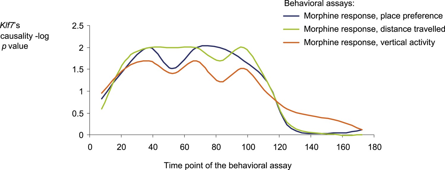
Causative relationships of module no. 2 across time points.
A plot of causality −log p values of Klf7 (y-axis), assuming a fixed genetic variant in the Klf7 gene and various behavioral assays (blue, place preference; green, distance travelled; orange, vertical activity) that were performed at various time points (y-axis) after morphine injection (data from Philip et al., 2010). The plot indicates that the causative influences of Klf7 on the three different behavioral assays act mainly between 30 and 120 min after morphine injection.
Figure 4 with 2 supplements
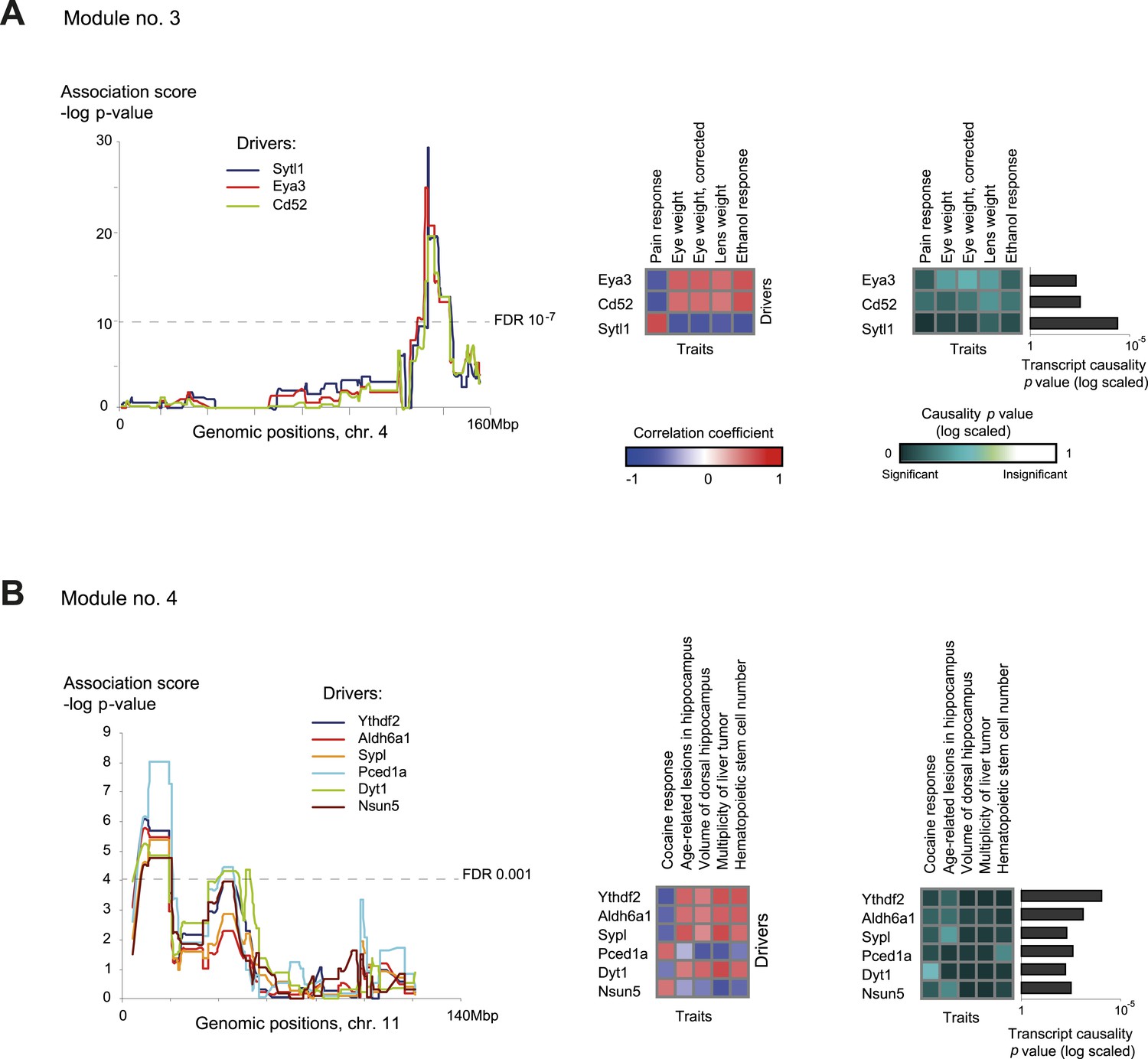
Characteristics of module nos. 3 (A) and 4 (B).
Left: Genetic associations. Association scores (y-axis) across the genomic positions (x-axis) for the module's driver transcripts, based on gene-expression data in myeloid cells. Middle: Matrix of correlations among traits (columns) vs driver transcripts (rows); the blue/red scale indicates negative/positive correlation coefficients. Right: Matrix of traits (columns) vs driver transcripts (rows), where the blue/white scale indicates the significance of their causative relationships based on gene-expression data from the myeloid tissue. A histogram depicting transcript causality p value scores is shown as in Figure 3C. A representative variant in the module's genomic interval is assumed (see Supplementary file 1C).
Figure 4—figure supplement 1
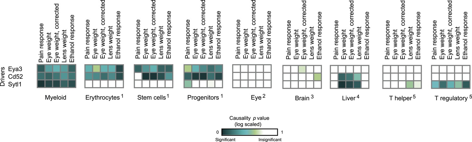
Causative relationships of module no. 3 in multiple tissues.
Significance of causative relationships (blue, significant; white, non-significant) among traits (columns) vs the expression of driver transcripts (rows) in nine different tissues or cell types (left to right matrices). A representative variant in the module's genomic interval is assumed (see Supplementary file 1C). Notably, causative relationships in this module are clearly observed along the entire myeloid lineage (stem cells [Lin−Sca-1+c-Kit+], common progenitors of the myeloid and erythroid lineages [Lin−Sca-1−c-Kit+], erythroid [TER-119+], and myeloid [Gr-1+] lineages), but not in lymphoid tissues or other tissues under study.
Figure 4—figure supplement 2
Causative relationships of module no. 4 in multiple tissues.
Profiles of causality p values across module no. 4, shown as in Figure 4—figure supplement 1. A representative variant in the module's genomic interval is assumed (see Supplementary file 1C). Causative relationships in this module are clearly observed in myeloid tissue, but not in the other tissues under study.
Figure 5 with 5 supplements

Comparative performance analysis on simulated models.
(A) Illustration of a sub-network model, in which all components are mapped to the same genetic variant v1 but not necessarily through the same relationships. In particular, the model includes k + 2 traits ,with k traits p1,..,pk that share the same underlying transcripts g1, g2, g3, and two additional traits pk + 1 and pk + 2 that are affected through other mechanisms (see detailed in Figure 5—figure supplement 1A). (B and C) Accuracy assessments of the synthetic sub-network depicted in A. Accuracy (y-axes) is compared across methods and different data parameters. Results are shown in models of different noise levels (x-axis, log-scaled; B) with either 5 (left) or 7 (right) traits, or over different numbers of traits (x-axis; C) with either a low noise level = 0.5 (left) or a high noise level = 2 (right). The accuracy metric evaluates whether p1,..,pk, but not pk + 1,..,pk + 2, share the same mechanisms, as detailed in Figure 5—figure supplement 1B. Plots depict alternative network construction methods (color coded, see Figure 5—figure supplement 2), indicating that GEMOT has an advantage over existing methods with noise levels ranging between 0.25 and 1, which is the relevant range for the mouse data in this study (see Figure 5—figure supplement 3).
Figure 5—figure supplement 1
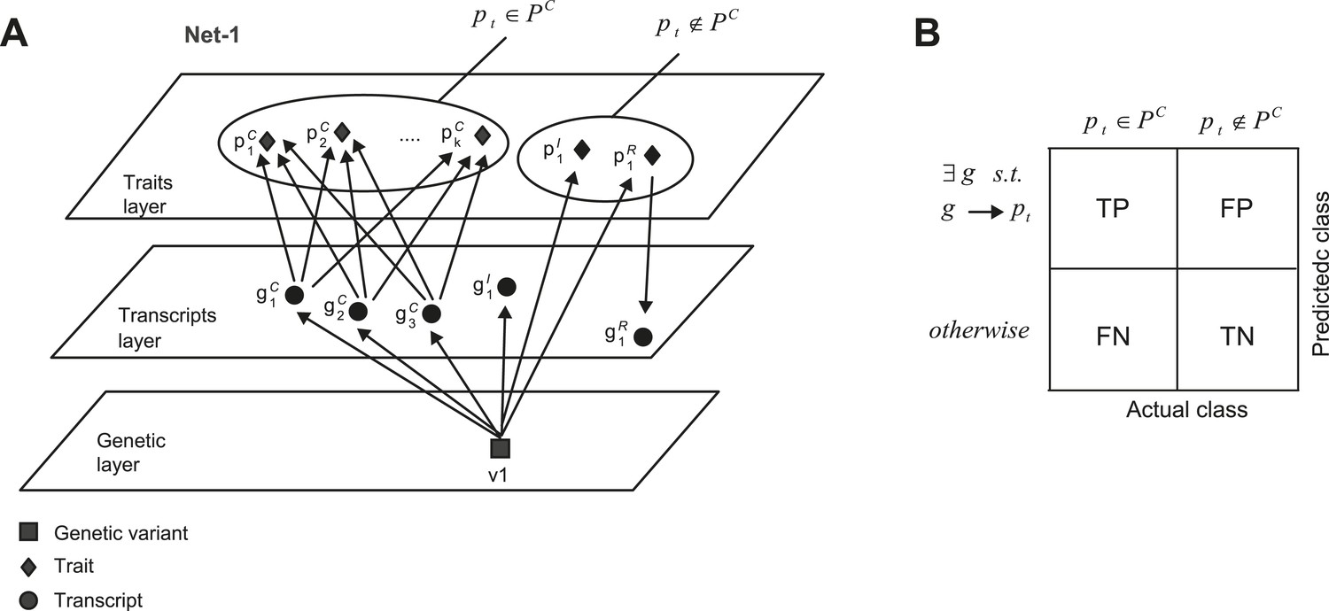
Accuracy assessment of predicted shared mechanisms in synthetic (co-mapped) sub-networks.
(A) Detailed illustration of the synthetic network ‘Net-1’ (a simplified illustration of the same network is shown in Figure 5A). Among the k + 2 traits, k traits are jointly affected by the same transcripts. (B) Accuracy assessment is summarized in an error matrix, where each cell i, j shows the prediction in row i for the mechanism of trait pt is TP, TN, FP or FN, while the actual class of trait pt is in column j. The two actual classes are pt ∈ PC and pt ∉ PC, as exemplified in A.
Figure 5—figure supplement 2
Evaluation of the compared network reconstruction methods.
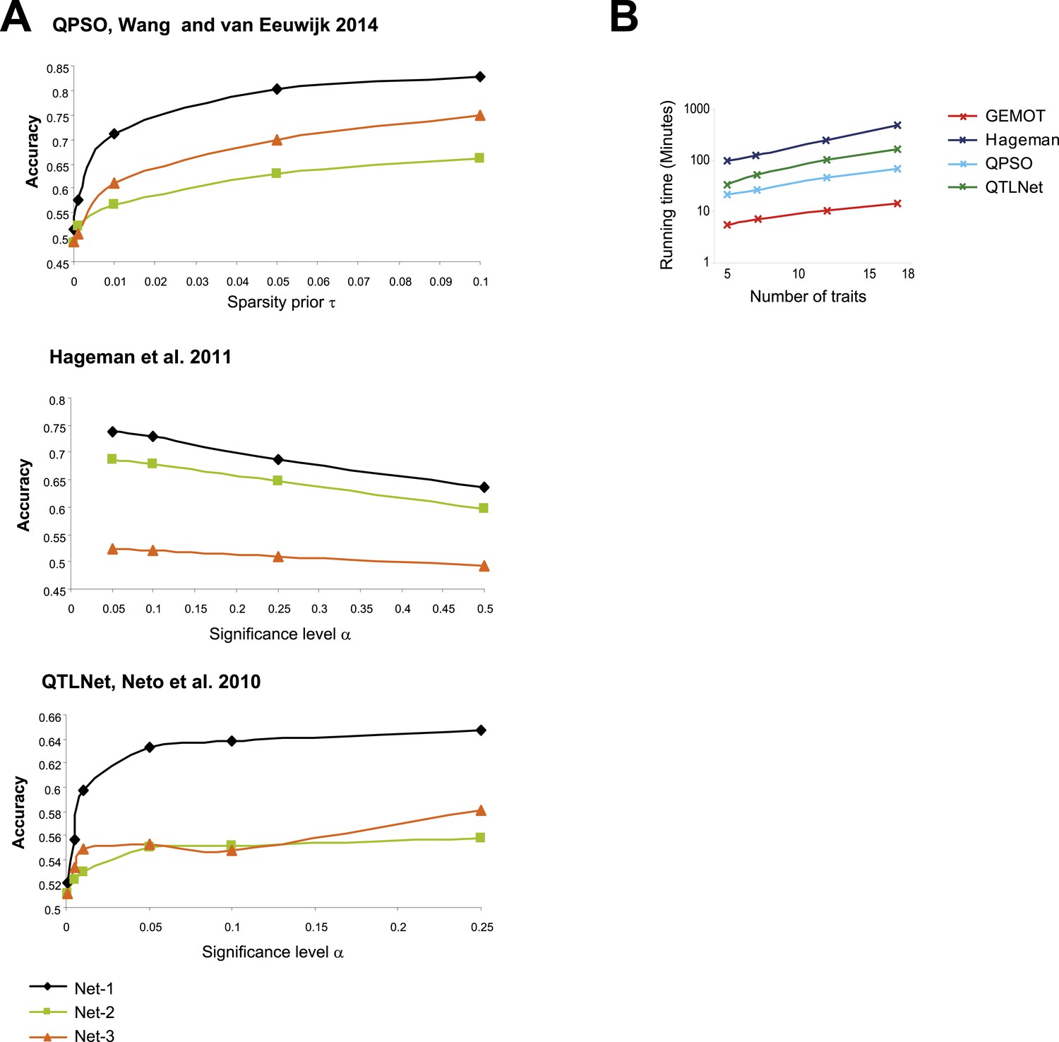
(A) Accuracy metrics (y-axes, according to the definition in Figure 5—figure supplement 1B) for three sub-network models (Figure 5—figure supplements 1A, 4A; color coded) with noise level 0.5 and 7 traits, shown across different method parameters (x-axes). The plots indicate that for Wang and van Eeuwijk, 2014 (top), Hageman et al., 2011 (middle), and Neto et al., 2010 (bottom), the best performances are attained with τ = 0.1, α = 0.05, and α = 0.25, respectively. These method parameters were used throughout the study. (B) Shown is the running time (y-axis, log scaled) across compared methods (color coded) and different numbers of traits (x-axis). The running time refers to construction of 100 sub-networks of type ‘Net-1’ (as demonstrated in Figure 5A) with noise level 0.5. The reported running time are from a Linux machine with 2.6 GHz AMD Opteron 6238 processors.
Figure 5—figure supplement 3
Relevant range of synthetic data parameters.
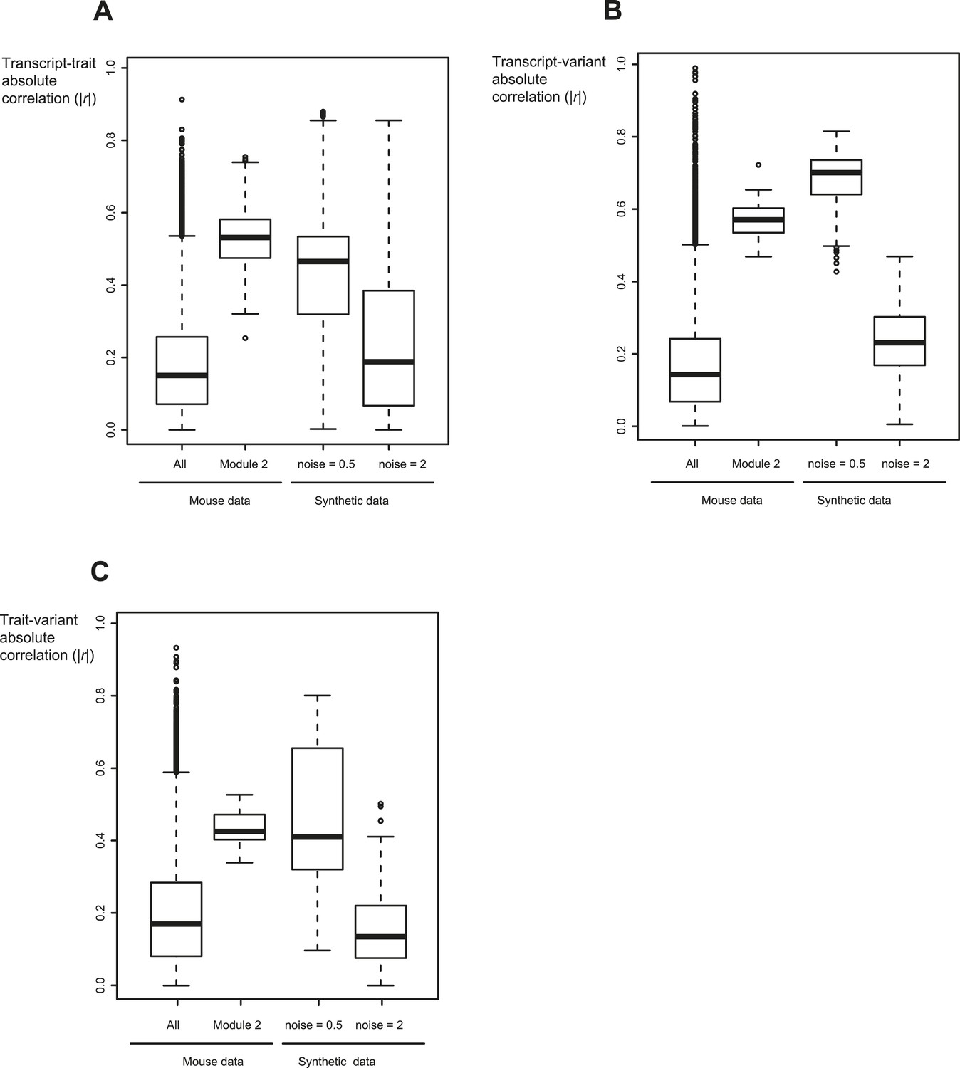
Shown are the absolute correlation coefficients between transcripts and traits (A), between transcripts and variants (B), and between traits and variants (C) for different datasets (x-axis). Datasets (from left to right): all traits, transcripts and variants in mouse myeloid data (Gerrits et al., 2009) (first column); the components of module no. 2 (second column); synthetic sub-networks with noise level = 0.5 (third column); and synthetic sub-networks with noise level = 2 (fourth column). In each box the central mark is the median; edges are the 25th and 75th percentiles; whiskers extend to the most extreme data points not considered outliers; and outliers are plotted individually. Notably, synthetic sub-networks with high noise level = 2 resemble the background distribution in mouse data. In contrast, synthetic networks with lower noise levels (noise level = 0.5) show a signal that is higher than the background distribution, similarly to the inter-relations within the desired GEMOT modules.
Figure 5—figure supplement 4
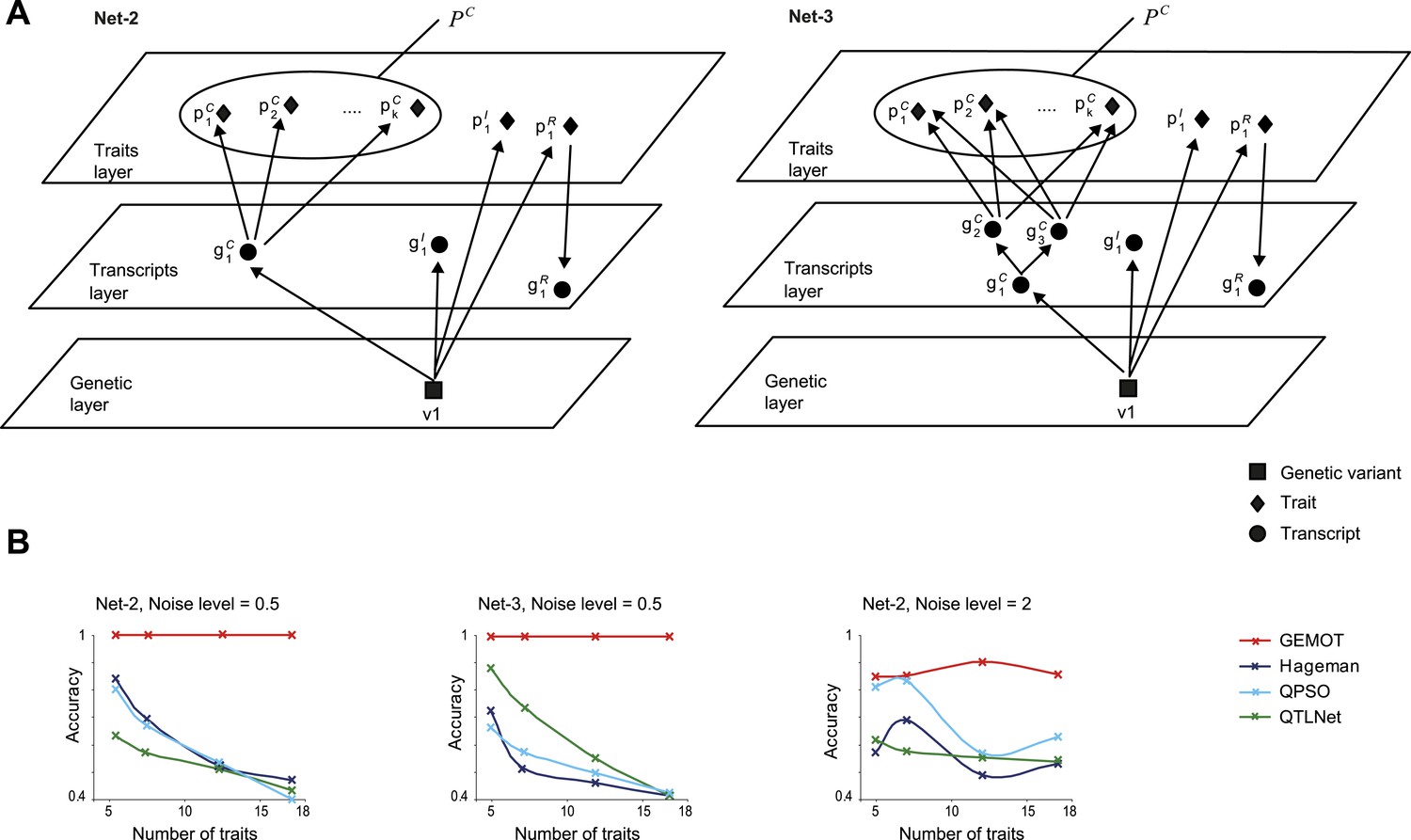
Accuracy assessment in additional sub-networks.
(A) Detailed illustration of two synthetic networks, ‘Net-2’ and ‘Net-3’. (B) Accuracy metrics (y-axes, according to the error matrix in Figure 5—figure supplement 1B) are shown over different numbers of traits (x-axes). Results are shown for Net-2 with noise level = 0.5 (left), for Net-3 with noise level = 0.5 (middle), and for Net-2 with noise level = 2 (right). Plots depict alternative methods of network construction (color coded).
Figure 5—figure supplement 5
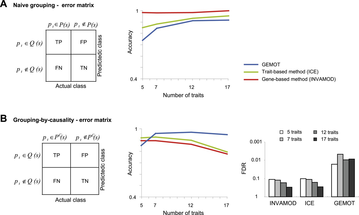
Accuracy assessment in a large biological network.
Performance is evaluated for the ability to group traits based on their co-mapping to the same variant (denoted naive grouping, A) and for the ability to identify groups of traits sharing the same causal transcripts (grouping-by-causality, B). (A) Naive grouping evaluation. Left: An error matrix, where each cell i, j shows the predicted class in row i for a trait pt is TP, TN, FP or FN while the actual class of trait pt is in column j. The actual class for a trait pt is either pt ∉ P(s) or pt ∉ P(s), where P(s) is the collection of all traits in a sub-network s. The predicted classes are defined similarly as pt ∉ Q(s) and pt ∈ Q(s), where Q(s) is the predicted group of traits that attain the largest intersection with the traits in a sub-network s. Right: The error matrix (from left panel) is used to calculate the accuracy metric (y-axis) across different numbers of traits (x-axis). Plots depict alternative grouping methods (color coded). The lower performance of GEMOT is expected, since it is designed for grouping by causality, rather than a naive grouping of traits. (B) grouping-by-causality evaluation. An error matrix (left) and an accuracy plot that utilizes this error matrix (middle), are presented as in A but for the case of grouping-by-causality. PC(s) is the subset of traits that share the same causal transcripts within a sub-network s, as exemplified in Figure 5—figure supplement 1A. Right: The error matrix (from left panel) is used to calculate the FDR metric (y-axis) across different numbers of traits (color coded) and alternative grouping methods. The plots clearly show that GEMOT's ability to group by causal relationships has an advantage over existing methods. Metrics: Accuracy = (TPR + TNR)/2, FDR = FPa/(FPa + TP) (see ‘Materials and methods’).
Additional files
-
Supplementary file 1
(A) Traits in the GEMOT modules of the BXD mouse strains. Shown is a module identifier (column 1) and details about a trait within it, including the trait title (column 2), PubMed record of the publication from which it is taken (column 3), the trait index in the GeneNetwork database (Wang et al., 2003; columns 4), and a short title of the trait as indicated in Figure 3B (column 5). (B) Drivers in the GEMOT modules of the BXD mouse strains. Shown is a module identifier (column 1), and details about a driver within it, including the gene symbol (column 2), its entrez identifier (column 3), genomic position (column 4), the type of association in the module (column 5), and its gene causality p value score (column 6). (C) Representative variants for causality testing in the tripartite modules of the BXD mouse strains. Shown is a tripartite module identifier and its GEMOT module identifier, if relevant (columns 1 and 2, respectively), the genomic position of the module's genomic interval (column 3), and the name and position of the representative variant (columns 4 and 5, respectively).
- https://doi.org/10.7554/eLife.04346.027
Download links
A two-part list of links to download the article, or parts of the article, in various formats.
Downloads (link to download the article as PDF)
Open citations (links to open the citations from this article in various online reference manager services)
Cite this article (links to download the citations from this article in formats compatible with various reference manager tools)
Linking traits based on their shared molecular mechanisms
eLife 4:e04346.
https://doi.org/10.7554/eLife.04346


