Cortical network architecture for context processing in primate brain
Figures
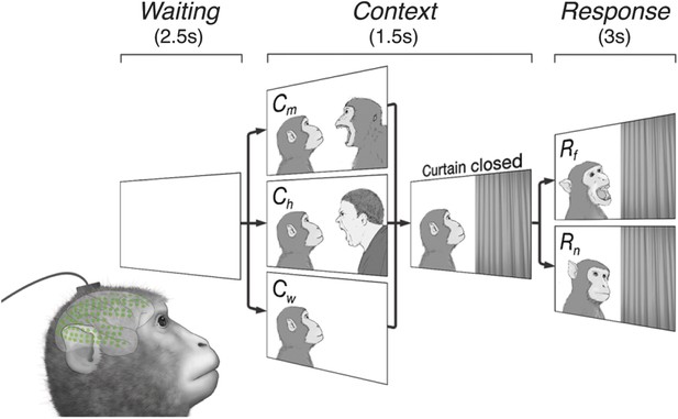
Subjects observe situational contexts with high-density electrocorticography (HD-ECoG) recording.
We recorded 128-channel HD-ECoG signals from monkeys viewing video clips of a conspecific under three different situational contexts and two responses. The subject (lower-left, green circles represent ECoG electrodes) was seated in front of a TV monitor showing video clips consisting of a Waiting period of 2.5 s followed by a Context period of 1.5 s with one of three interactions between a video monkey (vM) on the left and a second agent on the right: vM threatened by a human (Ch), threatened by another monkey (Cm), or an empty wall (Cw). Next, a curtain closed to conceal the second agent followed by a Response period of 3 s with the vM showing either a frightened (Rf), or neutral expression (Rn). Pairwise combination of the contexts and responses produced six different video clips.

Electrode locations in 3 subjects.
In Subject 1, electrodes (green dots) were placed to cover most of the lateral surface of the right hemisphere, also the medial parts of the frontal and occipital lobes. In Subject 2, a similar layout was used, but in the left hemisphere. In Subjects 3, all electrodes were placed on the lateral surface of the left hemisphere, and no medial parts were covered. For brain map registration, the electrode locations and the brain outlines from Subjects 1 and 3 were manually registered to those from Subject 2 based on 13 markers (red circles) in the lateral hemisphere and five markers in the medial hemisphere.
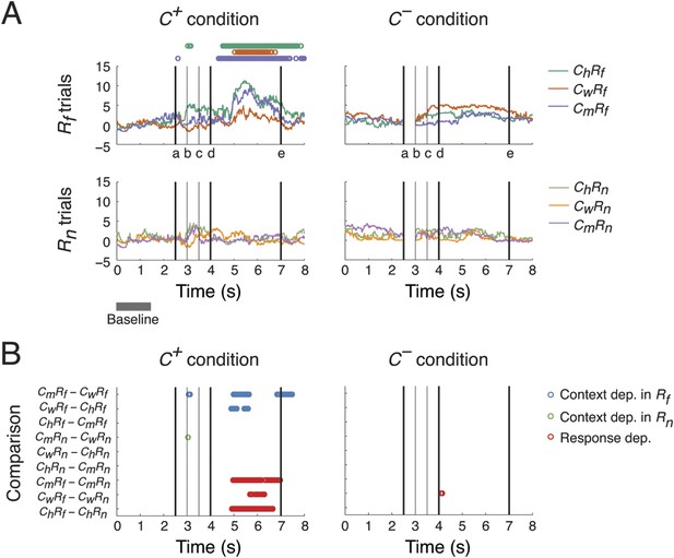
Context- and response-dependent eye movements.
(A) Measurements of gaze shifting revealed a behavioral association between the context and response phases of the task. The gaze positions averaged from three subjects are shown for each trial type (ChRf, CmRf, CwRf, ChRn, CmRn, and CwRn) and condition (C+ and C−). Gaze shifting was quantified by gaze positions significantly different from baseline values (αBonf = 0.05, baseline: gray bar), and was found only in Rf trials under the C+ condition (upper-left panel, the timing of gaze shifts are indicated on top, where the color represents the trial type indicated on the right). Black vertical lines represent the following events (see labels on the x-axis): (a) onset of the Context period, (b) the curtain starts closing, (c) the curtain is fully closed, (d) onset of the Response period, and (e) end of the Response period (onset of the next trial). (B) Context and response dependence in gazing behavior. Gaze positions between different trial types were compared, separately in C+ and C−. For each comparison (y-axis), the timing of significant differences are shown as circles (αBonf = 0.05), where blue, green, and red circles represent context dependence in Rf, context dependence in Rn, and response dependence, respectively. Gazing behavior showed both response dependence and context dependence, but only in C+.
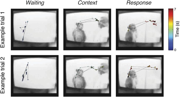
Examples of eye movement.
Examples of eye position during CmRf scenario under C+ condition from Subject 2. Sampled eye positions (circles) in the three periods (Waiting, Context, and Response) are shown, where the corresponding timings are indicated by the colorbar. Snapshots of the videos during the corresponding periods are also shown.
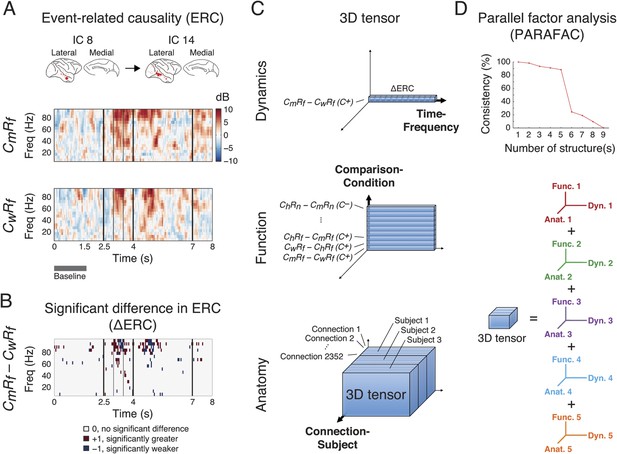
Identification of latent structures in context- and response-dependent cortical network interactions.
(A) Event-related causalities (ERCs) between cortical areas. Example ERCs for a connection (IC 8 to IC 14, the corresponding cortical areas shown on the top) in two scenarios (CmRf and CwRf in C+) from Subject 1 are shown. Each ERC represents the spectro-temporal dynamics of causality evoked by a scenario, calculated as the logarithmic ratio between the direct directed transfer function (dDTF) and corresponding baseline values (baseline: gray bar), and measured in decibel (dB). Black vertical lines represent task events explained in Figure 2. (B) ∆ERCs, or the significant differences in ERCs between the two trial types (CmRf − CwRf) (αFDR = 0.05, false discovery rate correction) are shown. The results were either 0 (no significant difference), +1 (significantly greater), or −1 (significantly weaker). (C) 3D tensor of ∆ERCs. The data for the entire study were organized in three dimensions: dynamics (top), function (middle), and anatomy (bottom). Top: ∆ERCs shown in B describe the dynamics of difference in causality of a connection between two trial types, presented as a vector in 3D space (illustrated as a bar, where each segment represents a ∆ERC value). Middle: For the same connection, ∆ERCs from other comparisons were pooled to describe the functional dynamics of the connection (illustrated as a plate). Bottom: Functional dynamics from all connections were pooled to summarize the functional network dynamics in a subject (illustrated as a block). The data from all subjects were further combined to assess common functional network dynamics across subjects. (D) Parallel factor analysis (PARAFAC) extracted five dominant structures from the 3D tensor with consistency (>80%, also see Figure 3—figure supplement 2). Each structure represented a unique pattern of network function, dynamics, and anatomy (e.g., Func. 1, Dyn. 1, and Anat. 1 for Structure 1).
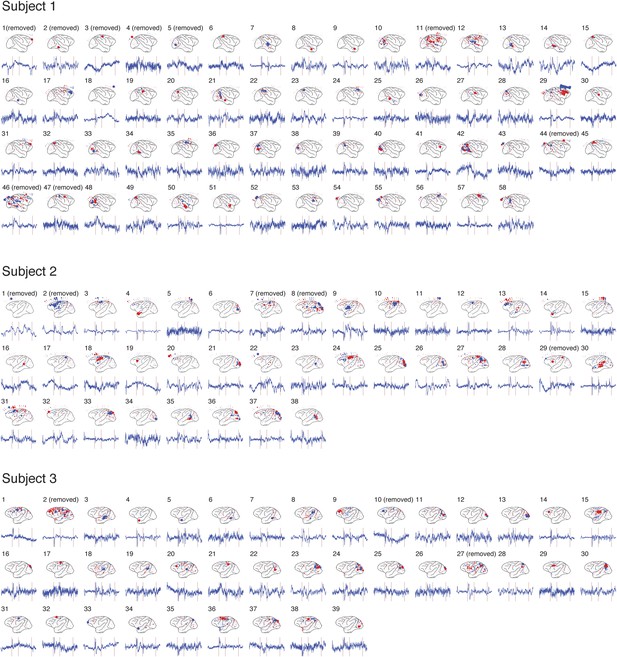
Independent component analysis (ICA) results from 3 subjects.
The spatial distribution of each IC and its time course are shown for each subject. For each IC, the size of each circle represents the relative contribution of the activity from the electrode to the IC, where red and blue colors represent the positive and negative contributions, respectively. For clarity, the time courses shown were obtained by averaging source signals of the IC over one trial type (CmRf trials under C+ condition), and the y-axis is not shown. For each time course, three red vertical lines represent the events (a), (d) and (e) described in Figure 2. The ICs that were removed from analysis are labeled (see Table 1).
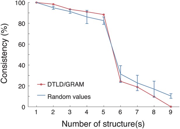
PARAFAC revealed five dominant structures in the 3D tensor.
A core consistency diagnostic was used to evaluate how well the tensor can be represented by different numbers of structures. During deconvolving the tensor into different numbers of structures, core consistencies were measured by two methods: DTLD/GRAM and random values (see the ‘Materials and methods’). For the random values method, 100 core consistency values were measured and their means and standard deviations are shown. In both methods, a sharp decrease in consistency was found when the number of structures increased from 5 to 6, indicating that five structures yielded the optimal fit.
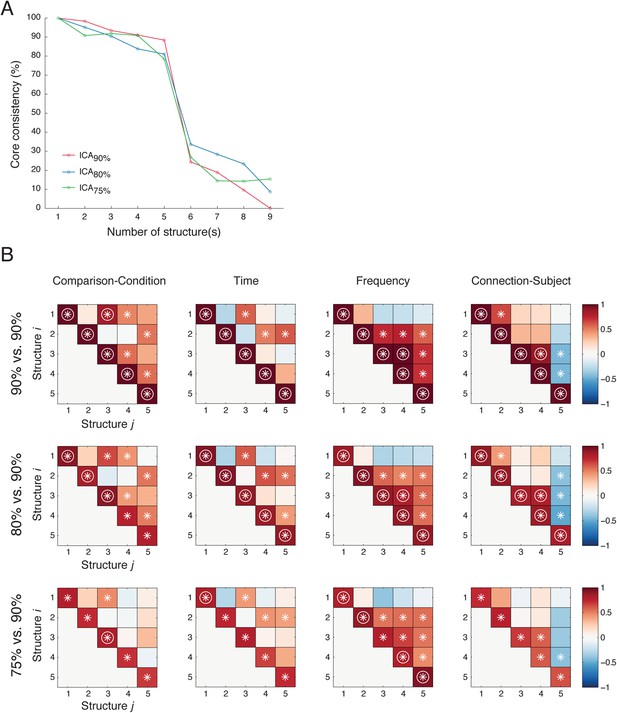
Five latent network structures were robust against ICA model order selection.
(A) PARAFAC results (with DTLD/GRAM method) from data obtained from ICA with 90% (ICA90%, as in Figure 2D), 80% (ICA80%), and 75% (ICA75%) of total variance preserved. In all cases, five latent network structures yelled the optimal fits. (B) Similarities among structures obtained from different ICA results. Top row: We first compared Structure i to Structure j obtained from ICA90% (90% vs 90%). Correlations were evaluated in four different domains: Comparison (the first tensor dimension), Time and Frequency (the second tensor dimension), and Causal outflow (the third tensor dimension). The significant correlations (α = 0.05) are indicated as asterisks, and the correlations with high correlation coefficients (Pearson, ρ > 0.8) are indicated as circles. Second row: Correlations between Structure i obtained from ICA80% and Structure j obtained from ICA90% (80% vs 90%). The structures obtained from ICA80% were reordered so that the correlations in the diagonals were maximized. Bottom row: Correlations between Structure i obtained from ICA75% and Structure j obtained from ICA90% (75% vs 90%). High correlations were found in the diagonals in 80% vs 90% and 75% vs 90%, and high similarities were found among 90% vs 90%, 80% vs 90%, and 75% vs 90%. These results indicate that the five latent network structures were similar under different selections of ICA model order.
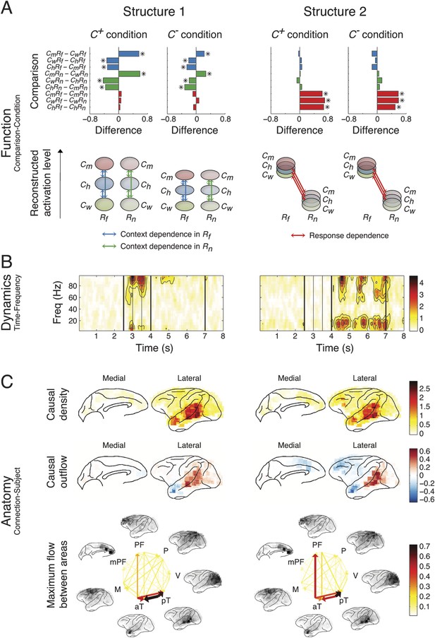
Network structures for perception of context and response.
Each structure was defined by three dimensions: function, dynamics, and anatomy. (A) Function: The function dimension showed each structure's context and response dependence. Top: For each structure, the first tensor dimension contained 18 differences for nine pairwise comparisons in the C+ or C− condition. Significant differences are highlighted (*, α = 0.05, see the ‘Materials and methods’). Bottom: The comparisons with significant differences were used to reconstruct how each structure was selectively activated. Each oval and its vertical position represent the trial type and its activation level, respectively. Blue, green, or red arrows indicate significant context dependence under Rf, significant context dependence under Rn, and significant response dependence, respectively (each corresponds to a significance highlighted in the top panel). (B) Dynamics: The dynamics dimension indexed each structure's activation in different times and frequencies. Black vertical lines represent events, as explained in Figure 2. (C) Anatomy: The anatomy dimension showed each structure's activation in different connections. Three connectivity statistics, averaged across subjects after brain map registration, are shown on the lateral and medial cortices. Top: Cortical areas with greater causal density represent areas with busier interactions. Middle: Cortical areas with positive (red) and negative (blue) causal outflows represent the sources and sinks of interactions, respectively. Bottom: The direction and strength of each maximum flow between areas are indicated by the direction and size (and color) of an arrow, respectively. Seven cortical areas were determined for visualization: the visual (V), parietal (P), prefrontal (PF), medial prefrontal (mPF), motor (M), anterior temporal (aT), and posterior temporal (pT) cortices.
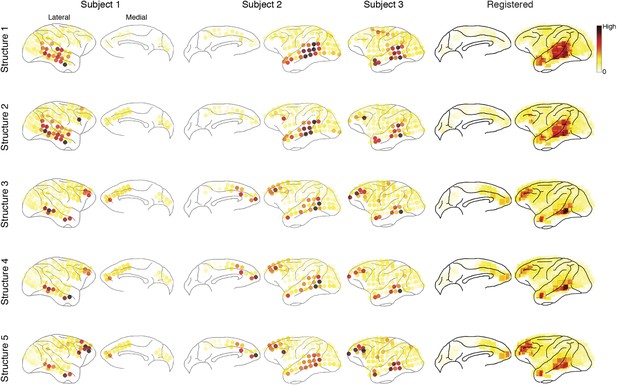
Causal density in individual subjects.
Cortical areas with high causal density (busy traffic) are indicated as red. Results from individual subjects and the summarized results after brain map registration are shown for each latent network structure.
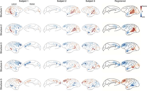
Causal outflow in individual subjects.
Cortical areas with overall positive causal outflow (source areas) are indicated shown in red, and those with overall negative causal outflow (sink areas) are shown in blue. Results from individual subjects and the summarized results after brain map registration are shown for each latent network structure.
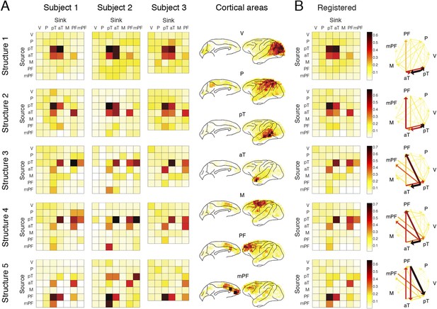
Maximum flow between areas in individual subjects.
(A) The maximum information flows between cortical areas in all subjects. For each subject (column) and each structure (row), the maximal loadings of connections from each of the seven cortical areas (source, y-axis) to the others (sink, x-axis) are shown. Seven cortical areas were manually identified: the visual cortex (V), the parietal cortex (P), the posterior temporal cortex (pT), the anterior temporal cortex (aT), the motor cortex (M), the prefrontal cortex (PFC), and the medial PFC (mPF). The seven areas identified in all subjects are shown on the registered brain map on the right. (B) The average maximum information flow between areas across subjects presented in two different formats: matrices (left) and arrows (right).
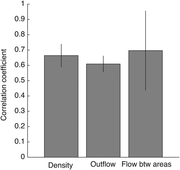
Robust connectivity across subjects.
For each connectivity statistics (causal density, causal outflow, or maximum flow between areas) from each structure, we compared its values (after brain map registration) between each subject pair. As results, 15 correlation coefficients were acquired for each connectivity statistics to show how similar the connectivity statistics across subjects in all structures. The average correlation coefficients for causal density, causal outflow, and maximum flow between areas were 0.66 ± 0.08, 0.60 ± 0.05, and 0.69 ± 0.26, respectively (mean ± std, n = 15: 3 pairs, 5 structures). High correlations in connectivity statistics among subjects indicate that connectivity in each structure is robust across subjects.
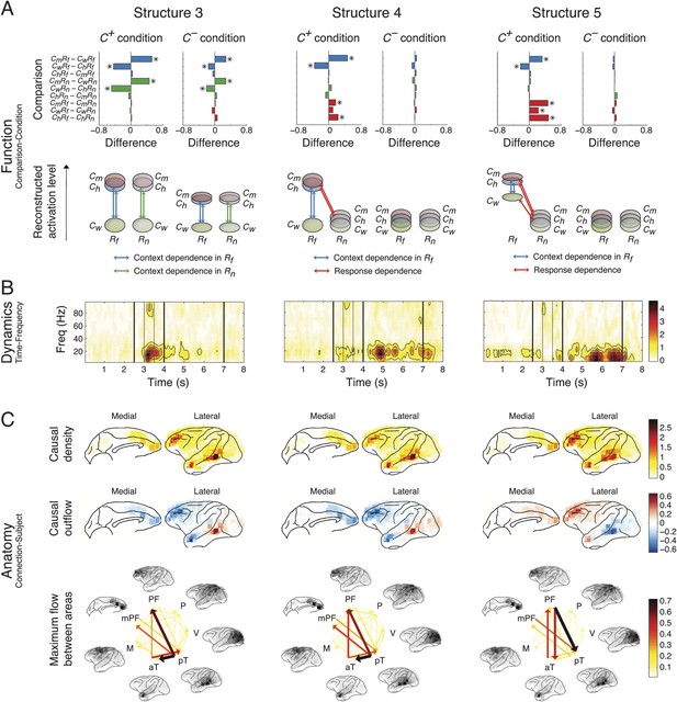
Network structures for context representation and modulation.
The function (A), dynamics (B), and anatomy (C) dimensions of Structures 3, 4, and 5. Structures 3 and 4 represent the initial formation/encoding and later reactivation/retrieval of abstract context information, respectively, and Structure 5 represents context-dependent top-down feedback that modulates eye gaze or visual attention. Same presentation details as in Figure 4.
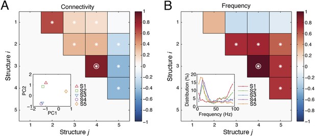
Spatial and spectral characteristics of network structures.
(A) The correlations between the causal outflows between structures. For each structure, causal outflows were measured for all ICs in all subjects, which resulted in a 1 by 118 vector (= 49 + 33 + 36, see the numbers of ICs in Table 1). The first two principal components (PC 1 and PC 2) of the causal outflows of the five structures are shown in the inset. The correlations between the causal outflows were also measured. The significant correlations (α = 0.05) are indicated as asterisks, and the correlations with high correlation coefficients (Pearson, ρ > 0.8) are indicated as circles. (B) The correlations between the frequency profiles of different structures. The frequency profile of each structure, shown in the inset, was quantified by averaging the corresponding loadings in the second tensor dimension (Time-Frequency) across time points, which resulted in a 1 by 19 vector. The correlations between the frequency profiles were then measured and shown.
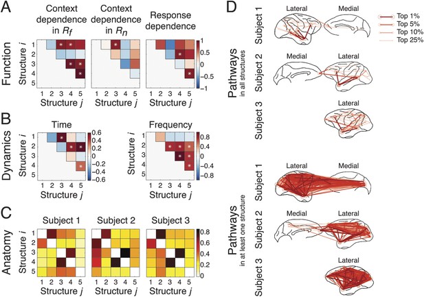
Coordination and co-activation of network structures.
(A) Functional coordination: The coordination between structures was evaluated by the correlation coefficients between structures' context and response dependence (the differences shown in Figures 4A, 5A). Each panel illustrates how Structure i (y-axis) correlated with Structure j (x-axis) in context dependence in Rf (left), context dependence in Rn (middle), and response dependence (right). Significant correlations are indicated as asterisks (α = 0.05) (see ‘Materials and methods’). (B) Dynamic co-activation: The dynamics correlation was shown by correlation coefficients between structures' temporal and spectral activation. Each panel shows how Structure i correlated with Structure j in temporal dynamics (left) and frequency profile (right). Significant correlations are indicated as asterisks (α = 0.05). (C) Anatomical overlap: The anatomical similarity was indexed by the ratio of shared anatomical connections between structures. Each panel illustrates the ratio of the number of shared connections between Structures i and j and the total number of connections in Structure i. Results obtained from three subjects are shown separately. (D) Undirected pathways of connections shared by all structures for each subject (top), and those appearing in at least one structure for each subject (bottom). The lateral cortical surface is shown on the left for Subject 1, and on the right for Subjects 2 and 3. Shared pathways (lines) between two cortical areas (circles) of the top 1, 5, 10, and 25% connections are shown. Pathways with greater strengths are overlaid on those with weaker strengths.
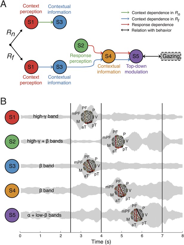
Context as a sequence of interactions between network structures.
(A) Coordination between network structures (S1 to S5, circles), under Rn (top) or Rf (bottom) responses. In both response contingencies, context perception (S1) encoded contextual information (S3). However, when the response stimulus contained high emotional valence (Rf, bottom), response perception (S2) reactivates the contextual information (S4), resulting in top-down modulation feedback (S5) that shares the same context and response dependence as the gazing behavior (black arrow and rounded rectangles). Green, blue, and red arrows represent correlations in context dependence in Rn, context dependence in Rf, and in response dependence, respectively (see Figure 6A). (B) Temporal, spectral, and spatial profiles and overlap in defined network structures. Network structures can be characterized by frequency range (labeled on the left) and connectivity pattern (shown on the right). Their temporal activations are plotted over trial time, with a ‘sound-like’ presentation, where a higher volume represents stronger activation. Black vertical lines represent the events as indicated in Figure 2.
Videos
Video clip for CmRf trials.
The clip contains the Context and Response periods.
Video clip for ChRf trials.
The clip contains the Context and Response periods.
Video clip for CwRf trials.
The clip contains the Context and Response periods.
Video clip for CmRn trials.
The clip contains the Context and Response periods.
Video clip for ChRn trials.
The clip contains the Context and Response periods.
Video clip for CwRn trials.
The clip contains the Context and Response periods.
Tables
Experimental parameters
| Subject 1 | Subject 2 | Subject 3 | ||
|---|---|---|---|---|
| Experiment | Hemisphere implanted | Right | Left | Left |
| # of electrodes | 128 | 128 | 128 | |
| # of trials per class | 150 | 150 | 150 | |
| # of trials preserved per class (mean ± std) (see trial screening in ‘Materials and methods’) | 117.7 ± 3.5 | 122.2 ± 3.1 | 109.5 ± 3.6 | |
| # of C+ trials per class (mean ± std) | 64.8 ± 5.2 | 60.3 ± 6.7 | 57.3 ± 5.6 | |
| # of C− trials per class (mean ± std) | 52.8 ± 1.9 | 61.8 ± 8.1 | 52.2 ± 3.5 | |
| ICA (see Figure 3—figure supplement 1) | # of ICs for 90% variance explained | 58 | 38 | 39 |
| # of ICs preserved (see IC screening in ‘Materials and methods’) | 49 (removed ICs 1, 2, 3, 4, 5, 11, 44, 46, and 47) | 33 (removed ICs 1, 2, 7, 8, and 29) | 36 (removed ICs 2, 10, and 27) |


