OpenSpliceAI provides an efficient modular implementation of SpliceAI enabling easy retraining across nonhuman species
Figures
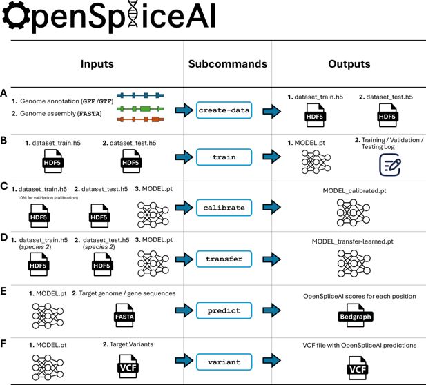
Overview of the OpenSpliceAI design.
This toolkit features six primary subcommands: (A) The ‘create-data’ subcommand processes genome annotations in GFF/GTF format and genome sequences in FASTA format to produce one-hot encoded gene sequences (X) and corresponding labels (Y), both stored in HDF5 format. (B) The ‘train’ subcommand utilizes the HDF5 files generated by ‘create-data’ to train the SpliceAI model using PyTorch, resulting in a serialized model in PT format. This process also generates logs for training, testing, and validation. (C) The ‘calibrate’ subcommand takes both training and test datasets along with a pre-trained model in PT format. It randomly allocates 10% of the training data as a validation (calibration) set, which is then used to adjust the model’s output probabilities so that they more accurately reflect the observed empirical probabilities during evaluation on the test set. (D) The ‘transfer’ subcommand allows for model customization using a dataset from a different species, requiring a pre-trained model in PT format and HDF5 files for transfer learning and testing. (E) The ‘predict’ subcommand enables users to predict splice site probabilities for sequences in given FASTA files. (F) The ‘variant’ subcommand assesses the impact of potential SNPs and indels on splice sites using VCF format files, providing predicted cryptic splice sites.

Overview of the OpenSpliceAI architectures trained with different flanking sequence lengths.
(A) OpenSpliceAI-10k: schematic of the model configured for 10 kb flanking regions. The input sequence is passed through an initial convolution layer (Conv1D), followed by 16 residual units, each incorporating skip connections. The final output is fed into a softmax function for splice site classification. (B) OpenSpliceAI-2k: model variant with 2 kb flanking sequences, using a similar structure with 12 repeated residual units. (C) OpenSpliceAI-400: Model variant with 400 bp flanking sequences, using a similar structure with 8 repeated residual units. (D) OpenSpliceAI-80: the smallest variant, trained on 80 bp flanking sequences, using a similar structure with 4 repeated residual units. (E) Detailed view of the residual unit (RU) structure, highlighting the convolution, batch normalization, and skip connections. (F) Training setup: all models were trained using the AdamW optimizer, either a MultiStepLR or CosineAnnealingWarmRestarts learning rate scheduler, and cross-entropy or focal loss functions.

Decision-making and workflow of the predict subcommand.
Required inputs include the FASTA file and PyTorch model, while optional inputs include a GFF annotation file and custom parameters. The outputs are two BED files corresponding to predicted donor and acceptor splice sites. Several intermediate files may be generated and useful to the user, including the HDF5-compressed data file (raw sequences) and dataset (encoded inputs) for training.

Decision-making and workflow of the variant subcommand.
Required inputs include the VCF file, FASTA file, and annotation file, while optional inputs include the output path, splicing model, and distance, precision, and masking parameters. The output is a VCF file with the OpenSpliceAI delta scores of the variants. Note that both Keras and PyTorch models are supported in this tool, but PyTorch is recommended.
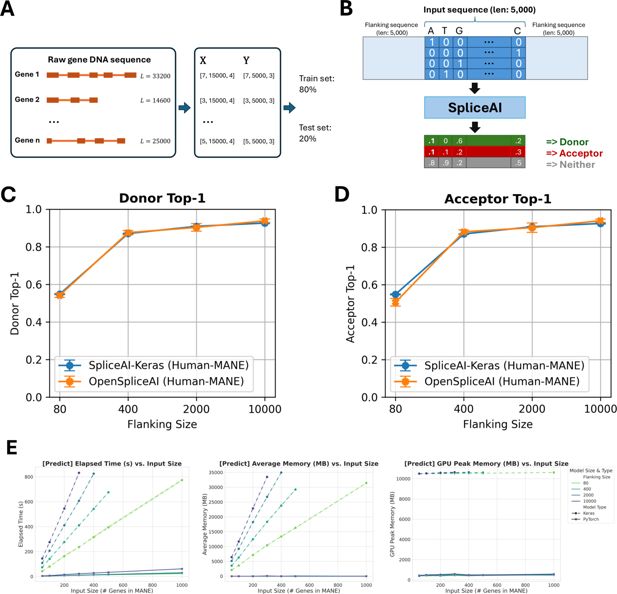
Overview of OpenSpliceAI framework, performance benchmarking, and comparison with SpliceAI-Keras.
(A) Schematic overview of OpenSpliceAI’s approach. Gene sequences are first extracted from the genome FASTA file and one-hot encoded (X). Splice sites are identified and labeled using the annotation file (Y). The resulting paired data (X, Y) for each gene is then compiled for model training (80% of the sequences) and testing (20% of the sequences). (B) Workflow of the OSAIMANE 10,000 model. Input sequences are one-hot encoded and padded with 5000 Ns ([0,0,0,0]) on each side, totaling 10,000 Ns. The model processes the input and outputs, for each position, the probability of that position being a donor site, an acceptor site, or neither. (C–D) Performance comparison between OSAIMANE and SpliceAI-Keras on splicing donor and acceptor sites, trained with 80 nt, 400 nt, 2000 nt, and 10,000 nt flanking sequences. Evaluation metrics include top-1 accuracy for both donor and acceptor sites. Blue curves represent SpliceAI-Keras, while orange curves represent OSAIMANE. Each dot is the mean over five trained model variants, and error bars show ±1 standard error of the mean. Performance is compared across test datasets from humans. (E) Benchmarking results for elapsed time, average memory usage, and GPU peak memory for the prediction submodule.

Comparison of splice site prediction performance between SpliceAI-Keras (blue) and OSAIMANE (orange) across human (Homo sapiens) datasets with varying flanking sequence lengths.
The plots display donor (5′) and acceptor (3′) splice site prediction metrics using 80, 400, 2000, and 10,000 nt of flanking context. OSAIMANE was trained using the RefSeq MANE v1.3 database and GRCh38.p14 genome. (A) Donor top-1: measures the percentage of times the model’s most confident prediction exactly matches the true donor site label. (B) Donor AUPRC: area under the precision-recall curve for donor site predictions. (C) Donor accuracy: proportion of correct donor site calls among all predictions. (D) Donor precision: the fraction of predicted donor sites that are correct. (E) Donor recall: the fraction of true donor sites that are correctly predicted. (F) Donor F1: the harmonic mean of precision and recall for donor sites. (G) Acceptor top-1: measures the percentage of times the model’s most confident prediction exactly matches the true acceptor site label. (H) Acceptor AUPRC: area under the precision-recall curve for acceptor site predictions. (I) Acceptor accuracy: proportion of correct acceptor site calls among all predictions. (J) Acceptor precision: the fraction of predicted acceptor sites that are correct. (K) Acceptor recall: the fraction of true acceptor sites that are correctly predicted. (L) Acceptor F1: the harmonic mean of precision and recall for acceptor sites. Each panel illustrates that increasing the flanking sequence length generally enhances model performance, with both SpliceAI-Keras and OpenSpliceAI achieving high accuracy and F1 scores at 10,000 nt. Each data point represents the mean across five independently trained models, with error bars indicating the standard error.

Comparison of splice site prediction performance between SpliceAI-Keras (blue) and OSAIMANE (orange) across house mouse (Mus musculus) datasets with varying flanking sequence lengths.
The plots display donor (5′) and acceptor (3′) splice site prediction metrics using 80, 400, 2000, and 10,000 nt of flanking context. OSAIMANE was trained using the RefSeq MANE v1.3 database and GRCh38.p14 genome. The house mouse datasets are curated from RefSeq GRCm39 annotation and GRCm39 genome. (A) Donor top-1: measures the percentage of times the model’s most confident prediction exactly matches the true donor site label. (B) Donor AUPRC: area under the precision-recall curve for donor site predictions. (C) Donor accuracy: proportion of correct donor site calls among all predictions. (D) Donor precision: the fraction of predicted donor sites that are correct. (E) Donor recall: the fraction of true donor sites that are correctly predicted. (F) Donor F1: the harmonic mean of precision and recall for donor sites. (G) Acceptor top-1: measures the percentage of times the model’s most confident prediction exactly matches the true acceptor site label. (H) Acceptor AUPRC: area under the precision-recall curve for acceptor site predictions. (I) Acceptor accuracy: proportion of correct acceptor site calls among all predictions. (J) Acceptor precision: the fraction of predicted acceptor sites that are correct. (K) Acceptor recall: the fraction of true acceptor sites that are correctly predicted. (L) Acceptor F1: the harmonic mean of precision and recall for acceptor sites. Each panel illustrates that increasing the flanking sequence length generally enhances model performance, with both SpliceAI-Keras and OpenSpliceAI achieving high accuracy and F1 scores at 10,000 nt. Each data point represents the mean across five independently trained models, with error bars indicating the standard error.

Comparison of splice site prediction performance between SpliceAI-Keras (blue) and OSAIMANE (orange) across honeybee (Apis mellifera) datasets with varying flanking sequence lengths.
The plots display donor (5′) and acceptor (3′) splice site prediction metrics using 80, 400, 2000, and 10,000 nt of flanking context. OSAIMANE was trained using the RefSeq MANE v1.3 database and GRCh38.p14 genome. The honeybee datasets are curated from RefSeq Amel_HAv3.1 annotation and Amel_HAv3.1 genome. (A) Donor top-1: measures the percentage of times the model’s most confident prediction exactly matches the true donor site label. (B) Donor AUPRC: area under the precision-recall curve for donor site predictions. (C) Donor accuracy: proportion of correct donor site calls among all predictions. (D) Donor precision: the fraction of predicted donor sites that are correct. (E) Donor recall: the fraction of true donor sites that are correctly predicted. (F) Donor F1: the harmonic mean of precision and recall for donor sites. (G) Acceptor top-1: measures the percentage of times the model’s most confident prediction exactly matches the true acceptor site label. (H) Acceptor AUPRC: area under the precision-recall curve for acceptor site predictions. (I) Acceptor accuracy: proportion of correct acceptor site calls among all predictions. (J) Acceptor precision: the fraction of predicted acceptor sites that are correct. (K) Acceptor recall: the fraction of true acceptor sites that are correctly predicted. (L) Acceptor F1: the harmonic mean of precision and recall for acceptor sites. Each panel illustrates that increasing the flanking sequence length generally enhances model performance, with both SpliceAI-Keras and OpenSpliceAI achieving high accuracy and F1 scores at 10,000 nt. Each data point represents the mean across five independently trained models, with error bars indicating the standard error.

Comparison of splice site prediction performance between SpliceAI-Keras (blue) and OSAIMANE (orange) across zebrafish (Danio rerio) datasets with varying flanking sequence lengths.
The plots display donor (5′) and acceptor (3′) splice site prediction metrics using 80, 400, 2000, and 10,000 nt of flanking context. OSAIMANE was trained using the RefSeq MANE v1.3 database and GRCh38.p14 genome. The zebrafish datasets are curated from RefSeq GRCz11 annotation and GRCz11 genome. (A) Donor top-1: measures the percentage of times the model’s most confident prediction exactly matches the true donor site label. (B) Donor AUPRC: area under the precision-recall curve for donor site predictions. (C) Donor accuracy: proportion of correct donor site calls among all predictions. (D) Donor precision: the fraction of predicted donor sites that are correct. (E) Donor recall: the fraction of true donor sites that are correctly predicted. (F) Donor F1: the harmonic mean of precision and recall for donor sites. (G) Acceptor top-1: measures the percentage of times the model’s most confident prediction exactly matches the true acceptor site label. (H) Acceptor AUPRC: area under the precision-recall curve for acceptor site predictions. (I) Acceptor accuracy: proportion of correct acceptor site calls among all predictions. (J) Acceptor precision: the fraction of predicted acceptor sites that are correct. (K) Acceptor recall: the fraction of true acceptor sites that are correctly predicted. (L) Acceptor F1: the harmonic mean of precision and recall for acceptor sites. Each panel illustrates that increasing the flanking sequence length generally enhances model performance, with both SpliceAI-Keras and OpenSpliceAI achieving high accuracy and F1 scores at 10,000 nt. Each data point represents the mean across five independently trained models, with error bars indicating the standard error.

Comparison of splice site prediction performance between SpliceAI-Keras (blue) and OSAIMANE (orange) across Arabidopsis thaliana datasets with varying flanking sequence lengths.
The plots display donor (5′) and acceptor (3′) splice site prediction metrics using 80, 400, 2000, and 10,000 nt of flanking context. OSAIMANE was trained using the RefSeq MANE v1.3 database and GRCh38.p14 genome. The A. thaliana datasets are curated from RefSeq TAIR10.1 annotation and TAIR10.1 genome. (A) Donor top-1: measures the percentage of times the model’s most confident prediction exactly matches the true donor site label. (B) Donor AUPRC: area under the precision-recall curve for donor site predictions. (C) Donor accuracy: proportion of correct donor site calls among all predictions. (D) Donor precision: the fraction of predicted donor sites that are correct. (E) Donor recall: the fraction of true donor sites that are correctly predicted. (F) Donor F1: the harmonic mean of precision and recall for donor sites. (G) Acceptor top-1: measures the percentage of times the model’s most confident prediction exactly matches the true acceptor site label. (H) Acceptor AUPRC: area under the precision-recall curve for acceptor site predictions. (I) Acceptor accuracy: proportion of correct acceptor site calls among all predictions. (J) Acceptor precision: the fraction of predicted acceptor sites that are correct. (K) Acceptor recall: the fraction of true acceptor sites that are correctly predicted. (L) Acceptor F1: the harmonic mean of precision and recall for acceptor sites. Each panel illustrates that increasing the flanking sequence length generally enhances model performance, with both SpliceAI-Keras and OpenSpliceAI achieving high accuracy and F1 scores at 10,000 nt. Each data point represents the mean across five independently trained models, with error bars indicating the standard error.

Comparison of runtime and memory metrics for ‘predict’ (panels A–F) and ‘variant’ (panels G–L) in OSAIMANE models with different flanking sequences.
Each corresponding pair of panels displays the same metric for the two methods as a function of increasing input size. (A, G) Overall elapsed time: total elapsed CPU time to complete processing. (B, H) Average memory usage: mean CPU memory consumption (in MB) during execution, reflecting the typical memory footprint. (C, I) Peak memory usage: maximum CPU memory recorded (in MB) at any point. (D, J) Peak GPU memory: maximum GPU memory recorded (in MB) at any point. (E, K) Memory growth rate: the average rate of memory increase during runtime, which indicates how the constant of memory usage increases with larger inputs. (F, L) CPU utilization profile: percentage of time spent in native C execution (as opposed to interpreted Python code), reflecting the runtime that is being used by compiled, low-level routines.
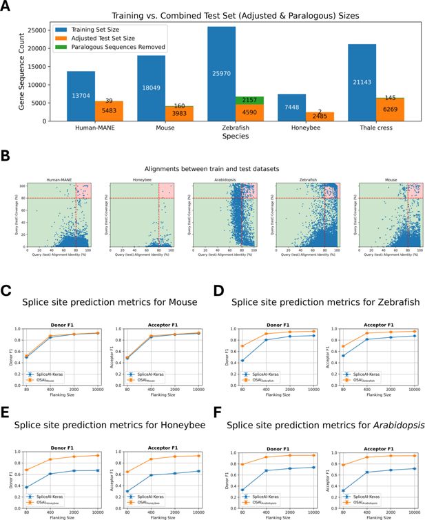
Cross-species dataset composition, sequence filtering, and performance comparison of OpenSpliceAI with SpliceAI-Keras.
(A) The number of protein-coding genes in the training and test sets, along with the count of paralogous genes removed for each species: Human MANE, mouse, zebrafish, honeybee, and Arabidopsis. (B) Scatter plots of DNA sequence alignments between testing and training sets for human MANE, mouse, honeybee, zebrafish, and Arabidopsis. Each dot represents an alignment, with the x-axis showing alignment identity and the y-axis showing alignment coverage. Alignments exceeding 80% for both identity and coverage are highlighted in the red-shaded region and excluded from the test sets. (C–F) Performance comparisons of OSAIs trained on species-specific datasets (mouse, zebrafish, honeybee, and Arabidopsis) vs. SpliceAI-Keras, original published SpliceAI models, trained on human data. The orange curves represent OSAI metrics, while the blue curves show SpliceAI-Keras metrics. Each subplot (C–F) includes F1 score evaluated separately for donor and acceptor sites. Each data point represents the mean across five independently trained models, with error bars indicating the standard error.

Splice site motif count and intron length distributions across five species.
(A) Canonical vs. non-canonical donor and acceptor splice sites. Bar plots depict the total number of donor (blue, orange) and acceptor (green, red) sites across human (MANE), mouse, zebrafish, honeybee, and Arabidopsis genomes, subdivided into canonical (GT/AG) and noncanonical motifs. Percentages above each bar indicate the proportion of sites using canonical motifs in each species. (B) Splice junction (intron) length distributions. Kernel density curves illustrate the distribution of intron lengths in each genome (colored as in the legend). Differences in the breadth and peak of each distribution highlight notable cross-species variation in intron size. (C) Scatter plots of DNA sequence alignments between validation and training sets for human MANE, mouse, honeybee, zebrafish, and Arabidopsis. Each dot represents an alignment, with the x-axis showing alignment identity and the y-axis showing alignment coverage. Alignments exceeding 80% for both identity and coverage are highlighted in the red-shaded region and excluded from the test sets.

Splice site prediction metrics for the mouse (M. musculus) across varying flanking sequence lengths.
Plots compare performance of SpliceAI-Keras (blue) and OSAIMouse (orange) on donor (5′) and acceptor (3′) splice site predictions using 80, 400, 2000, and 10,000 nt of flanking context. OSAIMouse was trained with RefSeq GRCm39 annotation and GRCm39 genome. (A) Donor top-1: measures the percentage of times the model’s most confident prediction exactly matches the true donor site label. (B) Donor AUPRC: area under the precision-recall curve for donor site predictions. (C) Donor accuracy: proportion of correct donor site calls among all predictions. (D) Donor precision: the fraction of predicted donor sites that are correct. (E) Donor recall: the fraction of true donor sites that are correctly predicted. (F) Donor F1: the harmonic mean of precision and recall for donor sites. (G) Acceptor top-1: measures the percentage of times the model’s most confident prediction exactly matches the true acceptor site label. (H) Acceptor AUPRC: area under the precision-recall curve for acceptor site predictions. (I) Acceptor accuracy: proportion of correct acceptor site calls among all predictions. (J) Acceptor precision: the fraction of predicted acceptor sites that are correct. (K) Acceptor recall: the fraction of true acceptor sites that are correctly predicted. (L) Acceptor F1: the harmonic mean of precision and recall for acceptor sites. Each panel illustrates that increasing the flanking sequence length generally enhances model performance, with both SpliceAI-Keras and OpenSpliceAI achieving high accuracy and F1 scores at 10,000 nt. Each data point represents the mean across five independently trained models, with error bars indicating the standard error.

Splice site prediction metrics for the honeybee (A. mellifera) across varying flanking sequence lengths.
Plots compare performance of SpliceAI-Keras (blue) and OSAIHoneybee (orange) on donor (5′) and acceptor (3′) splice site predictions using 80, 400, 2000, and 10,000 nt of flanking context. OSAIHoneybee was trained with RefSeq Amel_HAv3.1 annotation and Amel_HAv3.1 genome. (A) Donor top-1: measures the percentage of times the model’s most confident prediction exactly matches the true donor site label. (B) Donor AUPRC: area under the precision-recall curve for donor site predictions. (C) Donor accuracy: proportion of correct donor site calls among all predictions. (D) Donor precision: the fraction of predicted donor sites that are correct. (E) Donor recall: the fraction of true donor sites that are correctly predicted. (F) Donor F1: the harmonic mean of precision and recall for donor sites. (G) Acceptor top-1: measures the percentage of times the model’s most confident prediction exactly matches the true acceptor site label. (H) Acceptor AUPRC: area under the precision-recall curve for acceptor site predictions. (I) Acceptor accuracy: proportion of correct acceptor site calls among all predictions. (J) Acceptor precision: the fraction of predicted acceptor sites that are correct. (K) Acceptor recall: the fraction of true acceptor sites that are correctly predicted. (L) Acceptor F1: the harmonic mean of precision and recall for acceptor sites. Each panel illustrates that increasing the flanking sequence length generally enhances model performance, with both SpliceAI-Keras and OpenSpliceAI achieving high accuracy and F1 scores at 10,000 nt. Each data point represents the mean across five independently trained models, with error bars indicating the standard error.

Splice site prediction metrics for the zebrafish (D. rerio) across varying flanking sequence lengths.
Plots compare performance of SpliceAI-Keras (blue) and OSAIZebrafish (orange) on donor (5′) and acceptor (3′) splice site predictions using 80, 400, 2000, and 10,000 nt of flanking context. OSAIZebrafish was trained with RefSeq GRCz11 annotation and GRCz11 genome. (A) Donor top-1: measures the percentage of times the model’s most confident prediction exactly matches the true donor site label. (B) Donor AUPRC: area under the precision-recall curve for donor site predictions. (C) Donor accuracy: proportion of correct donor site calls among all predictions. (D) Donor precision: the fraction of predicted donor sites that are correct. (E) Donor recall: the fraction of true donor sites that are correctly predicted. (F) Donor F1: the harmonic mean of precision and recall for donor sites. (G) Acceptor top-1: measures the percentage of times the model’s most confident prediction exactly matches the true acceptor site label. (H) Acceptor AUPRC: area under the precision-recall curve for acceptor site predictions. (I) Acceptor accuracy: proportion of correct acceptor site calls among all predictions. (J) Acceptor precision: the fraction of predicted acceptor sites that are correct. (K) Acceptor recall: the fraction of true acceptor sites that are correctly predicted. (L) Acceptor F1: the harmonic mean of precision and recall for acceptor sites. Each panel illustrates that increasing the flanking sequence length generally enhances model performance, with both SpliceAI-Keras and OpenSpliceAI achieving high accuracy and F1 scores at 10,000 nt. Each data point represents the mean across five independently trained models, with error bars indicating the standard error.

Splice site prediction metrics for the A. thaliana across varying flanking sequence lengths.
Plots compare performance of SpliceAI-Keras (blue) and OSAIArabidopsis (orange) on donor (5′) and acceptor (3′) splice site predictions using 80, 400, 2000, and 10,000 nt of flanking context. OSAIArabidopsis was trained with RefSeq TAIR10.1 annotation and TAIR10.1 genome. (A) Donor top-1: measures the percentage of times the model’s most confident prediction exactly matches the true donor site label. (B) Donor AUPRC: area under the precision-recall curve for donor site predictions. (C) Donor accuracy: proportion of correct donor site calls among all predictions. (D) Donor precision: the fraction of predicted donor sites that are correct. (E) Donor recall: the fraction of true donor sites that are correctly predicted. (F) Donor F1: the harmonic mean of precision and recall for donor sites. (G) Acceptor top-1: measures the percentage of times the model’s most confident prediction exactly matches the true acceptor site label. (H) Acceptor AUPRC: area under the precision-recall curve for acceptor site predictions. (I) Acceptor accuracy: proportion of correct acceptor site calls among all predictions. (J) Acceptor precision: the fraction of predicted acceptor sites that are correct. (K) Acceptor recall: the fraction of true acceptor sites that are correctly predicted. (L) Acceptor F1: the harmonic mean of precision and recall for acceptor sites. Each panel illustrates that increasing the flanking sequence length generally enhances model performance, with both SpliceAI-Keras and OpenSpliceAI achieving high accuracy and F1 scores at 10,000 nt. Each data point represents the mean across five independently trained models, with error bars indicating the standard error.
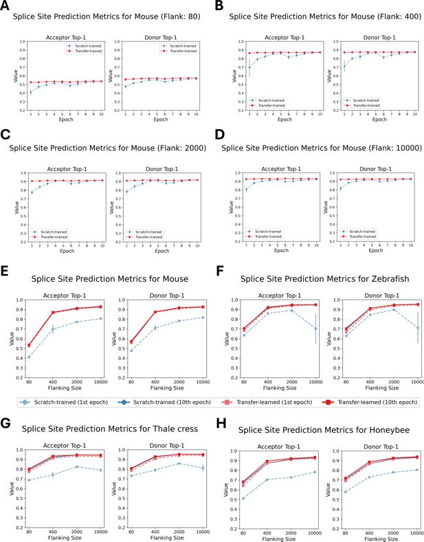
Performance comparison of scratch-trained and transfer-trained OSAIs across species and sequence lengths.
(A–D) Top-1 accuracy for donor and acceptor splice sites of 80 nt, 400 nt, 2000 nt, and 10,000 nt models, comparing OSAIMouse (scratch-trained) and OSAIMouse-transferred (transfer-trained) models over epochs 1–10 on the test dataset. (E–H) Top-1 accuracy after one epoch of training vs. after 10 epochs for both scratch-trained and transfer-trained models across the same sequence lengths. Each plot represents one species and its corresponding transfer-trained model: (E) OSAIMouse vs. OSAIMouse-transferred, (F) OSAIZebrafish vs. OSAIZebrafish-transferred, (G) OSAIArabidopsis vs. OSAIArabidopsis-transferred, and (H) OSAIHoneybee vs. OSAIHoneybee-transferred. Each data point represents the mean across five independently trained models, with error bars indicating the standard error.

Transfer learning from OSAIMANE was leveraged to evaluate performance metrics for splice site prediction in mouse (M. musculus) across four flanking sequence lengths (80, 400, 2000, and 10,000 nt) and two splice site types (acceptor and donor).
Each row corresponds to a unique flanking length-splice site combination, and each column depicts a distinct evaluation metric (top-1 accuracy, F1, and AUPRC). Blue and red curves represent the mean performance (± standard deviation) of five models trained from scratch and five models fine-tuned from OSAIMANE, respectively. The x-axis indicates the training epoch, and the y-axis denotes the corresponding metric value. Subplot titles specify the flanking length, splice site type, and metric. Overall, fine-tuned models converge more rapidly, reaching stable performance as early as the first epoch, whereas models trained from scratch require additional epochs to stabilize.

Transfer learning from OSAIMANE was leveraged to evaluate performance metrics for splice site prediction in honeybee (A. mellifera) across four flanking sequence lengths (80, 400, 2000, and 10,000 nt) and two splice site types (acceptor and donor).
Each row corresponds to a unique flanking length-splice site combination, and each column depicts a distinct evaluation metric (top-1 accuracy, F1, and AUPRC). Blue and red curves represent the mean performance (± standard deviation) of five models trained from scratch and five models fine-tuned from OSAIMANE, respectively. The x-axis indicates the training epoch, and the y-axis denotes the corresponding metric value. Subplot titles specify the flanking length, splice site type, and metric. Overall, fine-tuned models converge more rapidly, reaching stable performance as early as the first epoch, whereas models trained from scratch require additional epochs to stabilize.

Transfer learning from OSAIMANE was leveraged to evaluate performance metrics for splice site prediction in zebrafish (D. rerio) across four flanking sequence lengths (80, 400, 2000, and 10,000 nt) and two splice site types (acceptor and donor).
Each row corresponds to a unique flanking length-splice site combination, and each column depicts a distinct evaluation metric (top-1 accuracy, F1, and AUPRC). Blue and red curves represent the mean performance (± standard deviation) of five models trained from scratch and five models fine-tuned from OSAIMANE, respectively. The x-axis indicates the training epoch, and the y-axis denotes the corresponding metric value. Subplot titles specify the flanking length, splice site type, and metric. Overall, fine-tuned models converge more rapidly, reaching stable performance as early as the first epoch, whereas models trained from scratch require additional epochs to stabilize.

Transfer learning from OSAIMANE was leveraged to evaluate performance metrics for splice site prediction in A. thaliana across four flanking sequence lengths (80, 400, 2000, and 10,000 nt) and two splice site types (acceptor and donor).
Each row corresponds to a unique flanking length-splice site combination, and each column depicts a distinct evaluation metric (top-1 accuracy, F1, and AUPRC). Blue and red curves represent the mean performance (± standard deviation) of five models trained from scratch and five models fine-tuned from OSAIMANE, respectively. The x-axis indicates the training epoch, and the y-axis denotes the corresponding metric value. Subplot titles specify the flanking length, splice site type, and metric. Overall, fine-tuned models converge more rapidly, reaching stable performance as early as the first epoch, whereas models trained from scratch require additional epochs to stabilize.

Cross‐species transfer learning performance on human splice‐site prediction.
Models pre-trained on (A) A. thaliana (OSAIArabidopsis), (B) A. mellifera (OSAIHoneybee), (C) M. musculus (OSAIMouse), and (D) D. rerio (OSAIZebrafish) were fine‐tuned on the human MANE dataset (orange) and compared to a model trained from scratch on MANE (OSAIMANE, blue). Within each panel, the top row shows donor top-K (left) and donor F1 (right) scores, and the bottom row shows acceptor top-K (left) and acceptor F1 (right) scores. The x-axis indicates models trained with flanking sequence sizes of 80, 400, 2000, and 10,000 bp. Each data point represents the mean across five independently trained models, with error bars indicating the standard error.
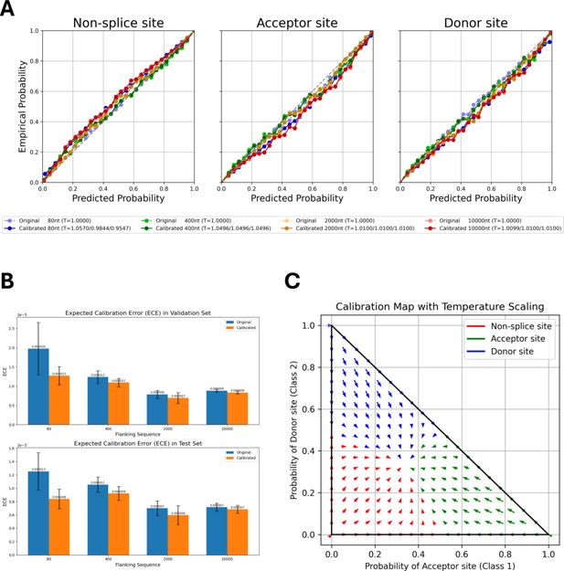
Calibration of OSAIMANE predictions across splice-site classes and flanking sequence lengths.
(A) Calibration results for OSAIMANE across non-splice sites, acceptor sites, and donor sites. Models trained with different flanking sequence lengths are represented by color: 80 nt (blue), 400 nt (green), 2000 nt (orange), and 10,000 nt (red). Dotted curves in lighter colors denote pre-calibration results, while solid curves in darker shades show post-calibration results. (B) Expected calibration error (ECE) on the validation set (top) and test set (bottom), comparing the OSAIMANE’s performance before (blue bars) and after (orange bars) calibration. For each flanking sequence OSAIMANE, five calibration experiments were performed, with the mean loss and ±1 standard error. (C) Two-dimensional calibration map for OSAIMANE, illustrating how raw predicted probabilities for acceptor (x-axis) and donor (y-axis) sites are transformed after calibration. Arrows indicate the shift from pre- to post-calibration states in two-dimensional probability space, resulting in a smoother probability distribution.

Calibration results for human MANE splice site classification at four flanking sequence sizes.
(A, C, E, G) Reliability (calibration) curves for flanking sequence sizes of 80, 400, 2000, and 10,000 nucleotides, respectively. Each plot compares predicted probabilities (x-axis) to empirical probabilities (y-axis) for non-splice sites (left), acceptor sites (middle), and donor sites (right). The blue curves depict the reliability of the original OSAIMANE models, while the green curves show reliability after calibration. Shaded regions represent confidence intervals. The diagonal black line indicates perfect calibration, where predicted probabilities match observed frequencies exactly. (B, D, F, H) Temperature scaling maps for each corresponding flanking sequence size, illustrating how raw predicted probabilities for acceptor (x-axis) and donor (y-axis) sites are transformed after calibration. Arrows indicate the shift from pre- to post-calibration states in two-dimensional probability space.

Expected calibration error (ECE) on the validation (top) and test (bottom) sets.
Blue bars indicate model performance before calibration, and orange bars indicate performance after calibration. Results are shown for (A) human MANE, (B) mouse, (C) honeybee, (D) Arabidopsis, and (E) zebrafish.

Negative log likelihood (NLL) loss on the validation (top) and test (bottom) sets.
Blue bars indicate model performance before calibration, and orange bars indicate performance after calibration. Results are shown for (A) human MANE, (B) mouse, (C) honeybee, (D) Arabidopsis, and (E) zebrafish.

Calibration results for house mouse (M. musculus) splice site classification at four flanking sequence sizes.
(A, C, E, G) Reliability (calibration) curves for flanking sequence sizes of 80, 400, 2000, and 10,000 nt, respectively. Each plot compares predicted probabilities (x-axis) to empirical probabilities (y-axis) for non-splice sites (left), acceptor sites (middle), and donor sites (right). The blue curves depict the reliability of the original OSAIMouse models, while the green curves show reliability after calibration. Shaded regions represent confidence intervals. The diagonal black line indicates perfect calibration, where predicted probabilities match observed frequencies exactly. (B, D, F, H) Temperature scaling maps for each corresponding flanking sequence size, illustrating how raw predicted probabilities for acceptor (x-axis) and donor (y-axis) sites are transformed after calibration. Arrows indicate the shift from pre- to post-calibration states in two-dimensional probability space.

Calibration results for zebrafish (D. rerio) splice site classification at four flanking sequence sizes.
(A, C, E, G) Reliability (calibration) curves for flanking sequence sizes of 80, 400, 2000, and 10,000 nt, respectively. Each plot compares predicted probabilities (x-axis) to empirical probabilities (y-axis) for non-splice sites (left), acceptor sites (middle), and donor sites (right). The blue curves depict the reliability of the original OSAIZebrafish models, while the green curves show reliability after calibration. Shaded regions represent confidence intervals. The diagonal black line indicates perfect calibration, where predicted probabilities match observed frequencies exactly. (B, D, F, H) Temperature scaling maps for each corresponding flanking sequence size, illustrating how raw predicted probabilities for acceptor (x-axis) and donor (y-axis) sites are transformed after calibration. Arrows indicate the shift from pre- to post-calibration states in two-dimensional probability space.

Calibration results for honeybee (A. mellifera) splice site classification at four flanking sequence sizes.
(A, C, E, G) Reliability (calibration) curves for flanking sequence sizes of 80, 400, 2000, and 10,000 nt, respectively. Each plot compares predicted probabilities (x-axis) to empirical probabilities (y-axis) for non-splice sites (left), acceptor sites (middle), and donor sites (right). The blue curves depict the reliability of the original OSAIHoneybee models, while the green curves show reliability after calibration. Shaded regions represent confidence intervals. The diagonal black line indicates perfect calibration, where predicted probabilities match observed frequencies exactly. (B, D, F, H) Temperature scaling maps for each corresponding flanking sequence size, illustrating how raw predicted probabilities for acceptor (x-axis) and donor (y-axis) sites are transformed after calibration. Arrows indicate the shift from pre- to post-calibration states in two-dimensional probability space.

Calibration results for A. thaliana splice site classification at four flanking sequence sizes.
(A, C, E, G) Reliability (calibration) curves for flanking sequence sizes of 80, 400, 2000, and 10,000 nt, respectively. Each plot compares predicted probabilities (x-axis) to empirical probabilities (y-axis) for non-splice sites (left), acceptor sites (middle), and donor sites (right). The blue curves depict the reliability of the original OSAIArabidopsis models, while the green curves show reliability after calibration. Shaded regions represent confidence intervals. The diagonal black line indicates perfect calibration, where predicted probabilities match observed frequencies exactly. (B, D, F, H) Temperature scaling maps for each corresponding flanking sequence size, illustrating how raw predicted probabilities for acceptor (x-axis) and donor (y-axis) sites are transformed after calibration. Arrows indicate the shift from pre- to post-calibration states in two-dimensional probability space.
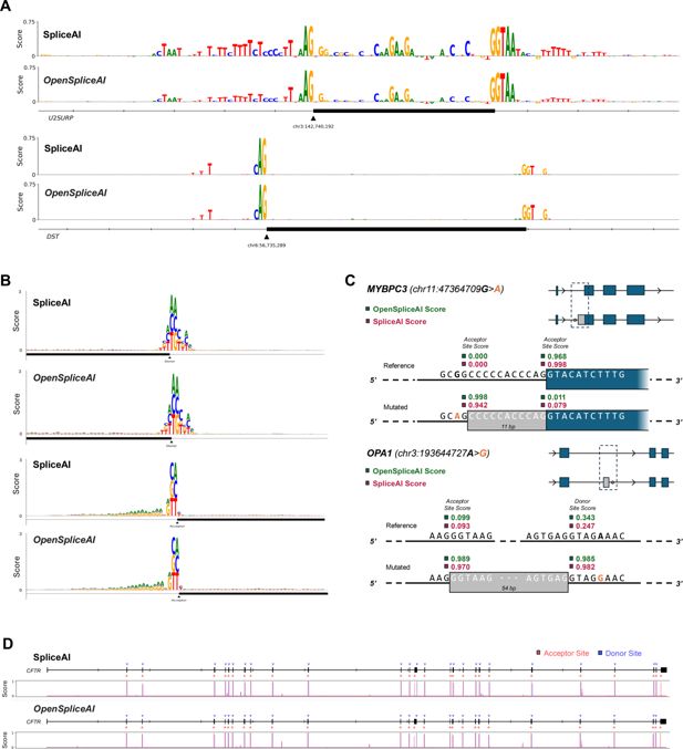
Comparison of SpliceAI and OSAIMANE in predicting mutation impacts and cryptic splicing events.
(A) Plot of importance scores for nucleotides near the acceptor site of exon 9 of U2SURP (top) and DST (bottom), for both SpliceAI and OSAIMANE. The importance score is calculated by taking the average decrease in acceptor site score across the three possible point mutations at a given base position. (B) Plot of the impact of each possible point mutation within 80 bp of a donor (top) site or acceptor (bottom) site, for both SpliceAI and OSAIMANE. The impact is the raw decrease in predicted splice site score after mutating a given base to a different one. (C) Visualization of cryptic splicing variants being predicted for the MYBPC3 gene (top), with an acceptor site gain and loss event, from SpliceAI’s original analysis, and the OPA1 gene (bottom), where a cryptic exon inclusion event was recently reported (Qian et al., 2021). (D) Predicted splice sites for the entire CFTR gene, with the corresponding predicted probability distribution by base position plotted below, for both SpliceAI and OSAIMANE.

Zoomed‐in 160 bp DNA sequence logos derived from in silico mutagenesis (ISM) importance score profiles for representative donor (A–E) and acceptor (F–J) splice sites.
Logos were generated by mapping the ISM importance score at each position centered on the splice site to letter heights, with SpliceAI scores shown in the upper logo and OSAIMANE scores shown in the lower logo of each panel.
Tables
Genome assembly and annotation details for species used for OpenSpliceAI training and transfer learning in this study.
Note: For each species, the table includes the GenBank accession number, assembly name, ftp sites for assembly and annotation downloads, and annotation release dates.
| Species | Name | Genbank accession | Download link | Annotation release date |
|---|---|---|---|---|
| H. sapiens | GRCh38.p14 | GCA_000001405.29 | https://ftp.ncbi.nlm.nih.gov/genomes/all/annotation_releases/9606/GCF_000001405.40-RS_2023_03/ | March 21, 2023 |
| M. musculus | GRCm39 | GCA_000001635.9 | https://ftp.ncbi.nlm.nih.gov/genomes/all/GCF/000/001/635/GCF_000001635.27_GRCm39/ | February 8, 2024 |
| A. mellifera | Amel_HAv3.1 | GCA_003254395.2 | https://ftp.ncbi.nlm.nih.gov/genomes/all/GCF/003/254/395/GCF_003254395.2_Amel_HAv3.1/ | September 30, 2022 |
| A. thaliana | TAIR10.1 | GCA_000001735.2 | https://ftp.ncbi.nlm.nih.gov/genomes/all/GCF/000/001/735/GCF_000001735.4_TAIR10.1/ | June 16, 2023 |
| D. rerio | GRCz11 | GCA_000002035.4 | https://ftp.ncbi.nlm.nih.gov/genomes/all/GCF/000/002/035/GCF_000002035.6_GRCz11/ | August 15, 2024 |
Summary of the four OpenSpliceAI model architectures, each trained with a distinct flanking sequence length (80, 400, 2000, and 10,000 nucleotides).
The table lists the kernel sizes (W), dilation rates (AR), number of residual and skip blocks, and total cropping length (CL).
| Parameter | Flanking = 80 | Flanking = 400 | Flanking = 2000 | Flanking = 10,000 |
|---|---|---|---|---|
| Kernel sizes (W) | [11, 11, 11, 11] | [11, 11, 11, 11, 11, 11, 11, 11] | [11, 11, 11, 11, 11, 11, 11, 11, 21, 21, 21, 21] | [11, 11, 11, 11, 11, 11, 11, 11, 21, 21, 21, 21, 41, 41, 41, 41] |
| Dilated rates (AR) | [1, 1, 1, 1] | [1, 1, 1, 1, 4, 4,,4,4] | [1, 1, 1, 1, 4, 4,,4,4, 10, 10, 10, 10] | [1, 1, 1, 1, 4, 4,,4,4, 10, 10, 10, 10, 25, 25, 25, 25] |
| Residual blocks | 4 | 8 | 12 | 16 |
| Skip connections | 1 (inserted after residual block 4) | 2 (inserted after residual blocks 4 and 8) | 3 (inserted after residual blocks 4, 8, and 12) | 4 (inserted after residual blocks 4, 8, 12, and 16) |
| Cropping length (CL); () | 80 | 400 | 2000 | 10,000 |


