A spiral attractor network drives rhythmic locomotion
- The Chicago Medical School, Rosalind Franklin University of Medicine and Science, United States
- University of Manchester, United Kingdom
Figures
Figure 1 with 1 supplement
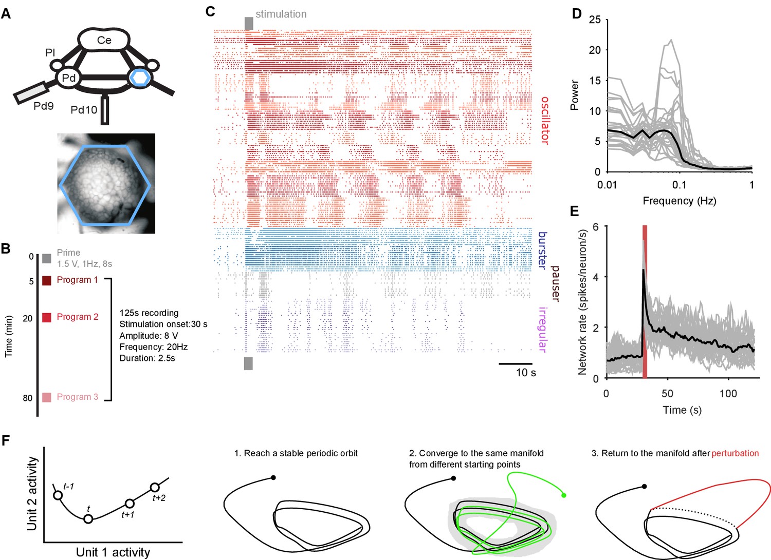
Population dynamics during fictive locomotion.
(A) Voltage-sensitive dye recording of the pedal ganglion (Pd) network in an isolated central nervous system preparation (top) using a photodiode array (blue hexagon). The array covered the dorsal surface of the ganglion (bottom). Ce: cerebral ganglion; Pl: pleural ganglion; Pd9/10: pedal nerve 9/10. (B) Stimulus protocol. Three escape locomotion bouts were evoked in each preparation by stimulation of tail nerve Pd9. Parameters are given for the stimulus pulse train. (C) Example population recording. Raster plot of 160 neurons before and after Pd9 nerve stimulation. Neurons are grouped into ensembles of similarly-patterned firing, and ordered by ensemble type (colors) - see Materials and methods. (D) Power spectra of each population’s spike-trains, post-stimulation (grey: mean spectrum of each bout; black: mean over all bouts). (E) Network firing rate over time (grey: every bout; black: mean; red bar: stimulation duration. Bins: 1 s). (F) Terminology and schematic illustration of the necessary conditions for identifying a periodic attractor (or ‘cyclical’ attractor). Left: to characterise the dynamics of a -dimensional system, we use the joint activity of its units at each time-point – illustrated here for units. The set of joint activity points in time order defines the system’s trajectory (black line). Right: the three conditions for identifying a periodic attractor. In each panel, the line indicates the trajectory of the joint activity of all units in the dynamical system, starting from the solid dot. The manifold of a dynamical system is the space containing all possible trajectories of the unperturbed system – for periodic systems, we consider the manifold to contain all periodic parts of the trajectories (grey shading). In (condition 3), the dashed line indicates where the normal trajectory of the system would have been if not for the perturbation (red line). See Figure 1—figure supplement 1 for a dynamical model illustrating these conditions.
Figure 1—figure supplement 1
Necessary and sufficient conditions of a periodic attractor.
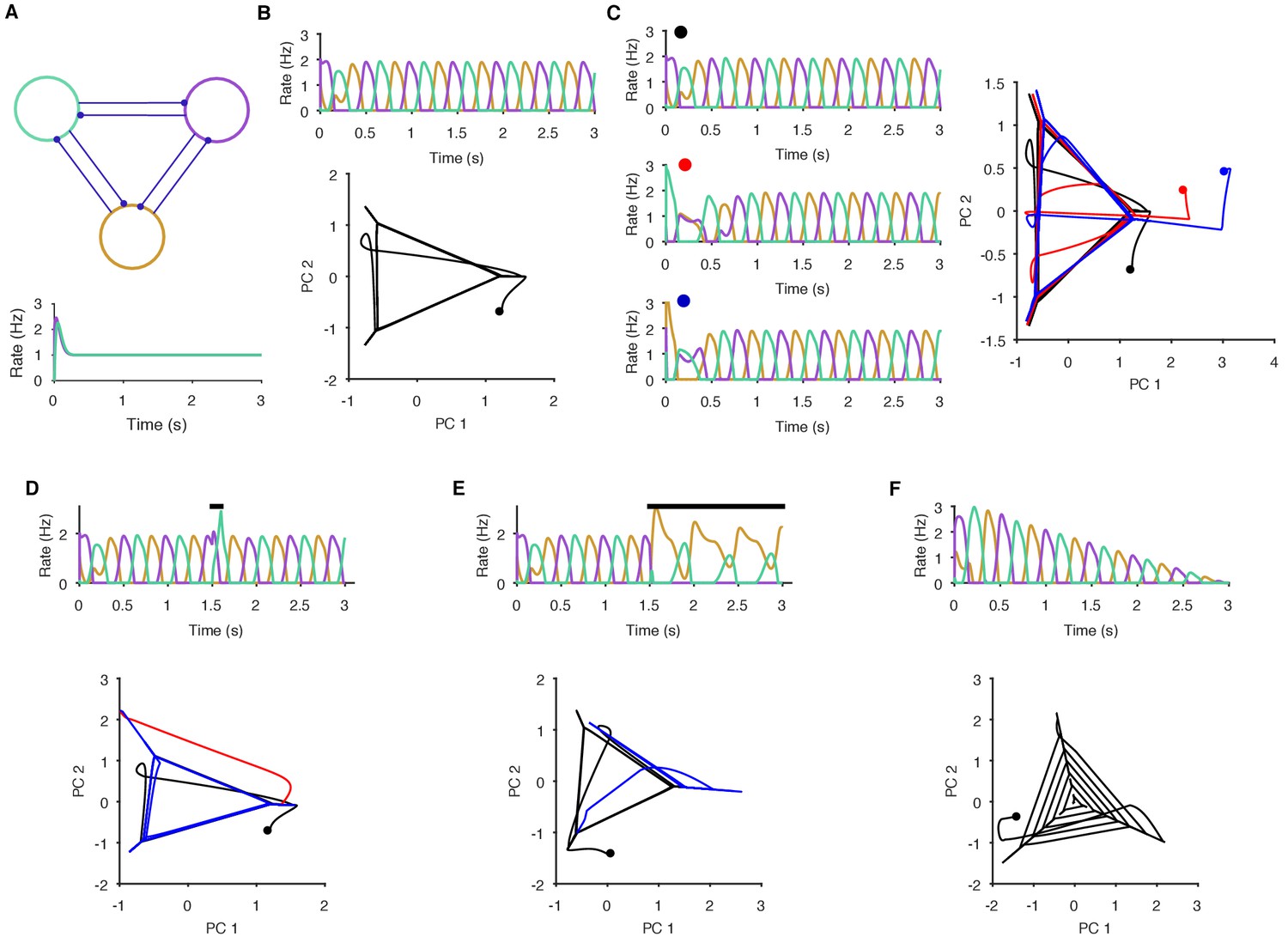
Here we demonstrate the essential properties of a periodic attractor network. (A) Top: a simple neuronal implementation of a periodic attractor network using three mutually inhibitory neurons. Bottom: model neurons are not endogenous oscillators - if uncoupled, they do not oscillate in response to constant input. The oscillatory activity we show here is an emergent property of the model network. (B) The underlying periodic attractor is revealed by the recurrence of the neurons’ joint activity. Top: given sustained input, the three neurons rapidly settle into an alternating oscillatory rhythm. Bottom: projection of the three neurons’ firing rates onto the first two principal components (PCs). Starting from time zero (black dot), the joint activity of the network rapidly converges to a recurrent trajectory, where each corner of the triangle - extending into the short diagonal line - corresponds to the maximum rate of one neuron. The space containing the repeated trajectory is the attractor’s manifold. (C) Convergence to the manifold from different initial conditions. From three different initial conditions for the neurons (coloured dots), each corresponding joint activity converges to the attractor manifold. (D) Transient perturbations cause a divergence and return to the attractor’s manifold. Top: A brief increase in input to one neuron (black bar) perturbs the ongoing oscillation, which is rapidly recovered. Bottom: in the PC projection, the initial recurrent trajectory (in black) is moved away from the manifold by the perturbation (red); removing the perturbing input rapidly moves the joint activity back to the manifold (blue). (E) Sustained perturbations move the network to a new attractor. Top: A sustained change in input (black bar) causes one neuron (purple) to become silent and the others to change their oscillation pattern. Bottom: in the PC projection, the perturbation causes the joint activity of the network to move from the initial stable manifold (black) to a new stable manifold (blue: note this is a repeating line). (F) Decaying input causes a spiral. Top: linearly decaying input to all neurons changes the amplitude, but not the frequency of the oscillatory activity. Bottom: in the PC projection, this decay is shown by the spiral of the joint activity’s trajectory to the stable point at (0,0) – which corresponds to no activity.
Figure 2 with 2 supplements
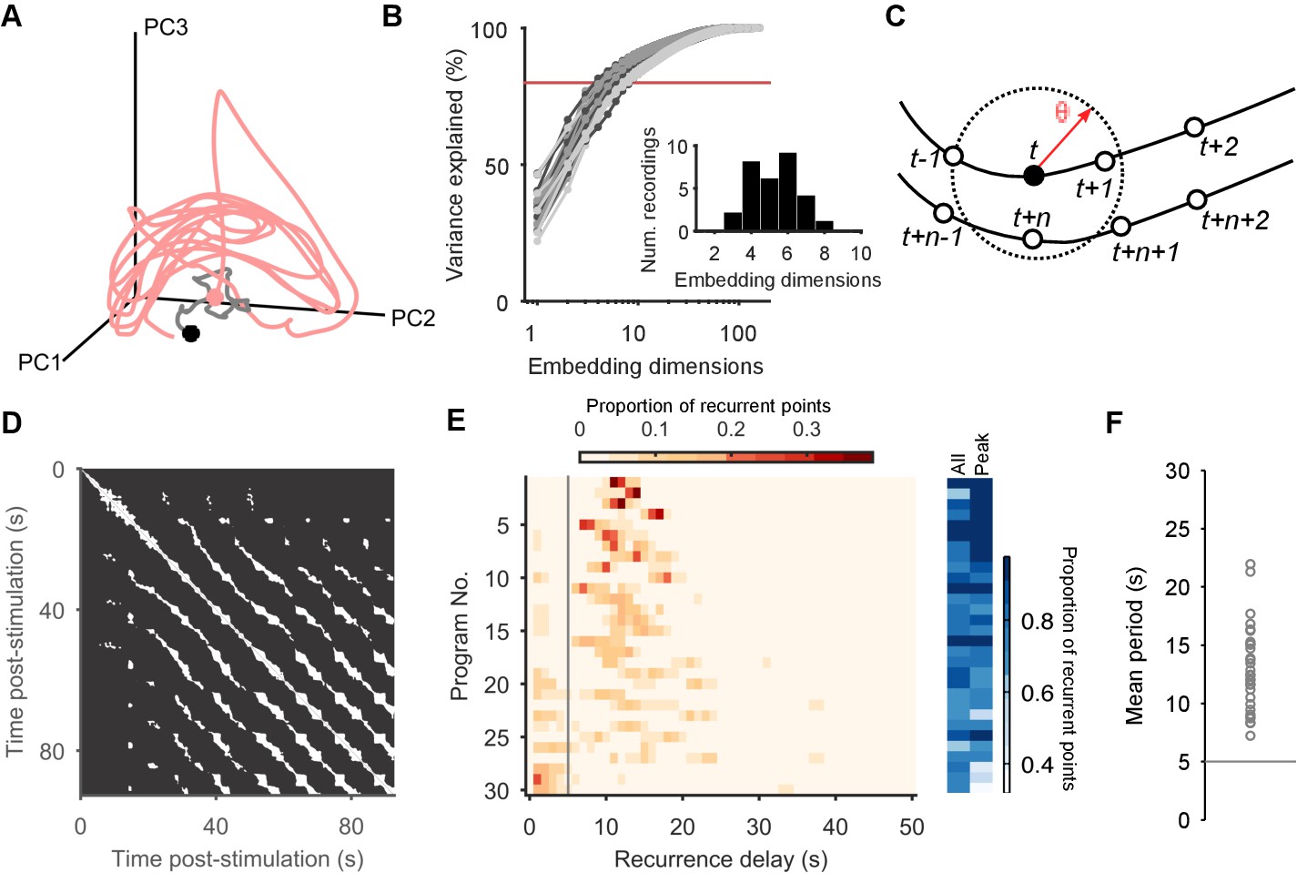
Population dynamics form a low-dimensional periodic orbit.
(A) Projection of one evoked population response into three embedding dimensions, given by its first three principal components (PCs). Dots: start of recording (black) and stimulation (pink); spontaneous activity is shown in grey. Smoothed with 2 s boxcar window. (B) Proportion of population variance explained by each additional embedding dimension, for every evoked population response (; light-to-dark grey scale indicates stimulations 1 to 3 of a preparation). We chose a threshold of 80% variance (red line) to approximately capture the main dimensions: beyond this, small gains in explained variance required exponentially-increasing numbers of dimensions. Inset: Histogram of the number of PCs needed to explain 80% variance in every recorded population response. (C) Quantifying population dynamics using recurrence. Population activity at some time is a point in -dimensional space (black circle), following some trajectory (line and open circles); that point recurs if activity at a later time passes within some small threshold distance . The time is the recurrence time of point . (D) Recurrence plot of the population response in panel A. White squares are recurrence times, where the low-dimensional dynamics at two different times passed within distance . We defined as a percentile of all distances between points; here we use 10%. Stimulation caused the population’s activity to recur with a regular period. Projection used 4 PCs. (E) Histograms of all recurrence times in each population response (threshold: 10%), ordered top-to-bottom by height of normalised peak value. Vertical line indicates the minimum time we used for defining the largest peak as the dominant period for that population response. Right: density of time-points that were recurrent, and density of recurrence points with times in the dominant period. (F) Periodic orbit of each evoked population response, estimated as the mean recurrence time from the dominant period.
Figure 2—figure supplement 1

Range of dynamics in the evoked locomotion programs.
Here we quantify the complexity of the dynamics in each evoked program using the structure of the recurrence plots (five example plots are shown). Each white dot is a pair of time-points at which the low-dimensional trajectory recurred. A diagonal line indicates a contiguous period of recurrence of the population dynamics. We thus quantified the complexity of each program by the duration of the longest diagonal line (measuring the predictability of the system) and by the proportion of recurrent points falling in long (5 s) diagonal lines (measuring the cleanness of the system’s dynamics). We plot the joint distribution of these two quantities here, one point per program; colours indicate programs from the same preparation. These show how the range of dynamics captured by our dataset stretches from quasi-noise (bottom left), though stuttering/pausing oscillations (top left), to continuous oscillation (right). Despite this heterogeneity, almost all evoked programs revealed the same underlying dynamical system (Figures 2–4, main text).
Figure 2—figure supplement 2

Robustness of the periodic orbits.
Here we show that the periodic orbits, defined by recurrence, are robust to the choice of threshold for defining ‘close’. We defined the threshold as a percentile of all distances between all points in the post-stimulation trajectory. We show here the effects of choosing a threshold of 10% (A), 5% (B), and 2% (C). Left column: histograms of all recurrence times in each program, ordered top-to-bottom by height of normalised peak value. Vertical line indicates the minimum time we used for defining the largest peak as the dominant period for that program. Middle column: density of time-points that were recurrent, and density of recurrence points with times in the dominant period. Right column: Periodic orbit of each program, estimated as the mean recurrence time from the dominant period. We use a threshold of 10% in the main text as it allows a denser sampling of potential trajectory points that are noisy realisations of the underlying attractor.
Figure 3 with 2 supplements

Low dimensional population dynamics meet the conditions for a periodic attractor.
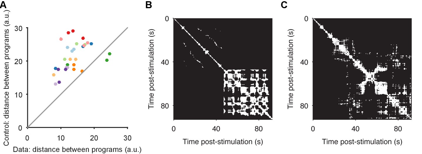
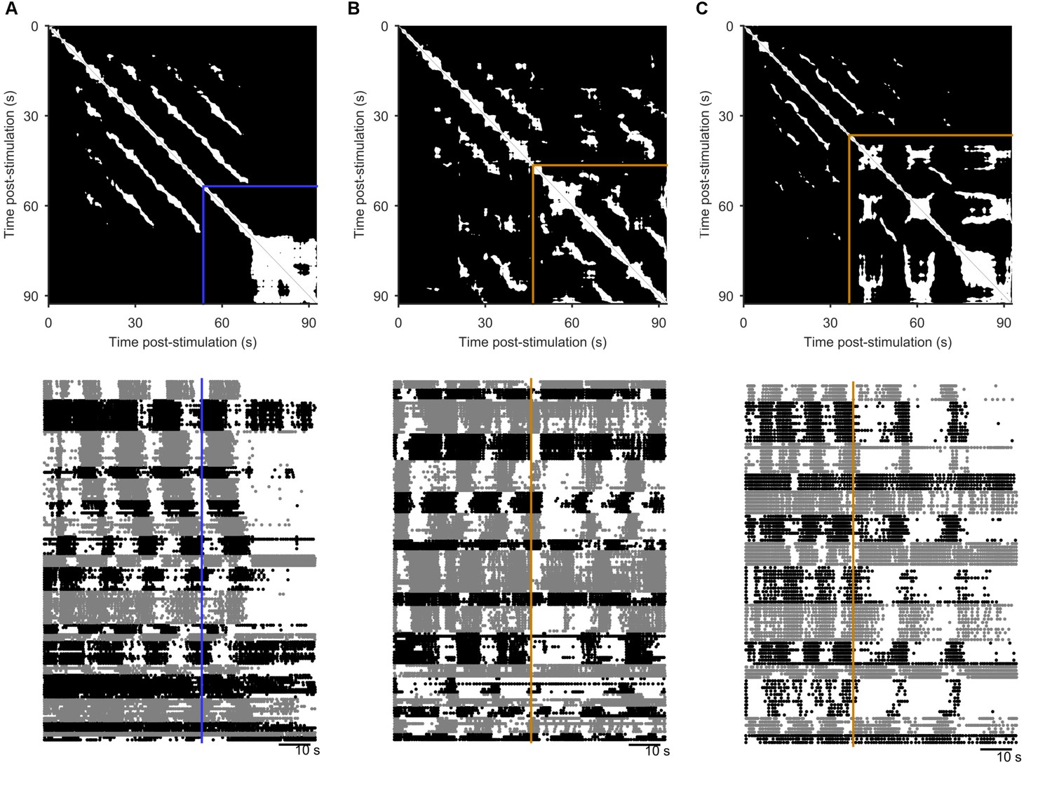
(A) Distribution of the time the population dynamics took to coalesce onto the attractor from the stimulation onset, and the subsequent stability of the attractor (measured by the proportion of recurrent points). Colours indicate evoked responses from the same preparation. The coalescence time is the mid-point of the first 5 s sliding window in which at least 90% of the points on the population trajectory recurred in the future. (B) Projection of three sequential population responses from one preparation onto the same embedding dimensions. Dots are time of stimulus offset. (C) Sequential population responses fall onto the same manifold. Dots indicate distances between pairs of population responses in the same preparation; color indicates preparation. Control distances are from random projections of each population response onto the same embedding dimensions - using the same time-series, but shuffling the assignment of time series to neurons. This shows how much of the manifold agreement is due to the choice of embedding dimensions alone. The two pairs below the diagonal are for response pairs (1,2) and (1,3) in preparation 4; this correctly identified the unique presence of apparent chaos in response 1 (see Figure 3—figure supplement 1). (D) Distances between pairs of population responses from the same preparation in three states: the end of spontaneous activity (at stimulus onset); between stimulation onset and coalescence (the maximum distance between the pair); and after both had coalesced (both reaching the putative attractor manifold; data from panel C). (E) Example neuron activity similarity matrices for consecutively evoked population responses. Neurons are ordered according to their total similarity in stimulation 2. (F) Correlation between pairs of neuron similarity matrices (Data) compared to the expected correlation between pairs of matrices with the same total similarity per neuron (Control). Values below the diagonal indicate conserved pairwise correlations between pairs of population responses within the same preparation. The two pairs on the diagonal are response pairs (1,3) and (2,3) in preparation 7; this correctly identified the unique presence of a random walk in response 3 (see Figure 3—figure supplement 1). (G) Spontaneous divergence from the trajectory. For one population response, here we plot the density of recurrence points (top) and the mean recurrence delay in 5 s sliding windows. Coalescence time: grey line. The sustained ‘divergent’ period of low recurrence (grey shading) shows the population spontaneously diverged from its ongoing trajectory, before returning. Black dot: pre-divergence window (panel I). (H) Breakdown of spontaneous perturbations across all population responses. Returned: population activity became stably recurrent after the perturbation. (I) Returning to the same manifold. For each of the 17 ‘Returned’ perturbations in panel H, the proportion of the recurrent points in the pre-divergence window that recurred after the divergent period, indicating a return to the same manifold or to a different manifold.
Figure 3—figure supplement 1
Convergence and non-convergence to the same manifold.
(A) Robustness of convergence to the same manifold. Here we repeat the analysis of Figure 3A, but using different low-dimensional projections. In the main text Figures 2–4, we analyse low-dimensional projections of each individual program; the comparison of distances between sequentially evoked programs was then done by projecting all three programs onto the axes of the first program. Here we derive a common set of axes, by first applying PCA to the concatenated time-series of the three programs. We then project each program onto those common axes, before computing distances between data and control (random projection) pairs of programs (dots). We obtain the same results: sequentially-evoked programs converge to the same manifold. (B) Apparent chaotic motion in the non-convergent program. Here we show the recurrence plot for program 1 of preparation 4, the only program that was further from the other programs in the same preparation than random projections. We see that this program seemed to reach an apparently chaotic attractor about 45 s after stimulation: quasi-periodic activity, with no regular structure. (C) Apparent random-walk in the non-correlated program. Here we show the recurrence plot for program 3 of preparation 7, the only program that did not recapitulate the pair-wise correlations of neural activity of the other programs in the same preparation. We see that this program had no clear periodic activity, but seemingly random periods of locally-similar activity, consistent with a dynamical system undergoing a random walk.
Figure 3—figure supplement 2
Spontaneous perturbations of ongoing programs.
We plot here examples of each type of spontaneous perturbation we observed, visualised using the recurrence plot (top), and the raster plot of population activity (bottom) sorted into detected ensembles. (A) Spontaneous perturbation away from the periodic attractor. Blue line indicates the final 5 s window with more than 50% recurrence, long before the end of the recording. (B) Spontaneous perturbation returning to the same manifold of the periodic attractor. The orange lines indicates the point of maximum divergence from the manifold. The recurrence plot shows that same trajectory was recovered thereafter (white patches in upper right corner), visible as the return of the phasically firing ensembles (raster plot). (C) Spontaneous perturbation moving to a new periodic attractor. The recurrent trajectory up to 30 s post-stimulus did not recur thereafter (black region in upper right of the recurrence plot), but was replaced with a new recurrent trajectory. The raster plot shows this was an apparent transition in the oscillation period, and/or firing pattern of the ensembles.
Figure 4 with 1 supplement
The pedal ganglion contains a spiral attractor.
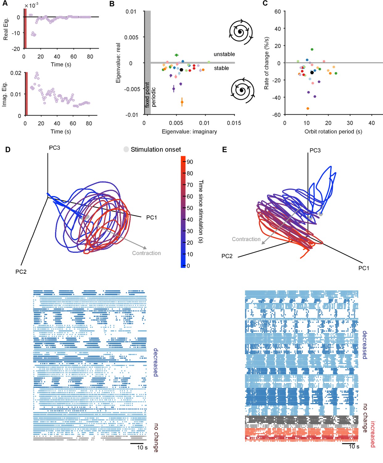
(A) Example time-series from one population response of the real (top) and imaginary (bottom) component of the maximum eigenvalue for the local linear model. Points are averages over a 5 s sliding window. Red bar indicates stimulus duration. (B) Dominant dynamics for each evoked population response. Dots and lines give means 2 s.e.m. of the real and imaginary components of the maximum eigenvalues for the local linear model. Colours indicate responses from the same preparation. Black dot gives the mean over all population responses. Grey shaded regions approximately divide the plane of eigenvalue components into regions of qualitatively different dynamics: fixed point attractor; stable spiral (bottom-right schematic); unstable spiral (top-right schematic). (C) As panel B, converted to estimates of orbital period and rate of contraction. (Note that higher imaginary eigenvalues equate to faster orbital periods, so the ordering of population responses is flipped on the x-axis compared to panel B). (D) A preparation with a visible spiral attractor in a three-dimensional projection. Each line is one of the three evoked population responses, colour-coded by time-elapsed since stimulation (grey circle). The periodicity of the evoked response is the number of loops in the elapsed time; loop magnitude corresponds to the magnitude of population activity. The approximate dominant axis of the spiral’s contraction is indicated. Bottom: corresponding raster plot of one evoked response. Neurons are clustered into ensembles, and colour-coded by the change in ensemble firing rate to show the dominance of decreasing rates corresponding to the contracting loop in the projection. (E) As panel D, but for a preparation with simultaneously visible dominant spiral and minor expansion of the low-dimensional trajectory. The expansion corresponds to the small population of neurons with increasing rates.
Figure 4—figure supplement 1
Further properties of the spiral attractor.
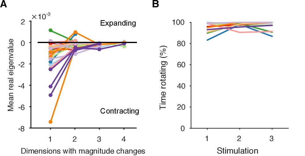
(A) Other eigenvalues. We plot here the mean real eigenvalue for all unique dimensions. (We plot each dimension that has a unique real eigenvalue, indicating a possible change in whether the magnitude of the trajectory is contracting or expanding: complex eigenvalues come in conjugate pairs of dimensions, so each pair only defines one unique dimension). Dimensions are arranged in decreasing order of explained variance. Almost all population responses contained solely contracting trajectories in all dimensions, corresponding to a dominant decrease in neuron firing rates. A few population responses contained low-variance dimensions in which the trajectory was expanding, corresponding to a fraction of neurons with increasing firing rates (as illustrated in Figure 4E). Lines are colour-coded by preparation; one line per population response. (B) Proportion of local trajectories that were dominated by rotation in each preparation. This is measured as the proportion of either the top two eigenvalues of the local linear models that were complex: by looking at the top two dimensions, we accounted for some evoked responses in which the dominance of contraction-only (real eigenvalue) and contraction-and-rotation (complex eigenvalue) dynamics alternated betwen the top two dimensions over time. Population responses were dominated by rotation throughout.
Figure 5
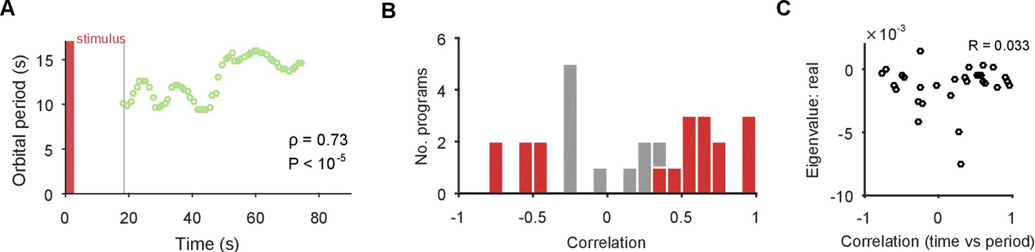
The spiral attractor dissociates changes in oscillation period and firing rate.
(A) Example of a change in the local estimate of the periodic orbit over a population response; here, slowing over time ( points are each averages over a 5 s sliding window; is weighted Spearman’s rank correlation - see Materials and methods; from a permutation test). Changes in the periodic orbit were assessed only after coalescence to the manifold (grey line). (B) Histogram of correlations between time elapsed and local estimate of the periodic orbit for each population response (positive: slowing; negative: speeding up). Red bars correspond to population responses with (permutation test). Number of local estimates ranged between 31 and 72 per population response. (C) Relationship between the change in periodic orbit over time and the rate of contraction for each population response (Pearson’s R; responses).
Figure 6 with 2 supplements

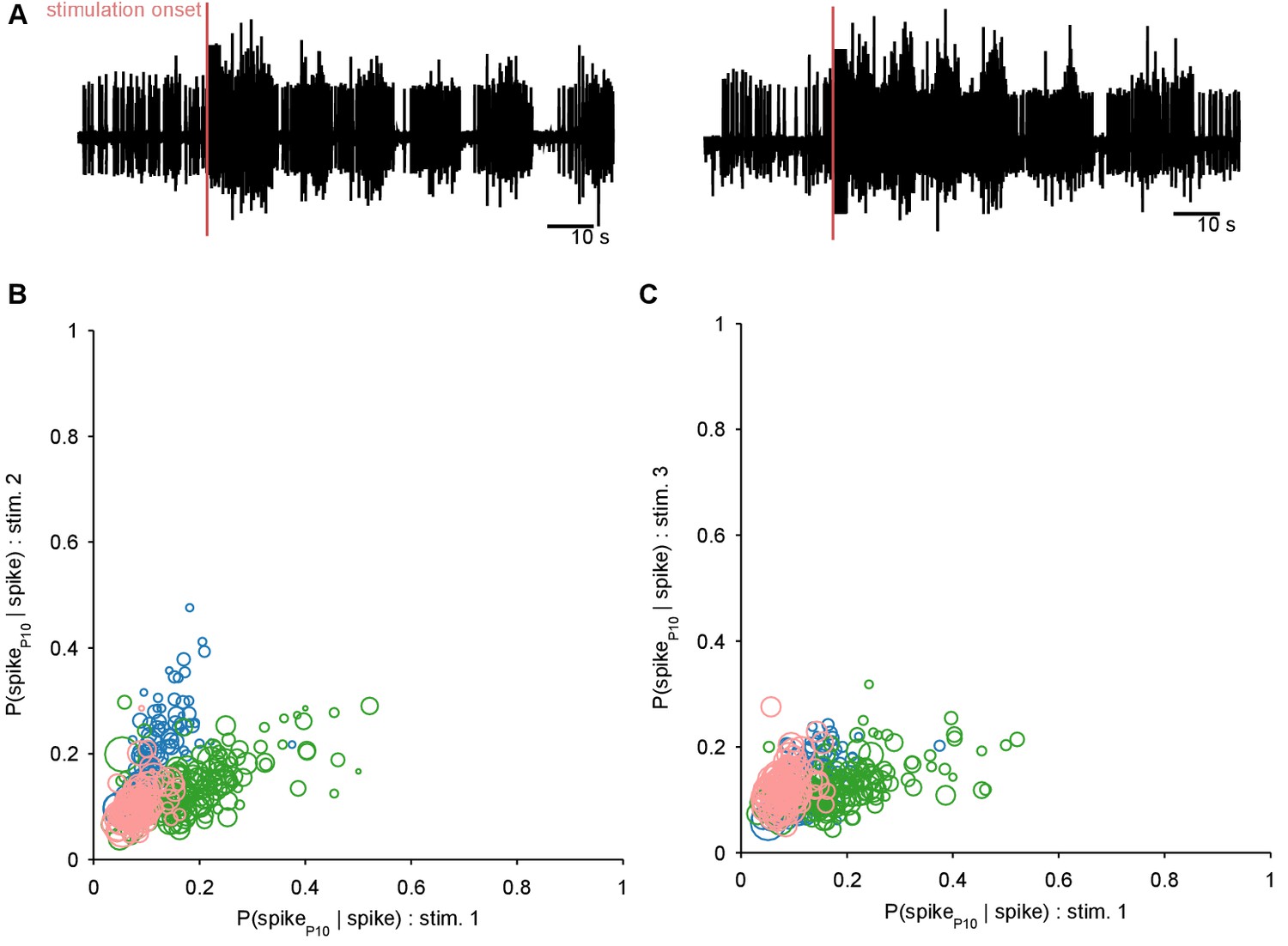
Motor output can be decoded directly from the low-dimensional trajectory of population activity.
(A) An example two-dimensional projection of one population’s response trajectory, color-coded by simultaneous P10 firing rate. In this example pair of dimensions, we can see nerve P10 firing is phase-aligned to the periodic trajectory of population activity. (B) Example fit and forecast by the statistical decoding model for P10 firing rate. Grey bar indicates stimulation time. (C) For the same example P10 data, the quality of the forecast in the 10 s after each fitted 40 s sliding window. Match between the model forecast and P10 data was quantified by the fits to both the change (R: correlation coefficient) and the scale (MAE: median absolute error) of activity over the forecast window. (D) Summary of model forecasts for all nine population responses with P10 activity (main panel). Dots and lines show means 2 s.e.m. over all forecast windows (). Three examples from the extremes of the forecast quality are shown, each using the fitted model to the first 40 s window to forecast the entire remaining P10 time-series. The bottom right example is from a recording in which the population response apparently shutdown half-way through. Inset, lower left: summary of model fits in the training windows; conventions as per main panel.
Figure 6—figure supplement 1
Ruling out P10 motorneurons in the recorded population.
We aimed to decode the spiking activity of the motorneuron axons in the P10 nerve directly from the low-dimensional trajectory of population activity in the pedal ganglion. If any P10 motorneurons had been captured in our population recording, these could have made a disproportionate contribution to the decoding. We thus first sought to detect them, and remove them if necessary. We reasoned that any putative P10 motorneuron should have close to a 1:1 locking between its spikes in the population activity recordings and corresponding spikes in the P10 nerve recording (panel A shows two example P10 unit recordings); in other words . Moreover, we expect a putative P10 motorneuron to show 1:1 locking consistently across all three programs from the same preparation. For each neuron in each recorded program with simultaneous P10 activity, we computed separately for a range of delays (0 to 25 ms) between neuron and P10 spikes, allowing for ms jitter at each delay. We plot the maximum probability for each neuron in programs 1 and 2 (B), and programs 1 and 3 (C); symbol size is proportional to the mean number of spikes for that neuron in the two programs (as few spikes would indicate an unlikely motorneuron). Colours indicate neurons from the three different preparations. We see that no neuron in our dataset comes close to at any delay, and there are no neurons with consistently high locking between programs. We concluded that there are no P10 motorneurons in our population recordings.
Figure 6—figure supplement 2

Increasing the dimensionality of state-space did not improve the P10 decoding model.
Here we show the effects of increasing the embedding dimensions for the population activity before using the decoding model for P10 activity. We used enough dimensions to capture at least 90% of the variance; we used 80% in the main text. (A) Comparison of the number of embedding dimensions needed to explain 80% and 90% variance for the nine recordings with simultaneous P10 activity. A 10% increase in variance needed at least double the number of dimensions. (B) Example fit and forecast by the statistical decoding model for P10 firing rate, when using enough embedding dimensions to capture 90% variance. Grey bar indicates stimulation time. (C) Summary of model forecasts for all nine population responses with P10 activity, when using enough embedding dimensions to capture 90% variance. Dots and lines show means 2 s.e.m. over all forecast windows (). MAE: median absolute error (error in scale) of forecast; R2: variance explained of forecast. (D) Comparison of the mean MAE in forecasting P10 activity when using embedding dimensions explaining 80% and 90% variance. Increasing the number of dimensions did not systematically lower the error in forecasting the scale of the P10 activity. (E) Comparison of the mean R2 in forecasting P10 activity when using embedding dimensions explaining 80% and 90% variance. Increasing the number of dimensions did not systematically improve the forecasting of the variance of the P10 activity.
Figure 7 with 2 supplements
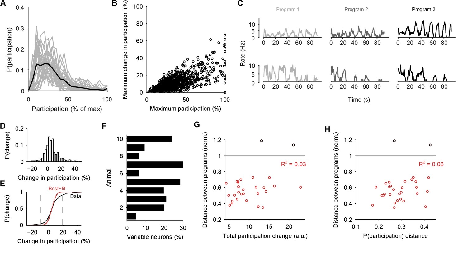
Single neuron participation varies within and between evoked locomotion bouts.
(A) Distributions of single neuron participation per evoked population response. We plot the distribution of participation for all neurons in a population (grey line), expressed as a percentage of the maximum participation in that population’s response. Black line gives the mean over all 30 population responses. (B) Change in participation between evoked locomotion bouts. Each dot plots one neuron’s maximum participation over all three evoked population responses, against its maximum change in participation between consecutive responses ( neurons). (C) Two example neurons with variable participation between responses, from two different preparations. (D) Distribution of the change in participation between responses for one preparation. (E) Detecting strongly variable neurons. Gaussian fit (red) to the distribution of change in participation (black) from panel D. Neurons beyond thresholds (grey lines) of mean SD of the fitted model were identified as strongly variable. (F) Proportion of identified strongly variable neurons per preparation. (G) Distance between pairs of population responses as a function of the total change in neuron participation between them. Each dot is a pair of responses from one preparation; the distance between them is given as a proportion of the mean distance between each response and a random projection (: closer than random projections), allowing comparison between preparations (Figure 3C). Black dots are excluded outliers, corresponding to the pairs containing response 1 in preparation 4 with apparent chaotic activity (Figure 3—figure supplement 1). (H) Distance between pairs of population responses as a function of the distance between the distributions of participation (panel A). Conventions as for panel G.
Figure 7—figure supplement 1
Participation captures both rate and synchrony effects.
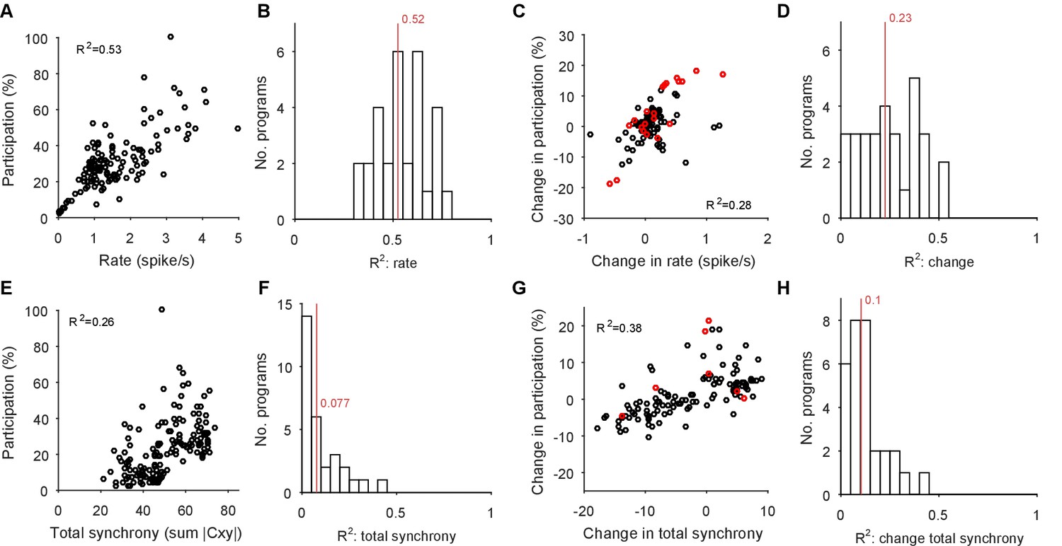
We illustrate here that the participation of each neuron in the low-dimensional trajectory contains contributions from both its firing rate and its synchrony with other neurons. Hence changes to its participation correspond to changes in rate and/or synchrony. Note that as the participation quantifies each neuron’s contribution to multiple dominant patterns of activity co-variation in the population, so we expect only approximate correlations with the cruder, independent measures of rate and synchrony used here. (A) Example correlation between the evoked firing rates and participation scores of all neurons in one evoked population response. Participation is expressed as a percentage of the maximum score; the firing rate is calculated using all spikes from the offset of the stimulus to the end of the recording, and thus cannot capture contributions due to the decay or increase of rates. (B) Histogram of firing rate and participation correlations across all 30 programs. Firing rate explains on average (R2, red line) 50% of the variation in participation within an evoked response. (C) Example correlation between the change in firing rates and the change in participation scores across one pair of evoked responses in the same preparation. One circle per neuron; red circles indicate neurons labelled as strongly variant for this preparation (though not necessarily across this pair of responses). (D) Histogram of the correlations between change in rate and participation across all 30 pairs of programs (pairs [1,2], [1,3], and [2,3] within each preparation). Firing rate changes explain on average 23% of the variation in the change of participation (R2, red line). (E-H) As A-D, for synchrony and changes in synchrony. The synchrony of each neuron is calculated as the total absolute correlation of that neuron with all other neurons, given by its corresponding column of the pairwise correlation matrix between all spike-density functions after stimulus offset.
Figure 7—figure supplement 2
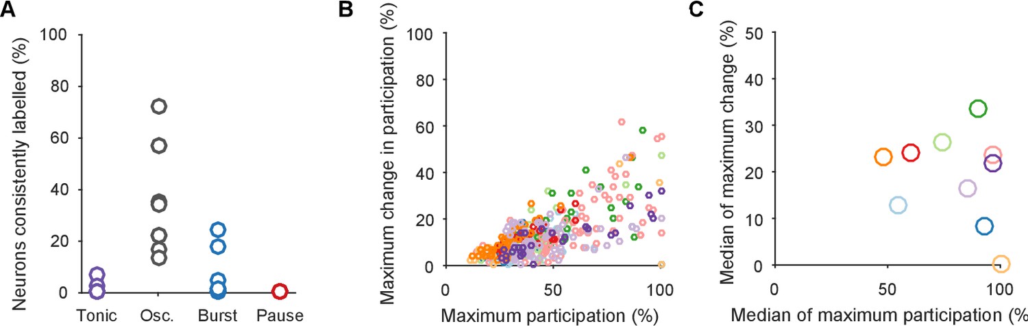
Testing for an invariant central pattern generator.
Here we test the possibility that hidden within the variation between programs is a small, invariant core of neurons that may form a classic central pattern generator. We do this by first determining the type of dynamical ensemble to which each neuron was assigned (tonic, oscillator, burster, or pauser: see Figure 1C, main text), in order to find phasically-firing neurons expected of a pattern generator. (A) The proportion of neurons consistently assigned to the same type of dynamical ensemble across all three population responses. One circle per preparation. The inconsistent classification across programs is congruent with the wide variation in participation. Only the oscillator class of ensembles contained at least one consistently assigned neuron in all ten preparations, and so were candidates for containing an invariant core of neurons. (B) Scatter plot of participation against the maximum change in participation, restricted to neurons consistently assigned to the oscillator type of ensemble. One circle per neuron; colours indicate preparation. The same correlation between participation and variation as for the entire dataset is observed, with no clear evidence of an invariant group of strongly participating neurons across the preparations (as would be indicated by neurons falling in the lower right quadrant). (C) The top 10% of consistent oscillator neurons by participation, and their corresponding maximum change in participation. Each circle plots the median across the top 10% for that preparation. Even restricted to just the top 10%, most preparations showed high variation in participation amongst the oscillator neurons.
Figure 8
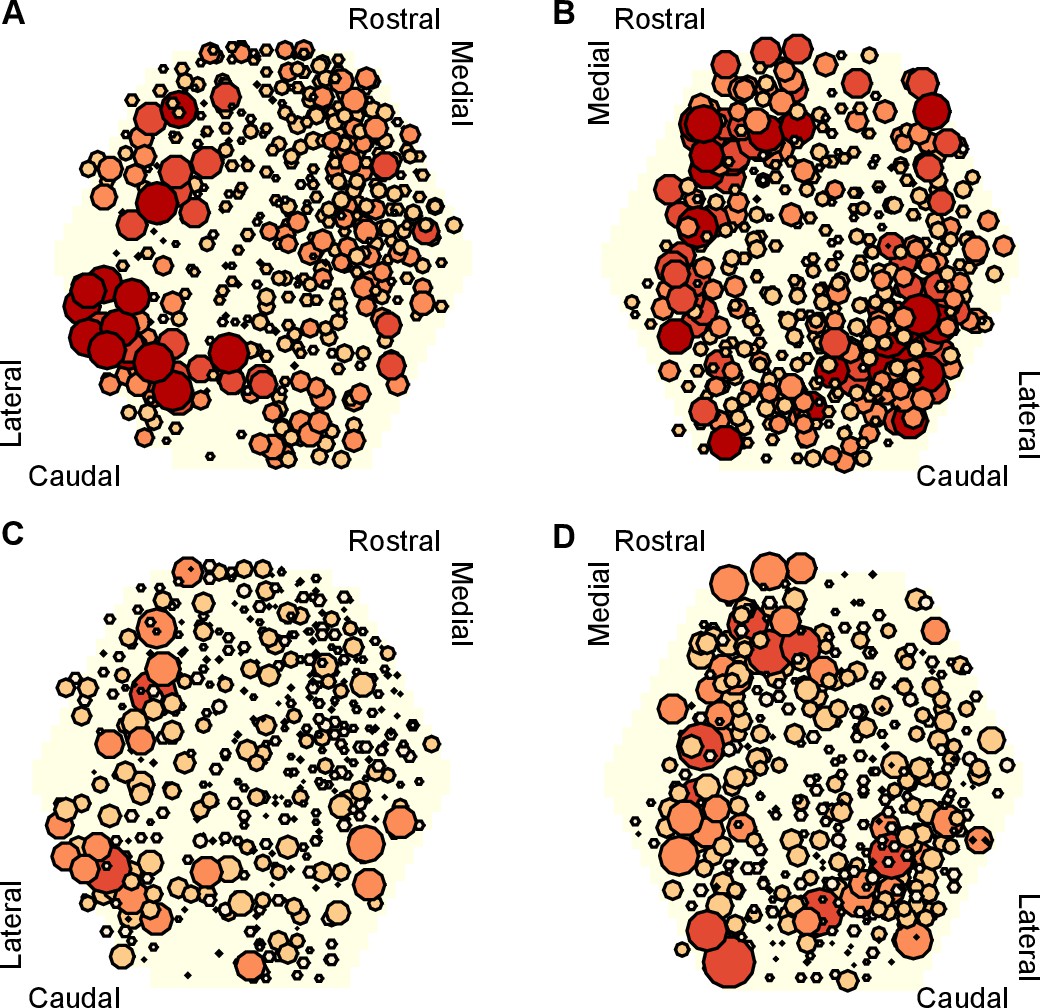
Mapping of participation in the attractor across the ganglion network.
Here we plot neuron location with respect to the photodiode array (yellow hexagon). Each plot pools neurons from preparations of the left ( preparations) or right () ganglia. A,B Maps of maximum participation across the three evoked population responses for left (A) and right (B) ganglion recordings. The area of each marker is proportional to the neuron’s maximum participation. Neurons are colour coded (light orange to dark red) by the quintile of their participation across all preparations. C,D As for panels (A,B), but plotting the range of participation across the three evoked population responses.
Download links
A two-part list of links to download the article, or parts of the article, in various formats.
Downloads (link to download the article as PDF)
Open citations (links to open the citations from this article in various online reference manager services)
Cite this article (links to download the citations from this article in formats compatible with various reference manager tools)
A spiral attractor network drives rhythmic locomotion
eLife 6:e27342.
https://doi.org/10.7554/eLife.27342


