Single-cell transcriptomics reveals a new dynamical function of transcription factors during embryonic hematopoiesis
- European Molecular Biology Laboratory, EMBL Rome, Italy
- Wellcome Trust Sanger Institute, United Kingdom
- European Molecular Biology Laboratory, Germany
Figures
Figure 1 with 6 supplements
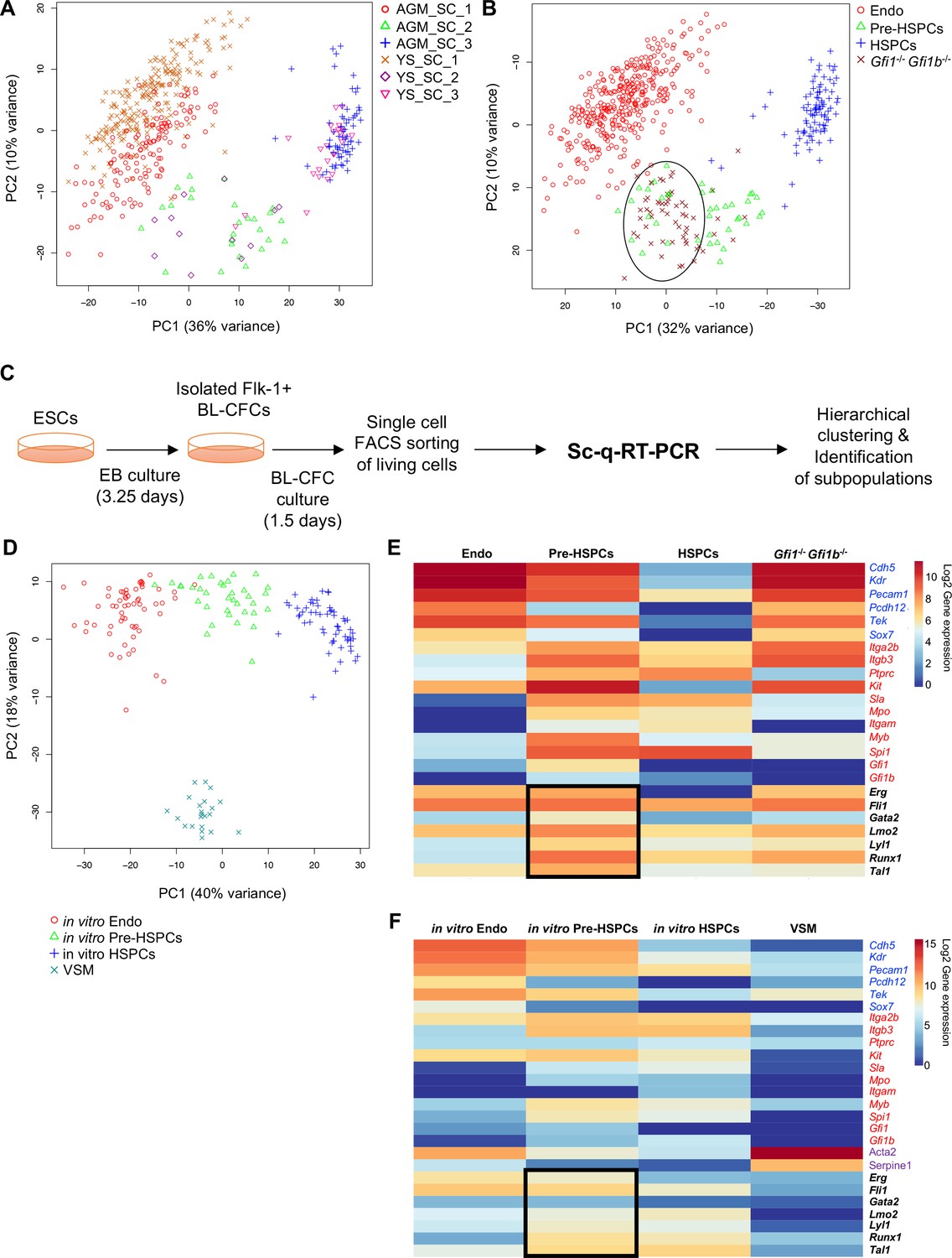
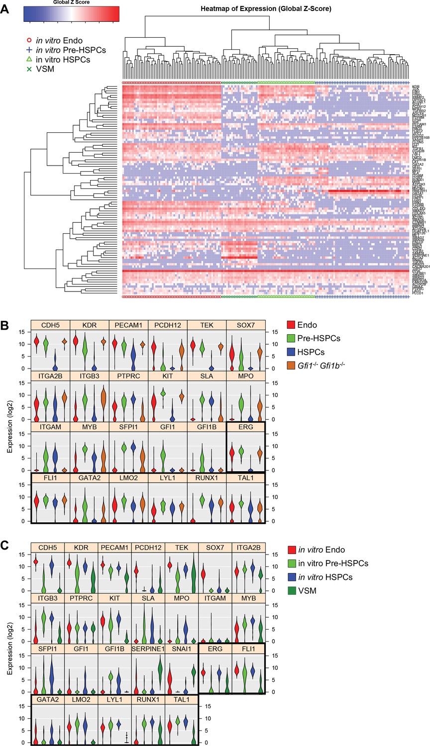
Analysis of in vivo and in vitro EHT by single-cell qRT-PCR identified the expression of key TFs at the Pre-HSPC stage.
(A) Principal component analysis (PCA) plot showing the cells isolated at E9, E10.5 and E11 from AGM and YS according to the indicated sample clusters (SC). For each tissue, each time point represents one experiment. (B) PCA plot showing the Gfi1–/– Gfi1b–/– GFP+ YS cells mixing with Pre-HSPCs group (black ellipse). Note that the PC2 axis has been reversed. (C) Experimental workflow used to differentiate in vitro ESCs into blood cells. BL-CFC, blast colony forming cells; EB, embryoid body; FACS, fluorescence-activated cell sorting. (D) PCA plot showing the four groups of cells coming from in vitro differentiated ESCs. (E) Heatmap showing average expression of endothelial (blue), hematopoietic genes (red) and seven key TFs (black) in the four groups found in vivo. The black rectangle highlights the expression of the seven TFs. (F) Heatmap showing the average expression of endothelial (blue), hematopoietic (red), vascular smooth muscle genes (purple) and seven key TFs (black) in the four groups found after in vitro differentiation of ESCs. The black rectangle highlights the expression of the seven TFs. See also Figure 1—figure supplements 1–6, Supplementary file 1, 2, 3 and 11.
Figure 1—figure supplement 1
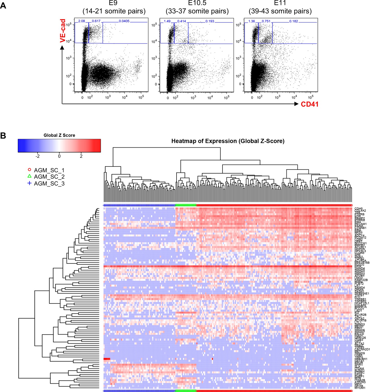
Hierarchical clustering analysis of AGM VE-Cad+ cells.
(A) FACS plots of VE-Cad and CD41 expression in the AGM region at E9, E10.5 and E11. Several embryos (seven for E9, 13 for E10.5 and 9 for E11) were pooled for each time point and three subpopulations were single-cell sorted: VE-Cad+ CD41–, VE-Cad+ CD41Medium and VE-Cad+ CD41High. (B) Hierarchical clustering analysis done with sc-q-RT-PCR data from AGM cells isolated in 1A. Three main groups were defined. See also Supplementary file 11.
Figure 1—figure supplement 2
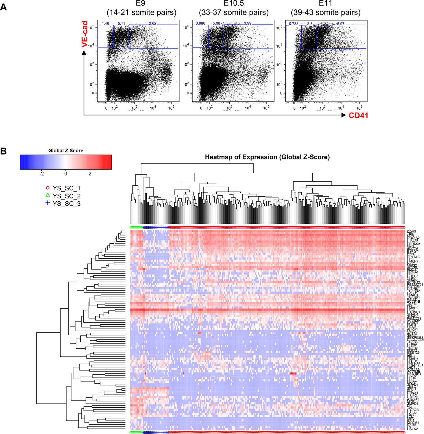
Hierarchical clustering analysis of YS VE-Cad+ cells.
(A) FACS plots of VE-Cad and CD41 expression in the YS region at E9, E10.5 and E11. Several embryos (seven for E9, 13 for E10.5 and 9 for E11) were pooled for each time point and three subpopulations were single-cell sorted: VE-Cad+ CD41–, VE-Cad+ CD41Medium and VE-Cad+ CD41High. (B) Hierarchical clustering analysis done with sc-q-RT-PCR data from YS cells isolated in 2A. Three main groups were defined. See also Supplementary file 11.
Figure 1—figure supplement 3
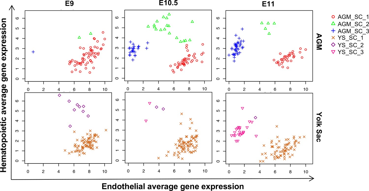
Time-course analysis of EHT in the AGM and YS.
Scatter plots showing the average expression of endothelial genes versus the average expression of hematopoietic genes at the indicated developmental time points.
See also Supplementary file 11.
Figure 1—figure supplement 4
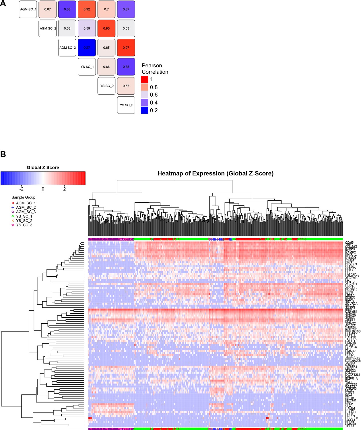
Comparison of EHT subpopulations from AGM and YS.
(A) Correlation study performed on the average gene expression for the groups highlighted in Figure 1A, Figure 1—figure supplements 1B and 2B. (B) Hierarchical clustering analysis done with sc-q-RT-PCR data from AGM and YS cells presented in Figure 1—figure supplements 1B and 2B. See also Supplementary file 11.
Figure 1—figure supplement 5
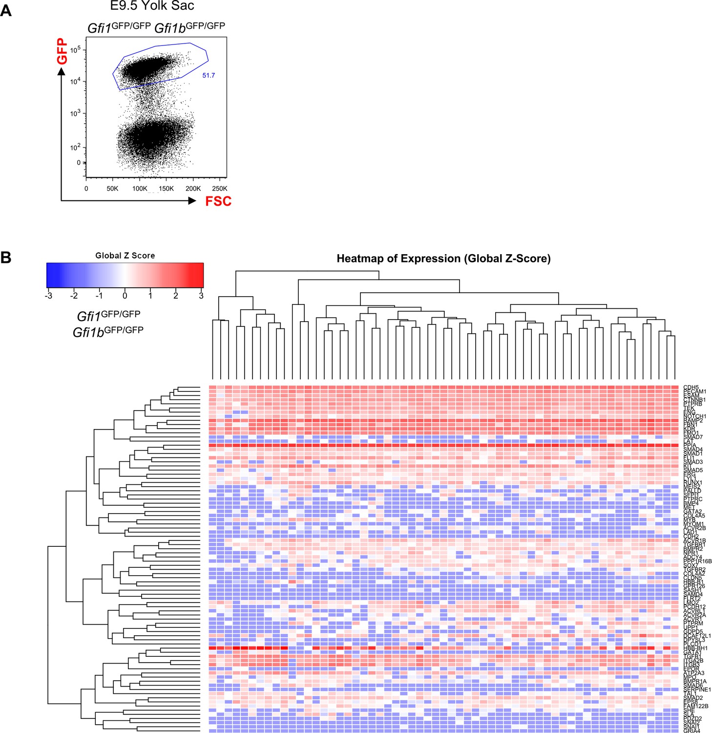
Hierarchical clustering analysis of YS Gfi1-/- Gfi1b-/- cells.
(A) FACS plot of GFP expression in the Gfi1–/– Gfi1b–/– yolk sac region at E9.5. Single cells expressing highly GFP were isolated and studied with sc-q-RT-PCR. (B) Hierarchical clustering analysis done with sc-q-RT-PCR data from yolk sac cells isolated in (A). See also Supplementary file 11.
Figure 1—figure supplement 6
Hierarchical clustering analysis of in vitro differentiated ESCs.
(A) Hierarchical clustering analysis done with sc-q-RT-PCR data from in vitro differentiated ESCs. Four main clusters were defined. (B) Violin plots showing the expression of the 24 genes shown in Figure 1E. Seven key transcription factors are highlighted with a black rectangle. (C) Violin plots showing the expression of the 26 genes shown in Figure 1F. Seven key transcription factors are highlighted with a black rectangle. See also Supplementary file 11.
Figure 2
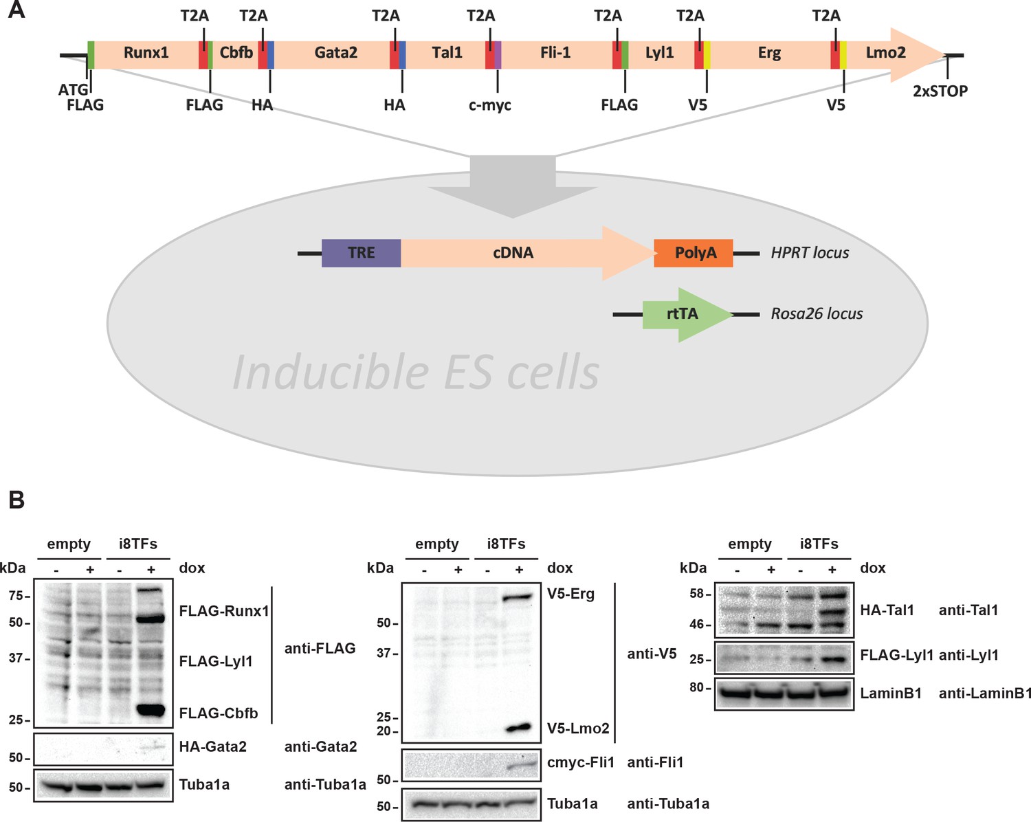
Generation of a doxycycline-inducible ESC line for the simultaneous expression of the eight transcription factors.
(A) Scheme showing the generation of the i8TFs ESC line. (B) Western blot showing the protein expression of the eight TFs after doxycycline (dox) treatment in the Empty line and in the i8TFs ESC line. See also Supplementary file 11.
Figure 3 with 5 supplements

Hematopoietic differentiation of the i8TFs ESC line highlights the role of the eight transcription factors in the generation of Pre-HSPCs.
(A) Representative FACS plots of VE-Cad, cKit and CD41 expression after 3 days of BL-CFC culture of the indicated ESC lines (n = 3). (B) Graphs showing the average numbers of round cells counted per frame (n = 3) in a 48 hr time course for the indicated ESC lines. Error bars represent standard deviations. (C) Bar graph indicating the frequency of non-apoptotic living cells for the indicated ESC lines. Error bars represent standard deviations (n = 3). (D) Bar graph displaying the frequency of cycling cells for the indicated ESC lines. Error bars represent standard deviations (n = 3). (E) Bar graph displaying the number of hematopoietic colonies after replating cells in a colony-forming-unit assay from the indicated conditions. Error bars represent standard deviation (n = 4). ns, non significant. ** p-value<0.01 (paired two-tailed t-test). * p-value<0.05 (paired two-tailed t-test). See also Figure 3—figure supplement 1 to 5, Supplementary file 1, 4, 5 and 11.
Figure 3—figure supplement 1
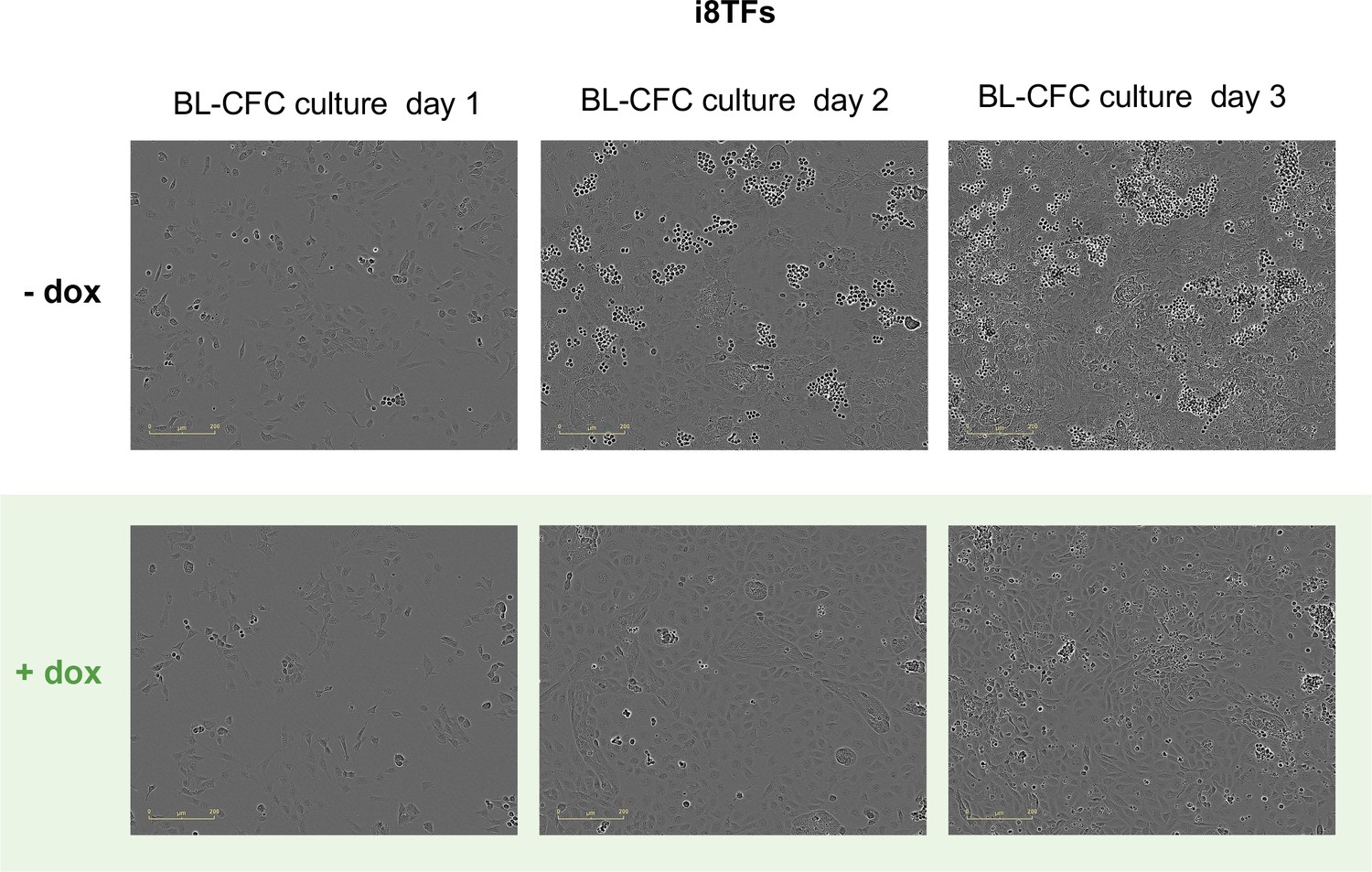
Microscopy pictures of the i8TFs BL-CFC culture after one, two and three days of BL-CFC culture in -dox and +dox conditions.
The scale bar corresponds to 200 μm. See also Supplementary file 11.
Figure 3—figure supplement 2
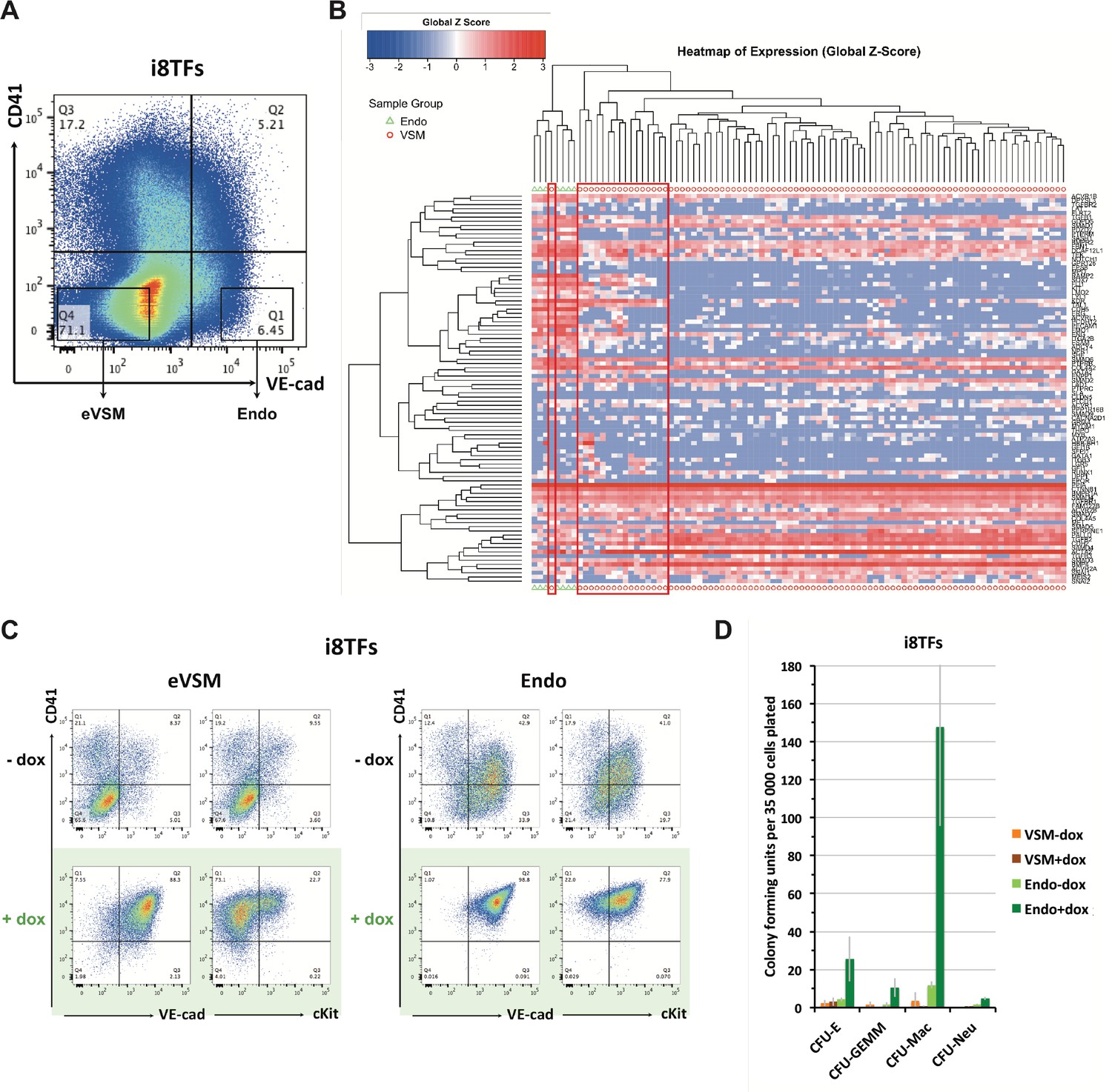
Comparison of eVSM and Endo populations response to the induction of the 8TFs.
(A) FACS plot of VE-Cad and CD41 expression at day 1 of BL-CFC culture. The rectangles highlight the enriched vascular smooth muscle (eVSM) and endothelial (Endo) populations. (B) Hierarchical clustering analysis done with sc-q-RT-PCR data from VE-Cad+ CD41– (Endo) and VE-Cad– CD41– (eVSM) populations. The red rectangles indicate the cells from the eVSM population expressing endothelial markers (e.g. Ramp2, Sox7, Kdr). (C) FACS plots of VE-Cad, cKit and CD41 expression of the enriched vascular smooth muscle (eVSM) and endothelial (Endo) populations from the i8TFs cell line after 48 hr in HE culture. (D) Bar graph displaying the number of hematopoietic colonies after replating cells in a colony-forming-unit assay from the indicated conditions. Error bars represent standard deviations (n = 2). See also Supplementary file 11.
Figure 3—figure supplement 3
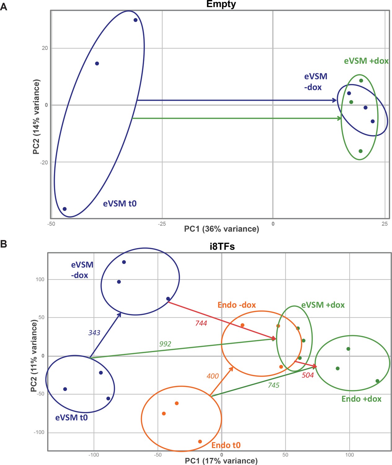
PCA plots of microarrays data.
(A) PCA plot showing the microarray analysis results from the eVSM after 24 hr of dox treatment on the Empty cell line. Ellipses indicate the different groups of samples. (B) PCA plot showing the microarray analysis results from the indicated conditions after 24 hr of dox treatment on the i8TFs ESC line. Numbers indicate the number of genes significantly differentially expressed between the two conditions (p-value<0.05). Ellipses indicate the different groups of samples. See also Supplementary file 11.
Figure 3—figure supplement 4
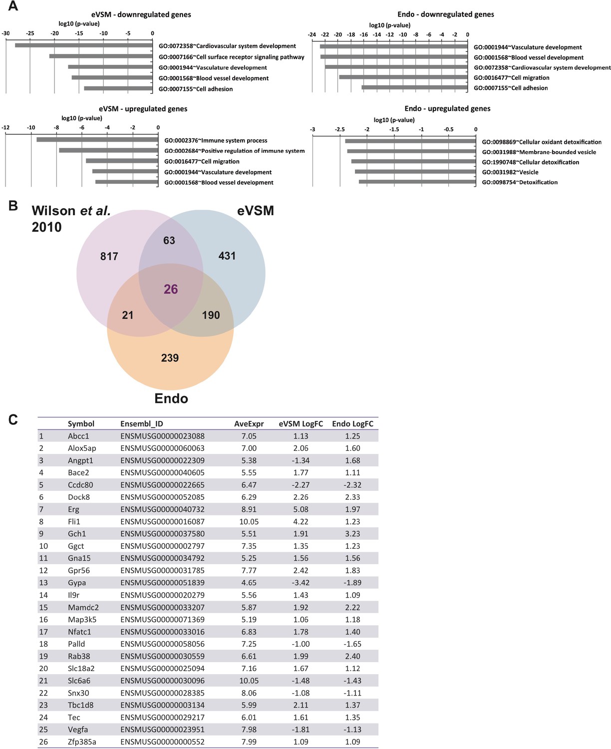
Analysis of microarrays data.
(A) GO term enrichment analysis of the genes differentially expressed between –dox and +dox conditions for each population. (B) Venn diagrams showing the genes differentially expressed for both populations together with the gene targets previously identified by ChIP-seq analysis (Wilson et al., 2010). (C) List of the 26 heptad target genes differentially expressed upon induction of the eight TFs in both Endo and eVSM populations. See also Supplementary file 11.
Figure 3—figure supplement 5
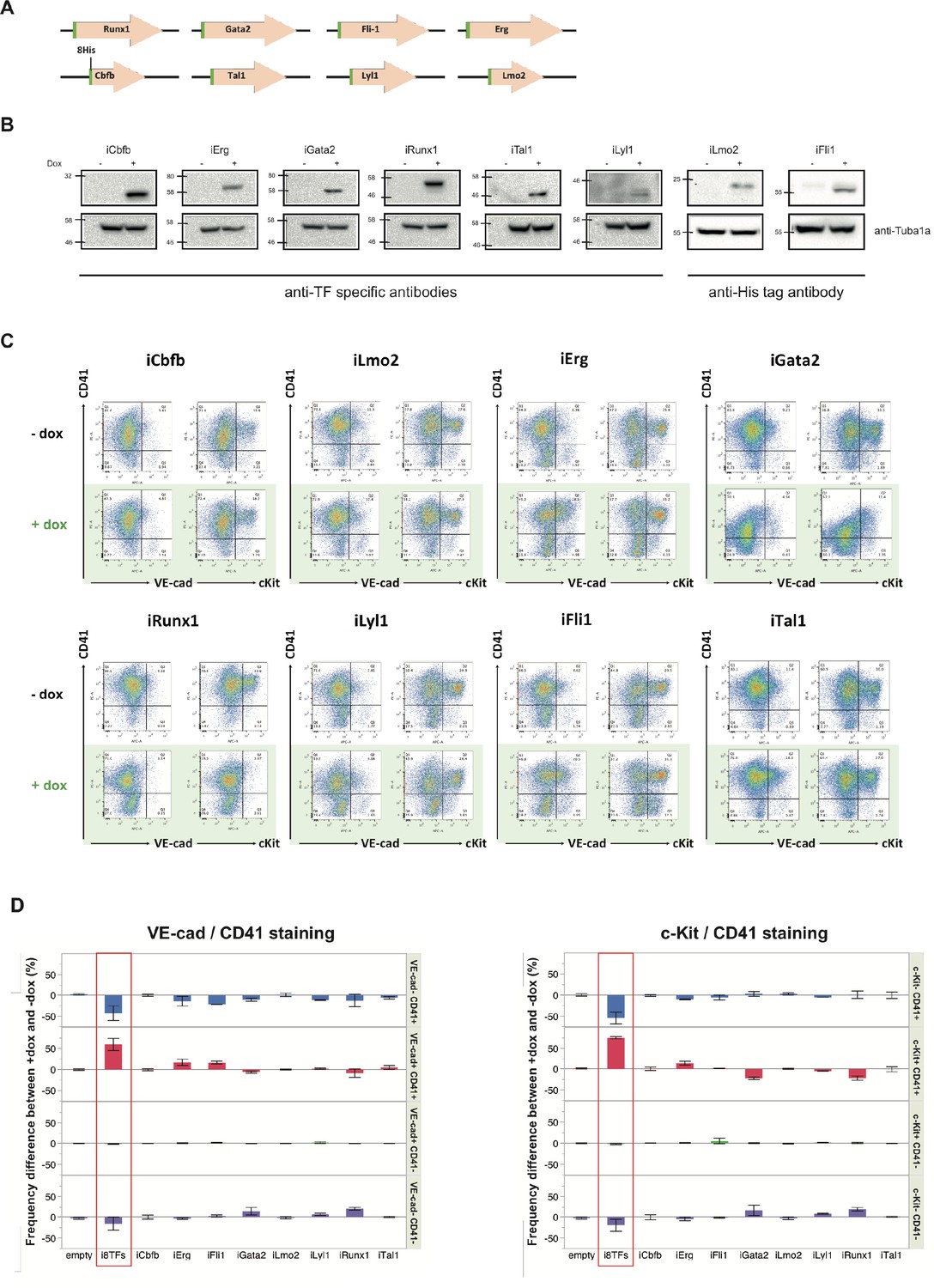
Analysis of the i1TF ESC lines.
(A) Scheme showing the eight constructs used to make the i1TF ESC lines. (B) Western blots showing the protein expression of the eight transcription factors after doxycycline treatment for each of the i1TF ESC lines. (C) Representative FACS plots of VE-Cad, cKit and CD41 expression after three days of BL-CFC culture of the indicated ESC lines (n = 3). (D) Bar graphs indicating the frequency difference between +dox and –dox conditions for the ten indicated cell lines. Error bars represent standard deviations (n = 3). See also Supplementary file 11.
Figure 4 with 2 supplements
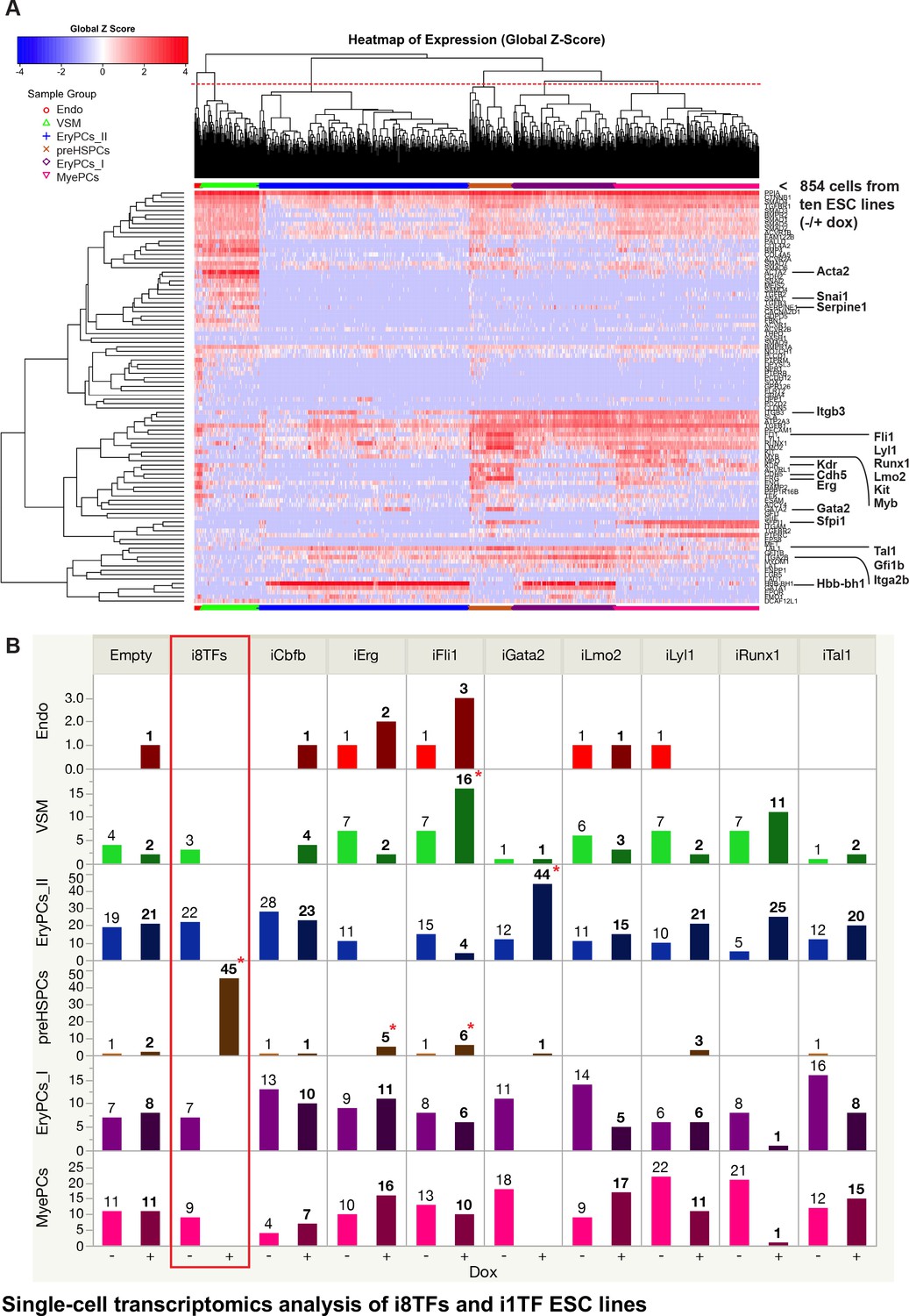
Single-cell transcriptomics analysis of i8TFs and i1TF ESC lines.
(A) Hierarchical clustering showing the sc-q-RT-PCR results for 95 genes on the ten inducible ESC lines after three days of BL-CFC culture. The clusters were defined according to the intersection of the red dotted line with the dendrogram in the upper part of the heatmap. (B) Bar graphs displaying the cell number in each of the six clusters defined in (A) for the ten cell lines. Stars indicate significant differences for +dox conditions (see Supplementary file 6 for p-values). See also Figure 4—figure supplements 1 and 2, Supplementary file 1, 6 and 11.
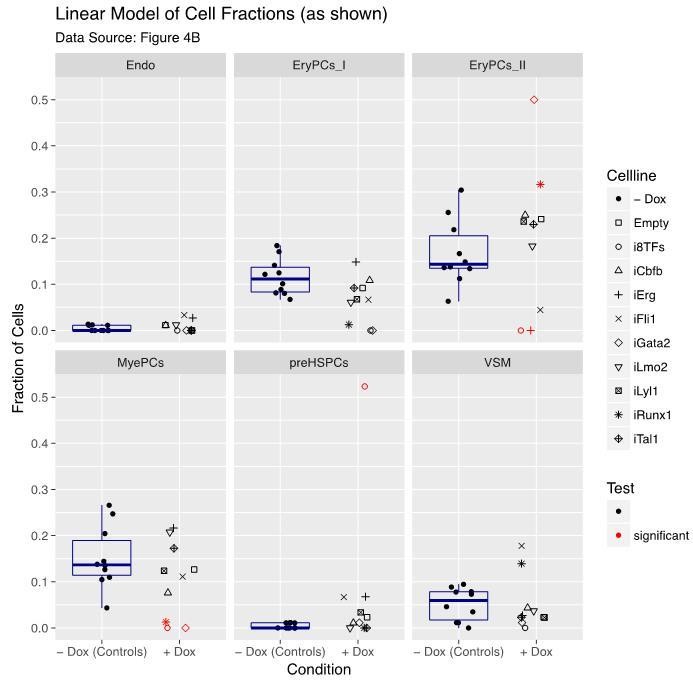
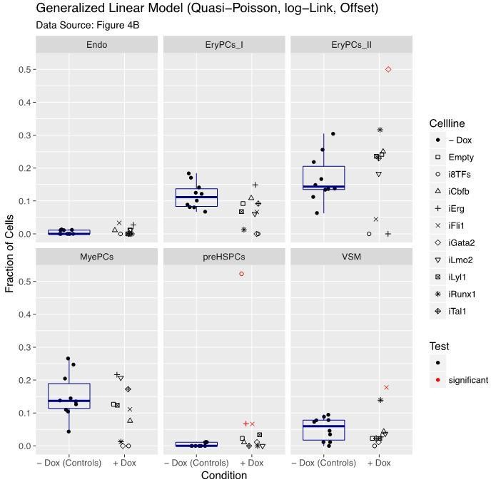
Figure 4—figure supplement 1
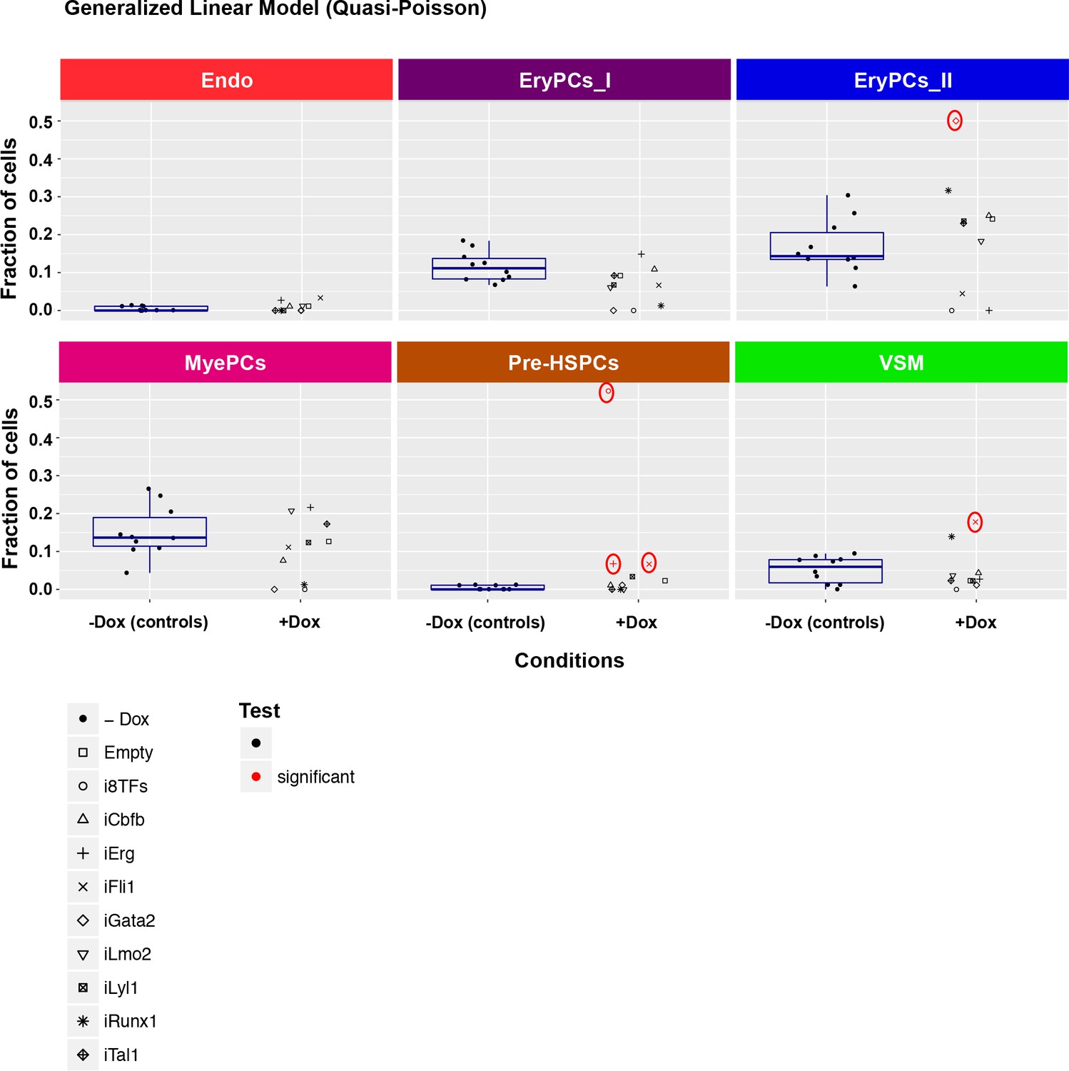
Six scatter plots are displayed corresponding to the six populations defined in Figure 4.
The data set is identical to the one in Figure 4. Here, fractions of cells are shown instead of absolute cell numbers. For the –dox condition, a box plot has been added. Significant differences between the –dox condition and the +dox condition for each cell line and population are indicated by red circles as determined by a general linearized model (quasi-Poisson). See also Supplementary file 11.
Figure 4—figure supplement 2
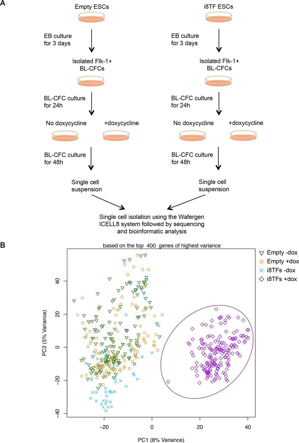
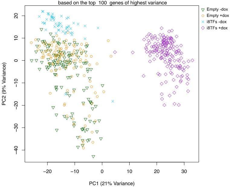
Comparison of Empty and i8TFs day 3 BL-CFC cultures by single-cell RNA sequencing.
(A) Experimental outline followed to compare the Empty and i8TFs ESCs with single-cell RNA sequencing. (B) PCA plot showing sc-RNA-seq analysis of the Empty and i8TFs cell lines after three days of BL-CFC culture. Ellipse highlights i8TFs + dox. See also Supplementary file 11.
Figure 5 with 2 supplements
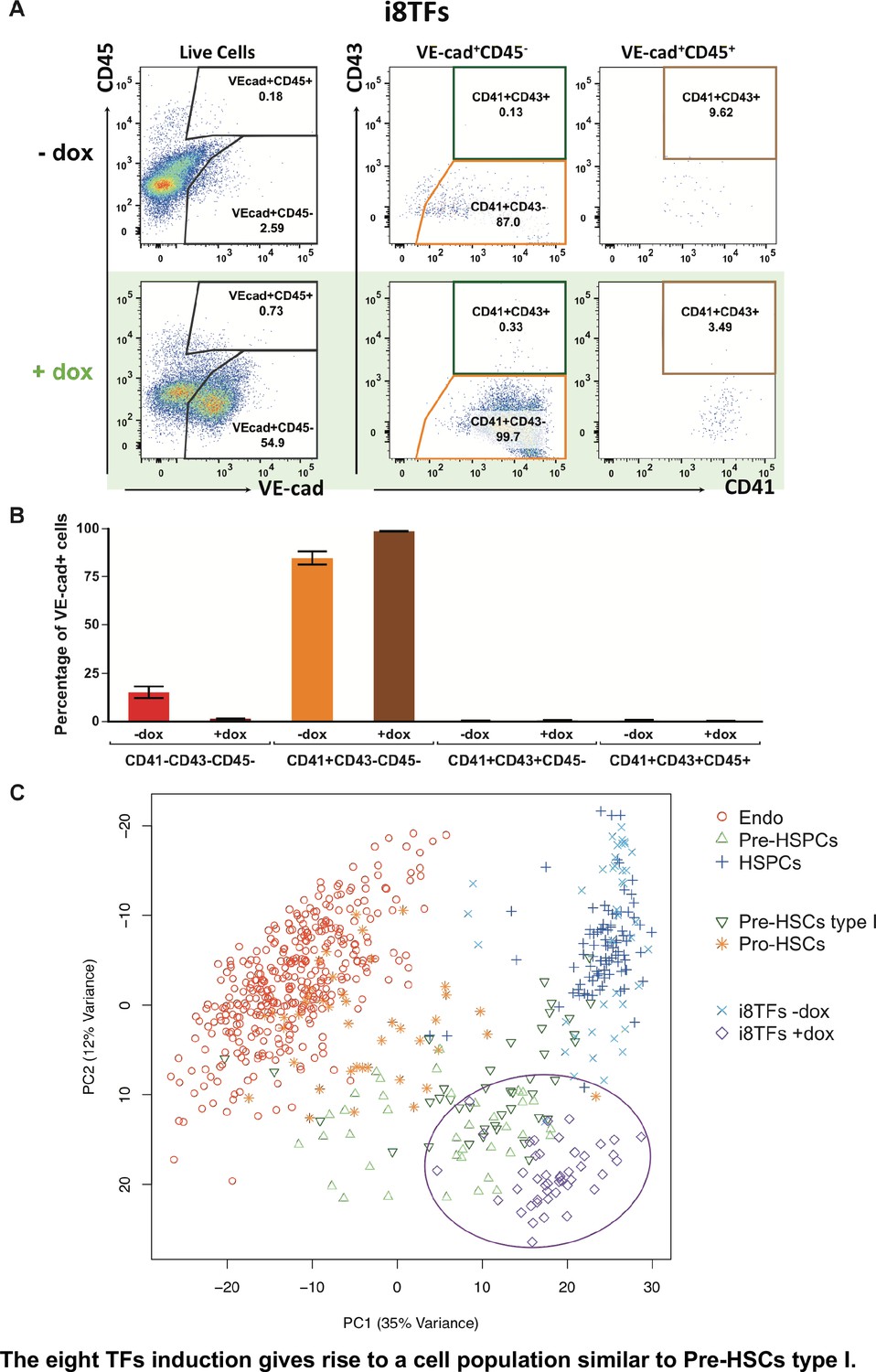
The eight TFs induction gives rise to a cell population similar to Pre-HSCs type I.
(A) Representative FACS plots of VE-Cad, CD45, CD43 and CD41 expression after 3 days of BL-CFC culture of the i8TFs ESC line in the presence or absence of dox (n = 3). (B) Bar graphs showing the average percentage of the four different VE-Cad+ cell populations after three days of culture (n = 3). Error bars represent standard deviations. (C) PCA plot showing the sc-q-RT-PCR results for 95 genes combining the cells from the i8TFs cell line after three days BL-CFC culture with the results from cells collected from wildtype YS and AGM regions (Figure 1B) and from the E10 AGM Pro-HSCs and Pre-HSCs type I. Note that the PC2 axis has been reversed. The ellipse highlights i8TFs +dox. See also Figure 5—figure supplements 1 and 2, Supplementary file 1, 7, 8 and 11.
Figure 5—figure supplement 1
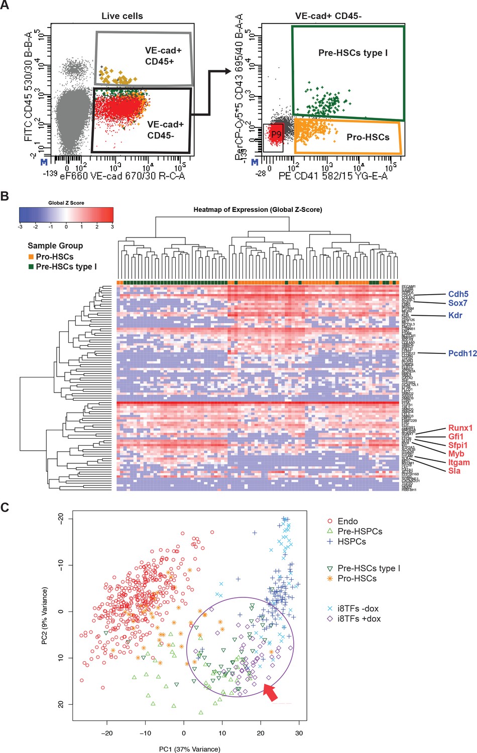
Hierarchical clustering analysis of Pro-HSCs and Pre-HSCs type I.
(A) FACS plots of VE-Cad, CD45, CD43 and CD41 expression in the AGM region at E10 (31–32 somite pairs). Single cells from Pro-HSCs (VE-Cad+ CD41+ CD45- CD43-) and Pre-HSCs type I (VE-Cad+ CD41+ CD45- CD43+) populations were isolated. P9 highlights CD41– CD43– cells. (B) Hierarchical clustering analysis done with sc-q-RT-PCR data from (A). Endothelial (Cdh5, Sox7, Kdr and Pcdh12) and hematopoietic genes (Runx1, Gfi1, Sfpi1, Itgam and Sla) were marked in blue and red, respectively. (C) PCA plot showing the sc-q-RT-PCR results of the same cells as in Figure 5C but after removing Runx1, Gata2, Tal1, Fli1, Lyl1, Erg and Lmo2 genes from the expression data. Note that the PC2 axis has been reversed. The ellipse and red arrow highlight the i8TFs +dox cells. See also Supplementary file 11.
Figure 5—figure supplement 2
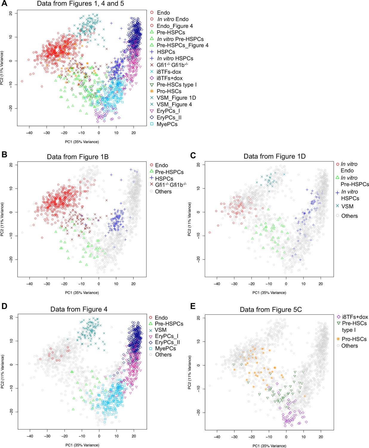
PCA plots comparing the single-cell-q-RT-PCR data of Figures 1, 4 and 5.
(A) PCA plot displaying the single-cell qPCR results of all cells from Figures 1, 4 and 5 (a total of 1,660 cells). (B) Same PCA plot as (A) but highlighting the populations from Figure 1B. (C) Same PCA plot as (A) but highlighting the populations from Figure 1D. (D) Same PCA plot as (A) but highlighting some of the populations from Figure 4. (E) Same PCA plot as (A) but highlighting some of the populations from Figure 5C. See also Supplementary file 11.
Figure 6 with 1 supplement
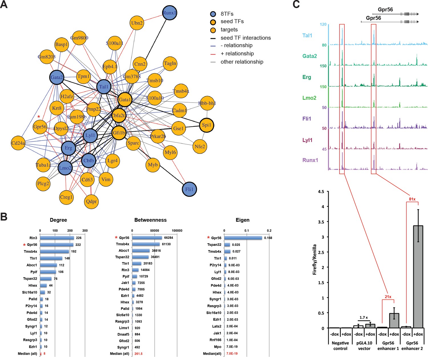
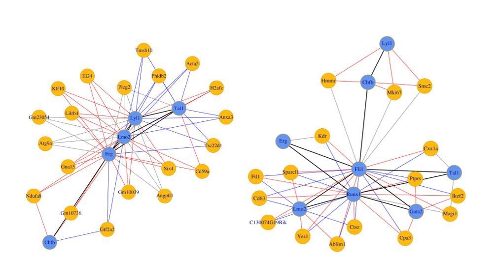
Single-cell transcriptomics analysis reveals the transcriptional networks involved in Pre-HSPCs generation.
(A) Network built from gene correlations. Gpr56 is highlighted with a red asterisk. (B) Centrality values for all the genes containing a heptad peak within 1 kb of the TSS that are significantly above the median. Gpr56 is highlighted with a red asterisk. (C) The upper part shows the ChIP-Seq data for the seven TFs from the Wilson et al. (2010) study in the Gpr56 locus. The y-axis shows reads displayed as density plots, which were generated by Wilson et al. (2010) and visualized using the Integrated Genome Browser software. The two putative enhancers are highlighted with red rectangles. The lower part shows the results of the transcriptional reporter assay for two potential heptad enhancers in Gpr56 locus using i8TFs ESCs treated for 24 hr with doxycycline. Error bars represent standard deviations (n = 3). See also Figure 6—figure supplement 1 and Supplementary file 11.
Figure 6—figure supplement 1
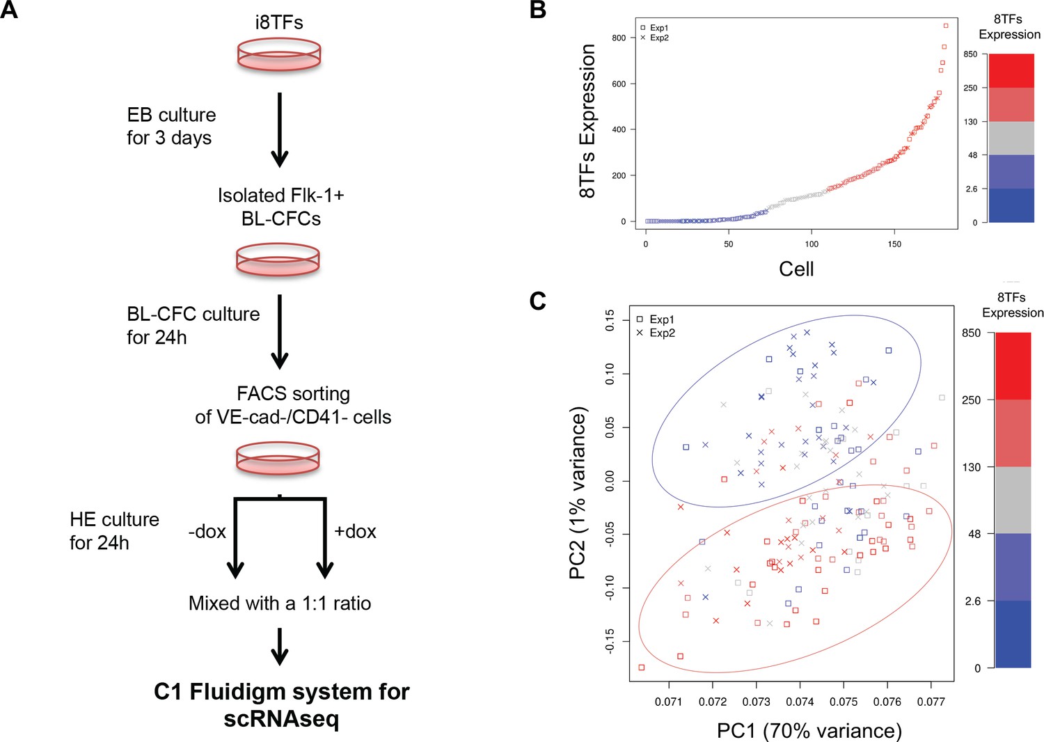
Single-cell transcriptome analysis following over-expression of the 8TFs in eVSM cells.
(A) Experimental workflow used to differentiate in vitro eVSM cells from the i8TFs ESC line and to analyze them by sc-RNA-seq after 24 hr of treatment. (B) Scatter plot showing the expression of the 8TFs construct among all the cells from the two replicates. Red indicates high expression, blue low expression and grey undefined expression. The y-axis shows SF-normalized expression colored by quantile. (C) PCA plot of sc-RNA-seq results. The color codes are the same as those in (B). See also Supplementary file 11.
Figure 7 with 1 supplement
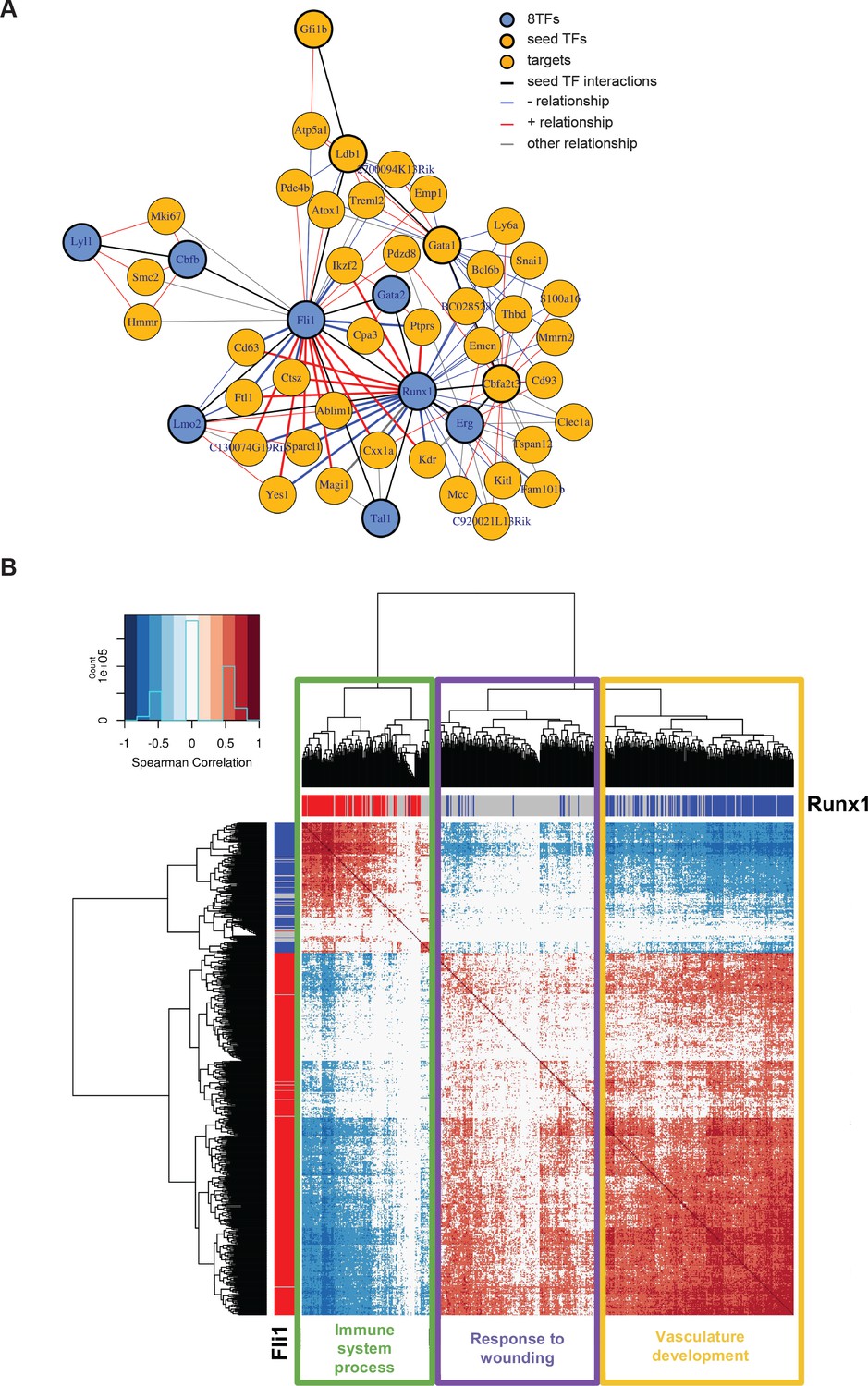
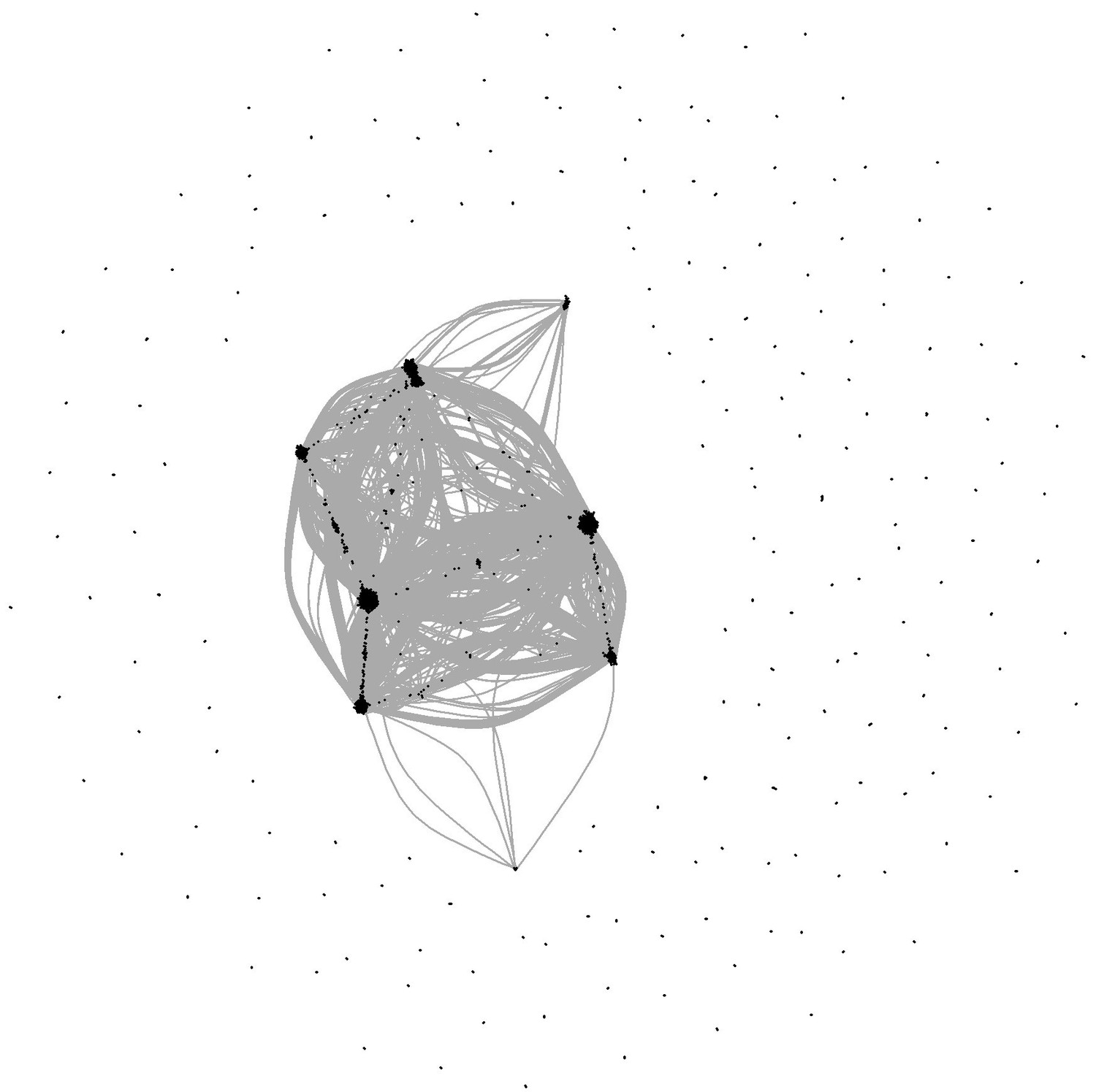
Single-cell transcriptome analysis suggests that Runx1 and Fli1 have opposite functions during EHT.
(A) Network built from gene correlations found in the Peirera dataset (Pereira et al., 2016). (B) Heatmap displaying Spearman correlations between the 210 genes found to be correlated to Runx1 and Fli1. The hierarchical clustering analysis gave us three groups of genes highlighted by three rectangles of different colors. The top GO term for each group of genes is indicated. See also Figure 7—figure supplement 1 and Supplementary file 9.
Figure 7—figure supplement 1
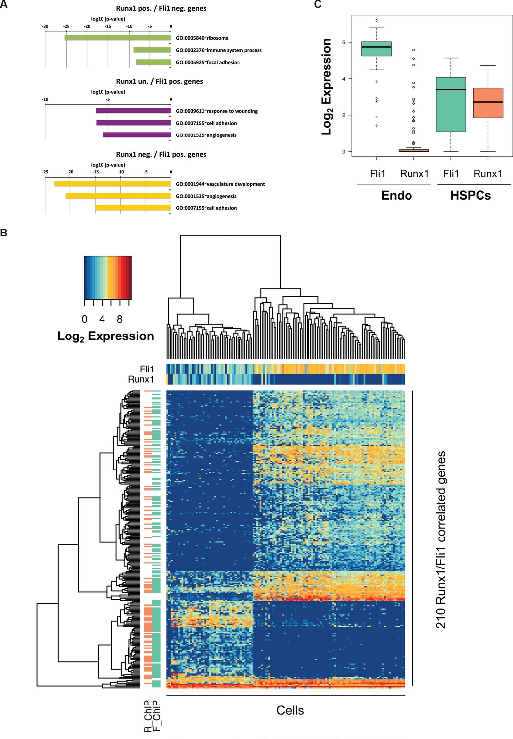
Bioinformatic analysis of the Pereira dataset.
(A) GO term enrichment analysis of the genes correlated with Fli1 and Runx1. The color code matches the gene clusters from Figure 7B. (B) Heatmap displaying hierarchical clustering of the 210 genes correlated with Fli1 and Runx1. On top of the heatmap, the expression level of Fli1 and Runx1 is indicated (color gradient indicates log2 of gene expression). On the left of the heatmap, the DNA occupancy of Fli1 (F_ChIP) or Runx1 (R_ChIP) on the 210 genes is indicated (orange indicates Runx1 target genes and green Fli1 target genes). (C) Box plot showing the expression of Fli1 (green) and Runx1 (orange) in the Endo and HSPC populations isolated by Pereira et al. (2016)). The top and bottom box edges correspond to the first and third quartiles. The black line inside the box represents the median. The top and bottom whisker lines mark the maximum and minimum values of the data set, respectively.
Figure 8 with 1 supplement
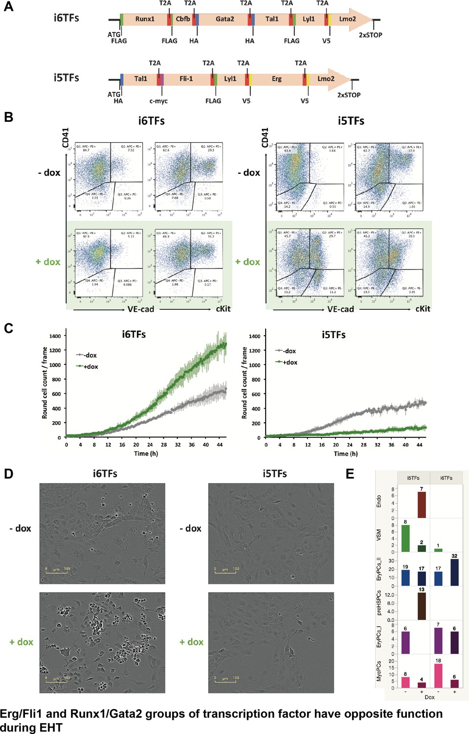
The Erg/Fli1 and Runx1/Gata2 groups of transcription factors have opposite functions during EHT.
(A) Scheme showing the i5TFs and i6TFs constructs used to generate the two inducible ESC lines missing Runx1, Gata2 and Cbfb, or Fli1 and Erg (respectively). (B) Representative FACS plots of VE-Cad, cKit and CD41 expression following three days of BL-CFC culture of the indicated ESC lines (n = 3). (C) Graphs showing the average numbers of round cells counted per frame (n = 3) in a 48 hr time course for the indicated ESC lines. Error bars represent standard deviations. (D) Representative pictures taken two days after HE culture of sorted VE-Cad+ CD41– (Endo) cells for the indicated cell lines. Round cells correspond to blood cells. The scale bar corresponds to 100 μm. (E) Bar graphs displaying the sc-q-RT-PCR results for the i6TFs and i5TFs ESC lines. See also Figure 8—figure supplement 1, Supplementary files 1, 10 and 11.
Figure 8—figure supplement 1
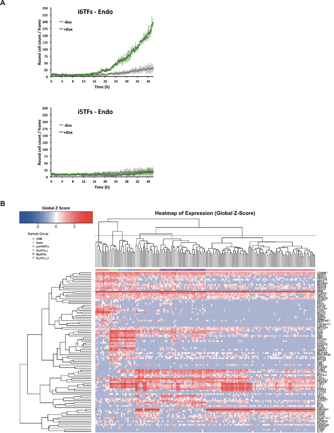
Study of the role of Erg/Fli1 and Runx1/Gata2 groups of transcription factors in EHT.
(A) Graphs showing the average numbers of round cells counted per frame (n = 3) in a 48 hr time course of HE culture for the indicated cell lines. Error bars represent standard deviations. (B) Hierarchical clustering showing the sc-q-RT-PCR results for 95 genes on the i5TFs and i6TFs cell lines after three days of BL-CFC culture. Six major subpopulations were defined according to the intersection of the red dotted line with the dendrogram in the upper part of the heatmap. See also Supplementary file 11.
Figure 9
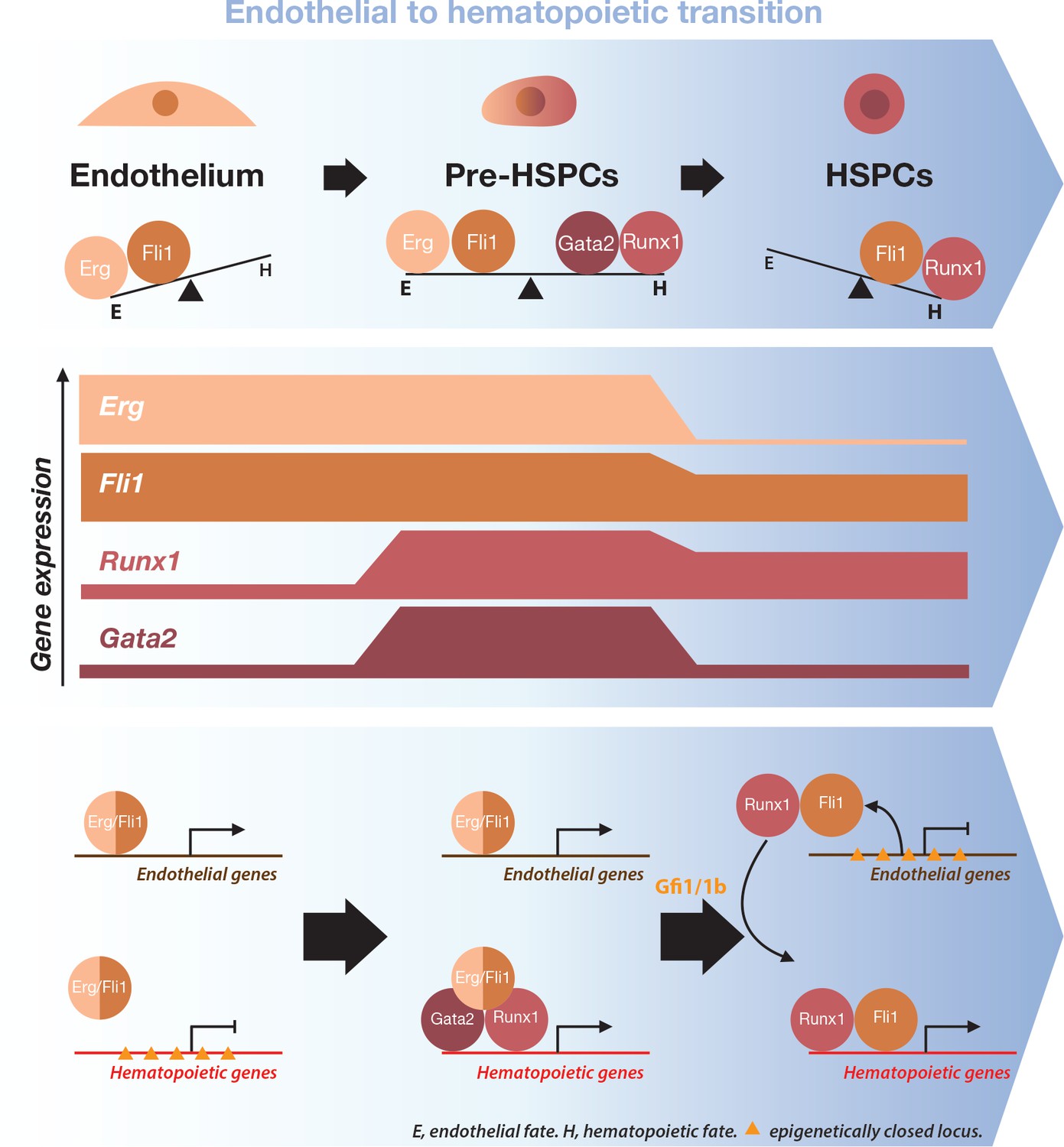
Model for the dynamical function of transcription factors during the formation of blood stem and progenitor cells.
Proposed model for the dynamical function of transcription factors during the endothelial to hematopoietic transition. The upper blue arrow section shows the balance between transcription factors along the transition. The middle section indicates the gene expression levels for the two sets of transcription factors. In the lower blue arrow section, a possible mechanism for the functional switch of Erg/Fli1 in presence of Runx1/Gata2 is depicted. During the transition, epigenetically closed hematopoietic gene loci are progressively opened and activated in the presence of Runx1/Gata2 together with Fli1/Erg while the endothelial loci are progressively closed through Gfi1 and Gfi1b transcriptional repression. The DNA-binding data combined with single-cell GRN analysis suggests a dual function for Fli1 that is dependent on the cellular context (see main text for full description).
Author response image 1
Author response image 2
Author response image 3
Author response image 4
(Left) 8TFs network in our sc-RNA-Seq data.
(Right) 8TFs network in Pereira sc-RNA-Seq data.
Author response image 5
Author response image 6
Additional files
-
Supplementary file 1
(Related to Figures 1, 3, 4, 5 and 8.) Description of the genes used for single-cell quantitative RT-PCR.
The genes are classified by categories. A gene can belong to several categories.
- https://doi.org/10.7554/eLife.29312.031
-
Supplementary file 2
(Related to Figure 1.) Single-cell quantitative RT-PCR data shown in Figure 1A and B.
The first worksheet contains Ct values, the second log2 expression data and the third the metadata relative to the cells shown in Figure 1A and B.
- https://doi.org/10.7554/eLife.29312.032
-
Supplementary file 3
(Related to Figure 1D.) Single-cell quantitative RT-PCR data shown in Figure 1D.
The first worksheet contains Ct values, the second log2 expression data and the third the metadata relative to the cells shown in Figure 1D.
- https://doi.org/10.7554/eLife.29312.033
-
Supplementary file 4
(Related to Figure 3—figure supplement 2B.) Single-cell quantitative RT-PCR data shown in Figure 3—figure supplement 2B.
The first worksheet contains Ct values, the second log2 expression data and the third the metadata relative to the cells shown in the Figure 3—figure supplement 2.
- https://doi.org/10.7554/eLife.29312.034
-
Supplementary file 5
(Related to Figure 3—figure supplements 3B and 4A,) Microarray data results shown in Figure 3—figure supplement 3B.
The first worksheet contains metadata, the nine other sheets contain the results of expression contrast between two populations indicated in the name of the corresponding worksheet. The worksheets 10–14 contain information for the GO term analysis presented in Figure 3—figure supplement 4A.
- https://doi.org/10.7554/eLife.29312.035
-
Supplementary file 6
(Related to Figure 4.) Single-cell quantitative RT-PCR data shown in Figure 4A and B.
The first worksheet contains Ct values, the second log2 expression data, the third the metadata relative to the cells shown in Figure 4A and B, the fourth the matrix for Figure 4B and the fifth the p-values for Figure 4B.
- https://doi.org/10.7554/eLife.29312.036
-
Supplementary file 7
(Related to Figure 5.) Single-cell quantitative RT-PCR data shown in Figure 5C.
The first worksheet contains Ct values, the second log2 expression data and the third the metadata relative to the cells shown in Figure 5C.
- https://doi.org/10.7554/eLife.29312.037
-
Supplementary file 8
(Related to Figure 5—figure supplement 2.) Single-cell quantitative RT-PCR data shown in Figure 5—figure supplement 2.
The first worksheet contains Ct values, the second log2 expression data and the third the metadata relative to the cells shown in Figure 5—figure supplement 2.
- https://doi.org/10.7554/eLife.29312.038
-
Supplementary file 9
(Related to Figure 7.) Results of the Spearman correlation analysis shown in Figure 7B.
The first worksheet contains all correlation values shown in the heatmap of Figure 7B. The second contains the list of Fli1 target genes defined by Wilson et al. (2010). The third contains the list of Runx1 target genes defined by Wilson et al. (2010). The fourth contains the name of Fli1 targets among the 210 genes list and their corresponding Spearman correlation values. The fifth contains the name of Runx1 targets among the 210 genes list and their corresponding Spearman correlation values. The sixth worksheet contains the name of both Fli1 and Runx1 targets among the 210 genes list and their corresponding Spearman correlation values.
- https://doi.org/10.7554/eLife.29312.039
-
Supplementary file 10
(Related to Figure 8 and Figure 8—figure supplement 1.) Single-cell quantitative RT-PCR data shown in Figure 8E and Figure 8—figure supplement 1B.
The first worksheet contains Ct values, the second log2 expression data and the third the metadata relative to the cells shown in Figure 8E.
- https://doi.org/10.7554/eLife.29312.040
-
Supplementary file 11
(Related to all Figures except Figure 7 and Figure 7—figure supplement 1.) Table summarizing the experiments done in the manuscript.
For each figure panel, the type of experiments is described as well as the number of times they were carried out.
- https://doi.org/10.7554/eLife.29312.041
-
Transparent reporting form
- https://doi.org/10.7554/eLife.29312.042
Download links
A two-part list of links to download the article, or parts of the article, in various formats.
Downloads (link to download the article as PDF)
Open citations (links to open the citations from this article in various online reference manager services)
Cite this article (links to download the citations from this article in formats compatible with various reference manager tools)
Single-cell transcriptomics reveals a new dynamical function of transcription factors during embryonic hematopoiesis
eLife 7:e29312.
https://doi.org/10.7554/eLife.29312


