Neuropathological and transcriptomic characteristics of the aged brain
- Allen Institute for Brain Science, United States
- University of Washington, United States
- Kaiser Permanente Washington Health Research Institute, United States
- University of California, Los Angeles, United States
Figures
Figure 1 with 2 supplements
Experimental design and cohort characteristics.
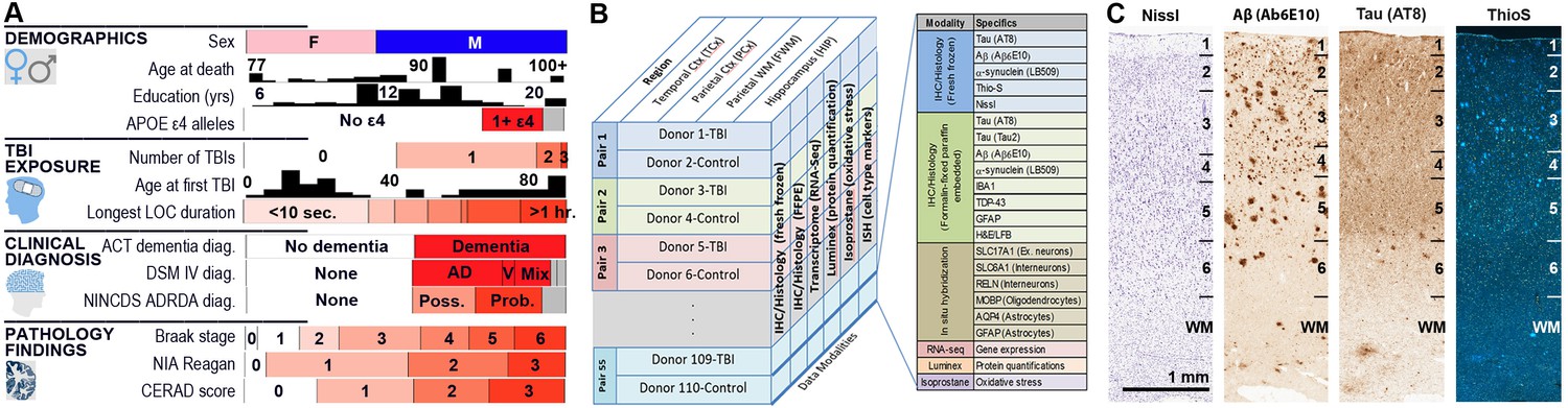
(A) Demographics for all 106 donors (after excluding one outlier; Materials and methods). Histograms are shown for Age at death, Education (yrs), and Age at first TBI. All other metrics (except sex) are sorted from lowest to highest, with white corresponding to none (or 0 or control), and red corresponding to the highest severity of the condition or pathology. (B) Summary of all data available for each donor included in this study, including IHC on fresh and frozen tissue, RNA-seq analysis, and Luminex protein and isoprostane quantification. (C) Examples of histology from fresh frozen temporal cortex of donor H14.09.075 using IHC for Ab6E10 and AT8 and ThioS labeling, showing severe Ab and pTau pathology. Numbers indicate cortical layers. Descriptions of each metric (including abbreviations used) are included as a downloadable file on http://aging.brain-map.org/download/index. See also Figure 1—figure supplements 1–2.
Figure 1—figure supplement 1
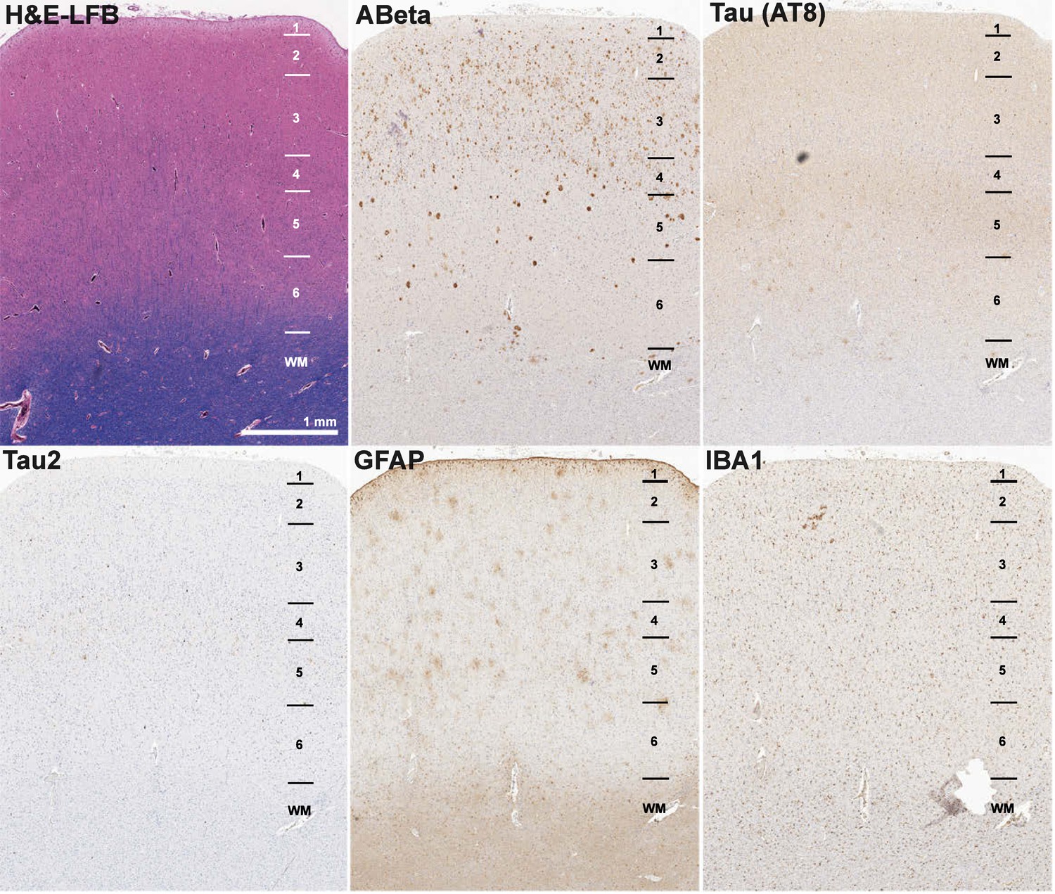
Example of FFPE pathology in donor H14.09.075.
Examples of histology from FFPE temporal cortex of donor H14.09.075 using IHC for Ab6E10 (Aβ), AT8 (paired helical filament pTau), Tau2 (pTau), GFAP (astrocytes), and IBA1 (microglia), and ThioS labeling, showing severe Aβ and pTau pathology. FFPE pathology measurements are relatively dim compared with fresh frozen, but can still be quantified. Numbers indicate cortical layers.
Figure 1—figure supplement 2
Dominant gene expression signatures in RNA-Seq data are brain region and RIN.
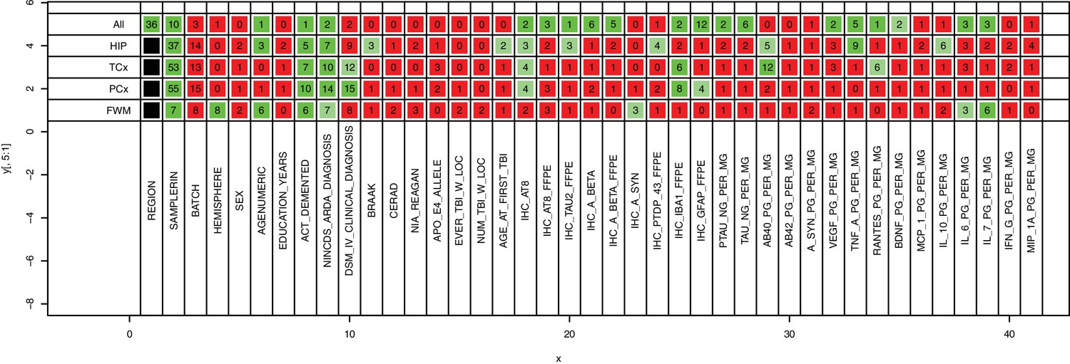
MDMR on all uncorrected data (top row) identifies region as the top source of variability, and MDMR run region by region (remaining rows) identifies sample RIN as the top source of variability, highlighting the importance of correcting for RNA quality. Numbers indicate percent of variation explained by a variable (columns) using a univariate model (Materials and methods), and colors indicate significance (green, p<0.01; light green, 0.05 < p < 0.01; red, p>0.05).
Figure 2 with 6 supplements

Amyloid beta and tau pathologies show a relationship with age, but with high variability.
(A) Distributions of values for quantitative pathology metrics, separated by brain region (colors in legend). Lines are density plots (y-axis) of distributions of each metric (specified in x-axis label), with triangles indicating the average value. Note that several metrics have higher values in cortex than hippocampus, or vice versa. (B) Donors with higher levels of tau pathology (defined as Braak stage; top row) and of Aβ (defined as CERAD score; bottom row) were older on average (y-axis) than donors with lower measures of pathology. (C) Donors with dementia have higher levels of tau and Aβ pathology on average than donors without dementia, as measured both by global metric (Braak stage, CERAD score; left column), and local IHC quantifications in hippocampus (AT8, Ab6E10; right column). (D) Donors with higher levels of dementia pathology (x-axes; same metrics as in C) also tend to have lower cognitive scores (y-axes). For bar plots in B-D, dots indicate specific donors, and boxes and whiskers represent 25%/75% and 5%/95%, respectively. For scatterplots, dots indicate donors, with specific metrics shown on axes. See also Figure 2—figure supplements 1–6.
Figure 2—figure supplement 1
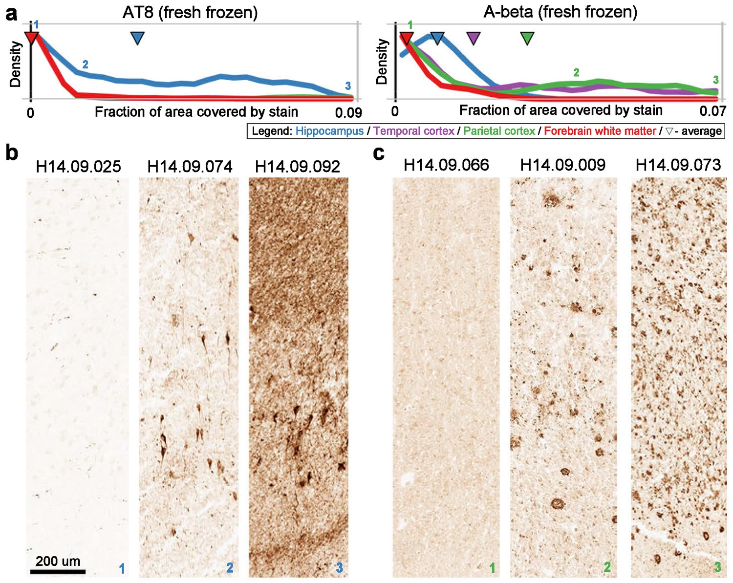
Quantitative measures of pTau and Aβ generally match qualitative observations.
(A) Distributions of quantitative measures of AT8 in hippocampus (left) and of Ab6E10 (A-beta) in parietal cortex (right). Numbers indicate samples chosen for visualization. Labeling as in Figure 2A. (B) Example slices of CA1 region of hippocampus from donors with low (left), medium (middle), and high (right) pTau pathology. (C) Example slices of parietal cortex from donors with low (left), medium (middle), and high (right) Aβ pathology.
Figure 2—figure supplement 2
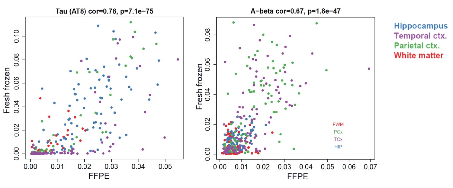
Quantitative measures of pTau and Aβ are consistent between frozen and FFPE tissue.
Quantifications of paired helical filament pTau (AT8; left) and Aβ (Ab6e10, right) pathology derived from images of FFPE tissue sections (x-axes) and fresh frozen sections (y-axes) are highly correlated. Dots correspond to samples. Colors correspond to brain regions.
Figure 2—figure supplement 3
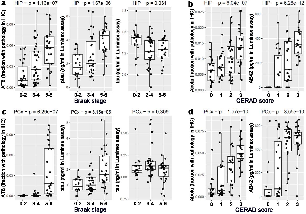
Consistent measures of pathology across metrics.
(A) Local measurements of pathological tau based on IHC (AT8; left) and Luminex (pTau; center), but not total tau (Tau, right) show a progressive increase with Braak stage in hippocampus, consistent with Braak stage definitions. (B) Local measures of Aβ based on IHC (Ab6E10; left) and Luminex (Aβ42; right) show a monotonic increase with increasing CERAD score in hippocampus, as expected. (C) Tau pathology is higher in parietal cortex of donors with Braak stages 5–6, compared with stages 1–4. (D) Aβ pathology increases with CERAD score in parietal cortex. Labeling as in Figure 2B.
Figure 2—figure supplement 4
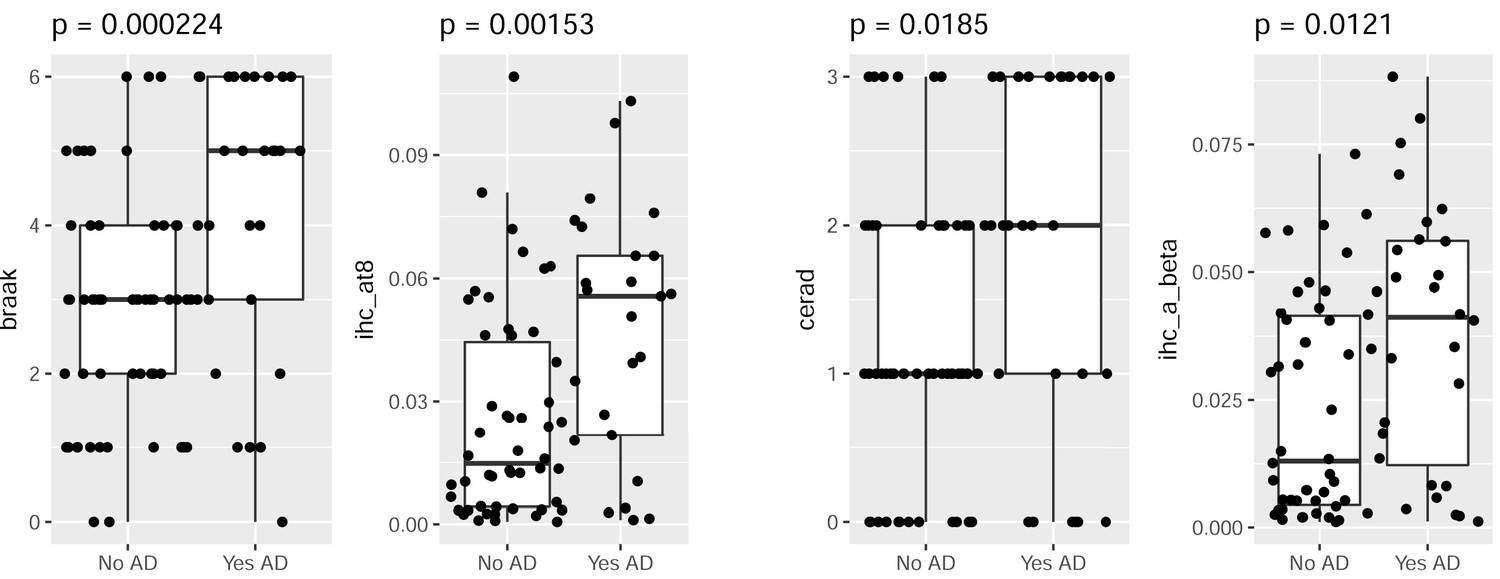
Consistent measures of pathology for the subset of dementia donors with AD.
Donors with AD have higher levels of pTau (left two plots) and Aβ (right two plots) pathology than donors without AD, as measured both by global metric (Braak stage, CERAD score; left bars), and local IHC quantifications in hippocampus (AT8, Ab6E10; right bars). Labeling as in Figure 2C.
Figure 2—figure supplement 5
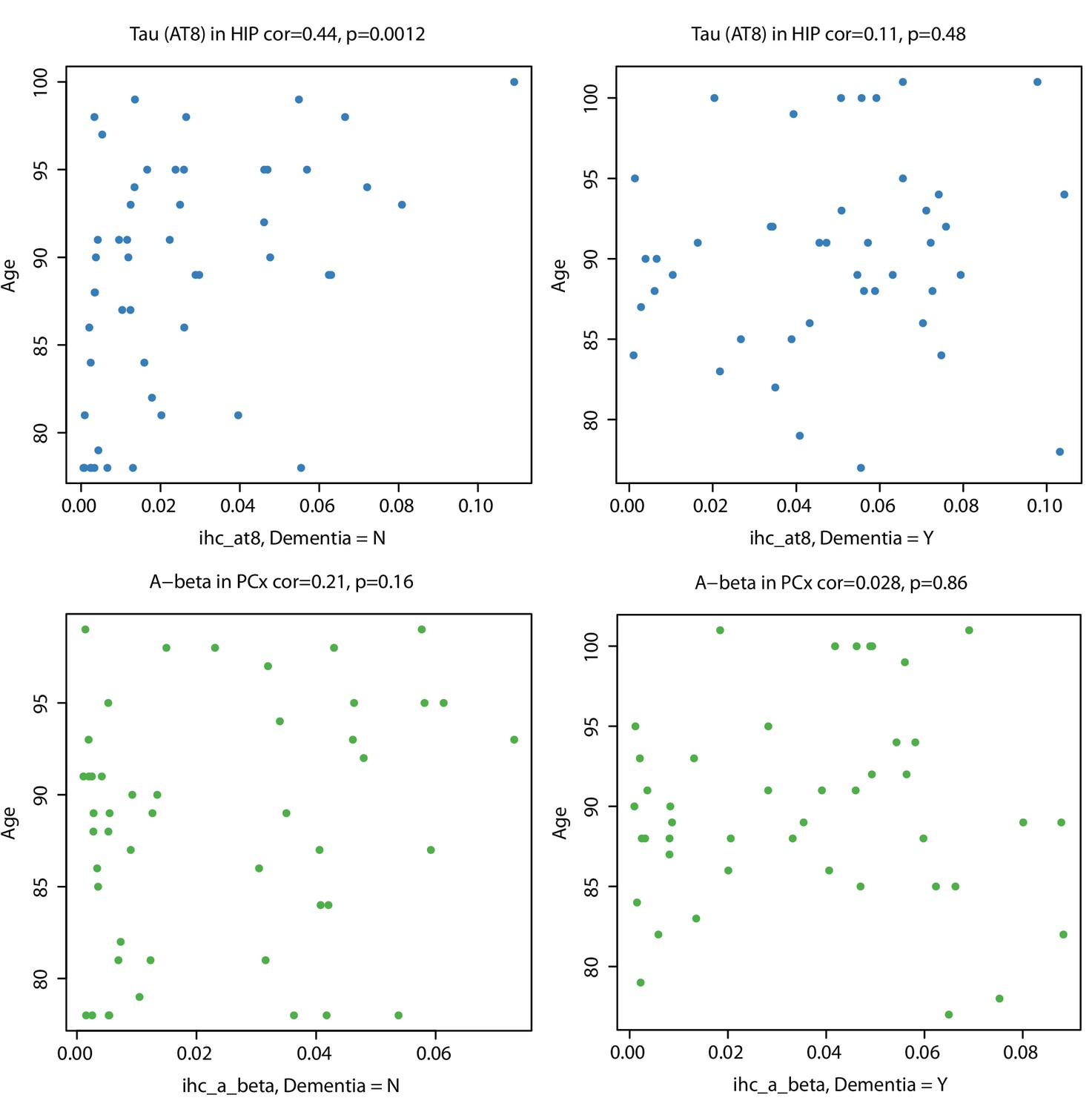
Tau pathology increases with age in hippocampi of non-demented donors.
Local measurements of pTau (AT8; top panels) and Aβ (Ab6E10; bottom panels) are more highly correlated with age in donors without dementia (left panels) than in those with dementia (right panels). Labeling as in Figure 2D.
Figure 2—figure supplement 6
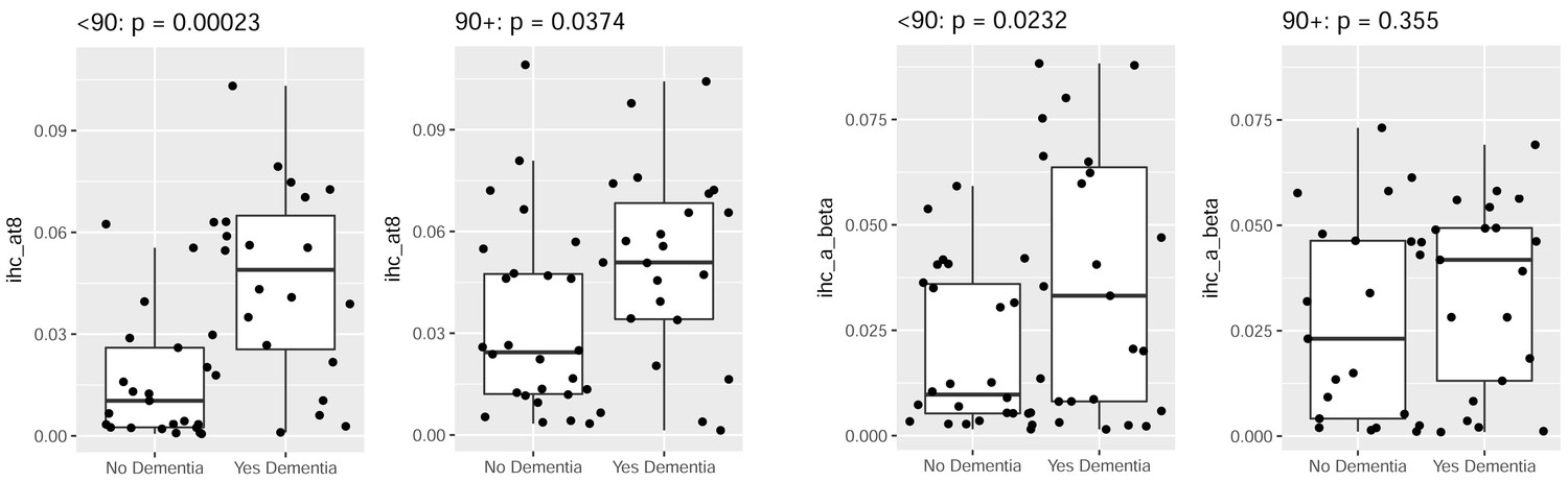
Younger donors show more significant relationships between dementia status and pathology than older donors.
Local measurements of pTau (AT8; left two panels) and Aβ (Ab6E10; right two panels) show more significant differences between control donors (left bars) and donors diagnosed with dementia (right bars) in younger donors (<90 years; left panels) than in older donors (90+ years; right panels). This difference can be largely explained by increased pathology in older donors that are cognitively normal (Figure 2—figure supplement 5).
Figure 3
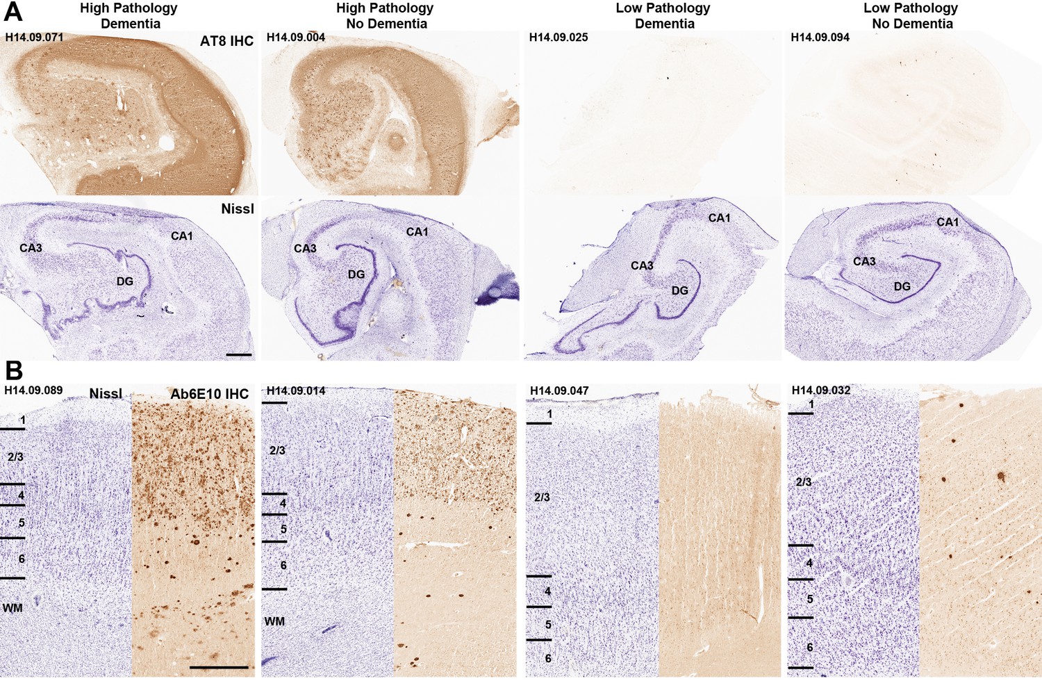
Disconnect between pathology and dementia status.
AT8 (tau; A) and Ab6E10 (Aβ; B) IHC in high and low pathology donors with and without dementia, demonstrating individual variation in the relationship between pathology and dementia status. AT8 images of tau pathology are from the hippocampus (with matching Nissl-stained section below), while Ab6E10 images of Aβ pathology are from the parietal cortex. CA1, CA3: hippocampal subfields; DG: dentate gyrus. Numbers in B indicate cortical layers. Donor labels are indicated. Scale bar: 1 mm.
Figure 4
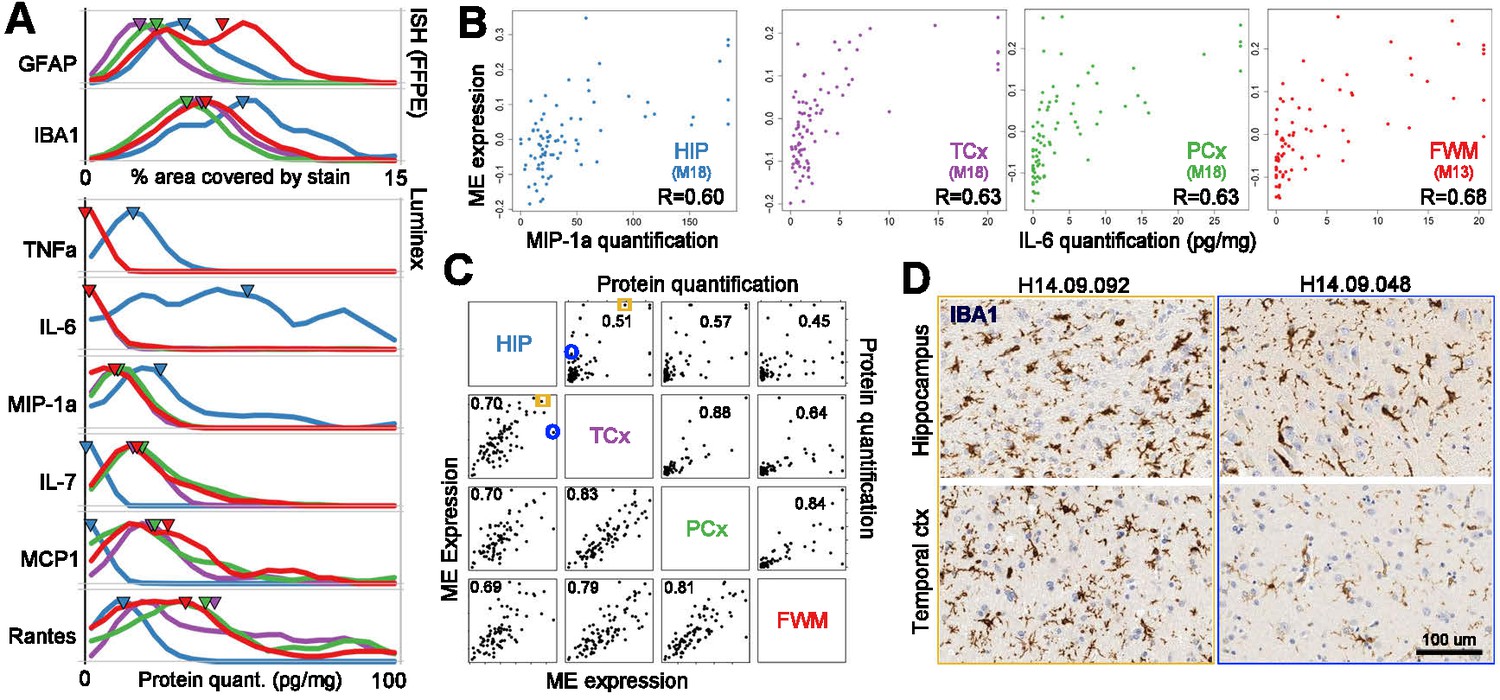
Gene expression signatures of inflammation.
(a) Distributions of values for glia and for each Luminex variable marking inflammation, separated by brain region (labeling as in Figure 2A). (B) Correlation between gene metrics of inflammation (x-axis) and protein metrics of inflammation (y-axis) in each brain region. Gene signatures are defined as the module eigengene (ME) of the module with the largest enrichment for the GO term ‘inflammatory response’, and protein metrics are the truncated quantifications of the Luminex protein most highly correlated with each ME. (C) Gene (lower left) and protein (upper right) expression markers of inflammation are highly correlated between brain regions. Dots represent donors with x- and y-axes corresponding to the gene and protein values in B. Pairwise brain region correlations are shown below in each box. Blue circle and orange box correspond to donors in D. (D) IHC for IBA1 in a donor showing inflammation across regions (left, orange), and in a donor showing higher levels of inflammatory marker genes in hippocampus than cortex (right; blue). See also Figure 4—source datas 1–3.
-
Figure 4—source data 1
Module assignments and associated module eigengene correlations for each gene in the four regional WGCNA networks.
- https://doi.org/10.7554/eLife.31126.015
-
Figure 4—source data 2
Module annotation for cell types.
Cell type gene lists are derived from Zhang et al. (2014) and NeuroExpresso in the left and right panels, respectively, and enrichment p-values for each module are calculated using a hypergeometric test and are Bonferroni-corrected.
- https://doi.org/10.7554/eLife.31126.016
-
Figure 4—source data 3
Module comparison with demographic and pathology metrics.
Module eigengene expression is compared with 24 demographic and pathology metrics (including Dementia/control, AD/control, sex, measures of tau and abeta pathology, and inflammatory markers) using SVA, and p-values are Bonferroni-corrected.
- https://doi.org/10.7554/eLife.31126.017
Figure 5 with 1 supplement
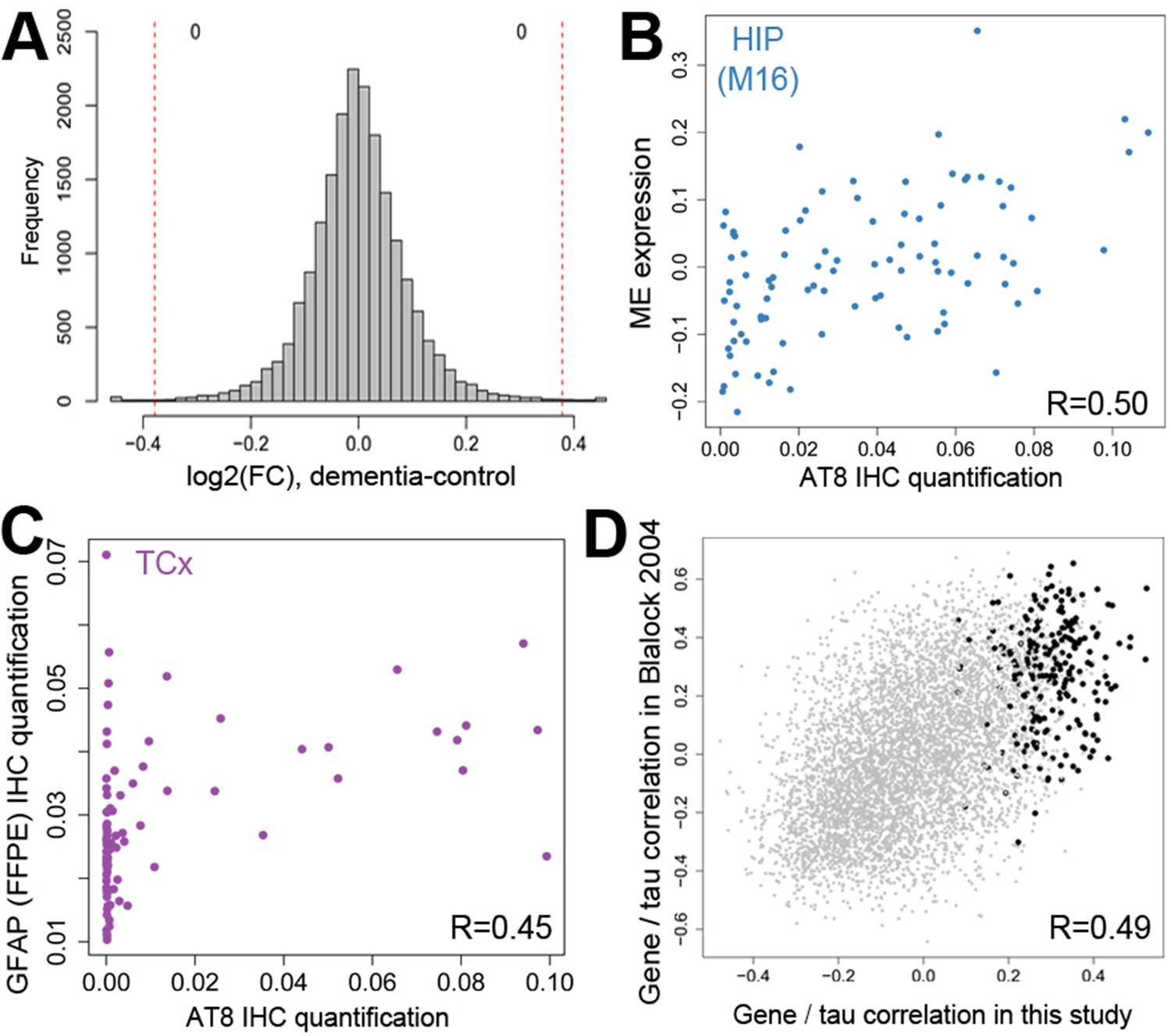
Gene expression signatures of dementia and related pathology.
(A) No significant gene expression differences between donors with and without dementia in hippocampus. The histogram shows the distribution of log2(fold difference) expression levels (x-axis) between control and dementia donors. Numbers indicate how many genes have a fold change > 1.3 (red lines) and p<0.05. (B) Significant correlation between the ME of M16 (y-axis) and measures of tau (AT8 IHC) in hippocampus. (C) Significant correlation between protein quantification of IHC for GFAP (y-axis) and measures of pTau (AT8 IHC) in temporal cortex. (D) Genes show comparable relationships with tau in this and an earlier study of dementia. X-axis shows the correlation between gene expression and AT8 IHC in this study. Y-axis shows the correlation between quantifications of NFTs and gene expression in (Blalock et al., 2004). Dots represent genes, with black dots corresponding to genes in module M16. See also Figure 5—figure supplement 1.
Figure 5—figure supplement 1
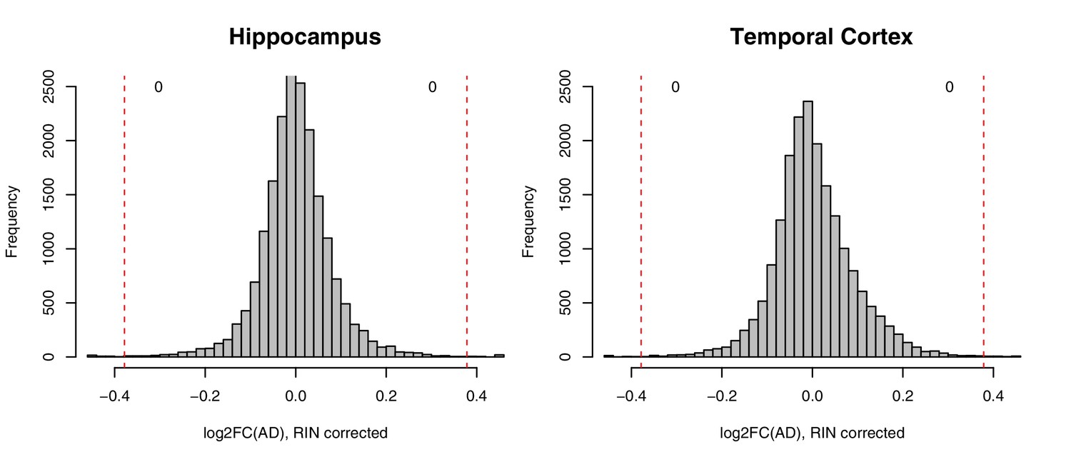
No significant gene expression differences between donors with and without AD diagnosis in RIN-corrected data.
Histograms show the distribution of log2(fold change) expression levels (x-axis) between control and AD donors in two brain regions (hippocampus, left; temporal cortex, right). Numbers indicate how many genes have a fold change >1.3 (red lines) and p<0.05.
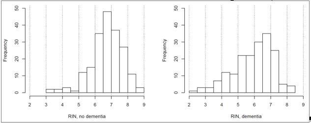
Figure 6 with 2 supplements
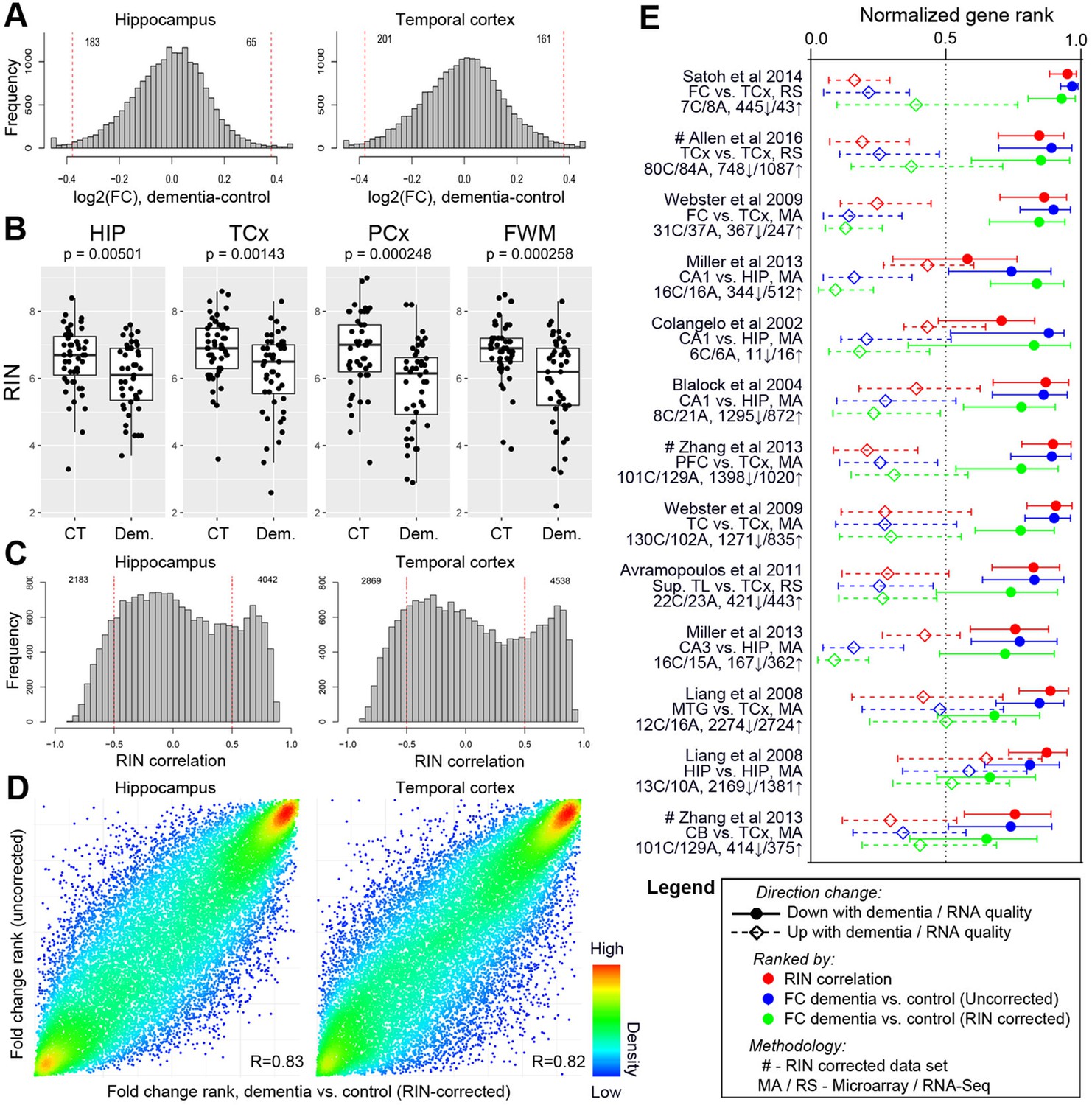
Differences in RNA quality between dementia and controls greatly impact gene expression results.
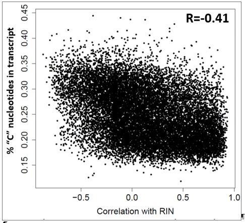
(A) Gene expression differences between donors with and without dementia in uncorrected data. Histograms show the distribution of log2(fold difference) expression levels (x-axis) between control and dementia donors in two brain regions (hippocampus, left; temporal cortex, right). Numbers indicate how many genes have a fold change > 1.3 (red lines) and p<0.05. (B) RNA quality in donors with dementia (Dem.; right bars) is significantly lower than in non-demented controls (CT; left bars) in all four brain regions. Y-axes are RIN values. Plots as in Figure 2B–D. (C) Gene expression levels for many genes are highly correlated with RIN, with more showing lower expression with lower RNA quality (positive values) than with higher RNA quality (negative values). Histograms show the distribution of RIN correlations in two brain regions. Numbers indicate how many genes have R > 0.5 (red lines) and p<0.05. (D) Rank order of fold differences between controls and dementia cases is largely unchanged after controlling for RNA quality. Ranked fold differences on the x- and y-axes correspond to Figure 6A and Figure 5A, respectively. Dots indicate genes and are color-coded by density. (E) Genes with higher or lower expression levels in people with dementia compared with cognitively normal older adults from 12 brain regions in eight previous studies (rows) are related to dementia diagnosis and RNA quality in this study. Horizontal tics show the 25th percentile, median, and 75th percentile rank of the indicated dementia-related list in our current data set. Gene expression levels from genes lower in low RIN samples are also lower in AD samples from the comparison studies (red, solid lines are shifted towards 1), while gene expression levels from genes higher in high RIN samples are also higher in AD samples from the comparison studies (red, dotted lines are shifted towards 0). Gene expression results accounting for RIN (green) generally agree less well between studies than results not accounting for RIN (blue). See also Figure 6—figure supplements 1–2 and Figure 6—source datas 1–6.
-
Figure 6—source data 1
Log2 fold changes between AD vs. control and dementia vs. control for each gene in all four brain regions, along with associated SVA p-values.
Results for both RIN corrected and uncorrected data are shown.
- https://doi.org/10.7554/eLife.31126.023
-
Figure 6—source data 2
Correlations between each gene and RNA quality (RIN) with associated SVA p-values in all four brain regions.
- https://doi.org/10.7554/eLife.31126.024
-
Figure 6—source data 3
Significant GO terms for genes increasing or decreasing expression with decreasing RNA quality.
Up to 50 significant categories for molecular function (MF), cellular component (CC), and biological process (BP) are shown, after correction for multiple comparisons.
- https://doi.org/10.7554/eLife.31126.025
-
Figure 6—source data 4
Description of nine previous studies comparing AD vs. control, including details of how gene lists used in paper were derived.
- https://doi.org/10.7554/eLife.31126.026
-
Figure 6—source data 5
List of 26 gene lists from the nine above publications that are used in Figure 6E.
- https://doi.org/10.7554/eLife.31126.027
-
Figure 6—source data 6
Significance of association between each of the first 25 principal components and every assessed metric in the un-normalized and RIN-normalized data.
SVA P-values (Bonferroni corrected) are shown. Only metrics with at least one significant association in any region in either the un-normalized or RIN-normalized data are included in the table.
- https://doi.org/10.7554/eLife.31126.028
Figure 6—figure supplement 1
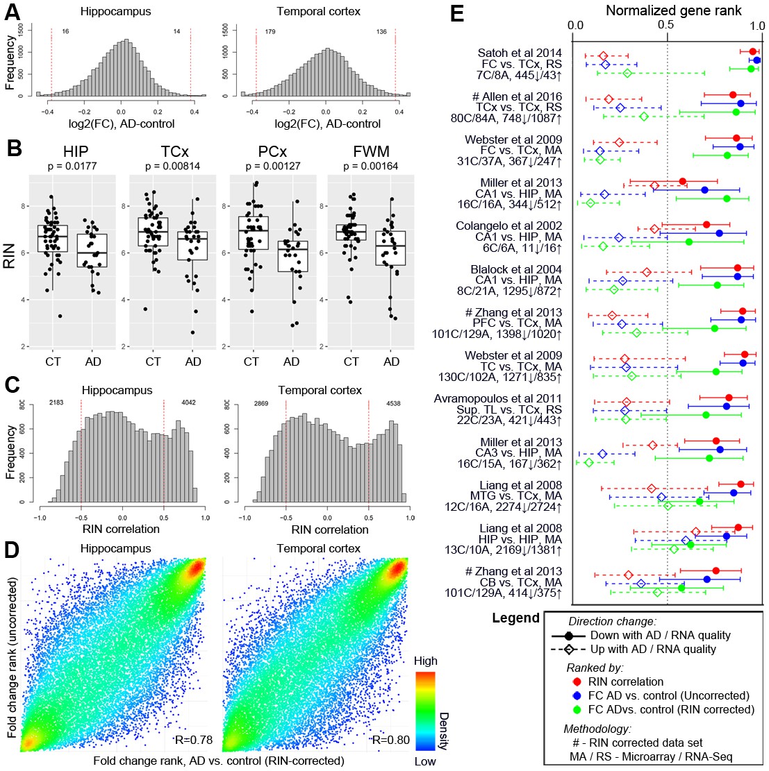
Differences in RNA quality between AD and controls greatly impact gene expression results.
See legend for Figure 6 - all panels are matched, but only when considering the subset of dementia donors with AD diagnosis. Panel C is identical to Figure 6C and reproduced for continuity.
Figure 6—figure supplement 2
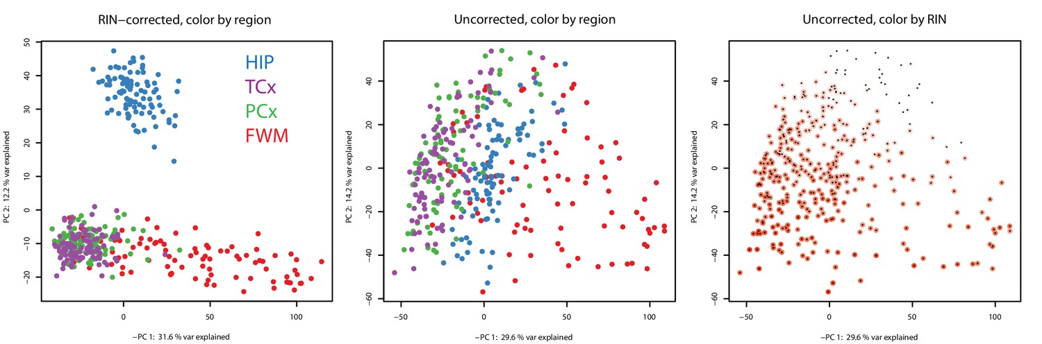
Decreased separation of brain region in principal component space without RIN correction.
(Left) Principal component analysis (PCA) of all samples in this data set using RIN-corrected data separates cortical grey vs. white matter (PC 1, x-axis) and hippocampus from cortex (PC 2, y-axis). First two PCs are shown and explain 43.8% of the variation. PCA groups samples by brain region (color), except for temporal and parietal grey matter, which completely overlap. (Center) Repeating the PCA on unnormalized data identifies one component related to brain region (PC 1) and a second component related to RNA quality (PC 2). Dots correspond to samples. Colors correspond to brain regions. (Right) Same plot as the center, but coloring each dot by RIN (white = low RIN, red = high RIN). *Included as separate files.
Author response image 1
Author response image 2
Tables
Table 1
Summary of demographics for donors with and without dementia.
P-values for upper seven and lower two metrics are uncorrected significance values from T-tests and hypergeometric tests, respectively (*p<0.05 after Bonferroni correction for multiple comparisons). Demographic summary includes 106 donors used in analysis (Materials and methods).
| Category | Non-demented | Demented | |||
|---|---|---|---|---|---|
| Mean | SD | Mean | SD | P-value | |
| Age at death (yrs) | 89 | 7 | 90 | 6 | 2.8E-01 |
| Education (yrs) | 15 | 3 | 14 | 3 | 4.9E-02 |
| Number of TBIs | 0.6 | 0.7 | 0.7 | 0.7 | 8.0E-01 |
| Age at first TBI | 23 | 31 | 24 | 32 | 8.2E-01 |
| Braak stage | 2.8 | 1.5 | 4.1 | 1.7 | 8.9E-05* |
| NIA Reagan | 1.4 | 0.7 | 1.9 | 0.9 | 1.8E-03* |
| CERAD score | 1.2 | 0.9 | 1.8 | 1.2 | 1.4E-02 |
| Count | Count | P-value | |||
| Sex | 20 F / 36 M | 23 F / 27 M | 1.0E-01 | ||
| >0 APOE ɛ4 alleles | 47 No/7 Yes | 32 No/13 Yes | 2.1E-02 | ||
Table 2
RNA quality assessment for donors with and without AD in multiple studies.
https://doi.org/10.7554/eLife.31126.029| Data set | Brain region | Count (Control|AD) | RIN/ in control | RIN/ in AD | P-value |
|---|---|---|---|---|---|
| ACT cohort (current data set) | TCx | 50|29 | 6.87 ± 0.92 | 6.18 ± 1.27 | p=1.48×10⁻² |
| ROS (Bennett et al., 2012a) | TCx | 107|136 | 7.21 ± 1.01 | 7.06 ± 0.95 | p=0.23 (ns) |
| MAP (Bennett et al., 2012b) | TCx | 94|120 | 7.25 ± 1.07 | 6.79 ± 0.96 | p=1.18×10⁻³ |
| MSBB * | BA36 | 98|169 | 6.51 ± 1.30 | 5.86 ± 1.59 | p=1.10×10⁻³ |
| Mayo Study (Allen et al., 2016) † | TCx | 31|82 | 7.64 ± 1.21 | 8.59 ± 0.55 | p=1.98×10⁻⁴ |
| (Colangelo et al., 2002) | CA1 | 6|6 | 6.76 ± 0.1 | ns | |
| (Preece and Cairns, 2003) $ | Cortex | 81|90 | ~6.5 | ~6.4 | p<10−2 |
| (Durrenberger et al., 2010) ‡,$ | Brain | 72|12 | ~7.1 | ~5.9 | p<10−4 |
| (Zhang et al., 2014) | PFc | 101|129 | 7.31 ± 0.47 | 7.12 ± 0.56 | p=6.78×10⁻³ |
-
*=we are defining AD as CDR >1 in this data set, but note that the result holds for other cutoffs, †=only control donors from the Mayo Brain Bank Dickson were considered, ‡=Tissue collected from multiple brain regions and multiple brain banks. RNA quality is assessed with either RIN (black text) or pH (blue text) in each study. $=RIN/pH values are estimated from plots. Calculated p-values in this table are two tailed student t-tests uncorrected for multiple comparisons, and p-values from previous studies are as reported.
Additional files
-
Transparent reporting form
- https://doi.org/10.7554/eLife.31126.030
Download links
A two-part list of links to download the article, or parts of the article, in various formats.
Downloads (link to download the article as PDF)
Open citations (links to open the citations from this article in various online reference manager services)
Cite this article (links to download the citations from this article in formats compatible with various reference manager tools)
Neuropathological and transcriptomic characteristics of the aged brain
eLife 6:e31126.
https://doi.org/10.7554/eLife.31126


