The relationship between spatial configuration and functional connectivity of brain regions
- University of Oxford, United Kingdom
- Washington University Medical School, United States
- St. Luke’s Hospital, United States
- King’s College London, United Kingdom
- Radboud University Medical Centre, Netherlands
Figures
Figure 1 with 1 supplement
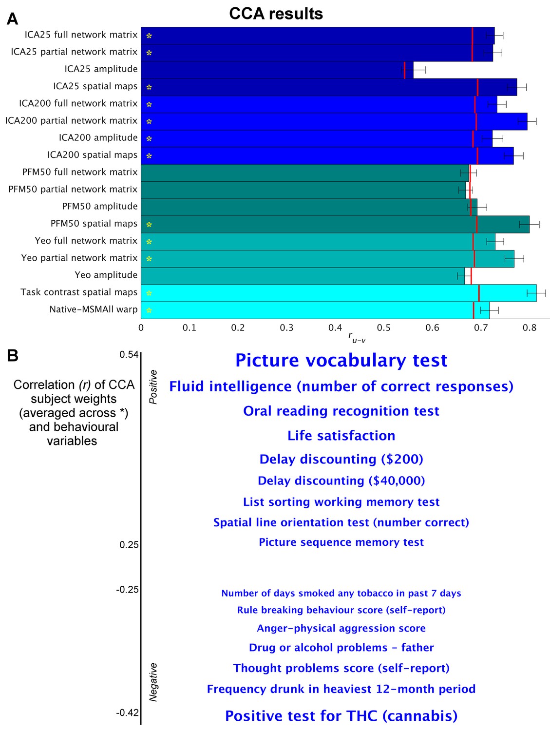
Highly similar associations between behaviour and the brain occur across 17 distinct measures derived from fMRI.
(A) Comparison of strength of CCA result for network matrices, spatial maps and amplitudes (node timeseries standard deviation) derived from several distinct group-average spatial parcellations/decompositions: ICA decompositions at two scales of detail (dimensionalities of 25 and 200, with ‘ICA200 partial network matrix’ corresponding to the measures used previously [Smith et al., 2015]); a PROFUMO decomposition (PFM; dimensionality 50); an atlas-based hard parcellation (108 parcels [Yeo et al., 2011]), task contrast spatial maps (86 contrasts, 47 unique), and warp field from native space to MSMAll alignment. Each bar reports a separate CCA analysis (first CCA mode shown), performed against behaviour/life-factors. A similar mode of variation is found across most of the parcellation methods and different fMRI measures. rUV is the strength of the canonical correlation between imaging and non-imaging measures. Error bars indicate confidence intervals (2.5–97.5%) estimated using surrogate data (generated with the same correlation structure), and red lines reflect the p<0.002 significant threshold compared with a null distribution obtained with permutation testing (i.e. family-wise-error corrected across all CCA components and Bonferroni corrected across a total of 25 CCAs performed, see Supplementary file 1a and b for the full set of results). CCA estimates the highest possible ruv given the dataset; therefore, the null distribution for low-dimensional brain data (e.g. ICA 25 amplitude) is expected to be lower than for high-dimensional brain data. (B) Set of non-imaging variables that correlate most strongly with the CCA mode (averaged subject weights V across results marked with * in A; i.e. p=0.00001) with behavioural variables. Position against the y-axis and font size indicate strength of correlation.
-
Figure 1—source data 1
Source data for Figure 1.
- https://doi.org/10.7554/eLife.32992.004
Figure 1—figure supplement 1
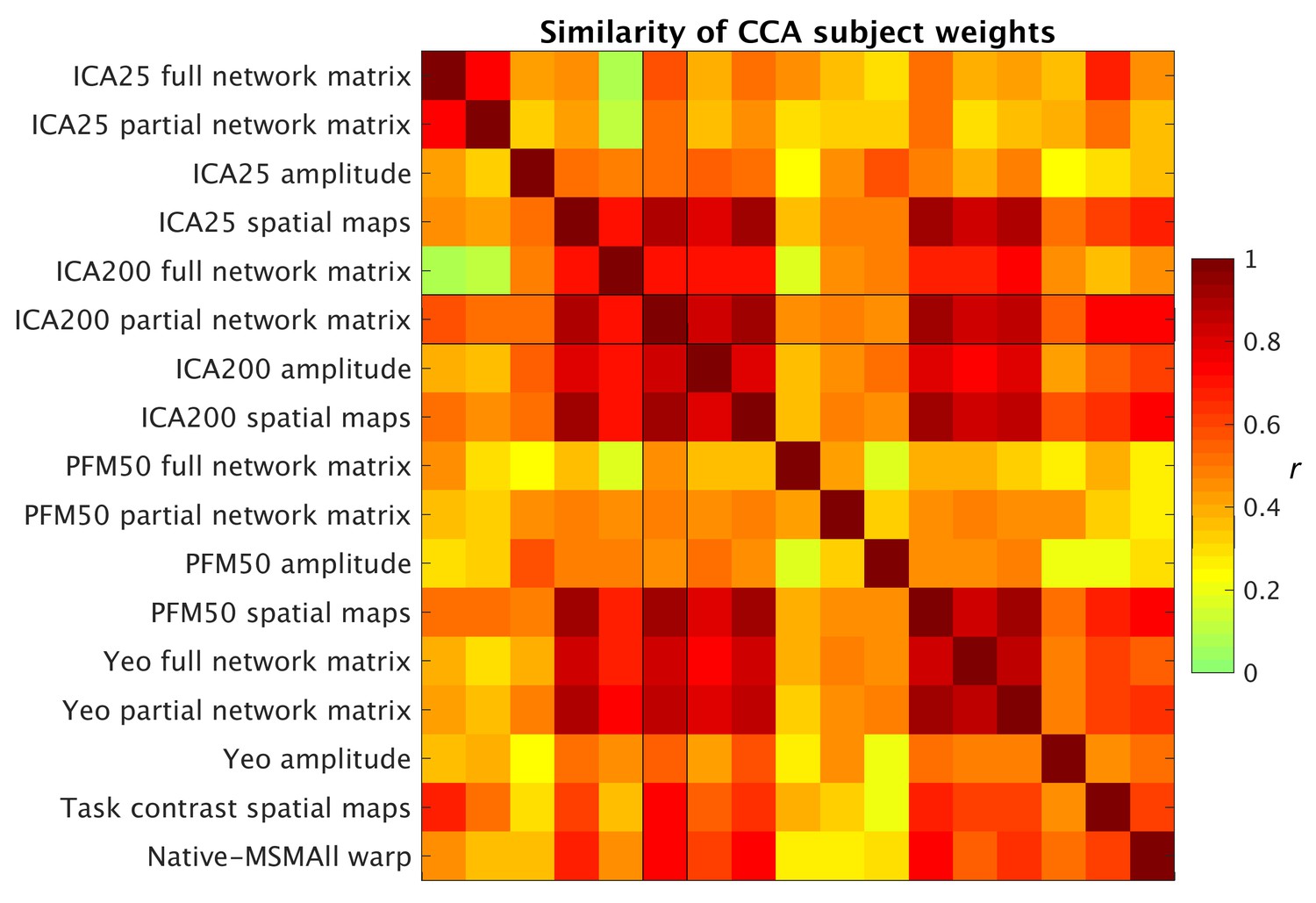
Similarity of behavioural subject weights from a range of separate CCA analyses between MRI-derived measures and behavioural measures.
For each CCA instance, the mode with the maximum correlation with the ICA200 partial network matrix was selected for comparison. Absolute correlation values between behavioural subject weights (V) are shown and reveal that a comparable behavioural mode is obtained from the CCAs.
Figure 2 with 7 supplements
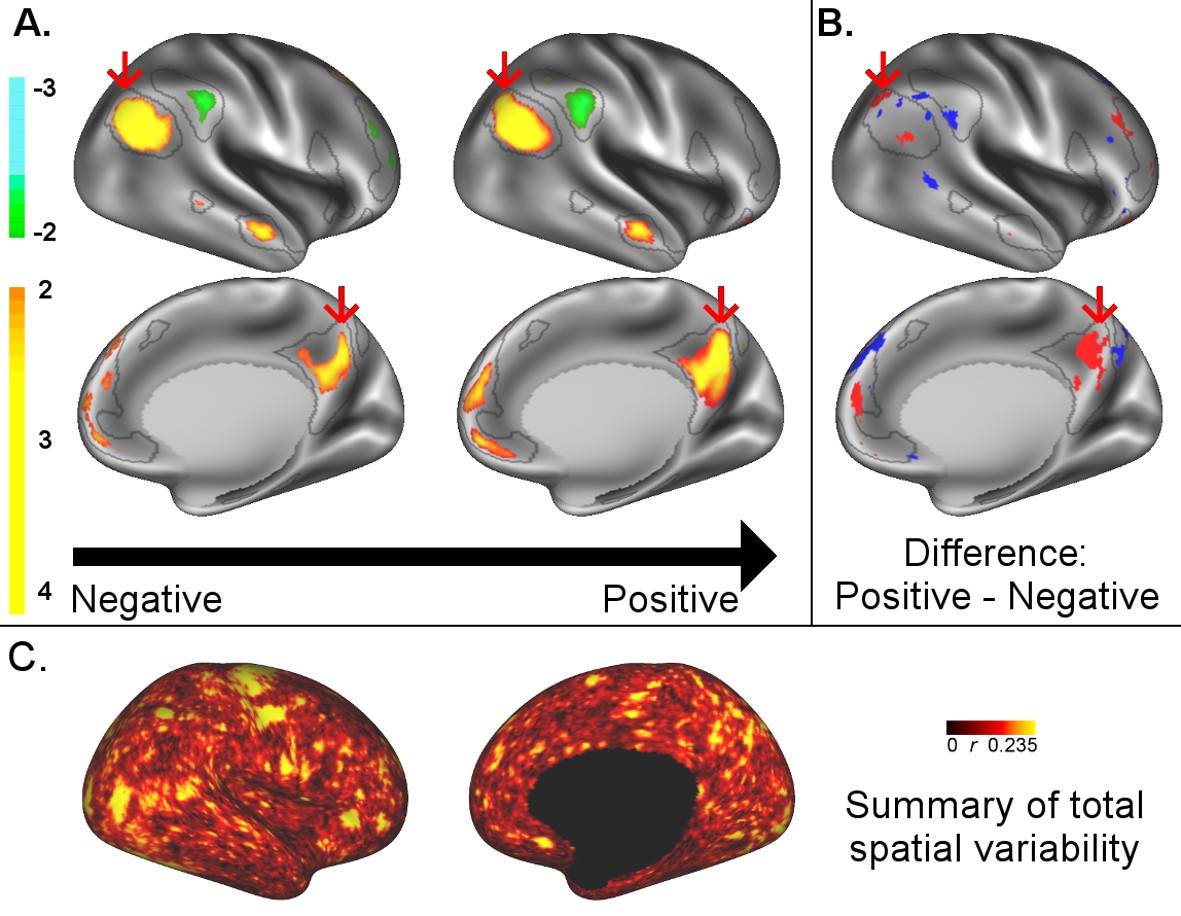
A: representative maps of the two extreme ends (identified based on the low and high extremes along a linearly spaced vector that spans the full range of subject CCA scores) of the CCA mode of population covariation continuum are shown for the default mode network (DMN, the PFM mode that contributed most strongly to the CCA mode of population covariation).
The top row shows that the inferior parietal node of the DMN differs in shape and extends into the intraparietal sulcus in subjects who score high on the positive-negative CCA mode (right), compared with subjects who score lower (left). The bottom row shows that medial prefrontal and posterior cingulate/precuneus regions of the DMN differ in size and shape as a function of the CCA positive-negative mode. The representative maps at both extremes are thresholded at ±2 (arbitrary units specific to the PFM algorithm) for visualisation purposes (the differences are not affected by the thresholding; for unthresholded video-versions of these maps, please see the Supplementary video files. The grey contours are identical on the left and right to aid visual comparison and are based on the group-average maps (thresholded at 0.75). Spatial changes of all PFM modes can be seen in the Supplementary video files and in Figure 2—figure supplements 2–7. B: difference maps (positive - negative; thresholded at ±1) are shown to aid comparison. C: A summary of topographic variability across all PFM modes, showing PFM correlations with CCA subject weights (at each grayordinate the maximum absolute r across all PFMs is displayed). An extended version of C is available in Figure 2—figure supplement 7. Data of Figure 2 available at: https://balsa.wustl.edu/8lVx.
Figure 2—figure supplement 1
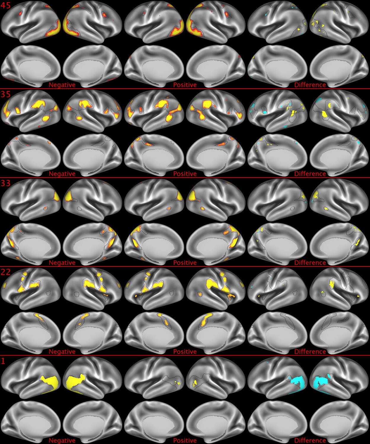
Representative maps of the two extreme ends of the positive-negative continuum for five PFMs.
Maps can directly be compared between the left (negative) and the middle (positive), and difference maps are shown on the right (blue = negative > positive; yellow = positive > negative). Arbitrary thresholds used for visualisation purposes (same thresholds for all maps), see videos for the unthresholded continuum. Gray outlines are based on group average maps and are identical between left and right images to facilitate comparison. Data available at https://balsa.wustl.edu/07pz, https://balsa.wustl.edu/21kq, https://balsa.wustl.edu/rKMN, https://balsa.wustl.edu/xK16, https://balsa.wustl.edu/PGw5.
Figure 2—figure supplement 2
Representative maps of the two extreme ends of the positive-negative continuum for five PFMs.
Maps can directly be compared between the left (negative) and the middle (positive), and difference maps are shown on the right (blue = negative > positive; yellow = positive > negative). Arbitrary thresholds used for visualisation purposes (same thresholds for all maps except map 15, where lower thresholds were used), see videos for the unthresholded continuum. Gray outlines are based on group average maps and are identical between left and right images to facilitate comparison. Data available at https://balsa.wustl.edu/KMGg, https://balsa.wustl.edu/Nq9K, https://balsa.wustl.edu/G1mN, https://balsa.wustl.edu/LBLx, https://balsa.wustl.edu/pKwg.
Figure 2—figure supplement 3
Representative maps of the two extreme ends of the positive-negative continuum for five PFMs.
Maps can directly be compared between the left (negative) and the middle (positive), and difference maps are shown on the right (blue = negative > positive; yellow = positive > negative). Arbitrary thresholds used for visualisation purposes (same thresholds for all maps), see videos for the unthresholded continuum. Gray outlines are based on group average maps and are identical between left and right images to facilitate comparison. Data available at https://balsa.wustl.edu/9qw5, https://balsa.wustl.edu/kKxK, https://balsa.wustl.edu/07m9, https:// balsa.wustl.edu/21gB, https://balsa.wustl.edu/rKw9.
Figure 2—figure supplement 4
Representative maps of the two extreme ends of the positive-negative continuum for five PFMs.
Maps can directly be compared between the left (negative) and the middle (positive), and difference maps are shown on the right (blue = negative > positive; yellow = positive > negative). Arbitrary thresholds used for visualisation purposes (same thresholds for all maps), see videos for the unthresholded continuum. Gray outlines are based on group average maps and are identical between left and right images to facilitate comparison. Data available at https://balsa.wustl.edu/xKwn, https://balsa.wustl.edu/PG0X, https://balsa.wustl.edu/7B1G, https://balsa.wustl.edu/6M1K, https://balsa.wustl.edu/16mg.
Figure 2—figure supplement 5
Representative maps of the two extreme ends of the positive-negative continuum for five PFMs.
Maps can directly be compared between the left (negative) and the middle (positive), and difference maps are shown on the right (blue = negative > positive; yellow = positive > negative). Arbitrary thresholds used for visualisation purposes (same thresholds for all maps except map 20, where lower thresholds were used), see videos for the unthresholded continuum. Gray outlines are based on group average maps and are identical between left and right images to facilitate comparison. Data available at https://balsa.wustl.edu/5g1G, https://balsa.wustl.edu/nKVP, https://balsa.wustl.edu/gKkP, https://balsa.wustl.edu/Mlpw, https://balsa.wustl.edu/Brql.
Figure 2—figure supplement 6
Representative maps of the two extreme ends of the positive-negative continuum for five PFMs.
Maps can directly be compared between the left (negative) and the middle (positive), and difference maps are shown on the right (blue = negative > positive; yellow = positive > negative). Arbitrary thresholds used for visualisation purposes (same thresholds for all maps), see videos for the unthresholded continuum. Gray outlines are based on group average maps and are identical between left and right images to facilitate comparison. Data available at https://balsa.wustl.edu/lK0L, https://balsa.wustl.edu/qK7x, https://balsa.wustl.edu/jK9z, https://balsa.wustl.edu/wKjp, https://balsa.wustl.edu/4nL6.
Figure 2—figure supplement 7
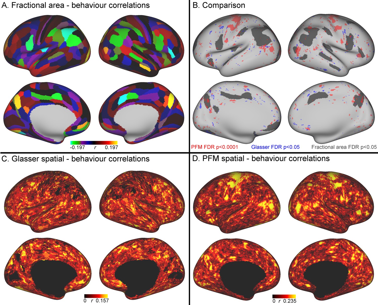
Comparison of the cortical representation of associations with behaviour across fractional area, HCP_MMP1.0 individual subject parcellation and PFM spatial maps.
(A) Correlations between fractional area and behaviour were highly consistent between left and right hemispheres, and revealed relatively high correlations in higher order sensory and cognitive regions. Specifically, bilaterally significant (FDR corrected p<0.05) positive associations between larger surface area and higher scores on the positive-negative mode of population covariation were found in area POS2 of the parieto-occipital sulcus and in area IPS1 of the dorsal visual processing stream; bilaterally significant negative correlations were identified in the cingulate motor area 24dv, premotor area 6 r, and inferior parietal cortex (areas PFt, PFm, PGi). (B) Qualitative comparison between the spatial localisation of strongest correlations with behaviour across all three datasets reveals that many regions that contribute strongly in either the HCP_MMP1.0 or in the PFM individual subject spatial estimates spatially overlap or adjoin cortical areas in which fractional surface area was also closely linked to behaviour. This qualitative finding suggests that differences in regional surface area may drive many of the results presented in this work, although further research is needed to confirm this interpretation (for visual comparison the PFM correlation maps are shown using a higher threshold pFDR <0.0001, |r| > 0.218, and HCP_MMP1.0 correlation maps are correlated at pFDR <0.05; |r| > 0.159). (C) Un-thresholded HCP_MMP1.0 correlations with CCA subject weights; these are the maximum absolute r across all parcels, and therefore do not contain the parcel structure itself. (D) Un-thresholded PFM correlations with CCA subject weights (maximum absolute r across all PFMs). The cortical localisation of strong associations with behaviour do not closely overlap between PFMs and the HCP_MMP1.0 parcellation (i.e. red and blue regions in B and un-thresholded maps in C/D). This lack of exact correspondence of the representations of cross-subject variability may reflect differences between the HCP_MMP1.0 and PROFUMO models (the former being a hard parcellation with no overlap between parcels, and the latter being a soft parcellation that includes complex and often overlapping networks), and differences in the data types driving the parcellation (PROFUMO being driven by rfMRI data only, and the HCP_MMP1.0 parcellation being driven by data from multiple different modalities). Data available at https://balsa.wustl.edu/mK28.
Figure 3
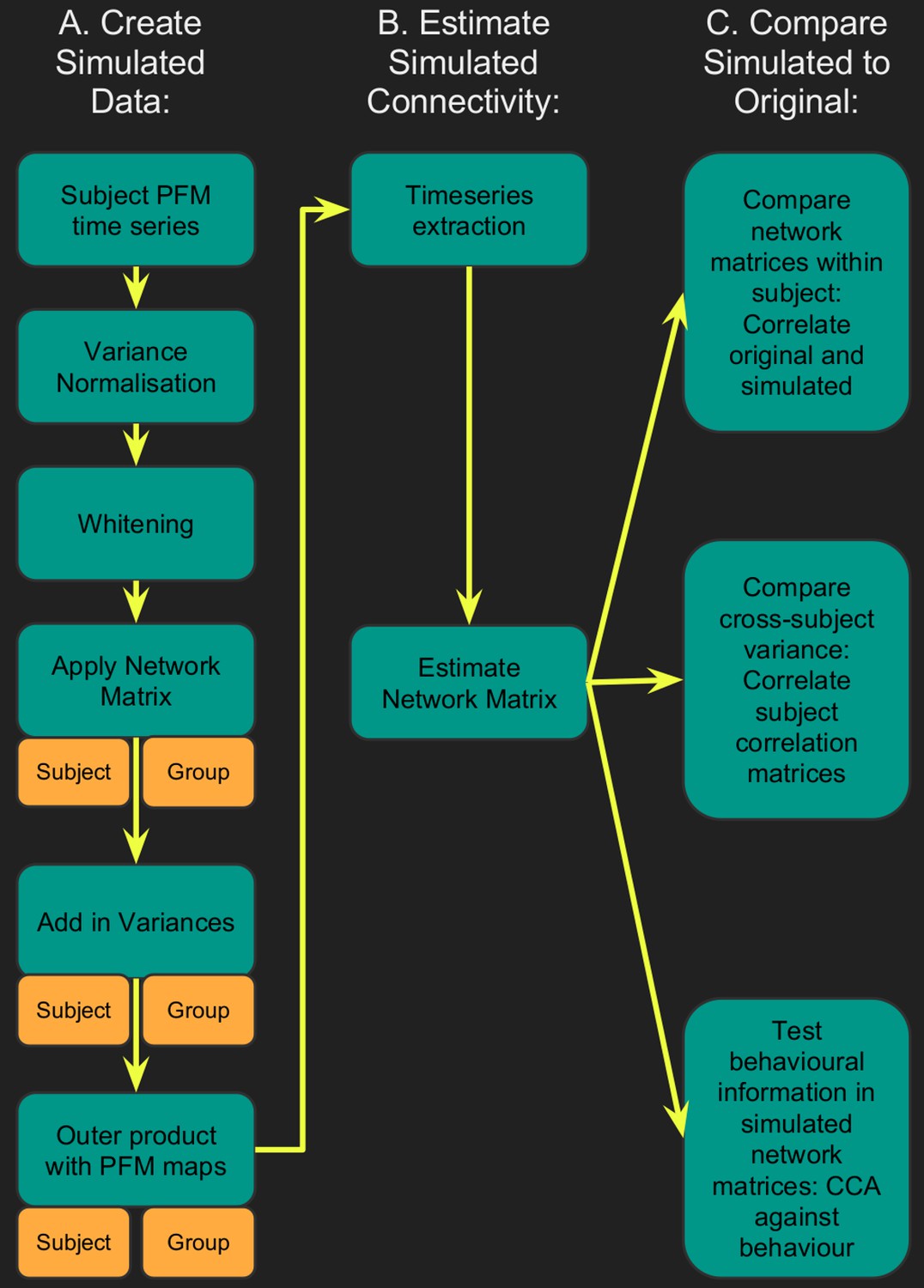
Flowchart for spatiotemporal simulations.
Simulated data was generated for each subject by setting one or more aspects (from the network matrices, node amplitudes, and spatial maps) to the group average. Timeseries extraction is performed (uinsg either dual regression against original group ICA maps, or masked against a binary parcellation); network matrices are calculated and compared against network matrices estimated from the original data.
Figure 4 with 1 supplement
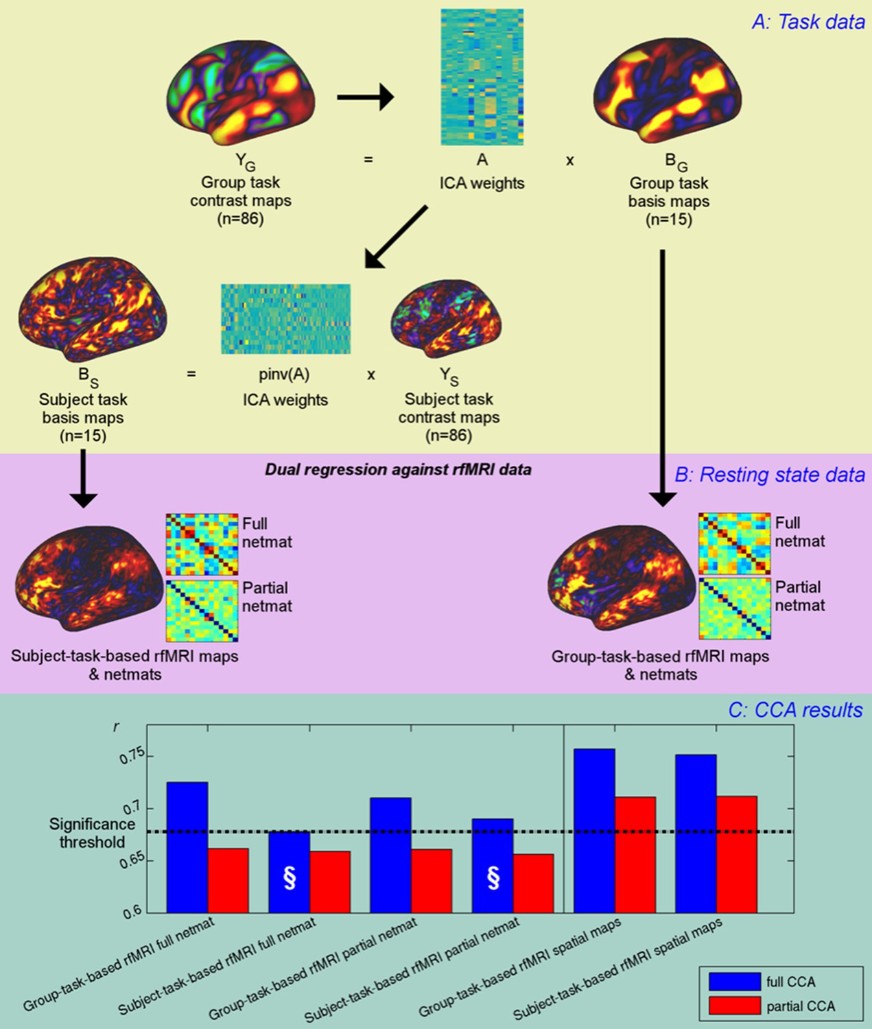
Unique contribution of topography versus coupling.
(A) Task basis maps are extracted from group-averaged task contrasts (n=86, 47 unique) using ICA to ensure correspondence of basis maps across subjects. These maps represent the basic building blocks of any activation pattern, and subject task basis maps (obtained by applying the ICA weights to subject task contrast maps) are not influenced by misalignment problems. (B) Dual regression against rfMRI data is performed using either the (potentially misaligned) group task basis maps or the (functionally localised) subject task basis maps. (C) CCA results of group-task-based rfMRI maps and network matrices and of subject-task-based rfMRI maps and netmats. The results show rUV (i.e., the correlation between the first U and V obtained from the CCA analysis describing the strength of association between the rfMRI and behavioural measures). The null line (i.e., p=0.05 based on permutation testing) is shown as a dotted line at 0.68; results below this line do not reach significance. The blue bars show the main CCA results using the complete data, and the red bars show partial CCA results computed after regressing out any variance that can be explained by network matrices from the spatial maps and vice versa prior to running the CCA. The results show a general decrease in rUV for all measures when comparing partial to full CCA results. The strongest partial CCA result (red bars on right) are found when using rfMRI spatial maps, and the associated netmats showed the weakest results (“§”). However, the partial CCA results for the spatial maps (i.e., the red bars on the right) still reach significance. All of the partial CCAs also showed lower rU-Uica compared to the full CCAs (not shown here).
-
Figure 4—source data 1
Source data for Figure 4.
- https://doi.org/10.7554/eLife.32992.026
Figure 4—figure supplement 1
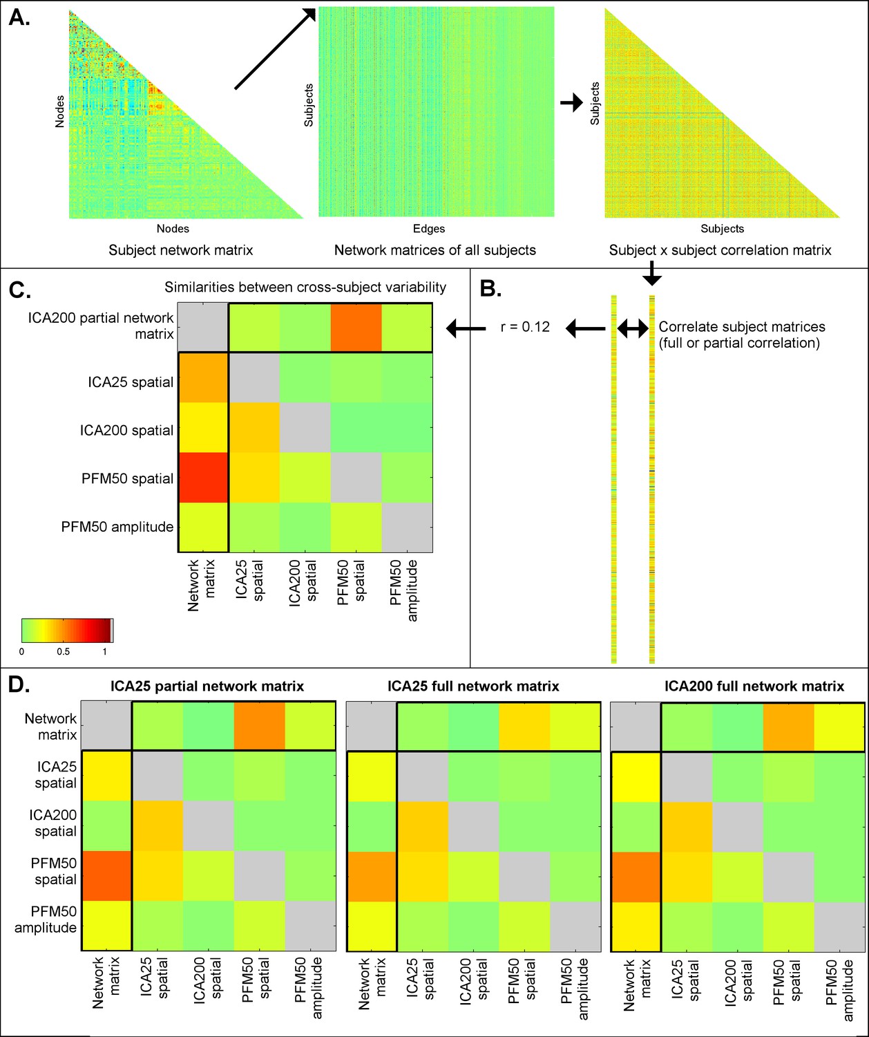
Similarities between cross-subject variations estimated from different rfMRI measures.
Subject-by-subject correlation matrices are estimated (A), and vectorised (B; one subject correlation matrix being estimated for each measure type). The first column of the similarities (C; highlighted) shows the relationship (full correlation) between the ICA network matrix and various other measures, such as PFM spatial maps and amplitudes, and ICA spatial maps. These results show that the ICA network matrix is closely related to PFM spatial maps. The first row of the similarities (C; highlighted) shows the same relationship after taking into account all the other elements (i.e. the partial correlation between different measures). This reveals that PFM spatial maps are strongly linked to the ICA network matrix, even after accounting for any variance that can be explained by ICA spatial maps and PFM amplitudes. Similar results are obtained for ICA 200 and 25 dimensionality and for partial and full network matrices (D). These findings are consistent with the simulation results in Table 1, showing that estimated network matrices and spatial topography to a large extent overlap in terms of the interesting cross-subject variability they represent. Additionally, the results show that while dual regression ICA spatial maps are able to capture some of the subject spatial variability, subject maps estimated by PROFUMO capture considerably more spatial variability over and above the dual regression maps.
Author response image 1
Videos
Video 1
Unthresholded maps are shown for the 4 PFMs that contribute most strongly to the CCA result (14, 45, 35, 33; corresponding stills in Figure 2 and Figure 2—figure supplement 1).
Each video shows five frames representing the continuum from negative to positive CCA results.
Video 2
Unthresholded maps are shown for the next 4 PFMs that contribute most strongly to the CCA result (following earlier video files; 22, 1, 8, 48; corresponding stills in Figure 2—figure supplements 1,2).
Each video shows five frames representing the continuum from negative to positive CCA results.
Video 3
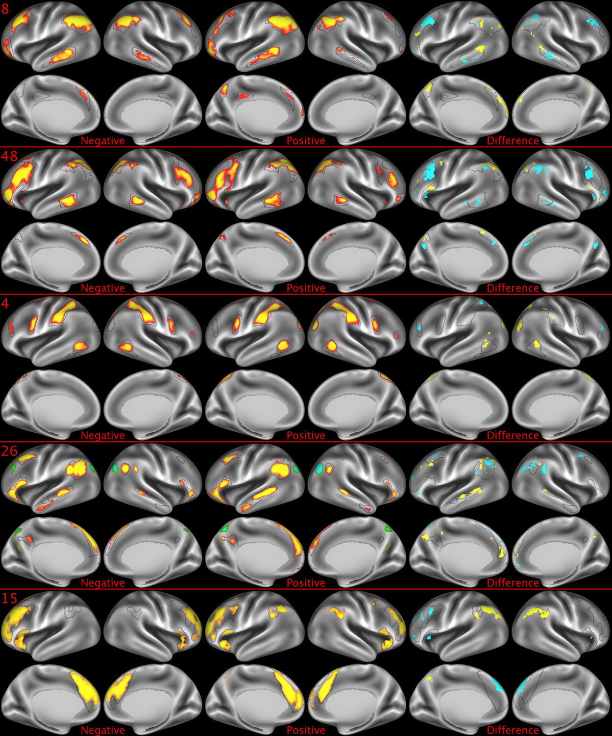
Unthresholded maps are shown for the next 4 PFMs that contribute most strongly to the CCA result (following earlier video files; 4, 26, 15, 6; corresponding stills in Figure 2—figure supplements 2,3).
Each video shows five frames representing the continuum from negative to positive CCA results.
Video 4
Unthresholded maps are shown for the next 4 PFMs that contribute most strongly to the CCA result (following earlier video files; 40, 12, 50, 46; corresponding stills in Figure 2—figure supplement 3).
Each video shows five frames representing the continuum from negative to positive CCA results.
Video 5
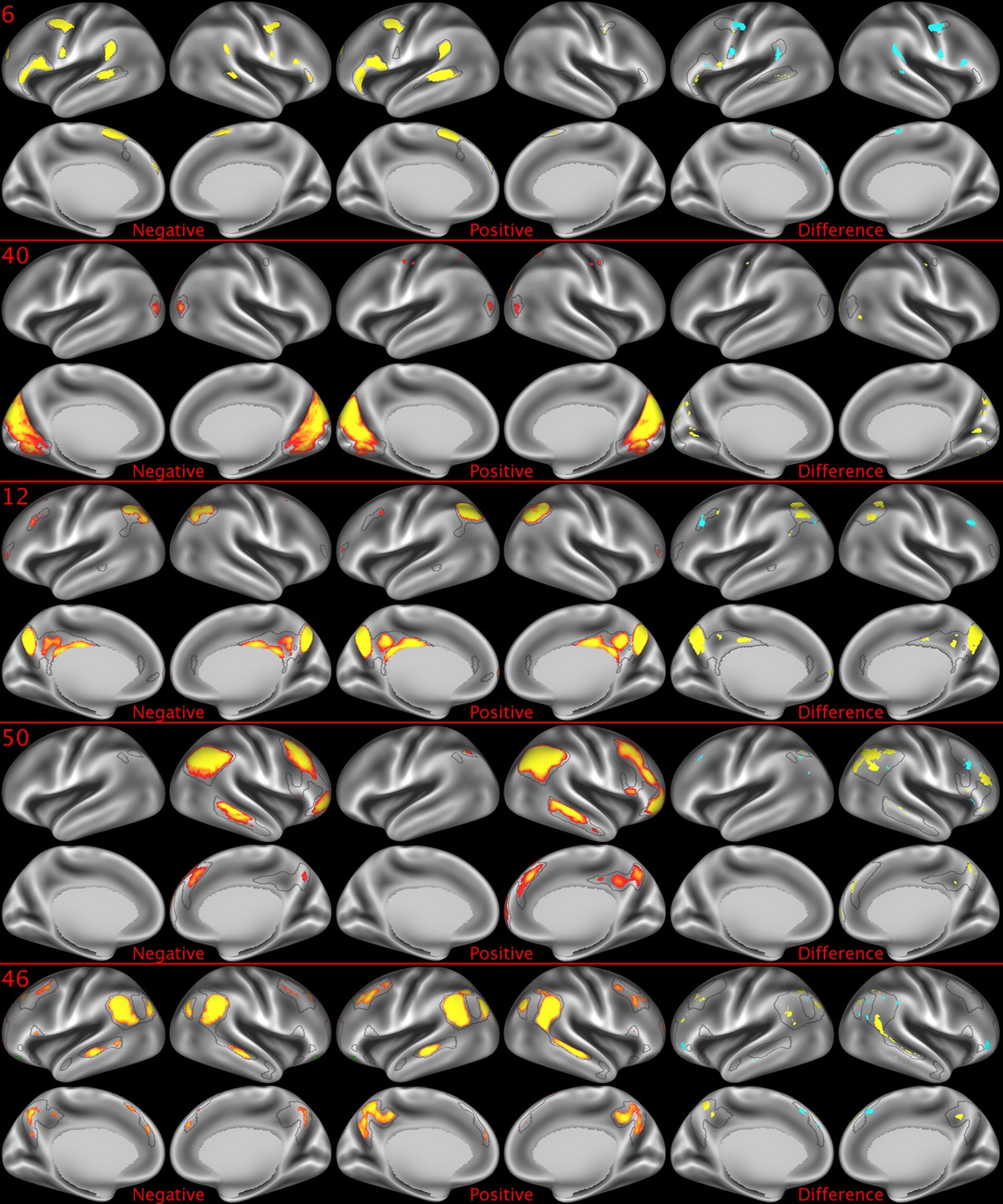
Unthresholded maps are shown for the next 4 PFMs that contribute most strongly to the CCA result (following earlier video files; 18, 9, 43, 2; corresponding stills in Figure 2—figure supplement 4).
Each video shows five frames representing the continuum from negative to positive CCA results.
Video 6
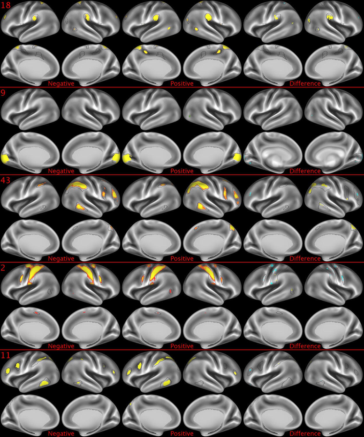
Unthresholded maps are shown for the next 4 PFMs that contribute most strongly to the CCA result (following earlier video files; 29, 11, 37, 24; corresponding stills in Figure 2—figure supplements 4,5, map 29 is missing from stills because results fall below the still threshold).
Each video shows five frames representing the continuum from negative to positive CCA results.
Video 7
Unthresholded maps are shown for the next 4 PFMs that contribute most strongly to the CCA result (following earlier video files; 10, 38, 20, 39; corresponding stills in Figure 2—figure supplements 5,6).
Each video shows five frames representing the continuum from negative to positive CCA results.
Video 8
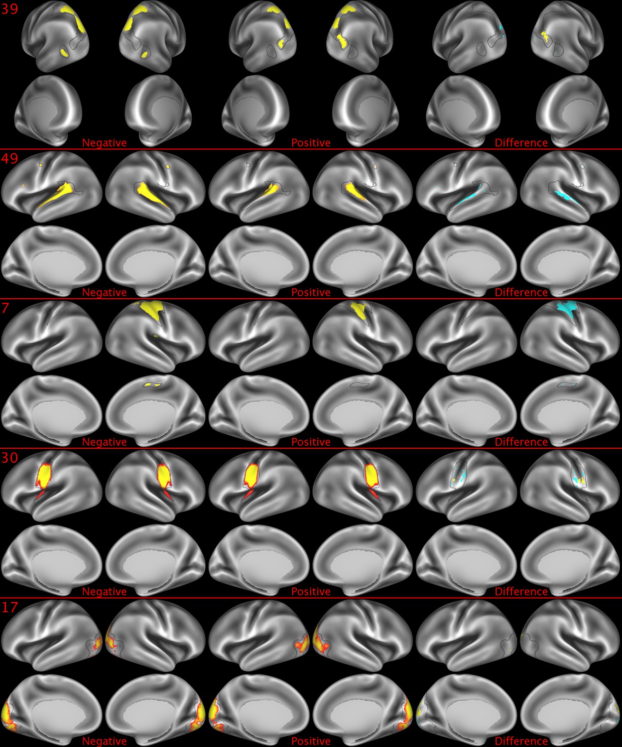
Unthresholded maps are shown for the next 4 PFMs that contribute most strongly to the CCA result (following earlier video files; 49, 7, 19, 30; corresponding stills in Figure 2—figure supplement 6, map 19 is missing from stills because results fall below the still threshold).
Each video shows five frames representing the continuum from negative to positive CCA results.
Video 9
Unthresholded maps are shown for the next 4 PFMs that contribute most strongly to the CCA result (following earlier video files; 17, 3, 42, 23; corresponding stills in Figure 2—figure supplement 4, maps 3, 42, 23 are missing from stills because results fall below the still threshold).
Each video shows five frames representing the continuum from negative to positive CCA results.
Tables
Table 1
Results from simulated datasets in which one or more of the network matrices, amplitudes and spatial maps are fixed to the group average to remove any subject variability associated with it.
Results in each row were driven by variables in which subject variability was preserved, as indicated with ✓ (variables with ‘-’ were fixed to the group average). Results are shown for within-subject correlations between simulated and original z-transformed network matrices (Znetwork matrix), similarities of cross-subject variability represented in simulated and original network matrices (Rcorrelation), and for results obtained from the CCA against behaviour (where rU-V is the strength of the canonical correlation between imaging and non-imaging measures, PU-V is the associated (family-wise error corrected) p-value estimated using permutation testing, taking into account family structure, and rU-Uica is the correlation of a CCA mode (subject weights) with the positive-negative mode of population covariation obtained from ICA200 partial network matrices as used in Smith et al. (2015). For brevity, this Table presents results from full correlation network matrices obtained from a dual regression of ICA 200 maps onto the simulated data (because this approach closely matches previously published findings [Smith et al., 2015]), results for other parcellations are in Supplementary file 1c and for partial correlation network matrices in Supplementary file 1d. The results for a wide range of different parcellations show comparable trends (i.e. a large proportion of cross-subject variability is captured purely by spatial maps, as indicated by the highlighted rows), and this main result is also found when using partial network matrices (e.g., for ICA 200, 0.512 = 26% variance explained in partial network matrices was captured by spatial information, and 0.542 = 29% variance explained in full network matrices was captured by spatial information).
| Simulation driven by true subject variability in: | Network matrix | Amplitude | Spatial map | Z network matrix | R correlation | CCA R U-V | Cca P U-V | CCA R U-Uica | |
|---|---|---|---|---|---|---|---|---|---|
| ICA D = 200 N = 819 | Nothing | - | - | - | −0.0003 | 0.03 | 0.65 | 0.32017 | 0.11 |
| Amps and maps | - | ✓ | ✓ | 1.14 | 0.60 | 0.71 | 0.00001 | 0.52 | |
| Connectivity only | ✓ | - | - | 0.47 | 0.65 | 0.69 | 0.00028 | 0.40 | |
| Amplitudes only | - | ✓ | - | 0.22 | 0.15 | 0.69 | 0.00052 | 0.45 | |
| Maps only | - | - | ✓ | 0.78 | 0.54 | 0.72 | 0.00001 | 0.62 |
Additional files
-
Supplementary file 1
(a) Highly similar associations between behaviour and the brain can be found across a wide range of different measures derived from fMRI. We included a set of network matrices, spatial maps and amplitudes (node timeseries standard deviation) derived from several distinct group-average spatial parcellations/decompositions: from ICA decompositions at two scales of detail (dimensionalities of 25 and 200); a PROFUMO decomposition (PFM; dimensionality 50); an atlas-based hard parcellation (108 parcels [Yeo et al., 2011]); task contrast spatial maps (86 contrasts); and MSM warp fields from native space to MSMAll aligned data (from estimate_metric_distortion; https://github.com/ecr05/MSM_HOCR_macOSX/blob/master/src/MSM/estimate_metric_distortion.cc). Each row reports a separate CCA analysis, performed against behaviour/life-factors. A very similar mode of variation is found across most of the parcellation methods and different fMRI measures. rU-V is the strength of the canonical correlation between imaging and non-imaging measures (confidence intervals estimated using surrogate data), PU-V is the associated (family-wise error corrected) p-value estimated using permutation testing, taking into account family structure, and rU-V CI is the 2.5–97.5% confidence interval estimated using surrogate data. rU-Uica is the correlation of a CCA mode (subject weights) with the positive-negative mode of population covariation obtained from ICA200 partial network matrices as used in Smith et al. (2015), and is therefore defined to be one in the row containing the results from that CCA. The rU-Uica result was included because it shows whether different metrics are associated with similar or distinct behavioural modes of population covariation (one may expect different rfMRI measures to be associated with distinct aspects of behaviour). The final column contains the total number of CCA modes with PU-V <0.05 (results in other columns correspond to the most significant CCA mode, except for rU-Uica, which relates to the maximum correlation across all CCA modes). (b) The rU-V results here are inflated in comparison to the results presented in Supplementary file 1a (due to increased overfitting as a result of the parcellation only being available in 441 subjects compared with 819 subjects included for the other CCAs), but the associated PU-V can (to some extent) be used for comparison. Therefore, this Table compares PFM (d = 50), HCP_MMP1.0 (d = 360), and fractional surface area (the fraction of cortex occupied by each area in the multimodal HCP_MMP1.0 parcellation) on the same set of 441 subjects (only considering subjects with a complete set of 4800 resting state timepoints). (c) Results from simulated datasets in which one or more of the network matrices, amplitudes and spatial maps are fixed to the group average to remove any subject variability associated with it. Results in each row were driven by variables in which subject variability was present, as indicated with ✓ (variables with - were fixed to the group average). Results are shown for within-subject correlations between simulated and original z-transformed network matrices (Znetwork matrix), across-subject correlations between simulated and original subject correlation matrices (Rcorrelation), and for results obtained from the CCA against behaviour. Note that comparable CCA results from the original data can be found in Supplementary file 1a. This Table presents results from full correlation network matrices. (d) Results from simulated datasets in which one or more of the network matrices, amplitudes and spatial maps are fixed to the group average to remove any subject variability associated with it. Results in each row were driven by variables in which subject variability was present, as indicated with ✓ (variables with - were fixed to the group average). Results are shown for within-subject correlations between simulated and original z-transformed network matrices (Znetwork matrix), across-subject correlations between simulated and original subject correlation matrices (Rcorrelation), and for results obtained from the CCA against behaviour. This Table presents results from partial correlation network matrices. Note that the results flagged with * are poorly estimated as a result of the low rank of the PFM subject network matrices (containing 50 PFM modes) used to drive these simulations. The reason for this is that the PFM 50-dimensional subject network matrices were added into the data (to keep the simulation pipeline identical). This approximated 50-dimensional network matrix is too low rank to allow accurate estimation of partial connectivity across a much larger number of nodes. The full correlation results in Supplementary file 1c are estimable, and support the 25-dimensional ICA results. (e) Modulating the subject spatial maps by thresholding and binarizing retains the shape and size aspects, but removes any relative amplitude information from the spatial maps. Binarised % results are binarised after applying a percentile threshold, and therefore only retain shape aspects (while fixing the size). The results reveal that even after thresholding and binarizing the spatial maps, remaining spatial variability strongly drives the cross-subject information present in the resulting network matrices. See earlier Tables for a description of the measures.
- https://doi.org/10.7554/eLife.32992.028
-
Transparent reporting form
- https://doi.org/10.7554/eLife.32992.029
Download links
A two-part list of links to download the article, or parts of the article, in various formats.
Downloads (link to download the article as PDF)
Open citations (links to open the citations from this article in various online reference manager services)
Cite this article (links to download the citations from this article in formats compatible with various reference manager tools)
The relationship between spatial configuration and functional connectivity of brain regions
eLife 7:e32992.
https://doi.org/10.7554/eLife.32992


