A transformation from temporal to ensemble coding in a model of piriform cortex
Figures
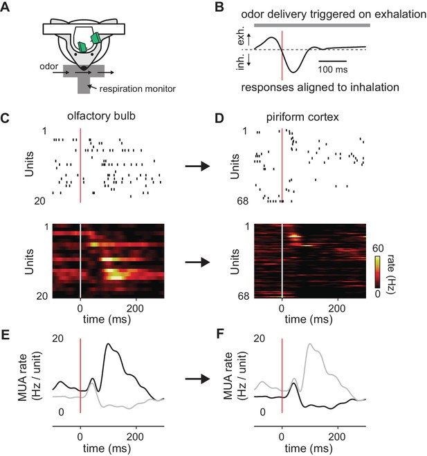
Transformation of odor information from OB to PCx.
(A) Experimental setup. (B) Example respiration trace. Odor deliveries (1 s pulses) were triggered by exhalation and trials are aligned to the onset of the next inhalation (red line). (C,D) Single-trial raster plots (top) and average firing rates (15 trials, bottom) for simultaneously recorded populations of cells in OB (C) and PCx (D), during a respiration cycle as in B. Cells are sorted by mean latency to first spike. (E,F) Population peristimulus time histograms for the cells shown above (dark traces) in OB (E) and PCx (F) (dark traces). For comparison, the PSTHs from the other area are overlaid (light traces).
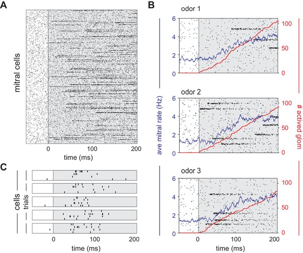
Mitral cells are activated with odor-specific latencies.
(A) Example raster plot showing all 22,500 model mitral cells (900 glomeruli with 25 mitral cells each) for one odor trial. Each row represents a single mitral cell and all mitral cells belonging to each glomerulus are clustered. Tick marks indicate spike times. Inhalation begins at 0 ms and is indicated by the grey shaded region. (B) Raster plots showing spiking of 1000 mitral cells (40 glomeruli) in response to three different odors. The red curve shows the cumulative number of glomeruli activated across the sniff, and the blue curve is the firing rate averaged across all mitral cells. (C) Raster plots showing trial-to-trial variability for five mitral cells from the same glomerulus in response to repeated presentations of the same odor. Each box represents a different mitral cell, with trials 1–4 represented by the rows within each box.
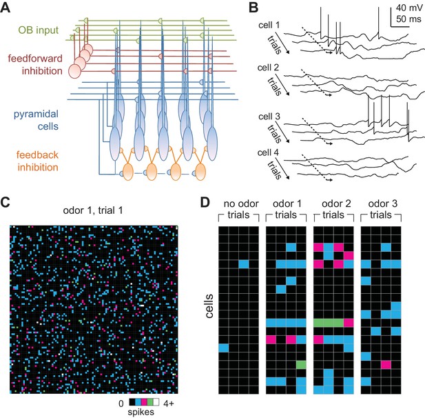
Odors activate distributed ensembles of PCx neurons.
(A) Schematic of the PCx model. (B) Voltage traces for three sequential sniffs in four model pyramidal cells. Time of inhalation is indicated by the dashed line. (C) Single-trial population activity map for all 10,000 pyramidal cells. Each pixel represents a single cell, and pixel color indicates the number of spikes fired during the 200 ms inhalation. Approximately 13% of cells fired at least one action potential, with activated cells randomly distributed across the cortex. (D) Response vectors shown for 20 cells in response to different odors presented on four sequential trials. Spiking levels are low for no-odor controls. Note the trial-to-trial variability and that individual cells can be activated by different odors.
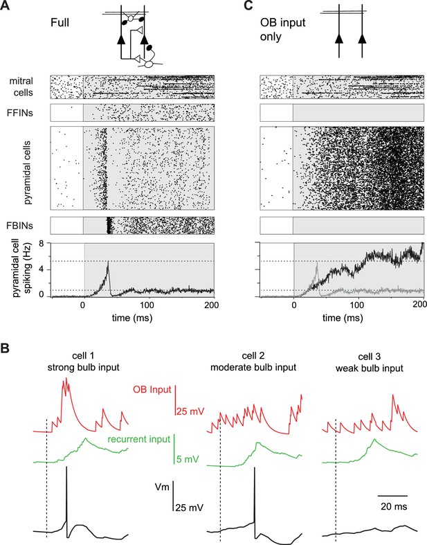
Evolution of a cortical odor response.
(A) Raster for a single sniff showing spiking activity of a subset of mitral cells (2250 out of 22,500), all 1225 feedforward neurons (FFINs), all 10,000 pyramidal cells, and all 1225 feedback interneurons (FBINs). Spiking rate for the population of pyramidal cells is shown at the bottom (average of six trials). Note that the earliest activated glomeruli initiate a cascade of pyramidal cell spiking that peaks after ~40 ms and is abruptly truncated by synchronous spiking of FBINs. Dashed lines show peak and steady-state firing rates during inhalation. (B) Single-trial voltage traces (black) for three pyramidal cells in response to the same odor. Inhalation onset is indicated by the dashed line. The red traces show OB input and the green traces the recurrent input received by each cell. Cell 1receives strong OB input and spikes soon after odor presentation. Cell 2 receives subthreshold input from OB and only spikes after receiving addition recurrent input from other pyramidal cells. Cell 3 receives no early odor-evoked input from the bulb, and its recurrent input is subthreshold, so it does not spike over the time period shown. (C) Raster plots for a reduced model in which pyramidal cells only get excitatory input from the OB, without FFI, recurrent excitation or FBI. Pyramidal cell spiking tracks mitral cell input. Population rate for the full network is shown in grey for comparison.
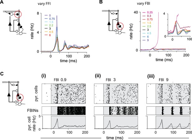
Inhibition shapes pyramidal cell spiking.
Model output expressed by pyramidal cell population firing rates for multiple parameter values. The varied parameter is indicated by the red circle in the circuit schematics on left. Each colored trace represents the averaged firing rates (six trials each with four different odors). The legend, with colors corresponding to the traces, indicates the peak IPSP for the parameters generating the traces. Black traces show results using default parameter values. (A) Effect of FFI on pyramidal cell output. Different strengths of FFI correspond to peak IPSP amplitudes of 0, 0.75, 1.5, 2.25, 3, 4.5 and 6 mV (see Materials and methods for conversion to parameter values). FFI primarily controls the amplitude of the peak response. (B) Effect of FBI on pyramidal cell output. Different strengths of FBI corresponsd to peak IPSP amplitudes of 0.25, 0.3, 0.75, 1.5, 2.5, 3, 4.5, 6 and 9 mV. Pyramidal cell output is largely robust to changes in the strength of FBI. However, extremely small values of FBI can lead to runaway excitation (see also Figure 5—figure supplement 1D). (C) Raster plots for pyramidal cells (showing 3000 cells) and FBINs with different amounts of FBI. (i) Peak IPSP amplitude = 0.9 mV. (ii) Peak IPSP amplitude = 3 mV. (iii) Peak IPSP amplitude = 9 mV. Population spike rates are at bottom, with rates for the control case (ii) overlaid in grey for comparison. While the average pyramidal cell rate is robust to different FBI strength, large values of FBI can lead to oscillations.
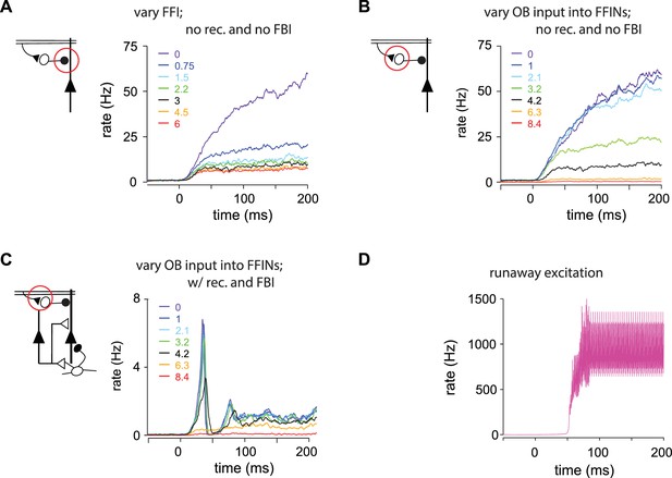
(A–C) Pyramidal cell population firing rates using different parameter values.
Schematics on left indicate the circuit being used, with the varied parameter indicated by the red circle. Each colored trace represents the averaged firing rate (six trials each with four different odors). The legend, with colors corresponding to the traces, indicates the peak IPSP amplitude generated by the inhibition parameters used for the traces. Black traces show results using default parameter values. (A) FFI effects the magnitude but not the shape of the response in a reduced circuit. Effect of FFI on pyramidal cell output. Recurrent connections and FBI are absent in the reduced circuit shown here. Different strengths of FFI correspond to IPSPs with peaks of 0, 0.75, 1.5, 2.25, 3, 4.5 and 6 mV (as indicated in the legend). FFI changes the amount of pyramidal activity but not the shape of the response. (B) OB input onto FFINs effects the magnitude but not the shape of the response in a reduced circuit. Effect of bulb input on pyramidal cell output. Recurrent connections and FBI are absent in the reduced circuit modeled here. Different strengths of bulb input correspond to EPSPs from the mitral cells onto FFINs with peaks of 0, 1, 2.1, 3.2, 4.2, 6.3 and 8.4 mV (as indicated in the legend). The strength of the OB input onto FFINs changes the amount of pyramidal activity but not the shape of the response. (C) OB input onto FFINs effects the shape of the response in the full circuit. Effect of bulb input on pyramidal cell output. The full circuit is modeled here. Population firing rate with different strengths of bulb input corresponding to EPSPs from the mitral cells onto FFINs with peaks of 0, 1, 2.1, 3.2, 4.2, 6.3 and 8.4 mV (as indicated in the legend). Strong OB input onto FFINs suppresses the initial peak pyramidal response, whereas weak OB input onto FFINs increases the peak response. (D) Runaway excitation. The magenta trace (for a peak IPSP amplitude of 0.25 mV) from Figure 5B rescaled.

Recurrent excitation shapes the early cortical response.
Model output expressed by pyramidal cell population firing rates using multiple parameter values. The varied parameters are indicated by the red circle in the circuit schematics. Each colored trace represents the average firing rate (six trials each with four different odors). The legend, with corresponding colors, indicates the maximum values of EPSPs onto pyramidal cells and FBINs. Black traces show results using default parameter values. (A) Pyramidal cell population activity with different recurrent collateral couplings. Peak EPSPs onto pyramidal cells of 0, 0.03, 0.05, 0.1, 0.21, 0.32 and 0.42 mV and onto FBINs, 0, 0.13, 0.21, 0.4, 0.85, 1.3 and 1.7 mV. Strong recurrent excitation leads to a stronger initial response but lower activity later in the sniff. Weaker recurrent excitation leads to lower initial response followed by higher and more variable activity. (Bi) Pyramidal cell population activity with different strength recurrent connections onto pyramidal cells only. Peak EPSPs of 0, 0.05, 0.1, 0.13, 0.17 and 0.32 mV. Stronger recurrent connections between pyramidal cells lead to higher and earlier initial response peaks. Even stronger connections lead to runaway pyramidal activity (magenta trace, see also Figure 5—figure supplement 1D). (Bii) Pyramidal cell population activity with different recurrent connection strengths onto FBINs only. Peak EPSPs of 0.13, 0.21, 0.34, 0.4, 0.85 and 1.3 mV. Stronger recurrent connections from pyramidal cells onto FBINs lead to lower, yet earlier initial response peaks. Very weak connections lead to runaway activity (purple trace).
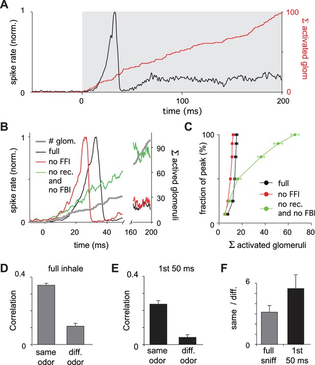
Earliest-active glomeruli define the PCx response.
(A) Normalized population spike rates (black) in response to an odor during the sniff cycle (inhalation indicated by grey background). The red curve shows the cumulative number of glomeruli activated across the sniff. Note that population spiking peaks after only a small subset of glomeruli have been activated. (B) Normalized population spike rates for one odor for the full network (black trace), without FFI (red trace) and without recurrent excitation (green trace). Grey trace shows the cumulative number of activated glomeruli. (C) Fraction of the peak population spike rate as a function of the cumulative number of activated glomeruli for six different odors. These curves indicate the central role recurrent excitation plays in amplifying the impact of early responsive glomeruli. (D) Average correlation coefficients for repeated same-odor trials and pairs of different-odor trials measured over the full 200 ms inhalation. (E) As in D but measured over the first 50 ms after inhalation onset. (F) Ratios of correlations for same- vs. different-odor trials measured over the full sniff (grey bar on left) and over the first 50 ms (black bar on right).
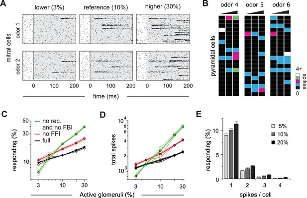
Cortical output is normalized across concentrations.
(A) Mitral cell raster plots for 2 odors at three different concentrations, defined by the fraction of active glomeruli during a sniff. Odors are different from the odors in Figure 1. (B) Single-trial piriform response vectors over a concentration range corresponding to 3, 10% and 30% active glomeruli. Note that activity does not dramatically increase despite the 10-fold increase in input. (C) Fraction of activated pyramidal cells at different odor concentrations for the full network (black trace), without FFI (red trace) and without recurrent excitation (green trace) for four different odors (open circles, thin lines) and averaged across odors (filled circles, thicker lines). Note that eliminating FFI primarily shifts the number of responsive cells, indicating that FFI is largely subtractive, whereas eliminating recurrent excitation alters the gain of the response. Note also that recurrent excitation amplifies the number of activated cells at low-odor concentrations. (D) As in C but for the total number of spikes across the population. (E) Distribution of spike counts per cell at different odor concentrations. Data represent mean ± s.e.m. for n = 4 odors at each concentration.
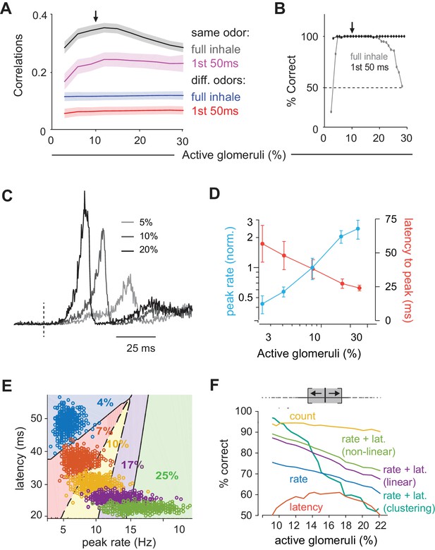
Coding of odor identity and concentration.
(A) Correlation coefficients between responses of a target odor with 10% active glomeruli (black arrow) and the same (black and pink curves) or different (blue and red curves) odors across concentrations. Correlations were calculated using pyramidal cell activity from the full inhale (black and blue curves) or from the first 50 ms of inhalation (pink and red curves). For correlations with the same odor, 25 trial with 10% active glomeruli were paired with 25 trials at each different concentration. For correlations with other odors, 100 trials with the target odor at 10% active glomeruli were paired with each of the 100 other odors at each different concentration. Lines show the mean result and shaded areas show the standard deviation. (B) Readout classifications of odor identity when presented at different concentrations. Either the transient cortical activity (first 50 ms of the inhalation; black curve) or the activity across the full inhalation (gray curve) was used for both training and testing. Training was performed solely at the reference concentration (black arrow). The dashed line shows the chance level of classification. (C). Example of population spike rates for an odor at three concentrations. Response amplitudes are normalized to the responses at the highest concentration. Dashed lines indicate inhalation onset. (D) Average peak firing rate (blue) and latencies to peak (orange) of the population response vs. number of activated glomeruli (four odors). (E) Distribution of peak latencies and firing rates for one odor presented at five concentrations. Different colors represent distinct concentrations (fraction of active glomeruli). Background colors indicate classification into one of 5 concentrations (with clustering method). (F) Concentration classification accuracy using different features of the population response. (top) For each target concentration, responses within a ± 3% range (grey shading) were presented and classified as lower or higher than the target. Different features of the population response and techniques used for classification (see Materials and methods) are indicated by colored lines. Dashed lines in B indicate classification boundaries for the clustering classifier using rate + latency.
Additional files
-
Source code 1
This is the code used to generate the model.
This C code is used in an environment that can execute consecutive single steps and plot the results (e.g. xcode).
- https://doi.org/10.7554/eLife.34831.012
-
Source code 2
App Piriform model.
This compiled program launches and runs the piriform model used here as an app. Parameters are described in the Materials and methods.
- https://doi.org/10.7554/eLife.34831.013
-
Transparent reporting form
- https://doi.org/10.7554/eLife.34831.014


