National and regional seasonal dynamics of all-cause and cause-specific mortality in the USA from 1980 to 2016
Figures
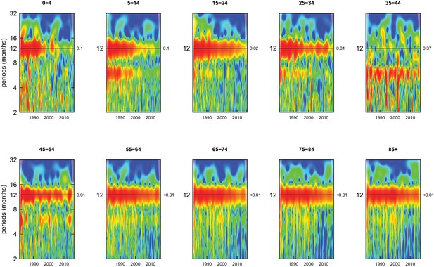
Wavelet power spectra for national time series of all-cause death rates for 1980–2016, by age group for males.
Wavelet power values increase from blue to red. The shaded regions at the left and right edge of each box indicate the cone of influence, where spectral analysis is less robust. P-values for the presence of 12 month seasonality are to the right of each figure at the 12 month line.
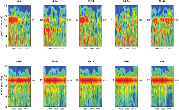
Wavelet power spectra for national time series of all-cause death rates for 1980–2016, by age group for females.
Wavelet power values increase from blue to red. The shaded regions at the left and right edge of each box indicate the cone of influence, where spectral analysis is less robust. P-values for the presence of 12 month seasonality are to the right of each figure at the 12 month line.
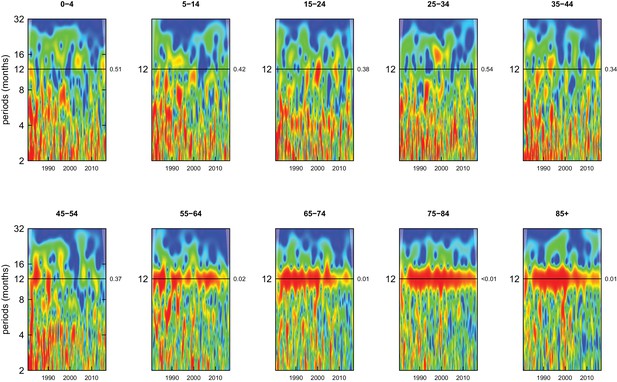
Wavelet power spectra for national time series of cancer death rates for 1980–2016, by age group for males.
Wavelet power values increase from blue to red. The shaded regions at the left and right edge of each box indicate the cone of influence, where spectral analysis is less robust. P-values for the presence of 12 month seasonality are to the right of each figure at the 12 month line.
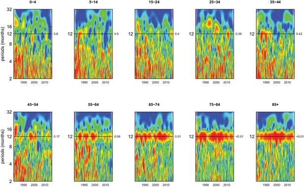
Wavelet power spectra for national time series of cancer death rates for 1980–2016, by age group for females.
Wavelet power values increase from blue to red. The shaded regions at the left and right edge of each box indicate the cone of influence, where spectral analysis is less robust. P-values for the presence of 12 month seasonality are to the right of each figure at the 12 month line.
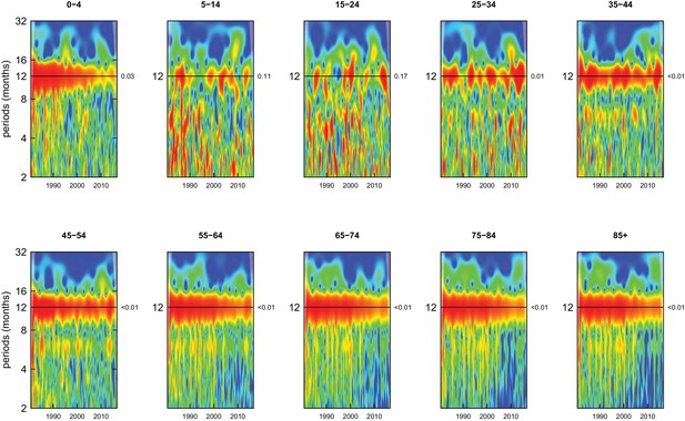
Wavelet power spectra for national time series of cardiorespiratory disease death rates for 1980–2016, by age group for males.
Wavelet power values increase from blue to red. The shaded regions at the left and right edge of each box indicate the cone of influence, where spectral analysis is less robust. P-values for the presence of 12 month seasonality are to the right of each figure at the 12 month line.
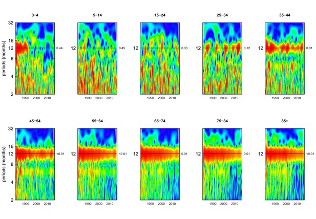
Wavelet power spectra for national time series of cardiovascular disease death rates for 1980–2016, by age group for males.
Wavelet power values increase from blue to red. The shaded regions at the left and right edge of each box indicate the cone of influence, where spectral analysis is less robust. P-values for the presence of 12 month seasonality are to the right of each figure at the 12 month line.
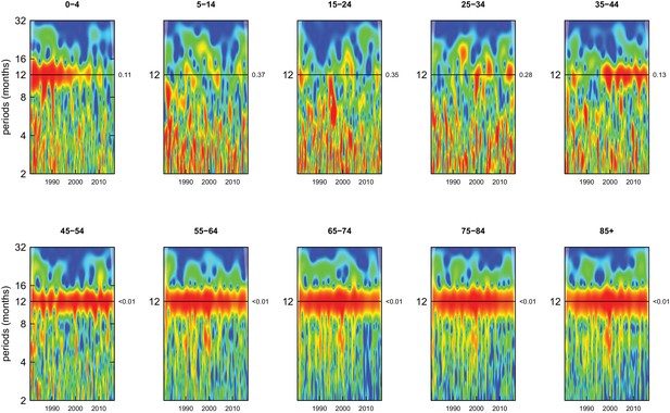
Wavelet power spectra for national time series of chronic respiratory disease death rates for 1980–2016, by age group for males.
Wavelet power values increase from blue to red. The shaded regions at the left and right edge of each box indicate the cone of influence, where spectral analysis is less robust. P-values for the presence of 12 month seasonality are to the right of each figure at the 12 month line.
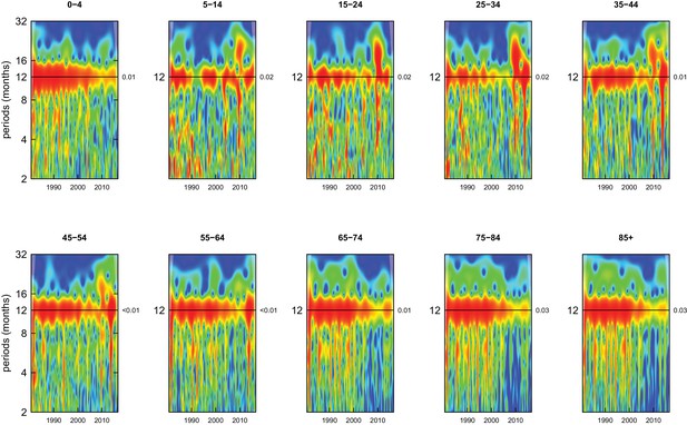
Wavelet power spectra for national time series of respiratory infection death rates for 1980–2016, by age group for males.
Wavelet power values increase from blue to red. The shaded regions at the left and right edge of each box indicate the cone of influence, where spectral analysis is less robust. P-values for the presence of 12 month seasonality are to the right of each figure at the 12 month line.
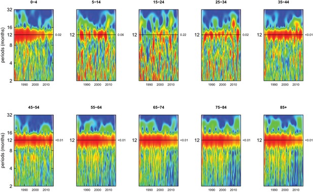
Wavelet power spectra for national time series of cardiorespiratory disease death rates for 1980–2016, by age group for females.
Wavelet power values increase from blue to red. The shaded regions at the left and right edge of each box indicate the cone of influence, where spectral analysis is less robust. P-values for the presence of 12 month seasonality are to the right of each figure at the 12 month line.
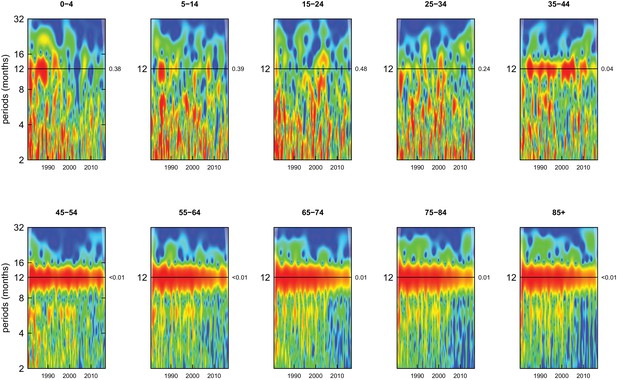
Wavelet power spectra for national time series of cardiovascular disease death rates for 1980–2016, by age group for females.
Wavelet power values increase from blue to red. The shaded regions at the left and right edge of each box indicate the cone of influence, where spectral analysis is less robust. P-values for the presence of 12 month seasonality are to the right of each figure at the 12 month line.
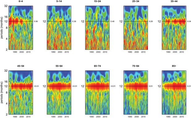
Wavelet power spectra for national time series of chronic respiratory disease death rates for 1980–2016, by age group for females.
Wavelet power values increase from blue to red. The shaded regions at the left and right edge of each box indicate the cone of influence, where spectral analysis is less robust. P-values for the presence of 12 month seasonality are to the right of each figure at the 12 month line.
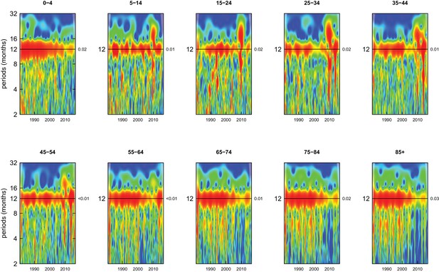
Wavelet power spectra for national time series of respiratory infection death rates for 1980–2016, by age group for females.
Wavelet power values increase from blue to red. The shaded regions at the left and right edge of each box indicate the cone of influence, where spectral analysis is less robust. P-values for the presence of 12 month seasonality are to the right of each figure at the 12 month line.
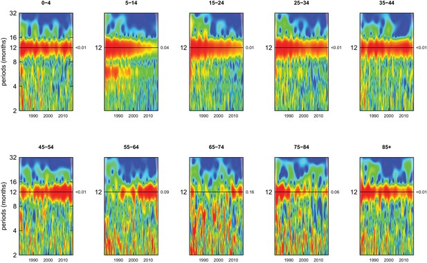
Wavelet power spectra for national time series of injury death rates for 1980–2016, by age group for males.
Wavelet power values increase from blue to red. The shaded regions at the left and right edge of each box indicate the cone of influence, where spectral analysis is less robust. P-values for the presence of 12 month seasonality are to the right of each figure at the 12 month line.
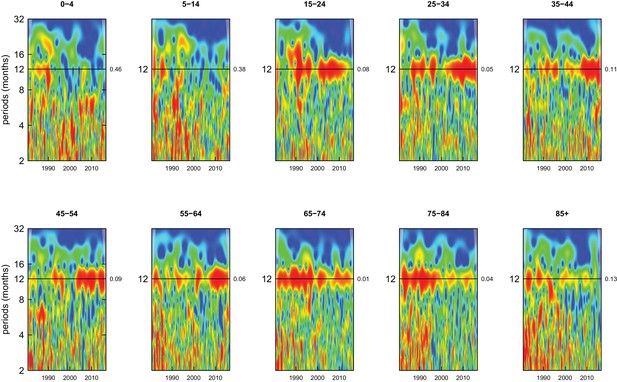
Wavelet power spectra for national time series of intentional injury death rates for 1980–2016, by age group for males.
Wavelet power values increase from blue to red. The shaded regions at the left and right edge of each box indicate the cone of influence, where spectral analysis is less robust. P-values for the presence of 12 month seasonality are to the right of each figure at the 12 month line.
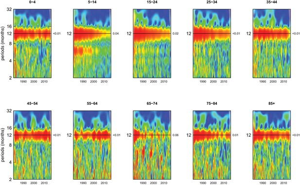
Wavelet power spectra for national time series of unintentional injury death rates for 1980–2016, by age group for males.
Wavelet power values increase from blue to red. The shaded regions at the left and right edge of each box indicate the cone of influence, where spectral analysis is less robust. P-values for the presence of 12 month seasonality are to the right of each figure at the 12 month line.
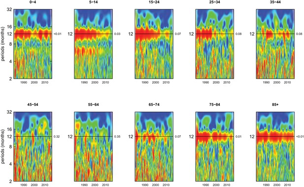
Wavelet power spectra for national time series of injury death rates for 1980–2016, by age group for females.
Wavelet power values increase from blue to red. The shaded regions at the left and right edge of each box indicate the cone of influence, where spectral analysis is less robust. P-values for the presence of 12 month seasonality are to the right of each figure at the 12 month line.
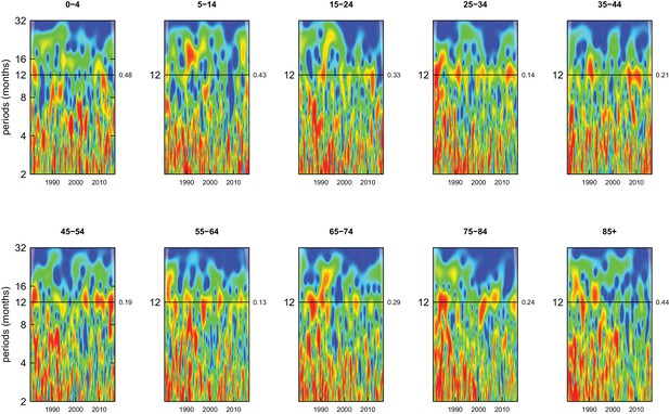
Wavelet power spectra for national time series of intentional injury death rates for 1980–2016, by age group for females.
Wavelet power values increase from blue to red. The shaded regions at the left and right edge of each box indicate the cone of influence, where spectral analysis is less robust. P-values for the presence of 12 month seasonality are to the right of each figure at the 12 month line.
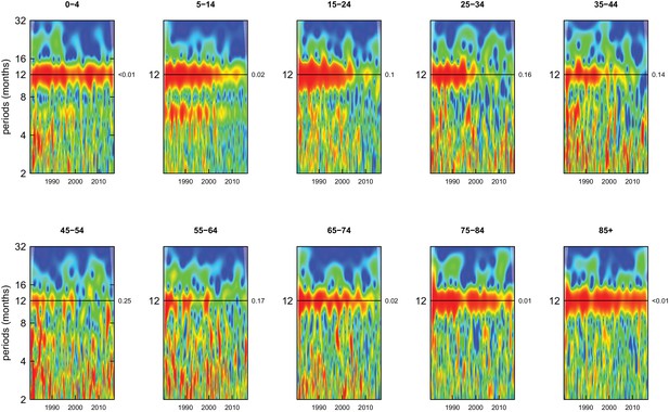
Wavelet power spectra for national time series of unintentional injury death rates for 1980–2016, by age group for females.
Wavelet power values increase from blue to red. The shaded regions at the left and right edge of each box indicate the cone of influence, where spectral analysis is less robust. P-values for the presence of 12 month seasonality are to the right of each figure at the 12 month line.
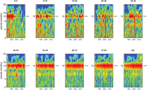
Wavelet power spectra for national time series of death rates from causes other than cancers, cardiorespiratory diseases and injuries for 1980–2016, by age group for males.
Wavelet power values increase from blue to red. The shaded regions at the left and right edge of each box indicate the cone of influence, where spectral analysis is less robust. P-values for the presence of 12 month seasonality are to the right of each figure at the 12 month line.
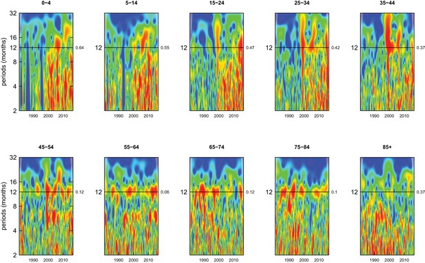
Wavelet power spectra for national time series of substance use disorder death rates for 1980–2016, by age group for males.
Wavelet power values increase from blue to red. The shaded regions at the left and right edge of each box indicate the cone of influence, where spectral analysis is less robust. P-values for the presence of 12 month seasonality are to the right of each figure at the 12 month line.
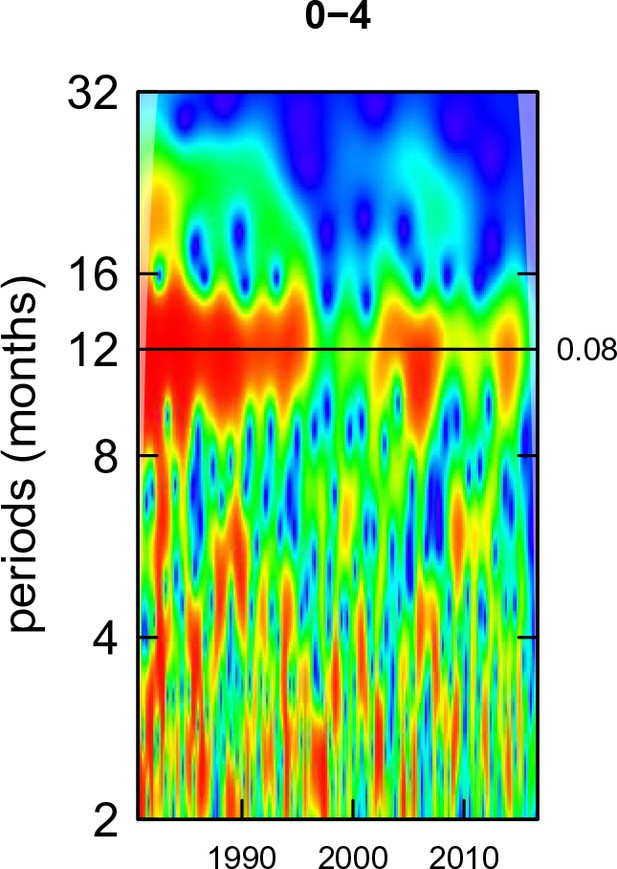
Wavelet power spectra for national time series of perinatal condition death rates for 1980–2016, by age group for males.
Wavelet power values increase from blue to red. The shaded regions at the left and right edge of each box indicate the cone of influence, where spectral analysis is less robust. P-values for the presence of 12 month seasonality are to the right of each figure at the 12 month line.
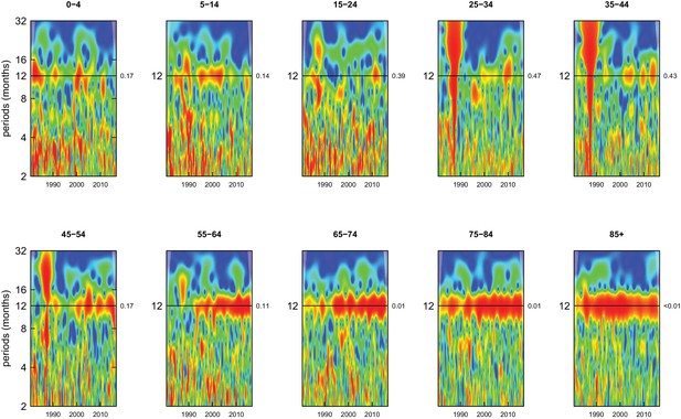
Wavelet power spectra for national time series of endocrine disorder death rates for 1980–2016, by age group for males.
Wavelet power values increase from blue to red. The shaded regions at the left and right edge of each box indicate the cone of influence, where spectral analysis is less robust. P-values for the presence of 12 month seasonality are to the right of each figure at the 12 month line.
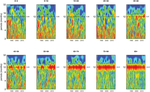
Wavelet power spectra for national time series of genitourinary disease death rates for 1980–2016, by age group for males.
Wavelet power values increase from blue to red. The shaded regions at the left and right edge of each box indicate the cone of influence, where spectral analysis is less robust. P-values for the presence of 12 month seasonality are to the right of each figure at the 12 month line.
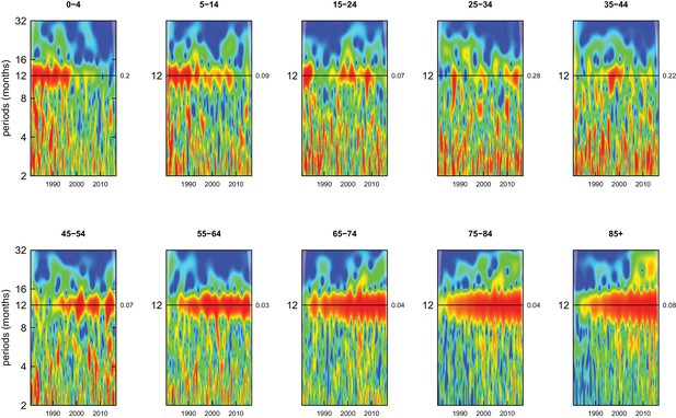
Wavelet power spectra for national time series of neuropsychiatric disorder death rates for 1980–2016, by age group for males.
Wavelet power values increase from blue to red. The shaded regions at the left and right edge of each box indicate the cone of influence, where spectral analysis is less robust. P-values for the presence of 12 month seasonality are to the right of each figure at the 12 month line.
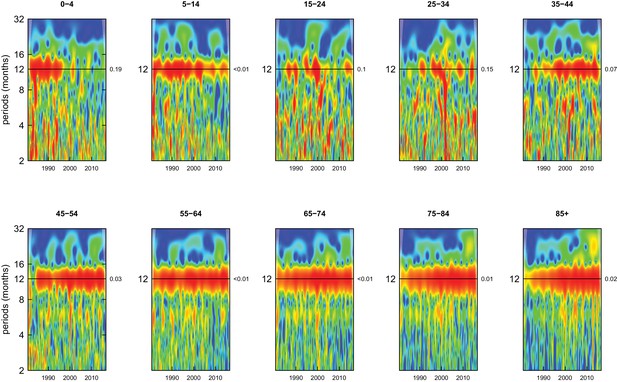
Wavelet power spectra for national time series of death rates from causes other than cancers, cardiorespiratory diseases and injuries for 1980–2016, by age group for females.
Wavelet power values increase from blue to red. The shaded regions at the left and right edge of each box indicate the cone of influence, where spectral analysis is less robust. P-values for the presence of 12 month seasonality are to the right of each figure at the 12 month line.
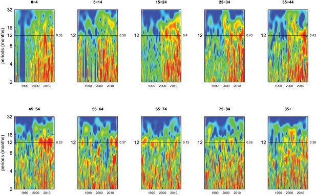
Wavelet power spectra for national time series of substance use disorder death rates for 1980–2016, by age group for females.
Wavelet power values increase from blue to red. The shaded regions at the left and right edge of each box indicate the cone of influence, where spectral analysis is less robust. P-values for the presence of 12 month seasonality are to the right of each figure at the 12 month line.
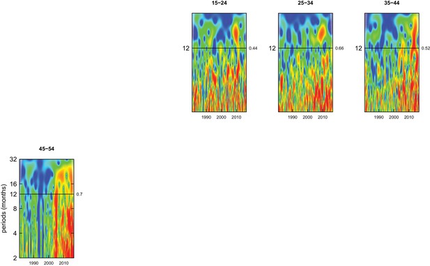
Wavelet power spectra for national time series of maternal condition death rates for 1980–2016, by age group for females.
Wavelet power values increase from blue to red. The shaded regions at the left and right edge of each box indicate the cone of influence, where spectral analysis is less robust. P-values for the presence of 12 month seasonality are to the right of each figure at the 12 month line.
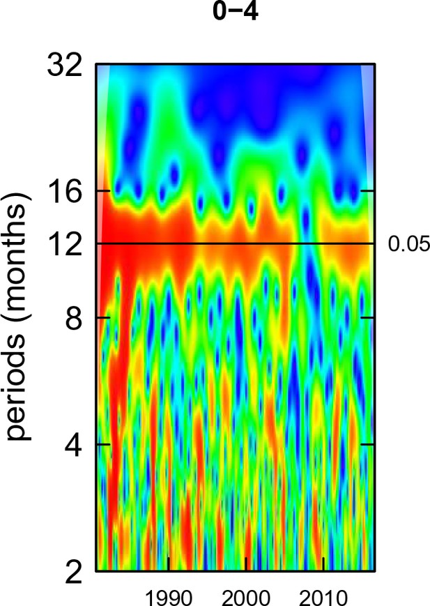
Wavelet power spectra for national time series of perinatal condition death rates for 1980–2016, by age group for females.
Wavelet power values increase from blue to red. The shaded regions at the left and right edge of each box indicate the cone of influence, where spectral analysis is less robust. P-values for the presence of 12 month seasonality are to the right of each figure at the 12 month line.
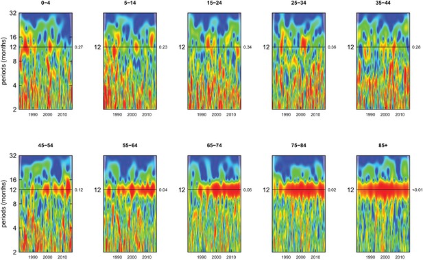
Wavelet power spectra for national time series of endocrine disorder death rates for 1980–2016, by age group for females.
Wavelet power values increase from blue to red. The shaded regions at the left and right edge of each box indicate the cone of influence, where spectral analysis is less robust. P-values for the presence of 12 month seasonality are to the right of each figure at the 12 month line.
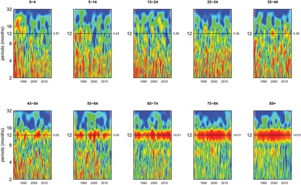
Wavelet power spectra for national time series of genitourinary disease death rates for 1980–2016, by age group for females.
Wavelet power values increase from blue to red. The shaded regions at the left and right edge of each box indicate the cone of influence, where spectral analysis is less robust. P-values for the presence of 12 month seasonality are to the right of each figure at the 12 month line.
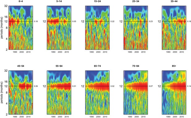
Wavelet power spectra for national time series of neuropsychiatric disorder death rates for 1980–2016, by age group for females.
Wavelet power values increase from blue to red. The shaded regions at the left and right edge of each box indicate the cone of influence, where spectral analysis is less robust. P-values for the presence of 12 month seasonality are to the right of each figure at the 12 month line.
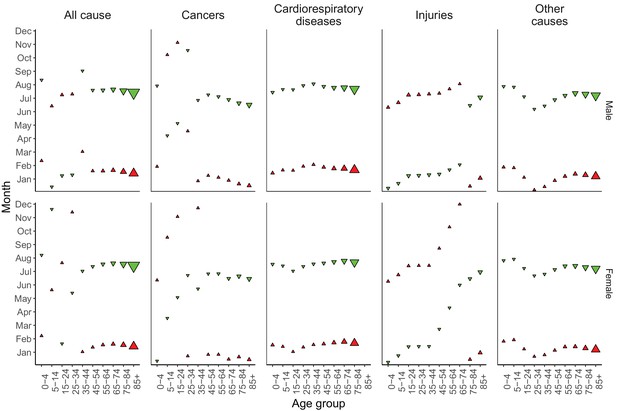
Mean timing of maximum and minimum all-cause and cause-specific mortality at the national level, by sex and age group for 1980–2016.
Red arrows indicate the month of maximum mortality, and green arrows that of minimum mortality. The size of the arrow is inversely proportional to its respective variance.
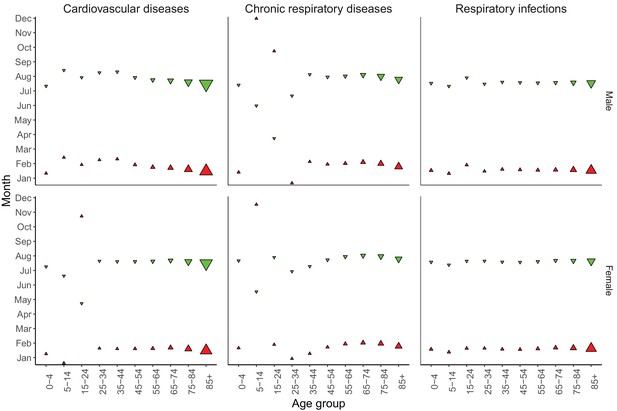
Mean timing of maximum and minimum mortality for specific cardiorespiratory diseases at the national level, by sex and age group for 1980–2016.
Red arrows indicate the month of maximum mortality, and green arrows that of minimum mortality. The size of the arrow is inversely proportional to its respective variance.
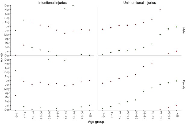
Mean timing of maximum and minimum mortality for specific injuries at the national level, by sex and age group for 1980–2016.
Red arrows indicate the month of maximum mortality, and green arrows that of minimum mortality. The size of the arrow is inversely proportional to its respective variance.
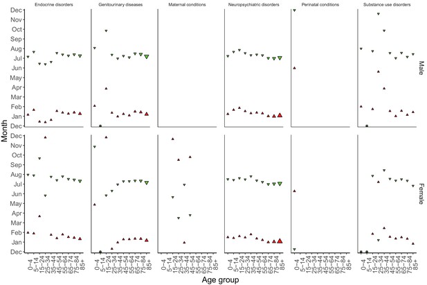
Mean timing of maximum and minimum mortality for the cluster of causes other than cancers, cardiorespiratory diseases and injuries at the national level, by sex and age group for 1980–2016.
Red arrows indicate the month of maximum mortality, and green arrows that of minimum mortality. The size of the arrow is inversely proportional to its respective variance.
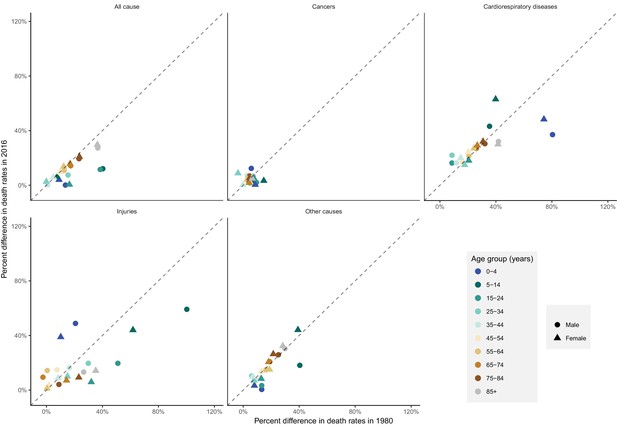
National percent difference in death rates between the maximum and minimum mortality months for all-cause and cause-specific mortality in 2016 versus 1980, by sex and age group.
https://doi.org/10.7554/eLife.35500.039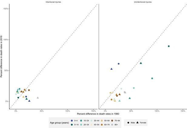
National percent difference in death rates between the maximum and minimum mortality months for specific injuries in 2016 versus 1980, by sex and age group.
https://doi.org/10.7554/eLife.35500.040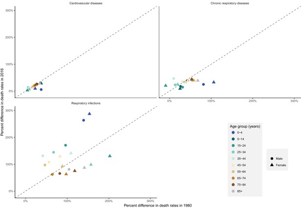
National percent difference in death rates between the maximum and minimum mortality months for specific cardiorespiratory diseases in 2016 versus 1980, by sex and age group.
https://doi.org/10.7554/eLife.35500.041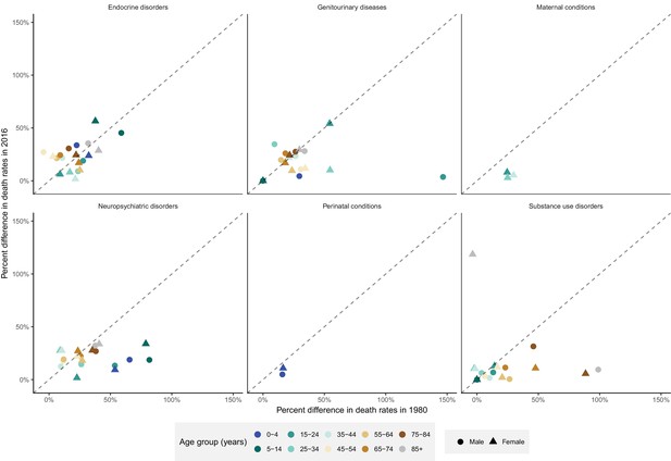
National percent difference in death rates between the maximum and minimum mortality months for the cluster of causes other than cancers, cardiorespiratory diseases and injuries in 2016 versus 1980, by sex and age group.
https://doi.org/10.7554/eLife.35500.042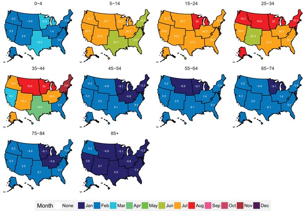
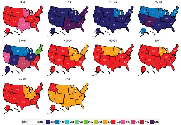
Mean timing of maximum all-cause mortality for 1980–2016, by climate region and age group for males.
Average temperatures (in degrees Celsius) are included in white for the corresponding month of maximum and minimum mortality for each climate region.
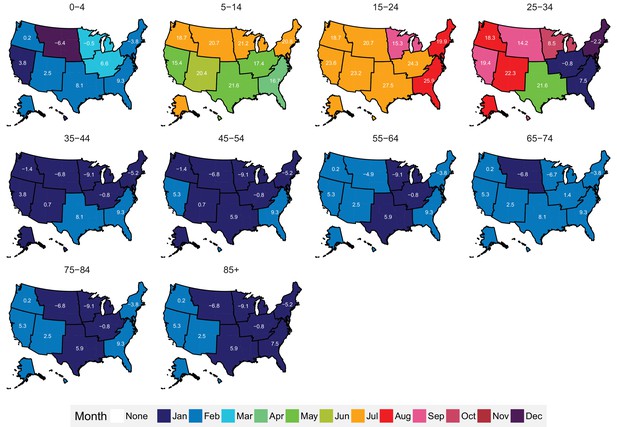
Mean timing of minimum all-cause mortality for 1980–2016, by climate region and age group for males.
Average temperatures (in degrees Celsius) are included in white for the corresponding month of maximum and minimum mortality for each climate region.
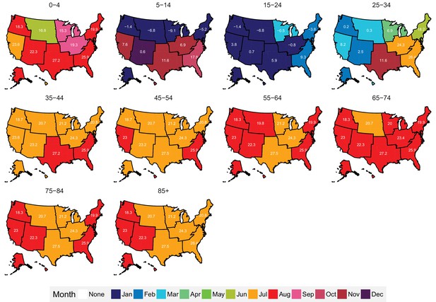
Mean timing of maximum all-cause mortality for 1980–2016, by climate region and age group for females.
Average temperatures (in degrees Celsius) are included in white for the corresponding month of maximum and minimum mortality for each climate region.
Mean timing of minimum all-cause mortality for 1980–2016, by climate region and age group for females.
Average temperatures (in degrees Celsius) are included in white for the corresponding month of maximum and minimum mortality for each climate region.
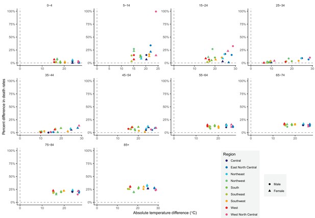
The relationship between percent difference in all-cause death rates and temperature difference between months with maximum and minimum mortality across climate regions, by sex and age group in 2016.
https://doi.org/10.7554/eLife.35500.047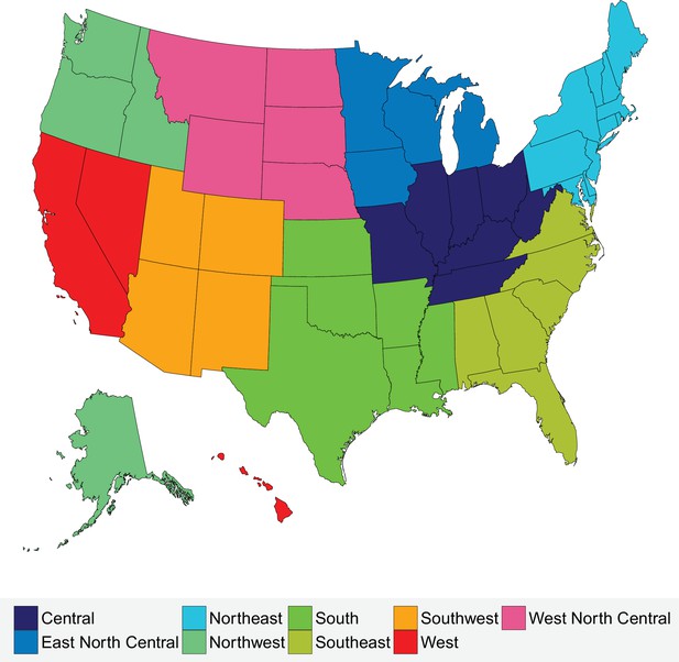
Climate regions of the USA.
https://doi.org/10.7554/eLife.35500.048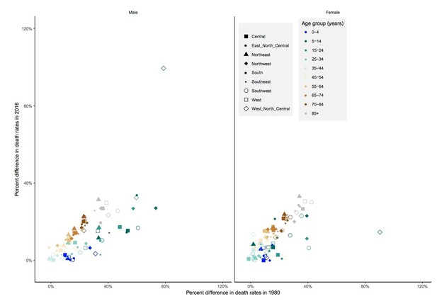
Percent difference in death rates between the maximum and minimum mortality months for all-cause mortality in 2016 versus 1980 by sex, age group and region.
https://doi.org/10.7554/eLife.35500.052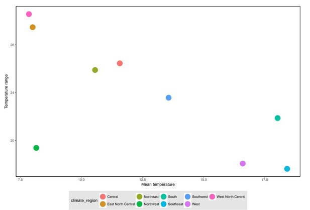
The relationship between annual mean temperature (used in European papers) and temperature range between maximum and minimum mortality months (used in our paper).
https://doi.org/10.7554/eLife.35500.053Tables
Number of deaths, by cause of death and sex from 1980 to 2016.
https://doi.org/10.7554/eLife.35500.003| Cause | Male | Female | Total | ||
|---|---|---|---|---|---|
| All cause | 43,558,203 | 42,295,973 | 85,854,176 | ||
| Cancers | 10,481,582 | 9,476,530 | 19,958,112 | ||
| Cardiorespiratory diseases | 20,168,049 | 21,109,525 | 41,277,574 | ||
| Cardiovascular diseases | 16,238,344 | 17,210,556 | 33,448,900 | ||
| Chronic respiratory diseases | 2,791,652 | 2,595,950 | 5,387,602 | ||
| Respiratory infections | 1,138,053 | 1,303,019 | 2,441,072 | ||
| Injuries | 4,034,876 | 1,768,170 | 5,803,046 | ||
| Unintentional | 2,489,142 | 1,348,187 | 3,837,329 | ||
| Intentional | 1,545,734 | 419,983 | 1,965,717 | ||
| Other causes | 8,873,696 | 9,941,748 | 18,815,444 | ||
Characteristics of climate regions of the USA.
https://doi.org/10.7554/eLife.35500.049| Climate region | Constituent states | Population (2016) | Mean annual temperature (1980–2016) (°C) |
|---|---|---|---|
| Central | Illinois, Indiana, Kentucky, Missouri, Ohio, Tennessee, West Virginia | 50,191,326 | 11.6 |
| East North Central | Iowa, Michigan, Minnesota, Wisconsin | 24,418,738 | 8 |
| Northeast | Connecticut, Delaware, Maine, Maryland, Massachusetts, New Hampshire, New Jersey, New York, Pennsylvania, Rhode Island, Vermont | 64,046,741 | 10.6 |
| Northwest | Alaska, Idaho, Oregon, Washington | 13,811,810 | 8.2 |
| South | Arkansas, Kansas, Louisiana, Mississippi, Oklahoma, Texas | 45,388,414 | 18 |
| Southeast | Alabama, Florida, Georgia, North Carolina, South Carolina, Virginia | 59,356,072 | 18.4 |
| Southwest | Arizona, Colorado, New Mexico, Utah | 17,613,981 | 13.6 |
| West | California, Hawaii, Nevada | 43,708,574 | 16.6 |
| West North Central | Montana, Nebraska, North Dakota, South Dakota, Wyoming | 5,168,753 | 7.6 |
Additional files
-
Transparent reporting form
- https://doi.org/10.7554/eLife.35500.050


