Oscillatory hyperactivity and hyperconnectivity in young APOE-ɛ4 carriers and hypoconnectivity in Alzheimer’s disease
- Cardiff University, United Kingdom
- Neuroscience and Mental Health Research Institute, Cardiff University, United Kingdom
- Core Bioinformatics and Statistics Team, College of Biomedical and Life Sciences, Cardiff University, United Kingdom
- College of Human and Health Sciences, Swansea University, United Kingdom
- School of Medicine, Cardiff University, United Kingdom
Figures
Figure 1
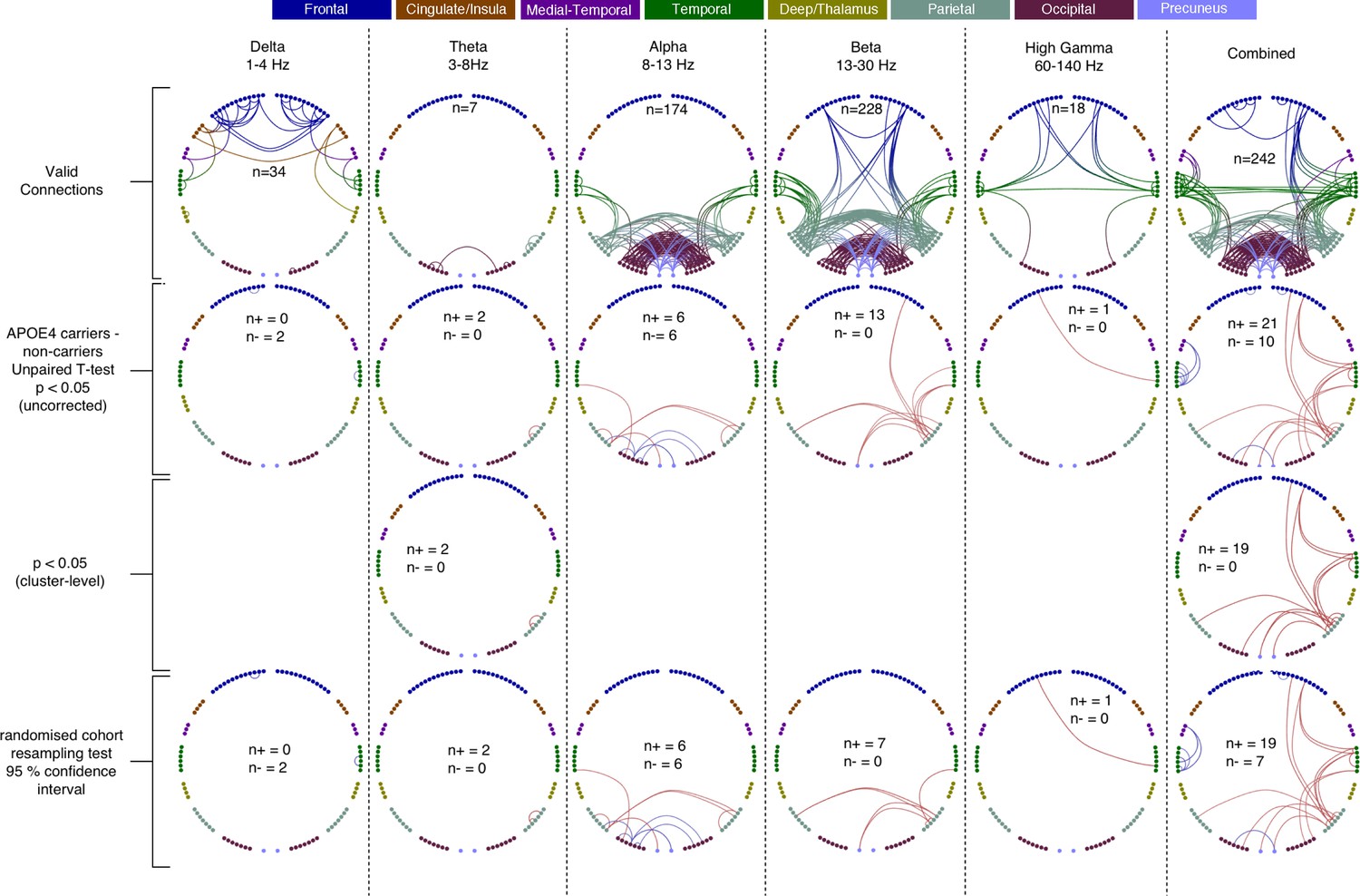
Each column shows oscillatory amplitude correlations comparing APOE-ɛ4 carriers and non-carriers for each of the five frequency ranges where valid edges were found, and combined across frequency.
The top row shows where there are ‘valid’ edge connections in either of the two groups. Colours, with a key at the top of the figure, indicate regions of brain areas that the connections originate from. The numbers on the plots show the number of valid edges found. Note that Low Gamma is not shown as no ‘valid’ edges were found. The second row shows the unpaired t-statistic for APOE-ɛ4 carriers compared to non-carriers. Increases are displayed in red and decreases in blue and only those connections significant at p<0.05 (uncorrected) are shown. The numbers on each plot (n+/n-) show the number of significant increases and decreases found in each map. Note that, across all tests, only one edge connection, in the Theta band, was found to be significantly different when corrected for multiple comparisons (p<0.036, right parietal). Using the cluster-level network-based size statistic, shown in the third row, significantly large clusters were found for the theta and Combined maps. The bottom, fourth row, shows the results of the cohort random sampling analysis. Edges are only shown if they are within the 95% confidence limit for APOE-ɛ4 -related increases (red) or decreases (blue). Note that, in general, the predominant effect is for edges to show increases in connectivity in APOE-ɛ4 carriers, compared to non-carriers and that this is most clearly shown in the Combined map (right-hand column), in which the most valid connections are identified and the most significant, and consistent, differences are seen. In all connection plots, line opacity indicates relative connection strength within the plot (most opaque = strongest). Data and scripts needed to generate this figure can be found at http://dx.doi.org/10.17605/OSF.IO/E4CJX.
Figure 2
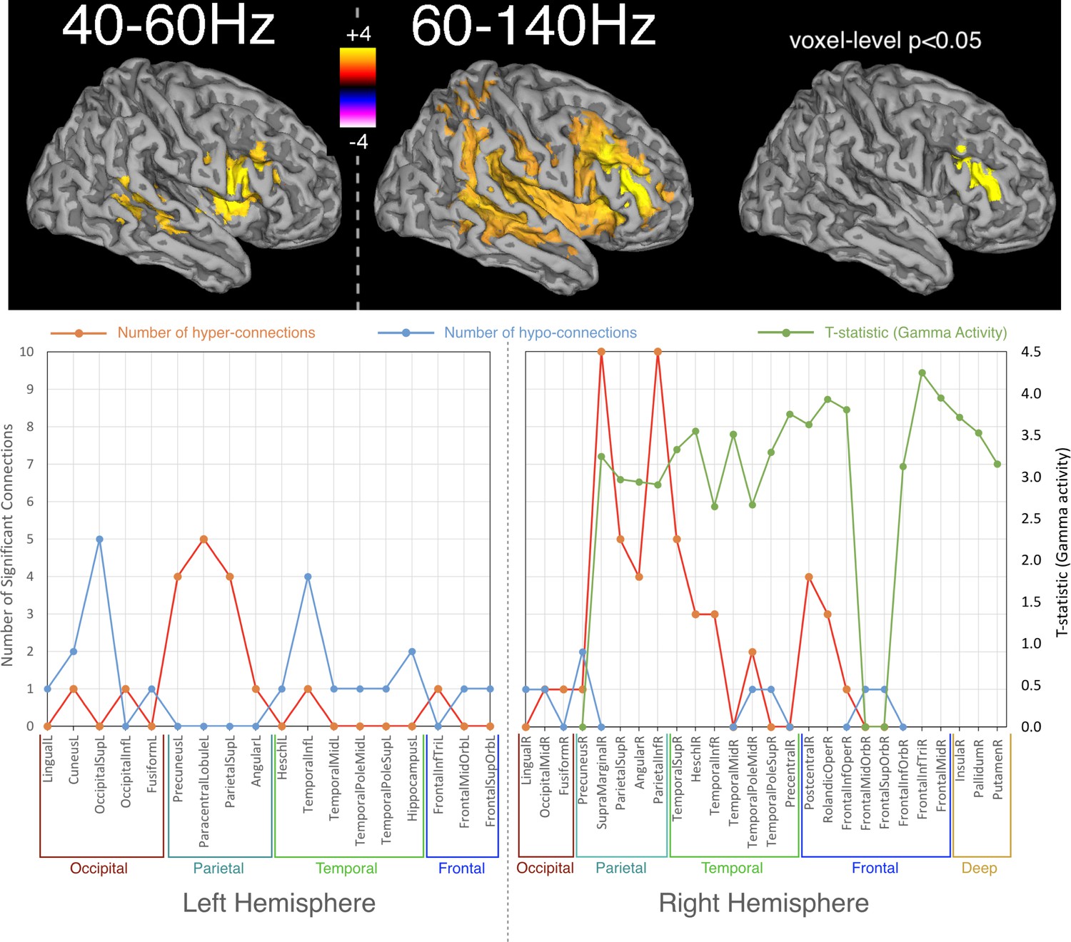
Spatial distribution of differences in oscillatory activity, between young APOE-ε4 carriers and their matched controls and the relationship with hyper- and hypo- connectivity.
Top panel shows differences in activity as a coloured overlay depicting unpaired t-statistics (thresholded at p<0.05, corrected using TFCE), with yellow/orange representing greater activity in the APOE-ε4 carriers. Significant effects were only found in the right hemisphere and only for the two gamma ranges tested, 40–60 Hz and 60–140 Hz. The overlays are shown depicted on a template brain surface. The far-right column shows the results for the 60–140 Hz comparison using a more stringent voxel-wise correction for multiple-comparisons. The bottom panel shows the distribution of differences in both connectivity and activity, between APOE-ε4 carriers and non-carriers, within each AAL node that shows any significant effect. For clarity the left and right hemispheres are shown separately. Red lines show the number of significant connections to/from each node that are of higher strength in APOE-ε4 carriers, compared to non-carriers. Blue lines show the number of significant connections to/from each AAL node that are weaker in APOE-ε4 carriers. For the right hemisphere only, as effects were only found on the right, the green lines show the most significant t-statistic found in each AAL region for the analysis of gamma activity. Positive values indicate that gamma activity, in either band, was higher in APOE-ε4 carriers compared to non-carriers. Note that connection numbers are the sum across all frequency ranges tested, with most of these coming from the low frequencies – only one connection (FrontalInfTriL to TemporalPoleMidR) showed hyperconnectivity in the gamma range. In contrast, only gamma showed hyperactivity, so the green lines/marker exclusively reflect right-hemisphere gamma hyperactivity. The spreadsheet used to generate the graphs on this figure can be found at http://dx.doi.org/10.17605/OSF.IO/E4CJX.
Figure 3
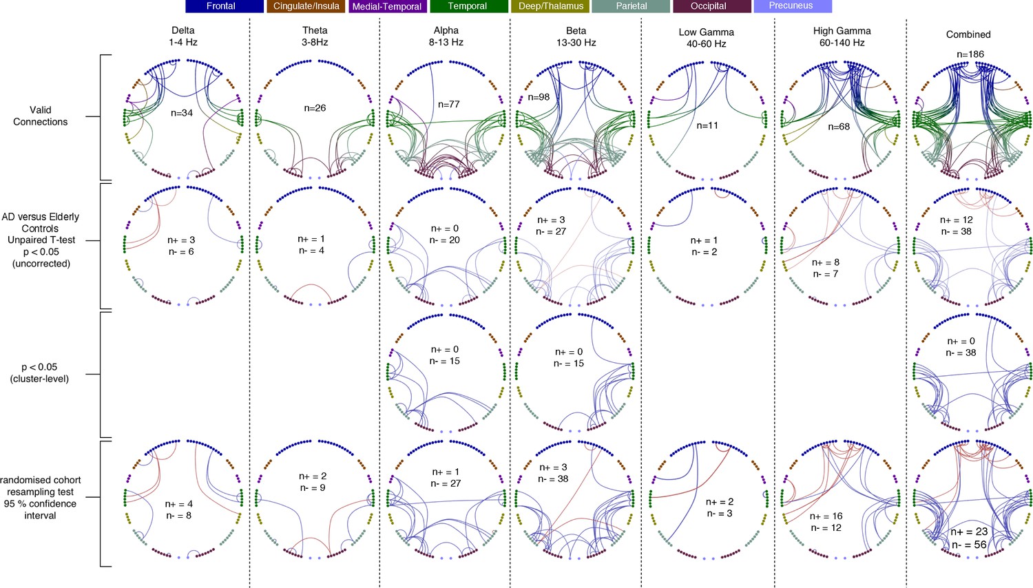
Each column shows oscillatory amplitude correlations comparing AD patients and matched elderly controls for each of the six frequency ranges where valid edges were found, and combined across frequency, and the Combined map.
The top row shows where there are ‘valid’ edge connections in either of the two groups. Colours, with a key at the top of the figure, indicate regions of brain areas that the connections originate from. The numbers on the plots show the number of valid edges found. The second row shows the unpaired t-statistic for AD compared to controls - Increases are displayed in red and decreases in blue and only those connections significant at p<0.05 (uncorrected) are shown. The numbers on each plot (n+/n-) show the number of significant increases and decreases found in each map. In terms of corrected significance only one connection each reached the p<0.05 threshold in Beta, High-Gamma and Combined (not shown). Using the cluster-level network-based size statistic, shown in the third row, significantly large clusters were found for the Delta, Alpha, Beta and Combined maps. The bottom row shows the results of the cohort random sampling analysis. Edges are only shown if they are within the 95% confidence limit for AD-related increases (red) or decreases (blue). Note that, in general, the predominant effect is for edges to show decreases in connectivity in AD patients, compared to controls, and that this is most clearly shown in the Combined map (right-hand column), in which the most valid connections are identified and the most significant, and consistent, differences are seen. Data and scripts needed to generate this figure can be found at http://dx.doi.org/10.17605/OSF.IO/E4CJX.
Figure 4
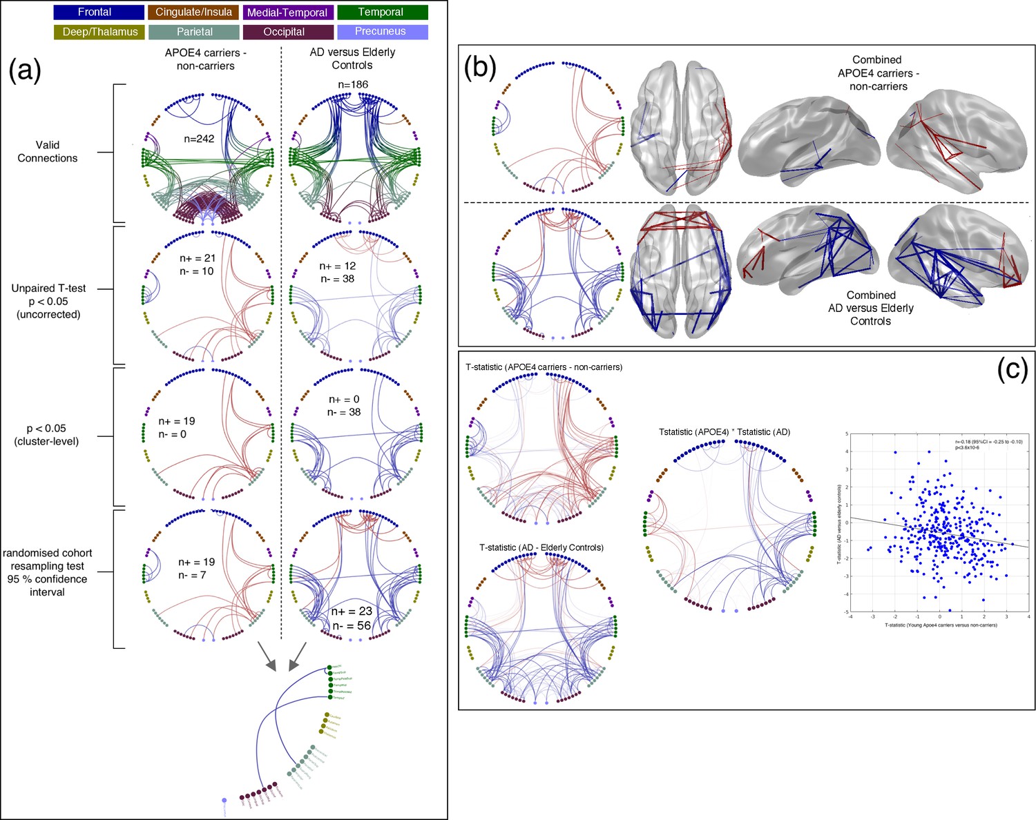
Comparison of connectivity differences in the two experiments, assessed using the Combined connectivity maps.
(a) Replotting of the results for the Combined maps, extracted from Figure 1 and Figure 2 and displayed in the same format. At the bottom of this panel, a conjunction analysis is shown in which connections that meet the 95% confidence criterion for both experiments are displayed. Three connections survive this test and are shown in blue to reflect the fact that the effects have opposite sign (see Table 2 for more details). (b) A comparison of connections surviving a 95% confidence interval threshold, estimated using cohort resampling, for the APOE-ɛ4 versus young controls experiment (top row) and the AD versus elderly controls experiment (bottom row). Here we display the thresholded connections on both the circle plots (left column) and three views of a template brain (columns 2–4). (c) A direct comparison of effect sizes. In the left column, unthresholded t-statistics are displayed for the two experiments, with the opacity of the lines reflecting the magnitude of the t-statistic. In the middle, the two sets of t-statistics are multiplied together for display. In this panel, strong lines represent connections with high t-statistics for both the APOE-ɛ4 experiment and the AD experiment, with blue colours representing connections which show opposite effect directions for example hyperconnectivity in APOE-ɛ4 and hypoconnectivity in AD. In the right panel, the scatter plot shows the effect-size (i.e. unpaired t-statistic, thresholded at p<0.05 uncorrected) for the AD versus elderly control experiment, plotted against the effect-size for the APOE-ɛ4 carriers versus non-carriers experiment. A clear negative relationship is observed. Data and scripts needed to generate this figure can be found at http://dx.doi.org/10.17605/OSF.IO/E4CJX.
Figure 5
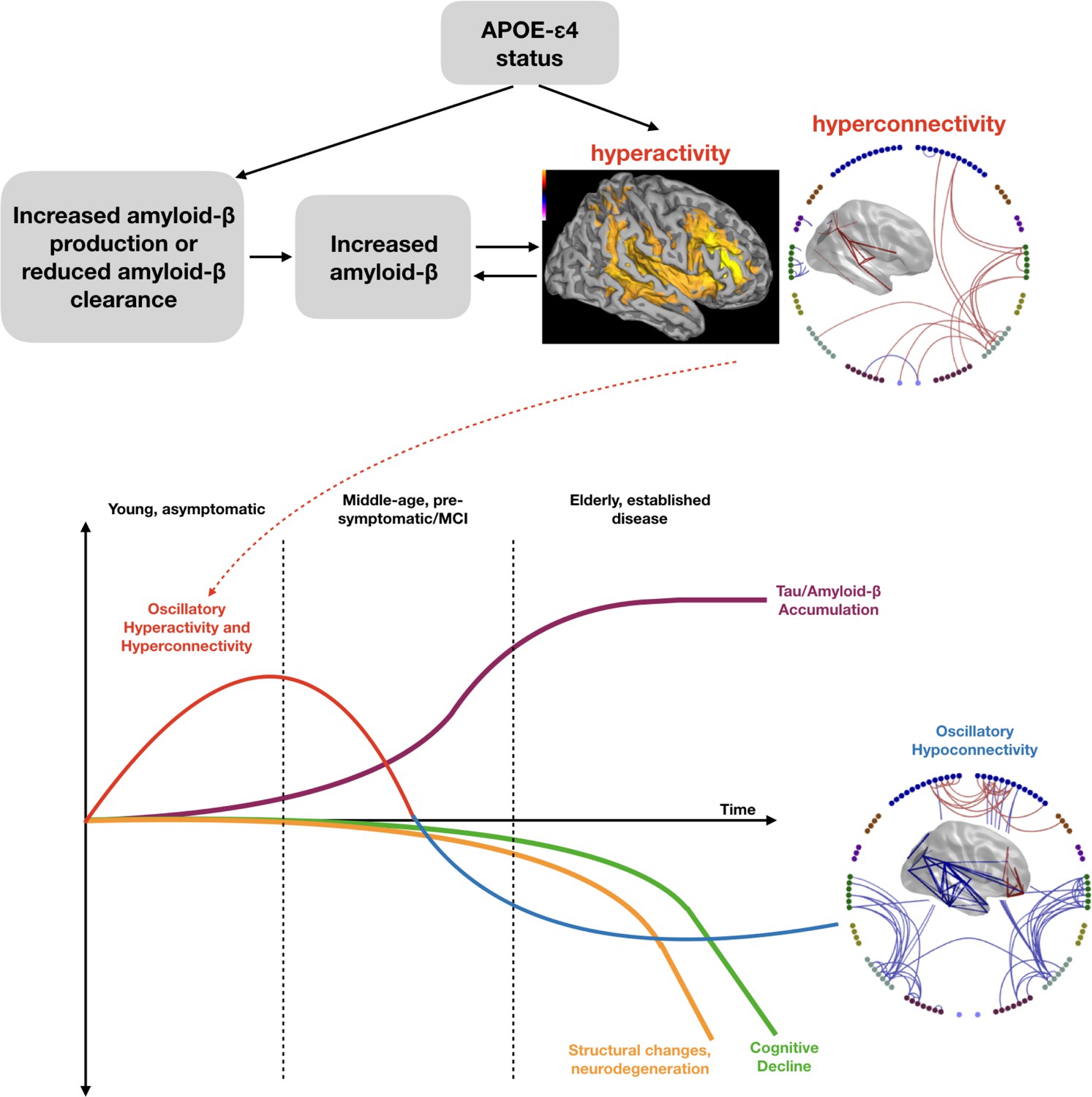
Schematic representation of a speculated mechanism (top tow) and order of events (bottom row) in brain structure and function when a healthy young individual develops Alzheimer’s disease.
Our results are consistent with theories that APOE-ɛ4 status may lead to early neuronal hyperactivity/hyperconnectivity, either directly via modification of the excitation/inhibition balance (Nuriel et al., 2017) or linked with amyloid deposition (Stargardt et al., 2015). Most biomarkers of disease show a progressive incline or decline, whereas our results suggest that functional connectivity shows a profile of an early increase, before structural, cognitive and neurobiological markers are evident. Eventually a more profound connectivity decrease is seen after a clinical diagnosis of Alzheimer’s disease has been established. Inspired by Hampel et al. (2011), Figure 4.
Figure 6
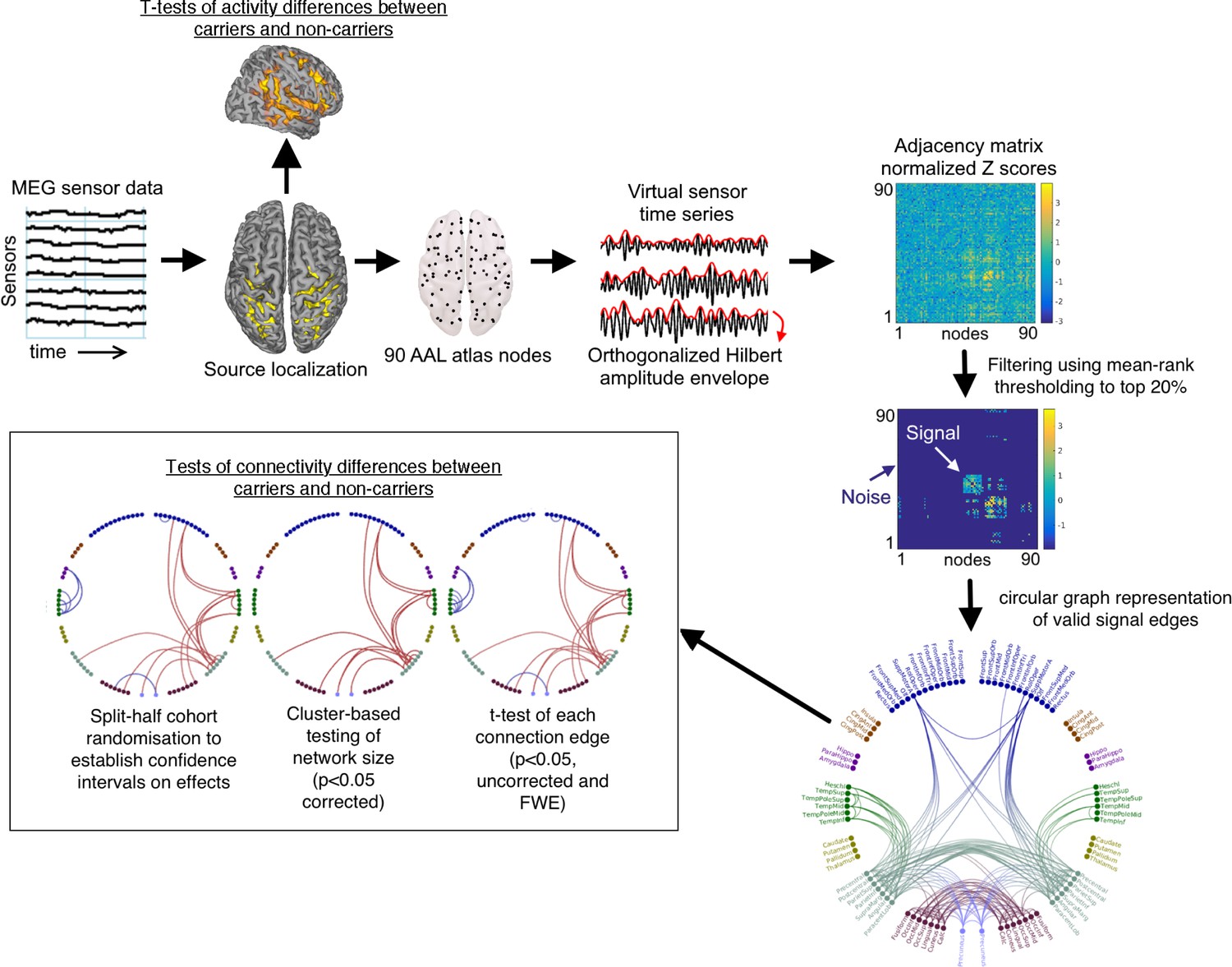
Schematic overview of the analysis pipeline.
Note that in the labelled circular plot (bottom right) the nodes are in approximate anatomical locations as if the brain was viewed from above (left is left/right is right) and are coloured according to their originating lobes (Blue: frontal, Gold: Insula/Anterior-Posterior cingulate, Purple: Medial temporal, Green: Temporal: Teal: Parietal and Sensorimotor, Maroon: occipital, Lilac: Precuneus. When statistical effects are plotted, red represents cohort increases and blue cohort decreases.
Tables
Table 1
Participant demographics and statistical assessment of APOE-ɛ4 group differences (two-sample t-tests).
https://doi.org/10.7554/eLife.36011.002| All MEG datasets | APOE-ɛ4 carriers | APOE-ɛ4 non-carriers | P value | |
|---|---|---|---|---|
| Number | 183 | 51 | 108 | |
| Male/female | 60/123 | 18/33 | 36/72 | 0.81 |
| Allele composition | 41 ɛ3ɛ4 6 ɛ4ɛ4 4 ɛ2ɛ4 | 87 ɛ3ɛ3 17 ɛ2ɛ3 4 ɛ2ɛ2 | ||
| Age* | 24.5 ± 5.4 years | 25.2 ± 6.8 years | 24.2 ± 4.6 years | 0.23 |
| Years of education | 16.4 ± 0.9 (N = 15) | 17.0 ± 1.3 (N = 34) | 0.13 | |
| Cognitive tasks:† Trail making test BACS symbol coding HVLT-R (verbal learning) WMS-III SS (spatial span) Letter-number span NAB mazes (reasoning) BVMT-R (visual learning) Category fluency | 27.8 ± 10.1 (N = 47) 65.0 ± 8.7 (N = 48) 27.7 ± 3.9 (N = 48) 16.9 ± 3.4 (N = 47) 15.0 ± 2.9 (N = 48) 22.9 ± 3.0 (N = 48) 28.3 ± 5.5 (N = 48) 29.2 ± 6.8 (N = 47) | 27.1 ± 8.8 (N = 98) 66.3 ± 9.1 (N = 100) 27.2 ± 4.3 (N = 100) 16.5 ± 3.5 (N = 99) 15.1 ± 2.8 (N = 100) 21.4 ± 4.3 (N = 100) 27.8 ± 5.1 (N = 100) 28.6 ± 6.9 (N = 100) | 0.65 0.42 0.51 0.51 0.86 0.03 0.54 0.60 | |
| Hippocampal volume (L) absolute, relative‡ | 4343 ± 408 mm3 2.734 ± 0.26 | 4362 ± 422 mm3 2.705 ± 0.24 | 4228 ± 394 mm3 2.746 ± 0.27 | 0.74 0.35 |
| Hippocampal volume (R) absolute, relative‡ | 4439 ± 368 mm3 2.797 ± 0.25 | 4417 ± 363 mm3 2.757 ± 0.23 | 4416 ± 345 mm3 2.798 ± 0.26 | 0.67 0.35 |
| Total ICV | 1596 ± 161 cm3 | 1618 ± 156 cm3 (N = 50) | 1589 ± 166 cm3 (N = 106) | 0.29 |
| MEG head motion | 0.28 ± 0.23 cm | 0.32 ± 0.26 cm | 0.27 ± 0.21 cm | 0.18 |
| MEG number of epochs | 144.75 ± 7.63 | 144.25 ± 7.02 | 145.06 ± 7.75 | 0.53 |
-
*Values are represented as group mean ±SD.
†The MCCB includes tests of processing speed (BACS symbol coding, category fluency: animal naming, trail making test), working memory (WMS-III: spatial span, letter-number span), verbal and visual learning, and reasoning and problem-solving skills (NAB mazes).
-
‡Relative left (L) and right (R) hippocampal volumes are calculated as absolute hippocampal volumes divided by total intracranial volume (ICV), multiplied by 1000.
Table 2
Connections which show a statistically significant effect in both experiments.
https://doi.org/10.7554/eLife.36011.006| Frequency Range | AAL Region 1 | AAL Region 2 | E4 carriers versus non-carriers (T-statistic) | AD versus elderly controls (T-statistic) |
|---|---|---|---|---|
| Alpha | Cuneus left | Lingual left | −2.5 | −1.8 |
| Beta | Parietal superior right | Precuneus left | +2.3 | −2.3 |
| Combined | Occipital mid right | Temporal inferior right | +2.3 | −2.2 |
| Combined | Supramarginal right | Heschl right | +2.5 | −3.2 |
| Combined | Temporal Superior right | Heschl right | +3.0 | −3.0 |
Table 3
Leave-one-out Cross-validated performance of within experiment (top two rows) and cross-experiment (bottom row) SVM classification tests.
https://doi.org/10.7554/eLife.36011.008| Problem | Performance using all valid features |
|---|---|
| Classify AD versus elderly controls eyes open | Specificity/Sensitivity = 76.7 % / 65.3% AUC = 77.6%, p<0.019 |
| Classify E4 versus nonE4 eyes open | Specificity/Sensitivity = 56.8 % / 58.6% AUC = 63.5%, p<0.005 |
| Train on E4 versus nonE4 then classify AD versus elderly controls eyes open | Specificity/Sensitivity = 36.4 % / 28.6% AUC = 31.8% (68.2% using reversed labels) p<0.14 |
Additional files
-
Transparent reporting form
- https://doi.org/10.7554/eLife.36011.011
Download links
A two-part list of links to download the article, or parts of the article, in various formats.
Downloads (link to download the article as PDF)
Open citations (links to open the citations from this article in various online reference manager services)
Cite this article (links to download the citations from this article in formats compatible with various reference manager tools)
Oscillatory hyperactivity and hyperconnectivity in young APOE-ɛ4 carriers and hypoconnectivity in Alzheimer’s disease
eLife 8:e36011.
https://doi.org/10.7554/eLife.36011


