Mapping the transcriptional diversity of genetically and anatomically defined cell populations in the mouse brain
- Janelia Research Campus, United States
- Brandeis University, United States
Figures
Figure 1 with 3 supplements
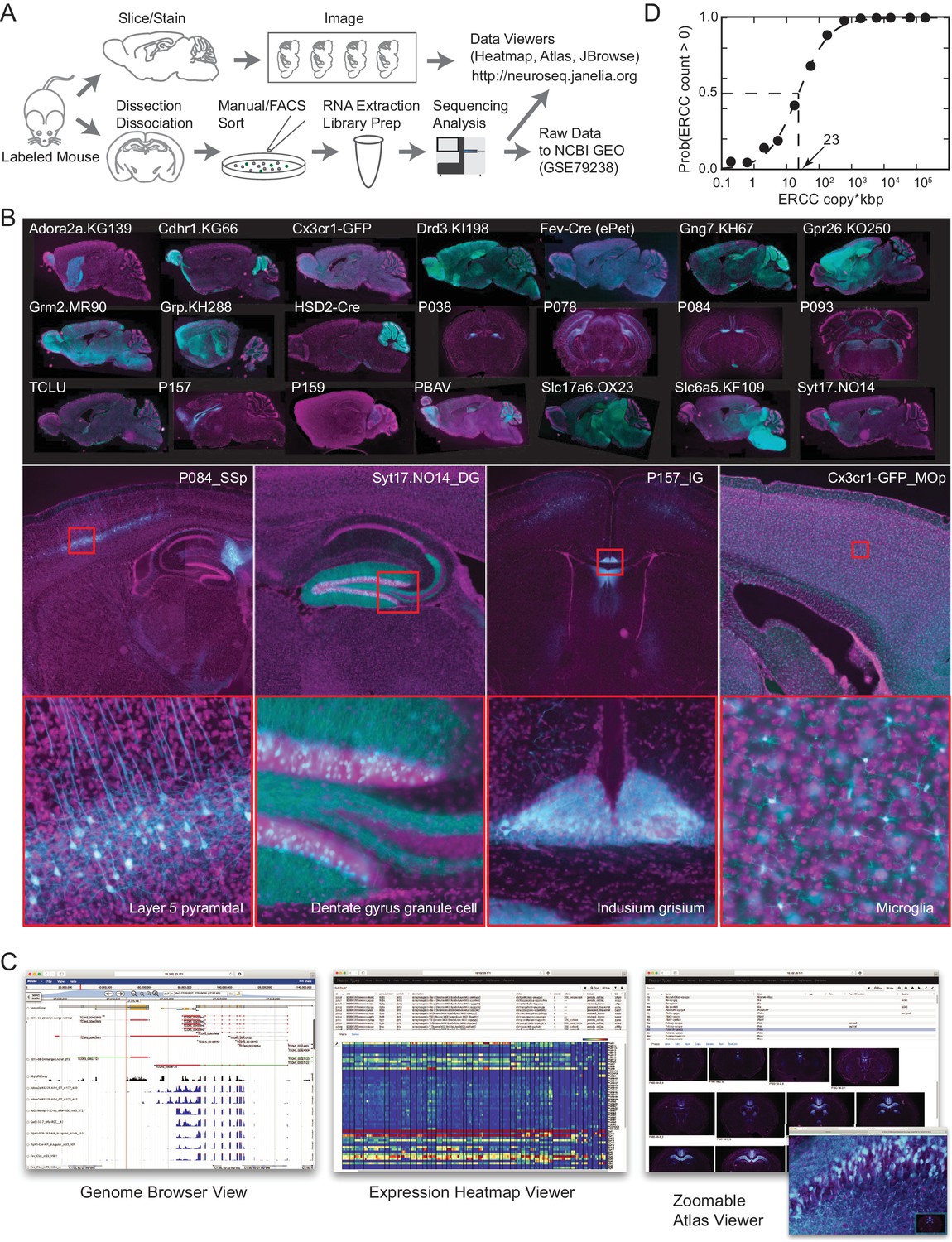
The NeuroSeq dataset.
(A) Schema of pipeline for anatomical and genomic data collection. (B) Example sections from atlases at low (top), medium (middle) and high (bottom) magnifications. (C) Web tools available at http://neuroseq.janelia.org (D) Sensitivity of library preparation measured from ERCC detection across all libraries. The 50% detection sensitivity of the assay itself was 23 copy*kbp.
Figure 1—figure supplement 1

GACP samples.
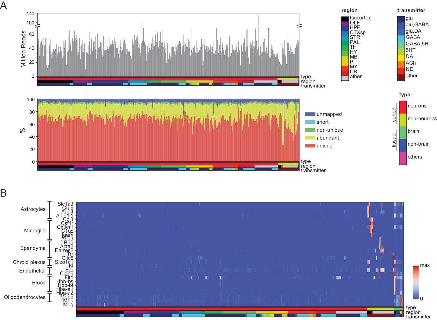
Sample groups color coded by type (left color bar), region (middle color bar) and transmitter phenotype (right color bar). Transmitter phenotype was determined from transmitter synthesis and storage enzyme expression. Abbreviations: OLF: olfactory regions; CTXsp.CLA: Claustrum; HPF: hippocampal formation; STR: Striatum and related ventral forebrain structures; PAL: pallidum; TH: thalamus; HY: hypothalamus; MB: midbrain; MY: medulla; P: pons; CB: cerebellum; RE: retina; OE: olfactory epithelium; SP: spinal cord; @: other non-brain regions. For additional abbreviations see Materials and methods.
Figure 1—figure supplement 2
Quality control measures.
(A) (Top) Total reads for each of the libraries. Samples are color coded by type, region and transmitter, as shown in Figure 1—figure supplement 1. (Bottom) Categories of reads in each library: unmapped: reads that did not map to the mm10 genome including chimeric and back-spliced reads; short: reads less than 30 bp in length after removing adaptor sequences; non-unique: reads mapping to multiple locations; abundant: reads containing ribosomal RNA, polyA, polyC and phiX sequences, and unique: uniquely mapped reads. For further analyses, abundant, short and unmapped reads were not used. (B) Contaminating transcripts from nonneuronal cell populations. Samples with significant expression of these transcripts (at right) include tissue samples and nonneuronal samples. Each row is normalized by the maximum value.
Figure 1—figure supplement 3
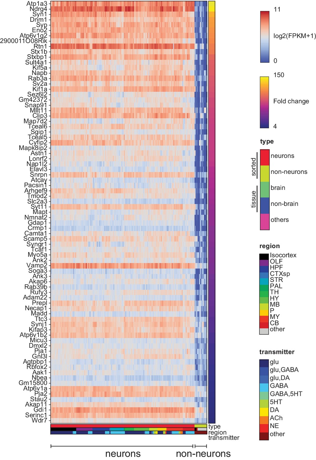
Pan-neuronal genes.
Genes expressed in all neuronal GACPs, but not (or at much lower levels) in nonneurons within the dataset. Heat-map shows log expression levels and the color at the right side indicates fold-change of the expression level between neurons and nonneurons. Criteria for extracting these genes are listed in the Materials and methods.
Figure 2 with 7 supplements
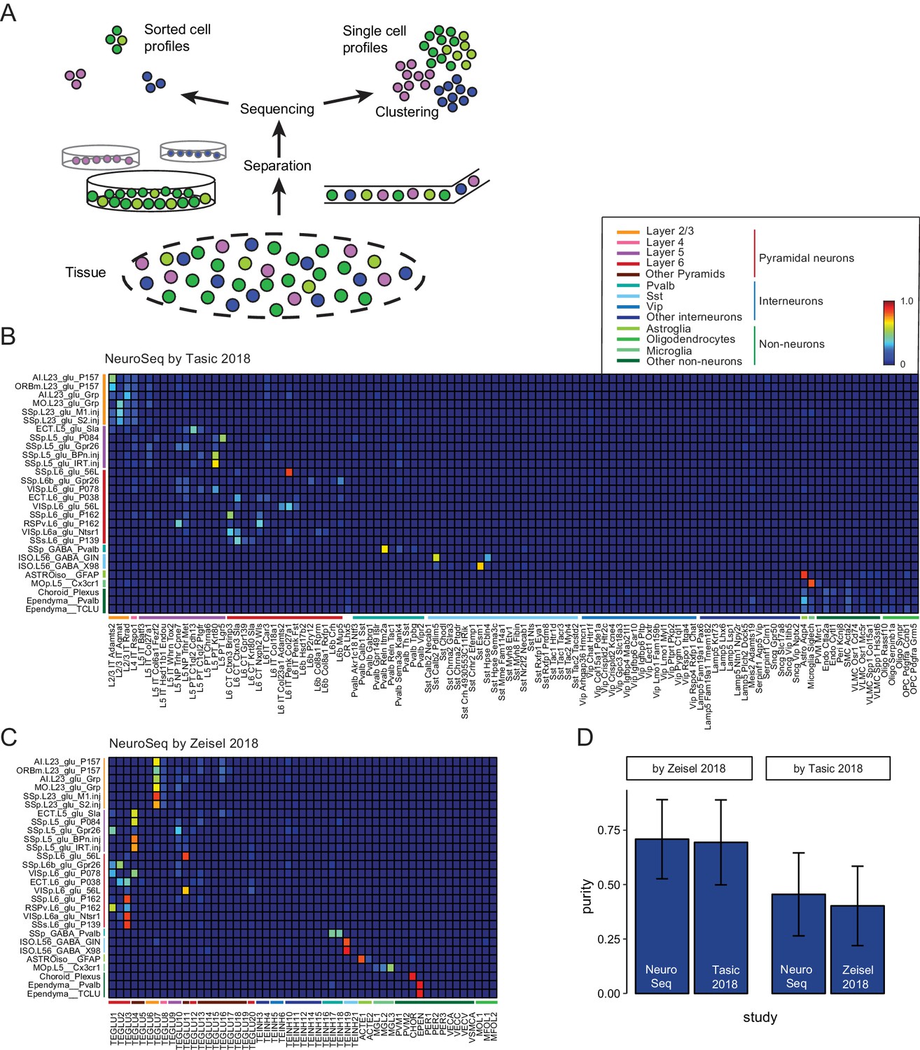
Decomposition by non-negative least squares (NNLS) fitting.
(A) Diagram illustrating potential sources of heterogeneity at the separation phase in profiles from sorted cells (left) or at the clustering phase in profiles from single cells (right). (B,C) NNLS coefficients of NeuroSeq cell populations decomposed by two scRNA-seq datasets: (Tasic et al., 2018; Zeisel et al., 2018). (D) Mean purity scores for NeuroSeq and SC datasets. The purity score for a sample is defined as the ratio of the highest coefficient to the sum of all coefficients. Error bars are Std. Dev.
Figure 2—figure supplement 1

Self decompositions by NNLS.
Each dataset is randomly divided into two groups and one is used to decompose the other. Coefficients matrix with perfect decomposition would be diagonal. Non-diagonal elements indicate limitation of the decomposition method due to having a subset of cell groups too similar to each other. (A–C) Heatmaps illustrate NNLS coefficients for subsets of samples in each dataset. Column order is same as row order. (A) 25 neocortical samples from Tasic et al. (2018), (B) 25 neocortical samples from Zeisel et al. (2018) and (C) 28 neocortical samples from present study. (D) Mean purity scores (as defined in Figure 2) for cross-validation (calculated over all neocortical samples) were comparable in each dataset. Error bars are Std. Dev.
Figure 2—figure supplement 2
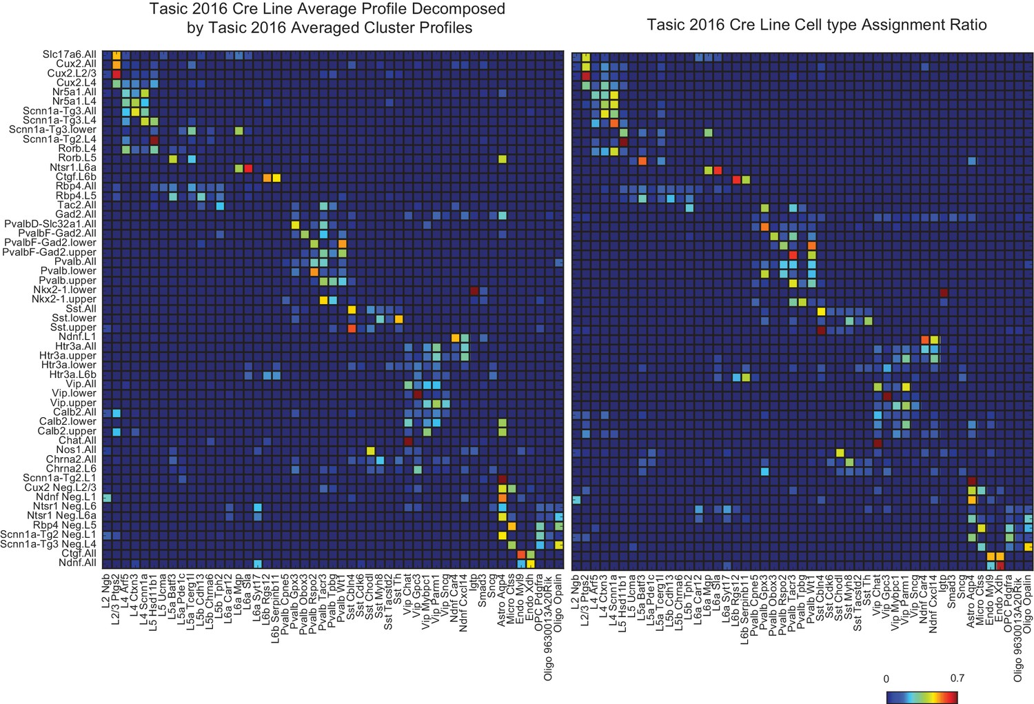
A validation of NNLS decomposition.
(Left) Single-cell profiles from Tasic et al. (2016) were merged according to which of the 17 transgenic strains and sub-dissected layers they originated from (row labels). Merged profiles were then decomposed using individual cell type cluster profiles defined in Tasic et al. (2016) (column labels). (Right) The reported proportion of single-cell profiles according to the author’s classification. The close similarity between left and right matrices indicates an accurate NNLS decomposition of the merged clusters. Note that information about which and how many individual cell types were sorted from each line and set of layers was not explicitly provided to the decomposition algorithm, but were accurately deduced from the merged expression profiles.
Figure 2—figure supplement 3

NNLS decomposition of SC datasets: Tasic by Zeisel.
The same neocortical samples from Tasic et al. (2018) and Zeisel et al. (2018) used in Figure 2 to decompose NeuroSeq neocortical samples were used to decompose each other. See Figure 2 for further details of cell identity. Order of samples listed is as in Figure 2. Presumably because Tasic et al. samples are more finely sub-clustered, individual Zeisel et al. samples (horizontal) frequently map to multiple Tasic samples (vertical).
Figure 2—figure supplement 4
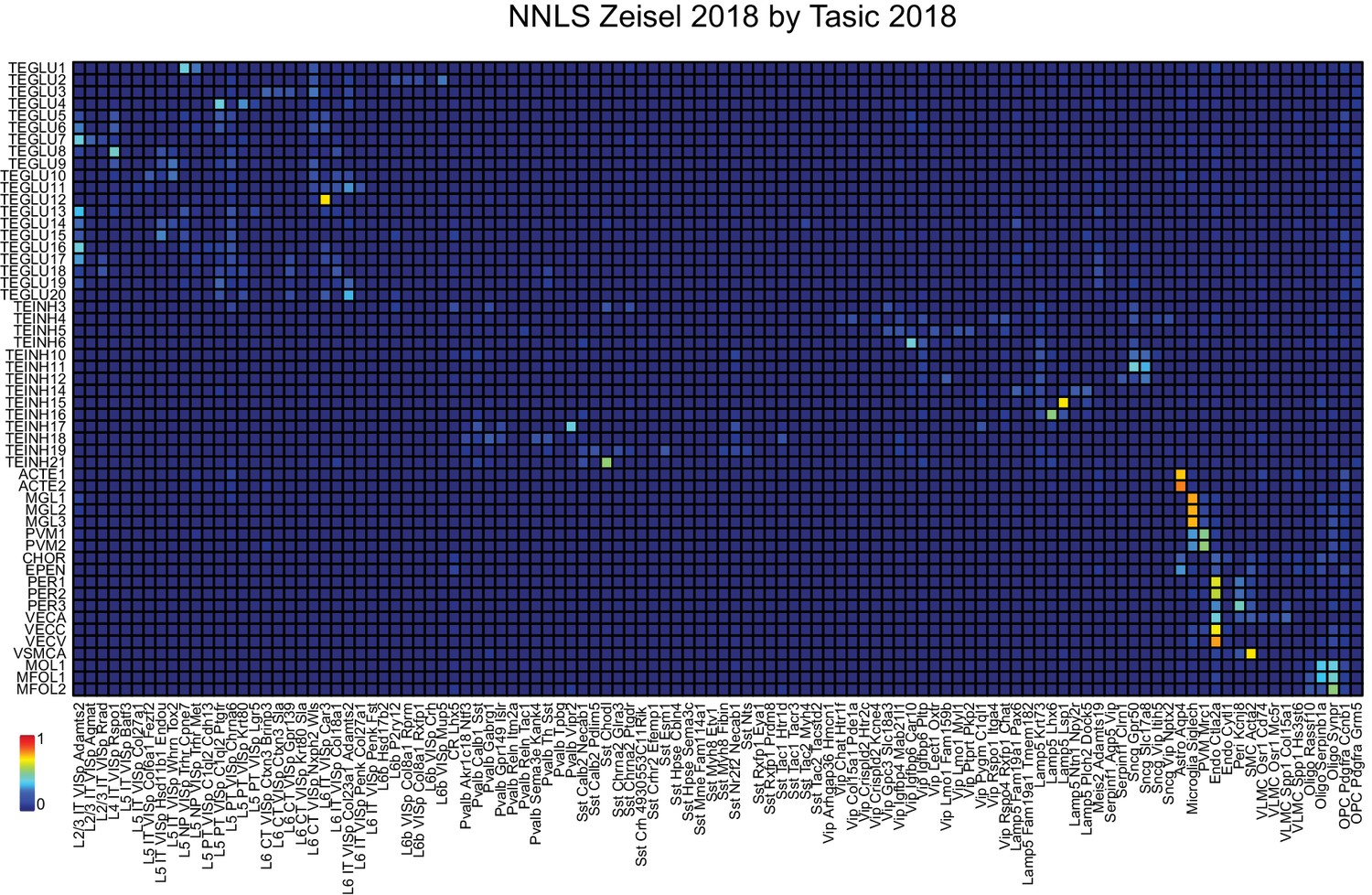
NNLS decomposition of SC datasets: Zeisel by Tasic.
The same neocortical samples from Tasic et al. (2018) and Zeisel et al. (2018) used in Figure 2 to decompose NeuroSeq neocortical samples were used to decompose each other, but in the reverse order from the preceding supplementary figure. See Figure 2 for further details of cell identity. Order of samples listed is as in Figure 2.
Figure 2—figure supplement 5
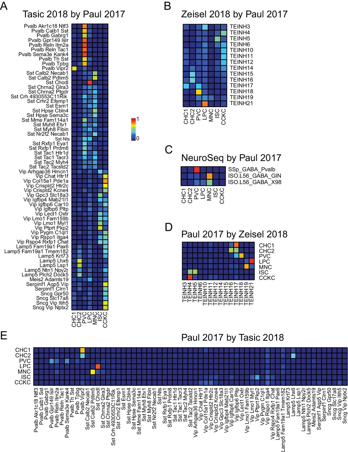
NNLS decomposition of interneuron datasets.
Data from Paul et al. (2017), a third recent single-cell study focusing on neocortical interneurons, was used to decompose the cortical interneuron samples from (A) Tasic et al. (2018), (B) Zeisel et al. (2018), and (C) NeuroSeq. In addition, this data set was decomposed using the interneuron samples from the two other single cell data sets (D,E).
Figure 2—figure supplement 6
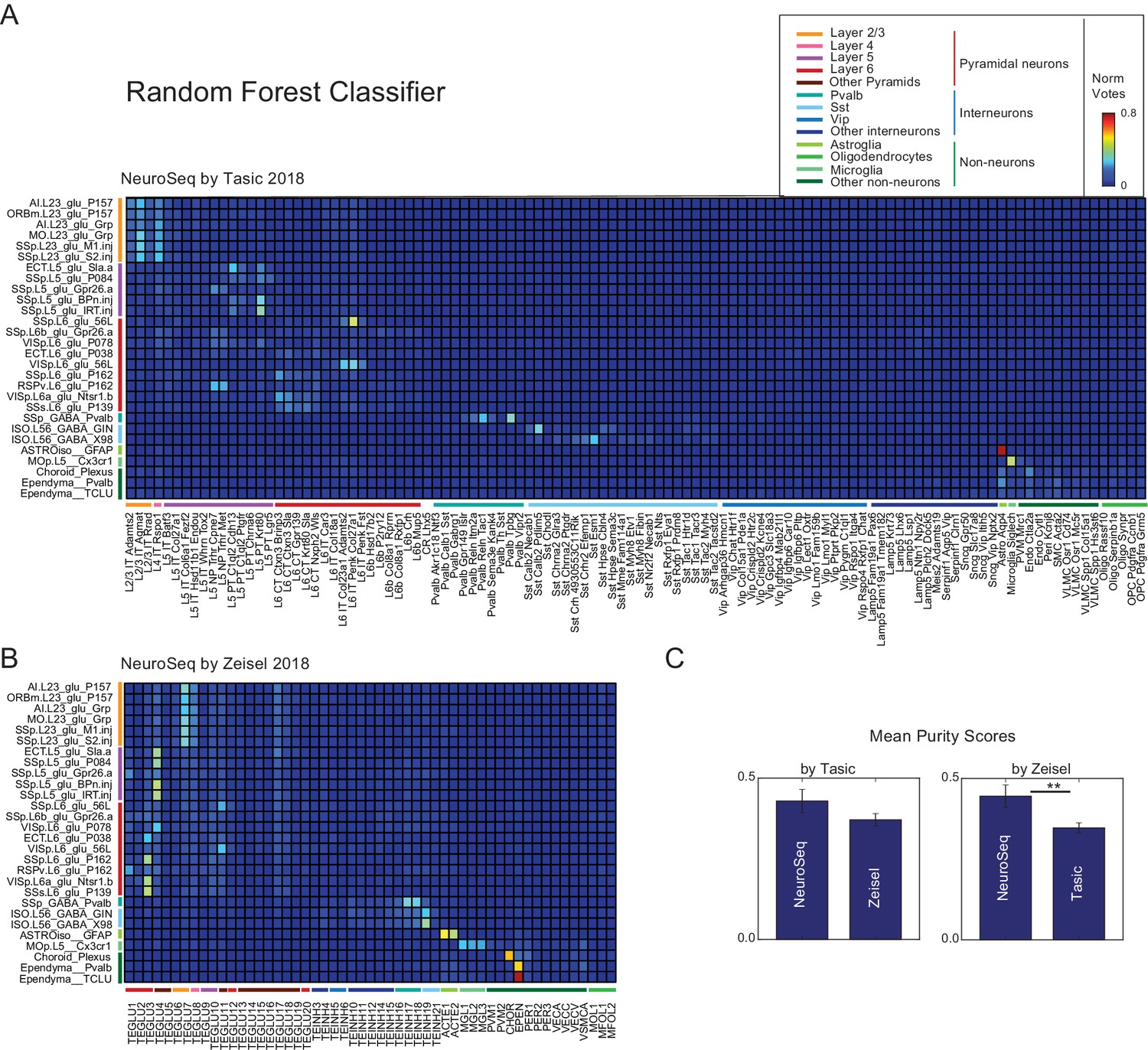
Random forest decomposition.
A random forest classifier (500 decision trees) was trained from single-cell profiles (column labels) and then used to decompose NeuroSeq cell populations (row labels). Coefficients are the ratio of the votes from the 500 trees (coefficient ranges from 0 to 1 and 1 indicates all trees vote for a single class). The pattern of coefficients is similar to that obtained by NNLS (Figure 2) suggesting the decomposition is relatively robust and does not reflect a peculiarity of the NNLS algorithm.
Figure 2—figure supplement 7
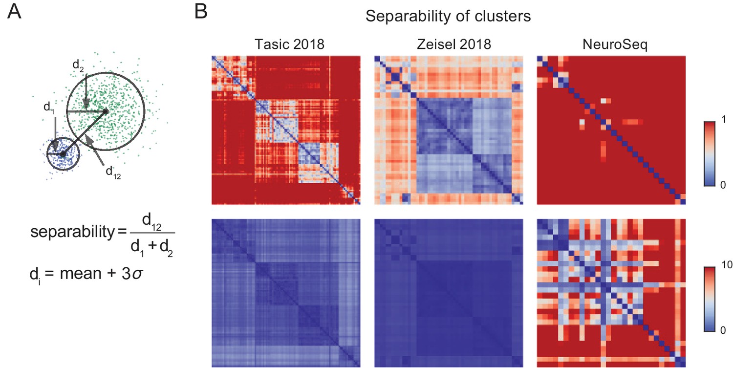
Separability of cell population clusters.
(A) Definition of separability. Cartoon represents two different single-cell clusters as distributions of points. The separability is the ratio of the distance between the centroids to the sum of the 'diameter’ of each cluster. The diameter of a cluster is calculated as the mean distance to the centroid of the cluster +3 times the standard deviation of the distances of each point in the cluster. With this definition, two clusters are 'touching’ when separability =1, overlapping when <1, and separate when >1. The multi-dimensional distance is computed as 1- Pearson’s corr.coef. Note that averaging is expected to improve separability by roughly the square root of the number of cells averaged, hence most of the improved separability in the NeuroSeq data likely reflects averaging. (B) Separabilities between cell population clusters for three datasets shown with two different dynamic ranges (color scale; 0–1 for upper row and 0–10 for lower row). The order of cell population clusters are the same as in Figure 2.
Figure 3 with 1 supplement
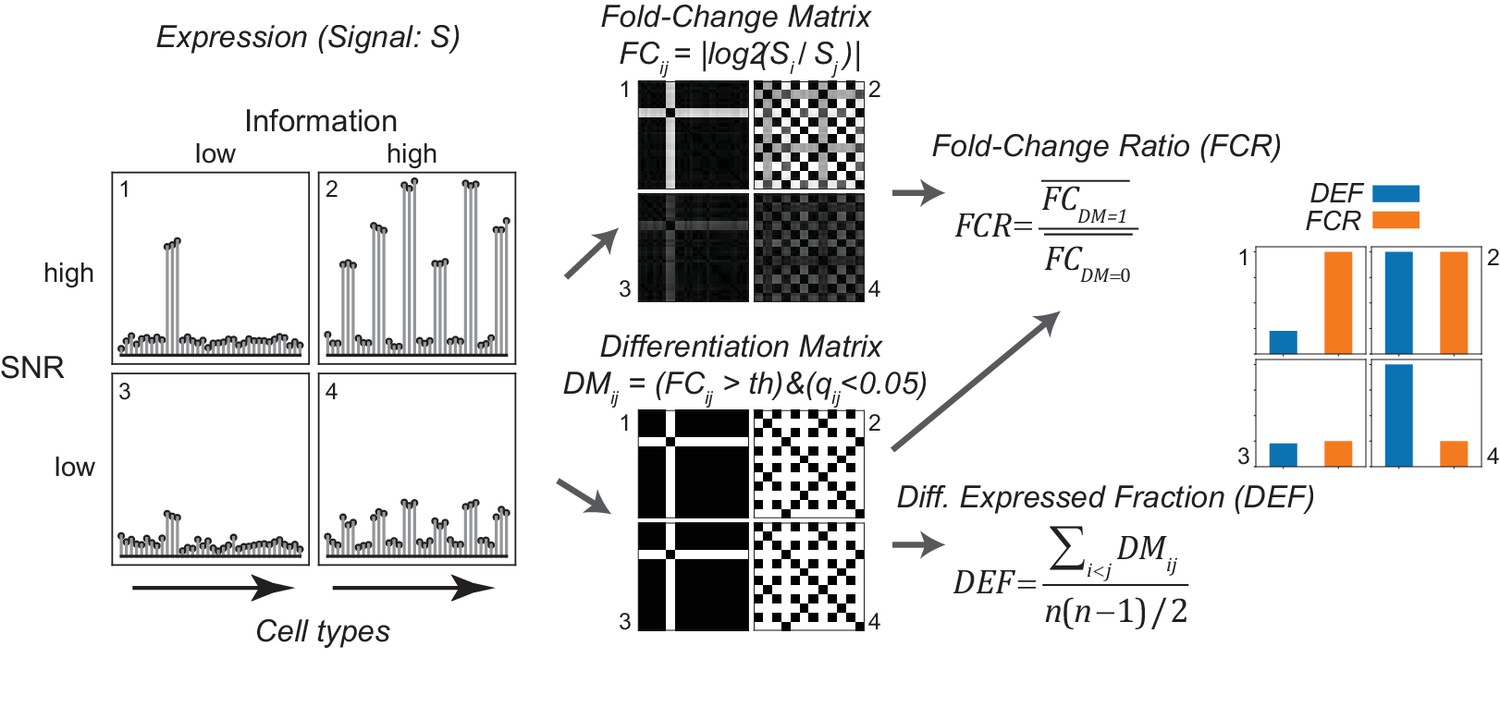
Gene expression metrics related to information content and robustness (Left) Cartoon illustrating the process of calculating fold-change ratio (FCR) and differentially expressed fraction (DEF) for four different hypothetical genes that differ in the information content (2 and 4 vs. 1 and 3) and signal-to-noise ratio (SNR; 1 and 2 vs. 3 and 4) of their expression patterns across cell populations.
(Middle) Expression signals are used to construct matrices for each gene of the log fold-changes between populations (fold-change matrix) and the distinctions between populations based on those differences (Differentiation Matrix; DM; see Materials and methods). (Right) The differentially expressed fraction (DEF) is the fraction of the total pairs of cell populations distinguished (i.e. of nonzero values in DM excluding diagonal). The fold-change ratio (FCR) is the average expression difference between distinguished pairs divided by the average expression difference between undistinguished pairs. Orange and blue bars show that the resulting DEF and FCR calculations capture the variations in information and SNR across the four genes.
Figure 3—figure supplement 1

Simulated data reveal features of expression metrics.
(A) (Upper) An example of simulated binary and graded expression patterns with added noise. X-axis indicates cell populations. (Lower) Various average metrics calculated from the simulated expression patterns (100 individual simulations; error bars are standard deviations). Values are normalized within each metric across binary expression group or graded expression group. (B) Summary of each metric’s correlation with Mutual Information (MI) and SNR: check mark–correlated, X–uncorrelated, triangle–partially correlated. (C) DEF and MI are highly correlated. The relationship between DEF, calculated without considering replicates, and MI with expression levels discretized into two levels (left) and five levels (right). Although increasing the number of discrete expression levels decreases the degree of correlation, they remain closely related.
Figure 4 with 1 supplement
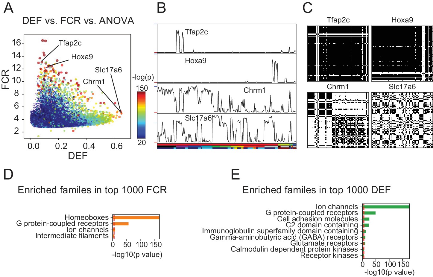
DEF and FCR capture distinct aspects of expression diversity related to information content and robustness.
(A) Highly variable genes (warm colored dots; color scale shows significance of ANOVA across cell populations) include both genes with high FCR and low DEF (like Tfap2c and Hoxa9) and genes with lower FCR and high DEF (like Chrm1 and Slc17a6). (B) Expression profiles of example genes labeled in A. Sample key in horizontal color bar as in Figure 1—figure supplement 1–3. Red ticks at left indicate 0; Vertical scale is ; blue ticks = 6) (C) DMs for example genes, calculated as shown in Figure 3. (D, E) HUGO gene groups enriched in the top 1000 FCR and top 1000 DEF genes. Red lines indicate the p = 10-5 threshold used to judge significance.
Figure 4—figure supplement 1

PANTHER and GO enrichment analysis for high FCR and high DEF genes.
(A, B) Enrichment using PANTHER gene families. (C, D) Enrichment using Gene Ontology Molecular Function (GOM) categories. Note that GOM does not contain a separate category for homeobox transcription factor, but that these are contained within the parent category: 'sequence-specific DNA binding.’ Red lines indicate the p = 10-5 threshold used to judge significance.
Figure 5 with 4 supplements
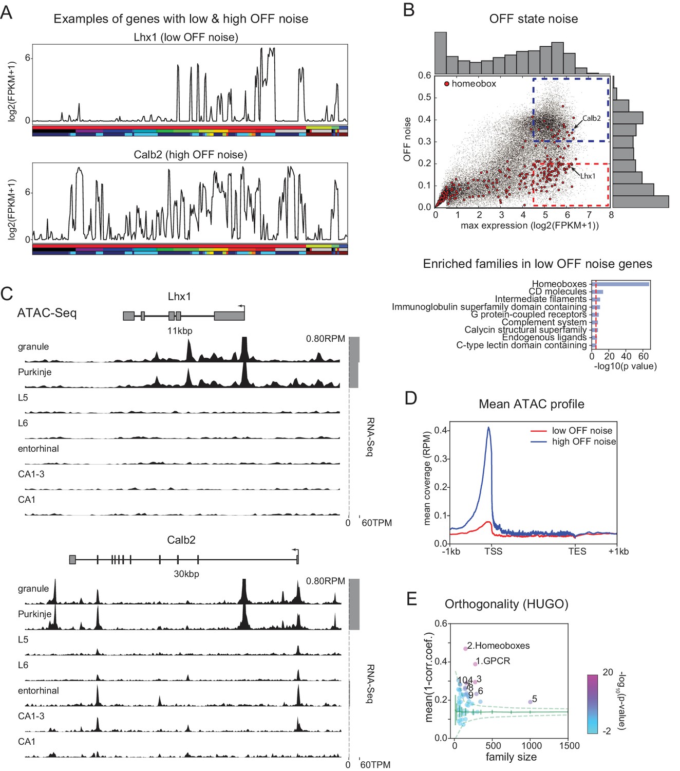
Mechanisms contributing to low noise and high information content of homeobox TFs.
(A) Example expression patterns of a LIM class homeobox TF (Lhx1) and a calcium binding protein (Calb2) with similar overall expression levels. Sample key as in Figure 1—figure supplement 1–3. (B) (upper) OFF state noise (defined as standard deviation (std) of samples with FPKM<1) plotted against maximum expression. (lower) HUGO gene groups enriched in the region indicated by red dashed box in the upper panel (see Figure 5—figure supplement 1 for PANTHER and Gene Ontology enrichments). (C) Average (replicate n = 2) ATAC-seq profiles for the genes shown in A. Some peaks are truncated. Expression levels are plotted at right (gray bars). (D) Length-normalized ATAC profile for genes with high ( 0.3, blue dashed box in B, n = 853) and low ( 0.2, red dashed box in B, n = 1643) OFF state expression noise. (E) Each circle represents the orthogonality of expression patterns calculated using HUGO gene groups. Orthogonality is a measure of the degree of non-redundancy in a set of expression patterns. Since the dispersion of orthogonality depends on family size, results are compared to orthogonality calculated from randomly sampled groups of genes (green solid lines: mean and Std. Dev.; green dashed lines: 99% confidence interval). Families, Z-scores, family size: 1. GPCR: 17.1, n = 277; 2. Homeoboxes: 16.6, n = 148; 3. Ion channels: 10.7, n = 275; 4. C2 domain containing: 7.8, n = 159; 5. Zinc fingers: 6.9, n = 1002; 6. Immunoglobulin superfamily domain containing: 6.7, n = 292; 7. PDZ domain containing: 6.3, n = 144; 8. Fibronectin type III domain containing: 5.9, n = 143; 9. Endogenous ligands: 5.1, n = 165; 10. Basic helix-loop-helix proteins: 4.9, n = 77.
Figure 5—figure supplement 1

Properties of Low OFF noise genes.
PANTHER (A) and Gene Ontology (GOM: Gene Ontology Molecular functions category) (B) enrichments for low OFF noise genes defined by red dashed region in Figure 5B. (C) Histogram of max expression for Low OFF noise genes and high OFF noise genes (genes in blue dashed region in Figure 5B). Low OFF genes have slightly higher max expression values than high OFF genes, p=0.002, Students’ t-test. Red and blue vertical lines indicate mean values (5.31 and 5.27, respectively). (D) Histogram of gene length for Low/high OFF genes. Low OFF noise genes are significantly shorter than high OFF noise genes, p=0 (below machine precision), Student’s t-test. Red/blue vertical lines indicate mean values (3.47 and 4.24 respectively). (E) Orthogonality, calculated as in Figure 5E, but using the PANTHER gene families.
Figure 5—figure supplement 2
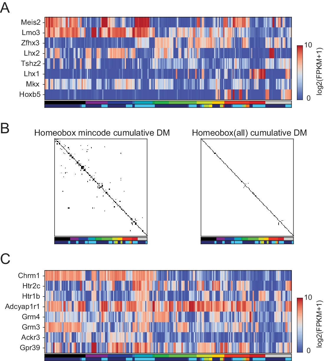
Homeobox TFs form a combinatorial code.
(A) Heatmap showing expression patterns of 8 homeobox TFs that distinguished 99% of pairs. A minimal gene set algorithm (see Materials and methods) was used to select these TFs. Each GACP expressed an average of 4.1 ± 1.3 (Std. Dev.) of these TFs. (B) Combined DM (differentiation matrix, see Figures 3 and 4C) constructed by allowing GACP pairs to be distinguished on the basis of expression of any of 8 homeobox TFs in the minimal set (left) or by any homeobox TFs (right). White indicates distinguishable pairs and black indicates indistinguishable pairs. (C) Heatmap showing expression patterns of minimal gene sets for GPCR capable of distinguishing 99% of pairs.
Figure 5—figure supplement 3
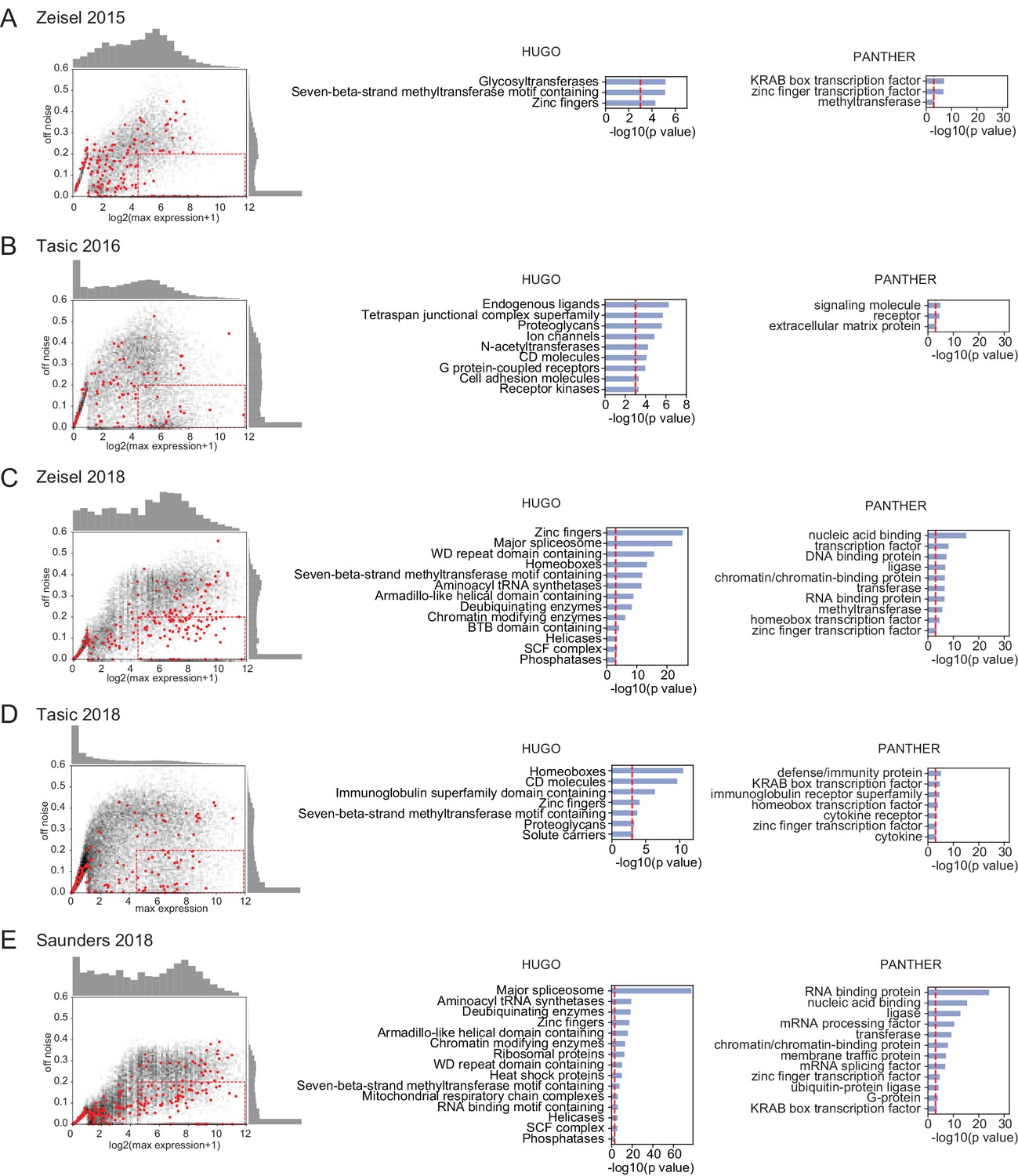
OFF noise in single-cell datasets.
(Left column) OFF noise calculated as in Figure 5B from the standard deviation of cluster averages, plotted against the maximum expression. Red dots are homeobox transcription factors, black dots are all other genes. (Middle, Right columns). HUGO gene groups and PANTHER protein families over-represented in the dashed red boxes in the OFF noise plots. Datasets are from (Zeisel et al., 2015; Tasic et al., 2016; Zeisel et al., 2018; Saunders et al., 2018; Tasic et al., 2018).
Figure 5—figure supplement 4
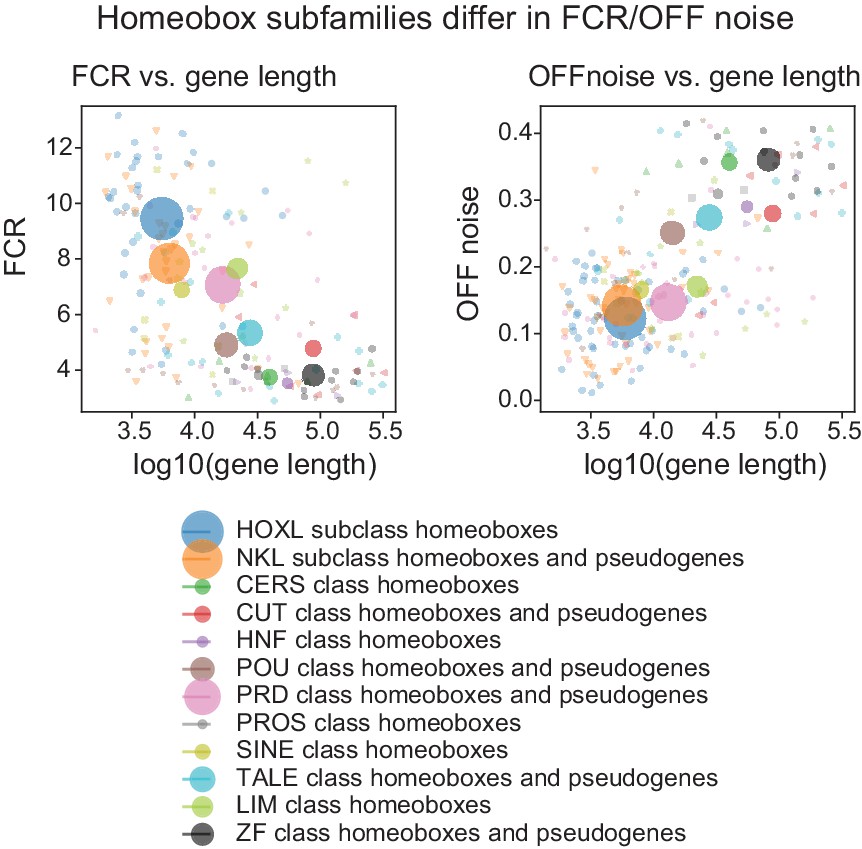
OFF noise and gene length in Homeobox subfamilies.
(Left) Scatter plot of mean gene length and mean FCR for homeobox subfamilies. Subfamilies are as defined according to HUGO gene groups. (Right) Scatter plot of mean gene length and mean OFF noise for homeobox subfamilies.
Figure 6
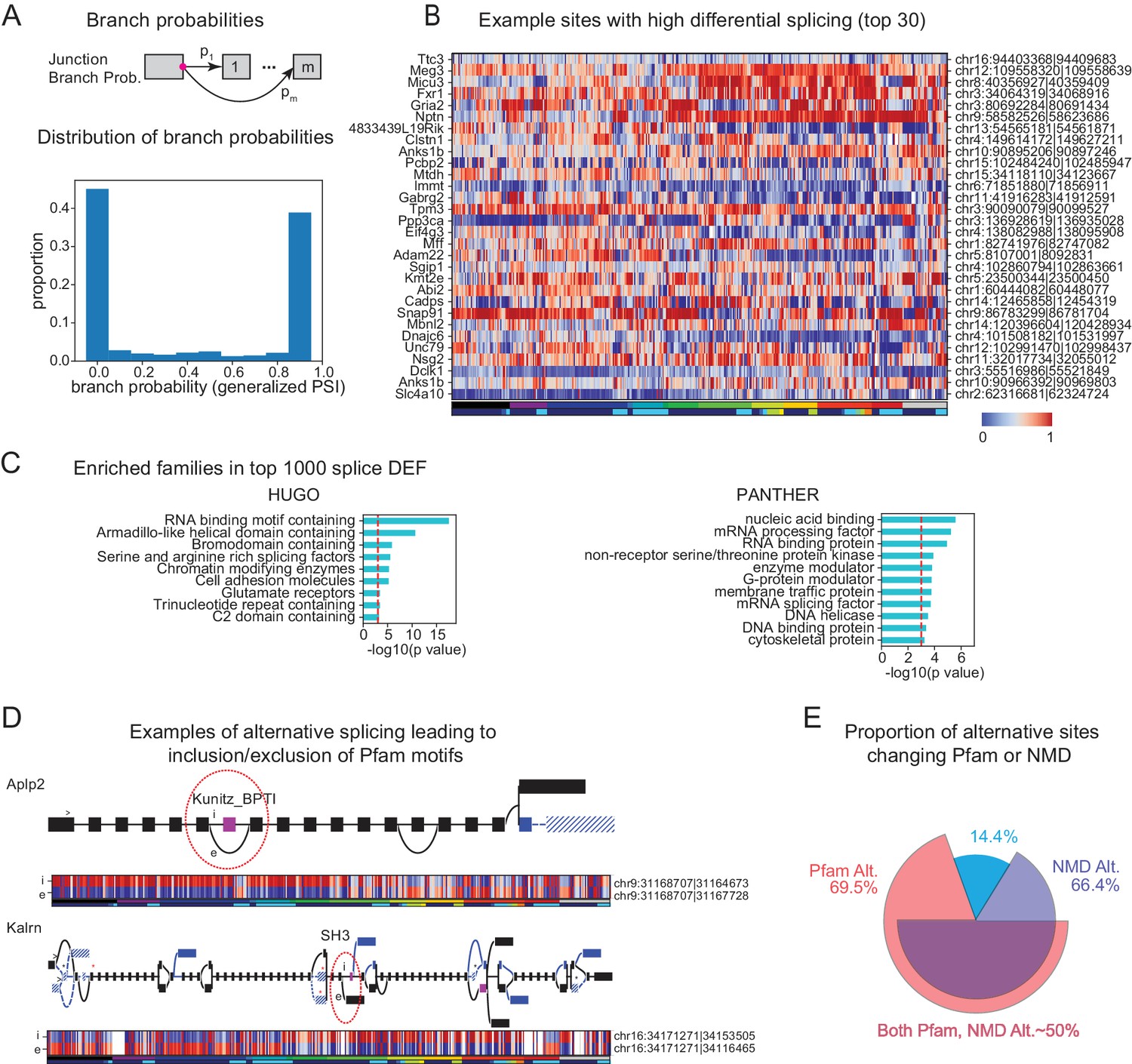
Alternative splicing and neuronal diversity.
(A) (Top) Schematic representation of branch probabilities. Alternative donor sites (red dot) can be spliced to multiple acceptor sites with probabilities . (Bottom) Distribution of branch probabilities across all samples and all alternative splice sites. (B) Heatmap showing branch probabilities across neuronal samples for branches with highest splice DEF. Each row corresponds to a branch within the indicated gene on the left and the location is indicated on the right. Samples without junctional reads at this branch are colored white. (C) Enriched HUGO gene groups and PANTHER protein classes for genes with top 1000 combined splice DEF. (D) Splice graphs illustrating examples of alternative splicing leading to inclusion or exclusion (marked 'i', 'e’ of Pfam domains (magenta exons) with branch probabilities shown in the heatmap below. Previously unannotated exons and junctions are blue; annotated are black. Dotted lines indicate branches predicted to lead to nonsense-mediated decay (NMD). A red star above an exon indicates existence of a premature termination codon (PTC) within the exon which satisfies the '50nt rule' for NMD (Nagy and Maquat, 1998) (i.e. more than 50 bp upstream to the next junction), whereas a black star indicates existence of a PTC within 50 bp of the next junction. Dashed lines and hatches indicate that there is no coding path through the element. (>) indicates an annotated translation start site. (E) Proportion of branch points predicted to lead to NMD (purple), altered Pfam inclusion (red), or both (overlapped region), at one or more of its branches.
Figure 7 with 3 supplements
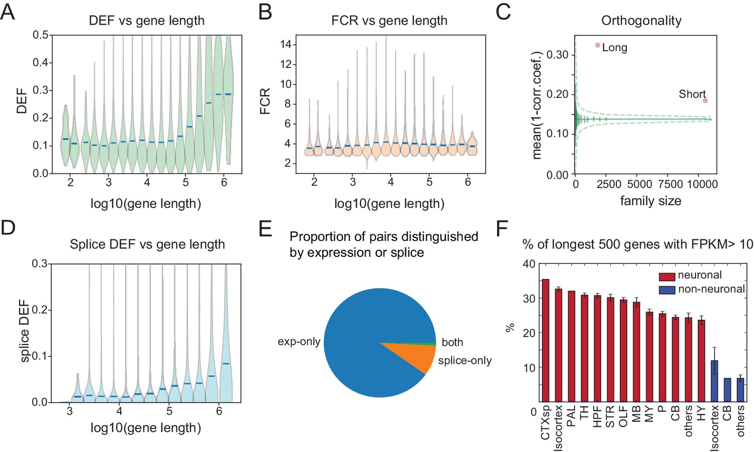
Long genes have a greater capacity for distinguishing cell populations.
(A) DEF as a function of gene length. For violin plots in A, B, D, genes are sorted by length and binned (four bins per log unit). (B) Robustness of expression difference (FCR) as a function of gene length. (C) Orthogonality of expression patterns calculated as in Figure 5E, but using long neuronal genes (n = 1829, 100 kb) and short neuronal genes (n = 10572, 100 kb) rather than functionally defined gene families. Z-score is 33.2 for long and 22.1 for short neuronal genes. Both are highly different from randomly sampled genes (green solid lines mean and Std. Dev.; dashed lines = 99% confidence interval), but long genes provide greater separation. (D) Splice DEF as a function of gene length. (E) Fraction of pairs distinguished by splicing (splice-only), transcript abundance (exp-only), or by both measures. (F) Variation in long gene expression in neuronal and nonneuronal populations across major brain regions studied. Error bars are SEM. (CTXsp consisted of single region: Claustrum.)
Figure 7—figure supplement 1
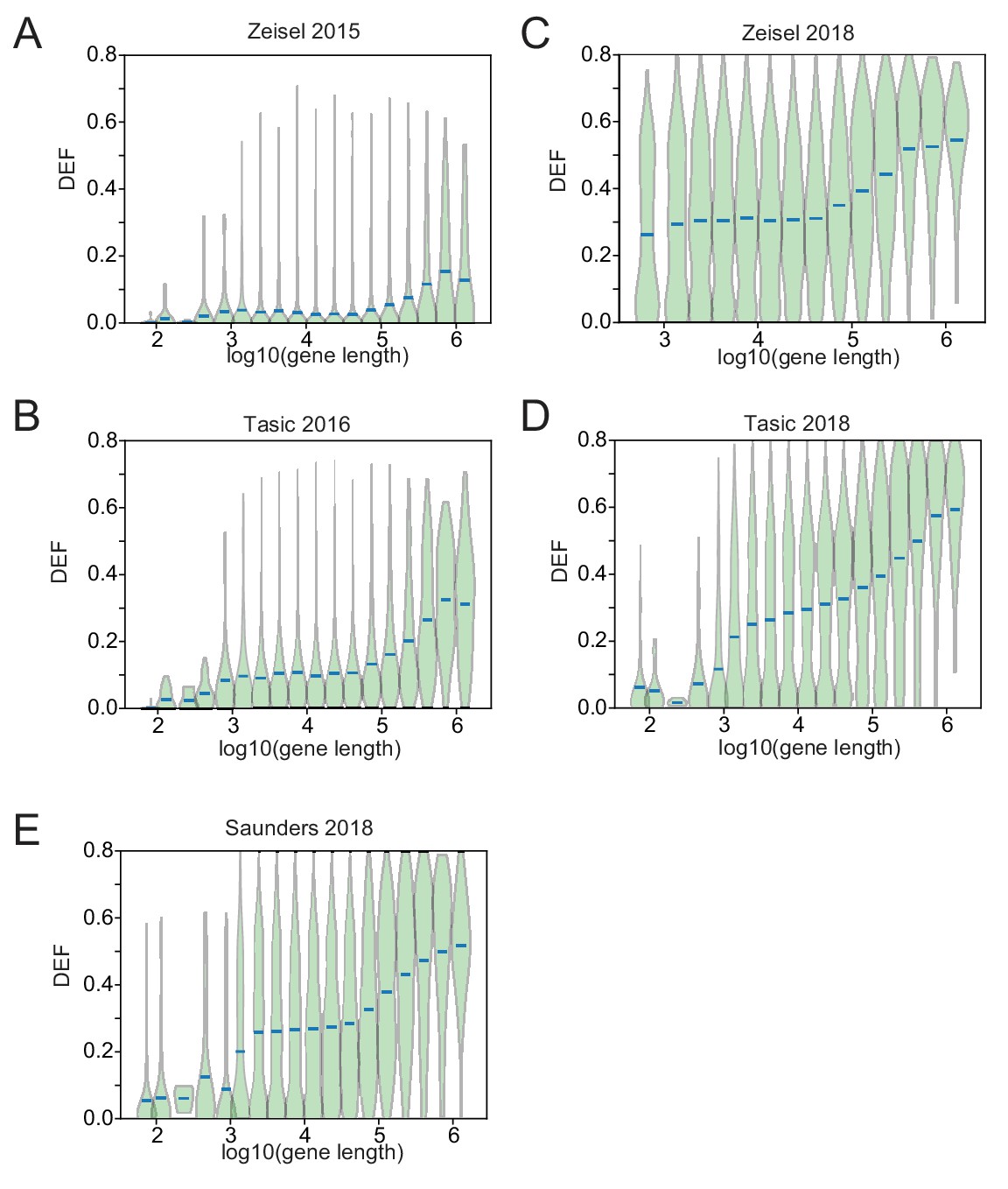
DEF length bias in SC datasets.
DEF is plotted against (gene length) for five SC RNA-seq datasets from (Zeisel et al., 2015; Tasic et al., 2016; Zeisel et al., 2018; Saunders et al., 2018; Tasic et al., 2018). Red bars represent average DEF for genes binned by gene length (four bins per log unit), sorted by length).
Figure 7—figure supplement 2
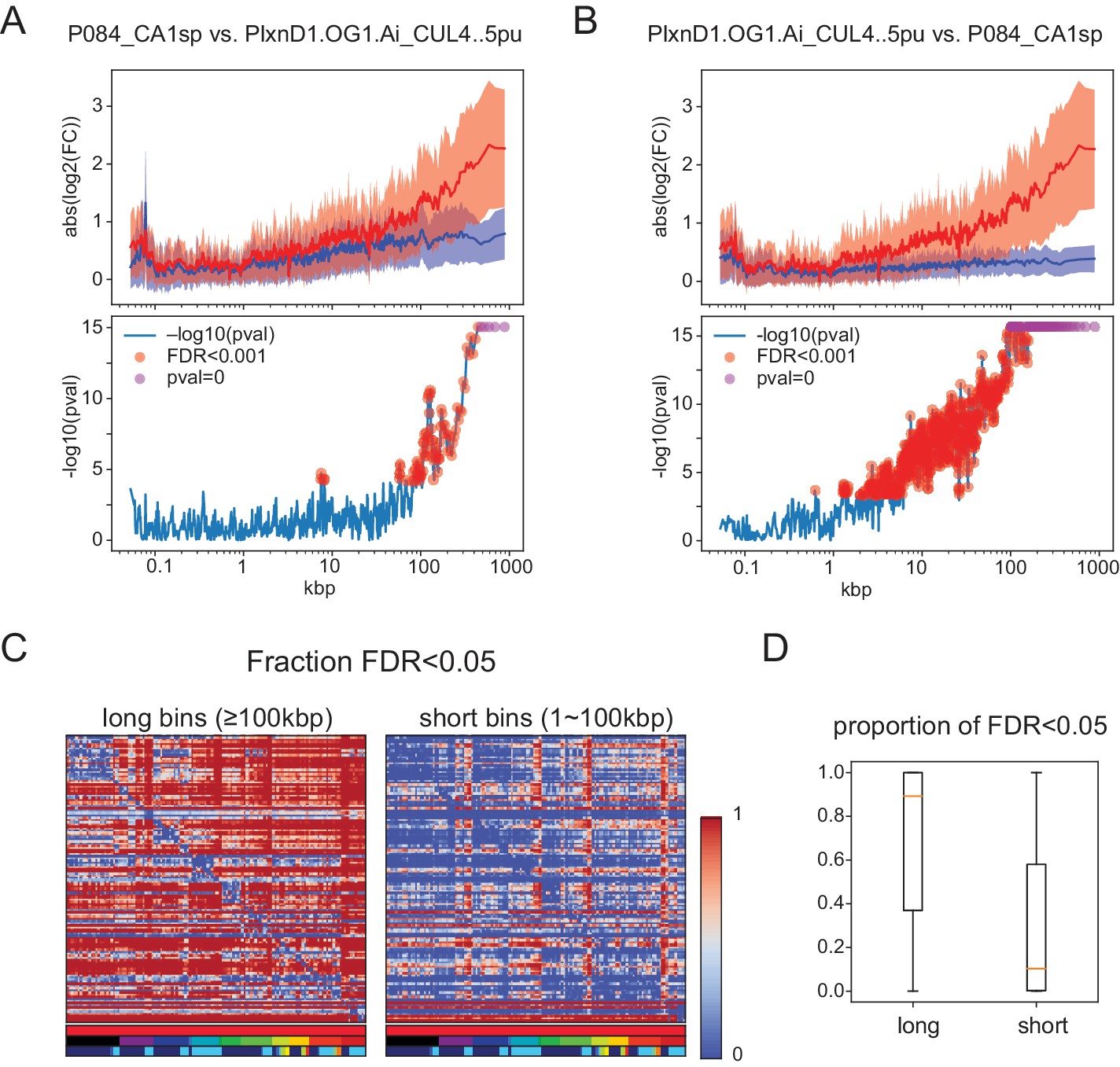
Significant length differences using the test proposed by Raman et al. (2018) evaluating length dependent differences by comparing expression ratios between groups to those within a single group.
(A,B) (Top panels) Mean and Std. Dev. of . Blue: same for . For A, Grp1 is P084_CAsp and Grp2 is PlxnD1.OG1.Ai_CUL4..5pu. For B, groups are reversed. Note that the results are not symmetric because the proposed test makes use of baseline variance in only one of the two groups. (Bottom panels) Negative for each bin. p-Values are calculated by Student’s t-test (two-sided, unequal variance). Red dots indicate bins with FDR ≤0.001. FDR (multiple tests correction) is calculated using all bins (n = 1245). Some bins have p-values below the machine precision (double float; ∼1e-308) indicated as pval = 0 (magenta dots). (C) Matrices of the fraction of significant long (Left) and short (right) bins calculated using the Raman et al. test. Horizontal color legends below each matrix label populations as in Figure 1—figure supplement 1, and Figures 4, 5 and 6: top row:sample type (red indicates all are sorted neurons), second row: brain region, third row: transmitter. Vertical color bar indicates fraction of gene bins that are significant. The matrices are asymmetric because test significance can vary depending on which population is used to calculate baseline FC. (D) Boxplots showing median (orange bar), and first to third interquartile ranges (boxes) for the same data shown in matrix form in C.
Figure 7—figure supplement 3

Regional bias of long gene expression in SC datasets.
Percentage of expression of the longest 500 genes in four single-cell datasets. Boxes show median and quartiles. Whiskers extend to 1.5 x inter-quartile range. CNS neurons are shown in red. Immature or PNS neurons are shown in blue. Nonneurons shown in green. Abbreviations: CTX: cortex, pyr: pyramidal, int: interneuron, PC: posterior cortex, FC: frontal cortex, HC: hippocampus, TH: thalamus, GP: globus pallidus externus and nucleus basalis, STR: striatum, CB: cerebellum, SN: substantia nigra and ventral tegmental area, Ent: Enteropeduncular nucleus and subthalamic nucleus, VisP: primary visual area, ALM: anterior lateral motor cortex.
Tables
Table 1
Summary of profiled samples.
https://doi.org/10.7554/eLife.38619.006| Region/type | Transmitter | #groups | Subregions | #samples | |
|---|---|---|---|---|---|
| CNS neurons | Olfactory (OLF) | glu | 10 | AOBmi, MOBgl, PIR, AOB, COAp | 30 |
| GABA | 4 | AOBgr, MOBgr, MOBmi | 11 | ||
| Isocortex | glu | 22 | VISp, AI, MOp5, MO, VISp6a, SSp, SSs, ECT, ORBm, RSPv | 68 | |
| GABA | 3 | Isocortex, SSp (Sst+, Pvalb+) | 7 | ||
| glu,GABA | 1 | RSPv | 3 | ||
| Subplate (CTXsp) | glu | 1 | CLA | 4 | |
| Hippocampus (HPF) | glu | 24 | CA1, CA1sp, CA2, CA3, CA3sp, DG, DG-sg, SUBd-sp, IG | 65 | |
| GABA | 4 | CA3, CA, CA1 (Sst+, Pvalb+) | 12 | ||
| Striatum (STR) | GABA | 12 | ACB, OT, CEAm, CEAl, islm, isl, CP | 33 | |
| Pallidum (PAL) | GABA | 1 | BST | 4 | |
| Thalamus (TH) | glu | 11 | PVT, CL, AMd, LGd, PCN, AV, VPM, AD | 29 | |
| Hypothalamus (HY) | glu | 11 | LHA, MM, PVHd, SO, DMHp, PVH, PVHp | 36 | |
| GABA | 4 | ARH, MPN, SCH | 15 | ||
| glu,GABA | 2 | SFO | 3 | ||
| Midbrain (MB) | DA | 2 | SNc, VTA | 5 | |
| glu | 2 | SCm, IC | 6 | ||
| 5HT | 2 | DR | 10 | ||
| GABA | 1 | PAG | 4 | ||
| glu,DA | 1 | VTA | 3 | ||
| Pons (P) | glu | 7 | PBl, PG | 22 | |
| NE | 1 | LC | 2 | ||
| 5HT | 2 | CSm | 7 | ||
| Medulla (MY) | GABA | 7 | AP, NTS, MV, NTSge, DCO | 18 | |
| glu | 6 | NTSm, IO, ECU, LRNm | 20 | ||
| ACh | 2 | DMX, VII | 6 | ||
| 5HT | 1 | RPA | 3 | ||
| GABA,5HT | 1 | RPA | 4 | ||
| glu,GABA | 1 | PRP | 3 | ||
| Cerebellum (CB) | GABA | 10 | CUL4, 5mo, CUL4, 5pu, CUL4, 5gr, PYRpu | 25 | |
| glu | 4 | CUL4, 5gr, NODgr | 10 | ||
| Retina | glu | 5 | ganglion cells (MTN, LGN, SC projecting) | 14 | |
| Spinal Cord | glu | 1 | Lumbar (L1-L5) dorsal part | 3 | |
| GABA | 4 | Lumbar (L1-L5) dorsal part, central part | 12 | ||
| PNS | Jugular | glu | 2 | (TrpV1+) | 7 |
| Dorsal root ganglion (DRG) | glu | 2 | (TrpV1+, Pvalb+) | 5 | |
| Olfactory sensory neurons (OE) | glu | 4 | MOE,VNO | 9 | |
| nonneuron | Microglia | 2 | MOp5(Isocortex),UVU(CB) (Cx3cr1+) | 6 | |
| Astrocytes | 1 | Isocortex (GFAP+) | 4 | ||
| Ependyma | 1 | Choroid Plexus | 2 | ||
| Ependyma | 2 | Lateral ventricle (Rarres2+) | 6 | ||
| Epithelial | 1 | Blood vessel (Isocortex) (Apod+, Bgn+) | 3 | ||
| Epithelial | 1 | olfactory epithelium | 2 | ||
| Progenitor | 1 | DG (POMC+) | 3 | ||
| Pituitary | 1 | (POMC+) | 3 | ||
| non brain | Pancreas | 2 | Acinar cell, beta cell | 7 | |
| Myofiber | 2 | Extensor digitorum longus muscle | 7 | ||
| Brown adipose cell | 1 | Brown adipose cell from neck. | 4 | ||
| total | 194 | 565 |
Additional files
-
Supplementary file 1
Table listing information for mouse lines.
Information (columns) includes regions profiled, source of the mouse line, repository ID and URL, whether atlas is available via the Janelia viewer, URL for other atlases, and relevant references.
- https://doi.org/10.7554/eLife.38619.029
-
Supplementary file 2
Table for sample information.
Included fields are, 1. sample_id: Sample ID; 2. sample_name: Sample Name; 3. group: Sample Group ID; 4. group_label: Label for Group; 5. sample_label: Label for Sample; 6. seqlane: Sequencing Lane ID; 7. mouseline: Mouse Line ID; 8. sample_code: Type of sample, cs.n: cell-type-specific neuronal sample; cs.o: cell-type-specific nonneuronal sample; ti.b: tissue sample from brain; ti.o: sample from non-brain tissue; cs.p: cell-type-specific progenitor sample; 9. region: Anatomical Region (large structure); 10. transmitter: Transmitter; 11. allenregion: Region using Allen Reference Atlas notation; 12. num_cells: Number of cells used in the sample; 13. age_(day): Postnatal age (in days) of the mouse; 14. sex: Sex of the mouse; 15. weight_(g): Weight (g) of the mouse; 16. ercc(10-̂5 dilution ul): Amount of added ERCC in ul. ( diluted); 17. ercc_mix: Which ERCC mix is used; 18. adaptor: Which Illumina (Solexa) sequencing adaptor is used; 19. total_reads: Total number of sequencing reads; 20. total_wo_ERCC: Total number of sequencing reads without reads mapping to ERCC; 21. read_length: Sequencing read length; 22. ercc%: Percentage of ERCC reads; 23. ribosomal_etc%: Percentage of reads mapping to ribosomal or other abundant sequences (phiX, polyC, polyA); 24. unmapped_reads%: Percentage of reads not mapped to mm10 genome; 25. unique_reads%: Percentage of reads uniquely mapped; 26. nonunique_reads%: Percentage of non-uniquely mapped reads; 27. short_insert%: Percentage of short (¡30 bp) reads; 28. mapped_reads: Number of mapped reads; 29. comments: Comments;
- https://doi.org/10.7554/eLife.38619.030
-
Supplementary file 3
Table listing public tissue samples used in analyses.
- https://doi.org/10.7554/eLife.38619.031
-
Transparent reporting form
- https://doi.org/10.7554/eLife.38619.032
Download links
A two-part list of links to download the article, or parts of the article, in various formats.
Downloads (link to download the article as PDF)
Open citations (links to open the citations from this article in various online reference manager services)
Cite this article (links to download the citations from this article in formats compatible with various reference manager tools)
Mapping the transcriptional diversity of genetically and anatomically defined cell populations in the mouse brain
eLife 8:e38619.
https://doi.org/10.7554/eLife.38619


