Image content is more important than Bouma’s Law for scene metamers
- Eberhard Karls Universität Tübingen, Germany
- Bernstein Center for Computational Neuroscience, Germany
- Baylor College of Medicine, United States
- Max Planck Institute for Biological Cybernetics, Germany
Figures
Figure 1 with 1 supplement
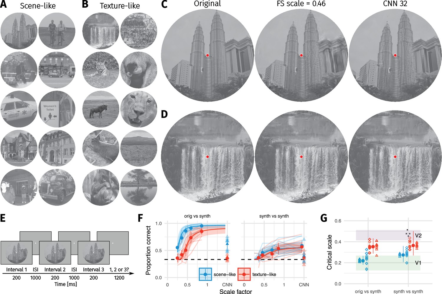
Two texture pooling models fail to match arbitrary scene appearance.
We selected ten scene-like (A) and ten texture-like (B) images from the MIT 1003 dataset (Judd et al., 2009, https://people.csail.mit.edu/tjudd/WherePeopleLook/index.html) and synthesised images to match them using the Freeman and Simoncelli model (FS scale 0.46 shown) or a model using CNN texture features (CNN 32; example scene and texture-like stimuli shown in (C) and (D) respectively). Images reproduced under a CC-BY license (https://creativecommons.org/licenses/by/3.0/) with changes as described in the Methods. (E): The oddity paradigm. Three images were presented in sequence, with two being physically-identical and one being the oddball. Participants indicated which image was the oddball (1, 2 or 3). On 'orig vs synth’ trials participants compared real and synthesised images, whereas on 'synth vs synth’ trials participants compared two images synthesised from the same model. (F): Performance as a function of scale factor (pooling region diameter divided by eccentricity) in the Freeman-Simoncelli model (circles) and for the CNN 32 model (triangles; arbitrary x-axis location). Points show grand mean SE over participants; faint lines link individual participant performance levels (FS-model) and faint triangles show individual CNN 32 performance. Solid curves and shaded regions show the fit of a nonlinear mixed-effects model estimating the critical scale and gain. Participants are still above chance for scene-like images in the original vs synth condition for the lowest scale factor of the FS-model we could generate, and for the CNN 32 model, indicating that neither model succeeds in producing metamers. (G): When comparing original and synthesised images, estimated critical scales (scale at which performance rises above chance) are lower for scene-like than for texture-like images. Points with error bars show population mean and 95% credible intervals. Triangles show posterior means for participants; diamonds show posterior means for images. Black squares show critical scale estimates of the four participants from Freeman and Simoncelli (2011) (x-position jittered to reduce overplotting); shaded regions denote the receptive field scaling of V1 and V2 estimated by Freeman and Simoncelli (2011). Data reproduced from Freeman and Simoncelli (2011) using WebPlotDigitizer v. 4.0.0 (Rohatgi, A., software under the GNU Affero General Public License v3, https://www.gnu.org/licenses/agpl-3.0.en.html).
Figure 1—figure supplement 1
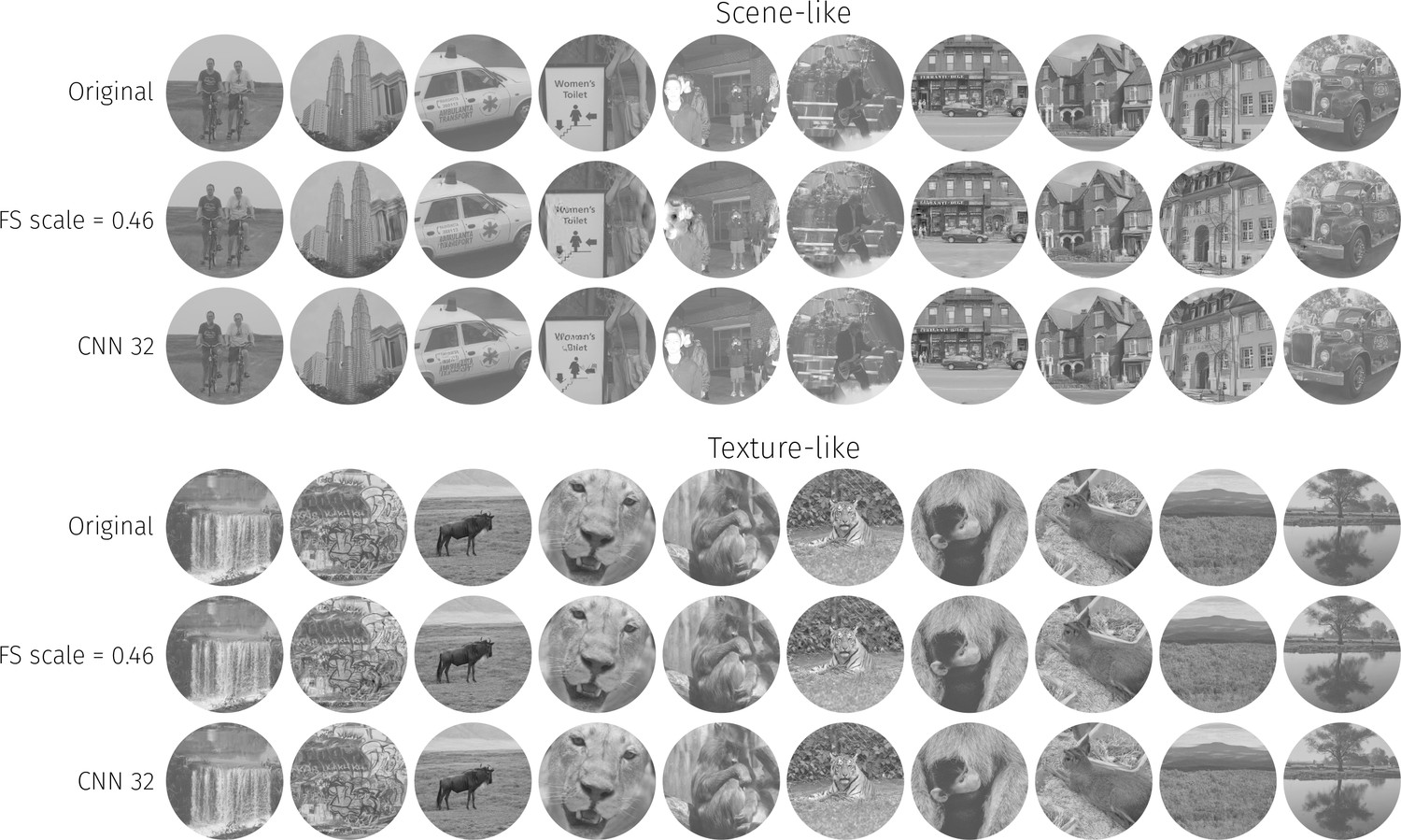
The ten scene-like and ten texture-like images used in our main experiments, along with example syntheses from the FS-0.46 and CNN 32 models (best viewed with zoom).
Images reproduced from the MIT 1003 Database (Judd et al., 2009, https://people.csail.mit.edu/tjudd/WherePeopleLook/index.html) under a CC-BY license (https://creativecommons.org/licenses/by/3.0/) with changes as described in the Methods.
Figure 2 with 1 supplement
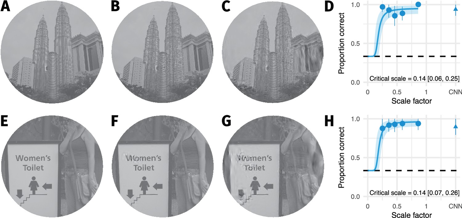
The two images with smallest critical scale estimates are highly discriminable even for the lowest scale factor we could generate.
(A) The original image. (B) An example FS synthesis at scale factor 0.25. (C) An example FS synthesis at scale factor 0.46. Images in B and C reproduced from the MIT 1003 Database (Judd et al., 2009), https://people.csail.mit.edu/tjudd/WherePeopleLook/index.html) under a CC-BY license (https://creativecommons.org/licenses/by/3.0/) with changes as described in the Methods. (D) The average data for this image. Points and error bars show grand mean and SE over participants, solid curve and shaded area show posterior mean and 95% credible intervals from the mixed-effects model. Embedded text shows posterior mean and 95% credible interval on the critical scale estimate for this image. (E–H) Same as A–D for the image with the second-lowest critical scale. Note that in both cases the model is likely to overestimate critical scale.
Figure 2—figure supplement 1
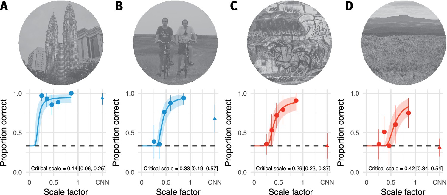
Images with the highest and lowest critical scale estimates within the scene-like and texture-like categories for the orig vs synth comparison.
(A) Scene-like image with the lowest critical scale estimate. Points and error bars show grand mean and ±2 SE over participants, solid curve and shaded area show posterior mean and 95Inline text shows posterior mean and 95B: Scene-like image with the highest critical scale estimate. (C) Texture-like image with the lowest critical scale estimate. (D) Texture-like image with the highest critical scale estimate. Images reproduced from the MIT 1003 Database (Judd et al., 2009, https://people.csail.mit.edu/tjudd/WherePeopleLook/index.html) under a CC-BY license (https://creativecommons.org/licenses/by/3.0/) with changes as described in the Methods.
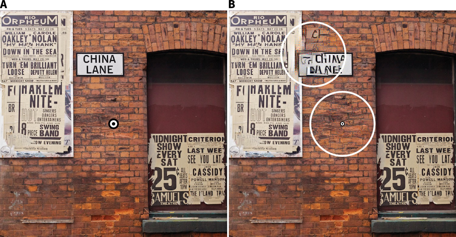
Figure 3

Sensitivity to local texture distortions depends on image content.
(A) A circular patch of an image was replaced with a texture-like distortion. In different experimental conditions the radius of the patch was varied. (B) Two example images in which a ’scene-like’ or inhomogenous region is distorted (red cross). (C) Two example images in which a ’texture-like’ or homogenous region is distorted (red cross). (D) Examples of an original image and the four distortion sizes used in the experiment. Images in B–D reproduced from the MIT 1003 Database (Judd et al., 2009), https://people.csail.mit.edu/tjudd/WherePeopleLook/index.html) under a CC-BY license (https://creativecommons.org/licenses/by/3.0/) with changes as described in the Methods. (E) Depiction of the 2IFC task, in which the observer reported whether the first or second image contained the distortion. (F) Proportion correct as a function of distortion radius in scene-like (blue) and texture-like (red) image regions. Lines link the performance of each observer (each point based on a median of 51.5 trials; min 31, max 62). Points show mean of observer means, error bars show SEM.
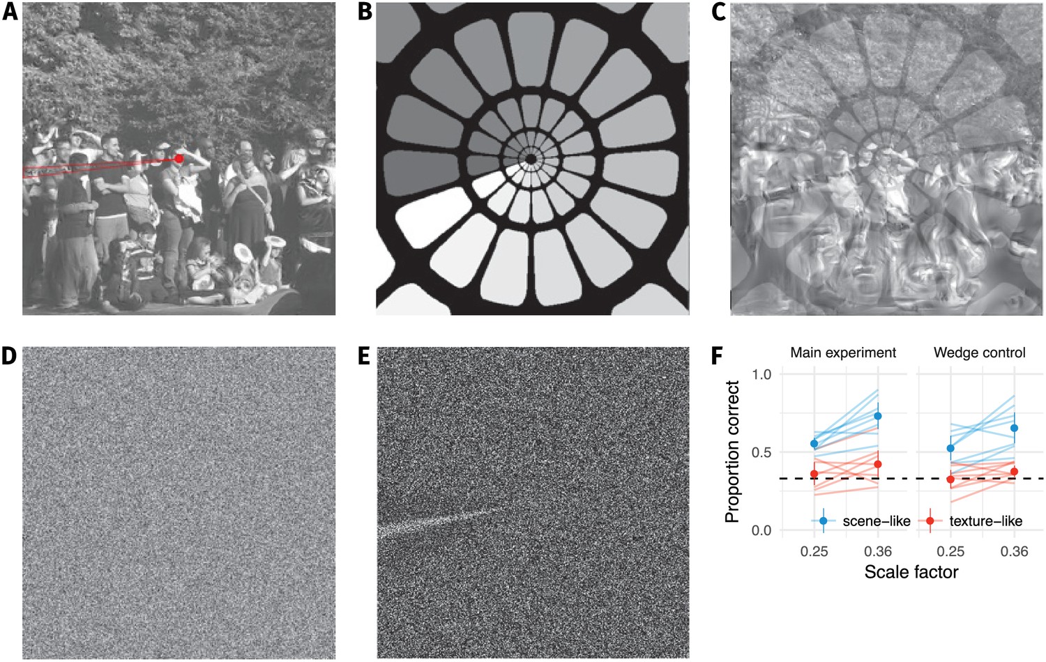
Figure 4 with 1 supplement

The visibility of texture-like distortions depends on image content.
(A) 'Geotemporal Anomaly’ by Pete Birkinshaw (2010: https://www.flickr.com/photos/binaryape/5203086981, re-used under a CC-BY 2.0 license: https://creativecommons.org/licenses/by/2.0/uk/). The image has been resized and a circular bullseye has been added to the centre. (B) Two texture-like distortions have been introduced into circular regions of the scene in A (see Figure 4—figure supplement 1 for higher resolution). The distortion in the upper-left is quite visible, even with central fixation on the bullseye, because it breaks up the high-contrast contours of the text. The second distortion occurs on the brickwork centered on the bullseye, and is more difficult to see (you may not have noticed it until reading this caption). The visibility of texture-like distortions can depend more on image content than on retinal eccentricity (see also Figure 3). (C) Results synthesised from the FS-model at scale 0.46 for comparison. Pooling regions depicted for one angular meridian as overlapping red circles; real pooling regions are smooth functions tiling the whole image. Pooling in this fashion reduces large distortions compared to B, but our results show that this is insufficient to match appearance.
Figure 4—figure supplement 1
Higher-resolution versions of the images from Figure 4.
(A) 'Geotemporal Anomaly' by Pete Birkinshaw (2010: https://www.flickr.com/photos/binaryape/5203086981, re-used under a CC-BY 2.0 license: https: //creativecommons.org/licenses/by/2.0/uk/). The image has been resized and a circu- lar bullseye has been added to the centre. (B) The image from A with two circular texture-like distortions (circles enclose distorted area) created using the Gatys et al. (2015) texture synthesis algorithm.
Appendix 1—figure 1
Our results do not depend on an artifact in the synthesis procedure.
(A) During our pilot testing, we noticed a wedge-like artifact in the synthesis procedure of Freeman and Simoncelli (highlighted in red wedge; image from https://github.com/freeman-lab/metamers and shared under a CC-BY license (https://creativecommons.org/licenses/by/3.0/)). The artifact occurred where the angular pooling regions wrapped from 0 to (B) pooling region contours shown with increasing greyscale to wrap point, (C) overlayed on scene with artifact. (D) The artifact was not driven by image content, because it also occurred when synthesising to match white noise (shown with enhanced contrast in (E)). If participants’ good performance at small scale factors was due to taking advantage of this wedge, removing it by masking out that image region should drop performance to chance. (F) Performance at the two smallest scale factors replotted from the main experiment (left) and with a wedge mask overlayed (right) in the orig vs synth comparison. Points show average (±2SE) over participants; faint lines link individual participant means. Performance remains above chance for the scene-like images, indicating that the low critical scales we observed were not due to the wedge artifact.
Appendix 1—figure 2
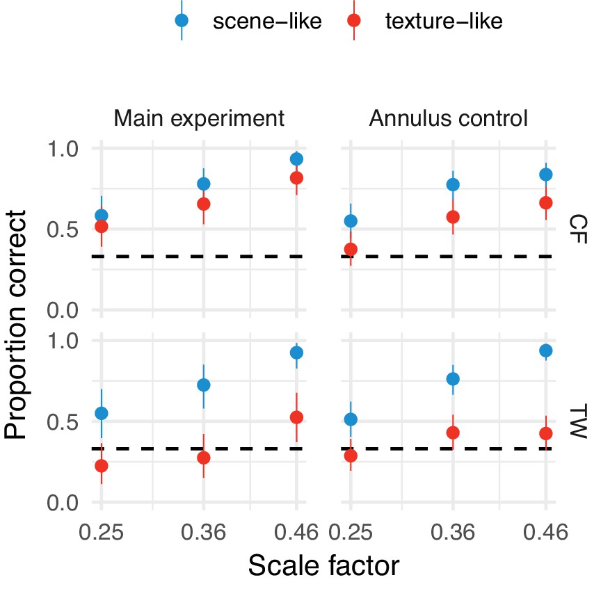
Our results do not depend on any potential annular artifact resulting from the synthesis procedure.
Performance at the three smallest scale factors replotted from the main experiment (left) and with an annular mask overlayed (right) in the orig vs synth comparison for authors TW and CF. Points show average performance (error bars show 95% beta distribution confidence limits). Performance remains above chance for the scene-like images, indicating that the low critical scales we observed were not due to a potential annular artifact.
Appendix 1—figure 3
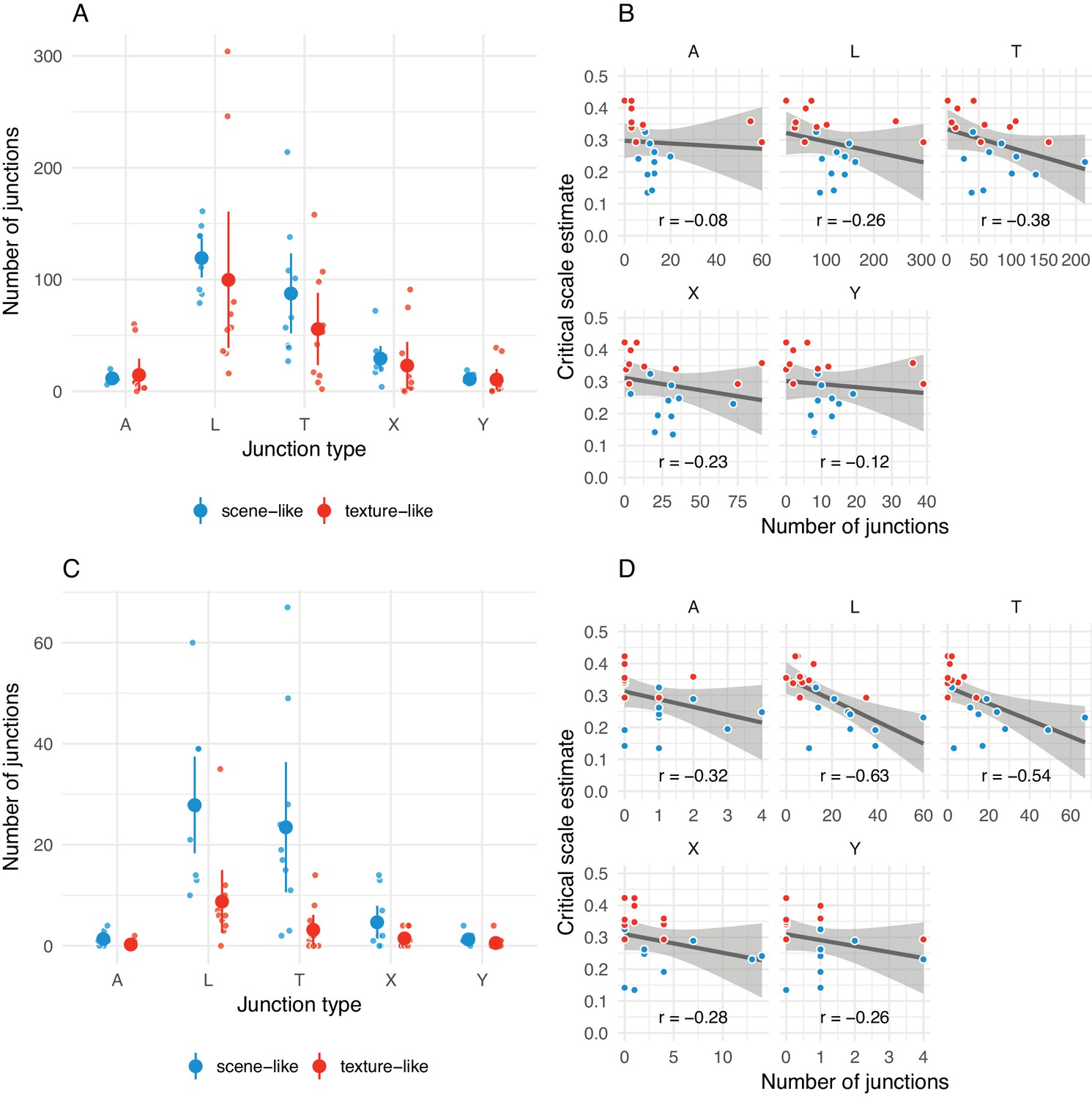
The number of junctions present in original images may be related to critical scale estimates.
(A) Distribution of arrow (A), L-, T-, X- and Y-junctions at all scales and all levels of ‘meaningfulness’ (Xia et al., 2014) in scene-like and texture-like images. Each small point is one image; larger points with error bars show mean ±2 SE. Points have been jittered to aid visibility. (B) Correlations between number of junctions of each type with critical scale estimates for that image from the main experiment. Grey line shows linear model fit with shaded region showing 95% confidence area. Pearson correlation coefficient shown below. Note that the x-axis scales in the subplots differ. (C) Same as A but for junctions defined with a more strict ‘meaningfulness’ cutoff of (Xia et al., 2014). (D) Same as B for more ‘meaningful’ junctions as in C.
Appendix 1—figure 4

Results from the main paper replicated under an ABX task.
(A) Performance in the ABX task as a function of scale factor. Points show grand mean ±2 SE over participants; faint lines link individual participant performance levels. Solid curves and shaded regions show the fit of a nonlinear mixed-effects model estimating the critical scale and gain. (B) When comparing original and synthesised images, estimated critical scales (scale at which performance rises above chance) are lower for scene-like than for texture-like images. Points with error bars show population mean and 95% credible intervals. Triangles show posterior means for participants; diamonds show posterior means for images. Black squares show critical scale estimates of the four participants from Freeman and Simoncelli reproduced from that paper (x-position jittered to reduce overplotting); shaded regions denote the receptive field scaling of V1 and V2 estimated by Freeman and Simoncelli.
Appendix 2—figure 1

Methods for the CNN scene appearance model.
(A) The average activations in a subset of CNN feature maps were computed over non-overlapping radial and angular pooling regions that increase in area away from the image centre (not to scale), for three spatial scales. Increasing the number of pooling regions (CNN 4 and CNN 8 shown in this example) increases the fidelity of matching to the original image, restricting the range over which distortions can occur. Higher-layer CNN receptive fields overlap the pooling regions, ensuring smooth transitions between regions. The central 3° of the image (grey fill) is fixed to be the original. (B) The image radius subtended 12.5°. (C) An original image from the MIT1003 dataset. (D) Synthesised image matched to the image from C by the CNN 8 pooling model. (E) Synthesised image matched to the image from E by the CNN 32 pooling model. Fixating the central bullseye, it should be apparent that the CNN 32 model preserves more information than the CNN 8 model, but that the periphery is nevertheless significantly distorted relative to the original. Images from the MIT 1003 dataset (Judd et al., 2009), (https://people.csail.mit.edu/tjudd/WherePeopleLook/index.html) and reproduced under a CC-BY license (https://creativecommons.org/licenses/by/3.0/) with changes as described in the Materials and methods.
Appendix 2—figure 2

Performance for discriminating model syntheses and original scenes for single- and multi-scale models (all with pooling regions corresponding to CNN 32) for participants CF and TW.
Points show participant means (error bars show ±2 SEM), dashed line shows chance performance. The multiscale model with three scales produces close-to-chance performance.
Appendix 2—figure 3
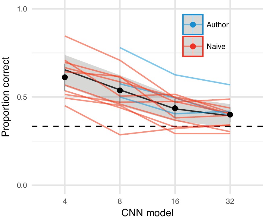
The CNN model comes close to matching appearance on average.
Oddity performance as a function of the CNN image model. Points show mean over participants (error bars ±2 SEM), coloured lines link the mean performance of each participant for each pooling model. For most participants, performance falls to approximately chance (dashed horizontal line) for the CNN 32 model. Black line and shaded regions show the mean and 95% credible intervals on the population mean derived from a mixed-effects model.
Appendix 2—figure 4
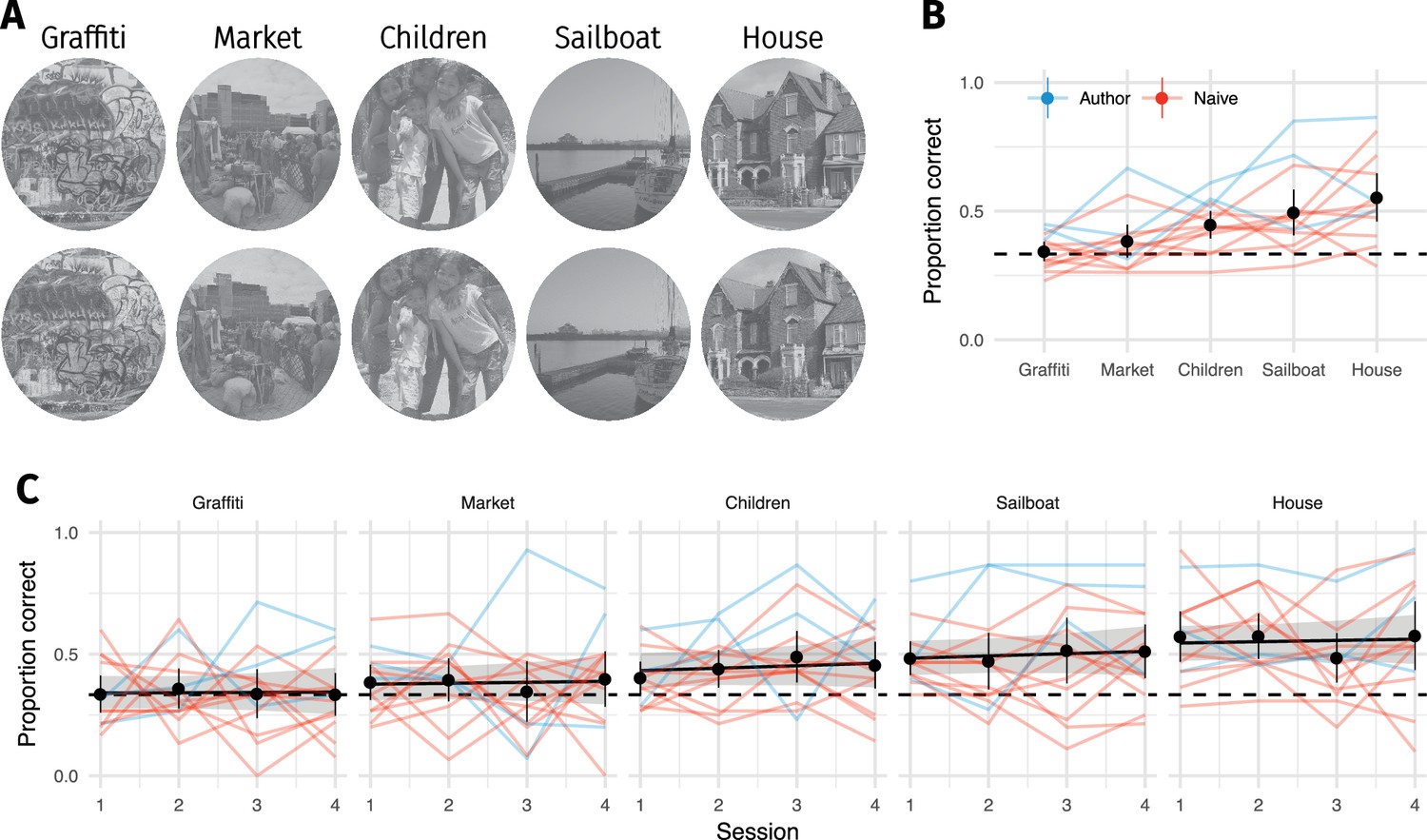
Familiarity with original image content did not improve discrimination performance.
(A) Five original images (top) were repeated 60 times (interleaved over 4 blocks), and observers discriminated them from CNN 32 model syntheses (bottom). (B) Proportion of correct responses for each image from A. Some images are easier than others, even for the CNN 32 model. (C) Performance as a function of each 75-trial session reveals little evidence that performance improves with repeated exposure. Points show grand mean (error bars show bootstrapped 95% confidence intervals), lines link the mean performance of each observer for each pooling model (based on at least 5 trials; median 14). Black line and shaded region shows the posterior mean and 95% credible intervals of a logistic mixed-effects model predicting the population mean performance for each image. Images from the MIT 1003 dataset (Judd et al., 2009, https://people.csail.mit.edu/tjudd/WherePeopleLook/index.html) and reproduced under a CC-BY license (https://creativecommons.org/licenses/by/3.0/) with changes as described in the Materials and methods.
Appendix 2—figure 5
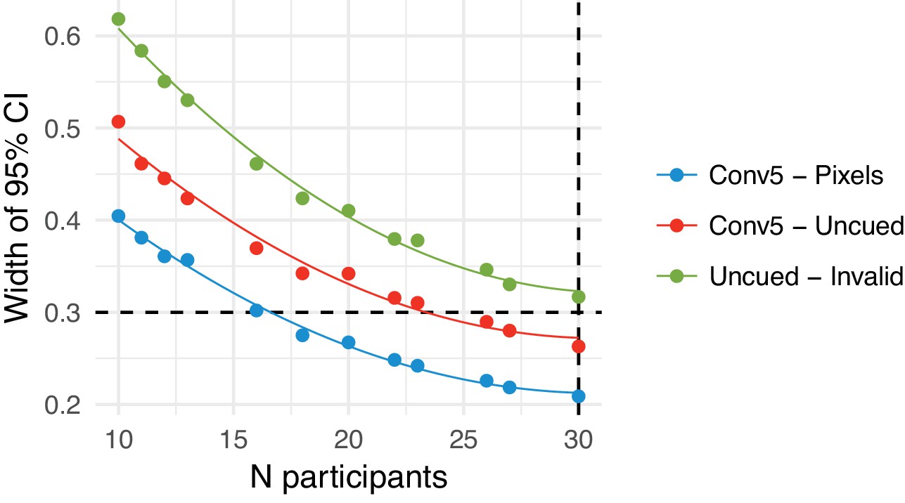
Parameter precision as a function of number of participants.
(A) Width of the 95% credible interval on three model parameters as a function of the number of participants tested. Points show model fit runs (the model was not re-estimated after every participant due to computation time required). We aimed to achieve a width of 0.3 (dashed horizontal line) on the linear predictor scale, or stop after 30 participants. The Uncued - Invalid parameter failed to reach the desired precision after 30 participants. Lines show fits of a quadratic polynomial as a visual guide.
Appendix 2—figure 6
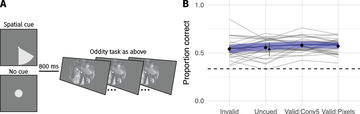
Cueing spatial attention has little effect on performance.
(A) Covert spatial attention was cued to the area of the largest difference between the images (70% of trials; half from conv5 feature MSE; half from pixel MSE) via a wedge stimulus presented before the trial. On 15% of trials the wedge cued an invalid location (smallest pixel MSE), and on 15% of trials no cue was provided (circle stimulus). (B) Performance as a function of cueing condition for 30 participants. Points show grand mean (error bars show SE), lines link the mean performance of each observer for each pooling model (based on at least 30 trials; median 65). Blue lines and shaded area show the population mean estimate and 95% credible intervals from the mixed-effects model. Triangle in the Uncued condition replots the average performance from CNN 8 in Figure 3 for comparison. Images from the MIT 1003 dataset (Judd et al., 2009, https://people.csail.mit.edu/tjudd/WherePeopleLook/index.html) and reproduced under a CC-BY license (https://creativecommons.org/licenses/by/3.0/) with changes as described in the Materials and methods.
Appendix 2—figure 7
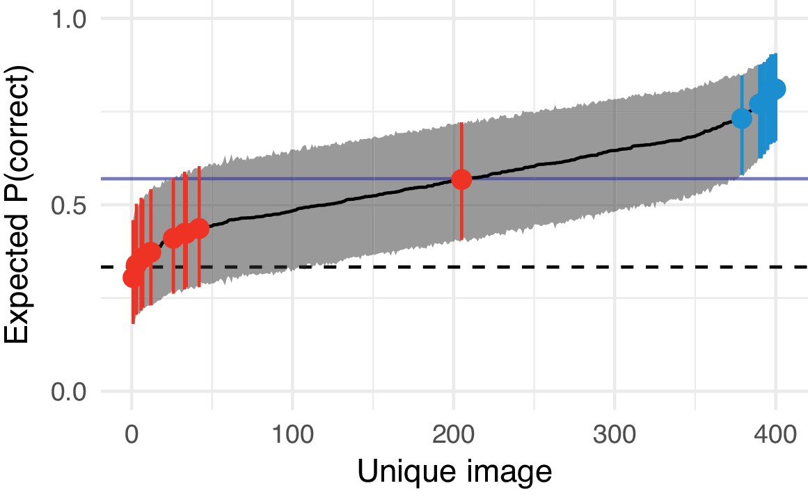
Estimated difficulty of each image in Experiment 3 (syntheses with the CNN 8 model) and the images chosen to form the texture- and scene-like categories in the main experiment.
Solid black line links model estimates of each image’s difficulty (the posterior mean of the image-specific model intercept, plotted on the performance scale). Shaded region shows 95% credible intervals. Dashed horizontal line shows chance performance; solid blue horizontal line shows mean performance. Red and blue points denote the images chosen as texture- and scene-like images in the main experiment respectively. The red point near the middle of the range is the ‘graffiti’ image from the experiments above.
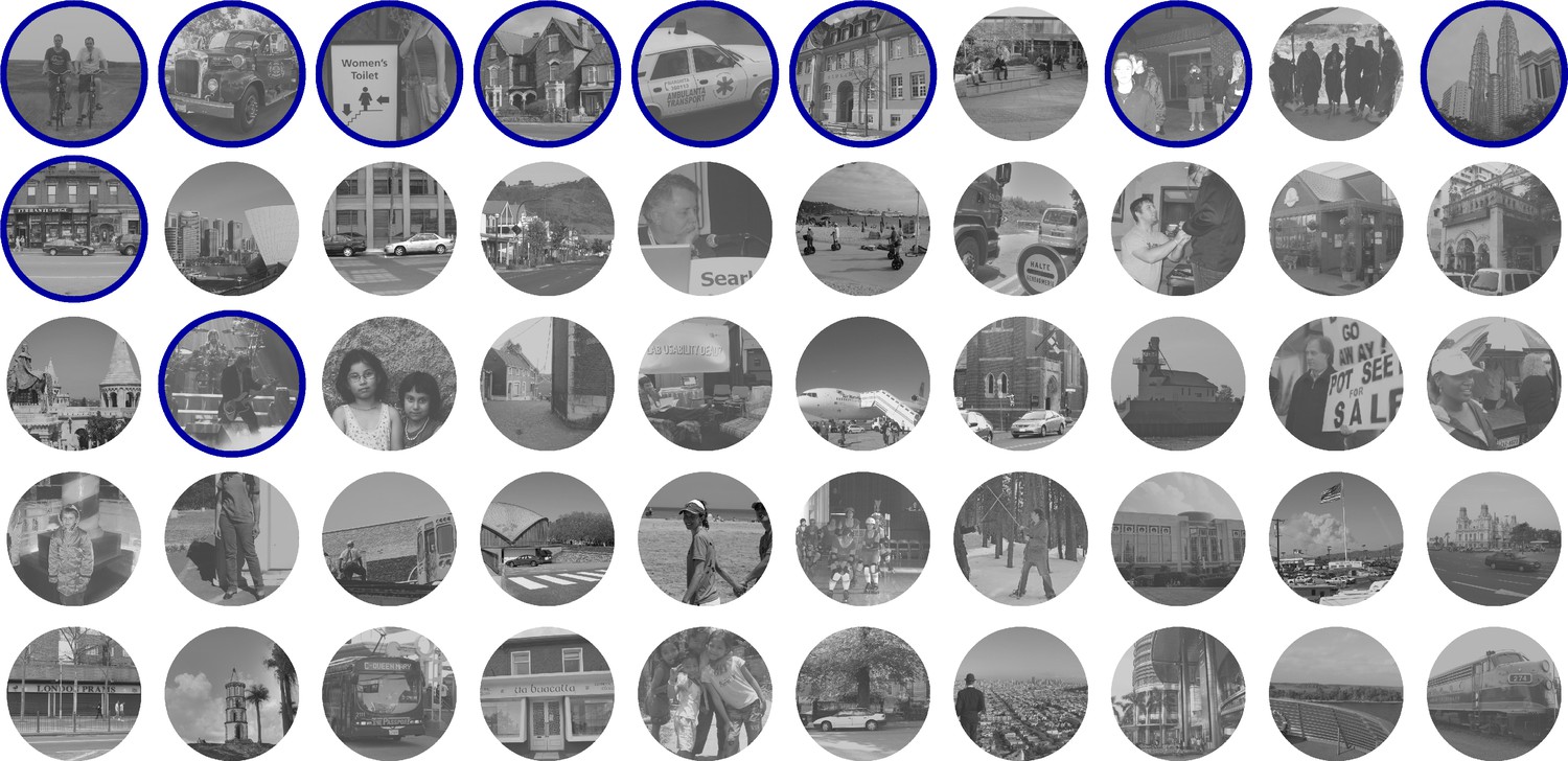
Appendix 2—figure 8
The 50 easiest images from Appendix 2—figure 7 where difficulty increases left-to-right, top-to-bottom.
Images chosen for the main experiment as ‘scene-like’ are circled in blue. Images from the MIT 1003 dataset (Judd et al., 2009, https://people.csail.mit.edu/tjudd/WherePeopleLook/index.html) and reproduced under a CC-BY license (https://creativecommons.org/licenses/by/3.0/).
Appendix 2—figure 9
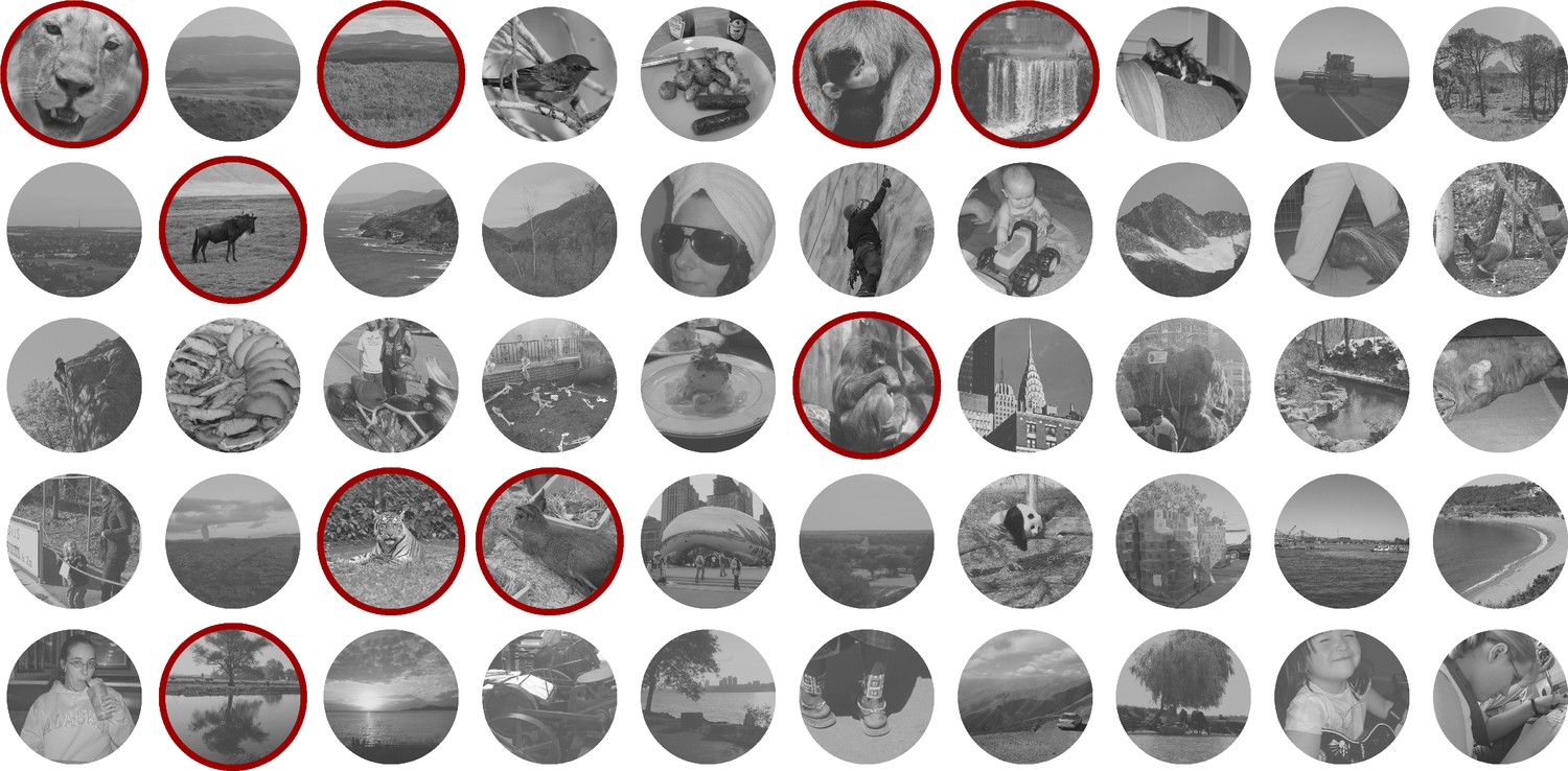
The 50 hardest images from Appendix 2—figure 7 where difficulty decreases left-to-right, top-to-bottom.
Images chosen for the main experiment as ‘texture-like’ are circled in red. Images from the MIT 1003 dataset (Judd et al., 2009, https://people.csail.mit.edu/tjudd/WherePeopleLook/index.html) and reproduced under a CC-BY license (https://creativecommons.org/licenses/by/3.0/).
Appendix 2—figure 10
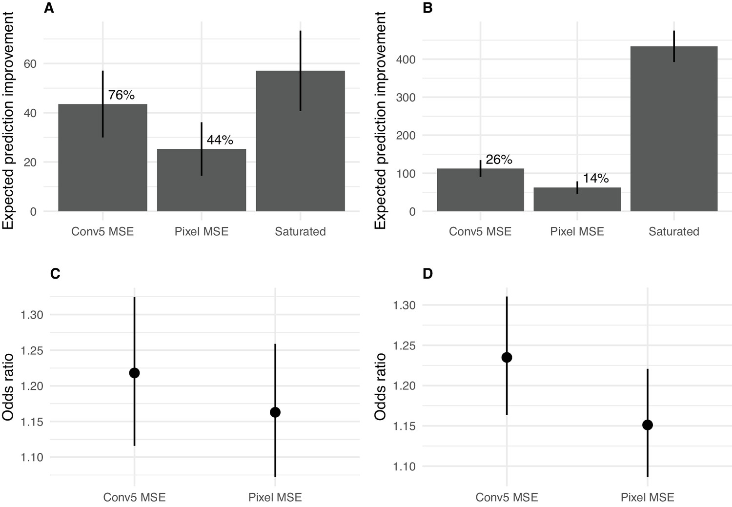
Predicting image difficulty using image-based metrics.
(A) Expected prediction improvement over a baseline model for models fit to the data from Experiment 1 (Appendix 2—figure 3), as estimated by the LOOIC (Vehtari et al., 2016). Values in deviance units (−2 * log likelihood; higher is better). Error bars show ±2 1 SE. Percentages are expected prediction improvement relative to the saturated model. (B) Same as A but for the data from Experiment 3 (Appendix 2—figure 6). (C) Odds of a success for a one SD increase in the image predictor for data from Experiment 1. Points show mean and 95% credible intervals on odds ratio (exponentiated logistic regression weight). (D) As for C for Experiment 3.
Additional files
-
Transparent reporting form
- https://doi.org/10.7554/eLife.42512.010
Download links
A two-part list of links to download the article, or parts of the article, in various formats.
Downloads (link to download the article as PDF)
Open citations (links to open the citations from this article in various online reference manager services)
Cite this article (links to download the citations from this article in formats compatible with various reference manager tools)
Image content is more important than Bouma’s Law for scene metamers
eLife 8:e42512.
https://doi.org/10.7554/eLife.42512


