Seminal fluid compromises visual perception in honeybee queens reducing their survival during additional mating flights
- University of Copenhagen, Denmark
- The University of Western Australia, Australia
- University of California, Riverside, United States
Figures
Figure 1 with 3 supplements

Semen and seminal fluid inseminations cause expression changes in honeybee queen brains, as revealed by Non-metric Multidimensional Scaling (NMDS) of Bray-Curtis dissimilarities between brain samples based on the 1327 differentially expressed genes identified with DESeq2 analyses.
Samples from truly inseminated queens (semen and pure seminal fluid without sperm) are separated from controls (Hayes saline and mechanical mock insemination) after removal of batch effect caused by two distinct RNA-sequencing experiments being combined. A stress value well below 0.2 of the NMDS analysis indicates that after reduction to two dimensions the plot captures the relevant variation fairly well.
-
Figure 1—source data 1
Table of normalized counts after variance stabilizing transformation, removal of experimental batch effect by removeBatchEffect function in edgeR v.3.12.1 and centring over the mean across samples, used as input for ordination analysis in Paleontological Statistics v.3.04.
- https://doi.org/10.7554/eLife.45009.007
Figure 1—figure supplement 1
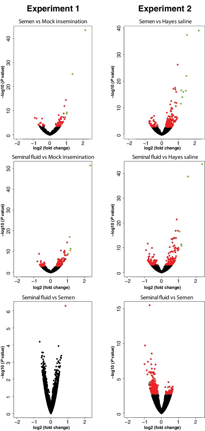
Volcano plots presenting significance (-log10 (P value)) versus log2 (fold change) for all pair-wise comparisons between treatment groups in RNA-sequencing Experiments 1 and 2.
Genes with unchanged expression are plotted as black dots, differentially expressed genes with FDR < 0.05 as red dots, genes with log2 (fold change)>1 as orange dots, and genes with both FDR < 0.05 and log2 (fold change)>1 as green dots.
Figure 1—figure supplement 2
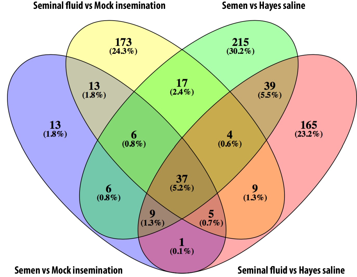
Venn diagram showing overlap between differentially expressed genes identified in each of the pair-wise comparisons of insemination treatments against controls across the two experiments.
https://doi.org/10.7554/eLife.45009.005
Figure 1—figure supplement 3
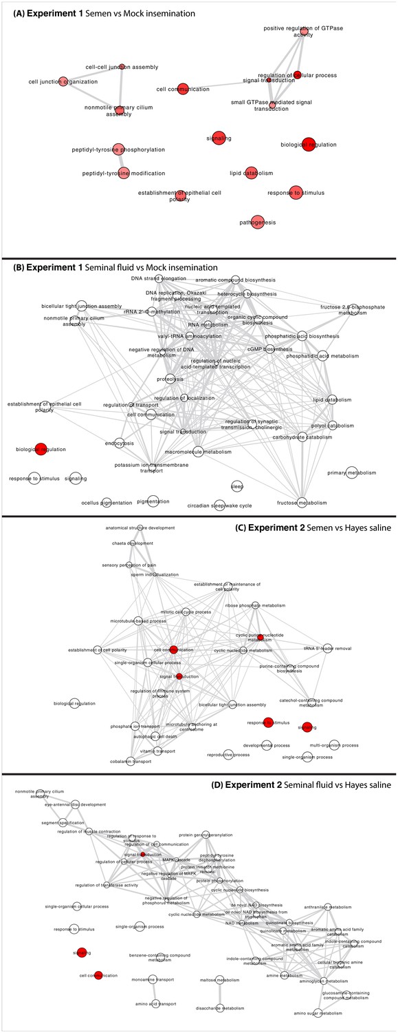
Networks representing interactions between enriched GO terms (p<0.05) in all pair-wise comparisons between insemination treatment groups in Experiments 1 and 2.
Circle colours represent enrichment P values (red more significant, white less significant, but still below 0.05) and circle sizes are proportional to the frequency of GO terms in the underlying Gene Ontology Annotation (GOA) database (Barrell et al., 2009). Highly similar GO terms are linked by grey-line edges with line-width indicating degree of semantic similarity (the distance between terms is based on the likeness of their meaning). Nodes are placed based on an edge-weighted spring-embedded layout algorithm, which keeps nodes with higher semantic similarity closer together.
Figure 2
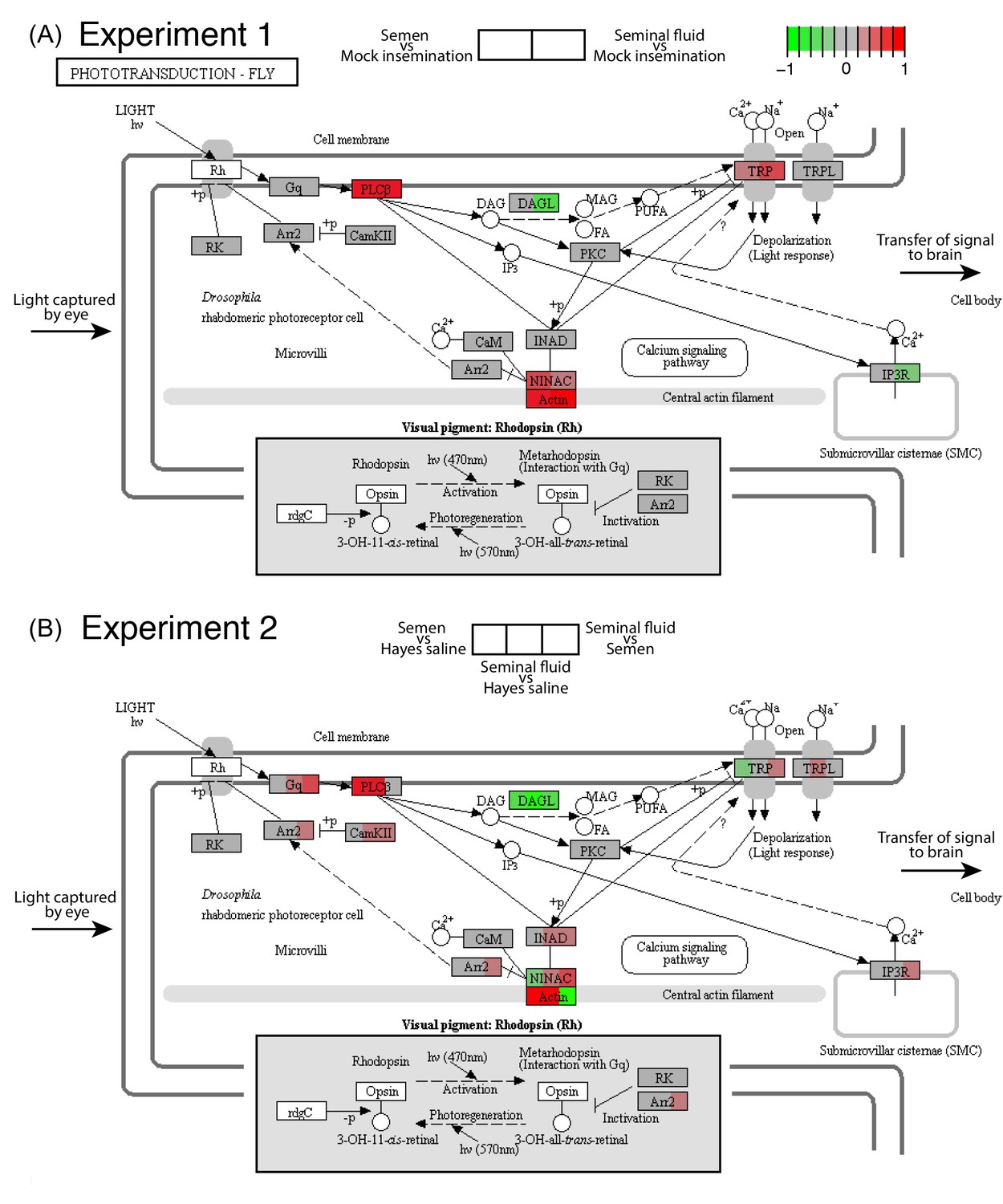
Seminal fluid and semen induce expression changes in honeybee queen brains for genes mapping to the phototransduction pathway of Drosophila in both Experiment 1 (A) and Experiment 2 (B).
The plotted KEGG model represents the microvillus of a photoreceptor cell with the major proteins in the pathway shown by rectangles. Photoreceptors use the pigment rhodopsin (bottom grey panel) to absorb light, after which phospholipase protein C (PLC), upon activation via rhodopsin and the G-protein Gq, hydrolyzes phosphatidyl-inositol 4,5-bisphosphate (PIP2) to generate diacylglycerol (DAG), inositol 1,4,5-trisphosphate (InsP3) and a proton, resulting in the activation of two classes of Ca2+-permeable cation channels, TRP and TRPL (Hardie, 2012) (top right). Several components of the cascade, including TRP, PLC, and protein kinase C (PKC), are assembled into multimolecular signaling complexes by the scaffolding protein INAD (Hardie, 2012), which has been suggested to be linked to the central F-actin filament via the ninaC class III myosin (Hicks et al., 1996) (bottom centre). The electrical impulses generated by light absorption reach the brain through the visual fibres of photoreceptor cells, which extend into the optic lobes (Ehmer and Gronenberg, 2002; Wernet et al., 2015). Results of Experiment 1 and Experiment 2 are shown in separate panels with quadrants within each protein-rectangle showing differences in the expression of the underlying coding genes of the first treatment group in each pair-wise comparison, relative to the second treatment group as shown above each of the figure panels (red for up-regulation, green for down-regulation, grey if no significant difference between treatments was detected but the gene was expressed in our datasets, white if the gene was not expressed).
-
Figure 2—source data 1
Table of log2 (fold change) for each pair-wise comparison between treatment groups of genes mapping to the Drosophila phototransduction pathway.
- https://doi.org/10.7554/eLife.45009.009
Figure 3 with 3 supplements
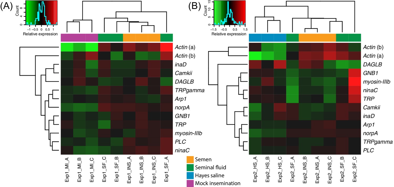
Heatmaps of gene expression for genes mapping to the phototransduction pathway in Experiment 1 (A) or Experiment 2 (B).
Colours in each cell represent counts normalized by variance stabilizing transformation (Huber et al., 2003), which were then centred over the mean across samples. Only genes having expression differences between treatment groups above noise levels based on separate analyses performed with the essGene function (R Bioconductor package GAGE) in Experiment 1 or two are shown (legends to the right). Column and row dendrograms represent sample and gene clustering, respectively, based on Euclidean distances, reflecting that samples represent different treatments (central legend at the bottom) and that gene expression reacted differently to treatments. Small plots towards the top left of panels represent colour legends for expression values (x axis), and the distribution of gene counts (y axis) for these values across all genes and samples is depicted by blue lines. Bottom legends: MI = mock insemination, SF = seminal fluid insemination, INS = semen insemination, and HS = Hayes saline insemination.
-
Figure 3—source data 1
Tables of normalized counts after variance stabilizing transformation and centring over the mean across samples for genes in the phototransduction pathway showing expression changes over noise levels based on the essGene function in GAGE.
Data for RNA-sequencing Experiments 1 and 2 are reported in separate sheets.
- https://doi.org/10.7554/eLife.45009.014
Figure 3—figure supplement 1
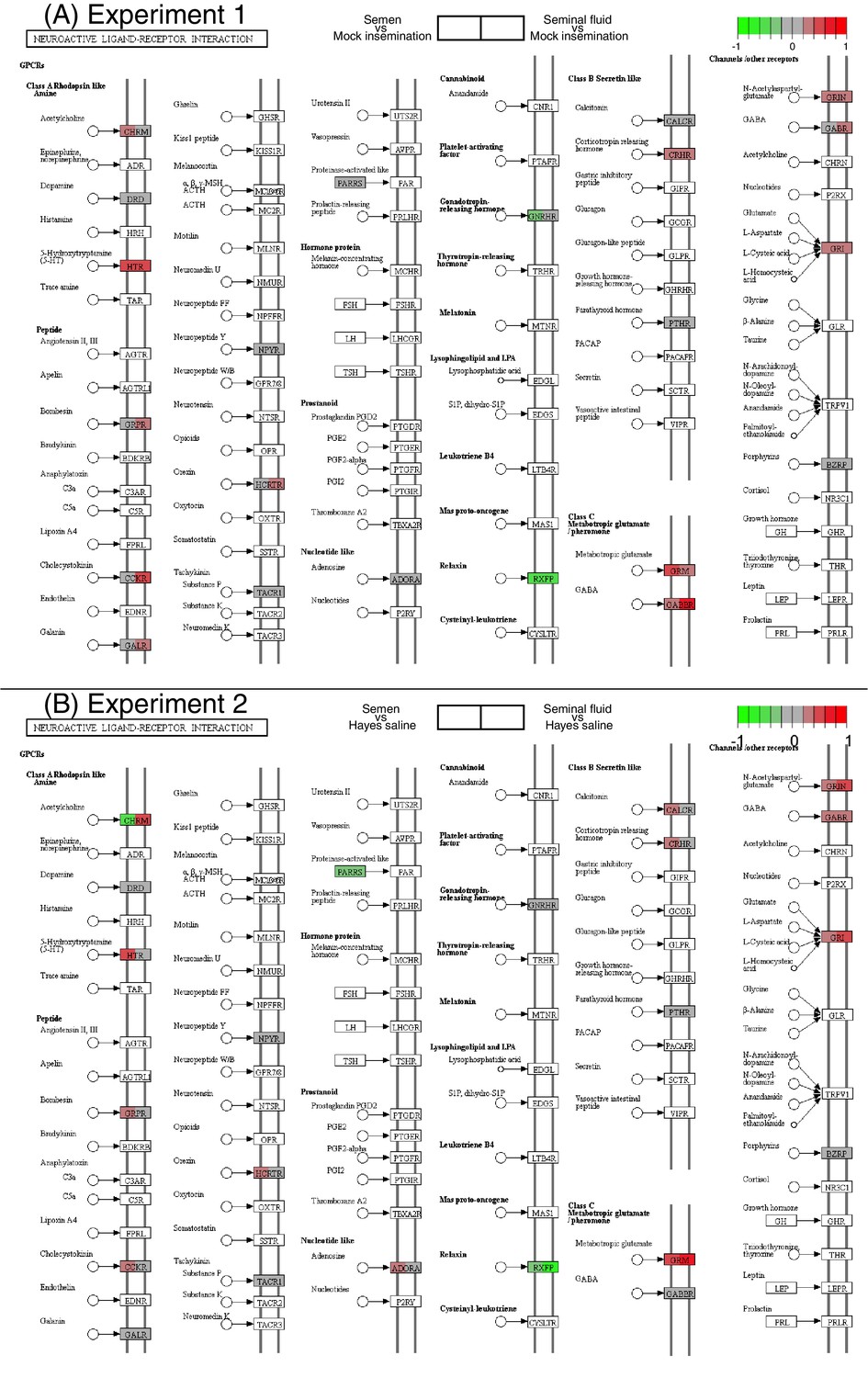
Differences in expression between pair-wise combinations of treatment groups of genes mapping to the KEGG neuroactive ligand-receptor interaction pathway for Experiments 1 and 2.
Separately colour-marked quadrants within each gene box show differences in expression for the first treatment group relative to the second in each pair-wise comparison as explained in the legends above the figure panels (red for up-regulation, green for down-regulation, grey if no significant difference between treatments was detected but the gene was expressed in our datasets, white if the gene was not expressed).
Figure 3—figure supplement 2
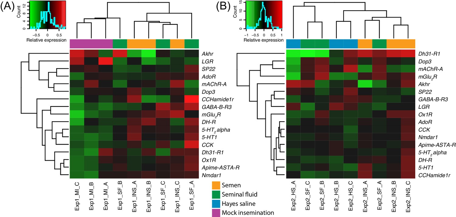
Heatmaps of gene expression for genes mapping to the KEGG neuroactive ligand-receptor interaction pathway in Experiments 1 (A) or 2 (B).
Colours in each cell represent counts normalized by variance stabilizing transformation (Huber et al., 2003), which were then centred over the mean across samples. Only genes having expression differences between treatment groups above noise levels based on separate analyses performed with the essGene function (R, R Core Development Team, 2015; Bioconductor package GAGE, Luo et al., 2009) in Experiment one and/or two are shown (legends to the right). Column and row dendrograms represent sample and gene clustering, respectively, based on Euclidean distances, reflecting that samples represent different treatments (central legend at the bottom). Small plots towards the top left of panels represent colour legends for expression values (x axis), and the distribution of gene counts (y axis) for these values across all genes and samples is depicted by blue lines. Bottom legends: MI = mock insemination, SF = seminal fluid insemination, INS = semen insemination, and HS = Hayes saline insemination.
Figure 3—figure supplement 3
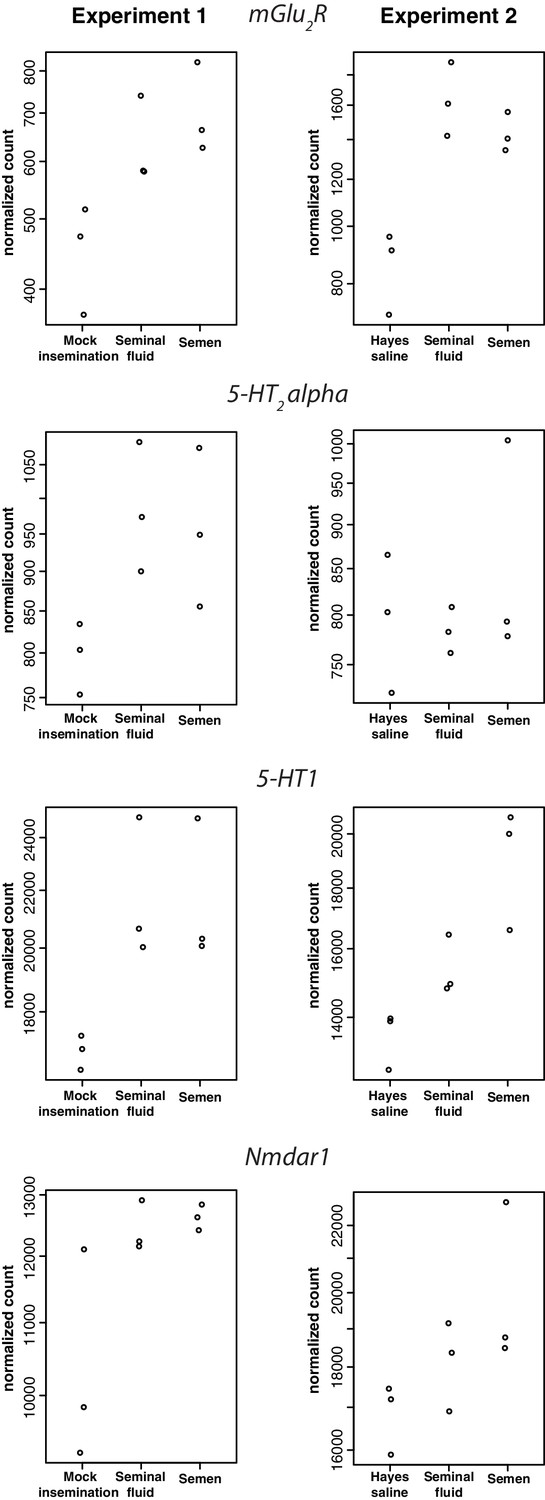
Receptor genes for, respectively, glutamate (first plot), serotonin (second and third plots), and N-Methyl-D-aspartic acid (last plot), showing consistent expression differences between insemination treatments in individual RNA-sequencing samples of honeybee brains in Experiment 1 (left panels) and Experiment 2 (right panels).
https://doi.org/10.7554/eLife.45009.013
Figure 4 with 4 supplements
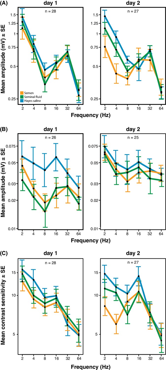
Response amplitude of electroretinograms (ERGs) measured from compound eyes (A) and ocelli (B) and mean contrast sensitivity (the lowest contrast to produce a detectable response) of ERGs from compound eyes (C) of honeybee queens stimulated with flickering lights of different frequencies (Hz).
All measurements were taken one and two days after artificial inseminations with either semen, seminal fluid or Hayes saline control solution (see colour legend). Panel C includes all measurements taken at all stimulus intensities. Total sample sizes (n) are shown in the top centre of each panel and differ because some queens were exclusively measured at day 1 (N = 10; seminal fluid: N = 5, semen: N = 3, Hayes saline: N = 2) or at day 2 (N = 9; seminal fluid: N = 4, semen: N = 3, Hayes saline: N = 2), whereas the remaining queens were consecutively assessed on both days (N = 18; seminal fluid: N = 5, semen: N = 6, Hayes saline: N = 7). Two queens were excluded from the ocelli dataset because of large technical noise. See Materials and Methods for additional details.
-
Figure 4—source data 1
Electroretinography data recorded after stimulating queens’ compound eyes and ocelli with flickering light.
Data for panels A, B and C of Figure 4 are reported in separate sheets.
- https://doi.org/10.7554/eLife.45009.020
Figure 4—figure supplement 1
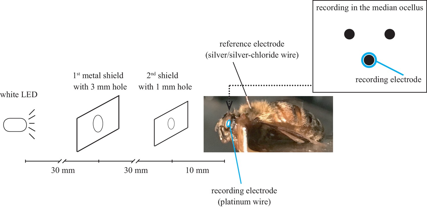
Experimental set-up for electroretinography to measure honeybee queen eyesight responses to flickering light or short (1 ms) light impulses.
https://doi.org/10.7554/eLife.45009.016
Figure 4—figure supplement 2
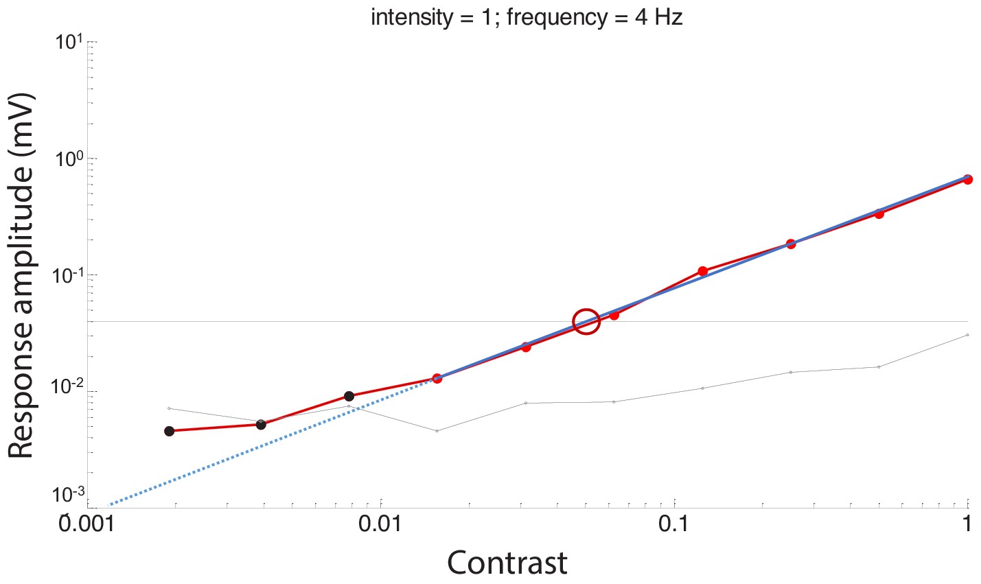
An example of response amplitude (mV) at different contrasts to calculate a contrast threshold measured at the highest intensity and temporal frequency of 4 Hz.
The amplitudes to the flickering light stimuli typically decreased as stimulus contrast reduced. The horizontal black line represents the noise threshold of 0.04 mV, determined from the control measurement with blocking the light stimuli. Red data points indicate responses that were significantly different from the surrounding noise, whereas black data points indicate responses that were not significantly different. The blue line is the fitted regression line of the response amplitude. The contrast threshold was determined as the intercept of the fitted response amplitude line and the noise threshold (red circle) for each temporal frequency. Contrast sensitivity was defined as the inverse of the contrast threshold.
Figure 4—figure supplement 3
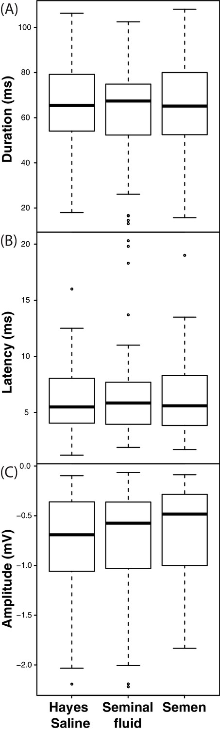
Response duration (A), latency (B) and amplitude (C) of electroretinograms (ERGs) measured from compound eyes of queens treated with semen, seminal fluid or Hayes saline after exposure to 1 ms light impulses.
https://doi.org/10.7554/eLife.45009.018
Figure 4—figure supplement 4
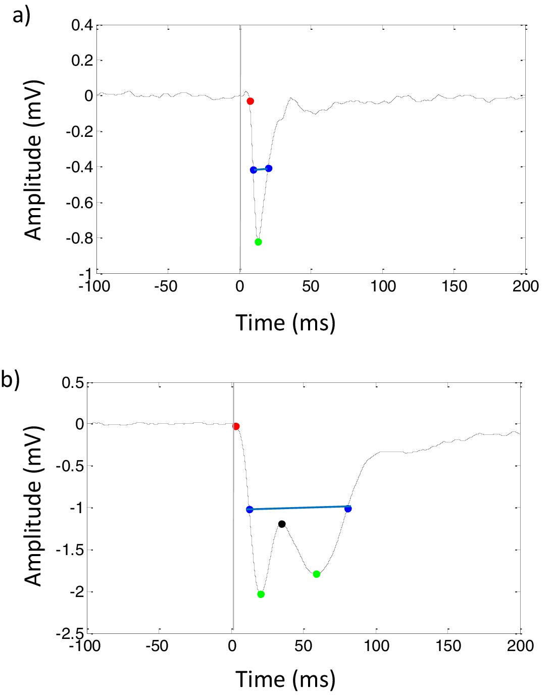
Examples of impulse responses to 1 ms flashes of light in (A) median ocellus and (B) compound eye of honeybee queens.
Peak amplitude (green point) was determined by the minimum amplitude of response. The latency of impulse response (red point) was defined as the time taken for the response to attain −0.5 mV amplitude. The duration of impulse response (blue line) was measured as the half-width of response size. The impulse response of compound eye has an inset (black point) considered as an input from high order neurons, such as a lamina neuron.
Figure 5
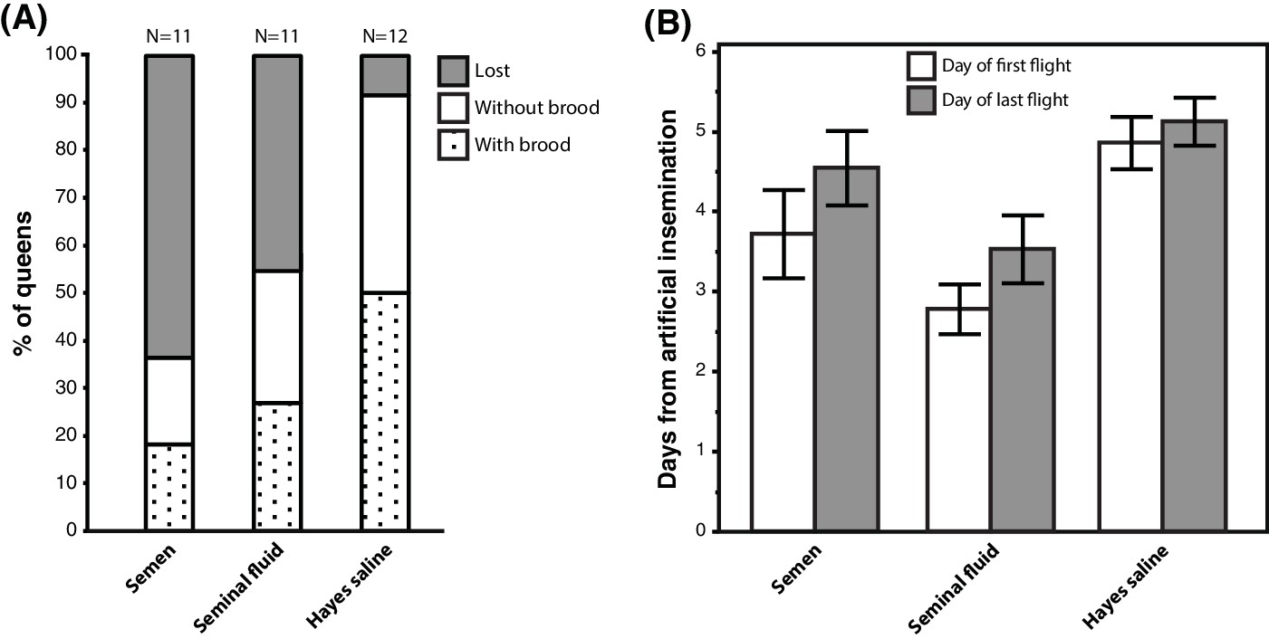
Seminal fluid and semen induce alterations of mating flight behaviour in honeybee queens.
(A) Stacked bars showing the percentage of queens in each artificial insemination treatment that were lost and how many of them produced brood after returning from their last mating flight, with absolute sample sizes printed on top of the bars. (B) Effects of insemination and control treatments on the time from artificial insemination to making their first and last flight. Bars show mean ±SE.
-
Figure 5—source data 1
Experimental data recorded during the mating flight experiment.
- https://doi.org/10.7554/eLife.45009.022
Additional files
-
Supplementary file 1
Summary of results from differential expression analyses performed with DESeq2 (Love et al., 2014).
The total number of DEGs identified, the number of these DEGs that were up-regulated, and the number of DEGs that were down-regulated are reported in separate columns for each of the pair-wise comparisons between treatment groups in both RNA-sequencing experiments.
- https://doi.org/10.7554/eLife.45009.023
-
Supplementary file 2
Results of differential expression analyses performed with DESeq2 (Love et al., 2014).
Differentially expressed genes at FDR < 0.1 are highlighted in yellow. Results from different pair-wise comparisons are reported in separate sheets.
- https://doi.org/10.7554/eLife.45009.024
-
Supplementary file 3
Summary of enriched Biological Process and Molecular Function GO terms at p<0.05 in all pair-wise comparisons between treatment groups in both RNA-seq experiments.
Different pair-wise comparisons are reported in separate sheets.
- https://doi.org/10.7554/eLife.45009.025
-
Supplementary file 4
Summary of GAGE pathway analyses results mapping the DEG lists of each of our pair-wise comparisons to known metabolic and signaling KEGG pathways.
Significant pathways (q values < 0.2) are presented in bold. Different pair-wise comparisons are reported in separate sheets.
- https://doi.org/10.7554/eLife.45009.026
-
Supplementary file 5
Annotation of the 37 genes showing consistent changes in expression between all pair-wise comparisons of semen and seminal fluid insemination treatments against controls.
- https://doi.org/10.7554/eLife.45009.027
-
Supplementary file 6
Results of analyses of overlap (Hypergeometric tests) in DEG lists between our study and Manfredini et al. (2015).
Overlap between each of our pair-wise comparison and the comparisons mated versus virgin and mated versus CO2-treated, and the overall overlap of all the DEGs identified in our study and in Manfredini et al. (2015) are reported in two separate tables. For each of our DEG lists, tables report the number of DEGs identified in our study, the number of shared DEGs with the specific comparisons by Manfredini et al. (2015), and the representation factor and P value of the Hypergeometric test.
- https://doi.org/10.7554/eLife.45009.028
-
Supplementary file 7
Summary of enriched Biological Process and Molecular Function GO terms at p<0.05 for the DEGs shared with the Manfredini et al. (2015) study of naturally-inseminated honeybee queens.
- https://doi.org/10.7554/eLife.45009.029
-
Supplementary file 8
Results of a linear mixed effects model for flicker response amplitude of compound eyes, showing the significance of the fixed effects and their interactions.
Significant effects (p<0.05) are reported in bold. df = degrees of freedom, χ²=chi squared statistic. The final model is shown below the table.
- https://doi.org/10.7554/eLife.45009.030
-
Supplementary file 9
Results of a linear mixed effects model for flicker response amplitude of compound eyes comparing the measurements taken on the second day post-inseminations for the nine queens that had exclusively been measured at day two with those of the 18 queens that were measured both on day 1 and 2.
df = degrees of freedom, χ²=chi squared statistic. The final model is shown below the table.
- https://doi.org/10.7554/eLife.45009.031
-
Supplementary file 10
Results of a linear mixed effects model for flicker response amplitude of compound eyes after excluding all semen measurements, showing the significance of the fixed effects and their interactions.
Significant effects (p<0.05) are reported in bold. df = degrees of freedom, χ²=chi squared statistic. The final model is shown below the table.
- https://doi.org/10.7554/eLife.45009.032
-
Supplementary file 11
Linear mixed effect model for flicker response amplitude of ocelli, showing significant factors and their interactions.
Significant effects (p<0.05) are reported in bold. df = degrees of freedom, χ²=chi squared statistic. The final model is shown below the table.
- https://doi.org/10.7554/eLife.45009.033
-
Supplementary file 12
Linear mixed effect model for flicker response amplitude of ocelli after exclusion of semen measurements, showing significant factors and their interactions.
Significant effects (p<0.05) are reported in bold. df = degrees of freedom, χ²=chi squared statistic. The final model is shown below the table.
- https://doi.org/10.7554/eLife.45009.034
-
Supplementary file 13
Results of a linear mixed effects model for contrast sensitivity of compound eyes, showing the significance of the fixed effects and their interactions.
Significant effects (p<0.05) are reported in bold. df = degrees of freedom, χ²=chi squared statistic. The final model is shown below the table.
- https://doi.org/10.7554/eLife.45009.035
-
Supplementary file 14
Results of a linear mixed effects model for contrast sensitivity of compound eyes after exclusion of semen measurements, showing the significance of the fixed effects and their interactions.
Significant effects (p<0.05) are reported in bold. df = degrees of freedom, χ²=chi squared statistic. The final model is shown below the table.
- https://doi.org/10.7554/eLife.45009.036
-
Supplementary file 15
RNA-sequencing statistics.
For each sample the table shows the total number of reads obtained from the sequencer, the number of reads retained and discarded after the filtering steps (Trimmomatic and SortMeRNA), and the number or reads mapped and unmapped after reads were aligned to the honeybee genome using STAR.
- https://doi.org/10.7554/eLife.45009.037
-
Source code 1
Custom-made MATLAB software used to control ERG recordings.
- https://doi.org/10.7554/eLife.45009.038
-
Transparent reporting form
- https://doi.org/10.7554/eLife.45009.039
Download links
A two-part list of links to download the article, or parts of the article, in various formats.
Downloads (link to download the article as PDF)
Open citations (links to open the citations from this article in various online reference manager services)
Cite this article (links to download the citations from this article in formats compatible with various reference manager tools)
Seminal fluid compromises visual perception in honeybee queens reducing their survival during additional mating flights
eLife 8:e45009.
https://doi.org/10.7554/eLife.45009


