Heterogeneous T cell motility behaviors emerge from a coupling between speed and turning in vivo
- Department of Applied Physics, Stanford University, United States
- Department of Bioengineering, Stanford University, United States
- Chan Zuckerberg Biohub, United States
Figures
Figure 1 with 3 supplements
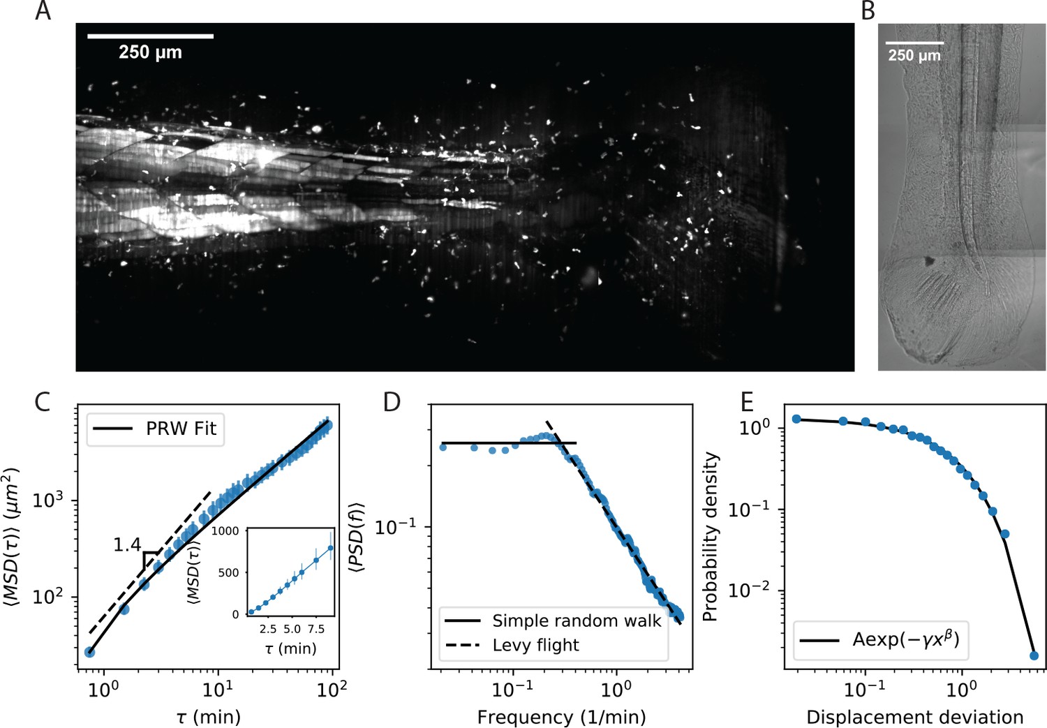
Cell motility behavior is inconsistent with Levy flight.
(A) Maximum Z projection of a Tg(lck:GFP, nacre-/-) zebrafish at 12 dpf. This projection represents the first frame of a timecourse; see Figure 1—video 1. (B) Brightfield of the region of tissue shown in A. Stitching across three tiles was performed in ImageJ. (C) Mean squared displacement as a function of time lag. The cells migrate super-diffusively on scales of a few minutes. The MSD for a persistent random walk is fit to the data (Materials and methods, Appendix 1). Error bars represent 95% confidence intervals on a bootstrap over n = 316 trajectories containing all measured time intervals. (See also Figure 1—figure supplement 2). Inset: linear scale for the first 10 min. (D) The velocity power spectrum, averaged across all trajectories (n = 634). A Levy (scale-free) process consistent with the short time behavior would result in a continuation of the high frequency slope (dashed line). Instead, we observe a timescale at a few minutes. (E) Distribution of bout lengths within a trajectory (Materials and methods), fit with a stretched exponential (n = 35819 bouts). The fitted stretch parameter . For all panels, trajectories were pooled from n = 16 fish.
-
Figure 1—source data 1
Source data for Figure 1C.
MSD values and error bar bounds.
- https://cdn.elifesciences.org/articles/53933/elife-53933-fig1-data1-v1.txt
-
Figure 1—source data 2
Source data for Figure 1D.
PSD values.
- https://cdn.elifesciences.org/articles/53933/elife-53933-fig1-data2-v1.txt
-
Figure 1—source data 3
Source data for Figure 1E.
Bout distribution histogram values.
- https://cdn.elifesciences.org/articles/53933/elife-53933-fig1-data3-v1.txt
Figure 1—figure supplement 1

As in Figure 1B, with annotations.
Stitched brightfield image of the zebrafish tail, (same as Figure 1B), with the fin fold and tail fin regions indicated. Lines were added at the border between the fin fold and muscle regions of the tail to guide the eye.
Figure 1—figure supplement 2

MSD for all trajectories tracked through 15 min.
MSD for all trajectories tracked through 15 min, including all measured time intervals (n = 612). As with the subset of longer trajectories, we observe a curved MSD consistent with a persistent random walk (PRW) model. Inset: linear scale through 10 min, showing a straight line consistent with diffusive behavior after the first few minutes. Error bars represent 95% confidence intervals on a bootstrap over trajectories.
Figure 1—video 1
T cell dynamics in the larval zebrafish tail and fin fold.
Maximum Z projection of the tail of a Tg(lck:GFP, nacre-/-) at 12 dpf (GFP channel). Tiled Z stacks were recorded every 45 s for 2.5 hr (50 3 slices per stack). Tiles were assembled based on recorded stage locations. The movie was prepared using Python 3.6.0 (code available at: https://github.com/erjerison/TCellMigration; Jerison, 2020.
Figure 2 with 2 supplements

Cell speed and turning behavior are heterogeneous.
(A) Example of trajectories recorded over 3 hr at a 12 s interval (Tg(lck:GFP, nacre-/-) zebrafish; 10 dpf). Here we show a maximum Z projection of the 900th frame with trajectories overlaid; see Figure 2—video 1 for the timecourse. Examples of four cell trajectories, with a range of characteristic speeds, are colored. (B) Spearman rank correlation between trajectory speeds measured on non-overlapping 19.5 min intervals, as a function of the time between the beginning of the intervals. Error bars represent 95% confidence intervals on a bootstrap over trajectories. The null model was constructed by permuting measured speeds across all the trajectories at each interval; error bars represent 95% confidence intervals over the permutations. (Calculations performed on the n = 321 trajectories of at least 117 min in length.) Trajectories were pooled over n = 16 fish. (C) Velocity traces for the four cells highlighted in A. (D) Secant-approximated speed distributions for each cell from A, compared with the distribution over all cells (grey;n = 98141 steps). (E) Turn angle distributions for each cell from A, compared with the distribution over all cells (grey;n = 96122 turn angles).
-
Figure 2—source data 1
Source data for Figure 2B.
Correlation values and error bar bounds.
- https://cdn.elifesciences.org/articles/53933/elife-53933-fig2-data1-v1.txt
-
Figure 2—source data 2
Source data for Figure 2C.
vx values for trajectories.
- https://cdn.elifesciences.org/articles/53933/elife-53933-fig2-data2-v1.txt
-
Figure 2—source data 3
Source data for Figure 2D.
Speed histogram values.
- https://cdn.elifesciences.org/articles/53933/elife-53933-fig2-data3-v1.txt
-
Figure 2—source data 4
Source data for Figure 2E.
Angle histogram values.
- https://cdn.elifesciences.org/articles/53933/elife-53933-fig2-data4-v1.txt
Figure 2—figure supplement 1
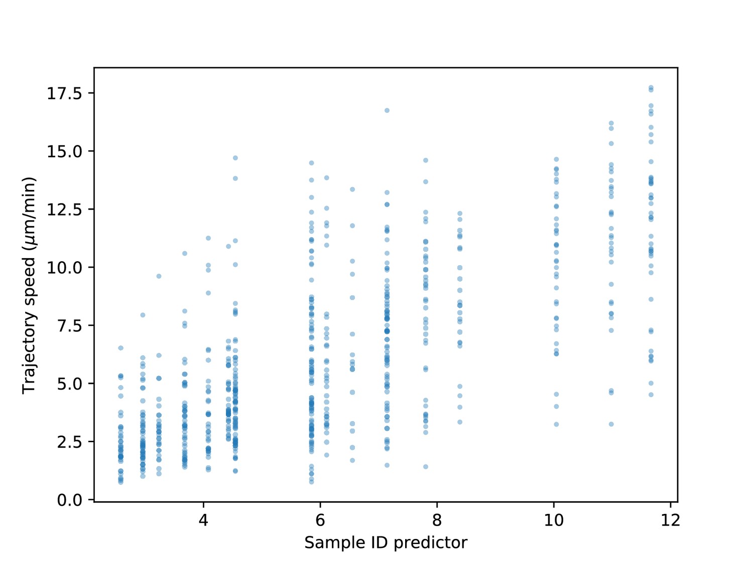
Range of speeds by sample.
Best linear predictor of speed based on sample identity (i.e. mean speed within the sample) vs. trajectory speeds. There is both variation in speeds from sample to sample and also a broad distribution of speeds within each sample.
Figure 2—video 1
Heterogeneity of T cell migration.
Maximum Z projection of the tail of a Tg(lck:GFP, nacre-/-) at 10 dpf (GFP channel), with cell trajectories overlaid. A Z stack was recorded every 12 s for 3 hr (62 2 slices per stack). A maximum pixel value threshold of 1200 was used throughout the timecourse (no minimum pixel threshold was used). Four trajectories were chosen and highlighted in color; the remainder of the trajectories are plotted in grey. The movie was prepared using Python 3.6.0 (code available at: https://github.com/erjerison/TCellMigration; Jerison, 2020).
Figure 3 with 1 supplement
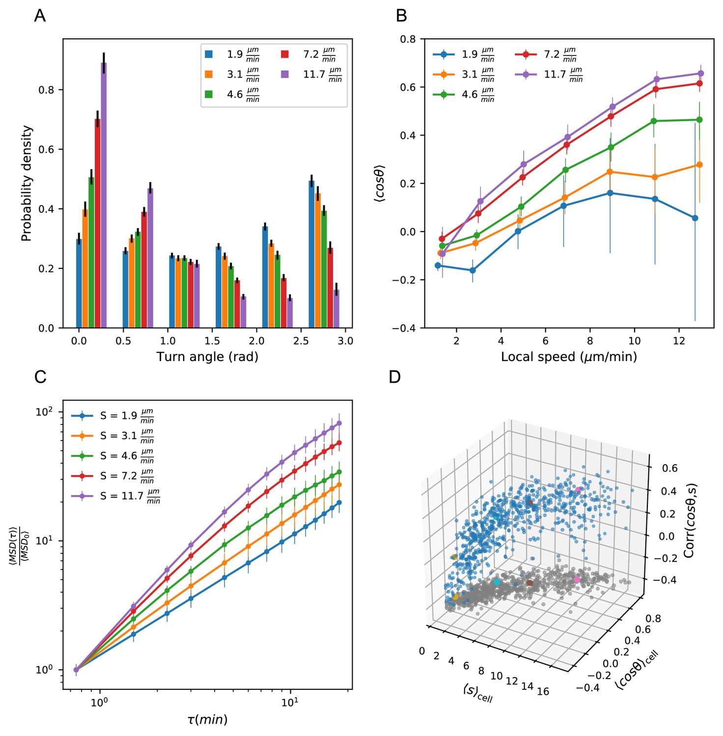
Heterogeneous cell migration statistics fall on a behavioral manifold.
(A) Distribution of turn angles amongst cells grouped by speed class. The distribution varies smoothly from faster cells, which tend to go straighter, to slower cells, which tend to turn around more often. Error bars represent 95% confidence intervals from a bootstrap over trajectories in each speed class. The legend reports the mean speed for trajectories in each class. (B) Turning behavior conditioned on current cell speed. The average of the cosine of the turn angle as a function of the average length of the steps on either side. Cells are grouped into speed classes as in A. Error bars represent 95% confidence intervals from a bootstrap over trajectories in each speed class. (C) Mean squared displacement by speed class. Due to the variation in turning behavior, the faster cells appear initially more superdiffusive. Error bars represent 95% confidence intervals from a bootstrap over trajectories in each speed class. All speed class calculations were performed on the n = 569 trajectories that included all time intervals in the MSD analysis. (D) Organization of cell behavior into a curve in a three dimensional behavioral space. Each point represents a trajectory, and we show the average speed, turn angle, and local speed-turn correlation. Grey: projection into the x-y plane. The trajectories shown in Figure 2 are colored. Trajectories pooled over n = 16 fish.
-
Figure 3—source data 1
Source data for Figure 3A.
Angle histogram values and error bounds by speed class.
- https://cdn.elifesciences.org/articles/53933/elife-53933-fig3-data1-v1.txt
-
Figure 3—source data 2
Source data for Figure 3B.
Cosine statistic by speed class.
- https://cdn.elifesciences.org/articles/53933/elife-53933-fig3-data2-v1.txt
-
Figure 3—source data 3
Source data for Figure 3C.
MSD by speed class and error bounds.
- https://cdn.elifesciences.org/articles/53933/elife-53933-fig3-data3-v1.txt
-
Figure 3—source data 4
Source data for Figure 3D.
Speeds, turn angle cosines, and correlations by trajectory.
- https://cdn.elifesciences.org/articles/53933/elife-53933-fig3-data4-v1.txt
Figure 3—figure supplement 1
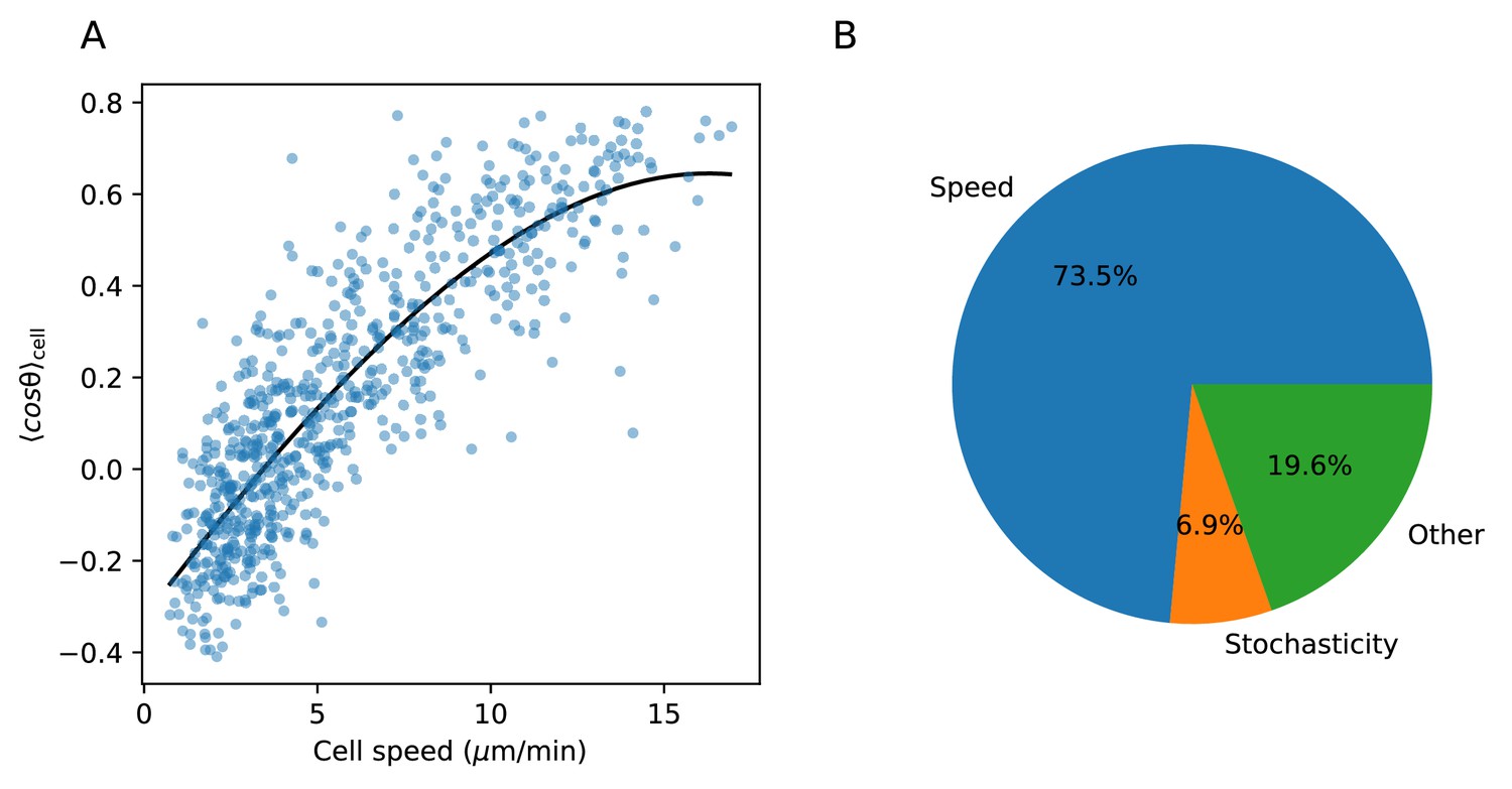
Variance explained by speed-turn relationship.
(A) Spline fit to speed-turn angle relationship. (B) The fraction of the variance in the turn angle summary statistic explained by speed (estimated based on the spline fit in A.), by stochasticity, that is variance within a trajectory; and by other factors, which may include imperfections in the spline fit (see Materials and methods).
Figure 4 with 2 supplements
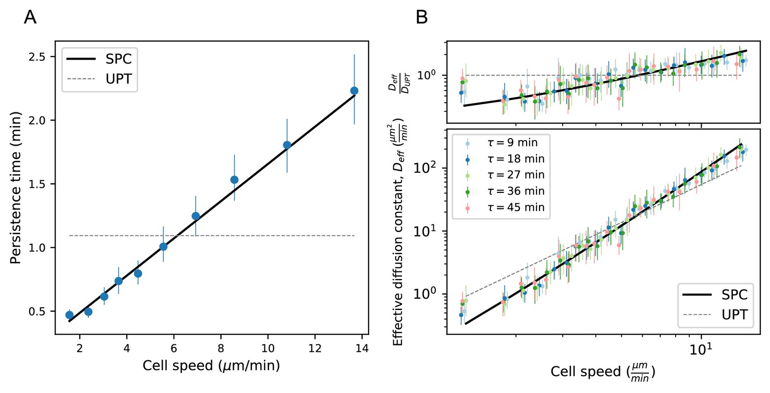
Model predicts wide variation in length scales of exploration across the population.
(A) Mean persistence time as a function of cell speed, measured along trajectories (n = 710). Error bars represent 95% confidence intervals from a bootstrap over trajectories. UPT: Uniform persistence time; SPC: Speed-persistence coupling. (B) Scaling of the effective diffusion constant with cell speed. Except for a constant offset, parameters are fixed based on the speed-persistence relationship in A. Error bars represent 95% confidence intervals on a bootstrap over trajectories. Numbers of trajectories in each time interval: n = 704; n = 654; n = 607; n = 558; n = 523. Trajectories were pooled over n = 16 fish.
-
Figure 4—source data 1
Source data for Figure 4A.
Average persistence time measurement and error bounds.
- https://cdn.elifesciences.org/articles/53933/elife-53933-fig4-data1-v1.txt
-
Figure 4—source data 2
Source data for Figure 4B.
MSD by speed for each time interval, and error bounds.
- https://cdn.elifesciences.org/articles/53933/elife-53933-fig4-data2-v1.txt
Figure 4—figure supplement 1

Statistics from Figures 3 and 4, with timepoints subsampled.
Panels A,B,D,E as in Figure 3A–D; Panels C,F as in Figure 4A–B; with all statistics re-calculated based on sub-sampling timepoints by a factor of 2. .
Figure 4—figure supplement 2

Speed-persistence relationship with shallower cut-off angle.
As in Figure 4A, where the persistence time is defined to be the average time before the angle deviates by .
Figure 5 with 1 supplement
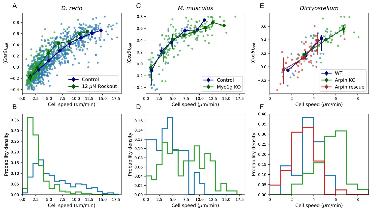
Manifold is preserved under a drug perturbation to cell speeds, and in other species.
(A) Correlation between the average cosine of the turn angles along the trajectory and cell speed, for cells in control and Rockout-treatment conditions. Data for all cells is shown as well as a binned average. Error bars represent 95% confidence intervals on the binned average on a bootstrap over cells. (B) The distribution of speeds amongst control and Rockout-treated trajectories. The treatment lowers cell speeds but maintains the relationship between speed and persistence. Statistics based on trajectories pooled over n = 16 control fish (n = 712 trajectories) and n = 6 Rockout treatment fish (n = 236 trajectories). (See also Figure 5—figure supplement 1. (C) As in A, for mouse T cells (data from Gérard et al., 2014). The perturbation is a genetic knockout of a non-canonical myosin motor, Myo1g. E. As in A, for Dictyostelium (data from Dang et al., 2013). The perturbations are a knockout and rescue of the Arp2/3 inhibitor Arpin. (control: n = 42; Myo1g KO: n = 123) (D,F) Distributions of cell speeds for the control and treatment conditions shown in C,E. (WT: n = 42; Arpin KO: n = 38; Arpin rescue: n = 42) In each case, the distribution of speeds shifts, but the cells tend to move along the speed-turn curve. ).
-
Figure 5—source data 1
Source data for Figure 5A.
Speeds and turn angle cosines for each trajectory in each treatment (fish).
- https://cdn.elifesciences.org/articles/53933/elife-53933-fig5-data1-v1.txt
-
Figure 5—source data 2
Source data for Figure 5B.
Speed histogram values for each treatment (fish).
- https://cdn.elifesciences.org/articles/53933/elife-53933-fig5-data2-v1.txt
-
Figure 5—source data 3
Source data for Figure 5C.
Speeds and turn angle cosines for each trajectory in each treatment (mouse).
- https://cdn.elifesciences.org/articles/53933/elife-53933-fig5-data3-v1.txt
-
Figure 5—source data 4
Source data for Figure 5D.
Speed histogram values for each treatment (mouse).
- https://cdn.elifesciences.org/articles/53933/elife-53933-fig5-data4-v1.txt
-
Figure 5—source data 5
Source data for Figure 5E.
Speeds and turn angle cosines for each trajectory in each treatment (Dictyostelium).
- https://cdn.elifesciences.org/articles/53933/elife-53933-fig5-data5-v1.txt
-
Figure 5—source data 6
Source data for Figure 5F.
Speed histogram values for each treatment (Dictyostelium).
- https://cdn.elifesciences.org/articles/53933/elife-53933-fig5-data6-v1.txt
Figure 5—figure supplement 1
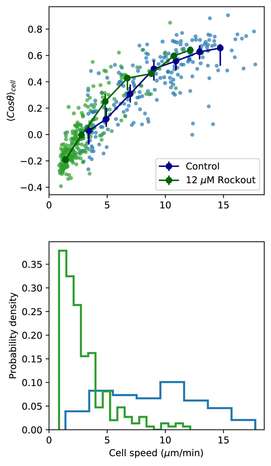
Figure 5A,B, including only paired control-Rockout treatment samples.
As in Figure 5A,B, but including only those control samples with a paired Rockout treatment sample (n = 6 fish). Fish were imaged for 2.5 hr, and imaging media was replaced with media containing Rockout. Imaging over the same field of view was continued for 2.5 hr.
Figure 6 with 3 supplements
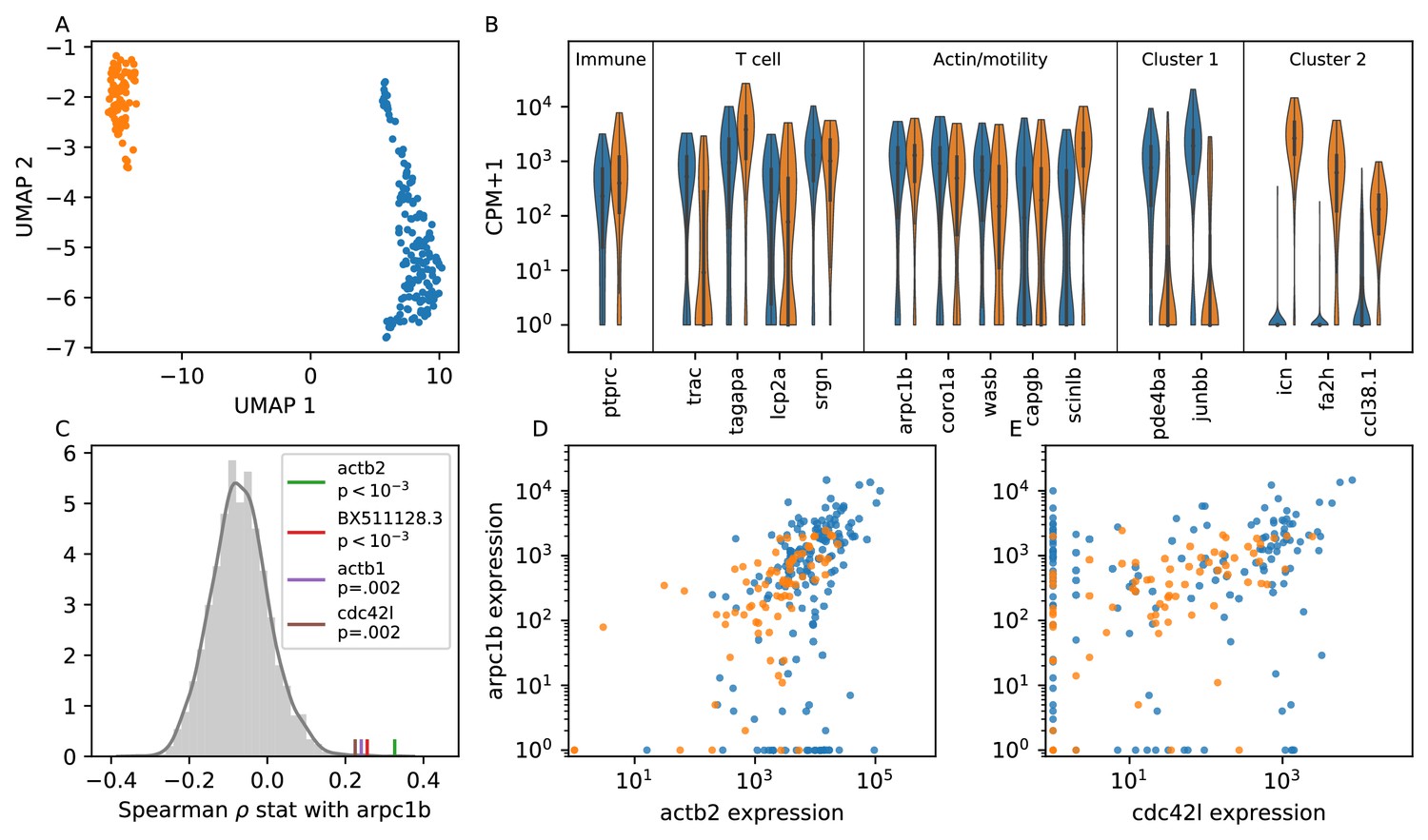
Single cell RNA sequencing shows moderate covariation in actin nucleation across T cells.
(A) UMAP dimensional reduction of single-cell RNA sequencing profiles of zebrafish T cells (Materials and methods) shows two main subtypes. Cluster colors are shared across panels A, B, D, and E. For a list of differentially-expressed genes between clusters, see Supplementary file 1. (B) Violin plots of marker genes in common to both subtypes (including immune, T cell, and motility markers), as well as selected marker genes for each subtype. (For the list of differentially-expressed genes, see Supplementary file 1). (C) Distribution of a rank correlation coefficient-related statistic between arpc1b and other moderate and high expressed genes, amongst all T cells (Materials and methods). Statistically significant outliers (after Bonferonni correction) are colored and labeled. The top correlated genes include three also involved in actin nucleation activity. (D) Correlation between expression (counts + 1) of arpc1b and actb2 across the T cells, with colors as in A. (E) Correlation between expression (counts + 1) of arpc1b and cdc24l, with colors as in A. Analysis performed on n = 237 cells (see Main Text, Materials and methods).
-
Figure 6—source data 1
Source data for Figure 6A.
UMAP coordinates for cells.
- https://cdn.elifesciences.org/articles/53933/elife-53933-fig6-data1-v1.txt
-
Figure 6—source data 2
Source data for Figure 6B.
Expression (Log10(CPM+1)) for marker genes for cells, and cluster labels.
- https://cdn.elifesciences.org/articles/53933/elife-53933-fig6-data2-v1.txt
-
Figure 6—source data 3
Source data for Figure 6C.
Histogram values for correlation statistic, as well as values for the four significant genes.
- https://cdn.elifesciences.org/articles/53933/elife-53933-fig6-data3-v1.txt
-
Figure 6—source data 4
Source data for Figure 6D.
Expression (counts + 1) for actb2 and arpc1b, and cluster labels.
- https://cdn.elifesciences.org/articles/53933/elife-53933-fig6-data4-v1.txt
-
Figure 6—source data 5
Source data for Figure 6E.
Expression (counts + 1) for actb2 and cdc42l, and cluster labels.
- https://cdn.elifesciences.org/articles/53933/elife-53933-fig6-data5-v1.txt
Figure 6—figure supplement 1
Comparison between UMAP and index sort, over all cells.
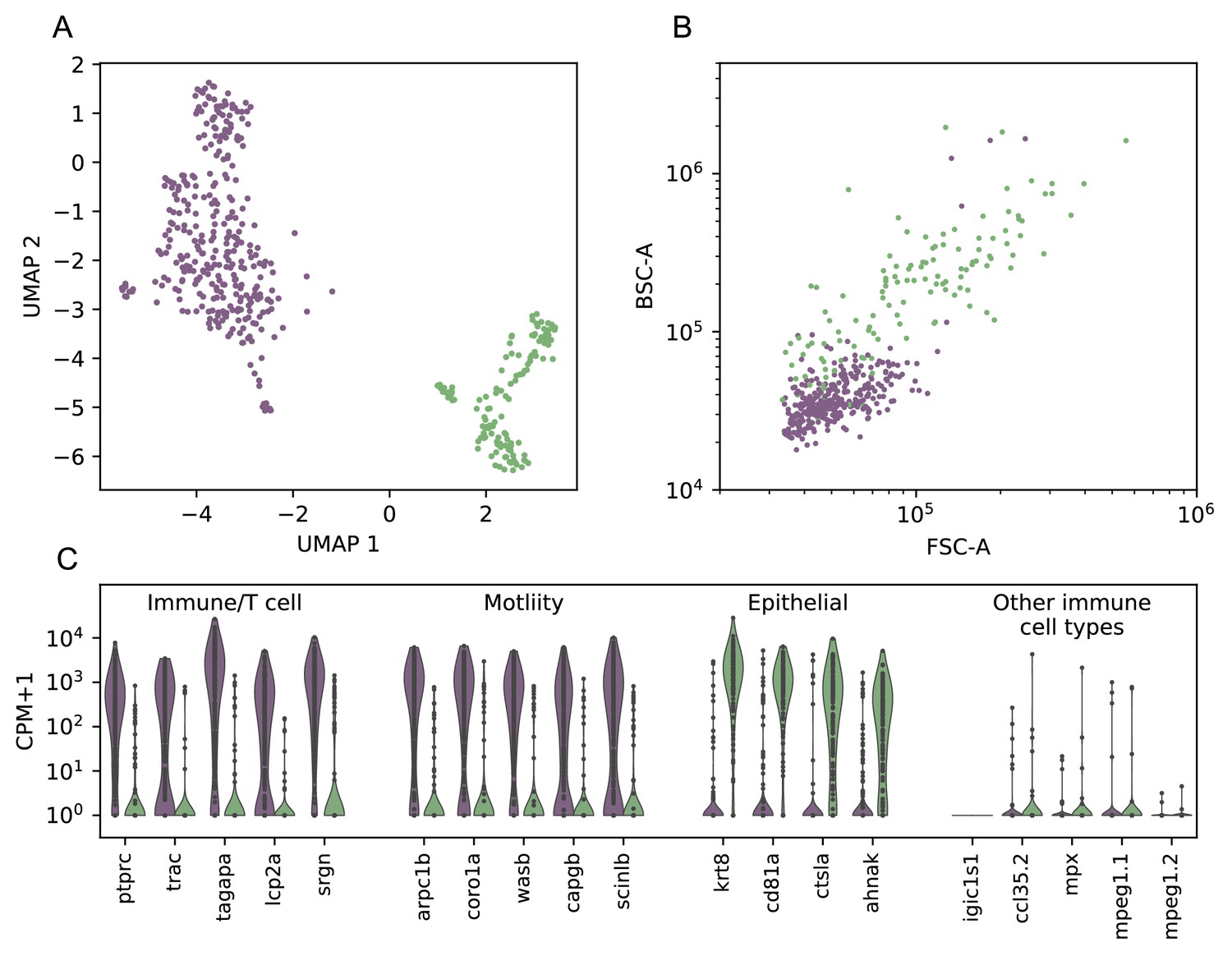
(A) UMAP dimensional reduction of cell gene expression profiles from scRNAseq, with clusters assigned by HDBSCAN (colors). (B) Index sort data of FSC/BSC for these cells (colors correspond to cluster assignments from A). (C) Violin plot of a selection of the differentially-expressed genes between the two clusters (Wilcoxon rank-sum test, see Figure 6—figure supplement 2, Supplementary file 2), as well as a panel of markers associated with other types of immune cells. Genes expressed in the first cluster include immune, T-cell associated, and actin remodeling/motility associated genes. Genes expressed in the second cluster include keratin as well as the epithelial marker ahnak. .
Figure 6—figure supplement 2
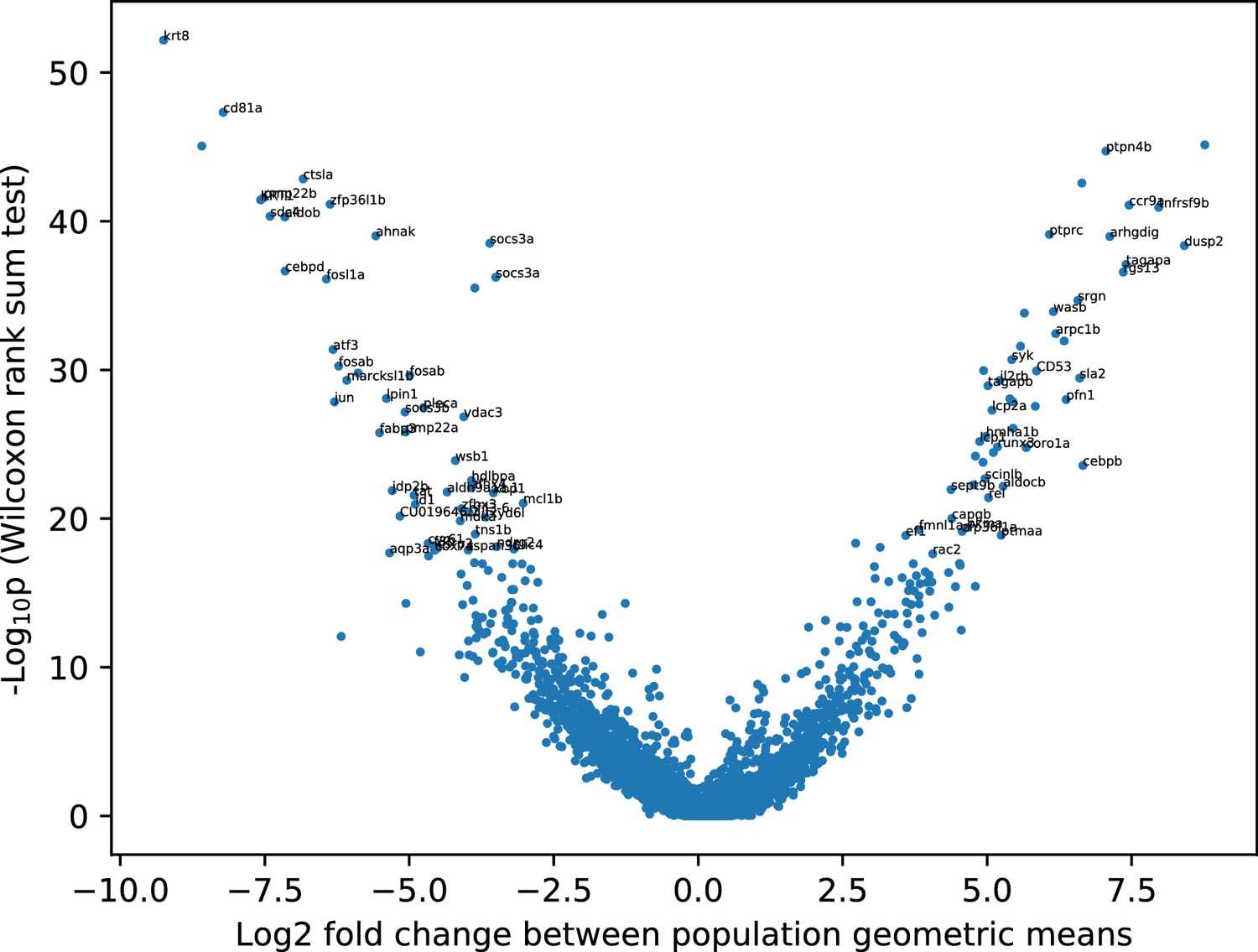
Differential expression between the two main clusters.
Differential expression analysis between the two cell clusters in Figure 6—figure supplement 1. Named genes with the top 100 p values are labeled. See also Supplementary file 2.
Figure 6—figure supplement 3
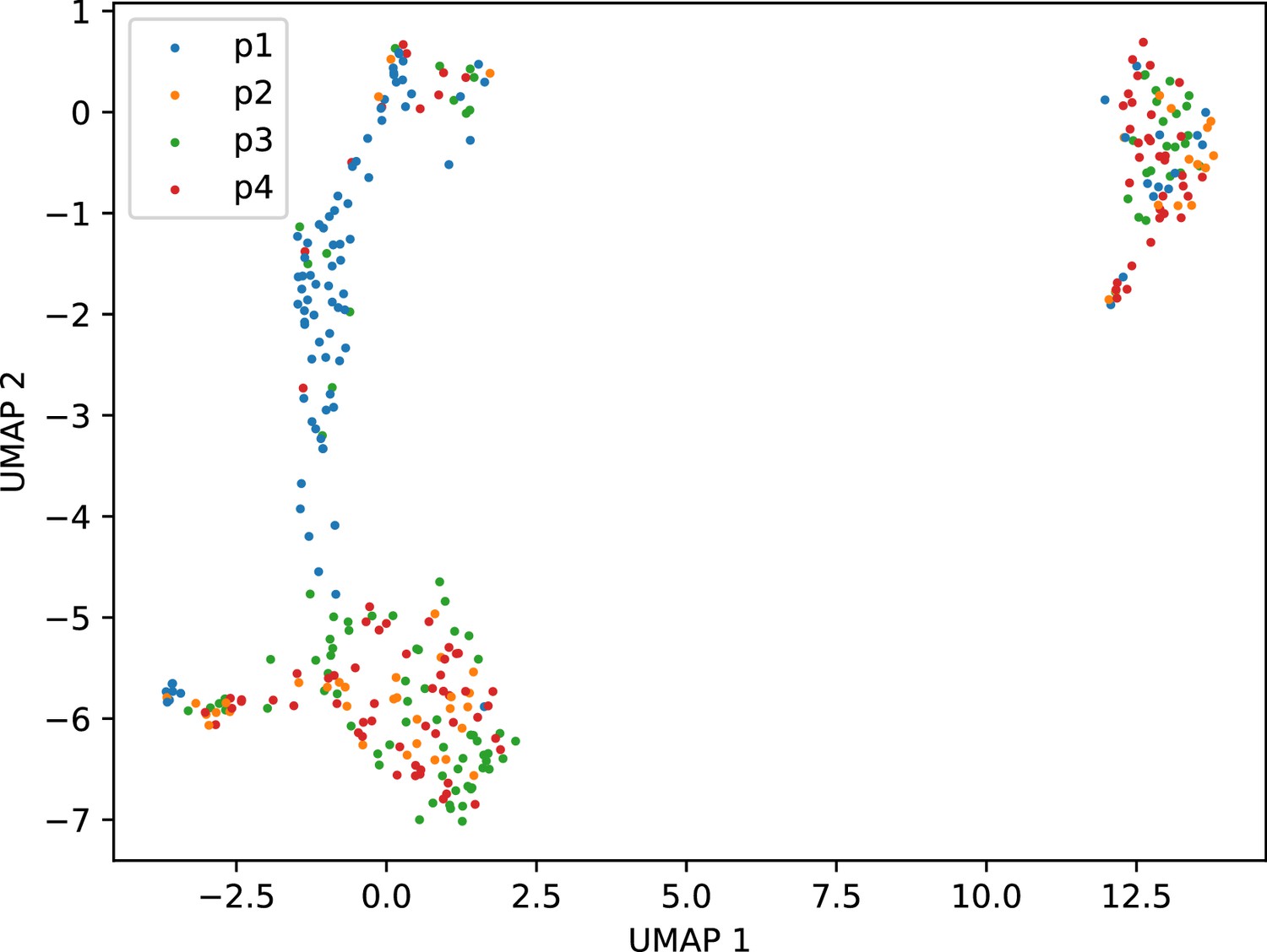
Plate effect in variation within T cell cluster.
UMAP dimensional reduction of only the T cell cluster, using the self-assembling manifold algorithm, colored by sort plate. This revealed a significant plate effect involving p1. We therefore excluded this plate from further analysis of the fine-scale variation amongst T cells.
Appendix 1—figure 1
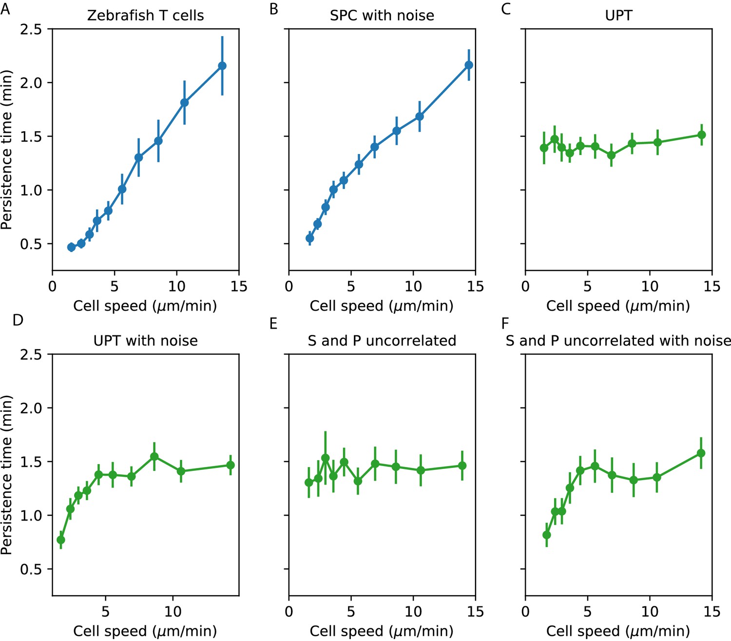
Comparisons between speed-persistence time relationship in simulations and data.
(A) Data (as in Figure 4A). (B) Simulation of the SPC model with empirical parameters (see Appendix 1 for details). (C) Simulation of uniform persistence time (UPT) model, with speeds and persistence times measured as in the data. Biases introduced by measured speeds and persistence times do not lead to an observable correlation. (D) Simulation of UPT model with a conservative estimate of mislocation noise. A spurious correllation is induced at low cell speeds, but cannot account for the trend across cell speeds that we observe. (E) Simulation of a model where the predicted persistence times have been reshuffled amongst the cells, to simulate an empirically-realistic model where persistence times vary but are uncorrelated with speed. This does not generate a significant bias in the speed-persistence relationship. (F) Model with reshuffled persistence times, as in E., and mislocation noise. As in D., this leads to a spurious correlation at low speeds but no other significant effects.
Appendix 1—figure 2
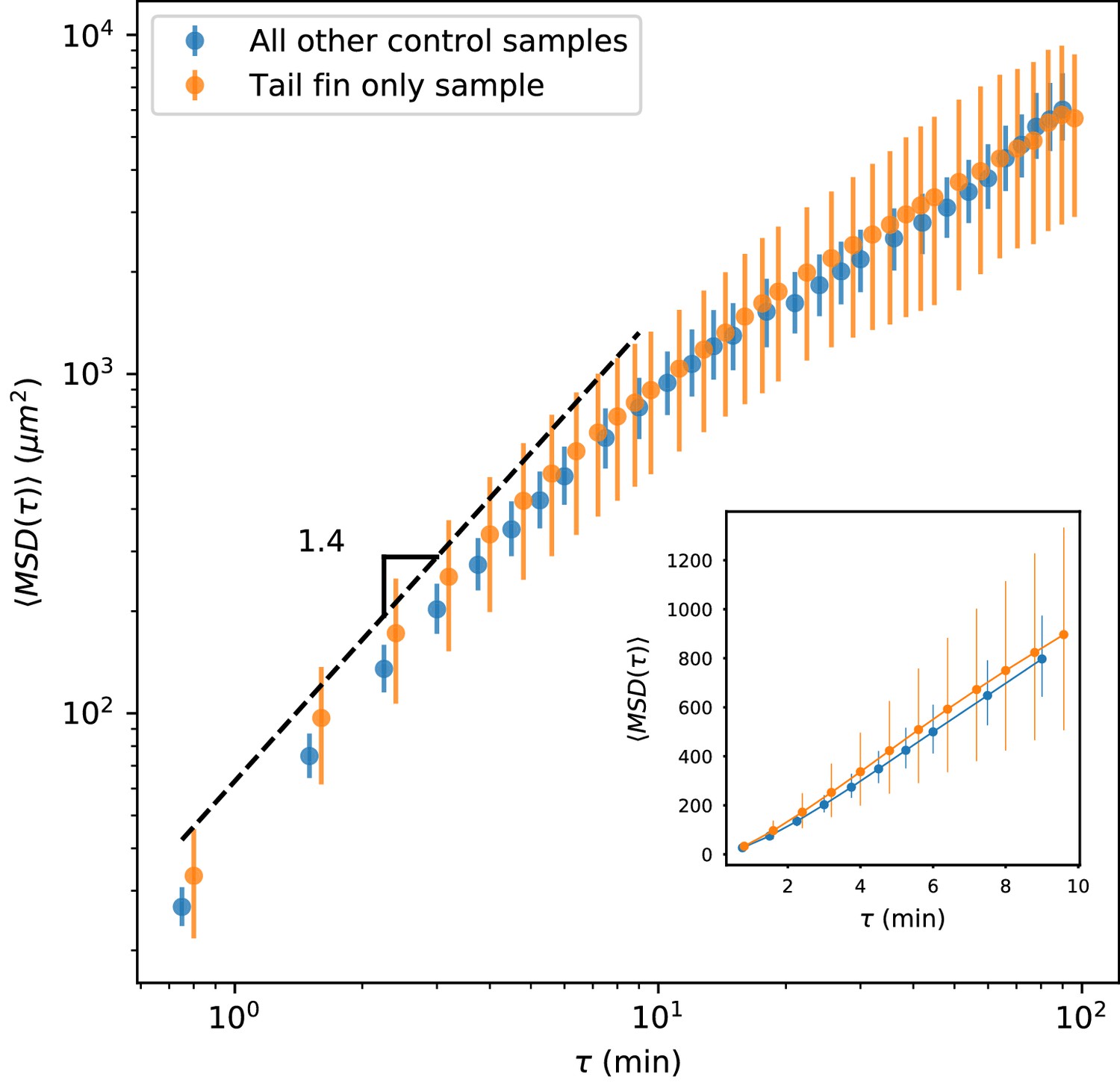
MSD measured on all control trajectories except those from the sample shown in Figure 2, compared with MSD measured on the trajectories from the held-out sample.
All trajectories for this sample were measured in the tail fin area, and so are not subject to potential effects due to a boundary between the fin fold and muscle region of the tail (Figure 1—figure supplement 1). We do not observe a difference between these measurements. Error bars represent 95% confidence intervals on a bootstrap over trajectories.
Tables
Key resources table
| Reagent type (species) or resource | Designation | Source or reference | Identifiers | Additional information |
|---|---|---|---|---|
| Strain, strain background (Danio rerio) | Tg(lck:GFP) | Gift from Aya Ludin-Tal and Leonard Zon Langenau et al., 2004 | ||
| Chemical compound, drug | Tricaine-S, MS-222 | Pentair | ||
| Chemical compound, drug | Rockout | Sigma Aldrich | #555553 | |
| Software, algorithm | Ilastik | Sommer et al., 2011 | ||
| Software, algorithm | Custom analysis software | This paper | Available at https:// github.com/ erjerison/ TCellMigration | |
| Software, algorithm | STAR | Dobin et al., 2013 | ||
| Software, algorithm | htseq | Anders et al., 2015 | ||
| Software, algorithm | SAMalg | Tarashansky et al., 2019 |
Additional files
-
Supplementary file 1
Differentially-expressed genes between the two T cell sub-clusters (Figure 6A).
Log differential expression ratio (see Materials and methods) and Bonferroni-corrected Wilcoxon rank-sum p-value are listed for each gene. Genes with at least 10-fold differential expression and Bonferroni-corrected Wilcoxon rank-sum p-value are included.
- https://cdn.elifesciences.org/articles/53933/elife-53933-supp1-v1.txt
-
Supplementary file 2
Differentially-expressed genes between the T cells and putative epithelial cell clusters (Figure 6—figure supplement 1, Figure 6—figure supplement 2).
Log differential expression ratio (see Materials and methods) and Bonferroni-corrected Wilcoxon rank-sum p-value are listed for each gene. Genes with at least 10-fold differential expression and Bonferroni-corrected Wilcoxon rank-sum p-value are included.
- https://cdn.elifesciences.org/articles/53933/elife-53933-supp2-v1.txt
-
Transparent reporting form
- https://cdn.elifesciences.org/articles/53933/elife-53933-transrepform-v1.pages
Download links
A two-part list of links to download the article, or parts of the article, in various formats.
Downloads (link to download the article as PDF)
Open citations (links to open the citations from this article in various online reference manager services)
Cite this article (links to download the citations from this article in formats compatible with various reference manager tools)
Heterogeneous T cell motility behaviors emerge from a coupling between speed and turning in vivo
eLife 9:e53933.
https://doi.org/10.7554/eLife.53933


