Alternative polyadenylation mediates genetic regulation of gene expression
- Genetics, Genomics, and Systems Biology, University of Chicago, United States
- Department of Human Genetics, University of Chicago, United States
- Section of Genetic Medicine, Department of Medicine, University of Chicago, United States
Figures
Figure 1 with 11 supplements
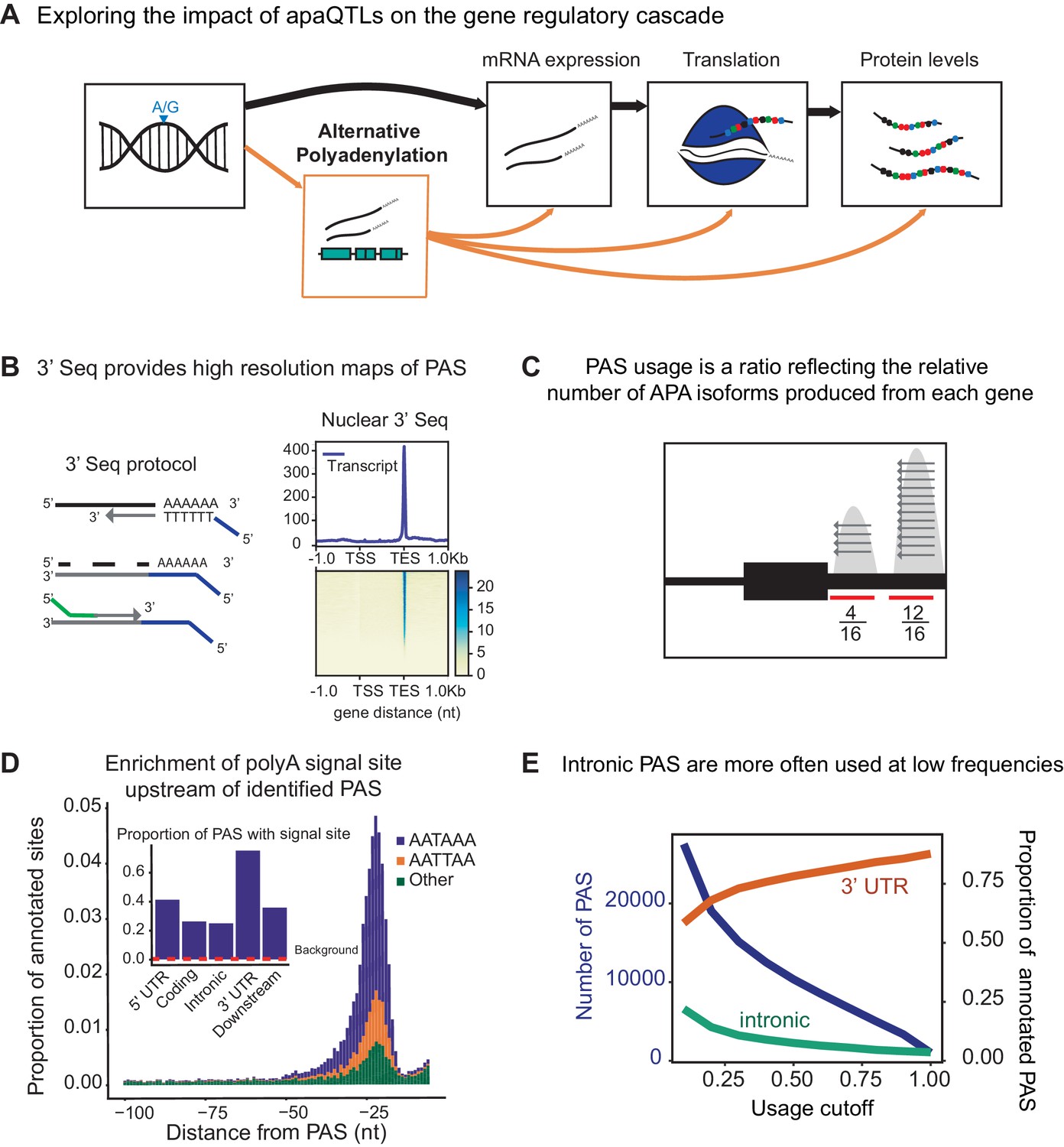
3' sequencing of mRNA from the nuclear fraction to study inter-individual variation in APA.
(A) Schematic of how genetic variants affect phenotypes by percolating through gene regulatory layers (black arrows). We aimed to understand how genetic variation can mediate gene regulation through alternative polyadenylation (orange arrows). (B) (Left) Schematic of Lexogen QuantSeq Reverse 3' mRNA-Seq protocol (Moll et al., 2014) (Right) Meta gene plot showing read coverage for five 3' Seq libraries collected from nuclei isolated from LCLs. (C) Representation for how PAS usage is calculated. Read count for each PAS were divided by the total number of reads at all PAS for the gene. (D) (Main) Stacked density of canonical (AATAAA, AATTAA) and other polyadenylation signal sites (AAAAAA, AAAAAG, AATACA, AATAGA, AATATA, ACTAAA, AGTAAA, CATAAA, GATAAA, TATAAA) upstream of identified PAS. (Inset) Proportion of PAS in different genomic regions with a polyadenylation signal site 10–50 bp upstream of cleavage site. The red dotted line represents the proportion of signal site in random 40 bp windows, i.e. the intronic background. (D) The proportion of intronic PAS increases as the usage cutoff decreases, implying that a disproportionate number of intronic PAS are used at low frequencies. The blue line represents the number of PAS identified as the stringency of the usage cutoff increases. The orange and green lines represent the proportion of PAS in the 3’ UTR and introns, respectively.
Figure 1—figure supplement 1
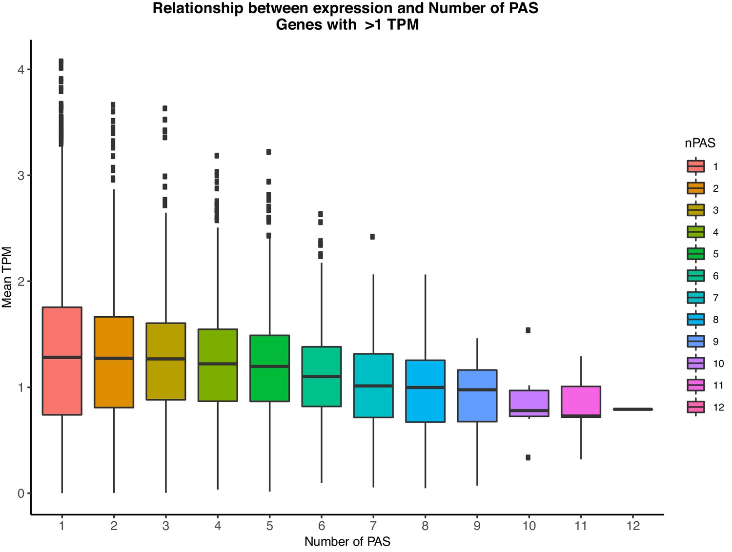
Relationship between the number of PAS identified in our study and gene expression levels (TPM) as measured from GEUVADIS YRI LCLs.
Genes with mean TPM <1 across individuals were considered not expressed and thus were removed for this analysis.
Figure 1—figure supplement 2
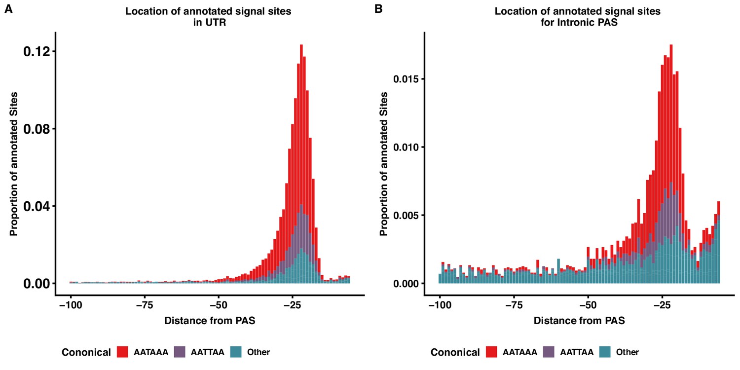
Intronic and 3' UTR share signal site motif density distributions.
(A) Stacked density plot showing the signal site distribution for PAS in 3’ UTR. (B) Stacked density plot showing the signal site distribution for PAS in introns. Other signal sites are in both panels are AAAAAA, AAAAAG, AATACA, AATAGA, AATATA, ACTAAA, AGTAAA, CATAAA, GATAAA, TATAAA.
Figure 1—figure supplement 3
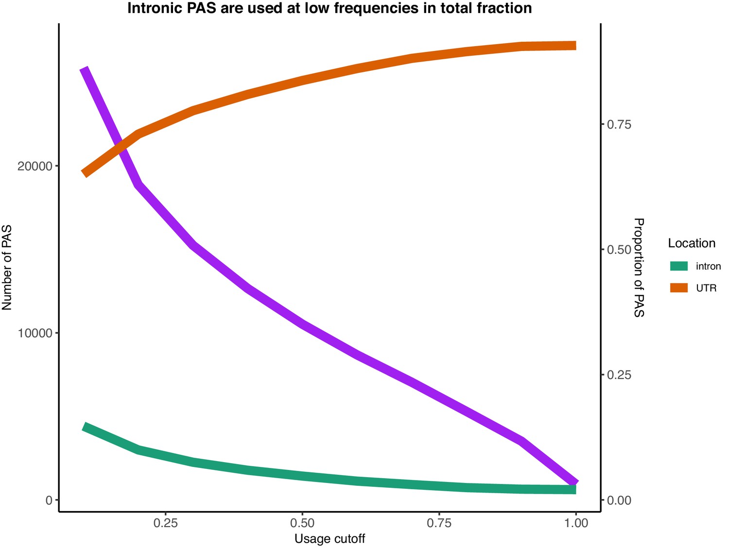
Number of PAS identified with usage larger than the usage cutoff (x-axis) in the total mRNA fraction (purple).
Proportion of PAS in introns when PAS are filtered by total usage (green). Proportion of PAS in 3’ UTRs when PAS are filtered by total usage (orange).
Figure 1—figure supplement 4
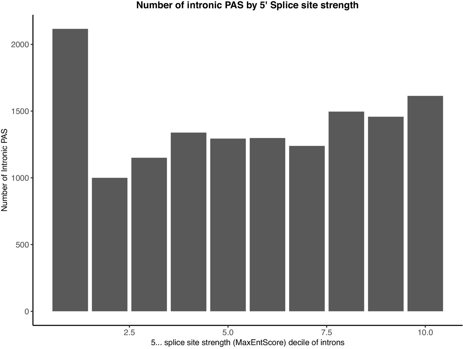
Intronic PAS are enriched in introns with the weakest 5’ splice sites.
Splice site strengths for all introns were calculated using MaxEntScore.
Figure 1—figure supplement 5
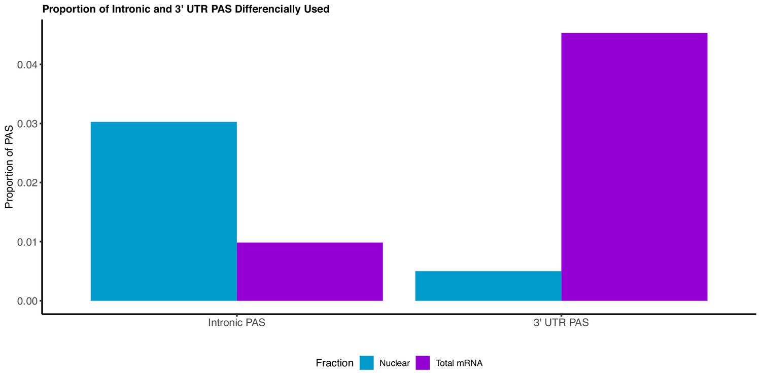
We adapted LeafCutter to identify genes with significant differential usage of PAS between the total and nuclear fraction (Li et al., 2018).
The majority of PAS preferentially used in the nuclear fraction are intronic, whereas the majority of PAS preferentially used in the total fraction lie in the 3’ UTR.
Figure 1—figure supplement 6

Our identified PAS include both previously annotated and novel sites.
(A) Distribution of distance between PAS and the closest annotated site in the annotation database (PolyA_DB release 3.2). (B) Scatter plot showing the number of PAS we identified in our study (X-axis) versus the number of PAS in the PolyA database (Y-axis) separated by genomic location (colors). (C) Scatter plot showing the number of nuclear-specific PAS we identified in our study versus the number of PAS in the PolyA database separated by genomic location (colors). The vast majority of nuclear-specific PAS are intronic. (D) Proportion of PAS present in the PolyA database by usage in nuclear (green) or total (orange) mRNA fraction.
Figure 1—figure supplement 7
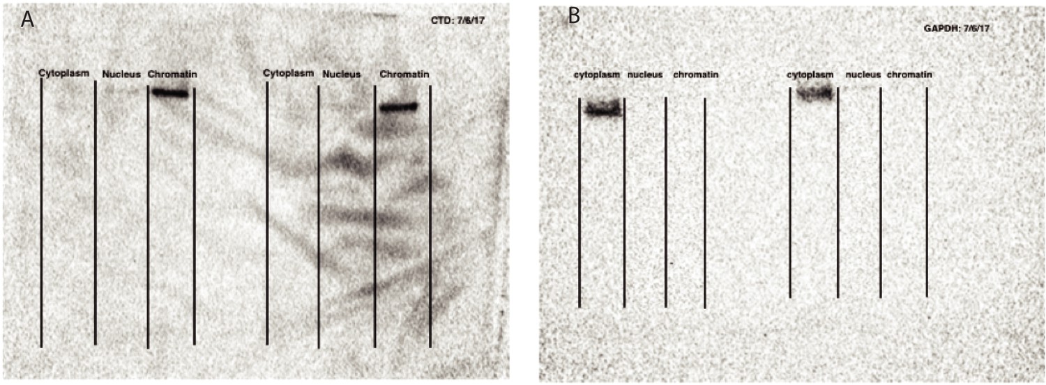
Validation of cellular fractionation with western blots.
(A) Western blot against Carboxyl terminal domain of RNA Polymerase II, photo captured at 10 s exposure. Blot is not used for quantification, but to validate cell fractionation. (B) Western blot against GAPDH to mark glycolysis in cytoplasm, photo captured at 25 s exposure time. Blot is not used for quantification, but to validate cell fractionation. Figure panels are modeled off Mayer and Churchman, 2016, Figure 2.
Figure 1—figure supplement 8
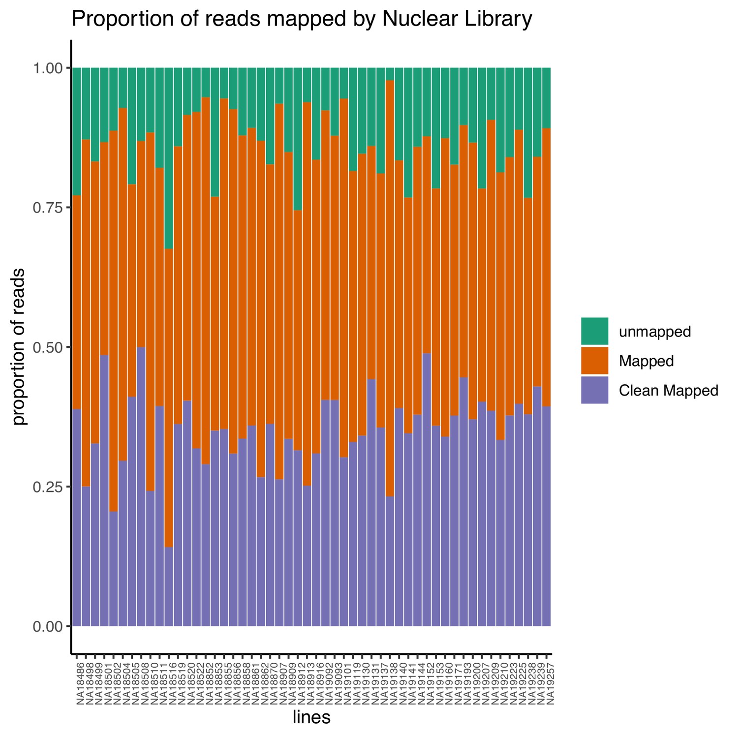
Proportion of reads that map to the genome (mapped) and the proportion of final reads used for analysis are cleanly mapped (Clean Mapped) by nuclear mRNA library.
Cleanly mapped reads are reads that mapped successfully and passed the filtering for mispriming (MP) as described in the Materials and methods.
Figure 1—figure supplement 9
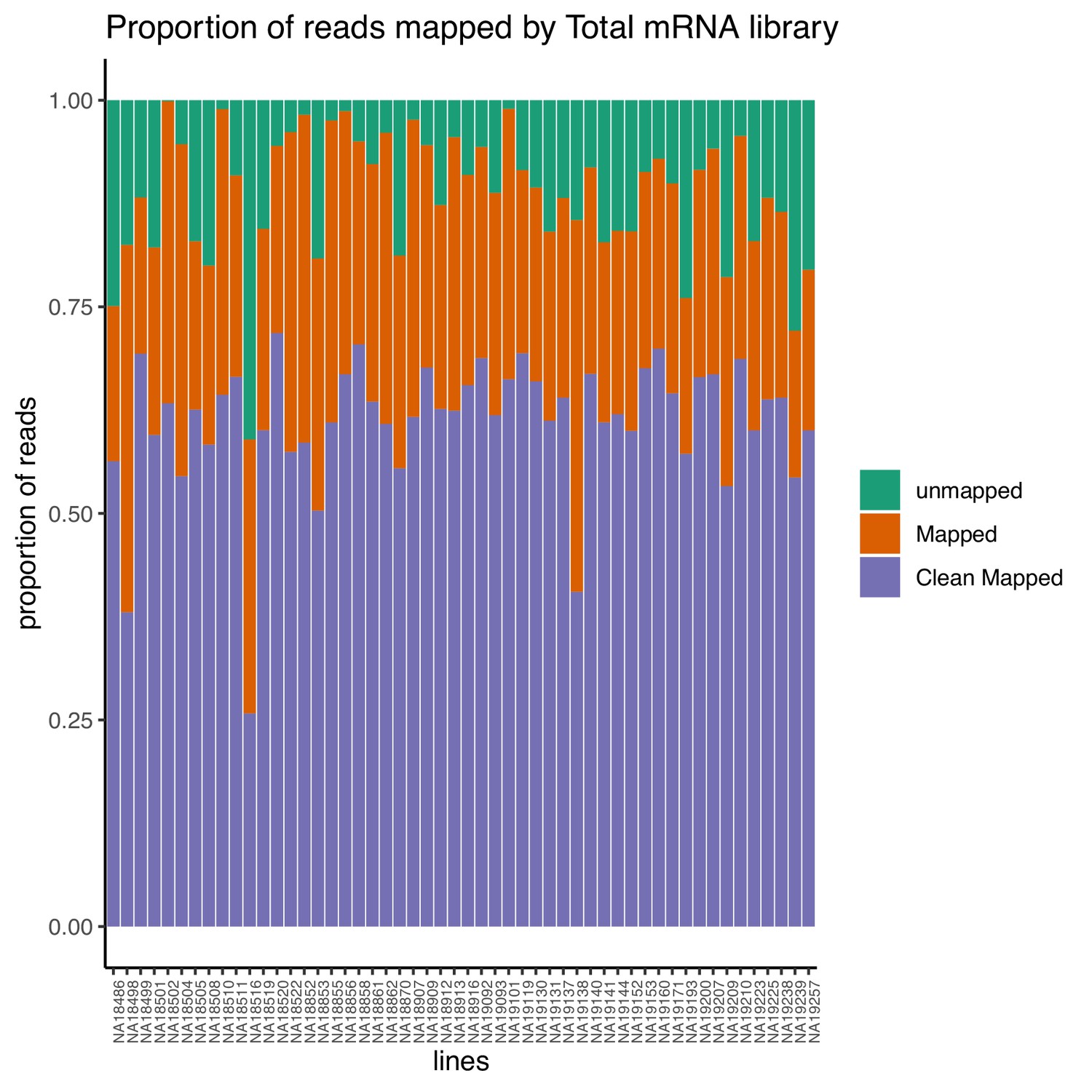
Proportion of reads that map to the genome (mapped) and the proportion of final reads used for analysis that are cleanly mapped (Clean Mapped) by total mRNA library.
Cleanly mapped reads are reads that mapped successfully and passed the filtering for mispriming (MP) as described in the Materials and methods.
Figure 1—figure supplement 10

Total number of reads that map to the genome (mapped) and the number of final reads used for analysis that are cleanly mapped (Clean Mapped) by nuclear mRNA library.
Cleanly mapped reads are reads that mapped successfully and passed the filtering for mispriming (MP) as described in the Materials and methods.
Figure 1—figure supplement 11
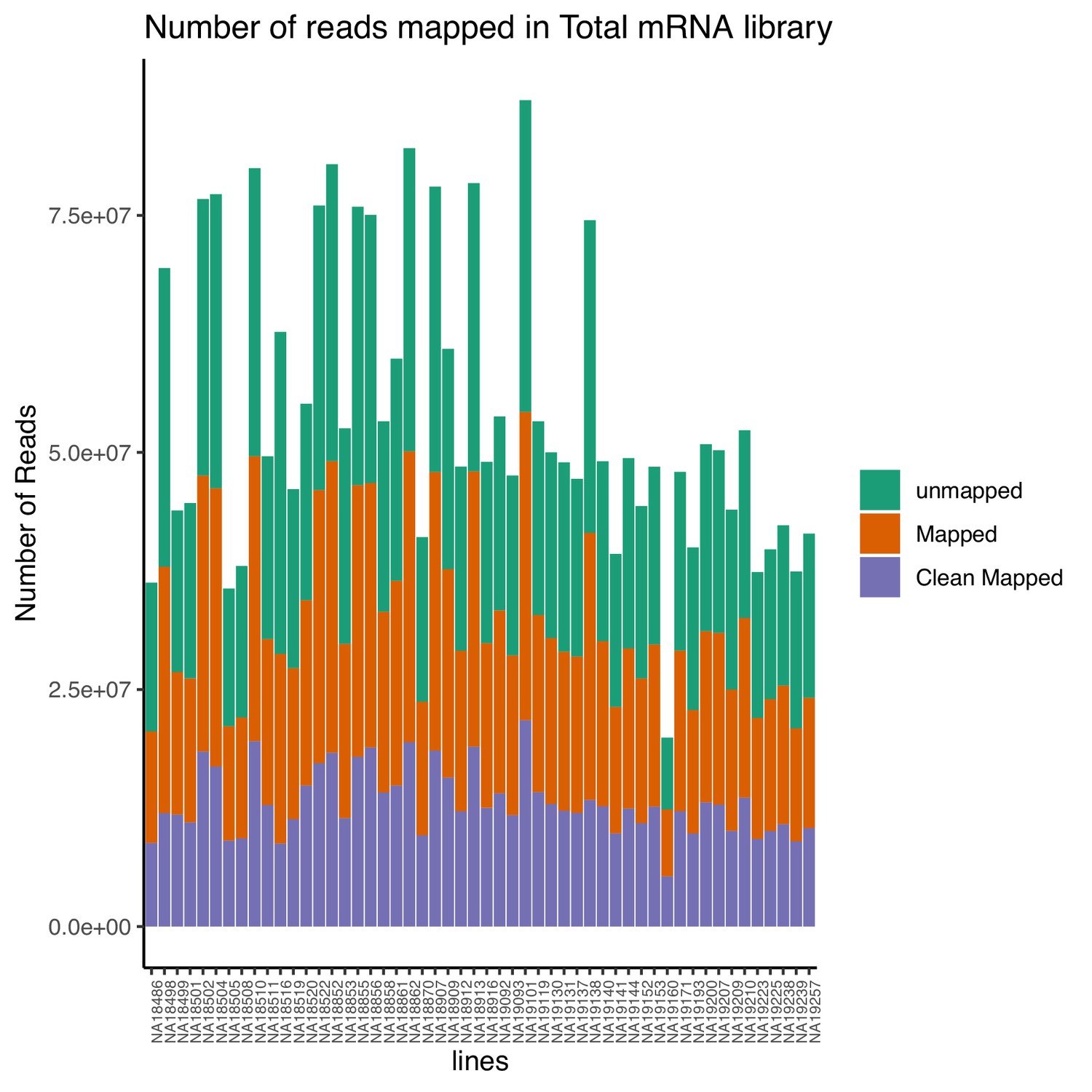
Total number of reads that map to the genome (mapped) and the number of final reads used for analysis that are cleanly mapped (Clean Mapped) by total mRNA library.
Cleanly mapped reads are reads that mapped successfully and passed the filtering for mispriming (MP) as described in the Materials and methods.
Figure 2 with 8 supplements
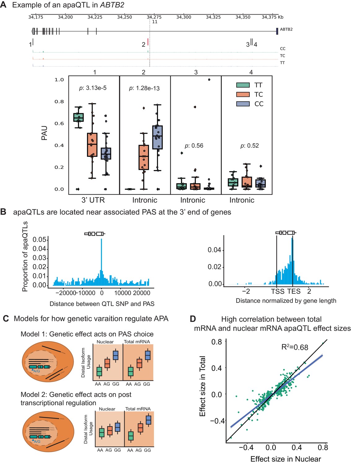
Impact of genetic variation on PAS choice.
(A) An apaQTL in the ABTB2 gene impact usage of an intronic PAS. (Top) Gene track and identified PAS. Each bar represents a PAS. The red bar corresponds to the PAS most strongly associated with the apaQTL. The vertical dotted line represents the position of the lead apaQTL SNP. (Bottom) Boxplot of polyadenylation site usage at each PAS by genotype listed according to the PAS order above. The C allele increases usage of the intronic PAS. (B) (Left) Location of the lead nuclear apaQTL SNPs relative to their corresponding PAS. (Right) Meta gene plot showing the distribution of apaQTL SNPs in the annotated gene body, where 0 represents the transcription start site and 1 represents the annotated transcription end site. (C) Two mechanistic models for how genetic variants can affect PAS usage. (Model 1) Genetic variation acts directly on PAS choice. In this case, the apaQTL will be identified with similar effect sizes in both nuclear and total mRNA fractions, or smaller effect size in the total mRNA fraction. (Model 2) Genetic variation acts through a post transcriptional mechanism. For example, one mRNA isoform is subject to decay. In this case, the apaQTL will be identified only in the total mRNA fraction, or will be identified in the total mRNA fraction with a larger effect size than in the nuclear mRNA fraction. (D) Effect sizes of apaQTLs originally identified at 10% FDR in the nuclear mRNA fraction plotted against the effect sizes ascertained in the total mRNA fraction. Regression line is shown in blue and line is shown in black.
Figure 2—figure supplement 1
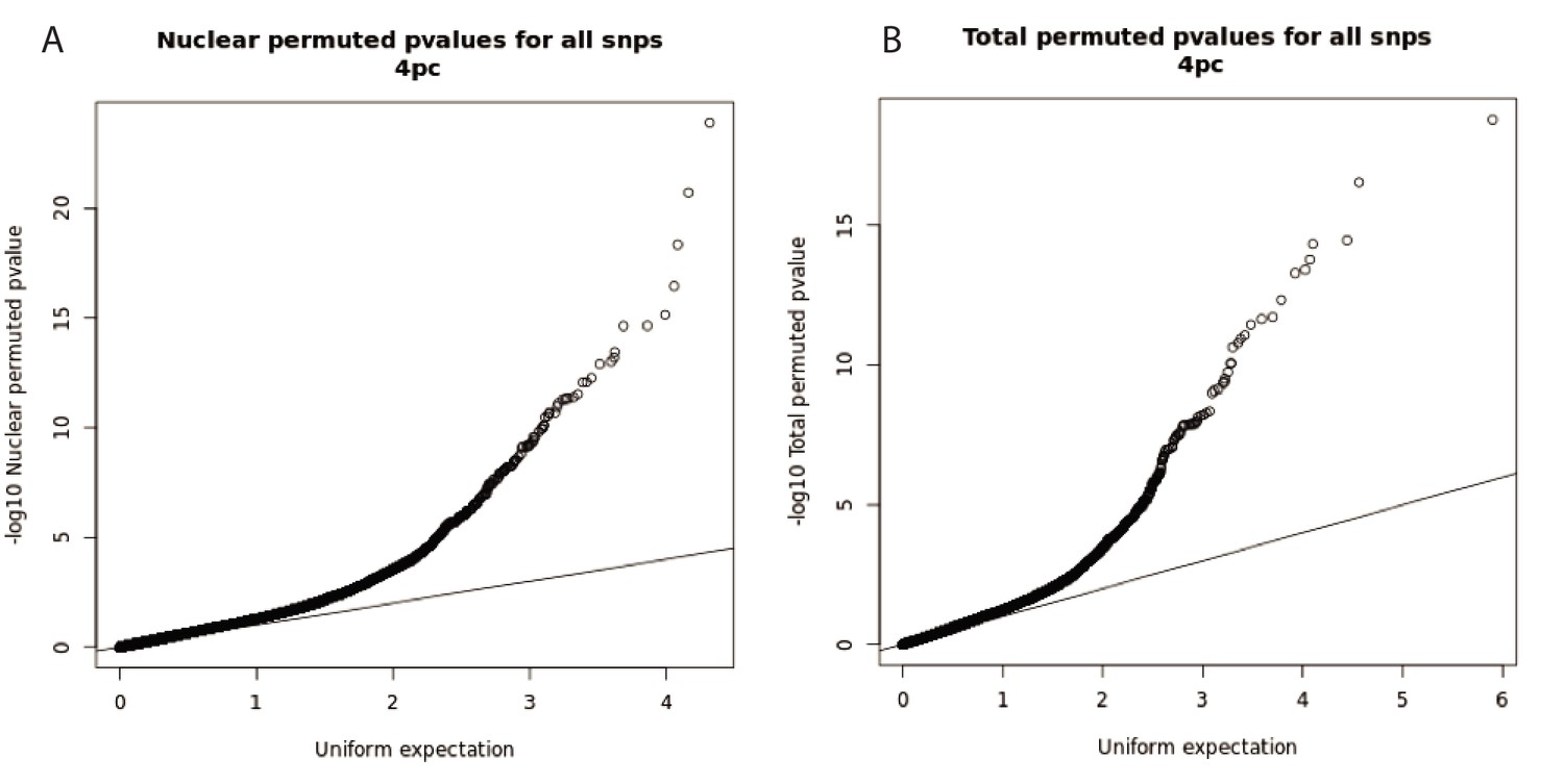
Q-Q plots for total and nuclear apaQTL linear regression tests.
(A) Q-Q plot for nuclear apaQTLs, plotting adjusted p-values of the top SNP PAS associations. (B) Q-Q plot for total apaQTLs, plotting adjusted p-values of the top SNP PAS associations.
Figure 2—figure supplement 2
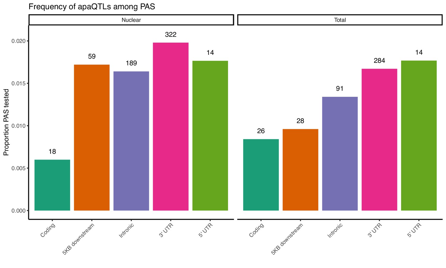
Proportion of PAS in different genomic locations with a significant apaQTL.
The numbers above each bar represent the number of identified apaQTL for each location.
Figure 2—figure supplement 3
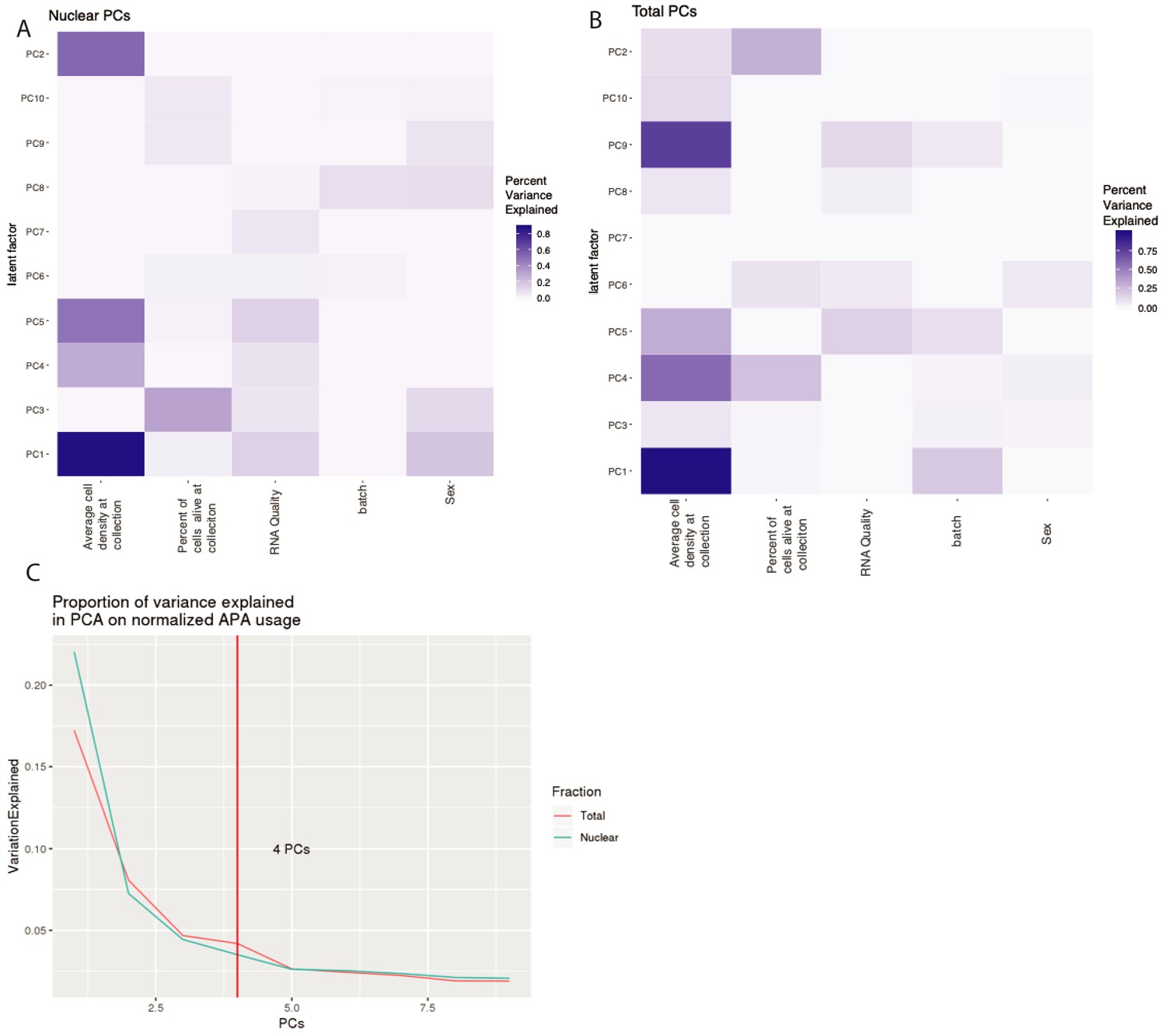
Top 4 PCs included in our apaQTL linear models to account for technical variation.
(A) Proportion of variance explained in the 10 first PCs by experimental variables in nuclear APA usage. We used a linear model to look at correlation between PC and each covariate. (B) Proportion of variance explained in the 10 first PCs by experimental variables in total APA usage. We used a linear model to look at correlation between PC and each covariate. (C) Proportion of variance explained by each PC in APA usage. Vertical line represents the number of PCs used as covariates in our apaQTL analysis.
Figure 2—figure supplement 4
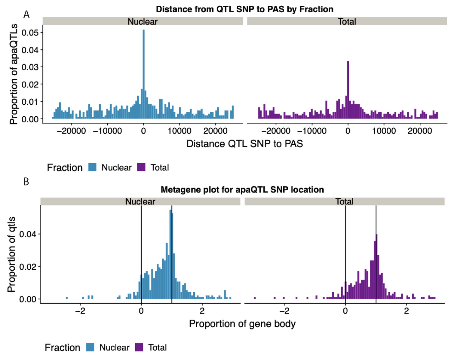
Expansion of Figure 4B that includes both fractions.
(A) Histogram showing the distribution of the distance between lead apaQTL SNP and the PAS, separated by mRNA fraction. (B) Histogram showing the distribution of the distance between lead apaQTL SNP and gene features, where 0 represents annotated TSS and 1 represents annotated TES, separated by mRNA fraction.
Figure 2—figure supplement 5
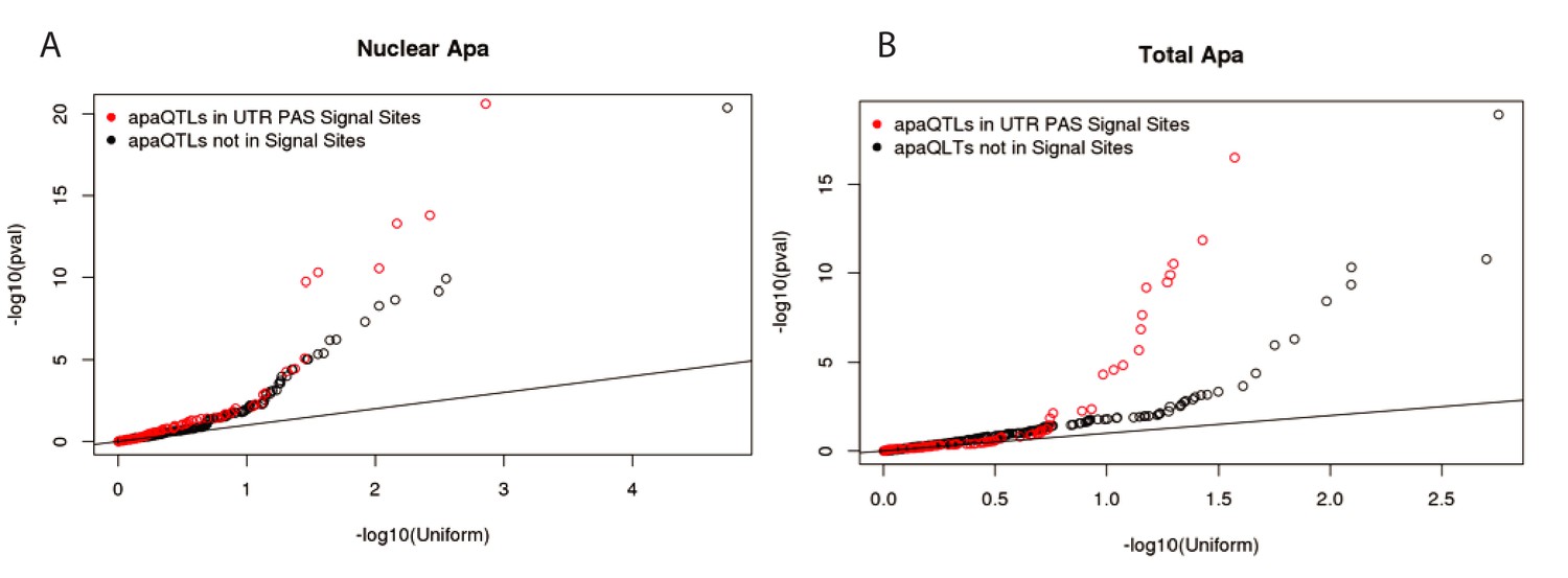
Signal site disruption cannot explain the majority of apaQTLs.
(A) Q-Q plot showing the nuclear apaQTL p-values for SNP in signal sites upstream of 3’ UTR PAS compared to matched SNPs (equal distance) upstream of a set of 3’UTR PAS without identified signal sites. (B) Similar to panel A, but for total apaQTLs.
Figure 2—figure supplement 6
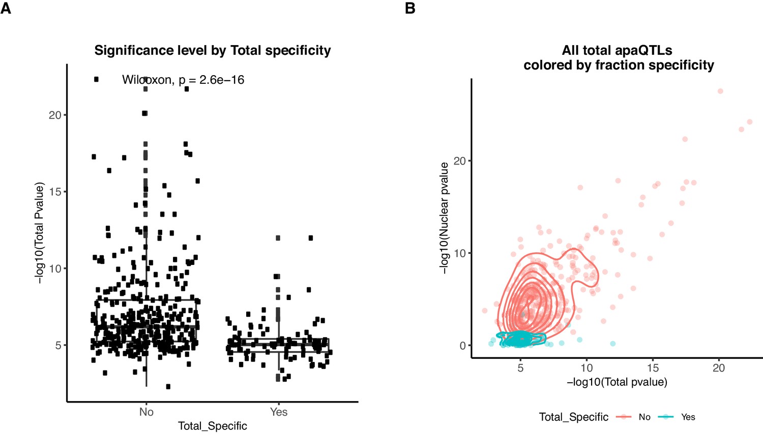
Total specific apaQTLs have smaller effect sizes than shared apaQTLs.
(A) Boxplot showing the -log10(p-value) of the nominal total apaQTL associations separated by whether the association is also identified in the nuclear mRNA fraction. ApaQTLs that are total-specific have significantly weaker associations. (B) Scatter plot showing the relationship between the -log10(p-valued) of the apaQTL associations in both mRNA fractions for total mRNA apaQTLs. Dots and densities are colored by whether the apaQTL is total-specific or shared. Total-specific apaQTLs are likely not detected in the nuclear fraction due to a lack of power.
Figure 2—figure supplement 7
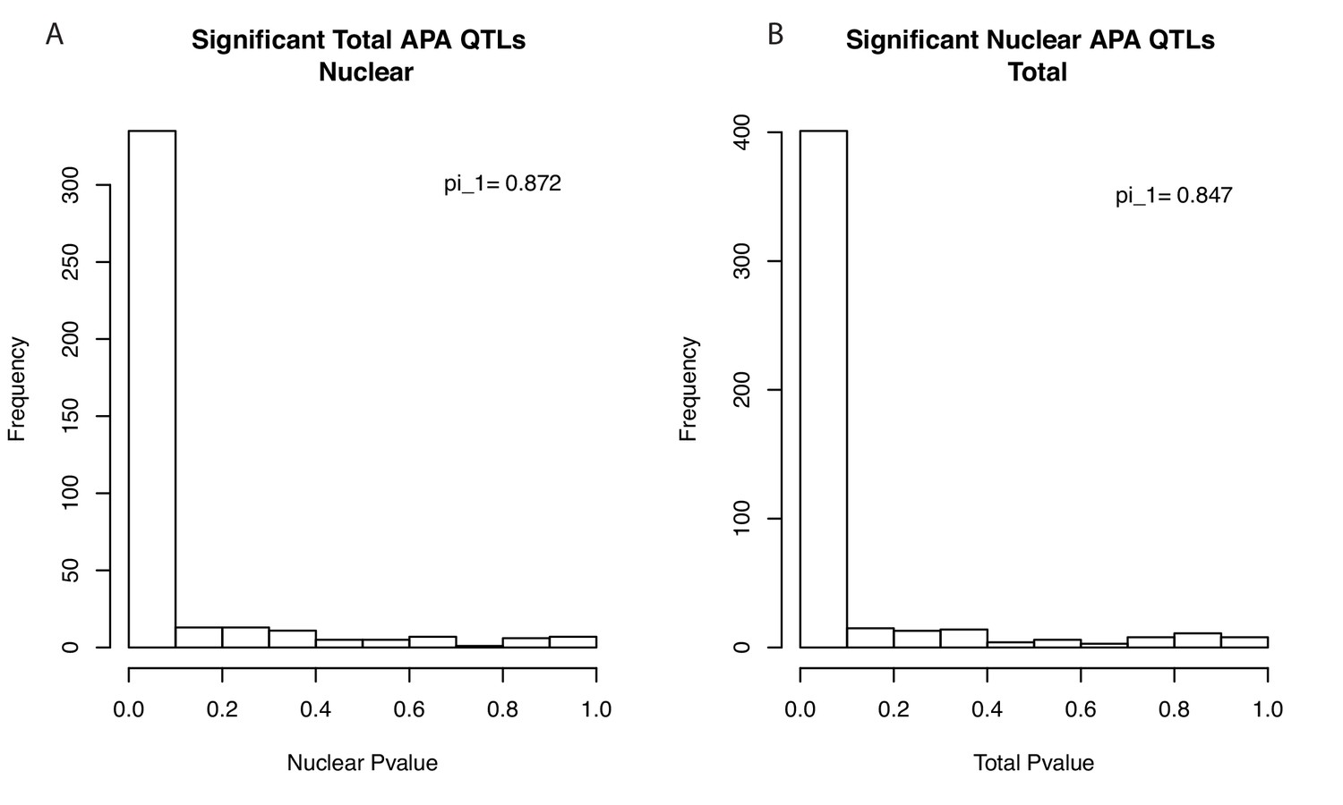
Storey's Pi statistics suggest most apaQTLs are shared between fractions.
(A) Histogram showing the P-value distribution of the apaQTL associations between the lead total apaQTL SNP and the corresponding PAS ascertained using our 3’-Seq data from the nuclear mRNA fraction. Values were calculated based on PAS tested in both fractions (403 of 443). Results are robust to using all PAS (pi_1 = 0.842). (B) Histogram showing the P-value distribution of the apaQTL associations between the lead nuclear apaQTL SNP and the corresponding PAS ascertained using our 3’-Seq data from the total mRNA fraction. Values calculated based on PAS tested in both fractions. (483 of 602) Results are robust to using all PAS (pi_1 = 0.825).
Figure 2—figure supplement 8
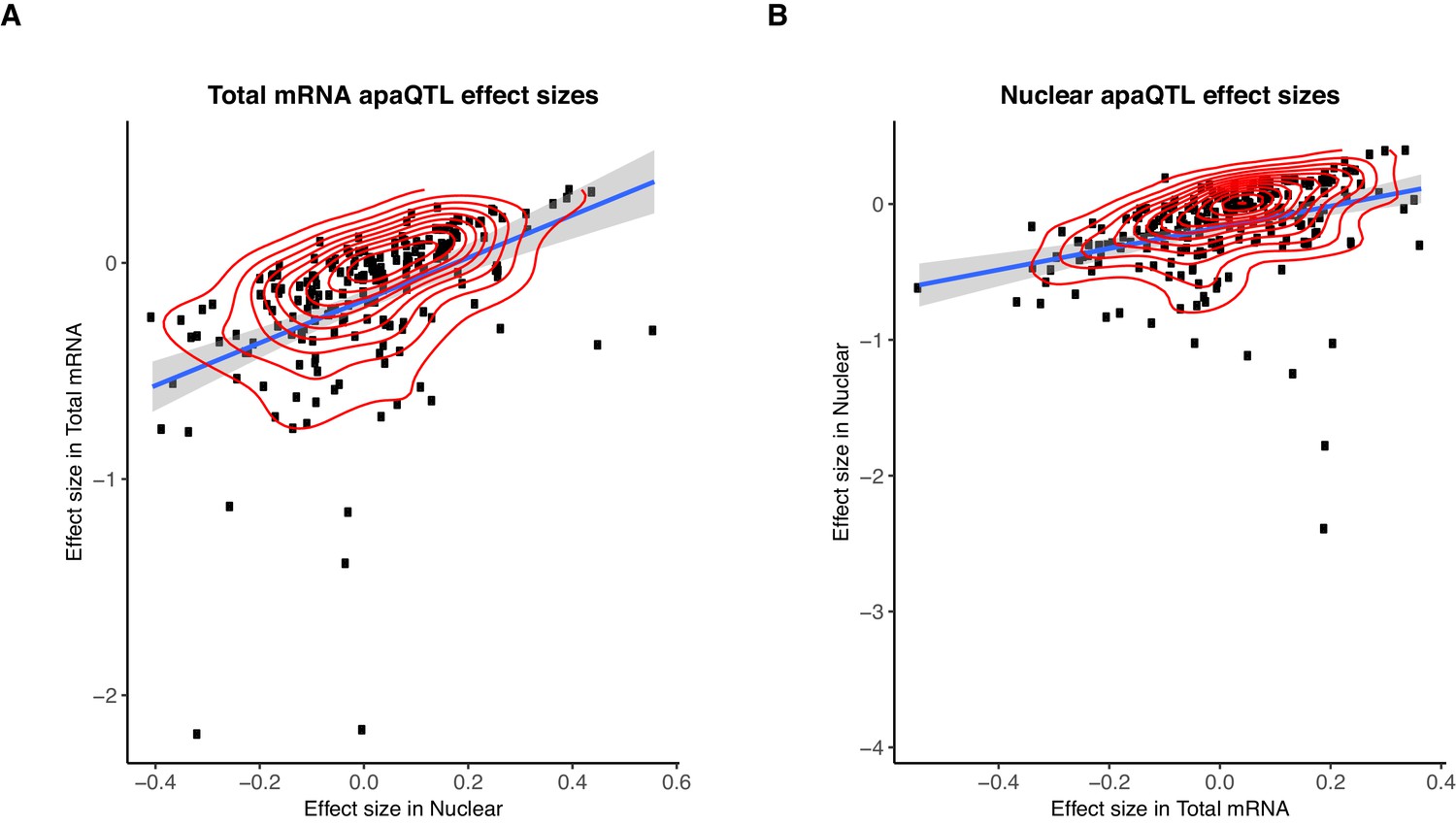
Sharing of genetic effects on APA between fractions.
(A) Normalized effect sizes ascertained in total mRNA and nuclear fraction of total apaQTLs tested in both fractions. (B) Normalized effect sizes ascertained in total mRNA and nuclear fraction for nuclear apaQTLs tested in both fractions.
Figure 3 with 4 supplements

APA can mediate genetic effects on mRNA expression.
(A) Scatter plot of intronic apaQTL effect sizes plotted against their eQTL effect sizes shows negative correlation. (B) Quantile-quantile (Q–Q) plot for apaQTLs shows that apaQTLs are more highly enriched in unexplained eGenes (purple dots) compared to explained eGenes (red dots). (C) Example of an apaQTL that is also an unexplained eQTL for C10orf88. (Top) Gene track and identified PAS in the C10orf88 gene. The red bar corresponds to the PAS most strongly associated with the apaQTL. The vertical dotted line represents the position of the strongest apaQTL SNP. (Middle) Zoomed version of track represented above. (Bottom) Boxplot of polyadenylation site usage at each PAS by genotype listed according to PAS order above. (D) (Top) LocusZoom plot for eQTL associations for the C10orf88 gene. (Bottom) LocusZoom plot for apaQTL associations. Interestingly, the lead apaQTL and eQTL SNP, rs7904973, has been linked to increased LDL cholesterol through GWAS (Klarin et al., 2018).
Figure 3—figure supplement 1
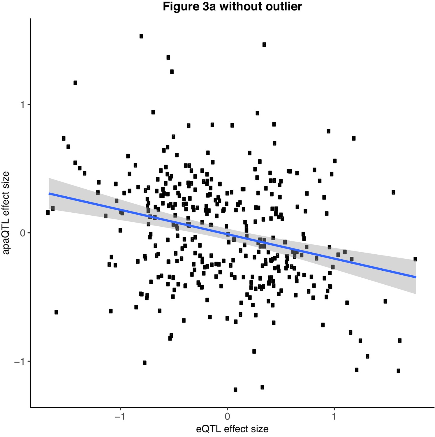
Scatter plot showing the relationship between intronic nuclear apaQTL effect size and eQTL effect size after removing outlier SNPs (Filtered for SNPs with eQTL effect size <− 2.0).
Figure 3—figure supplement 2

Q-Q plot showing the total apaQTL (adjusted) p-values separated by whether the gene harbors an explained (red) or unexplained (blue) eQTLs.
We observe an enrichment for low apaQTL association p-values in genes with eQTLs compared to all tested genes (black).
Figure 3—figure supplement 3
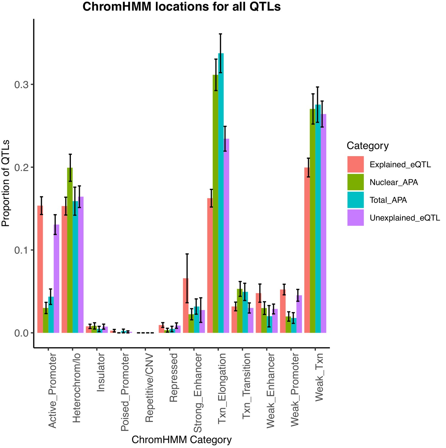
Bar plot showing the proportion of apaQTLs located in each of the 12 chromatin states from chromHMM.
We find that the location profile of apaQTLs is more similar to that of unexplained eQTLs than that of explained eQTLs. Error bars represent the 95% confidence interval for each point estimate from bootstrapping 1000 times.
Figure 3—figure supplement 4
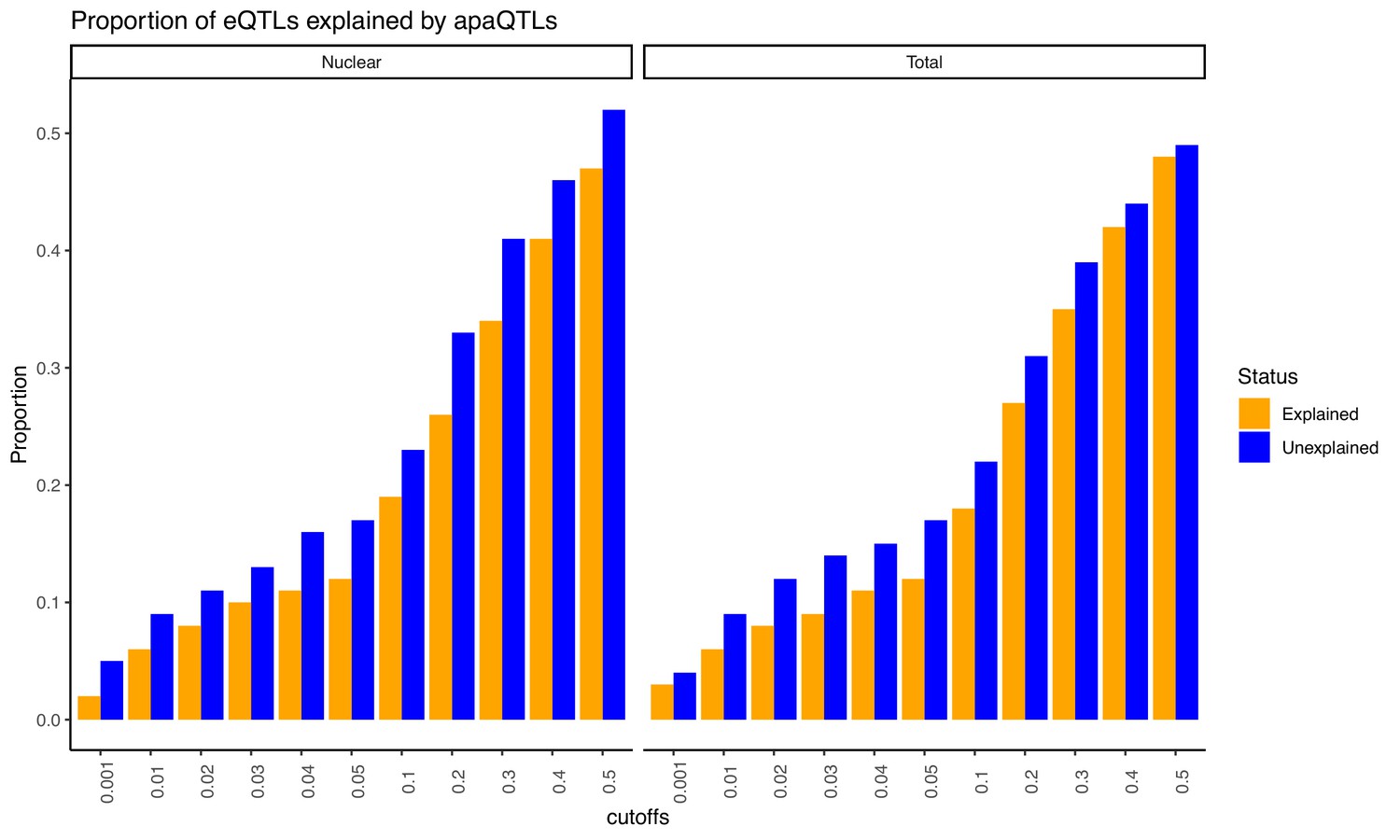
Proportion of eQTLs putatively explained by apaQTLs separated by fraction.
Expression QTLs could be explained by apaQTLs identified from both fractions. This observation is robust to apaQTL association p-value cutoffs. We observed that apaQTLs explain a slightly higher proportion of previously unexplained eQTLs. Explained/Unexplained status of each eQTL was determined previously in Li et al., 2016.
Figure 4 with 3 supplements
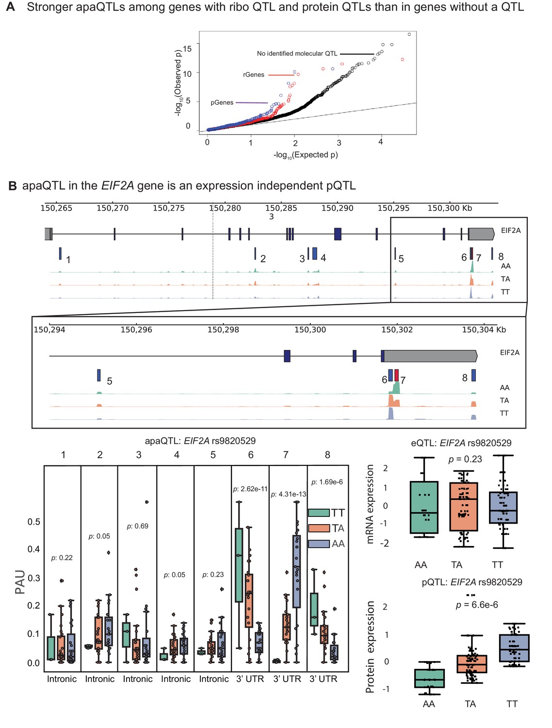
apaQTLs can regulate gene expression without affecting mRNA expression levels.
(A) Quantile-quantile (Q–Q) plot for apaQTLs separated by genes in previously detected rQTLS (red) and pQTLs (purple) that are not eQTLs. Black points are apaQTL genes with no pQTL, rQTL, or eQTL. (B) (Top) Gene track and identified PAS in the EIF2A gene. The red bar corresponds to the PAS most strongly associated with the apaQTL. The vertical dotted line represents the position of the strongest apaQTL SNP. (Middle) Zoomed version of track represented above. (Bottom Left) Boxplot of polyadenylation site usage at each PAS by genotype listed according to PAS order above. (Top Right) Boxplot showing normalized mRNA expression for EIF2A by genotype at the apaQTL SNP (rs9820529). (Bottom Right) Boxplot showing normalized protein expression for EIF2A by genotype at the apaQTL SNP (rs9820529).
Figure 4—figure supplement 1
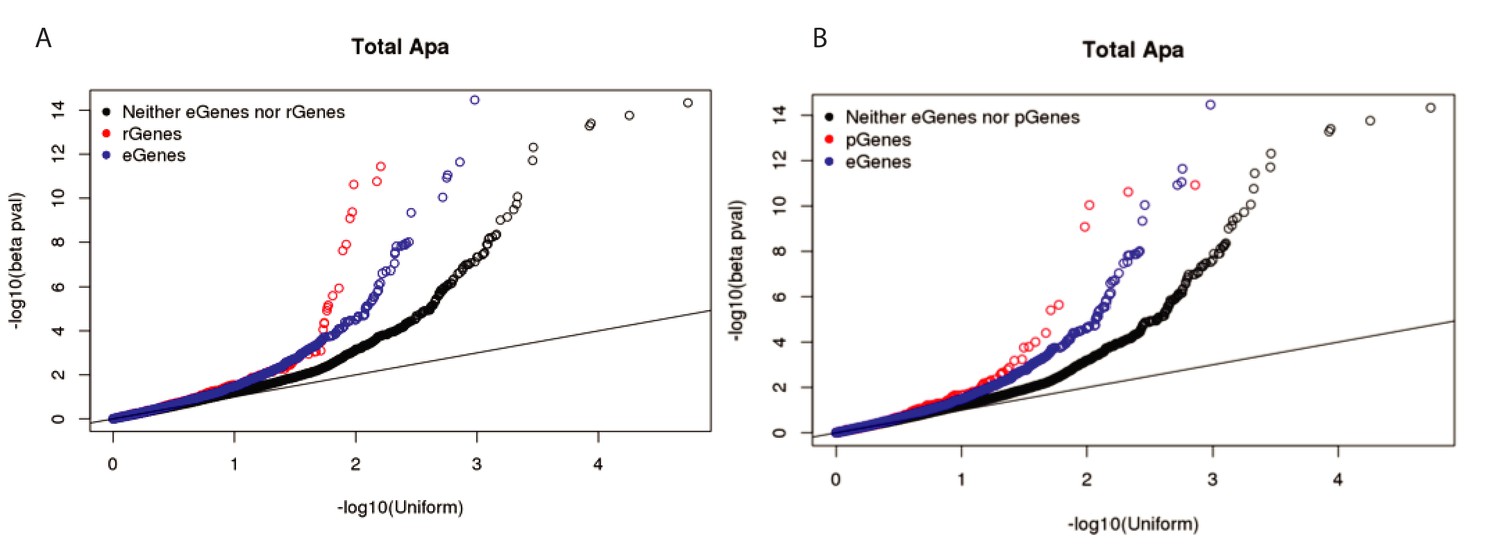
Stronger ribo QTLs and protein QTLs than expression QTLs in total fraction.
(A) Q-Q plot showing the total apaQTL (adjusted) p-values separated by whether the corresponding gene has a ribosome occupancy QTL (red) or an eQTL (red). We see an enrichment for low apaQTL p-values in genes with either association. (B) Q-Q plot showing the total apaQTL (adjusted) p-values separated by whether the corresponding gene has a protein expression QTL (red) or an eQTL (red). We see an enrichment for low apaQTL p-values in genes with either association.
Figure 4—figure supplement 2

LocusZoom plots for EIF2A apaQTL in Figure 4B along with associations with RNA expression, ribosome occupancy (ribo-seq), and protein expression as determined using normalized data from Li et al., 2016.
LD patterns were colored according to the HapMap YRI lines.
Figure 4—figure supplement 3
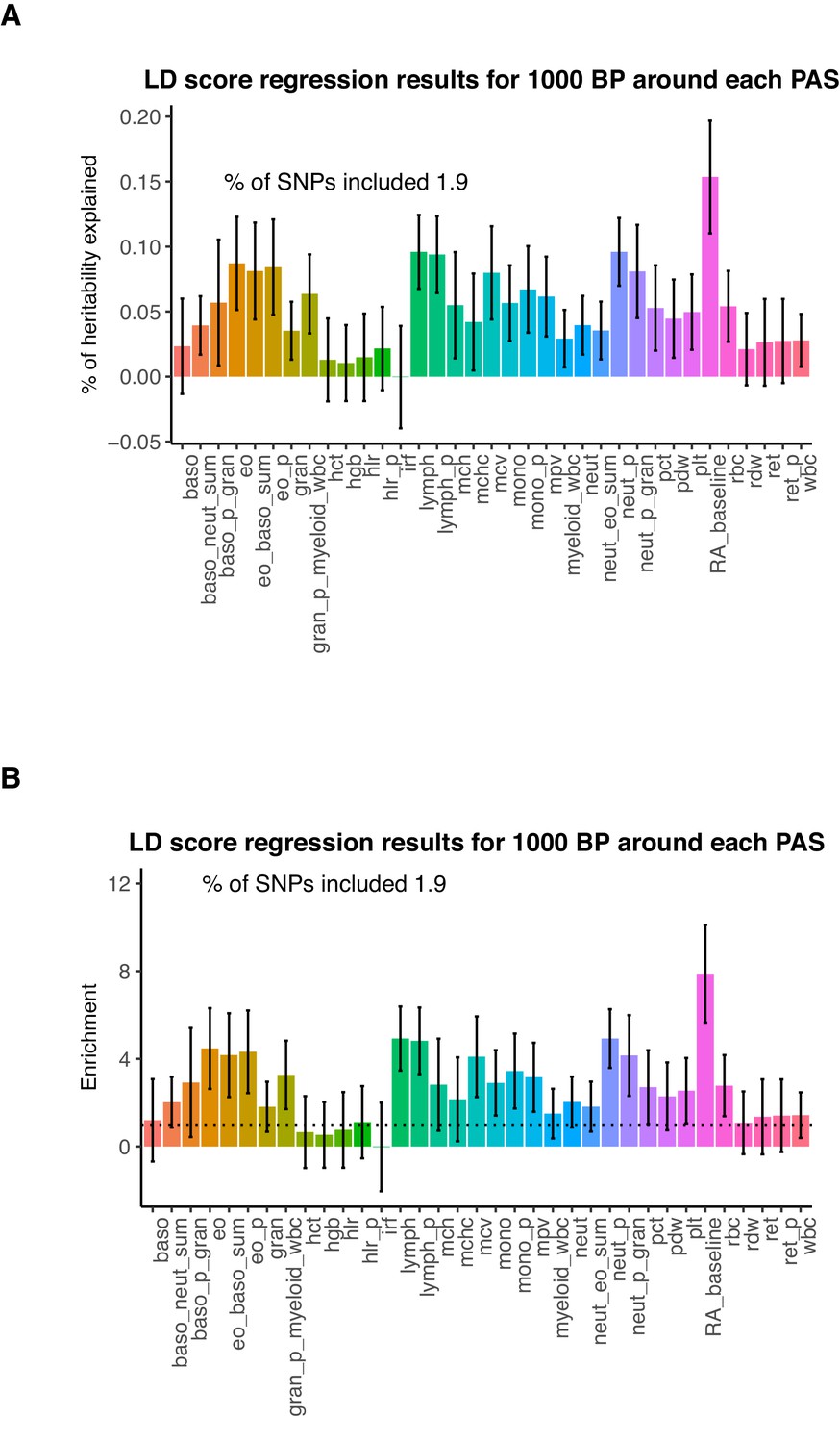
Genetic variation around PAS contribute to trait heritability.
(A) Percent of heritability explained by SNPs within 1kb around each PAS. Error bars represent +/- 1 standard deviation. We analyzed the following phenotypes: Baso – Basophil count, Baso_p – Basophil percentage of white cells, Baso_p_gran – Basophil percentage of granulocytes, Baso_neut_sum – sum basophil neutrophil count, Eo_baso_sum – sum eosinophil basophil count, Eo – eosinophil count, Eo_p – eosinophil percentage of white cells, Eo_p_gran - eosinophil percentage of granulocytes, Gran – granulocyte count, Gran_p_myeloid_wbc - granulocyte percentage of myeloid white cells, Hct - hermatocrit, Hgb - hemoglobin concentration, Hlr_p - high light scatter percentage of red cells, Hlr - high light scatter reticulocyte count, Irf - immature fraction of reticulocyte cells, Lymph - lymphocyte count, Lymph_p – lymphocyte percentage of white cells, Mchc - mean corpuscular hemoglobin concentration, Mch - mean corpuscular hemoglobin, Mcv - mean corpuscular volume, Mono – monocyte count, Mono_p – monocyte percentage of white cells, Mpv – mean platelet volume, Myeloid_wbc – myeloid cell count, Neut_eo_sum – neutrophil percentage of granulocytes, Neut - neutrophil count, Neut_p -neutrophil percentage of white cells, Pct - plateletcrit, Pdw - platelet distribution width, Plt - platelet count, Rbc - red blood cell count, Rdw - red cell distribution width, Ret - reticulocyte count, Ret_p – reticulocyte fraction of red cells, Wbs - white blood cell count, RA – rheumatoid arthritis. Blood phenotype statistics published in Astle et al., 2016. Rheumatoid arthritis statistics were obtained from Okada et al., 2014. (B) Enrichment of heritability explained by SNPs within 1kb around PAS for the phenotypes analyzed.
Author response image 1
Author response image 2

Author response image 3
Author response image 4
Additional files
-
Supplementary file 1
Supplementary Text.
- https://cdn.elifesciences.org/articles/57492/elife-57492-supp1-v2.pdf
-
Supplementary file 2
ApaQTL whose lead SNP is nominally associated with protein expression levels but not expression.
Table includes p-value and slope for the associated between the lead SNP and nuclear APA usage, gene expression levels, protein expression levels, and ribosome occupancy (as measured using ribo-seq).
- https://cdn.elifesciences.org/articles/57492/elife-57492-supp2-v2.txt
-
Supplementary file 3
Library information for each Yoruba lymphoblastoid cell line, including sample, collection, and read information.
- https://cdn.elifesciences.org/articles/57492/elife-57492-supp3-v2.txt
-
Transparent reporting form
- https://cdn.elifesciences.org/articles/57492/elife-57492-transrepform-v2.docx
Download links
A two-part list of links to download the article, or parts of the article, in various formats.
Downloads (link to download the article as PDF)
Open citations (links to open the citations from this article in various online reference manager services)
Cite this article (links to download the citations from this article in formats compatible with various reference manager tools)
Alternative polyadenylation mediates genetic regulation of gene expression
eLife 9:e57492.
https://doi.org/10.7554/eLife.57492


