Phenotypic and molecular evolution across 10,000 generations in laboratory budding yeast populations
- Department of Organismic and Evolutionary Biology, Harvard University, United States
- Quantitative Biology Initiative, Harvard University, United States
- NSF-Simons Center for Mathematical and Statistical Analysis of Biology, Harvard University, United States
- Department of Molecular and Cellular Biology, Harvard University, United States
- John A Paulson School of Engineering and Applied Sciences, Harvard University, United States
- Graduate Program in Systems, Synthetic, and Quantitative Biology, Harvard University, United States
- Department of Physics, Harvard University, United States
- Department of Applied Physics, Stanford University, United States
- Department of Physics, Massachusetts Institute of Technology, United States
- AeroLabs, Aeronaut Brewing Co, United States
- The Max Planck Institute of Molecular Cell Biology and Genetics, Germany
- School of Biological Sciences, Monash University, Australia
- Department of Cell and Systems Biology, University of Toronto, Canada
Figures
Figure 1
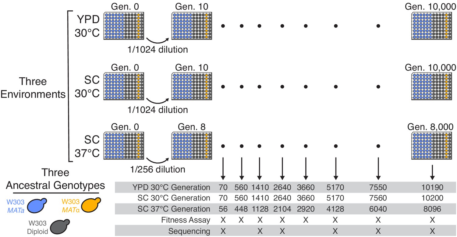
Experimental design.
We propagated budding yeast lines in 96-well microplates in one of three environmental conditions, using a daily dilution protocol as shown at top. Each population was founded by a single clone of one of three ancestral genotypes (a haploid MATa, a haploid MATα, and a diploid, all derived from the W303 strain background). On a weekly basis, we froze all populations in glycerol at −80°C for long-term storage. The frozen timepoints used for the analyses in this paper are indicated at bottom.
Figure 2 with 2 supplements
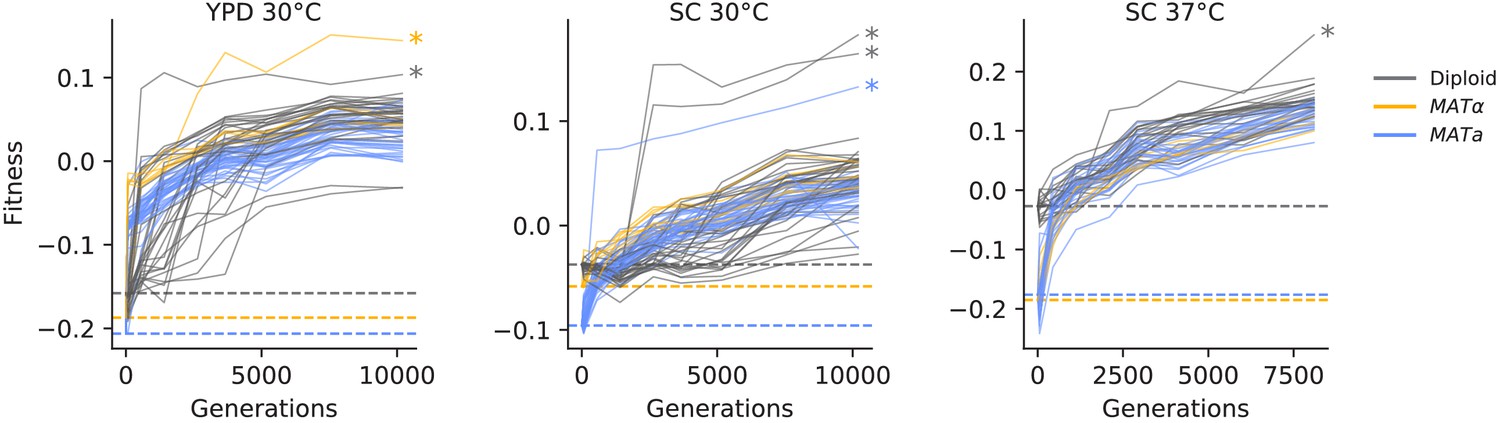
Fitness changes during evolution.
Competitive fitness is plotted relative to a reference strain in each environment. Inferred ancestral fitness is indicated by horizontal lines and colored by strain. Populations with premature stop-codon reversion mutations in ADE2 are indicated by asterisks. Correlations between replicate fitness measurements are shown in Figure 2—figure supplement 2.
Figure 2—figure supplement 1
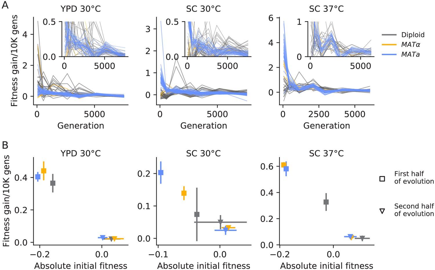
Declining adaptability.
(A) Fitness increase rate (per 10,000 generations) between timepoints over the course of evolution. The insets are the same data, but with a cut-off y-axis. (B) For each strain and environment, the mean rate of fitness gain over the first half of evolution (square points) and the second half of evolution (triangle points), as a function of initial fitness or the mean fitness at the midpoint, respectively. Colors are the same as in (A). Error bars represent standard deviations.
Figure 2—figure supplement 2
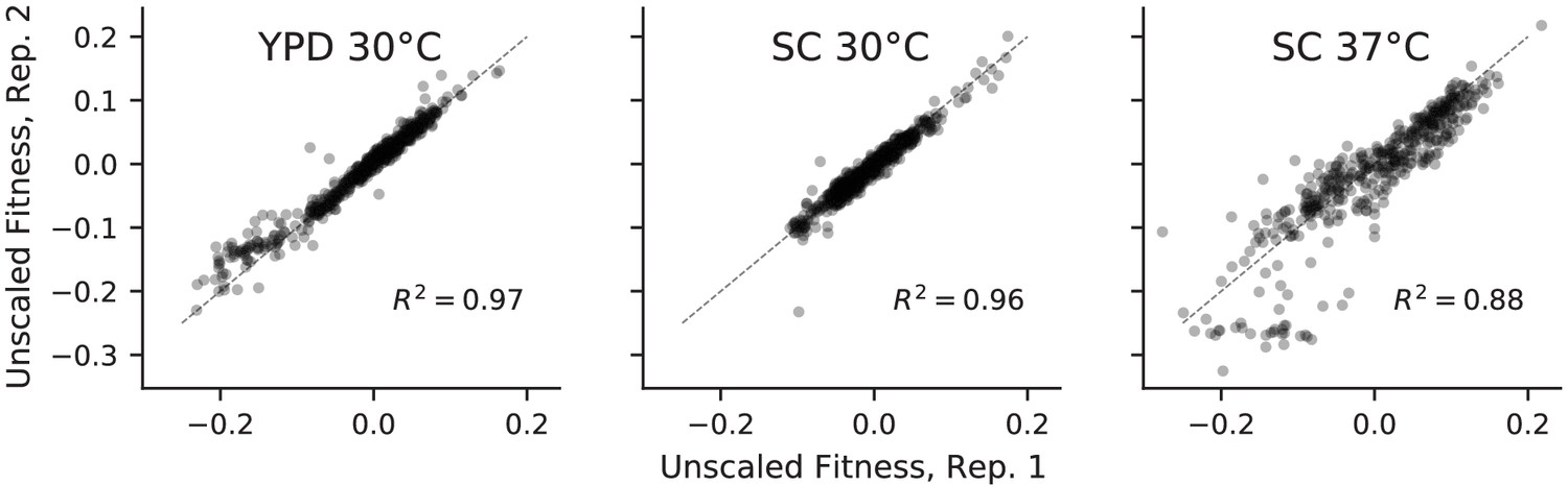
Correlations between absolute fitness measured in replicate competitions with a fluorescent reference.
Figure 3 with 11 supplements

Dynamics of molecular evolution.
(A) Allele frequencies over time in four example populations. Nonsynonymous mutations in ‘multi-hit’ genes are solid black lines (see ‘Parallelism’ section below), nonsynonymous mutations in the adenine biosynthesis pathway are colored orange and labeled, other nonsynonymous mutations are thin gray lines, and synonymous mutations are dotted lines. (B) Number of fixed mutations over time in each population. Timepoints with average coverage less than 10 (for haploids) or 20 (for diploids) are not plotted.
Figure 3—figure supplement 1
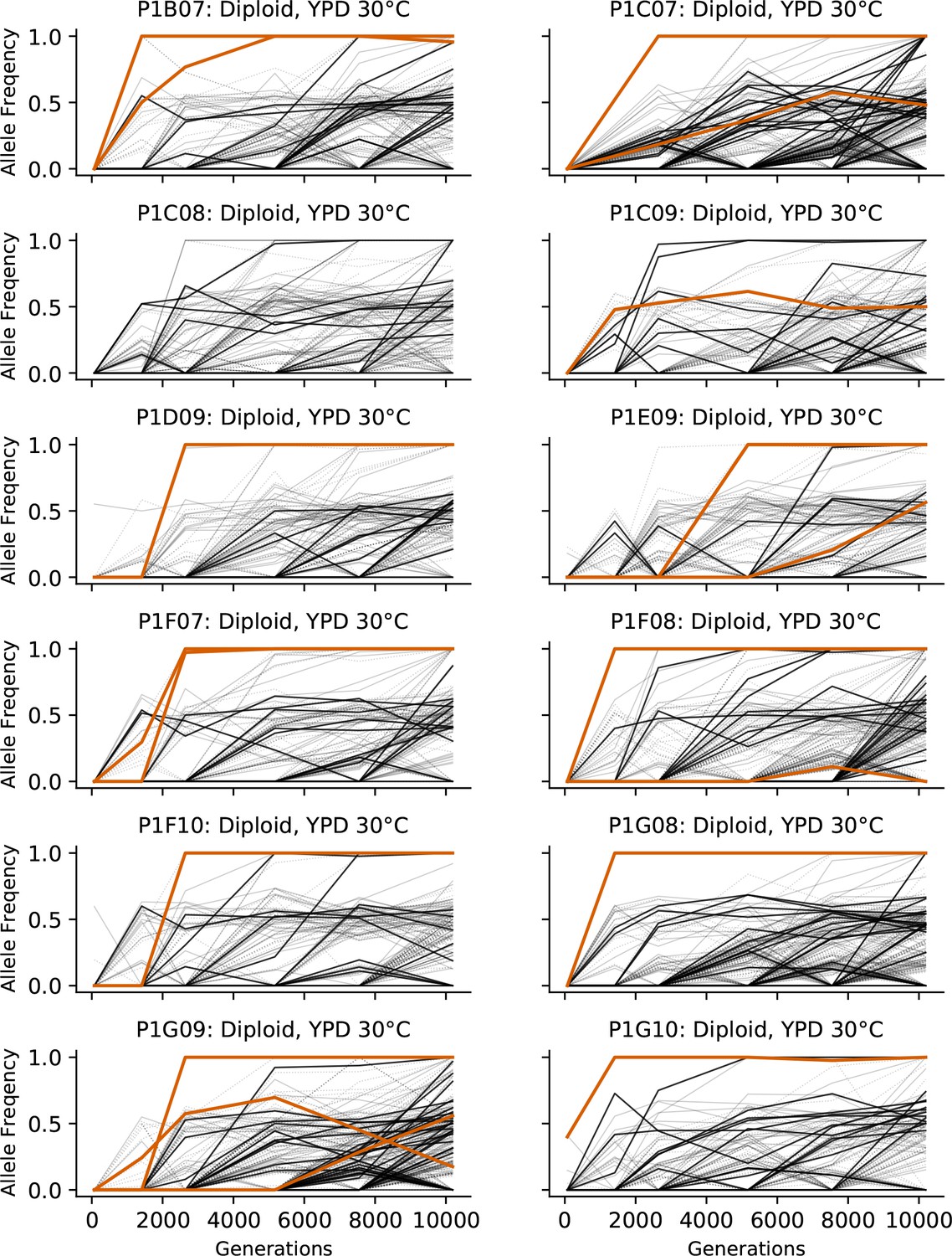
Allele frequencies over time in all focal diploid populations in YPD 30°C.
Nonsynonymous mutations in ‘multi-hit’ genes are solid black lines, mutations in the adenine biosynthesis pathway are colored orange, other nonsynonymous mutations are thin gray lines, and synonymous mutations are dotted lines.
Figure 3—figure supplement 2
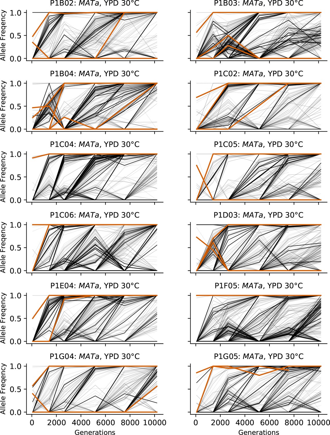
Allele frequencies over time in all focal MATa populations in YPD 30°C.
Nonsynonymous mutations in ‘multi-hit’ genes are solid black lines, mutations in the adenine biosynthesis pathway are colored orange, other nonsynonymous mutations are thin gray lines, and synonymous mutations are dotted lines.
Figure 3—figure supplement 3

Allele frequencies over time in all focal MATα populations in YPD 30°C.
Nonsynonymous mutations in ‘multi-hit’ genes are solid black lines, mutations in the adenine biosynthesis pathway are colored orange, other nonsynonymous mutations are thin gray lines, and synonymous mutations are dotted lines.
Figure 3—figure supplement 4
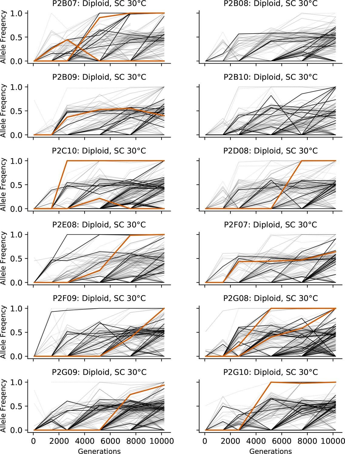
Allele frequencies over time in all focal diploid populations in SC 30°C.
Nonsynonymous mutations in ‘multi-hit’ genes are solid black lines, mutations in the adenine biosynthesis pathway are colored orange, other nonsynonymous mutations are thin gray lines, and synonymous mutations are dotted lines.
Figure 3—figure supplement 5
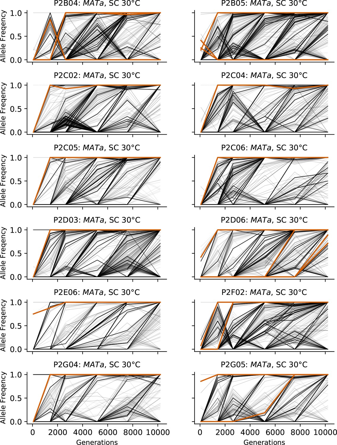
Allele frequencies over time in all focal MATa populations in SC 30°C.
Nonsynonymous mutations in ‘multi-hit’ genes are solid black lines, mutations in the adenine biosynthesis pathway are colored orange, other nonsynonymous mutations are thin gray lines, and synonymous mutations are dotted lines.
Figure 3—figure supplement 6
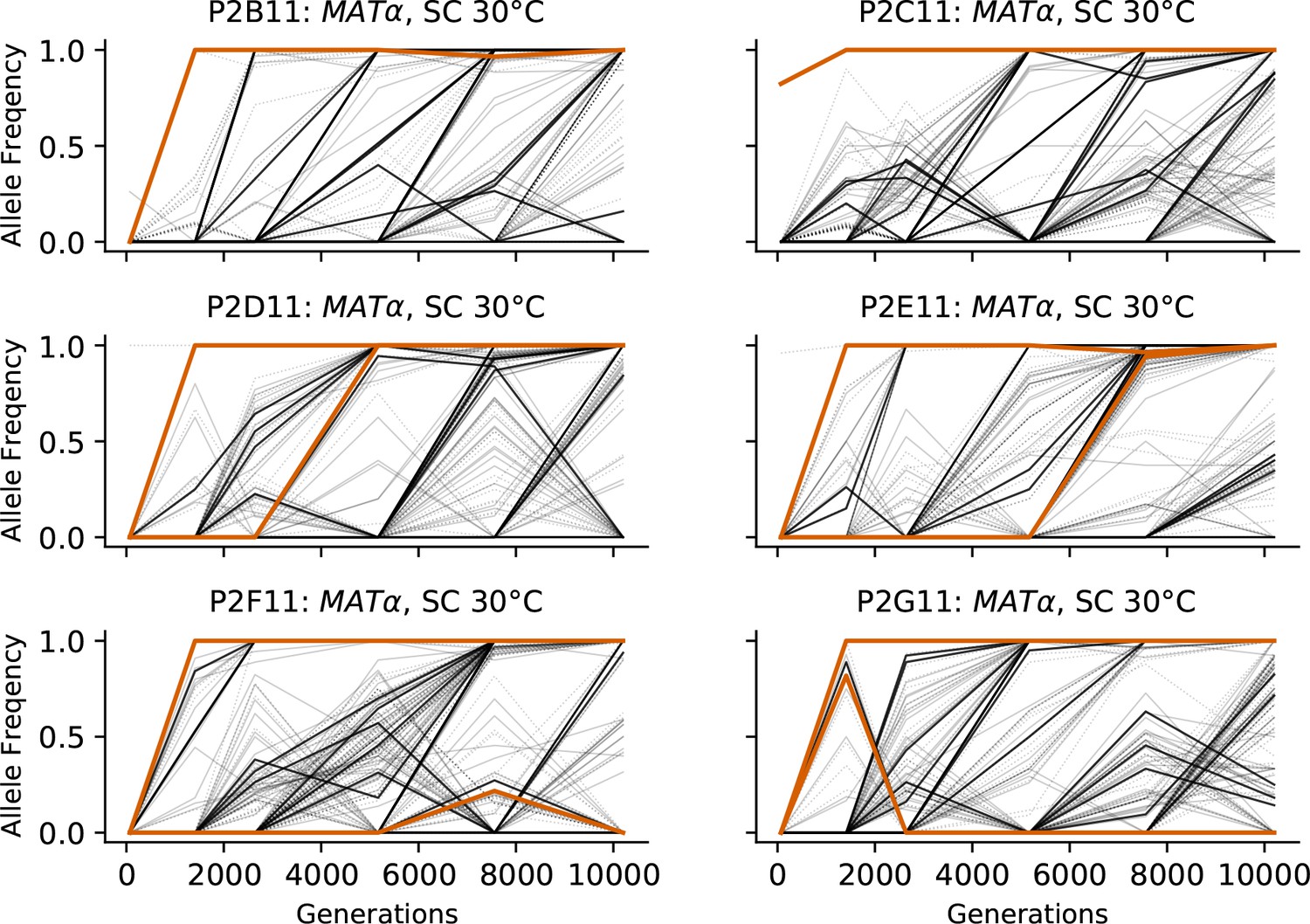
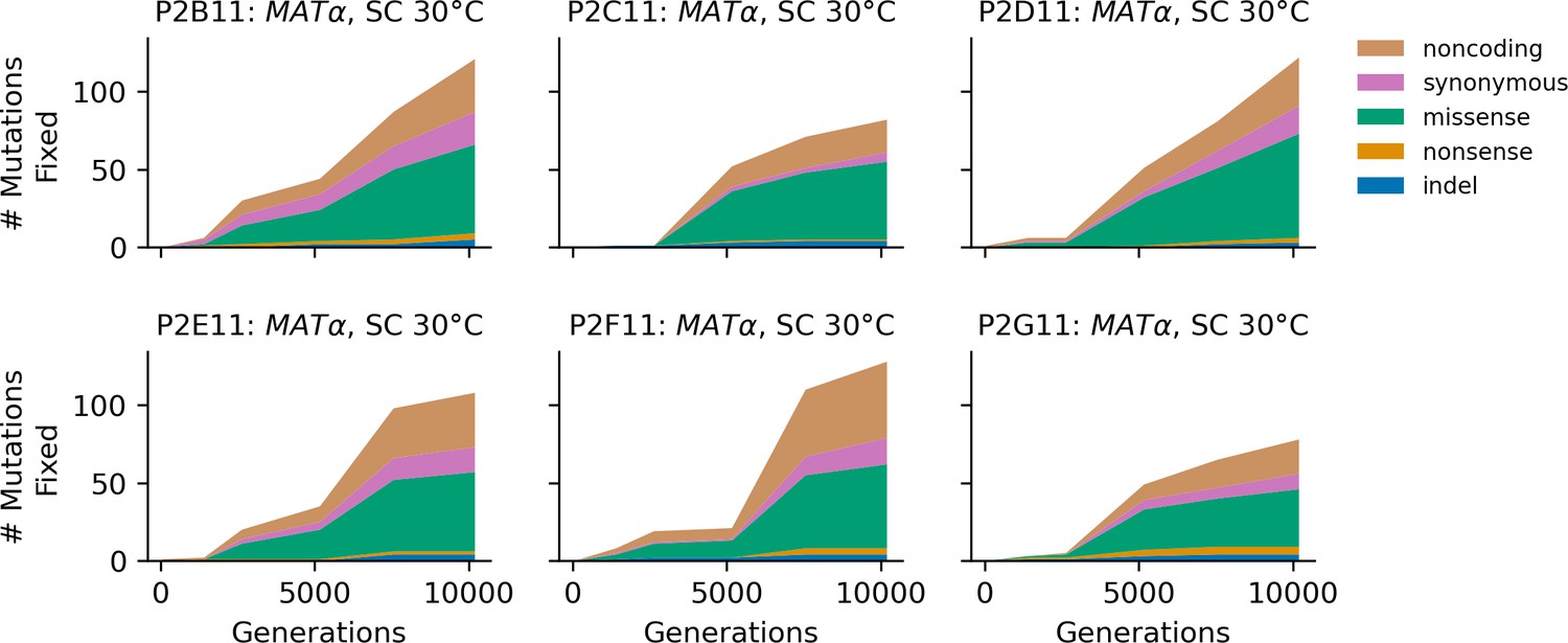
Allele frequencies over time in all focal MATα populations in SC 30°C.
Nonsynonymous mutations in ‘multi-hit’ genes are solid black lines, mutations in the adenine biosynthesis pathway are colored orange, other nonsynonymous mutations are thin gray lines, and synonymous mutations are dotted lines.
Figure 3—figure supplement 7
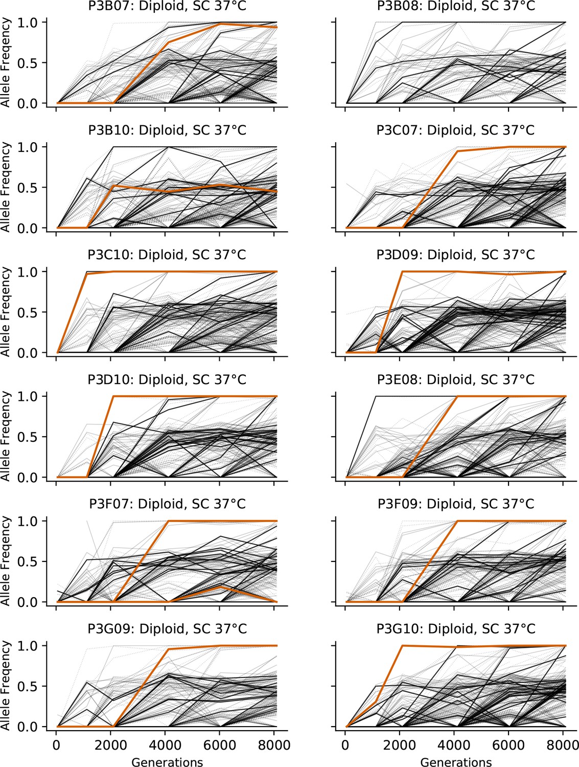
Allele frequencies over time in all focal diploid populations in SC 37°C.
Nonsynonymous mutations in ‘multi-hit’ genes are solid black lines, mutations in the adenine biosynthesis pathway are colored orange, other nonsynonymous mutations are thin gray lines, and synonymous mutations are dotted lines.
Figure 3—figure supplement 8
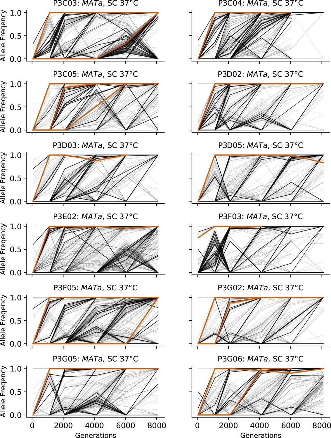
Allele frequencies over time in all focal MATa populations in SC 37°C.
Nonsynonymous mutations in ‘multi-hit’ genes are solid black lines, mutations in the adenine biosynthesis pathway are colored orange, other nonsynonymous mutations are thin gray lines, and synonymous mutations are dotted lines.
Figure 3—figure supplement 9
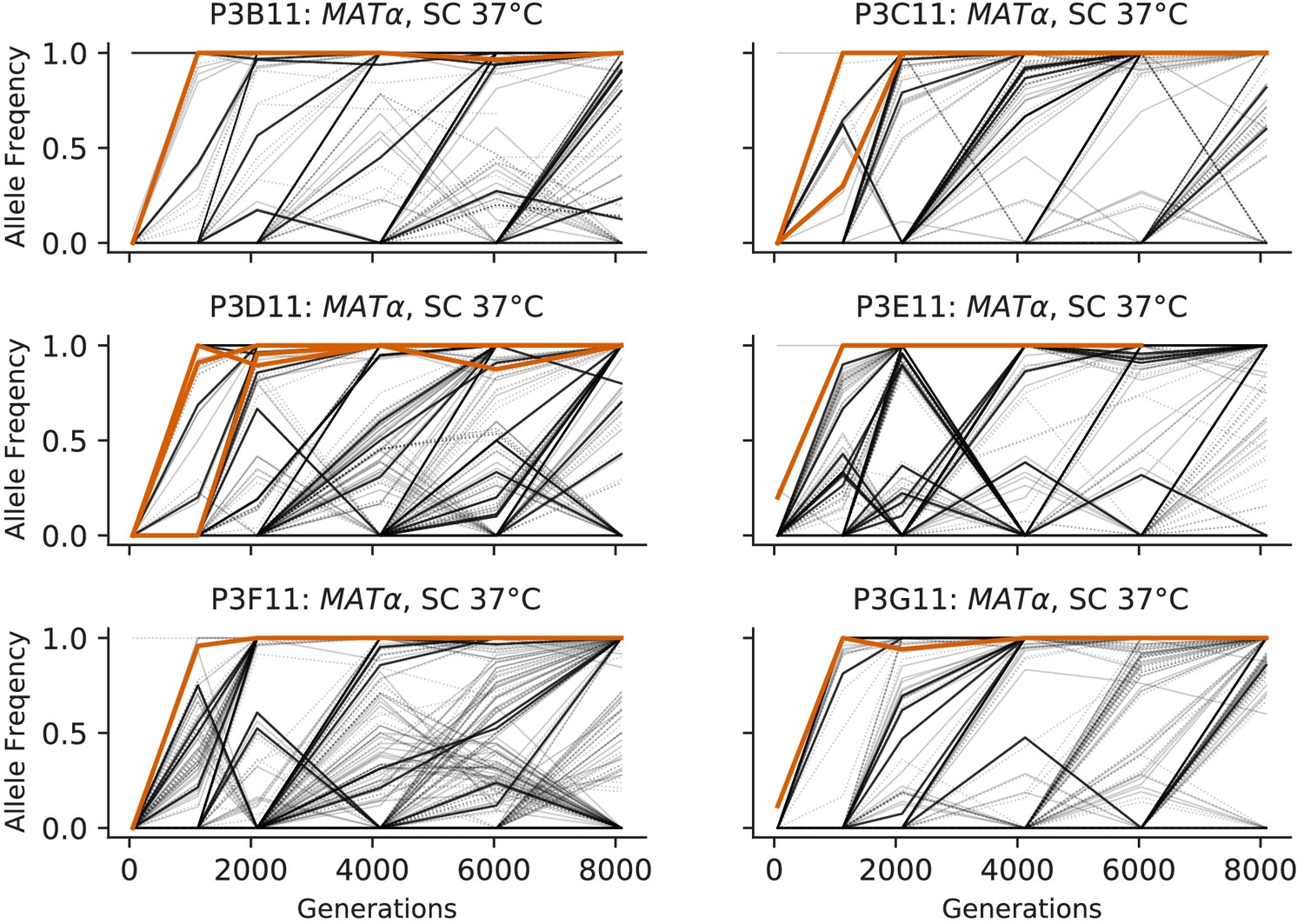
Allele frequencies over time in all focal MATα populations in SC 37°C.
Nonsynonymous mutations in ‘multi-hit’ genes are solid black lines, mutations in the adenine biosynthesis pathway are colored orange, other nonsynonymous mutations are thin gray lines, and synonymous mutations are dotted lines.
Figure 3—figure supplement 10
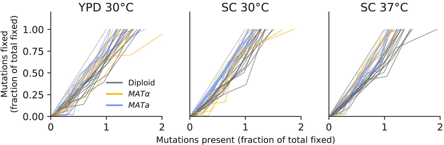
No evidence of coexistence.
The number of mutations present in a population plotted against the number of mutations fixed, both scaled by the total number fixed by the final timepoint. Long-term coexistence of multiple lineages in a population would be visible here as horizontal lines because more mutations would be present over time, but no mutations would fix; we do not observe any clear examples of this here, in contrast to the LTEE.
Figure 3—figure supplement 11

Copy number variation in the ribosomal DNA array and CUP1 array, determined from sequencing coverage data.
Figure 4 with 14 supplements

Types of mutations.
(A) Swarm plot of dN/dS (ratio of nonsynonymous / synonymous fixations by the final timepoint, scaled by the ratio of possible nonsynonymous / synonymous mutations across the genome) for each environment-strain combination. Each point represents one population and the horizontal line represents the median. Asterisks indicate significant differences (p<0.01, Mann-Whitney U test) between strains in the same environment. (B) Breakdown of mutation types for all mutations fixed by the final timepoint, in all populations corresponding to each environment-strain combination.
Figure 4—figure supplement 1
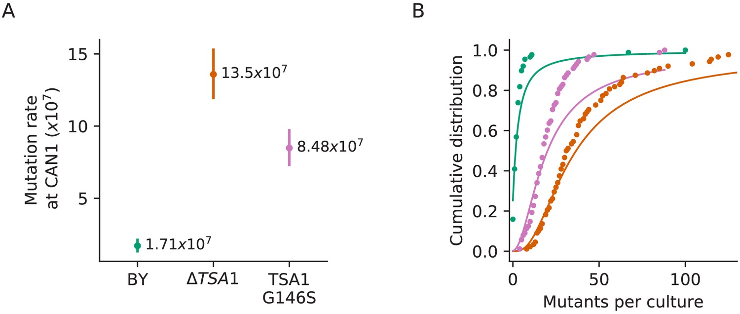
Confirmation that the TSA1 mutation increases mutation rate.
(A) Inferred mutation rates of BY4741, BY4741 with TSA1 deleted (YAN727), and BY4741 with the G146S mutation in TSA1 (YAN728). Error bars represent 95% confidence intervals. (B) Cumulative distributions of colony counts from fluctuation assays and corresponding Luria-Delbrück fits, colors are the same as in (A).
Figure 4—figure supplement 2

Population P1E11, a putative mutator.
(A) Histogram of the percentage of fixed mutations that are indels in all 90 focal populations, with P1E11 indicated by an arrow. (B) Allele frequencies of mutations in P1E11. Nonsynonymous mutations in ‘multi-hit’ genes are solid black lines, other nonsynonymous mutations are thin gray lines, synonymous mutations are dotted lines, indels are brown lines, and mutations in MSH3 and GPB2 are colored and labeled. We hypothesize that the MSH3 mutation hitchhiked to fixation with the selected GPB2 indel mutation, which occurred partially due to higher rates of indel mutations in strains without proper MSH3 function.
Figure 4—figure supplement 3
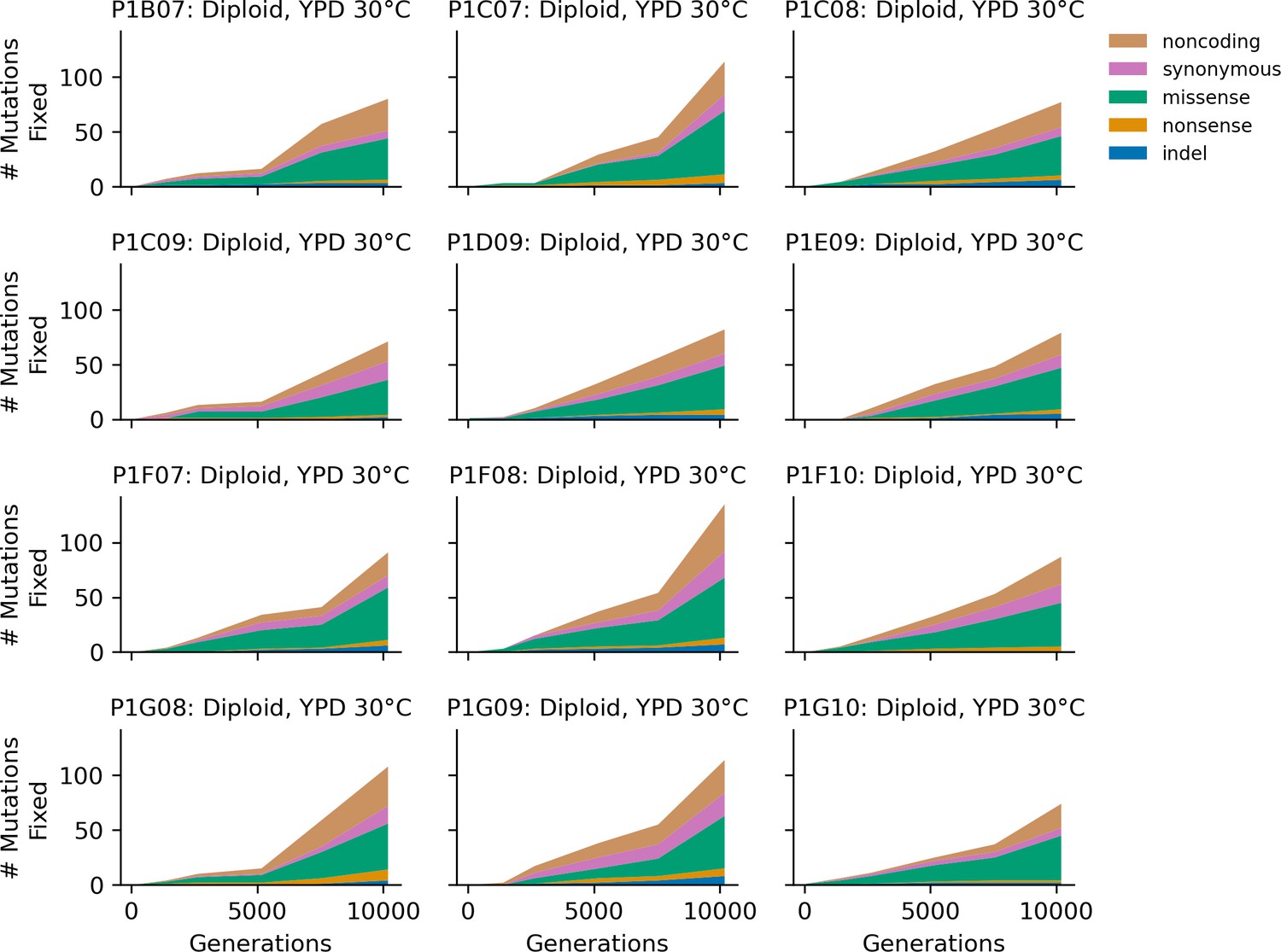
Stacked plot of heterozygous or homozygous fixed mutation types over time in all focal diploid populations in YPD 30°C.
Figure 4—figure supplement 4
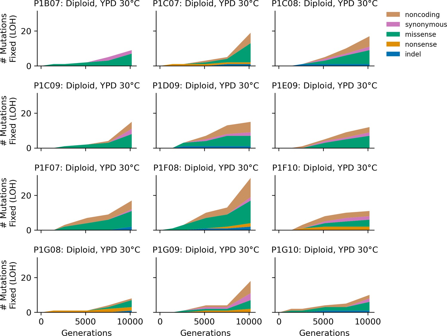
Stacked plot of homozygous-only (lost heterozygosity) fixed mutation types over time in all focal diploid populations in YPD 30°C.
Figure 4—figure supplement 5

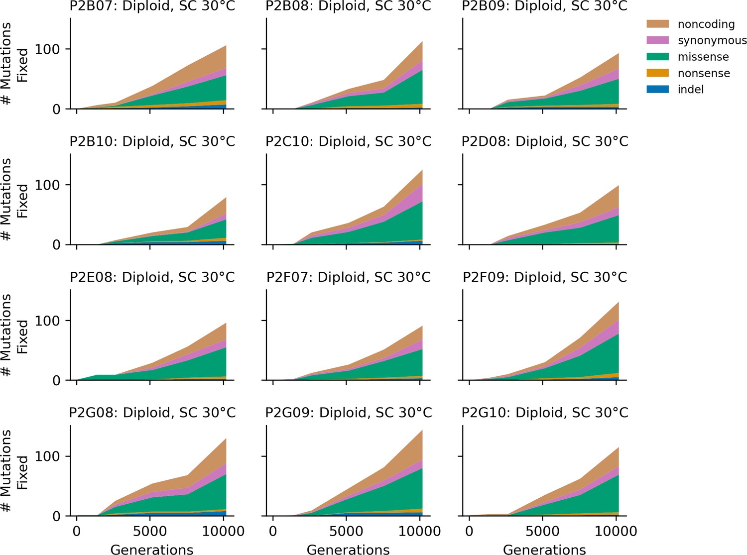
Stacked plot of fixed mutation types over time in all focal MATa populations in YPD 30°C.
Figure 4—figure supplement 6
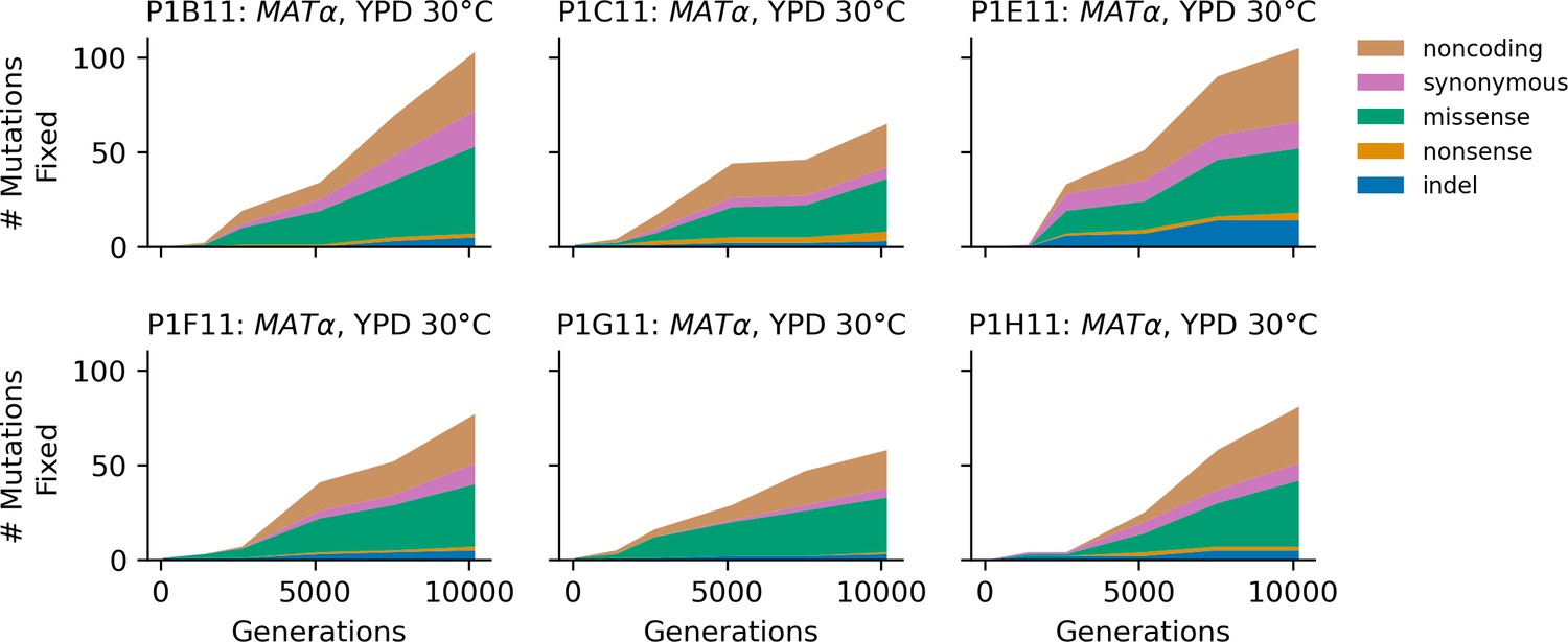
Stacked plot of fixed mutation types over time in all focal MATα populations in YPD 30°C.
Figure 4—figure supplement 7
Stacked plot of heterozygous or homozygous fixed mutation types over time in all focal diploid populations in SC 30°C.
Figure 4—figure supplement 8
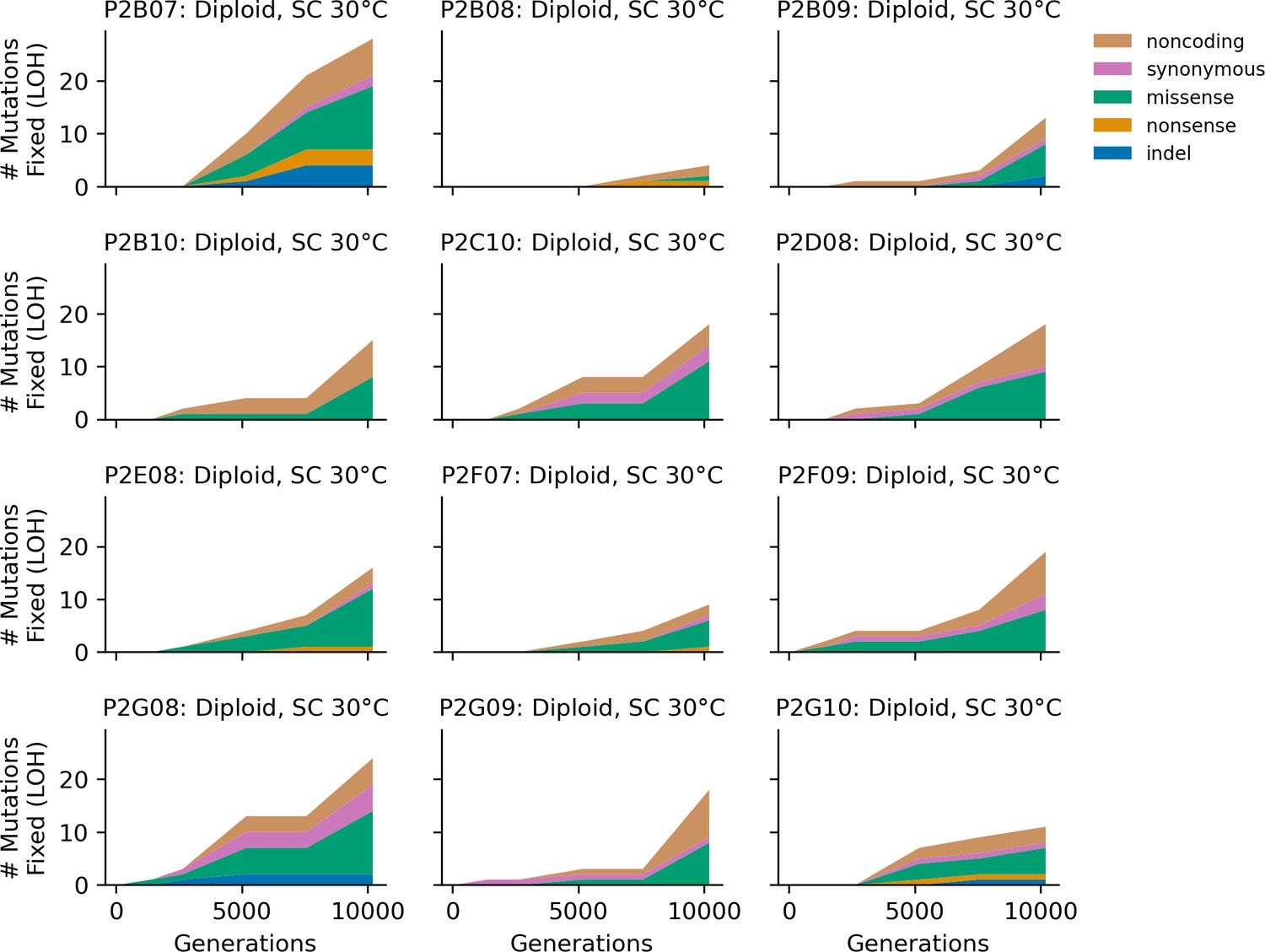
Stacked plot of homozygous-only (lost heterozygosity) fixed mutation types over time in all focal diploid populations in SC 30°C.
Figure 4—figure supplement 9
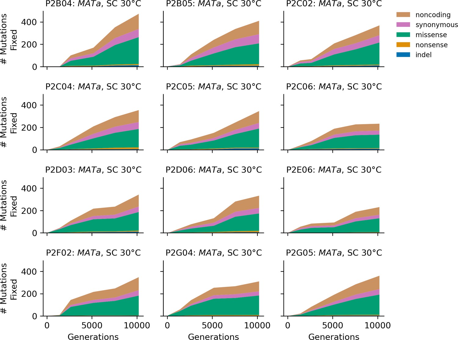
Stacked plot of fixed mutation types over time in all focal MATa populations in SC 30°C.
Figure 4—figure supplement 10
Stacked plot of fixed mutation types over time in all focal MATα populations in SC 30°C.
Figure 4—figure supplement 11
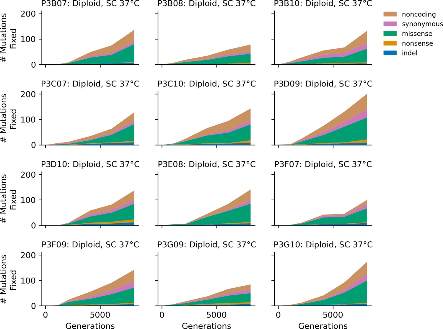
Stacked plot of heterozygous or homozygous fixed mutation types over time in all focal diploid populations in SC 37°C.
Figure 4—figure supplement 12

Stacked plot of homozygous-only (lost heterozygosity) fixed mutation types over time in all focal diploid populations in SC 37°C.
Figure 4—figure supplement 13

Stacked plot of fixed mutation types over time in all focal MATa populations in SC 37°C.
Figure 4—figure supplement 14
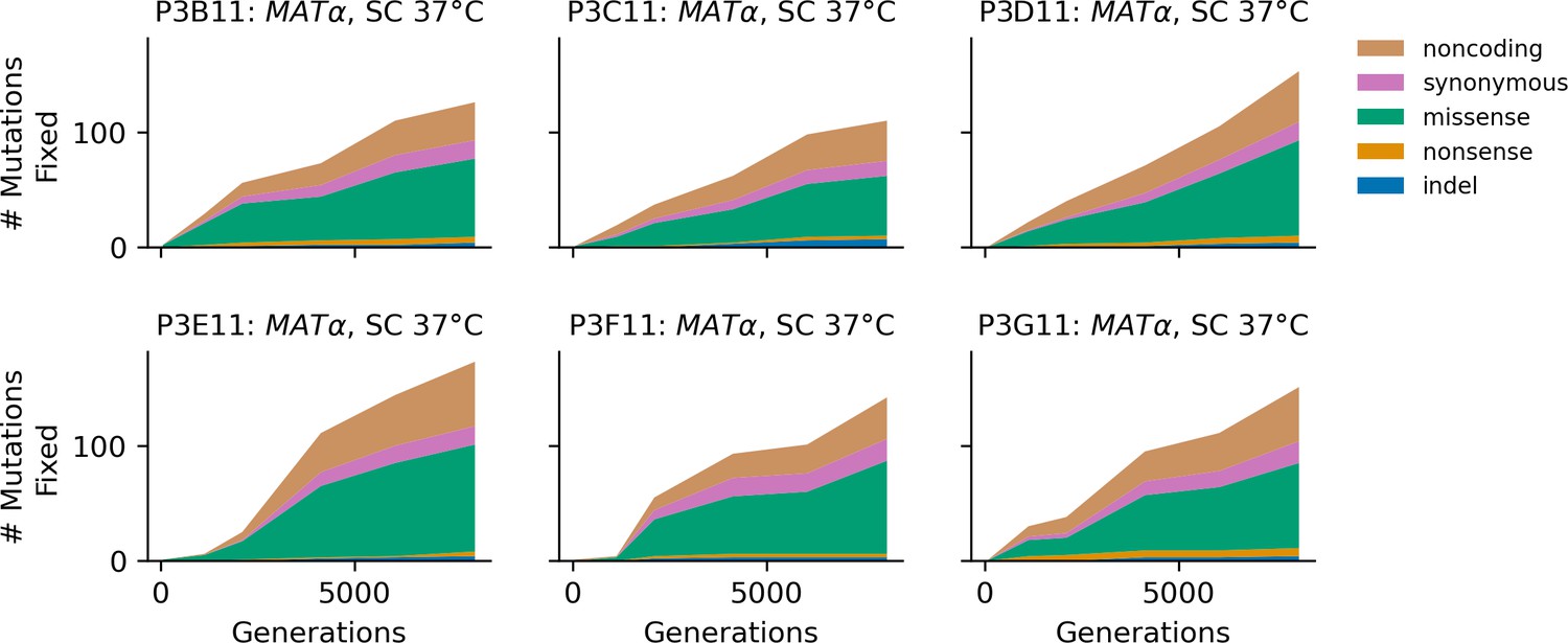
Stacked plot of fixed mutation types over time in all focal MATα populations in SC 37°C.
Figure 5
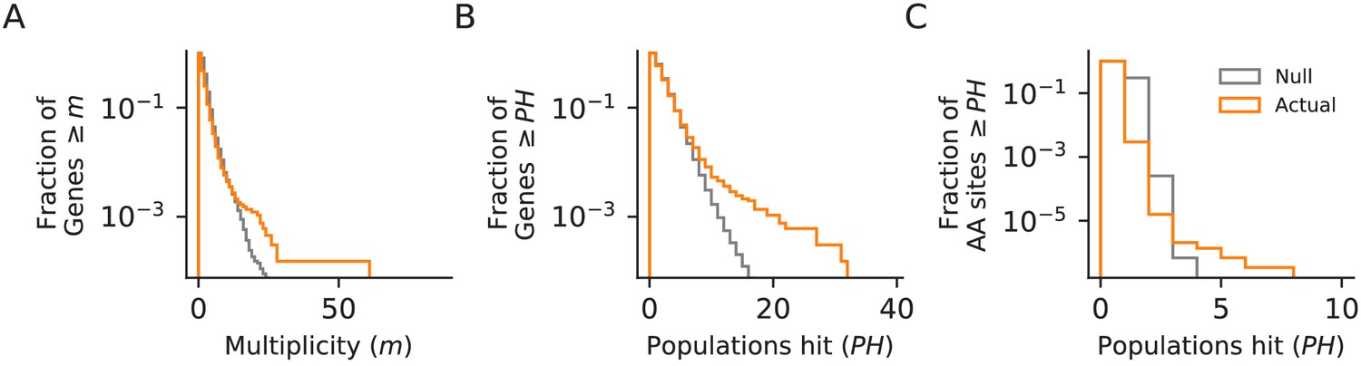
Parallelism.
Comparison between null and actual distributions of (A) the fraction of genes with multiplicity ≥ m (see Materials and methods), (B) the fraction of genes with hits in ≥ PH populations, and (C) the fraction of amino acid sites with hits in ≥ PH populations (those with PH ≥3 are listed in Supplementary file 4). For all three plots, the null distribution (shown in gray) is obtained by simulating random hits to genes, taking into account the number of hits in each population in our data and the relative length of each gene.
Figure 6 with 4 supplements
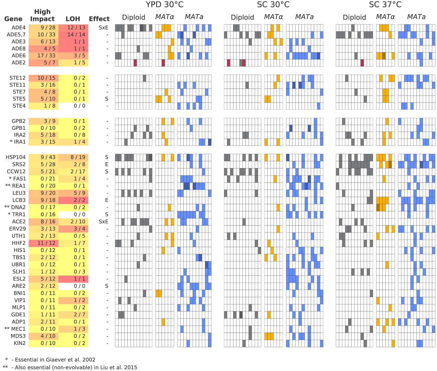
Multi-hit genes.
Each row represents a gene. The first three blocks are groups of genes identified from gene-ontology enrichment analysis of multi-hit genes (from top to bottom: adenine biosynthesis, sterility, and negative regulation of the Ras pathway). The bottom block is all other genes with hits in at least 10 populations. Each column in the heatmap represents a population, such that if a gene is hit in that population the square will be colored (darker color if a gene is hit two or more times in that population). Red squares indicate premature-stop-lost mutations in ADE2, which correspond to the populations with asterisks in Figure 2. One population that was not sequenced (not shown here) also has this mutation (confirmed by Sanger sequencing). The table at left gives more information on each multi-hit gene: ‘High impact’ is the fraction of hits that are likely to cause a loss-of-function, as annotated by SnpEff (e.g. nonsense mutations), ‘LOH’ (loss of heterozygosity) is the fraction of hits in diploid populations that fix homozygously, and ‘Effect’ describes whether the hits are distributed significantly unevenly across strain-types (S), environments (E), or both (SxE), when compared to a null model where fixations are not strain or environment dependent.
Figure 6—figure supplement 1
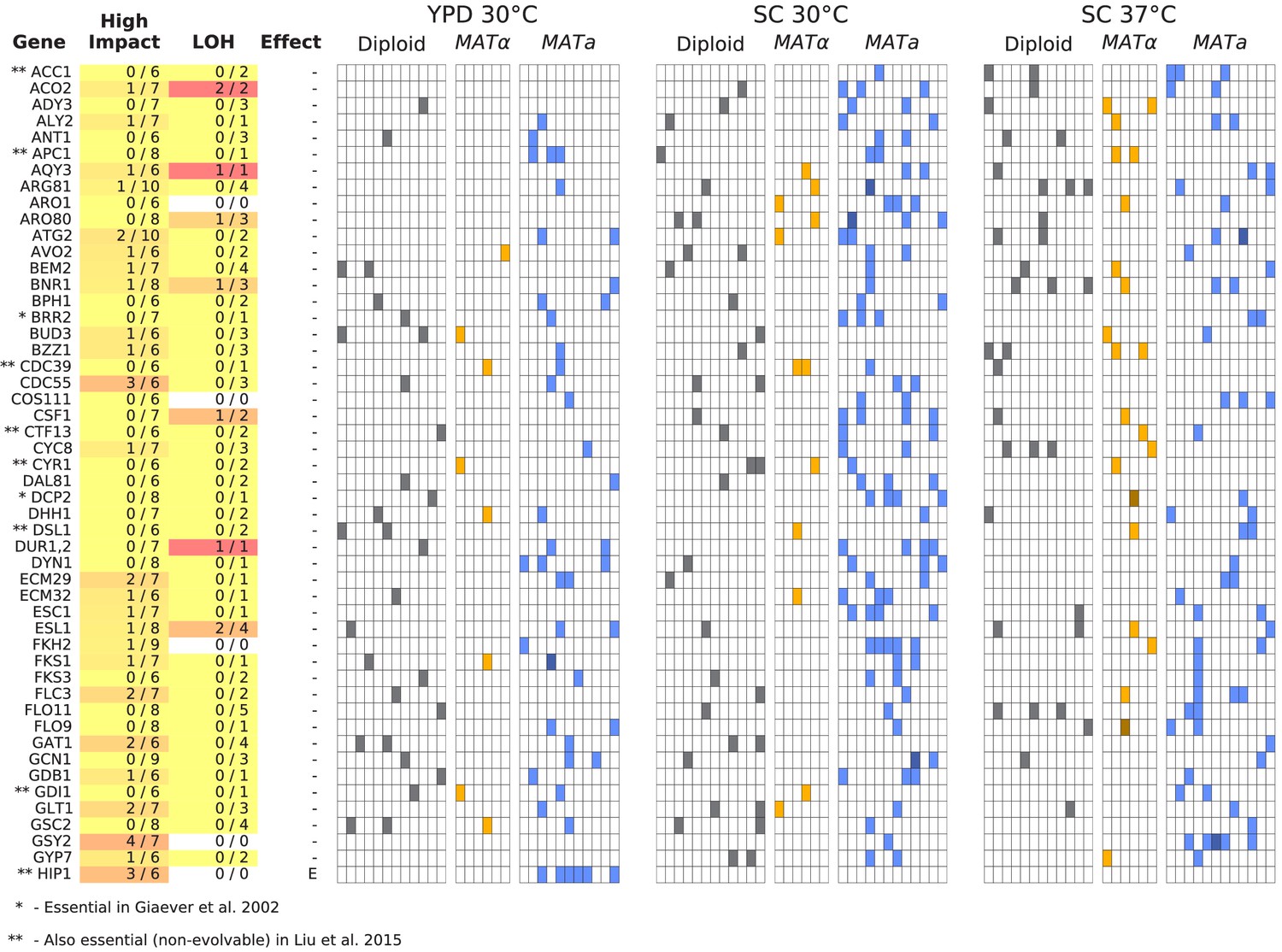
Same as Figure 6, but for all multi-hit genes not shown in Figure 6 (plot 1/3).
Figure 6—figure supplement 2
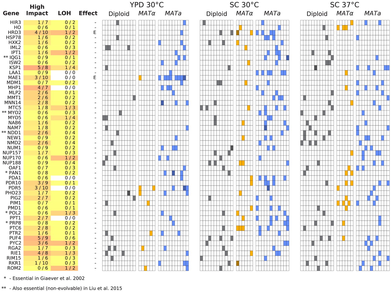
Same as Figure 6, but for all multi-hit genes not shown in Figure 6 (plot 2/3).
Figure 6—figure supplement 3
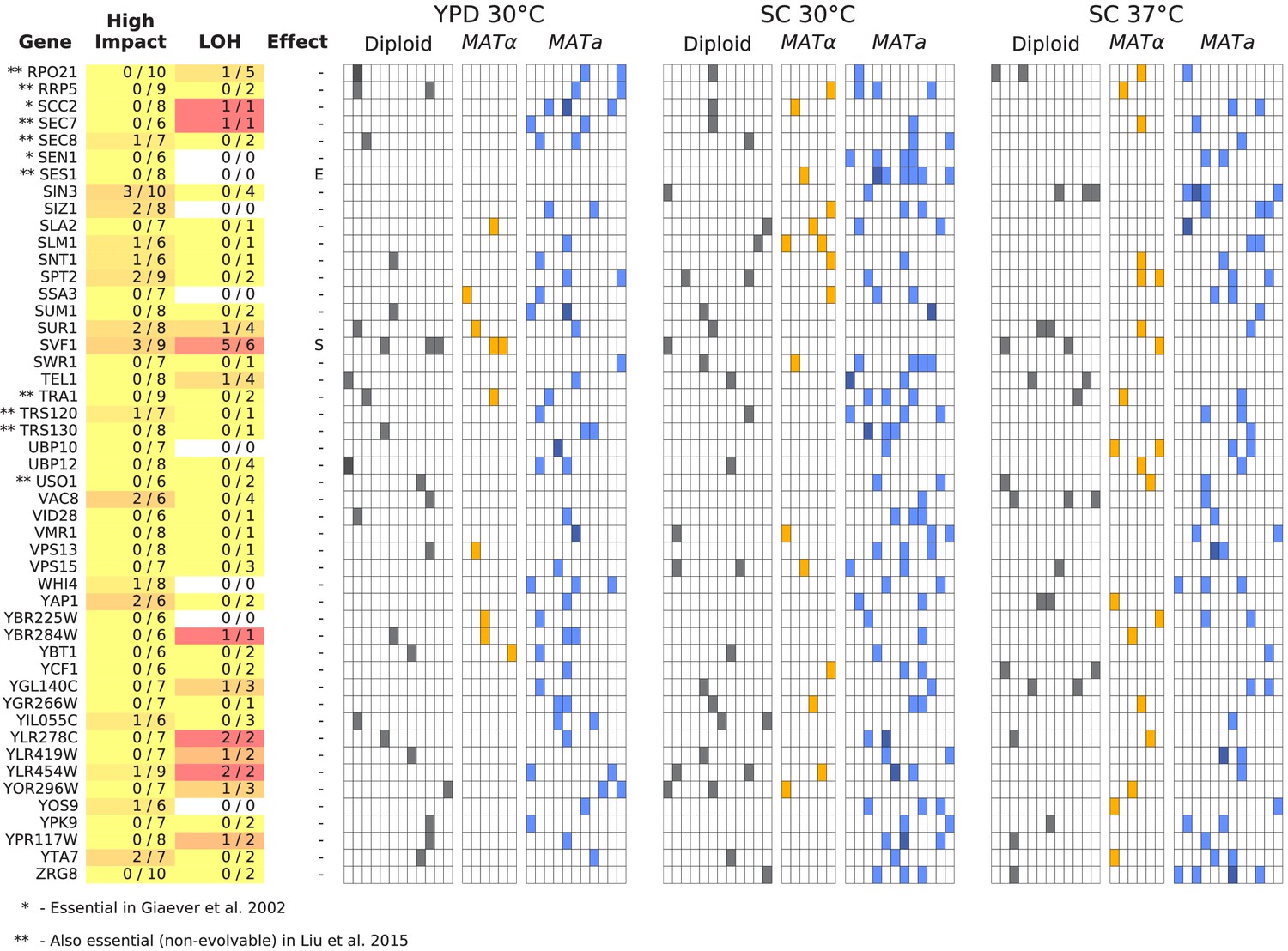
Same as Figure 6, but for all multi-hit genes not shown in Figure 6 (plot 3/3).
Figure 6—figure supplement 4

Same as Figure 6, but for all multi-hit genes where hits are distributed significantly unevenly across strain-types (S), environments (E), or both (SxE) compared to a null model where fixations are not strain or environment dependent.
Figure 7 with 2 supplements
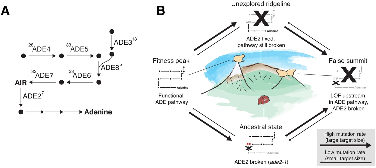
ADE pathway evolution.
(A) Simplified schematic of the adenine biosynthesis pathway. Circles represent metabolic intermediates; AIR is the toxic metabolic intermediate phosphoribosylaminoimidazole. Annotations represent the number of fixed nonsynonymous mutations in each gene (note that ADE5 and ADE7 are both products of the same gene). (B) Schematic of a fitness landscape with four possible states defined by whether ADE2 is functional and whether the ADE pathway upstream of ADE2 is functional. The small insets represent the state of the pathway in (A) at each position. Elevation in the landscape represents putative fitness differences, and the width of the arrows represents the putative mutation rates between the different states.
Figure 7—figure supplement 1
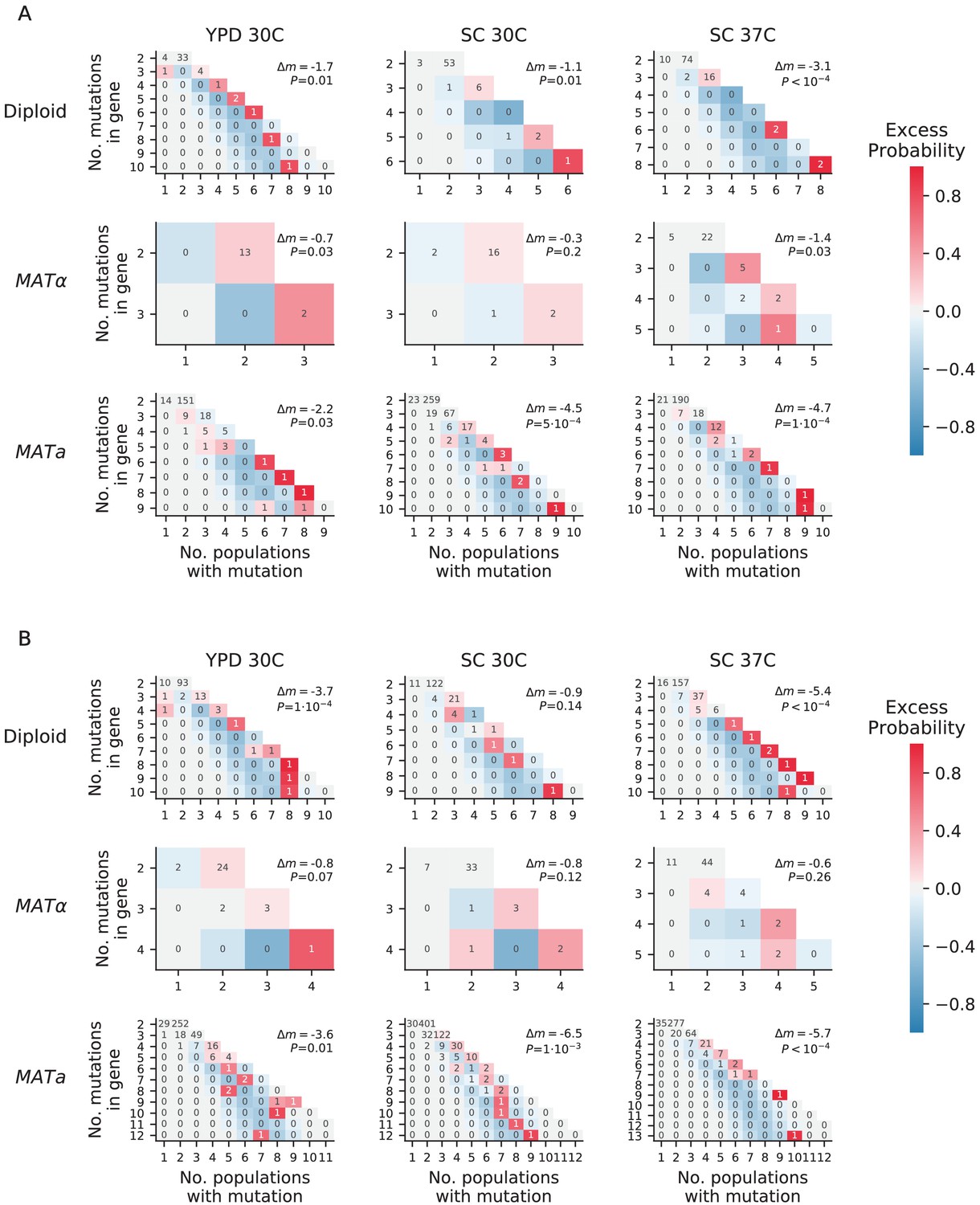
Overdispersion.
(A) For each environment-strain combination, we plot the number of genes having a certain number of fixed nonsynonymous mutations (y axis) spread amongst a certain number of unique populations (x axis). Each possible outcome is colored by its excess probability, as compared to a simulated null expectation in which mutations are distributed among populations using a multinomial distribution that takes into account how many nonsynonymous mutations fix in each population. Each plot is annotated with Δm, the difference between the total number of ‘missed opportunities’ as defined by Good et al., 2017 and the average total number of missed opportunities from simulated datasets, along with the probability of finding less than or equal to our total missed opportunities in one of the simulated datasets. The negative values for Δm indicate that we are seeing less missed opportunities than we would expect by chance, indicating overdispersion most likely caused by a ‘coupon collecting’ effect. (B) The same as A, but also including nonsynonymous mutations that are detected but do not fix.
Figure 7—figure supplement 2

Mutual information analysis.
Comparison of the sum of mutual information between all multi-hit genes in our dataset and the mutual information between this set of genes in simulated data based on probabilities assigned to each mutation in each population, allowing for different probabilities in each environment strain combination (see Materials and methods).
Figure 8 with 2 supplements
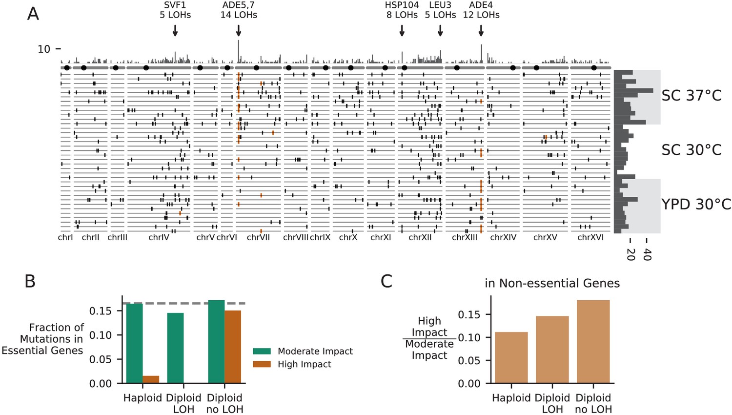
Patterns of molecular evolution and loss of heterozygosity in diploids.
(A) Genomic positions of all mutations that experienced loss of heterozygosity (LOH) across all diploid populations (loss of heterozygosity defined by a mutation reaching >90% frequency). Orange marks represent mutations in the ADE pathway. Each horizontal line represents one population, and the histogram at right represents the total number of LOH fixations in each population, with populations arranged by environment. The top histogram represents the frequency of loss of heterozygosity across the genome, and the chromosomes underneath show the centromere location with a black circle. Genes with five or more LOH fixations are annotated. (B) The fraction of fixed nonsynonymous mutations that are in essential genes, plotted for mutations fixed in haploid populations, mutations fixed homozygously in diploid populations (LOH) and mutations fixed heterozygously in diploid populations, plotted separately for mutations annotated as high or moderate impact by SnpEff (high-impact mutations are likely to cause loss-of-function). The dashed line represents the fraction of the coding genome that is in essential genes. (C) The ratio of high-impact to moderate-impact fixations in the same three mutation groups as in (B), for mutations in non-essential genes only.
Figure 8—figure supplement 1
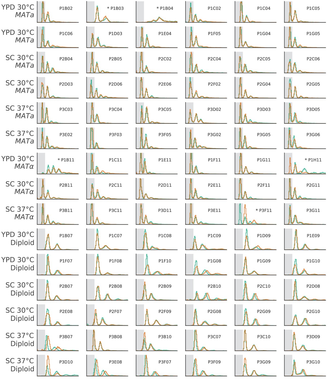
The ploidy state of two clones from each focal population, shown by FITC histograms of Sytox-stained cells.
The x-axis is in arbitrary fluorescence units, and the y-axis is normalized frequency. We have shaded the area where single-genome-copy cells (1N) usually fall to help identify haploids. Populations with abnormal FITC histograms are marked by asterisks. P1B03 is the only haploid population that became diploid. Based on sequencing data, this transition likely happened between generation 5000 and generation 7500 (Figure 3—figure supplement 3). P1H11 and P3F11 both had one diploid and one haploid clone, suggesting that diploids may be present in these populations, but have not fixed. P1B04 and P1B11 have strange FITC histograms, which we believe is due to clustering phenotypes in these populations (Figure 8—figure supplement 2). Based on continued fixations in sequencing data even at the final timepoint, it is unlikely that diploid haplotypes have played a significant role in any of these four populations up to this point in the evolution (Figure 3—figure supplements 3, 4 and 10).
Figure 8—figure supplement 2
Cell imaging from three populations with abnormal Sytox data.
Note the clustering phenotypes observed in later timepoints of P1B04 and P1B11. The microscope failed to capture an image for P1B04 generation 10190. All imaging data is available in Supplementary file 6.
Figure 9 with 1 supplement
Loss of extrachromosomal elements.
(A) Killer virus activity at each sequenced timepoint, determined by a killer assay against a sensitive strain. Each row represents one population. Examples of raw data for each qualitative phenotypic category are shown in the key, and the full raw data underlying these scores is shown in Figure 9—figure supplement 1. (B) 2-micron plasmid copy number at each sequenced timepoint. Rows represent the same populations as in A. The x in a diploid population at generation 1410 marks a population we excluded due to contamination in the population during these experiments.
Figure 9—figure supplement 1

Contrast-enhanced scanned images of killer virus halo assays.
Additional files
-
Supplementary file 1
Experimental record.
Includes daily notes, phenotype information for individual wells (including fitness), and a record of sample sizes for statistical tests.
- https://cdn.elifesciences.org/articles/63910/elife-63910-supp1-v2.xlsx
-
Supplementary file 2
A zip file of processed variant calling files for each population.
- https://cdn.elifesciences.org/articles/63910/elife-63910-supp2-v2.zip
-
Supplementary file 3
A table of all confirmed copy number variants.
- https://cdn.elifesciences.org/articles/63910/elife-63910-supp3-v2.xlsx
-
Supplementary file 4
Summary information on mutations, including which genes are mutated in which populations, GO-term enrichments, multi-hit codons, and statistical test results for strain or environment enrichment for each multi-hit gene.
- https://cdn.elifesciences.org/articles/63910/elife-63910-supp4-v2.xlsx
-
Supplementary file 5
A record of the detected differences between our ancestral strains and of the fluctuation assay confirming that the TSA1 mutation increases mutation rate.
- https://cdn.elifesciences.org/articles/63910/elife-63910-supp5-v2.xlsx
-
Supplementary file 6
A zip file of all preliminary cell imaging.
- https://cdn.elifesciences.org/articles/63910/elife-63910-supp6-v2.zip
-
Transparent reporting form
- https://cdn.elifesciences.org/articles/63910/elife-63910-transrepform-v2.docx
Download links
A two-part list of links to download the article, or parts of the article, in various formats.
Downloads (link to download the article as PDF)
Open citations (links to open the citations from this article in various online reference manager services)
Cite this article (links to download the citations from this article in formats compatible with various reference manager tools)
Phenotypic and molecular evolution across 10,000 generations in laboratory budding yeast populations
eLife 10:e63910.
https://doi.org/10.7554/eLife.63910


