Perception of microstimulation frequency in human somatosensory cortex
- Rehab Neural Engineering Labs, University of Pittsburgh, United States
- Department of Bioengineering, University of Pittsburgh, United States
- Center for the Neural Basis of Cognition, University of Pittsburgh, United States
- Department of Neurosurgery, Stanford University, United States
- Department of Electrical Engineering, Stanford University, United States
- Department of Physical Medicine and Rehabilitation, University of Pittsburgh, United States
- Human Engineering Research Laboratories, VA Center of Excellence, Department of Veterans Affairs, United States
Figures
Figure 1 with 4 supplements
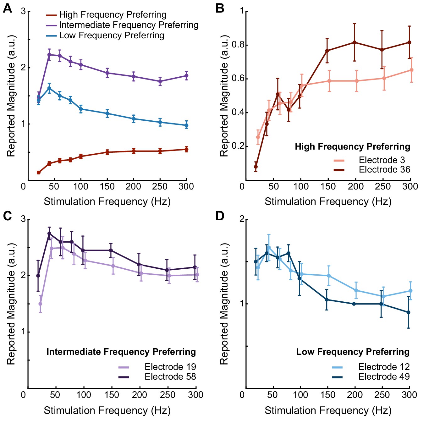
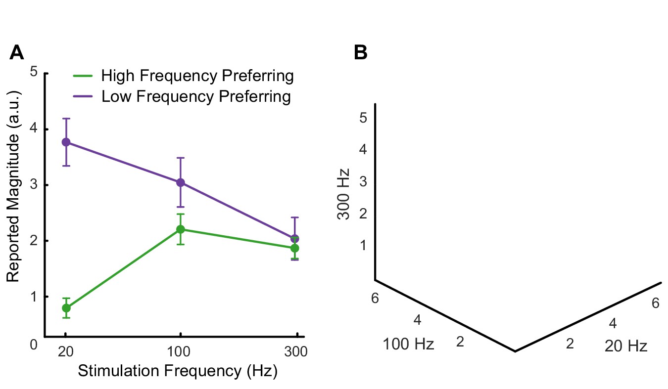
Pulse frequency drives electrode-specific changes in intensity which can be grouped into three categories.
(A) Perceived intensity for each aggregated frequency preference group. Different colors represent different categories. Each data point shows the mean intensity response of all of the electrodes in a given category. (B) Perceived intensity for two examples of high-frequency preferring electrodes that evoked the most intense percepts at the highest pulse frequencies and that generated the least intense percepts overall. (C) Perceived intensity for two examples of intermediate-frequency preferring electrodes that generated the most intense overall percepts, which occurred between 40 Hz and 100 Hz. (D) Perceived intensity for two examples of low-frequency preferring electrodes, which generated intermediate overall intensities that were maximized between 20 and 100 Hz. Error bars represent the standard error. The points are connected with piecewise fits. Axes are scaled differently between panels for clarity.
-
Figure 1—source data 1
This file contains all the magnitude estimation data from participant P2 using an amplitude of 60 μA and frequencies of 20, 40, 60, 80, 100, 150, 200, 250, and 300 Hz.
Each sheet contains data for one of the three frequency preference groups (LFP, IFP, or HFP). Each sheet contains information about the electrode number, post-implant day on which the testing was performed, stimulation frequency, the participant’s response, and the block for each data point.
- https://cdn.elifesciences.org/articles/65128/elife-65128-fig1-data1-v2.xlsx
Figure 1—figure supplement 1
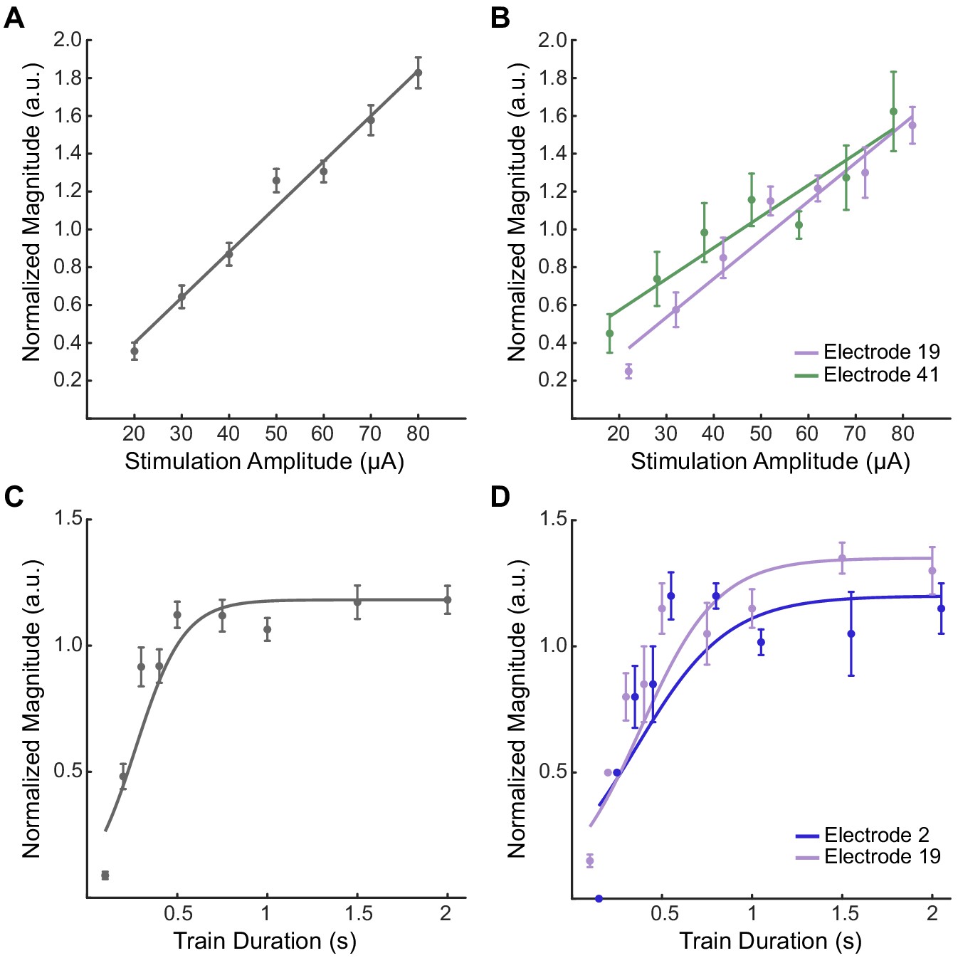
Increases in current amplitude and train duration consistently drive increases in perceived intensity.
(A, B) Normalized intensity as a function of current amplitude for all nine tested electrodes (A), and for two individual electrodes (B). The data were fit with a linear function. (C, D) Normalized intensity as a function of train duration for all four tested electrodes (C) and two individual electrodes (D). The data were fit with a logistic function. In all panels, data points are the median-reported intensity at each stimulus parameter. Samples were normalized to the median intensity value for each test. Error bars show the standard error. Note that the Y-axes are scaled differently for each panel for clarity. Colors represent different electrodes as indicated by the legends. Data points for individual electrodes are jittered slightly on the x-axis for visualization.
-
Figure 1—figure supplement 1—source data 1
This file contains the data from participant P2 for magnitude estimation using a frequency of 100 Hz.
The ‘Amplitude’ sheet contains data for experiments in which the train duration was 1 s, and the amplitude was varied between 20, 30, 40, 50, 60, 70, and 80 μA. The ‘Duration’ sheet contains data for experiments in which the amplitude of 60 μA and train duration was varied between 0.2, 0.4, 0.6, 0.8, 1, 1.2, 1.5, and 2 s. Each sheet contains information about the electrode number, the value of the varied parameter (amplitude or duration), the participant’s response, and the block for each data point.
- https://cdn.elifesciences.org/articles/65128/elife-65128-fig1-figsupp1-data1-v2.xlsx
Figure 1—figure supplement 2
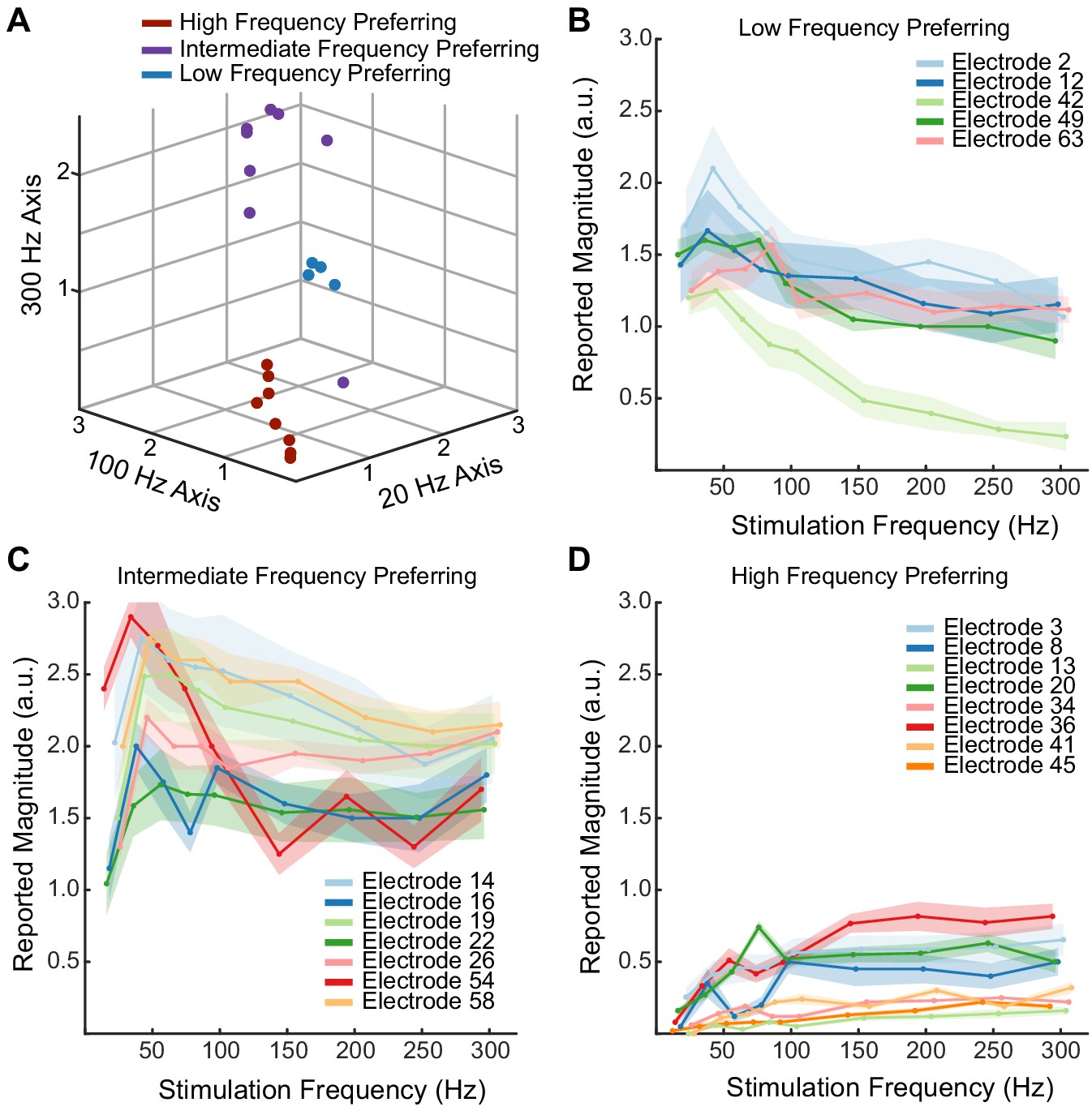
Electrodes divide into three categories based on their frequency–intensity relationships.
(A) K-means clustering of individual electrodes based on intensity responses at 20, 100, and 300 Hz. Individual data points are the median intensities at each frequency across all repetitions. (B–D) Perceived intensity responses at different frequencies for all electrodes classified as low-frequency preferring (B), intermediate-frequency preferring (C), and high-frequency preferring (D). Shaded regions show the smoothed standard error for each electrode.
-
Figure 1—figure supplement 2—source data 1
This file contains the mean reported intensity and standard error for participant P2 for magnitude estimation trials using an amplitude of 60 μA and frequencies of 20, 40, 60, 80, 100, 150, 200, 250, and 300 Hz.
Each sheet contains data for one of the three frequency preference groups (LFP, IFP, or HFP). Each sheet contains information about the electrode number, stimulation frequency, mean response magnitude, and the standard error of the response magnitude. The individual trial data to create these means and standard error values can be found in Figure 1—source data 1.
- https://cdn.elifesciences.org/articles/65128/elife-65128-fig1-figsupp2-data1-v2.xlsx
Figure 1—figure supplement 3
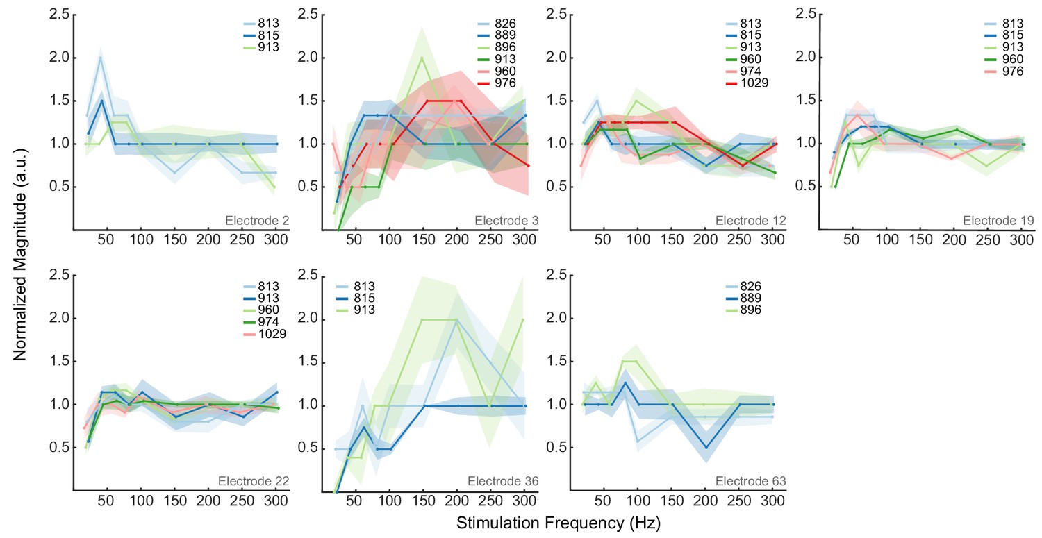
Electrodes maintain same frequency–intensity relationships over time.
Plots of magnitude estimation results on all electrodes tested three or more times. Each set of points and the corresponding fit indicate a single post-implant date, as indicated in the legend. Data from each test session were normalized by the median intensity. Different colors show different post-implant dates in each plot as indicated by the legend. Shaded regions show the smoothed standard error.
-
Figure 1—figure supplement 3—source data 1
This file contains the normalized median-reported intensity for participant P2 for magnitude estimation trials using an amplitude of 60 μA and frequencies of 20, 40, 60, 80, 100, 150, 200, 250, and 300 Hz.
Each sheet contains data for a different electrode. Each sheet contains information about the post-implant day, stimulation frequency, normalized median value of the participant’s response, and the standard error of the reported responses. The individual trial data to create these means and standard error values can be found in Figure 1—source data 1.
- https://cdn.elifesciences.org/articles/65128/elife-65128-fig1-figsupp3-data1-v2.xlsx
Figure 1—figure supplement 4
Electrode-specific frequency–intensity relationships and spatial clustering generalize to a second participant.
(A) The mean intensity response across two frequency preference groups. Each data point represents the mean intensity response at the given frequency. The error bars represent the standard error of the mean. The points are connected with piecewise fits. (B) K-means clustering of individual electrodes based on intensity responses at 20, 100, and 300 Hz. Individual data points are the median intensities at each frequency across all repetitions. Some points may overlap due to having the same median intensities.
-
Figure 1—figure supplement 4—source data 1
This file contains all the magnitude estimation data from participant P3 using an amplitude of 80 μA and frequencies of 20, 100, and 300 Hz.
The ‘Magnitude Estimation’ sheet contains all the reported data including information about the electrode number, post-implant day, stimulation frequency, the participant’s response, and the block for each data point. This sheet also contains the classification group of each electrode. The ‘K-means clustering’ sheet contains the median-intensity data for each electrode at the three different stimulation frequencies and the k-means cluster number.
- https://cdn.elifesciences.org/articles/65128/elife-65128-fig1-figsupp4-data1-v2.xlsx
Figure 2 with 1 supplement
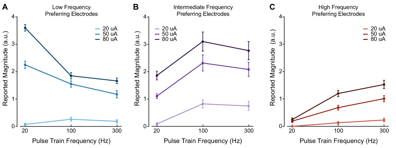
Stimulus current amplitude does not change the relationship between pulse frequency and intensity at suprathreshold amplitudes.
Magnitude estimation data for different current amplitudes and pulse frequencies. Data were aggregated across electrodes by their category, where each plot shows a different category of electrodes. Perceived intensity values for (A) LFP electrodes, (B) IFP electrodes, and (C) HFP electrodes at different current amplitudes and pulse frequencies. Different colored bars represent different current amplitudes. Error bars indicate the standard error across electrodes. We tested two LFP electrodes, three IFP electrodes, and two HFP electrodes which were each tested twice in different sessions.
-
Figure 2—source data 1
This file contains all the magnitude estimation data from participant P2 using amplitudes of 20, 50, and 80 μA and frequencies of 20, 100, and 300 Hz.
Each sheet contains data for a for one of the three frequency preference groups (LFP, IFP, or HFP). Each sheet contains information about the electrode number, post-implant day, stimulation amplitude, stimulation frequency, the participant’s response, and the block for each data point.
- https://cdn.elifesciences.org/articles/65128/elife-65128-fig2-data1-v2.xlsx
Figure 2—figure supplement 1
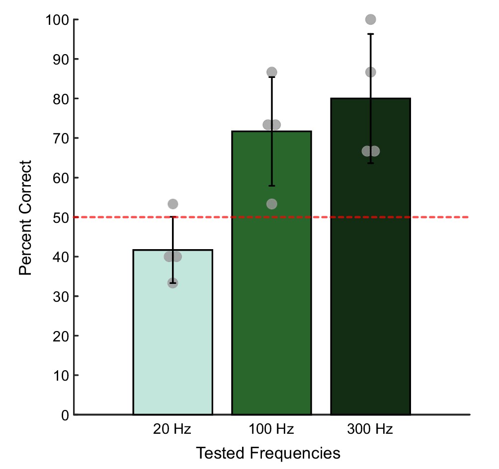
Higher pulse frequencies always improved detection at perithreshold current amplitudes.
Bar plots showing the probability of correctly identifying the window containing a stimulus train with different pulse frequencies at a fixed perithreshold current amplitude (6–16 μA). Each bar represents the mean detection accuracy at each pulse frequency on four tested electrodes. The error bar indicates the standard deviation. The gray dots show the individual electrode performance accuracies. Chance performance was 50% and is indicated with the red dotted line.
-
Figure 2—figure supplement 1—source data 1
This file contains all the data from participant P2 for a detection task conducted at perithreshold amplitudes.
The file contains the electrode number, stimulation amplitude, stimulation frequency, the train that was selected (response), the order in which the reference train was presented, whether the participant correctly identified the interval with stimulation (success), and block for each trial.
- https://cdn.elifesciences.org/articles/65128/elife-65128-fig2-figsupp1-data1-v2.xlsx
Figure 3 with 2 supplements

Perceptual qualities are associated with specific electrode categories and stimulus pulse frequencies.
Radar plots showing the distribution of reported qualities at different pulse frequencies for each electrode category. (A) Percepts sorted by pulse frequency. Electrode categories are indicated with different colors. (B) Percepts sorted by electrode categories. Pulse frequencies are indicated with different colors. In each plot, qualities on which there was a significant difference between categories, as determined with Fisher’s exact test, are marked with an asterisk.
-
Figure 3—source data 1
This file contains the total number of reports of each percept quality in participant P2 across each frequency preference group (LFP, IFP, and HFP).
It also contains the number of times an electrode was stimulated in each group. Each sheet has data for a different stimulus frequency.
- https://cdn.elifesciences.org/articles/65128/elife-65128-fig3-data1-v2.xlsx
Figure 3—figure supplement 1
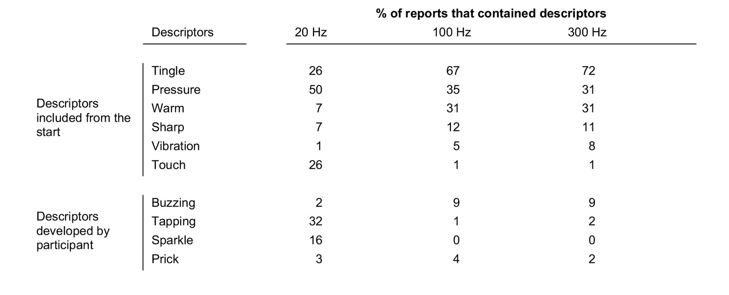
All reported percepts and their percent occurrence at each pulse frequency.
Since multiple percepts can be reported for a single stimulus, columns will add to more than 100%. There were 152 samples at 20 Hz, 621 samples at 100 Hz, and 85 samples at 300 Hz.
-
Figure 3—figure supplement 1—source data 1
This file contains the percept identifiers from the perceptual reports from the surveys from P2.
It also includes a logical array with information about which electrodes were stimulated during each survey. Sheets are divided by the stimulus frequency provided in the survey.
- https://cdn.elifesciences.org/articles/65128/elife-65128-fig3-figsupp1-data1-v2.xlsx
Figure 3—figure supplement 2
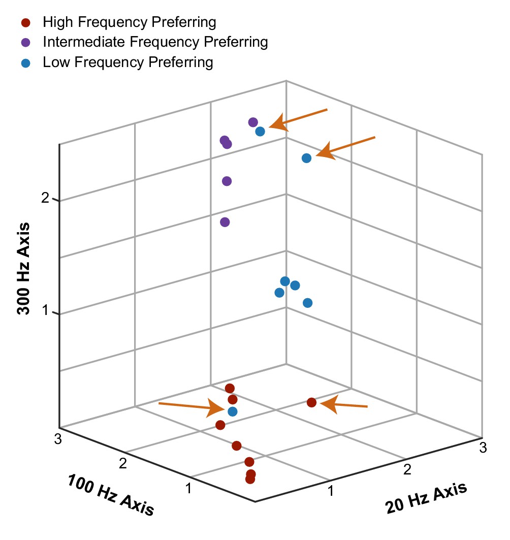
Clustering by evoked qualities results in nearly identical clusters to those identified from perceived intensity.
Individual electrodes are plotted on the same axes as shown in Figure 1—figure supplement 1. The data were clustered in a 10-dimensional quality space and then plotted in the three-dimensional frequency-intensity space. Clusters are labeled based on the three categories defined by frequency-intensity responses. For example, the blue point in the lower portion of the figure represents an electrode that shared similar frequency-intensity properties with other high-frequency preferring electrodes but shared qualities that were similar to low-frequency preferring electrodes. However, the majority of the electrodes were identified as being in the same clusters regardless of whether the clustering was performed on quality or frequency-intensity data. Electrodes that were classified differently between quality and frequency-intensity data are indicated with orange arrows.
-
Figure 3—figure supplement 2—source data 1
This file contains the median intensities at 20, 100, and 300 Hz reported by participant P2 for each electrode tested as well as the cluster number that was assigned by k-means clustering based on the qualitative data.
- https://cdn.elifesciences.org/articles/65128/elife-65128-fig3-figsupp2-data1-v2.xlsx
Figure 4 with 1 supplement
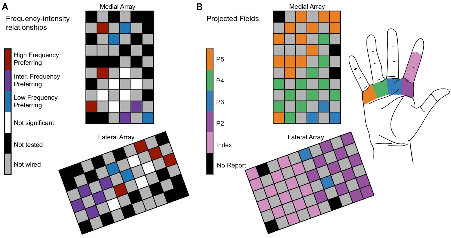
Electrode location is significantly related to electrode categorization.
(A) Map of the medial electrode array (top) and lateral electrode array (bottom) implanted in somatosensory cortex and the distribution of the frequency preference categorizations. The electrode arrays were implanted close to the central sulcus with the left edge of the medial array being approximately parallel to the central sulcus. The arrays are oriented to reflect the implant orientation. Colored squares represent different types of electrodes as indicated by the color bar. (B) The projected field locations for each tested electrode. The label for each electrode corresponds to the most reported projected field for each electrode on all 100 Hz surveys taken in the same year as the magnitude estimation data.
-
Figure 4—source data 1
This file contains the spatial mapping of each electrode and the frequency preference group for each electrode for participant P2.
‘Nan’ values represent unwired electrodes.
- https://cdn.elifesciences.org/articles/65128/elife-65128-fig4-data1-v2.xlsx
Figure 4—figure supplement 1
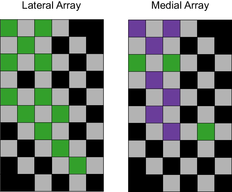
The spatial mapping of the two groups on the arrays for P3.
Spatial clustering was significant across the arrays (p=0.0045, LISA). Gray square represents unwired electrodes, and black squares represent untested electrodes.
-
Figure 4—figure supplement 1—source data 1
This file contains the spatial mapping of each electrode and the frequency preference group for each electrode in participant P3.
‘Nan’ values represent unwired electrodes.
- https://cdn.elifesciences.org/articles/65128/elife-65128-fig4-figsupp1-data1-v2.xlsx
Additional files
Download links
A two-part list of links to download the article, or parts of the article, in various formats.
Downloads (link to download the article as PDF)
Open citations (links to open the citations from this article in various online reference manager services)
Cite this article (links to download the citations from this article in formats compatible with various reference manager tools)
Perception of microstimulation frequency in human somatosensory cortex
eLife 10:e65128.
https://doi.org/10.7554/eLife.65128


