Whole genome phylogenies reflect the distributions of recombination rates for many bacterial species
Figures
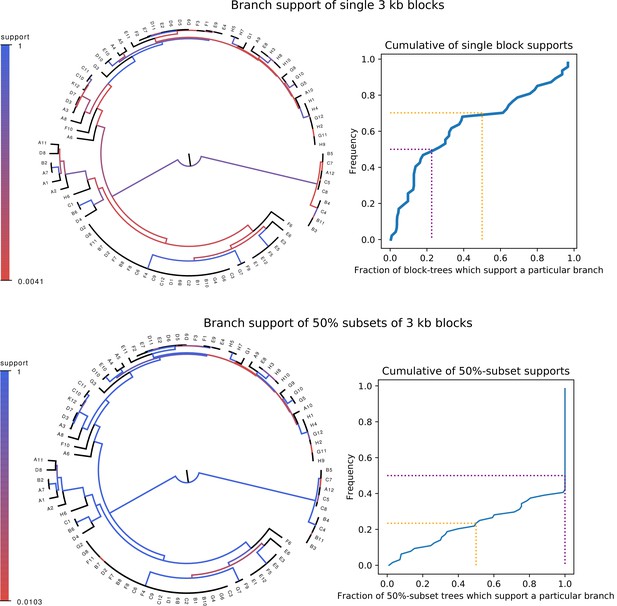
Whereas phylogenies of individual alignment blocks differ substantially from the core tree, phylogenies reconstructed from a large number of blocks are highly similar to the core tree.
Top left: For each split (i.e. branch) in the core tree, the color indicates what fraction of the phylogenies of 3 kb blocks support that bi-partition of the strains. Top right: Cumulative distribution of branch support, that is fraction of 3 kb blocks supporting each branch. The dotted lines indicated show the fraction of branches that have less than 50% support (yellow) and the median support per branch (purple). Bottom left and bottom right : As in the top row, but now based on phylogenies reconstructed from random subsets of 50% of all 3 kb blocks as opposed to individual blocks.
-
Figure 1—source data 1
List of database accessions of the genomes used.
- https://cdn.elifesciences.org/articles/65366/elife-65366-fig1-data1-v2.txt
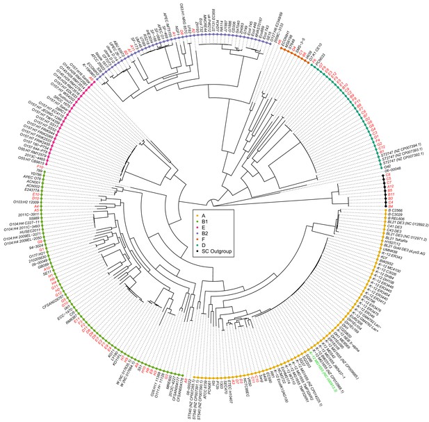
Joint maximum likelihood phylogeny of our strains and 189 E.coli reference strains.
Maximum likelihood tree reconstructed from the core genome alignments of the SC1 strains (red font names), the K-12 lab strain (green font name), and 189 E. coli reference strains (black font names). Known phylogroups are indicated as different colored leaf nodes. The SC1 strains are distributed across essentially all known phylogroups, include strains that cannot be easily assigned to a phylogroup, and a distal ‘outgroup’ of nine strains (black leaves) that are at 6% nucleotide divergence from other strains (branch shortened).
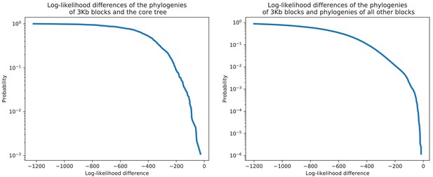
Each 3 kb alignment block rejects the core tree topology as well as the topologies of the phylogenies reconstructed from all other blocks.
Each 3 kb alignment block rejects the core tree topology as well as the topologies of the phylogenies reconstructed from all other blocks. Left panel: For each 3 kb block in the core alignment, we used PhyML to reconstruct a phylogeny and then calculated the difference in the log-likelihood of the alignment block under the topology of the core tree and the log-likelihood of the reconstructed phylogeny. The figure shows the reverse cumulative distribution of these log-likelihood differences, with the vertical axis shown on a logarithmic scale. There are virtually no blocks for which the log-likelihood of the core tree topology is close to the log-likelihood under the block’s own phylogeny. Right panel: As in the left panel, but now we calculated, for each 3 kb block, the log-likelihood differences for the topologies of the phylogenies reconstructed from all other blocks. Each block attains a substantially higher log-likelihood when using its own topology than using the topology of any other alignment block.
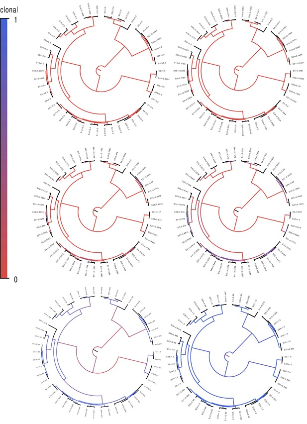
Fractions of positions that are clonally inherited (not affected by recombination) along each branch of the clonal phylogeny for the simulated datasets.
Fractions of positions that are clonally inherited (not affected by recombination) along each branch of the clonal phylogeny for the simulated datasets. Each panel shows the clonal phylogeny with the color of the branches indicating what fraction of positions were clonally inherited from all (blue) to none (red) along that branch. Panels correspond, from top-left to bottom-right, to recombination to mutation rates of equalling 10, 1, 0.3, 0.1, 0.01, and 0.001. The fractions at the leaves indicate the fraction of the genome that was clonally inherited along each terminal branch.
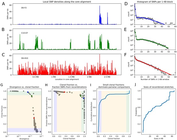
Pairwise analysis of recombination in the SC1 strains.
(A-C) SNP densities (SNPs per kilobase) along the core genome for three pairs of strains at overall nucleotide divergences of (D6–F2), 0.002 (C10–D7), and 0.0048 (D6–H10). (D-F) Corresponding histograms for the number of SNPs per kilobase (dots) together with fits of the mixture model for D6-F2 (blue), C10-D7 (green), and D6-H10 (red). Note the vertical axis is on a logarithmic scale. (G) For each pair of strains (dots), the fraction of the genome that was inherited clonally is shown as a function of the nucleotide divergence of the pair, shown on a logarithmic scale. The three pairs that were shown in panels (A-F) are shown as the blue, green, and red dots. The light green, yellow, and blue segments show strains that are mostly clonal, a mixture of clonal and recombined, and fully recombined, respectively. (H) Fraction of all SNPs that lie in recombined regions as a function of the clonally inherited fraction of the genome. (I) Cumulative distribution of the clonal fractions of the pairs. (J) Cumulative distribution of the lengths of recombined segments for pairs that are in the mostly clonal regime. The mean length of recombined regions is , with first quartile 2000, median , and third quartile .
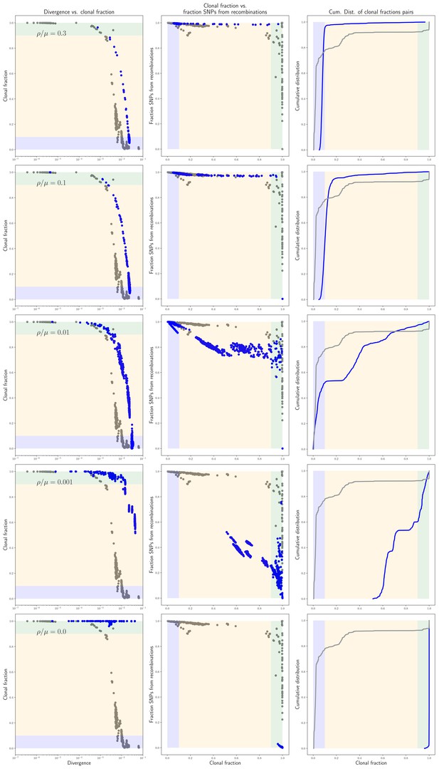
Statistics of the pairwise analysis on the simulated data.
Statistics of the pairwise analysis on the simulated data. Each row of panels corresponds to simulations performed with a different recombination rate (indicated in each row) and shows, in blue, the same results as in panels G, H, and I of Figure 2, that is the fraction of the genome that was clonally inherited as a function of divergence for each pair, the fraction of all mutations that derive from recombination as a function of the clonally inherited fraction, and the cumulative distribution of clonally inherited fractions. For reference, the corresponding results for the E. coli strains are shown in gray.
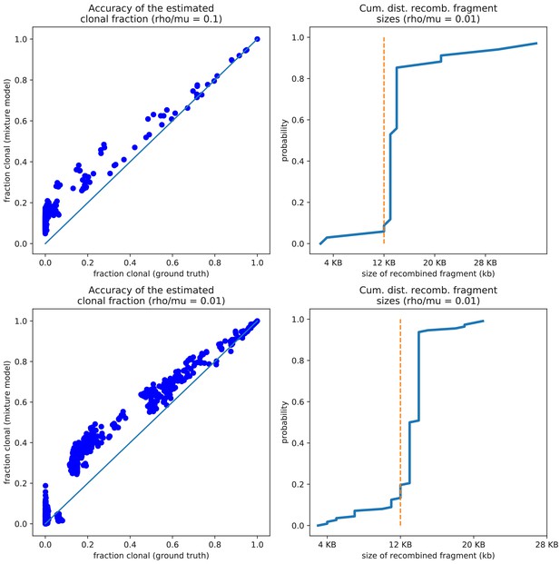
The pairwise analysis accurately estimates both the clonally inherited fractions and the sizes of the recombined segments for the simulation data.
The pairwise analysis accurately estimates both the clonally inherited fractions and the sizes of the recombined segments. Left panels: Comparison of the true fraction of the genome that was clonally inherited (horizontal axis) and the estimated fraction from the pairwise analysis (vertical axis) for the simulation with (top) and 0.01 (bottom). Each dot corresponds to one pair and the diagonal line shows the line . Right panels: Cumulative distribution of the lengths of the recombined segments, as estimated by the pairwise analysis of the simulations with (top) and 0.01 (bottom). The vertical dotted lines show the ground truth, that is all recombined segments were 12 kb long in the simulations.
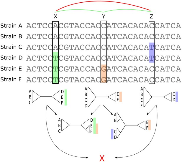
Bi-allelic SNPs correspond to phylogeny splits.
A segment of a multiple alignment of 6 strains containing three bi-allelic SNPs, X, Y, and Z. Assuming that each SNP corresponds to a single substitution in the evolutionary history of the position, each SNP constrains the local phylogeny to contain a particular split, that is bi-partition of the strains, as illustrated by the three diagrams immediately below each SNP. In this example, the neighboring pairs of SNPs and are both consistent with a common phylogeny and can be used to further resolve the phylogeny in the local segment of the alignment as shown in the second row with two diagrams. However, SNPs X and Z are mutually inconsistent with a common phylogeny (red cross at the bottom) indicating that somewhere between X and Z at least one recombination event must have occurred.
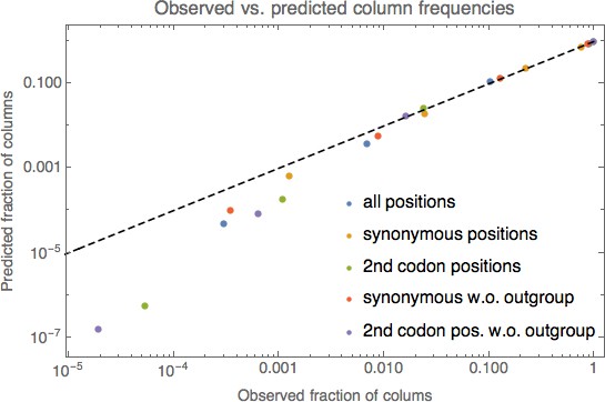
Comparison of the observed frequencies of columns with different numbers of nucleotides with predictions from a simple substitution model.
Comparison of the observed frequencies of columns with 1, 2, 3, and 4 different nucleotides under the simple model described in the methods. Different colored dots correspond to different subsets of columns, as indicated in the legend. For each color, four dots are shown corresponding to the observed frequencies of columns with 1, 2, 3, and 4 nucleotides (horizontal axis) and the predicted frequencies according to the simple model (vertical axis). The dashed line shows the identity . Both axes are shown on logarithmic scales.
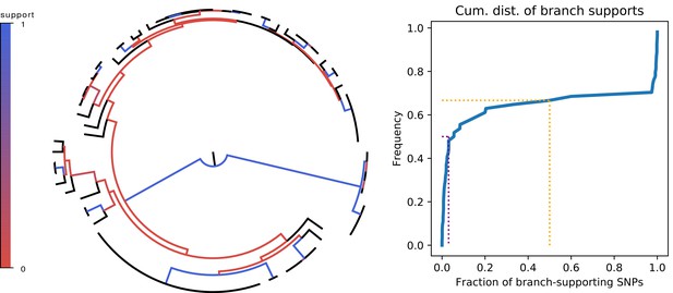
Most branches of the core genome tree are rejected by the statistics of individual SNPs.
Left panel: Fraction of supporting versus clashing SNPs for each branch of the core tree. Right panel: Cumulative distribution of the fraction of supporting SNPs across all branches. The purple and orange dotted lines show the median and the frequency of branches with 50% or less support, respectively.
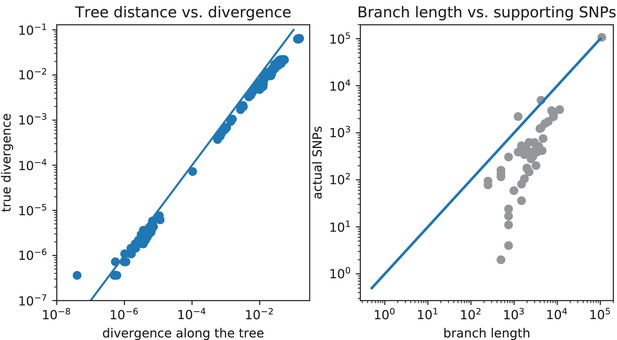
The pairwise distances and number of SNPs on each branch as predicted by the core tree do not match the pairwise distances and SNP numbers observed in the data.
Comparison of pairwise distances and number of SNPs on each branch as predicted by the core tree, with pairwise distances and SNP numbers observed in the data. Left panel: Scatter plot of the pairwise divergences along the core tree (horizontal axis) versus the observed pairwise divergences (vertical axis). Right panel: For each branch of the tree, the total number of SNPs predicted to fall on the branch, that is the probability of a substitution to occur along the branch times the number of columns in the alignment, is shown (horizontal axis) against the actual number of SNPs in the data that fall on the branch. All axes are shown on logarithmic scales.
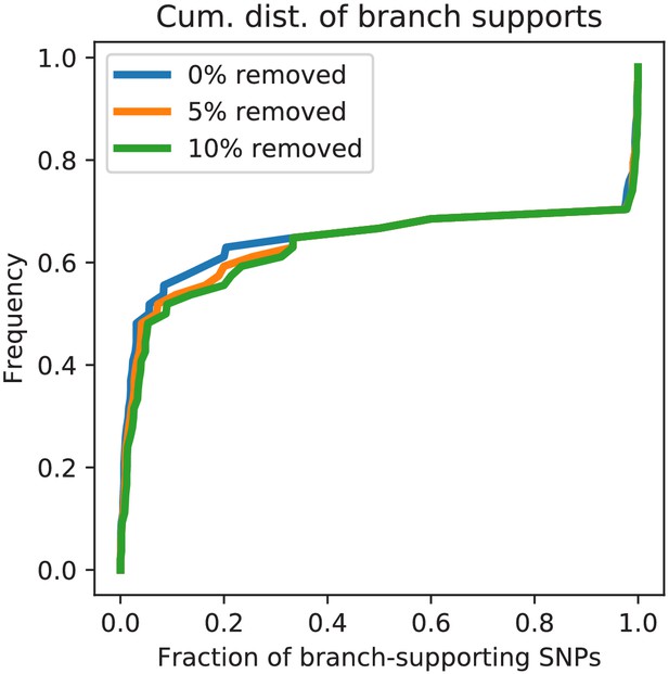
Homoplasies do not significantly effect the fractions of supporting SNPs for E.coli.
Cumulative distribution of the fraction of supporting SNPs across all branches of the core tree for the original alignment of E. coli strains (blue) as well as for alignments from which 5% (orange) and 10% of potentially homoplasic columns were removed. The fact that the curves are almost identical shows that the distribution of SNP support is highly insensitive to a small fraction of homoplasies among the SNPs.

Distributions of SNP support for the data from the simulations.
Cumulative distributions of the fraction of supporting SNPs across all branches of the core tree for the alignments resulting from the simulations with (dark blue), (light blue), (light green), (dark green), (orange), (red), and (dark red). The panels corresponds to the distribution for the original alignment (left), and alignments from which 5% (middle) and 10% of potentially homoplasic columns were removed. For reference, the distribution of support for the E. coli data is shown in black. Note that except for the simulations without any recombination where all inconsistencies are caused by homoplasies, the distributions are generally insensitive to the removal of homoplasic positions.
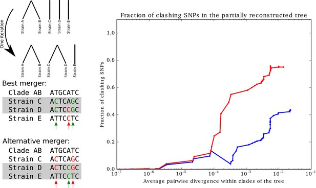
Supporting versus clashing SNPs for trees that were built bottom-up, while minimizing SNP clashes.
Supporting versus clashing SNPs for trees that were built bottom-up, while minimizing SNP clashes. Left panel: Illustration of the iterative bottom-up tree reconstruction. At each step, the pair of clades is fused that minimizes the number of SNPs that clash with the fusion (red arrows). In case of multiple pairs that have the same number of clashing SNPs, the pair with the largest number of supporting SNPs (green arrows) is chosen. Right panel: Fraction of SNPs that support vs. clash with the partially reconstructed tree as a function of the average pairwise divergence of strains that occur within the clades of the partially reconstructed tree. The blue curve corresponds to the full set of strains and the red curve to all strains except for the outgroup. The horizontal axis is shown on a logarithmic scale.
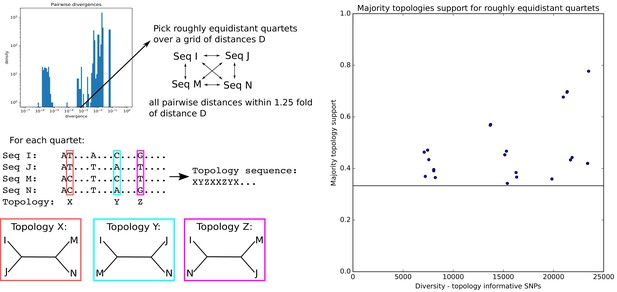
Quartets of roughly equidistant strains have no consensus phylogeny.
Quartets of roughly equidistant strains have no consensus phylogeny. Left: Using the distribution of pairwise distances (top panel) we select, for each pairwise distance D, quartets of strains whose pairwise distances are all within a factor 1.25 of D. SNPs for which two strains have one letter and two strains another are informative for the topology and each support one of the three possible topologies. Right: For each quartet, we determined the topology that is supported by most SNPs and then calculated the fraction of topology-informative SNPs that supported the most common topology. The plot shows the fraction of SNPs supporting the most common topology (vertical axis) as a function of the total number of informative SNPs (horizontal axis). The horizontal line marks the minimal possible fraction, which is attained when all three topologies are supported by 1/3 of the SNPs. Note that, for the majority of quartets, the most common topology is supported by less than half of the informative SNPs.

SNP compatibility along the core genome alignment shows tree-compatible segments are short.
(A) Linkage disequilibrium (squared correlation, see Materials and methods) as a function of the separation of a pair of columns in the core genome alignment. (B) Probability distribution of the number of consecutive SNP columns that are consistent with a common phylogeny for the core genome alignment (orange) and for an alignment in which the positions of all columns have been randomized (blue). (C) Probability distribution of the number of consecutive alignment columns consistent with a common phylogeny for both the real (orange) and randomized alignment (blue).
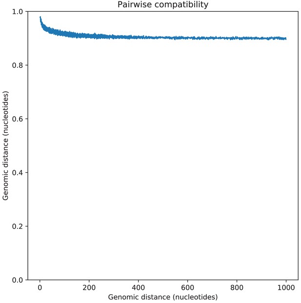
Pairwise SNP compatibility as a function of genomic distance.
Pairwise SNP compatibility as a function of genomic distance. The plot show the fraction of SNP pairs that are compatible with a common phylogeny as a function of the genomic distance between the pair (in nucleotides).
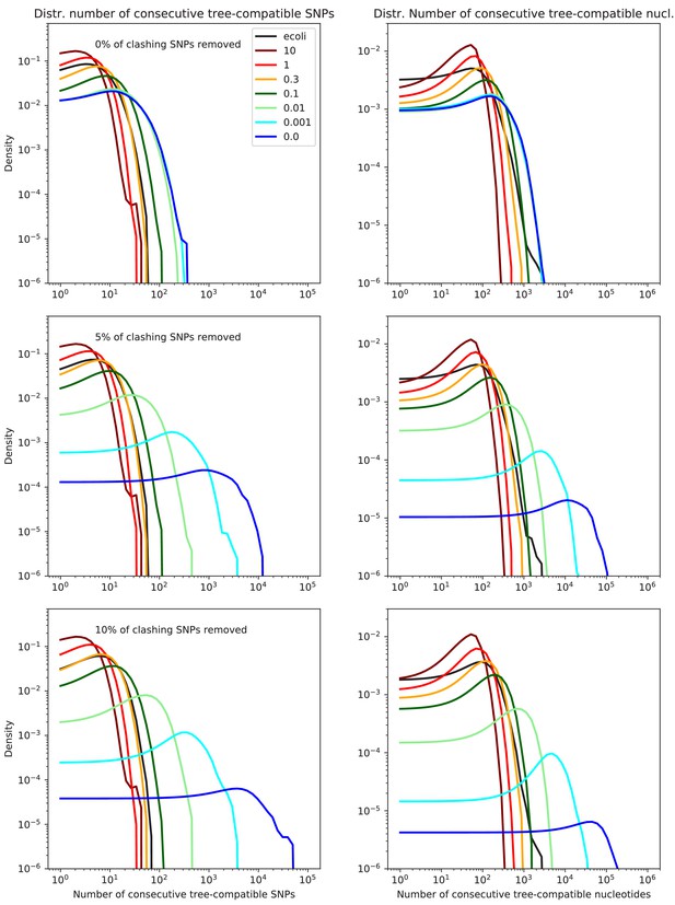
Lengths of tree-compatible segments for the data from the simulations.
Probability distributions of the length of tree-compatible segments along the alignments of the E. coli genomes (black line) and the alignments of the sequences from the simulations with (dark blue), (light blue), (light green), (dark green), (orange), (red), and (dark red). The left panels show the distributions of the number of consecutive SNP columns and the right panels the distributions of the number of consecutive nucleotides. The top row corresponds to the full alignments, and the middle and bottoms row to the alignments from which 5% and 10% of potentially homoplasic positions have been removed, respectively. All axes are shown on logarithmic scales.
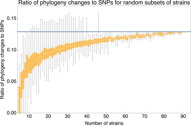
Ratio of the minimal number of phylogeny changes C to substitutions M for random subsets of strains using the alignment from which 5% of potentially homoplasic positions have been removed.
For strain numbers ranging from to , we collected random subsets of n strains and calculated the ratios of phylogeny changes to SNPs in the alignment. The figure shows box-whisker plots that indicate, for each strain number n, the 5th percentile, first quartile, median, third quartile, and 95th percentile of the distribution of across subsets. The blue line shows .
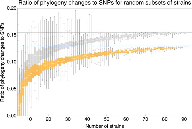
Ratios for homoplasy-corrected and full alignments of random subsets of strains.
Ratio of the minimal number of phylogeny changes C to substitutions M for random subsets of strains using the alignment for which 5% of potentially homoplasic positions have been removed (orange) as well as for the full alignment (gray). For strain numbers ranging from to , we collected random subsets of n strains and calculated the ratios of phylogeny changes to SNPs in the alignment. The figure shows box-whisker plots that indicate, for each strain number n, the 5th percentile, first quartile, median, third quartile, and 95th percentile of the distribution of across subsets. The blue line shows and the gray line .
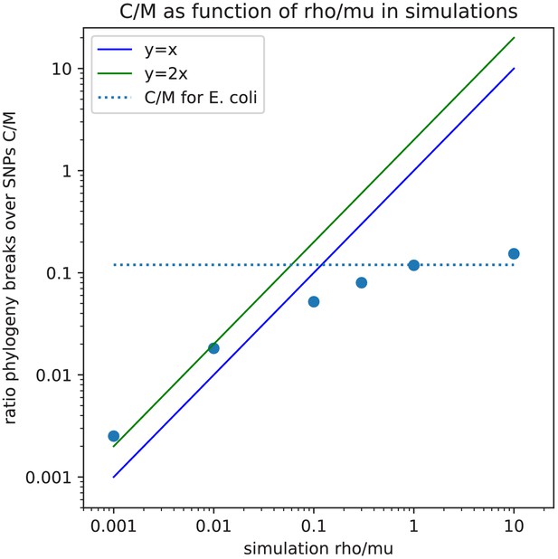
Lower bound on the ratio of phylogeny changes to mutations, versus the ratio of recombination to mutation rate, for the data of the simulations.
Observed ratio of the minimal number of phylogeny changes C and SNPs M in the alignment (vertical axis) as a function of the ratio of recombination and mutation rate used in the simulation (horizontal axis), as calculated on the simulation data using the alignments from which 5% of potentially homoplasic sites have been removed. Each blue dot corresponds to a simulation with a given value of . Both axes are shown on logarithmic scales. For guidance, the lines (blue) and (green) are shown. The horizontal dashed line shows the ratio that is observed for the 5% homoplasy corrected alignment of the E. coli strains.
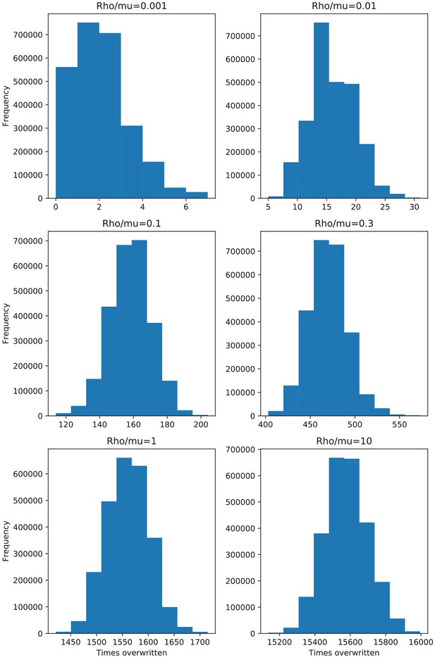
Distributions of the number of times each position in the alignment has been overwritten by recombination for the data of the simulations.
Histograms of the number of times each position in the genome was overwritten by recombination along the branches of the clonal phylogeny, for the simulations with recombination-to-mutation ratios ranging from (top left), to (bottom right).
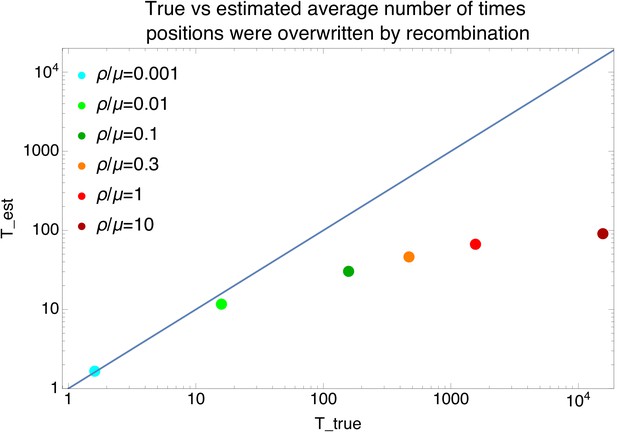
Comparison of the estimated and true average number of times each position in the alignment has been overwritten by recombination for the data of the simulations.
Comparison of the true average number of times that positions were overwritten by recombination along the branches of the clonal phylogeny (horizontal axis) versus the estimated number of times , as estimated from the lower bound on the number of phylogeny changes (with L the length of the alignment and the average length of the recombination segments), for the simulation data. Each dot corresponds to a simulation dataset with a different recombination to mutation rate (see legend). The diagonal line shows the line .
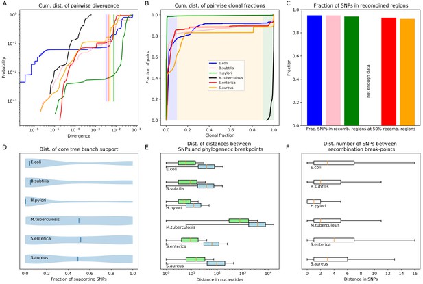
Quantification of the importance of recombination across species.
(A) The cumulative distribution of pairwise divergences is shown as a different colored line for each species (see legend in panel B). Both axes are shown on logarithmic scales. The vertical lines in corresponding colors show the critical divergences at which half of the genome is recombined for each species. (B) Cumulative distributions of clonal fractions across the pairs of strains for each species, with the blue, yellow, and green shaded regions indicating the fully recombined, partially recombined, and mostly clonal regimes, respectively, that is analogous to Figure 2I (C) For each species, the height of the bar shows the fraction of SNPs that fall in recombined regions for pairs of strains for which half of the genome is recombined, that is see Figure 2H. (D) The violin plots show, for each species, the distribution of branch support, that is the relative ratio of SNPs supporting versus clashing with each branch split, analogous to the right panel of Figure 4. The blue lines correspond to the medians of the distributions. (E) Box-whisker plots showing the 5, 25, 50, 75, and 95 percentiles of the distributions of nucleotide distances between consecutive SNPs (green) and phylogeny breakpoints (blue, that is analogous to Figure 5C), for each species. The axis is shown on a logarithmic scale. (F) Box-whisker plots of the distributions of the number of consecutive SNPs in tree-compatible segments, that is analogous to Figure 5B.
-
Figure 7—source data 1
List of database accessions of the genomes used.
- https://cdn.elifesciences.org/articles/65366/elife-65366-fig7-data1-v2.txt
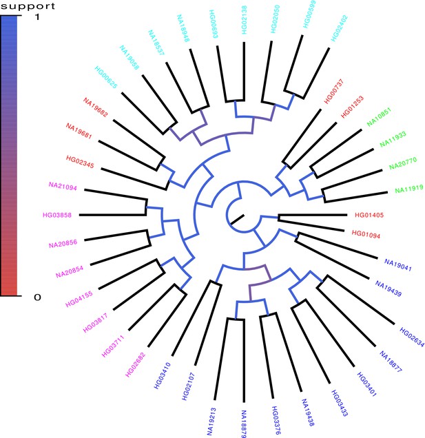
Core tree build by PhyML from the sequences of chromosomes 1–12 of 40 randomly chosen human genomes of the 1000 Genome project.
The colors indicate what fraction of the time each split in the core tree occurred in trees build from random subsets of half of the genomic loci. The colors on the leaves indicate the annotated ancestry of the individuals, with blue corresponding to African ancestry, green to European ancestry, red to (South) American ancestry, cyan to East Asian ancestry, and magenta to South Asian ancestry. Individuals from the same geographic area reliably form clades in the tree with the exception of South Americans, two of which form an outgroup of the Europeans, three an outgroup of East Asians, and two an outgroup of Africans.
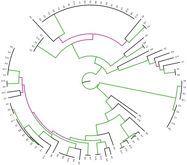
The E.coli core tree is relatively insensitive to removal of all SNPs that correspond to branches of the core tree.
Differences between the core tree T and the tree reconstructed from the alignment from which all SNPs that fall on branches of the core tree have been removed. Each branch of the core tree T is colored green when the branch also occurs in and pink if it does not. The Robinson-Foulds distance between two trees is defined as the number of branches (that is bi-partitions) that occur in only one of the two trees. For T and the Robinson-Foulds distance is 62 out of a maximal 178, that is a fraction 0.35 does not match. Note that for tree only 3% of the SNPs fall on its branches.
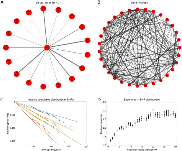
SNP-type frequencies follow approximately power-law distributions.
(A) Frequencies of 2-SNPs of the type in which a SNP is shared between strain A1 and one other strain s. Each edge corresponds to a 2-SNP and the thickness of the edge is proportional to the logarithm of the number of occurrences of this 2-SNP. The frequency of each edge is also indicated at the corresponding outer node. (B) A graph showing all 2-SNPs that were observed in the core genome alignment. Each node corresponds to a strain and each edge to a 2-SNP, with the thickness of the edge proportional to the logarithm of the number of occurrences of the SNP. (C) Reverse cumulative distributions of the frequencies of all observed 2-SNPs (blue dots), 3-SNPs (orange dots), 4-SNPs (green dots), and 12-SNPs (red dots). The solid lines in corresponding colors show power-law fits. Both axes are shown on a logarithmic scale. (D) Exponents of the power-law fits to the n-SNP frequency distributions, as a function of the number of strains sharing a SNP n. Error bars correspond to 95% posterior probability intervals.
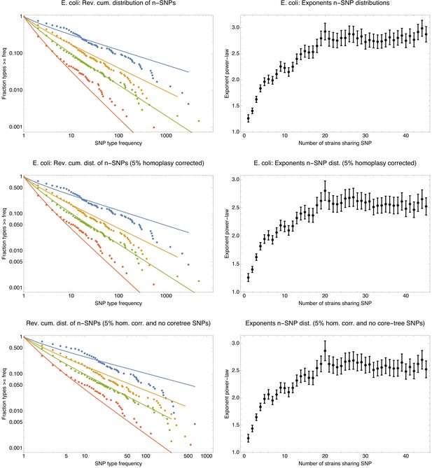
The n-SNP distributions are insensitive to removal of potential homoplasies and removal of n-SNPs corresponding to branches of the core tree.
Distributions of n-SNP frequencies (left panels) and exponents of the power-law fits (right panels) for original E. coli core genome alignment (top row), the 5% homoplasy-corrected core genome alignment (middle row), and the 5% homoplasy-corrected alignment from which all n-SNPs that correspond to branches of the core tree have been removed (bottom row). The observed n-SNP distributions and exponents are very similar for all three datasets, showing that the n-SNP distributions are not affected by homoplasies, and that clonal SNPs make only a minor contribution to these distributions.

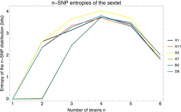
Phylogenetic entropy profiles of the E.coli strains.
Left panel: Entropy profiles (in bits) for six example strains, indicated in the legend. Right panel: Entropy profiles for all E. coli strains.
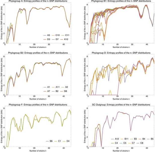
Entropy profiles of the n-SNP distributions for each of the E.coli phylogroups.
Entropy profiles of the n-SNP distributions for each of the E. coli phylogroups. Each panel shows the entropy of the n-SNP distribution (vertical axis) as a function of n for each strain s (differently colored lines) within a phylogroup (indicated at the top of the panel). All entropies were calculated on the 5% homoplasy-corrected alignments. For phylogroups with less than 10 strains, the names of the strains are indicated in the legend of the plot. Note that the bottom right panel corresponds to the outgroup of nine strains that are highly diverged from all other strains. Note also that entropy profiles are perfectly overlapping for strains within groups that are so close that they had a recent clonal ancestor. For example, for the pairs (C10,C11) and (D3,D7) in phylogroup A, the pair (A7,B2) in phylogroup B2, and pair (B6,C1) in phylogroup F, the two profiles are identical and only one curve is visible.
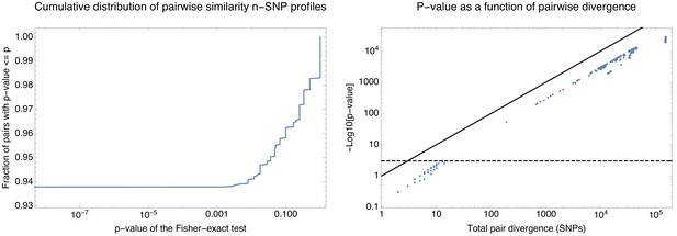
Statistical significance of the difference in n-SNP statistics for all pairs of strains.
Statistical significance of the difference in n-SNP statistics for all pairs of strains. Left panel: Cumulative distribution of the p-values of the Fisher exact test (Materials and methods) for the n-SNP statistics across all pairs of strains. About 94% of all pairs have significantly different n-SNP distributions. Right panel: p-values of the Fisher-exact test as a function of the divergence of each pair of strains. Each dot corresponds to one pair with the horizontal axis showing the total number of single-nucleotide differences between the pair of core genomes and the vertical axis showing minus the logarithm of the p-value (base 10). The diagonal line corresponds to the line and the horizontal dashed line corresponds to a p-value of 0.001. Note that the significance correlates very well with the divergence of the pair and that only pairs of genomes that differ in less than 10 nucleotides in their core genomes have indistinguishable n-SNP statistics.
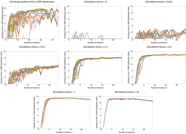
Comparison of the entropy profiles of the n-SNP distributions of E.coli with those of the data of the simulations.
Entropy profiles of the n-SNP distributions for the E. coli data (top left panel) and the data from the simulations other panels, with the recombination rate indicated in the title of each panel. Each panel shows the entropy of the n-SNP distribution (vertical axis) as a function of n for each strain s (differently colored lines). All entropies were calculated using the 5% homoplasy-corrected alignments. Note that the small number of nonzero entropies for the simulations without recombination are due to the small number of remaining homoplasies.

Left panel: Exponents of the power-law fits to the n-SNP frequency distributions, as a function of the number of strains sharing a SNP n for each of the species (different colors).
Error bars correspond to 95% posterior probability intervals. Right panel: Mean entropy of the entropy profiles , averaged over all strains s, as a function of the number n of strains sharing the SNP, for each of the species (different colors). The error bars correspond to two standard-errors of the mean.
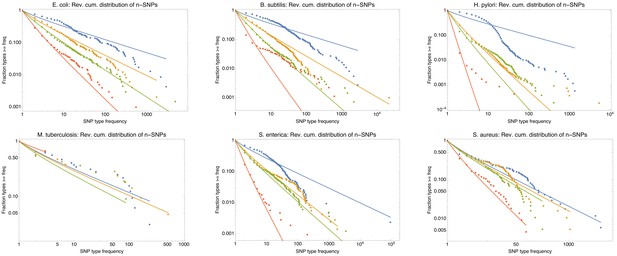
Power-law fits of the n-SNP distributions for all six species.
Power-law fits of the n-SNP distributions for all six species. Each panel shows the reverse cumulative distributions of the frequencies of all observed 2-SNPs (blue dots), 3-SNPs (orange dots), 4-SNPs (green dots), and 12-SNPs (red dots), with the solid lines in corresponding colors showing power-law fits. The species is indicated at the top of each panel.
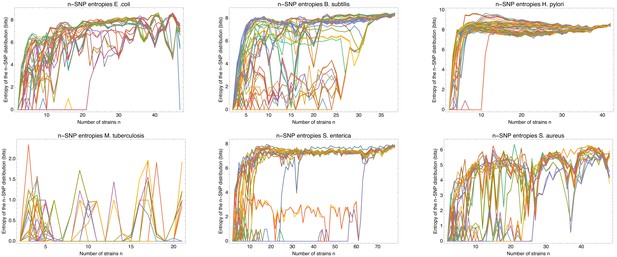
Entropy profiles of all the strains for each of the six species.
Entropy profiles of all the strains for each of the six species. Each panel corresponds to one species (indicated at the top) and shows the entropy profiles of the distributions of n-SNPs in which a particular strain s occurs as a function of the number of strains n (different colors).

n-SNPs distributions and entropy profiles for the human data.
n-SNPs distributions and entropy profiles for the human data. Left panel: Reverse cumulative distributions of the frequencies of all observed 2-SNPs (blue dots), 3-SNPs (orange dots), 4-SNPs (green dots), and 12-SNPs (red dots), with the solid lines in corresponding colors showing power-law fits, for the human data. Both axes are shown on a logarithmic scale. Middle panel: Fitted exponents for the power-law n-SNP distributions on the human data for n ranging from 1 to 30. The error bars correspond to 95% posterior probability intervals. Right panel: Entropy profiles of the n-SNP distributions for the individuals from the 1000 Genomes project. Individuals with African ancestry are in blue, European in green, South American in red, East Asian in cyan, and South Asian in magenta.
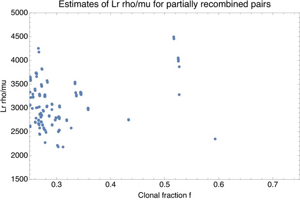
Estimate of the effective recombination strength (vertical axis) as a function of the estimated fraction of clonally inherited genome fc (horizontal axis) for each pair of strains with fc between and .
Each point corresponds to a pair of strains.
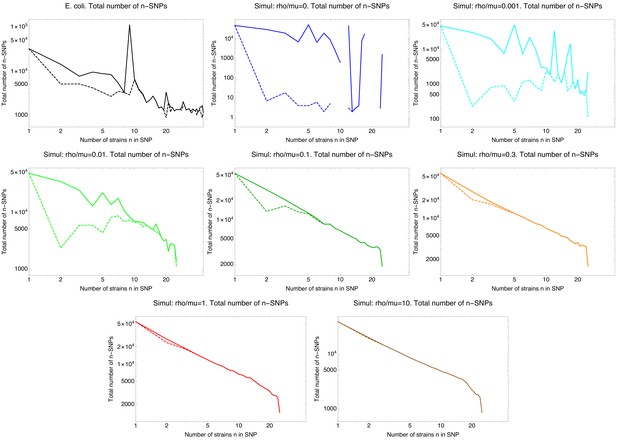
SNP frequency spectra.
Total number of occurrences of n-SNPs, that is SNPs shared by n strains (vertical axes) as a function of n (horizontal axes) for the E. coli data (top left panel) and all simulated data with different recombination rates, where the ratio of recombination to mutation rate is indicated above each panel. The solid lines correspond to all n-SNPs in the 5% homoplasy-corrected alignment, whereas for the dashed lines all n-SNPs corresponding to branches in the core tree have been removed. Note that all axes are shown on logarithmic scales and for high recombination rates , the n-SNP frequencies are approximately proportional to .

Diversity of n-SNPs.
Left panel: Number of n-SNP types (vertical axis) as a function of n (horizontal axis) for the E. coli data (black line) and for simulations with different recombination to mutation rates (colored lines, see legend). Both axes are shown on a logarithmic scale. Right panel: Geometric average of the number of occurrences per n-SNP type (vertical axis) as a function of n for the E. coli data (black line) and for simulations with different recombination to mutation rates (colored lines, see legend). Both axes are shown on a logarithmic scale. Note that, in order to better show the heights of the curves for the different datasets the vertical axis is clipped at 50. For the simulated datasets, the geometric mean of the 1-SNP counts runs from 400 to 1000.
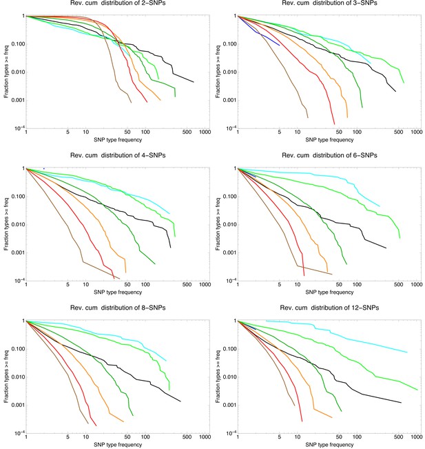
Example n-SNP distributions for E. coli (black lines) as well as for the simulations with different rates of recombination with shown in blue, in cyan, in light green, in dark green, in orange, in red, and in brown.
Each panel corresponds to the observed n-SNP distributions with the value of n indicated at the top of each panel. All axes are shown on logarithmic scales.
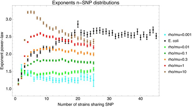
Fitted exponents of the n-SNP distributions for the E. coli data (black) and the data from the simulations with different recombination rates (colors, see legend).
The bars show the fitted exponent plus and minus one standard-deviation of the posterior distribution.
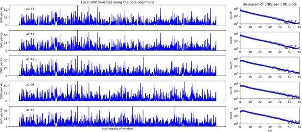
Left panels: SNP densities (SNPs per kilobase) along the core genome for the five pairs of strains (A1-B2), (A1-A7), (A1-A11), (A1-D8), and (A1-A2).
Right panels: Corresponding histograms for the number of SNPs per kilobase (dots) together with fits of the mixture model. Note the vertical axis is on a logarithmic scale.

Distribution of the five most common 2-SNP patterns involving strain A1 along the core genome alignment.
Left: Direct visualization of the positions of each of the 2-SNP patterns along the core genome alignment. Each dashed line corresponds to an SNP and SNPs are colored according to the 2-SNP type (see legend in middle and right panels) and ordered with the most common type at the bottom. Middle: Reverse cumulative distributions of the distances between consecutive SNPs of the same type. Each colored line corresponds to the distribution for one 2-SNP type (see legend). The vertical axis is shown on a logarithmic scale. Right: Reverse cumulative distribution of the length of runs of consecutive 2-SNPs of the same type. Each colored line corresponds to the distribution for one 2-SNP type (see legend). The vertical axis is shown on a logarithmic scale.

Left: Histogram of the number of consecutive SNPs before an inconsistency in the core genome alignment of the sextet of strains (A1,A2,A7,A11,B2,D8) of phylogroup B2.
Note that the vertical axis corresponds to the number of segments with the corresponding number of consecutive SNPs. Middle: Histogram of the length of segments without phylogeny breaks. Right: Histogram of the SNP density across the segments that are consistent with a single phylogeny (shown on a logarithmic axis). Note that the SNP densities vary by two orders of magnitude.
Tables
Estimated expected number of mutations per position and estimated fraction of homoplasies for five different subsets of core alignment columns: all columns, all synonymous positions (third positions in fourfold degenerate codons), second positions in codons, synonymous positions excluding the outgroup, and second positions in codons excluding the outgroup.
| Column set | fh | |
|---|---|---|
| All columns | 0.118 | 0.026 |
| Synonymous positions | 0.287 | 0.063 |
| Second positions in codons | 0.0258 | 0.006 |
| Synom. pos. without outgroup | 0.149 | 0.033 |
| Sec. pos. without outgroup | 0.0172 | 0.004 |
Detailed statistics on the polymorphisms in the whole core genome alignment, at synonymous positions (third positions in fourfold degenerate codons) and at second codon positions (where all substitutions are non-synonymous).
First, for each set of positions the table lists the total number of positions, and the number of positions at which 1, 2, 3 or 4 different nucleotides appear. Second, for the subset of positions where two nucleotides appear, the table lists the total number of transitions and transversions, and the number of positions with each of the six possible two-nucleotide subsets.
| Statistic | All columns | Synom. codon pos. | Sec. codon pos. |
|---|---|---|---|
| Total columns | 2,880,516 | 349,311 | 960,172 |
| 1-letter columns | 2,484,831 | 299,536 | 936,588 |
| 2-letter columns | 363,164 | 46,807 | 22,505 |
| 3-letter columns | 30,611 | 2838 | 1029 |
| 4-letter columns | 1910 | 130 | 50 |
| Transitions | 275,134 | 36,866 | 13,420 |
| Transversions | 88,030 | 9941 | 9085 |
| A ↔ G | 138,728 | 21,767 | 6676 |
| C ↔ T | 136,406 | 15,099 | 6744 |
| G ↔ T | 23,679 | 2198 | 963 |
| A ↔ C | 23,636 | 3294 | 3510 |
| A ↔ T | 21,036 | 2416 | 2549 |
| C ↔ G | 19,679 | 2033 | 2063 |
Average length of tree compatible segments, both in terms of number of consecutive SNPs and number of consecutive nucleotides, for the full E. coli and simulation data, as well as for alignments from which 5% or 10% of potentially homoplasic sites were removed.
| Statistic | Average nb. of SNPs | Average nb. of nucleotides | ||||
|---|---|---|---|---|---|---|
| Perc. homoplasies removed | 0% | 5% | 10% | 0% | 5% | 10% |
| E. coli | 7.59 | 8.79 | 10.75 | 123 | 145 | 179 |
| 32 | 2757 | 11606 | 387 | 30435 | 108413 | |
| 32 | 430 | 702 | 371 | 5020 | 8396 | |
| 28 | 57 | 85 | 365 | 733 | 1158 | |
| 14 | 16 | 18 | 211 | 256 | 312 | |
| 8 | 9 | 10 | 135 | 157 | 183 | |
| 5 | 5 | 5 | 88 | 100 | 114 | |
| 3 | 3 | 3 | 57 | 62 | 68 | |
Number of substitutions and phylogeny changes within sub-alignments corresponding to known phylogroups.
Starting from the full 5% homoplasy-corrected core genome alignment we extracted, for each phylogroup, the sub-alignment of all strains belonging to that phylogroup and determined the number of bi-allelic SNPs M and number of phylogeny changes C. Each row of the table corresponds to one of the known phylogroups and shows the number of our strains in that phylogroup, the SNP rate within the clade , the lower bound C on the number of phylogeny changes, the ratio , and the estimated average number of times each position in the genome has been overwritten by recombination . Note that the phylogroup ’O’ stands for the outgroup. See Figure 1—figure supplement 1 for the phylogroup annotation of our strains.
| Phylogroup | No. of strains | SNP rate | Phyl. changes C | ||
|---|---|---|---|---|---|
| A | 6 | 0.0024 | 178 | 0.027 | 0.65 |
| B1 | 35 | 0.013 | 4540 | 0.130 | 16.5 |
| B2 | 6 | 0.011 | 2664 | 0.088 | 9.7 |
| D | 29 | 0.017 | 5426 | 0.114 | 19.7 |
| E | 1 | - | - | - | - |
| F | 3 | 0.007 | - | - | - |
| O | 9 | 0.003 | 2 | 0.0002 | 0.007 |
Summary statistics of the core genome alignments of the different bacterial species.
For each species, the number of strains, the median genome size, the size of the core genome alignment, and the total number of informative SNPs (that is SNPs that occur in at least two strains) are listed.
| Species | Strains | Genome size | Core size | Inf. SNPs |
|---|---|---|---|---|
| Escherichia coli | 92 | 4,929,299 | 2,756,541 (56%) | 247,822 |
| Bacillus subtilis | 75 | 4,155,843 | 2,341,553 (56%) | 182,535 |
| Helicobacter pylori | 83 | 1,655,288 | 850,827 (51%) | 114,993 |
| Mycobacterium tuberculosis | 40 | 4,465,985 | 4,150,139 (93%) | 3502 |
| Salmonella enterica | 155 | 4,810,980 | 2,846,634 (59%) | 192,117 |
| Staphylococcus aureus | 95 | 2,881,899 | 2,002,833 (69%) | 73,756 |
Summary statistics on mutation and recombination for each of the six species.
For each species, the table shows the SNP rate (SNPs per alignment column) , the lower bound on the number of phylogeny changes C, and the lower bound on the ratio of phylogeny changes to mutations .
| Species | SNP rate | Phyl. changes C | |
|---|---|---|---|
| Escherichia coli | 0.101 | 43,575 | 0.156 |
| Bacillus subtilis | 0.113 | 40,811 | 0.155 |
| Helicobacter pylori | 0.202 | 50,743 | 0.295 |
| Mycobacterium tuberculosis | 0.002 | 755 | 0.078 |
| Salmonella enterica | 0.085 | 31,598 | 0.131 |
| Staphylococcus aureus | 0.053 | 13,215 | 0.124 |
Pairwise divergence of strain with each of the other strains of phylogroup B2.
| Strain | Divergence |
|---|---|
| B2 | 0.00626 |
| A7 | 0.00627 |
| A11 | 0.00702 |
| D8 | 0.00729 |
| A2 | 0.00778 |
Lengths, total SNP count, and SNP types (that is the strains that carry the minority allele) for the ten longest segments (in terms of number of consecutive SNPs) along the core genome of the sextet (A1,A2,A7,A11,B2,D8) of phylogroup B2.
| Length segment | Number of SNPs | SNP types |
|---|---|---|
| 9698 | 109 | (A7, B2) (A1, A7, B2) (A2, D8) |
| 5672 | 100 | (A7,B2) (A1,A2) (A11,D8) |
| 2068 | 100 | (A2,D8) (A11,A7,B2) |
| 2255 | 95 | (A7,B2) (A11,A2) (A1,A11,A2) |
| 11726 | 95 | (A7,B2) (A2,A7,B2) (A1,D8) |
| 11790 | 93 | (A7,B2) (A2,D8) |
| 3614 | 86 | (A11,A2) |
| 4564 | 86 | (A11,A7,B2) (A1,A2) |
| 2890 | 75 | (A7,B2) (A1,A7,B2) |
| 2390 | 71 | (A1,A11) |
All 2-SNPs, 3-SNPs, and 4-SNPs involving strains from the sextet (A1 A2 A7 A11 B2 D8), that occur at least 100 times, sorted by their frequency of occurrence.
| Strains | Number of occ. |
|---|---|
| A7 B2 | 1227 |
| A11 D8 | 306 |
| A2 D8 | 291 |
| A11 A2 | 284 |
| A1 D8 | 214 |
| A1 A2 | 196 |
| A1 A11 | 194 |
| A1 A7 B2 | 389 |
| A7 B2 D8 | 303 |
| A11 A7 B2 | 265 |
| A2 A7 B2 | 208 |
| A11 A2 D8 | 179 |
| A1 A11 D8 | 172 |
| A1 A11 A2 | 161 |
| A1 A2 D8 | 153 |
| A1 A11 A7 B2 | 265 |
| A1 A11 A2 D8 | 248 |
| A11 A7 B2 D8 | 232 |
| A1 A7 B2 D8 | 226 |
| A1 A2 A7 B2 | 139 |
| A2 A7 B2 D8 | 136 |
| A11 A2 A7 B2 | 110 |


