Genome-wide association study in quinoa reveals selection pattern typical for crops with a short breeding history
- Plant Breeding Institute, Christian-Albrechts-University of Kiel, Germany
- King Abdullah University of Science and Technology (KAUST), Biological and Environmental Sciences & Engineering Division (BESE), Saudi Arabia
- Institute of Plant Breeding, Seed Science and Population Genetics, University of Hohenheim, Germany
- Department of Physiology of Yield Stability, University of Hohenheim, Germany
Figures
Figure 1 with 9 supplements

Genetic diversity and population structure of the quinoa diversity panel.
(a) Principal component analysis (PCA) of 303 quinoa accessions. PC1 and PC2 represent the first two analysis components, accounting for 23.35% and 9.45% of the total variation, respectively. The colors of dots represent the origin of accessions. Two populations are highlighted by different colors: Highland (light blue) and Lowland (pink). (b) Subpopulation-wise linkage disequilibrium (LD) decay in Highland (blue) and Lowland population (red). (c) Population structure is based on 10 subsets of SNPs, each containing 50,000 single nucleotide polymorphisms (SNPs) from the whole-genome SNP data. Model-based clustering was done in ADMIXTURE with different numbers of ancestral kinships (K=2 and K=8). K=8 was identified as the optimum number of populations. Left: Each vertical bar represents an accession, and color proportions on the bar correspond to the genetic ancestry. Right: Unrooted phylogenetic tree of the diversity panel. Colors correspond to the subpopulation.
-
Figure 1—source data 1
Principal component analysis (PCA) of 303 quinoa accessions.
- https://cdn.elifesciences.org/articles/66873/elife-66873-fig1-data1-v2.xlsx
-
Figure 1—source data 2
Subpopulation-wise linkage disequilibrium (LD) decay in Highland and Lowland population.
- https://cdn.elifesciences.org/articles/66873/elife-66873-fig1-data2-v2.xlsx
-
Figure 1—source data 3
Population structure is based on 10 subsets of single nucleotide polymorphisms (SNPs), each containing 50,000 SNPs from the whole-genome SNP data.
Model-based clustering was done in ADMIXTURE with different numbers of ancestral kinships.
- https://cdn.elifesciences.org/articles/66873/elife-66873-fig1-data3-v2.xlsx
Figure 1—figure supplement 1
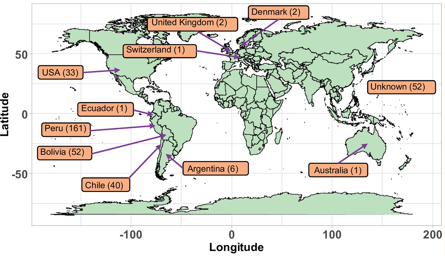
Geographical origin of the accessions forming the quinoa diversity panel.
Figure 1—figure supplement 2
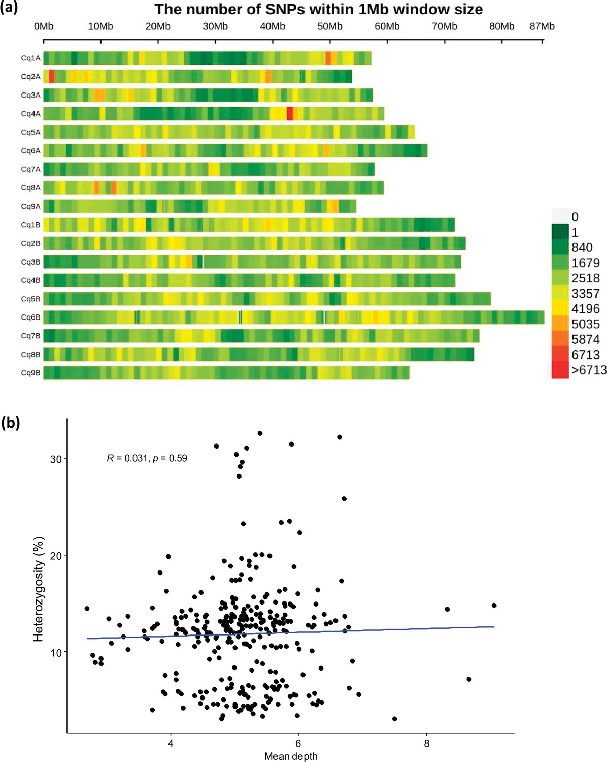
The SNP distribution in quinoa genome.
(a) Single nucleotide polymorphism (SNP) density heatmap across the 18 quinoa chromosomes. Different colors depict SNP density. (b) Scatter plot between mean depth and heterozygosity of accessions. Dots represent 310 different accessions.
Figure 1—figure supplement 3
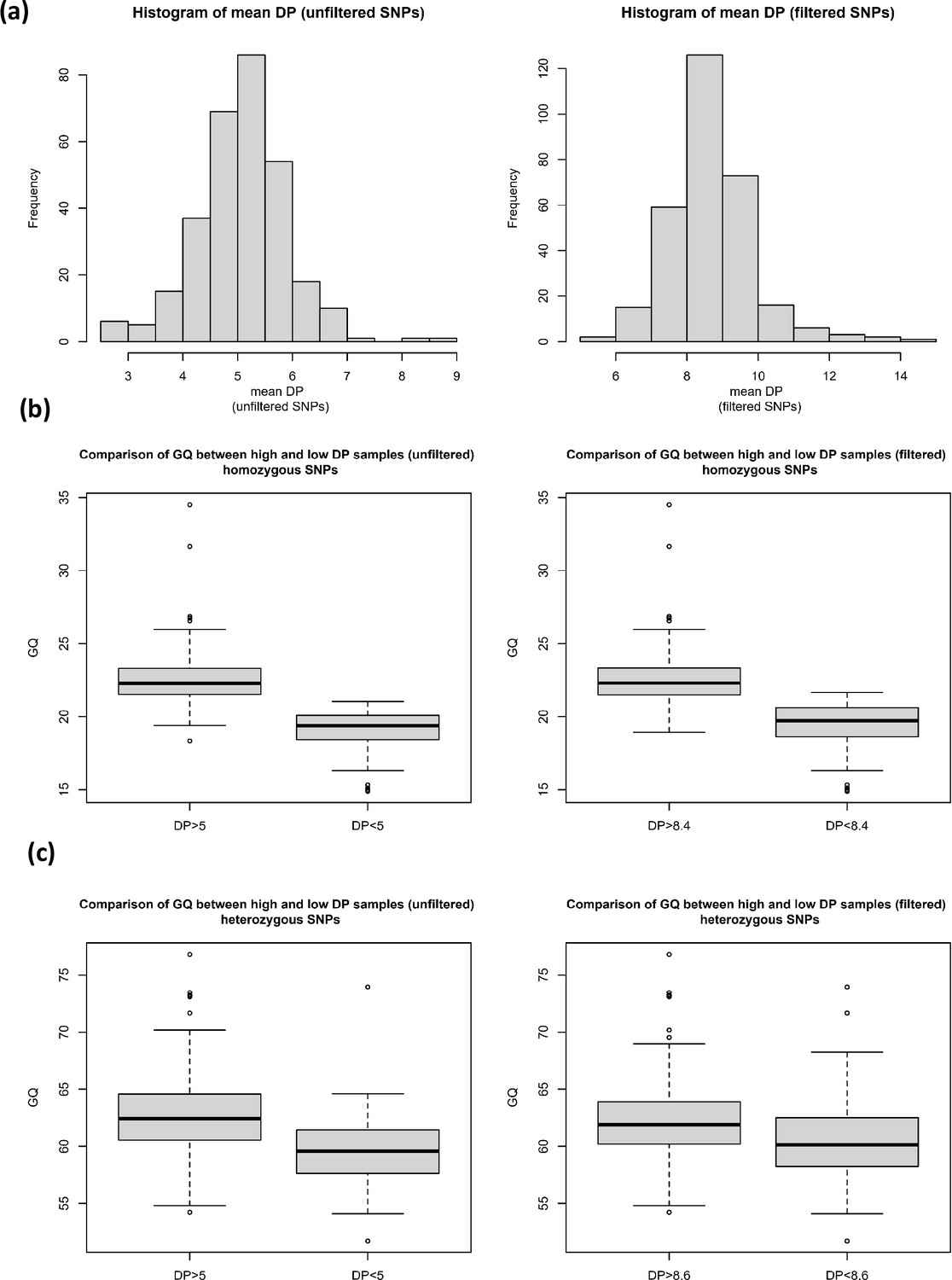
The effect of read depth on genotype quality for homozygous and heterozygous SNPs.
(a) Histograms of mean read depth (DP) for unfiltered and filtered single nucleotide polymorphisms (SNPs), and the comparison of genotype quality (GQ) between high and low DP samples for (b) homozygous SNPs (filtered and unfiltered) and (c) heterozygous SNPs (filtered and unfiltered).
Figure 1—figure supplement 4
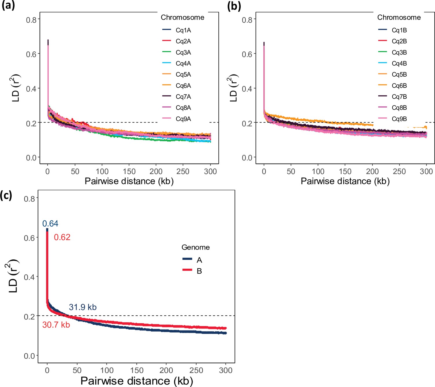
Chromosome-wide linkage disequilibrium (LD) decay in genome A (a) and genome B (b).
Colors depict different chromosomes. (c) Genome-wide average LD decay of the A subgenome (blue) and B subgenome (red). Pairwise distance at r2=0.20 is defined as the threshold for genome-wide LD decay (dashed line).
Figure 1—figure supplement 5
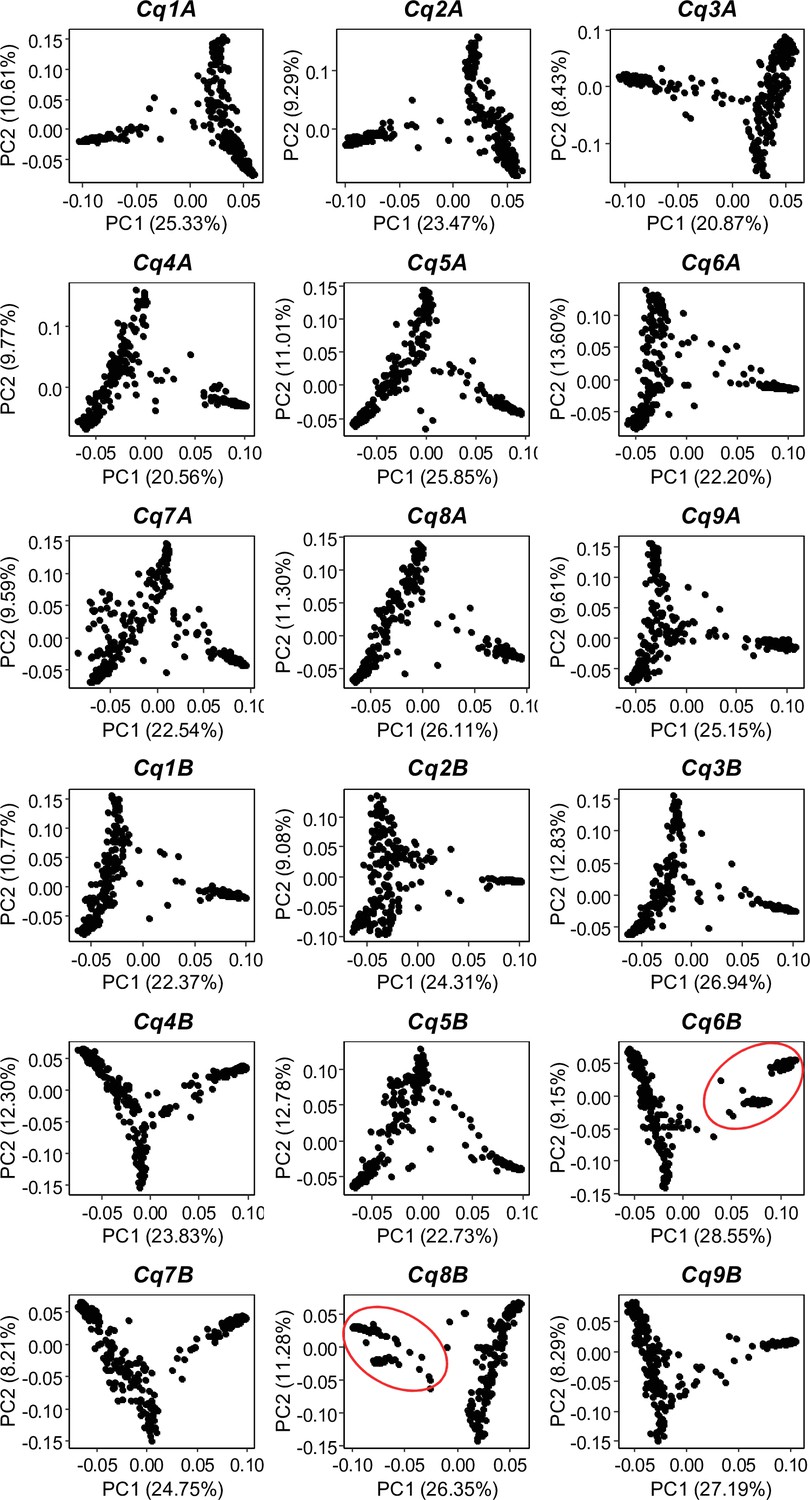
Single nucleotide polymorphism (SNP)-based principal component analysis (PCA) across all 18 quinoa chromosomes.
Red circles depict the two clusters of Lowland accessions.
Figure 1—figure supplement 6
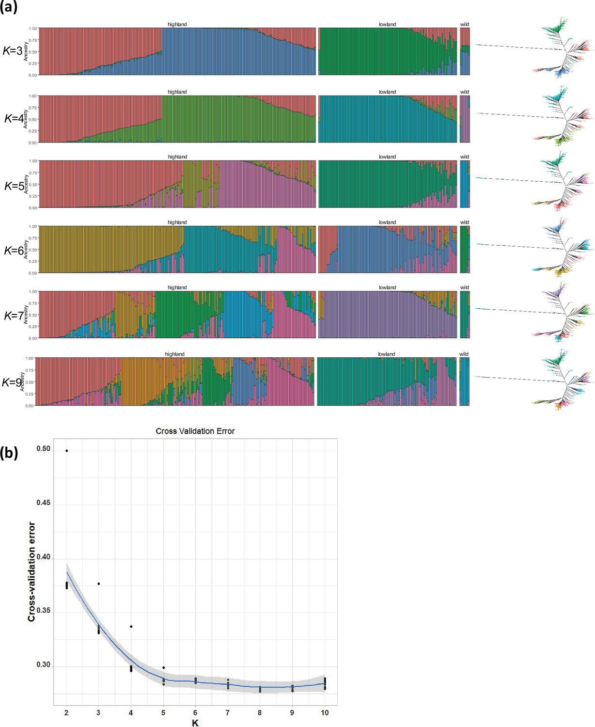
population structure analysis in quinoa.
(a) ADMIXTURE ancestry coefficients for K ranging from 3 to 7 and 9. Each vertical bar represents an accession, and the color proportions on the bar correspond to the genetic ancestry. (b) Cross-validation error in ADMIXTURE run.
Figure 1—figure supplement 7
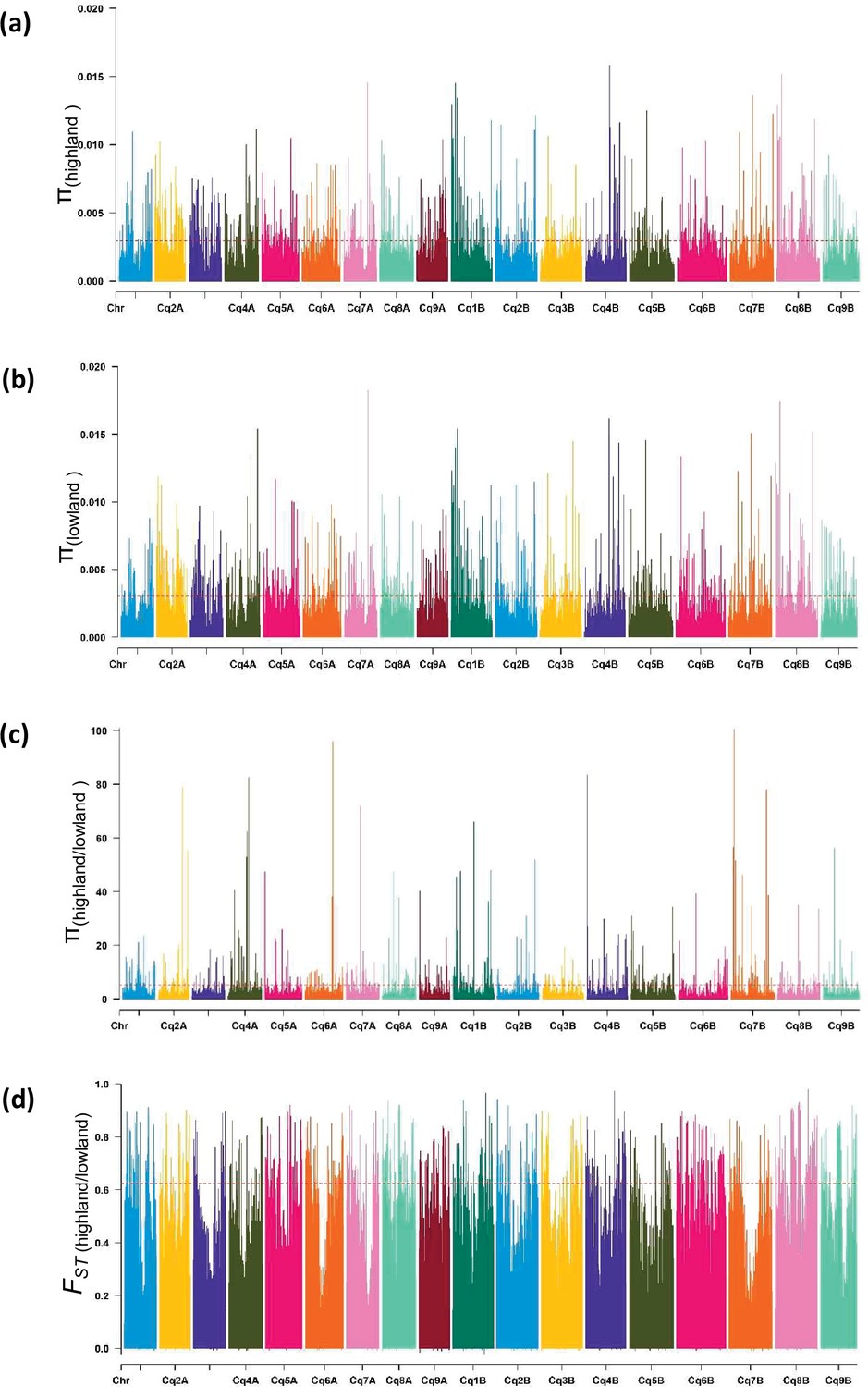
Diversity of populations along chromosomes measured based on 10 kb non-overlapping windows.
Nucleotide diversity (π) distribution of 10 kb windows in population Highland (a) and Lowland (b). (c) Nucleotide diversity ratios (π Lowland/ π Highland). (d) Pairwise genome-wide fixation index (FST) between Highland and Lowland. The broken horizontal line represents the top 1% threshold.
Figure 1—figure supplement 8
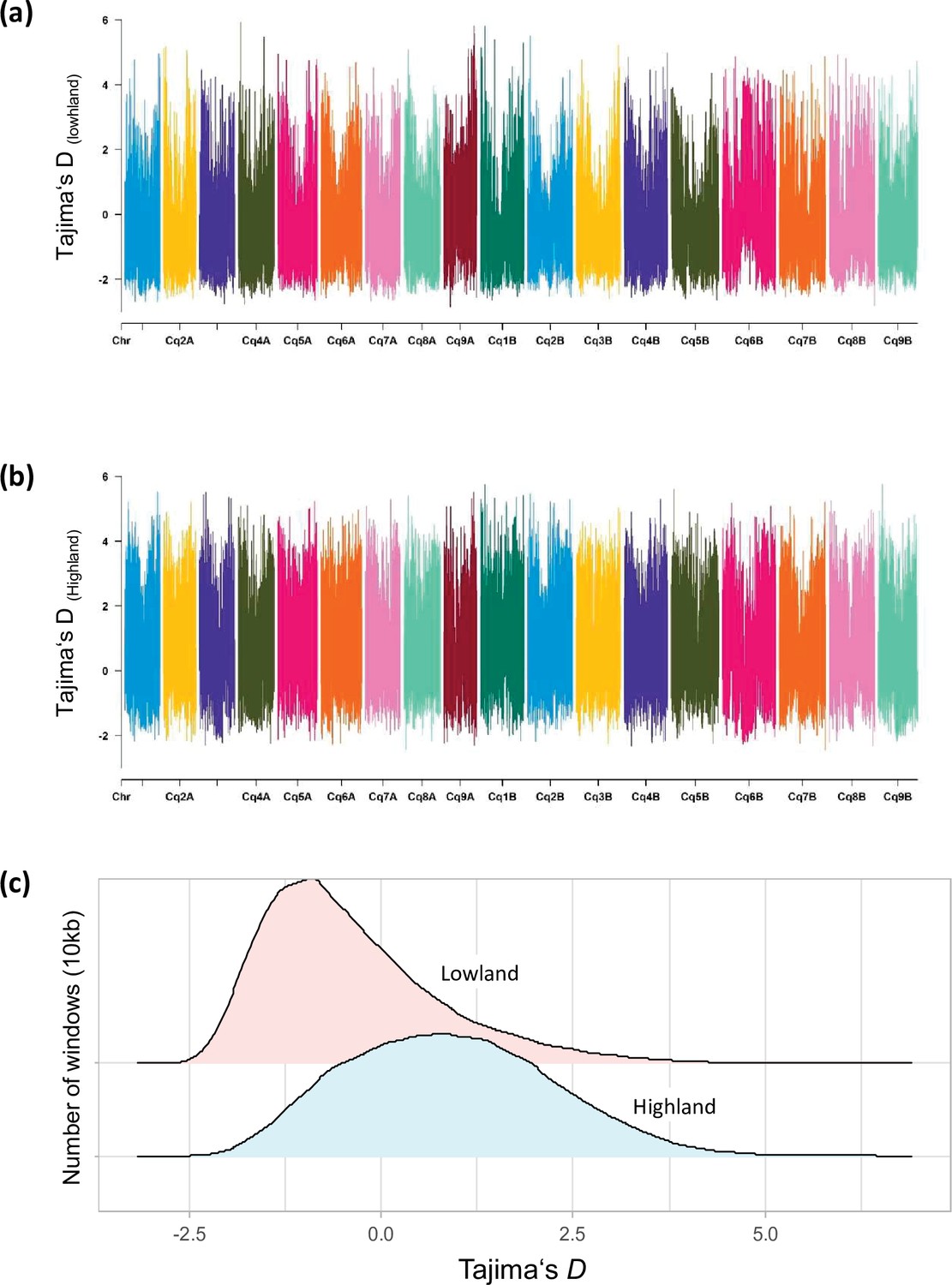
Distribution of Tajima’s D along chromosomes in Lowland (a) and Highland (b) populations.
(c) Density distribution of Tajima’s D between populations. Different colors represent the quartiles.
Figure 1—figure supplement 9
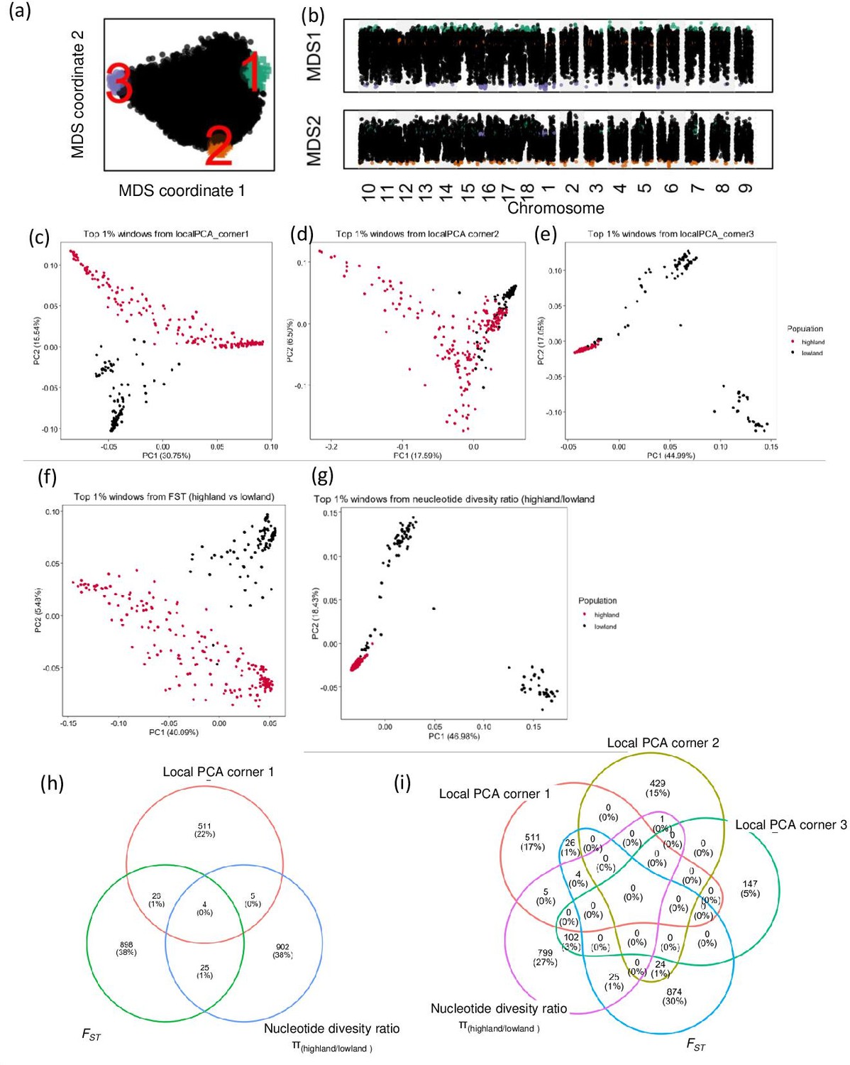
Local principal component analysis (PCA) and identification of candidate genes using diversity parameters.
(a) Relationship between genomic windows visualized using multidimensional scaling (MDS). (b) Two MDS coordinates of each window along the quinoa genome, candidate genomic regions are marked in different colors, which correspond with the colors on figure a. candidate regions are identified as the closest 1% window with the most extreme MDS coordinates. (c, d, e, f, and g) PCA using single nucleotide polymorphisms (SNPs) located within the candidate genomic regions identified by different analyses. (h and i) Venn diagrams represent the comparison of candidate genes identified by different analyses.
Figure 2 with 1 supplement
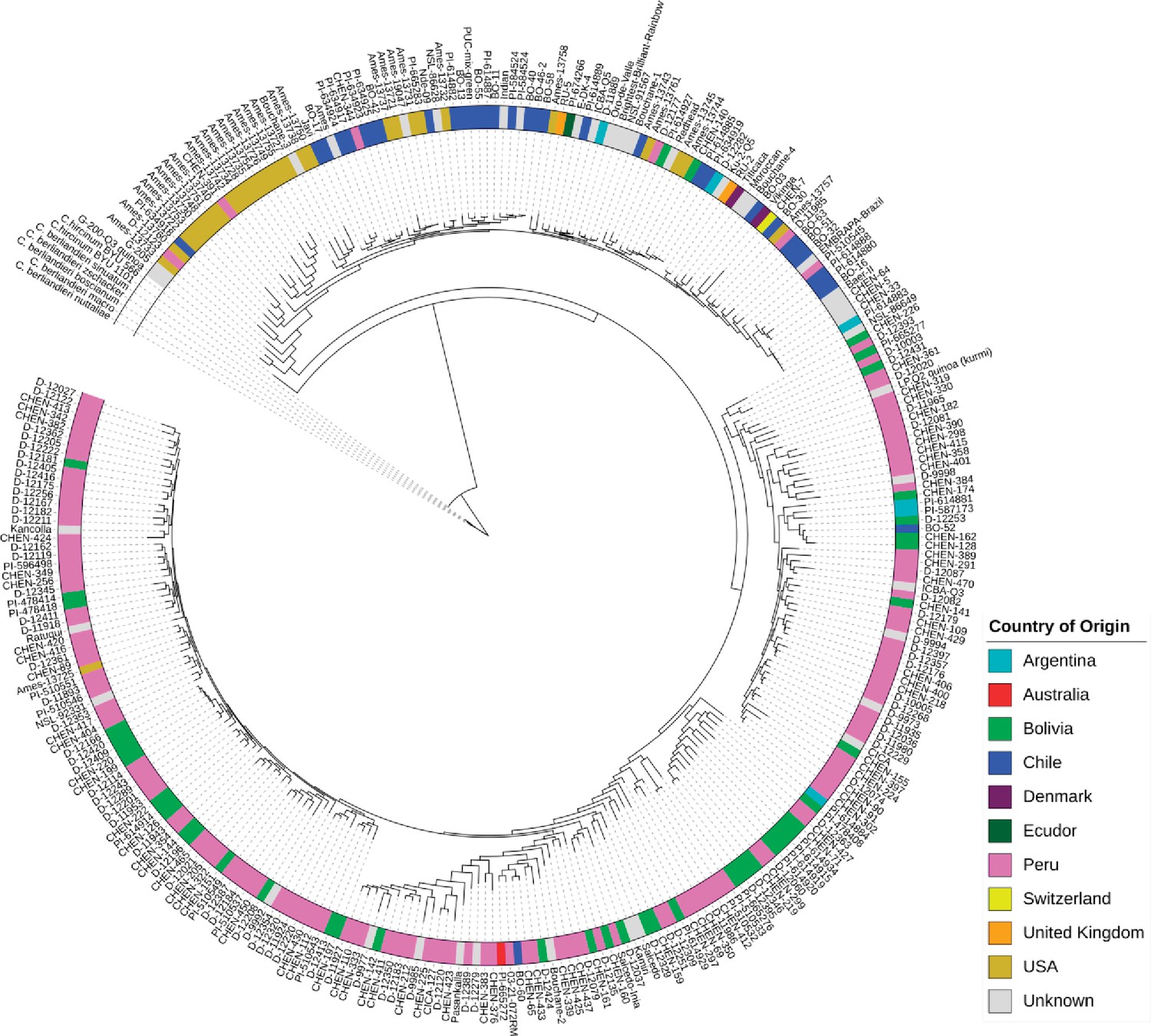
Maximum likelihood tree of 303 quinoa and 7 wild Chenopodium accessions from the diversity panel.
Colors depict the geographical origin of accessions.
-
Figure 2—source data 1
Maximum likelihood tree of 303 quinoa and 7 wild Chenopodium accessions from the diversity panel.
- https://cdn.elifesciences.org/articles/66873/elife-66873-fig2-data1-v2.xlsx
Figure 2—figure supplement 1
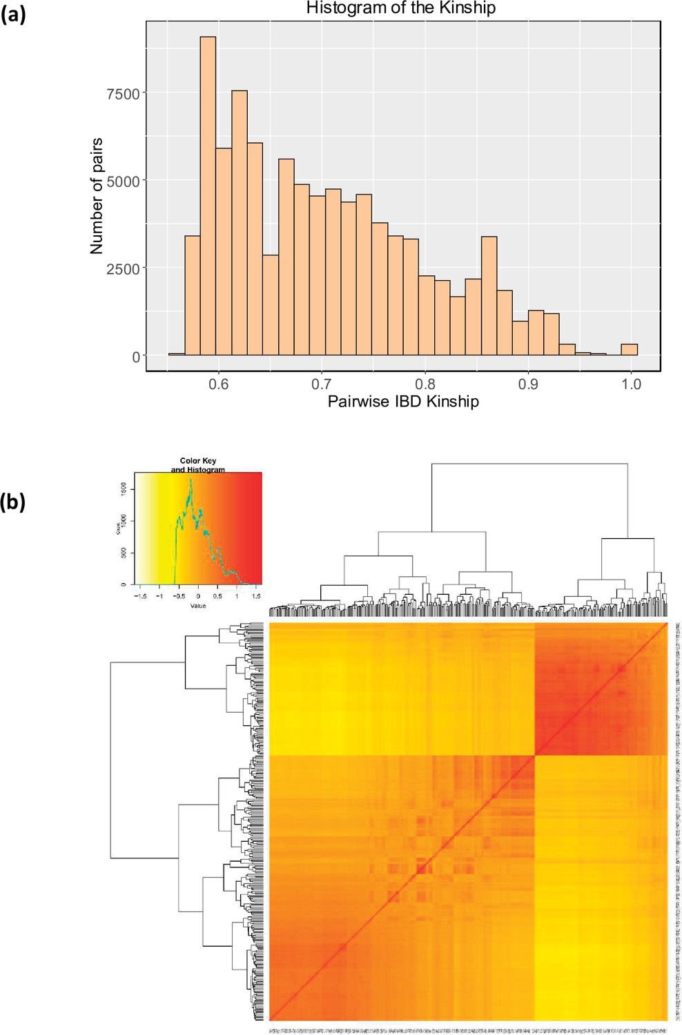
Genetic relationships between quinoa accessions.
(a) Histogram representing the distribution of pairwise IBS kinship estimated using EMMAX. The same kinship matrix was used to represent the relationship among individuals in the GWAS analysis. (b) The heatmap of the pairwise kinship relationship was estimated using the Van Raden method using GAPIT software (Tang et al., 2016).
Figure 3 with 7 supplements
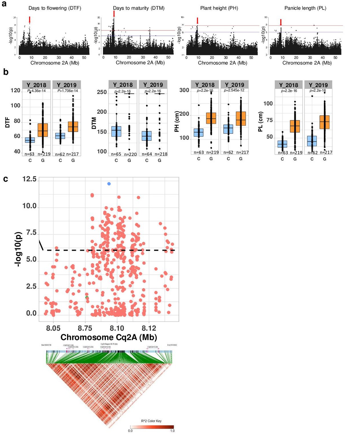
Genomic regions associated with important agronomic traits.
(a) Significant marker-trait associations (MTAs) for days to flowering (DTF), days to maturity (DTM), plant height (PH), and panicle density on chromosome Cq2A. Red color arrows indicate the single nucleotide polymorphism (SNP) loci pleiotropically acting on all four traits. (b) Boxplots showing the average performance for four traits over 2 years, depending on single nucleotide variation (C or G allele) within locus Cq2A_ 8093547. The P-values written above the boxplot are from Wilcoxon mean comparisons test (unpaired) between C and G allele. (c) Local Manhattan plot from region 8.04–8.14 Mb on chromosome Cq2A associated with PC1 of the DTF, DTM, PH, and panicle length (PL), and local linkage disequilibrium (LD) heatmap (bottom). The triangle below is the LD heatmap and the colors represent the pairwise correlation (r2) between individual SNPs. On top of the triangle, gene models are represented. Green color dots represent the strongest MTA (Cq2A_ 8093547).
-
Figure 3—source data 1
Genomic regions associated with important agronomic traits.
- https://cdn.elifesciences.org/articles/66873/elife-66873-fig3-data1-v2.xlsx
-
Figure 3—source data 2
Boxplots showing the average performance for four traits over 2 years.
- https://cdn.elifesciences.org/articles/66873/elife-66873-fig3-data2-v2.xlsx
-
Figure 3—source data 3
Local Manhattan plot from region 8.04–8.14 Mb on chromosome Cq2A associated with PC1 of the days to flowering, days to maturity, plant height, and panicle length.
- https://cdn.elifesciences.org/articles/66873/elife-66873-fig3-data3-v2.xlsx
-
Figure 3—source data 4
Manhattan plots from GWAS with data from 2018 (left), 2019 (center), and the mean of both years (right): The blue horizontal line indicates the suggestive threshold -log10 (8.98E-7).
The red horizontal line indicates the significant threshold (Bonferroni correction) -log10(1.67e-8).
- https://cdn.elifesciences.org/articles/66873/elife-66873-fig3-data4-v2.pdf
-
Figure 3—source data 5
Quantile-quantile plots of GWAS in 2 years, 2018 (left) and 2019 (center), and best linear unbiased estimates (right).
- https://cdn.elifesciences.org/articles/66873/elife-66873-fig3-data5-v2.pdf
Figure 3—figure supplement 1
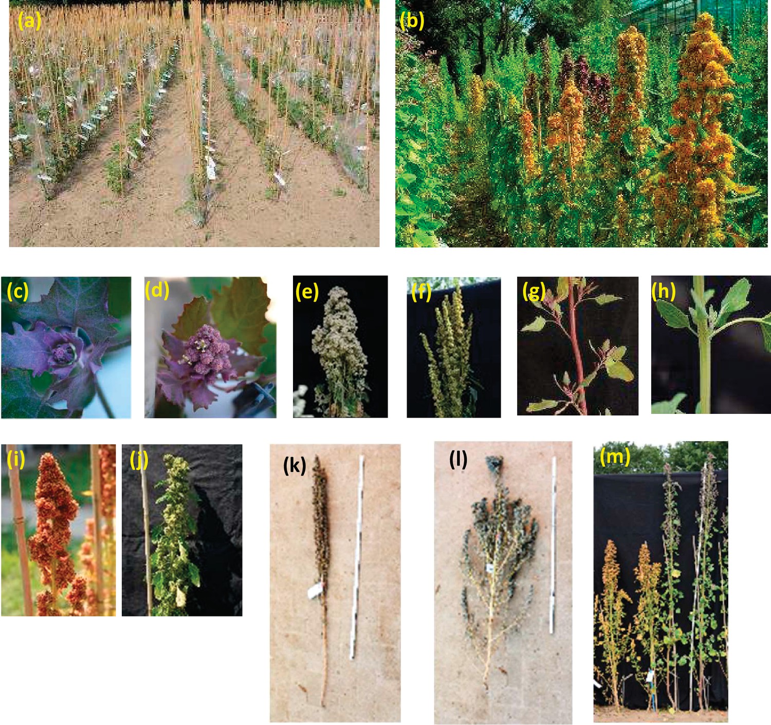
Overview of the field experiment and exemplary images demonstrating phenotypic traits.
(a and b) Overview of the field and phenotypic variation among accession; (c): bolting (BBCH51) and (d) flowering (BBCH60) stage; glomerulate (e) and amarantiform (f) panicle shapes; red (g) and green (h) stem color; red (i) and green (j) flower/inflorescence; growth type 1 (k) and type 5 (l); (m) plant height and maturity variation between two accessions.
Figure 3—figure supplement 2
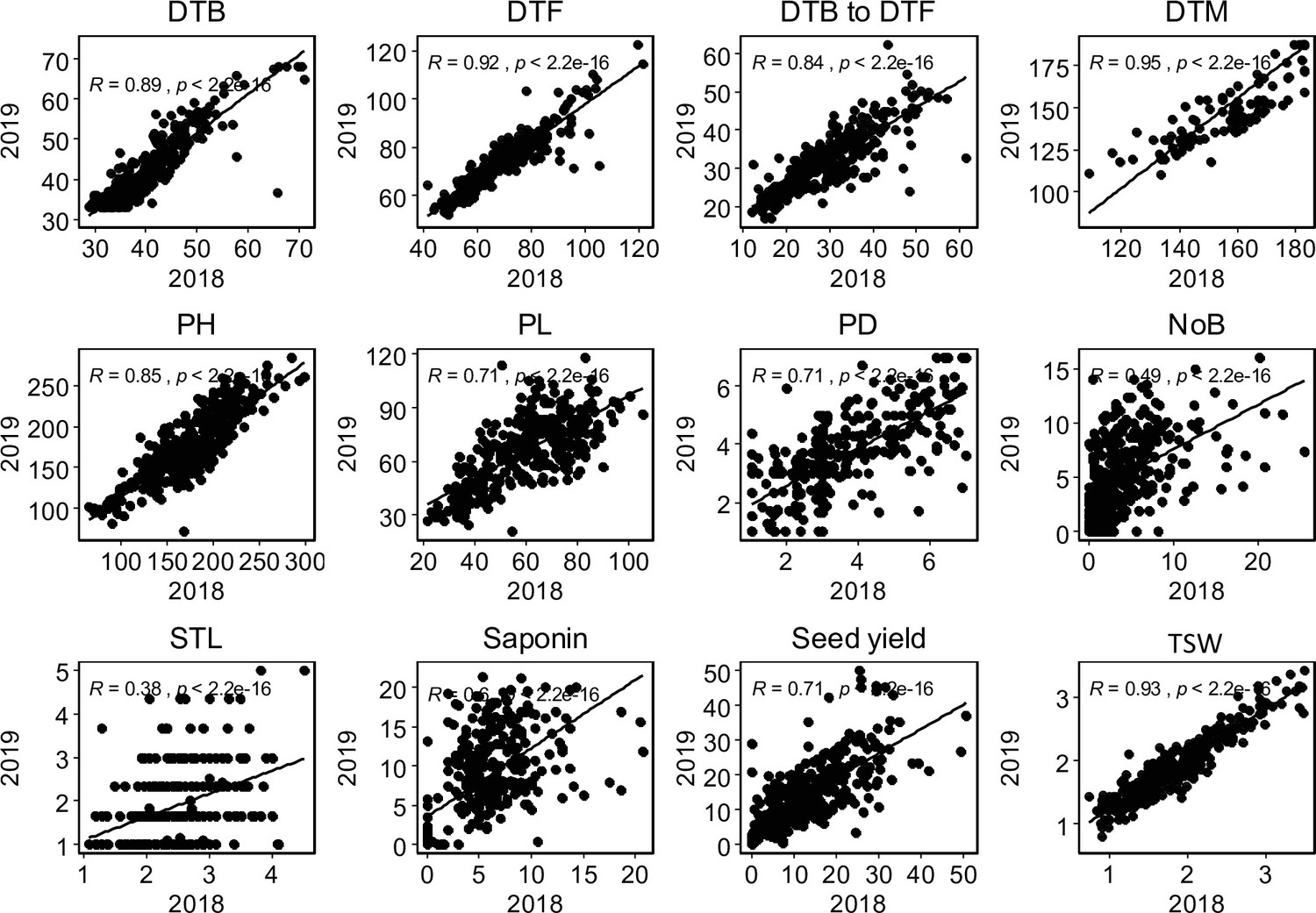
Graphical presentation of correlations between years among 12 traits.
Pearson correlation value (R) with p-values are shown. DTB: days to bolting (inflorescence emergence), DTF: days to flowering, days to bolting to days to flowering: days between bolting and flowering, DTM; days to maturity, PH: plant height (cm), PL: panicle length (cm), PD: panicle density (cm), NoB: number of branches, STL: stem lying, Saponin: saponin content as foam height (mm), Seed yield: seed yield per plant (g), TSW: thousand seed weight (g),.
Figure 3—figure supplement 3
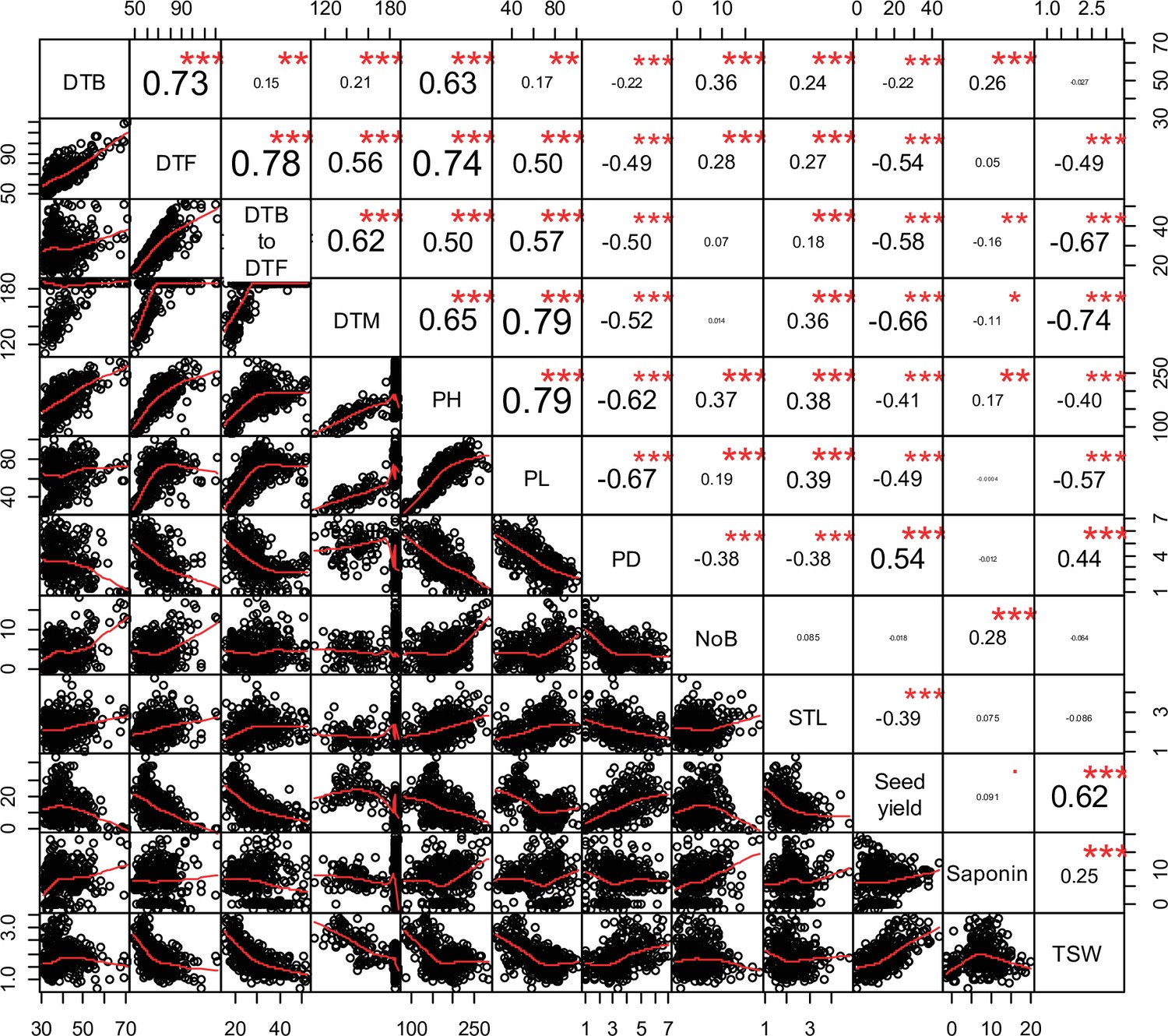
Pearson correlations among 12 quinoa traits.
Best linear unbiased estimates across 2 years were used. Below the diagonal, scatter plots are shown with the fitted line in red. Above the diagonal, the Pearson correlation coefficients are shown with significance levels, ***=p < 0.001, **=p < 0.01.
Figure 3—figure supplement 4
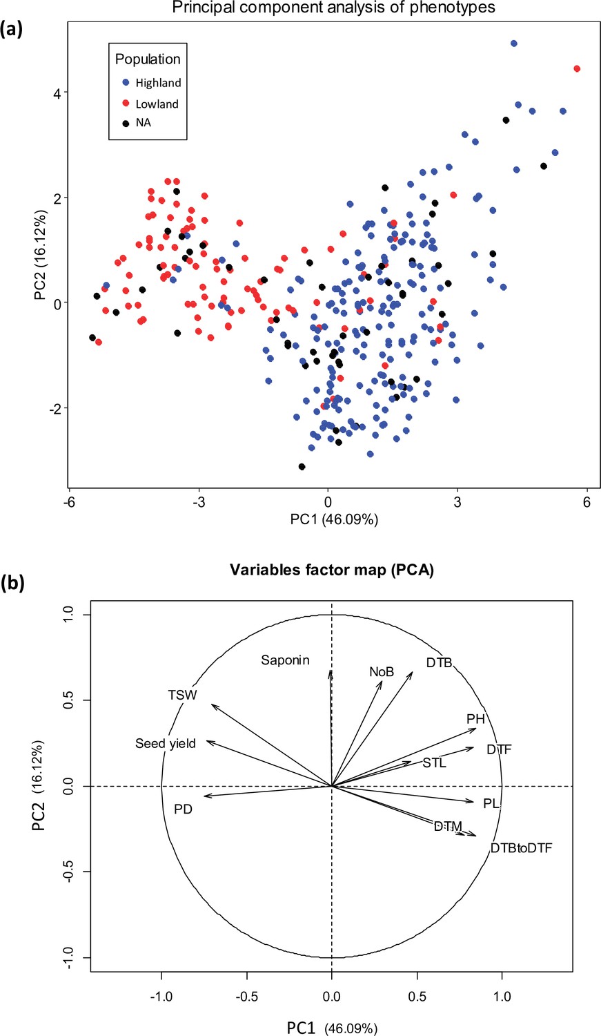
Principal component analysis (PCA) of 12 quantitative phenotypes.
(a) Individual factor map colored according to populations identified from single nucleotide polymorphism (SNP) analysis. (b) Variables factor map of the PCA.
Figure 3—figure supplement 5
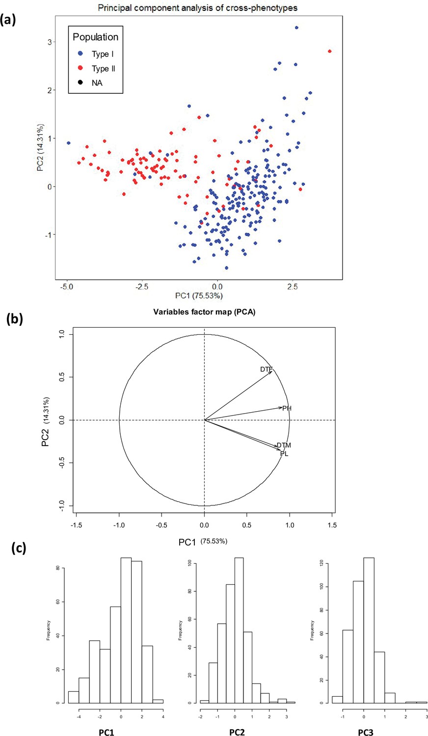
Principal component analysis (PCA) of four quantitative traits (days to flowering, days to maturity, plant height, and panicle length).
(a) Individual factor map, (b) variables factor map of the PCA, (c) distribution of the first three principal components used for GWAS analysis. Type I: Highland population, Type II: Lowland population.
Figure 3—figure supplement 6
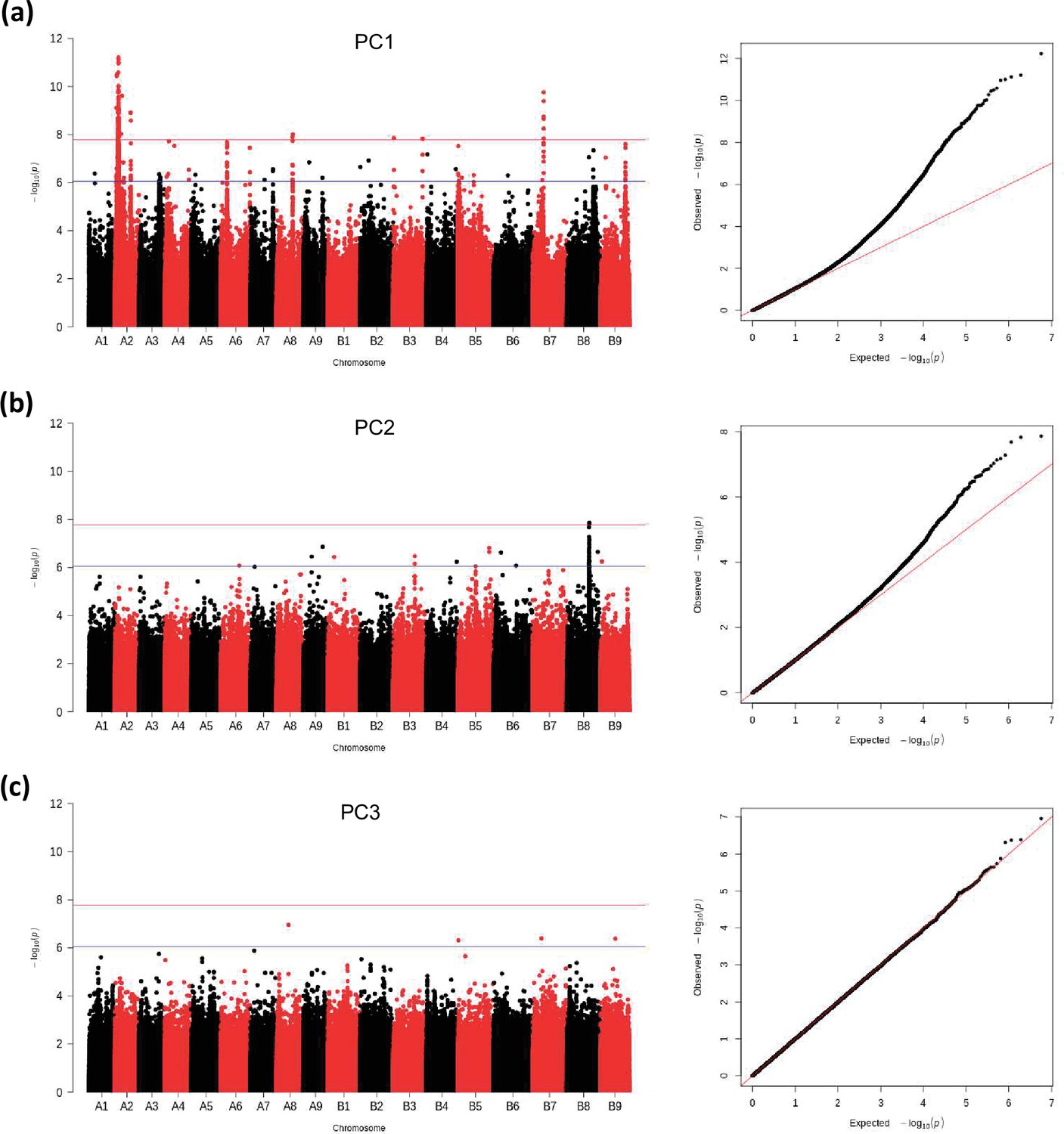
GWAS analysis of principal components, PC1 (a), PC2 (b), PC3 (c): Manhattan plots (left), and quantile-quantile plots (right).
The blue horizontal line in the Manhattan plots indicates the suggestive threshold -log10 (8.98E-7). The red horizontal line indicates the significance threshold (Bonferroni correction) -log10 (1.67e-8).
Figure 3—figure supplement 7
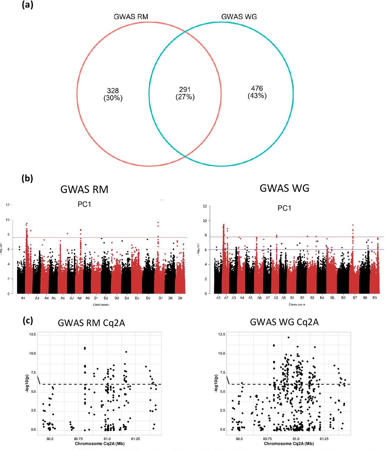
The effect of repetitive sequences on identification of marker-trait associations in quinoa.
(a) GWAS with two different single nucleotide polymorphism (SNP) data sets, one encompassing all SNP from whole-genome sequencing and one SNP set after removing repetitive sequences. The number of marker-trait association (MTA) identified by each analysis are given in the Venn diagram. (b) Comparison of GWAS analysis (Manhattan plots) of principal component PC1 between whole-genome SNP set (WG) and repeat masked SNP set (RM). The blue horizontal line in the Manhattan plots indicates the suggestive threshold -log10 (8.98E-7). The red horizontal line indicates the significance threshold (Bonferroni correction) -log10 (1.67e-8). (c) Comparison of local Manhattan plots from region 8.04–8.14 Mb on chromosome Cq2A associated with days to flowering (DTF), days to maturity (DTM), plant height (PH), and panicle length (PL) between whole-genome SNP set (WG) and repeat masked SNP set (RM).
Figure 4 with 2 supplements
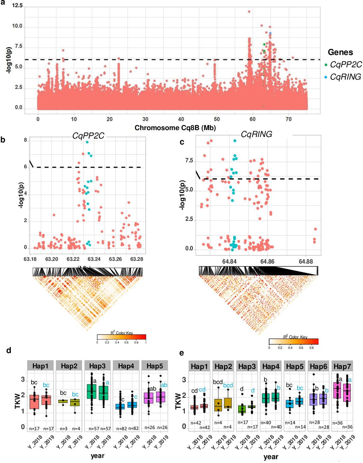
Identification of candidate genes for thousand seed weight.
(a) Manhattan plot from chromosome Cq8B. Green and blue dots depict the CqPP2C5 and the CqRING gene, respectively. (b) Top: Local Manhattan plot in the neighborhood of the CqPP2C gene. Bottom: Linkage disequilibrium (LD) heatmap. (c) Top: Local Manhattan plot in the neighborhood of the CqRING gene. Bottom: LD heatmap. Differences in thousand seed weight between five CqPP2C (d) and seven CqRING haplotypes (e). ANOVA was performed for each year separately to determine significance among haplotypes and grouping of pairwise multiple comparison was obtained using Tukey’s test. (blue and black colour letters are for different years).
-
Figure 4—source data 1
Manhattan plot from chromosome Cq8B.
Green and blue dots are depicting the CqPP2C5 and CqRING.
- https://cdn.elifesciences.org/articles/66873/elife-66873-fig4-data1-v2.xlsx
-
Figure 4—source data 2
Manhattan plot from chromosome Cq8B.
Green and blue dots are depicting the CqPP2C5.
- https://cdn.elifesciences.org/articles/66873/elife-66873-fig4-data2-v2.xlsx
-
Figure 4—source data 3
Differences in thousand seed weight between five CqPP2C (d) and seven CqRING haplotypes (e).
- https://cdn.elifesciences.org/articles/66873/elife-66873-fig4-data3-v2.xlsx
Figure 4—figure supplement 1
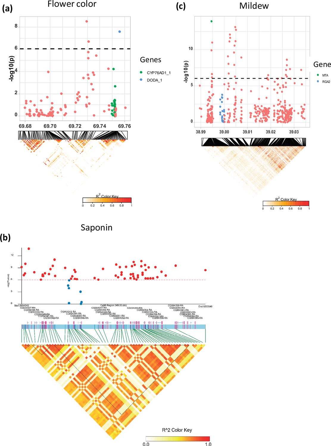
Local Manhattan plots for (a) flower color, (b) saponin content, and (c) mildew infection.
Candidate genes are shown in the color legend. Linkage disequilibrium (LD) heatmaps are placed at the bottom. The colors of the heatmap represent the pairwise correlation between individual single nucleotide polymorphisms (SNPs). SNPs with significant p-values and SNPs on candidate genes were used to create the heatmap for the saponin content. Gene models and names are given on top of the heatmap. Haplotype blocks were identified using the Gabriel method in LDBlockShow software (Dong et al., 2021).
Figure 4—figure supplement 2
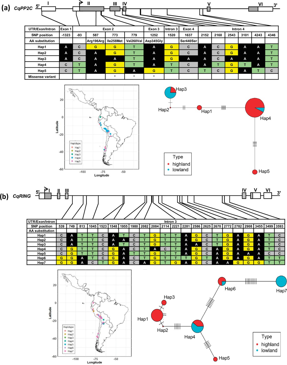
Haplotypes of two genes, CqPP2C (a) and CqRING (b), associated with seed size in quinoa.
The geographical origin of the accessions and haplotype networks are displayed below the gene structure. The frequency of haplotypes is correspondent to the circle size. The color of the pie chart depicts the population. Cross-lines represent the number of nucleotide polymorphisms between haplotypes.
Tables
Table 1
Summary statistics of genome-wide single nucleotide polymorphisms identified in 303 quinoa accessions.
| Parameter | Type | All genotypes(quinoa only) | Highland population | Lowland population |
|---|---|---|---|---|
| SNP | Total | 2,872,935 | 2,590,907 | 1,938,225 |
| Population-specific SNPs | 1,512,301 | 859,619 | ||
| Intergenic | 2,452,347 | 2,227,952 | 1,649,310 | |
| Introns | 251,481 | 101,546 | 172,692 | |
| Exons | 114,654 | 214,945 | 78,248 | |
| Nucleotide diversity | 5.78 × 10⁻⁴ | 3.56 × 10⁻⁴ | ||
| Tajima’s D | 0.884 | –0.384 | ||
| Population divergences | FST (weighted average) | 0.36 | ||
Additional files
-
Supplementary file 1
Quinoa accessions, growth conditions, high confidence SNP identification and marker-trait associations and candidate genes identified in the current study.
(a) Accessions from the quinoa diversity panel and results from re-sequencing. (b) Summary of high-quality SNPs identified in quinoa accessions. (c) Variance components analysis of 12 quantitative traits. (d) Summary of marker-trait associations (MTA). (e) Candidate genes linked to SNPs with significant trait associations. (f) Summary of MTA associated with days to flowering, days to maturity, panicle density, and plant height identified on chromosome Cq2A. (g) Candidate genes located within the 50 kb flanking regions of significantly associated SNPs from the multivariate GWAS analysis. (h) Daily temperature, precipitation, humidity, radiation, and wind speed during the cultivation seasons 2018 and 2019 in Kiel, Germany.
- https://cdn.elifesciences.org/articles/66873/elife-66873-supp1-v2.xlsx
-
Transparent reporting form
- https://cdn.elifesciences.org/articles/66873/elife-66873-transrepform1-v2.docx
Download links
A two-part list of links to download the article, or parts of the article, in various formats.
Downloads (link to download the article as PDF)
Open citations (links to open the citations from this article in various online reference manager services)
Cite this article (links to download the citations from this article in formats compatible with various reference manager tools)
Genome-wide association study in quinoa reveals selection pattern typical for crops with a short breeding history
eLife 11:e66873.
https://doi.org/10.7554/eLife.66873


