Relating multivariate shapes to genescapes using phenotype-biological process associations for craniofacial shape
Figures
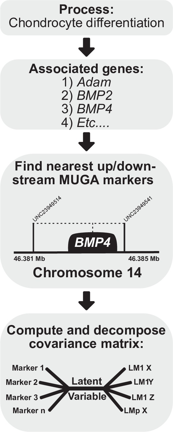
Process multivariate genotype-phenotype (MGP) schematic.
Once a process is selected, we cross-reference the known gene locations using Ensembl with the locations of the genotyped markers in the Diversity Outbred (DO) sample. The founder probabilities of the nearest upstream and downstream markers are averaged for each gene. The compiled founder probabilities and landmark coordinates are then used in a regularized partial least squares (PLS) model to estimate the axis of greatest covariance between the marker data and craniofacial variation.
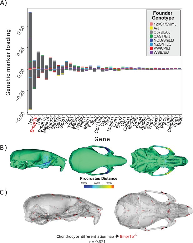
Process multivariate genotype-phenotype (MGP) for chondrocyte differentiation with a regularization parameter of 0.075.
(A) PLS1 genetic loadings are shown for each gene in the model sorted from largest to smallest effects. Individual founder allele effect sizes are colored within each bar. The gene in red text corresponds to the mutant used for comparison of phenotypic effects. (B) The estimated chondrocyte differentiation MGP phenotype is shown with a heatmap. Warm colors represent areas of relative expansion, light green represents areas of little shape effect, and cool colors represent areas with relative contraction. (C) Chondrocyte differentiation MGP effects shown in black vectors multiplied 4× are compared to a Bmpr1b (Alk6) homozygous mutant and are shown with red vectors. The vector correlation between chondrocyte differentiation MGP and Bmpr1b is shown below the phenotypic effects.
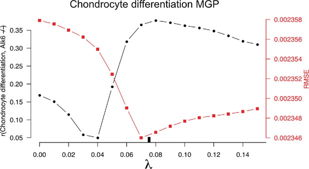
10-fold cross-validation results for the chondrocyte differentiation multivariate genotype-phenotype (MGP).
The black-labeled Y axis on the left shows the vector correlation between the process MGP model and a Bmpr1b mutant. The red-labeled Y axis on the right shows the root mean squared error (RMSE) of the out-of-fold phenotypic prediction. The X axis shows the range of regularization strengths for the partial least squares (PLS) model. The regularization parameter was chosen to balance the minimization of RMSE and the maximization of the vector correlation to Bmpr1b. The chosen parameter is shown as a black tick along the X axis.
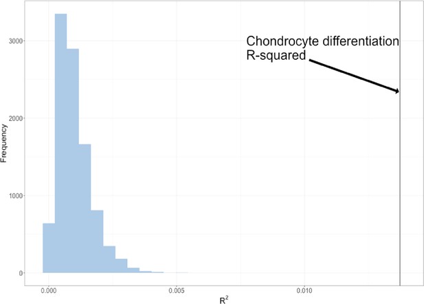
Permutation of marker sets of fixed size.
The permuted R2 distribution of 10,000 chondrocyte differentiation multivariate genotype-phenotype (MGP) analyses is shown in blue. The estimated R2 of the chondrocyte differentiation MGP is shown as a black vertical line.
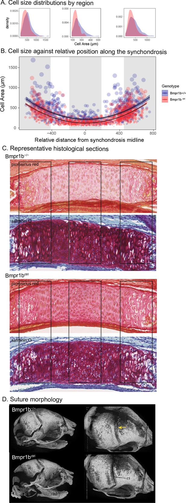
Chondrocyte defects in Bmpr1b mutants.
(A, B) Quantification of cell size in the sections of the intersphenoid synchondrosis shows an increase in relative cell size as well as a change in the distribution of cell sizes throughout the width of the synchondrosis. (C) Sections of intersphenoid synchondroses highlighting the midline and extremes of the synchondroses. (D) Premature fusion of the coronal suture is visible in Bmpr1b homozygous mutants.
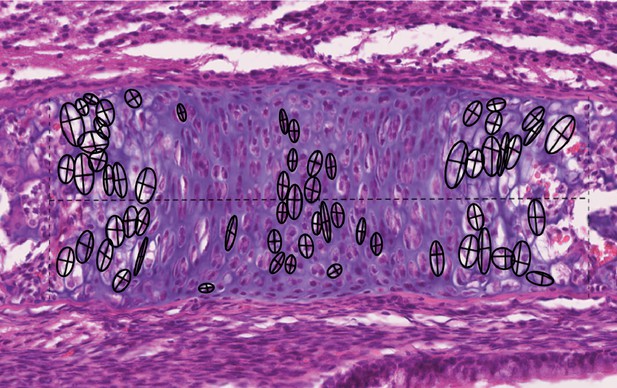
Chondrocyte morphometric example.
Landmarks are placed in the top, bottom, left, and right sides of the cell to best capture the height and width of the cells (show here as crosses). The height and width measurements are then used to calculate the area of an ellipsoid as an approximation of cell size.
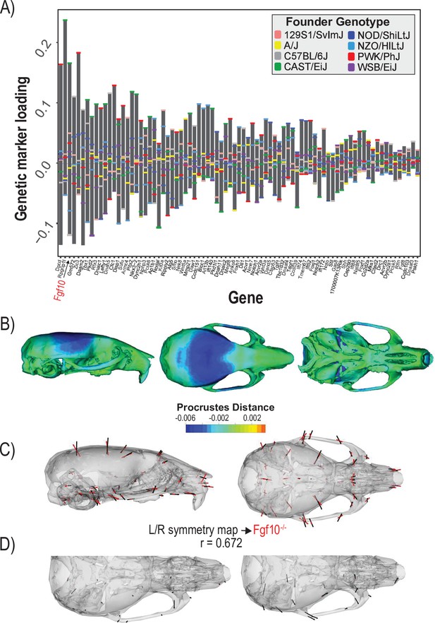
Process multivariate genotype-phenotype (MGP) for determination of left/right symmetry with a regularization parameter of 0.04.
(A) PLS1 genetic loadings are shown for each gene in the model sorted from largest to smallest effects. Individual founder allele effect sizes are colored within each bar. The gene in red text corresponds to the mutant used for comparison of phenotypic effects. (B) The estimated left/right symmetry MGP phenotype is shown with a heatmap. Warm colors represent areas of relative expansion, light green represents areas of little shape effect, and cool colors represent areas with relative contraction. (C) Estimated left/right symmetry MGP phenotype is shown with black vectors multiplied 4×. An Fgf10 homozygous mutant is shown with red vectors for comparison. The vector correlation between left/right symmetry MGP and the Fgf10 mutant is shown below the phenotypic effects. (D) Visualizations of asymmetry in the L/R MGP response and the Fgf10 homozygous mutant. Asymmetry vectors are magnified 4×.
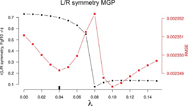
10-fold cross-validation results for the chondrocyte differentiation multivariate genotype-phenotype (MGP).
The black-labeled Y axis on the left shows the vector correlation between the process MGP model and a Fgf10 homozygous mutant. The red-labeled Y axis on the right shows the root mean squared error (RMSE) of the out-of-fold phenotypic prediction. The X axis shows the range of regularization strengths for the partial least squares (PLS) model. The regularization parameter was chosen to balance the minimization of RMSE and the maximization of the vector correlation to the Fgf10 homozygous mutant. The chosen parameter is shown as a black tick along the X axis.
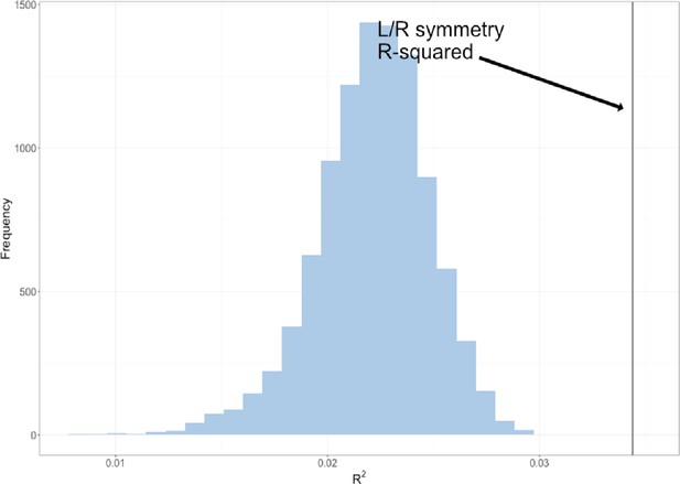
The permuted R2 distribution of 10,000 L/R symmetry multivariate genotype-phenotype (MGP) analyses is shown in blue.
The estimated R2 of L/R symmetry MGP is shown as a black vertical line.
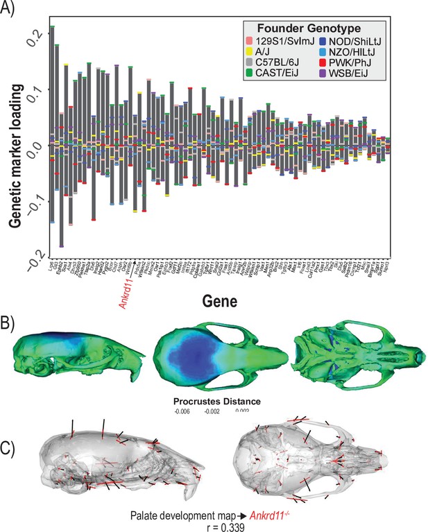
Process multivariate genotype-phenotype (MGP) for palate development.
(A) PLS1 genetic loadings are shown for each gene in the model sorted from largest to smallest effects. Individual founder allele effect sizes are colored within each bar. The gene in red text corresponds to the mutant used for comparison of phenotypic effects. (B) The estimated palate development MGP phenotype is shown with a heatmap. Warm colors represent areas of relative expansion, light green represents areas of little shape effect, and cool colors represent areas with relative contraction. (C) Estimated palate development MGP phenotype is shown with black vectors multiplied 4×. An Ankrd11 mutant mean is shown with red vectors for comparison. The vector correlation between palate development MGP and the Ankrd11 mutant is shown below the phenotypic effects.
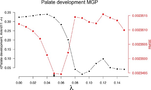
10-fold cross-validation results for the palate development multivariate genotype-phenotype (MGP).
The black-labeled Y axis on the left shows the vector correlation between the process MGP model and a Ankrd11 homozygous mutant. The red-labeled Y axis on the right shows the root mean squared error (RMSE) of the out-of-fold phenotypic prediction. The X axis shows the range of regularization strengths for the PLS model. The regularization parameter was chosen to balance the minimization of RMSE and the maximization of the vector correlation to the Ankrd11 heterozygous mutant. The chosen parameter is shown as a black tick along the X axis.
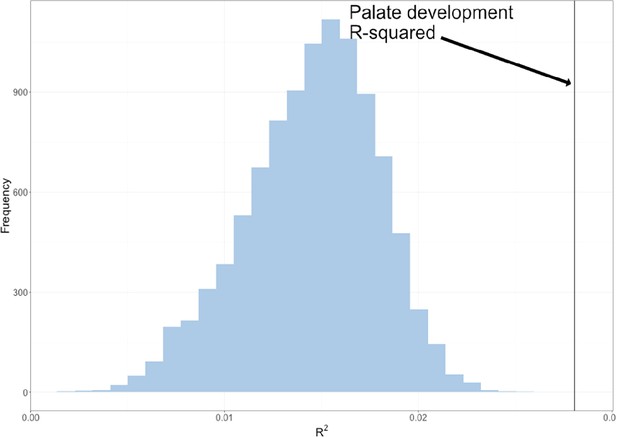
The permuted R2 distribution of 10,000 palate development multivariate genotype-phenotype (MGP) analyses is shown in blue.
The estimated R2 of palate development MGP is shown as a black vertical line.
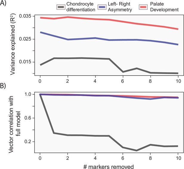
Gene drop tests.
For each of the example analyses, we show the effect of removing the most heavily loaded markers from the process multivariate genotype-phenotype (MGP) analysis on the (A) variance explained by the model and (B) vector correlation with the full model. The variance explained as well as vector correlation is relatively stable for both L/R symmetry and palate development MGP models, suggesting that the effect is driven by the coordination of many markers. In contrast, chondrocyte differentiation MGP shows large differences, particularly in the direction of the phenotypic effect as the most heavily loaded markers are removed from the analysis.
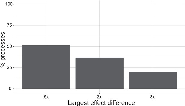
Single marker importance.
For a sample of 500 processes, we show the proportion of processes with a single marker with 0.5×, 2×, and 3× higher effect size than any other marker. 51.6% of processes show a marker effect 0.5× larger than any other individual effect. 36.6% of processes show a marker effect 2× larger than any other individual effect. 20% of processes show a marker effect 3× larger than any other individual effect.
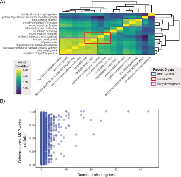
Pairwise multivariate genotype-phenotype (MGP) vector correlations.
(A) Pairwise correlations of phenotypic effects for 15 process MGP analyses. Scale on the right denotes color correspondences to vector correlation, where yellows are high correlations, greens are moderate, and blues are low. (B) Pairwise process MGP vector correlations as a function of the number of shared genes between the processes. Processes that share less than 10 genes can produce very similar and very disparate phenotypic effects. Processes with substantial numbers of shared genes will tend to show highly correlated responses as they increasingly use similar marker sets.
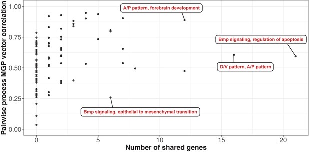
Pairwise process multivariate genotype-phenotype (MGP) vector correlations as a function of the number of shared genes between the processes.
The pairwise vector comparisons have been subset to only include the processes shown in Figure 7A, with four pairs highlighted. Processes that share less than 10 genes can produce very similar and very disparate phenotypic effects. Processes with substantial numbers of shared genes will tend to show highly correlated responses as they increasingly use similar marker sets.
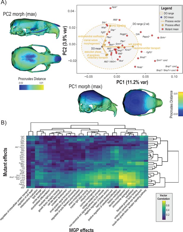
Comparisons of multivariate genotype-phenotype (MGP) and mouse mutant directions.
(A) Seven MGP phenotypes projected onto a principal component analysis (PCA) of the Diversity Outbred (DO) and a sample of 30 mutant mouse genotypes. Mutant means are labeled in black. The directions of MGP effects are shown with orange vectors from the DO mean to the associated process MGP. The range of DO variation on principal components (PCs) 1 and 2 is shown with the shaded ellipse with an orange border. (B) A heatmap of vector correlations between 30 mutant effects and 30 process MGP effects. The scale on the right denotes color correspondences to vector correlation, where yellows are high correlations, greens are moderate, and blues are low.
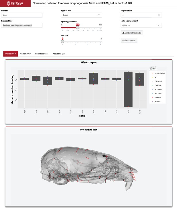
Example screenshot of web version of process analysis.
Analyses include a barplot of the relative effect sizes of each selected marker and the associated phenotype shown with black vectors at each landmark. If a mutant comparison is selected, the vector correlation is provided and the mutant phenotype is shown with red vectors. Selecting ‘send me the results’ generates an HTML report with an interactive 3D model.
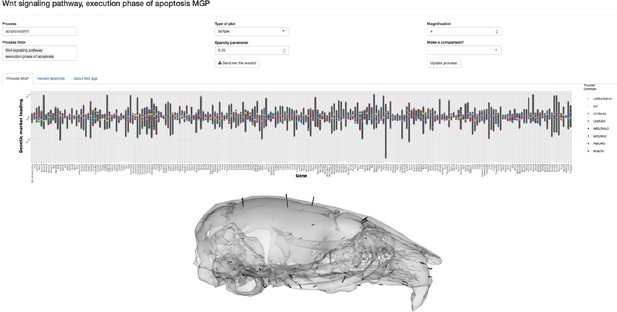
Combining queries in the multivariate genotype-phenotype (MGP) shiny app with the pipe operator.
In order to filter the Gene Ontology (GO) database with multiple terms, the pipe operator can be used as shown. Here, the user has selected processes associated with either the apoptosis or Wnt pathway process. The barplot shows the relative effect sizes for markers associated to both ‘Wnt signaling pathway’ and ‘execution phase of apoptosis’ GO terms.
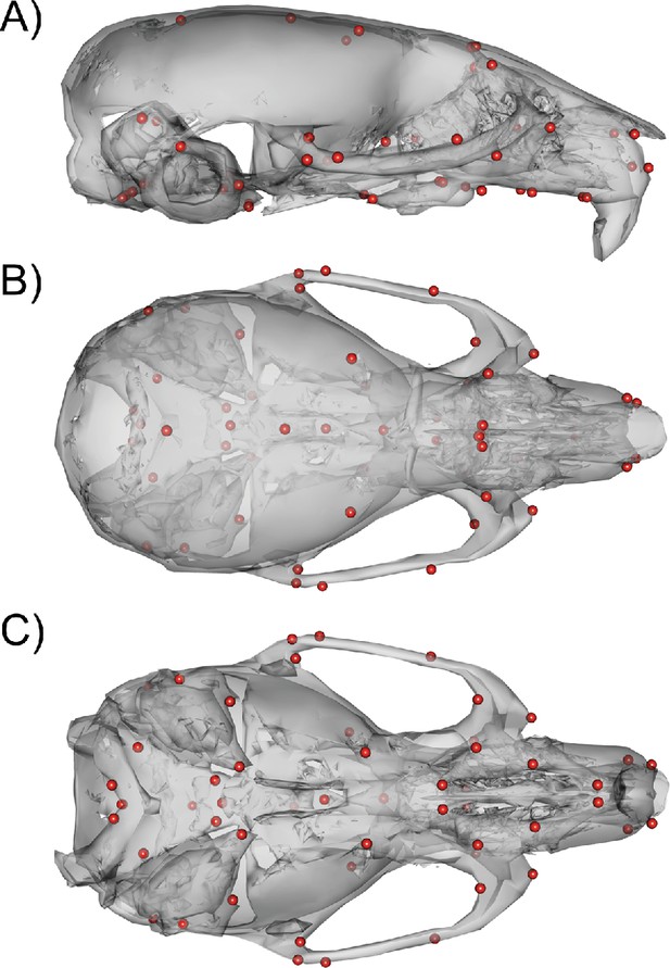
54 3D landmark configuration.
(A) Sagittal view of representative scan with landmarks shown as red spheres. (B) Dorsal view of landmark configuration. (C) Ventral view of landmark configuration.
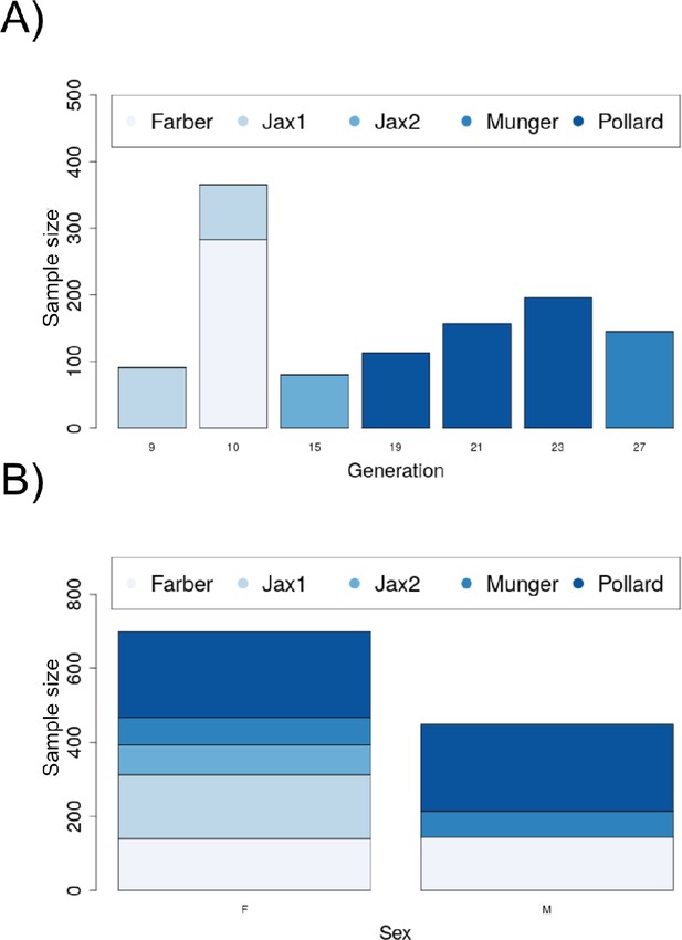
Demographic plots for the Diversity Outbred (DO) sample.
(A) The distribution of the sample by generation and data source (lab). (B) Distribution of sex by source (lab).


