Decreased recent adaptation at human mendelian disease genes as a possible consequence of interference between advantageous and deleterious variants
- University of Arizona Department of Ecology and Evolutionary Biology, United States
- Institut de Biotecnologia i de Biomedicina and Departament de Genètica i de Microbiologia, Universitat Autònoma de Barcelona, Spain
Figures
Figure 1

Potential confounding factors in disease versus non-disease genes.
Each potential confounding factor is detailed in the Materials and methods. For each confounding factor, the boxplot shows on the y-axis the ratio of the average factor value for disease genes, divided by the average factor value for non-disease genes. The boxplot error bars are obtained by calculating the ratio 1000 times, each time by randomly sampling as many non-disease genes as there are disease genes.
Figure 2
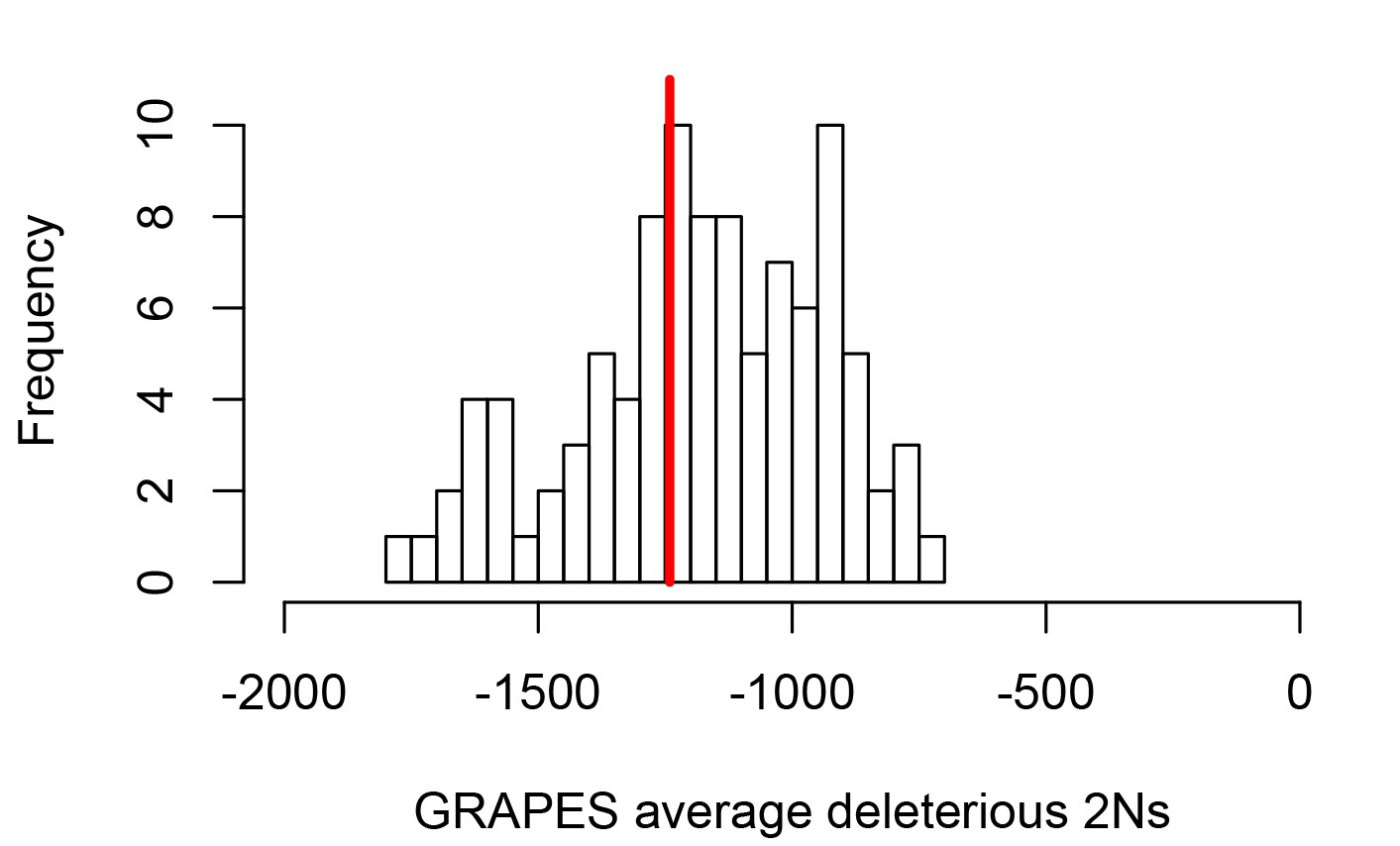
Average strength of deleterious nonsynonymous variants in disease vs control genes.
The average strength of deleterious nonsynonymous variants was measured using GRAPES with the DisplGamma distribution of fitness effects, which gave the best fit to disease and control sets. The histogram represents 100 control sets. The red line represents the average strength of deleterious nonsynonymous variants in mendelian disease genes (2Ns=-1241).
Figure 3
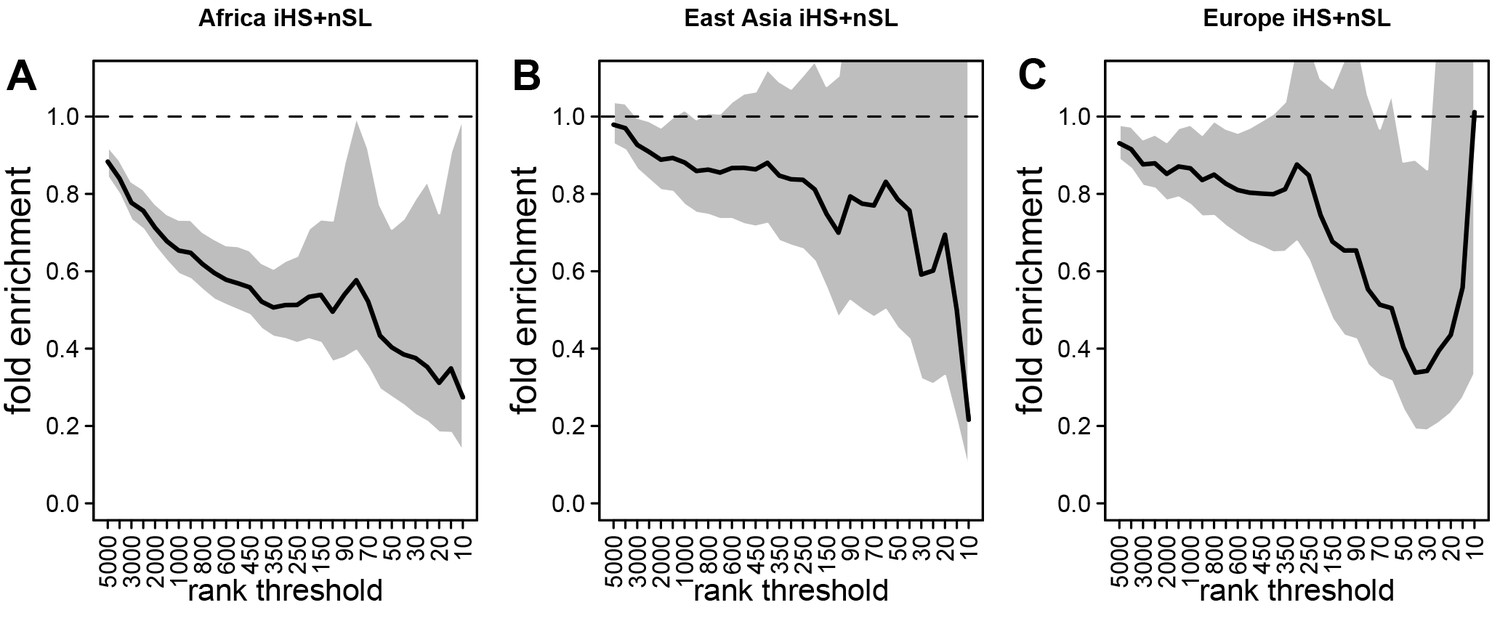
Deficit of iHS and sweep signals at mendelian disease genes.
The figure shows the averaged whole enrichment curves and their averaged confidence intervals from the bootstrap test, averaged over both iHS and sweep ranks, and over all the populations from each continent (Materials and methods). The y-axis represents the relative sweep enrichment at disease genes, calculated as the number of disease genes in putative sweeps, divided by the number of control non-disease genes in putative sweeps. The gray areas are the 95% confidence interval for this ratio. The number of genes in putative sweeps is measured for varying sweep rank thresholds. For example, at the top 100 rank threshold, the relative enrichment is the number of disease genes within the top 100 genes with the strongest sweep signals (either according to iHS or ), divided by the number of control non-disease genes within the top 100 genes with the strongest sweep signals. We use genes ranked by iHS or using 200 kb windows, since 200 kb is the intermediate size of all the window sizes we use (50 kb, for the smallest, 1000 kb for the largest; see Materials and methods). (A) Africa, average over the ESN, GWD, LWK, MSL, and YRI populations from the 1000 Genomes Project. (B) East Asia, average over the CDX, CHB, CHS, JPT, and KHV populations. (C) Europe, average over the CEU, FIN, GBR, IBS, and TSI populations.
Figure 4 with 1 supplement
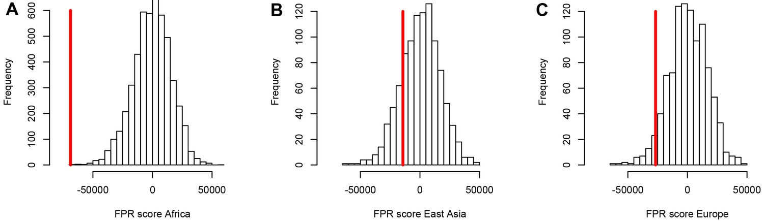
A stronger sweep deficit at disease genes in Africa than in East Asia and Europe.
The figure shows the observed sweep enrichment/deficit score used to measure the false positive risk (FPR) in the real genome (red line), compared to the expected null distribution of the score estimated with block-randomized genomes (5000 block-randomized genomes in Africa, 1000 in East Asia and Europe; Materials and methods). The FPR score is based on summing the difference between the number of genes in sweeps at disease genes and the number of genes in sweeps in control genes, over both iHS and , and different window sizes (Materials and methods). (A) FPR score in Africa, estimated summing over the ESN, GWD, LWK, MSL, and YRI populations from the 1000 Genomes Project. (B) FPR score in East Asia, estimated summing over the CDX, CHB, CHS, JPT, and KHV populations. (C) FPR score in Europe, summing over the CEU, FIN, GBR, IBS, and TSI populations.
Figure 4—figure supplement 1

FPR with or without controlling for GERP.
(A) All disease genes without controlling for GERP. (B) Disease genes in low recombination regions and with many disease variants, without controlling for GERP. (C) All disease genes, controlling for GERP. (D) Disease genes in low recombination regions and with many disease variants, controlling for GERP.
Figure 5
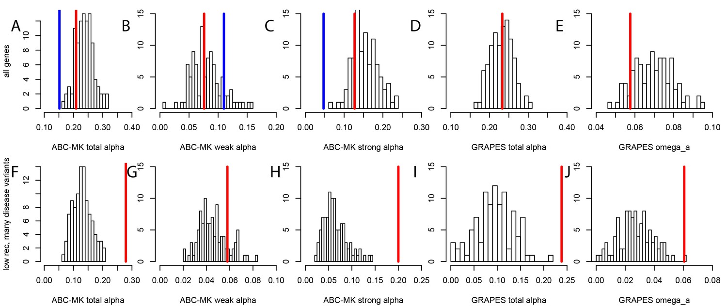
Nonsynonymous coding adaptation in disease vs. control genes.
Histograms represent the long-term coding adaptation values in 100 control sets. Red lines represent the long-term coding adaptation value in disease genes. Blue lines represent the long-term adaptation value across the whole coding genome. (A to E) All disease genes compared to controls. (F to J) Disease genes with many disease variants vs. controls, in low recombination regions of the genome. (A and F) Total alpha from ABC-MK. (B and G) Alpha for weak adaptation according to ABC-MK. (C and H) Alpha for strong adaptation according to ABC-MK. (D and I) Total alpha according to GRAPES. (E and J) Omega_a, the ratio of the rate of advantageous amino acid changes over the rate of synonymous changes, according to GRAPES.
Figure 6
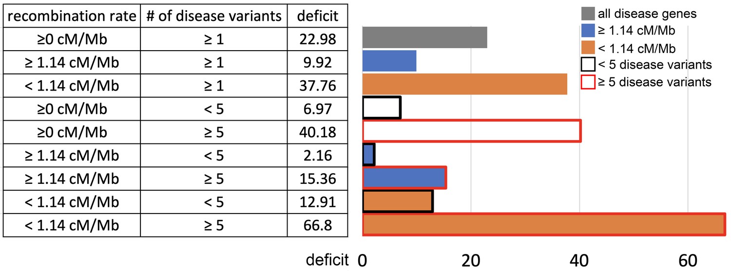
Sweep deficit as a function of recombination and disease variants number.
The sweep deficit is measured as the FPR score per gene (to make all tested groups comparable) over all window sizes, and and iHS, as in Figure 2 (Materials and methods). The different groups are separated according to recombination and numbers of disease variants so that they have approximately the same size (a half or a fourth of the disease genes). All deficits are measured using only African populations.
-
Figure 6—source data 1
Confounding factors differences between low and high recombination disease genes.
- https://cdn.elifesciences.org/articles/69026/elife-69026-fig6-data1-v2.xlsx
Figure 7
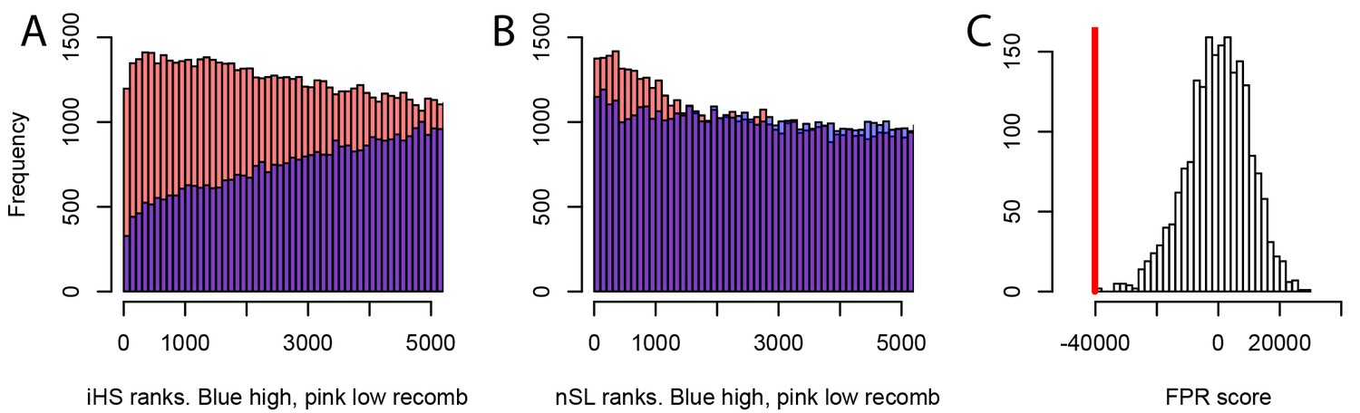
Different sweep detection power response of iHS and nSL to varying recombination rates.
(A) iHS sweep ranks, shown from 1 to 5000 across all window sizes (50 kb to 1000 kb) in Africa, in low recombination (pink) or high recombination regions (blue). (B) Same as A. but for nSL. (C) Observed sweep deficit at disease genes (red line) compared to the distribution of the sweep deficit in 2000 block-randomized genomes. Same as Figure 2A but with only nSL.
Figure 8
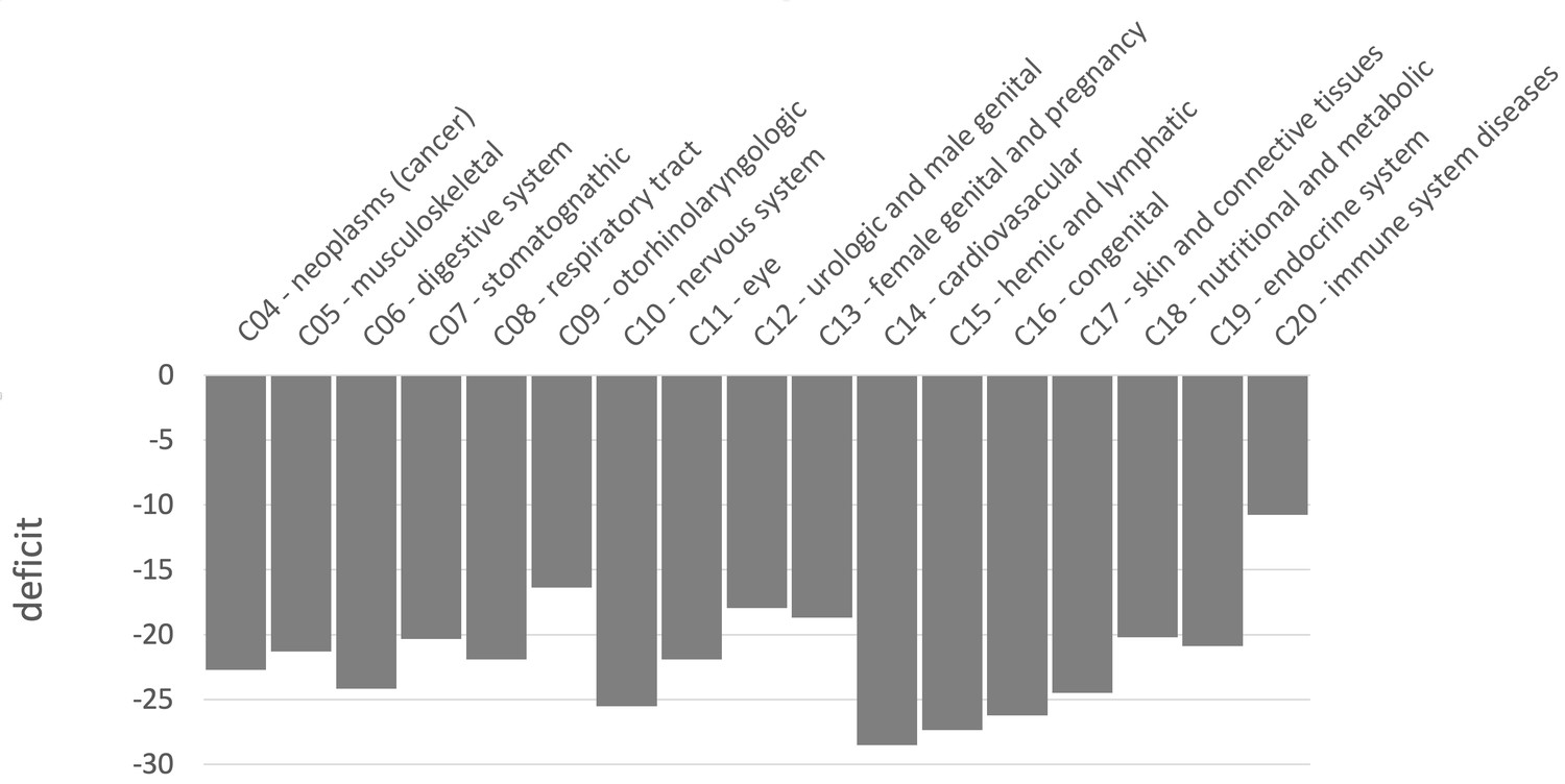
Sweep deficit per MeSH disease classes.
The sweep deficit is measured as the overall FPR score per gene (Materials and methods), to make all MeSH classes comparable even if they include different numbers of genes.
Figure 9
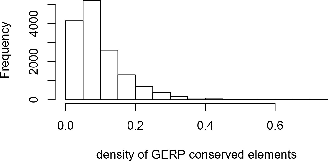
Density of GERP conserved elements around genes.
The histogram represents the density of GERP conserved elements in 100kb windows centered on Ensembl protein-coding genes.
Tables
Table 1
Decreased interference during a bottleneck.
The table provides the proportion of advantageous mutations that go to fixation (% fixed), and the time to fixation under multiple conditions simulated with SLiM (Materials and methods). For example, s=0.005, 40% constrained, recessive means that we simulate advantageous mutations with s=0.005, surrounded by a genomic region where 40% of sites experience recessive deleterious mutations according to a specific distribution of fitness effets (Materials and methods). The fix. time increase column provides the relative increase in fixation time (ratio of times) in the presence compared to in the absence of deleterious mutations. The time to fixation is in number of generations. The Methods provide more details on the simulations.
| S=0.005, 10% constrained, recessive | Demography | Deleterious mutations? | Time to fixation | % fixed | Fix. time increase | Fix. prob decrease |
|---|---|---|---|---|---|---|
| East Asia: 10000->1000 | No | 2265 | 0.0050 | 1.12 | 0.66 | |
| Yes | 2547 | 0.0033 | ||||
| Africa: 10000->10000 | No | 4204 | 0.0051 | 1.55 | 0.74 | |
| Yes | 6530 | 0.0038 | ||||
| s=0.005, 20% constrained, recessive | demography | deleterious mutations? | time to fixation | % fixed | fix. time increase | fix. prob decrease |
| East Asia: 10000->1000 | no | 2265 | 0.0050 | 1.16 | 0.66 | |
| yes | 2617 | 0.0033 | ||||
| Africa: 10000->10000 | no | 4204 | 0.0051 | 1.69 | 0.62 | |
| yes | 7113 | 0.0032 | ||||
| s=0.005, 40% constrained, recessive | demography | deleterious mutations? | time to fixation | % fixed | fix. time increase | fix. prob decrease |
| East Asia: 10000->1000 | no | 2265 | 0.0050 | 1.17 | 0.65 | |
| yes | 2642 | 0.0033 | ||||
| Africa: 10000->10000 | no | 4204 | 0.0051 | 2.10 | 0.56 | |
| yes | 8809 | 0.0028 | ||||
| s=0.01, 40% constrained, recessive | demography | deleterious mutations? | time to fixation | % fixed | fix. time increase | fix. prob decrease |
| East Asia: 10000->1000 | no | 1530 | 0.0092 | 1.37 | 0.78 | |
| yes | 2090 | 0.0072 | ||||
| Africa: 10000->10000 | no | 2546 | 0.0098 | 2.05 | 0.82 | |
| yes | 5209 | 0.0080 | ||||
| s=0.005, 40% constrained, dominant | demography | deleterious mutations? | time to fixation | % fixed | fix. time increase | fix. prob decrease |
| East Asia: 10000->1000 | no | 2265 | 0.0050 | 0.96 | 0.93 | |
| yes | 2169 | 0.0046 | ||||
| Africa: 10000->10000 | no | 4204 | 0.0051 | 0.99 | 0.92 | |
| yes | 4169 | 0.0047 |
Table 2
Sweep deficit as a function of the minimal distance of control non-disease genes.
The sweep deficit is measured by the FPR score, that is the cumulative difference between the number of genes in sweeps at disease and control non-disease genes, across window sizes, sweep summary statistics, and African populations (see the rest of the Materials and methods).
| Minimal distance | Sweep deficit |
|---|---|
| 100 kb | −20889 |
| 200 kb | −35009 |
| 300 kb | −68928 |
| 400 kb | −88546 |
Additional files
Download links
A two-part list of links to download the article, or parts of the article, in various formats.
Downloads (link to download the article as PDF)
Open citations (links to open the citations from this article in various online reference manager services)
Cite this article (links to download the citations from this article in formats compatible with various reference manager tools)
Decreased recent adaptation at human mendelian disease genes as a possible consequence of interference between advantageous and deleterious variants
eLife 10:e69026.
https://doi.org/10.7554/eLife.69026


