Reconciling functional differences in populations of neurons recorded with two-photon imaging and electrophysiology
- MindScope Program, Allen Institute, United States
- Allen Institute for Brain Science, Allen Institute, United States
Figures
Figure 1

Overview of the ephys and imaging datasets.
(A) Illustration of the orthogonal spatial sampling profiles of the two modalities. Black and white area represents a typical imaging plane (at approximately 250 µm below the brain surface), while tan circles represent the inferred locations of cortical neurons recorded with a Neuropixels probe (area is proportional to overall amplitude). (B) Comparison of temporal dynamics between the modalities. Top: a heatmap of ΔF/F values for 100 neurons simultaneously imaged in V1 during the presentation of a 30 s movie clip. Bottom: raster plot for 100 neurons simultaneously recorded with a Neuropixels probe in V1 in a different mouse viewing the same movie. Inset: Close-up of one sample of the imaging heatmap, plotted on the same timescale as 990 samples from 15 electrodes recorded during the equivalent interval from the ephys experiment. (C) Steps in the two data generation pipelines. Following habituation, mice proceed to either two-photon imaging or Neuropixels electrophysiology. (D) Side-by-side comparison of the rigs used for ephys (left) and imaging (right). (E) Schematic of the stimulus set used for both modalities. The ephys stimuli are shown continuously for a single session, while the imaging stimuli are shown over the course of three separate sessions. (F) Histogram of neurons recorded in each area and layer, grouped by mouse genotype.
Figure 2 with 4 supplements

Baseline metric comparison.
(A) Steps involved in computing response magnitudes for units in the ephys dataset. (B) Same as A, but for the imaging dataset. (C) Drifting gratings spike rasters for an example ephys neuron. Each raster represents 2 s of spikes in response to 15 presentations of a drifting grating at one orientation and temporal frequency. Inset: spike raster for the neuron’s preferred condition, with each trial’s response magnitude shown on the right, and compared to the 95th percentile of the spontaneous distribution. Responsiveness (purple), preference (red), and selectivity (brown) metrics are indicated. (D) Same as C, but for an example imaged neuron. (E) Fraction of neurons deemed responsive to each of four stimulus types, using the same responsiveness metric for both ephys (gray) and imaging (green). Numbers above each pair of bars represent the Jensen–Shannon distance between the full distribution of response reliabilities for each stimulus/area combination. (F) Distribution of preferred temporal frequencies for all neurons in five different areas. The value D represents the Jensen–Shannon distance between the ephys and imaging distributions. (G) Distributions of lifetime sparseness in response to a drifting grating stimulus for all neurons in five different areas. The value D represents the Jensen–Shannon distance between the ephys and imaging distributions.
Figure 2—figure supplement 1
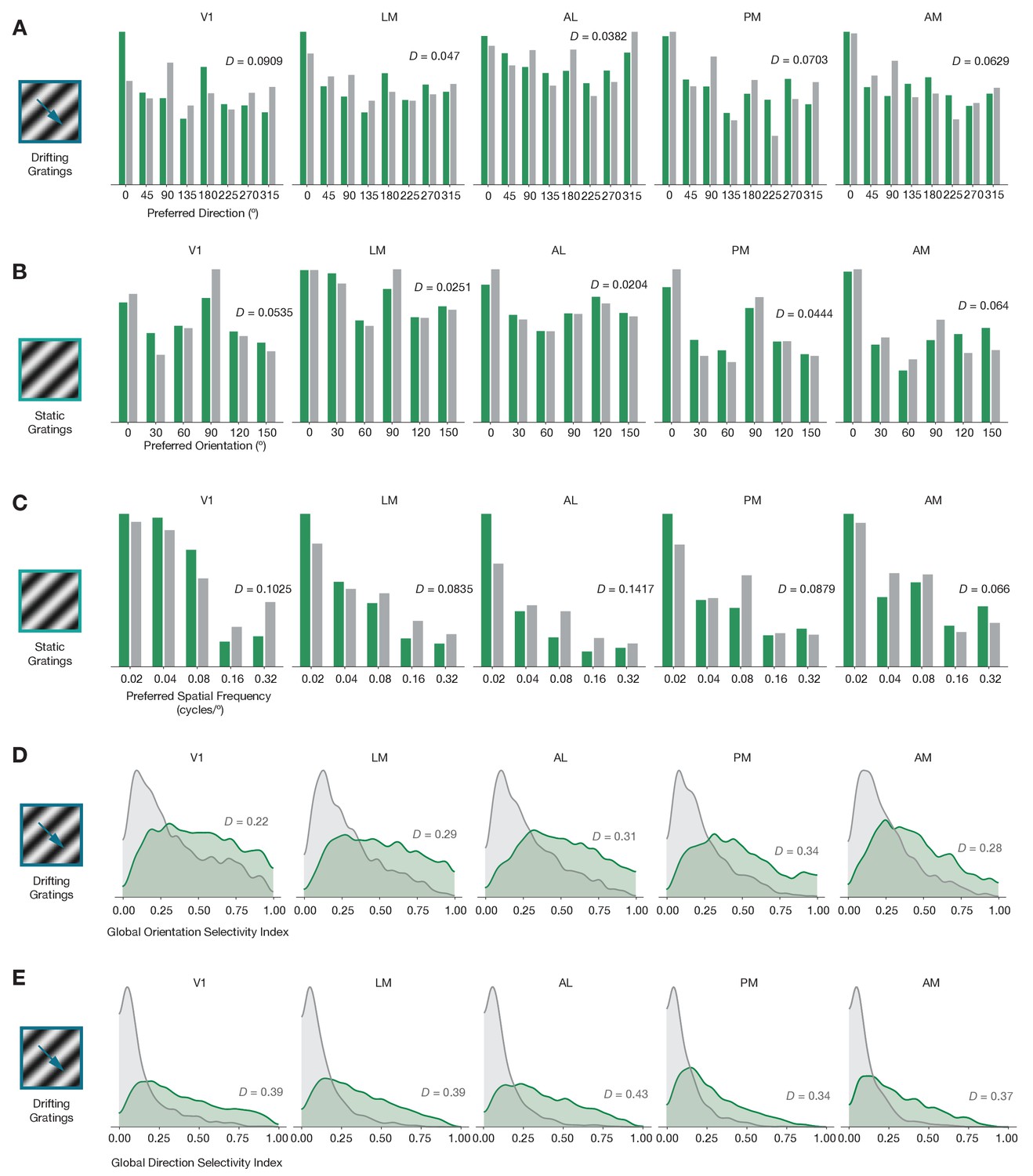
Baseline comparisons for additional preference and selectivity metrics.
(A) Distribution of preferred directions across five areas. (B) Distribution of preferred orientations across five areas. (C) Distribution of preferred spatial frequency across five areas. (D) Distribution of global orientation selectivity index across five areas. (E) Distribution of global direction selectivity index across five areas. In all plots, ephys = gray and imaging = green.
Figure 2—figure supplement 2
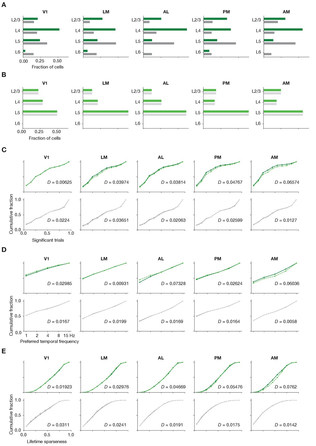
Matching laminar distribution patterns across modalities.
(A) Original layer distributions, prior to resampling, for imaging (green) and ephys (gray). (B) Layer distributions following the resampling procedure, for imaging (light green) and ephys (light gray). (C) Cumulative histograms of significant trial fractions for imaging and ephys, before and after resampling. (D) Cumulative histograms of preferred temporal frequency for imaging and ephys, before and after resampling. (E) Cumulative histograms of preferred temporal frequency for imaging and ephys, before and after resampling. The value D represents the Jensen–Shannon distance between the before/after distributions. In panels (C–E), lighter dashed lines represent the values after resampling.
Figure 2—figure supplement 3
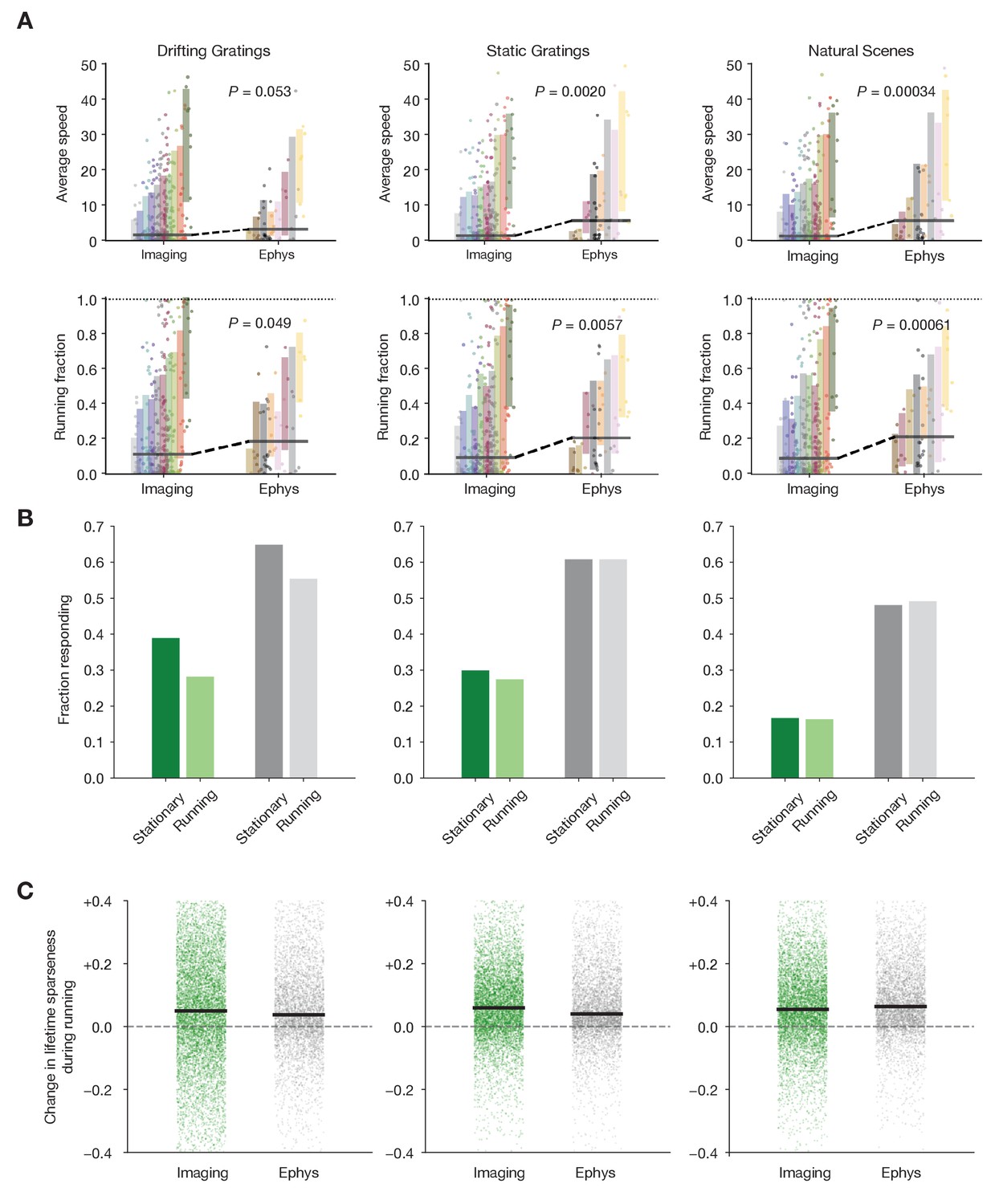
Characterizing the impact of running behavior on response metrics.
(A) Average speed and running fraction for individual mice from imaging and ephys experiments, grouped by genotype. Shaded areas represent the mean ± standard deviation for each genotype. Colors are the same as in Figure 1F. p Values are from the Mann–Whiteny U test between all imaging and all ephys values for each stimulus/metric combination. (B) Fraction of neurons responding to three stimulus types during stationary and running intervals. Neurons were included only if the mouse was stationary or running on at least 20% of trials. (C) Change in lifetime sparseness during running intervals for all neurons from imaging and ephys experiments. Black line represents the median change for each modality/stimulus type.
Figure 2—figure supplement 4
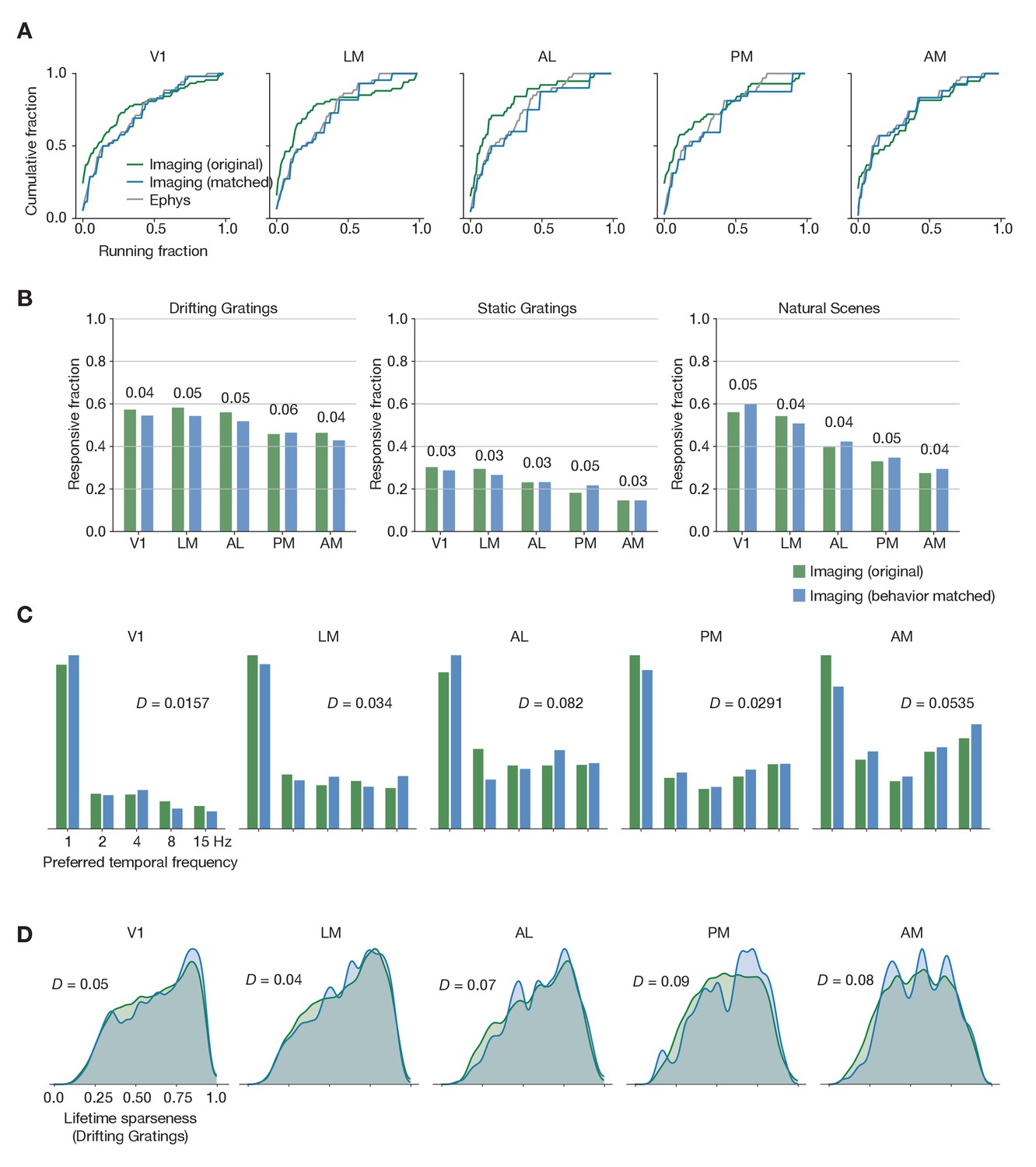
Matching running behavior across modalities.
(A) Cumulative histogram of drifting gratings running fractions for the ephys dataset, and for the imaging dataset before and after performing the behavioral matching procedure. (B) Fraction of neurons deemed responsive to each of three stimulus types, before and after sub-sampling the imaging experiments to match ephys running behavior. Numbers above each pair of bars represent the Jensen–Shannon distance between the full distribution of responsive trial fractions for each stimulus/area combination. (C) Distribution of preferred temporal frequencies for all neurons in five different areas. The Jensen–Shannon distance between the original imaging and resampled imaging distributions is shown for each plot. (D) Distributions of lifetime sparseness in response to a drifting grating stimulus for all neurons in five different areas. The Jensen–Shannon distance between the original imaging and resampled imaging distributions is shown for each plot.
Figure 3
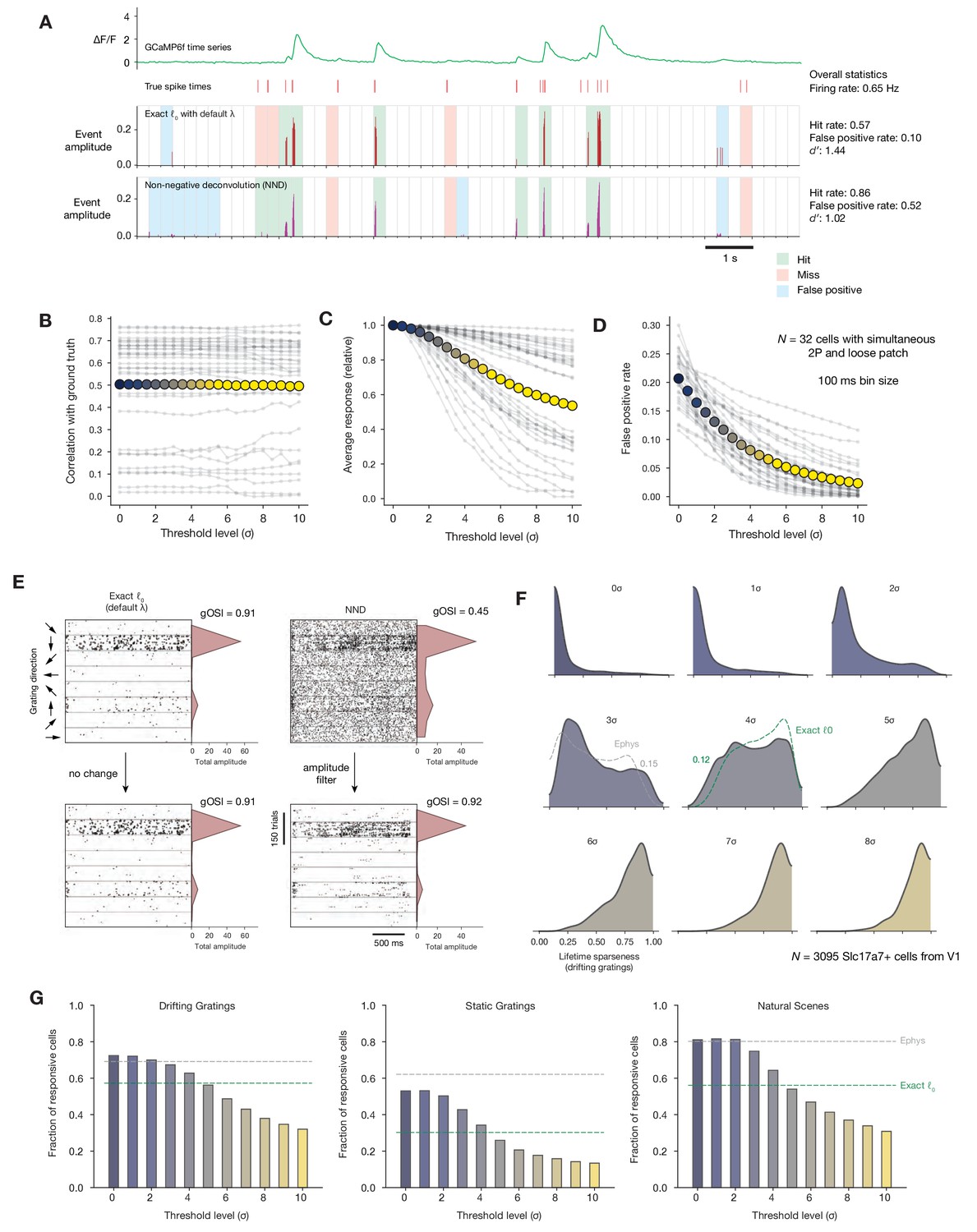
Impact of calcium event detection on functional metrics.
(A) GCaMP6f fluorescence trace, spike times, and detected events for one example neuron with simultaneous imaging and electrophysiology. Events are either detected via exact ℓ0-regularized deconvolution (Jewell and Witten, 2018) or unpenalized non-negative deconvolution (Friedrich et al., 2017). Each 250 ms bin is classified as a ‘hit,’ ‘miss,’ ‘false positive,’ or ‘true positive’ by comparing the presence/absence of detected events with the true underlying spike times. (B) Correlation between binned event amplitude and ground truth firing rate after filtering NND events at different threshold levels relative to each neuron’s noise level (σ). The average across neurons is shown as colored dots. (C) Same as B, but for the average response amplitude within a 100 ms interval (relative to the amplitude with no thresholding applied). (D) Same as B, but for the probability of detecting a false positive event in a 100 ms interval. (E) Event times in response to 600 drifting gratings presentations for one example neuron, sorted by grating direction (ignoring differences in temporal frequency). Dots representing individual events are scaled by the amplitude of the associated event. Each column represents the results of a different event detection method. The resulting tuning curves and measured global orientation selectivity index (gOSI) are shown to the right of each plot. (F) Lifetime sparseness distributions for Scl17a7+ V1 neurons, after filtering out events at varying threshold levels relative to each neuron’s baseline noise level. The overall V1 distributions from ephys (gray) and exact ℓ0 (green) are overlaid on the most similar distribution. (G) Fraction of Slc17a7+ V1 neurons responding to three different stimulus types, after filtering out events at varying threshold levels relative to each neuron’s baseline noise level.
Figure 4
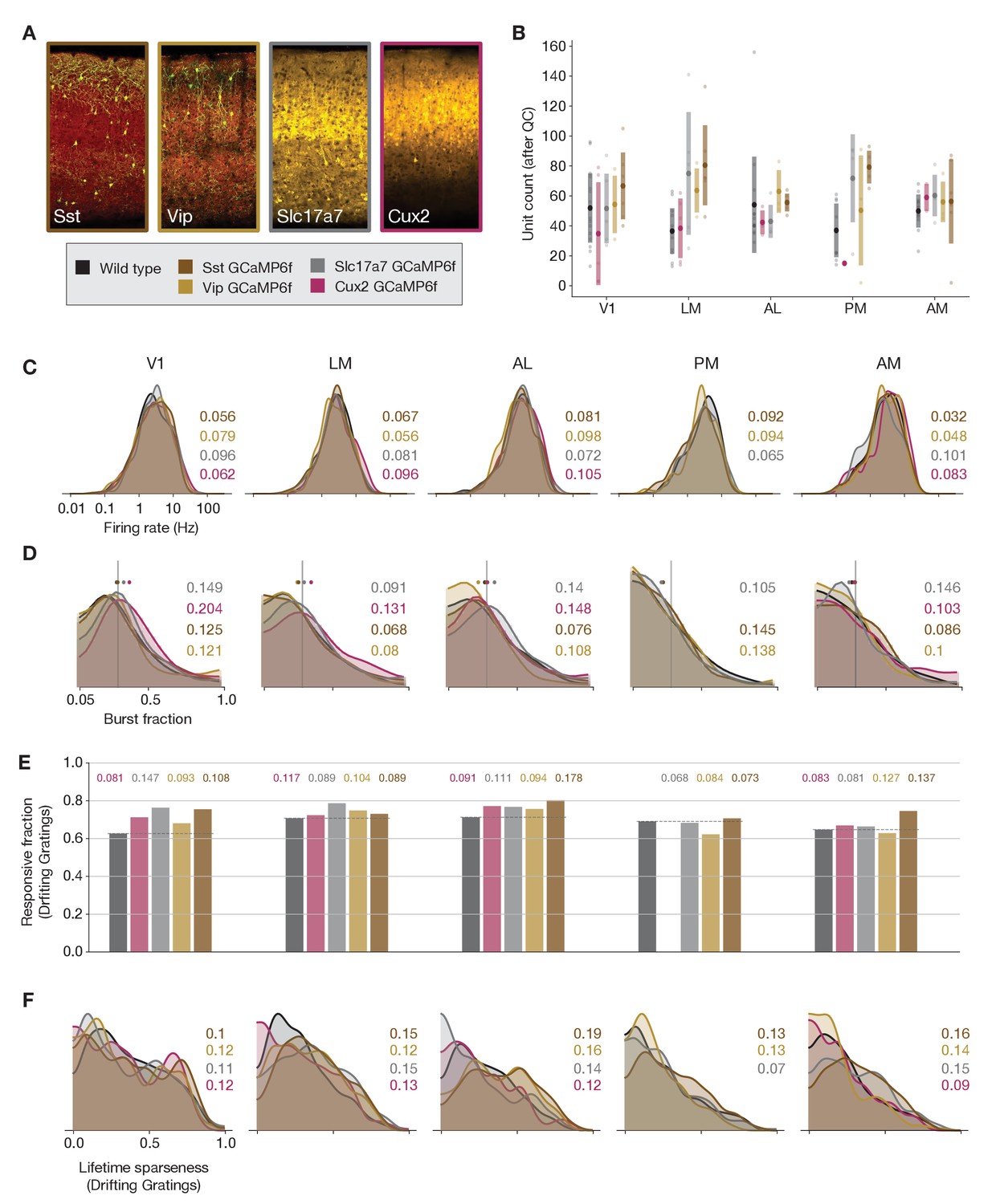
Comparing responses across GCaMP-expressing mouse lines.
(A) GCaMP expression patterns for the four lines used for ephys experiments, based on two-photon serial tomography (TissueCyte) sections from mice used in the imaging pipeline. (B) Unit yield (following QC filtering) for five areas and five genotypes. Error bars represent standard deviation across experiments; each dot represents a data point from one experiment. (C) Distribution of firing rates for neurons from each mouse line, aggregated across experiments. (D) Distribution of burst fraction (fraction of all spikes that participate in bursts) for neurons from each mouse line, aggregated across experiments. Dots represent the median of each distribution, shown in relation to a reference value of 0.3. (E) Fraction of neurons deemed responsive to drifting gratings, grouped by genotype. (F) Distribution of lifetime sparseness in response to a drifting grating stimulus, grouped by genotype. In panels (C–F), colored numbers indicate the Jensen–Shannon distance between the wild-type distribution and the distributions of the four GCaMP-expressing mouse lines. Area PM does not include data from Cux2 mice, as it was only successfully targeted in one session for this mouse line.
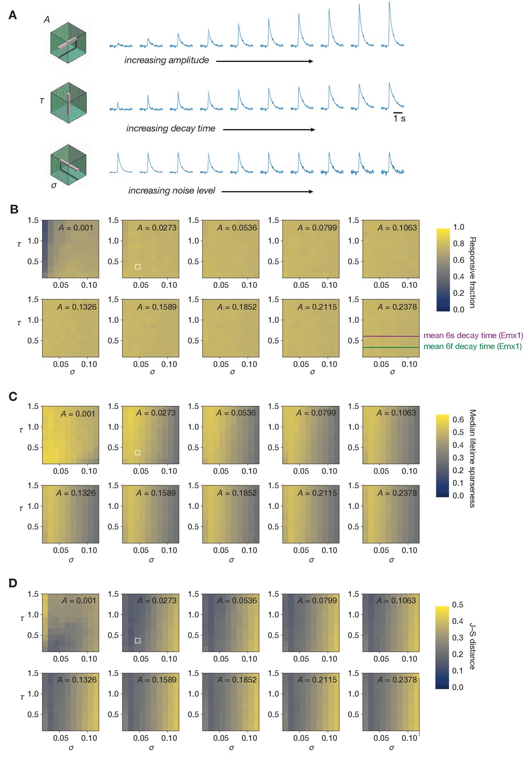
Figure 5 with 2 supplements

Effects of the spikes-to-calcium forward model.
(A) Example of the forward model transformation. A series of spike times (top) is converted to a simulated ΔF/F trace (middle), from which ℓ0-regularized events are extracted using the same method as for the experimental imaging data (bottom). (B) Overview of the three forward model parameters that were fit to data from the Allen Brain Observatory two-photon imaging experiments. (C) Raster plot for one example neuron, before and after applying the forward model. Trials are grouped by drifting grating direction and ordered by response magnitude from the original ephys data. The magnitudes of each trial (based on ephys spike counts or summed imaging event amplitudes) are shown to the right of each plot. (D) Count of neurons responding (green) or not responding (red) to drifting gratings before or after applying the forward model. (E) Fraction of neurons deemed responsive to each of three stimulus types, for both synthetic fluorescence traces (yellow) and true imaging data (green). Numbers above each pair of bars represent the Jensen–Shannon distance between the full distribution of responsive trial fractions for each stimulus/area combination. (F) 2D histogram of neurons’ preferred temporal frequency before and after applying the forward model. (G) Distribution of preferred temporal frequencies for all neurons in five different areas. The Jensen–Shannon distance between the synthetic imaging and true imaging distributions is shown for each plot. (H) Comparison between measured lifetime sparseness in response to drifting grating stimulus before and after applying the forward model. (I) Distributions of lifetime sparseness in response to a drifting grating stimulus for all neurons in five different areas. The Jensen–Shannon distance between the synthetic imaging and true imaging distributions is shown for each plot.
Figure 5—figure supplement 1
Sampling the entire space of forward model parameters.
(A) Schematic of three different ‘slices’ through forward model parameter space, sampling all values of unitary amplitude (A), decay time (τ), or noise level (σ). (B) Fraction of neurons responding to drifting gratings for all parameter combinations. (C) Median lifetime sparseness in response to a drifting grating stimulus for all parameter combinations. The median value for the experimental imaging data determines the maximum value of the color scale. (D) Jensen–Shannon distance between the distributions of drifting gratings lifetime sparseness for all parameter combinations. In panels (B–D), the combination used in Figure 5 is highlighted in white.
Figure 5—figure supplement 2
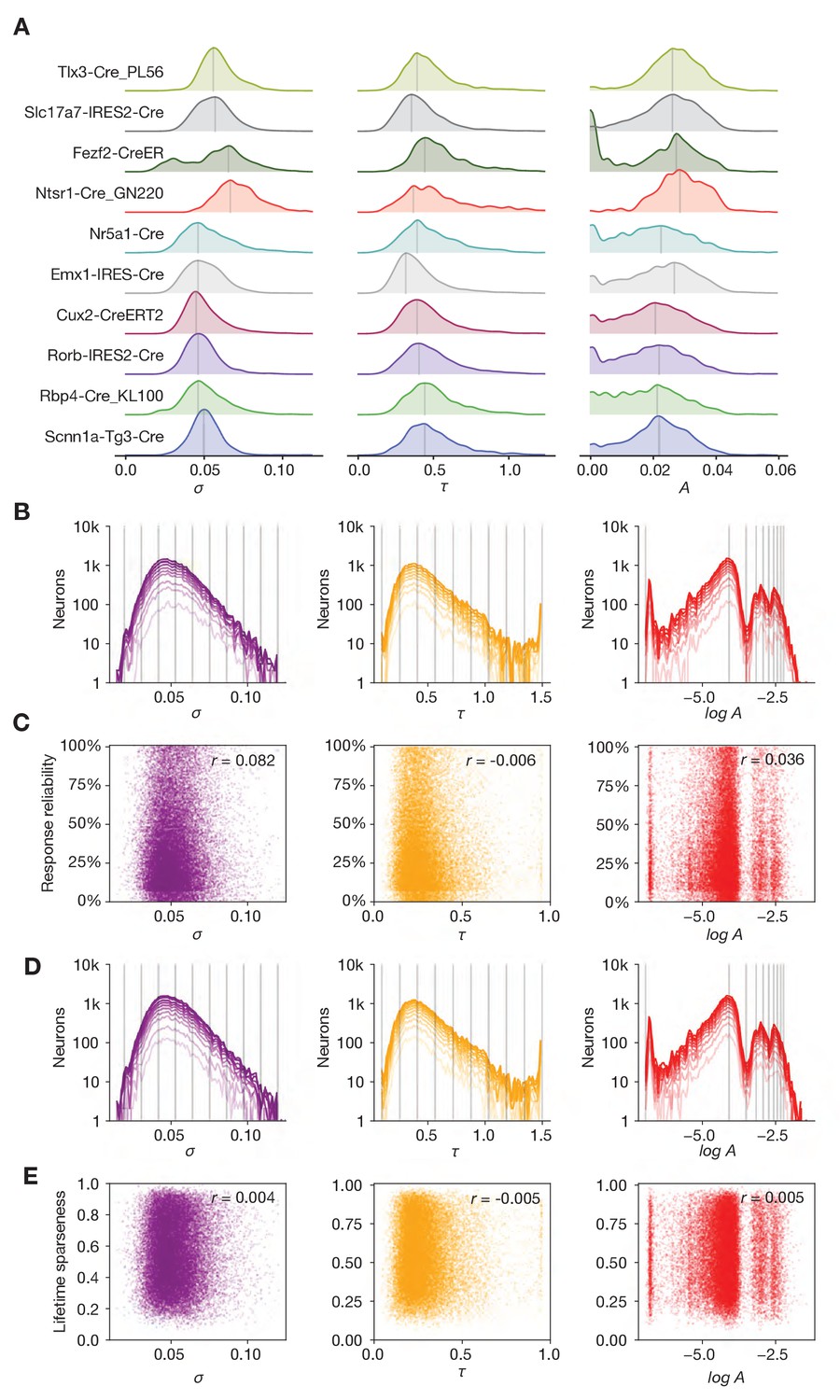
Relationship between forward model parameters, genotype, and functional metrics.
(A) Distribution of noise level (σ), decay time (τ), and amplitude (A) parameters for the 10 different Cre lines used in this study. (B) Effect of sub-selecting neurons based on drifting gratings response reliability. Each line represents the parameter distribution for quantiles of increasing reliability (from dark to light). (C) Relationship between forward model parameters and response reliability. (D) Effect of sub-selecting neurons based on selectivity. Each line represents the parameter distribution for quantiles of increasing selectivity (from dark to light). (E) Relationship between forward model parameters and drifting gratings lifetime sparseness.
Figure 6 with 1 supplement
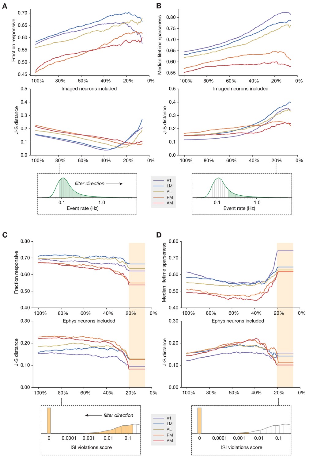
Sub-sampling based on event rate or ISI violations.
(A) Top: Change in fraction of neurons responding to drifting gratings for each area in the imaging dataset, as function of the percent of imaged neurons included in the comparison. Middle: Jensen–Shannon distance between the synthetic imaging and true imaging response reliability distributions. Bottom: Overall event rate distribution in the imaging dataset. As the percentage of included neurons decreases (from left to right), more and more neurons with low activity rates are excluded. (B) Same as A, but for drifting gratings lifetime sparseness (selectivity) metrics. (C) Top: Change in fraction of neurons responding to the drifting gratings stimulus for each area in the ephys dataset, as function of the percent of ephys neurons included in the comparison. Middle: Jensen–Shannon distance between the synthetic imaging and true imaging response reliability distributions. Bottom: Overall ISI violations score distribution in the ephys dataset. As the percent of included neurons decreases (from right to left), more and more neurons with high contamination levels are excluded. Yellow shaded area indicates the region where the minimum measurable contamination level (ISI violations score = 0) is reached. (D) Same as C, but for drifting gratings lifetime sparseness (selectivity) metrics.
Figure 6—figure supplement 1
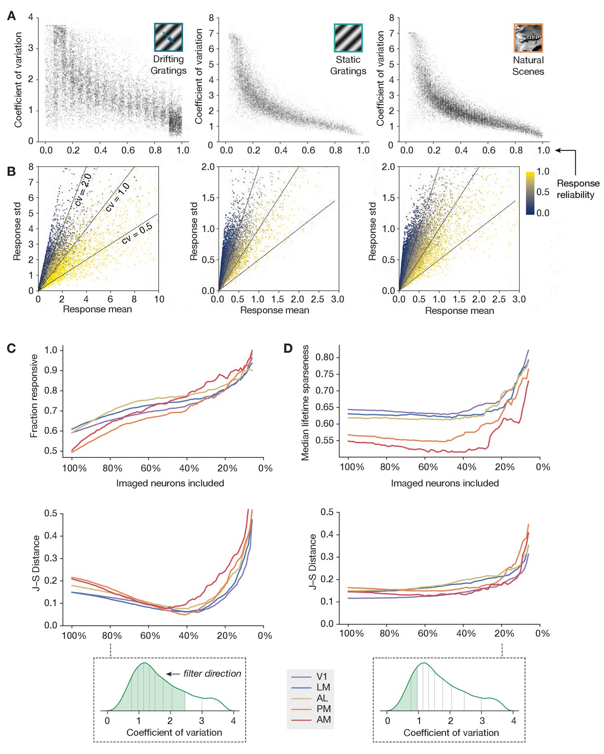
An alternative metric of response robustness.
(A) Relationship between response reliability (fraction of preferred-condition trials with responses larger than 95% of baseline intervals) and coefficient of variation (ratio between standard deviation and mean of responses for preferred condition trials), for three different stimulus types. (B) Mean and standard deviation of the preferred condition response, for all neurons in the imaging dataset. Response reliability is indicated by color. (C) Same as Figure 6A, but with imaged neurons filtered by coefficient of variation, rather than by event rate. (D) Same as Figure 6B, but with imaged neurons filtered by coefficient of variation, rather than event rate.
Figure 7
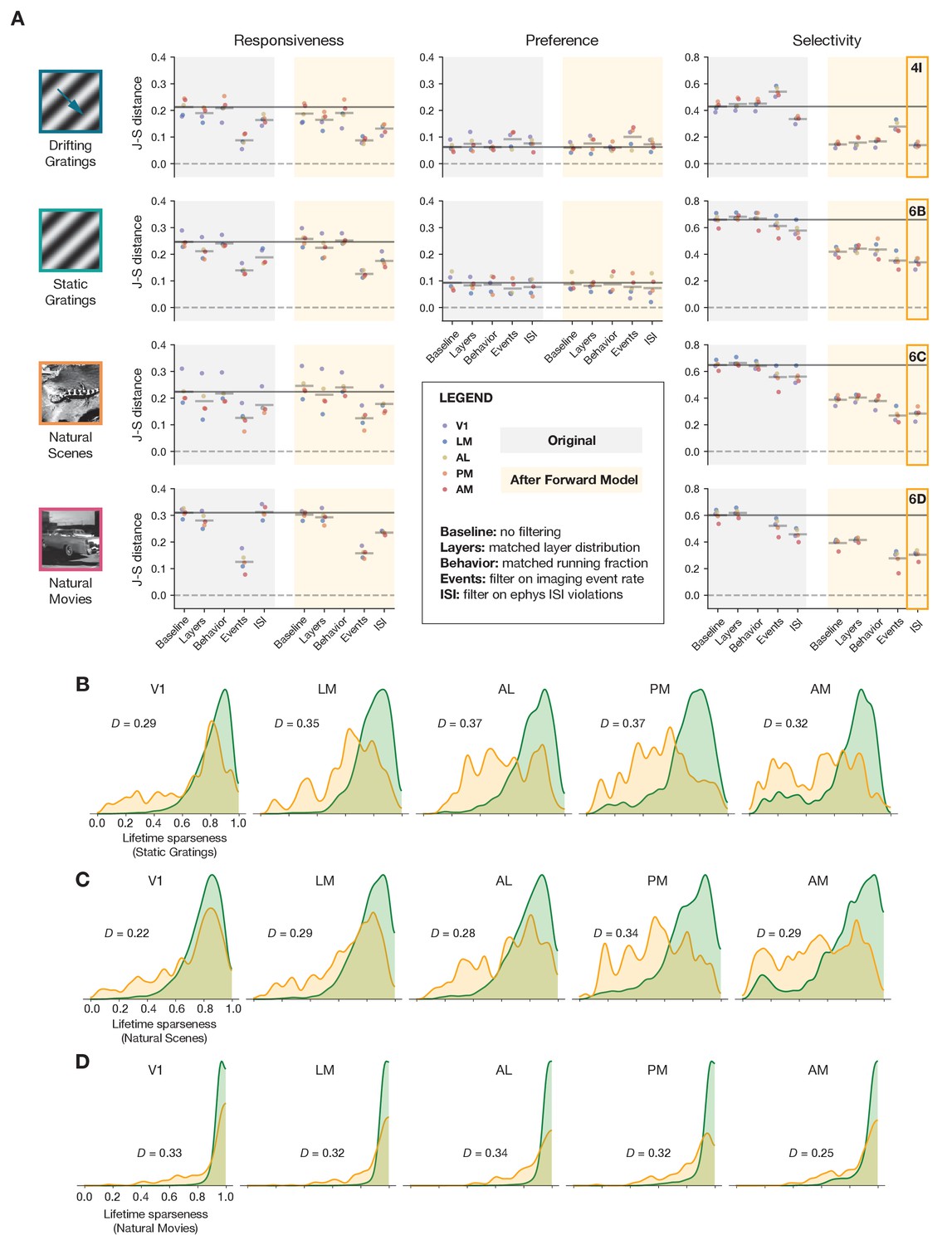
Summary of results for all stimulus types.
(A) Jensen–Shannon distance between the ephys and imaging distributions for three metrics and four stimulus classes. Individual dots represent visual areas, and horizontal lines represent the mean across areas. Each column represents a different post-processing step, with comparison performed on either the original ephys data (gray), or the synthetic fluorescence data obtained by passing experimental ephys data through a spikes-to-calcium forward model (yellow). (B) Full distributions of lifetime sparseness in response to static gratings for experimental imaging (green) and synthetic imaging (yellow). (C) same as B, but for natural scenes. (D), same as B and C, but for natural movies. The distribution for drifting gratings is shown in Figure 5I.
Figure 8
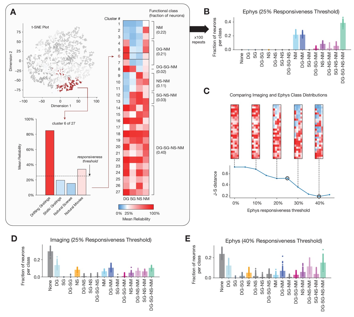
Identifying functional classes based on response reliability.
(A) Example clustering run for all neurons in the ephys dataset. First, unsupervised clustering is performed on the matrix of response reliabilities to four stimulus types. Colors on the t-SNE plot (used for visualization purposes only) represent different cluster labels, with one cluster highlighted in brown. Next, the neurons in each cluster are used to compute the mean reliability for each stimulus type. The mean reliabilities for all 27 clusters are shown in the heatmap, with the 25% responsiveness threshold indicated by the transition from blue to red. Each cluster is assigned to a class based on the stimulus types for which its mean reliability is above threshold. (B) Strip plots representing the fraction of neurons belonging to each class, averaged over 100 repeats of the Gaussian mixture model for ephys (N = 11,030 neurons), at a 25% threshold level. (C) Jensen–Shannon distance between the ephys and imaging class membership distributions, as a function of the ephys responsiveness threshold. The points plotted in panels B and E are circled. Heat maps show the mean reliabilities relative to threshold for all 27 clusters shown in panel A. (D) Strip plots representing the fraction of neurons belonging to each class, averaged over 100 repeats of the Gaussian mixture model for imaging (N = 20,611 neurons), at a 25% threshold level. (E) Same as B, but for the 40% threshold level that minimizes the difference between the imaging and ephys distributions.
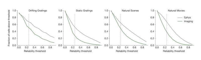
Author response image 1
Additional files
Download links
A two-part list of links to download the article, or parts of the article, in various formats.
Downloads (link to download the article as PDF)
Open citations (links to open the citations from this article in various online reference manager services)
Cite this article (links to download the citations from this article in formats compatible with various reference manager tools)
Reconciling functional differences in populations of neurons recorded with two-photon imaging and electrophysiology
eLife 10:e69068.
https://doi.org/10.7554/eLife.69068


