Interactions between strains govern the eco-evolutionary dynamics of microbial communities
- Physics of Living Systems, Department of Physics, Massachusetts Institute of Technology, United States
- Department of Civil and Environmental Engineering, Massachusetts Institute of Technology, United States
- Department of Biological Sciences, Boise State University, United States
Figures
Figure 1 with 10 supplements
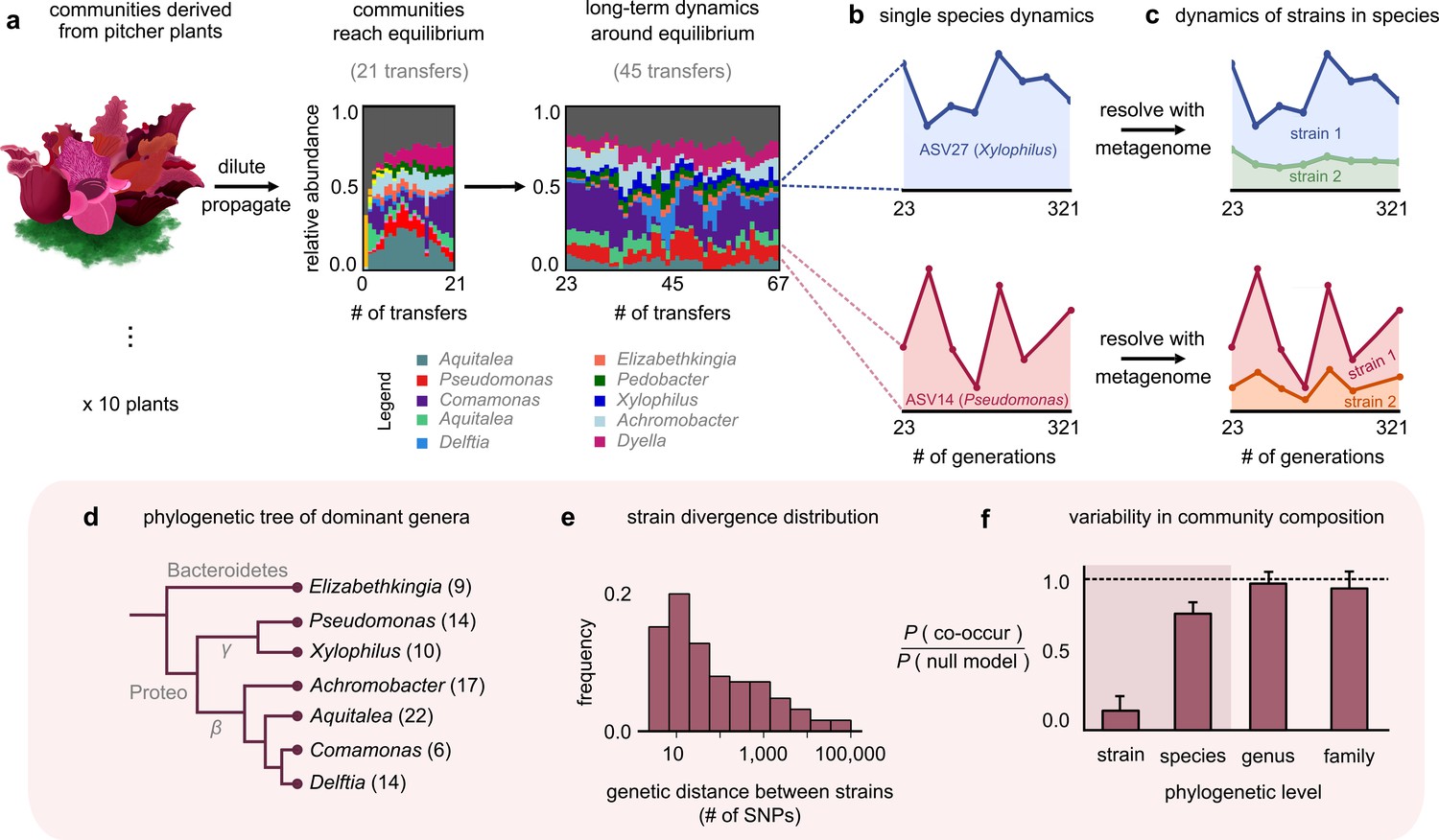
Closely related strains coexist for hundreds of generations in pitcher plant-derived microbial communities.
(a) Diagram illustrating our experimental protocol. Stacked bar plots show the composition of one community (M06) at the amplicon sequence variant (ASV) (species) level sampled at each transfer; each color corresponds to a unique ASV that we tracked further using metagenomic sequencing, with their genera in the legend. (Illustration credit: Michelle Oraa Ali.) (b) Relative abundances of ASV27 (blue) and ASV14 (pink) with the approximate number of generations (see Materials and methods); the eight time points shown correspond to those for which we collected metagenomic data. (c) Relative abundances of strains identified in ASV27 and ASV14 using metagenomes. The shaded colors correspond to the abundance of each of the two strains. (d) Phylogenetic tree of the dominant strain-containing taxa across all 10 communities, with the identified genus names labeled. Brackets indicate the number of detected strains belonging to each genus. (e) Distribution of the genetic distance (divergence) between strains belonging to the same species, measured in the number of detected single-nucleotide polymorphisms (SNPs) differentiating them. (f) Bar plot showing the probability with which two members of the same taxonomic group (family, genus, species, etc.) co-occurred in a sample, normalized with a null model where all members were distributed randomly across communities. Dashed line indicates the null expectation.
Figure 1—figure supplement 1
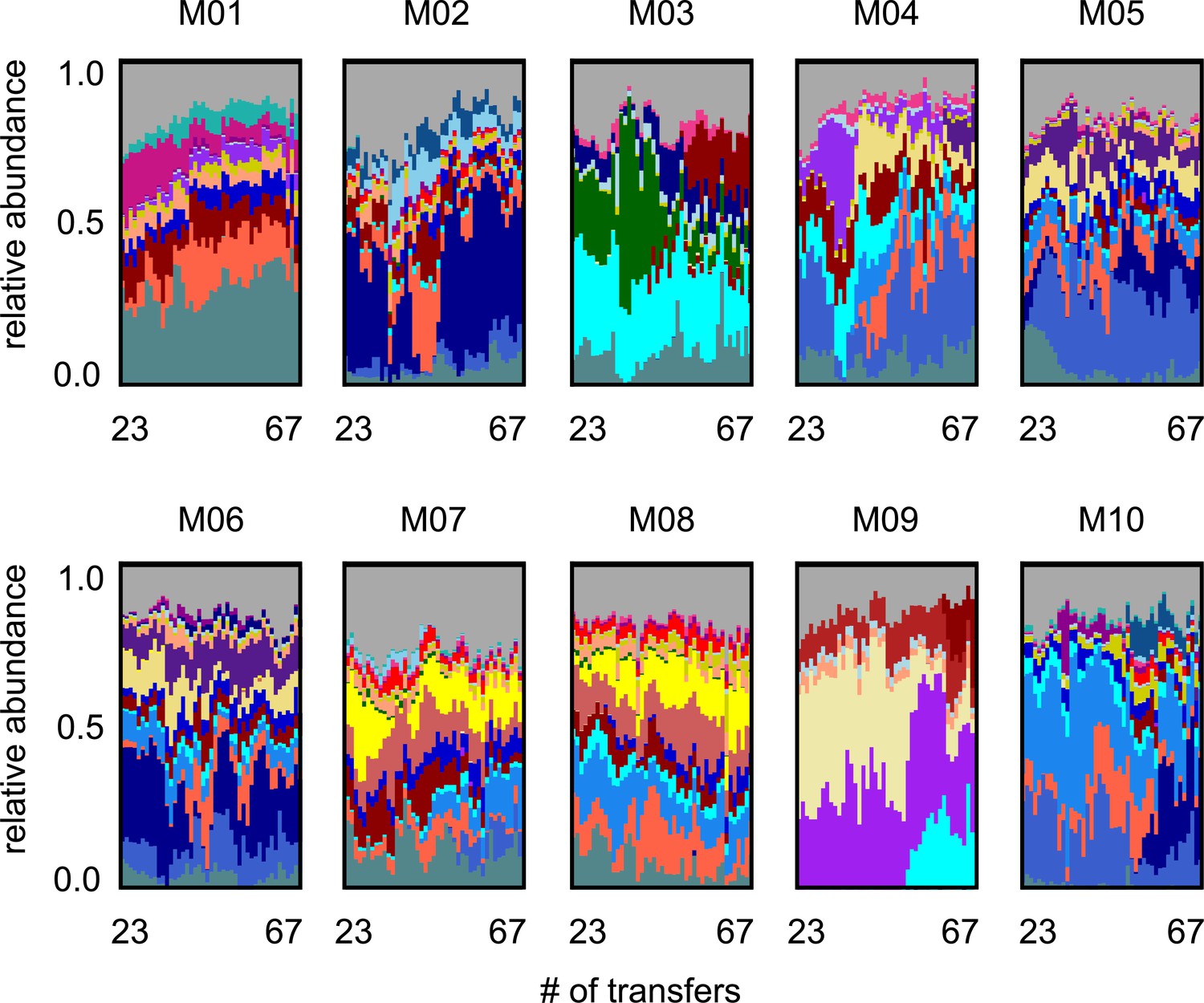
Long-term species dynamics of all 10 experimental microbial communities.
Stacked bar plots show the composition of all 10 communities (M01–M10) at the amplicon sequence variant (ASV) (species) level sampled at each transfer; each color corresponds to a unique ASV that we tracked further using metagenomic sequencing.
Figure 1—figure supplement 2
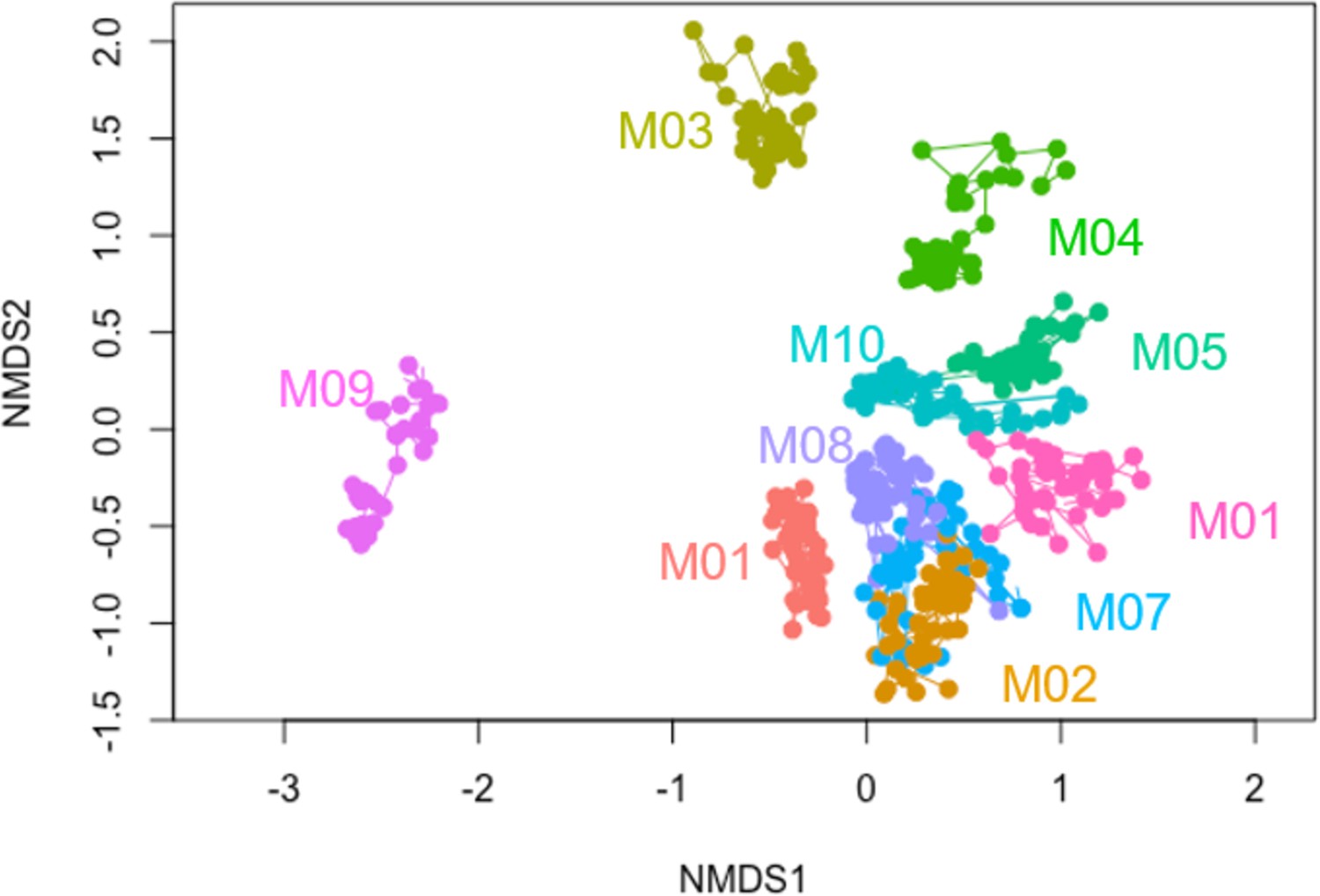
Non-metric multidimensional scaling (NMDS) plot of community compositions at the species level.
Two-dimensional NMDS plot of the 16S community compositions (species level) using Bray–Curtis dissimilarity. Each point represents a community at a particular sequenced time points, and lines connect the same community at adjacent time points. Colors represent different communities (names labeled).
Figure 1—figure supplement 3
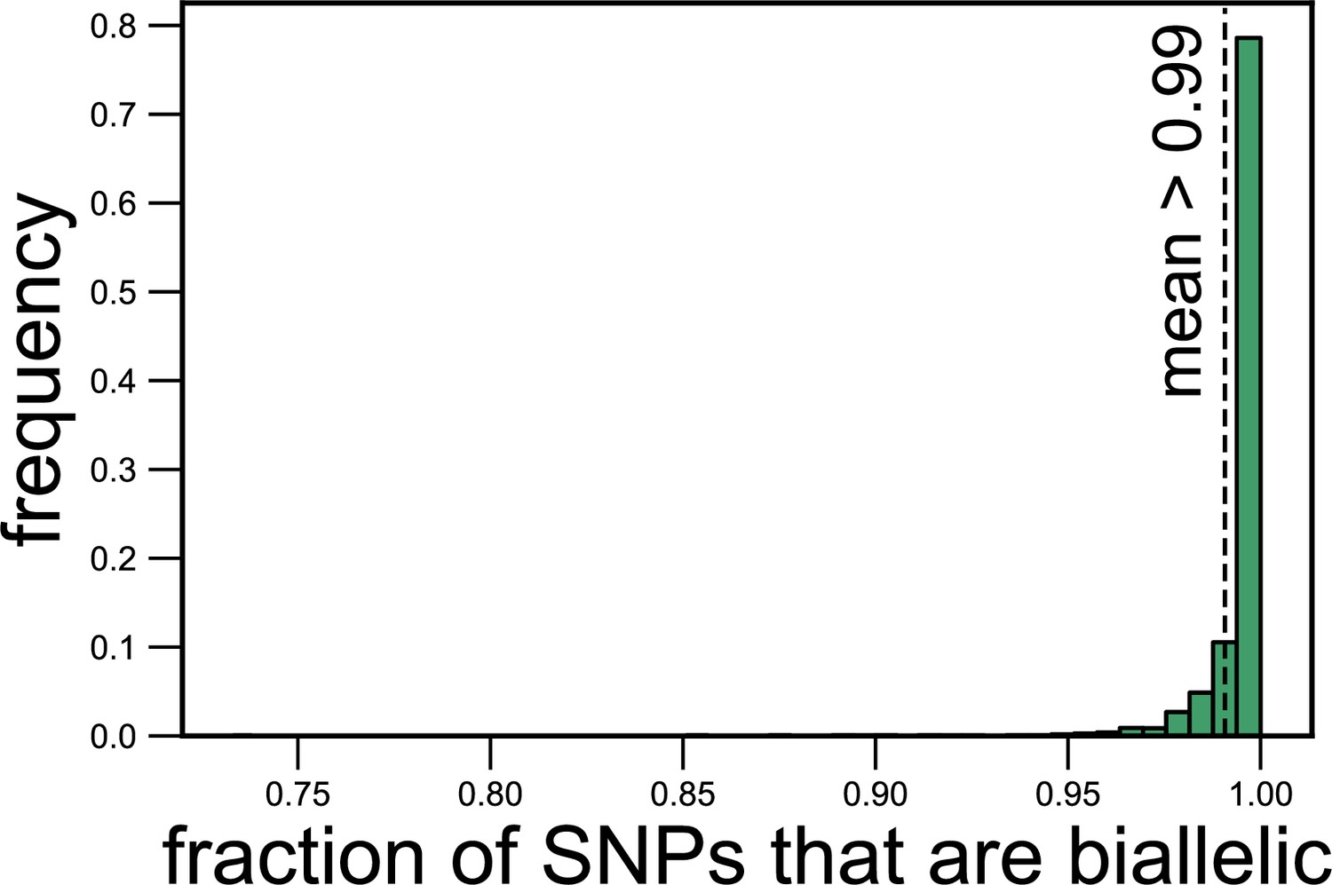
Most (>99%) single-nucleotide polymorphisms (SNPs) are biallelic (have two alleles).
Histogram showing the fraction of SNPs corresponding to each species in each metagenomic sample for which we could detect only two alleles. The dashed line shows the mean fraction of SNPs that are biallelic (0.99).
Figure 1—figure supplement 4
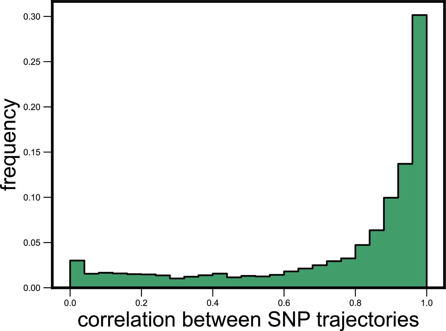
Single-nucleotide polymorphism (SNP) trajectories within a species are highly correlated.
Histogram showing the distribution of the Pearson correlation coefficient between all pairs of SNP trajectories belonging to the same species in the same community, measured across all species and communities. The mean correlation between SNPs was 0.78.
Figure 1—figure supplement 5
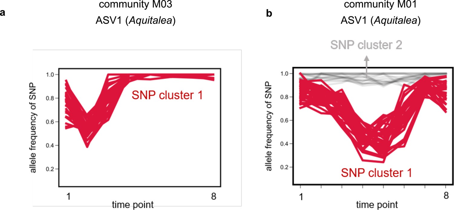
Single-nucleotide polymorphisms (SNPs) within strains tightly cluster together.
Examples of allele frequency trajectories of SNPs belonging to the same species in the same community for amplicon sequence variant (ASV)1, belonging to the genus Aquitalea, in communities (a) M03 and (b) M01, respectively. SNP trajectories are colored and marked according to the cluster they were identified to be part of using k-means clustering (see Materials and methods). (a) shows an example where only one cluster was identified, whereas (b) shows an example of two clusters. SNP cluster 2 consisted of SNPs with an allele frequency near 1, and were therefore assumed to be shared between and common to both strains (but different from the reference genome; see Materials and methods).
Figure 1—figure supplement 6
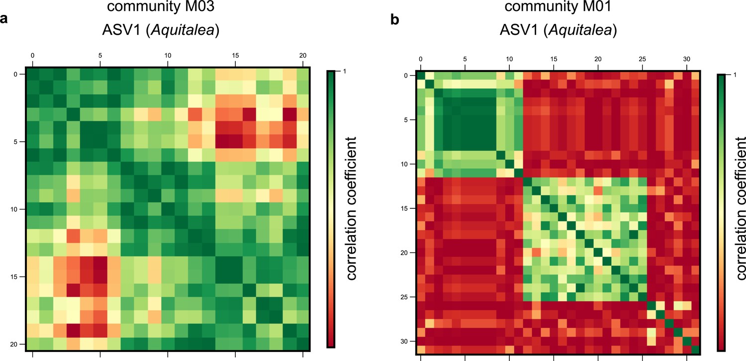
Single-nucleotide polymorphism (SNP) clusters are robust to alternate clustering methods.
Examples of correlation matrices between SNP trajectories belonging to the same species in the same community for amplicon sequence variant (ASV)1, belonging to the genus Aquitalea, in communities (a) M03 and (b) M01, respectively. Each row and column represents a distinct SNP trajectory for that species, and colors represent the Pearson correlation coefficient between them. SNPs are ordered according to the clusters identified using a hierarchical clustering algorithm (see Materials and methods).
Figure 1—figure supplement 7

More examples of single-nucleotide polymorphism (SNP) clusters.
Examples of correlation matrices between SNP trajectories belonging to different species and communities across the dataset, specifically (a) amplicon sequence variant (ASV)31 from M02, (b) ASV15 from M09, and (c) ASV21 from M04, respectively. Each row and column represents a distinct SNP trajectory for that species, and colors represent the Pearson correlation coefficient between them. SNPs are ordered according to the clusters identified using a hierarchical clustering algorithm (see Materials and methods). (d) Histogram showing the number of correlated clusters identified using the unweighted pair group method with arithmetic mean (UPGMA) clustering method throughout all species in our dataset (see Materials and methods).
Figure 1—figure supplement 8
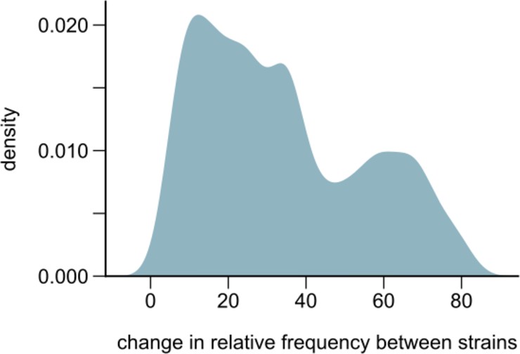
Changes in strain relative frequencies.
Distribution of the overall change in relative strain frequency between conspecific strains across all species in our communities. The overall change was measured as the difference between the maximum and minimum frequency of the major strain, where the major strain was defined as the one whose frequency was higher at the first metagenomic time point (~21 generations into the experiment). The distribution has been smoothened using Gaussian kernel density estimation.
Figure 1—figure supplement 9
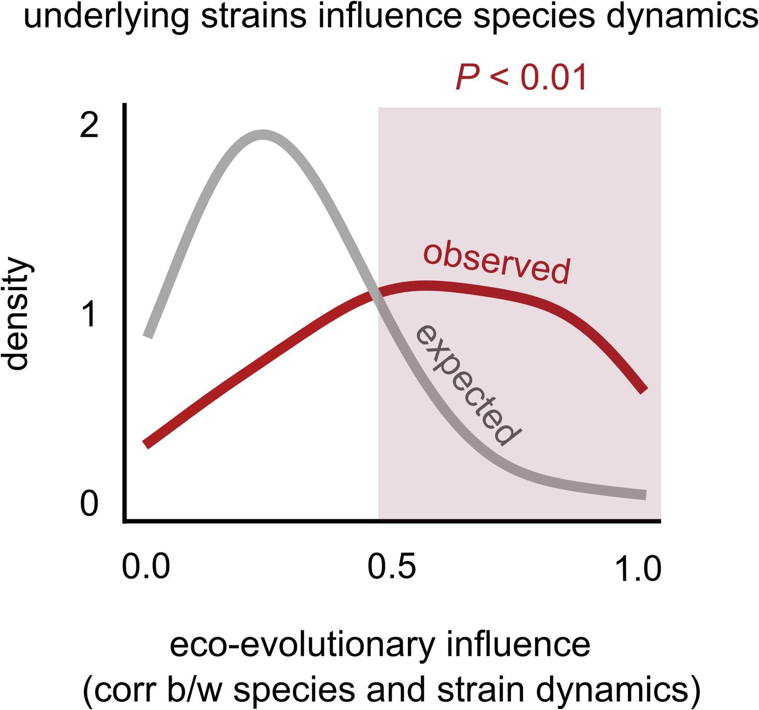
Changes in strain frequencies often influence their overall species abundances.
Distribution of the eco-evolutionary influence between a species and its constituent strains across all communities (see supplementary text), measured as the magnitude of the correlation between the species’ relative abundance trajectory, and the relative frequency of its major strain. The red distribution shows the observed distribution while the gray distribution shows the expectation under a random shuffling of strains across species labels (see Materials and methods).
Figure 1—figure supplement 10
Distribution of correlations between species’ relative abundances inferred using read mapping and 16S rRNA sequencing.
Distribution of the correlations between the relative read abundance (fraction of shotgun metagenomic reads mapped to each species, after normalizing for genome length) with its relative abundance estimated independently using 16S rRNA sequencing.
Figure 2 with 3 supplements
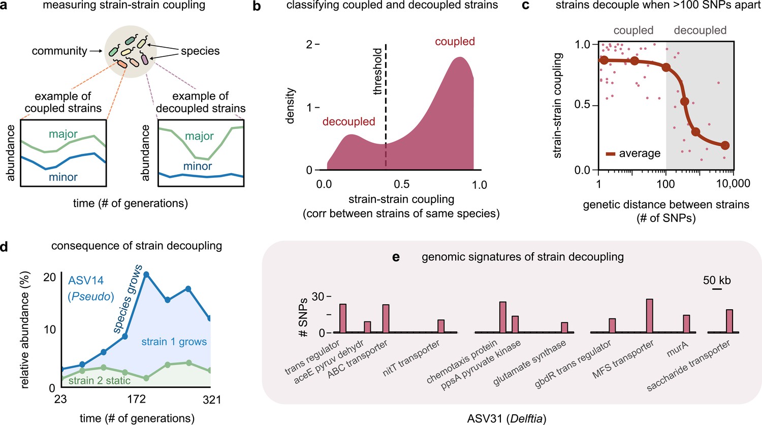
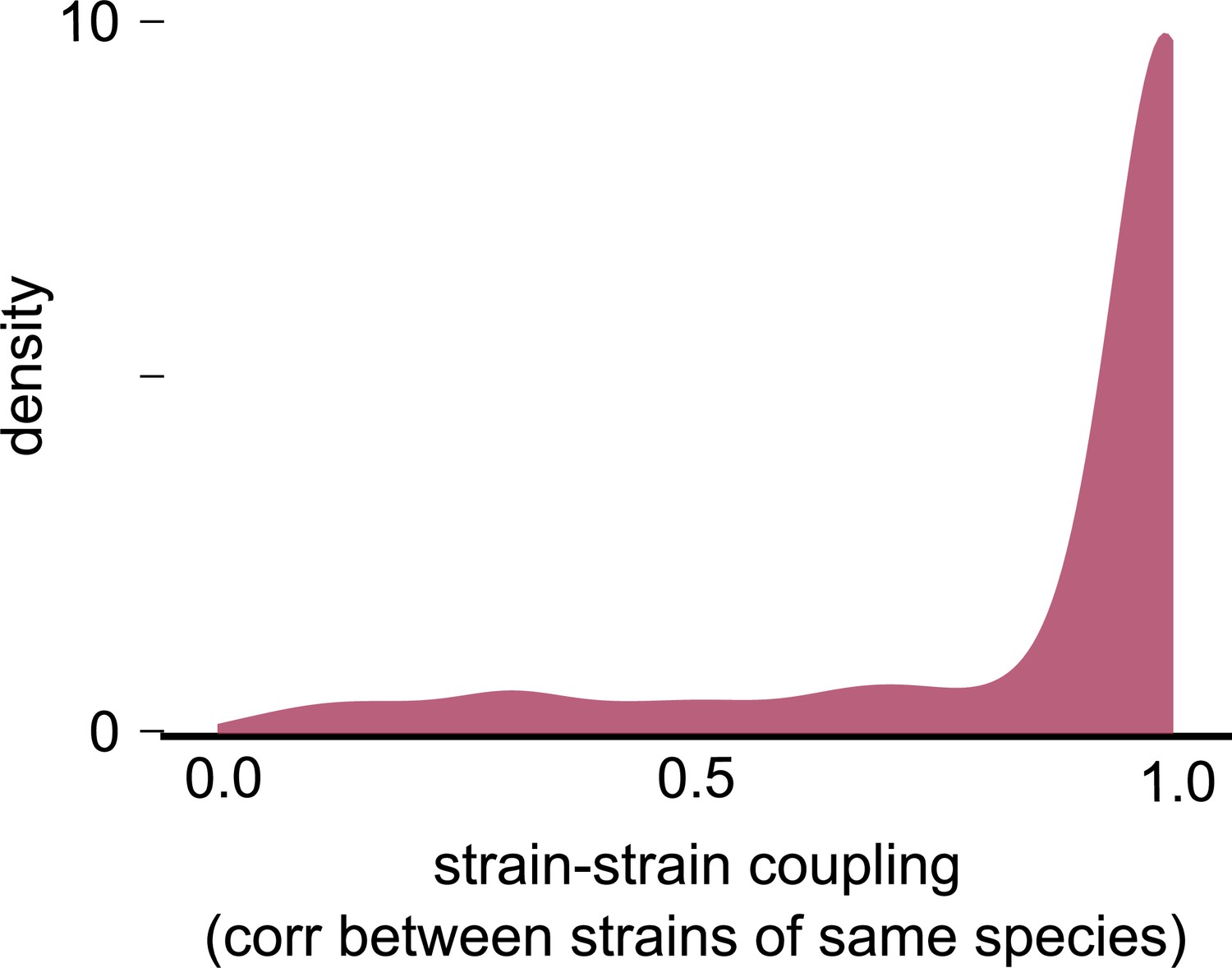
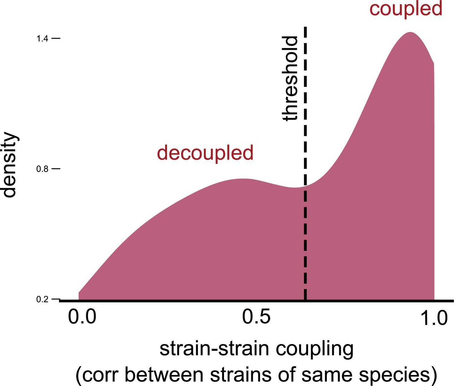
Even highly related strains (~100 single-nucleotide polymorphisms [SNPs] apart) can decouple in their dynamics.
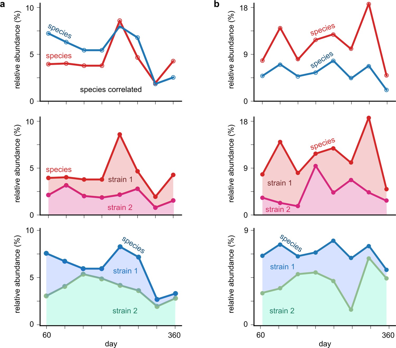
(a) Schematic showing examples of strain–strain coupling. We defined strain–strain coupling as the temporal correlation between strain abundances belonging to the same species in a community; coupled strains (left) had highly correlated abundances while decoupled strains (right) were uncorrelated. (b) Distribution of the strain–strain coupling across all species and communities, smoothed using Gaussian kernel density estimation; dashed line shows the threshold coupling used to classify strains as coupled and decoupled (see Materials and methods). (c) Strain–strain coupling as a function of the genetic distance between strains. Each gray point represents a conspecific strain pair. The solid red line shows a moving average (LOESS fit). (d) Relative abundance of the species labeled ASV14 of the genus Pseudomonas in community M03, and its underlying strains over time; the blue shaded region represents strain 1 while the green region represents strain 2. The solid blue line shows the total species abundance. (e) Bar plot showing the number and genetic location of SNPs in the core genome of ASV31 from community M04, whose strains were decoupled and differed by 186 SNPs. Each bar shows the number of SNPs in one gene along with its annotation. Only SNPs belonging to annotated genes are shown.
Figure 2—figure supplement 1
Null distribution of strain–strain coupling from a consumer-resource model with no differences between conspecific strains.
Distribution of the strain–strain coupling across all species and communities (similar to Figure 2b) but using trajectories generated from our second consumer-resource model, where strains are ecologically identical, and minor stochastic fluctuations (with mean 0% and variance 5%) change the relative frequency between strains. This null distribution estimates the chance of ecologically identical conspecifics appearing to be decoupled by chance.
Figure 2—figure supplement 2
Strain–strain coupling distribution is robust to using an alternate measure.
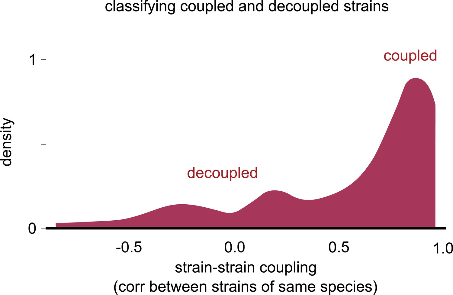
Distribution of the strain–strain coupling across all species and communities (similar to Figure 2b) but measured using the nonparametric Spearman correlation coefficient (see Materials and methods); dashed line shows the internal inflection point of the distribution, separating decoupled and coupled strains.
Figure 2—figure supplement 3
Distribution of strain–strain coupling with the sign of the correlation.
Distribution of the strain–strain coupling across all species and communities (similar to Figure 2b) but with the sign of the Pearson correlation coefficient, rather than the magnitude (see Materials and methods). Most correlations were positive, and there were no negative correlations of large magnitude.
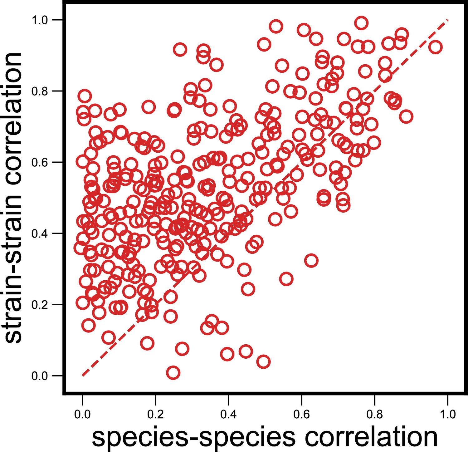
Figure 3 with 8 supplements
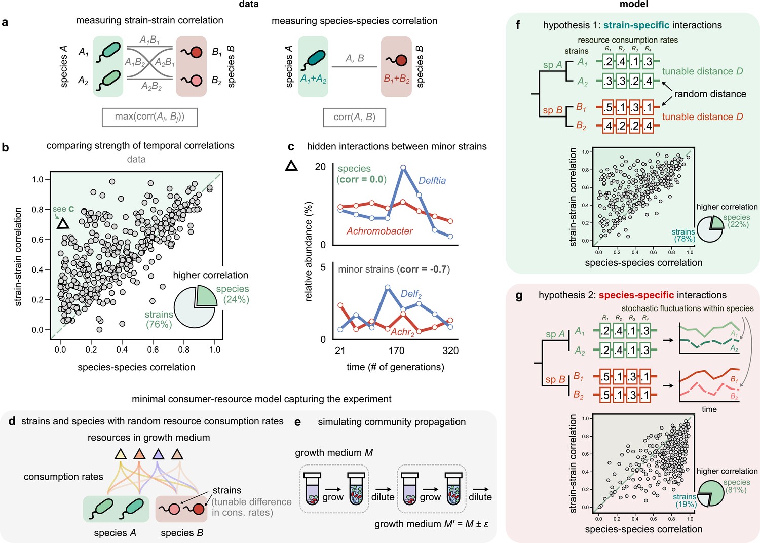
Community interactions are strain-specific.
(a) Schematic showing how we measured dynamical correlations at the strain and species level for a species pair A and B. For any species pair, we defined strain–strain correlations as the highest magnitude of correlation among all four strain pairs from different species (left), never the same species. The species–species correlation for the same pair was simply the correlation between the two species (right). (b) Scatter plot of the dynamical correlation between species in a community and the highest correlation between their corresponding strain pairs. Each point represents one species in one of the 10 communities. The shaded region indicates strain–strain correlations higher than species–species correlations. Inset shows a pie chart of the fraction of points supporting higher strain-level interactions (76%) versus species-level interactions (24%). Triangle indicates a pair of Achromobacter (red) and Delftia (blue) species, shown in (c). Top: relative abundance plots of two uncorrelated species measured over the experiment. Bottom: relative abundances of the minor strains for the same species, which are strongly negatively correlated. (d, e) Schematics of our models showing how species are split into strains, with tunable differences in their consumption rates for each resource, as well as the serial dilution protocol that we simulate, where we slightly change the growth medium from transfer to transfer. (f, g) Scatter plots of the expected dynamical correlations using our models, (f) where strains are ecologically distinct (hypothesis 1) and (g) identical (hypothesis 2), similar to (b). Schematics of the consumption rate matrices for both models (hypotheses) are also shown.
Figure 3—figure supplement 1

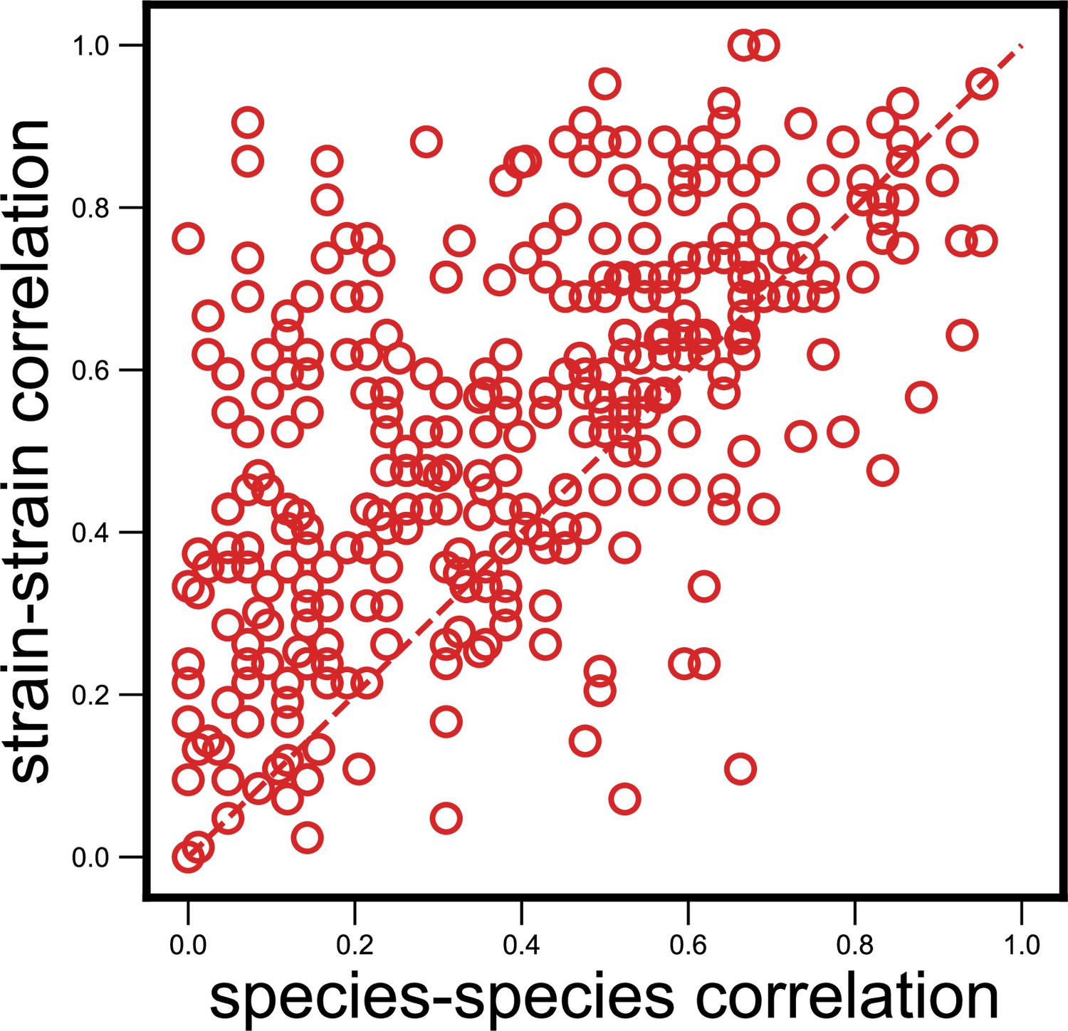
Null model where we shuffled species–strain associations does not show the observed strain specificity.
Scatter plot of the dynamical correlation between species in a community and the highest correlation between their corresponding strain pairs (similar to Figure 3b) but with species and strain associations shuffled within a community (see Materials and methods). Each point represents one species in one of the 10 communities, but is composed of two randomly chosen and unrelated strains from the community. Doing so results in a much lower fraction of correlations that are higher for strains (in this example, 62%, compared with 76% for real data; mean shuffled data fraction was 64%). The probability of observing a fraction greater than or equal to the observed fraction in Figure 3b by removing any species–strain associations was less than 0.1% (p<10–3).
Figure 3—figure supplement 2
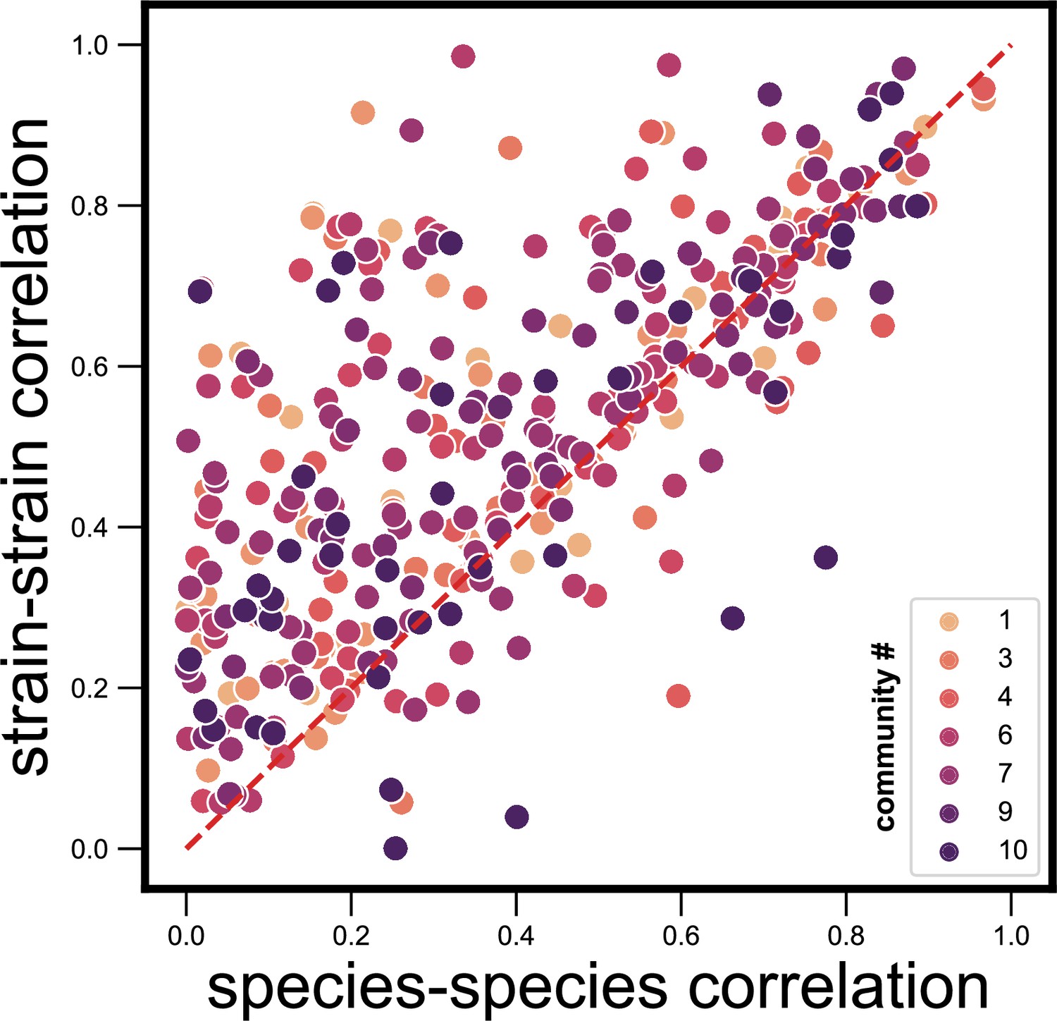
Dynamical correlations between species and strains do not cluster by community identity.
Scatter plot of the dynamical correlation between species in a community and the highest correlation between their corresponding strain pairs (similar to Figure 3b) but with strain pairs being colored by the community ID (1–10) in which they were detected. Each point represents one species in one of the 10 communities. Species do not cluster by community ID on this scatter plot, suggesting that there are no systematic differences from one community to another.
Figure 3—figure supplement 3
Strain-specific interactions are stronger even when estimating abundances purely from metagenomic reads.
Scatter plot of the dynamical correlation between species in a community and the highest correlation between their corresponding strain pairs (similar to Figure 3b) but with species abundances estimated using metagenomic reads, not 16S reads (see Materials and methods). Each point represents one species in one of the 10 communities. Similar to the fraction of strain-specific interactions observed in Figure 3b (76%), we see a large fraction of interaction strengths (78%) skewed towards strains.
Figure 3—figure supplement 4
Strain-specific interactions are stronger even when using an alternate measure.
Scatter plot of the dynamical correlation between species in a community and the highest correlation between their corresponding strain pairs (similar to Figure 3b) but correlations measured using the nonparametric Spearman correlation coefficient (see Materials and methods). Each point represents one species in one of the 10 communities. Similar to the fraction of strain-specific interactions observed in Figure 3b (76%), we see a large fraction of interaction strengths (80%) skewed towards strains.
Figure 3—figure supplement 5
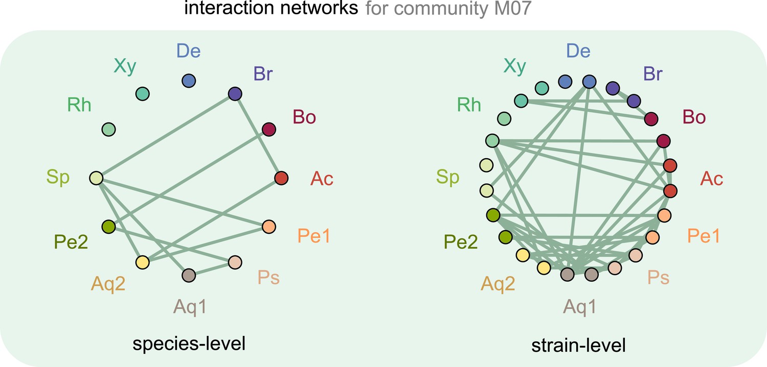
Interaction networks inferred at the level of species and strains.
Interaction networks inferred using dynamical correlations from community M07, measured at the species (left) and strain level (right) (see supplementary text and Materials and methods). Each node represents a species (left) or strain (right), and link indicates the presence of a detected interaction; Ac: Achromobacter; Pe: Pedobacter; Ps: Pseudomonas; Aq: Aquitalea; Sp: Sphingomonas; Rh: Rhodobacter; Xy: Xylophilus; De: Delftia; Br: Brevundimonas; Bo: Bosea.
Figure 3—figure supplement 6
Examples of shuffled cases where species correlations are higher than strain correlations.
(a, b) Top: relative abundance time-series plots of two correlated species (one each in a and b) obtained from the shuffling analysis (see Materials and methods). Bottom: relative abundances of each of the species, with its underlying mock strains shown. Each shaded region represents the abundance of one of the strains. In the cases shown, the underlying strains have lower interspecific strain correlations than the species correlations themselves.
Figure 3—figure supplement 7
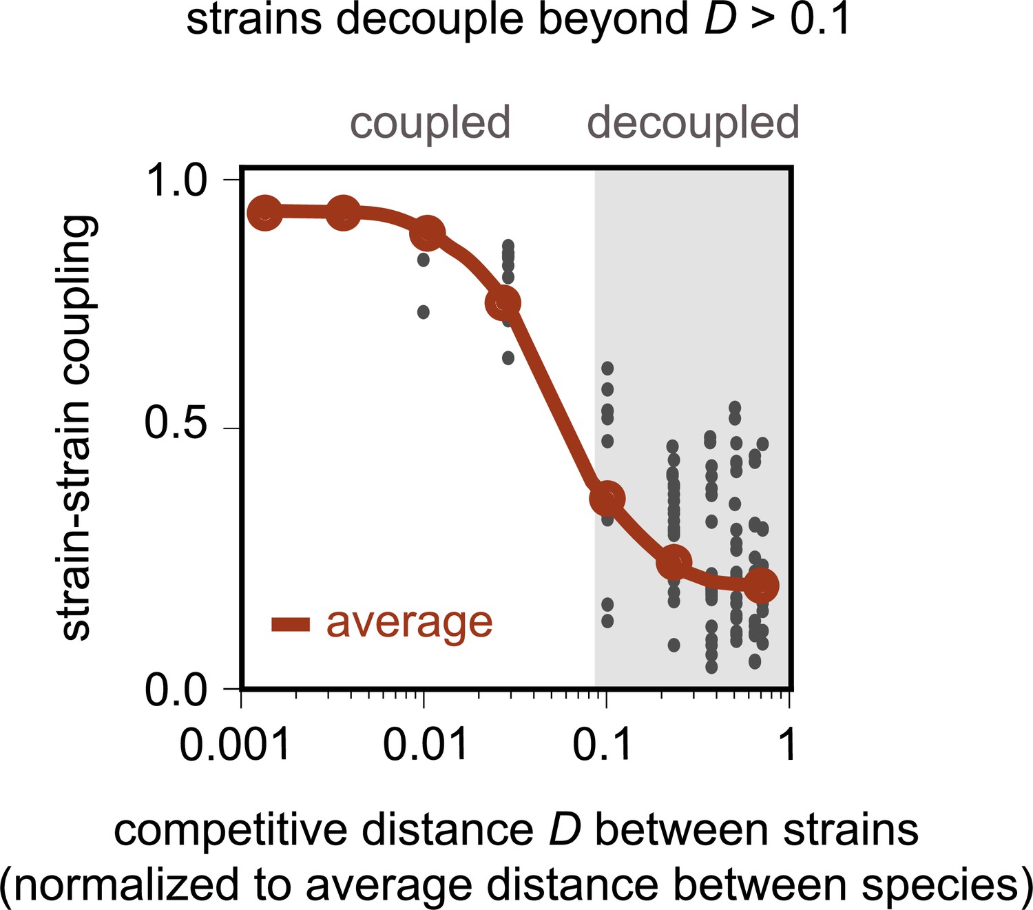
Model recapitulates distance-dependent strain decoupling.
Strain–strain coupling as a function of the competitive distance, D, between strains, in the first consumer-resource model, where strains are ecologically distinct (see Materials and methods). Each gray point represents a conspecific strain pair obtained from simulations of the model. The solid red line shows a moving average (LOESS fit).
Figure 3—figure supplement 8
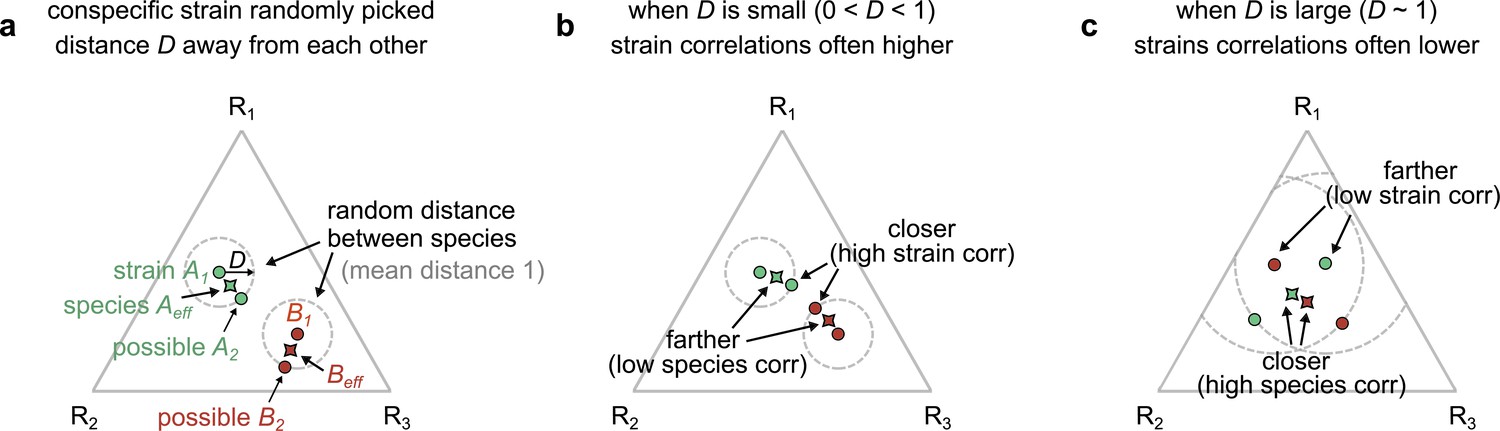
Geometric interpretation of strain–strain and species–species correlations in our models.
(a) Schematic showing the phenotypes (e.g., resource consumption rates) of strains belonging to two different species, A (green) and B (red), generated by our first consumer-resource model, where strains are ecologically distinct, a distance D apart in phenotypic space. Each point represents the consumption rate of a particular strain on three hypothetical resources, shown on a triangular simplex. The effective species consumption rates (obtained by coalescing the two conspecific strains) are shown as pointed shapes with the species’ color. In our space, the average distance between species is normalized to 1. (b) When D is small (~0.1), a pair of interspecific strains can often be closer to each other, and hence more correlated, than the corresponding species themselves (Figure 3—figure supplement 7 shows that distance is a proxy for dynamical correlations). (c) When D is large (~1), the effective species can instead be closer than any of the interspecific strains, leading to higher species–species correlations.
Figure 4 with 4 supplements
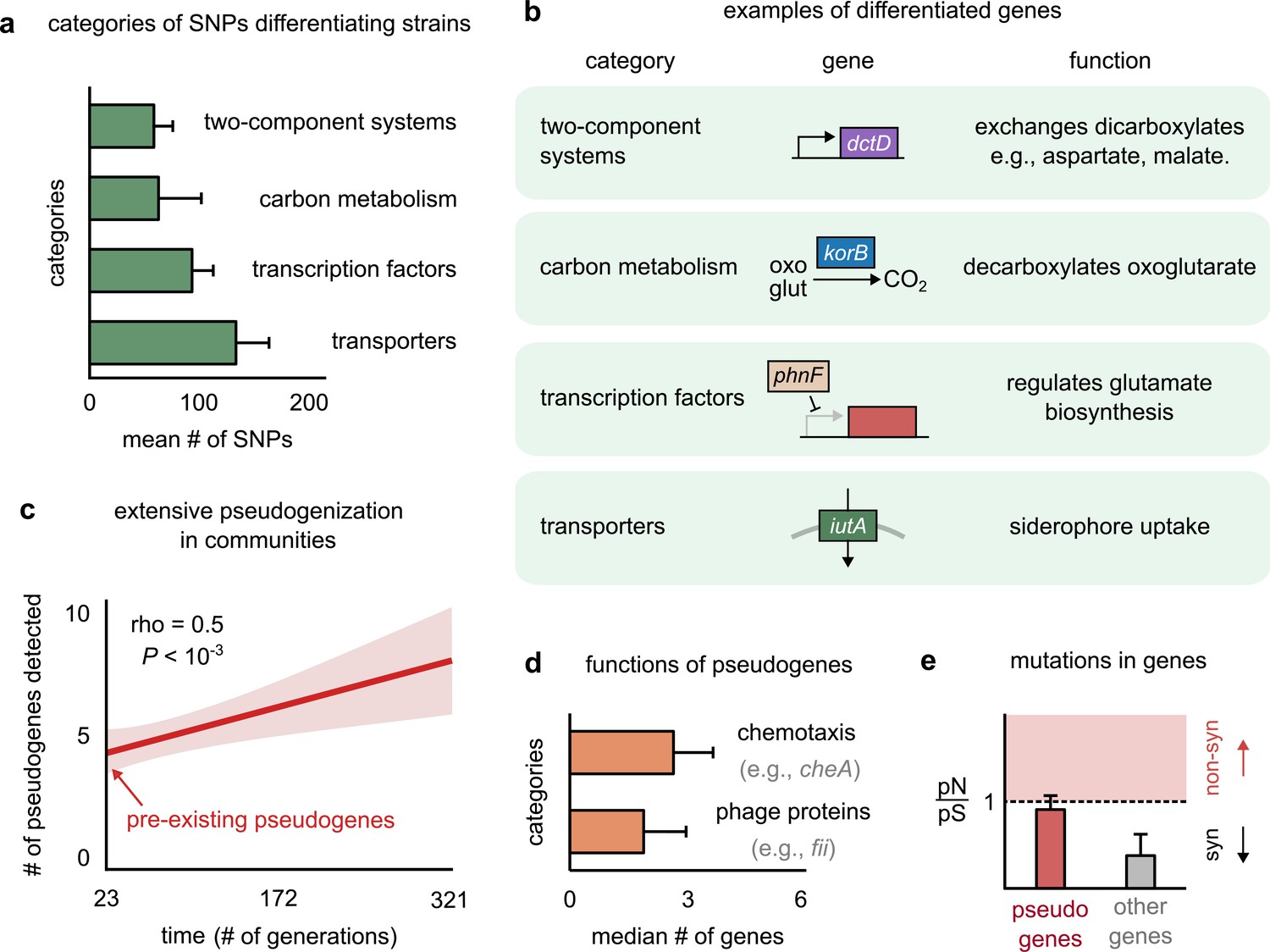
Genetic variation in regulators, transporters, and pseudogenes differentiates strains.
(a) Bar plot showing the four functional categories of genes most enriched in strain-differentiating single-nucleotide polymorphisms (SNPs). The x-axis represents the mean number of SNPs belonging to the category in a strain pair. (b) Table showing an example of a gene in each functional category identified in (a); the middle column shows a schematic of the gene with its name (italics). (c) The average number of pseudogenes detected in strains per strain as a function of time. The solid line shows a linear regression, whose intercept shows the number of pseudogenes detected at the first sequenced time point; the shaded region represents the standard error of the mean (s.e.m.). (d) Bar plot showing the two functional categories most enriched in strain-differentiating pseudogenes. The x-axis represents the median number of genes belonging to the category in a strain pair. (e) Bar plot showing the mean pN/pS of mutations detected in pseudogenes (red) and all other strain-differentiating genes (gray). Dashed line represents the expected pN/pS under a neutral model. All error bars represent s.e.m.
Figure 4—figure supplement 1
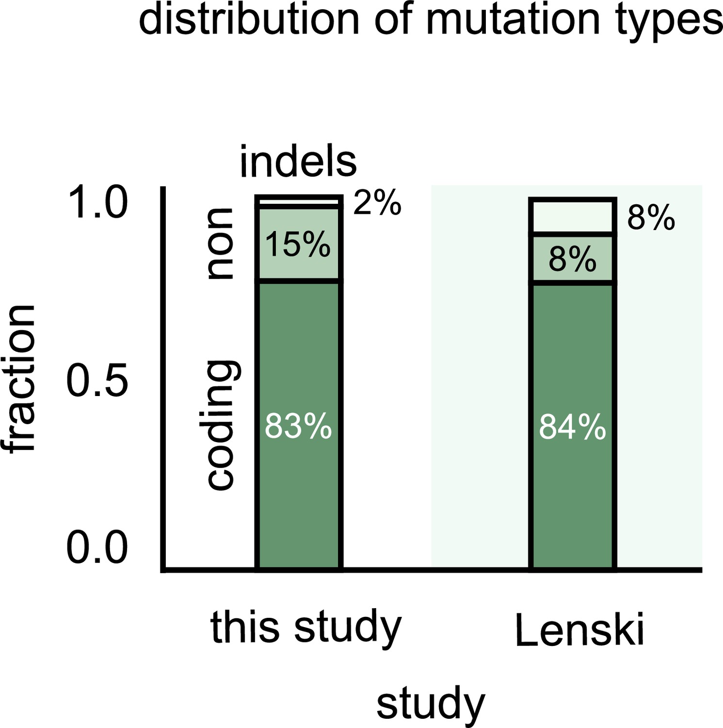
Most single-nucleotide polymorphisms (SNPs) that differentiate strains are in the coding regions.
Stacked bar plots showing the distribution of genetic differences between strains in our communities (left) and variants in the Escherichia coli long-term evolution experiment after 60,000 generations (LTEE) (data from Good et al., 2017). The top stack shows all multiple nucleotide polymorphisms (MNPs) and insertions–deletions (indels); the middle stack shows the SNPs in noncoding regions of strain genomes, and the bottom stack shows SNPs in the coding regions.
Figure 4—figure supplement 2

Mutations accumulate at a similar rate in both pseudogenes and other genes.
Bar plots showing the average number of mutations detected in a pseudogene (left) and any other gene (right) in strains within our 10 communities. The number of mutations was measured per gene per time point to correspond to a rate of mutation accumulation per gene per time point. (Each time point corresponds to about 40 microbial generations.) Error bars show standard error of the mean (s.e.m.). n.s. indicates that there was no significant difference in mutation rate between pseudogenes and other genes (p>0.05, according to a two-sample Student’s t-test).
Figure 4—figure supplement 3

Functional differences enriched in single-nucleotide polymorphisms (SNPs) differentiating strains of Aquitalea magnusonii from the NCBI GenBank database.
Bar plot showing the four functional categories of genes most enriched in strain-differentiating SNPs from random strains of the species Aquitalea magnusonii, derived from the NCBI GenBank database (see Materials and methods). The x-axis represents the mean number of SNPs belonging to the category in a strain pair.
Figure 4—figure supplement 4
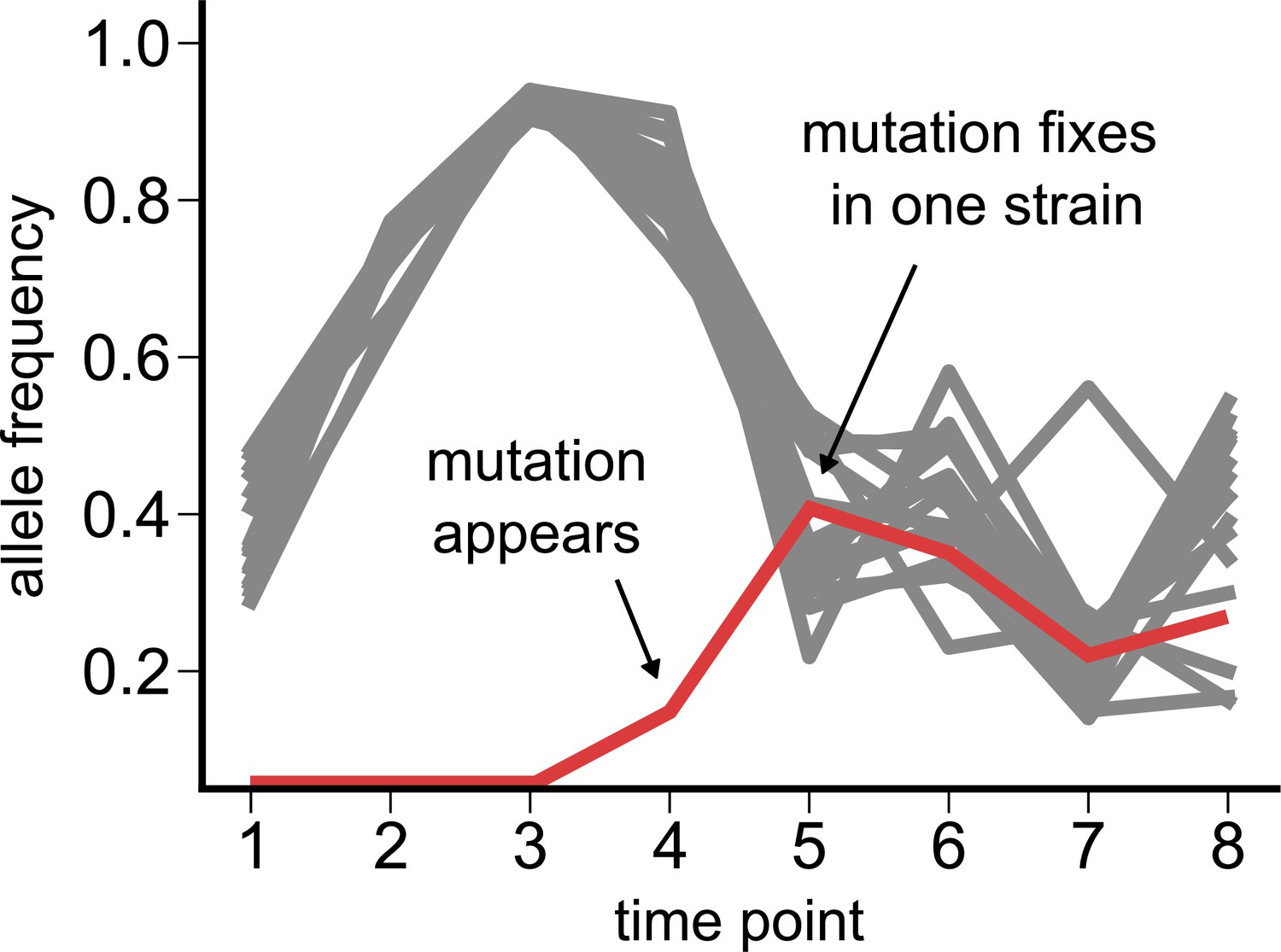
Dynamics of a de novo loss-of-function (pseudogenizing) mutation.
Time course of single-nucleotide polymorphisms (SNPs) in a Pseudomonas species from community M05, where we observe a new loss-of-function mutation (red) appearing at the fourth time point (zero frequency at the first three time points). All other SNPs detected in the species are shown in gray.
Figure 5
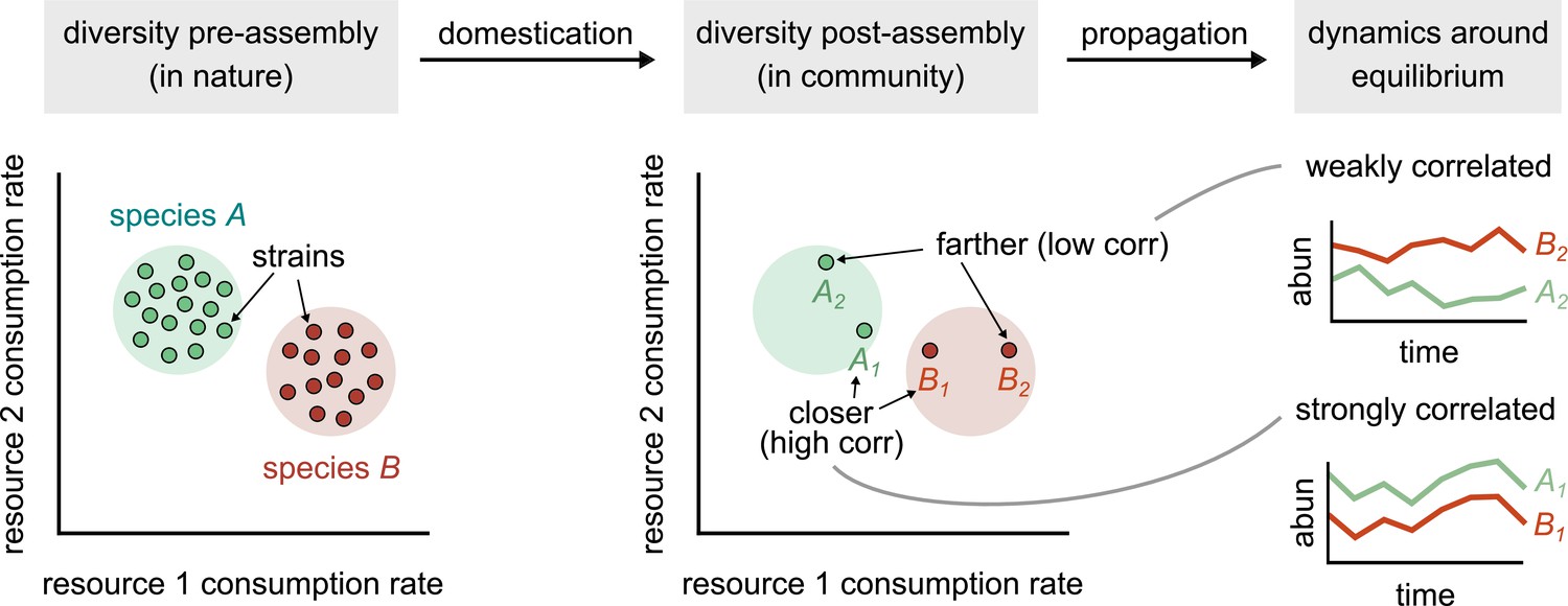
Conceptual model of strain-dominated long-term dynamics.
(Diversity pre-assembly) Schematic showing the phenotypes (e.g., resource consumption rates) of strains belonging to two different species, A (green) and B (red), in a large strain pool in nature. Each point represents the consumption rate of a particular strain on two hypothetical resources. (Diversity post-assembly) When assembled in a community (e.g., domesticated in the lab), a subset of the strains from each species (here, two from each species) may survive and coexist once the community reaches equilibrium. (Dynamics around equilibrium) The strains from each species influence each other’s long-term dynamics around equilibrium. Strains from different species that are closer in phenotype space (A1 and B1) will display strongly correlated dynamics while phenotypically distant strains (A2 and B2) will be weakly correlated.
Additional files
-
Supplementary file 1
Metadata and accession numbers for all 33 assembled genomes used in the study.
- https://cdn.elifesciences.org/articles/74987/elife-74987-supp1-v2.xlsx
-
Supplementary file 2
Set of single-nucleotide polymorphism (SNP) locations and corresponding gene annotations for members of an example community M04.
- https://cdn.elifesciences.org/articles/74987/elife-74987-supp2-v2.xlsx
-
Transparent reporting form
- https://cdn.elifesciences.org/articles/74987/elife-74987-transrepform1-v2.docx
Download links
A two-part list of links to download the article, or parts of the article, in various formats.
Downloads (link to download the article as PDF)
Open citations (links to open the citations from this article in various online reference manager services)
Cite this article (links to download the citations from this article in formats compatible with various reference manager tools)
Interactions between strains govern the eco-evolutionary dynamics of microbial communities
eLife 11:e74987.
https://doi.org/10.7554/eLife.74987


