Internally generated time in the rodent hippocampus is logarithmically compressed
Figures
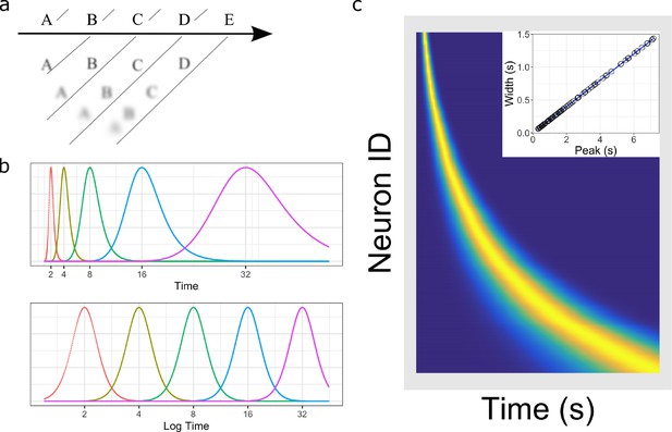
Temporal representation and the Weber-Fechner law.
(a) A compressed timeline of the past. The horizontal line A B C … represents objective reality as the experimenter presents a series of stimuli at regularly spaced intervals. At each moment, memory carries a subjective representation of what happened and when (diagonal line). The time of more recent events are represented more clearly while distant events are less distinguishable from each other, resulting in a compression of the temporal memory. (b) A schematic illustration of a neural implementation of a logarithmically-compressed timeline. Each curve corresponds to a time field. When plotted as a function of time (bottom), the receptive fields appear evenly distributed. When plotted as a function of linear time (top), the time-fields stretch out and become less numerous as time passes. (c) Heat map of hypothetical time cells firing pattern if time is represented logarithmically. (insert) Time-field widths are linearly correlated with time-field peaks. Each row represents the firing pattern of a time cell, sorted by the peak of its time-fields. Dark blue indicates low activity while light yellow indicates high activity. Because time-fields follow logarithmic compression, the sorted peaks form a specific curved line where more time cells fire at the beginning of the delay. In the insert, the time-field widths are plotted as a function of their peaks. Logarithmic compression predicts a linear relationship.
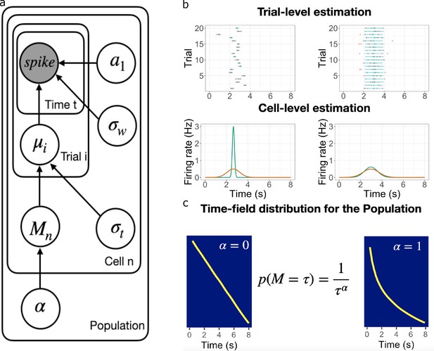
Schematic illustration of the best fitting hierarchical model.
(a) Graphic diagram of the model. Each node represents a variable in the model; the filled node represents the observed spike-train data and open nodes represent latent variables. Arrows represent relationships between variables and plates indicate whether the variable is estimated at the trial level, cell level, or population level. (b-c). Schematic illustration of model fitting for a group of simulated time cells. The model accounts for the firing pattern at individual trials (top rows in b), individual cells (bottom rows in b) and the population level c. (b) Two simulated cells with high (left) vs low (right) variability in time field location across trials. The pink dots indicate the spike train and the blue lines indicate the estimated time fields for each trial. At the cell level, the red lines indicate the average firing patterns across trials and the green lines indicate the estimated time fields for the cell from the model. For both the left and right cells, the overall firing pattern is similar and would result in similar time fields averaged over trials. By contrast, fitting at the individual trial level allows the model to estimate the within-trial time field. (c) Effect of on time field distributions. The prior for finding a time field mean goes like . The yellow line plots the location of the time field peaks, sorted from early to late, for two specific values of . Left: gives a uniform distribution such that all points in the past are equally represented by time cells. Right: resulting in logarithmic compression of the time axis.
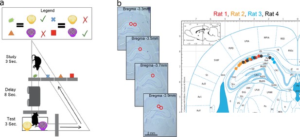
Data acquisition.
(a) Task paradigm. Rats performed a delayed-matching task wherein each of the four study objects indicated which of the two test objects contained hidden reward. (b) Recording sites. The left panel plots example histology sections for animal 1. The red circle indicates the final recording location. The right panel plots the estimated tetrode locations for each rat (coded by different color dots) mapped onto the Paxinos and Watson atlas (1986).
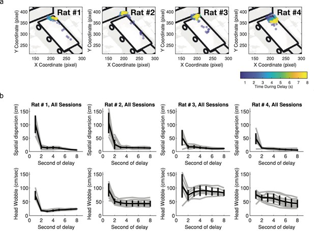
Within trial behavioral variability decreases with delay.
(a) Individual rat’s position across delay. Each dot represents the location at the second of the delay for the corresponding rat, averaged over all trials within one session. Blue indicates early in the delay and yellow indicates late in the delay. Other than Rat 4, there are very little systematic changes in rats’ location across the delay. (b) Behavioral variability of both spatial location (top panel) and head wobbles (bottom panel). In both cases, the behavioral variability decreases as time and thus could not account for the increased temporal variability observed within and across trials for later time cells (Black lines illustrate mean across animals, error bars indicate standard error of the mean and grey lines illustrate individual rats).
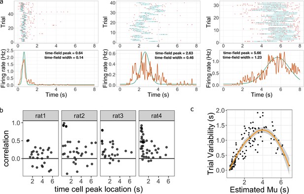
Across-trial variability measured by the Main Model.
(a) Three representative time cells with different temporal receptive fields. Rasters show estimated time fields for each trial as a blue line. In the bottom plots, the red line represents the peristimulus-time histogram averaged over trials. The green line indicates the estimated time field with within-trial time field width (, shown above). Across-trial variability in the location of the time field is estimated separately. (b) Trial-to-trial variability in time field location is correlated with the timing of events early in the trial. Several events happen at the beginning of each trial; the door opens to allow access to the treadmill, the animal steps onto the treadmill and then breaks a beam at the middle of the treadmill. The last event is used as time zero in this study. The y-axis in these graphs shows the Pearson correlation between time field peak location and the estimate of the time rats stepped on the treadmill on each trial. Each dot represent one time cell, shown separately for each rat. The correlation is significantly above zero for rats 2, 3, and 4. (c) Estimated trial variability as a function of the peak firing time . The line shows the best-fitting regression (see text for details).
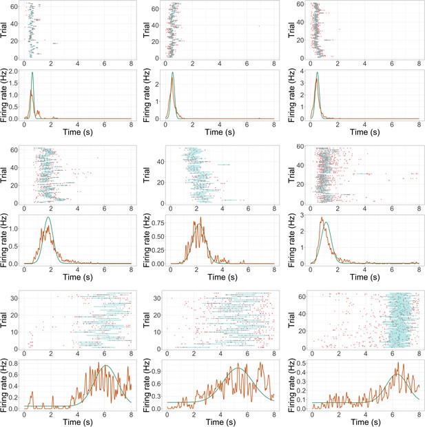
Additional example time cell fits.
Format is the same as Figure 2a.
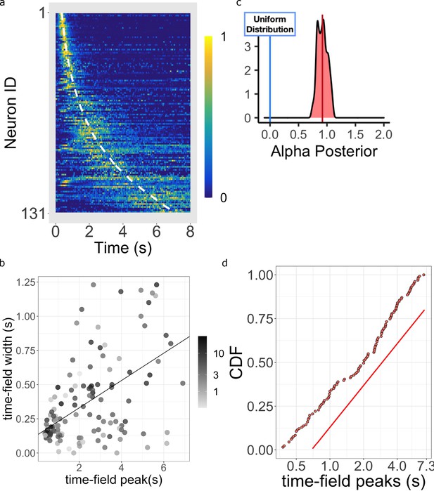
Log-compressed timeline.
(a) Normalized firing rate of time cells sorted by peak time. Yellow indicates high activity and blue indicates low activity. The dashed white line shows the peak times that would be expected if time cells uniformly sampled time. Equivalently, the dashed white line shows the peak times that would result if the probability of observing a peak time went down like corresponding to . (b) The width of the within-trial time field as a function of the peak firing time. The line shows the corresponding linear fit (see text for details). (c) The posterior distribution of the power-law exponent parameter . The blue line on the left marks zero, corresponding to a uniform distribution. The red line marks the mean (.93) of the posterior. (d) Cumulative distribution function (CDF) of time field peaks plotted on a scale. The CDF function forms a straight line only when , corresponding to logarithmic compression of the time axis. The straight red line has the same slope as the best fitting linear regression function to the CDF and is included to facilitate visual inspection of the cumulative function.
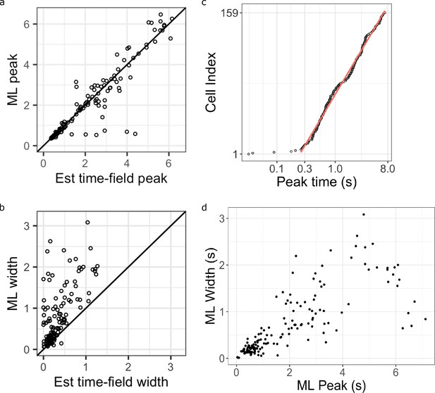
Additional analysis comparing the maximum likelihood fits and the hierarchical Bayesian fits.
(a-b) Maximum likelihood estimated time field peaks (a) and width (b) as a function of their corresponding estimation from the Hierarchical Bayesian method (x-axis). Points on the diagonal line are units where the two values are the same. Points above the diagonal line are units the higher values in the maximum likelihood fits. (c) Maximum likelihood estimated time field peaks plotted on a log-scale (x-axis), sorted on the order of their peak time location (y-axis). Pink line represents linear fit on log data excluding extremely early time cells (prior to 0.25 s). (d) Maximum likelihood estimated time field widths as a function of their time field peaks.
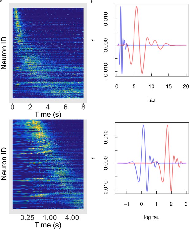
Temporal rescaling translates a logarithmically compressed time line.
(a) Normalized firing rate of time cells sorted by peak time on a linear time scale (top) and on a logarithmic time scale (bottom). Yellow indicates high activity and blue indicates low activity. When plotted on a linear scale, the sequence of time cells appears curved and widens with the passage of time. In contrast, when plotted on a axis time cells appear to uniformly tile the delay. (b) Two functions of time related to one another by a constant scaling factor and . (Top) The two functions are plotted as a function of linear time . (Bottom) The two functions plotted as a function of . Rescaling simply results in a translation of along the axis.
Videos
Video of example trials Three consecutive trials from example session (Rat 1).
An Overhead camera tracked the position of the rat on the maze and on the treadmill, whereas a second camera (inset) positioned at the reward objects allowed us to precisely score when the rat made a choice. Data were acquired at 30 frames per second at 640x480 pixel resolution (1/2 cm per pixel for overhead camera).
Tables
WAIC of the Main Model and alternative models.
| Time field | Trial variability | Population | WAIC | |
|---|---|---|---|---|
| Main Model | Gaussian | Location shift | Power-law | 1.4e+18 |
| Log-normal Time Field Model | Log-normal | - | - | 4.8e+19 |
| Alternative Trial Vary Model | - | Width vary | - | 6.3e+27 |
| Exponential Compression Model | - | - | Exponential | 5.2e+26 |
| Weibull Compression Model | - | - | Weibull | 1.7e+25 |
-
Note: - indicates the same assumption as the Main Model.


