Coordinated multiplexing of information about separate objects in visual cortex
- Department of Neurobiology, Duke University, United States
- Center for Cognitive Neuroscience, Duke University, United States
- Duke Institute for Brain Sciences, United States
- Department of Neuroscience, University of Pittsburgh, United States
- Center for the Neural Basis of Cognition, University of Pittsburgh, United States
- Department of Statistical Science, Duke University, United States
- Department of Psychology and Neuroscience, Duke University, United States
- Department of Biomedical Engineering, Duke University, United States
- Department of Computer Science, Duke University, United States
Figures
Figure 1 with 3 supplements

Experimental design.
(a) Multiunit activity was recorded in V1 and V4 using chronically implanted 10 × 10 or 6 × 8 electrode arrays in six monkeys (see ‘Methods’). (b) In both ‘superimposed’ and ‘adjacent’ datasets, the stimuli were positioned to overlap with (‘adjacent’ dataset) or completely span (‘superimposed’ dataset) the centers of the receptive fields of the recorded neurons. (c) In the ‘superimposed’ dataset, gratings were presented either individually or in combination at a consistent location and were large enough to cover the V1 and V4 receptive fields (stimulus diameter range: 2.5–7o). The combined gratings appeared as a plaid (rightmost panel). Monkeys maintained fixation throughout stimulus presentation and performed no other task. (d) In the V1 ‘adjacent’ dataset, Gabor patches were smaller (typically ~1o, see Figure 1—figure supplement 1) and were presented individually or side-by-side roughly covering the region of the V1 receptive fields. Monkeys maintained fixation while performing an orientation change detection task. The data analyzed in this study involved trials in which the monkeys were attending a third Gabor patch located in the ipsilateral hemifield to perform the orientation change detection. (e) In the V4 ‘adjacent’ dataset, the stimuli consisted of either Gabor patches or natural image stimuli, and monkeys performed a fixation task. Incorrectly performed trials and stimulus presentations during which we detected microsaccades were excluded from all analyses.
Figure 1—figure supplement 1
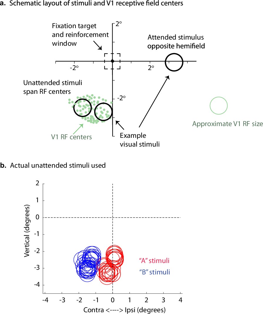
Stimulus and receptive field positions for the V1 "adjacent stimuli" dataset.
(a) Example receptive field positions, sample estimated receptive field size, and layout of stimuli for the V1 dataset involving adjacent stimuli. This figure was adapted from Figure 1B of Ruff and Cohen, 2016. (b) Actual stimuli used. One ‘A’ and one ‘B’ stimulus was used in each session. The sizes of the circles indicate the sizes of the Gabor patches; specifically, the radii are equal to twice the standard deviations of the Gaussian envelopes used to construct the patches. Some stimuli were centered slightly into the ipsilateral hemifield but extended into the contralateral hemifield.
Figure 1—figure supplement 2
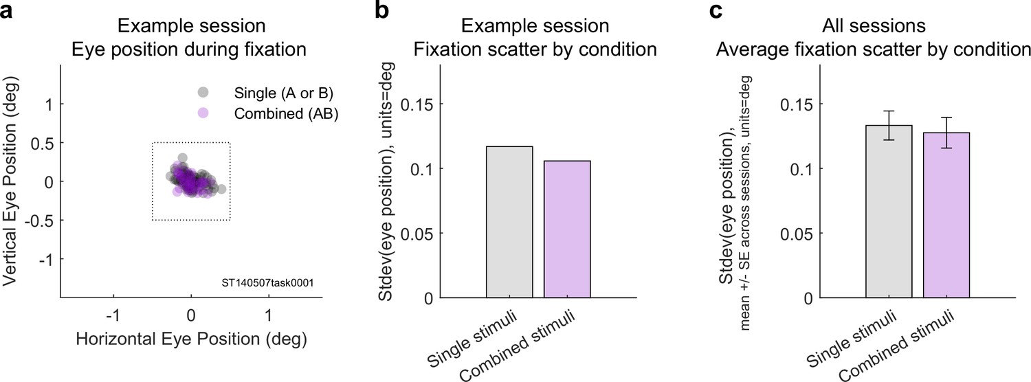
Eye positions did not differ on single vs. combined stimulus trials (adjacent dataset).
(a) Average eye positions during stimulus presentations on single (gray) vs. dual (magenta) stimulus trials during one recording session. Box indicates the fixation window, which was ±0.5°. (b) Geometric mean of the horizontal and vertical standard deviations of eye position for this session. (c) Average standard deviation of eye position across all 16 recording sessions as a function of stimulus type. The single vs. combined stimulus values did not differ (one-tailed paired t-test, p=0.927).
Figure 1—figure supplement 3
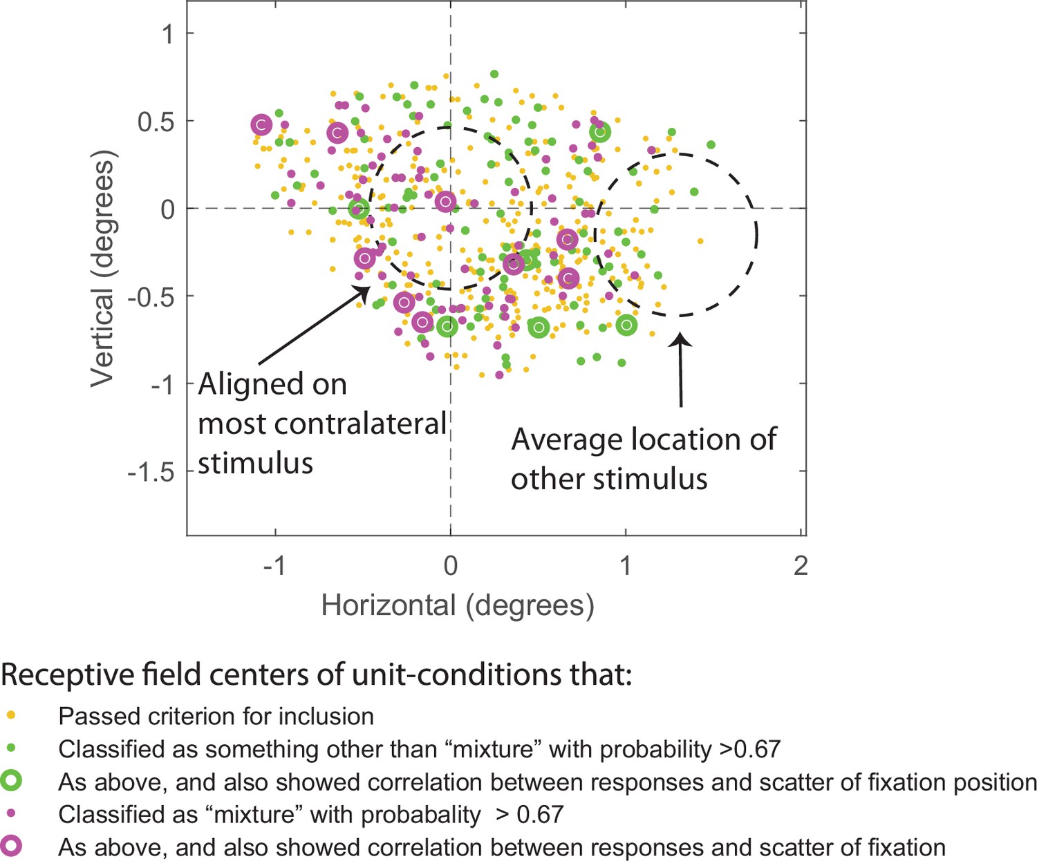
Relationship between receptive field (RF) location, stimulus location, spike count model classification , and whether firing rates also correlated with scatter in eye position.
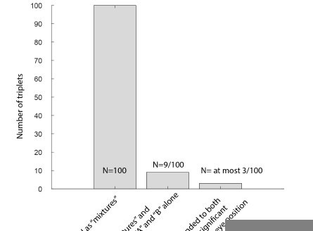
For clarity, receptive field centers are shown in relationship to the location of the more contralateral of the two stimuli; the other stimulus location is shown as the average of all the other stimulus locations in relation to the most contralateral one. Each dot shows the RF center of one unit condition (i.e., unit and particular set of stimulus conditions tested in the analysis). Yellow-orange dots correspond to the RF centers for unit conditions that met criteria for inclusion but for which the Bayesian response pattern classification did not yield a high-confidence result (i.e., probability of successful classification was less than 0.67). Magenta and green symbols indicate RF centers for unit conditions that were classified as ‘mixture’ (magenta) or as something other than a ‘mixture’ (green) with high confidence (probability of successful classification was greater than 0.67). The magenta and green bull’s eye symbols correspond to unit conditions that also showed a significant correlation between firing rate and fixational scatter along the dimension connecting the two stimuli for that session (p<0.01). A small number of unit conditions are not plotted here if the RF mapping did not produce a good estimate of RF center. Overall, significant correlations between spike count and scatter of eye fixation (p<0.01) were identified in 4% of the stimulus conditions that were included for analysis (57/1389, see Table 1). Among the conditions that could be successfully categorized with a probability of at least 0.67 (see Figure 2), the prevalence of significant eye position correlations did not differ significantly for conditions labels as ‘mixtures’ (~9%) vs. those that received some other label (~5%). These proportions did not differ from one another by chi-square test (p=0.1730), nor is there any clear pattern in the location of unit conditions showing correlations with eye scatter in relation to RF centers and stimulus locations as shown in this figure. Finally, about 9% of ‘mixtures’ (n = 9) were responsive to both stimuli (i.e., RF centers were intermediate between the two stimuli and responses exceeded baseline firing by at least 1 standard deviation for both stimuli alone); among these nine, only one showed sensitivity to eye position (11%).
Figure 2 with 1 supplement
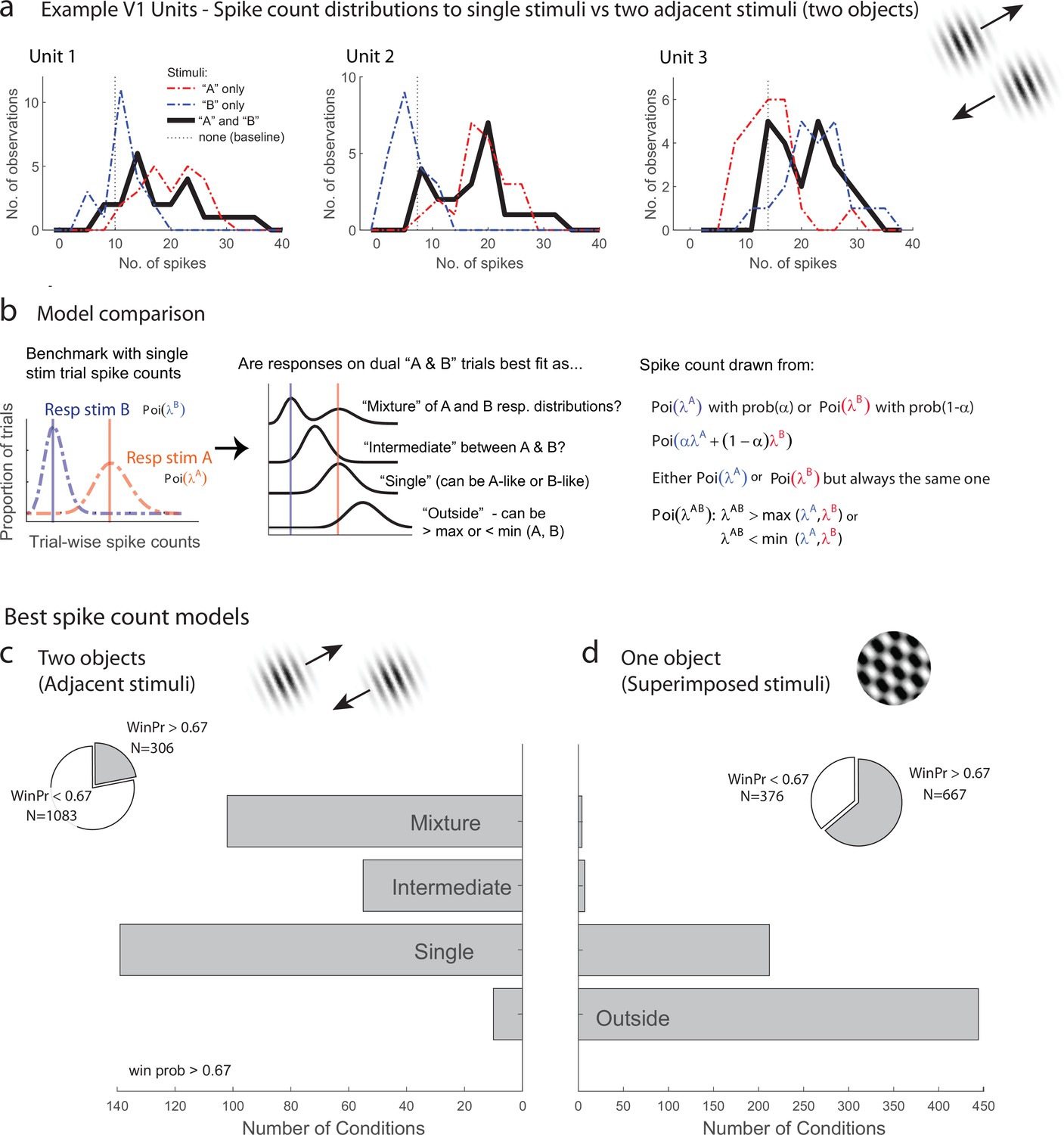
Examples of V1 units showing fluctuating activity pattern and formal statistical analysis.
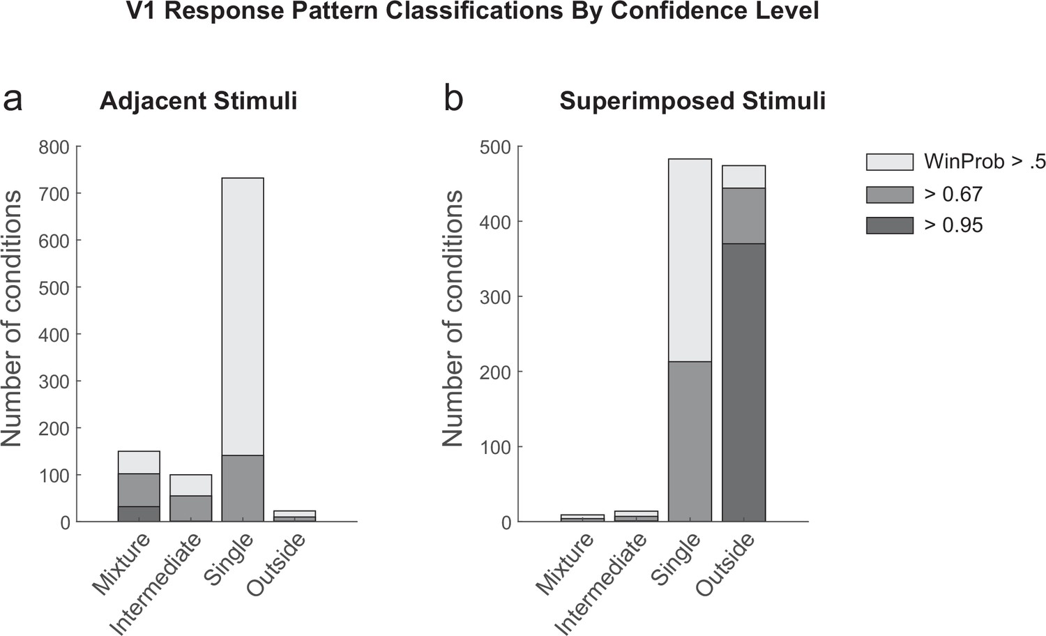
(a) Distribution of spike counts on single stimuli (red, blue) and dual adjacent stimulus presentations (black) for three units in V1 tested with adjacent stimuli. Spikes were counted in a 200 ms window following stimulus onset. (b) Bayesian model comparison regarding spike count distributions. We evaluated the distribution of spike counts on combined stimulus presentations in relation to the distributions observed on when individual stimuli were presented alone. Four possible models were considered as described in the equations and text. Only one case each of the ‘single’ (B-like) and ‘outside’ (λAB > max(λA, λB) is shown. (c, d) Best spike count models for the adjacent (c) and superimposed (d) stimulus datasets, meeting a minimum winning probability of at least 0.67, i.e., the winning model is at least twice as likely as the best alternative. Pie chart insets illustrate proportion of tested conditions that met this confidence threshold. While ‘singles’ dominated in the adjacent stimulus dataset and ‘singles’ and ‘outsides’ dominated in the superimposed stimulus datasets, we focus on the presence of a ‘mixtures’ as an important minority subpopulation present nearly exclusively in the ‘adjacent’ stimulus dataset.
Figure 2—figure supplement 1
Detailed results of the spike count response pattern classification analysis on V1 units for the adjacent (a) and superimposed datasets (b).
Shading indicates the confidence level of the model categorization. A winning probability of >0.5 indicates that the winning model is at least as likely as all other models combined; a probability of >0.67 indicates the winner is at least twice as likely as all others, and a probability of 0.95 indicates it is at least 20 times as likely as all others. Cases with a winning probability of >0.25 (the minimum possible) but less than 0.5 are not shown. As noted in the main text, for the adjacent dataset, ‘mixtures’ represented 33% of the cases in which a particular model was at least twice as likely as all other models combined (i.e., the winning probability of 0.67); overall they represented 14% of the cases that passed the exclusion criteria as described in ‘Methods’ and Table 1.
Figure 3 with 1 supplement

Schematic depiction of possible response patterns and resulting correlations.
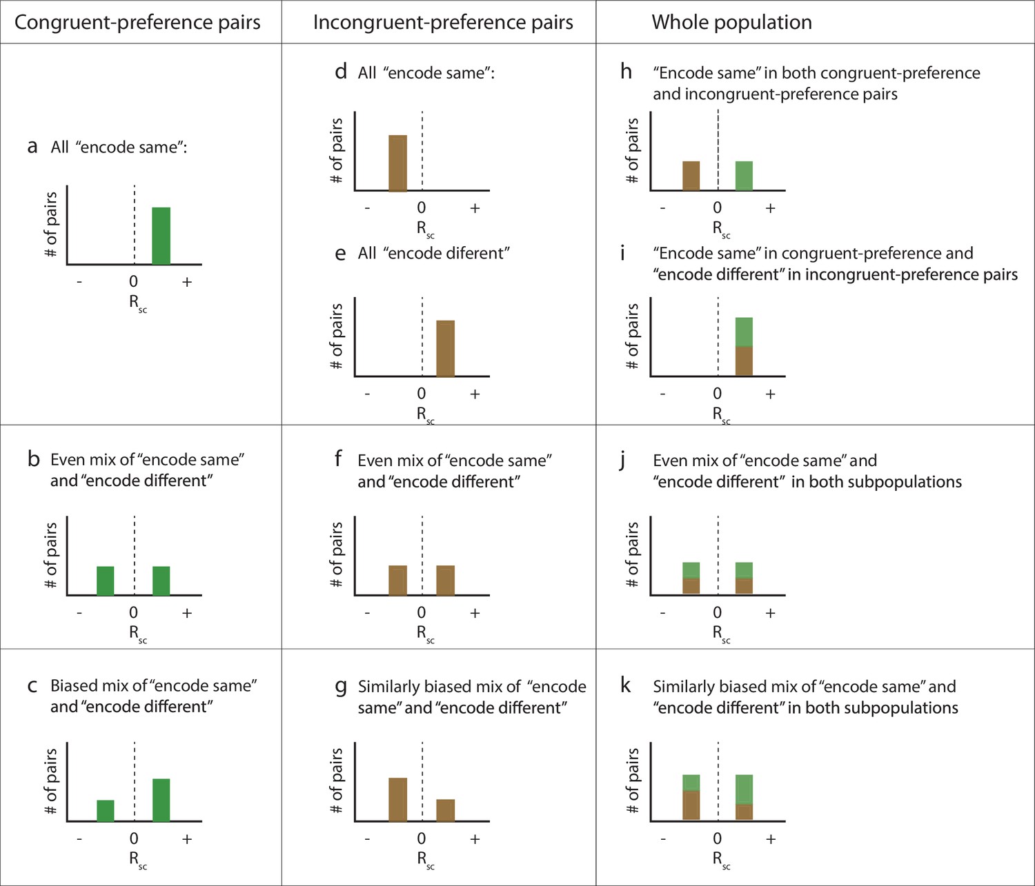
(a) Three hypothetical neurons and their possible spike count distributions for single-stimulus presentations. Units 1 and 2 both respond better to stimulus ‘A’ than to stimulus ‘B’ (“congruent” preferences). Unit 3 shows the opposite pattern (‘incongruent’ preferences). (b, c) Possible pairwise spike count correlation (Rsc) patterns for these units. Two units that have congruent A vs. B response preferences will show positive correlations with each other if they both show ‘A-like’ or ‘B-like’ activity on the same trials (panel b, left). In contrast, if one unit prefers ‘A’ and the other ‘B’ (incongruent), then A-like or B-like activity in both units on the same trial will produce a negative spike count correlation (panel b, right). The opposite pattern applies when units tend to respond to different stimuli on different trials (panel c). (d–f). Key examples of the inferences to be drawn at the population level from these potential correlation patterns. (d) Positive correlations among ‘congruent’ pairs negative correlations among ‘incongruent’ pairs would suggest only one stimulus is encoded at the population level at a time. (e) If both stimuli are encoded in the population, then both positive and negative correlations might be observed among both congruent and incongruent pairs. (f) Both stimuli may be encoded, but not necessarily equally. This example shows a pattern intermediate between the illustrations in (d) and (e), and is consistent with one of the two stimuli being overrepresented compared to the other. Other possibilities exist as well, including that neurons may could be uncorrelated with one another (not shown), which would also serve to preserve information about both stimuli at the population level.
Figure 3—figure supplement 1
Details of population-level predictions under different scenarios.
Schematic histograms of the possible patterns of spike count correlations across all the pairs of recorded neurons as a function of whether they share the same (‘congruent’) stimulus preferences or have different (‘incongruent’) preferences, and whether they tend to ‘encode’ the same stimulus or different stimuli on each presentation (panel h is panel a + panel d; i = a + e; j = b + f; k = c + g; the bottom row [c, g, k] is a biased version of the row above [b, f, j]). Panels (h), (j), and (k) are included in Figure 3 as panels (d), (e), and (f).
Figure 4
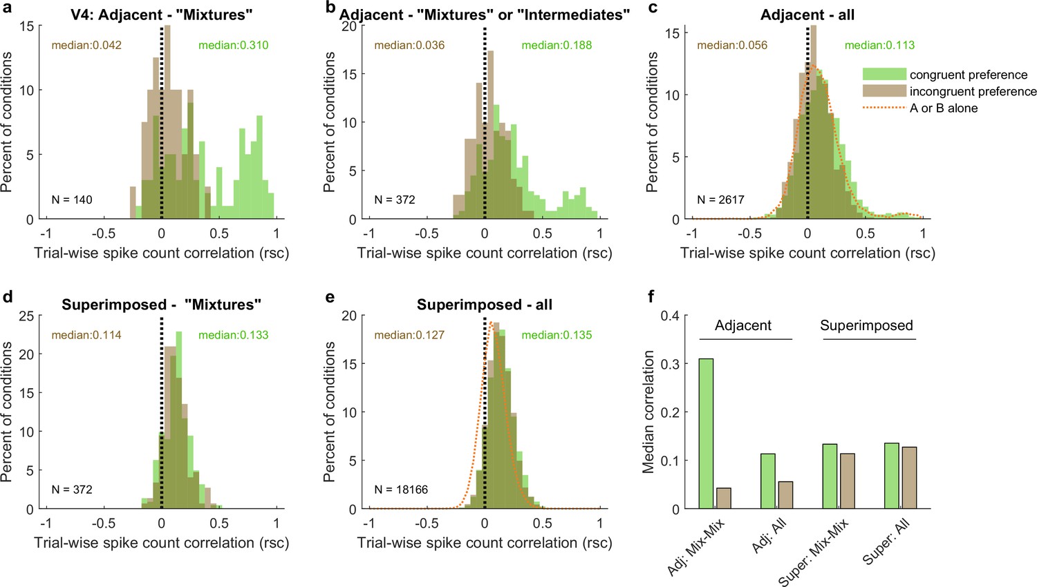
Patterns of spike count correlations among pairs of V1 neurons in different subgroups and conditions.
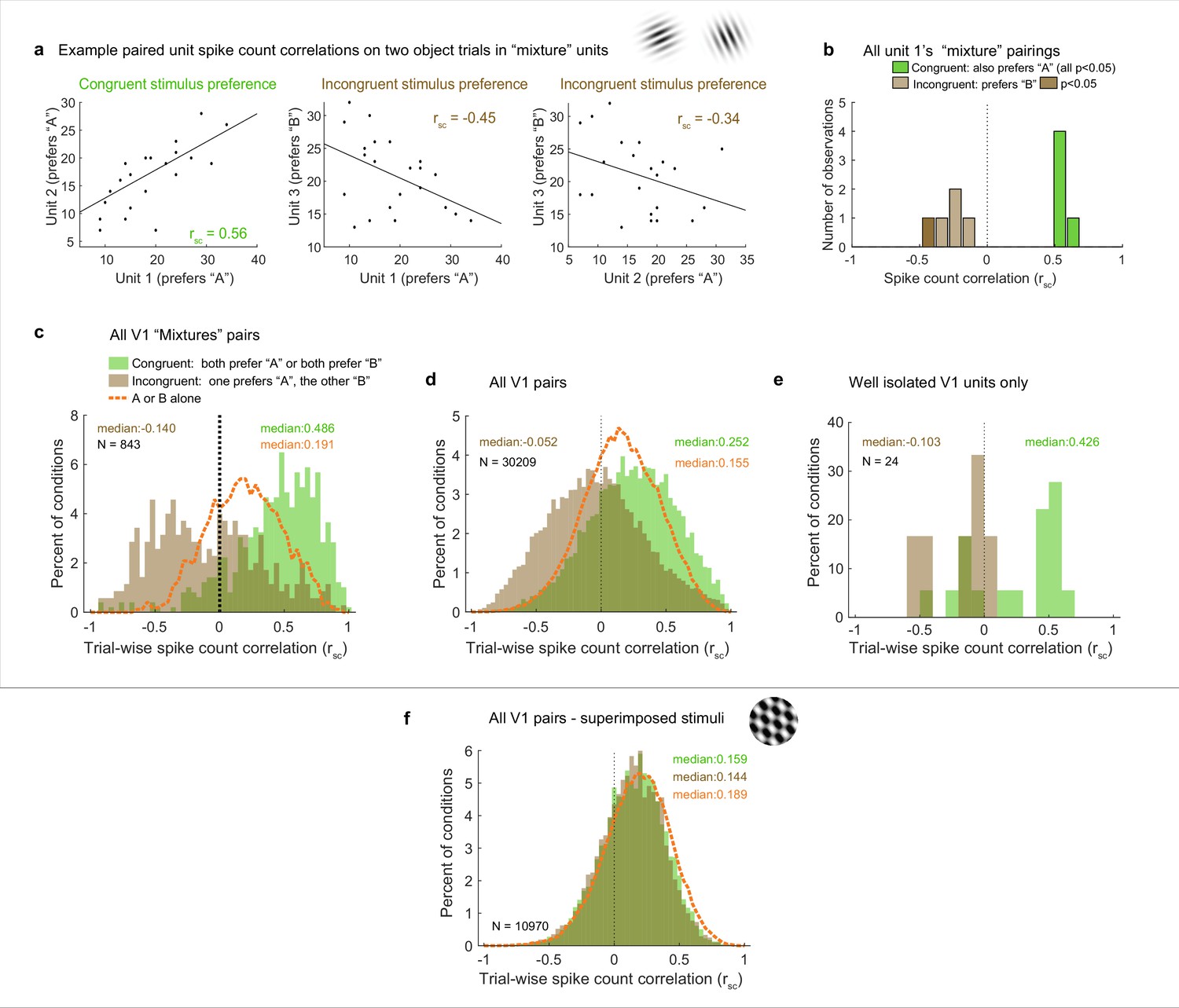
(a) Example units’ correlation patterns (same units as Figure 2a). The two units that shared a similar tuning preference (‘congruent’) exhibited positively correlated spike count variation on individual stimulus presentations for the dual stimulus condition (left), whereas both units 1 and 2 exhibited a negative correlation with the differently tuned (‘incongruent’) unit 3 (middle and right panels). (b) Distribution of Rsc values for the other units that were simultaneously recorded with unit 1 and were also classified as ‘mixtures,’ color coded according to whether the stimulus preference of the other unit was the same as that of unit 1 (‘congruent,’ green) or different (‘incongruent,’ brown). All of the ‘congruent’ pairs exhibited positive correlations, and 5 of 5 were individually significant (p<0.05). All of the ‘incongruent’ pairs exhibited negative correlations, and 1 of 5 was individually significant (p<0.05). (c) Overall, neural pairs in which both units met the ‘mixture’ classification showed distinct positive and negative patterns of correlation in response to adjacent stimuli. Positive correlations were more likely to occur among pairs of neurons that responded more strongly to the same individual stimuli (‘congruent,’ green bars, median rsc = 0.486), and negative correlations were more likely to occur among pairs of neurons that responded more strongly to different individual stimuli (‘incongruent,’ brown bars, median rsc = –0.14, p<0.0001, see ‘Methods’). This bimodal distribution did not occur when only a single stimulus was presented (dashed orange line). (d, e) This pattern of results held even when all the unit pairs were considered in aggregate (d, ‘congruent preference’ pairs, median rsc = 0.252; ‘incongruent preference’ pairs, median rsc = –0.052, p<0.0001), and also occurred for well-isolated single units (e). (f) However, among pairs recorded during presentation of superimposed gratings, this pattern was not apparent: unit pairs tended to show positive correlations in both cases (‘congruent-preference’ median rsc = 0.159, ‘incongruent-preference’ median rsc = 0.144), and there was little evident difference compared to when a single grating was presented (orange line). See Figure 4—source data 1 for additional information.
-
Figure 4—source data 1
Median spike count correlations for additional subgroups of the V1 adjacent stimuli dataset.
The top two rows show the median spike count correlations observed for dual stimuli for various types of pairs of units, and correspond to the data shown in Figure 4 and Figure 5 in the main text (gray background). The next three rows show the same analyses conducted for trials involving single stimuli. Here, the ‘congruent’ group was subdivided according to whether the presented stimulus was the one that elicited the stronger response (‘driven’) or the weaker one (‘not driven’). The bottom two rows show the differences in the medians observed for the relevant congruent and incongruent groups (lines 1 minus 2 and lines 3 minus 5; green background).
- https://cdn.elifesciences.org/articles/76452/elife-76452-fig4-data1-v1.docx
Figure 5
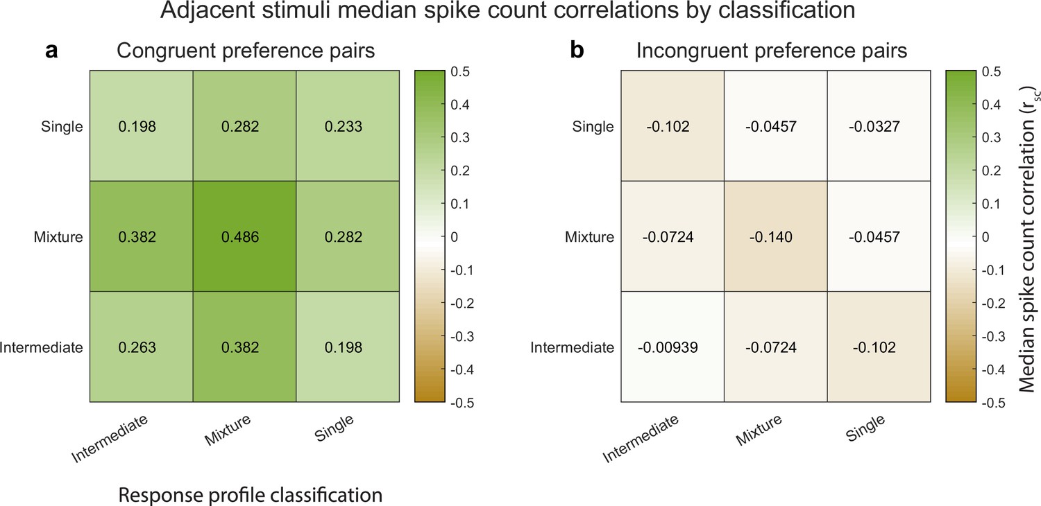
Median spike count correlations as a function of congruent-incongruent preference (panel a vs. panel b) and as a function of the spike count response profile classification resulting from the Bayesian model comparison for the V1 adjacent stimulus dataset.
The ‘mixture’-‘mixture’ combinations produced the strongest positive (congruent preference pairs) and strongest negative (incongruent preference pairs) median spike count correlations, but all other combinations also involved positive median correlations for congruent preference pairs and negative median correlations for incongruent preference pairs. See Figure 4—source data 1 for additional information.
Figure 6
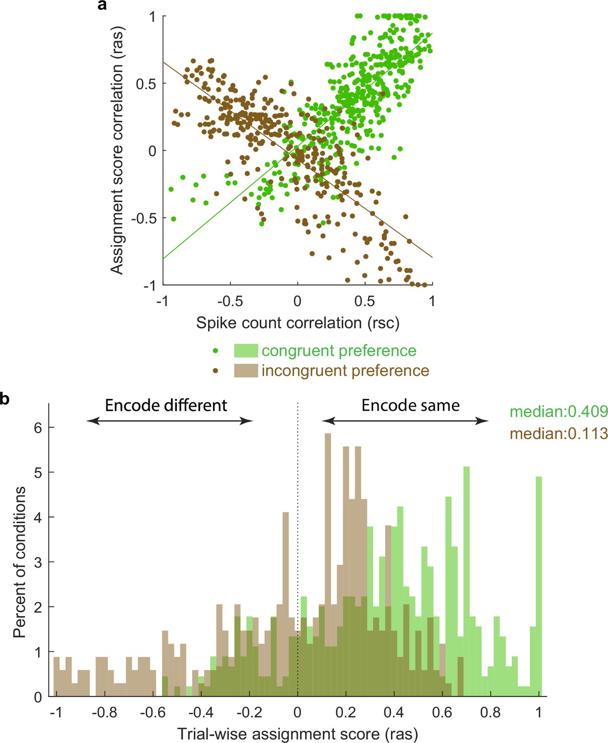
Activity fluctuations in ‘mixture’ pairs of unit conditions are consistent with a bias toward both units in the pair tending to signal the same stimulus at the same time.
This analysis involved the Pearson’s correlation coefficients computed on assignments scores (ras), which take into account whether the response on combined ‘AB’ stimulus presentations is more ‘A-like’ vs. ‘B-like.’ For two units that share a similar preference (e.g., both respond better to A or both respond better to B), this correlation will have the same sign as the spike count correlation (panel a, green points, positively sloped best-fit line). For two units that prefer different stimuli, this correlation will be opposite in sign to the spike count correlation (panel a, brown points, negatively sloped best-fit line). The overall positive skew in the assignment score correlations for both the ‘same’ and ‘different’ preferring unit condition pairs (panel b) therefore indicates a bias for the same stimulus at the same time. The negative tail indicates the other stimulus is nevertheless also represented in a (smaller) subpopulation of neurons.
Figure 7 with 1 supplement

Results of the spike count response pattern classification analysis for V4 units.
Shown here are classifications for all units regardless of confidence level, and results from gabors and natural images are combined. See Figure 7—figure supplement 1 for a breakdown by confidence level and for gabors and natural images separately. ‘Mixtures’ were seen in both datasets, but ‘intermediates’ were seen primarily in the adjacent-stimulus dataset. These two categories can in principle both contain fluctuating activity, and are grouped here as ‘between’ (i.e., the average response for dual stimuli for these two categories is between the average responses to single stimuli). As with V1, the relative proportions of ‘singles’ vs. ‘outsides’ also differed across these datasets. The combined incidence of these ‘not between’ categories was higher for the superimposed dataset than for the adjacent dataset.
Figure 7—figure supplement 1
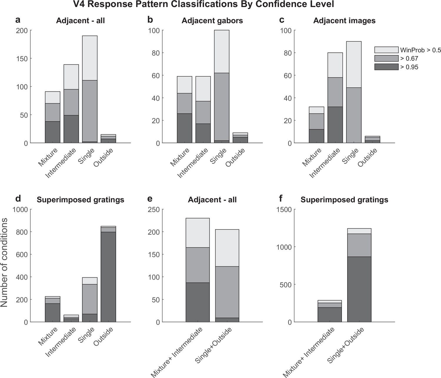
Detailed results of the spike count response pattern classification analysis on V4 units for the adjacent (a–c, e) and superimposed datasets (d, f).
Shading indicates the confidence level of the model categorization as described in Figure 3. Experiments involving adjacent gabors and adjacent images are combined in panels (a) and (e) and broken out separately in panels (b) and (c). Panels (e) and (f) show the sums of the corresponding bars in panels (a) and (d).
Figure 8
Like V1, pairs of V4 units show different patterns of spike count correlations when there are two adjacent stimuli vs. when there is one superimposed stimulus, depending on the tuning preferences of the pair.
(a) Mixture–mixture pairs for adjacent stimuli (gabors or images), color coded by whether the two units in the pair shared the same or had different tuning preferences. The ‘congruent preference’ and ‘incongruent preference’ median correlations differed (p<0.002, see ‘Methods’). (b) Similar but including intermediate–intermediate pairs since they too may be fluctuating (median difference p<0.0001). (c) All unit pairs tested with adjacent stimuli, regardless of classification in the modeling analysis (median difference p<0.0001). Orange line shows the results for single-stimulus presentations. (d) Similar to (a) but for superimposed stimuli (median difference not significant). (e) Similar to (c) but for superimposed stimuli (median difference not significant). (f) Comparison of median spike count correlations in the adjacent vs. superimposed datasets, color coded by tuning preference.
Figure 9

At the population level, each stimulus appears to be encoded by at least some units on every trial.
(a) The activity of 10 simultaneously recorded V1 units on 18 trials in which a particular combination of two adjacent gratings were presented. The activity of each unit was color coded according to how ‘A-like’ (red) or ‘B-like’ (blue) the responses were on that trial. Only units for which ‘mixture’ was the best descriptor of their response patterns are shown (winning probability >0.5, indicating ‘mixture’ was at least as likely as all other possibilities combined). There are both red and blue squares in every row, supporting the interpretation that these cells exhibited fluctuations across trials. There are also red and blue squares in every column, indicating that on every trial some cells were responding in an ‘A-like’ fashion and others in a ‘B-like’ fashion. (b) Histogram of the number of cells responding in ‘A-like,’ ‘B-like,’ or intermediate levels on each trial (each trace is a separate trial). (c) Similar histogram, but indicating the number of trials in which each cell responded in an ‘A-like,’ ‘B-like,’ or intermediate firing pattern. (d) A simulation of the expected pattern if the observed fluctuations chiefly involved covert fluctuations of attention – cells would be expected to show strong correlations with each other and respond in ‘A-like’ or ‘B-like’ fashion on the same trials. This simulation was constructed by retaining the cell identity and sets of responses observed for each cell, then instituting a strong correlation between them and shuffling the trials in random order. (e) A simulation of the expected pattern if cells were not fluctuating but instead averaging their inputs. This simulation was constructed by assuming that each trial’s response represented a draw from a normal distribution with the same mean as the observed distribution (0.34) and a standard deviation of 0.10.
Author response image 1

This schematic focuses on the “congruent” situation, assuming these involve neurons with adjacentreceptive fields.
Even within this group, variation in eye position would create both positive and negative correlations, and would not be expected to selectively impact dual stimulus trials or congruent vs incongruent pairs of neurons.
Author response image 2
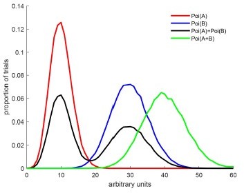
The red and blue curves illustrate two Poisson distributions with rates A and B.
The black curve illustrates draws from a mixture of those two poissons – in this case, there is a 50% chance that the draw is from rate A and a 50% chance from rate B. The green curve illustrates draws from a single Poisson whose rate is equal to A+B. We would classify the green curve as an outside because A+B>max(A,B). An intermediate is not shown here but it would have a shape like the green curve and a peak between the red and blue curves – e.g. Poi((A+B)/2).
Author response image 3
Tables
Table 1
Summary of included data.
Analyses were conducted on ‘triplets,’ consisting of a combination of A, B, and AB conditions. If the spikes evoked by the A and B stimuli failed to follow Poisson distributions with substantially separated means, the triplet was excluded from analysis. This table shows the numbers of triplets that survived these exclusion criteria for each brain area and type of stimulus condition (last column), as well as the numbers of monkeys, distinct units, and sessions that they were derived from (columns 6–9).
| 1. Stimuli | 2. Brain area | 3. Task | 4. Monkeys | 5. Available sessions | 6. Sessions for which at least one triplet was included | 7. Available units | 8. Units for which at least one triplet was included | 9. Triplets passing exclusion criteria for analysis |
|---|---|---|---|---|---|---|---|---|
| Adjacent | V1 | Attention | ST, BR | 16 | 16 | 1604 | 935 | 1389 |
| V4 | Fixation | BA, HO | 17 | 17 | 991 | 274 | 456 | |
| Superimposed | V1 | Fixation | ST, BR | 25 | 23 | 2304 | 770 | 1686 |
| V4 | Fixation | JD, SY | 21 | 21 | 1744 | 817 | 1529 |
Table 2
Trial counts for included sessions.
The values reported are calculated for individual recording sessions for which at least one triplet was included for the analysis; the numbers of trials are the same for all simultaneously recorded units within a session. The values for ‘A’ and ‘B’ trials indicate the values for either A or B; that is, there were on average 21 ‘A’ trials and 21 ‘B’ trials for each triplet in the adjacent V1 dataset.
| Stimuli | Brain area | Number of ‘A’ and ‘B’ trials | Number of ‘AB’ trials | ||||||
|---|---|---|---|---|---|---|---|---|---|
| Mean | SD | Min | Max | Mean | SD | Min | Max | ||
| Adjacent | V1 | 21.0 | 12.3 | 6 | 56 | 17.8 | 12.8 | 6 | 59 |
| V4 | 72.8 | 30.3 | 5 | 136 | 72.2 | 30.7 | 6 | 132 | |
| Superimposed | V1 | 25.4 | 15.4 | 7 | 74 | 23.3 | 12.1 | 7 | 64 |
| V4 | 131.3 | 42.0 | 20 | 196 | 184.5 | 64.6 | 20 | 270 | |
Author response table 1
Median spike count correlations for additional subgroups of the V1 adjacent stimuli dataset.
The top two rows show the median spike count correlations observed for dual stimuli for various types of pairs of units, and correspond to the data shown in figures 4 and 5 in the main text (first two rows). The next three rows show the same analyses conducted for trials involving single stimuli. Here, the “congruent” group was subdivided according to whether the presented stimulus was the one that elicited the stronger response (“driven”) or the weaker one (“not driven”). The bottom two rows show the differences in the medians observed for the relevant congruent and incongruent groups (lines 1 minus 2 and lines 3 minus 5)
| All | Mixture-Mixture pairs | Intermediate-Intermediate pairs | Single-Single pairs | |
|---|---|---|---|---|
| Congruent AB | 0.252 | 0.486 | 0.263 | 0.233 |
| Incongruent AB | -0.052 | -0.140 | -0.009 | -0.032 |
| Congruent driven A or B | 0.251 | 0.384 | 0.266 | 0.250 |
| Congruent not driven A or B | 0.145 | 0.132 | 0.142 | 0.147 |
| Incongruent A or B | 0.116 | 0.127 | 0.076 | 0.108 |
| Congruent minus Incongruent AB | 0.304 | 0.626 | 0.272 | 0.265 |
| Congruent driven minus incongruent A or B | 0.135 | 0.257 | 0.190 | 0.142 |
Author response table 2
| RF location | Left of left stim (group “i”) | “In” left stim(group “ii”) | Between stims(group “iii”) | “In” right stim(group “iv”) | Right of right stim (group “v”) |
|---|---|---|---|---|---|
| totals | 37 | 128 | 58 | 28 | 0 |
| “mixtures” | 22 | 45 | 19 | 4 | 0 |
| Percent “mixtures” | 59% | 35% | 33% | 14% | - |
| Num mixtures also eye position sensitive | 3 | 4 | 2 | 0 | - |
| Percent of mixtures that are eye position sensitive | 13.6% | 8.9% | 10.5% | 0% | - |
Additional files
-
Transparent reporting form
- https://cdn.elifesciences.org/articles/76452/elife-76452-transrepform1-v1.docx
-
Source data 1
Source data for the figures and analyses in this article are included as a zip file.
The file and folder names are informative regarding which analyses they relate to. Some analyses are based on multiple runs of the modeling code, with slight variations due to the probabilistic nature of the analysis.
- https://cdn.elifesciences.org/articles/76452/elife-76452-data1-v1.zip
Download links
A two-part list of links to download the article, or parts of the article, in various formats.
Downloads (link to download the article as PDF)
Open citations (links to open the citations from this article in various online reference manager services)
Cite this article (links to download the citations from this article in formats compatible with various reference manager tools)
Coordinated multiplexing of information about separate objects in visual cortex
eLife 11:e76452.
https://doi.org/10.7554/eLife.76452


