Locally adaptive temperature response of vegetative growth in Arabidopsis thaliana
Figures
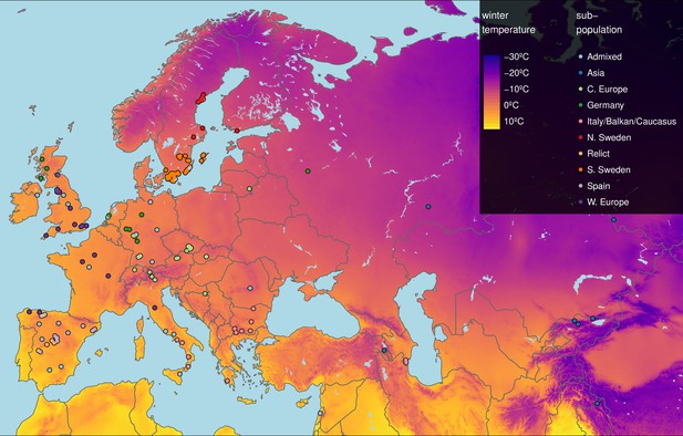
Geographic origin of the 249 accessions.
Map color shows winter temperature (mean temperature of coldest quarter). Accessions are colored according to subpopulation (1001 Genomes Consortium, 2016). Accessions from the warmest and coldest regions are from Greece and the Himalayas, respectively.
-
Figure 1—source data 1
List of all 249 accessions with indication of the 8 accessions used for the transcriptome analysis.
- https://cdn.elifesciences.org/articles/77913/elife-77913-fig1-data1-v1.csv
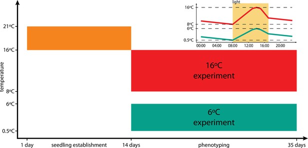
Timeline of the experiments.
Upon stratification, seeds germinated and seedlings established over 14 days. After 14 days, plants were exposed to either 16°C treatment or 6°C treatment. Insert shows the 24 hr temperature profile for the 16°C (red) and 6°C (green) treatments, with light period indicated in yellow.
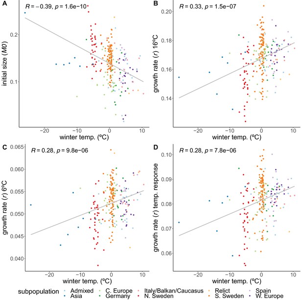
Correlations of growth parameters with winter temperature.
(A) Initial size. (B) Growth rate at 16°C. (C) Growth rate at 6°C. (D) Temperature response of growth rate. Colors indicate genetically defined subpopulations of the accessions (1001 Genomes Consortium, 2016).

Variation among accessions of initial size (M0), growth rate (), and the temperature response of the growth rate.
Distributions of initial size (A), growth rate (B) and growth rate's temperature response (C).
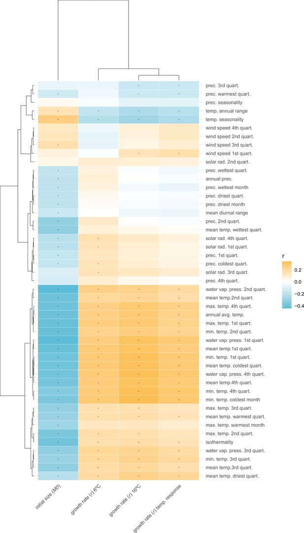
Correlations between growth parameters and (bio)climate variables.
(Bio)climate variables taken from the worldclim database (https://www.worldclim.org). Colors are correlation coefficients, correlations with false discovery rate (FDR)-corrected p-values <0.05 are indicated with a star. The order of the climate variables and phenotypes is based on hierarchical clustering.

Population structure-corrected correlations between growth parameters and (bio)climate variables.
(Bio)climate variables taken from the worldclim database (https://www.worldclim.org). Colors are the coefficients for the climate variable in the mixed model with phenotype as dependent variable and population structure as random factor. Phenotypes and climate variables were standardized, making regression coefficients comparable to correlation coefficients. Correlations with false discovery rate (FDR)-corrected p-values <0.05 are indicated with a star. The order of the climate variables and phenotypes is based on hierarchical clustering.
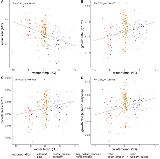
Correlations of growth parameters with winter temperature, excluding accessions defined as Asian subpopulation.
(A) Initial size. (B) Growth rate at 16ºC. (C) Growth rate at 6ºC. (D) Temperature response of growth rate. Colors indicate genetically defined subpopulations of the accessions (1001 Genomes Consortium, 2016).
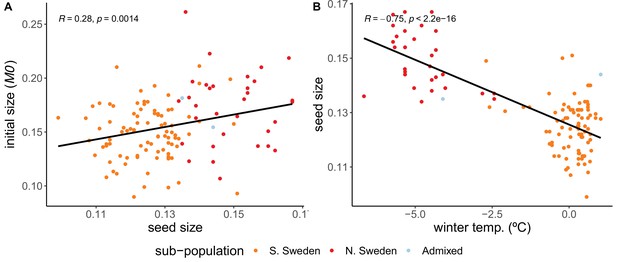
Seed size correlations.
(A) Correlation between initial size and seed size. (B) Correlation between seed size and winter temperature. Accessions are a subset of 123 Swedish accessions.

Growth rate’s temperature response variation.
(A) Coefficient of variance of the growth rate’s temperature response, for each subpopulation, correlated with each subpopulation’s respective median winter temperature. (B) Correlation between growth rate’s temperature response and winter temperature, excluding all Swedish accessions. (C) Correlation between growth rate’s temperature response and winter temperature, exclusively for Swedish accessions.
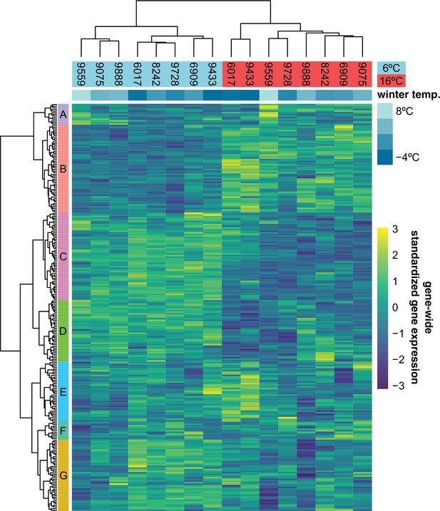
Expression of 251 previously described cold-acclimation genes.
Expression is shown as the gene-wide z-scores of the normalized counts. The z-scores allow for grouping genes with a similar expression behavior over the different accessions in both temperatures. The top bar indicates winter temperature (°C) for each accession’s origin. Both dendrograms along y-axis and x-axis, respectively, show hierarchical clustering of genes, and of accessions in both temperatures.
-
Figure 3—source data 1
Cold-acclimation genes and their expression cluster membership as shown in Figure 3.
- https://cdn.elifesciences.org/articles/77913/elife-77913-fig3-data1-v1.csv
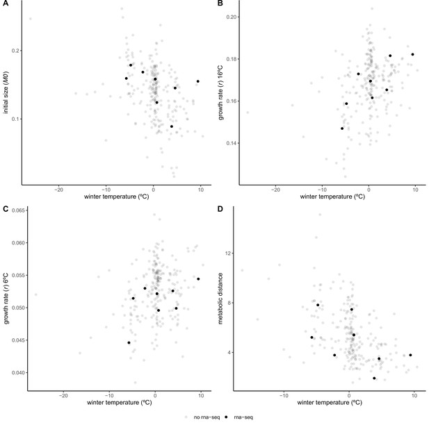
Growth parameters and metabolic distance of RNA-sequenced accessions in relation to local mean temperature of coldest quarter.
Initial size (A), growth rate at 16°C (B) and 6°C (C), and metabolic distance (D), as a measure of temperature response over all 37 measured primary metabolites (Weiszmann et al., 2020). Accessions selected for RNA-sequencing are depicted in black, remaining accessions are shown in gray. These eight accessions were chosen to represent the climatic variation in the full panel.
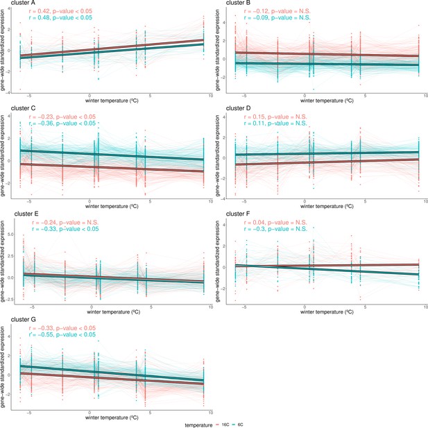
Cluster-specific expression in relation to winter temperature.
Gene-wide standardized expression at 16°C (red) and 6°C (blue) values are plotted for each gene in clusters 1–7 (A–G), as defined in Figure 3. Expression values of each gene are connected with thin lines. Thick lines represent the correlation of the cluster’s expression with the accession’s winter temperature. p-Values indicate whether the correlation with winter temperature for these genes is stronger than expected by chance (after permuting winter temperature 10,000 times) at a 5% significance threshold.
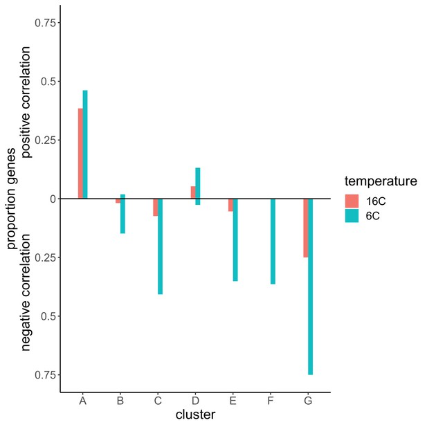
Proportion of genes in each cluster for which expression significantly correlated with winter temperature ().
Colors indicate the temperature in which expression was measured. Bars above the zero line are proportions of genes in each cluster that showed a positive correlation with winter temperature. Bars below the zero line represent proportions of genes that were correlated negatively with winter temperature.
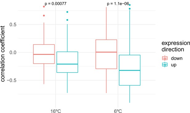
Gene expression correlations with winter temperature.
Correlation coefficients of each gene’s correlations with winter temperature are grouped by the experimental temperature (16 and 6°C) and by the expression direction upon cold exposure as measured by Park et al., 2015 and Vogel et al., 2005.
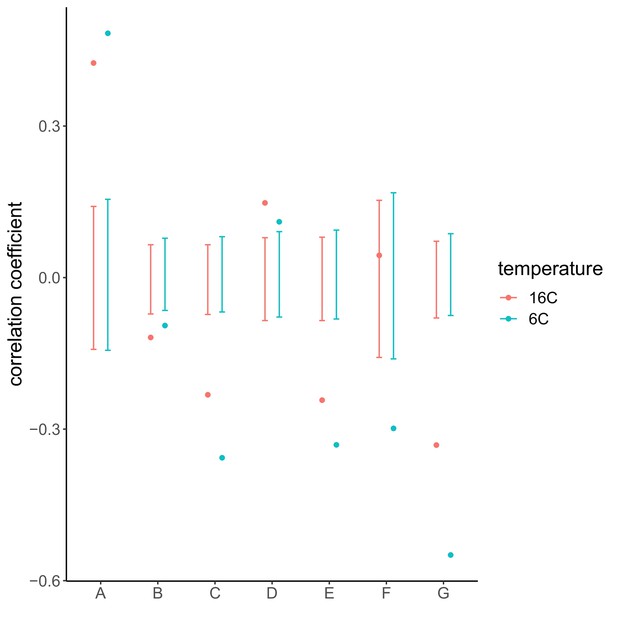
Gene expression correlations with winter temperature compared to background genes.
Correlation coefficients of the different clusters as defined in Figure 3 are compared to 10,000 permutations of random sets of background genes for each cluster. Points represent the correlation coefficients for each cluster of cold-acclimation genes, in each temperature. Error bars represent the 2.5 and 97.5% quantiles of 10,000 permutations with random sets of background genes.

Genome-wide association study (GWAS) results for the growth rate at 16°C.
(A) Manhattan plot showing the significance of the association between the phenotype and each of the tested SNPs (). The Bonferroni-corrected threshold is shown with a dashed red line. (B) QQ-plot showing the relation between observed and expected distributions. Red line shows the observed relationship. The gray line and band show the expected relationship under the null hypothesis of no differentiation between both distributions.
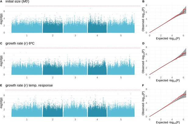
Genome-wide association study (GWAS) results for the initial size, growth rate at 6°C, and the temperature response of the growth rate.
(A, C, E) Manhattan plots showing the significance of the association between the initial size, growth rate at 6°C and the growth rate’s temperature response, and each of the tested SNPs. The Bonferroni-corrected threshold is visualized with the dashed red line. (B, D, F) QQ-plots showing the relation between observed and expected distributions for each of the respective GWAS. Red line shows the observed relationship. Gray line and band show the expected relationship under the null hypothesis of no differentiation between both distributions.

Adaptive differentiation of initial size, growth rate at 16°C, and the temperature response of growth rate along different axes of genetic differentiation.
Plots represent the phenotypes and axes of genetic differentiation for which we detected significant adaptive differentiation; initial size and PC6 (A), growth rate in 16ºC and PC5 (B), and the growthrate's temperature response and PC5 (C). Accessions are colored according to their respective admixture groups, as specified in 1001 Genomes Consortium, 2016. The gray ribbon represents the expected correlation between phenotype and axis of genetic differentiation under neutrality with a 90% confidence interval. The neutral expectation is based on axes of genetic differentiation within populations (see ‘Materials and methods’ and Josephs et al., 2019 for further details). The blue line represents the observed correlation between phenotype and axis of genetic differentiation. Percentages refer to the genetic variation explained by the respective principal component.
Adaptive differentiation of initial size, growth rate at 16°C, and the temperature response of growth rate along different axes of genetic differentiation.
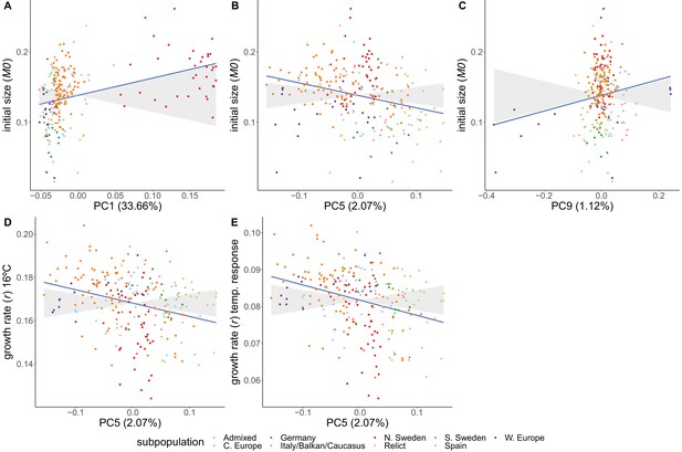
Plots represent the phenotypes and axes of genetic differentiation for which we detected significant adaptive differentiation, when excluding Asian accessions; initial size and PC (A), initial size and PC5 (B), initial size and PC9 (C), growth rate in 16ºC and PC5 (D), and growth rate's temperature response and PC5 (E). Asian accessions were excluded from this analysis to look at their importance to detect adaptive differentiation. Accessions are colored according to their respective admixture groups, as specified in 1001 Genomes Consortium, 2016. The gray ribbon represents the expected correlation between phenotype and axis of genetic differentiation under neutrality with a 90% confidence interval. The neutral expectation is based on axes of genetic differentiation within populations (see ‘Materials and methods’ and Josephs et al., 2019 for further details). The blue line represents the observed correlation between phenotype and axis of genetic differentiation. Percentages refer to the genetic variation explained by the respective principal component.
Tables
ANOVA table for the comparison between the exponential and power-law model with degrees of freedom (df), Akaike information criterion (AIC), Bayesian information criterion (BIC), and log-likelihood (logLik) for each model.
The likelihood ratio statistic (L.ratio) and p-value are given for the likelihood ratio test that was used to compare these models.
| Model | df | AIC | BIC | logLik | Test | L.ratio | p-Value | |
|---|---|---|---|---|---|---|---|---|
| Exponential | 1 | 6 | –668551.6 | –668488.1 | 334281.8 | - | - | |
| Power-law | 2 | 10 | –870605.0 | –870499.1 | 435312.5 | 1 vs. 2 | 202.061 | <0.001 |


