Long term intrinsic cycling in human life course antibody responses to influenza A(H3N2): an observational and modeling study
Figures
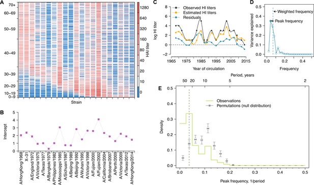
Long-term cycles in individual antibody responses to influenza A(H3N2) at baseline.
(A) Hemagglutination inhibition (HI) titers against A(H3N2) strains at baseline. Each row shows an antibody profile for a participant. Participants are sorted by age (y-axis). Strains (x-axis) are sorted by the year of isolation, which are listed in the x-axis of (B). (B) Strain-specific intercepts. A generalized additive model (GAM) was fitted to log HI titers (shown in A) on age at sampling (spline), age at isolation (spline), and strains (categorical) (also used for C). With the model, we extracted strain-specific intercepts (representing population level activity; shown in B) and calculated the residuals between predicted and observed log HI titers for each individual (individual-level antibody responses; shown in C and used for D, E; details in Figure 1—figure supplement 5A). (C) Illustration of estimating individual time series of residuals. Estimates were derived from the GAM model in (B). Residuals were calculated as the difference between observed and estimated HI titers (i.e., black minus orange; shown as the blue line). (D) Illustration of a Fourier spectrum. Peak (i.e., the frequency explaining the largest variance) and weighted frequency of a Fourier spectrum of the interpolated time series of residuals shown in (C). (E) Distribution of peak frequencies of individual residuals. We performed Fourier spectral analysis (shown in D) on the time series of residuals of each person and extracted the peak frequency. The light green shows the distribution of peak frequencies across participants, with the dashed vertical line indicating the peak frequencies that had the highest proportions among individuals. Median (thick gray ticks), interquartile (gray boxes), and 95% intervals (thin gray ticks) of distributions from 1000 permutations.
-
Figure 1—source data 1
Variance (%) explained by low frequencies and peak frequencies for Fourier spectra of individual residuals.
- https://cdn.elifesciences.org/articles/81457/elife-81457-fig1-data1-v2.docx
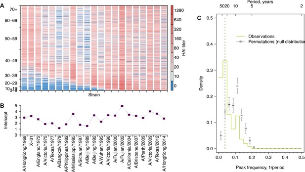
Long-term cycles in individual antibody responses to influenza A(H3N2) at follow-up.
(A) Hemagglutination inhibition (HI) titers against A(H3N2) strains at follow-up. Each row shows an antibody profile for a participant. Participants are sorted by age (y-axis). Strains (x-axis) are sorted by the year of isolation, which are listed in the x-axis of (B). (B) Strain-specific intercepts. A generalized additive model (GAM) was fitted to log HI titers (shown in A) on age at sampling (spline), age at isolation (spline), and strains (categorical). (C) Distribution of peak frequencies of individual residuals. We performed Fourier spectral analysis (shown in Figure 1D) on the time series of residuals of each person and extracted the peak frequency. The light green shows the distribution of peak frequencies across participants. Median (thick gray ticks), interquartile (gray boxes), and 95% intervals (thin gray ticks) of distributions from 1000 permutations are indicated.
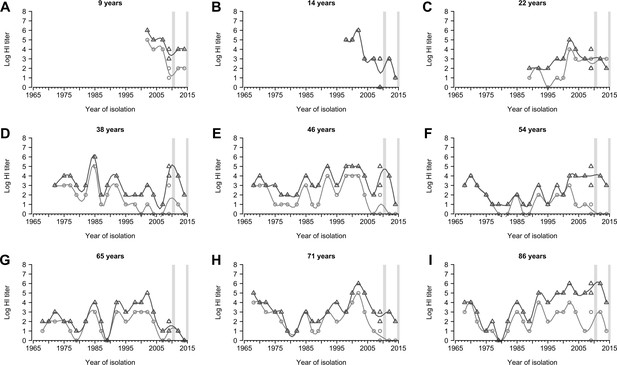
Representative individual profiles of hemagglutination inhibition (HI) titers.
(A-I) Random selected individuals from 777 participants with their ages shown shown in each panel. Light gray circles and dark gray triangles are antibody measures for baseline and follow-up visit, respectively. Gray vertical boxes indicate the durations of the baseline and follow-up visits.
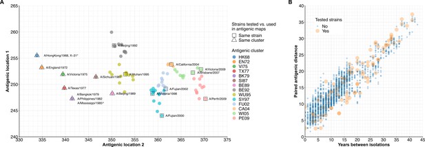
Antigenic map and paired antigenic distances of influenza A(H3N2) strains.
(A) Antigenic maps and locations of strains that were tested in our study. The antigenic map was generated using estimates by Fonville et al., 2014. We labeled our tested strains that were also included in generating the antigenic map with squares; otherwise, we labeled the corresponding antigenic clusters with triangles. A/Texas/2012 and A/HongKong/2014 are not shown as the antigenic map was up to 2010. *X-31 was a reassortment of A(H1N1) and A(H3N2), while the antigenic location of the used A(H3N2) strain (A/Aichi/2/68) was indicated (Slepushkin et al., 2001). ^A/Mississippi/1985 was not directly included in the antigenic map generation, which was classified as the same antigenic cluster with A/Philippines/1982 (Horby et al., 2012). (B) Paired antigenic distance between A(H3N2) strains that were used to generate antigenic map. Euclidean distance was calculated using the antigenic locations (in A) of each pair of strains. Orange indicates both strains in the pairs were included in our study.
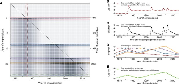
Conceptual plot for individual life-course immune responses to influenza.
(A) Simulated annual antibody profiles of a representative individual born in 1977 and who had four infections (1977, 1994, 2003, and 2006) (same as in D). Each row represents the antibody profile of strains, which were isolated between 1968 and 2014, from serum that was collected on the year listed in the right y-axis and at the participant’s age listed in the left y-axis. Darker gray represents greater hemagglutination inhibition (HI) titer. The diagonal dashed line represents the real-time titer – titer of strain isolated at year t measured at year t –1 that determined the risk of infection in each year. Colored boxes represent antibody profiles that were measured in each year of infection (1st red; 2nd blue; 3rd purple; and 4th orange) and sample collection (green, E). (B) Antibody responses against the first infected strain that were measured at different years, i.e., the red vertical block in (A). (C) Antibody responses against the strain that was isolated/circulated in the year of sampling, i.e., the diagonal line in (A). (D) Antibody profiles of influenza strains at each infection. (E) Antibody profiles of influenza strains at each infection.
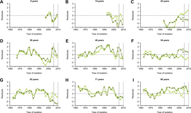
Representative individual profiles of residuals of hemagglutination inhibition (HI) titers.
(A-I) Random selected individuals from 777 participants with their ages shown shown in each panel. Profiles are from the same individuals shown in Figure 1—figure supplement 2. Residuals were derived from fitted generalized additive models of log HI titer on age at sampling, age at circulation, and strain (Figure 1—figure supplement 4A). Data from the baseline and follow-up visit were fitted separately. Light and dark green represent the baseline and follow-up visit, respectively. Lines were derived from the smooth spline of the observed data points and are shown for illustration purposes only. Gray vertical lines represent the duration of the two visits.
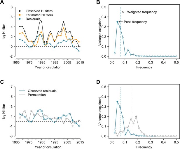
Illustration of estimation of individual time series of residuals and Fourier analysis of observed and permutation of time series.
(A) Observed hemagglutination inhibition (HI) titers, estimated HI titers, and residuals. Estimations were derived from the generalized additive model (GAM) of log HI titers on age at sampling (spline) and age at circulation (spline) with strain-specific intercept. Residuals were calculated as the difference between observed and estimated HI titers (i.e., black minus orange; shown as the blue line). (B) Peak and weighted frequency of a Fourier spectrum of the time series of residuals shown in (A). (C) Permutation of the time series of residuals. Shapes of points are used to match the observed and permutation of the strains, e.g., the residual value indicated by solid square is for the A/Texas/2012 but was assigned to A/Fujian/2002 for this permutation. (D) Peak and weighted frequencies of the Fourier spectra for the observed and permuted time series of residuals shown in (C). Solid points are peak frequencies and dashed lines are weighted frequencies.
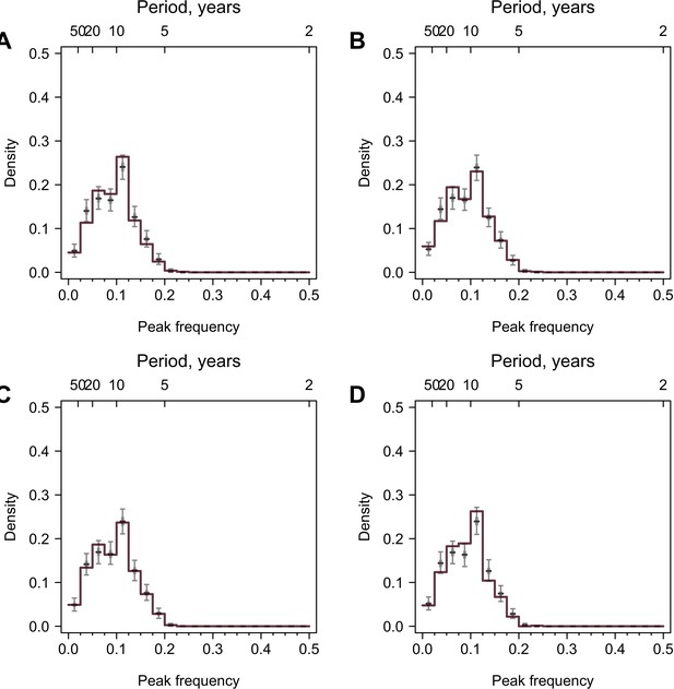
Validation using values generated from random distributions with no periodicity.
777 time series were simulated, and the lengths and resolutions of the time series were the same as the data. Colored lines are distributions of peak frequencies for yearly interpolation of the simulated data, and gray boxplots are distributions for 1000 permutations of the simulated data. (A) Normal distribution. Random values were generated from a normal distribution with mean 1 and sd 2. (B) Lognormal distribution. Random values were generated from lognormal distribution with mean 1.5 and sd 0.5. (C) Normal distribution with outliers. Random values were generated from the same normal distribution in (A), in which 2–4 time points for each time series had values from a normal distribution with larger mean (mean = 3 and sd = 1). (D) Lognormal distribution with outliers. Random values were generated from the same lognormal distribution in (B), in which 2–4 time points for each time series had values from a lognormal distribution with larger mean (mean = 2 and sd = 0.2).
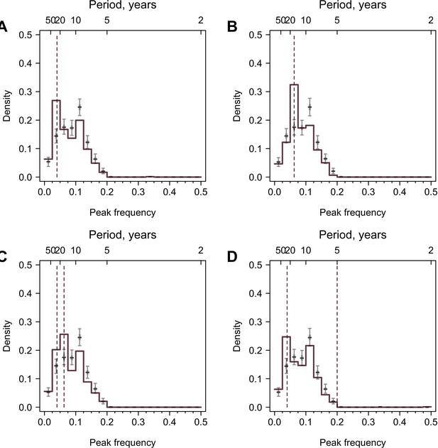
Validation using values generated from periodic curves.
A sine curve with predefined periodicity and white noise was simulated on a yearly basis, and values for the time points when tested A(H3N2) strains were isolated were extracted. 777 time series were simulated, and the lengths and resolutions of the time series were the same as the observed data. Colored lines are distributions of peak frequencies for simulated data, and gray lines are distributions for 1000 permutations of the simulated data. Dashed lines represent the true periodicity. (A) All participants have a 25-year periodicity. (B) All participants have a 16-year periodicity. (C) Half of the participants have a 25-year periodicity and the other half have a 16-year periodicity. (D) All participants have periodicities of 25 and 5 years.

Impacts of irregularly sampled data, interpolations, and long-term trends on cycles identified in individual antibody responses at baseline.
(A) Distribution of weighted frequencies of individual Fourier spectra at baseline. We performed Fourier spectral analysis on the interpolated time series of residuals for each person and calculated the average frequency weighted by the variance explained (‘weighted frequency’; see Figure 1D). (B) Distribution of peak frequencies of individual Lomb–Scargle periodograms. We performed Lomb–Scargle periodograms on the time series of residuals for each person and extracted the frequency that explained the most variance (‘peak frequency’). (C) Distribution of peak frequencies of individual Fourier spectra of detrended residuals at baseline. We performed Fourier analysis on time series that removed the nonlinear trend identified using empirical mode decomposition (EMD) analysis.
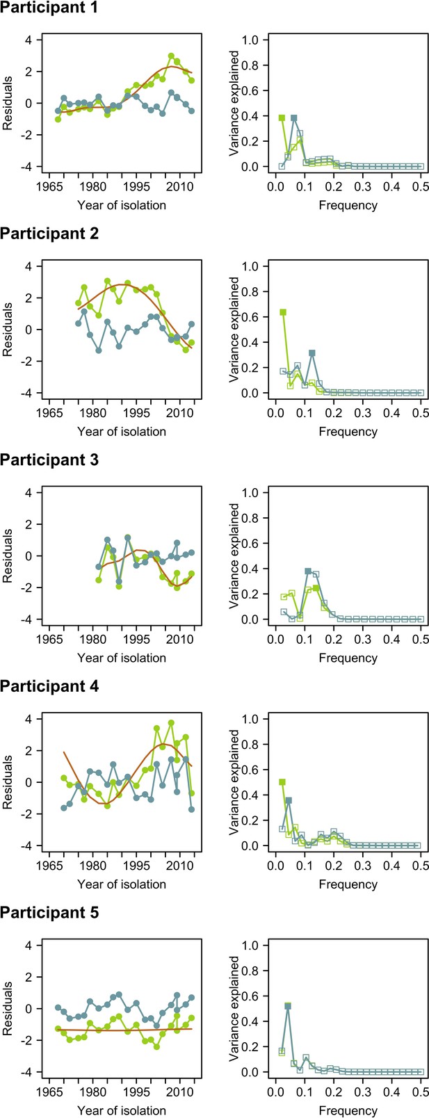
Comparison of time series of residuals and their Fourier spectra before and after empirical mode decomposition (EMD).
Left columns represent time series of residuals before (green) and after (blue) detrending using EMD. The orange line indicates the nonlinear trend identified using EMD. Right columns represent the Fourier spectra before (green) and after (blue) detrending with EMD. Solid squares indicate the peak frequencies in the Fourier spectra.
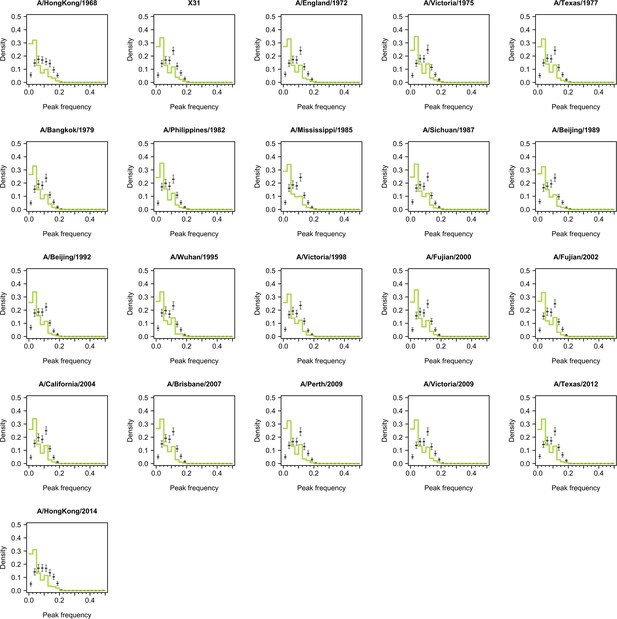
Distribution of peak frequencies across individuals when dropping titers of one tested strain for serums collected at baseline.
Light green lines indicate the distribution of peak frequencies in the data. Median (thick gray ticks), interquartile (gray bars), and 95% intervals (think gray ticks) of Fourier spectra from 1000 permuted time series are indicated.
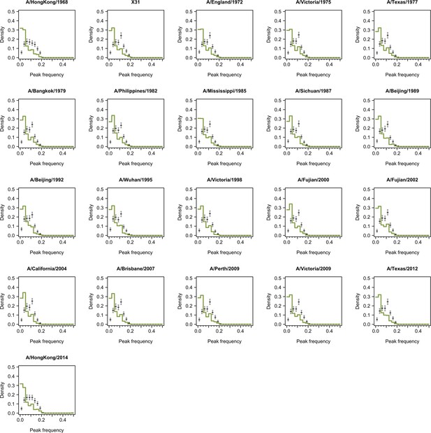
Distribution of peak frequencies across individuals when dropping titers of one tested strain for serums collected at follow-up.
Dark green lines indicate the distribution of peak frequencies in the data. Median (thick gray ticks), interquartile (gray bars), and 95% intervals (think gray ticks) of Fourier spectra from 1000 permuted time series are indicated.
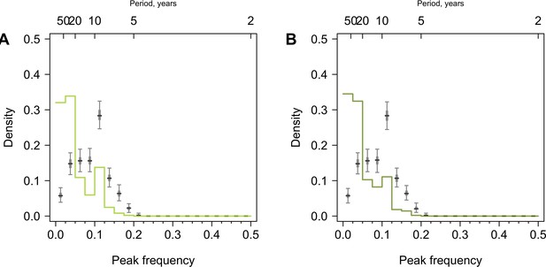
Distribution of peak frequencies across individuals born before 1968.
(A) Serums collected at baseline. (B) Serums collected during the follow-up visit. We performed Fourier spectral analysis on the time series of residuals and extracted peak frequencies for a subset of participants born before 1968 and thus able to experience all tested H3N2 strains. Light and dark green lines represent the distribution of peak frequencies across participants for the baseline and follow-up visits, respectively. Median (thick gray ticks), interquartile (gray bars), and 95% intervals (think gray ticks) of Fourier spectra from 1000 permuted time series are indicated.
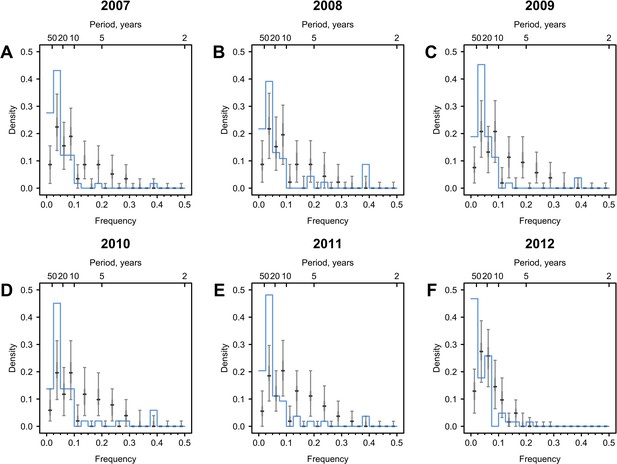
Cycles in immune responses to influenza in the Vietnam data.
(A–F) show distributions of frequencies that explain the most variance across 69 individuals, whose serums were annually collected from 2007 to 2012. The Vietnam data was taken from Bedford et al., 2014 as derived from Auladell et al., 2022; Kucharski et al., 2018. Blue lines are distributions of peak frequencies detected in the observations. Median (thick gray ticks), interquartile (gray bars), and 95% intervals (think gray ticks) of Fourier spectra from 1000 permuted time series are indicated.
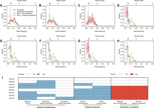
Cycles in simulated antibody responses from the model accounted for different mechanisms.
Colored lines are the distribution of peak frequencies detected in the simulated antibody profiles across individuals. Gray lines are the distributions of peak frequencies of the 1000 permutations of the simulated antibody profiles. For each scenario, we simulated the life course of infections and immune responses for 777 individuals of the same age as the participants in our study and extracted the antibody profile in 2014 for the year’s corresponding to when our 20 strains were isolated. (A) No biological mechanisms were modeled, and the individual risk of infection each year was purely random with a fixed probability of 0.2. (B) Narrow (i.e., against antigenically similar strains) and broad (i.e., against distant strains) cross-reactions of antibodies were modeled, which would however not affect individual risk of infection every year (i.e., the risk of infection each year was purely random with a fixed probability of 0.2). (C) Individual risk of infections was modeled as the randomly varied population-level H3N2 activity every year (i.e., not affected by individual antibody responses), no cross-reactions of antibodies were modeled. (D–F) Narrow and broad cross-reactions of antibodies were modeled, with greater cross-reactions conferring higher level of protection. Population-level H3N2 activity were modeled as constant (D), randomly (E), and periodically (F) varied, respectively. (G) Broad cross-reactions of antibodies were modeled, with greater cross-reactions conferring higher level of protection. Random variations in population-level H3N2 activity were modeled. (H) Narrow cross-reactions of antibodies were modeled, with greater cross-reactions conferring higher level of protection. Random variations in population-level H3N2 activity were modeled. (I) Biological mechanisms included in models that generated results in (A–H).
-
Figure 3—source data 1
Parameters used in the simulations.
- https://cdn.elifesciences.org/articles/81457/elife-81457-fig3-data1-v2.docx
-
Figure 3—source data 2
Mechanisms examined in the simulations.
- https://cdn.elifesciences.org/articles/81457/elife-81457-fig3-data2-v2.docx
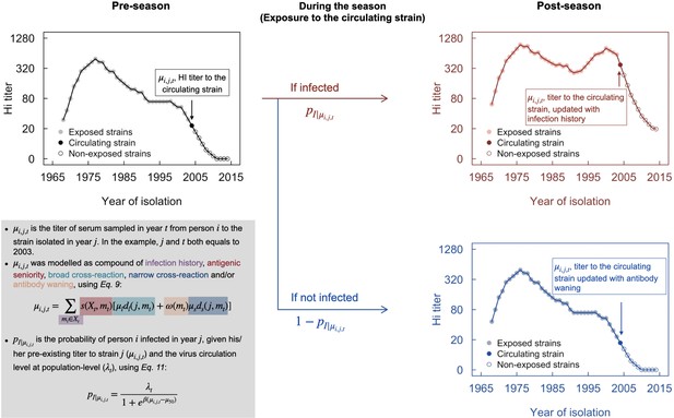
Conceptual plot of modeling immune responses.
The black line in the top-left panel denotes pre-season (e.g., 2003) antibody profile, from which the titer of the circulating strain (filled point) was used to determine the probability of infection, using Equation 11. Infection was randomly generated following a binomial distribution with probability p. Red and blue lines in the right panels indicate the post-season antibody profile for infection and non-infection, respectively.
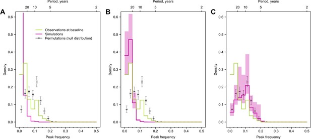
Impact of antigenic evolution speed on the reported cycles in individual antibody responses.
Green and purple lines indicate the distribution of peak frequencies detected in the observed simulated antibody profiles across individuals. Gray lines are the distributions of peak frequencies of the 1000 permutations of the simulated antibody profiles (i.e., null distribution). We assumed the antigenic evolution speed was five times slower (A), the same (B), and five times faster (C) than that was used in the main analysis.
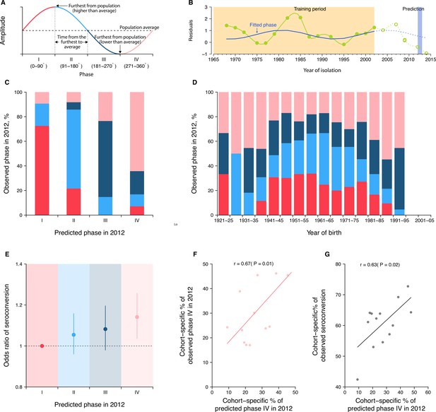
Predicting seroconversion to the recently circulated strains using phases of individual antibody responses.
(A) Concept plot for phases. Four phases were classified based on the phase angles between 0 and 360°. (B) Illustration of predicting phase in 2012 using individual residuals from baseline hemagglutination inhibition (HI) titer that were measured against 14 historical strains (i.e., isolation year up to 2002). Green dots and solid green lines indicate the residuals against historical strains that were used to fit the periodic function (shown in solid blue lines). With the fitted periodic function, we predicted phase angles in 2012 based on the predicted residuals for individual’s titers against strains that were circulating after the training period (shown in dotted blue lines). For reference, we also showed the observed baseline residuals for individual’s titers against strains that were circulating after the training period (indicated as green circles and dotted green lines). (C) Observed and predicted phase in 2012 across participants. Colors represent participants’ observed phase in 2012, with I, II, III, and IV represented by red, light blue, dark blue, and pink, respectively (same for D and E). (D) Observed cohort-specific distribution of phase in 2012. (E) Adjusted risk of seroconversion to recent strains (i.e., A/Texas 2012 or A/HongKong/2014) between baseline and follow-up visits for different phases. We estimated associations between phases in 2012 that were estimated from individual antibody profile residuals and seroconversion to any of the two recent strains and adjusted for age at sampling and the average preexisting titer of the two strains. (F) Observed and predicted cohort-specific proportion of phase IV in 2012. (G) Predicted proportion of phase IV in 2012 and the observed proportion of seroconversion to recent strains between baseline and follow-up for each cohort.
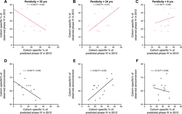
Impact of periodicity on predictions of cohort-specific phases and seroconversions to circulating strains.
Predictions of phases in 2012 were derived using hemagglutination inhibition (HI) titers against strains isolated between 1968 and 2002, assuming individual antibody responses with periodicity of 35 years (left column), 24 years (middle, suggested by the data), and 6 years (right). (A–C) Observed and predicted cohort-specific proportion of phase IV in 2012. (D-F) Predicted proportion of phase IV in 2012 and the observed proportion of seroconversion to recent strains between baseline and follow-up for each cohort.


