The landscape of antibody binding affinity in SARS-CoV-2 Omicron BA.1 evolution
- Department of Organismic and Evolutionary Biology, Harvard University, United States
- Department of Physics, Harvard University, United States
- Biological and Biomedical Sciences, Harvard Medical School, United States
- Basic Sciences Division and Computational Biology Program, Fred Hutchinson Cancer Research Center, United States
- Department of Genome Sciences, University of Washington, United States
- Medical Scientist Training Program, University of Washington, United States
- Howard Hughes Medical Institute, United States
- NSF-Simons Center for Mathematical and Statistical Analysis of Biology, Harvard University, United States
- Quantitative Biology Initiative, Harvard University, United States
Figures
Figure 1 with 2 supplements
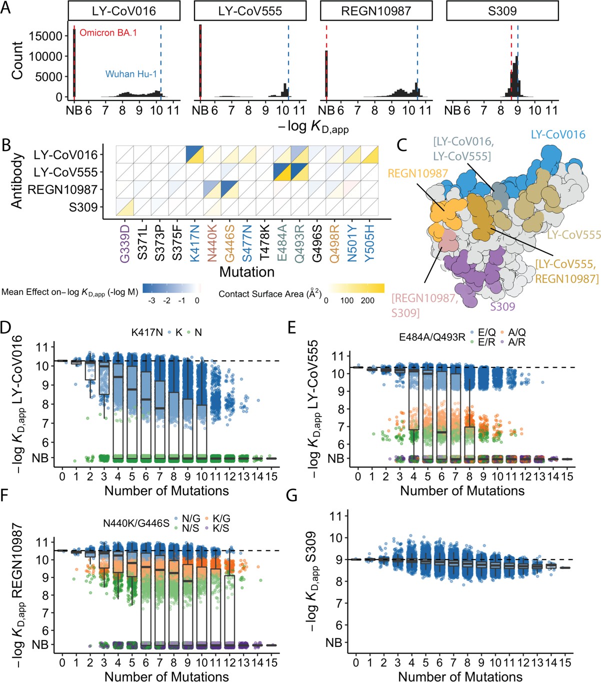
Antibody affinity landscape.
(A) Binding affinities to one antibody from each class (LY-CoV016, LY-CoV555, REGN10987, and S309, from classes 1–4, respectively) across all N=32,768 receptor binding domain (RBD) genotypes tested. Binding affinities are shown as −logKD,app; vertical blue and red dashed lines indicate the −logKD,app for Wuhan Hu-1 and Omicron BA.1, respectively. ‘NB’ denotes non-binding (escape). (B) Mean effect of each mutation on antibody and ACE2 affinity (defined as the change in −logKD,app resulting from mutation averaged across all backgrounds at the other loci) plotted with contact surface area between each residue and each antibody. Mutations are colored by footprint highlighted in (C). (C) Structure of SARS-CoV-2 BA.1 RBD with each antibody footprint annotated (PDB ID 7 KMG, 6WPT, 7C01, and 6XDG). Residues with overlapping footprints are colored and labeled accordingly. (D–G) Distribution of binding affinities to different antibodies grouped by number of Omicron BA.1 mutations. Binding affinity of the Wuhan Hu-1 variant is indicated by horizontal dashed lines. Variants with antibody escape mutations of interest are colored as noted in each key. NB denotes non-binding (escape). In all figures, the boxplots boxes show the spread between the 25th and 75th percentiles, with the median indicated by a horizontal line.
Figure 1—figure supplement 1
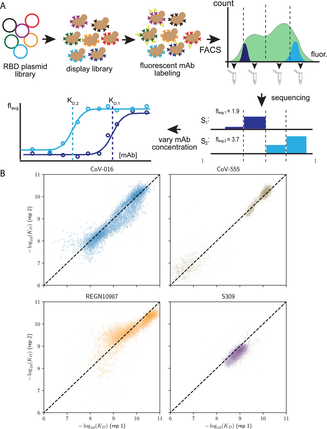
Schematic overview of the Tite-seq method and reproducibility of dissociation constants.
(A) The plasmid library containing receptor binding domain (RBD) sequences is transformed into a standard yeast display strain AWY101. The library is then incubated with soluble, fluorescent monoclonal antibody (mAb; either one of the four mAbs used in the study) and sorted by flow cytometry into bins based on mAb fluorescence. Deep sequencing of each bin results in the mean bin (Bavg) estimate of each RBD variant across varying mAb concentrations to produce a titration curve. Apparent equilibrium dissociation constants are then inferred by fitting Bavg to the mAb concentration. (B) Correlation of −log(KD,app) between the first and second biological replicates, (sample size = 32768).
Figure 1—figure supplement 2
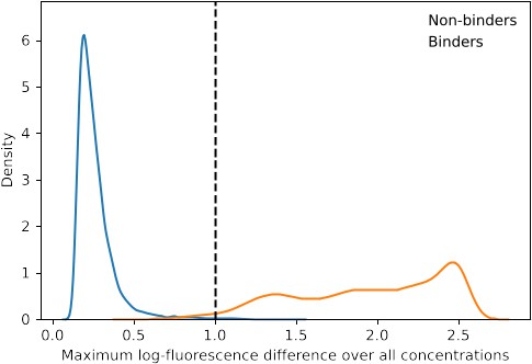
Distribution of maximum log-fluorescence difference.
To determine whether a genotype is a non-binder, the maximum difference of log fluorescence across concentrations of the genotype is computed. The dashed line represents the threshold below which a genotype with a certain maximum difference is considered non-binding.
Figure 2
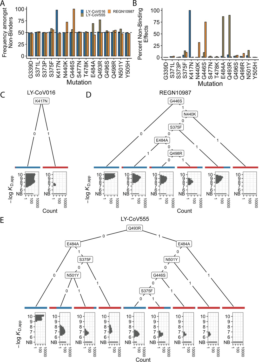
Escape mutations and genotypes.
(A) Fraction of antibody-escaping genotypes with each mutation. (B) Fraction of variants for which a given mutation confers antibody escape. Effects are colored as in (A). (C–E) Decision trees of escape phenotype for each antibody modeled as a function of the mutations present. Each leaf is annotated by the proportion of the genotypes that escape the corresponding antibody (red: escape and blue: does not) and by corresponding affinity distribution. NB denotes non-binding.
Figure 3 with 1 supplement

Epistastic effects on antibody binding.
(A) Correlation coefficients between the measured values of −log(KD,app) and the model estimate for various orders of epistatic models. Correlations are computed on the hold-out subset averaged over 10-folds of cross-validation. Zoomed-in version for orders 3–6 (sample size n=10) (B) Binding affinities predicted by complete coefficients from the optimum epistasis model are compared to the measured binding affinities for each antibody. Points are colored by mutations present in the genotypes, ‘N’ corresponds to non-binding genotypes. The accuracy measures the quality of the binary classification between binders and non-binders, and the coefficient of determination R² refers to the correlation between inferred and measured binding affinities, excluding non-binders. (C) Effects of mutations G339D, S371L, S373P, and S375F on S309 affinity grouped by the presence of each mutation. Each violin color corresponds to the number of mutations considered. Dashed line color denotes the average effect for each group represented by the violin color. The gray and orange lines indicate cases where the addition of mutation S371L has a positive (+) or negative (−) effect depending on the background (sample size n=2048).
Figure 3—figure supplement 1
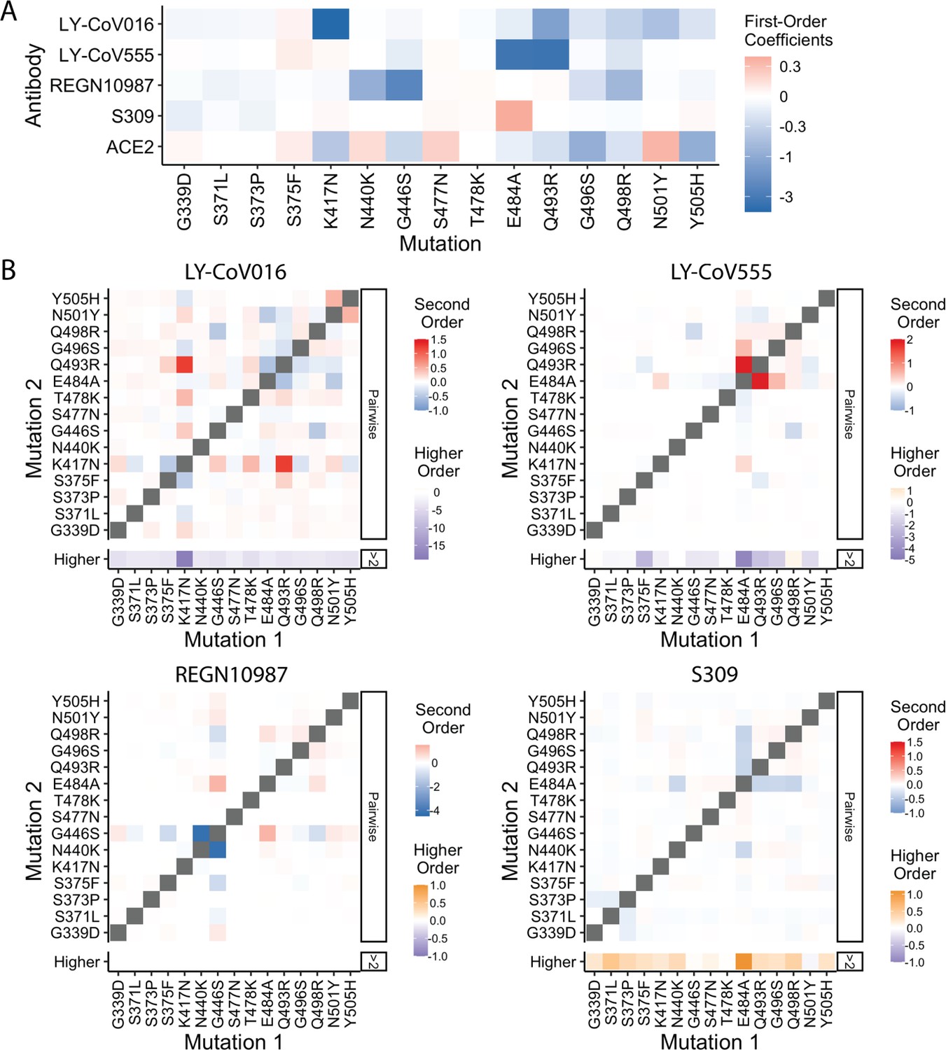
Epistatic coefficients.
(A) First-order effects in fourth order epistatic interaction models. (B) For each antibody, higher-order interaction coefficient of a mutation (shown at bottom of heat map plot) is calculated by summing over all third- and fourth-order interaction coefficients involving the mutation.
Figure 4
Trade-offs and comparison with ACE2 affinity.
(A) Distribution of ACE2 binding affinity grouped by number of BA.1 mutations and the number of monoclonal antibodies escaped. The dashed line corresponds to the affinity of the Wuhan strain. (B) ACE2 affinity distribution grouped by antibodies escaped and the presence of compensatory mutations (N501Y and Q498R). The dotted line represents the affinity of the Wuhan strain, while the dashed line shows the average affinity of the genotypes without compensatory mutations that bind all antibodies. (C) Affinities to monoclonal antibodies plotted as a function of the ACE2 affinity for all genotypes. Points are colored by presence of Q498R and N501Y. (D) Mean effect (averaged over all backgrounds at the other loci) of each mutation on antibody affinity and on ACE2 affinity (red-blue colormap) compared to the enrichment of their frequency with Q498R and N501Y (orange colormap). The enrichment score is defined as the normalized frequency a mutation emerged on a branch on which mutations Q498R and N501Y appear divided by the normalized frequency it emerged on any intermediate background between Wuhan and BA.1.
Additional files
-
Supplementary file 1
Isogenic validation of binding affinities.
The KD,app inferred from isogenic measurements (see Methods) shown with those inferred via Tite-seq measurement. NB denotes non-binding and SDs between replicates are also shown.
- https://cdn.elifesciences.org/articles/83442/elife-83442-supp1-v2.docx
-
MDAR checklist
- https://cdn.elifesciences.org/articles/83442/elife-83442-mdarchecklist1-v2.docx
Download links
A two-part list of links to download the article, or parts of the article, in various formats.
Downloads (link to download the article as PDF)
Open citations (links to open the citations from this article in various online reference manager services)
Cite this article (links to download the citations from this article in formats compatible with various reference manager tools)
The landscape of antibody binding affinity in SARS-CoV-2 Omicron BA.1 evolution
eLife 12:e83442.
https://doi.org/10.7554/eLife.83442


