The involvement of the human prefrontal cortex in the emergence of visual awareness
- State Key Laboratory of Cognitive Neuroscience and Learning and IDG/McGovern Institute for Brain Research, Division of Psychology, Beijing Normal University, China
- Department of Neurosurgery, Chinese PLA General Hospital, China
- Department of Anesthesiology, Peking University Third Hospital, China
Figures
Figure 1
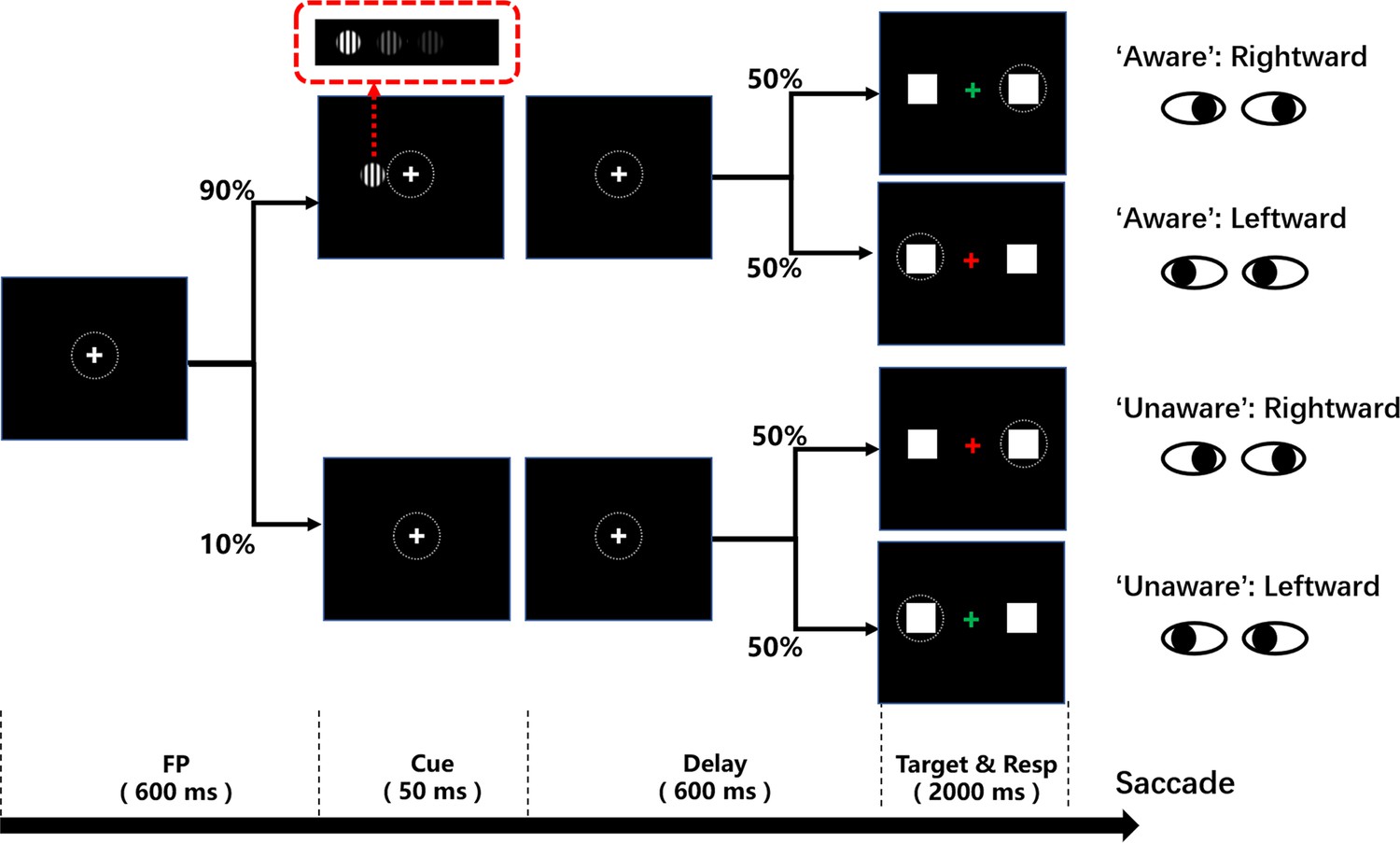
Schematic diagram of the visual awareness task.
A trial started when a fixation point (0.5°x0.5°, white cross) appeared at the center of the screen (radius of eye position check window is 4°, the dotted circle). After the subject fixated on the fixation point for 600ms, a cue stimulus (Gabor grating, 2x2° circle) was presented for 50ms at a fixed position (7°) on the left (or right, see Methods) side of the screen for all participants. In 70% of the trials, the grating contrast was maintained near the subject’s perceptual threshold by a staircase method; in 10% of the trials, the stimulus contrast was well above the threshold; and in the other 20% of the trials, the stimulus contrast was 0, namely, no stimulus appeared. After another 600ms delay, the color of the fixation point turned red or green, and two saccade targets (1x1°, white square) appeared at fixed positions (10°) on the left and right sides of the screen. If the grating was seen, the green fixation point was required to make a saccade to the right target, while the red fixation point was required to make a saccade to the left target. If the grating was not seen, the rule of saccadic direction was inverted.
Figure 2
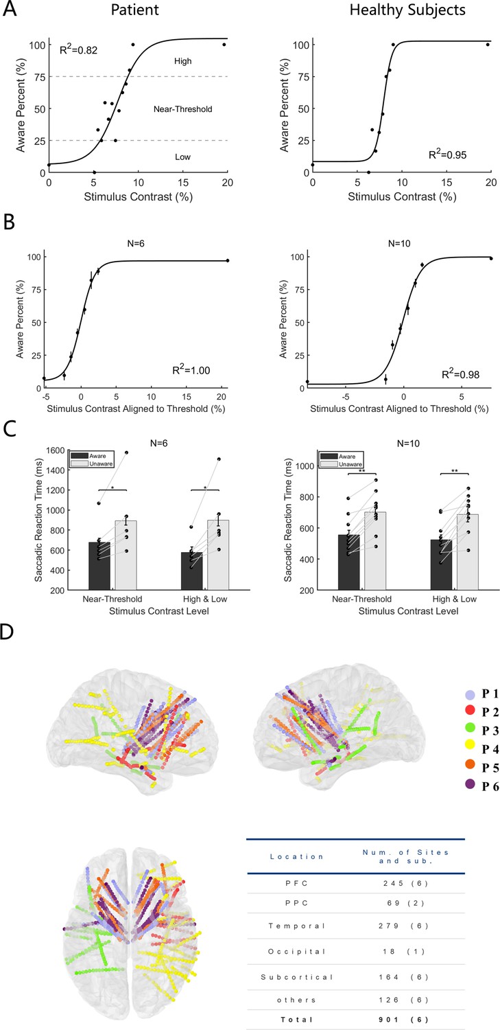
Behavioral performance and electrode location.
(A) Psychometric detection curve in a single session. Left panels from one patient and right from one healthy subject. Each black point in the graph represents the aware percent in a contrast level, and the black curve represents the fitted psychometric function. The contrast level that resulted in an awareness percentage greater than 25%, and less than 75% was defined as near-threshold, whereas an awareness percentage less than 25% was low and greater than 75% was high. (B) Psychometric detection curves for all participants. The same as Panel A except the contrast is aligned to the individual subject’s perceptual threshold, that is, the contrast 0 represents each subject’s perceptual threshold. (N, number of subjects; R2, coefficient of determination). (C) Saccadic reaction time in the aware and unaware trials under high +low and near-threshold-level contrasts of gratings. Bars show the mean values of saccadic reaction time. In the near-threshold condition, the mean reaction times of patients and healthy subjects in the aware trials were 676.55±42.38 and 556.16±28.45ms, respectively. The mean reaction times in the unaware trials were 892.57±43.28 and 702.30±30.93ms, respectively, and the p values were 0.03 and 9.77x10 –4, respectively, Wilcoxon signed-rank test. In the high +low condition, the mean reaction times for patients and healthy subjects under the aware trials were 577.78±55.28 and 524.08±31.06ms, and the mean reaction times of the unaware trials were 898.64±57.21 and 687.59±49.07ms, respectively, with p values of 0.002 and 9.77x10⁻⁴, respectively, Wilcoxon signed-rank test. Each black dot represents one participant. The gray solid line represents the paired dots. Error bars represent the standard error of the mean (SEM). (D) Left, right, and top views of all recording sites projected on an MNI brain template. Each color represents a participant. In all brain images, right and up side of the image represent the right and up side of the brain.
-
Figure 2—source code 1
Source code files for generating the results in Figure 2.
- https://cdn.elifesciences.org/articles/89076/elife-89076-fig2-code1-v1.zip
Figure 3
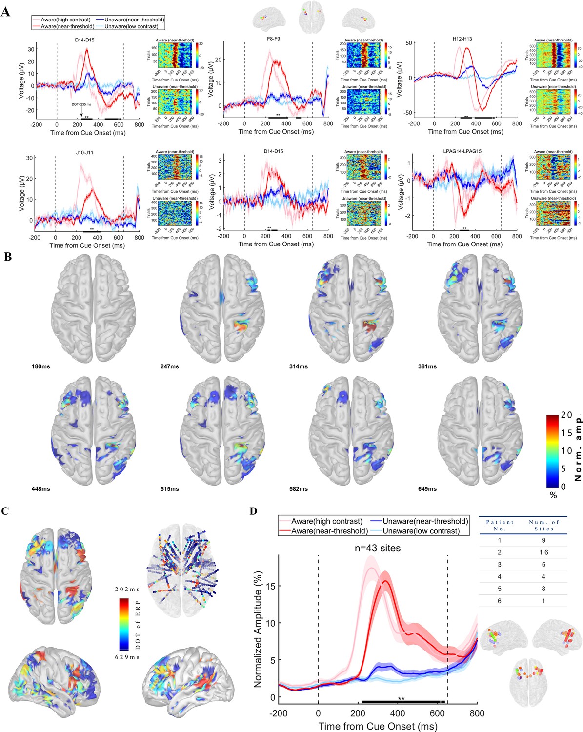
Visual awareness-related iERP activities in the PFC.
(A) LFP activity of example sites from each patient. Each panel represents one example site from one patient. In each panel, the left plot shows the grand average of LFP activity in different conditions. The pink line represents data under HA conditions, the red line represents data under NA conditions, the blue line represents data under NU conditions, and the light blue line represents data under LU conditions. The shaded area of the curve represents the SEM. The two black dotted lines at 0ms and 650ms represent the time when the grating and fixation point change color (the appearance of saccade targets), and the black thick solid line area represents the period when the LFP amplitude is significantly different under NA and NU conditions (p<0.01 corrected, independent sample t-test). The right figure in each panel shows the single-trial data in the NA (upper) and NU (lower) conditions. The color represents the voltage. (B) The spatial-temporal distribution of awareness-related ERP activities after the appearance of the grating. Each brain image showed a significant (p<0.01 corrected, see Methods) difference in local field potential in NA and NU trials at all visual awareness-related sites at a specific time point (lower left corner) after the grating appeared. The color represents the standardized voltage difference (see Methods). (C) Spatial distribution of divergence onset time. The color represents the normalized DOT value. (D) Population results of early phase ERP response in the prefrontal cortex. Different lines represent different conditions, as shown in Panel A. The right table shows the number of recording sites for different patients. The lower right is the location of these sites. The dots with different colors represent different subjects, as shown in Figure 2D.
-
Figure 3—source code 1
Source code files for pre-processing iEEG data and generating the results in Figure 3.
- https://cdn.elifesciences.org/articles/89076/elife-89076-fig3-code1-v1.zip
Figure 4 with 1 supplement
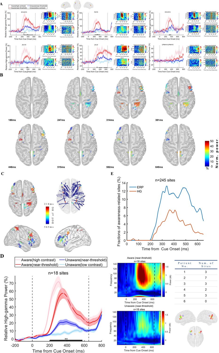
Visual awareness-related high-gamma activities in the PFC.
(A) High-gamma activity of example sites from each patient. Each panel represents one example site from one patient. In each panel, the left figure shows the grand average of high-gamma power in different conditions. The pink line represents data under HA conditions, the red line represents data under NA conditions, the blue line represents data under NU conditions, and the light blue line represents data under LU conditions. The shaded area of the curve represents the SEM. The two black dotted lines at 0ms and 650ms represent the time when the grating and fixation point change color (the appearance of saccade targets), and the black thick solid line area represents the period when the high-gamma power is significantly different under NA and NU conditions (p<0.01 corrected, independent sample t-test). The right figure in each panel shows the single-trial data in the NA (upper) and NU (lower) conditions. The color represents the normalized power. (B) The spatial-temporal distribution of awareness-related high-gamma activities after the appearance of the grating. Each brain image showed a significant (p<0.01 corrected, see Methods) difference in high-gamma activity in NA and NU trials at all visual awareness-related sites at a specific time point (lower left corner) after the grating appeared. The color represents the standardized power difference. (C) Spatial distribution of divergence onset time for high-gamma activity. The color represents the normalized DOT value. (D) Population results of early phase high-gamma response in the prefrontal cortex. Different lines represent different conditions, as shown in Panel A. The middle panel shows the spectrogram in NA (upper) and NU (lower) trials. The right table shows the number of recording sites for different patients. The lower right is the location of these sites. The dots with different colors represent different subjects, as shown in Figure 2D. (E) Percentage of awareness-related sites in ERP and HG analysis. n, number of recording sites in PFC.
-
Figure 4—source code 1
Source code files for generating the results in Figure 4.
- https://cdn.elifesciences.org/articles/89076/elife-89076-fig4-code1-v1.zip
Figure 4—figure supplement 1
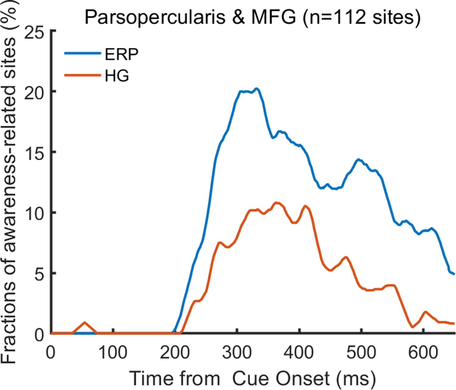
Percentage of awareness-related sites in ERP and HG analysis at parsopercularis and middle frontal gyrus (MFG).
n, number of recording sites.
-
Figure 4—figure supplement 1—source code 1
Source code files for generating the results in Figure 4—figure supplement 1.
- https://cdn.elifesciences.org/articles/89076/elife-89076-fig4-figsupp1-code1-v1.zip
Figure 5
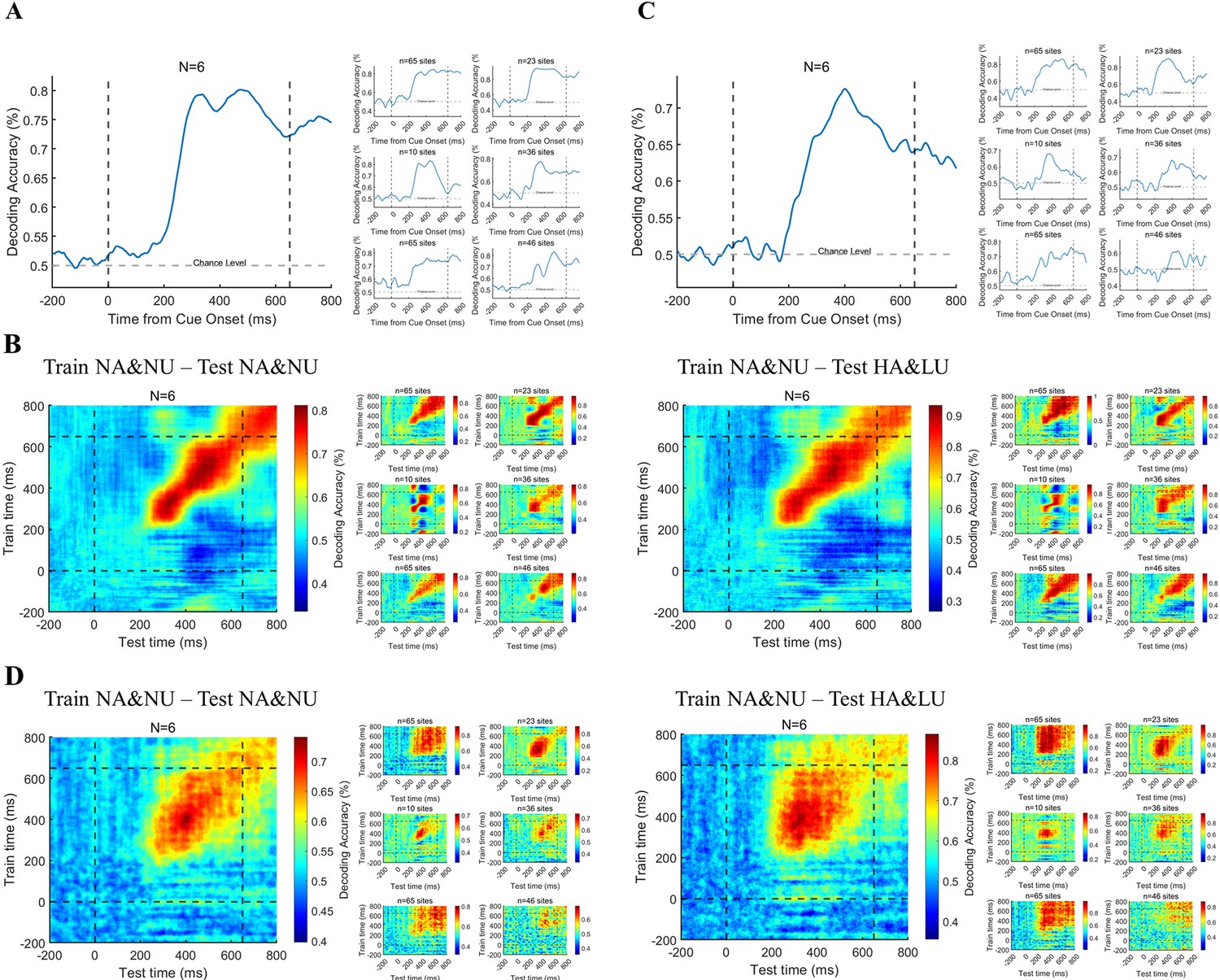
Decoding the awareness state through broadband and HG activities.
(A) Decoding the awareness state through broadband LFP activity. The population result (left) is the average result of six individual subjects (right) after decoding analysis. (B) Time generalization of broadband activity decoding. The left panel represents generalization across time. The right panel represents generalization across different conditions, which means training on NA&NU data and testing on HA&LU data. In each panel, the population result (left) is the average result of six subjects (right) after decoding analysis. (C) The awareness state is decoded by HG activity. Same as A, except that the HG magnitude is used for decoding. (D) Time generalization of HG activity decoding. Same as B, except that the HG magnitude is used for decoding.
-
Figure 5—source code 1
Source code files for generating the results in Figure 5.
- https://cdn.elifesciences.org/articles/89076/elife-89076-fig5-code1-v1.zip
Figure 6 with 1 supplement
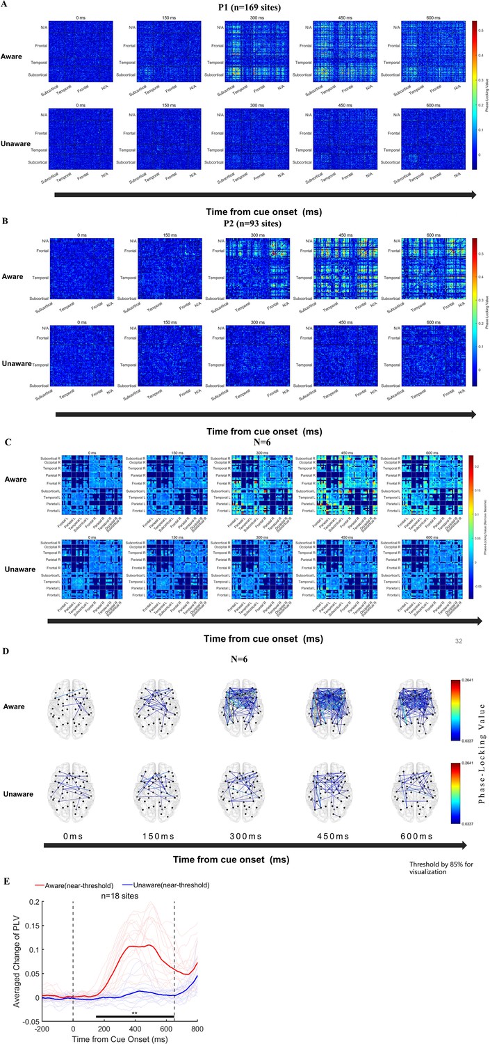
Functional connectivity analysis results.
(A–B) Phase-locking value (PLV) changes at the sensor level (NxN) in two example patients. From left to right, the changes in PLV between each recording site at the five time points of 0/150/300/450/600ms after the appearance of the grating in the near-threshold aware (upper) and near-threshold unaware (lower) trials are displayed (baseline removed, see the Methods). The color represents PLV. (C) The population results of functional connectivity analysis averaged according to brain regions. From left to right, PLV between different brain regions at the five time points of 0/150/300/450/600ms after the appearance of the grating in the near-threshold aware (upper) and near-threshold unaware (lower) trials (baseline removed, see the Methods). The color represents the PLV. (D) For the same data as C, only the strongest 15% PLV is displayed on the brain template for clear visualization. (E) PLV under different conditions at early-phase HG awareness-related sites in the PFC. The red line represents the average PLV in the NA trials, and the blue line represents the average PLV in the NU trials. The faded line represents the PLV of each site.
-
Figure 6—source code 1
Source code files for generating the results in Figure 6 and Figure 6—figure supplement 1.
- https://cdn.elifesciences.org/articles/89076/elife-89076-fig6-code1-v1.zip
Figure 6—figure supplement 1
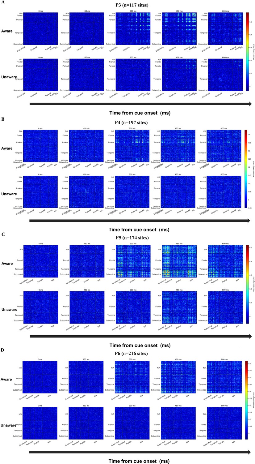
Functional connectivity analysis results of Patient 3–6.
(A–D) Phase-Locking Value (PLV) changes at sensor level (NxN) in four patients P3-P6. From left to right, the changes of PLV between each recording site in the five time points of 0/150/300/450/600ms after the appearance of the grating in the near-threshold aware (upper) and near-threshold unaware (lower) trials are displayed respectively (baseline removed, see the Method). The color represents PLV.
Figure 7
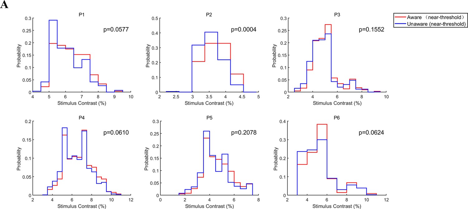
Grating contrast in NA and NU conditions.
(A) Distribution of grating contrast in the NA and NU conditions for each patient. Each panel represents one patient. The red and blue lines represent the distribution of grating contrast in NA and NU conditions, respectively.
-
Figure 7—source code 1
Source code files for generating the results in Figure 7.
- https://cdn.elifesciences.org/articles/89076/elife-89076-fig7-code1-v1.zip
Author response image 1

Percentage of awareness-related sites in ERP and HG analysis.
n, number of recording sites in PFC.
Author response image 2

Percentage of awareness-related sites in ERP and HG analysis at parsopercularis and middle frontal gyrus (MFG).
n, number of recording sites.
Author response image 3

Relationship between stimulus contract and PFC activity.
X axis represents the stimulus contrast difference between two paired conditions, i.e., aware versus unaware in near perceptual threshold conditions (NA – NU, red dots); aware in high contrast condition versus aware in near perceptual threshold condition (HA – NA, blue dots). Y axis represents the activity difference between paired stimulus conditions. The results show that activity difference is similar between two paired conditions regardless the remarkable contrast difference between two paired conditions. Such results indicate that the greater activity in NA trials than in NU trials (Fig. xx-xx) could not be interpreted by the slight difference in stimulus contrast between NA and NU trials.
Videos
Video 1
The spatial-temporal dynamics of visual awareness-related activities (event-related potential (ERP)) in all recording sites during the 180–650ms period (for a clearer display, projected to the cortex).
The curves in the upper left panel represent the significant (p<0.01 corrected, see Methods) difference (normalized) in averaged amplitude of local field potential in NA and NU trials at all visual awareness-related ERP sites. The brain image showed the difference projected on the surface at a specific time point after the grating appeared (top, left, and right views were showed at upper right, lower left, and lower right panels, respectively). The color represents the normalized voltage difference (see Methods).
Video 2
The spatial-temporal dynamics of visual awareness-related activities (high-gamma (HG) activity) in all recording sites during the 180–650ms period (for a clearer display, projected to the cortex).
The same as Video 1 but for high-gamma activity. The curves in the upper left panel represent the significant (p<0.01 corrected, see Methods) difference (normalized) in averaged magnitude of high-gamma activity in NA and NU trials at all visual awareness-related HG sites. The brain image showed the difference projected on the surface at a specific time point after the grating appeared (top, left and right views were showed at upper right, lower left and lower right panels, respectively). The color represents the normalized magnitude difference (see Methods).
Additional files
Download links
A two-part list of links to download the article, or parts of the article, in various formats.
Downloads (link to download the article as PDF)
Open citations (links to open the citations from this article in various online reference manager services)
Cite this article (links to download the citations from this article in formats compatible with various reference manager tools)
The involvement of the human prefrontal cortex in the emergence of visual awareness
eLife 12:RP89076.
https://doi.org/10.7554/eLife.89076.3


