A novel method for estimating properties of attentional oscillators reveals an age-related decline in flexibility
Figures

Design of the duration discrimination task in Experiment 1.
Each trial consisted of an isochronous standard sequence of five sounds (four intervals), followed by silence and another pair of sounds. The comparison duration was either shorter or longer than the standard intervals and took on one of ten values (DEV) that were proportional to the inter-onset interval (IOI) between sounds making up the standard sequence. The task was to press the S or L key to indicate whether the comparison interval was shorter or longer than the standard IOI. Over the course of 400 unique trials of a single session, IOI ranged from 200 ms to 998 ms. In random-order sessions, change in stimulus rate between a given trial n and immediately preceding trial n–1 (ΔIOI) was maximized, and the distribution of ΔIOI ranged from –778 ms to +770 ms. In linear-order sessions, IOI increased in each trial in the first 200 trials and decreased in the other half of the trials (or vice versa, counterbalanced across participants) in steps of 4 ms.
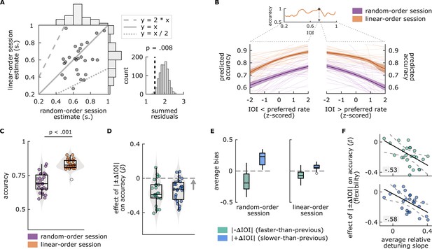
Main findings of Experiment 1.
(A) Left: Each circle represents a single participant’s preferred rate estimate from the random-order session (x axis) and linear-order session (y axis). The histograms along the top and right of the plot show the distributions of estimates for each session type. The dotted and dashed lines respectively represent 1:2 and 2:1 ratio between the axes, and the solid line represents one-to-one correspondence. Right: Permutation test results. The distribution of summed residuals (distance of data points to the closest y=x, y=2*x, and y=x/2 lines) of shuffled data over 1000 iterations, and the summed residual from original data (dashed line) that fell below 0.008 of the permutation distribution. (B) Top: Illustration of the preferred rate estimation method from an example participant’s linear-order session dataset. Estimates were the stimulus rates (IOI) where smoothed accuracy (orange line) was maximum (arrow). The dotted lines originating from the IOI axis delineate the stimulus rates that were faster (left, IOI < preferred rate) and slower (right, IOI > preferred rate) than the preferred rate estimate and expand those separate axes, the values of which were z-scored for the relative-detuning analysis. Bottom: Predicted accuracy, calculated from single-participant models where accuracy in random-order (purple) and linear-order (orange) sessions was predicted by z-scored IOIs that were faster than a participant’s preferred rate estimate (left), and by those that were slower (right). Thin lines show predicted accuracy from single-participant models, solid lines show the averages across participants, and the shaded areas represent standard error of the mean. Predicted accuracy is maximal at the preferred rate and decreases as a function of detuning. (C) Average accuracy from random-order (left, purple) and linear-order (right, orange) sessions. Each circle represents a participant’s average accuracy. (D) Flexibility estimates. Each circle represents an individuals’ slope (β) obtained from logistic models, fitted separately to conditions where |–ΔIOI| (left, green) or |+ΔIOI| (right blue) predicted accuracy, with greater values (arrow’s direction) indicating better oscillator flexibility. The means of the distributions of β from both conditions were smaller than zero (dashed line), indicating a negative effect of between-trial absolute rate change on accuracy. (E) Participants’ average bias from |–ΔIOI| (green) and |+ΔIOI| (blue) conditions in random-order (left) and linear-order (right) sessions. Negative bias indicates underestimation of the comparison intervals, positive bias indicates the opposite. Box plots in C–E show median (black vertical line), 25th and 75th percentiles (box edges), and extreme data points (whiskers). In C and E, empty circles show outlier values that remained after data cleaning procedures. (F) Correlations between participants’ average relative-detuning slopes, indexing the steepness of the increase in accuracy toward the preferred rate estimate (from panel B), and flexibility estimates from |–ΔIOI| (top, green) and |+ΔIOI| (bottom, blue) conditions (from panel C). Solid black lines represent the best-fit line, dashed lines represent 95% confidence intervals.
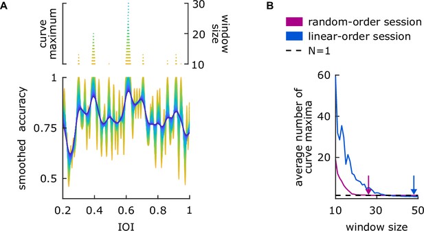
Illustration of the optimization procedure and parameter choices for smoothing accuracy in Experiment 1.
(A) Bottom: An example participant’s linear-order session dataset. Each color represents an output of the smoothing function that uses a window size, ranging from 10 (yellow) to 50 (dark blue). Top: The number of maximum values on the smoothed accuracy for each window size. (B) Participants’ average number of curve maxima for random-order (pink) and linear-order (blue) sessions. Arrows show the optimized window sizes for the session types, where each individual’s dataset had only one curve maximum (dashed line).

Permutation test results from the modular approach.
The histogram shows the distribution of median percentage divergence, obtained from 1000 iterations, and the dashed line represents the median percentage divergence from original data.

Experiment 2 (A) timeline, and illustrations of the (B) duration discrimination, (C) paced tapping, (D) slider, and (E) keypress tasks.

Results of the bootstrapping analysis.
(A) Each circle shows harmonic difference between preferred rate estimates from the original and downsampled datasets for session 1 (blue) and session 2 (pink) and their average (dotted black line) at the respective step size. (B) Each circle shows harmonic difference between preferred rate estimates from the downsampled session 1 and session 2 datasets at the respective step size.
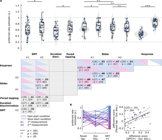
Results of Experiment 2 preferred rate analyses.
(A) Top: Estimates of preferred rate from each task condition. Box plots show median (black vertical line), 25th and 75th percentiles (box edges), and remaining data range (whiskers). Vertical lines above the box plots represent within-participants pairwise comparisons. The horizontal dashed lines represent the minimum and maximum stimulus rates presented in the experiment. Bottom: Pairwise correlations between preferred rates across tasks. For the slider and key-press tasks, boxes are colored to indicate fast-start (pink) and slow-start (blue) conditions. Coefficients and p-values are reported for significant correlations only. (B) Relationship between the preferred rate estimates from the paced tapping, duration discrimination, and spontaneous motor tempo (SMT) (first measurement) tasks. Left: Participants’ estimates from the three tasks. Each circle represents an individual’s preferred rate estimate, connected by lines between the tasks. Both circles and lines are color-sorted by individuals’ SMT, ranging from fast (pink) to slow (blue). Right: Correlation between the difference scores. Each circle represents a single participant’s difference score, namely, how different the estimates from SMT (x axis) and paced tapping (y axis) tasks were than those from the duration discrimination task. Solid black line represents the regression line, dashed lines represent 95% confidence intervals.
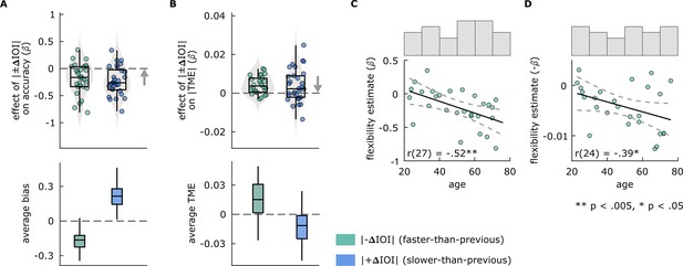
Results of Experiment 2 flexibility analyses.
(A and B) Effects of between-trial absolute rate change (|±ΔIOI|) on performance in Experiment 2 (A) duration discrimination and (B) paced tapping tasks. In the top panels, each circle represents an individual’s slope (β) obtained from models, fitted separately to conditions where |–ΔIOI| (left, green) or |+ΔIOI| (right, blue) predicted (A) accuracy in the duration discrimination or (B) |TME| in the paced tapping task. The arrow direction indicates better flexibility. In the bottom panels, box plots show (A) average bias in duration discrimination and (B) average TME in paced tapping tasks, from |–ΔIOI| (left, green) and |+ΔIOI| (right, blue) conditions. In all panels, box plots show the median (black vertical line), 25th and 75th percentiles (box edges), and extreme data points (whiskers). (C and D) Correlations between individuals’ age and the flexibility estimates from (C) duration discrimination and (D) paced tapping tasks. Solid black lines represent the regression line, dashed lines represent 95% confidence intervals. Histograms above each plot show the distribution of participant ages after outlier corrections.
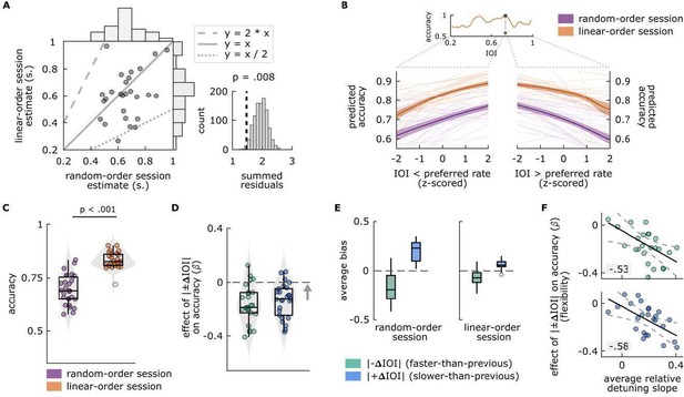
Main findings of Experiment 1.
(A) Left: Each circle represents a single participant’s preferred rate estimate from the random-order session (x axis) and linear-order session (y axis). The histograms along the top and right of the plot show the distributions of estimates for each session type. The dotted and dashed lines respectively represent 1:2 and 2:1 ratio between the axes, and the solid line represents one-to-one correspondence. Right: permutation test results. The distribution of summed residuals (distance of data points to the closest y=x, y=2*x and y=x/2 lines) of shuffled data over 1000 iterations, and the summed residual from original data (dashed line) that fell below .008 of the permutation distribution. (B) Top: Illustration of the preferred rate estimation method from an example participant’s linear-order session dataset. Estimates were the stimulus rates (IOI) where smoothed accuracy (orange line) was maximum (arrow). The dotted lines originating from the IOI axis delineate the stimulus rates that were faster (left, IOI < preferred rate) and slower (right, IOI > preferred rate) than the preferred rate estimate and expand those separate axes, the values of which were Z-scored for the relative-detuning analysis. Bottom: Predicted accuracy, calculated from single-participant models where accuracy in random-order (purple) and linear-order (orange) sessions was predicted by z-scored IOIs that were faster than a participant’s preferred rate estimate (left), and by those that were slower (right). Thin lines show predicted accuracy from single-participant models, solid lines show the averages across participants and the shaded areas represent standard error of the mean. Predicted accuracy is maximal at the preferred rate and decreases as a function of detuning. (C) Average accuracy from random-order (left, purple) and linear-order (right, orange) sessions. Each circle represents a participant’s average accuracy. (D) Flexibility estimates. Each circle represents an individuals’ slope (𝛽) obtained from logistic models, fitted separately to conditions where |𝚫IOI| (left, green) or |+𝚫IOI| (right blue) predicted accuracy, with greater values (arrow’s direction) indicating better oscillator flexibility. The means of the distributions of 𝛽 from both conditions were smaller than zero (dashed line), indicating a negative effect of between-trial absolute rate change on accuracy. (E) Participants’ average bias from |𝚫IOI| (green), and |+𝚫IOI| (blue) conditions in random-order (left) and linear-order (right) sessions. Negative bias indicates underestimation of the comparison intervals, positive bias indicates the opposite. Box plots in C-E show median (black vertical line), 25th and 75th percentiles (box edges) and extreme data points (whiskers). In C and E, empty circles show outlier values that remained after data cleaning procedures. F Correlations between participants’ average relative detuning slopes, indexing the steepness of the increase in accuracy towards the preferred rate estimate (from panel B), and flexibility estimates from |-𝚫IOI| (top, green), and |+𝚫IOI| (bottom, blue) conditions (from panel C). Solid black lines represent the best-fit line, dashed lines represent 95% confidence intervals.
Additional files
-
Supplementary file 1
Supplementary tables.
(a) Descriptive statistics and test results for comparison of β estimates against null distributions in Experiment 1 analyses. (b) Descriptive statistics of unpaced tapping measures in first and second experiments, and test results for pairwise comparisons. (c) Results of the pairwise correlation analyses between preferred rate estimates from each task and condition in Experiment 2. (d) Descriptive statistics and test results for comparison of β estimates against null distributions in Experiment 2 analyses.
- https://cdn.elifesciences.org/articles/90735/elife-90735-supp1-v1.docx
-
Supplementary file 2
Experiment 2 instructions.
- https://cdn.elifesciences.org/articles/90735/elife-90735-supp2-v1.docx
-
MDAR checklist
- https://cdn.elifesciences.org/articles/90735/elife-90735-mdarchecklist1-v1.docx


