Multi-day neuron tracking in high-density electrophysiology recordings using earth mover’s distance
- Janelia Research Campus, Howard Hughes Medical Institute, United States
- Department of Biomedical Engineering, Center for Imaging Science Institute, Kavli Neuroscience Discovery Institute, Johns Hopkins University, United States
- Sainsbury Wellcome Centre, University College London, United Kingdom
- Department of Psychology and Neuroscience Institute, University of Sheffield, United Kingdom
Figures
Figure 1
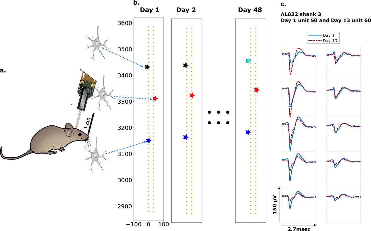
Schematic depiction of drift.
(a) Mice were implanted with a four-shank Neuropixels 2.0 probe in visual cortex area V1. (b) Each colored star represents the location of a unit recorded on the probe. In this hypothetical case, the same color indicates unit correspondence across days. The black unit is missing on day 48, while the turquoise star is an example of a new unit. Tracking aims to correctly match the red and blue units across all datasets and determine that the black unit is undetected on day 48. (c) Two example spatial-temporal waveforms of units recorded in two datasets that likely represent the same neuron, based on similar visual responses. Each trace is the average waveform on one channel across 2.7 ms. The blue traces are waveforms on the peak channel and nine nearby channels (two rows above, two rows below, and one in the same row) from the first dataset (day 1). The red traces, similarly selected, are from the second dataset. Waveforms are aligned at the electrodes with peak amplitude, different on the 2 days.
Figure 2 with 4 supplements
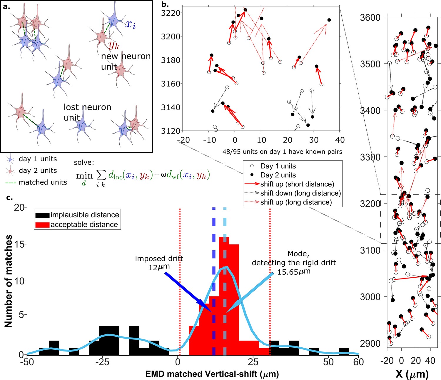
The earth mover’s distance (EMD) can detect the displacement of single units.
(a) Schematic of EMD unit matching. Each blue unit in day 1 is matched to a red unit in day 2. Dashed lines indicate the matches to be found by minimizing the weighted sum of physical and waveform distances. (b) Open and filled circles show positions of units in days 1 and 2, respectively. Arrows indicate matching using EMD. The arrow color represents the match direction; upward matches found with the EMD are in red and downward in black. Solid lines indicate a z-match distance within 15 μm, while a dashed line indicates a z-distance . Expanded view shows probe area from 3120 to 3220 μm. (c) Histogram of z-distances of matches (black and red bars) and kernel fit (light blue solid curve). The light blue dashed line shows the mode (). The dark blue dashed line shows the imposed drift (). The red region shows the matches within 15 μm of the mode. The EMD needs to detect the homogeneous movement against the background, i.e., units in the black region that are unlikely to be the real matches due to biological constraints.
Figure 2—figure supplement 1
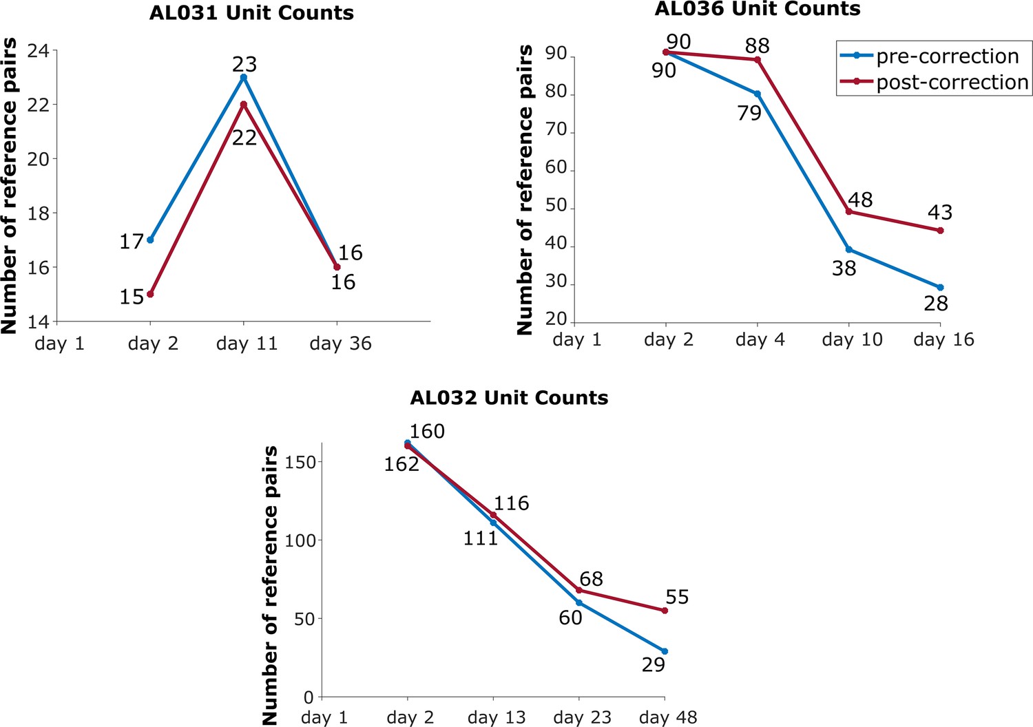
The effect of drift correction on reference units yield for all three animals.
Note that drift correction improves the recovery rate for most cases; the degree of improvement is a function of the magnitude of the drift.
Figure 2—figure supplement 2
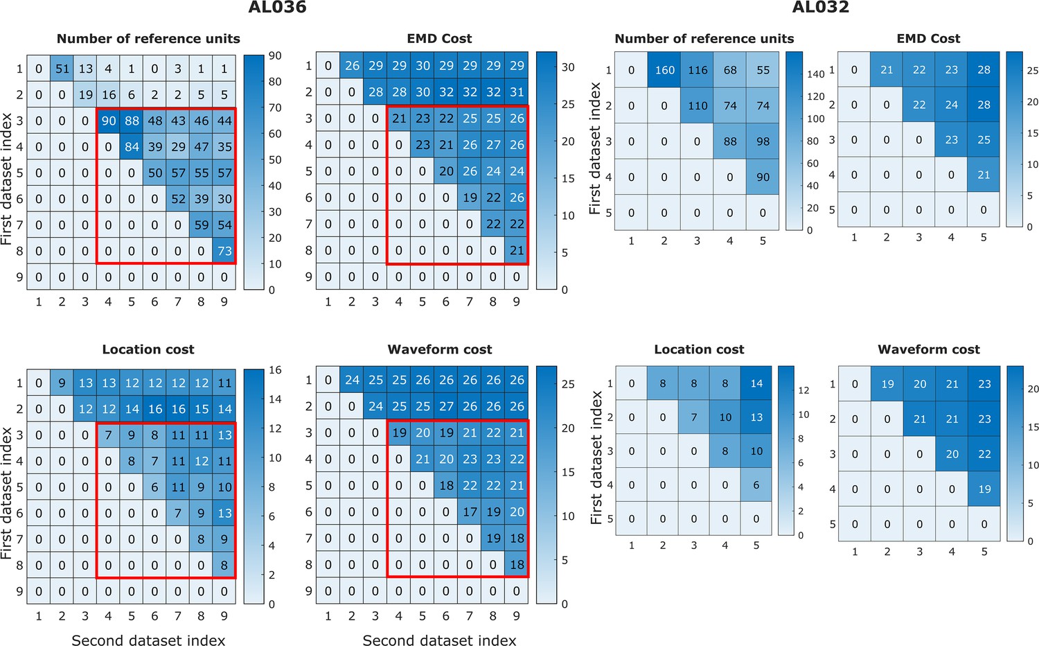
Earth mover’s distance (EMD) cost can be used to detect discontinuities in the data.
In animal AL036, we noted a large decrease in the number of reference units (units with matched visual responses, see section Reference set) after the second dataset. This likely indicates a large physical shift in the tissue relative to the probe. It is important to be able to detect such discontinuities to eliminate datasets from consideration. We find that the discontinuity can be detected in the EMD mean cost, location mean cost, and waveform mean cost. The four heatmaps on the left show reference counts and pairwise costs for units matched on one shank in animal AL036. Note that the days with few reference units also have higher EMD cost. To show that days 1–2 (first two rows) are significantly different from days 3 to 9, we use the Mann-Whitney U test. All three cost values show significant differences between the groups (EMD mean cost, reject H0, p = ; location mean cost, reject H0, p = ; waveform mean cost, reject H0, p = ). To show that days 3–9 come from the same distribution, we compare odd and even rows using the same test. All three cost values show no significant difference between odd and even days (accept H0, p=0.92). Based on this significant difference between days 1 and 2 and later days (datasets in the red rectangles), we infer that the first two datasets sampled a different population of units than the later recordings. These first two datasets were eliminated from our analysis. Matrices on the right show similar information for animal AL032 for reference. To estimate the relative magnitude of EMD cost in related datasets versus unrelated datasets, we calculated the cost between unrelated datasets with similar number of units (AL032 shank 1 and AL036 shank 1, EMD cost = 78, location cost = 67, and waveform cost = 32). The EMD cost is between 70 and 80, much larger than observed for related datasets (between 20 and 30).
Figure 2—figure supplement 3
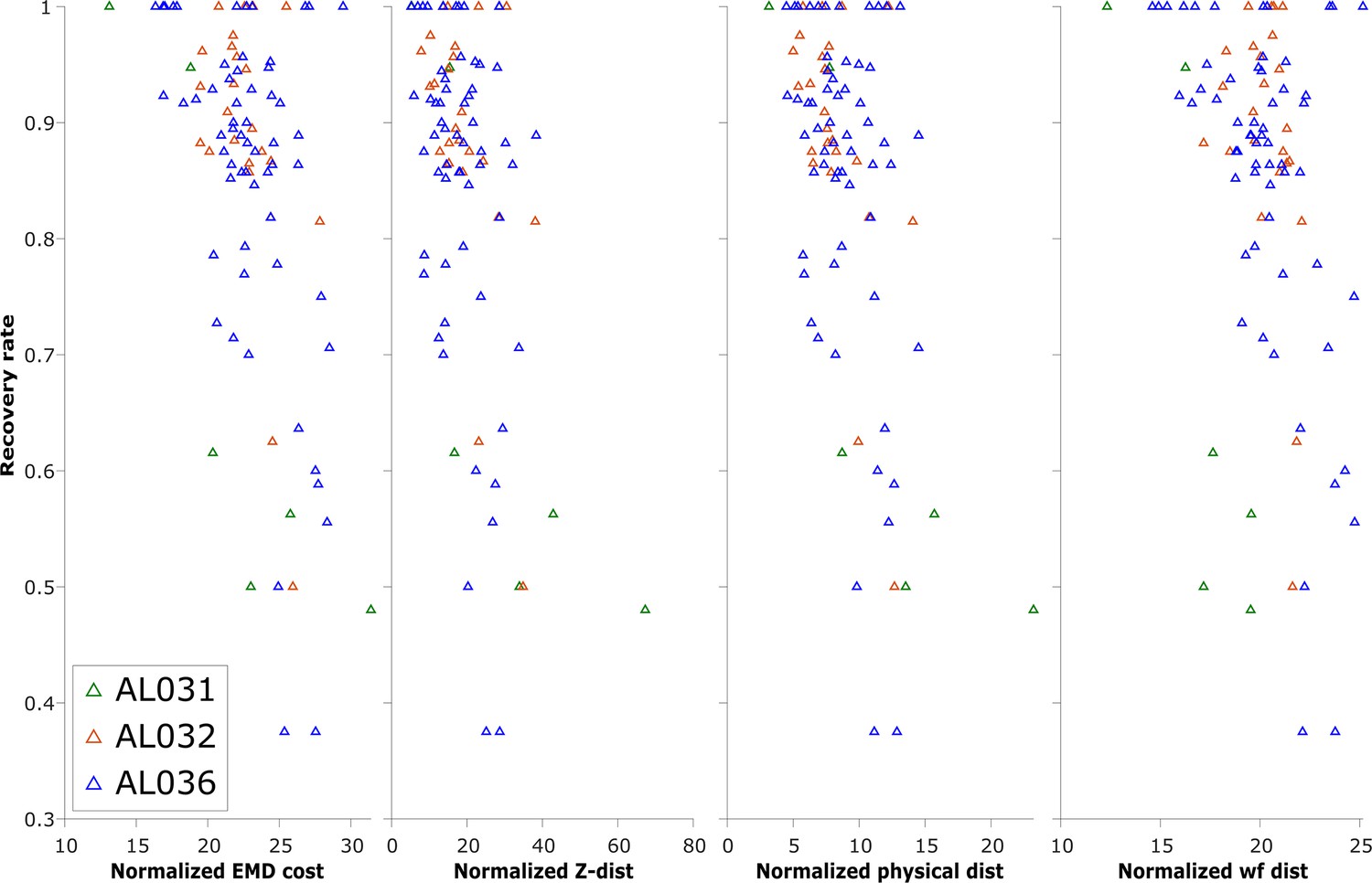
The normalized earth mover’s distance (EMD) cost (unitless), z-distance (μm), physical distance (μm), and waveform distance (unitless) and the corresponding recovery rate of reference unit (units with matched visual responses) in pairwise matches of all to all pairs of recordings, on each shank.
Each triangle represents the recovery rate in a pair of datasets. Animal AL031 has 6 sets of matching, with one outlier removed. Animal AL032 has 24 sets of matching. Animal AL036 has 60 sets of matched units. Overall, most of the datasets with high recovery rates have per-unit EMD in the range 20–30, but datasets with lower recovery are in the same range. Therefore, while very high EMD cost reveals discontinuous data, EMD cost in the normal range is not predictive of reference unit recovery, which is a metric of match success.
Figure 2—figure supplement 4
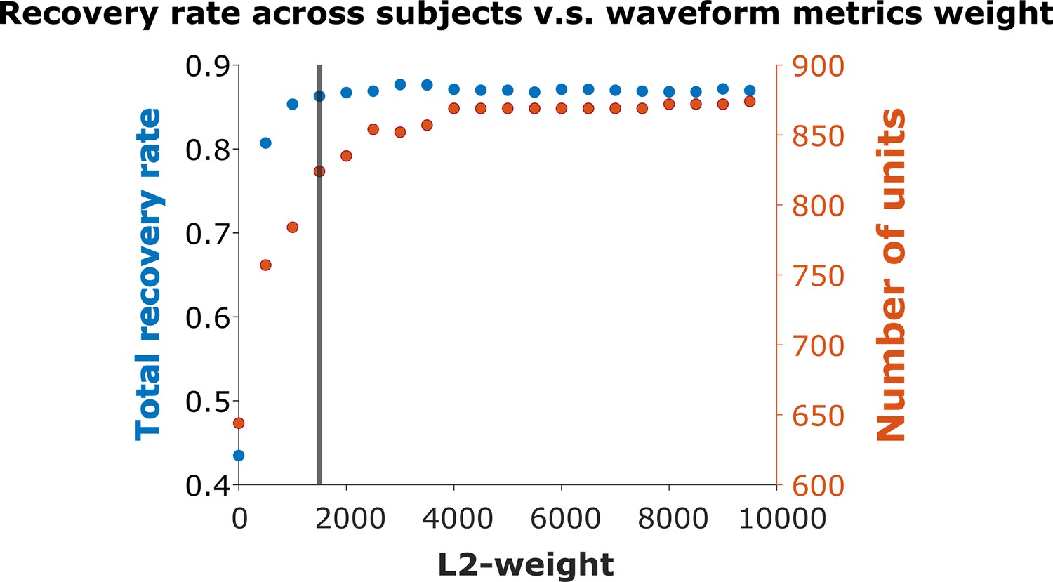
Recovery rate vs. L2-weight.
We varied the weight in Equation 4 used to combine the physical and waveform distances in increments of 500. The vertical line indicates weight = 1500, where the overall recovery rate = 86.29%. The maximum recovery rate = 87.68% occurs at weight = 3000. We chose weight = 1500 for all subsequent analysis.
Figure 3
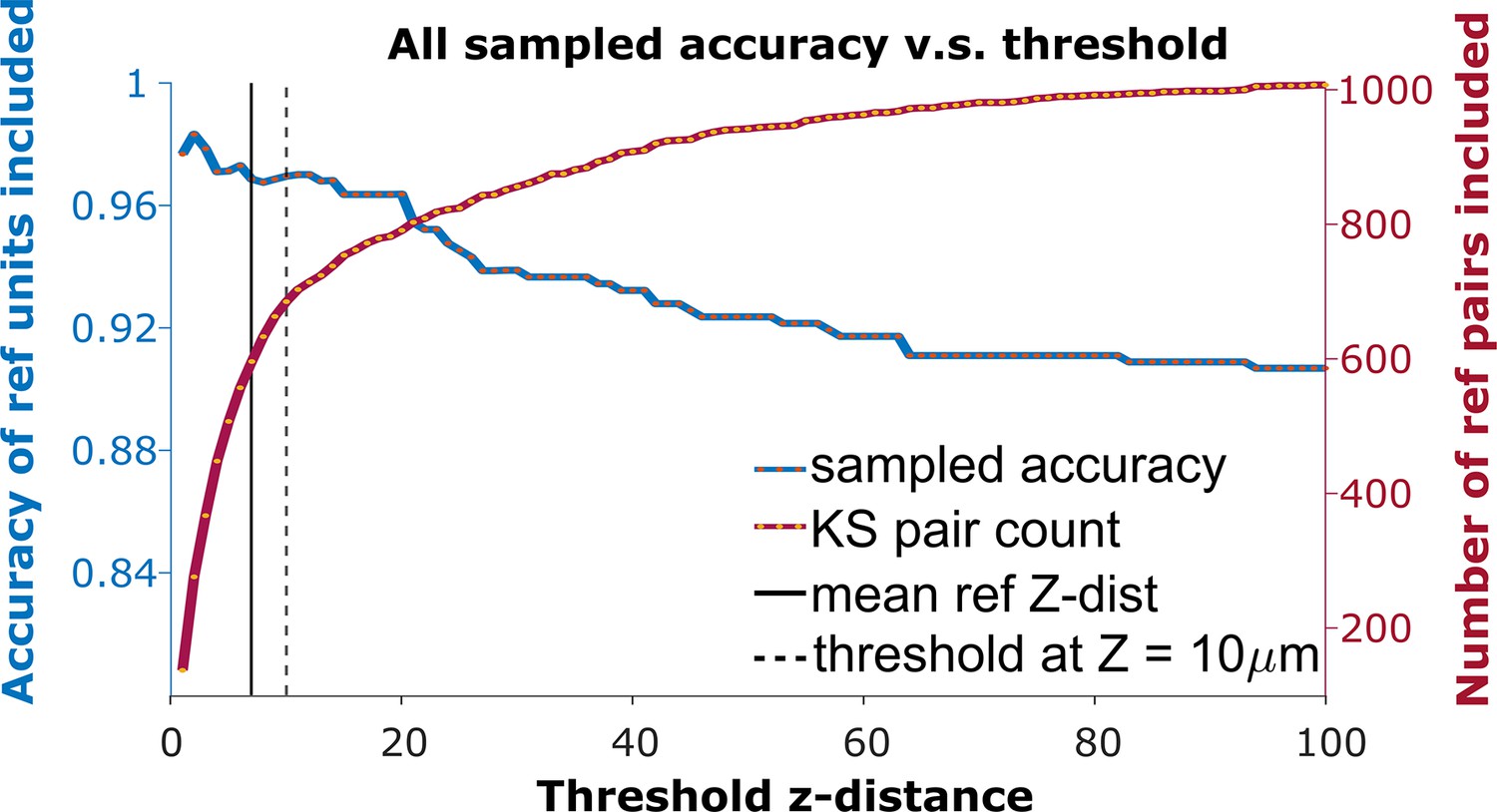
The receiver operator characteristic (ROC) curve of matching accuracy vs. distance.
The blue curve shows the accuracy for reference units. The red line indicates the number of reference units included. The solid vertical line indicates the average z-distance across all reference pairs in all animals (). The dashed vertical black line indicates a z-distance threshold at z=10 μm.
Figure 4 with 3 supplements
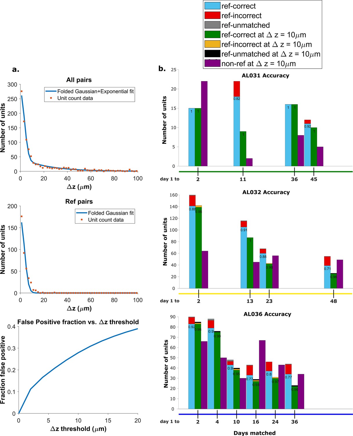
Recovery rate, accuracy, and putative pairs.
(a) The histogram distribution fit for all KSgood units (top) and reference units alone (middle). False positives for reference units are defined as units matched by earth mover’s distance (EMD) but not matched when using receptive fields. The false positive fraction for the set of all KSgood units is obtained by integration. z=10 μm threshold has a false positive rate = 27% for KSgood units. (b) Light blue bars represent the number of reference units successfully recovered using only unit location and waveform. The numbers on the bars are the recovery rate of each dataset, and the red portion indicates incorrect matches. Incorrect matches are cases where units with a known match from receptive field data are paired with a different unit by EMD; these errors are false positives. The green bars show matching accuracy for the set of pairs with z-distance less than the 10 μm threshold. The orange portion indicates incorrect matches after thresholding. The false positives are mostly eliminated by adding the threshold. Purple bars are the number of putative units (unit with no reference information) inferred with z-threshold=10 μm.
Figure 4—figure supplement 1
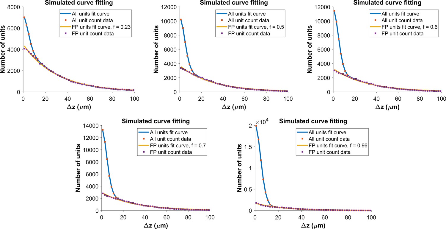
Determining the functional form for the z-distance distribution of all pairs.
As shown in Figure 4a, the z-distance distribution of reference pairs differs significantly from that of all pairs. The z-distance distribution for all pairs is the sum of z-distance distributions for true hits () and false positives (), weighted by the fraction correct, f: . We built a Monte Carlo model, with 150 units (the average density of subject AL032), normally distributed error with for the measured location of the units in true pairs, and random placement of false positives. For each value of fraction correct, we ran the model 500 times. The figure shows fits to model distributions with fraction correct = 0.23, 0.5, 0.6 (top row) and f=0.7, 0.96 (bottom row). The resulting z-distance distributions are well fit using a folded Gaussian for the distance distribution of true hits and an exponential for the distance distribution of false positives (see Algorithm 2). We use these functional forms to fit the experimental z-distance distribution and estimate the false positive rate.
Figure 4—figure supplement 2
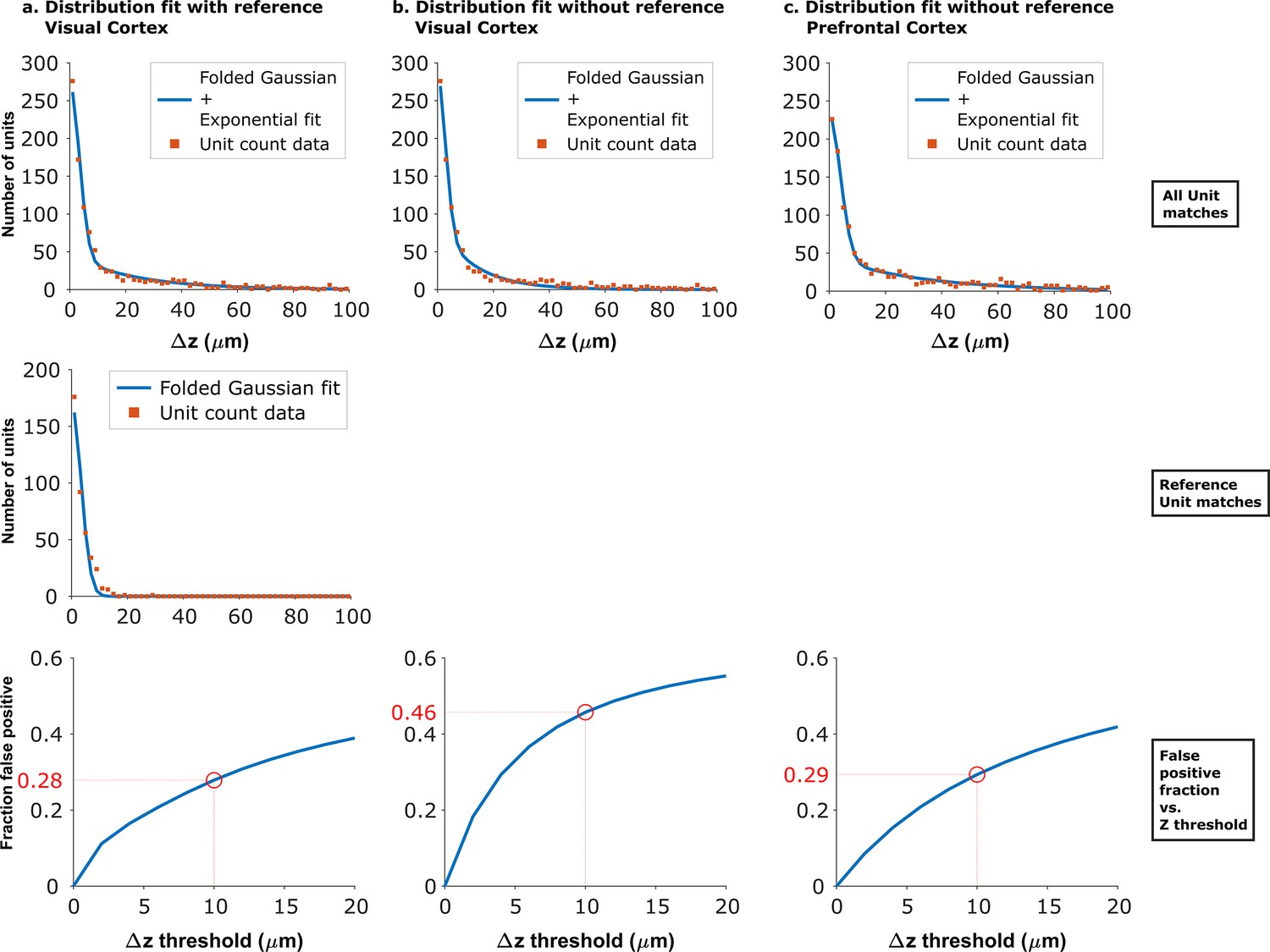
Fits of experimental z-distance distributions to the model.
When reference data is available, the z-distance distribution of these known true hits can be fit to obtain the width of the folded Gaussian. can then be fixed in the fit of the distribution of all KSgood units to Equation 3, which is used to estimate the false positive rate. When no reference data are available, can be estimated from fitting the distribution of all KSgood units to all four parameters in Equation 3. Panels a and b show the dataset from Figure 4 fit with and without fixing the folded Gaussian distribution width. The resulting false positive rate from the no-reference fit at threshold is larger than that from the fit using reference data, so the procedure gives a conservative estimate of the accuracy. Panel c shows the model fit of data from an unrelated dataset acquired with from mouse prefrontal cortex using Neuropixels 1.0 (Böhm and Lee, 2023). The similar shape of the distribution and a 29% false positive rate suggests that the method can be generalized.
Figure 4—figure supplement 3
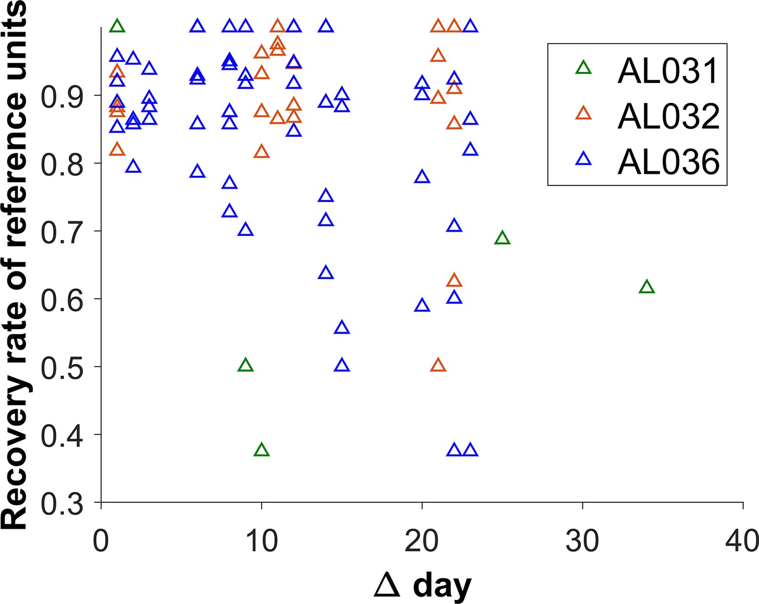
The reference unit recovery rate vs. days between matched recordings.
Each triangle represents the matching results of two datasets. Animal AL031 has 6 sets of matched units, with one outlier removed. Animal AL032 has 24 sets of matched units. Animal AL036 has 60 sets of matching. The recovery rate is lower for longer durations.
Figure 5 with 5 supplements
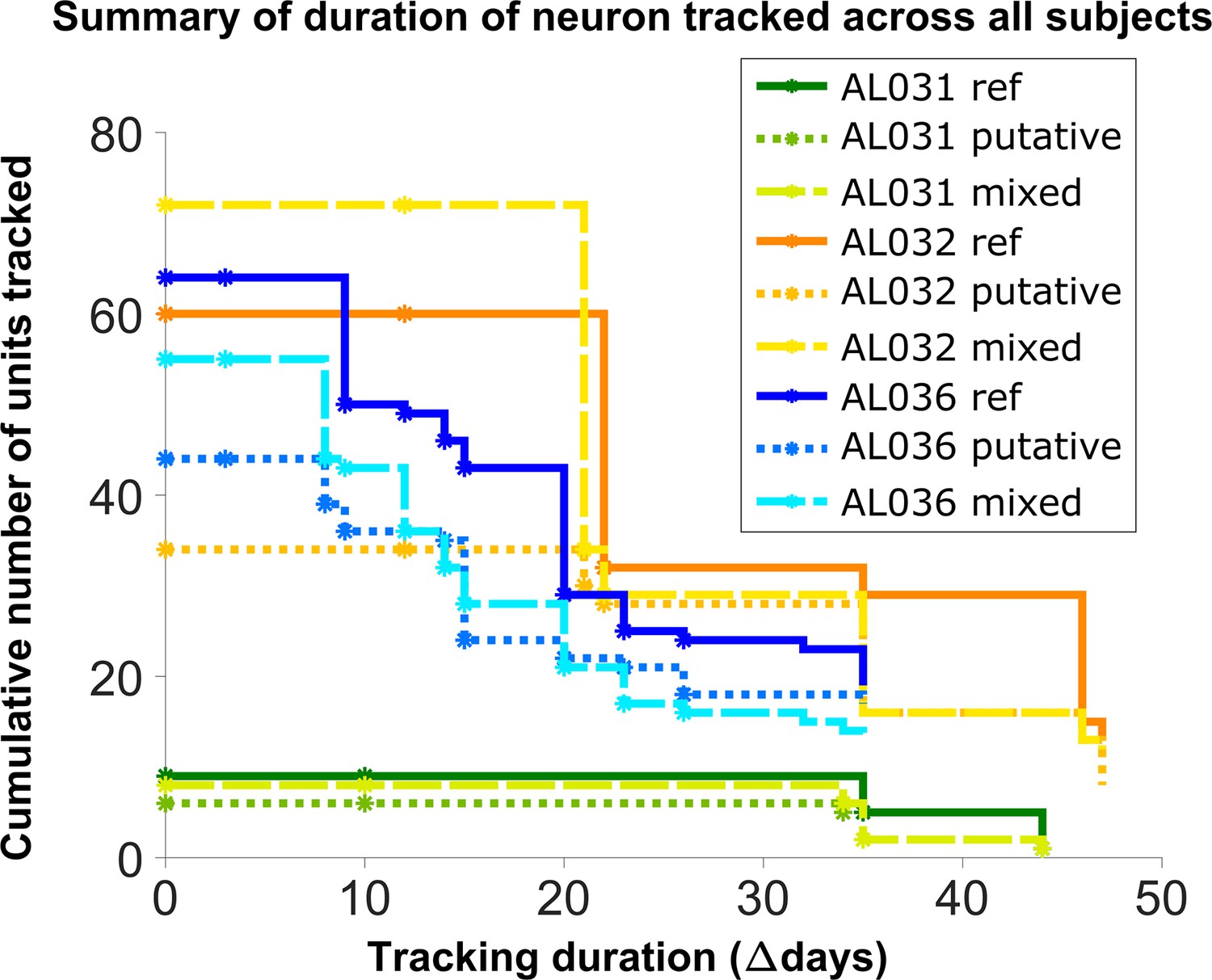
Number of reference units (deep blue, dark orange, and green for different subjects), putative (medium green, medium orange, and blue) units, and mixed units (light green, yellow, and light blue) tracked for different durations.
The loss rate is similar for different chain types in the same subject. Note that chains can start on any day in the full set of recordings, so the different sets of neurons have chains with different spans between measurements.
Figure 5—figure supplement 1

Distribution of waveform L2 similarity change per dataset for each neuron group (reference, putative, and mixed) and across all neurons.
Box plots indicate 25th percentile, medians, and 75th percentile. Whiskers at the ends of the box plot show maximum and minimum values. n and N are the number of unit comparisons, i.e., (number of units) × (number of datasets - 1). A Kruskal-Wallis test indicates no difference among the three groups.
Figure 5—figure supplement 2
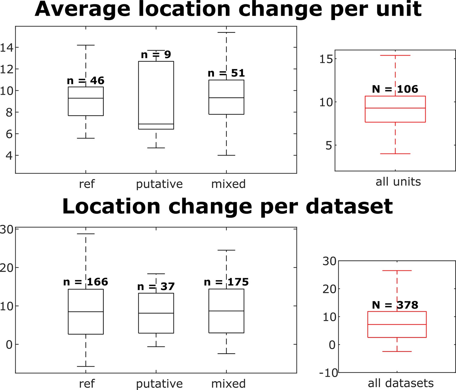
Distributions of individual unit location changes over whole chains (top) and unit location changes between pairs of datasets (bottom), for each neuron group and across all neurons.
Box plots indicate 25th percentile, medians, and 75th percentile. Whiskers at the ends of the box plot show maximum and minimum values. In the top plot, n and N are the number of units. In the bottom plot, n and N are the number of unit comparisons, i.e., (number of units) × (number of datasets - 1). A Kruskal-Wallis test indicates no difference among the three groups.
Figure 5—figure supplement 3
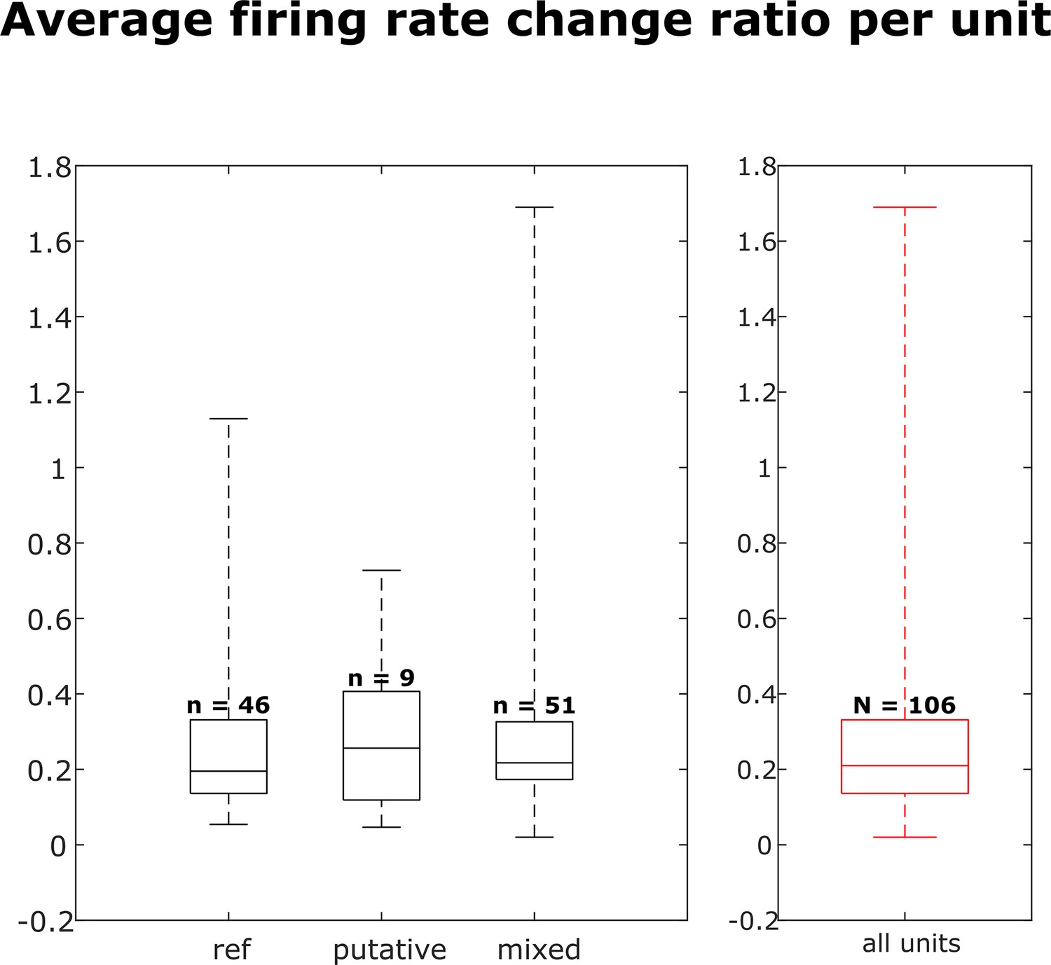
Distribution of firing rate fold change per dataset for each neuron group and across all neurons.
Box plots indicate 25th percentile, medians, and 75th percentile. Whiskers at the ends of the box plot show maximum and minimum values. n and N are the number of units. A Kruskal-Wallis test indicates no difference among the three groups.
Figure 5—figure supplement 4
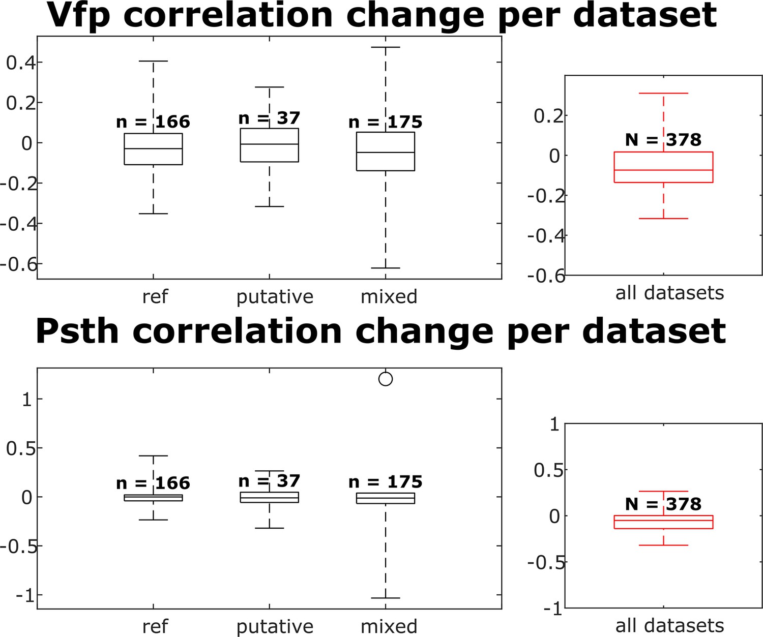
The visual fingerprint and peristimulus time histogram (PSTH) change distributions per dataset for each neuron group and across all neurons.
Box plots indicate 25th percentile, medians, and 75th percentile. Whiskers at the ends of the box plot show maximum and minimum values. n and N are the number of unit comparisons, i.e., (number of units) × (number of datasets - 1). A Kruskal-Wallis test indicates no difference among the three groups.
Figure 5—figure supplement 5
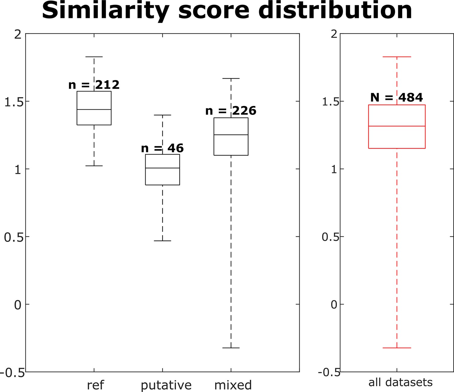
The similarity score distribution per dataset for each neuron group and across all neurons.
Box plots indicate 25th percentile, medians, and 75th percentile. Whiskers at the ends of the box plot show maximum and minimum values. n and N are the number of observations of the units, i.e., (observations of this unit).
Figure 6 with 2 supplements
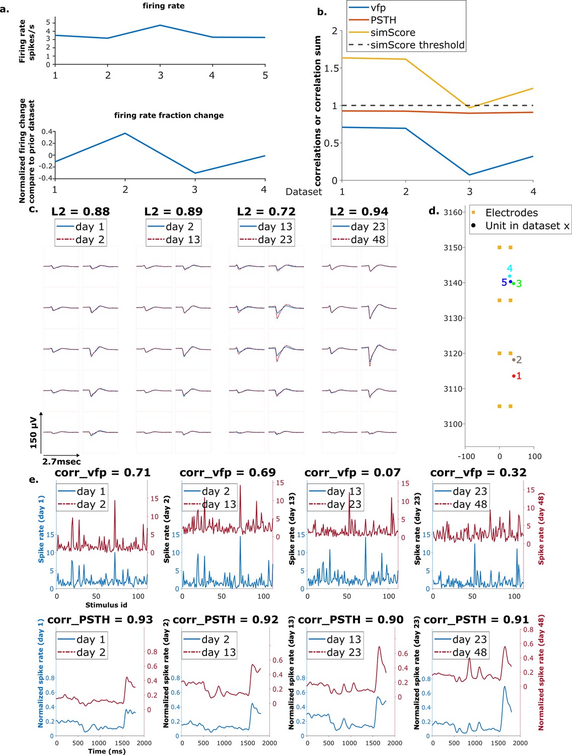
Example mixed chain.
(a) Above: Firing rates of this neuron on each day (days 1, 2, 13, 23, 48). Below: Firing rate fractional change compared to the previous day. (b) Visual response similarity (yellow line), peristimulus time histogram (PSTH) correlation (orange line), and visual fingerprint (vfp) correlation (blue line). The similarity score is the sum of vfp and PSTH. The dashed black line shows the threshold to be considered a reference unit. (c) Spatial-temporal waveform of a trackable unit. Each pair of traces represents the waveform on a single channel. (d) Estimated location of this unit on different days. Each colored dot represents a unit on 1 day. The orange squares represent the electrodes. (e) The pairwise vfp and PSTH traces of this unit.
Figure 6—figure supplement 1
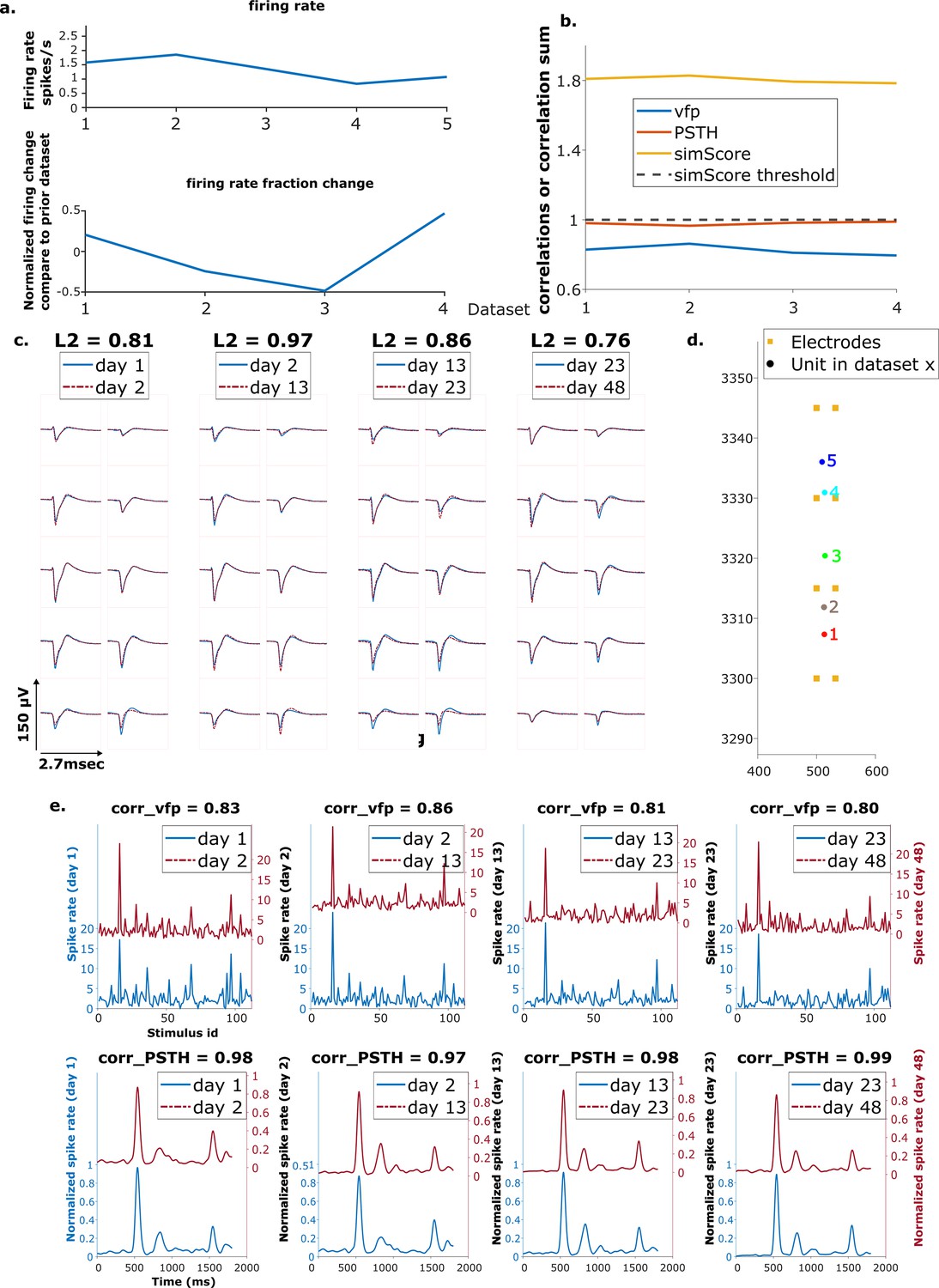
Example reference chain.
(a) Above: Firing rates of this neuron on each day. Below: Firing rate fractional change compared to the previous day. (b) Visual response similarity (yellow line), peristimulus time histogram (PSTH) correlation (orange line), and visual fingerprint (vfp) correlation (blue line). The similarity score is the sum of vfp and PSTH. The dashed black line shows the threshold to be considered a reference unit. (c) Spatial-temporal waveform of a trackable unit. Each pair of traces represent the waveform on a single channel. (d) Estimated location of this unit on different days. Each colored dot represents a unit on 1 day. The orange squares represent the electrodes. (e) The pairwise vfp and PSTH traces of this unit.
Figure 6—figure supplement 2
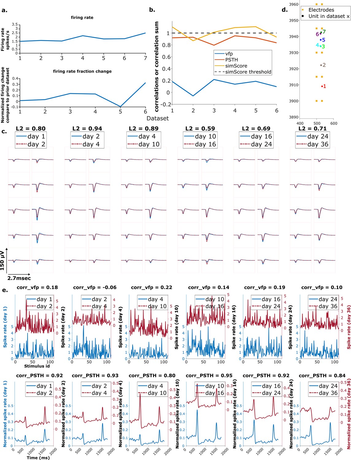
Example putative chain.
Order is the same as the previous figure.
Figure 7 with 3 supplements
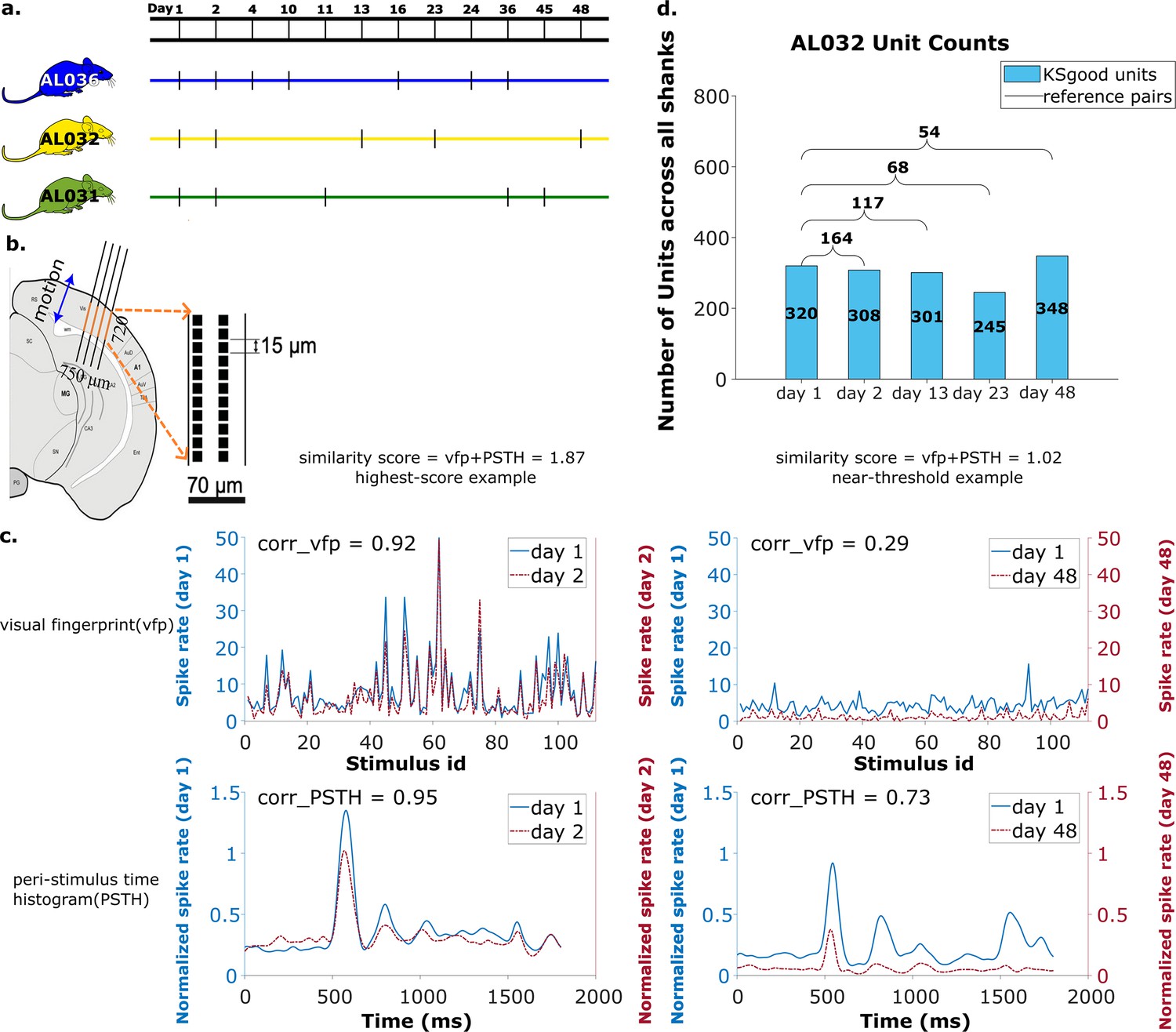
Summary of dataset.
(a) The recording intervals for each animal. A black dash indicates one recording on that day. (b) All recordings are from visual cortex V1 with a 720 μm section of the probe containing 96 recording sites. The blue arrow indicates the main drift direction. (c) Examples of visual fingerprint (vfp) and peristimulus time histogram (PSTH) from a high correlation (left column) and a just-above-threshold (right column) correlation unit. Both vfp and PSTH values vary from [–1,1]. (d) Kilosort-good and reference unit counts for animal AL032, including units from all four shanks.
Figure 7—figure supplement 1
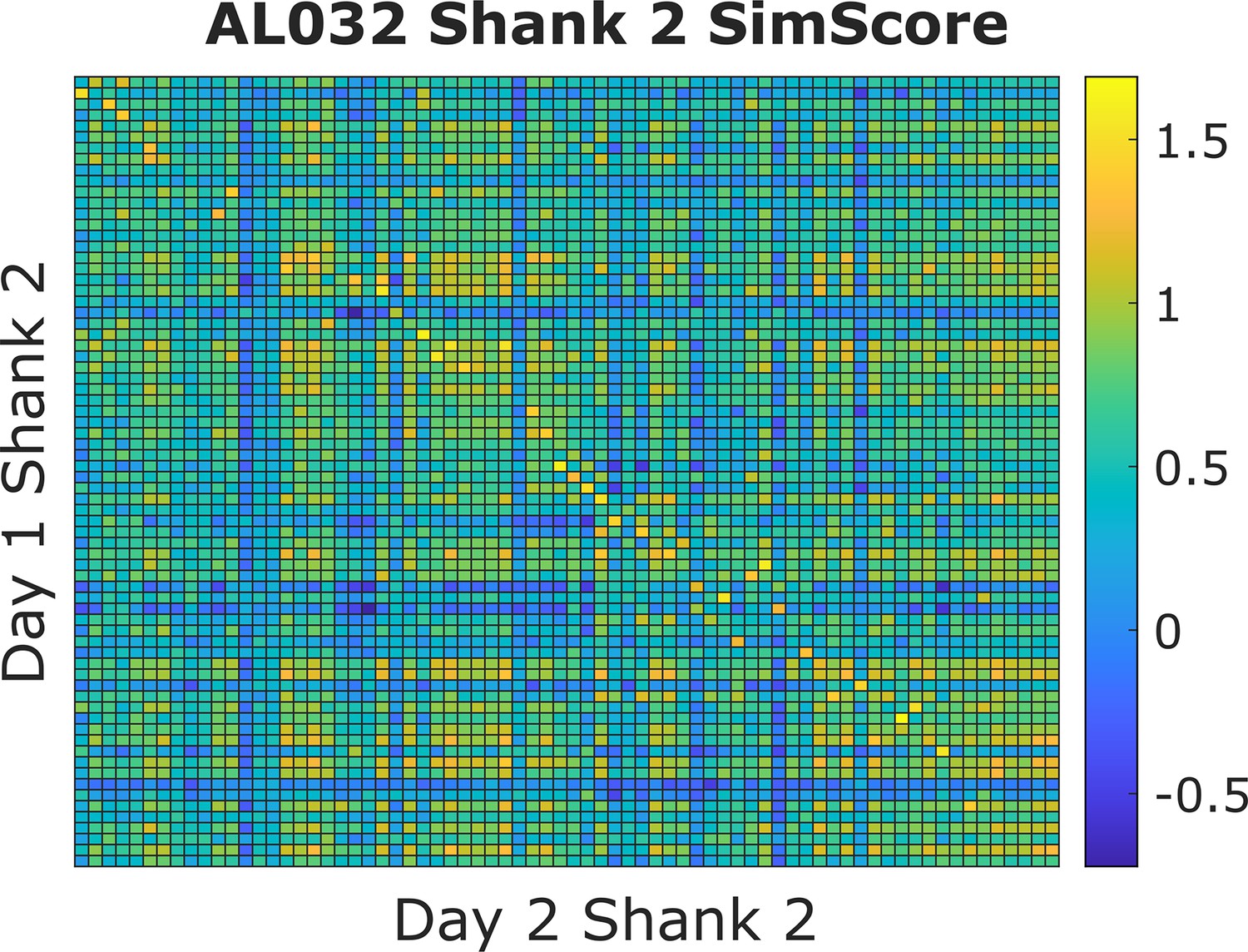
An example similarity score (visual fingerprint [vfp] + peristimulus time histogram [PSTH]) heatmap from animal AL032, shank 2, Kilosort-good units between days 1 and 2.
Each small square represents the similarity score (value range from [–2,2]) between one unit from day 1 and one unit from day 2. A warm colored square indicates a higher score. The clusters are ordered by their physical locations on the probe. There is a diagonal line with brightest color blocks, indicating that units with more similar firing responses across days tend to be physically close. This confirms our assumption that neurons are physically stable over time. Also notice that, on each column, there might be more than one bright block in the more distant clusters. We minimize the effect of distant units by constraining the feasible region during selection of reference units. There are also columns without bright yellow blocks. This happens because some units do not respond to the stimulus and those units are not included in the reference set.
Figure 7—figure supplement 2
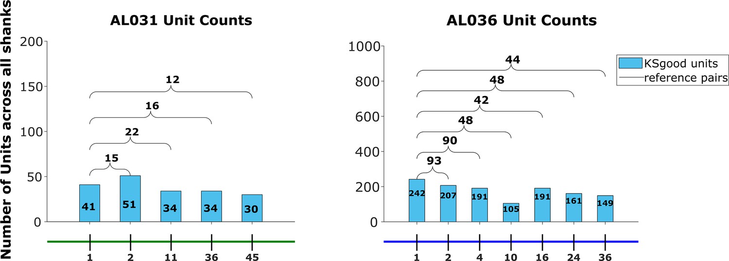
The Kilosort-good and reference unit counts for the animals AL031 and AL036, as shown for animal AL032 in Figure 7.
Figure 7—figure supplement 3
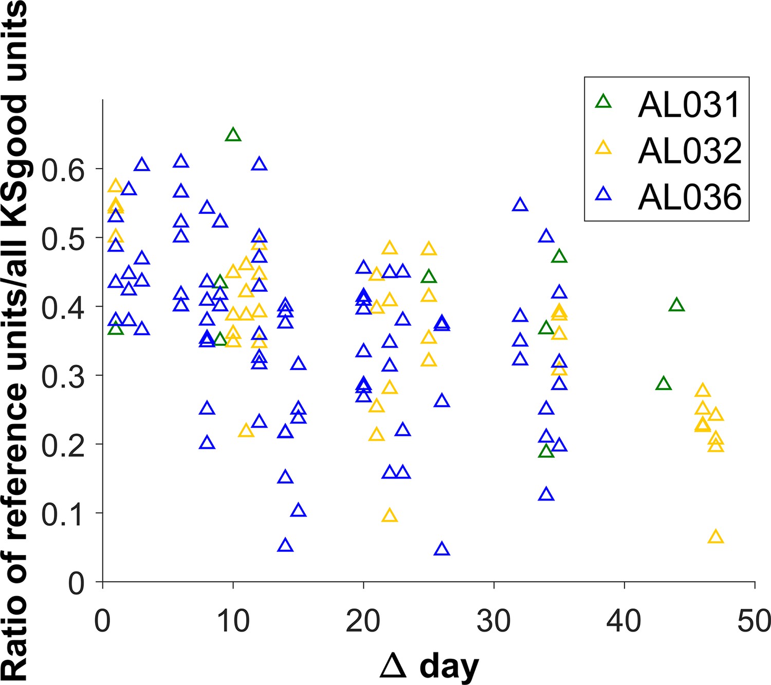
The ratio of the count of reference units to KSgood units decreases for pairs of datasets with larger time intervals.
However, the variability of the number of reference units is generally large for all time intervals.
Additional files
Download links
A two-part list of links to download the article, or parts of the article, in various formats.
Downloads (link to download the article as PDF)
Open citations (links to open the citations from this article in various online reference manager services)
Cite this article (links to download the citations from this article in formats compatible with various reference manager tools)
Multi-day neuron tracking in high-density electrophysiology recordings using earth mover’s distance
eLife 12:RP92495.
https://doi.org/10.7554/eLife.92495.3


