Speech and music recruit frequency-specific distributed and overlapping cortical networks
Figures
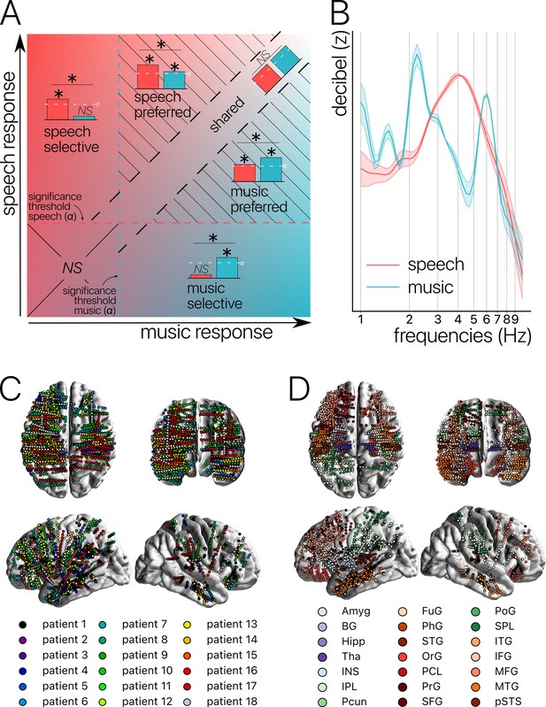
Concepts, stimuli, and recordings.
(A) Conceptual definition of selective, preferred, and shared neural processes. Illustration of the continua between speech and music selectivity, speech and music preference, and shared resources. ‘Selective’ responses are neural responses significant for one domain but not the other, and with a significant difference between domains (for speech top left; for music bottom right). ‘Preferred’ responses correspond to neural responses that occur during both speech and music processing, but with a significantly stronger response for one domain over the other (striped triangles). Finally, ‘shared’ responses occur when there are no significant differences between domains, and there is a significant neural response to at least one of the two stimuli (visible along the diagonal). If neither domain produces a significant neural response, the difference is not assessed (lower left square). (B) Stimuli. Modulation spectrum of the acoustic temporal envelope of the continuous, 10 min long speech and music stimuli. (C) Anatomical localization of the stereotactic EEG (sEEG) electrodes for each patient (N=18). (D) Anatomical localization of the sEEG electrodes for each anatomical region. Abbreviations according to the Human Brainnetome Atlas (Fan et al., 2016).
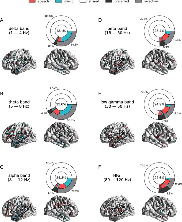
Power spectrum analyses of activations (speech or music>tones).
(A–F) Neural responses to speech and/or music for the six canonical frequency bands. Only significant activations compared to the baseline condition (pure tones listening) are reported (see Figure 2—figure supplement 2 for uncategorized, continuous results). Nested pie charts indicate: (1) in the center, the percentage of channels that showed a significant response to speech and/or music. (2) The outer pie indicates the percentage of channels, relative to the center, classified as shared (white), selective (light gray), and preferred (dark gray). (3) The inner pie indicates, for the selective (plain) and preferred (pattern) categories, the proportion of channels that were (more) responsive to speech (red) or music (blue). Brain plots indicate: Distribution of shared (white) and selective (red/blue) stereotactic EEG (sEEG) channels projected on the brain surface. Results are significant at q<0.01 (N=18).
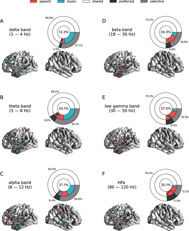
Power spectrum analyses of activations (speech or music>syllables).
(A–F) Neural responses to speech and/or music for the six canonical frequency bands. Only significant activations compared to the baseline condition (syllables listening) are reported. Same conventions as in Figure 2. Results are significant at q<0.01 (N=18).
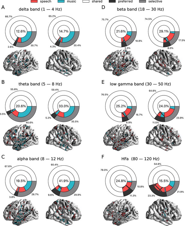
Power spectrum analyses of activations (speech or music>tones) for each hemisphere separately and for the six frequency bands (A-F).
Same conventions as in Figure 2. Results are significant at q<0.01 (N=18).
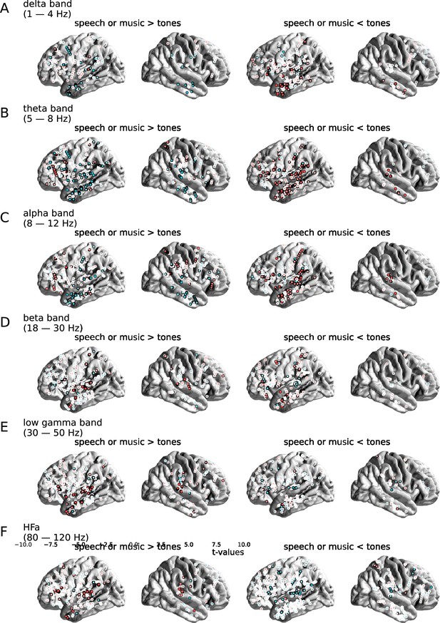
Contrast between the neural responses to speech and music, for the six (A-F) canonical frequency bands (tones baseline).
Distribution of uncategorized, continuous t-values from the speech vs. music permutation test, projected on the brain surface. Only stereotactic EEG (sEEG) channels for which speech and/or music is significantly stronger (left column) or weaker (right column) than the baseline condition (pure tones listening) are reported. Channels for which the speech vs. music contrast is significant are circled in black. Channels for which the speech vs. music contrast is not significant are circled in white. Results are significant at q<0.01 (N=18).
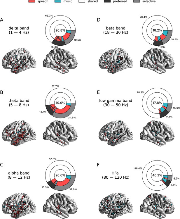
Power spectrum analyses of deactivations (speech or music<tones).
(A–F) Neural responses to speech and/or music for the six canonical frequency bands. Only significant deactivations compared to the baseline condition (pure tones listening) are reported. Same conventions as in Figure 2. Results are significant at q<0.01 (N=18).
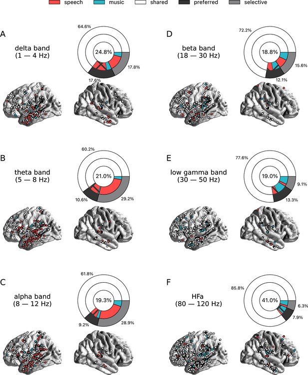
Power spectrum analyses of deactivations (speech or music<syllables).
(A–F) Neural responses to speech and/or music for the six canonical frequency bands. Only significant deactivations compared to the baseline condition (syllables listening) are reported. Same conventions as in Figure 2. Results are significant at q<0.01 (N=18).
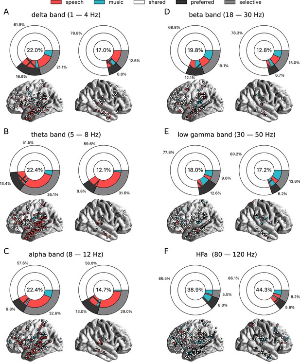
Power spectrum analyses of deactivations (speech or music<tones) for each hemisphere separately.
(A-F) Neural responses to speech and/or music for the six canonical frequency bands. Same conventions as in Figure 2. Results are significant at q<0.01 (N=18).

Cross-frequency channel selectivity for the power spectrum analyses.
(A-F) Percentage of channels that exclusively respond to speech (red) or music (blue) across different frequency bands. For each plot, the first (leftmost) value corresponds to the percentage (%) of channels displaying a selective response in a specific frequency band (either activation or deactivation, compared to the baseline condition of pure tones listening). In the next value, we remove the channels that are significantly responsive in the other domain (i.e. no longer exclusive) for the following frequency band (e.g. in panel A: speech selective in delta; speech selective in delta XOR music responsive in theta; speech selective in delta XOR music responsive in theta XOR music responsive in alpha; and so forth). The black dots at the bottom of the graph indicate which frequency bands were successively included in the analysis. Note that channels remaining selective across frequency bands did not necessarily respond selectively in every band. They simply never showed a significant response to the other domain in the other bands.

Cross-frequency channel selectivity for the power spectrum analyses (syllables baseline).
(A-F) Percentage of channels that selectively respond to speech (red) or music (blue) across different frequency bands, compared to the baseline condition (syllable listening). Same conventions as in Figure 4.
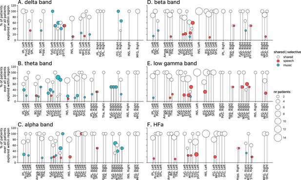
Population prevalence for the power spectral analyses of activations (speech or music>tones; N=18).
(A–F) Population prevalence of shared or selective responses for the six canonical frequency bands, per anatomical region (note that preferred responses are excluded). Only significant activations compared to the baseline condition (pure tones listening) are reported. Regions (on the x-axis) were included in the analyses if they had been explored by minimally two patients with minimally two significant channels. Patients were considered to show regional selective processing when all their channels in a given region responded selectively to either speech (red) or music (blue). When regions contained a combination of channels with speech selective, music selective, or shared responses, the patient was considered to show shared (white) processing in this region. The height of the lollipop (y-axis) indicates the percentage of patients over the total number of explored patients in that given region. The size of the lollipop indicates the number of patients. As an example, in panel F (high-frequency activity [HFa] band), most lollipops are white with a height of 100%, indicating that, in these regions, all patients presented a shared response profile. However, in the left inferior parietal lobule (IPL, left) one patient (out of the seven explored) shows speech selective processing (filled red circle). A fully selective region would thus show a fixed-color full height across all frequency bands. Abbreviations according to the Human Brainnetome Atlas (Fan et al., 2016).
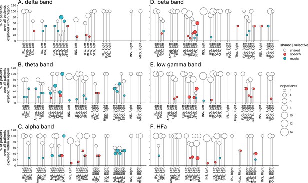
Population prevalence for the power spectral analyses of activations (speech or music>syllables; N=18).
(A–F) Population prevalence of shared or selective responses for the six canonical frequency bands, per anatomical region. Only significant activations compared to the baseline condition (syllables listening) are reported. Same conventions as in Figure 5.
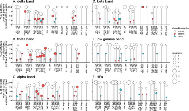
Population prevalence for the power spectral analyses of deactivations (speech or music<tones; N=18).
(A–F) Population prevalence of shared or selective responses for the six canonical frequency bands, per anatomical region. Only significant deactivations compared to the baseline condition (pure tones listening) are reported. Same conventions as in Figure 5.
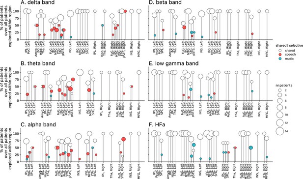
Population prevalence for the power spectral analyses of deactivations (speech or music<syllables; N=18).
(A–F) Population prevalence of shared or selective responses for the six canonical frequency bands, per anatomical region. Only significant deactivations compared to the baseline condition (syllables listening) are reported. Same conventions as in Figure 5.
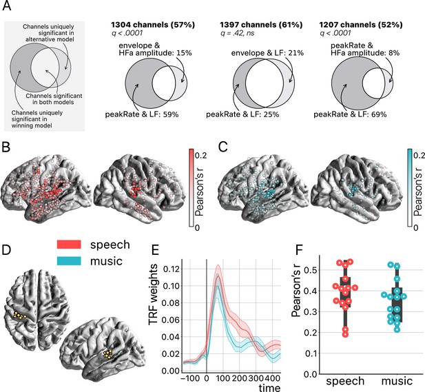
Temporal response function (TRF) analyses.
(A) Model comparison. On the top left a toy model illustrates the use of Venn diagrams comparing the winning model (peakRate in low frequency [LF]) to each of the three other models for speech and music (pooled). Four TRF models were investigated to quantify the encoding of the instantaneous envelope and the discrete acoustic onset edges (peakRate) by either the LF band or the high-frequency amplitude. The ‘peakRate & LF’ model significantly captures the largest proportion of channels, and is, therefore, considered the winning model. The percentages on the top (in bold) indicate the percentage of total channels for which a significant encoding was observed during speech and/or music listening in either of the two compared models. In the Venn diagram, we indicate, out of all significant channels, the percentage that responded in the winning model (left) or in the alternative model (right). The middle part indicates the percentage of channels shared between the winning and the alternative model (percentage not shown). q-Values indicate pairwise model comparisons (Wilcoxon signed-rank test, FDR-corrected). (B and C) peakRate & LF model: Spatial distribution of stereotactic EEG (sEEG) channels wherein LF neural activity significantly encodes the speech (red) and music (blue) peakRates. Higher prediction accuracy (Pearson’s r) is indicated by increasing color saturation. All results are significant at q<0.01 (N=18). (D) Anatomical localization of the best encoding channel within the left hemisphere for each patient (N=15), as estimated by the ‘peakRate & LF’ model (averaged across speech and music). These channels are all within the auditory cortex and serve as seeds for subsequent connectivity analyses. (E) TRFs averaged across the seed channels (N=15), for speech and music. (F) Prediction accuracy (Pearson’s r) of the neural activity of each seed channel, for speech and music.
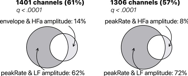
Temporal response function (TRF) model comparison of low-frequency (LF) amplitude and high-frequency activity (HFa) amplitude.
Models were investigated to quantify the encoding of the instantaneous envelope and the discrete acoustic onset edges (peakRate) by either the LF amplitude or the HFa amplitude. The ‘peakRate & LF amplitude’ model significantly captures the largest proportion of channels, and is, therefore, considered the winning model. Same conventions as in Figure 7A.
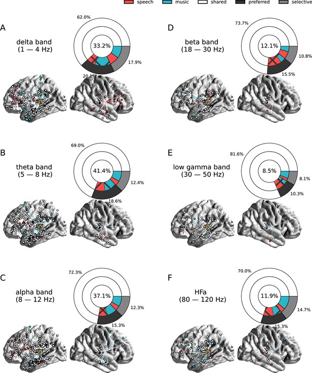
Seed-based functional connectivity analyses.
(A–F) Significant coherence responses to speech and/or music for the six canonical frequency bands (see Figure 8—figure supplement 1 for uncategorized, continuous results). The seed was located in the left auditory cortex (see Figure 7D). Same conventions as in Figure 2, except for the center percentage in the nested pie charts which, here, reflects the percentage of channels significantly connected to the seed. Results are significant at q<0.01 (N=15).
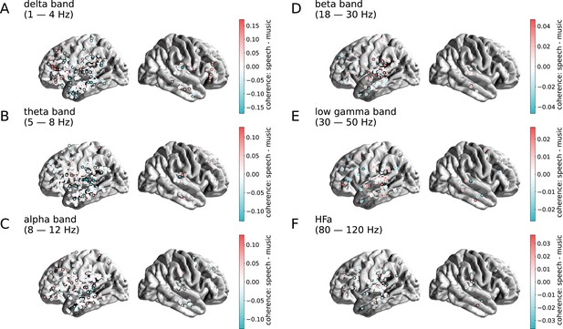
Contrast between the coherence responses to speech and music, for the six canonical frequency bands (A-F).
Distribution of uncategorized, continuous differences in coherence values between speech and music, projected on the brain surface. Same conventions as in Figure 8. Results are significant at q<0.01 (N=15).

Cross-frequency channel selectivity for the connectivity analyses.
Percentage of channels that showed selective coherence with the primary auditory cortex in speech (red) or music (blue) across different frequency bands (A-F). Same conventions as in Figure 4.
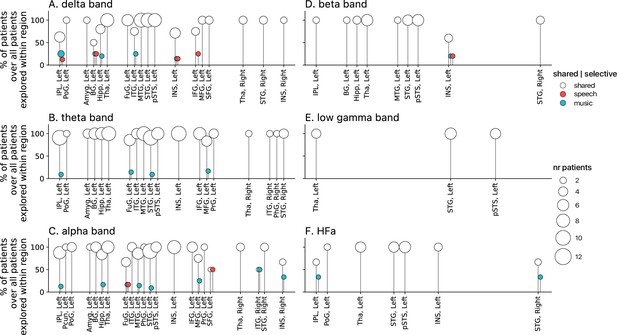
Population prevalence for the connectivity analyses for the six (A-F) canonical frequency bands (N=15).
Same conventions as in Figure 5.
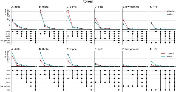
Cross-frequency channel selective responses.
The top figure shows the results for the spectral analyzes (baselined against the tones condition, including both activation and deactivation). The bottom figure shows the results for the connectivity analyzes. For each plot, the first (leftmost) value corresponds to the percentage (%) of channels displaying a selective response in a specific frequency band. In the next value, we remove the channels that no longer respond selectively to the target domain for the following frequency band. The black dots at the bottom of the graph indicate which frequency bands were successively included in the analysis.

TRF model comparison of low-frequency (LF) amplitude and high-frequency (HFa) amplitude.
Models were investigated to quantify the encoding of the instantaneous envelope and the discrete acoustic onset edges (peakRate) by either the low frequency (LF) amplitude or the high frequency (HFa) amplitude. The ‘peakRate & LF amplitude’ model significantly captures the largest proportion of channels, and is, therefore, considered the winning model. Same conventions as in Figure 7A.
Additional files
-
Supplementary file 1
Patients description.
Table provides an overview of patient characteristics and experimental conditions. The table includes 18 patients, with a mix of males and females aged between 8 and 54 years (mean 30). Presentation order (either speech-music or music-speech) was counterbalanced between patients. Recordings took place either at the bedside (room) or in the lab. Hemispheric dominance was mostly typical. All patients had an electrode implanted in the auditory cortex (Heschl’s gyrus; left, right, or bilaterally). The number of depth electrodes is indicated in the far right column.
- https://cdn.elifesciences.org/articles/94509/elife-94509-supp1-v1.docx
-
MDAR checklist
- https://cdn.elifesciences.org/articles/94509/elife-94509-mdarchecklist1-v1.docx


