Identifying images in the biology literature that are problematic for people with a color-vision deficiency
- Department of Biology, Brigham Young University, United States
Figures
Figure 1

Mean, pixel-wise color distance between each original and simulated image from eLife.
The histogram depicts the frequency distribution of this metric for 64,509 non-grayscale images.
Figure 2

Maximum color-distance ratio between each original and simulated image from eLife.
The histogram depicts the frequency distribution of this metric for 64,509 non-grayscale images.
Figure 3

Number of color pairs per image that exhibited a high color-distance ratio between the original and simulated images from eLife.
The histogram depicts the frequency distribution of this metric for 64,509 non-grayscale images.
Figure 4

Mean Euclidean spatial distance per image between pixels for high-ratio color pairs from eLife.
The histogram depicts the frequency distribution of this metric for 64,509 non-grayscale images.
Figure 5

Proportion of pixels in each original image that used a color from one of the high-ratio color pairs from eLife.
The histogram depicts the frequency distribution of this metric for 64,509 non-grayscale images.
Figure 6

Longitudinal trends for the eLife articles.
For the training set, we summarized our findings per article. This graph shows article counts for the ‘Definitely okay’ and ‘Definitely problematic’ categories for each year evaluated.
Figure 7

Trends by biology subdiscipline for the eLife articles.
For the training set, this graph shows the percentage of articles categorized as ‘Definitely problematic’ for a given subdiscipline, as indicated in the article metadata. In many cases, a single article was associated with multiple subdisciplines; these articles are shown as ‘Multidisciplinary’. We used a χ² goodness-of-fit test to calculate the p-value, with the overall proportion of each discipline as the expected probability.
Figure 8

Mean, pixel-wise color distance between each original and simulated image from eLife categorized as ‘Definitely okay’ or ‘Definitely problematic’.
We used a two-sided Mann-Whitney U test to calculate the p-value.
Figure 9

Maximum color-distance ratio between each original and simulated image from eLife categorized as ‘Definitely okay’ or ‘Definitely problematic’.
We used a two-sided Mann-Whitney U test to calculate the p-value.
Figure 10

Number of high-ratio color pairs per image from eLife categorized as ‘Definitely okay’ or ‘Definitely problematic’.
We used a two-sided Mann-Whitney U test to calculate the p-value.
Figure 11

Proportion of pixels for high-ratio color pairs for images from eLife categorized as ‘Definitely okay’ or ‘Definitely problematic’.
We used a two-sided Mann-Whitney U test to calculate the p-value.
Figure 12

Mean, pixel-wise Euclidean distance for high-ratio color pairs in images from eLife categorized as ‘Definitely okay’ or ‘Definitely problematic’.
We used a two-sided Mann-Whitney U test to calculate the p-value.
Figure 13

Rank-based metric score for images from eLife categorized as ‘Definitely okay’ or ‘Definitely problematic’.
We used a two-sided Mann-Whitney U test to calculate the p-value.
Figure 14

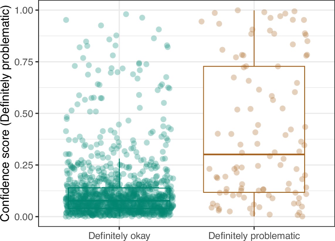
Logistic Regression predictions for the images in the eLife hold-out test set.
Each point represents the prediction for an individual image. Relatively high confidence scores indicate that the model had more confidence that a given image was ‘Definitely problematic’ for a person with deuteranopia.
Figure 15

Receiver operating characteristic curve for the Logistic Regression predictions for the images in the eLife hold-out test set.
This curve illustrates tradeoffs between sensitivity and specificity. The area under the curve is 0.82. The dashed, gray line indicates the performance expected by random chance.
Figure 16

Precision-recall curve for the Logistic Regression predictions for the images in the eLife hold-out test set.
This curve illustrates tradeoffs between precision and recall. The area under the curve is 0.49. The dashed, gray line indicates the frequency of the minority class (‘Definitely problematic’ images).
Figure 17

Receiver operating characteristic curve for the Convolutional Neural Network predictions for the images in the eLife hold-out test set.
This curve illustrates tradeoffs between sensitivity and specificity. The area under the curve is 0.89. The dashed, gray line indicates the performance expected by random chance.
Figure 18

Precision-recall curve for the Convolutional Neural Network predictions for the images in the eLife hold-out test set.
This curve illustrates tradeoffs between precision and recall. The area under the curve is 0.75. The dashed, gray line indicates the frequency of the minority class (‘Definitely problematic’ images).
Figure 19

Convolutional Neural Network predictions for images in the eLife hold-out test set.
Each point represents the prediction for an individual image. Relatively high confidence scores indicate that the model had more confidence that a given image was ‘Definitely problematic’ for a person with deuteranopia.
Figure 20

Receiver operating characteristic curve for the Convolutional Neural Network predictions for the images in the PubMed Central hold-out test set.
This curve illustrates tradeoffs between sensitivity and specificity. The area under the curve is 0.78. The dashed, gray line indicates the performance expected by random chance.
Figure 21

Precision-recall curve for the Convolutional Neural Network predictions for the images in the PubMed Central hold-out test set.
This curve illustrates tradeoffs between precision and recall. The area under the curve is 0.39. The dashed, gray line indicates the frequency of the minority class (‘Definitely problematic’ images).
Figure 22
Convolutional Neural Network predictions for images in the PubMed Central hold-out test set.
Each point represents the prediction for an individual image. Relatively high confidence scores indicate that the model had more confidence that a given image was ‘Definitely problematic’ for a person with deuteranopia.
Figure 23

Logistic Regression predictions for the images in the PubMed Central hold-out test set.
Each point represents the prediction for an individual image. Relatively high confidence scores indicate that the model had more confidence that a given image was ‘Definitely problematic’ for a person with deuteranopia.
Figure 24

Receiver operating characteristic curve for the Logistic Regression predictions for the images in the PubMed Central hold-out test set.
This curve illustrates tradeoffs between sensitivity and specificity. The area under the curve is 0.73. The dashed, gray line indicates the performance expected by random chance.
Figure 25

Precision-recall curve for the Logistic Regression predictions for the images in the PubMed Central hold-out test set.
This curve illustrates tradeoffs between precision and recall. The area under the curve is 0.16. The dashed, gray line indicates the frequency of the minority class (‘Definitely problematic’ images).
Additional files
-
Supplementary file 1
Supplementary tables.
(A) Predictive performance for metrics that characterize potentially problematic aspects of images. We calculated five metrics, as well as a rank-based, combined score and assessed their ability to categorize images as “Definitely okay” or “Definitely problematic”. (B) Predictive performance for classification algorithms that used the image metrics as inputs. We used classification algorithms to categorize images as “Definitely okay” or “Definitely problematic”. These results indicate the algorithms’ performance after cross validation on the training set. (C) Predictive performance for Convolutional Neural Network models that used the images as inputs. We tested 23 model configurations via cross validation on the training set, evaluating each model’s ability to categorize images as “Definitely okay” or “Definitely problematic”.
- https://cdn.elifesciences.org/articles/95524/elife-95524-supp1-v1.docx
-
Supplementary file 2
Results of manual curation for 5,000 images from the training set.
- https://cdn.elifesciences.org/articles/95524/elife-95524-supp2-v1.xlsx
-
Supplementary file 3
Results of manual curation for 1,000 images from the eLife hold-out test set.
- https://cdn.elifesciences.org/articles/95524/elife-95524-supp3-v1.xlsx
-
Supplementary file 4
Performance metrics for predictions made on hold-out test sets.
This file provides a variety of classification metrics for the two hold-out test sets. AUROC = area under receiver operating characteristic curve. AUPRC = area under precision-recall curve.
- https://cdn.elifesciences.org/articles/95524/elife-95524-supp4-v1.xlsx
-
Supplementary file 5
Results of manual review of misclassified images from the hold-out test set.
We manually reviewed each image that we had previously classified as “Definitely okay” but that the model predicted as “Definitely problematic” (or vice versa). The Conclusion column indicates our categorical reevaluation of each image. “Unclear”=We continue to conclude that our manual label was correct, and it is unclear what confused the model. “Understandable”=We continue to conclude that our manual label was correct, and we think we understand what confused the model. “Agree”=We acknowledge that the manual label was incorrect, and the model helped us identify that.
- https://cdn.elifesciences.org/articles/95524/elife-95524-supp5-v1.xlsx
-
Supplementary file 6
Results of manual curation for 2,000 images used from the PubMed Central hold-out test set.
- https://cdn.elifesciences.org/articles/95524/elife-95524-supp6-v1.xlsx
-
MDAR checklist
- https://cdn.elifesciences.org/articles/95524/elife-95524-mdarchecklist1-v1.docx
Download links
A two-part list of links to download the article, or parts of the article, in various formats.
Downloads (link to download the article as PDF)
Open citations (links to open the citations from this article in various online reference manager services)
Cite this article (links to download the citations from this article in formats compatible with various reference manager tools)
Identifying images in the biology literature that are problematic for people with a color-vision deficiency
eLife 13:RP95524.
https://doi.org/10.7554/eLife.95524.3


