Value construction through sequential sampling explains serial dependencies in decision making
Figures
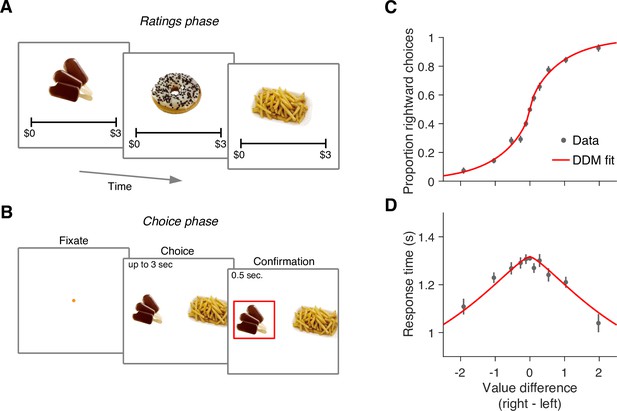
Food choice task.
(A) In an initial ‘ratings’ task, participants were shown 60 individual appetizing snack items and asked to indicate how much they would be willing to pay for each item using a monetary scale ranging from $0 to $3. (B) In the main experiment, participants were presented with pairs of snack items and asked to choose which one they would prefer to consume at the end of the session. After making their choice, the chosen item was highlighted by a square box for an additional 0.5 s. Each of the 30 participants completed 210 trials, with each item appearing seven times during the experiment. A subset of 60 item pairs were repeated once. (C) Proportion of trials in which participants selected the right item as a function of the difference in value between the right and left items (). Proportions were first determined for each participant and then averaged across participants. Error bars indicate the s.e.m. across participants. (D) Mean response time as a function of the difference in value between the right and left items. Error bars indicate the s.e.m. across participants. Red curves in panels C-D are fits of a drift-diffusion model (DDM).
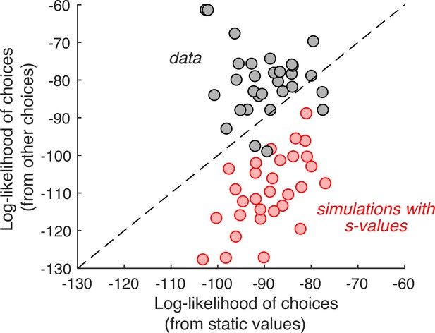
Individual choices are better explained by values inferred from the other trials than values reported in the ratings task.
Gray data points represent the total log-likelihood of each participant’s choices, given two types of predictions: (abscissa) from a logistic regression, fit to the static values; (ordinate) from a procedure that infers the values based on choices on the other trials. Predictions derived from the other trials are better in all but four participants. The red markers were obtained using the same procedure, applied to choices simulated under the assumption that the s-values are the true values of the items. It shows that the inferential procedure is not guaranteed to improve predictions.
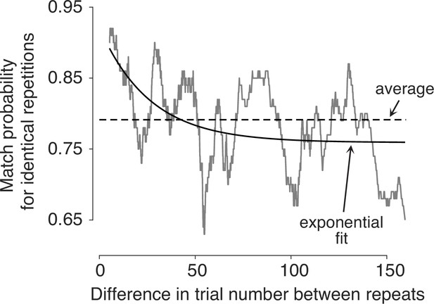
Preferences change over time.
Probability of making the same choice on the two trials with the same item pair, shown as a function of the difference in trial number between them (). Trial pairs with identical items (N=1726) were sorted by , and the match probabilities were smoothed with a boxcar function with a width of 100 observations.
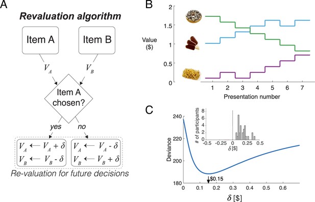
Revaluation algorithm.
(A) Schematic example of the revaluation algorithm applied to one decision. After a choice between items A and B, the value of the chosen item is increased by and the value of the unchosen item is decreased by the same amount. (B) Example of value changes due to revaluation, for three items, as a function of the presentation number within the session. In the experiment, each item was presented seven times. (C) Deviance of the of the logistic regression model fit with the values assigned by the Reval procedure to the data from one participant, for different values of . The best fitting value is $0.15. The inset shows a histogram of the best-fitting values across participants.
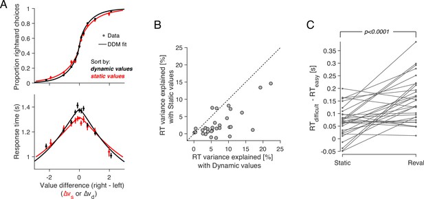
Revaluation explains choice and RT better than static values.
(A) Proportion of rightward choices (top) and mean response time (bottom) as function of the difference in d-value between the two items. The black lines are fits of a drift-diffusion model that uses the d-values. The red lines correspond to the fits of a DDM that uses the s-values (same as in Figure 1C–D). Error bars indicate s.e.m. across trials. Participants are more sensitive to d-values than s-values (top) and the d-values better explain the full range of RTs (bottom). (B) Percentage of variance in response times explained by a DDM in which the drift rate depends on either (abscissa) or (ordinate). Each data point corresponds to a different participant. For most participants, the model based on the dynamic values explained a greater proportion of the variance. (C) d-values are better than s-values at predicting the difficulty of a decision as reflected in the response times. Data points represent the difference in mean RTs between difficult and easy decisions. Positive values indicate that difficult decisions take longer on average than easy ones. Difficult and easy are defined relative to the median of the absolute value of (left) or (right). The lines connect the mean RTs of each participant. P-value is from a paired t-test.
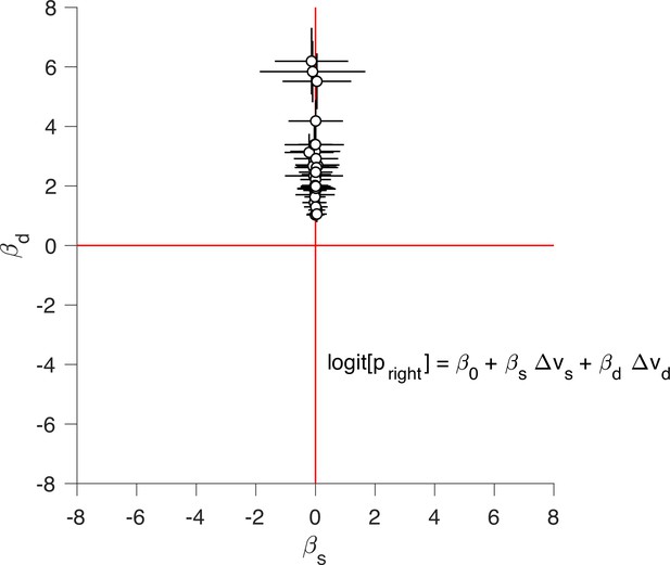
Static and dynamic values competing to explain choice.
We fit the logistic regression model indicated in the figure separately for each participant, where and are the difference in static and dynamic values for each trial, respectively. The ordinate show the regression coefficient associated with and the abscissa show the regression coefficient associated with . Each data point corresponds to a different participant. Error bars indicate the standard error of the associated regression coefficient.
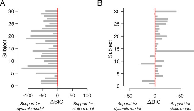
Comparison of DDM fits using static and dynamic values.
(A) BIC comparison between the DDM in which the drift rate depends on either or. The comparison favors the model that uses the dynamic values for all participants. (B) Same as A, but for choice and response time data simulated from the DDM fit to the participants’ data using the static (i.e. explicitly reported) values.
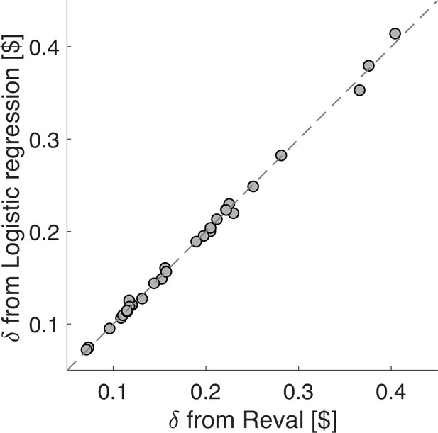
Similar values obtained by Reval and logistic regression.
Comparison of the values obtained by the Reval algorithm, and by an alternative approach that uses a single logistic regression model, applied to each participant’s data, that takes into account the number of times the items in the current trial were presented and either chosen or not chosen in previous trials (Equation 14). Each data point corresponds to one participant. The method lead to values of which are almost identical to Reval.

No revaluation in simulated data.
(A) Histogram of the best-fitting revaluation update () for data simulated by sampling choices from a logistic function fit to the participants’ choices. The best-fitting values for the simulated choices are centered around 0. For reference, we have also included a histogram of the values obtained from the fits to the participants’ data, showing all positive values (gray). (B) Deviance of the logistic regression model used to explain the choices (Equation 1), fit using either the static values (ordinate) or the Reval algorithm (abscissa). Each data point corresponds to a different participant. Experimental data are shown in gray and simulated data (as in panel A) are shown in red. The marked reduction in deviance in the experimental data is absent in the data simulated by sampling from logistic regressions fit to the static values. (C) The same analysis shown in Figure 5C, applied to the simulated data. The values obtained from Reval were no better than the static values at explaining the RTs, as expected, since the values were ∼0 and thus . Same conventions as in Figure 5C.
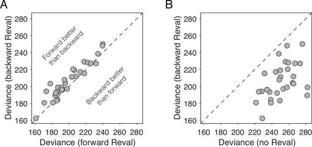
Reval is sensitive to trial order.
(A) Deviance obtained by applying Reval to the trials in the order in which they were completed (abscissa) and in the reverse order (ordinate). Each data point corresponds to a different participant. The deviance is greater (i.e. the fits are worse) when Reval is applied in the reverse direction. (B) The deviance of the logistic regression model used to explain the choices (Equation 1), obtained by applying Reval in the backward direction (ordinate), is lower (i.e. the fits are better) than the deviance obtained using the static values (abscissa). Each data point corresponds to a different participant.
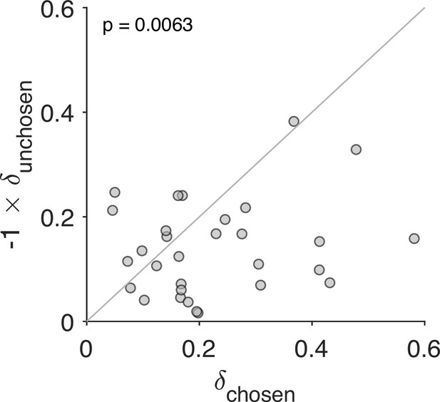
Stronger revaluation for the chosen than for the unchosen item.
We fit a variant of the Reval algorithm that includes separate update values () for the chosen and unchosen options. The best-fitting value for the chosen option (abscissa) is plotted against the best-fitting value for the unchosen option (ordinate). Each data point corresponds to one participant. The increase in value for the chosen option is greater than the decrease in value for the unchosen option (paired t-test).
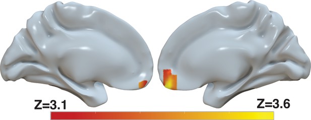
Revaluation reflected in BOLD activity in ventromedial prefrontal cortex.
Brain-wide fMRI analysis revealed a significant correlation between d-values and activity in the vmPFC, after controlling for s-values. The statistical map was projected onto the cortical surface. Shown here are the medial views of the right and left hemispheres of a semi-inflated surface of a template brain. Heatmap color bars range from z-stat=3.1–3.6. The map was cluster corrected for familywise error rate at a whole-brain level with an uncorrected cluster-forming threshold of z=3.1 and corrected extent of P<0.05. The full unthresholded map can be viewed here: https://identifiers.org/neurovault.image:869963.
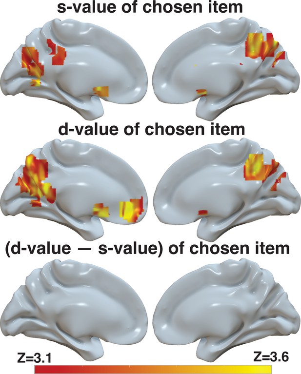
d-value, but to a lesser extent s-value and the difference between the two, is reflected in BOLD activity in ventromedial prefrontal cortex.
Brain-wide fMRI analyses with whole-brain correction for multiple comparisons revealed (1) no significant correlation between s-value and activity in the vmPFC, but a significant correlation with BOLD in the striatum and in the precuneus when only s-value was included in the model (top), (2) a significant correlation between d-value and BOLD in vmPFC, striatum, and precuneus in a model that only included d-value (middle), and (3) no significant correlation between the difference between d-value and s-value in the vmPFC when only this difference is included in the model. The statistical maps from these three independent models were projected onto the cortical surface. Shown here are the medial view of the right and left hemispheres of a semi-inflated surface of a template brain. The heatmap color bar ranges from z-stat=3.1–3.6. All maps were cluster corrected for familywise error rate at a whole-brain level with an uncorrected cluster-forming threshold of z=3.1 and corrected extent of p<0.05. Full unthresholded maps can be viewed here: https://identifiers.org/neurovault.collection:17498.
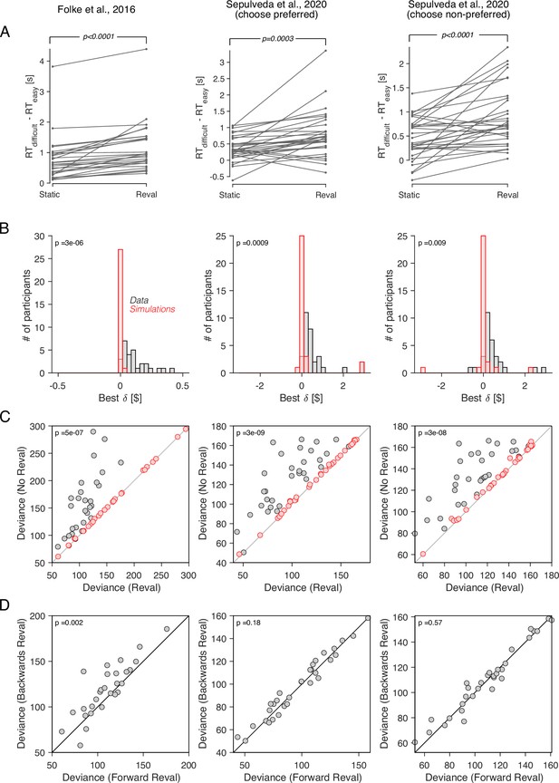
Revaluation observed in other datasets.
We applied the Reval method to other publicly available datasets of the food choice task. In the experiment of Folke et al., 2016 (first column), participants reported their willingness to pay for each of 16 common snack items. In the choice task, they were presented with each unique pair of items and asked to choose the preferred item. Each unique pair was presented twice for a total of 240 trials per participant. In the experiment of Sepulveda et al., 2020 (second and third columns), participants (N=31) reported their willingness to pay for each of 60 snack items. They were then presented with pairs of items from which to choose. Pairs were selected based on participants’ willingness-to-pay reports to provide comparisons between pairs of high-value, low-value and mixed-value items. The choice task was performed under two framing conditions: like-framing, selecting the more preferred item, and dislike framing, selecting the less preferred item. The task consisted of six alternating blocks of like- and dislike-framing (40 trials per block). (A) RT difference between easy and difficult trials, determined as a median split of . Same analysis as in Figure 5C. (B) Histogram of the best-fitting revaluation update () for data simulated by sampling choices from a logistic function fit to the participant’s choices (red), and for the actual data (gray). Same analysis as in Figure 6A. (C) Comparison of the deviance with and without Reval. Same analysis as in Figure 6B. (D) Comparison of the deviance applying Reval in the forward and backward directions. Same analysis as in Figure 7A. All p-values shown in the figure are from paired t-tests.
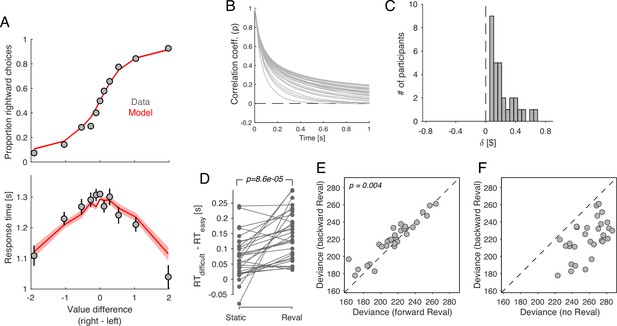
Revaluation occurs in a DDM with temporally-correlated noise.
A drift-diffusion model with non-independent noise (ceDDM) captures the main features of revaluation. (A) The ceDDM accounts for choices (top) and response times (bottom), plotted as a function of the difference in values obtained from explicit reports (). Same data as in Figure 1C–D. Red curves are simulations of the best-fitting model. Each trial was simulated 100 times. Simulations were first averaged within trials and then averaged across trials. Error bars and bands indicate s.e.m. across trials. (B) Noise correlations as a function of time lag, obtained from the best-fitting model. Each curve corresponds to a different participant. (C) parameters derived by applying Reval to simulated data from the best fitting ceDDM model to each participant’s data. As in the data, for all participants. (D) Similar analysis as in Figure 5C applied to simulations of the ceDDM. As for the data, Reval increased the range of RTs obtained after grouping trials by difficulty (by s-values on the left and d-values on the right; p-value from paired t-test). (E) Similar analysis to that of Figure 7A, using the simulated data. As observed in the data, the deviance resulting from applying Reval in the correct trial order (abscissa) is smaller than when applied in the opposite order (p-value from paired t-test). (F) Similar analysis to that of Figure 7B, using the simulated data.
Additional files
-
MDAR checklist
- https://cdn.elifesciences.org/articles/96997/elife-96997-mdarchecklist1-v1.pdf
-
Supplementary file 1
Activation table for map in Figure 9.
The effect of d-value on BOLD in Main fMRI model. For each cluster, the list shows regions from the Harvard-Oxford atlas that contained a peak activation of a subcluster, along with the peak p-value, the peak effect size, and the peak X/Y/Z location for the cluster in MNI space.
- https://cdn.elifesciences.org/articles/96997/elife-96997-supp1-v1.pdf
-
Supplementary file 2
Activation tables for maps in Figure 9—figure supplement 1.
The effect of s-value on BOLD in fMRI Model of s-value only (top), the effect of d-value on BOLD in fMRI Model of d-value only (middle), and the effect of (s-value − d-value) in fMRI model of (d-value − s-value) only (bottom). For each cluster, the list shows regions from the Harvard-Oxford atlas that contained a peak activation of a subcluster, along with the peak p-value, the peak effect size, and the peak X/Y/Z location for the cluster in MNI space.
- https://cdn.elifesciences.org/articles/96997/elife-96997-supp2-v1.pdf


