By Nick Duffield, User Experience Designer, eLife
In part one and two of this series, I talked about our process for generating ideas, gathering internal feedback and refining our designs through user testing. In this article, I am going to focus on how we tidied up our ideas to create a design system and make it ready for use by our development team.
Creating a design system
Part of the way through the project, our Senior Front-End Developer shared a design system known as Atomic Design with me. He believed the approach would help us manage code redundancy during the build phase of the project and, as a result, make the finished website more maintainable once delivered.
Atomic Design
In a nutshell, Atomic Design provides a way of thinking about building web pages from sets of reusable components. It provides a methodology that is easy to understand, making communication around the project much easier and helping to bridge the gap between designers, developers and other project stakeholders. This shared understanding helped us to build a more scalable, consistent and easy-to-maintain web product.
From my experience, Atomic Design was useful in a number of ways while designing eLife 2.0:
- Communication — personally, I found Atomic Design as a methodology an indispensable communication tool when justifying design decisions to project stakeholders. Discussions that typically might start with “Can’t we just…” were less frequent because everyone could see the website from a more holistic point of view.
- Design thinking — by thinking about design elements as reusable parts of a component, the Atomic Design methodology gave me a structure to work within, thus influencing my design thinking and giving me an approach to build out my designs. While working, I would constantly ask myself: “Do I already have something that I can use for this purpose? Or do I need to create something new?”
- Free asset library — by reusing elements to build larger user-interface (UI) components, I naturally built up a library of assets to help me maintain consistency throughout my designs. I tended to organise my assets in a way that was modelled on the Atomic Design structure and managed all of this using the inVision Craft plugin. This also meant that the more I designed, the faster I designed.
Typography
Type is found in almost every component on the eLife website. Because of this, starting our tidy up with typography seemed to make the most sense. While prototyping, I created a typographic hierarchy for my designs by eye. This was fine at the time; however, to build a system that would scale for future use, I would need to construct a reference point.

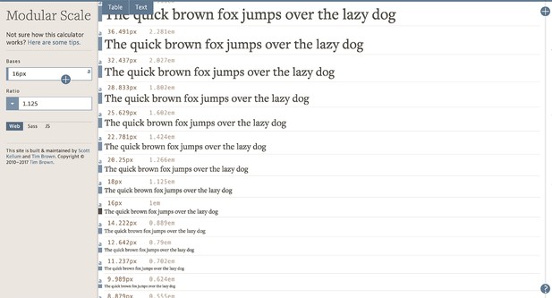
Modular scale tool set to 1.125 ratio. Source: http://www.modularscale.com.
To achieve this, I used a modular type scale and set our starting point to 16px. This measurement was based on our article paragraph text which gave us a sensible reading size without making the articles too long. I chose a very granular ratio of 1.125 to create a scale. This gave us the flexibility we needed to manage the large variety of information types found throughout the eLife website while also maintaining maximum consistency with as few type sizes and styles as possible.
Vertical rhythm
I find spacing in UIs is often overlooked or, at best, an afterthought. If not considered at the design phase it can introduce a lot of messy values in code or, even worse, a heap of inconsistent measurements creating a lack of vertical rhythm in designs.
I personally like to use a baseline grid as a guide, and tend to set the base value against my body text’s line height, then divide or multiply to create other spacing values in my UI.

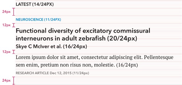
Section of working document showing line-heights combined with vertical space against a baseline grid.
The eLife baseline grid is set to 24px which divides and multiplies neatly to create sets of even numbers. We tended to use 6, 12, 24, 36, 48 and 72px, with 24 being the most common. This approach also dovetails very neatly with SASS variables and forms a nice way to communicate design to developers.
Examples of the baseline grid when applied to the UI might be:
- Paragraphs — 24px line-height; 24px margin-bottom
- Subheadings — 24px line-height; 12px padding-top; 12px padding-bottom
- Buttons — 48px height; 24px margin-bottom
Designing agnostic to Javascript
“Design assuming that Javascript is disabled, and try not to mess things up when we turn it on.” This idea was bounced around quite a bit between myself and our Senior Front-End Developer while sharing designs for feedback. Part of the eLife mission is to make scientific content available to as many people as possible, meaning that we couldn’t afford to alienate site visitors by forgetting about their browsing preferences.
My approach to this was to pick apart our prototype where needed and redesign the experience as if Javascript had been disabled. I wanted to create a better-than-acceptable experience without Javascript and then I hoped to modernise the experience where I could: making some of the controls a little more interactive and, in some instances, shortening the user’s journey to achieve a desired outcome.
Documenting designs ready for coding
I find that communicating design intent can be pretty hard, especially when there is a lot of design capital to hand over. A tool that I have adopted for this task is Sketch. It is easy to use, focused on designing UIs and offers the ability to include community-created plugins to increase its functionality.

A section of a responsive design with a marked set of values for our Technology team using Sketch Measure.
We had been working on the user experience for the eLife redesign for several months by the time the developers could join in. So, we had a lot of design capital to share and I took care to document my designs in a number of ways to ensure my intent was understood:
- A complete style guide for all components used to build the website, including items such as type hierarchy, colour, form elements and space.
- Documentation for responsive components when needed with marked values of height widths to indicate breakpoints for varying screen sizes. For this, I used a plugin called Sketch Measure.
- A set of pages made out of the above components in small (mobile), medium (tablet) and large (desktop) formats to show layout changes across various screen sizes.
Tickets and review
At eLife, we use Jira to keep track of work as it moves from the Product team to the Technology team and then finally out to the website. We file tickets assigned to the parts of the project being worked on, including the necessary design resources for the work to be carried out and a description covering any details that may be hard to communicate visually.
I think it is worth noting that our design process at eLife is very inclusive. We involve relevant stakeholders at every stage of a project, which in turn means that our expectations of a delivered feature are shared. Stakeholders can range from staff members with no design or technology experience to developers that will be working on the project. This early engagement strategy really helps us in the long run, because by the time a ticket is picked up by a member of our Technology team we are already in sync making the transition of turning designs into code much smoother.
A typical workflow may include the following:
- A ticket is picked up by a member of the Technology team and discussed to ensure we are all on the same page
- The first draft of the work is coded up and shared for feedback
- Usually, minor tweaks are made before approval
- The approved work is checked by the Technology team before being deployed to the website
Conclusion
eLife 2.0 was an immense project with a lot of learnings along the way. We used a mix of best practice and new techniques, and the sheer scale of the project was a lot to deal with but with a very satisfactory and well-received deliverable.
Some of the key things that stood out to me were:
- The Atomic Design approach was very new to me at the time but was very useful in guiding my thinking and seeing the site holistically. I feel that it really brought us together as a team to better understand the build and design of the website.
- Delivering a project of this scale was difficult. Looking back, it would have been easier to review if the site was designed as a whole but delivered to the Technology team in sections.
- Designing the site using a baseline grid made communicating spatial values to our developers much easier. Instead of trying to set spacing by eye, it created a system for us to rely on.
- User testing the site extensively gave us the confidence to make such a radical change. We already had a good idea of how visitors would feel about the redesign by sharing very high-fidelity prototypes with them.
Now that eLife 2.0 is live, we are currently working on an organisation-wide analytics plan to assist with our decision making for future plans. Plus, we are soon to see the introduction of new features to help the eLife community engage more deeply with the content that we publish and with each other. Keep an eye on our Labs page for more details soon.
This concludes my series of ‘Redesigning an online scientific journal from the article up’. Please feel free to contact me with any questions you may have, and I will do my best to answer them for you: email Nick at innovation [at] elifesciences [dot] org.
This article is cross-posted on Medium.
For the latest in innovation, eLife Labs and new open-source tools, sign up for our technology and innovation newsletter. You can also follow @eLifeInnovation on Twitter.
Do you have an idea or innovation to share on eLife Labs? Please send a short outline to innovation [at] elifesciences [dot] org.


