Predicting evolution from the shape of genealogical trees
Figures
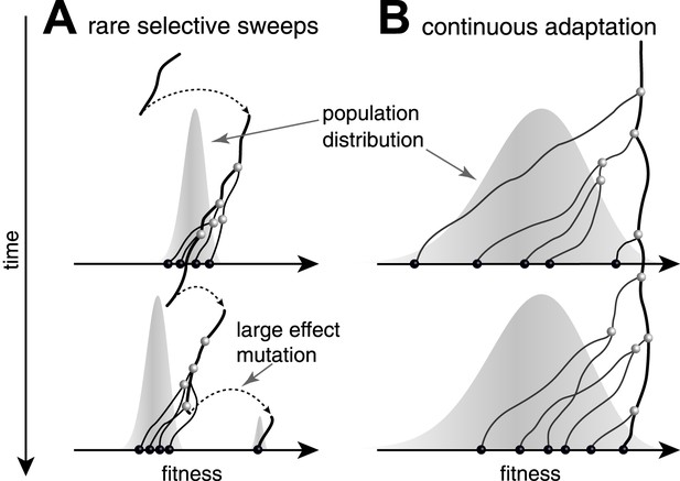
Genealogies in adapting populations.
(A and B) illustrate the genealogy of two successive samples embedded into the (Malthusian) fitness distribution of the population indicated in grey. In absence of adaptive mutations, fitness declines due to a changing environment or accumulation of deleterious mutations. Only one lineage (thick line) persists from first sample to second sample. (A) Evolution proceeds via rare large effect mutations (dashed arrows) that occur in a population with little fitness variance. All individuals are roughly equally likely to pick up the large effect mutation, rendering evolution unpredictable from sequence data alone. (B) Conversely, if adaptation is due to many small effect mutations, the successful lineage (thick) is always among the most fit individuals. Being able to predict relative fitness therefore enables to pick a progenitor of the future population.
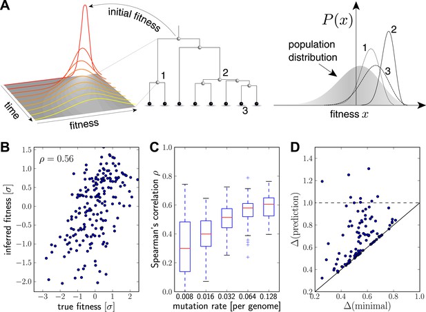
Inferring fitness from genealogical trees.
(A) The inference algorithm is based on branch propagators associated with each branch of the reconstructed tree (middle). Branch propagators characterize the fitness distribution of child nodes given the fitness of the ancestral node (left). The internal node 2 would have higher marginal fitness estimate (right) than node 1, as node 2 has more children. The inferred distribution of the fitness of the external node 3 has broadened along the branch from node 2. (B–D) Analysis of simulated data. Panel B shows for a typical example that inferred fitness is well correlated with the true fitness with a rank correlation coefficient . This correlation increases with increasing mutation rate as shown in panel C for 100 simulated data sets each (boxes cover the interquartile range, red lines indicate the median). Panel D shows that the sequence with the highest inferred fitness tends to be similar to the population 200 generations in the future. Both axis show the average Hamming distance to the future population between the predicted and the post-hoc optimal sequence on the y and x-axis, respectively, for 100 simulated data sets. Both distances are relative to the average distance between the present and future population. Parameters: , , , (B,D).
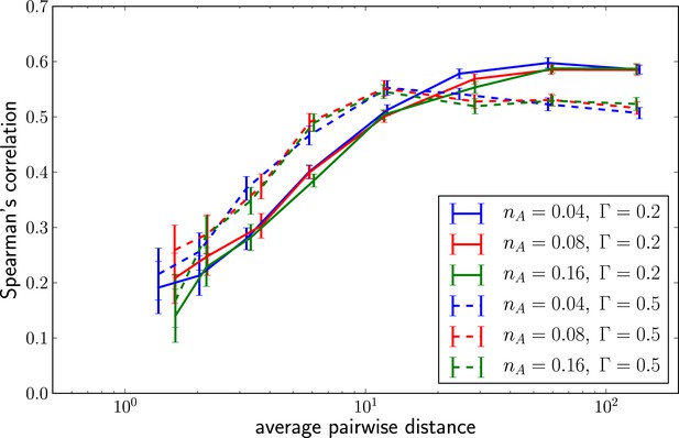
Predictability increases with genetic diversity.
The prediction performance quantified by the rank correlation coefficient between the inferred and true fitness increases with pairwise diversity. Large is superior at small pairwise distances, which corresponds to a regime of few large effect mutations. Smaller does better in at large pairwise distance where fitness variation is spread among many loci.
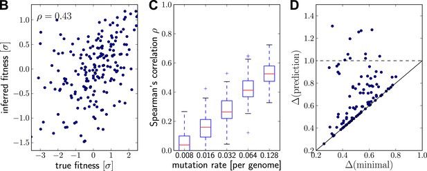
Prediction from continuously sampled sequences.
Same as Figure 2B–D, but with continuous sampling of 200 simulated sequences over 100 generations, as opposed to one sample from exactly one time point. Panels B&C shows that the rank correlation does not suffer when sampled continuously, at least at moderate or large mutation rates. Genetic distance of the predicted strain to future population behaves similarly. Parameters: , , and .
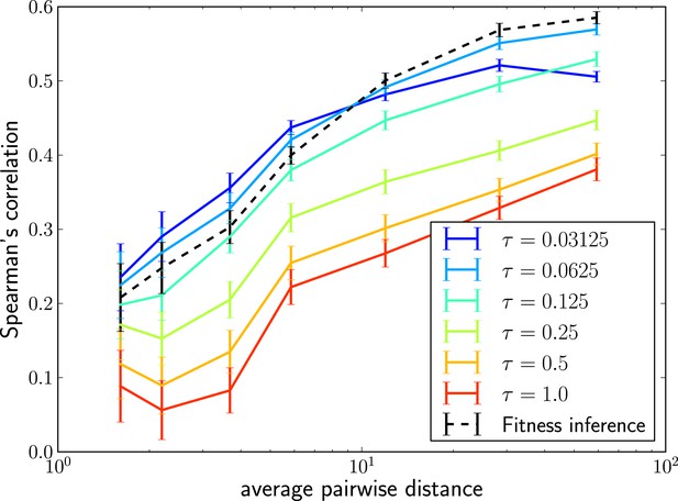
Local tree length as a fitness ranking.
Rank correlation between the true fitness and the LBI is shown as a function of pairwise diversity in the sample. Different curves correspond to different neighborhood sizes τ, which is measured in units of the average pairwise distance.
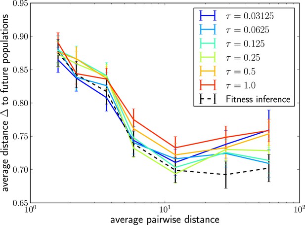
The LBI predicts progenitor sequences.
Sequences with the highest LBI in the sample tend to be close to the progenitor of future populations. The measure shows the distance of the predicted sequence to the population 200 generations in the future (relative to the average distance between the two populations).
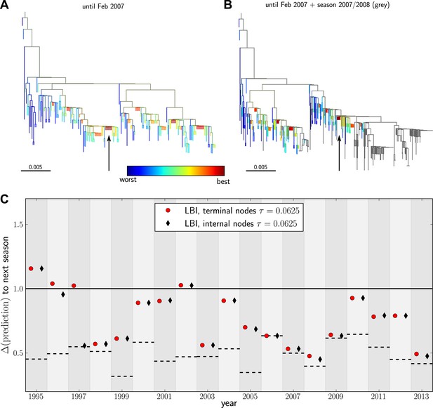
Predicting the evolution of seasonal influenza A/H3N2 viruses.
(A) A genealogical tree of a sample of HA1 sequences from May 2006 to end of February 2007. Nodes are colored according to our fitness ranking . The highest ranked node is marked by a black arrow. (B) A tree of the same sequences from (A) (colored) and sequences from October 2007 to end of March 2008 (in grey). Our algorithm successfully predicts a sequence genetically close and directly ancestral to viruses circulating the following winter. (C) For each year from 1995 to 2013 we predicted a progenitor sequence and calculated its nucleotide distance to the A/H3N2 population of the following winter. Predictions based on terminal or internal sequences are very similar. The figure shows the average of 50 runs using subsamples of the data. A random pick from the prediction set corresponds to the solid line at 1. The dashed lines indicate the optimal extant sequence at time of prediction. The distance of the dashed line from the line at 1 indicates the closeness of the optimal extant sequence to future populations.
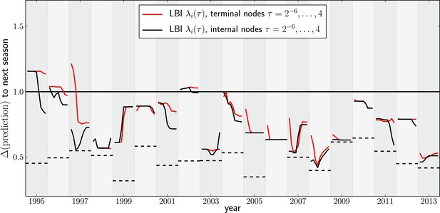
Variation of predictions upon variation of the memory time scale of the LBI .
Each year shows two lines–one for internal and external nodes–that show the variation of the prediction as τ varies from to 4 in multiples of 2.
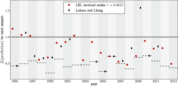
Comparison to predictions by Łuksza and Lässig (2014).
In many years, choosing the sequence with the highest LBI results in a very similar sequence to that predicted by Łuksza and Lässig (2014). In some years the LBI resulted in a pick closer to the future, in other years the sequences predicted by Łuksza and Lässig (2014) was a better choice. Łuksza and Lässig aimed at minimizing amino-acid distance at epitope position, rather than nucleotide distance as we do here. The two measures are strongly correlated, but nucleotide distance has better resolution and is hence used here.
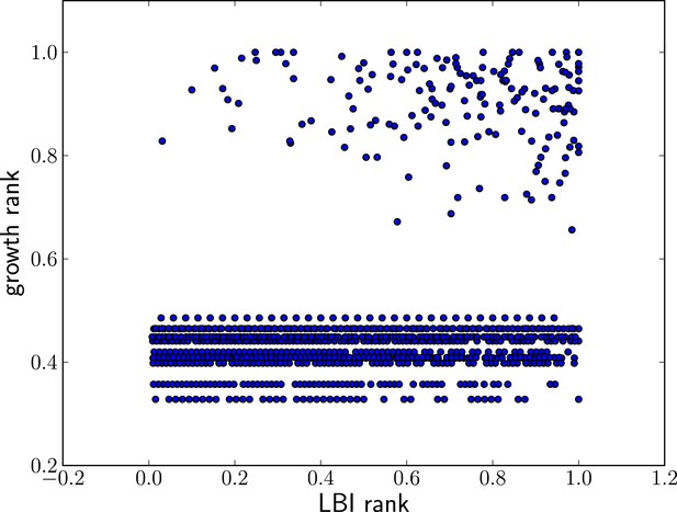
High LBI predicts clade expansion.
Each dot corresponds one clade with less than 75% frequency in a sample of sequences from May to February of year t. The excess of points in the upper right corner shows that high LBI is predictive of clade expansion. The x-axis shows its rank according to the LBI in this year, normalized to the iterval . The y-axis shows the rank according to clade growth measured as the ratio of frequency of this clade in year and year t. Again, rankking is done on a yearly basis and normalized to the interval . This plot contains data from years 2003–2013 for which there are sufficiently many sequences to calculate meaningful clade frequencies. The pointsin the lower half of the plot correspond to all clades that do not continue into the next year.
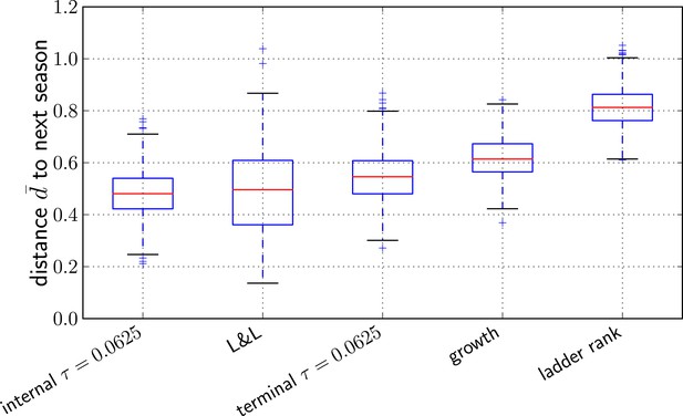
Comparison of predictors.
Transformed genetic distance averaged over 1000 bootstrap samples (bootstrapping years) to the next influenza season. We compared our method using the sequence of the top ranked internal node, external node, the predictions by Łuksza and Lässig (2014), the ancestral sequence of clades with the largest estimated growth rate, and the sequence of the most ‘advanced’ node in a ladderized tree.
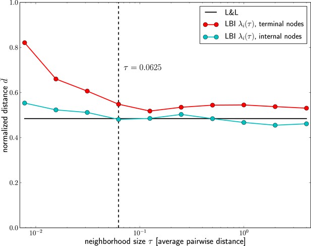
Dependence of prediction accuracy on τ.
Predictions for influenza virus A/H3N2 based on the LBI improve with increasing the memory time scale τ. Prediction accuracy is assessed as nucleotide distance to the future sample scaled such that the optimal pick as and a random pick has , averaged over 50 repeated predictions per year on different subsamples of the data (at most 100 sequences from Asia and North-America, 70% of the available data in cases fewer than 100 sequences are available). The figure shows the average of d over years 1995–2013; the accuracy of predictions by Łuksza and Lässig (2014) is shown as black line; the value of τ used in the remainder of the manuscript is indicated by the dashed vertical line.
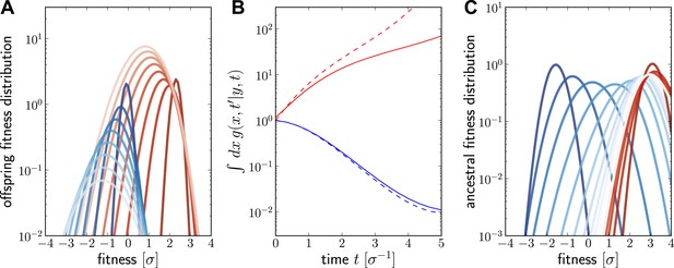
Numerical solution for the lineage propagator.
Panel A shows as a function of x for different at given the ancestor had Malthusian fitness (blue) or approximately (red). In both cases, the offspring tend to get less fit and the distribution broadens due to additional mutations. Saturated colors correspond to small , light colors large . Panel B shows as a function of for the high (red) and low (blue) fitness ancestor. The dashed lines show the approximation given in Equation (6). In the high fitness case, Equation (6) overestimates since it does not account for the non-sampling contribution. Panel C shows as a function of y, given the offspring is unfit (blue) or fit (red). Ancestors tend to be fit regardless of offspring fitness and both ancestral distributions converge to a common curve far back in time.
Tables
Non-synonymous mutations at epitopes correlate with increasing fitness
| Quartile | # non-syn | # syn | # epi | # Koel |
|---|---|---|---|---|
| 25 | 130 | 155 | 43 | 7 |
| 50 | 159 | 178 | 57 | 10 |
| 75 | 184 | 205 | 74 | 21 |
| 100 | 209 | 222 | 115 | 22 |
| total | 682 | 760 | 289 | 60 |
| Comparison | enrichment | p-value |
|---|---|---|
| non-syn vs syn | 1.12 | n.s. |
| epi vs syn | 1.9 | 0.002 |
| Koel vs syn | 2.2 | 0.08 |
| epi vs non-syn | 1.7 | 0.015 |
| Koel vs non-syn | 2.0 | n.s. |
-
For each tree constructed for the years 1995–2013, we calculated the increment in λi (τ) with τ = 0.0625 along each branch and determined the likely mutations on each branch. Branches were then sorted into quartiles according to changes in λi (τ). The left table shows the counts of non-synonymous (non-syn), synonymous (syn), non-synonymous mutations at epitope site (epi) and non-synonymous mutations at Koel positions (Koel) for branches in different quartiles. The right table quantifies the enrichment of certain types of mutations on branches in the top quartile relative the bottom quartile. Non-synonymous mutations at epitopes and Koel positions are approximately twofold enriched relative to synonymous mutations. Enrichment (odds ratio) and p-values were obtained using the Fisher exact test as implemented in scipy.stats (Oliphant, 2007).


