Persistence, period and precision of autonomous cellular oscillators from the zebrafish segmentation clock
- MRC-National Institute for Medical Research, United Kingdom
- Max Planck Institute of Molecular Cell Biology and Genetics, Germany
- CONICET, Argentina
- Max Planck Institute for the Physics of Complex Systems, Germany
- University College London, United Kingdom
Figures
Figure 1 with 9 supplements

Zebrafish segmentation clock cells oscillate autonomously in culture.
(A) Confocal section through the tailbud of a Looping zebrafish embryo in dorsal view where the dotted line indicates the anterior limit of tissue removed. Nuclei are shown in red and YFP expression in green. Scale bar = 50 μm. Kupffer’s vesicle (Kv), notochord (Nc), presomitic mesoderm (PSM), tailbud (Tb). (B) A representative 40x transmitted light field with dispersed low-density Looping tailbud-derived cells. Individual cells highlighted with black arrowheads; green arrowhead shows cell with green time series in (D). Scale bar = 10 μm. Pie chart: More than half of the in vitro population of Looping tailbud cells (n = 321 out of 547 cells combined from 4 independent culture replicates as described in Materials and methods) expresses the Her1-YFP reporter. Some expressing cells are disqualified because they move out of the field of view (4%), touch other cells by colliding in the field of view (12%) or following division (2%) for a total of 14%, or do not survive until the end of the 10-hr recording (7%). (C) Montage of timelapse images (transmitted light, top; YFP, bottom) of a single tailbud cell (green arrowhead in panel B) over 10-hr recording. Scale bar = 10 μm. (D) YFP signal intensity (arbitrary units) measured by tracking a regions of interest over 3 single tailbud cells (green trace follows cell marked by green arrowhead in B, gray traces are two additional cells from culture). Plotted in 2-min intervals. (E) Plot of Her1-YFP (black) and H2A-mCherry (red) signal intensity over time measured together from a representative cell. (EI). Nuclear YFP signal accumulates and degrades over time, as shown in the overlay of H2A-mcherry signal (red channel) and Her1-YFP signal (green channel) during troughs (297, 372) and peaks (342, 402) in Her1 expression. mCherry signal in the nucleus is relatively constant. Plotted in 2-min intervals. (F) Plot of YFP intensity (a.u.) over time in a fully isolated tailbud cell within a single well of a 96-well plate. Plotted in 2-min intervals.
-
Figure 1—source data 1
Summary table of segmentation clock tissue and cellular oscillatory properties.
Summary of statistics of time series traces recorded and analyzed in vitro in tailbud explants or tailbud cells. Peaks were identified, and the period/amplitude of cycles was determined as described in Materials and methods. A maximum period is defined in the method at 140 min, approximately twice the mean. Serum only cells were from the same cell suspension as those that were then treated with Fgf8b for the experiments 280711 and 250112. Pooled data from N = 2 independent cultures, for a total of n = 52 serum only cells. Pooled data from N = 4 independent cultures, for a total of n = 149 Fgf8b treated cells. To culture fully isolated cells, a cell suspension was serially diluted in wells within a 96-well plate, producing wells with a single tailbud cell. These were also treated with Fgf8b. N = 5 independent 96-well plate experiments, with a total of n = 10 fully isolated cells in these experiments.
- https://doi.org/10.7554/eLife.08438.004
-
Figure 1—source data 2
Summary table of low-density segmentation clock cell experiments.
Description of in vitro cultured tailbud cell population treated with Fgf8b (n = 547), using multiple donor embryos in each of 4 independent experimental replicates (N = 4), carried out on separate days. Across the 29 fields recorded, we observed cell divisions in both YFP-negative (30, 5% of total cells) and YFP-positive cells (13, 2% of total cells). We found a range in the number of cell divisions from 0 to 5 cells per field, with an average of 1.5 (±1 SD) divisions per field. The categories of disqualification list the first event in a recording that led to disqualification. For example, four divisions in YFP-positive cells occurred after the cell had been disqualified for another reason (movement in and out of field, touching another cell).
- https://doi.org/10.7554/eLife.08438.005
-
Figure 1—source data 3
Time series data from low-density segmentation clock cells.
XLS file containing all time series data for each of the 147 low-density segmentation clock cells in the presence of Fgfb. The file contains 4 work-sheets corresponding to each of the 4 independent replicates and to the plots in Figure 1—figure supplement 5. In each sheet, each cell is described by 3 neighboring columns: average fluorescence, local background, and background subtracted signal. Cells are also listed by their field of view in the original microscopy files.
- https://doi.org/10.7554/eLife.08438.006
Figure 1—figure supplement 1
Her1-YFP-expressing cells in the zebrafish tailbud.
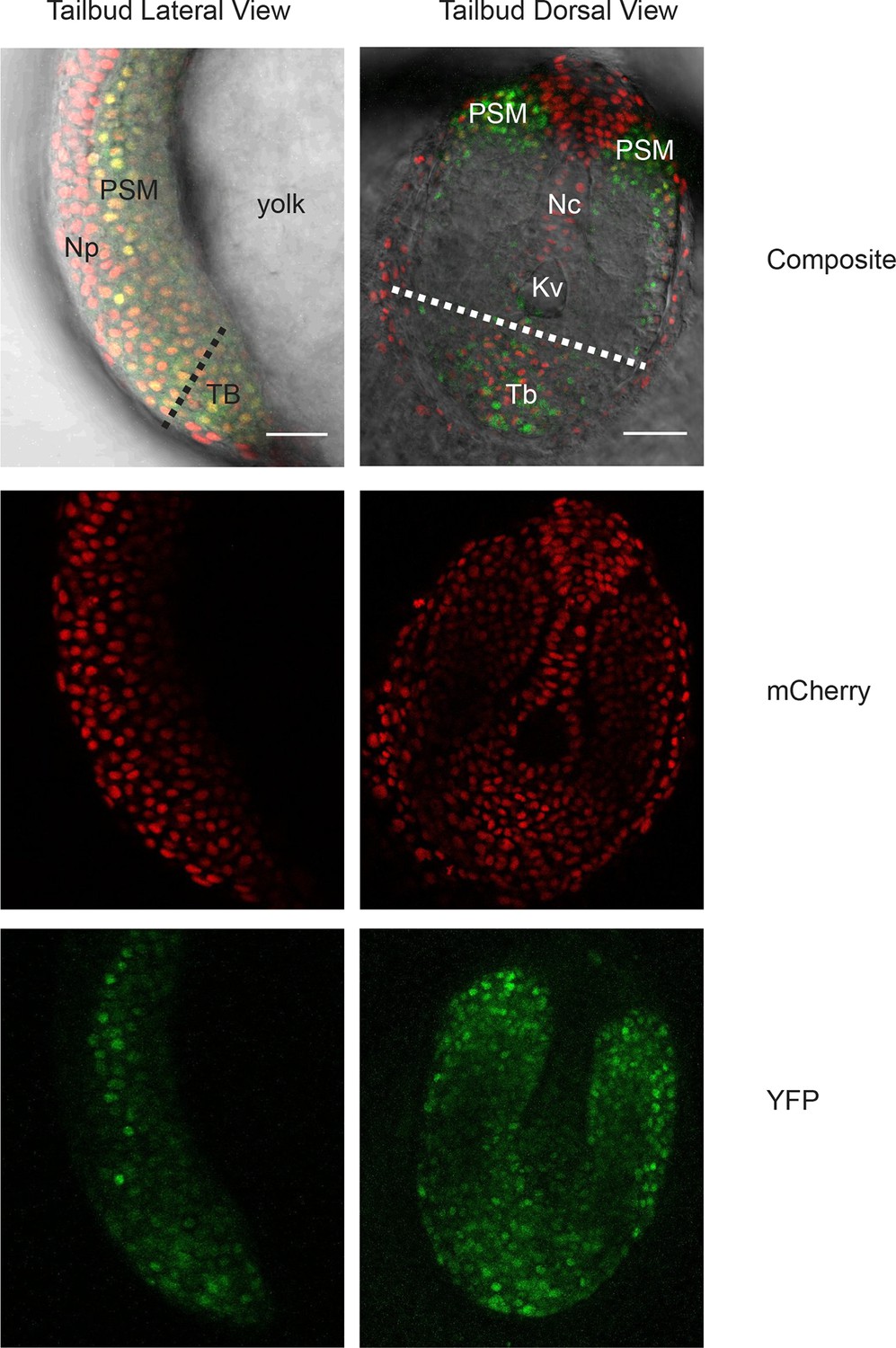
A confocal section through the tailbud of a Her1-YFP and Histone 2A-mCherry expressing 8-somite stage Looping zebrafish embryo in both lateral and dorsal orientations. The approximate location of the segmentation clock cells removed by surgery to generate the tailbud explants and single cell cultures is shown with the dashed line. Nuclei are shown in red and YFP in green. Scale bar = 50 μm. Kupffer’s vesicle (Kv), notochord (Nc), presomitic mesoderm (PSM), tailbud (Tb), neural progenitors (Np), yolk cell (yolk).
Figure 1—figure supplement 2
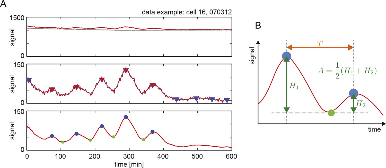
Peak finding in time series to estimate period and amplitude.
(A) An example of peak finding from a representative low-density cell trace, showing the steps used to find and estimate inter-peak intervals and amplitude. Top: raw data (red line) and background (grey line). Middle: peak finding (red triangles) and filtering (blue triangles) from the smoothed signal (thin blue line) of the background subtracted trace (red line). Bottom: resulting peaks (blue dots) and troughs (green dots). (B) Definition of period T as inter-peak interval (orange double arrow), and amplitude A as the average of peak heights relative to the trough (green double arrows).
Figure 1—figure supplement 3
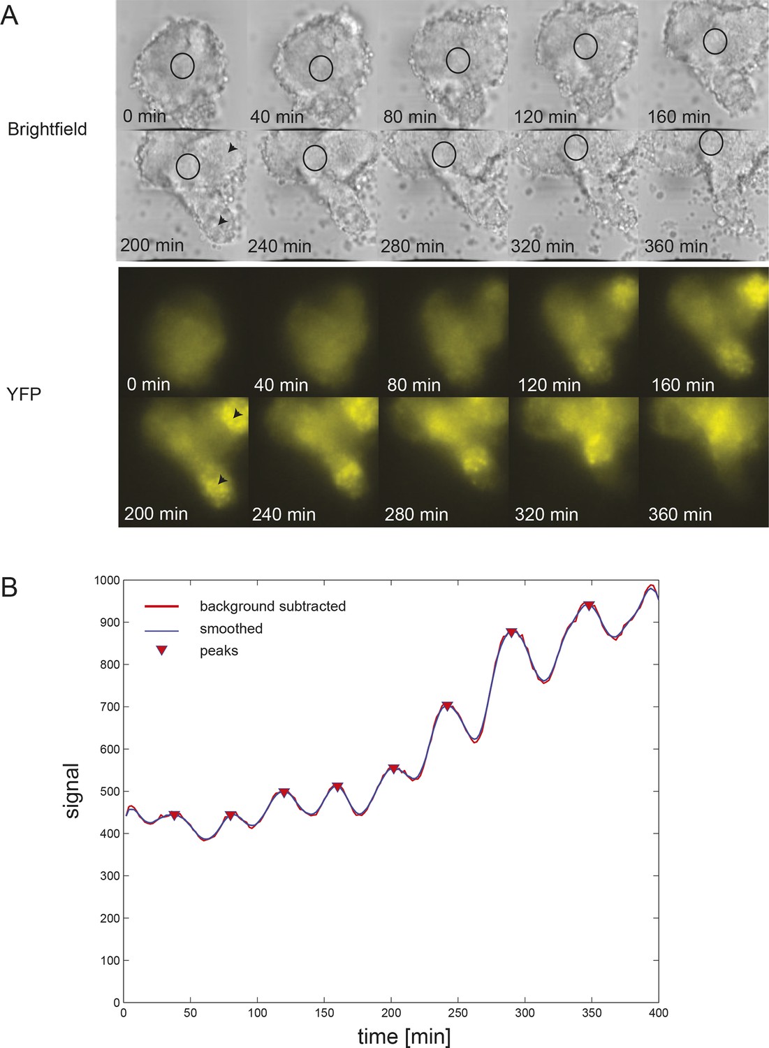
Persistent oscillations in explanted tailbud.
(A) Montage of brightfield and corresponding YFP images from representative explanted tailbud over ~7 hr recording. Brightfield image is a single z-plane, while YFP signal is shown as an average projection of the entire stack. Oscillations in the tailbud were measured using a region of interest (ROI; black circle) to extract average YFP intensity values over time. We placed this region on the most central “tailbud” area, as we observed “PSM”-like protrusions (black arrowheads) emerging from the explant. These areas, as expected for PSM, showed brighter and increasing YFP expression over time, which then switched off. (B) Intensity over time plot for the ROI shown in A. The tailbud area shows 9 cycles over the recording with no slowing of the period. Peak finding was performed as in Figure 1—figure supplement 2: background subtracted raw data (thick red line) was smoothed (thin blue line) and peaks were identified (red down triangles).
Figure 1—figure supplement 4
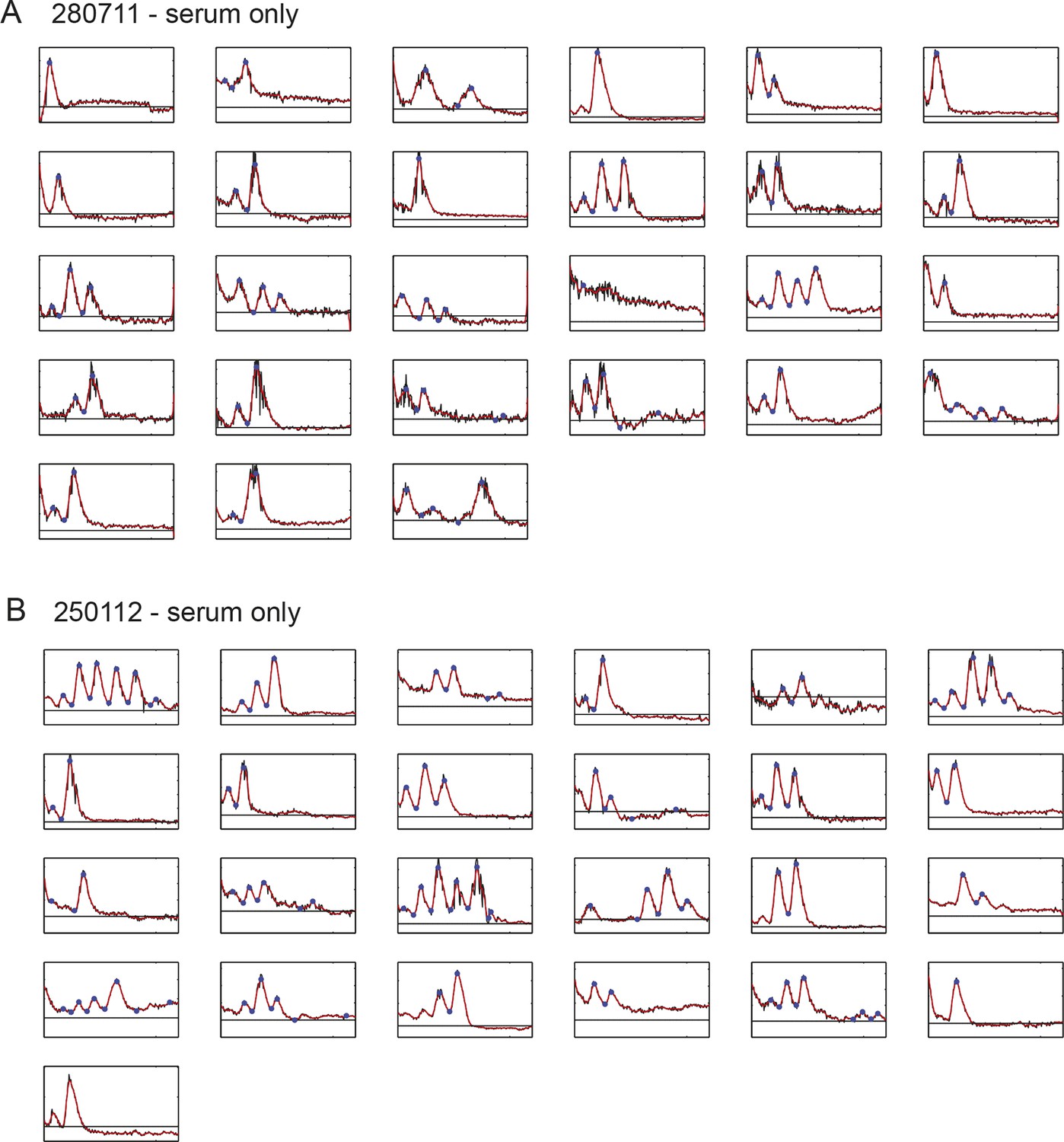
Time series of low-density segmentation clock cells in serum-only culture.
(A) Individual tailbud cells from experiment 280711 in the presence of serum. Black time trace is the raw data after background subtraction, the background level is the black line, the smoothed curve (red) was used for peak counting and identification of peaks and troughs (blue circles). Details of smoothing and peak finding are given in Materials and methods and Figure 1—figure supplement 2. (B) As above for experiment 250112. Corresponding cells grown in the presence of serum + Fgf8b from the same tailbud cell suspensions in this figure are found in Figure 1—figure supplement 5.
Figure 1—figure supplement 5
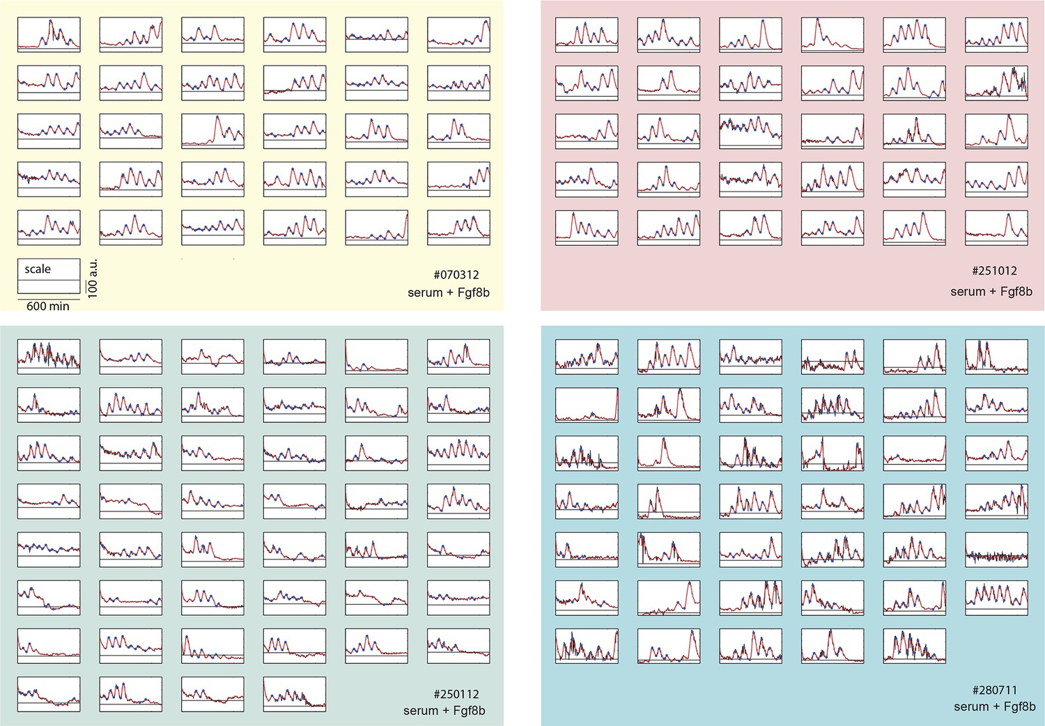
Time series of low-density segmentation clock cells.
Traces from each independent low-density culture replicate (serum + Fgf8b) are shown in separate panels (#070312: yellow, #012512: green, #251012: red, #280711: blue). Each raw trace (black) was smoothed (red) and peaks and troughs were identified (blue circles). This is the complete low-density cell data set from which representative examples shown in Figure 1B–D are chosen. Details of smoothing and peak finding are given in Materials and methods and Figure 1—figure supplement 2.
Figure 1—figure supplement 6
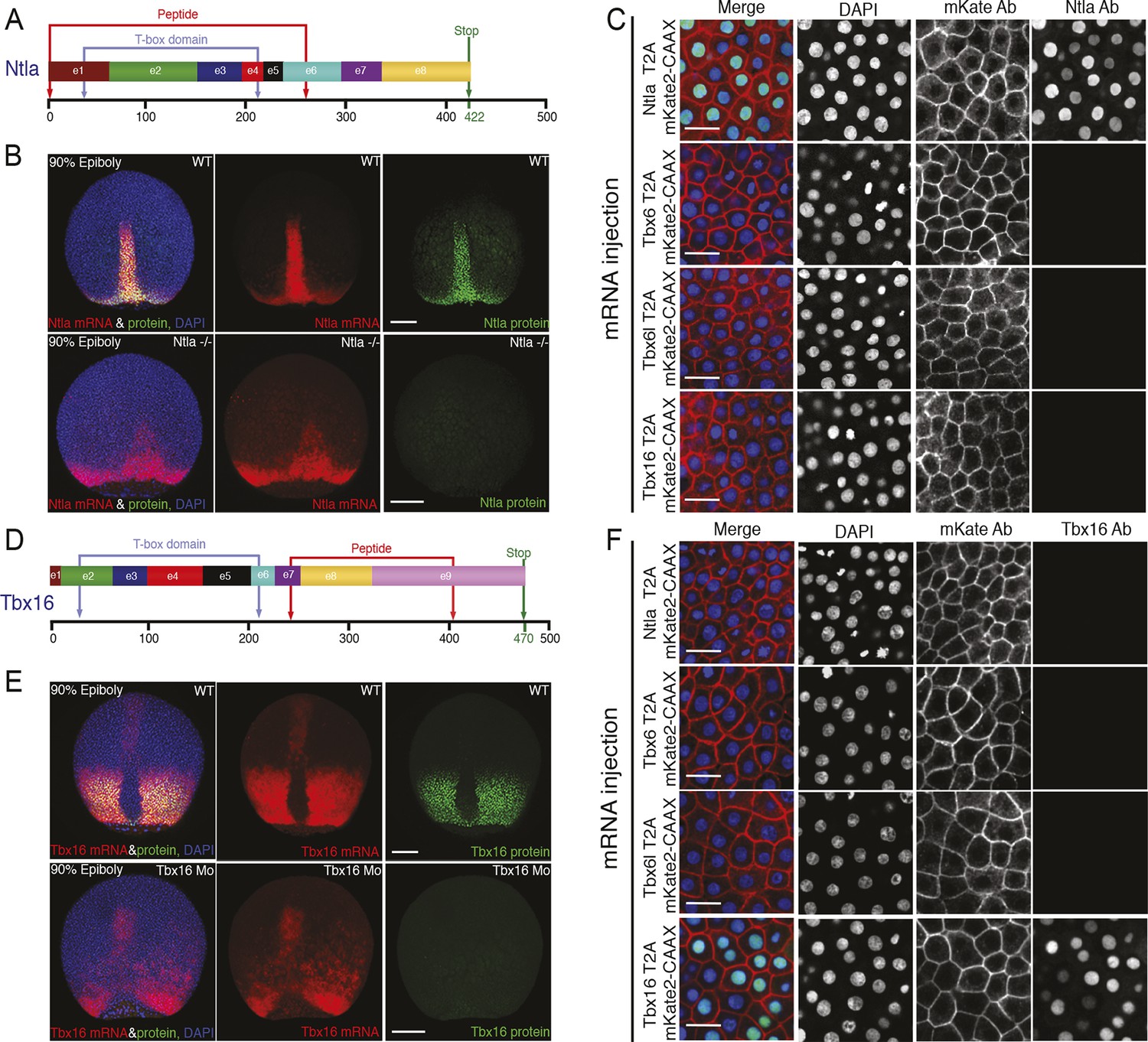
Characterization of Ntla and Tbx16 antibodies.
(A, D) Graphical representation of the full-length Ntla and Tbx16 proteins with exons depicted in different colors. Blue arrows show the predicted T-box domain from amino acid 35 to 212, and 31 to 213, for Ntla and Tbx16 respectively. The Ntla antibody (clone D18-4, IgG1) was generated using a peptide from amino acid 1 to 261, while the corresponding sequence for the Tbx16 antibody (clone C24-1, IgG2a) spans the region from amino acid 232 to 405 (bracketed in red in both cases). (B, E) Representative examples showing ntla mRNA and protein expression patterns in wild type and in ntla mutant embryos at 90% epiboly. Immunolabeling using the Ntla antibody was followed by in situ hybridization using a ntla riboprobe. The same procedure was used to characterize the Tbx16 antibody except that wild type embryos are compared to tbx16 morpholino-injected embryos and a tbx16 riboprobe was used. Scale bar = 150 μm. (C, F) Immunolabeling of wild type embryos injected at 1-cell-stage with capped mRNAs (Ntla-T2A-mKate2CAAX, Tbx6-T2AmKate2CAAX, Tbx6l-T2A-mKate2CAAX or Tbx16-T2A-mKate2CAAX), fixed at 4 hr post fertilization and imaged at the animal pole where the endogenous genes are not expressed. Both Ntla (C) and Tbx16 (F) antibodies bind only in embryos injected with ntla and tbx16 mRNA respectively, demonstrating antibody specificity. Scale bar = 20 μm.
Figure 1—figure supplement 7
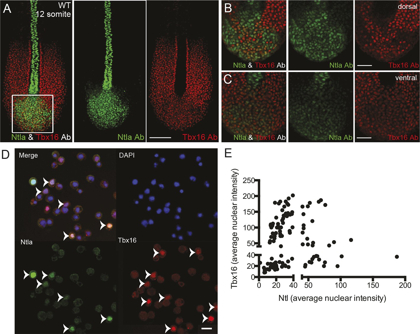
Expression of tailbud markers in vivo and in low-density cultures of segmentation clock cells.
(A) z-stack projection showing the expression patterns of Ntla (green) and Tbx16 (red) protein in a 12-somite stage wild type embryo detected using immunohistochemistry with monoclonal antibodies D18-4 (IgG1) to Ntla and C24-1 (IgG2a) to Tbx16. Scale bar = 120 μm (B-C) Close up view of the boxed area in (A) showing a single confocal section at dorsal (B) and ventral (C) locations in the tailbud. Scale bar = 60 μm. (D) Representative panels showing expression of Ntla (green) and Tbx16 (red) in single cells within low-density tailbud cultures (serum + Fgf8b) after 5 hr in vitro. Nuclei are labeled with DAPI (blue). Cells single-positive for Ntla and Tbx16 are visible, as are cells co-expressing both proteins. Scale bar = 20 μm. (E) Quantification of nuclear fluorescence intensity of experiment in (D) showing populations of Ntla-positive, Tbx16-positive, and Ntla/Tbx16 co-expressing cells.
Figure 1—figure supplement 8

Analysis of low-density segmentation clock cell cultures.
(A) Histogram of the number of peaks observed in each cell in the presence of serum + Fgf8b (blue) compared to those from cells in the presence of serum alone (orange). (B) Histogram of periods from all measured cycles for low-density cells in the presence of serum + Fgf8b (blue) compared to those from cells in the presence of serum alone (orange). (C) Histogram of amplitudes from all measured cycles for low-density serum + Fgf8b data set. See Figure 1—source data 1 for statistics. Average amplitude (D) and period (E) plotted vs. time intervals for all cycles in the four different serum + Fgf8b low-density experiments (rows). Data is grouped in bins of 100 min, error bars show variance.
Figure 1—figure supplement 9
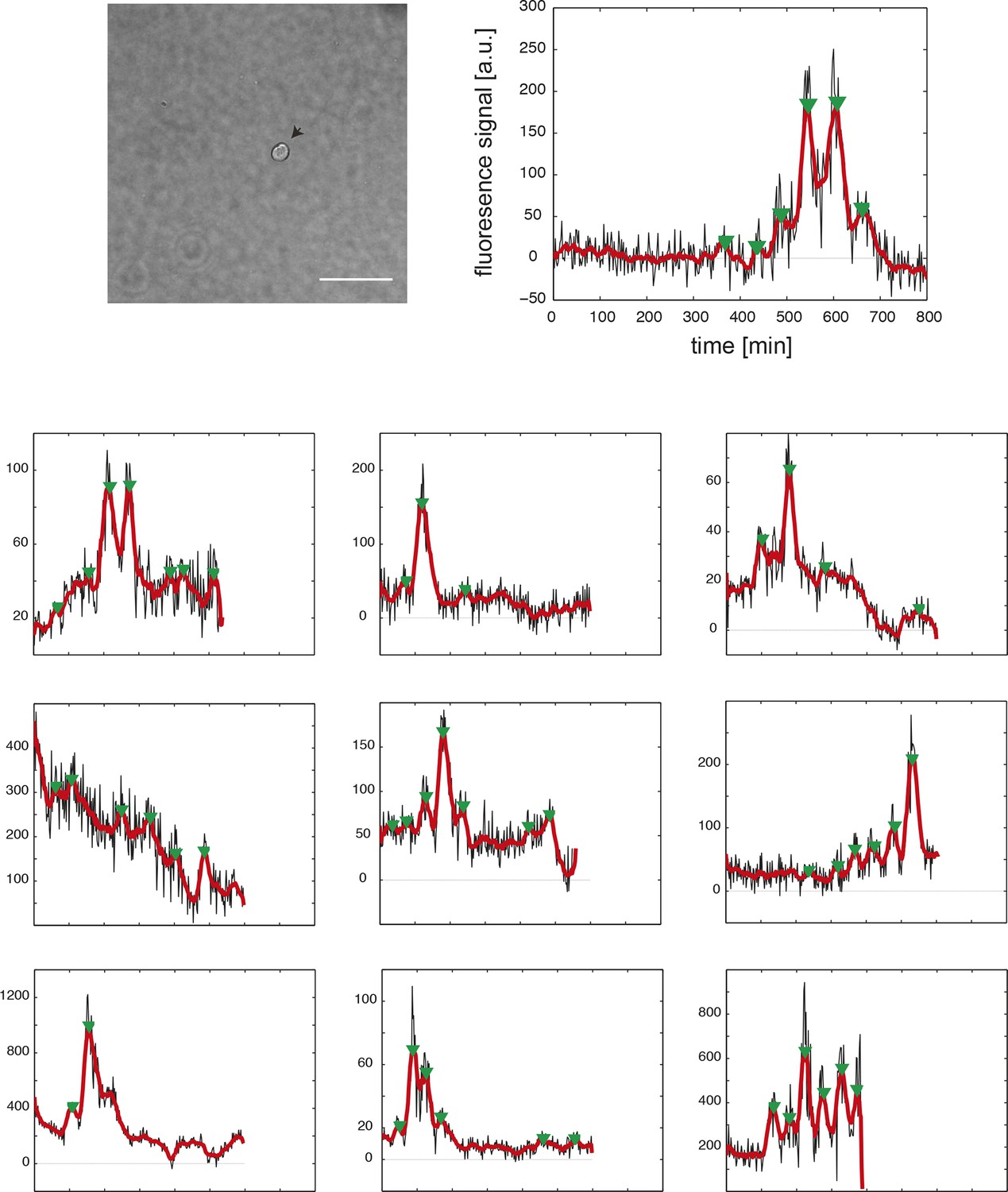
Time series of fully isolated segmentation clock cells.
(Top row) An example 40x transmitted light field of a single, isolated tailbud cell in a 96-well plate well. Scale bar = 20 μm. The cell’s corresponding fluorescence time series at the right shows raw YFP intensity over time (black), smoothed signal (red), and automatically detected peaks (green arrowheads). Cells were obtained from N = 5 independent replicates. From 43 YFP-expressing cells, 33 were disqualified due to death, division or movement from imaging field, leaving n = 10 for analysis. (Bottom panels) As above, each plot shows the background-subtracted average YFP intensity levels from a single cell over time (black), smoothed signal (red), and peaks (green arrowheads) for the remaining 9 fully isolated segmentation clock cells. Peak finding was first performed as in Figure supplement 1–2. Due to the higher noise levels in the fully isolated segmentation clock cells, we modified the parameters of the algorithm to be less stringent, and we introduced an additional step of curation to remove the detected peaks that had very low amplitude and were considered spurious.
Figure 2 with 3 supplements
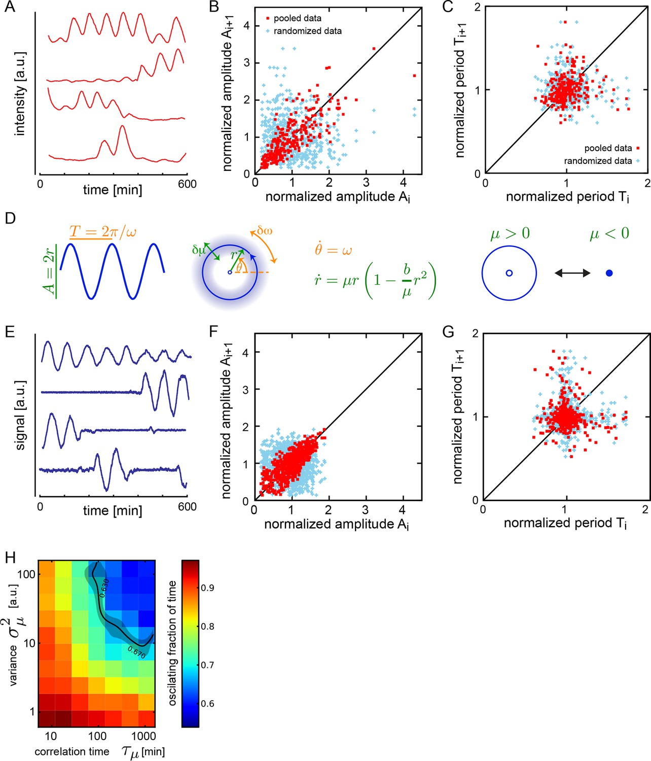
Dispersed low-density cells show a variety of behaviors compatible with slow amplitude fluctuations.
(A) Representative background-subtracted traces displaying different oscillatory behaviors: persistent oscillations, oscillations that initiate, stop, or start and stop within the recording time of 600 min. (B) Amplitude correlations in successive cycles from the Fgf-treated low-density data set (645 cycles measured from 147 cells) are shown as red squares. Blue crosses show correlations from the same data set with pairs of peaks drawn at random from the same list. Amplitude values are normalized to the mean of the data set. (C) Period correlations in successive cycles from the Fgf-treated low-density data set are shown as red squares. Blue crosses show correlations from the same data set with period values drawn at random from the same list. Period is normalized to the mean of the data set. (D) Left: Scheme defining amplitude and period and corresponding limit cycle illustrating fluctuations in μ and ω, which are parameters controlling amplitude and frequency, respectively. Middle: equation of the generic Stuart-Landau oscillator model, which describes the time evolution of phase θ and amplitude r of the oscillator. Right: illustration of the Hopf bifurcation showing how the limit cycle (blue circle) collapses and becomes a fixed point (blue dot) as μ changes from positive to negative values. (E) Simulated traces generated with the Stuart-Landau model with colored noise in parameter μ and white noise in the oscillator variables, showing behaviors corresponding to those observed in the data, compare to panel A. (F) Amplitude correlations in successive cycles from the simulated oscillator are shown in red squares. Blue crosses show correlations from the same data set with pairs of peaks drawn at random. (G) Period correlations in successive cycles from the simulated oscillator shown in red squares. Blue crosses show correlations from the same data set with inter-peak-intervals from pairs of peaks drawn at random. (H) Heat plot of the fraction of time spent oscillating as measured by number of peaks occurring over time given the median period observed in the synthetic data, as the variance and correlation time of colored noise fluctuations in μ vary. Oscillating fraction of time for the Fgf-treated low-density data set (Figure 1—figure supplement 5; Figure 1—source data 3) would be found in the shaded region of the heat plot.
Figure 2—figure supplement 1
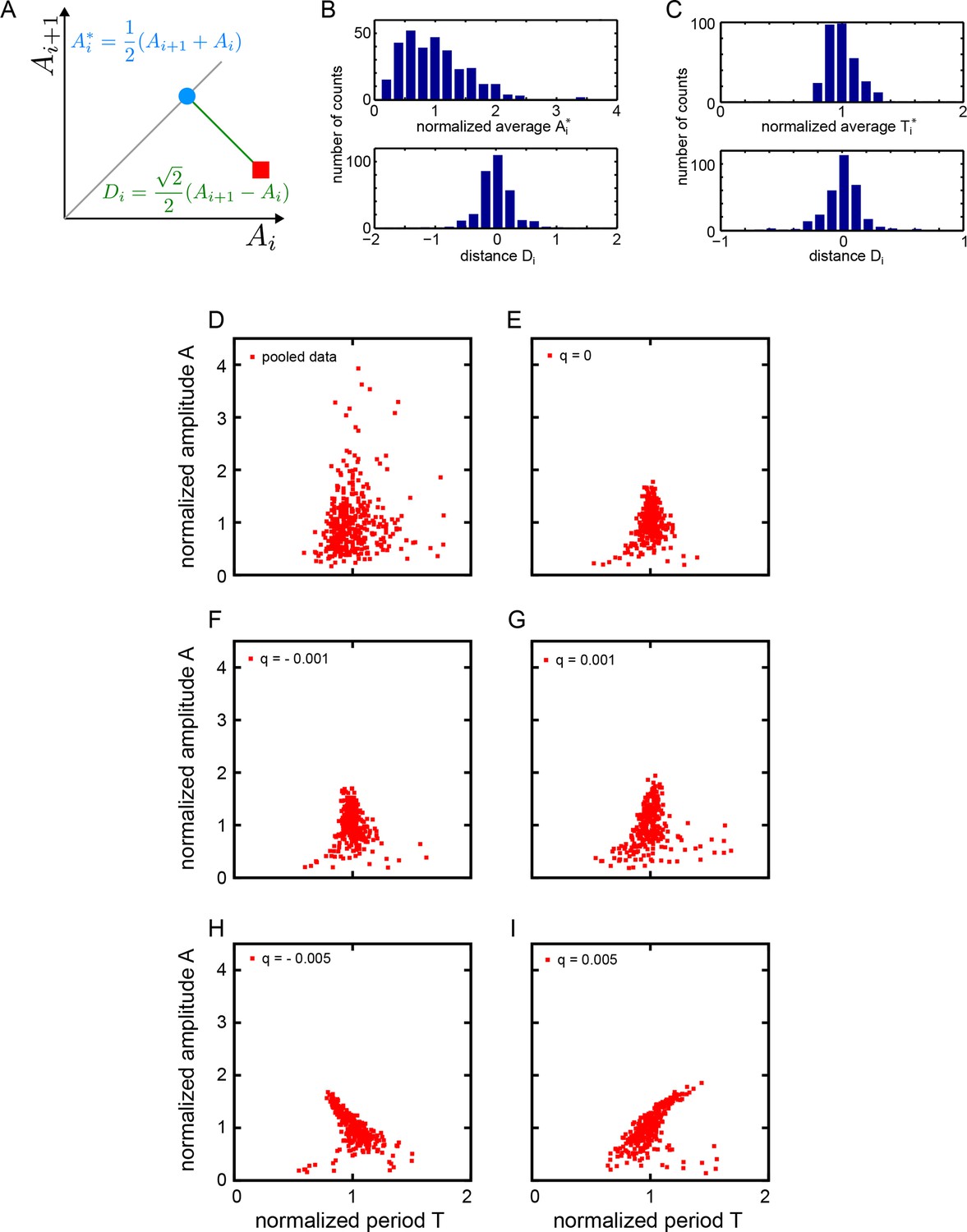
Statistics of amplitude and period correlations.
(A) Definition of averages Ai* (blue dot) of a quantity A measured in consecutive cycles (red square), and the distance Di (green line) to the identity (grey line), employed in panels (B) and (C). (B) Histograms of normalized average consecutive amplitudes Ai* (top) and the distances Di to the identity line (bottom), computed for all cycles in the low-density data set (Figure 2B). (C) Histograms of normalized average consecutive periods Ti* (top) and the distances Di to the identity line (bottom), computed for all cycles in the low-density data set (Figure 2C). (D-I) Correlation of amplitude and period. Amplitude and period values are normalized to the mean of the data set for each cycle. (D) Fgf-treated low-density data set: 645 cycles measured from 147 cells. (E-I) Simulated oscillators with , , , and min. (E) , min-1, (F) , min-1, (G) , min-1, (H) , min-1, (I) , min-1. Since non-isochronicity affects the instantaneous frequency for , we adjust the value of the autonomous frequency to keep the mean period of oscillation at 78 min.
Figure 2—figure supplement 2
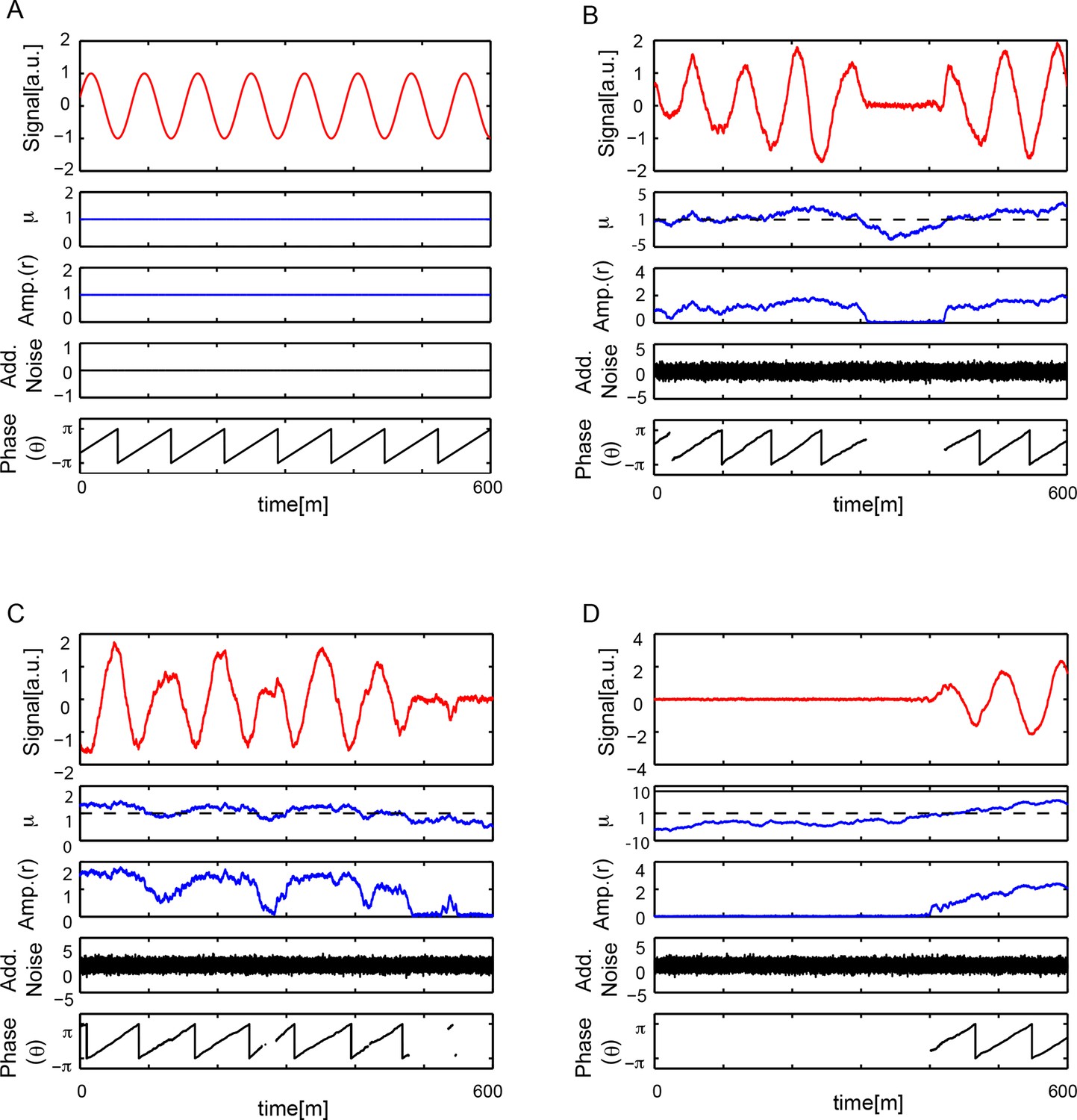
Numerical simulations.
(A) Numerical simulation of equation (S30), see Supplementary ile 1, with μ = 1, b = 1, ω = 2π/78 min-1, q = 0, . Signal x(t) oscillates with a constant amplitude and a period T = 78 min. There is no additive noise and the phase θ(t) increases monotonically with time, θ(t) ~ ω t, so when wrapped in the interval [−π, π] the phase is periodic with T = 78 min. (B-D) Numerical simulations of equation (S30) with μ = 1, b = 1, ω = 2π/78 min-1, q = 0, , and min. Each case B-D shows a different dynamical state that depends on the trajectory of μ(t). In all cases, top panel shows signal x(t) oscillatory behavior showing amplitude fluctuations. Second panel is . Third panel is amplitude of the signal . When μ(t) < 0, the system crosses the Hopf bifurcation and amplitude drops to zero. Fourth panel shows the additive white noise in variable x, . Bottom panel shows phase θ(t) increases monotonically in time θ(t) ~ ω t, when wrapped in the interval [−π, π] the phase is periodic with T = 78 min. Phase is not defined when r = 0.
Figure 2—figure supplement 3

Both additive noise and color noise are necessary for the theory to describe the observed fluctuations.
(A) Amplitude is not affected by additive noise. Data points show the median peak amplitude for 1000 stochastic simulations (S30), see Supplementary file 1, for . Error bars are the 68% confidence interval. Median of the amplitude remains constant as we increase , while amplitude fluctuations increase. (B) Median period is not affected by additive noise. Data points show the median value of the period for 1000 stochastic simulations (S30) for . Error bars are the 68% confidence interval. The median period from numerical simulations does not change when the variance of the additive noise increases. Dashed line joins data points. (C) Additive noise does not affect oscillating time fraction. Since the mean period is constant and additive noise does not modulate the amplitude, the oscillating time fraction remains constant. Data points show the median value of the oscillating time fraction for 1000 stochastic simulations (S30) for . Error bars are the 68% confidence interval. The dashed line joins data points. (D) Amplitude correlations of x(t) in successive cycles for fixed = 0.486 and . Red squares are data points, blue crosses show results of a randomized list.
Figure 3 with 1 supplement

Precision of persistent segmentation clock oscillators
(A) Quality factor workflow for time series analysis for an example persistent oscillator. Sub-panel 1: Background-subtracted intensity over time trace from a single tailbud cell (black) with phase (gray). Sub-panel 2: Wavelet transform of the intensity trace with cosine (light blue) of the phase information (gray). Sub-panel 3: Autocorrelation of the phase trace and fit (green) of the decay (for details see Supplementary file 1). The period of the autocorrelation divided by its correlation time is the quality factor plotted in B for each cell (blue). (B) Distribution of quality factors QP for persistent segmentation clock oscillators (blue; range 1–28, median 4.6 ± 5.8) compared to quality factors QE for the oscillating tailbud tissue in the embryo (red; range 1–117, median 10 ± 21). To compare between time series of different lengths we used sampling windows to calculate the quality factors, see theoretical supplement for details. Median values are indicated by dotted lines. Inset: Distribution of periods in single tailbud cells. (C) Estimation of tissue-level quality factor determined by measuring from an ROI placed over posterior PSM tissue in whole embryo timelapse of a single Looping embryo (Soroldoni et al., 2014). The intensity trace (black) and cosine (light blue) correspond to the average signal in the ROI over time. The period of the fit of the autocorrelation (green) divided by its correlation time is the quality factor plotted in B (red). (D) Distribution of quality factors for persistent segmentation clock oscillators (blue) replotted from B compared with the distribution of quality factors for circadian fibroblasts (orange; range 1–149, median 20 ± 27). Median values are indicated by dotted lines. Inset: Distribution of periods in circadian fibroblasts. (E) Precision decreases with increasing additive noise. Top panel, quality factor Q vs. variance of the additive noise, from numerical simulations (S30). Dots are the median value and error bars display the 68% confidence interval for 1000 stochastic simulations. Black line and shaded region indicates the median and the 68% confidence interval of persistent cells’ oscillations. Bottom panel, p-value of a two-sample Kolmogorov–Smirnov test vs. variance . We test whether the persistent cells oscillations and the quality factors obtained from simulations come from the same distribution. In the absence of amplitude fluctuations , for we have Q = 4.6 and a p-value of 0.78.
-
Figure 3—source data 1
Precision and period calculation for persistent segmentation clock oscillators.
Each set of panels shows, successively, the background-subtracted average YFP intensity levels over time from a single persistently oscillating cell in black; the cosine of the phase calculated from the wavelet transformation in blue; and the autocorrelation function in green. The dashed green curve shows the analytical fit of the autocorrelation. Both period and quality factor can be calculated from this procedure (see Supplementary file 1). This is the complete persistent cell data set, a sub-set of the low-density set, from which the plots of period andquality factor QP in Figure 3B and D are generated.
- https://doi.org/10.7554/eLife.08438.023
-
Figure 3—source data 2
Precision and period calculation for the tissue-level segmentation clock in the zebrafish embryo.
As for data set supplement 3–1, each set of panels shows, successively, the background-subtracted average YFP intensity levels from a region of posterior PSM tissue in a Looping embryo in black; the cosine of the phase calculated from the wavelet transformation in blue; and the autocorrelation function in green. The dashed green curve shows the analytical fit of the autocorrelation. Both period and quality factor can be calculated from this procedure. The original intensity versus time data comes from Soroldoni et al. (2014). This is the complete dataset from time-lapse data of 24 embryos from which the plot of quality factor QEmbryo in Figure 3B is generated.
- https://doi.org/10.7554/eLife.08438.024
-
Figure 3—source data 3
Precision and period calculation for persistent circadian clock oscillators.
As for data set supplement 3–1, each set of panels shows, successively, the background-subtracted intensity levels from a single persistently oscillating Per2-Lucifcerase-expressing fibroblast over time in black; the cosine of the phase calculated from the wavelet transformation in blue; and the autocorrelation function in green. The dashed green curve shows the analytical fit of the autocorrelation. Both period and quality factor can be calculated from this procedure. The original intensity versus time data comes from Leise et al. (2012). This is the complete fibroblast dataset from which the plot of quality factor QF in Figure 3D is generated.
- https://doi.org/10.7554/eLife.08438.025
Figure 3—figure supplement 1
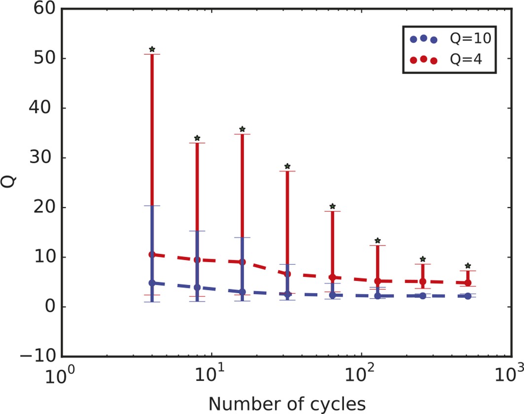
Quality factor value depends on length of time series.
Time series length is defined in terms of the number of cycles. The plot shows the quality factor from stochastic simulations for two parameter sets A and B that display QA = 4 and QB = 10 when the number of cycles used to compute Q is 4. The quality factor Q decreases with increasing number of cycles in the time series in both cases, but QA remains consistently smaller than QB. For all the different values analysed, the distributions have a p-value < 10–10 using the Kolmogorov-Smirnov test (asterisks). Thus, while the quality factor may depend on the length of the time series, we can use it to compare different datasets as long as we compare time series with the same number of cycles. For the comparison in this work, we use 6.5 cycles.
Videos
Video 1
Low-density segmentation clock cells oscillate in vitro.
Field of view containing cell in Figure 1B–C, highlighted by the red arrow. This field contains 18 cells in total, with 9 expressing YFP. We observed 5 cell divisions, the highest number in any experiment, including one non-YFP cell, 3 YFP-positive cells, which are excluded from analysis because of division, and one YFP-positive cell disqualified due to contact with another cell in the field prior to the division. The remaining 5 YFP-positive cells, including the highlighted cell, are part of the low-density data set. Total duration = 10 hr; Time interval = 2 min; field size = 410 x 410 μm; Scale bar = 50 μm.
Video 2
Isolated segmentation clock cells oscillate in vitro.
Field of view corresponding to cell in top row of Figure 1—figure supplement 9. Total duration = 6.2 hr; Time interval = 2.14 min, field size = 205 x 205 μm, Scale bar = 50 μm.
Additional files
-
Supplementary file 1
Theory supplement including Stuart-Landau theory with slow fluctuations, quantification of noisy oscillations, and numerical methods.
- https://doi.org/10.7554/eLife.08438.027
Download links
A two-part list of links to download the article, or parts of the article, in various formats.
Downloads (link to download the article as PDF)
Open citations (links to open the citations from this article in various online reference manager services)
Cite this article (links to download the citations from this article in formats compatible with various reference manager tools)
Persistence, period and precision of autonomous cellular oscillators from the zebrafish segmentation clock
eLife 5:e08438.
https://doi.org/10.7554/eLife.08438


