Benchmarking and optimization of methods for the detection of identity-by-descent in high-recombining Plasmodium falciparum genomes
- Center for Vaccine Development and Global Health, University of Maryland School of Medicine, United States
- Institute for Genome Sciences, University of Maryland School of Medicine, United States
Figures
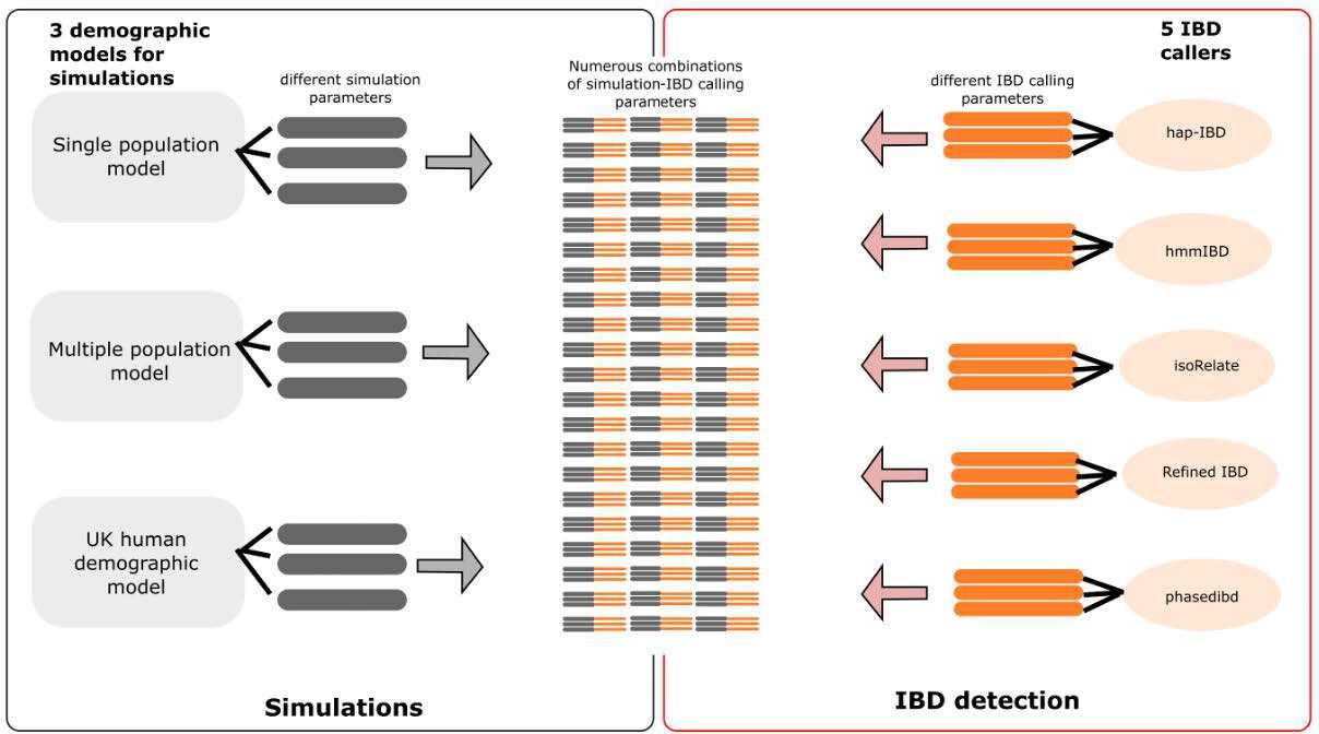
Figure 1
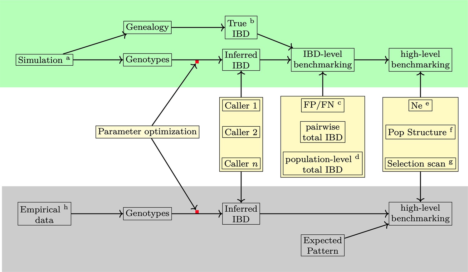
Overview of methods used in benchmarking IBD detection methods.
Benchmarking and optimization of IBD callers for Pf include simulation analyses (top, green shading) and empirical data-based validation analyses (bottom, gray shading). (1) For the simulation study, the genealogical trees and phased genotype data are generated via the combination of forward (SLiM Haller et al., 2019; Haller and Messer, 2019) and coalescent (msprime Baumdicker et al., 2022) simulations (indicated by the superscript a in the diagram). True IBD is obtained from a simulated genealogy tree via tskibd (Guo et al., 2024) (b) and inferred IBD from the phased genotype using different IBD callers, including hap-IBD (Zhou et al., 2020), hmmIBD (Schaffner et al., 2018), isoRelate (Henden et al., 2018), Refined IBD (Browning and Browning, 2013), and phased IBD (Freyman et al., 2021). IBD benchmarking is performed at two levels. The first is at the IBD segment level. The metrics include false positive and false negative rates (c), population-level total IBD per length bin (Browning and Browning, 2015) (d), and total IBD per isolate pair. The second is at the level of IBD-based downstream analyses, including the effective population size (Ne) by IBDNe (Browning and Browning, 2015) (e), community membership through the InfoMap algorithm (Rosvall et al., 2009; Csardi and Nepusz, 2006) (f), and selection signals by statistics XiHS (Guo et al., 2024) (g). As the default parameters of different IBD callers, particularly those developed for human data, may not be ideal for Pf genomes, we performed grid searches for key parameters for each IBD caller so that the comparison was based on the best performance of each caller (see Supplementary file 1—Data S1 for detailed information on simulation and IBD calling parameters and used values). (2) For validation in empirical data where true IBD is not available, we obtained IBD-based estimates using IBD from different callers and assessed which version of IBD can generate the expected patterns. The empirical data sets are subsampled from the MalariaGEN Pf7 database (Abdel Hamid et al., 2023) (h).
Figure 2 with 1 supplement
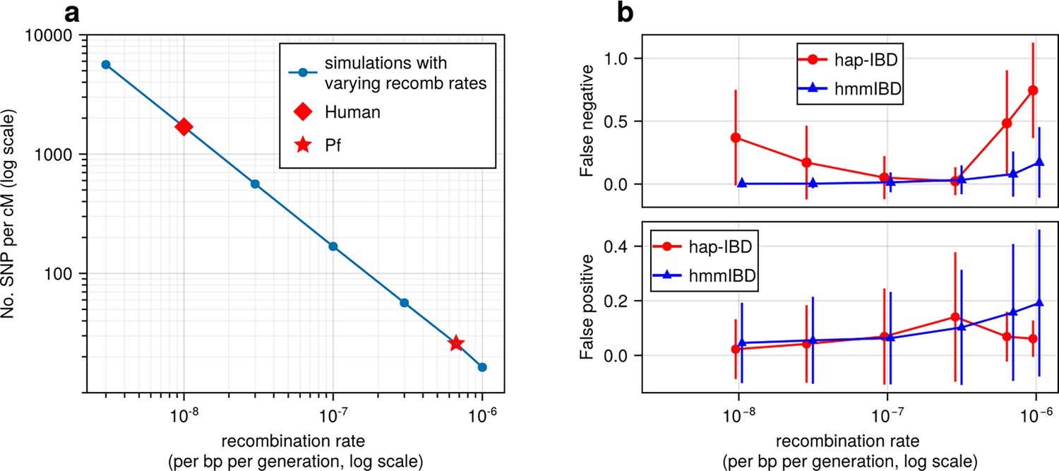
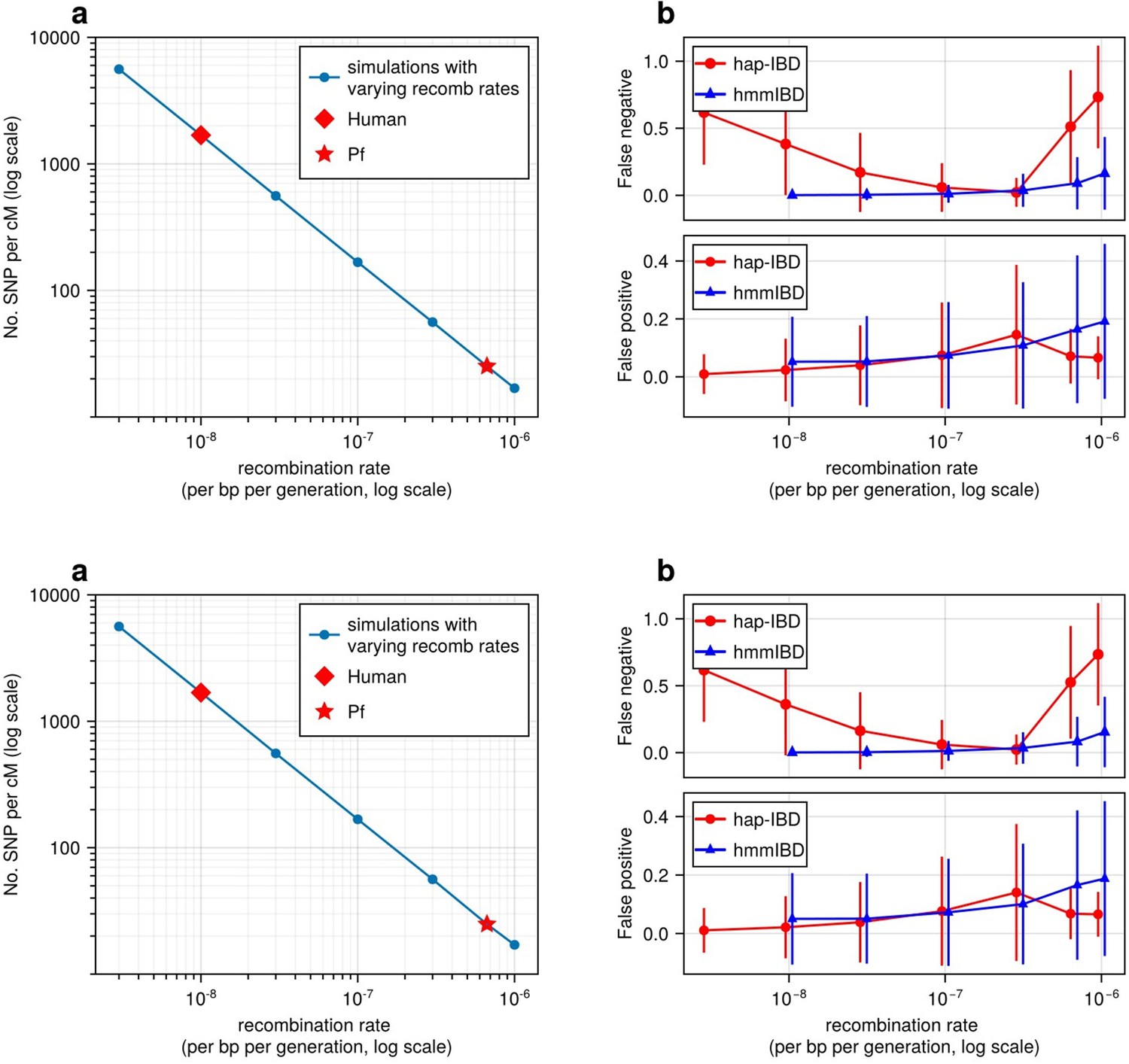
High recombination rates reduce genetic marker density and affect the quality of detected IBD segments.
(a) The number of common single nucleotide polymorphisms (SNPs) (minor allele frequency ≥ 0.01) per genetic unit (centimorgan, cM) in simulated genomes with different recombination rates. In these simulations (blue line), the mutation rates are fixed; the recombination rates vary widely to include the rate for both humans (red diamond) and Pf (red star). For each recombination rate, n = 4 independent simulations of chromosomes were performed. Data were plotted in the form of mean (marker) ± standard deviation (vertical lines, which are difficult to visualize given low variation among chromosomes). (b) Accuracy of IBD segments detected from genomes simulated with different recombination rates. The accuracy of IBD segments is measured by the false negative rates (top panel) and false positive rates (bottom panel). The plotted error rates represent the genome-wide rates (as defined in Methods) of IBD segments identified with default IBD caller parameters unless stated otherwise in Supplementary file 2—Table S4 . These rates are based on one representative set from n = 3 simulation sets. The plotted vertical lines indicate standard deviations of error rates across all genome pairs in the representative simulated set. Both the vertical lines and markers are horizontally staggered for clarity. Only error rates for two IBD detection methods, hmmIBD and hap-IBD, are included in (b) for simplicity. The error rates for all 5 IBD callers are provided in Figure 2—figure supplement 1. For both (a) and (b), the genomes were simulated under the single-population model (see Methods). Note that log scales are used for the y axis in (a) and the x axis in (b).
Figure 2—figure supplement 1
High recombination rates affect the quality of detected IBD segments (extending Figure 2).
(a-b) Accuracy of detected IBD segments from genomes simulated with different recombination rates. The accuracy of IBD segments is measured by the false negative rates (a) and the false positive rates (b). The plotted error rates reflect the genome-wide rates (as defined in Methods) of IBD segments called via default IBD caller parameters. These rates are based on one representative set from n = 3 simulation sets. The plotted vertical lines indicate standard deviations of error rates across all genome pairs in the representative simulated set. Both the vertical lines and markers are horizontally staggered for clarity. Note, for both (a) and (b), the genomes were simulated under the single-population model (Methods). Data for low recombination rates is missing for isoRelate as genome sizes in base pairs are too large for isoRelate to finish IBD calling in a timely manner. Note that axes in both (a) and (b) use log scales.
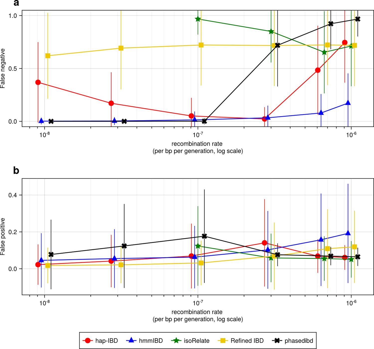
Figure 3 with 1 supplement
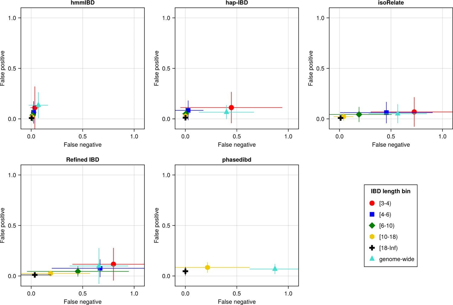
The accuracy of IBD segments detected from Pf genomes varies across IBD callers.
IBD segments were inferred from genomes simulated under the single-population model with a shrinking population size and a recombination rate compatible with Pf. The accuracy of IBD was evaluated using the calculated false positive rate (y axis) and false negative rate (x axis). The rates were calculated for different length bins in centimorgans, including [3-4), [4-6), [6-10), [10-18), [18, inf) centimorgans and at the genome-wide level (defined by overlapping analysis between true IBD segments and inferred IBD segments from each genome pair). These rates are based on one representative set from n = 3 simulation sets. The plotted vertical and horizontal lines represent the standard deviations of error rates (horizontal for false negatives and vertical for false positives) calculated across all relevant segments for length-bin specific rates or across all genome pairs for genome-wide rates in the representative simulated set. The titles of the subplots indicate the IBD callers analyzed. The results of the simulations under the multiple-population model and the UK human demographic model are provided as Supplementary file 2—Data S2.
Figure 3—figure supplement 1
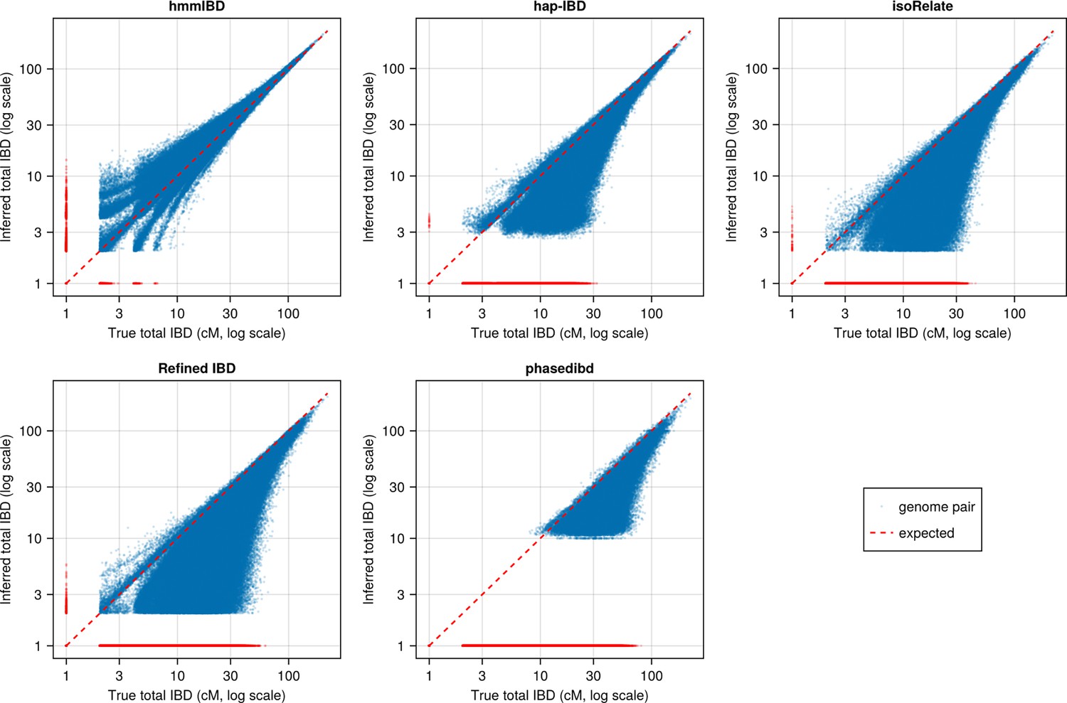
Pairwise total IBD of simulated Pf-like genomes from the different IBD callers compared with those based on true IBD (before parameter optimization).
Quality of detected IBD as measured by genome-wide pairwise total IBD (total length of IBD segments ≥ 2cM for each genome pair), an estimate of genetic relatedness. Data of n = 1000 haploid genomes from a representative simulation set was plotted with each subplot for an IBD caller (as indicated in the titles). Each dot represents a genome pair with the and coordinates being true and the inferred total IBD. The blue dots are pairs with nonzero true and inferred total IBD, whereas red dots are pairs with the true total IBD or the inferred total IBD being 0; ‘0’ total IBD was replaced with 1.0 cM for visualization. The red dotted line indicates the expected pattern, that is true total IBD equal to inferred total IBD if the inferred IBD was 100% accurate. Note that log scales are used in all and axes in (b).
Figure 4 with 2 supplements
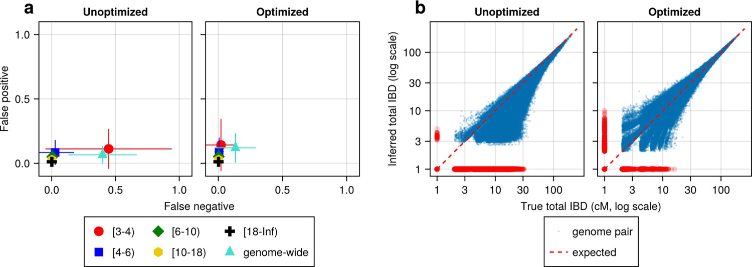
IBD caller-specific parameter optimization can improve the quality of IBD segments inferred from simulated Pf genomes (using hap-IBD as an example).
(a) Quality of detected IBD measured by false positive and false negative rates before (left column) and after (right column) hap-IBD-specific parameter optimization. As indicated in the axis legend, the error rates were calculated for different length ranges (in centimorgans), including [3-4), [4-6), [6-10), [10-18), [18, inf) and at the genome-wide level. These rates are based on one representative set from n = 3 simulation sets. The plotted vertical and horizontal lines represent the standard deviations of error rates (horizontal for false negatives and vertical for false positives) calculated across all relevant segments for length-bin-specific rates or across all genome pairs for genome-wide rates in the representative simulated set. (b) Quality of detected IBD measured by total genome pairwise IBD, an estimate of genetic relatedness, before (left column) and after (right column) parameter optimization. Data of n = 1000 haploid genomes from a representative simulation set was plotted with each subplot for hap-IBD before and after parameter optimization as indicated in the titles. Each dot represents a pair of genomes with the coordinates x and y being true and inferred total IBD. In (b), the blue dots are the pairs with nonzero true and inferred total IBD, while red dots are pairs with either true total IBD or inferred total IBD being 0; zero-valued total IBD was replaced with 1.0 cM for visualization purposes. The red dotted line of y = x indicates the expected pattern, that is, true total IBD equal to inferred total IBD if the inferred IBD was 100% accurate. Note that log scales are used in both the x and y axes in (b).
Figure 4—figure supplement 1
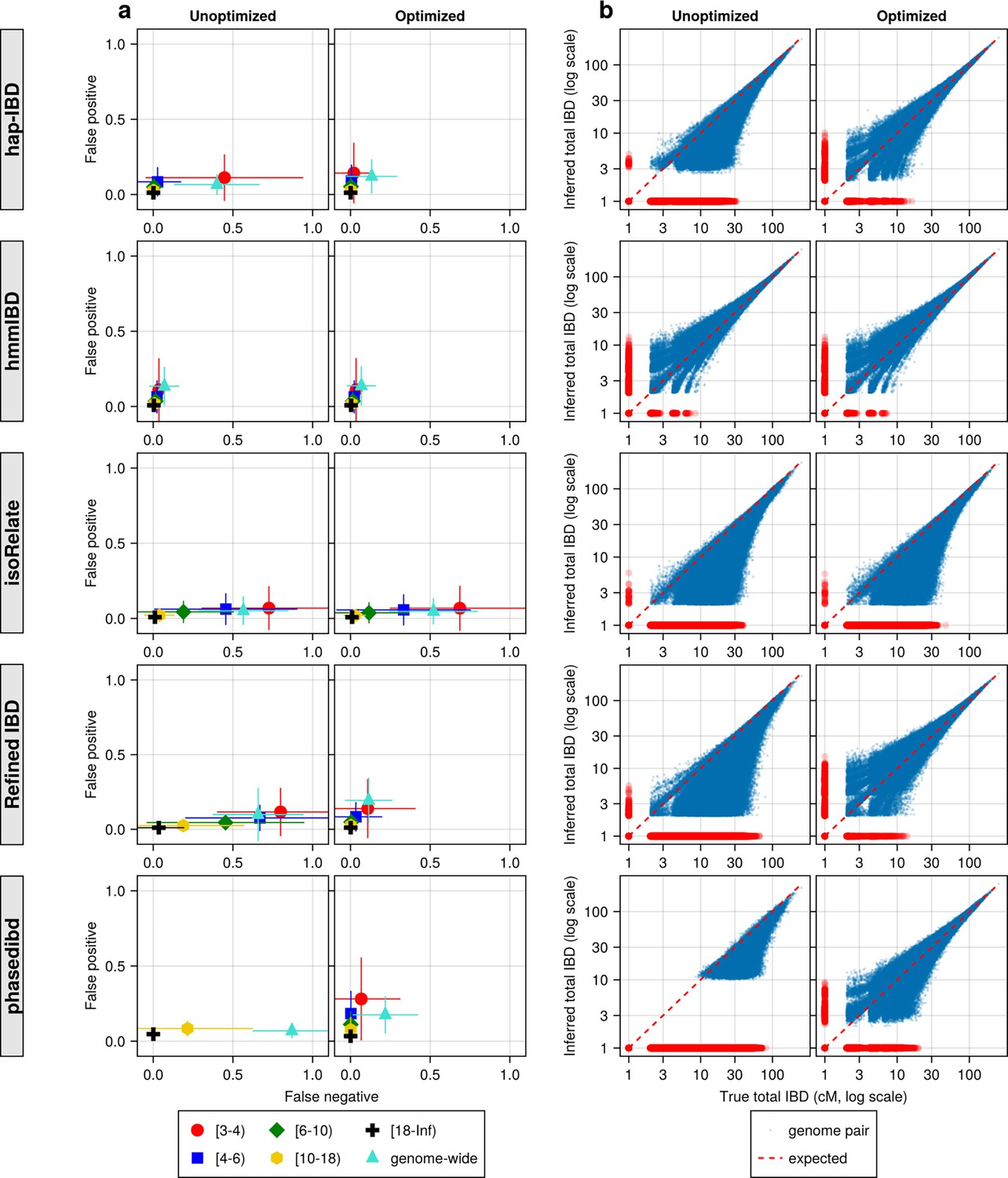
IBD caller-specific parameter optimization can improve the quality of IBD segments inferred from simulated Pf genomes (extending Figure 4).
(a) Quality of detected IBD measured by false positive and false negative rates before (left column) and after (right column) IBD caller-specific parameter optimization. As indicated in the legend of the axes, the error rates were calculated for different IBD segment length ranges (in centimorgans), including [3-4), [4-6), [6-10), [10-18), [18, inf), and at the genome-wide level. These rates are based on one representative set from n = 3 simulation sets. The plotted vertical and horizontal lines represent the standard deviations of error rates (horizontal for false negatives and vertical for false positives) calculated across all relevant segments for length-bin specific rates or across all genome pairs for genome-wide rates in the representative simulated set. (b) Quality of detected IBD measured by genome-wide pairwise total IBD, an estimate of genetic relatedness, before (left column) and after (right column) parameter optimization. Data of n = 1000 haploid genomes from a representative simulation set was plotted with each subplot for each IBD caller (indicated in shaded vertical labels) before and after parameter optimization (indicated in the titles). Each dot represents a genome pair with the x and y coordinates being true and inferred total IBD. In (b) the blue dots are pairs with non-zero true and inferred total IBD, whereas red dots are pairs with either true total IBD or inferred total IBD being 0; ‘0’ total IBD was replaced with 1.0 cM for visualization. The red dotted line of y = x indicates the expected pattern, that is, the true total IBD equal to the inferred total IBD if the inferred IBD was 100% accurate. Note: This figure is similar to Figure 4 except that it includes the results for the five IBD callers analyzed. For both (a) and (b), each row represents results for a caller, as indicated by the vertical text label with a gray background on the left of the figure. Note that log scales are used in all x and y axes.
Figure 4—figure supplement 2
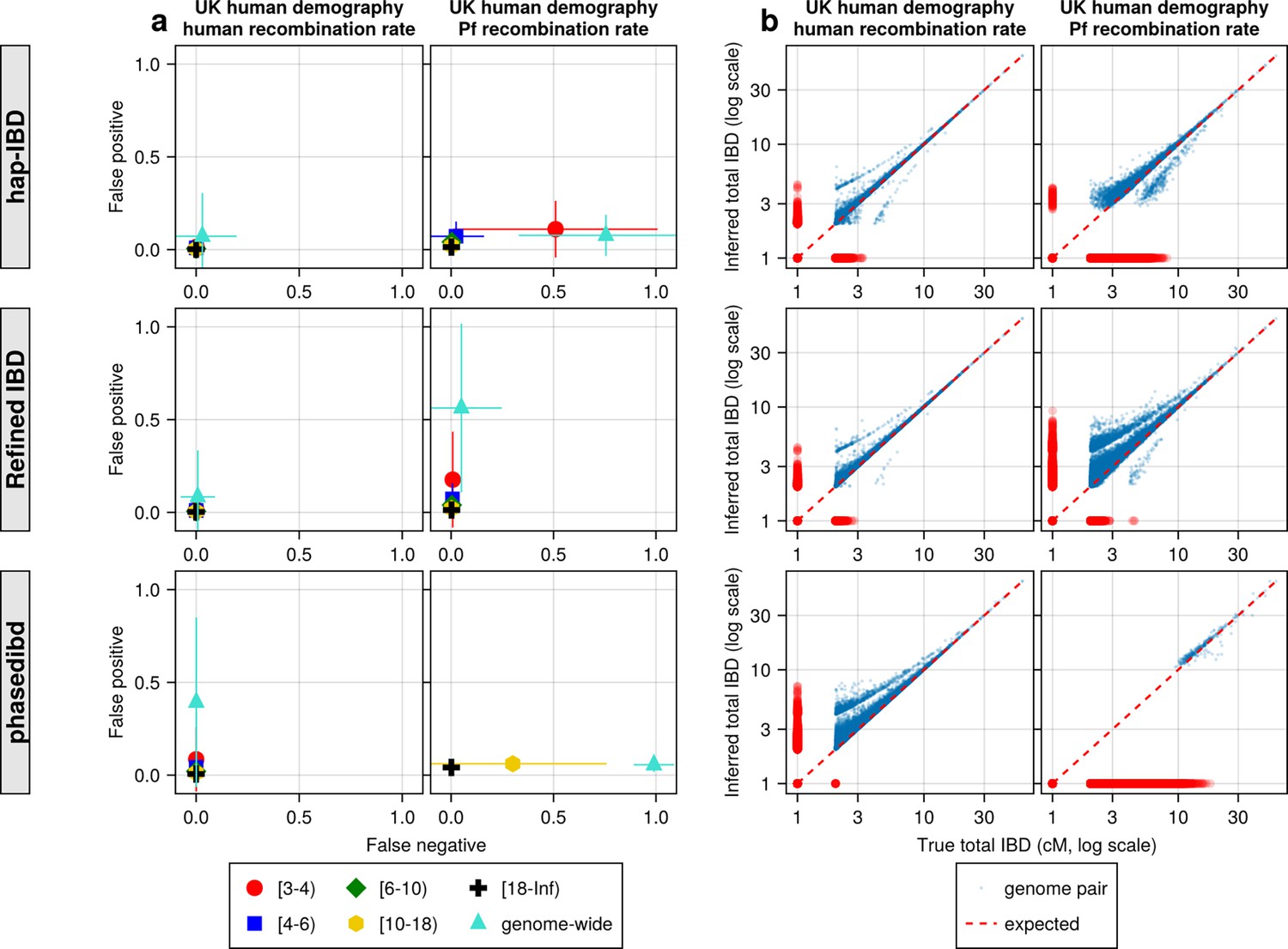
Quality of IBD segments called via human-oriented callers from simulated genomes with UK human population demographic history but different recombination rates (human versus Pf rates).
(a) Quality of detected IBD as measured by false positive and false negative rates from genomes simulated with human (left axes) and Pf (right axes) recombination rates. As indicated in the legend of the axes (at the bottom of the panel), the error rates were calculated for different length ranges (centimorgan), including [3-4), [4-6), [6-10), [10-18), [18, inf) and at the genome-wide level. These rates are based on one representative set from n = 3 simulation sets. The plotted vertical and horizontal lines represent the standard deviations of error rates (horizontal for false negatives and vertical for false positives) calculated across all relevant segments for length-bin specific rates or across all genome pairs for genome-wide rates in the representative simulated set. (b) Quality of detected IBD measured by genome-wide pairwise total IBD, an estimate of genetic relatedness, from genomes simulated with human (left column) and Pf (right column) recombination rates. Data of n = 1000 haploid genomes from a representative simulation set using human-like versus Pf-like recombination rates (indicated in the titles) was plotted with each subplot for each IBD caller (indicated in shaded vertical labels). Each dot represents a genome pair with the x and y coordinates being true and inferred total IBD. Note: (1) In (b) the blue dots are pairs with non-zero true and inferred total IBD, whereas red dots are pairs with either true total IBD or inferred total IBD being 0; ‘0’ total IBD was replaced with 1.0 cM for visualization. The red dotted line of y = x indicates the expected pattern, that is true total IBD equal to inferred total IBD if the inferred IBD was 100% accurate. (2) Genomes were simulated under the demographic model mimicking the history of the UK human population (described in Zhou et al., 2020). Note that log scales are used in all x and y axes in (b).
Figure 5 with 5 supplements
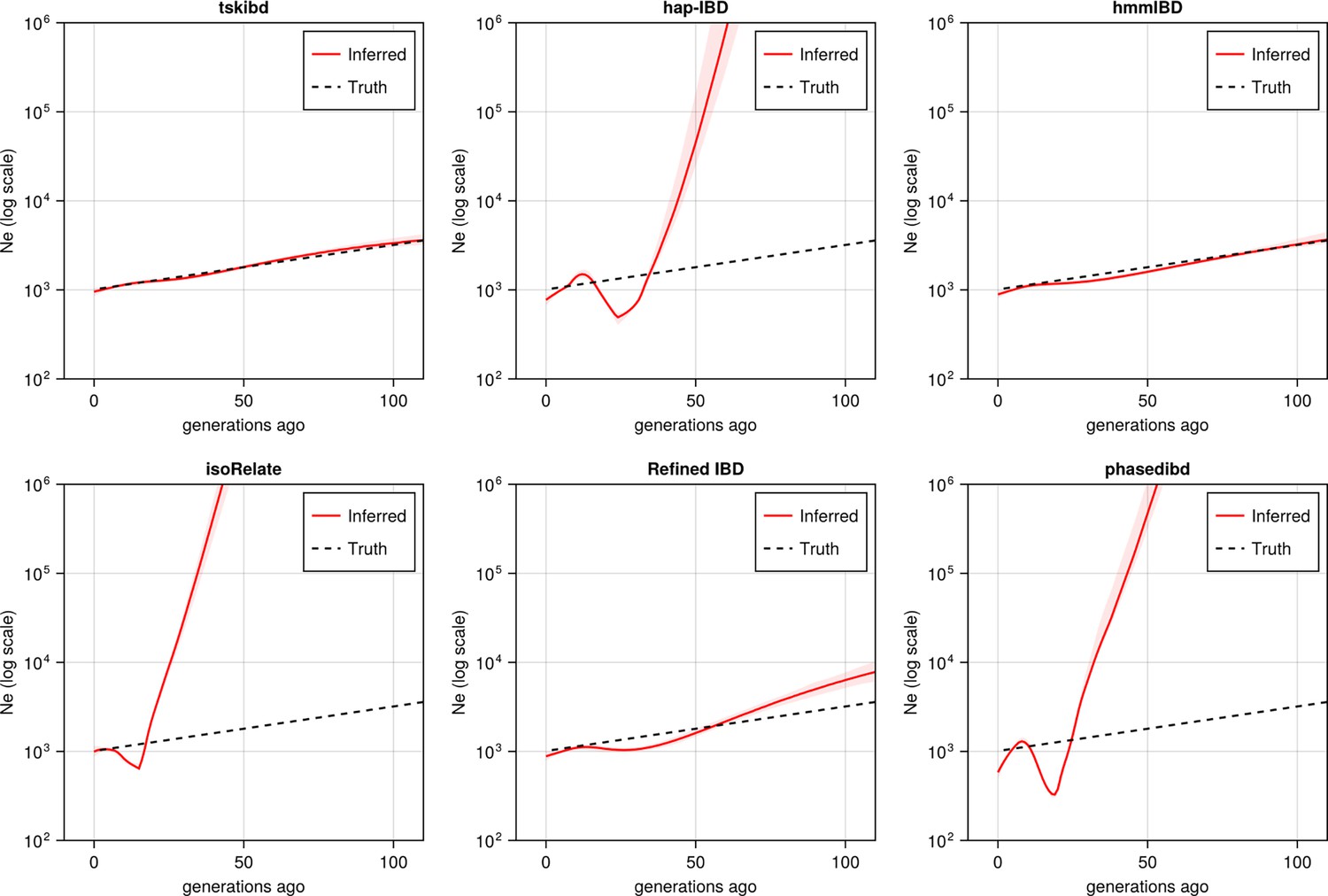
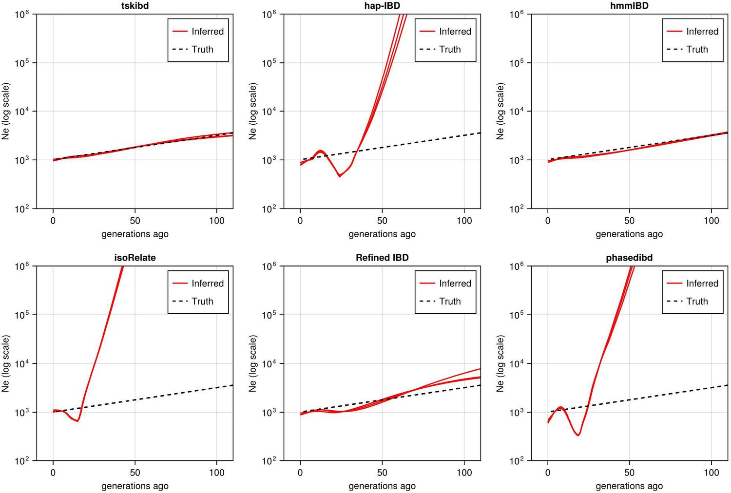
Post-optimization benchmarking of different IBD callers by comparing downstream estimates Ne .
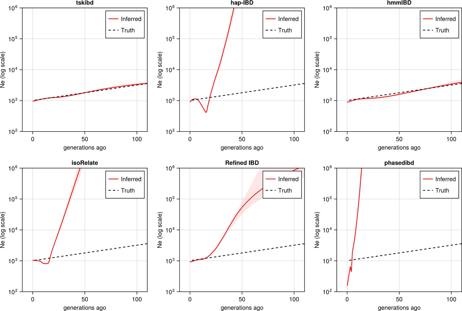
With parameters optimized for each IBD caller, the performance of IBD callers was evaluated by comparing the Ne trajectory for the recent 100 generations estimated via IBDNe based on true (black dashed line) IBD versus inferred IBD (red solid line). True IBD was calculated from simulated genealogical trees via tskibd; inferred IBD includes those inferred from hap-IBD, hmmIBD, isoRelate, Refined IBD, and phased IBD, with their Ne estimates shown from top left to bottom right. The shaded areas surrounding the red lines indicate 95% confidence intervals as determined by IBDNe. The plots show results from one representative set of n=3 replicated simulation sets. See Figure 5—figure supplement 5 for pre-optimization results. Note that log scales are used on the y axes.
Figure 5—figure supplement 1
Post-optimization benchmarking of different IBD callers by comparing downstream estimates of selected loci and population structure.
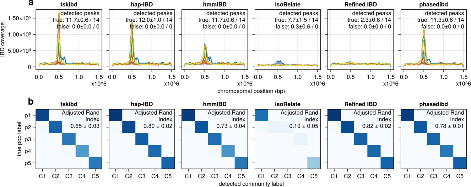
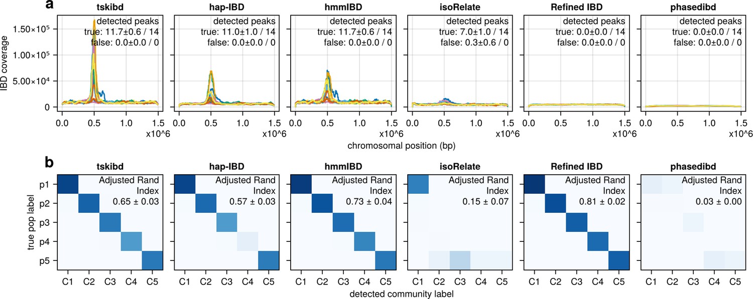
(a) IBD coverage and estimates of selected loci based on IBD segments called after parameter optimization. Each subplot corresponds to one of the five benchmarked IBD callers. In each subplot, lines of different colors represent the IBD coverage over one of 14 chromosomes; text in the upper right corner indicates the observed (on the left of ‘/’) and expected (on the right of ‘/’) numbers of true peaks and false peaks. A peak is defined as true if the span of the peak contains a selected site determined from the simulation. (b) Post-optimization inference of population structure via the InfoMap algorithm. In each subplot, the row labels indicate the true population labels set in the simulation, and the column labels indicate the detected community labels. C1–C5 represent the largest five detected communities. The color within each block represents the number of samples assigned to the given true population label and the detected community label. Columns are rearranged for better visualization. Text in the upper right corner of each plot is adjusted rand indices, indicating the consistency between true population labels (simulation) and detected community labels (detected). For both (a) and (b), the numbers of true and false peaks and adjusted rand indices are presented in the form of mean ± standard deviation as determined from n = 3 independent simulation sets. See Figure 5—figure supplement 4 for pre-optimization results.
Figure 5—figure supplement 2
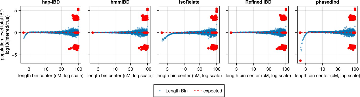
Population-level total IBD per length bin.
The population-level total length of IBD segments with a given length range is an intermediate quantity used by IBDNe internally to estimate the trajectory of Ne at different times in recent history. The population-level total IBD inferred by an IBD caller (as shown in the title of each subplot) is compared with that of true IBD. The log ratio of inferred to true population-level total IBD was plotted against length bins (represented by bin centers in centimorgans). Blue dots represent a length bin with non-zero population-level total IBD for both true and inferred sets. Red dots indicate either the true or inferred population-level total IBD is zero for the corresponding length bin (x coordinate). A line of y = 0 is added as the expected line, meaning that the log ratios for all length bins would be 0 if there were no biases. The data shown here is based on n = 1000 haploid genomes for one representative set of n = 3 simulation replication sets. Note that log scales are used for all x axes.
Figure 5—figure supplement 3
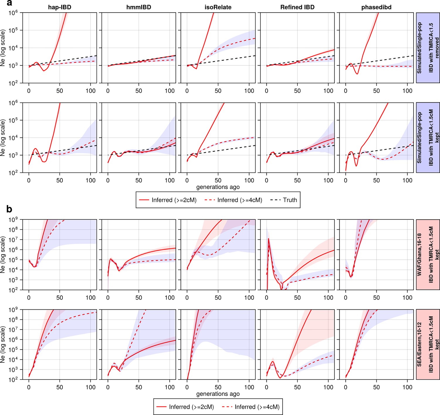
The effect of including and excluding short IBD segments (<4 cM) on estimation.
The effect of including and excluding short IBD segments (4 cM) on estimation. (a) Ne estimates for genomes simulated under the single-population model without selective sweep. In the upper row, IBD segments with TMRCA < 1.5 generations were excluded from the IBD input for Ne estimation; in the bottom row, they are kept. For true IBD segments (from tskibd), the TMRCA for each IBD segment was obtained directly from genealogical trees; for inferred IBD segments, any of them that overlapped with a segment of the truth set with TMRCA < 1.5 generations was determined to have TMRCA < 1.5 generations. The plots show results from one representative set of n=3 replicated simulation sets. (b) Ne estimates for genomes for different empirical data sets. Each row corresponds to a data set labeled on the right. The columns are estimates for different IBD callers. Solid red line: Ne estimates when short IBD segments are included; red dashed line: Ne estimates when short IBD segments are excluded; black dashed line: parameter population sizes used in simulations. For (a) and (b), log scales are used for all axes, and shaded areas indicate the 95% bootstrap confidence intervals as determined by IBDNe.
Figure 5—figure supplement 4
Pre-optimization benchmarking of different IBD callers by comparing downstream estimates of selected loci and population structure (for comparison with Figure 5—figure supplement 1).
(a) IBD coverage and estimates of selected loci based on IBD segments called before parameter optimization. Each subplot corresponds to one of five benchmarked IBD callers. In each subplot, lines of different colors represent the IBD coverage over one of 14 chromosomes; text in the upper right corner indicates the observed (on the left of the ‘/’) and expected (on the right of ‘/’) numbers of true peaks and false peaks. A peak is defined as true if the span of the peak contains selected sites determined from simulation. (b) Post-optimization inference of population structure via InfoMap algorithm. In each subplot, the row labels indicate the true population labels set in the simulation and the column labels indicate the detected community labels. C1–C5 represent the largest five detected communities. The color within each block represents the number of samples assigned to the given true population label and the detected community label. Columns are rearranged for visualization purposes. Text in the upper right corner of each plot is adjusted rand indices, indicating the consistency between true population labels (simulation) and detected community labels (detected). For both (a) and (b), the numbers of true and false peaks and adjusted rand indices are presented in the form of mean ± standard deviation as determined from n = 3 independent simulation sets.
Figure 5—figure supplement 5
Pre-optimization benchmarking of different IBD callers by comparing downstream estimates of Ne (for comparison with Figure 5).
With mainly default values for IBD caller parameters, the performance of IBD callers was evaluated by comparing the Ne trajectory for the recent 100 generations estimated via IBDNe based on true (black dashed line) IBD versus inferred IBD (red solid line). True IBD was calculated from simulated genealogical trees via tskibd; inferred IBD includes those inferred from tskibd, hap-IBD, hmmIBD, isoRelate, Refined IBD, and phased IBD, with their Ne estimates shown from left to right. Red shaded areas in each plot indicate the 95% confidence interval for Ne estimates as generated by IBDNe. The plots show results from one representative set of n = 3 replicated simulation sets. Note that log scales are used for all y axes.
Figure 6 with 1 supplement
Validation of the performance of IBD callers in empirical data sets by comparing IBD-based downstream analyses.
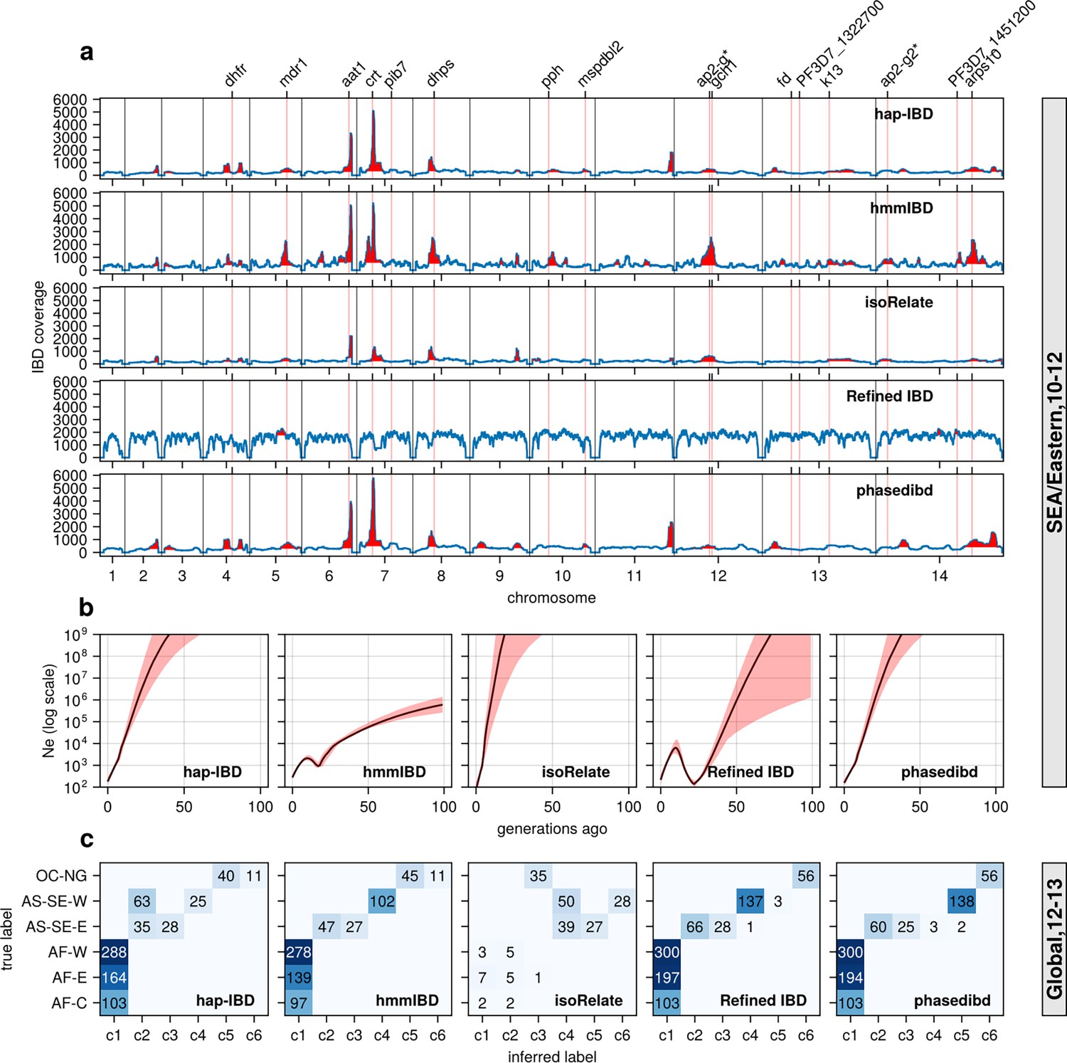
(a) IBD coverage and detected selection signals in the SEA data set using different IBD callers (rows 1 to 5). Annotations and corresponding vertical dotted lines at the top indicate the center of known and putative drug resistance genes and genes related to sexual commitment; red shading indicates regions that are inferred to be under positive selection (see Methods for definitions). (b) Ne estimates of the SEA data set based on IBD inferred from different callers. Line plots are point estimates; the shaded areas around the line plots indicate confidence intervals based on bootstrapping (generated by IBDNe). (c) Inference of the population structure of the structured data set by the InfoMap community detection algorithm using the IBD inferred from different IBD callers. The rows of the heatmap are geographic regions of isolates, and the columns are the largest, inferred communities, labeled as c1 to c6. The heatmap color represents the number of isolates in each block with the given row and column labels. The columns are rearranged so that the diagonal blocks tend to have the largest values per row for better visualization. Note that log scales are used in y axes in (b).
Figure 6—figure supplement 1
Performance of IBD callers with empirical data sets before parameter optimization (in comparison with post-optimization performance shown in Figure 6).
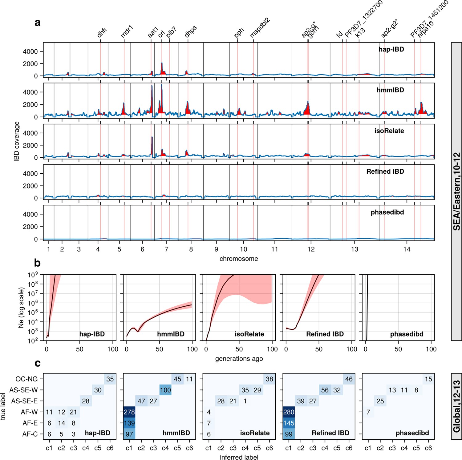
(a) IBD coverage and detected selection signals in the SEA data set using different IBD callers (rows 1 to 5). Annotations and corresponding vertical dotted lines at the top indicate the centers of known and putative drug resistance genes and genes related to sexual commitment; red shading indicates regions that are inferred to be under positive selection (see Methods for definitions). Note the difference in the peak height of IBD and the counts of hap-IBD and phased IBD compared to Figure 6a. (b) Ne estimates of the SEA data set based on IBD inferred from different callers. The line plots are the point estimates; the shaded areas around the line plots indicate confidence intervals based on bootstrapping (generated by IBDNe). (c) Inference of the population structure of the structured data set by the InfoMap community detection algorithm using IBD network inferred from different IBD callers. The rows of the heatmap are geographic regions of isolates, the columns of the heatmap are the largest, inferred communities, labeled as c1 to c6. The color of the heatmap represents the number of isolates in each block with the given row and column labels. The columns are rearranged such that diagonal blocks tend to have the largest values per row for better visualization. Note the difference in size of the main detected communities for hap-IBD and phased IBD for parasites from Africa when compared with Figure 6c. Note that log scales are used for all y axes in (b).
Figure 7 with 1 supplement
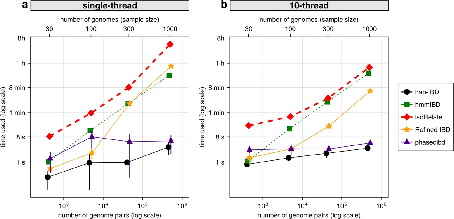
Comparison of computational runtime for IBD calling process for different callers.
(a) Runtime for different IBD callers to detect IBD from genomes of different sample sizes in single-thread mode. The comparison is based on Pf genomes of size 100 cM simulated under the single-population model. The x-axis tick labels include the number of pairs of genomes simulated and analyzed (below the plot, reflecting the number of computation units) and the number of haploid genomes (above the plot, representing sample size) analyzed. The line styles and markers for different callers/tools are provided in the legend box on the far right of the figure, which is shared across the two subplots. Values on the y axis represent means (markers) and standard deviations (vertical error lines) from n = 3 sets of independent simulations. Note that at each sample size, the x values for different IBD callers are slightly staggered to prevent the error lines from overlapping; some of the error lines are hard to visualize as they are relatively small. (b) Runtime in multithreading mode. (b) is organized similarly to (a) except that the IBD calling processes were run in multithreading mode with 10 CPU threads. Note that log scales are used in y axes and bottom x axes. Also, see Figure 7—figure supplement 1 for the maximum memory usage for different callers.
Figure 7—figure supplement 1
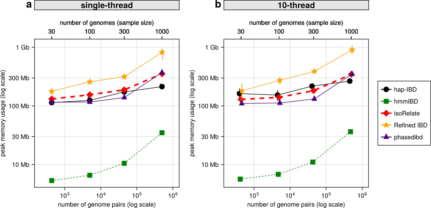
Comparison of maximum computer memory used for IBD calling process for different callers.
(a) Memory usage for different IBD callers to detect IBD from genomes of different sizes in single-thread mode. The comparison is based on Pf genomes simulated under the single-population model. The x-axis tick labels include the number of pairs of genomes simulated and analyzed (below the plot, reflecting the number of computation units) and the number of haploid genomes (above the plot, representing sample size) analyzed. The line styles and markers for different callers/tools are provided in the legend box on the far right of the figure, which is shared across the two subplots. Values on the y axis represent means (markers) and standard deviations (vertical error lines) from n = 3 sets of independent simulations. Note that at each sample size, the x values for different IBD callers are slightly staggered to prevent the error lines from overlapping. (b) Memory usage under the multi-threading mode. (b) is organized similarly to (a) except that the IBD calling processes were run under the multithreading mode with 10 threads. Note that log scales are used on y axes and bottom x axes.
Author response image 1
Additional simulation sets repeating experiments shown in Fig 2.
Author response image 2
Post-optimization Ne estimates based on three independent simulation sets (Fig 5 shows data simulation set 1).
Author response image 3
Schematic of combined parameters from simulations and IBD detection (also included in the S2 Data file).
Author response image 4
Example IBD segments inferred by isoRelate and hmmIBD compared to true IBD segments calculated by tskibd.
Additional files
-
MDAR checklist
- https://cdn.elifesciences.org/articles/101924/elife-101924-mdarchecklist1-v1.docx
-
Supplementary file 1
Detailed simulation and IBD calling parameters and values .
(Data S1) The Excel file contains 18 tabs. Tab 1 provides a summary of the tables, including a schematic of the parameter combinations for 3 demographic models and 5 IBD callers, parameter descriptions, and a list of the names of the other tabs. Tab 2 details the simulation replications at the chromosome and simulation set levels. Tab 3 presents all parameter values used in the simulations and IBD detection. Tabs 4-18 contain the parameter values for each demographic model-IBD caller combination.
- https://cdn.elifesciences.org/articles/101924/elife-101924-supp1-v1.xlsx
-
Supplementary file 2
Supplementary tables and data.
(Table S1) The default and optimized values for parameters used in inferring IBD segments via different callers. A link to the source code and a citation of the corresponding article are provided for each IBD caller. For hap-IBD, Refined IBD, and hmmIBD, the parameters are used on the command line except that the parameter rec_rate of hmmIBD needs to be specified in the source code file hmmIBD.c. For phased IBD and isoRelate, the parameters are specified within a Python or R script. The details of how the parameters are specified can be found in the scripts on GitHub (https://github.com/bguo068/bmibdcaller_simulations/tree/main/bin). Note that mincm and minmaf are values shared across IBD callers to allow fair comparisons. (Table S2) Grid/Line search to optimize IBD caller-specific parameters. Column 2 lists the optimized parameters (other parameters are not explored). Column 3 shows the tested values for each parameter. Some parameters are optimized via two steps, such as coarse search (coarse) and fine-tuning (fine-tune). Column 4 provides comments on the impact of the values on IBD accuracy (measured as false positive rates (FP) and false negative rates (FN)). (Table S3) Isolates in the ‘multi-population’ data set used in empirical validation. Rows are counts of isolates from different locations (‘Population’ labels from MalariaGEN Pf7 meta information table). (Table S4) Isolates in the ‘single-population’ data set for ‘AS-SE-E’ population used in empirical validation. Rows are counts of isolates from different locations (‘Country’ labels from MalariaGEN Pf7 meta information table); columns are counts of isolates collected in a given year. (Table S5) Isolates in the ‘single-population’ data set for ‘AF-W-Ghana’ population used in empirical validation. Rows are counts of isolates from different locations (‘admin level 1’ labels from MalariaGEN Pf7 meta information table); columns are counts of isolates collected in a given year. (Data S2) Detailed IBD-level benchmarking results shown in heatmaps. Each panel (a-r) represents the FN/FP rates for a specific combination of IBD callers (hap-IBD, hmmIBD, isoRelate, phased IBD, and Refined IBD), demographic models (single population model, multiple-population model, and UK human demographic model), and recombination rates (human versus Pf) as indicated in the text above the panel. Note that benchmarking for genomes with human recombination rates was not performed for hmmIBD and isoRelate as they did not scale well for large genome sizes (in base pairs). For each heatmap, the searched parameters and their values are indicated as the 𝑥 and 𝑦 labels and tick labels, respectively; the labels in gray background on the top indicate the IBD length bin that was used to calculate FN/FP rates (labels in gray on the left); the bold labels in gray at the bottom show either different groups (e.g. coarse search or fine-tune) or the third parameter searched (such as min-maf=0.01 and min-maf=0.00).
- https://cdn.elifesciences.org/articles/101924/elife-101924-supp2-v1.pdf
Download links
A two-part list of links to download the article, or parts of the article, in various formats.
Downloads (link to download the article as PDF)
Open citations (links to open the citations from this article in various online reference manager services)
Cite this article (links to download the citations from this article in formats compatible with various reference manager tools)
Benchmarking and optimization of methods for the detection of identity-by-descent in high-recombining Plasmodium falciparum genomes
eLife 14:RP101924.
https://doi.org/10.7554/eLife.101924.3


